All Latest 620 A/B Tests
MOST RECENT TESTS
Test #213 on
Mt.com
by  Vito Mediavilla
Dec 04, 2018
Desktop
Mobile
Signup
X.X%
Leads
Vito Tested Pattern #85: Benefit Button On Mt.com
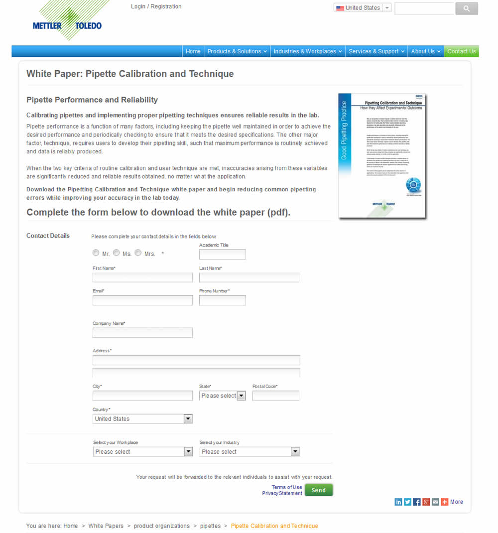
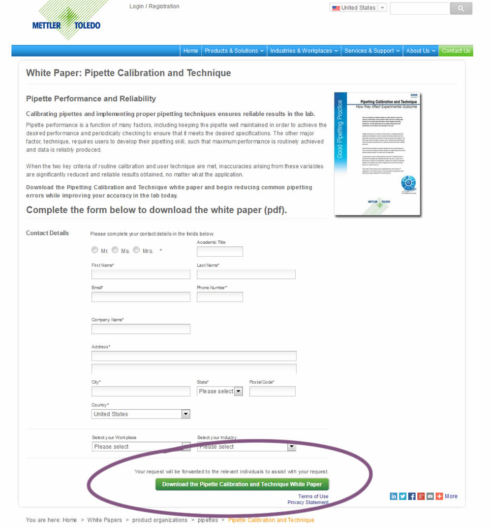
In this variation, a longer button label with a clearer benefit was tested against a shorter one.
Which A Or B Actually Wins? Find Out Before You Test.
Members see every test result — the winners, the flat ones, and the losers — along with exact effects and sample sizes. Use it to estimate your tests and prioritize by probability, not gut feel. Start every experiment with the odds on your side.
Test #210 on
Bomgar.com
by  Lee Elkins
Nov 13, 2018
Desktop
Mobile
Home & Landing
X.X%
Signups
Lee Tested Pattern #64: Tunnel On Bomgar.com


In this experiment, the header navigation links were removed on a landing page in order to provide more focus to the signup form.
Test #208 on
Thomasnet.com
by  Julian Gaviria
Nov 02, 2018
Desktop
Mobile
Listing
X.X%
Leads
Julian Tested Pattern #88: Action Button On Thomasnet.com
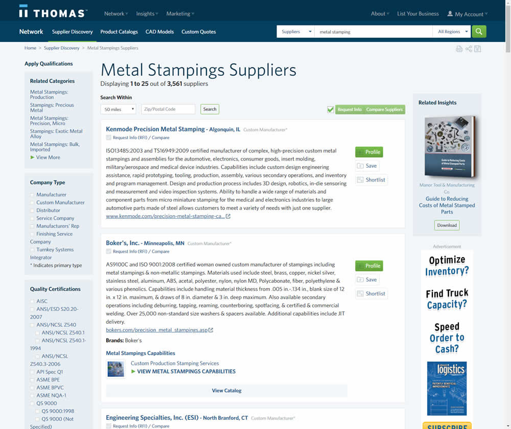
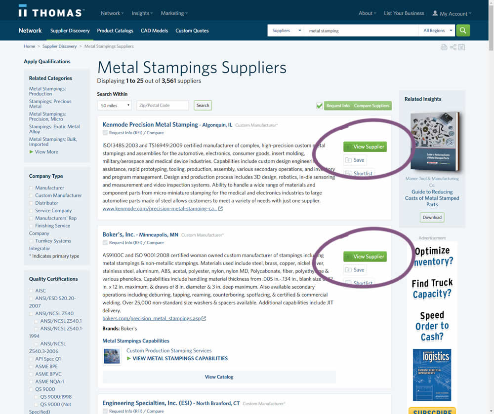
In this variation, the button labels were changed from "Profile" to "View Supplier".
Test #207 on
Suzuki.be
by  Karl Gilis
Nov 01, 2018
Desktop
Product
X.X%
Progression
Karl Tested Pattern #88: Action Button On Suzuki.be
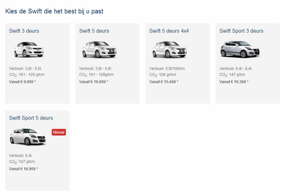
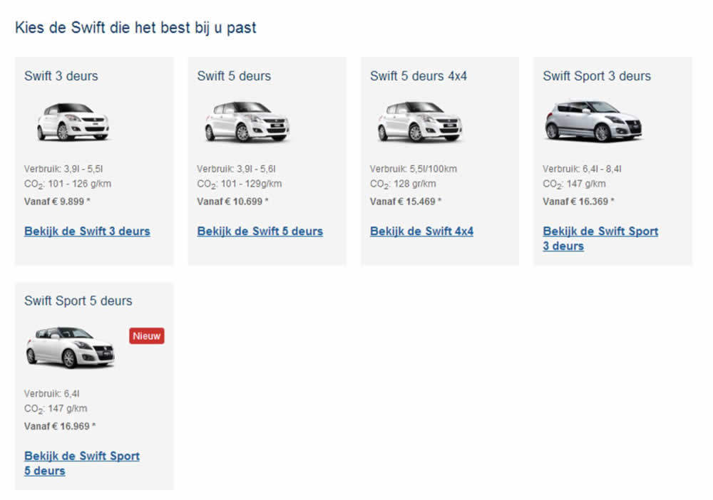
This test ran on the Suzuki Swift landing page. In the B variation, extra links with the following copy ‘Discover the <name of car model>’ were added for each sub product. (in Dutch: ‘Bekijk de…’).
Test #49 on
Menufy.com
by  Aleksandr Elesev
Oct 26, 2018
Desktop
Mobile
Checkout
X.X%
Sales
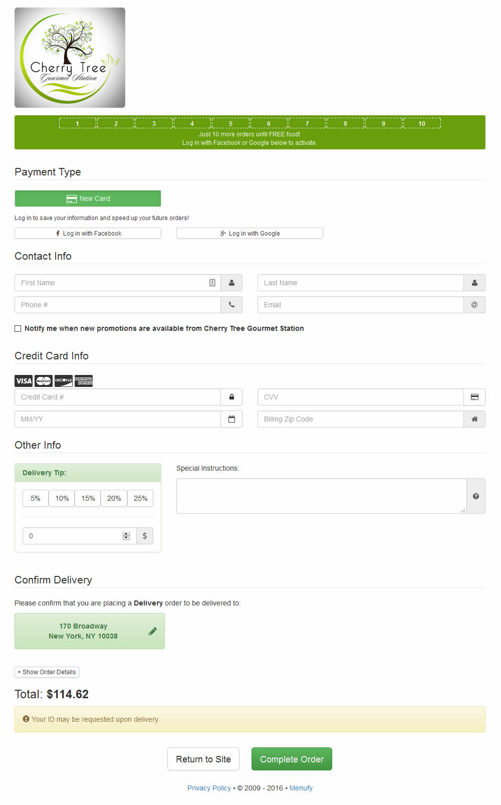
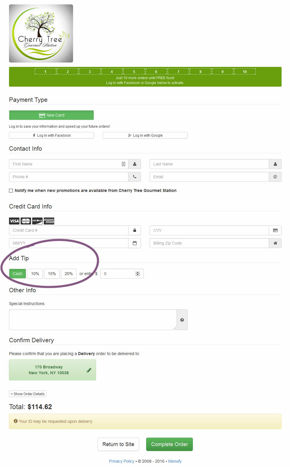
Aleksandr Tested Pattern #46: Pay Later On Menufy.com
Test #205 on
Msn.com
by  Ronny Kohavi
Oct 25, 2018
Desktop
Home & Landing
X.X%
Engagement
Ronny Tested Pattern #36: Fewer Or More Results On Msn.com

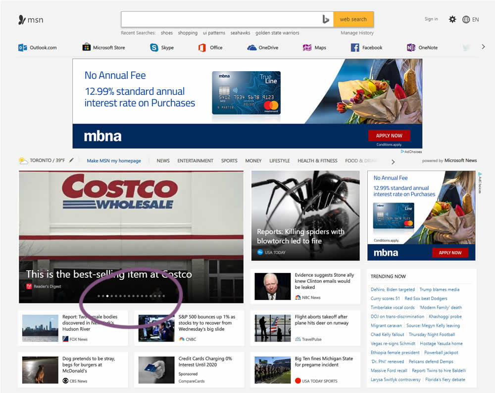
In this experiment, the carousel items were increased from 12 to 16.
Test #206 on
Yummly.com
by  Kimberly Cheung
Oct 25, 2018
Desktop
Mobile
Signup
X.X%
Signups
Kimberly Tested Pattern #40: Blurred Product Background On Yummly.com
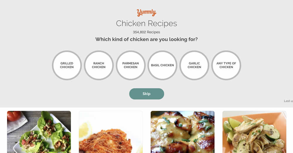
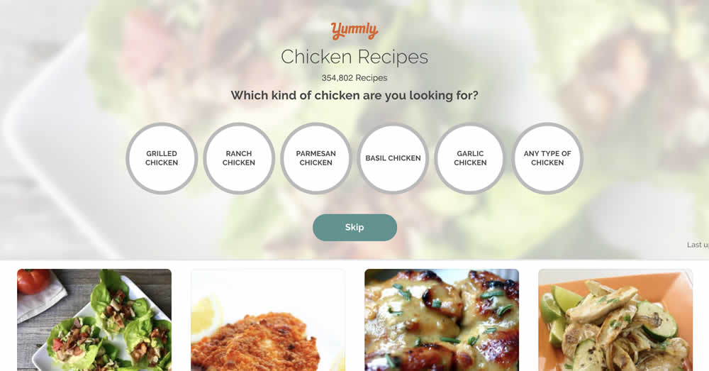
This test ran on the first step of a multiple signup funnel and only changed the background to a blurred image.
Test #204 on
Kenhub.com
by  Niels Hapke
Oct 11, 2018
Desktop
Mobile
Global
X.X%
Sales
Niels Tested Pattern #85: Benefit Button On Kenhub.com
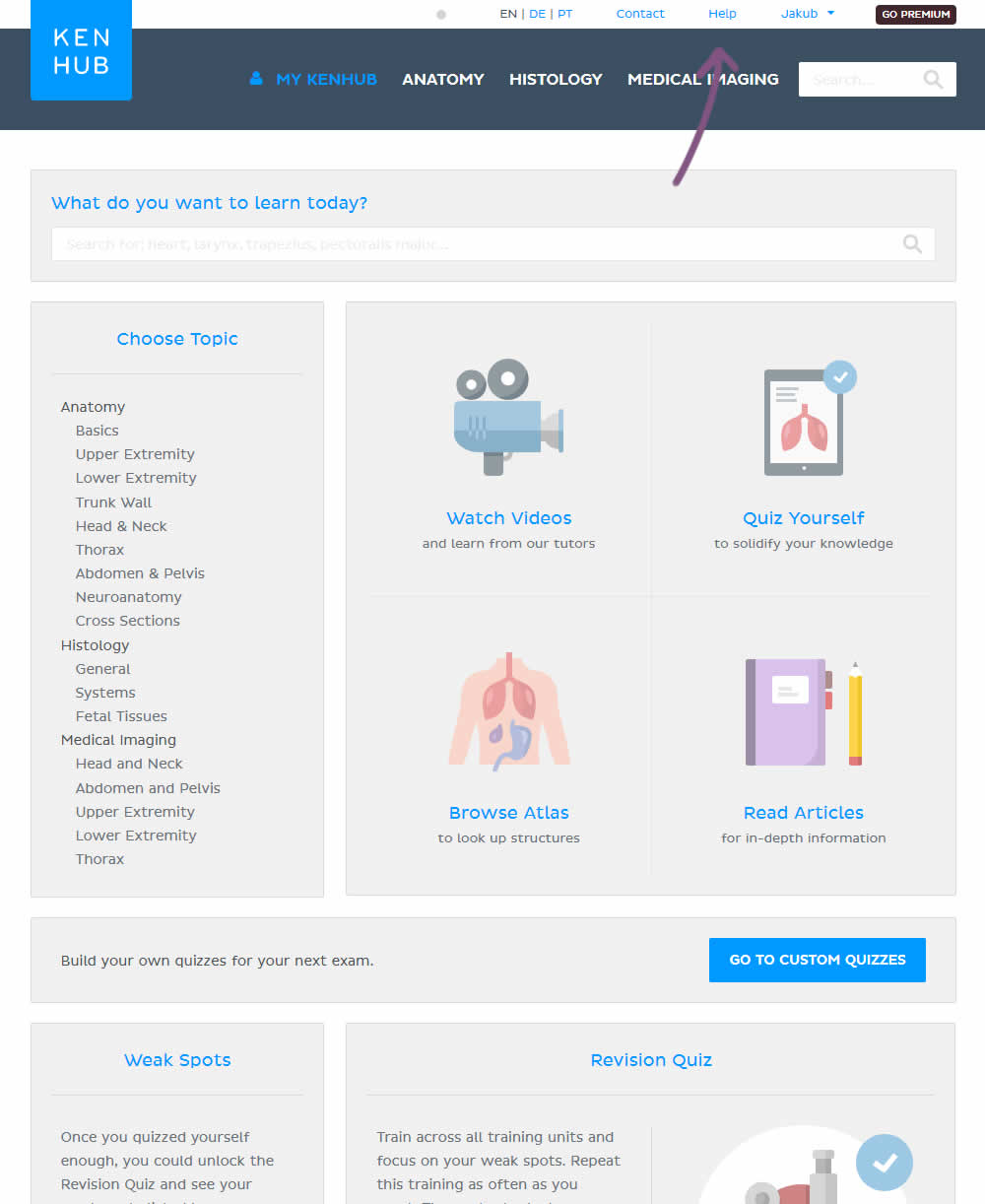
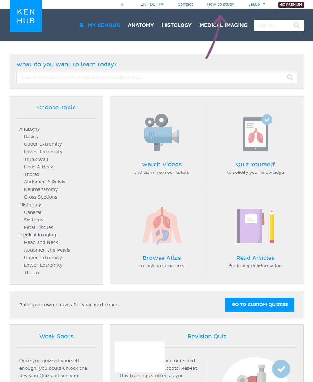
In the variation, the "Help" section was reworded to "How to study".
Test #203 on
Driving-tests.org
by  Andrei Zakhareuski
Oct 10, 2018
Desktop
Global
X.X%
Sales
Andrei Tested Pattern #85: Benefit Button On Driving-tests.org
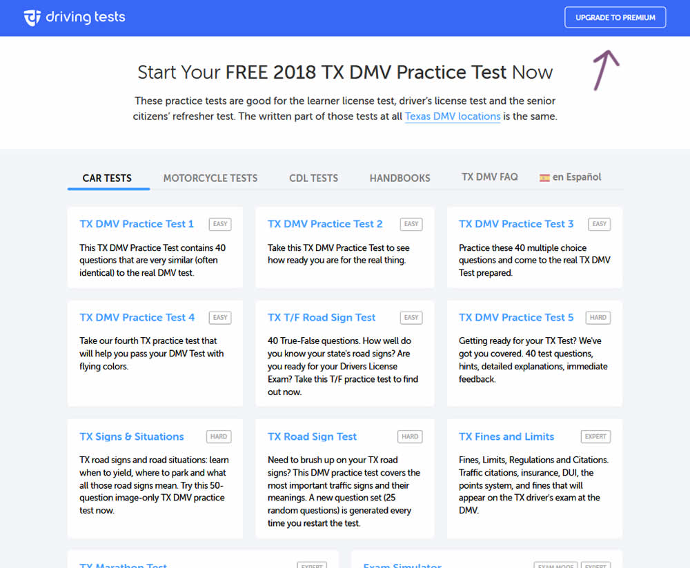
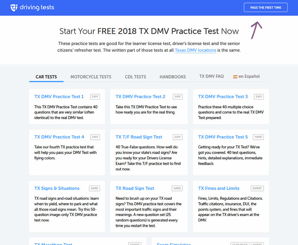
In the variation, the button label "Upgrade To Premium" was changed to one with a clearer benefit of "Pass The First Time".
Test #202 on
Kenhub.com
by  Niels Hapke
Oct 01, 2018
Desktop
Mobile
Checkout
X.X%
Sales
Niels Tested Pattern #13: Centered Forms & Buttons On Kenhub.com
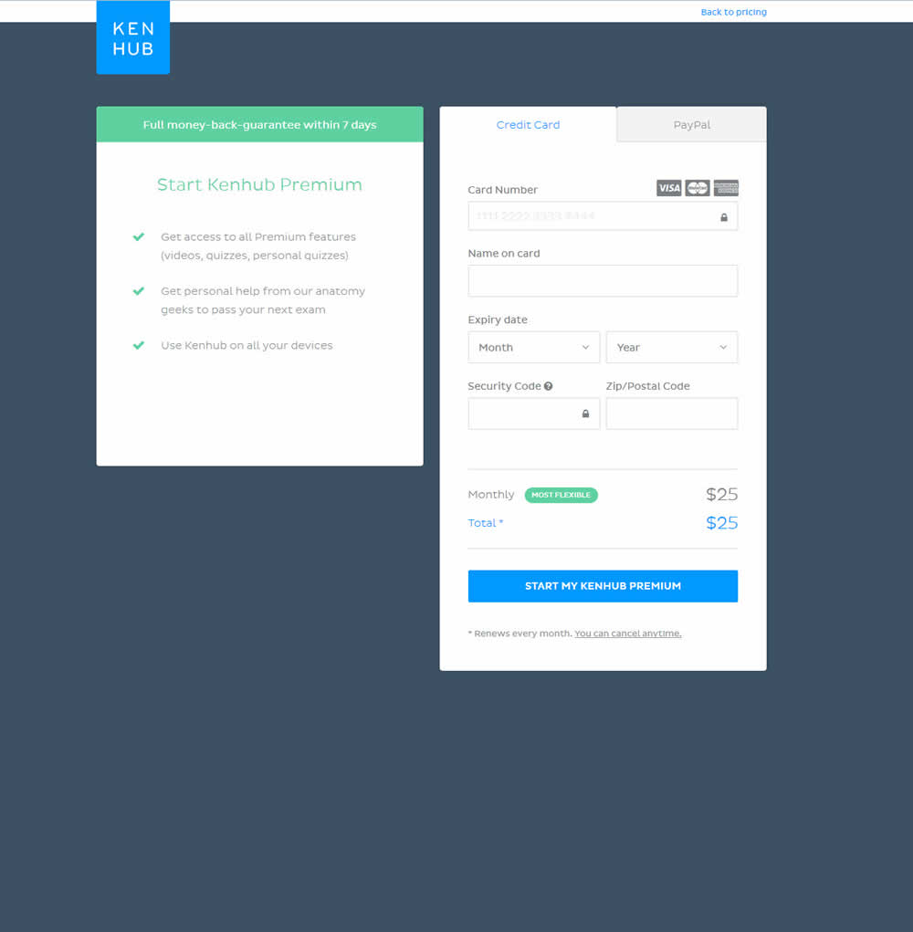
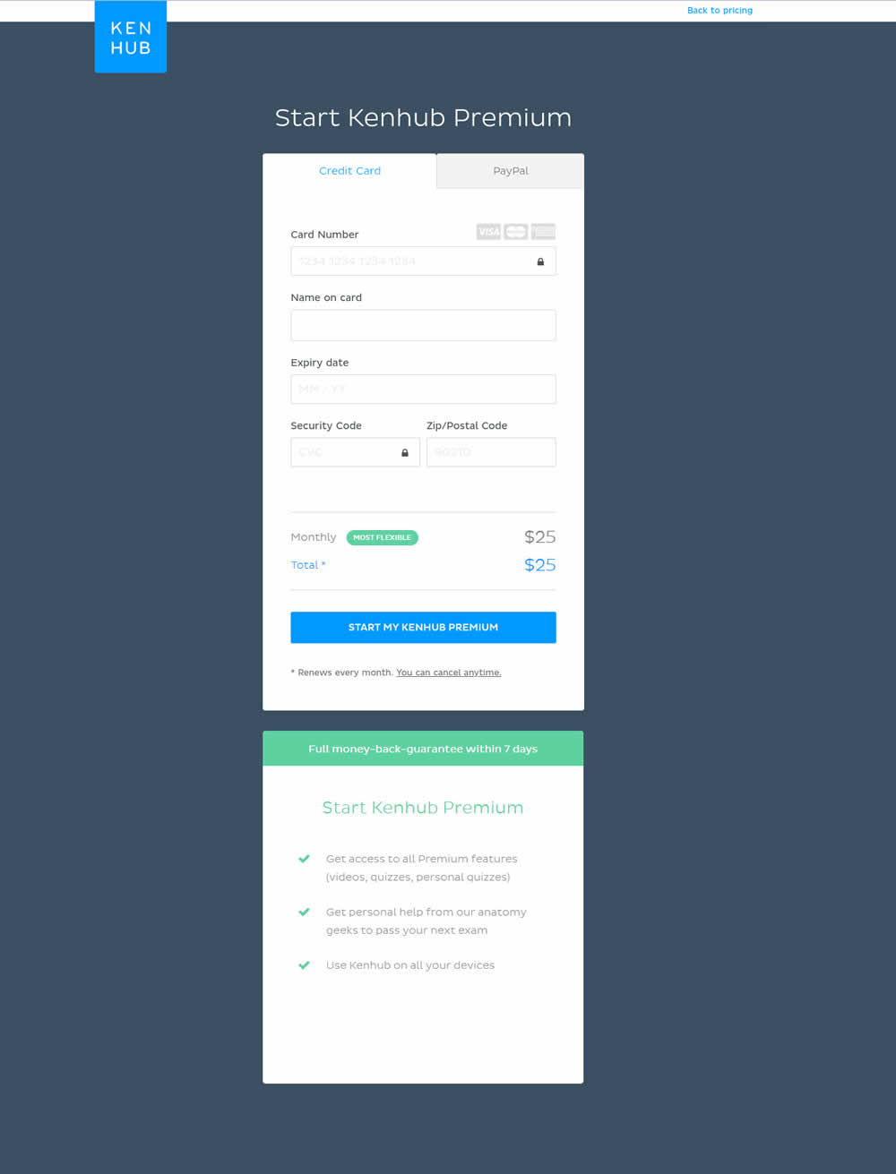
In this experiment, the form layout was adjusted by shifting the side benefits further down below the form.
Test #9 on
by  Rick Dawson
Sep 28, 2018
Desktop
Mobile
Home & Landing
X.X%
Leads
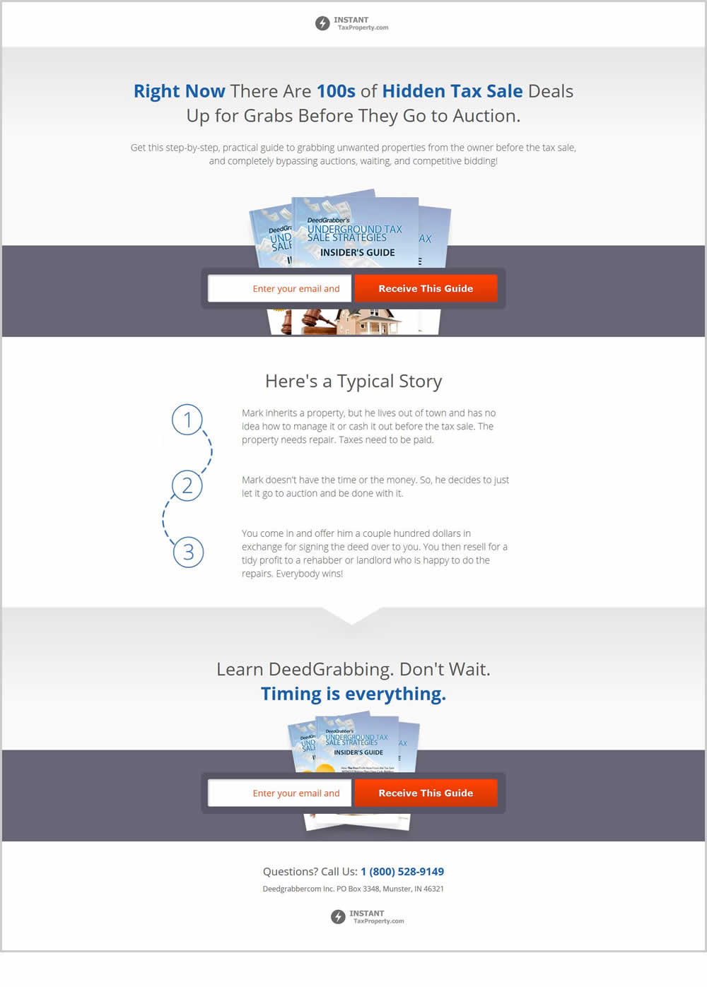
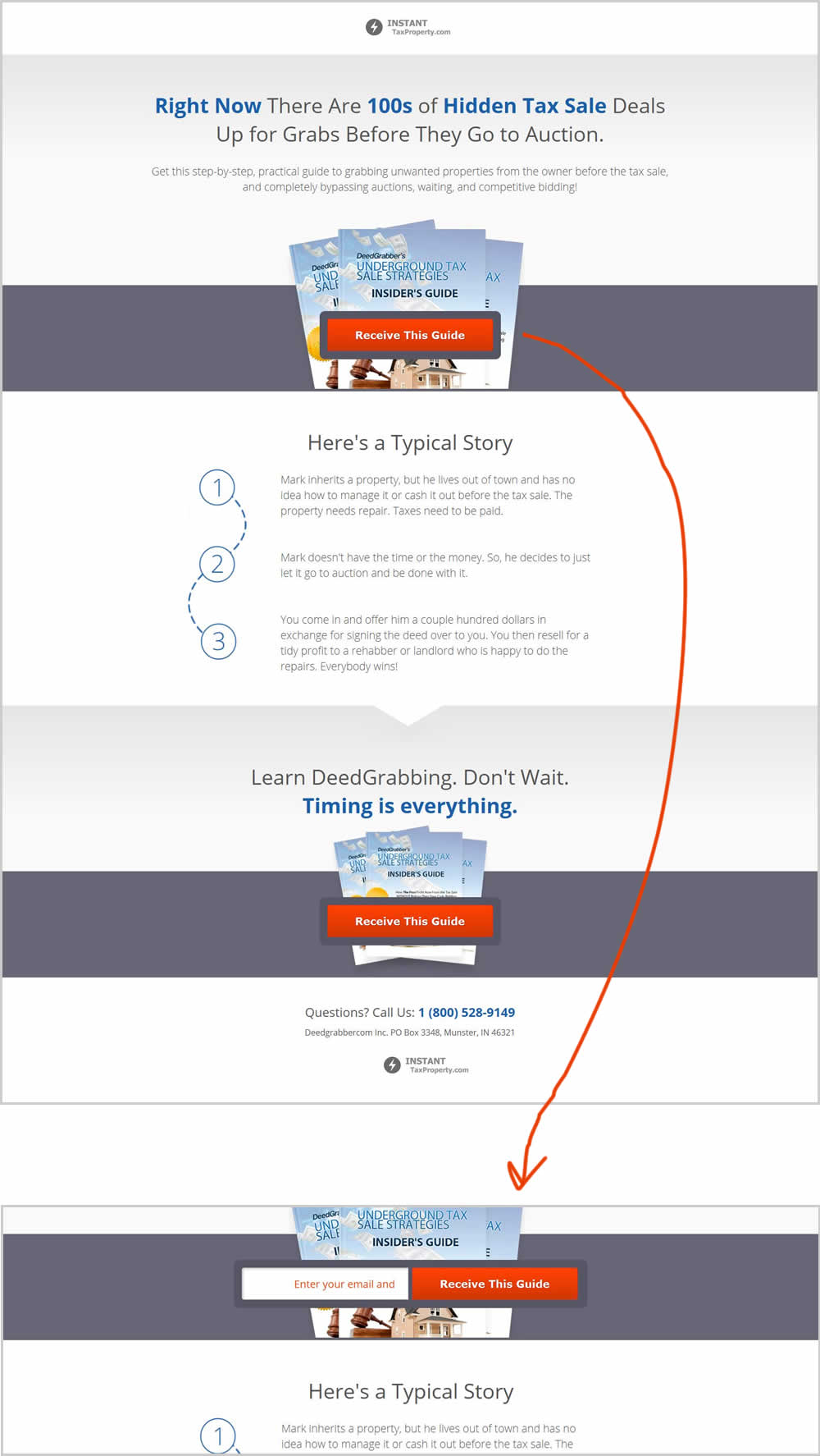
Rick Tested Pattern #83: Progressive Fields
Test #201 on
by  Ben Labay
Sep 19, 2018
Desktop
Mobile
Thank You
X.X%
Sales
Ben Tested Pattern #7: Social Counts
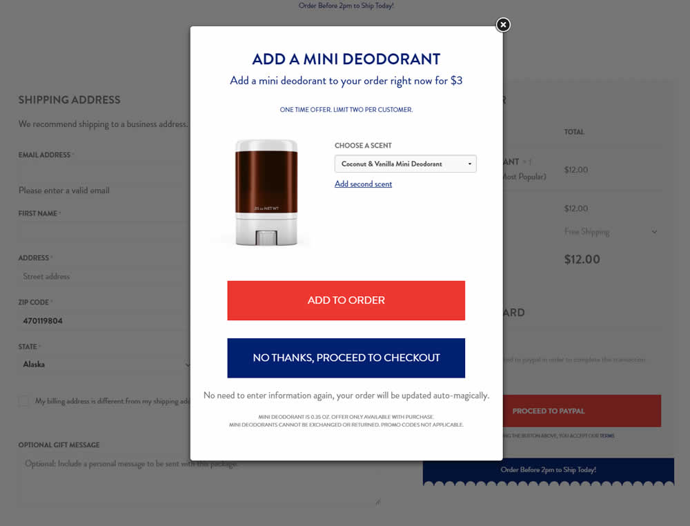
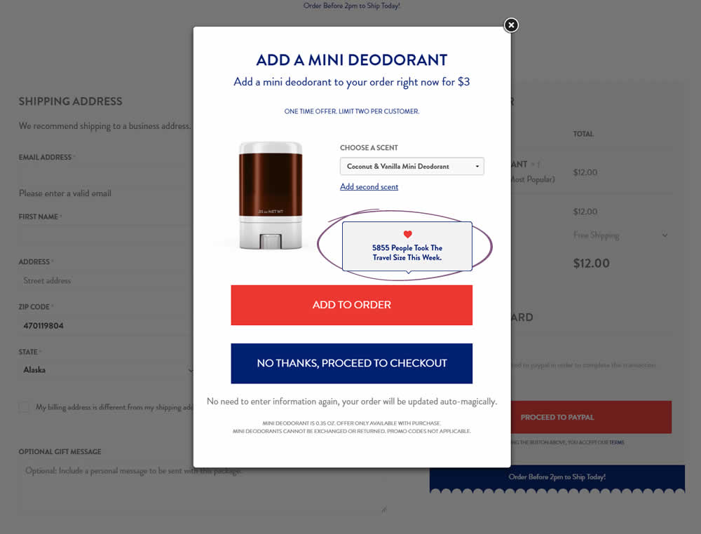
In this test the upsell modal had an added text box with number of people that day who took the offer. The test hypothesis was that social proof will add motivation to take an action and the offer.
Test #200 on
Trydesignlab.com
by  Will Anderson
Sep 14, 2018
Desktop
Mobile
Home & Landing
X.X%
Sales
Will Tested Pattern #52: How It Works On Trydesignlab.com
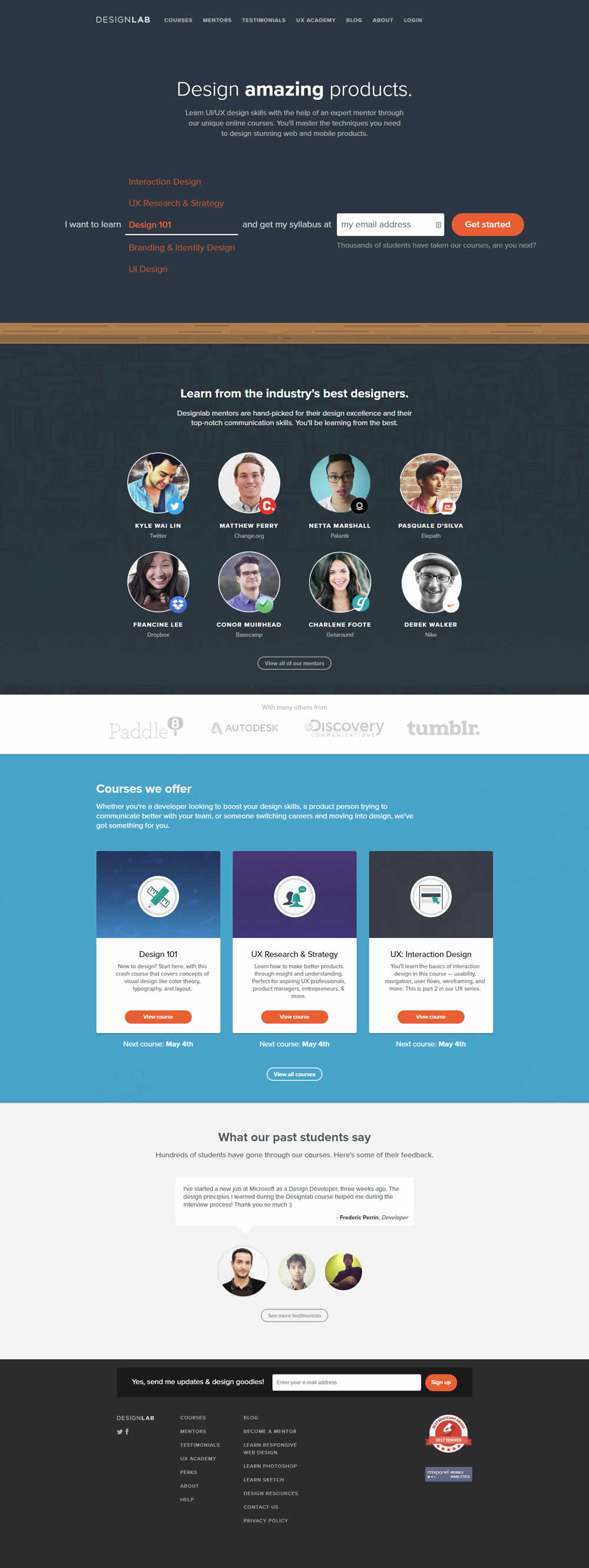

In this experiment, a "How It Works" content section was removed.
Test #199 on
Freshegg.co.uk
by  Luke Hay
Sep 13, 2018
Desktop
Mobile
Home & Landing
X.X%
Progression
Luke Tested Pattern #77: Filled Or Ghost Buttons On Freshegg.co.uk

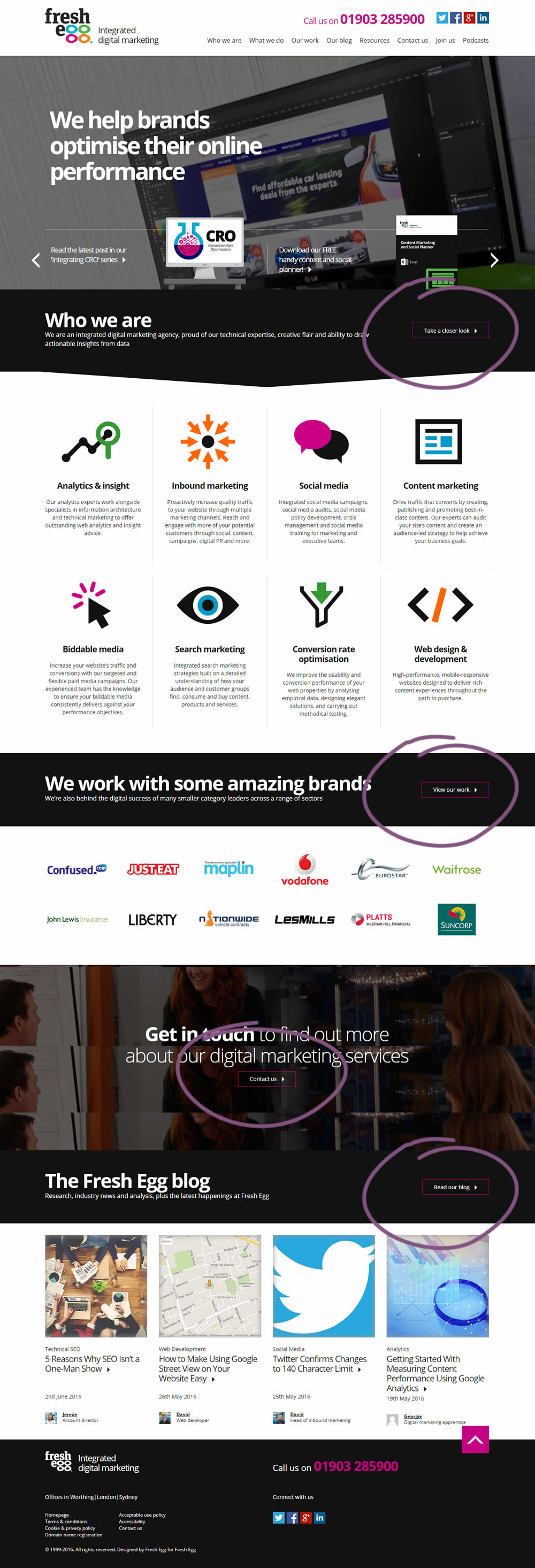
In this experiment, standard (filled) buttons were tested against ghost buttons.
Test #197 on
Reverb.com
by  Nicholas Evans
Sep 04, 2018
Desktop
Product
X.X%
Sales
Nicholas Tested Pattern #4: Testimonials On Reverb.com
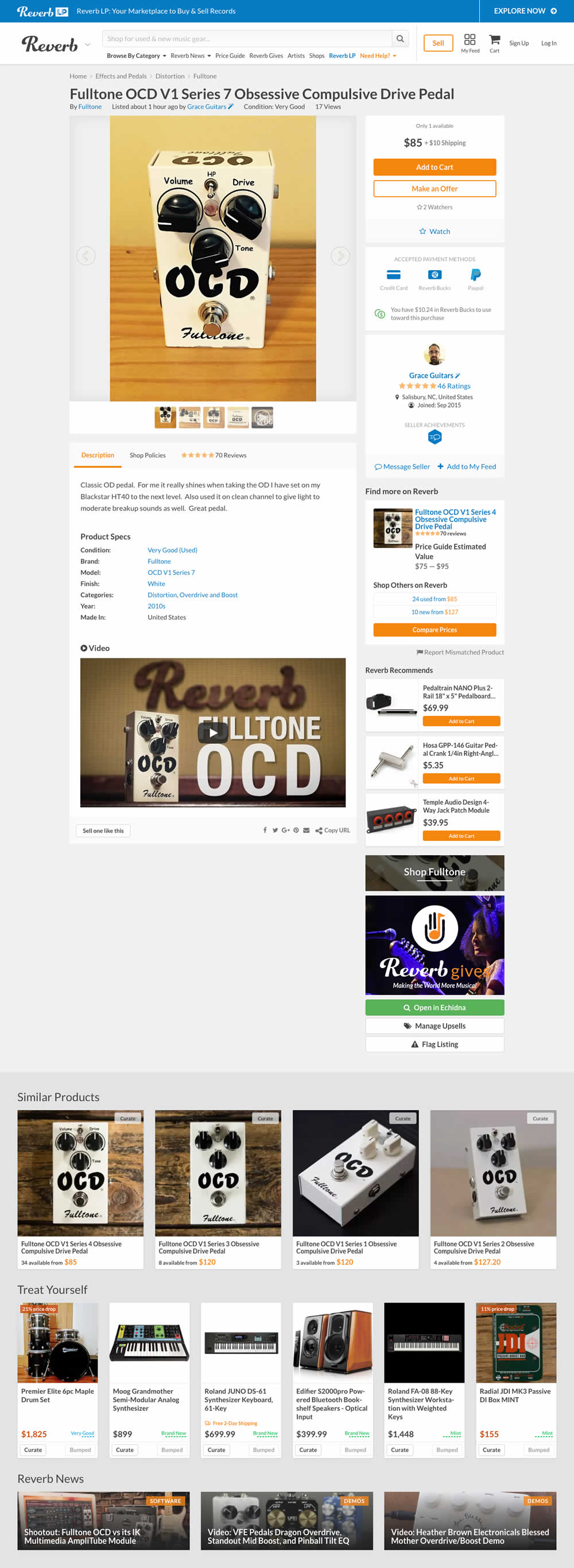

In the variation, customer reviews were exposed from a less visible tab view.
Test #198 on
Bomgar.com
by  Lee Elkins
Sep 03, 2018
Desktop
Signup
X.X%
Signups
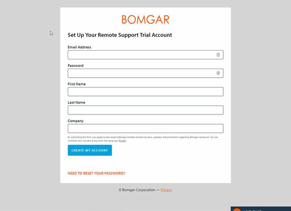
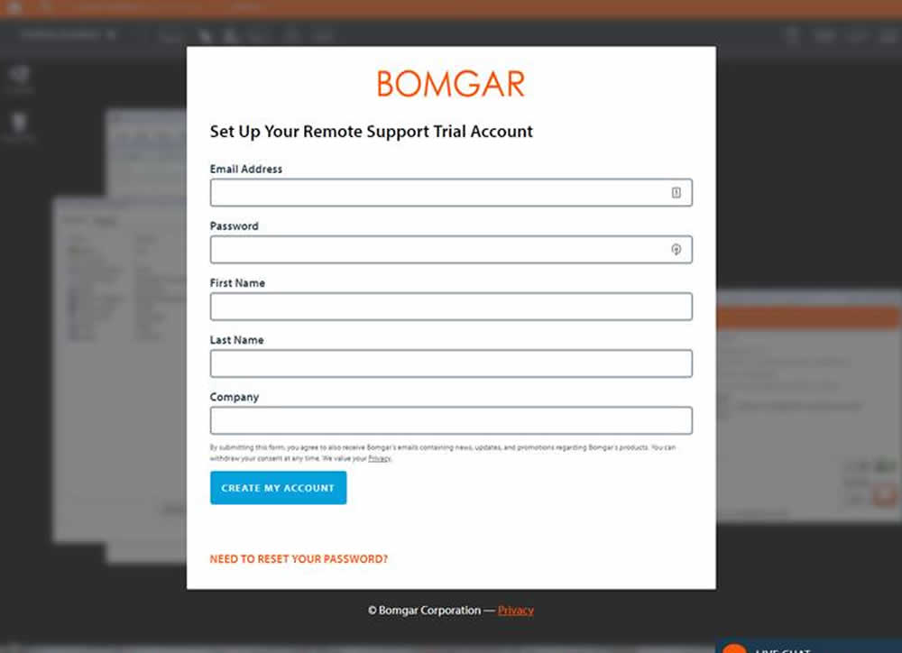
Lee Tested Pattern #40: Blurred Product Background On Bomgar.com
Test #195 on
Yummly.com
by  Kimberly Cheung
Aug 13, 2018
Desktop
Mobile
Listing
X.X%
Signups
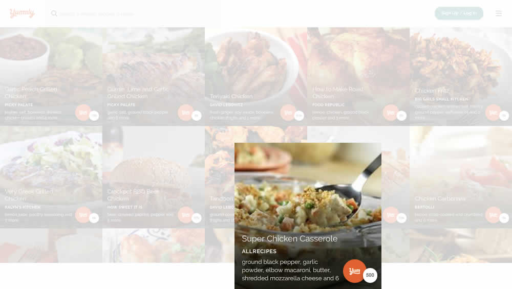
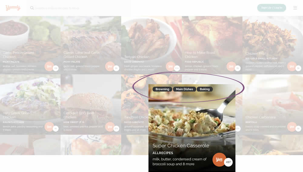
Kimberly Tested Pattern #78: Tags, Badges And Structured Information On Yummly.com
Test #194 on
Bomgar.com
by  Lee Elkins
Aug 08, 2018
Desktop
Mobile
Home & Landing
X.X%
Signups
Lee Tested Pattern #22: Empowering Headline On Bomgar.com


Test #193 on
Yummly.com
by  Marcos Ciarrocchi
Aug 07, 2018
Desktop
Mobile
Signup
X.X%
Signups
Marcos Tested Pattern #91: Forced Action On Yummly.com
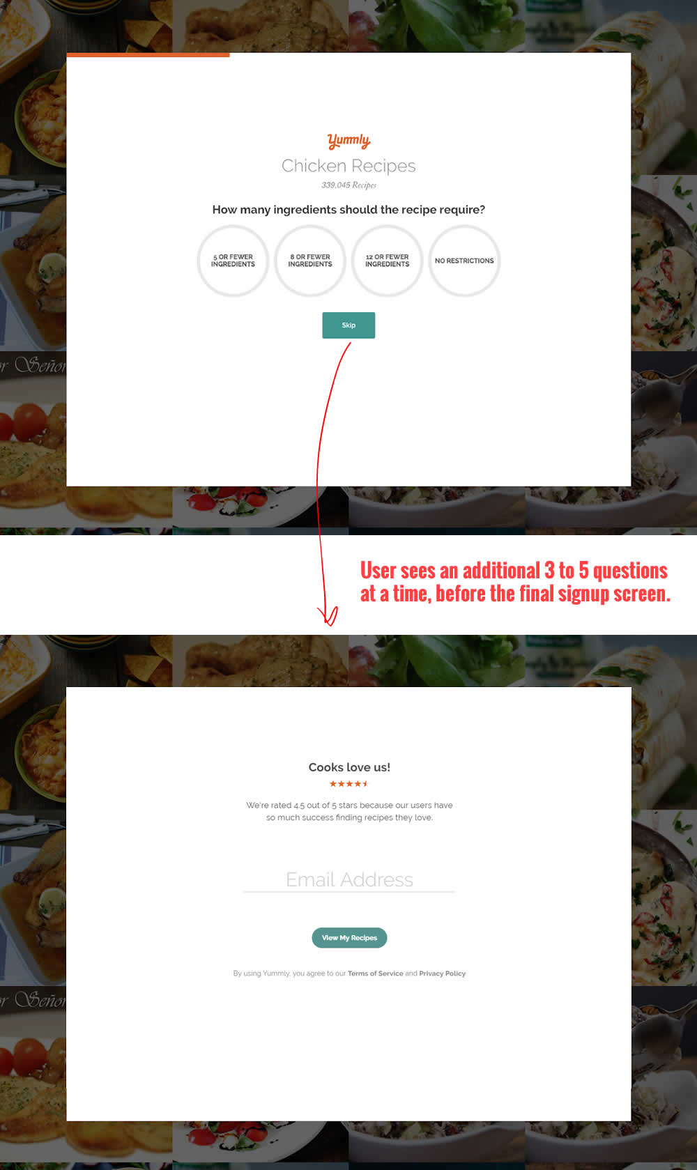
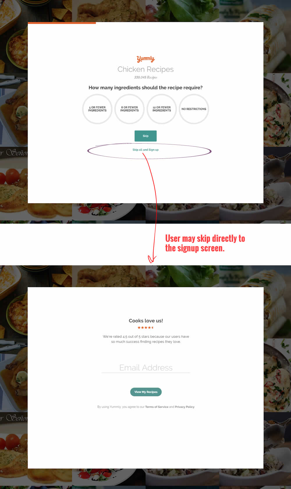
In this experiment, the presence of an additional "skip all" text link was tested on a multiple step signup flow. The skip all link allowed users to bypass personalization questions and go straight to their app dashboard. The control (A) shows its presence, and in variant B we can see it was removed.
Test #192 on
Refactoring.guru
by  Alexander Shvets
Aug 07, 2018
Desktop
Mobile
Product
X.X%
Sales
Alexander Tested Pattern #4: Testimonials On Refactoring.guru


In this experiment, a number of customer reviews were added at the middle of a product page.