All Latest 620 A/B Tests
MOST RECENT TESTS
Test #253 on
Volders.de
by  Alexander Krieger
Aug 08, 2019
Desktop
Mobile
Signup
X.X%
Revenue
Alexander Tested Pattern #17: Least Or Most Expensive First On Volders.de
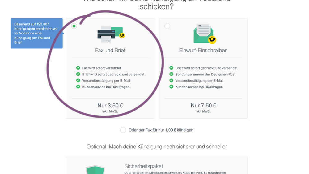
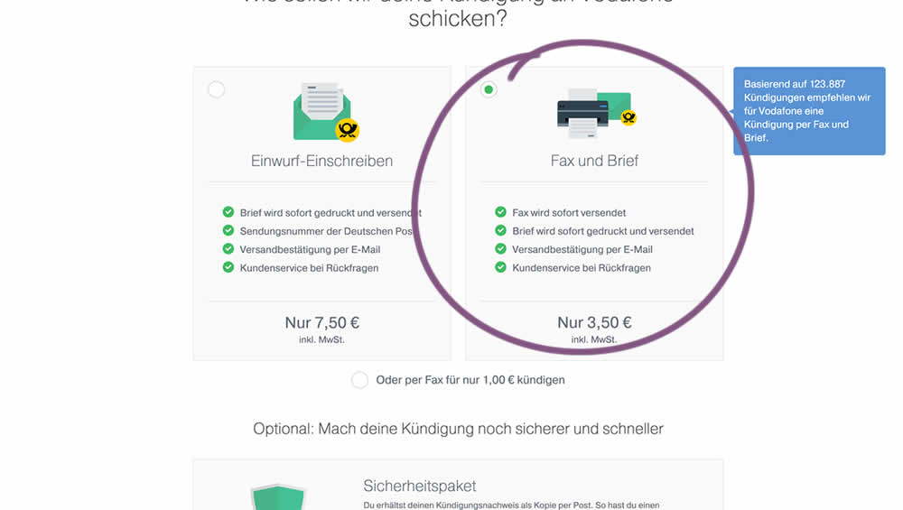
In this experiment, two pricing plans were inverted to show the most expensive plan first (in the variation).
Which A Or B Actually Wins? Find Out Before You Test.
Members see every test result — the winners, the flat ones, and the losers — along with exact effects and sample sizes. Use it to estimate your tests and prioritize by probability, not gut feel. Start every experiment with the odds on your side.
Test #252 on
Thomasnet.com
by  Julian Gaviria
Jul 30, 2019
Desktop
Mobile
Content
X.X%
Engagement
Julian Tested Pattern #107: Contrast Links & Buttons On Thomasnet.com
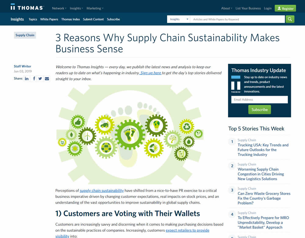
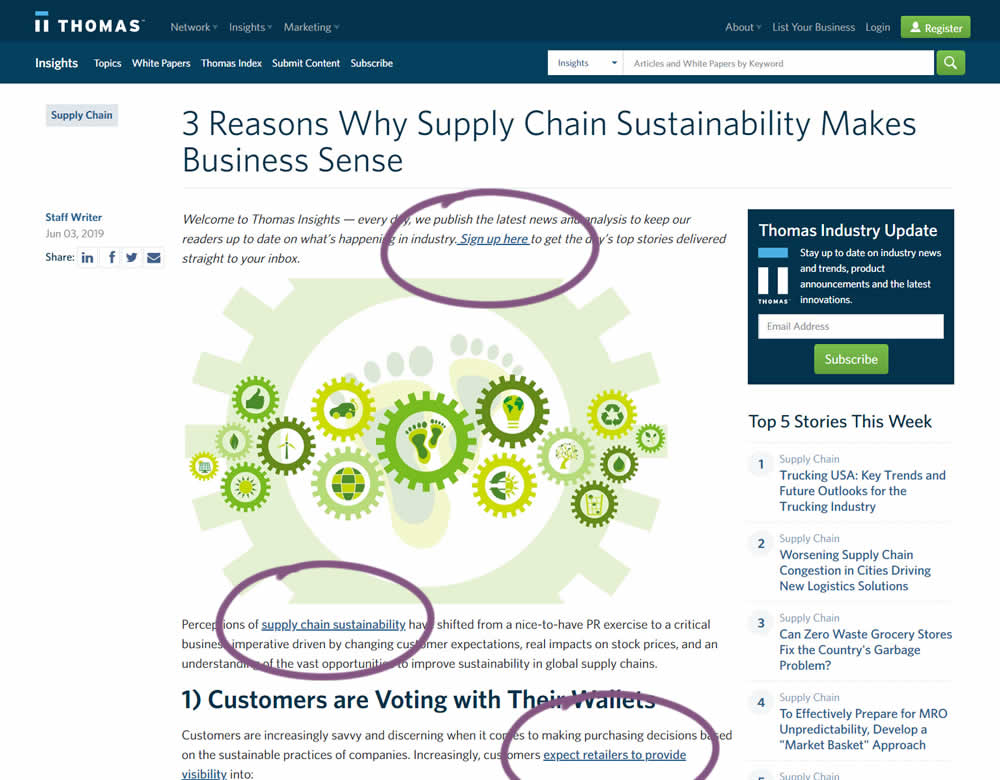
In this experiment a light blue bold link was tested against a darker blue bold link.
Test #250 on
Volders.de
by  Alexander Krieger
Jul 25, 2019
Desktop
Mobile
Signup
X.X%
Signups
Alexander Tested Pattern #106: Back Buttons On Volders.de
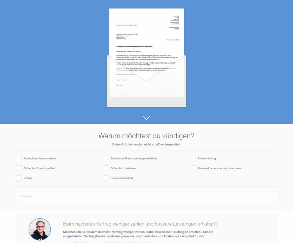
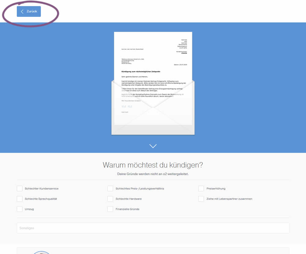
In this experiment, a version without a back button was tested against a one where it was positioned in the upper left corner. This test occured on a second step of a contract cancellation service.
Test #251 on
Goodui.org
by  Jakub Linowski
Jul 25, 2019
Desktop
Mobile
Content
X.X%
Signups
Jakub Tested Pattern #57: Maybe Later On Goodui.org


In this experiment, we tested a standard modal (with 2 choices) against a "Maybe Later" one (with 3 choices). One of the choices in the variant allowed users to postpone their decision with a "maybe" which would enable a floating bar at the bottom of the screen. Clicking on any of the "Yes" options would send people to the bottom of the screen with an email signup form. Increasing signup was our primary measure. Both modals also appeared instantly after a page load.
Test #249 on
Autoscout24.com
by  Optimizely
Jul 17, 2019
Desktop
Product
X.X%
Leads
Optimizely Tested Pattern #20: Canned Response On Autoscout24.com
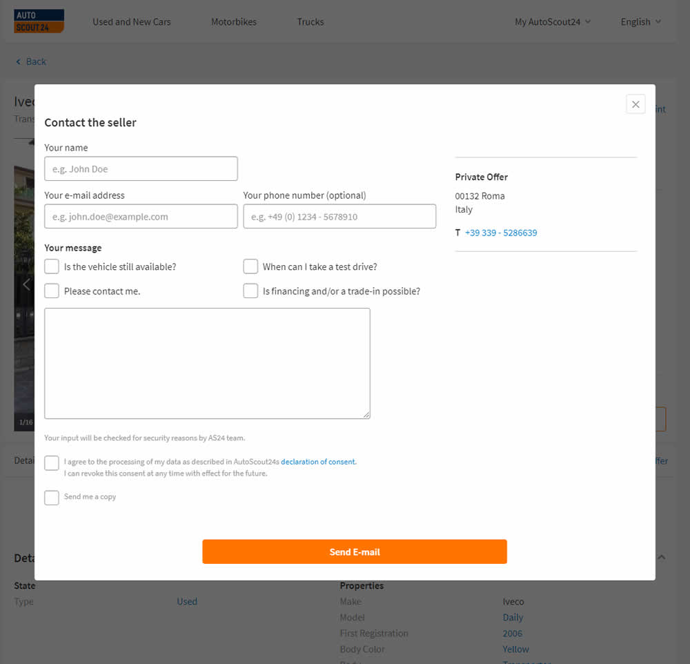
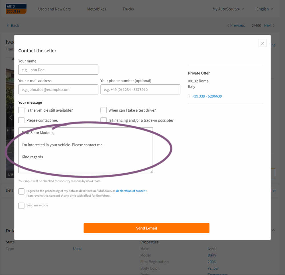
AutoScout24 is Europe’s largest online marketplace for new and used cars. As published by Optimizely, they tested a form pre-filled with text that read: ‘Hello. I am interested in your vehicle. Please contact me. Kind regards.’
Test #248 on
Volders.de
by  Alexander Krieger
Jul 16, 2019
Desktop
Signup
X.X%
Sales
Alexander Tested Pattern #20: Canned Response On Volders.de

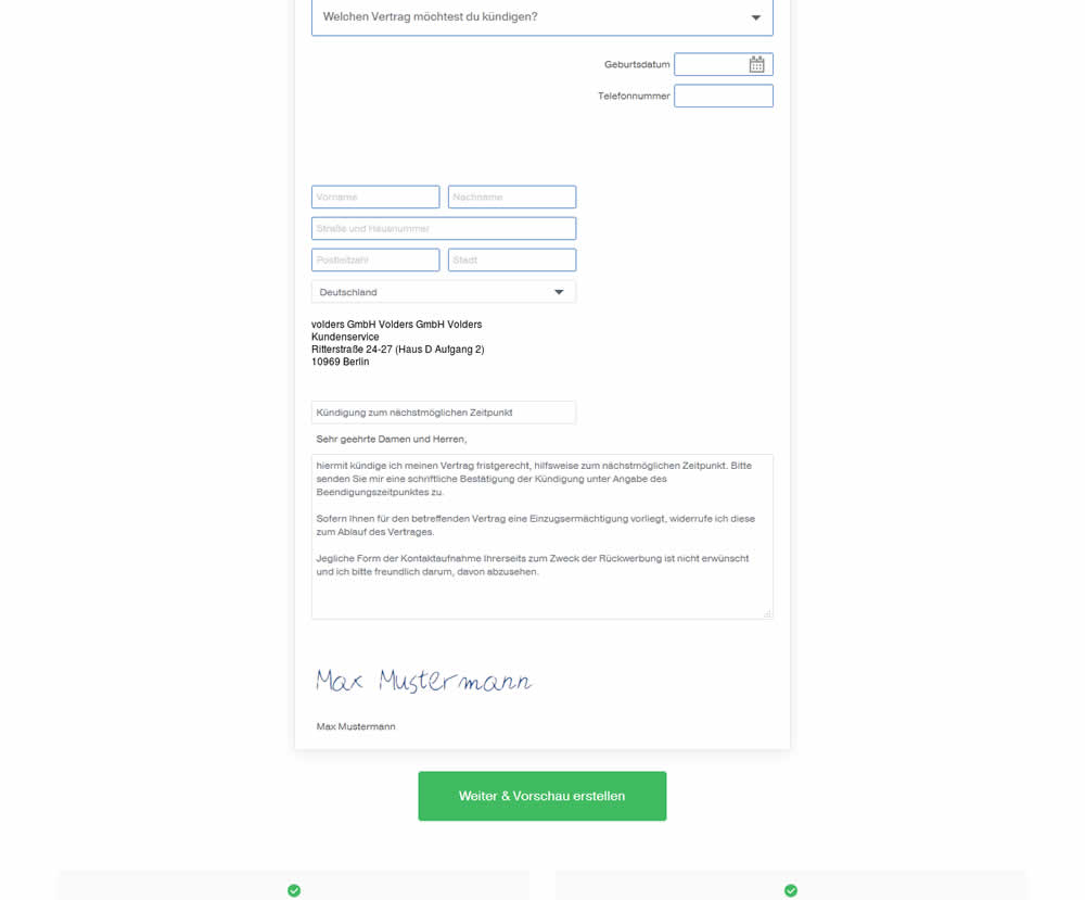
In this experiment, an editable contract cancellation letter was tested against a non-editable one. The editable letter first appeared in a text state, which required a click on a link in order for it to be transformed into an editable textarea field.
Test #39 on
Over-blog.com
by  Tael Pinault
Jul 02, 2019
Desktop
Signup
X.X%
Signups
Tael Tested Pattern #83: Progressive Fields On Over-blog.com
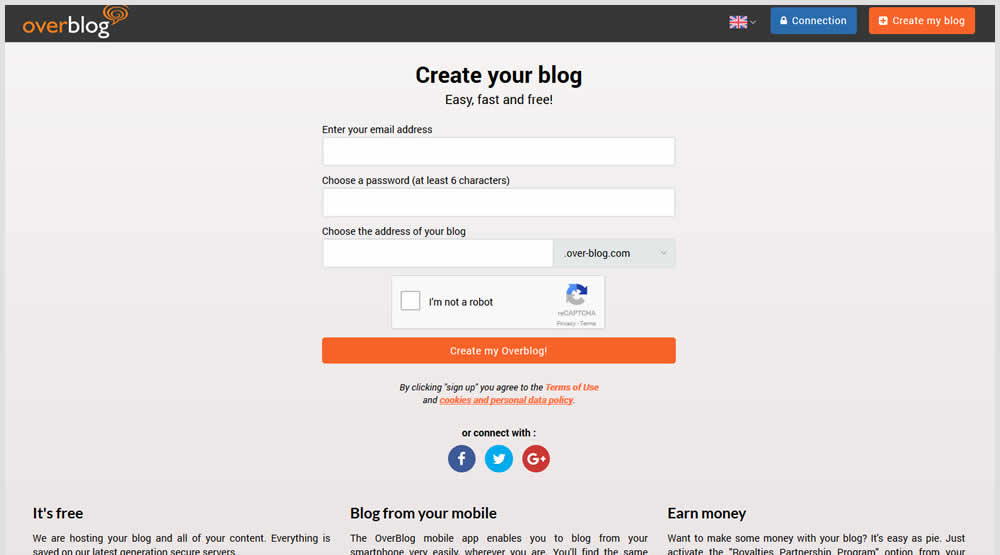
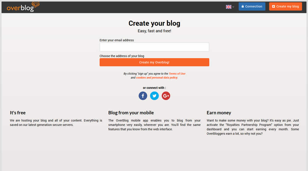
This test explored a progressive disclosure interaction in variation B. When a user started typing text into the first field, two more fields expanded into view.
Test #247 on
Thomasnet.com
by  Julian Gaviria
Jun 13, 2019
Desktop
Mobile
Content
X.X%
Signups
Julian Tested Pattern #41: Sticky Call To Action On Thomasnet.com
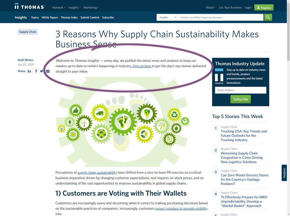
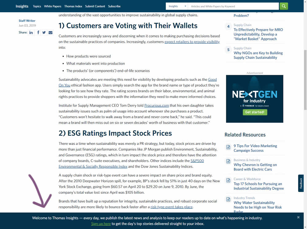
In this experiment, the same message (with a link) for signing up to a newsletter was shown in two distinct ways. The control (A) showed the signup message as inline one that preceded the content of the article at the very top. The variant showed the same signup message as a scroll-delayed sticky interaction at the bottom of the screen. The background color of the B variant was also inverted to match the style of the footer.
Test #246 on
Thomasnet.com
by  Julian Gaviria
Jun 12, 2019
Desktop
Mobile
Home & Landing
X.X%
Progression
Julian Tested Pattern #88: Action Button On Thomasnet.com
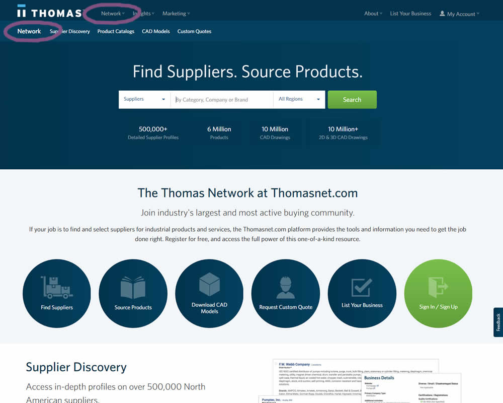
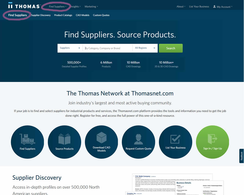
In this experiment, the navigation label was changed from "Network" to "Find Suppliers". The idea was to make use of an action label with a clearer benefit.
Test #245 on
Kenhub.com
by  Niels Hapke
Jun 11, 2019
Desktop
Signup
X.X%
Signups
Niels Tested Pattern #19: Benefit Testimonials On Kenhub.com
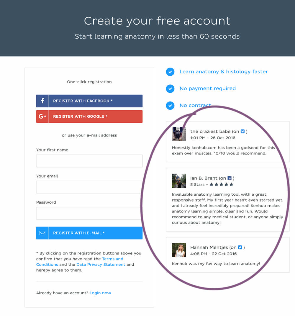
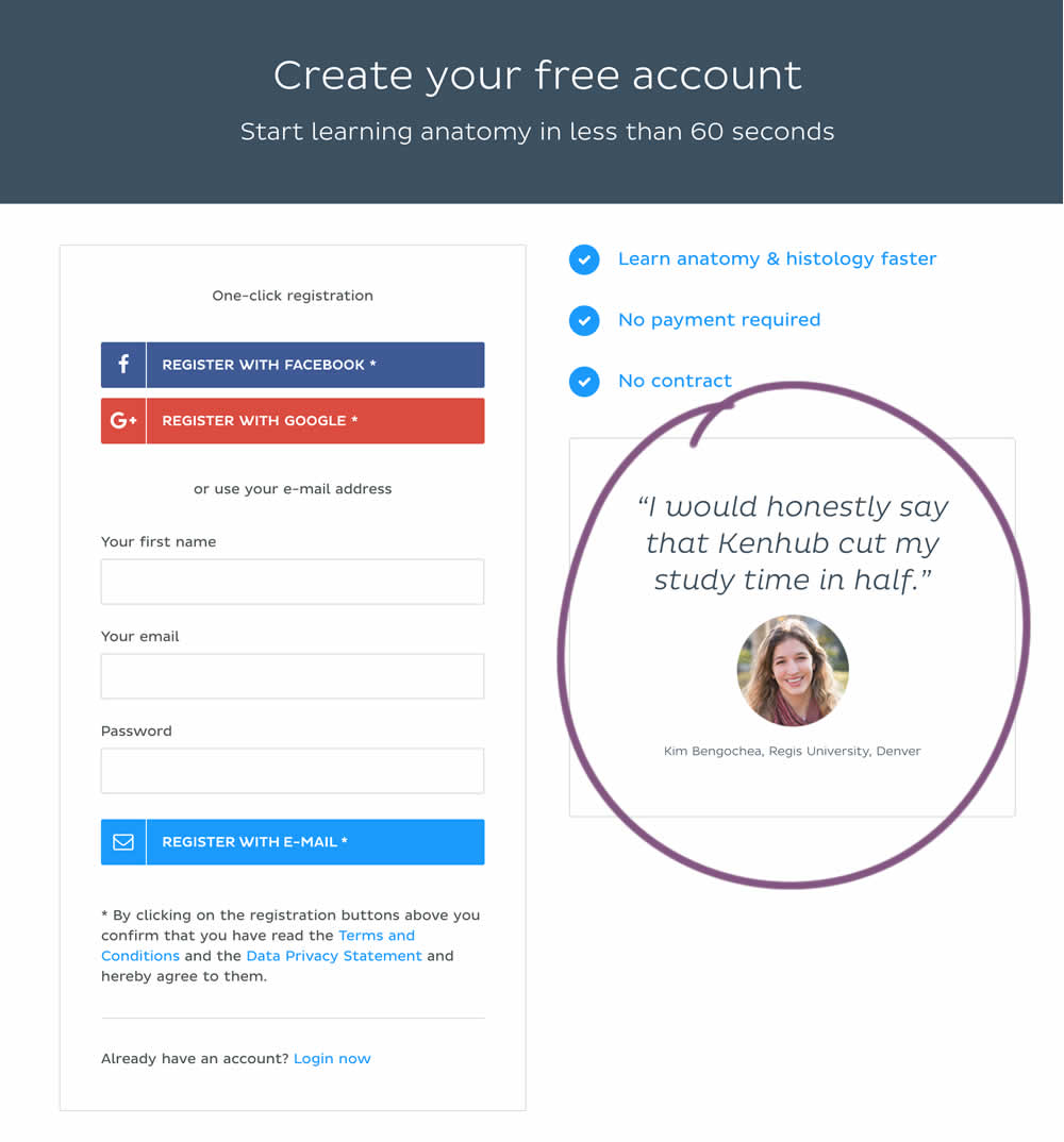
In this experiment a more elaborate and authentic testimonial was used instead of three more generic ones from social media sites.
Test #244 on
Mt.com
by  Vito Mediavilla
Jun 06, 2019
Desktop
Product
X.X%
Leads
Vito Tested Pattern #49: Above The Fold Call To Action On Mt.com

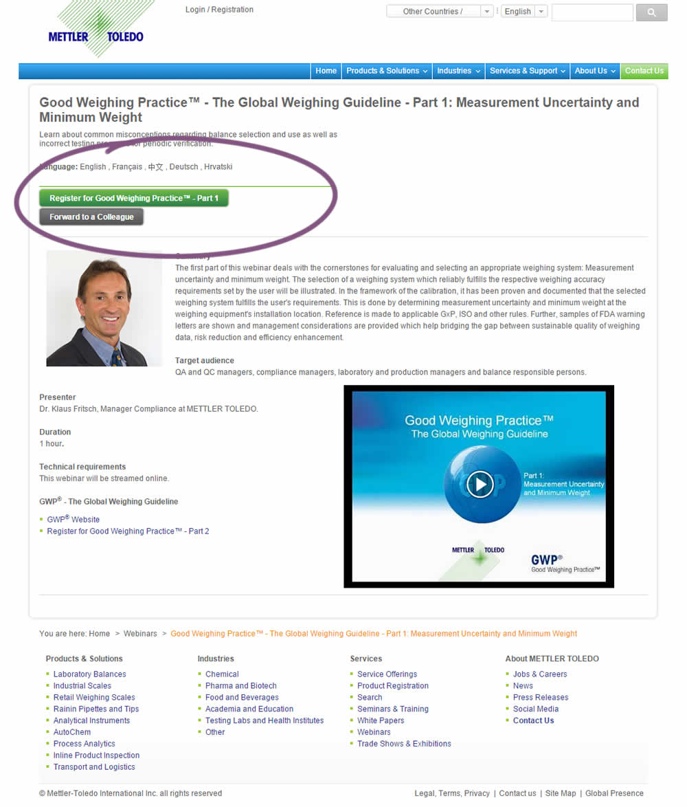
A product landing page with an image was tested against one without - raising the call to action above the fold.
Test #243 on
Goodui.org
by  Jakub Linowski
Jun 05, 2019
Desktop
Mobile
Home & Landing
X.X%
Progression
Jakub Tested Pattern #77: Filled Or Ghost Buttons On Goodui.org
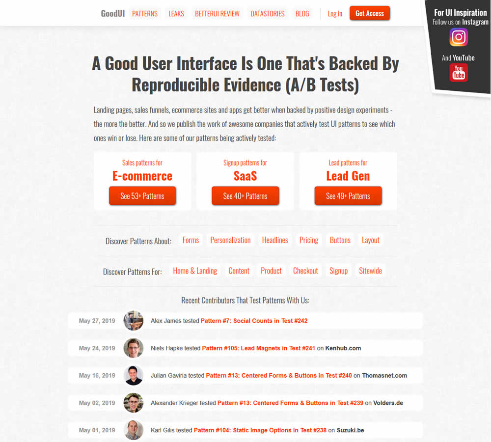
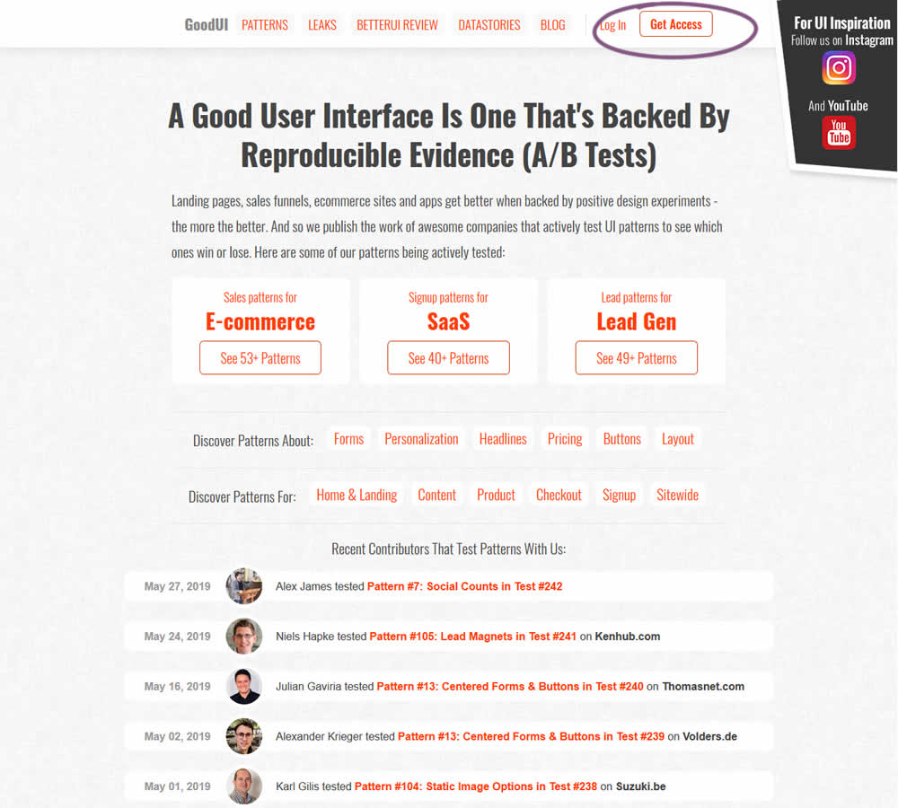
In this experiment, full red background buttons were changed to ghost buttons (red outline and transparent fill)
Test #242 on
by  Alex James
May 27, 2019
Desktop
Mobile
Signup
X.X%
Signups
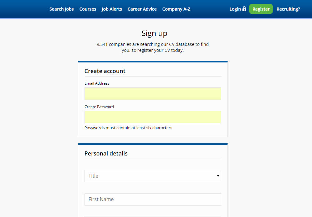
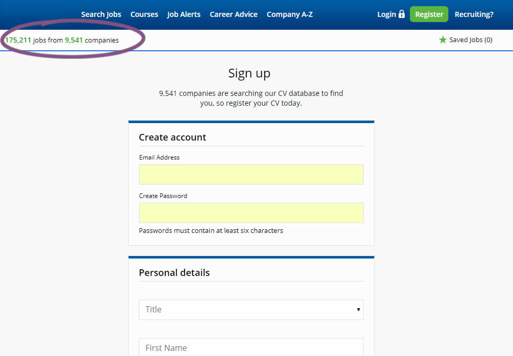
Alex Tested Pattern #7: Social Counts
Test #241 on
Kenhub.com
by  Niels Hapke
May 24, 2019
Desktop
Mobile
Signup
X.X%
Signups
Niels Tested Pattern #105: Lead Magnets On Kenhub.com
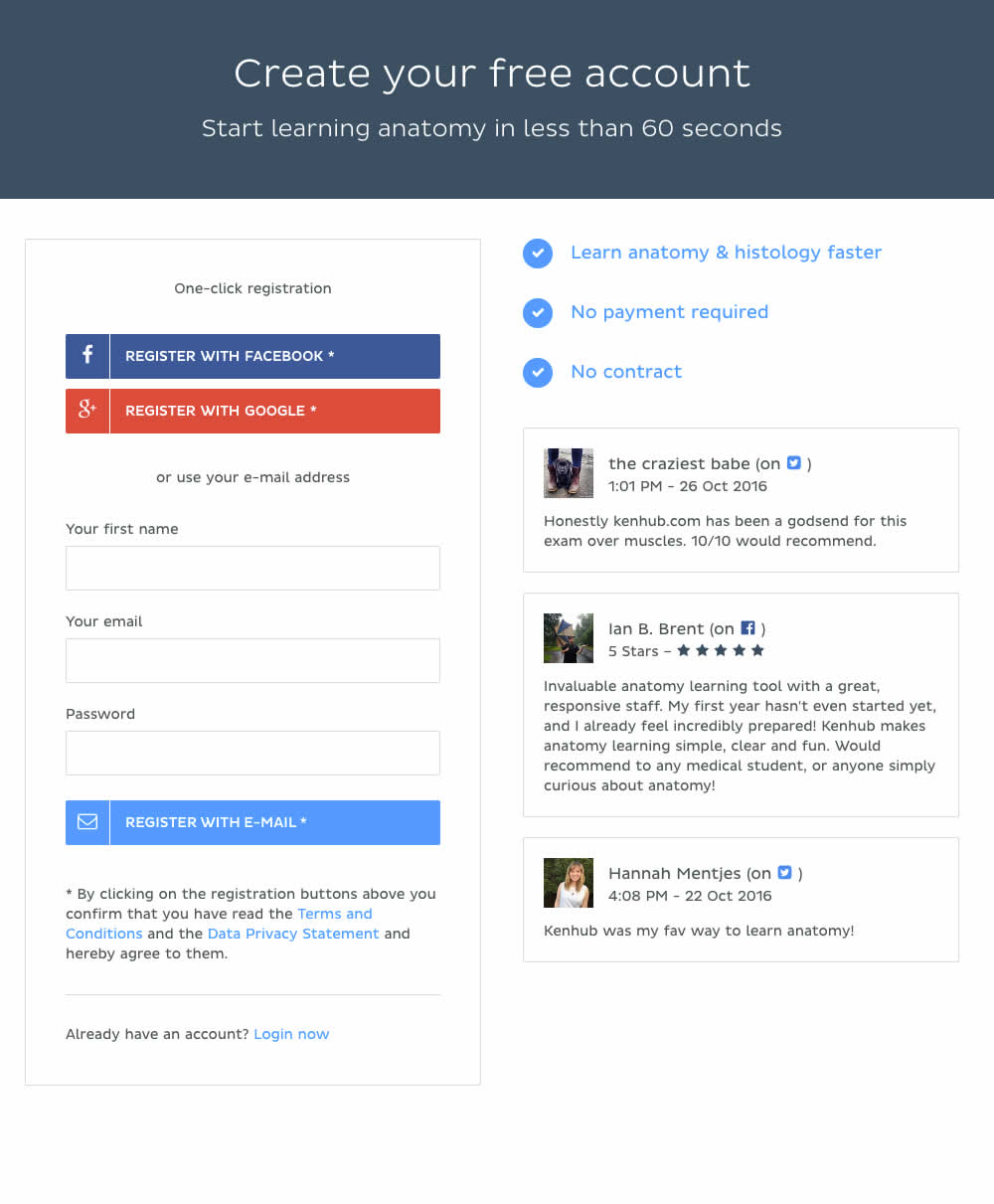
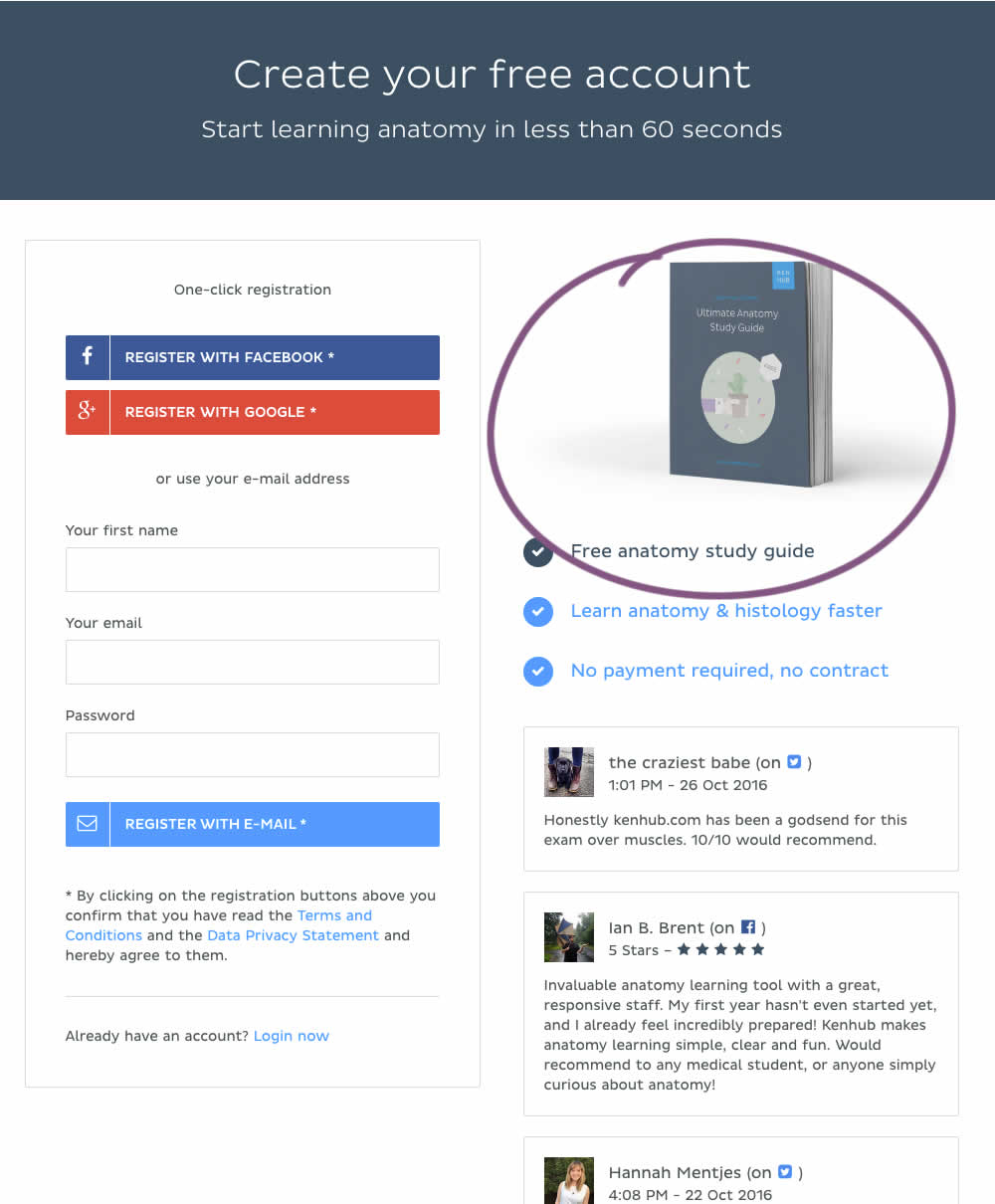
In this experiment, a free study guide ebook was promoted on a registration page.
Test #240 on
Thomasnet.com
by  Julian Gaviria
May 16, 2019
Desktop
Listing
X.X%
Engagement
Julian Tested Pattern #13: Centered Forms & Buttons On Thomasnet.com
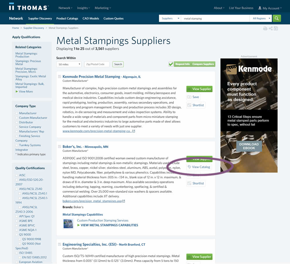
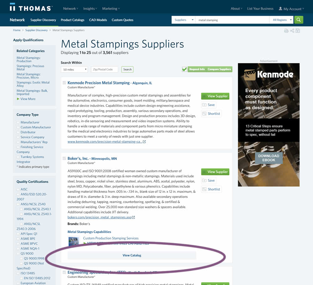
In this experiment, two different positions of the View Catalog button were compared. In version A the button was smaller and on the right. In version B the button was wider and more central. (The actual test was inverted before publishing to match the A-B of the pattern.)
Test #239 on
Volders.de
by  Alexander Krieger
May 02, 2019
Desktop
Home & Landing
X.X%
Progression
Alexander Tested Pattern #13: Centered Forms & Buttons On Volders.de
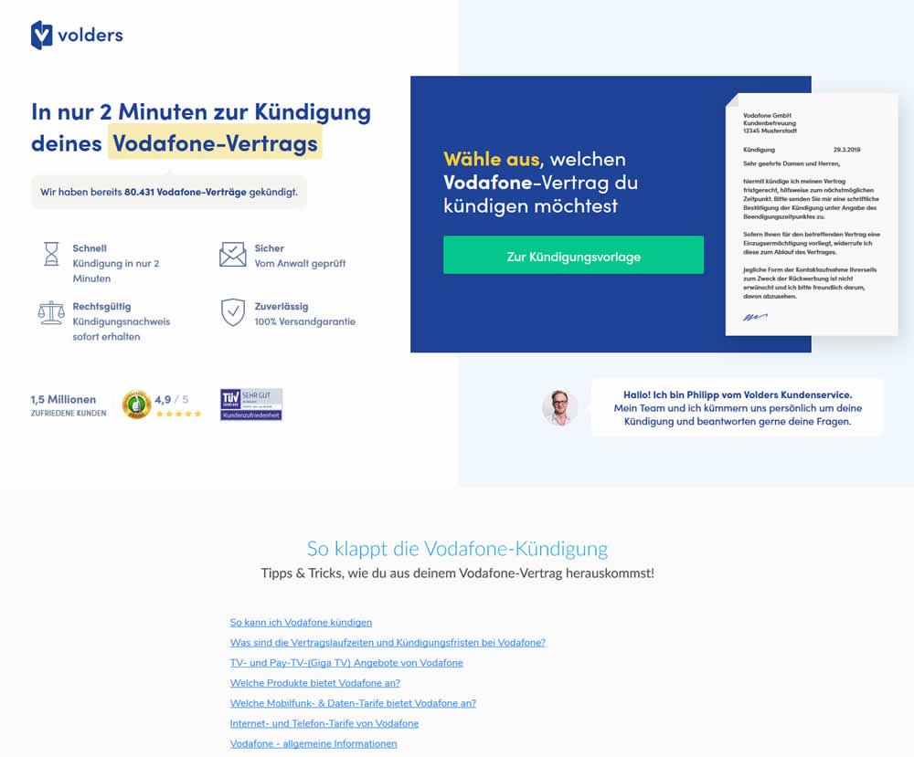
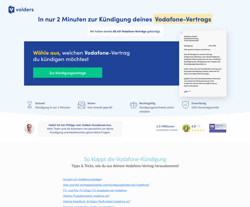
A contract cancellation landing page was tested for the effect of a single (wider CTA area with a left aligned button) vs two column layout (narrow CTA area with a right aligned button).
Test #238 on
Suzuki.be
by  Karl Gilis
May 01, 2019
Desktop
Home & Landing
X.X%
Progression
Karl Tested Pattern #104: Carousel Vs Static Grid Images On Suzuki.be
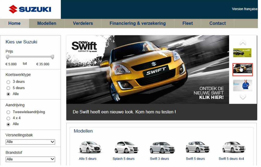
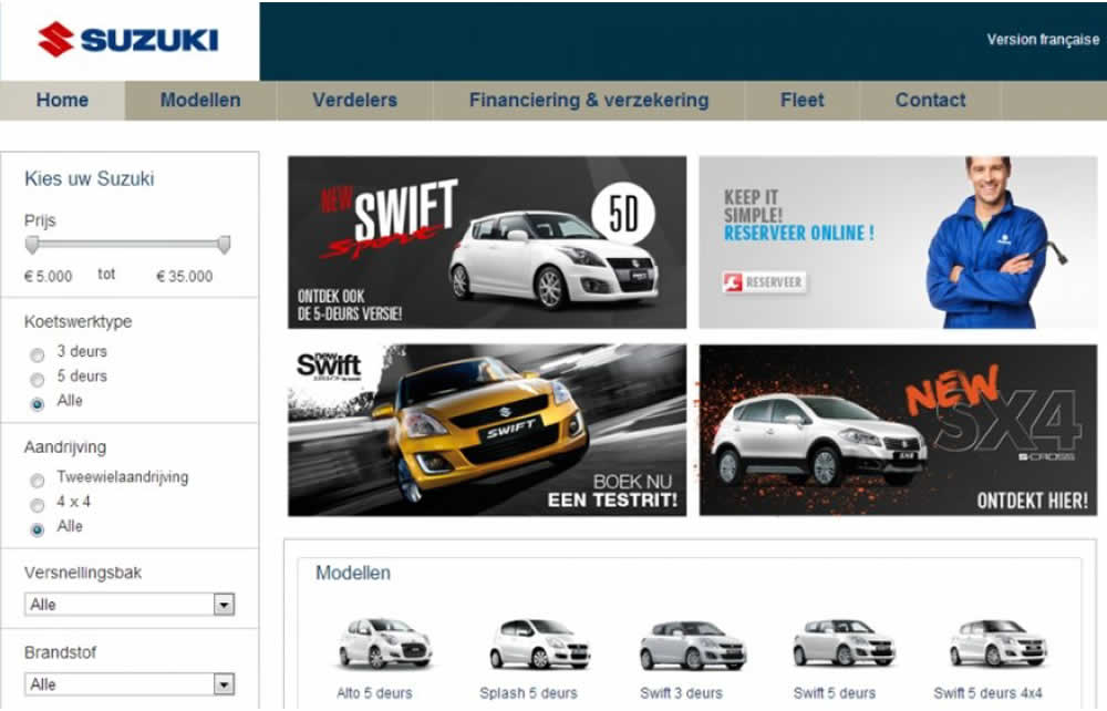
In this homepage experiment with a 4-slide carousel, the slides changed every 3.5 seconds and users could also choose another slide manually. In the variations, instead of the 4 slides in the carousel, static images were used to take up the same amount of space.
Test #237 on
Goodui.org
by  Jakub Linowski
Apr 29, 2019
Desktop
Mobile
Listing
X.X%
Sales
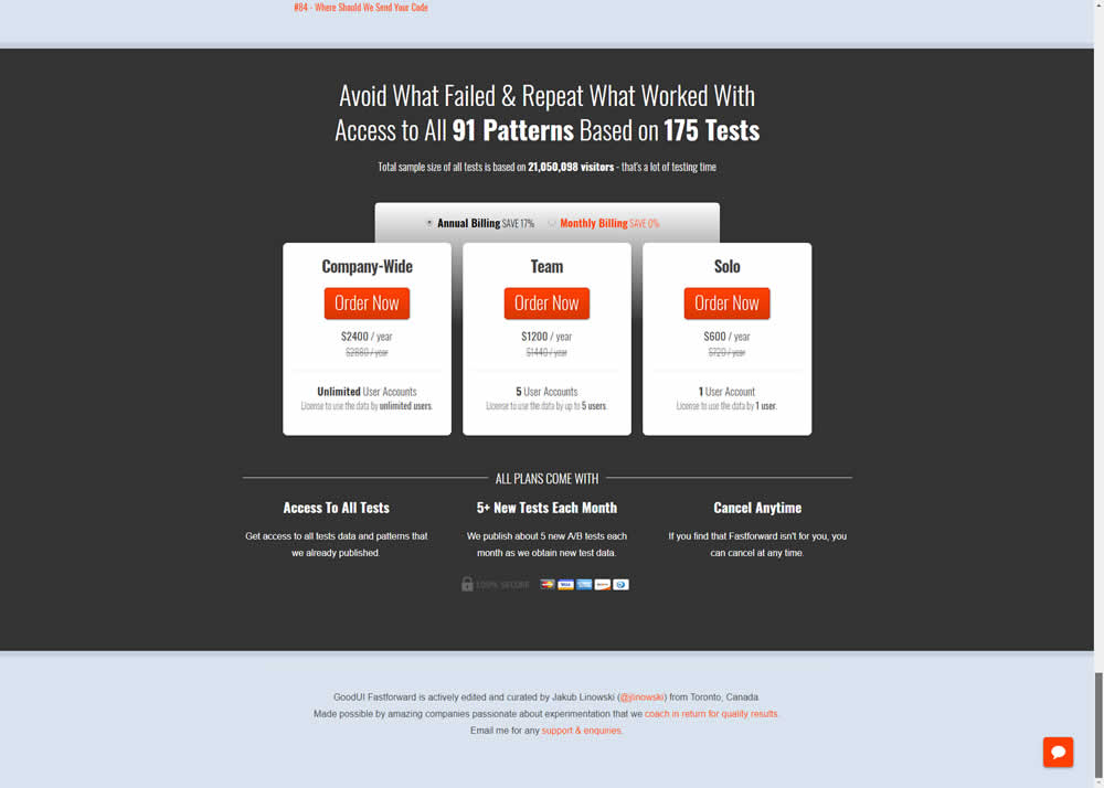
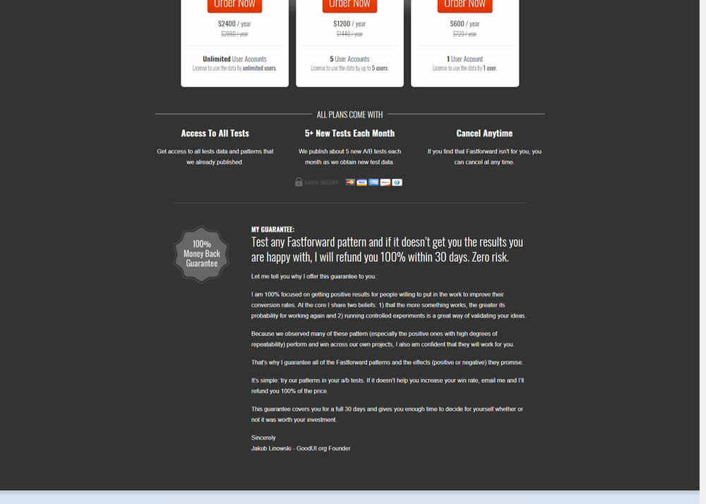
Jakub Tested Pattern #103: Money Back Guarantee On Goodui.org
Test #236 on
by  Alex James
Apr 04, 2019
Desktop
Signup
X.X%
Signups
Alex Tested Pattern #9: Multiple Steps
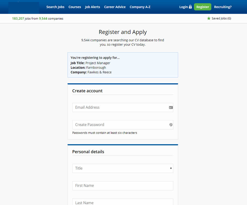
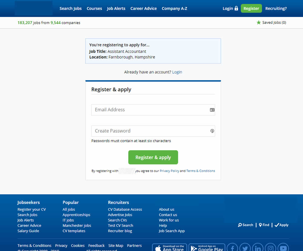
In this experiment a single screen signup process was broken into 2 separate steps: account creation & details.
Test #235 on
Thomasnet.com
by  Julian Gaviria
Apr 02, 2019
Desktop
Mobile
Home & Landing
X.X%
Leads
Julian Tested Pattern #102: Expanded Or Condensed Layout On Thomasnet.com
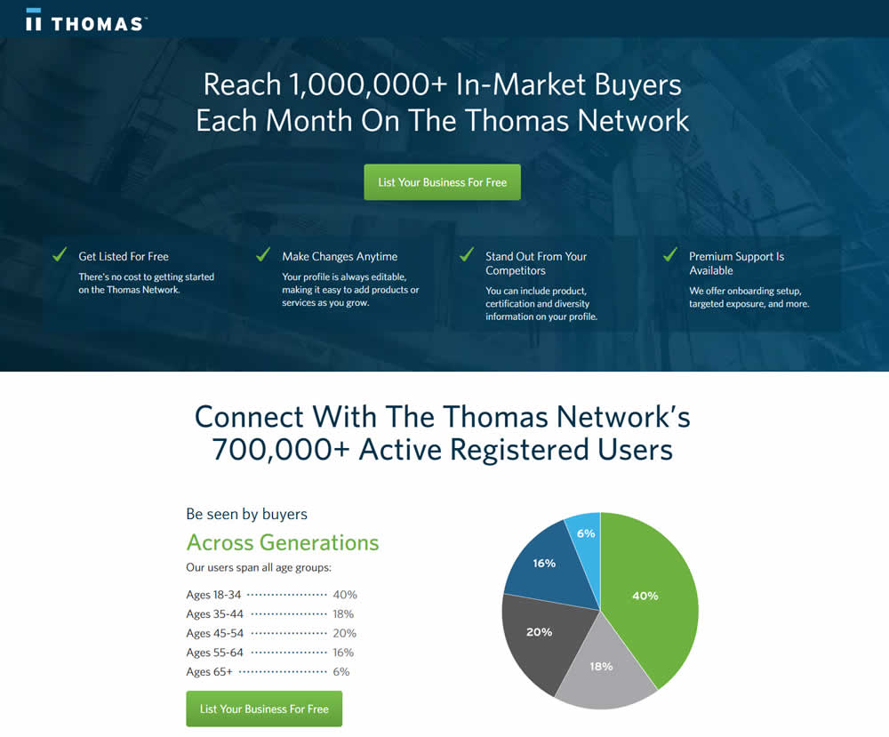
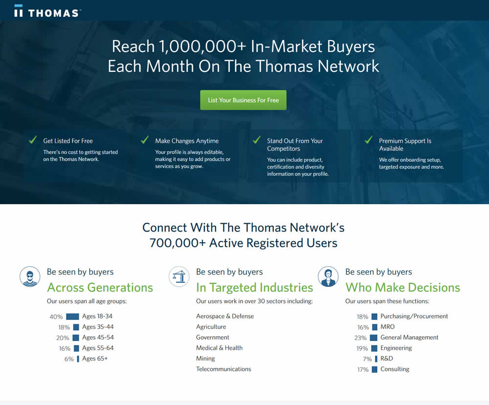
In this experiment, the layout was condensed from a taller to a shorter one.