All Latest 566 A/B Tests
Become a member to unlock the abiltiy to see the highest impact a/b tests. Being able to see the actual test results and sort by impact allows growth and experimentation teams to take action on the biggest gains first
MOST RECENT TESTS
Test #338 on
Umbraco.com
by
 Lars Skjold Iversen
Jan 29, 2021
Desktop
Mobile
Home & Landing
Lars Skjold Iversen Tested Pattern #63: Trust Seals In Test #338 On Umbraco.com
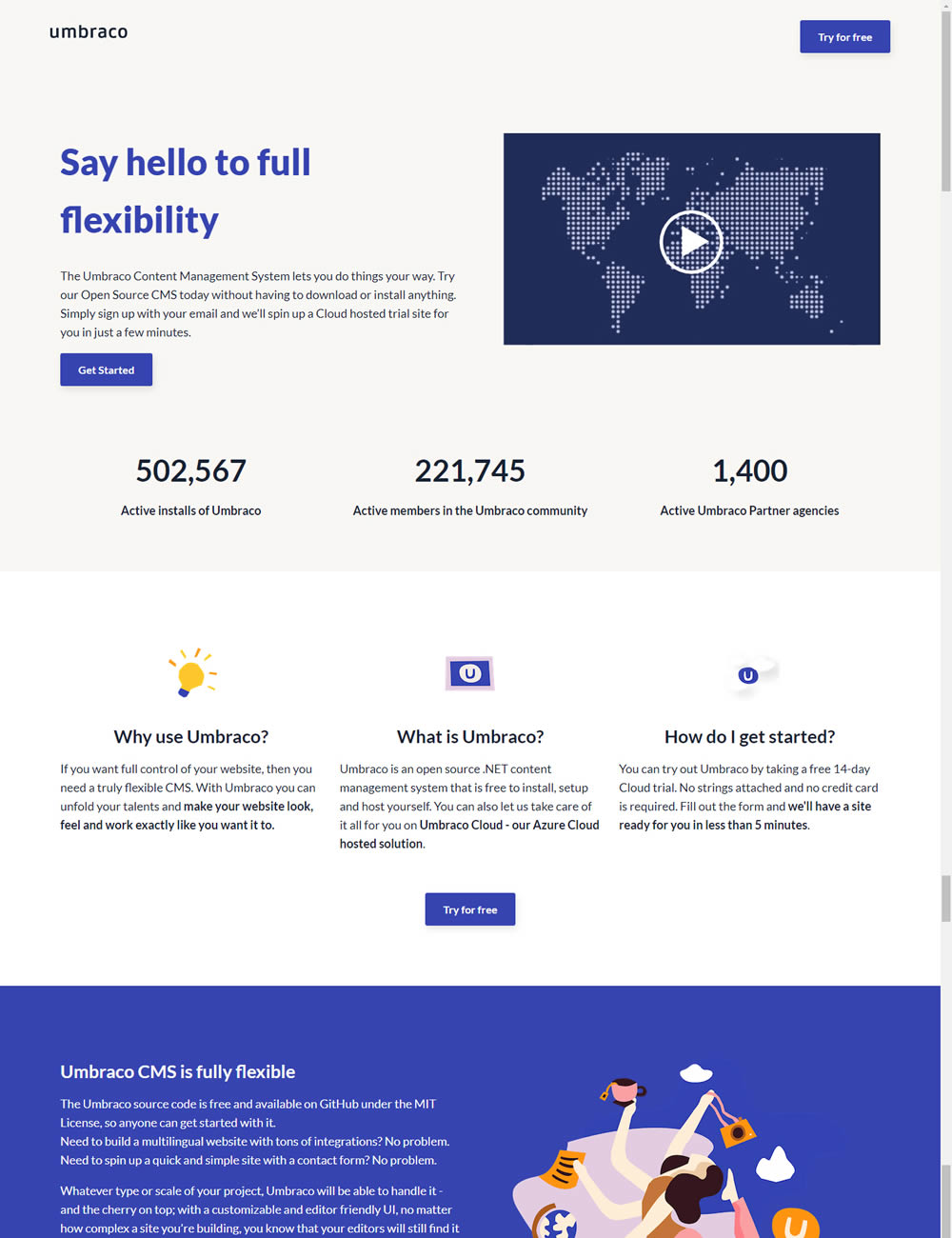
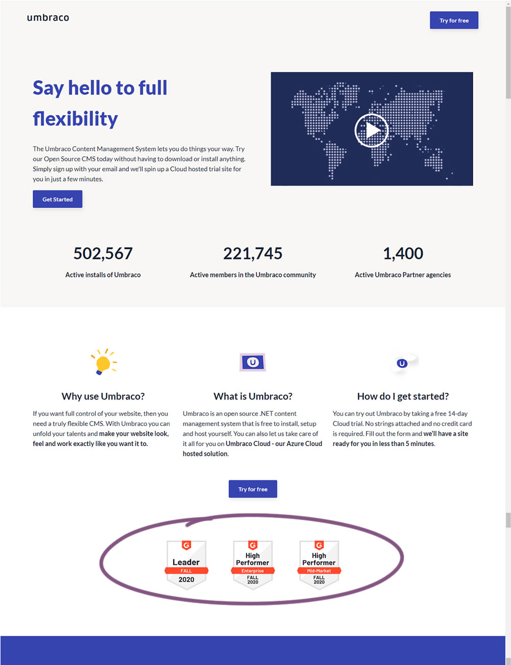
In this experiment, the variation added three G2 badges or awards. The intent was to measure the impact of this change on signups for Umbraco.
Test #328 on
Umbraco.com
by
 Lars Skjold Iversen
Dec 21, 2020
Desktop
Mobile
Home & Landing
Lars Skjold Iversen Tested Pattern #60: Repeated Bottom Call To Action In Test #328 On Umbraco.com
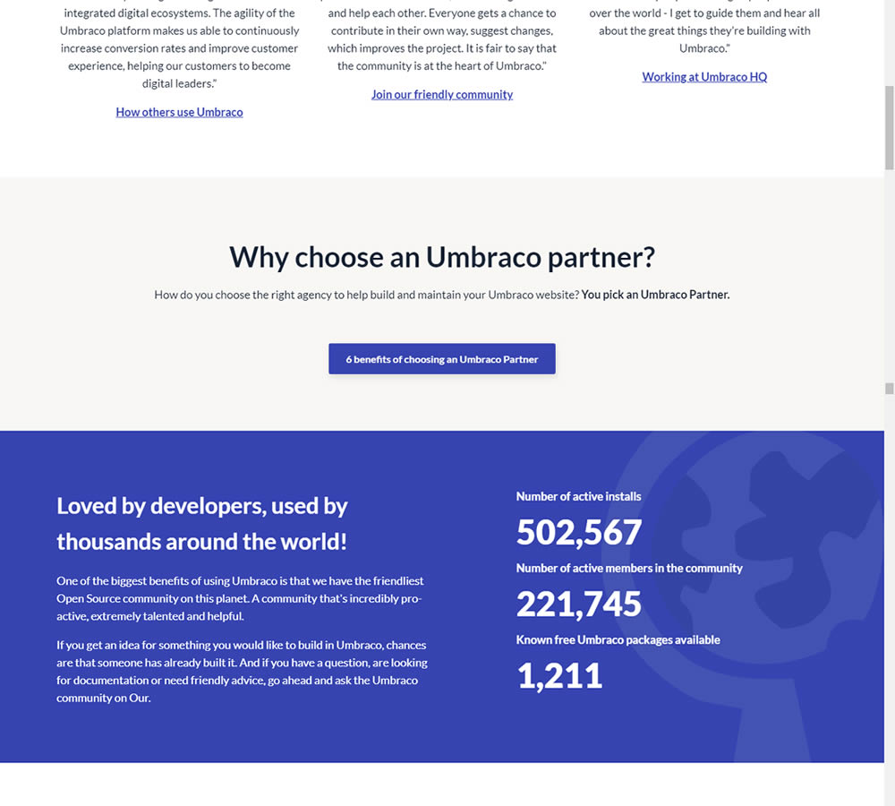
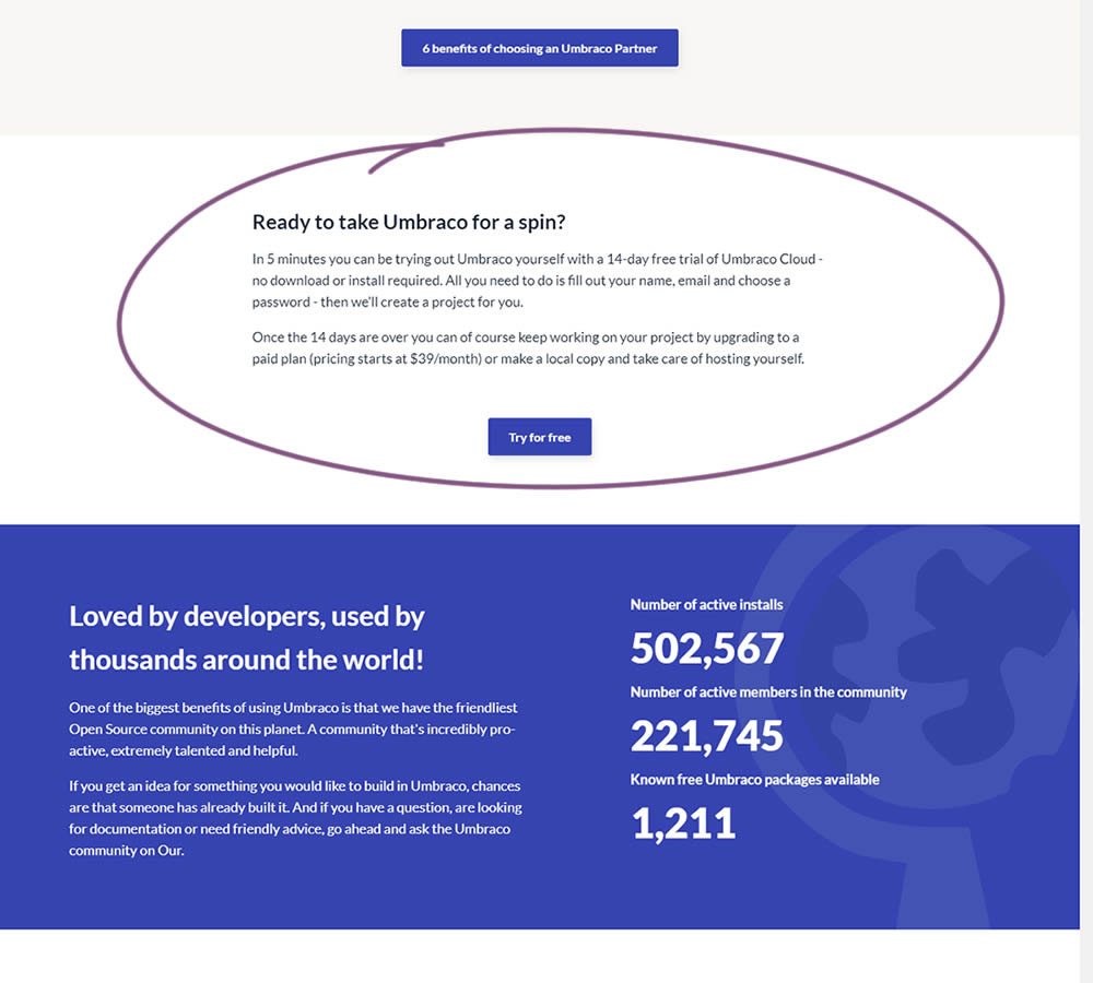
In this experiment, a trial signup section was added at the bottom of Umbraco's long homepage (CMS business). The experiment measured the impact on trial signups.
Test #323 on
Backstage.com
by
 Stanley Zuo
Oct 29, 2020
Mobile
Signup
Stanley Zuo Tested Pattern #117: Company Logos In Test #323 On Backstage.com
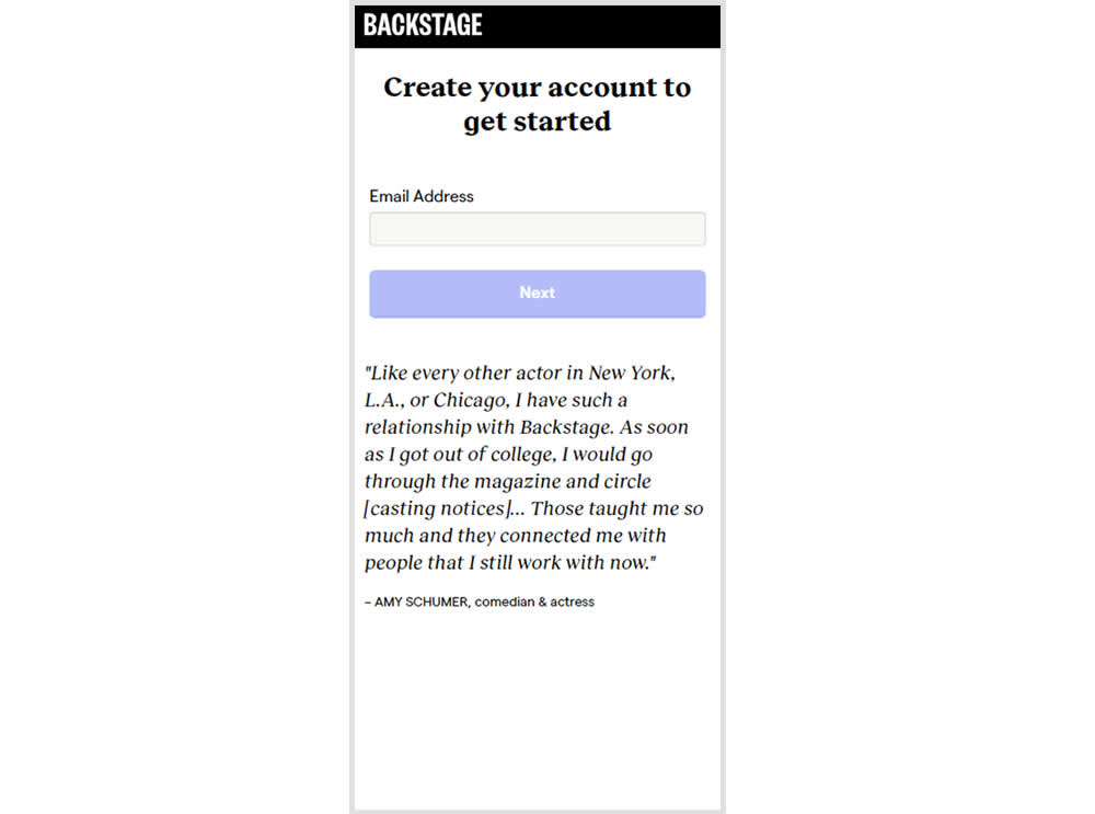
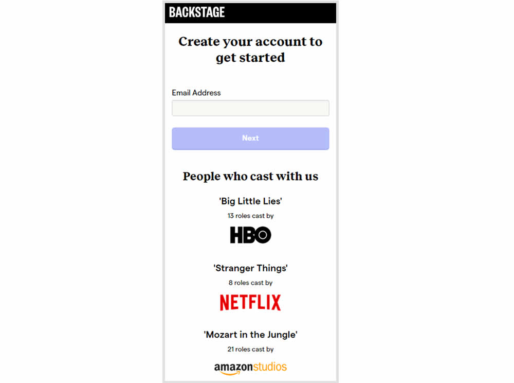
In this experiment, the variation replaced a text testimonial with high-profile production companies that have cast with Backstage. The logos were shown during the signup and checkout flow.
Test #322 on
Thomasnet.com
by
 Kyle Phillips
Oct 27, 2020
Desktop
Mobile
Product
Kyle Phillips Tested Pattern #82: Onboarding Callouts In Test #322 On Thomasnet.com
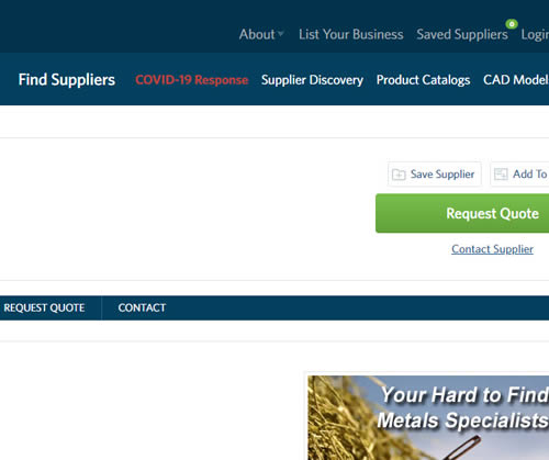
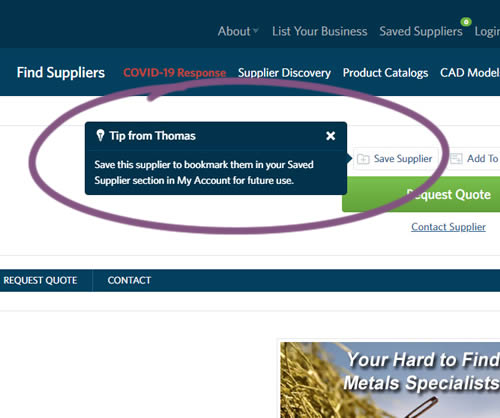
This experiment variation prompted users to save (bookmark) a company profile on a company detail page. Clicking on the save feature while logged out, would prompt a registration modal. Hence the save feature acted as an extra reason to signup. The number of people engaging or interacting with the feature was measured, as well as registrations.
Test #318 on
Thomasnet.com
by
 Kyle Phillips
Sep 29, 2020
Desktop
Mobile
Content
Kyle Phillips Tested Pattern #60: Repeated Bottom Call To Action In Test #318 On Thomasnet.com
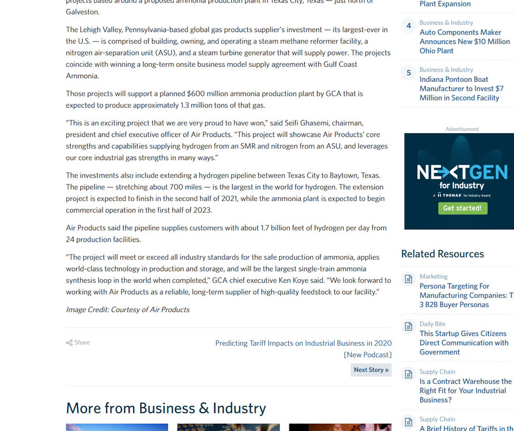
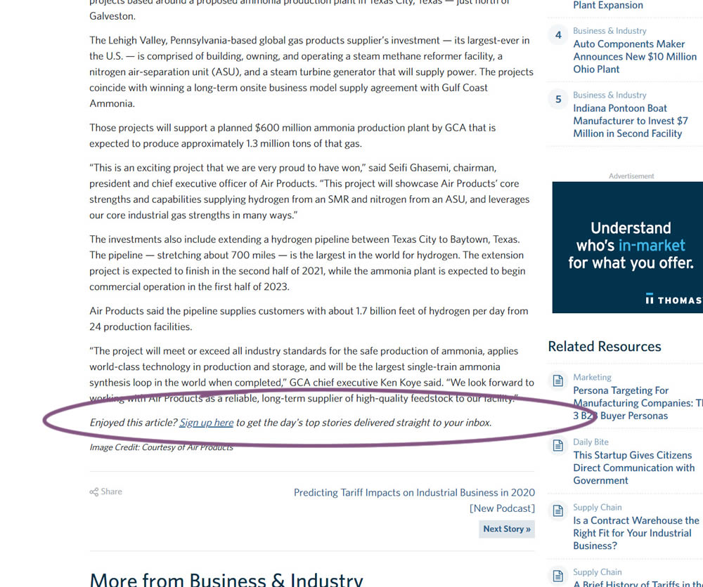
In this experiment, a simple link to a newsletter signup landing page was added at the bottom of an article. The newsletter landing page then encouraged users to provide their email address for future article updates.
Test #316 on
Trydesignlab.com
by
 Daniel Shapiro
Sep 24, 2020
Desktop
Mobile
Home & Landing
Daniel Shapiro Tested Pattern #22: Empowering Headline In Test #316 On Trydesignlab.com


In this experiment, the headline was changed to focus more on the end-goal of the UX Academy program - that of landing your first UI/UX role.
Test #315 on
Backstage.com
by
 Stanley Zuo
Aug 22, 2020
Mobile
Signup
Stanley Zuo Tested Pattern #7: Social Counts In Test #315 On Backstage.com
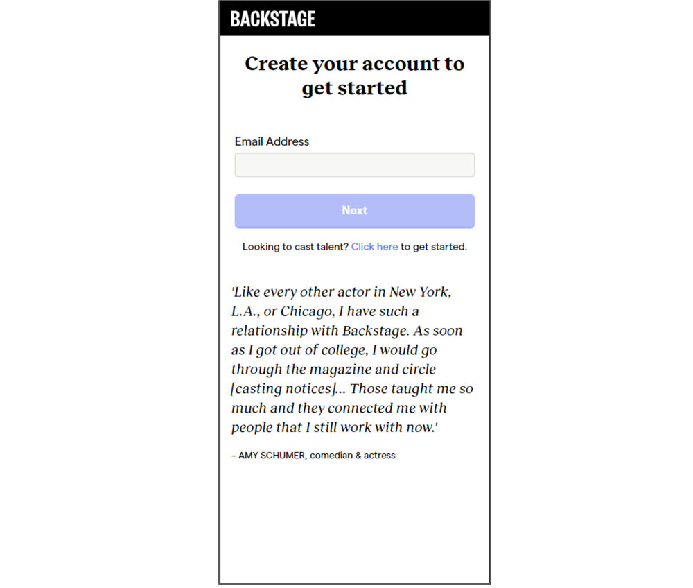
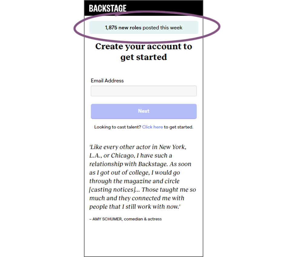
In this experiment, a dynamic number of job postings was displayed during the signup process - reinforcing the value of signing up for membership access.
Test #304 on
Backstage.com
by
 Stanley Zuo
Jun 29, 2020
Mobile
Product
Stanley Zuo Tested Pattern #97: Bigger Form Fields In Test #304 On Backstage.com
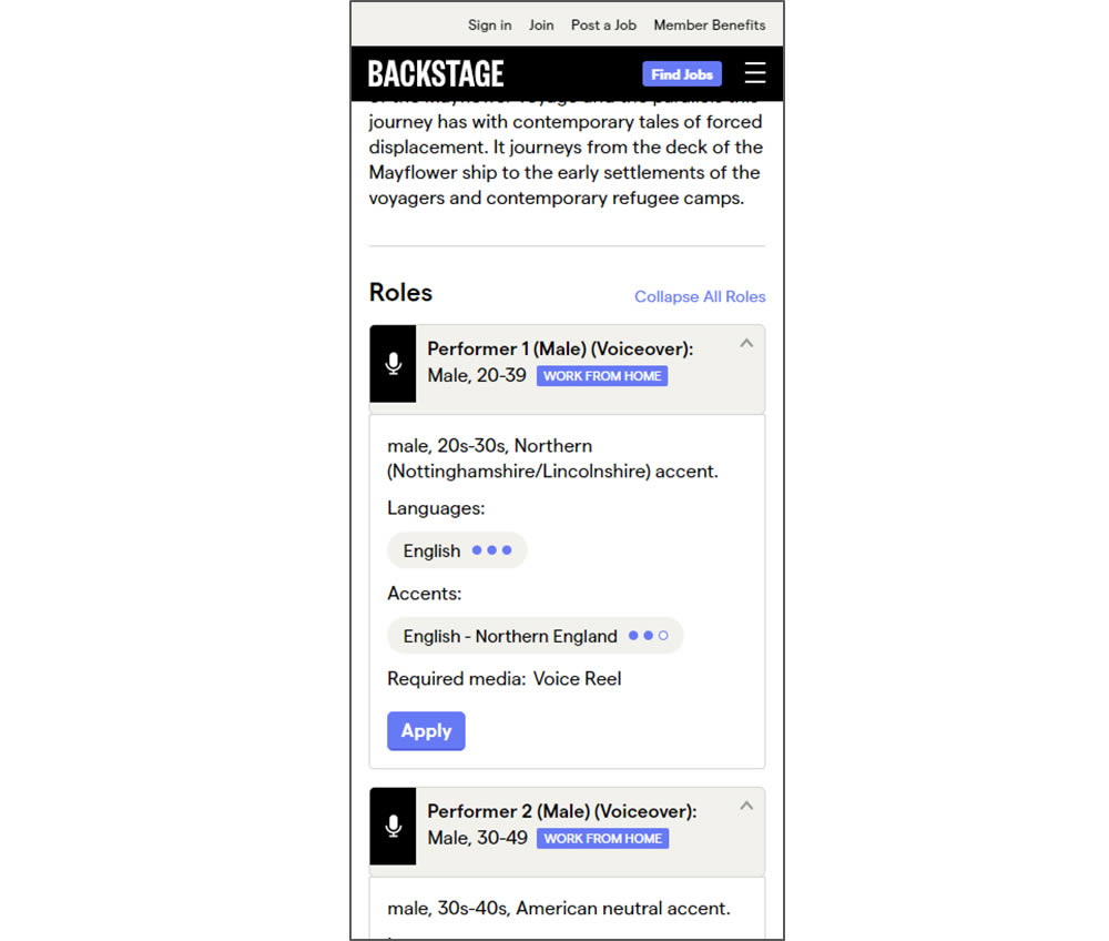
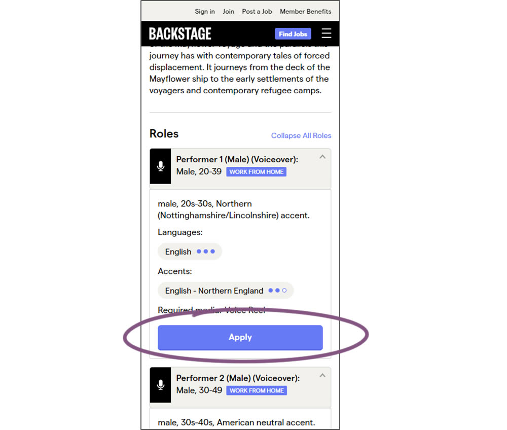
In this experiment, larger "Apply" buttons were shown on a casting detail page. The application funnel would take users through a series of steps leading to a paid membership subscription. The experiment measured initial progression and account signups (email signups).
Test #295 on
Thomasnet.com
by
 Julian Gaviria
Apr 29, 2020
Desktop
Mobile
Content
Julian Gaviria Tested Pattern #25: Nagging Results In Test #295 On Thomasnet.com
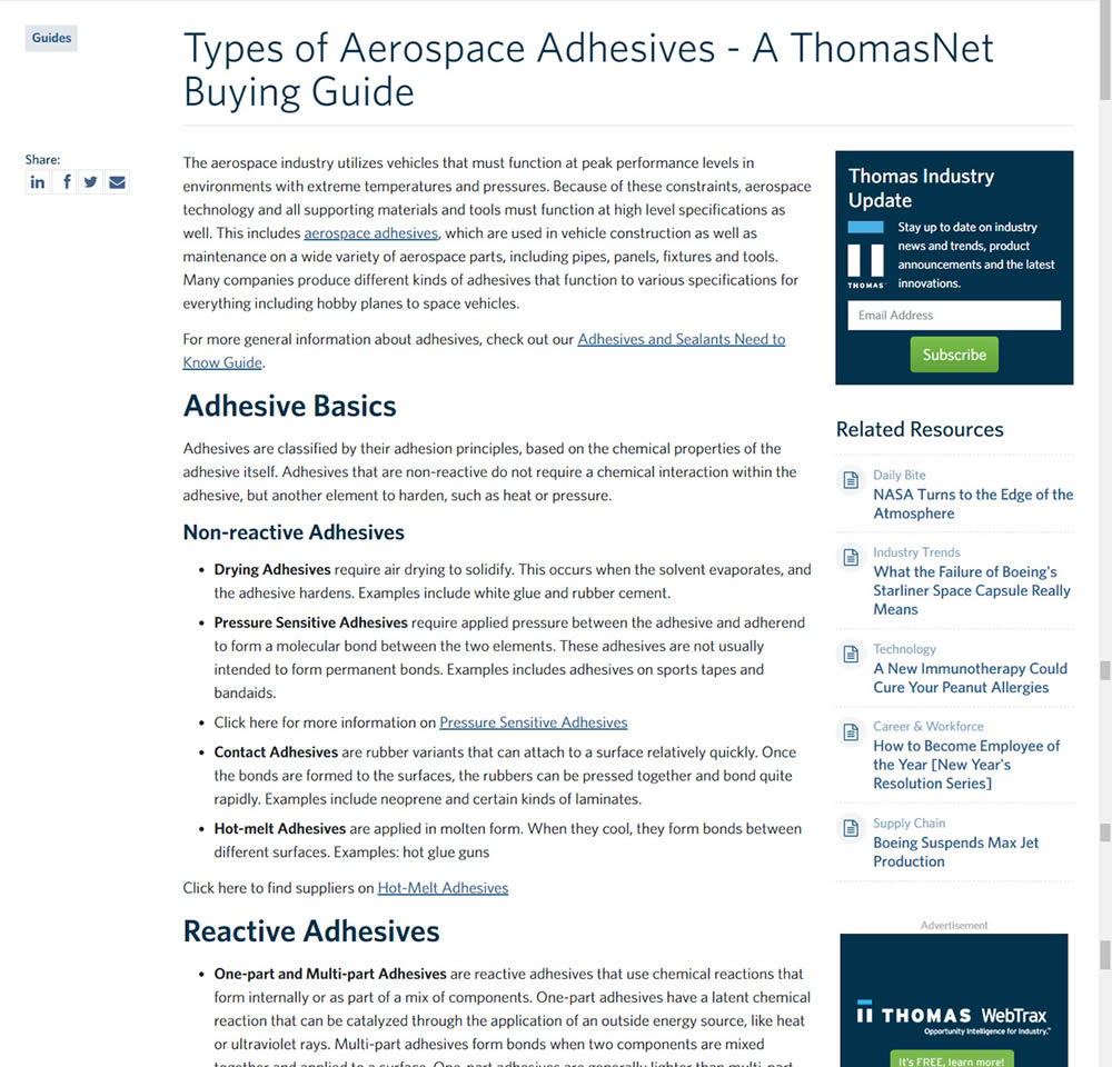
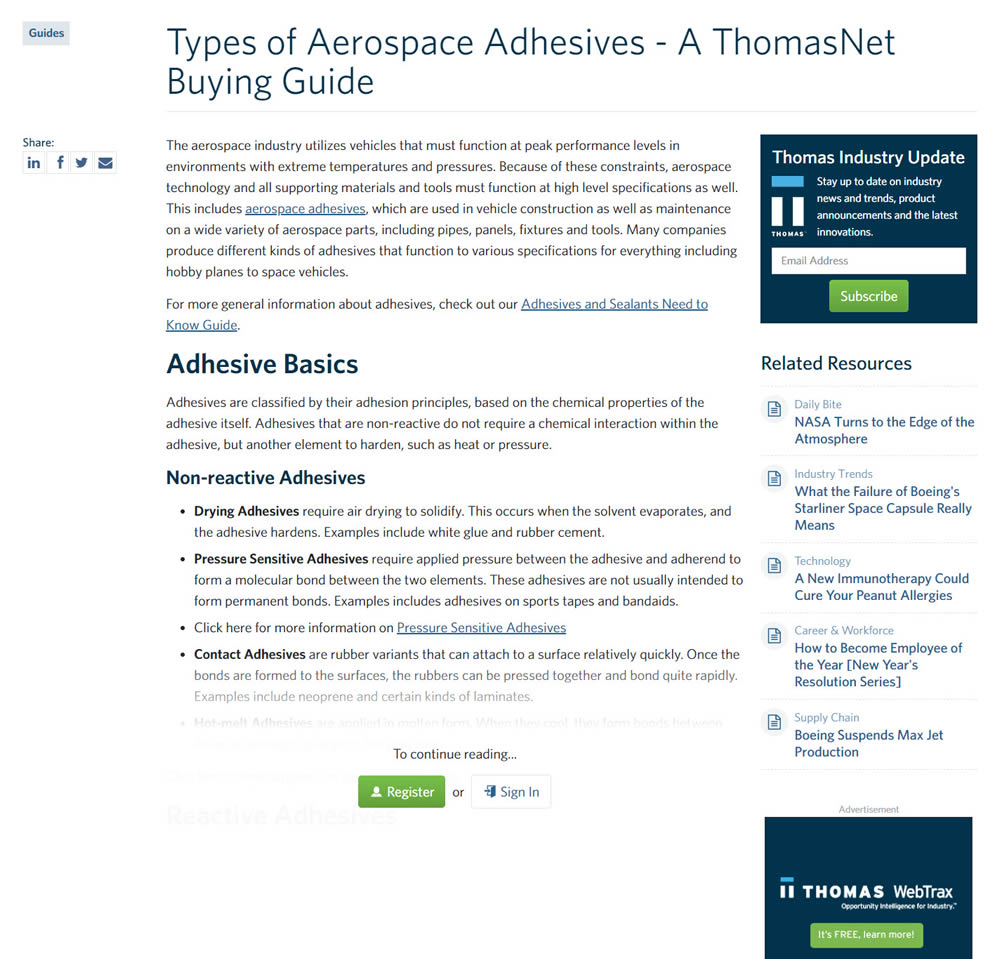
In this experiment, blog article pages were hidden behind a registration wall - requing a signup to access. The registration wall would appear after the first paragraph using gradual opacity to cover the rest of the article. We have published the effects of this change on registrations (signups) and on engagement (users viewing other more important company detail pages).
Test #291 on
Elevate App
by
 Jesse Germinario
Mar 30, 2020
Mobile
Signup
Jesse Germinario Tested Pattern #91: Forced Action In Test #291
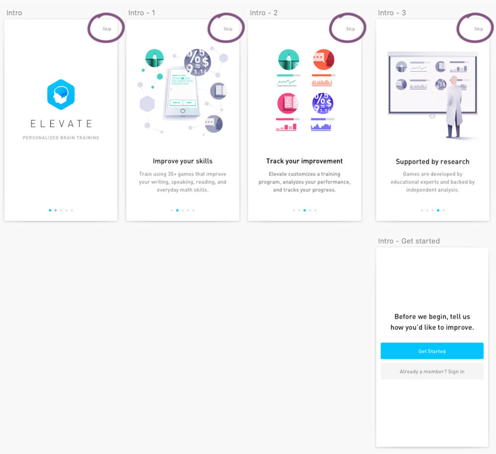
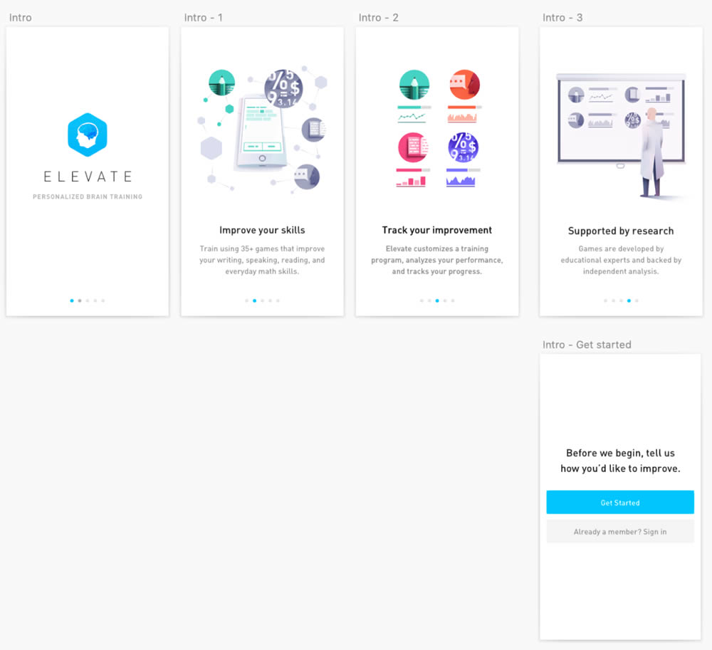
This experiment was ran on the initial onboarding screens of the Elevate App - right after installing and launching the app for the first time. The change was the removal of subtle "skip" links that fast tracked users to the signup/login screen (Get Started). Hence in the variation, all users had to scroll through the 4 introductory messages before being asked to create an account.
Test #288 on
Kenhub.com
by
 Niels Hapke
Mar 05, 2020
Desktop
Mobile
Home & Landing
Niels Hapke Tested Pattern #117: Company Logos In Test #288 On Kenhub.com


In this experiment, customer logos (of universities attended by students using Kenhub) were placed on a homepage. The experiment tested for the effect on registration visits, and premium subscription starts.
Test #276 on
Umbraco.com
by
 Lars Skjold Iversen
Dec 31, 2019
Desktop
Mobile
Home & Landing
Lars Skjold Iversen Tested Pattern #111: Field Explanations In Test #276 On Umbraco.com
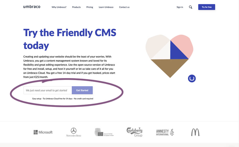
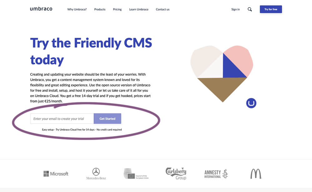
In this experiment, the idea was to move away from copy that was focusing on the needs of the company ("we need your email") towards copy that hinted at a customer benefit ("create your trial").
Test #273 on
Elevate App
by
 Jesse Germinario
Dec 19, 2019
Mobile
Signup
Jesse Germinario Tested Pattern #9: Multiple Steps In Test #273
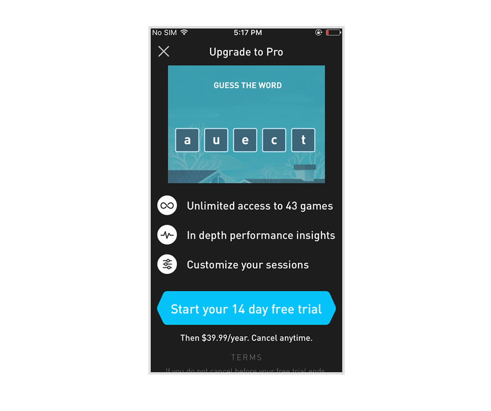
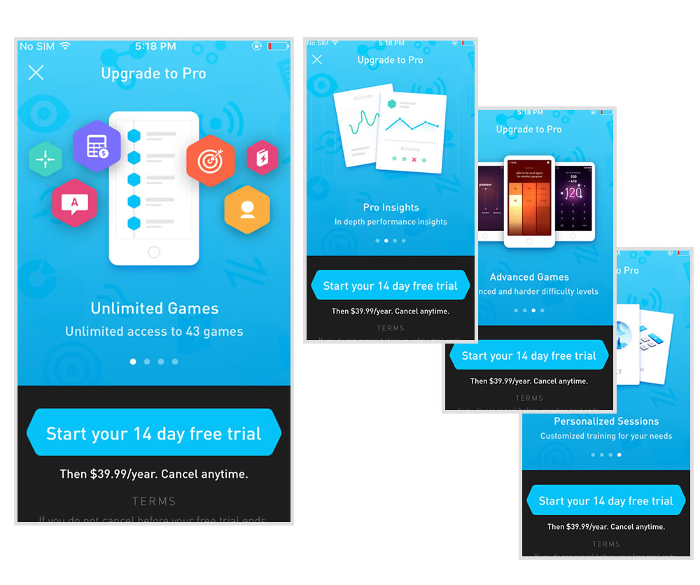
This experiment tests the impact of a different paywall screen on iOS. The current control paywall screen for 100% of iOS users was the animated pro screen. In this screen, users see an animation that gives shows glimpses of several Elevate games in action, as well as a bulleted list of key selling points for Pro. The proposed change (variant B) features a swipeable carousel of pages where each page has an image and some accompanying text explaining a different benefit of subscribing to Pro. The hypothesis is that we can lift conversion by showing users the alternate swiping paywall screen.
Test #271 on
Analytics-toolkit.co...
by
 Georgi Z. Georgiev
Nov 24, 2019
Desktop
Mobile
Signup
Georgi Z. Georgiev Tested Pattern #4: Testimonials In Test #271 On Analytics-toolkit.co...
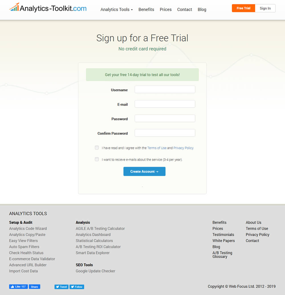
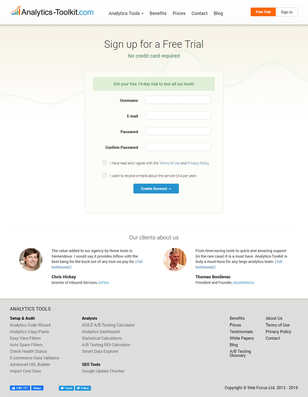
In this experiment, the test variant showed 2 testimonials on the user registration / free trial registration page at Analytics-Toolkit.com
Test #263 on
Goodui.org
by
 Jakub Linowski
Oct 04, 2019
Desktop
Mobile
Home & Landing
Jakub Linowski Tested Pattern #22: Empowering Headline In Test #263 On Goodui.org
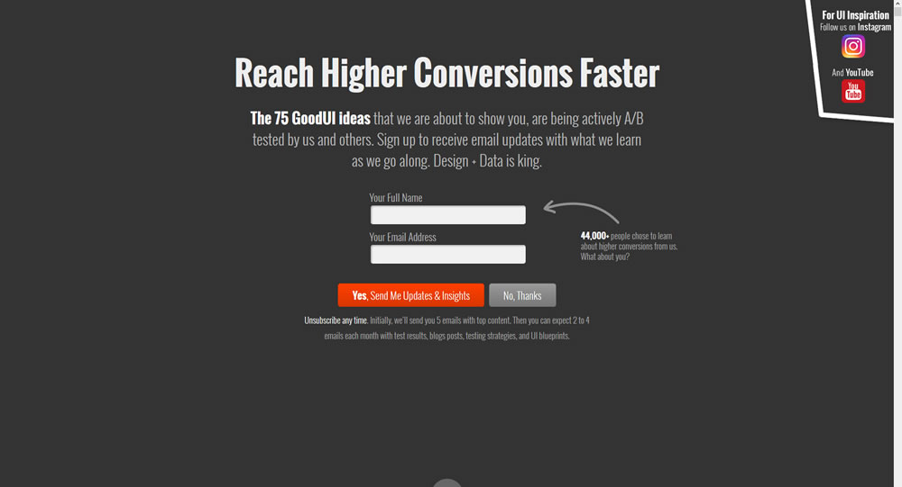
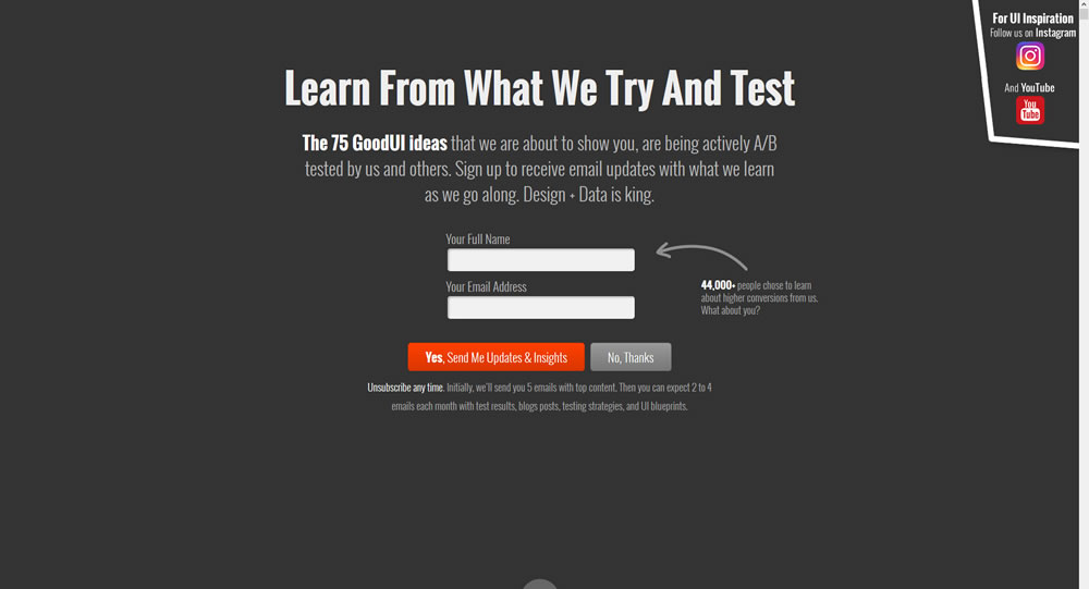
In this experiment a different headline was tested. "Reach Higher Conversions Faster" vs. "Learn From What We Try And Test".
Test #105 on
Inktweb.nl
by
 Martijn Oud
Sep 23, 2019
Desktop
Mobile
Signup
Martijn Oud Tested Pattern #111: Field Explanations In Test #105 On Inktweb.nl
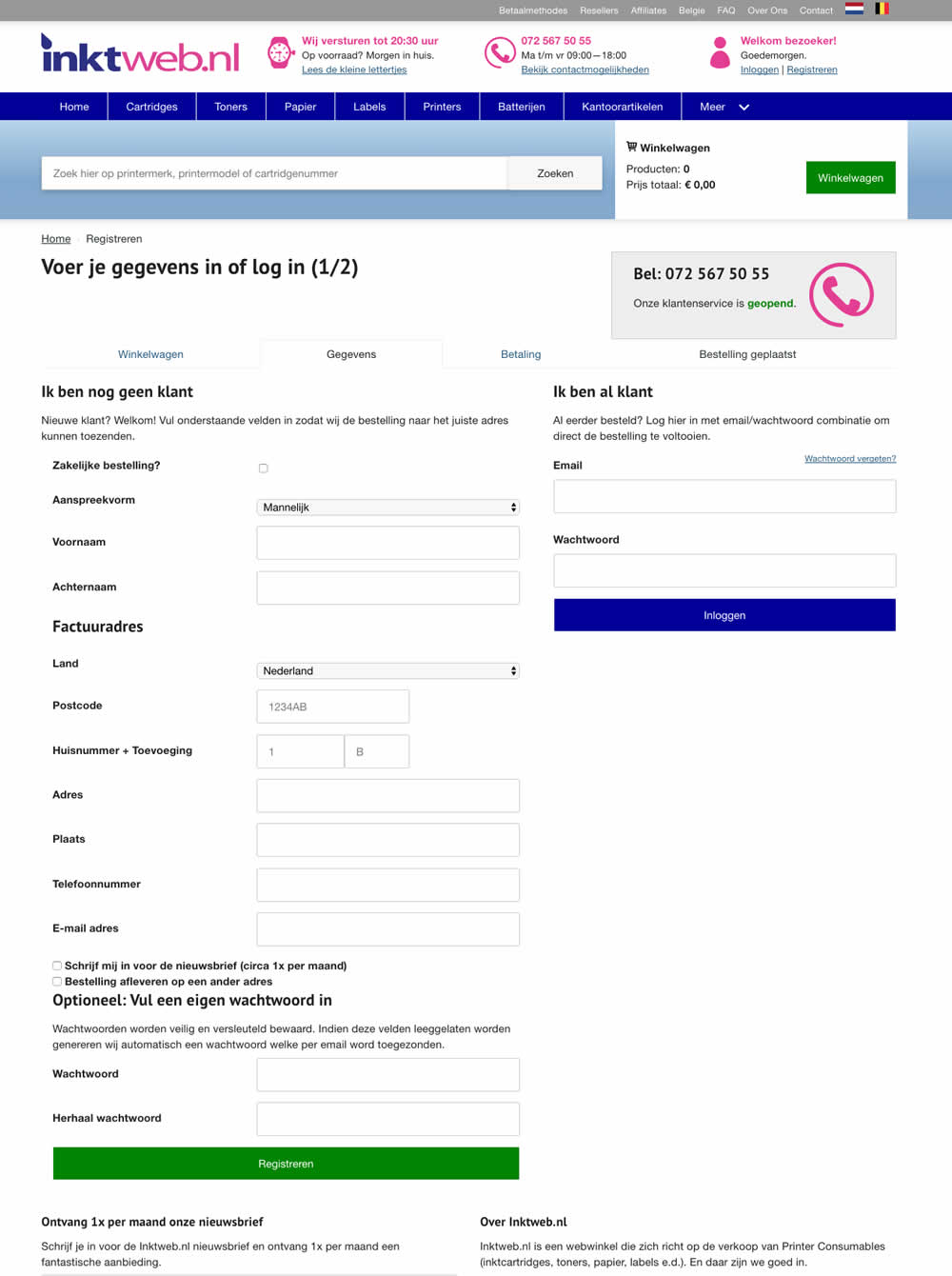
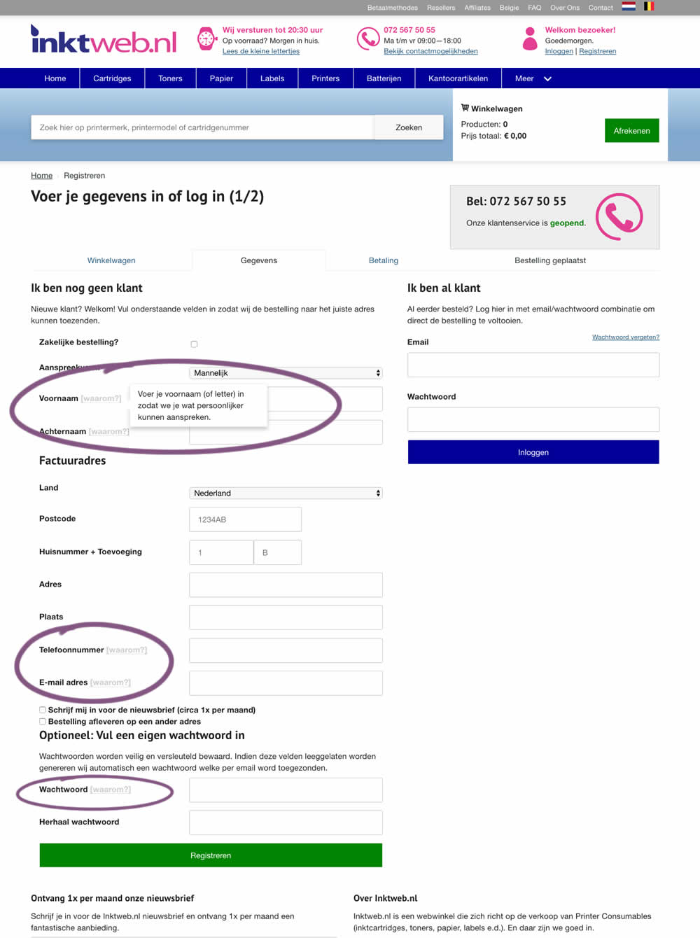
In this experiment, onhover tooltip explanations were added to selected fields (Firstname, Lastname, Phone, Email and Password). One translation example of the Firstname tooltip was the following "Enter your first name (or letter) so that we can address you in a more personal way".
Test #258 on
Thomasnet.com
by
 Julian Gaviria
Sep 12, 2019
Desktop
Mobile
Signup
Julian Gaviria Tested Pattern #110: Optional Field Labels In Test #258 On Thomasnet.com

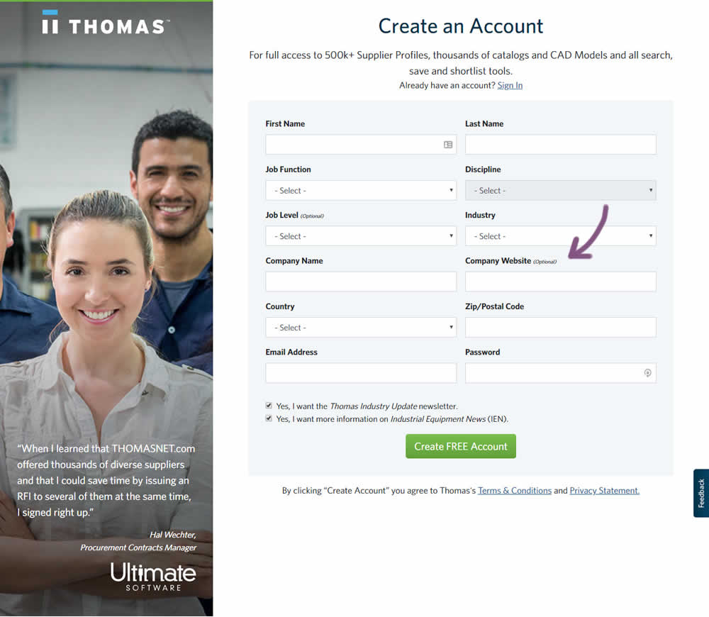
In this variation an optional field label was added.
Test #259 on
Thomasnet.com
by
 Julian Gaviria
Sep 12, 2019
Desktop
Mobile
Signup
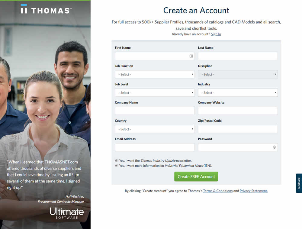
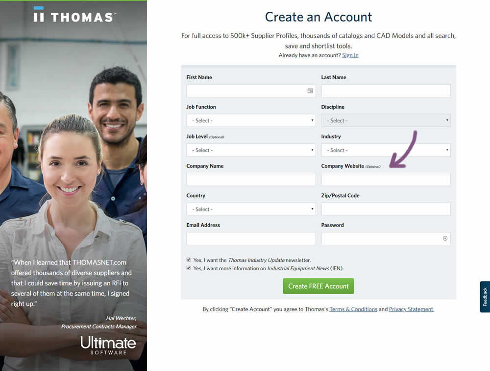
Julian Gaviria Tested Pattern #110: Optional Field Labels In Test #259 On Thomasnet.com
Test #257 on
Thomasnet.com
by
 Julian Gaviria
Sep 09, 2019
Desktop
Mobile
Signup
Julian Gaviria Tested Pattern #109: Required Field Labels In Test #257 On Thomasnet.com

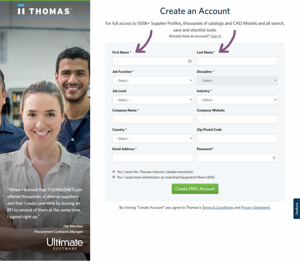
In this followup experiment, field labels without and with a marked asterisk were tested.
Test #256 on
by
 Alex James
Aug 23, 2019
Desktop
Mobile
Signup
Alex James Tested Pattern #109: Required Field Labels In Test #256
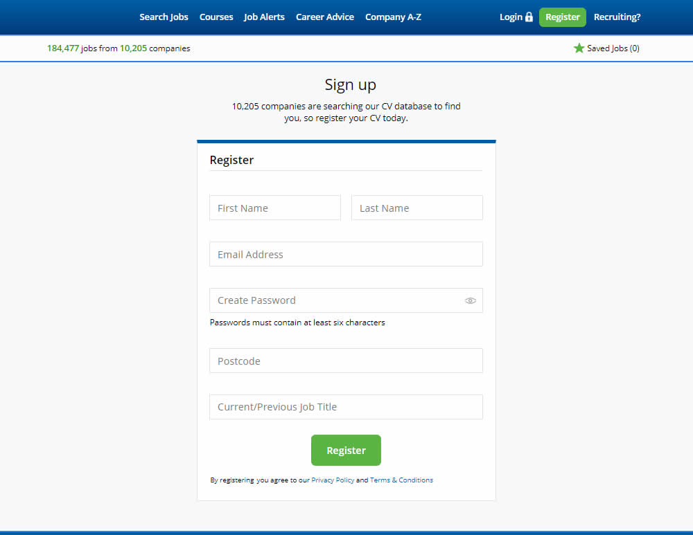
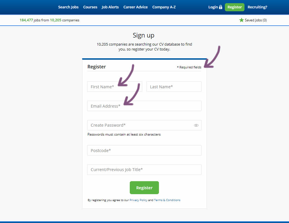
The original had no fields marked as required. The variant had all fields marked as required with an asterisk (and a reference note).