All Latest 620 A/B Tests
MOST RECENT TESTS
Test #337 on
Backstage.com
by  Stanley Zuo
Jan 28, 2021
Desktop
Mobile
Listing
X.X%
Sales
Stanley Tested Pattern #51: Shortcut Buttons On Backstage.com
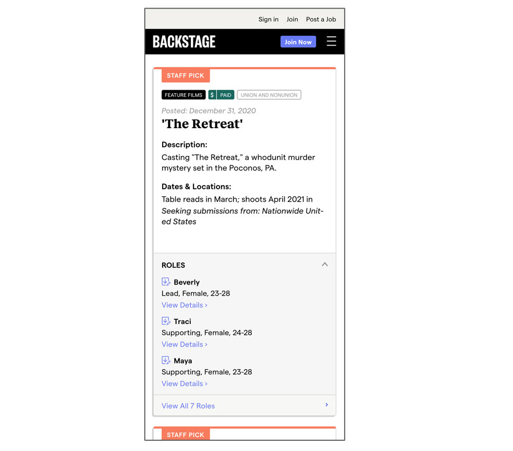
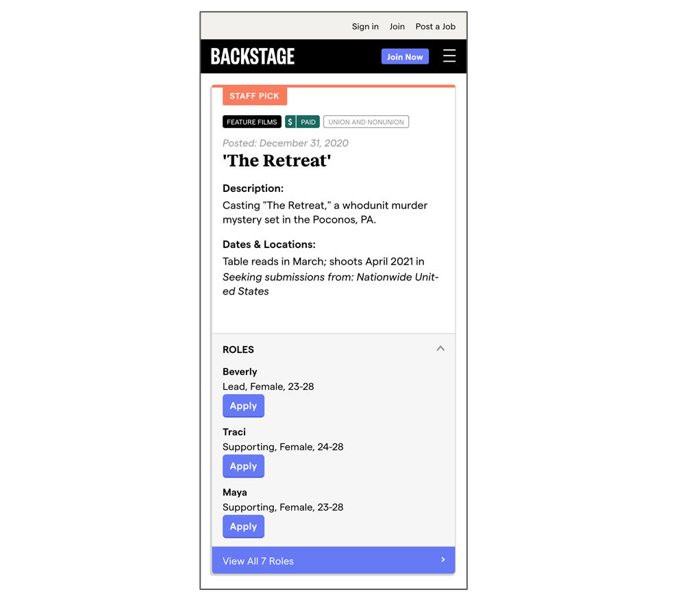
In this experiment, a listing page was expanded to show two actions (apply and view details) instead of a single one (view details only). In the variant, the "view detail" links were replaced with "apply links" starting a job application (and membership flows) sooner.
Which A Or B Actually Wins? Find Out Before You Test.
Members see every test result — the winners, the flat ones, and the losers — along with exact effects and sample sizes. Use it to estimate your tests and prioritize by probability, not gut feel. Start every experiment with the odds on your side.
Test #336 on
Backstage.com
by  Stanley Zuo
Jan 28, 2021
Desktop
Mobile
Listing
X.X%
Sales
Stanley Tested Pattern #51: Shortcut Buttons On Backstage.com
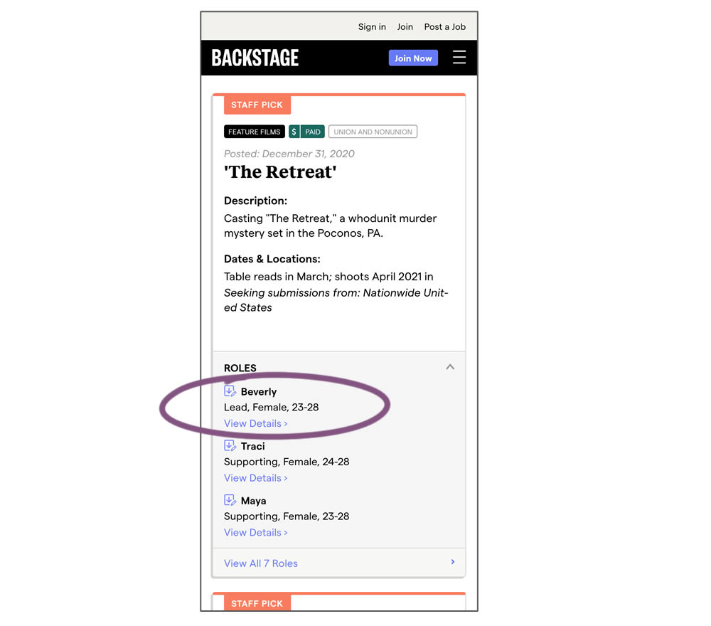
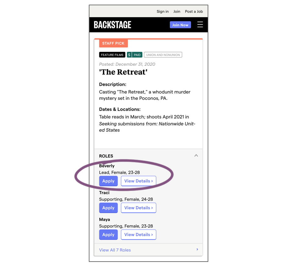
In this experiment, a listing page was expanded to show two actions (apply and view details) instead of a single one (view details only). This variation enabled users with a shortcut action to apply for roles one step earlier (and start membership flows for new users).
Test #330 on
Backstage.com
by  Stanley Zuo
Dec 29, 2020
Desktop
Content
X.X%
Signups
Stanley Tested Pattern #116: Links Or Buttons On Backstage.com
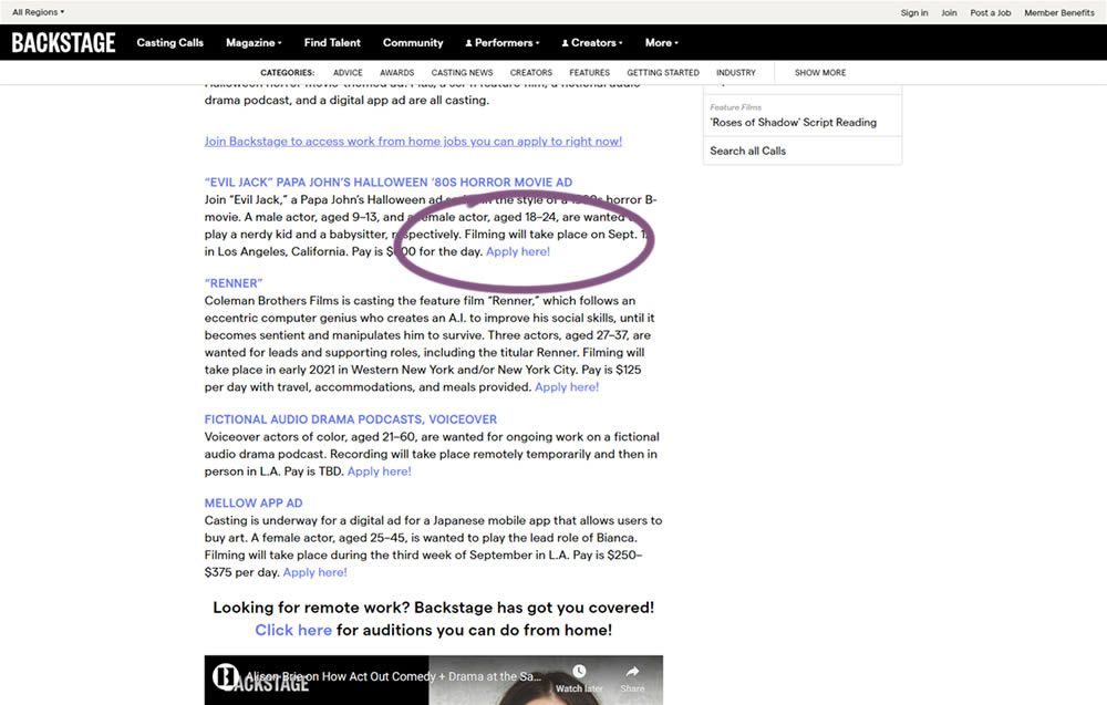
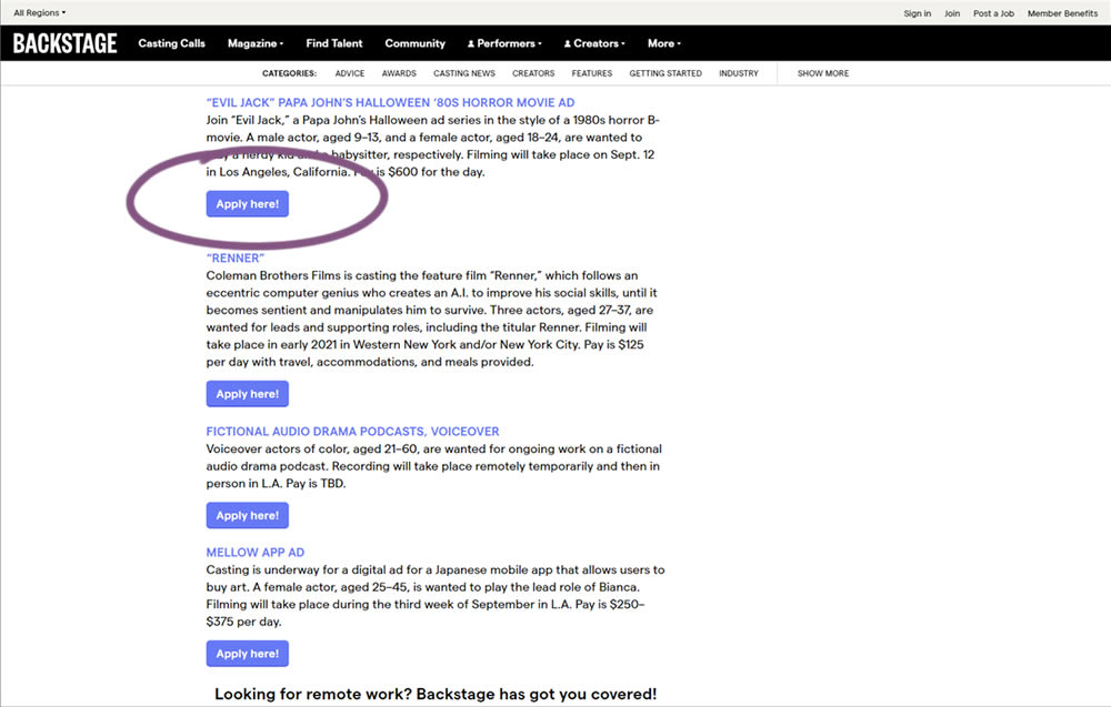
In this simple experiment on a content page, links were turned into more prominent buttons. The experiment measured clicks and signups.
Test #328 on
Umbraco.com
by  Lars Skjold Iversen
Dec 21, 2020
Desktop
Mobile
Home & Landing
X.X%
Signups
Lars Tested Pattern #60: Repeated Bottom Call To Action On Umbraco.com
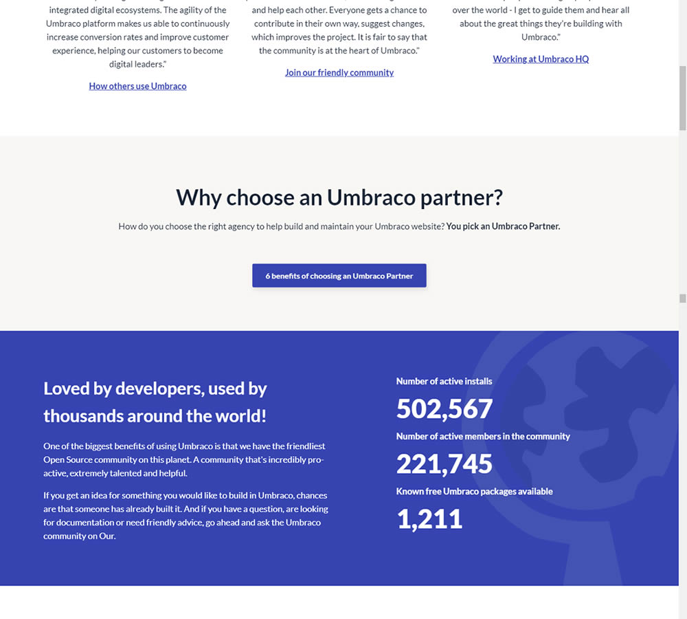
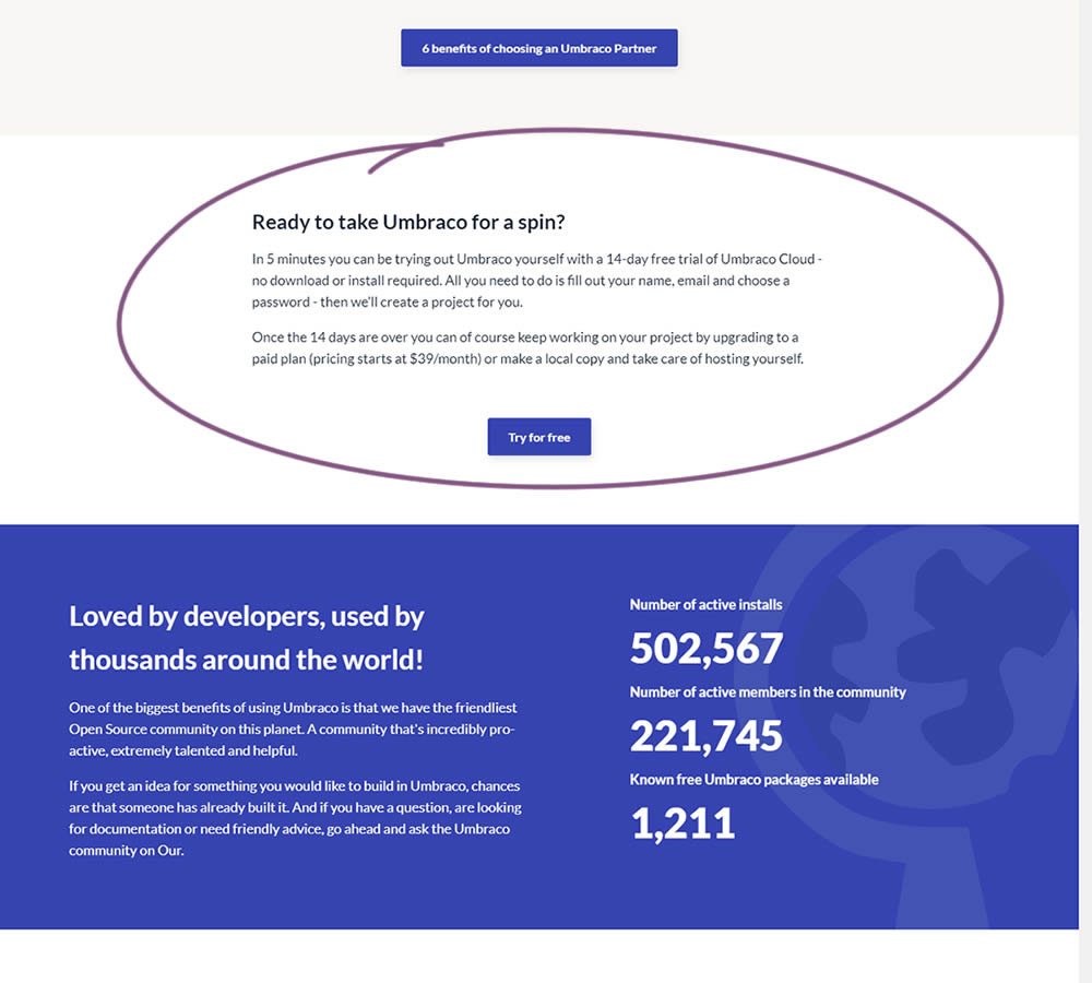
In this experiment, a trial signup section was added at the bottom of Umbraco's long homepage (CMS business). The experiment measured the impact on trial signups.
Test #320 on
by  Jakub Linowski
Oct 20, 2020
Desktop
Checkout
X.X%
Sales
Jakub Tested Pattern #49: Above The Fold Call To Action
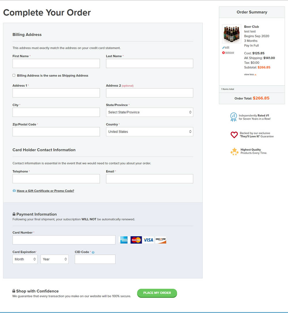
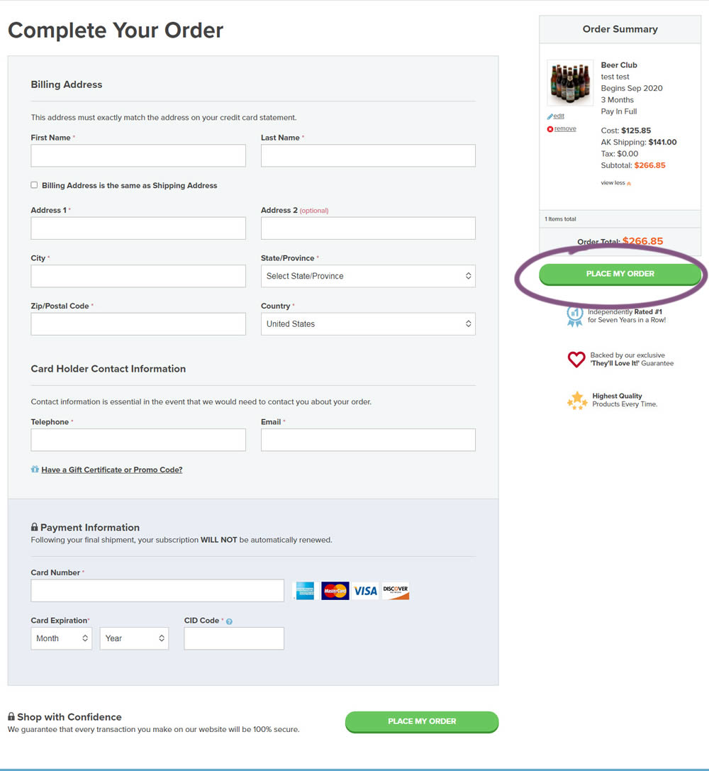
An extra "Place Order" button was duplicated above the fold on this checkout page. The control had a similar button further down at the bottom of the screen. The impact on total sales was measured from this change.
Test #310 on
Backstage.com
by  Stanley Zuo
Jul 25, 2020
Mobile
Listing
X.X%
Sales
Stanley Tested Pattern #77: Filled Or Ghost Buttons On Backstage.com
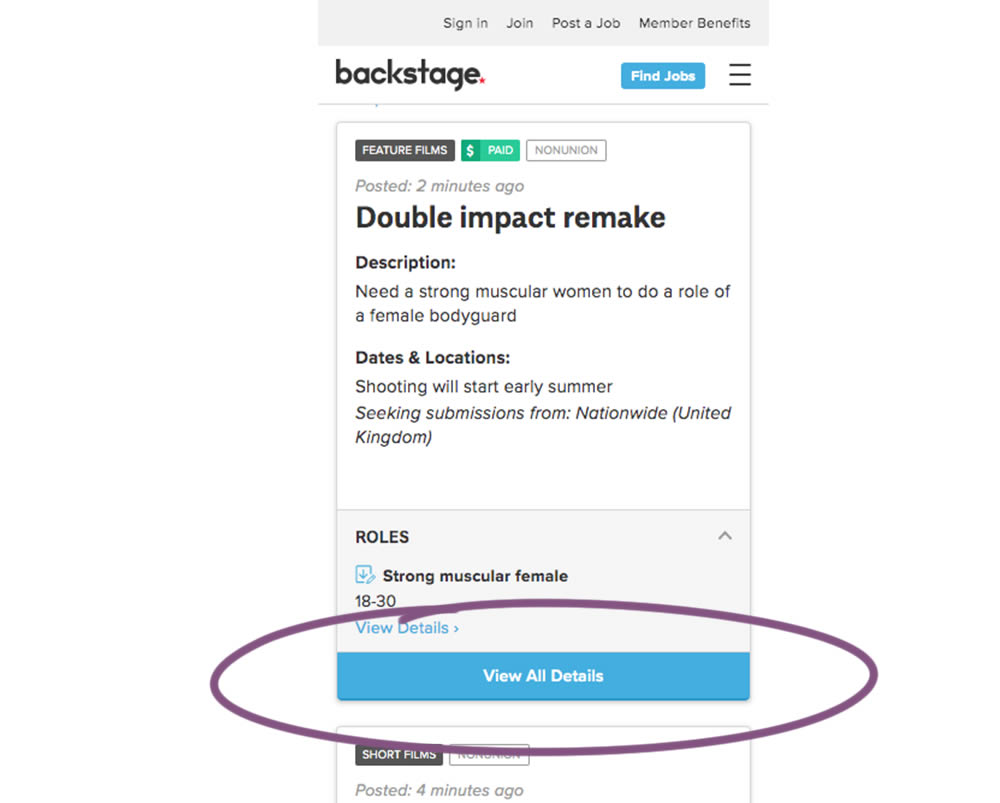
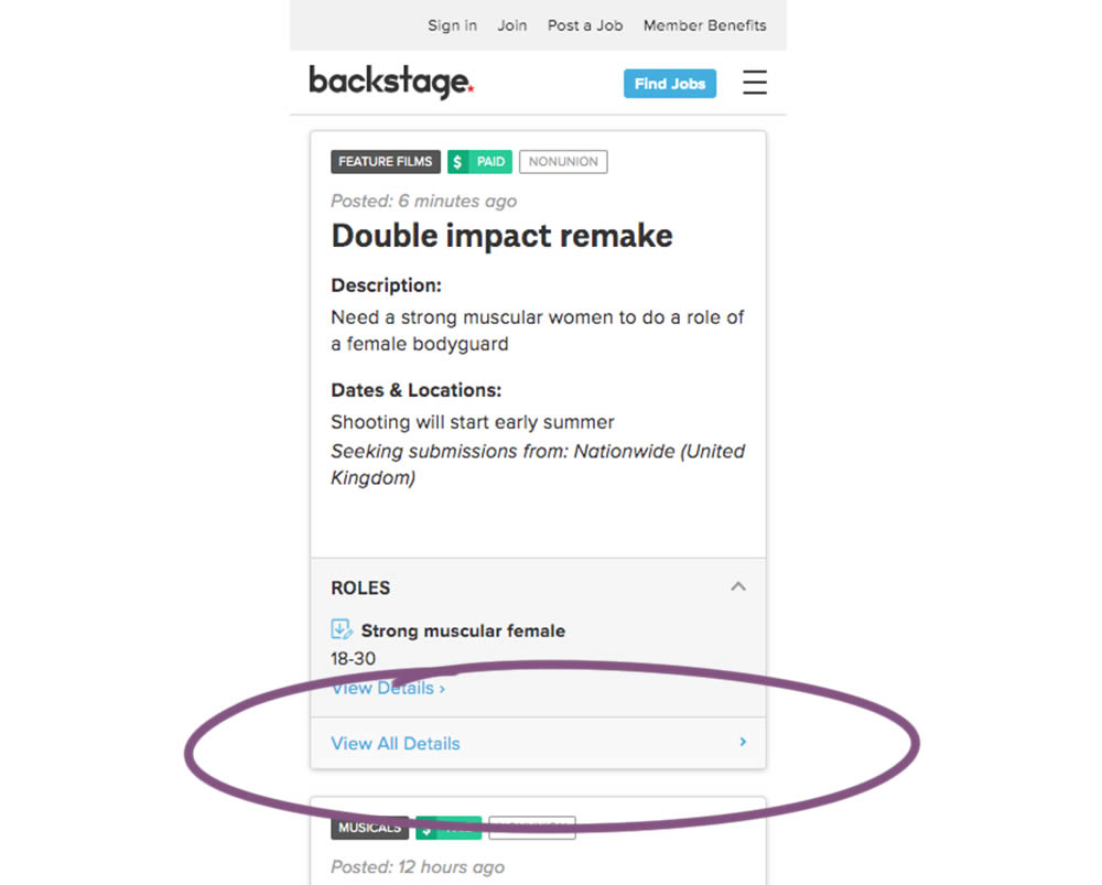
In this experiment, the style of a button leading to view detailed casting calls on a listing page was changed. In the A version the style was a filled high contrast blue background, and the B variation had a feint "ghost button" style.
Test #307 on
Volders.de
by Michal Fiech
Jul 17, 2020
Desktop
Thank You
X.X%
Progression
Michal Tested Pattern #77: Filled Or Ghost Buttons On Volders.de
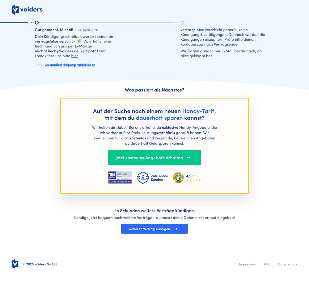
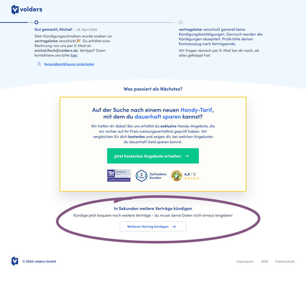
This experiment measured a shallow click goal on a button that would encourage to repeated the action that was just completed (in this case a contract cancellation). In the control version (A) a thank-you screen shows a filled button style, and the variant (B) there was a ghost button. As a note, I also flipped the A-B in this experiment for the purpose of matching it to our ghost button pattern, which means that Volders in fact was starting out with a ghost button to begin with.
Test #304 on
Backstage.com
by  Stanley Zuo
Jun 29, 2020
Mobile
Product
X.X%
Signups
Stanley Tested Pattern #97: Bigger Form Fields On Backstage.com
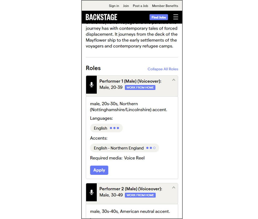
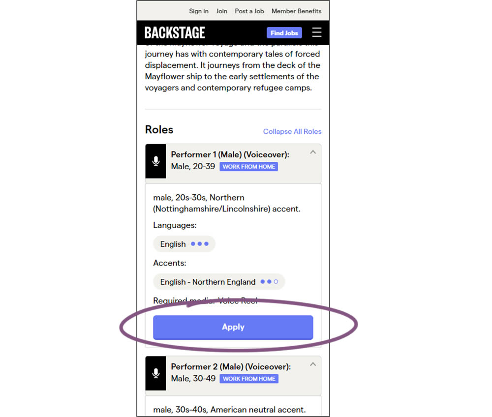
In this experiment, larger "Apply" buttons were shown on a casting detail page. The application funnel would take users through a series of steps leading to a paid membership subscription. The experiment measured initial progression and account signups (email signups).
Test #297 on
Trydesignlab.com
by  Daniel Shapiro
May 04, 2020
Desktop
Home & Landing
X.X%
Sales
Daniel Tested Pattern #41: Sticky Call To Action On Trydesignlab.com


In this experiment, a sticky "Enroll" button was shown on a course landing page. The button lead to a payment funnel to allow enrolling/paying for a course. The exeperiment measured inital progression into this funnel as well as the deeper completed sales metric.
Test #282 on
Thomasnet.com
by  Julian Gaviria
Feb 07, 2020
Desktop
Mobile
Listing
X.X%
Leads
Julian Tested Pattern #51: Shortcut Buttons On Thomasnet.com
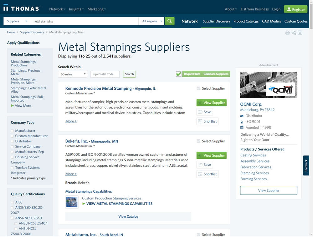
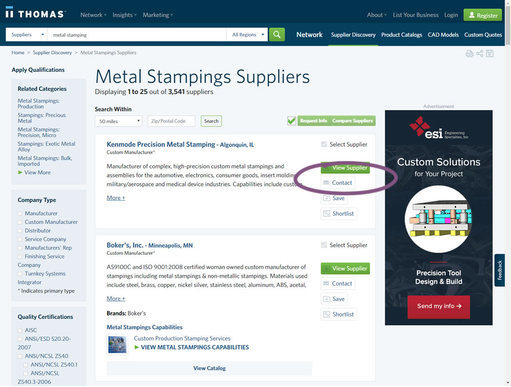
In this experiment, a contact button was added to a listing / search results page to make it faster to contact a company. This same button was also visible on the company detail page.
Test #281 on
Backstage.com
by  Stanley Zuo
Jan 31, 2020
Desktop
Listing
X.X%
Sales
Stanley Tested Pattern #116: Links Or Buttons On Backstage.com
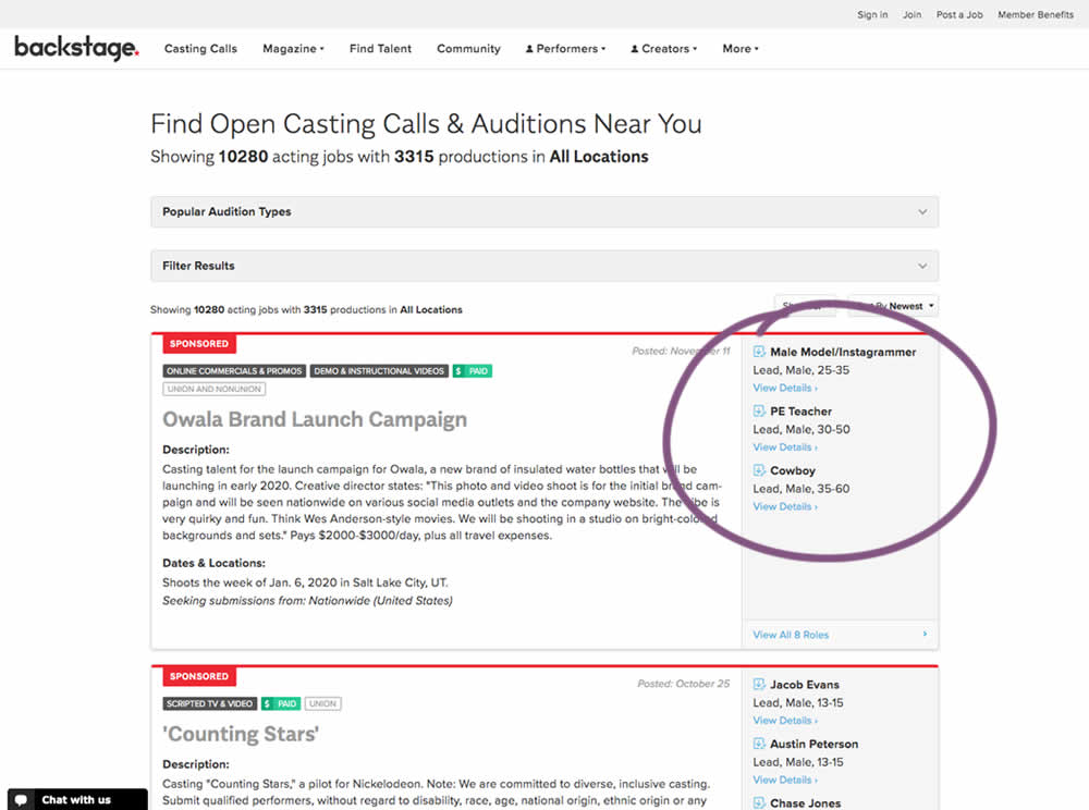
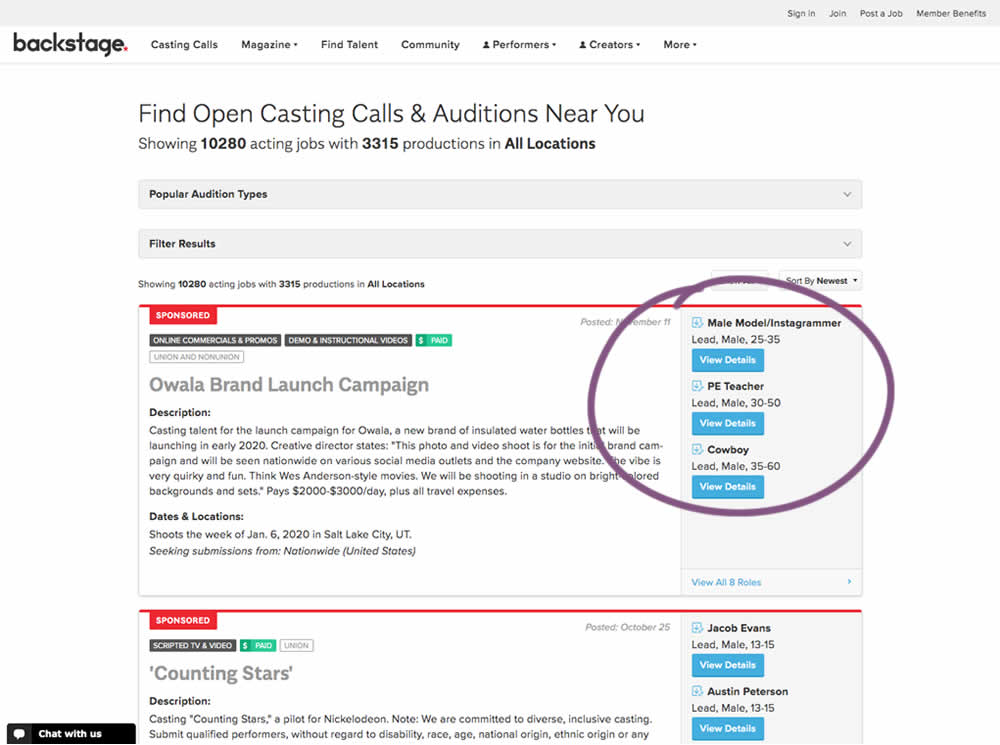
In this experiment, multiple view detail links for a listing tile were turned into higher contrast buttons.
Test #279 on
Umbraco.com
by  Lars Skjold Iversen
Jan 16, 2020
Desktop
Mobile
Home & Landing
X.X%
Sales
Lars Tested Pattern #79: Product Highlights On Umbraco.com
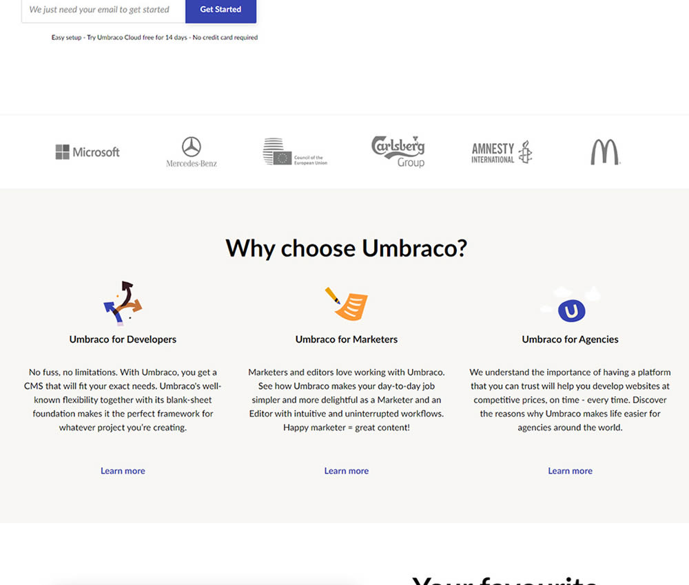
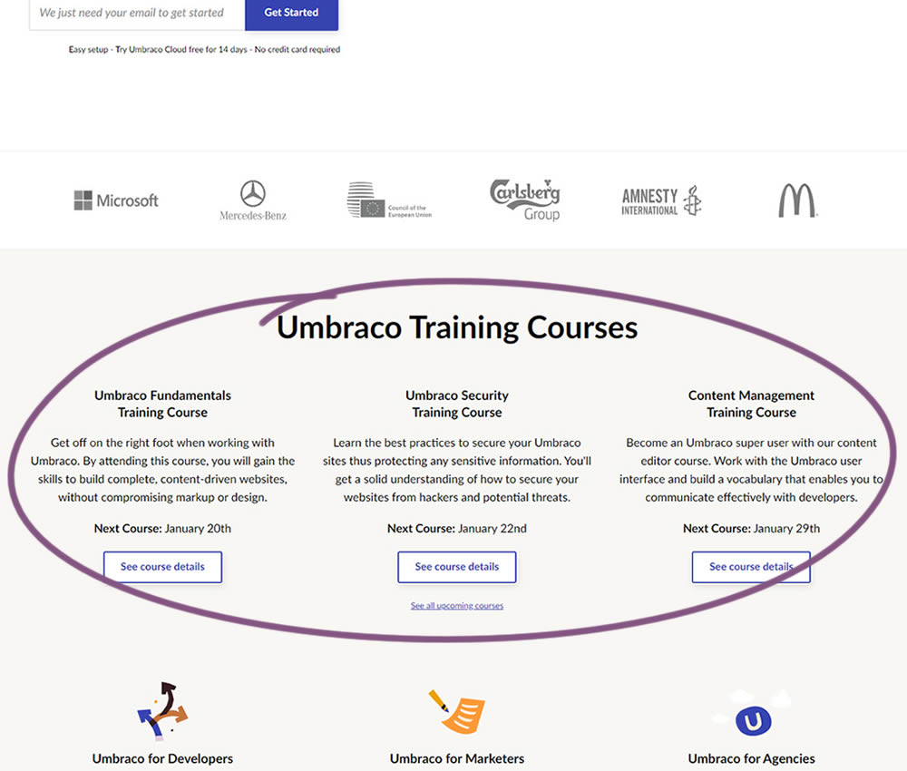
In this experiment, 3 additional course links with descriptions were added to the homepage. The idea was to increase course sales aside of the Saas subscription signups.
Test #250 on
Volders.de
by  Alexander Krieger
Jul 25, 2019
Desktop
Mobile
Signup
X.X%
Signups
Alexander Tested Pattern #106: Back Buttons On Volders.de
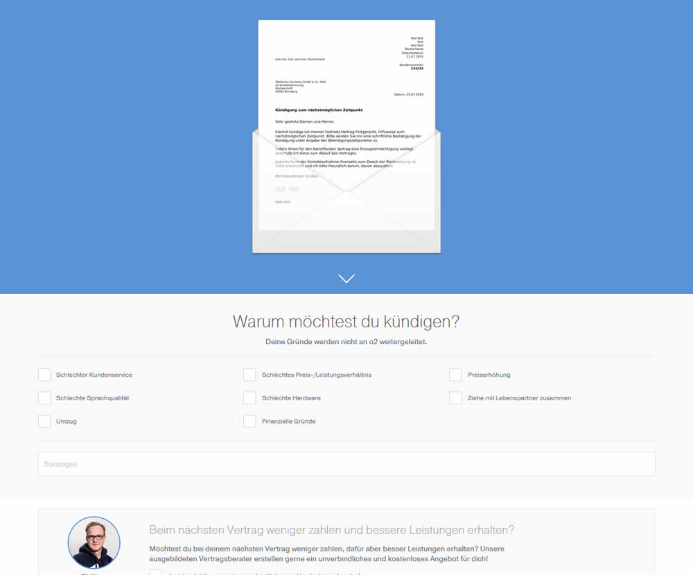
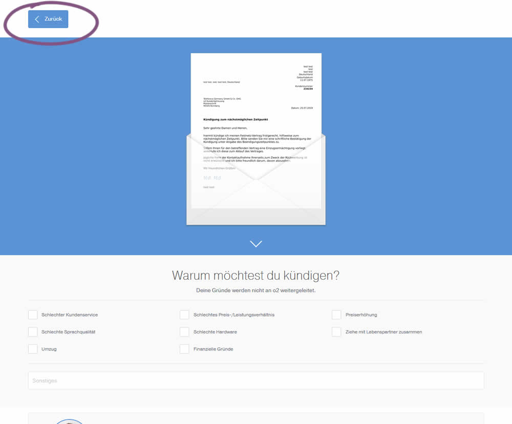
In this experiment, a version without a back button was tested against a one where it was positioned in the upper left corner. This test occured on a second step of a contract cancellation service.
Test #251 on
Goodui.org
by  Jakub Linowski
Jul 25, 2019
Desktop
Mobile
Content
X.X%
Signups
Jakub Tested Pattern #57: Maybe Later On Goodui.org
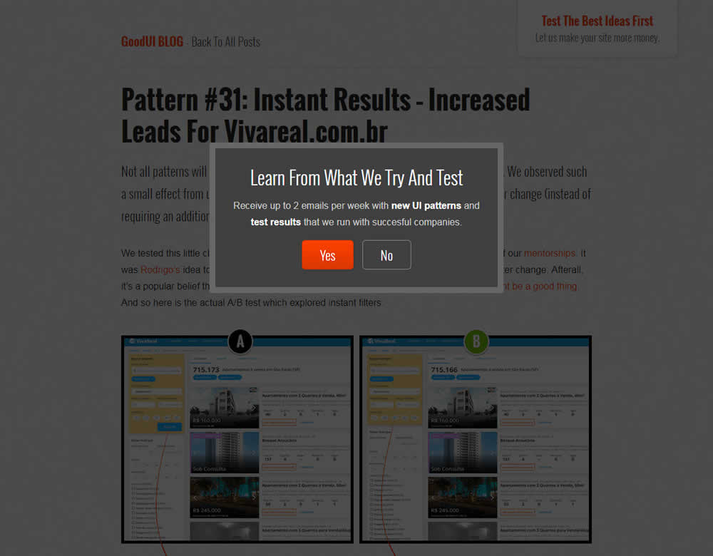
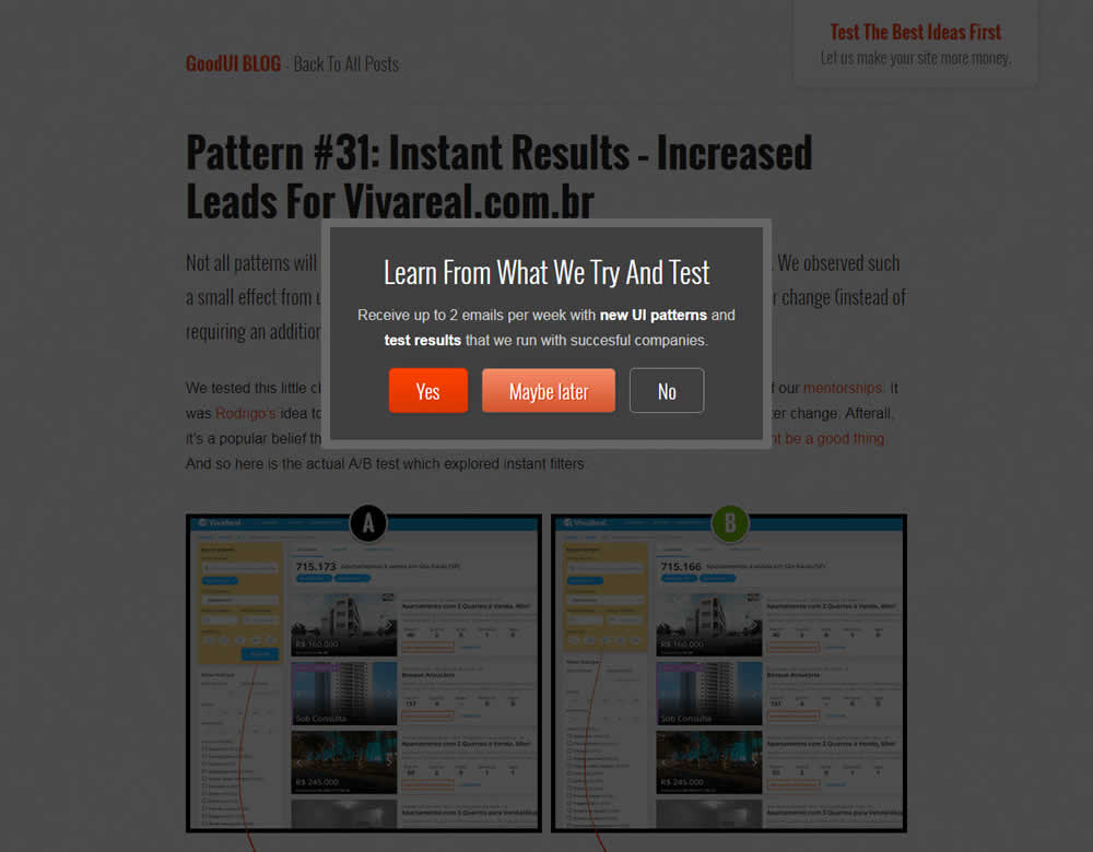
In this experiment, we tested a standard modal (with 2 choices) against a "Maybe Later" one (with 3 choices). One of the choices in the variant allowed users to postpone their decision with a "maybe" which would enable a floating bar at the bottom of the screen. Clicking on any of the "Yes" options would send people to the bottom of the screen with an email signup form. Increasing signup was our primary measure. Both modals also appeared instantly after a page load.
Test #244 on
Mt.com
by  Vito Mediavilla
Jun 06, 2019
Desktop
Product
X.X%
Leads
Vito Tested Pattern #49: Above The Fold Call To Action On Mt.com

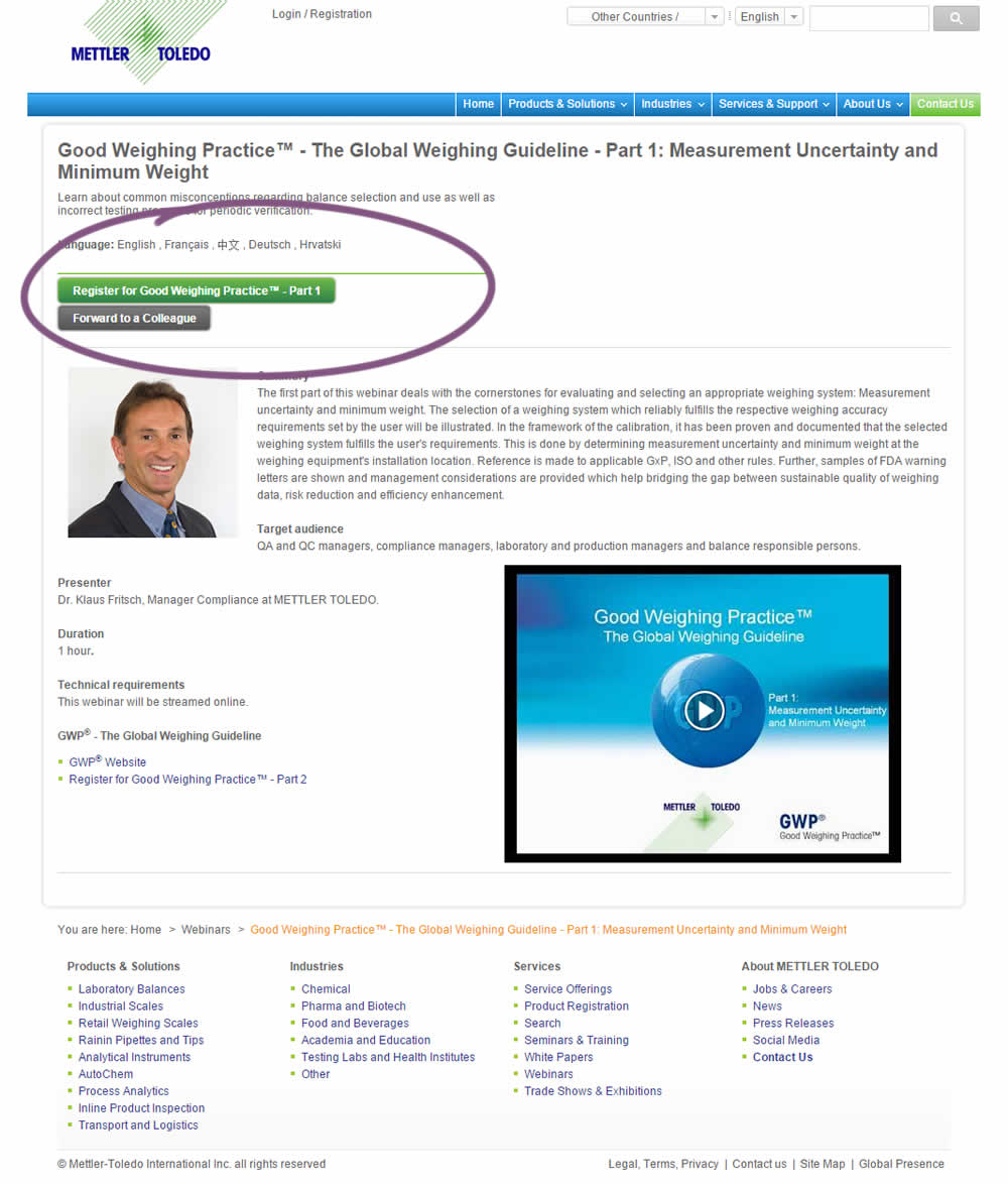
A product landing page with an image was tested against one without - raising the call to action above the fold.
Test #243 on
Goodui.org
by  Jakub Linowski
Jun 05, 2019
Desktop
Mobile
Home & Landing
X.X%
Progression
Jakub Tested Pattern #77: Filled Or Ghost Buttons On Goodui.org
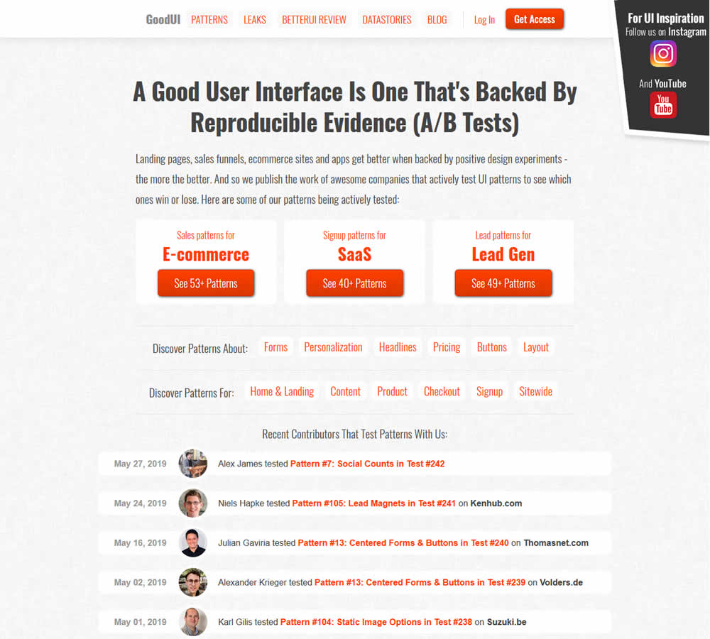
In this experiment, full red background buttons were changed to ghost buttons (red outline and transparent fill)
Test #240 on
Thomasnet.com
by  Julian Gaviria
May 16, 2019
Desktop
Listing
X.X%
Engagement
Julian Tested Pattern #13: Centered Forms & Buttons On Thomasnet.com
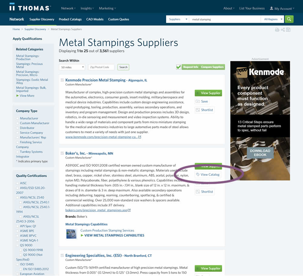
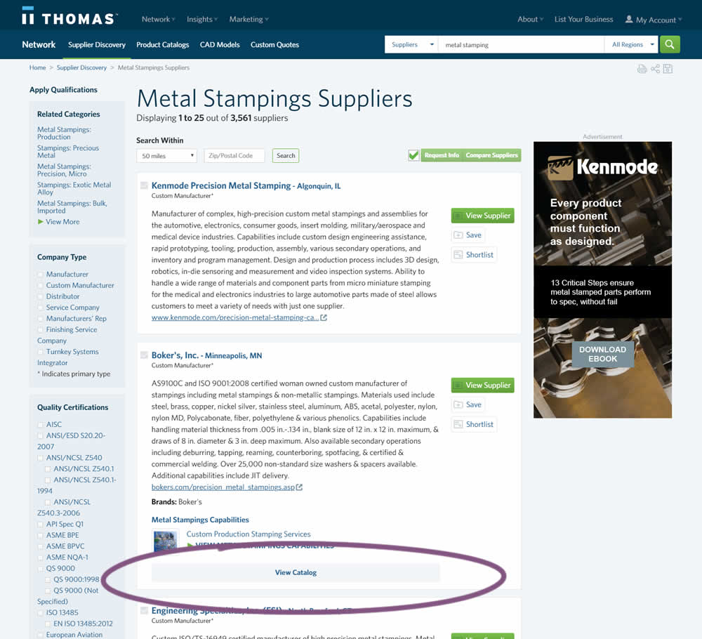
In this experiment, two different positions of the View Catalog button were compared. In version A the button was smaller and on the right. In version B the button was wider and more central. (The actual test was inverted before publishing to match the A-B of the pattern.)
Test #230 on
Goodui.org
by  Jakub Linowski
Mar 09, 2019
Desktop
Mobile
Listing
X.X%
Engagement
Jakub Tested Pattern #56: Hover Button On Goodui.org
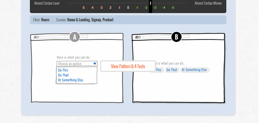
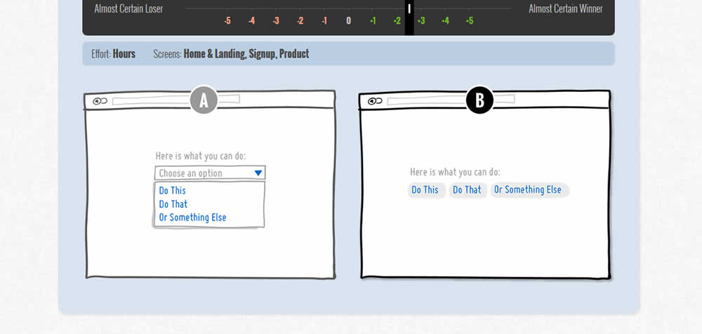
In this test we tested onhover buttons (variant) versus more traditional always exposed and visible ones.
Test #221 on
Microsoft.com
by  Ronny Kohavi
Jan 27, 2019
Desktop
Product
X.X%
Sales
Ronny Tested Pattern #49: Above The Fold Call To Action On Microsoft.com
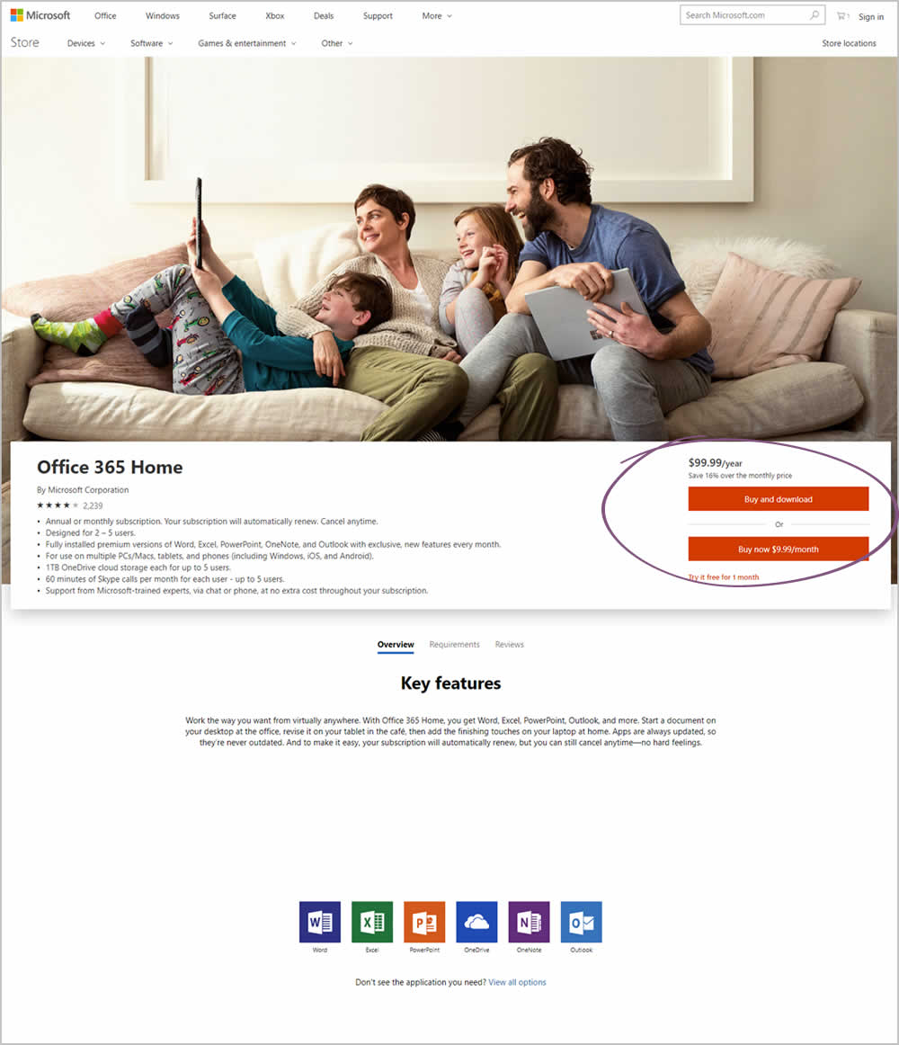
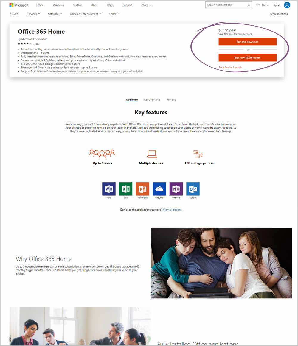
Microsoft Store ran an experiment on the Office 365 Home product page. The treatment raised the purchase calls to action higher by removing the hero image.
Test #213 on
Mt.com
by  Vito Mediavilla
Dec 04, 2018
Desktop
Mobile
Signup
X.X%
Leads
Vito Tested Pattern #85: Benefit Button On Mt.com
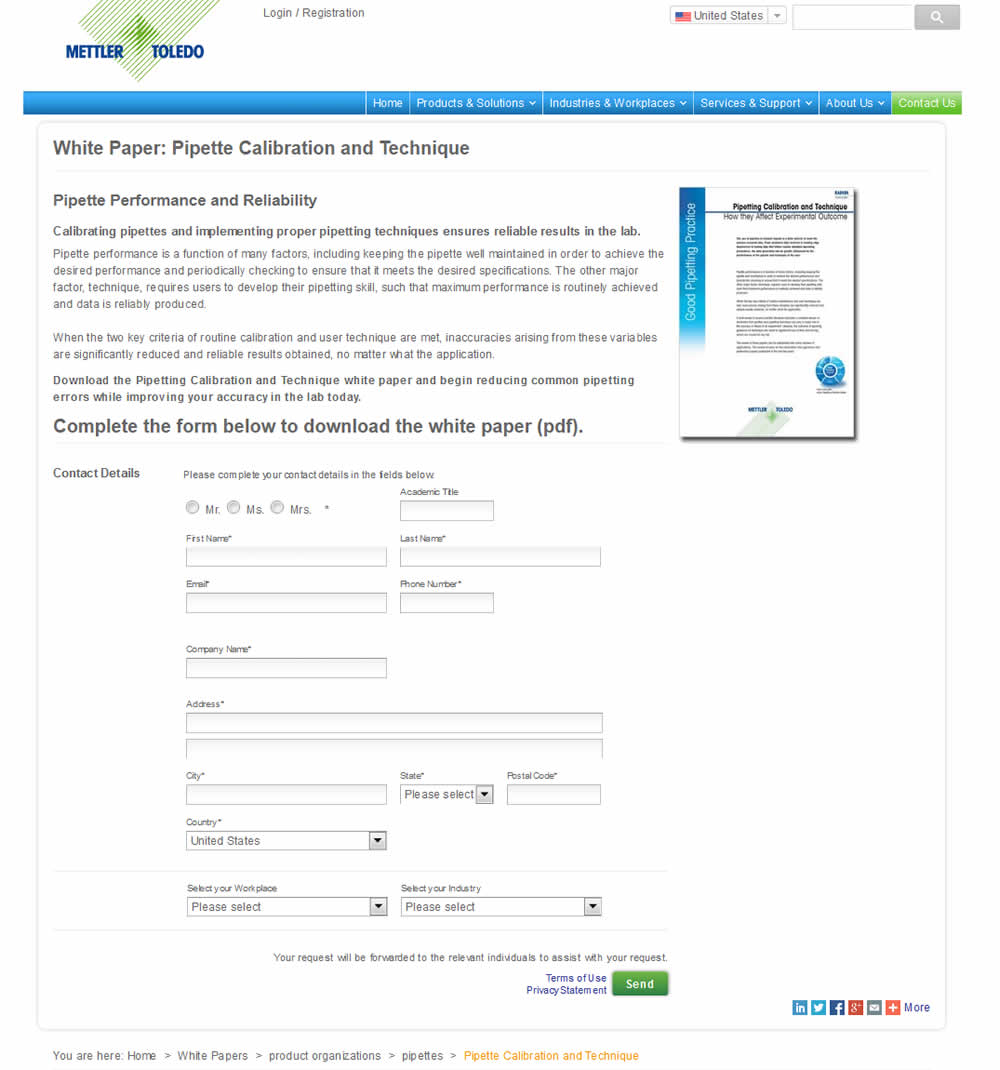
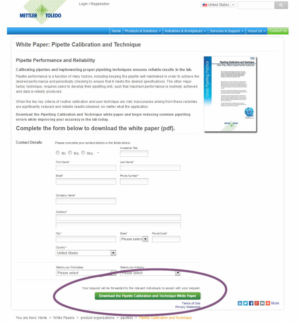
In this variation, a longer button label with a clearer benefit was tested against a shorter one.