All Latest 620 A/B Tests
MOST RECENT TESTS
Test #447 on
Vivareal.com.br
by  Vinicius Barros Peixoto
Dec 23, 2022
Mobile
Listing
X.X%
Leads
Vinicius Tested Pattern #18: Single Or Alternative Buttons On Vivareal.com.br
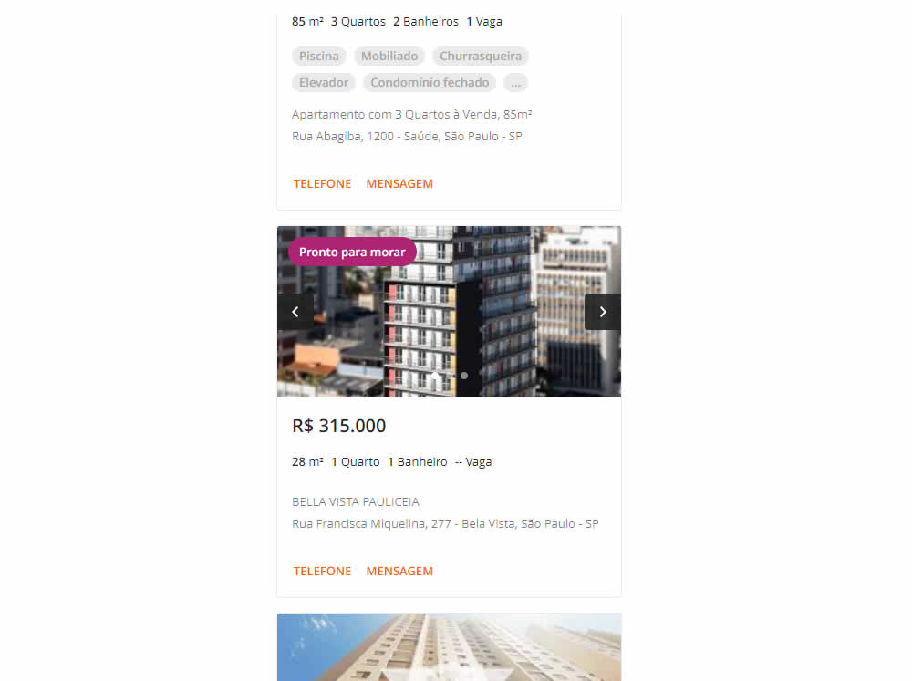
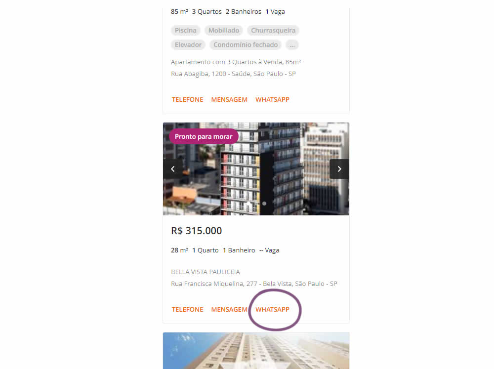
In this experiment, an additional call to action (Whatsapp link) was added on a listing page of one of Brazil's largest real estate sites.In the variation the 3 calls to action include: a link that launched the phone interaction, a general contact lead form, and finally the Whatsapp link (added in the variant). Impact on total lead starts and completions was measured.
Which A Or B Actually Wins? Find Out Before You Test.
Members see every test result — the winners, the flat ones, and the losers — along with exact effects and sample sizes. Use it to estimate your tests and prioritize by probability, not gut feel. Start every experiment with the odds on your side.
Test #444 on
by  Melina Hess
Nov 30, 2022
Mobile
Product
X.X%
Sales
Melina Tested Pattern #41: Sticky Call To Action
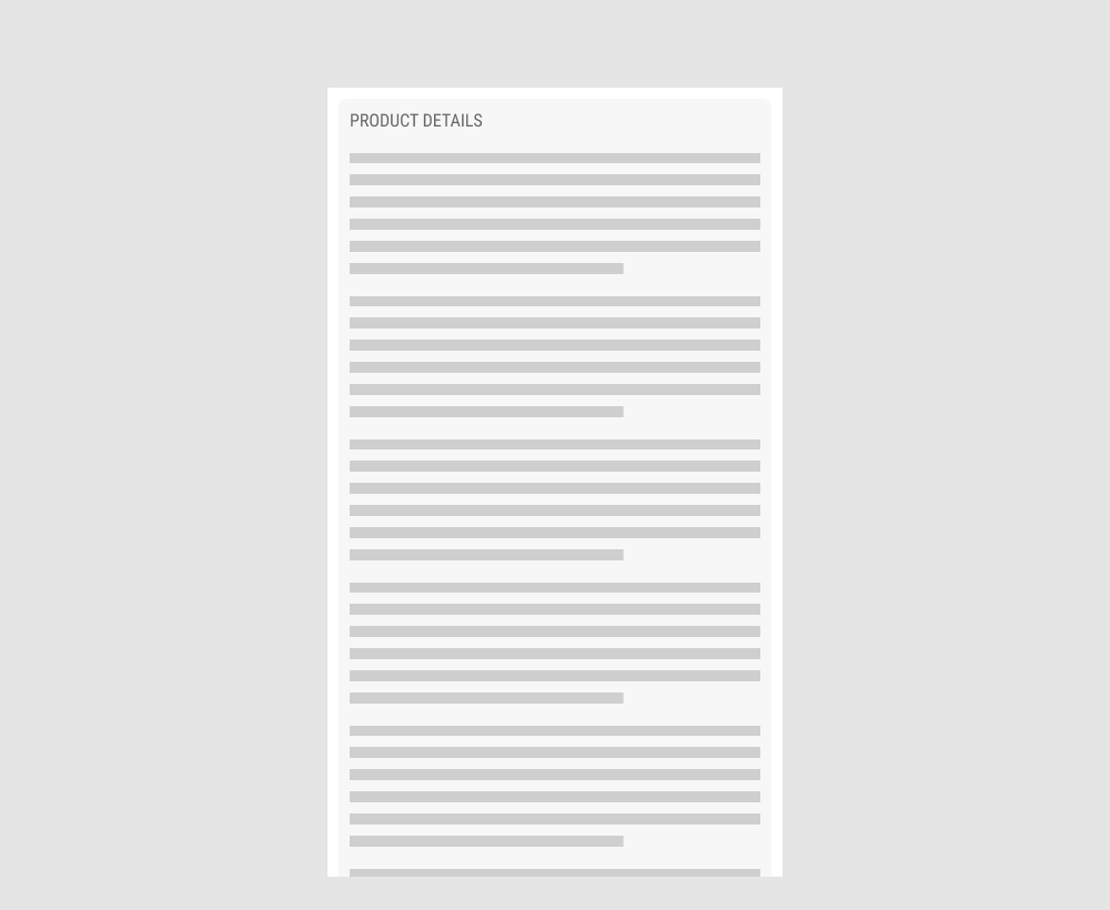
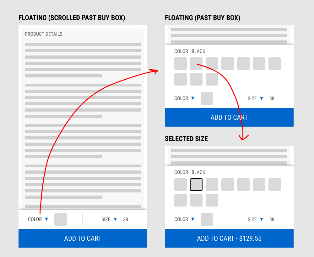
In this experiment, a floating add-to-cart with two product choices (color and size) were added on a product page. This appeared only after scrolling past the existing / embedded product selection buy box.
The floating add-to-cart widget had another layer of complexity in that it allowed customers to make a size and color selection with an expandable fly out. Making a selection would also append the total price to the add-to-cart button label.
Impact on total transactions was measured.
Test #441 on
by  Melina Hess
Nov 23, 2022
Desktop
Mobile
Product
X.X%
Sales
Melina Tested Pattern #41: Sticky Call To Action
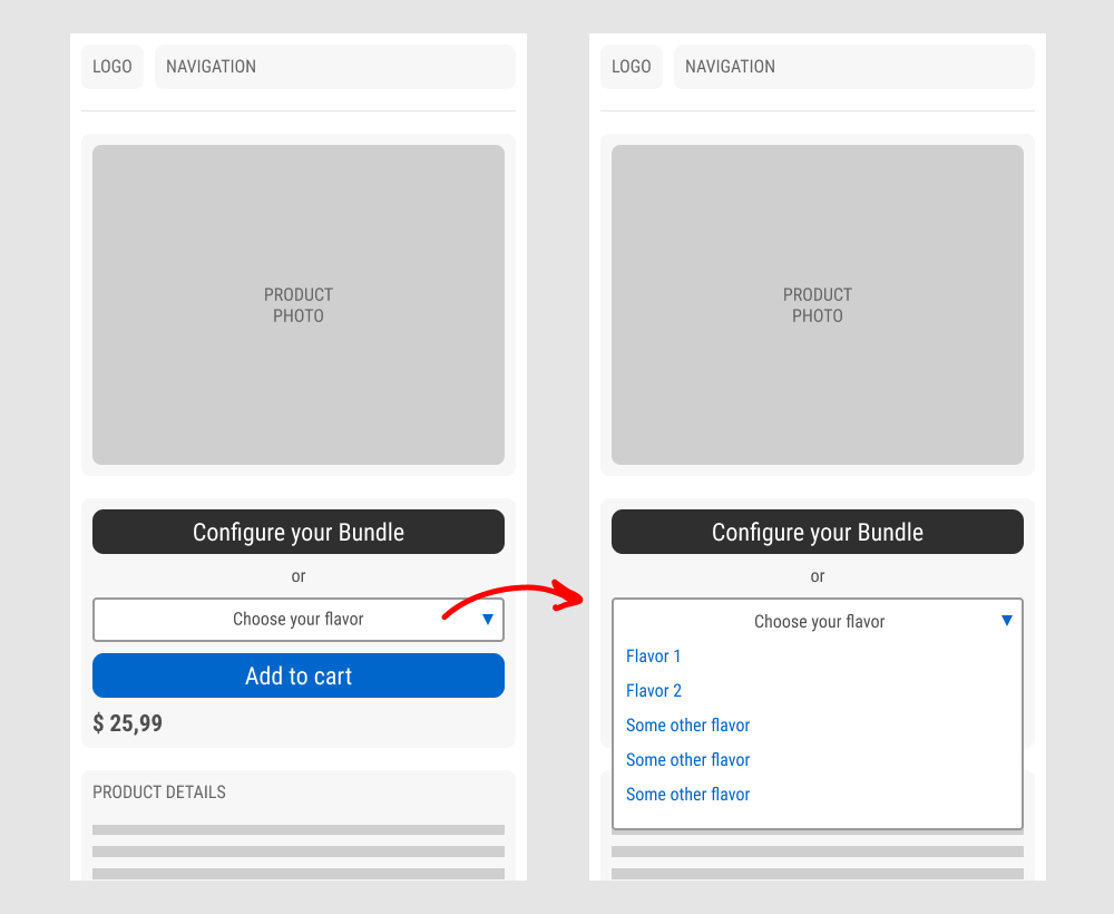
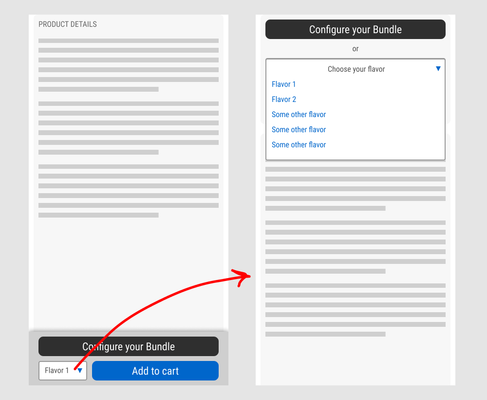
In this experiment, a floating sticky bar was added on product pages. The sticky elements only appeared after users scrolled beyond the fixed buy box area that is relatively high on the page (visible on the control screenshot). The sticky bar contained three elements: a button to configure up to three product choices, a flavor selection pulldown, and the add-to-cart button.
In the variation, when users clicked on the flavor pulldown three things happened. First, they were anchored back to the top of the buy box. Second, the floating sticky disappeared. And third, the flavors pulldown automatically expanded (overlapping the original primary add-to-cart button).
The control did not have any of the sticky behaviors.
Impact to total sales was measured.
Test #440 on
Formelskin.de
by  Alexander Krieger
Nov 17, 2022
Mobile
Signup
X.X%
Sales
Alexander Tested Pattern #49: Above The Fold Call To Action On Formelskin.de
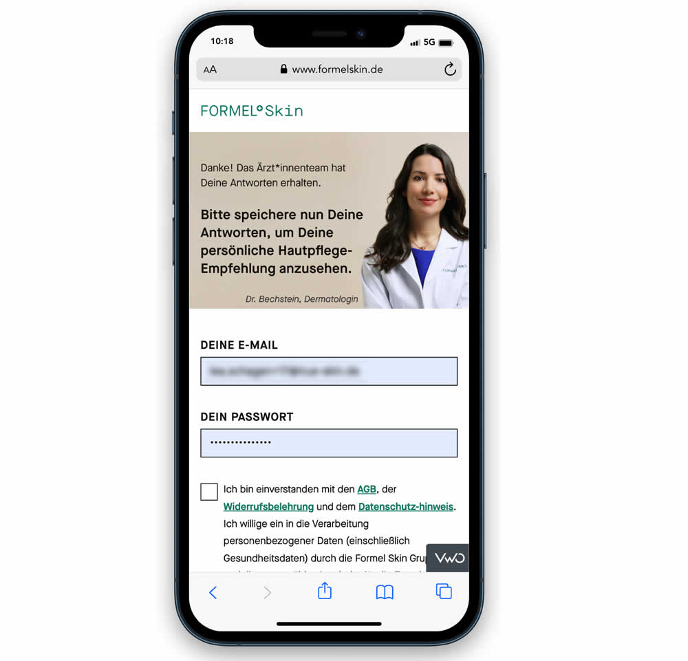
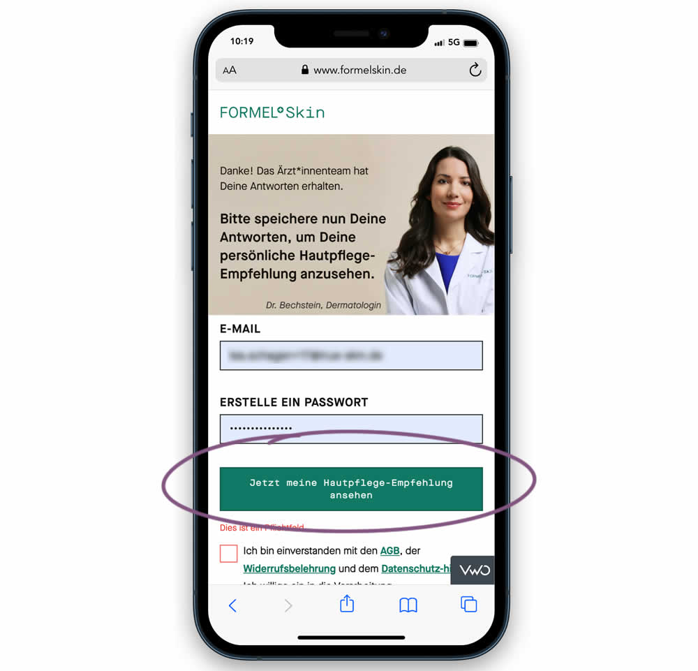
In this experiment, the call to action or button was raised above the legal text to be visible right away without scrolling. Additionally a error message was added for users that did not activate the checkbox to remind them that this is mandatory. Impact on signups and eventual follow-through to purchases (3 steps later) was measured.
Test #439 on
Designlab.com
by  Daniel Shapiro
Oct 31, 2022
Desktop
Mobile
Home & Landing
X.X%
Sales
Daniel Tested Pattern #18: Single Or Alternative Buttons On Designlab.com


This was a larger leap experiment with numerous changes to the header part of a design program landing page. One of the key changes however was a shift from a single to multiple call to actions for lead generation. In the control, all potential leads would first funnel through a single syllabus download flow. In the variation, users were given three visible choices: download syllabus, webinar signup and/or book a live call with admissions. Impact on overall generated leads was measured, as well as paid enrollments.
Test #437 on
Vivareal.com.br
by  Rodrigo Maués
Oct 28, 2022
Desktop
Mobile
Listing
X.X%
Leads
Rodrigo Tested Pattern #18: Single Or Alternative Buttons On Vivareal.com.br
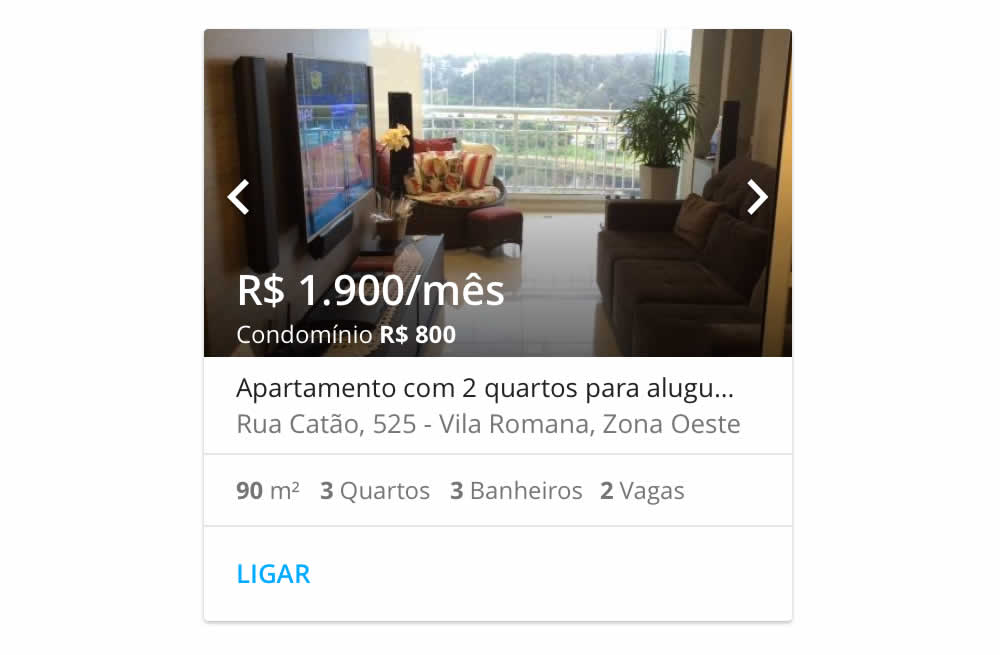
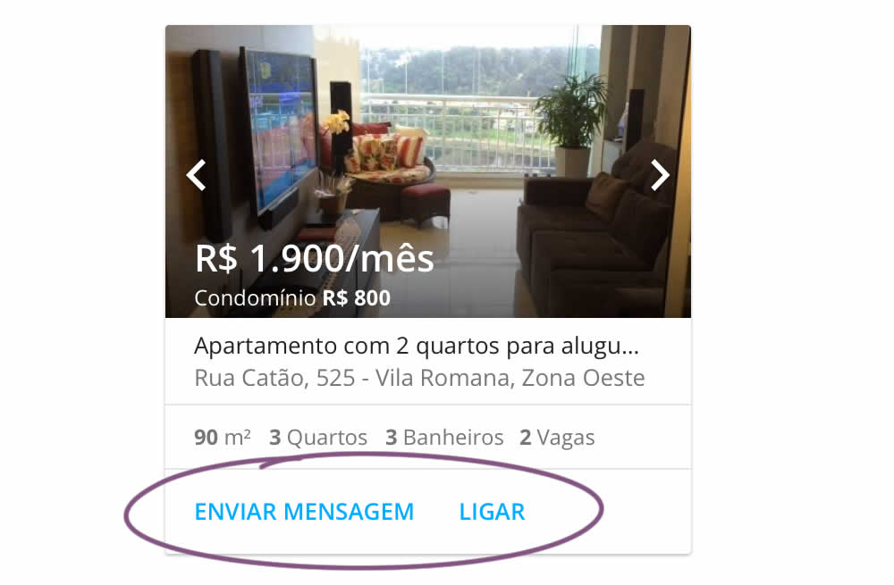
In this experiment, an additional and alternative text based call to action link was added on real estate properity listings. Instead of only having "Ligar" ("Call"), "Enviar mensagem" was also appended ("Send Message"). This additional link lead to a lead-gen form.
Test #438 on
Phorest.com
by  Sorcha Mullis
Oct 28, 2022
Desktop
Mobile
Home & Landing
X.X%
Leads
Sorcha Tested Pattern #18: Single Or Alternative Buttons On Phorest.com
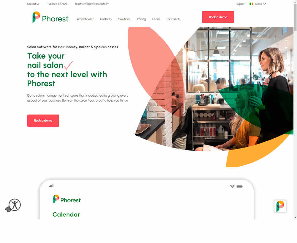
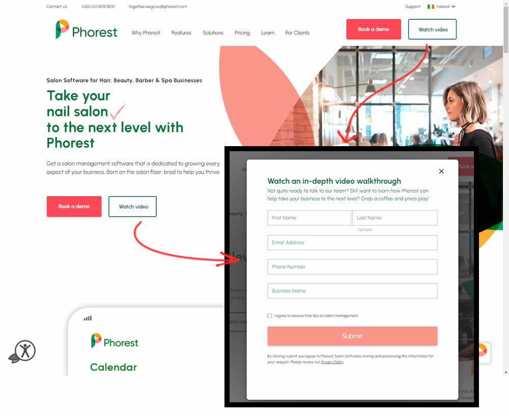
In this experiment, the addition of a secondary CTA for lead generation in the nav and the hero were tested. The additional button invited users to watch a gated demo video (approx 12 minutes). Clicking the CTA triggered a pop-up form collecting some basic contact information before the user could access the video page. Total leads were measured with lead form submittions.
Test #432 on
Snocks.com
by  Melina Hess
Sep 29, 2022
Mobile
Global
X.X%
Sales
Melina Tested Pattern #94: Visible Search On Snocks.com
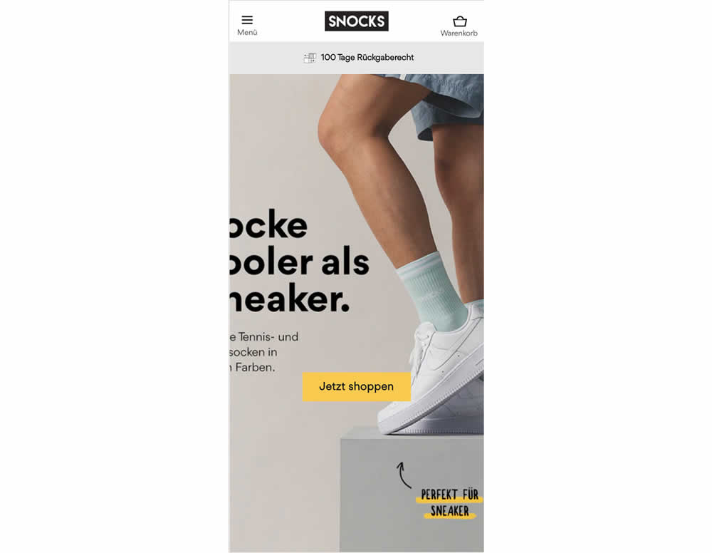
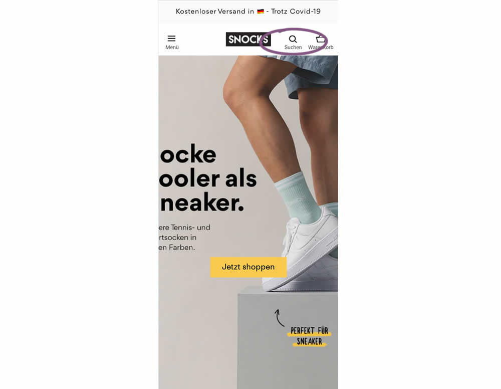
In this experiment, search functionality was added in the variation, globally on mobile. Impact on sales was measured
Test #429 on
Snocks.com
by  Melina Hess
Aug 16, 2022
Mobile
Desktop
Product
X.X%
Sales
Melina Tested Pattern #121: Free Shipping On Snocks.com
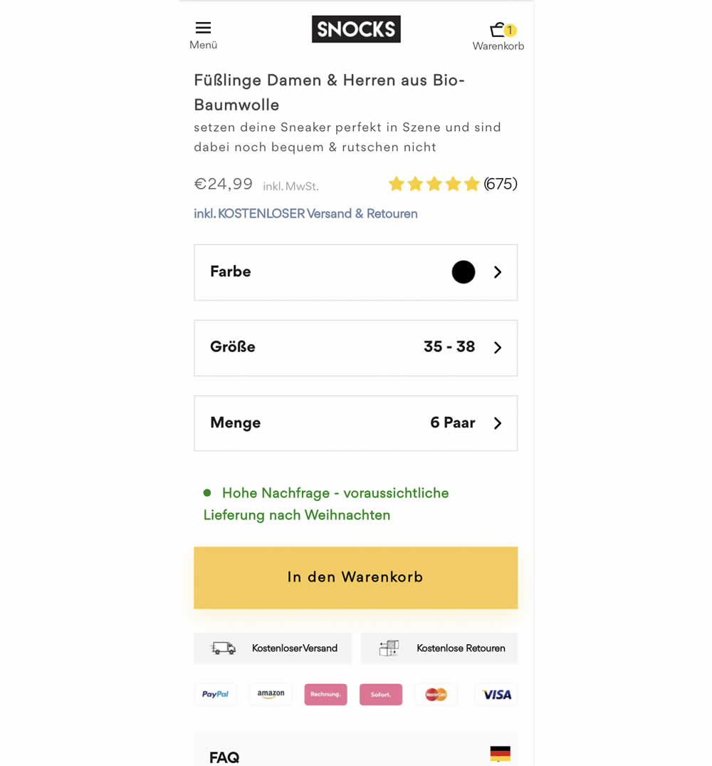
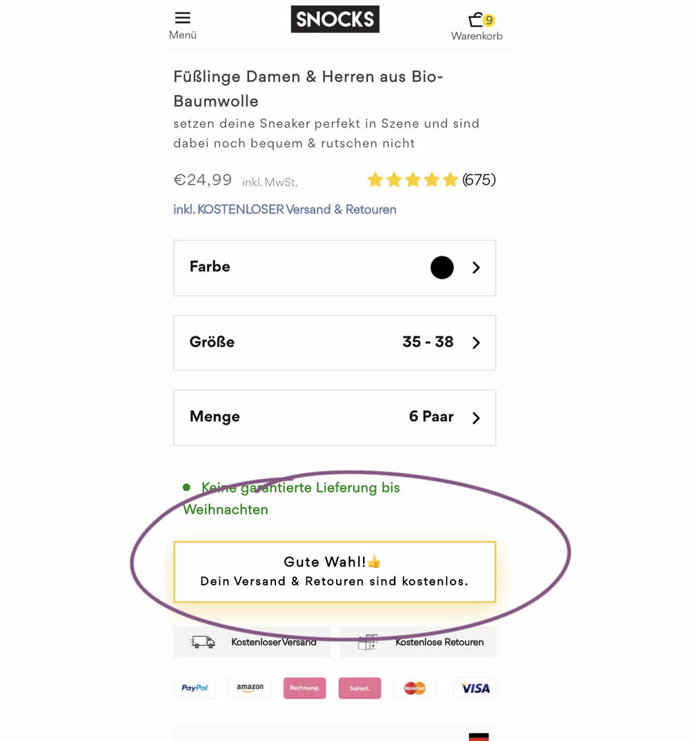
Upon clicking the Add-To-Cart button, the button label changed to a cheering message which congratulated the user on his choice and ensuring that shipping is free. Translation: "Good choice. Your shipping and returns are free."
Test #418 on
Online.metro-cc.ru
by  Andrey Andreev
Jun 28, 2022
Desktop
Mobile
Home & Landing
X.X%
Sales
Andrey Tested Pattern #135: Product Categories On Online.metro-cc.ru
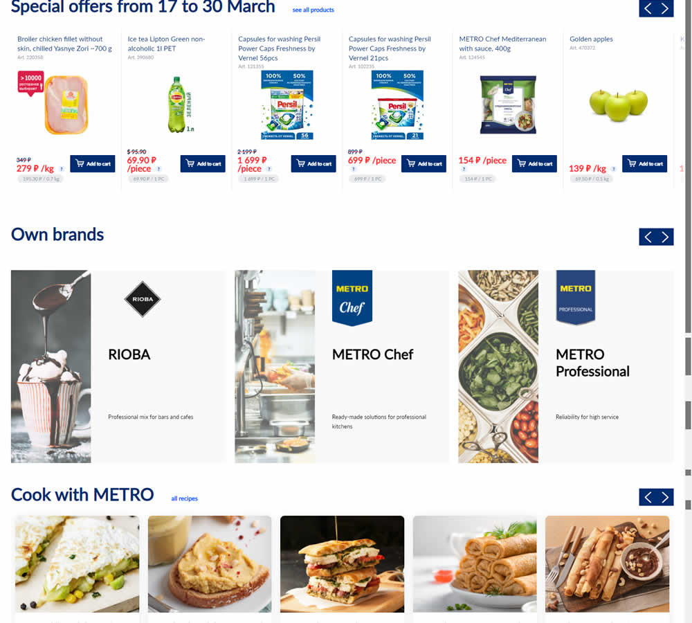
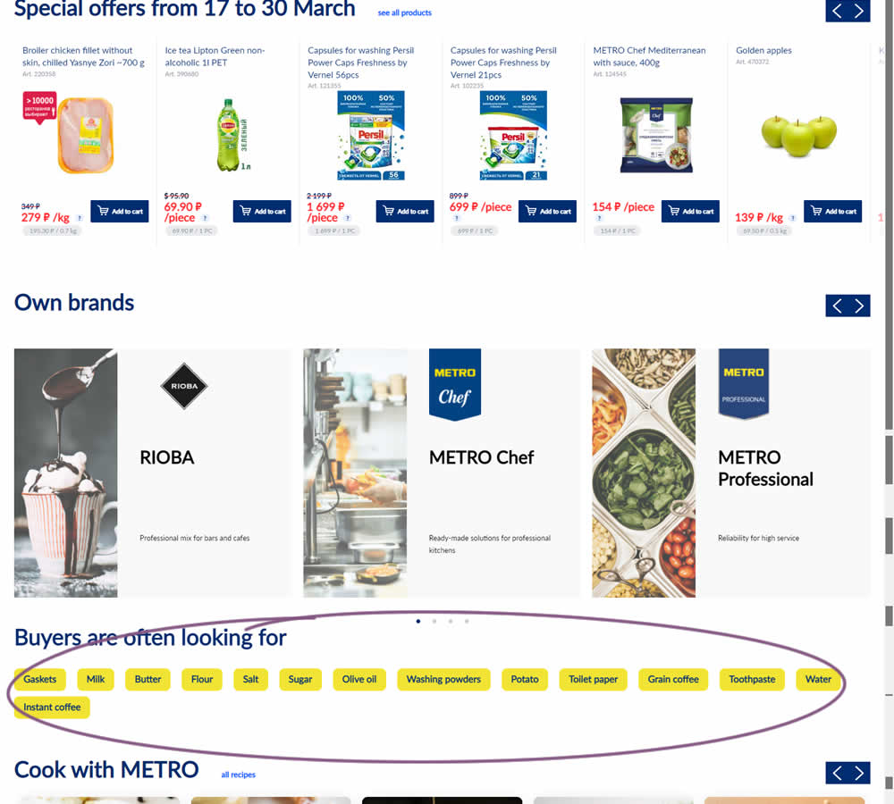
In this experiment, popular product category links were added near the bottom of the homepage of an online grocery store - Metro. Impact on completed sales was measured.
Test #404 on
Expertinstitute.com
by  Ardit Veliu
Mar 31, 2022
Desktop
Mobile
Signup
X.X%
Leads
Ardit Tested Pattern #97: Bigger Form Fields On Expertinstitute.com
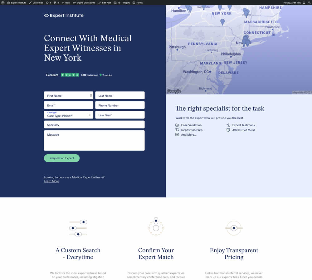
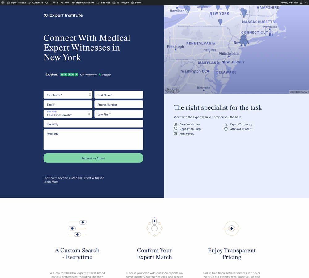
In this experiment, the button width was extended to the full width of the form above. Impact on leads was measured.
Test #123 on
Getninjas.com.br
by  Rodolfo Lugli
Feb 11, 2022
Mobile
Thank You
X.X%
Engagement
Rodolfo Tested Pattern #71: Personalized Next Step On Getninjas.com.br
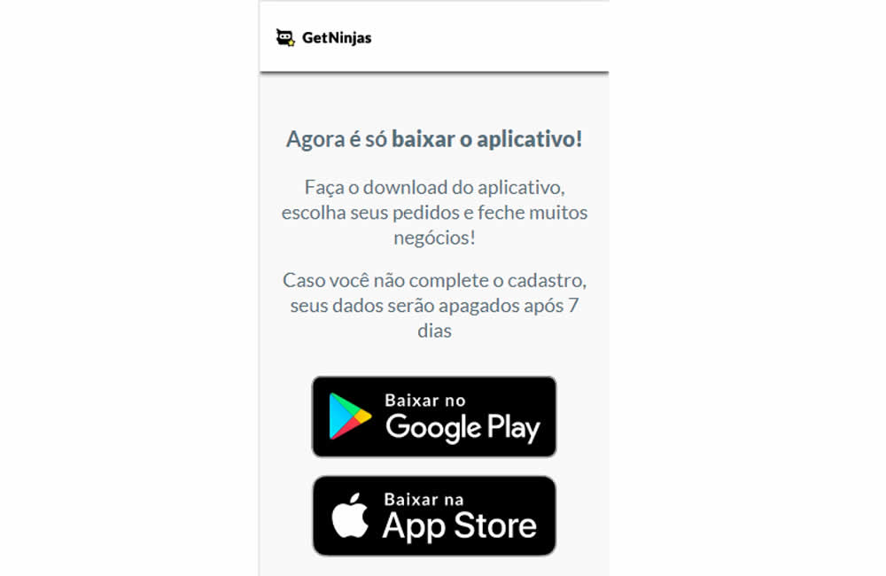
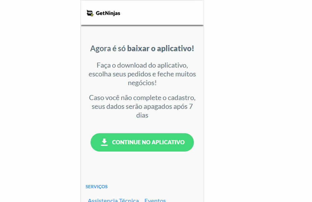
In this experiment, two app download buttons were tested against a single OS personalized one. In the control, both branded App Store and Google Play buttons were shown statically. Whereas in the variation a single download (stylized consistently with site wide button styles) button was shown depending on the user's operating system. Impact on application download was measured.
Test #388 on
by  Jakub Linowski
Dec 09, 2021
Mobile
Listing
X.X%
Sales
Jakub Tested Pattern #51: Shortcut Buttons
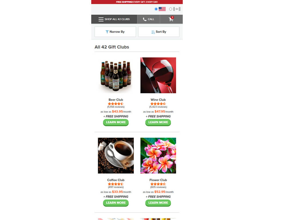
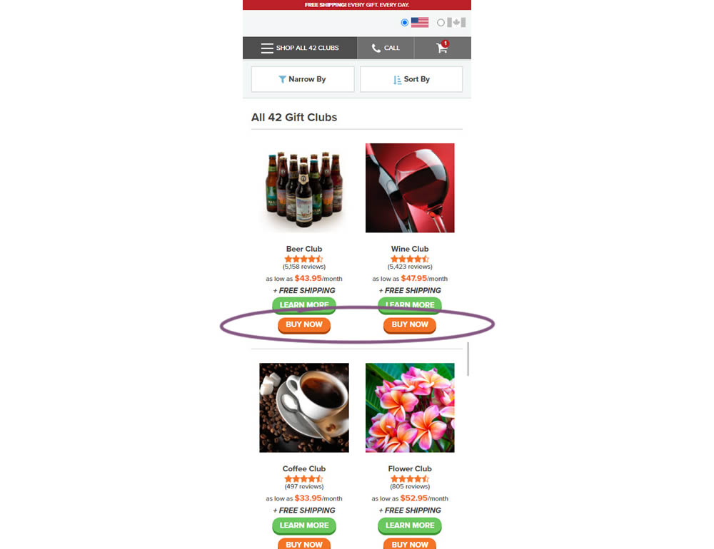
In this experiment, extra "buy now" buttons were added on a listing page. These buttons were shortcuts to an add to cart flow, whereas the "learn more" buttons lead customers to product detail pages (visible in both control and variation). Impact on adds-to-cart and sales was measured.
Test #387 on
by  Jakub Linowski
Nov 30, 2021
Mobile
Listing
X.X%
Sales
Jakub Tested Pattern #88: Action Button
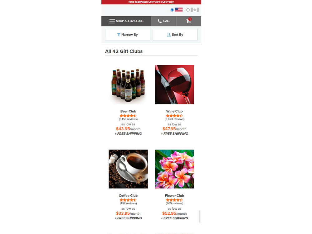
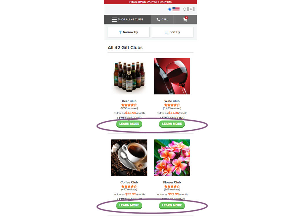
In this experiment, simple "Learn More" buttons were added underneath each product thumbnail. These buttons were additional triggers that linked to product detail pages on top of the existing thumbnails and product names (that also linked to the PDPs). Impact on product visits and sales was measured.
Test #381 on
Expertinstitute.com
by  Ardit Veliu
Oct 30, 2021
Desktop
Mobile
Home & Landing
X.X%
Leads
Ardit Tested Pattern #49: Above The Fold Call To Action On Expertinstitute.com


In this experiment, an extra button to a signup lead form was placed above the fold. In the control, the same button appeared further down on the page.
Test #371 on
by  Jakub Linowski
Aug 18, 2021
Desktop
Listing
X.X%
Sales
Jakub Tested Pattern #51: Shortcut Buttons
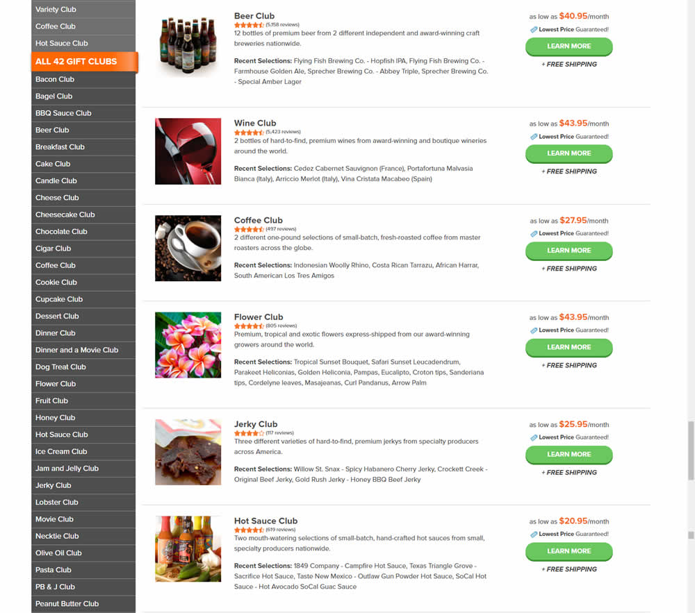
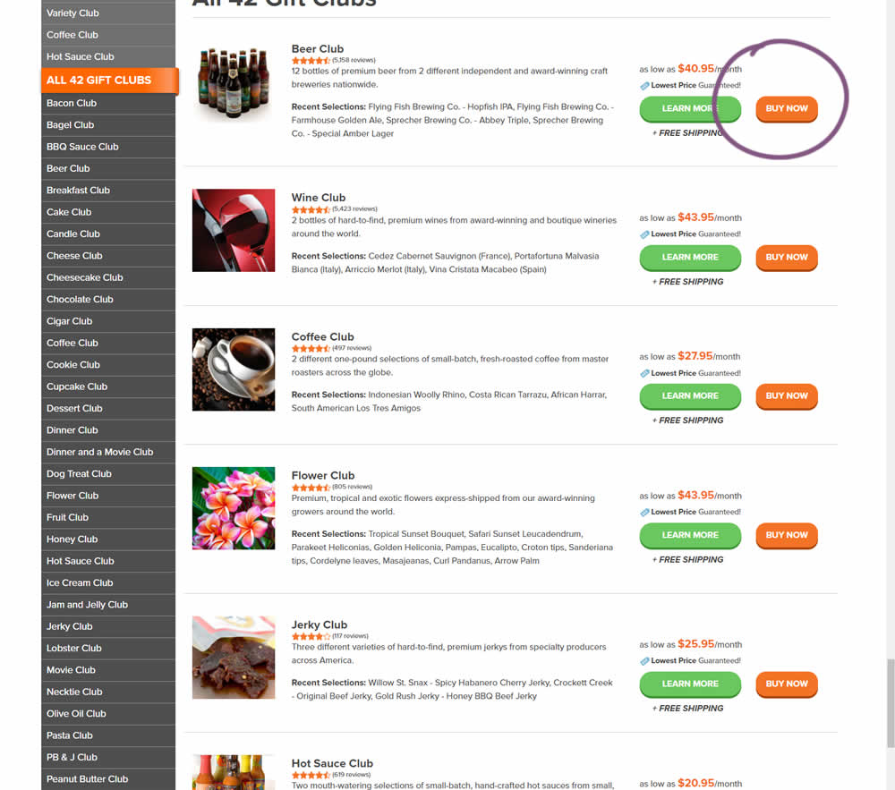
In this experiment, the variation added an extra "Buy Now" button that linked directly into the cart process. The variation only had a learn more button linking directly to a product page.
Test #360 on
by  Jakub Linowski
Jun 16, 2021
Desktop
Product
X.X%
Sales
Jakub Tested Pattern #60: Repeated Bottom Call To Action
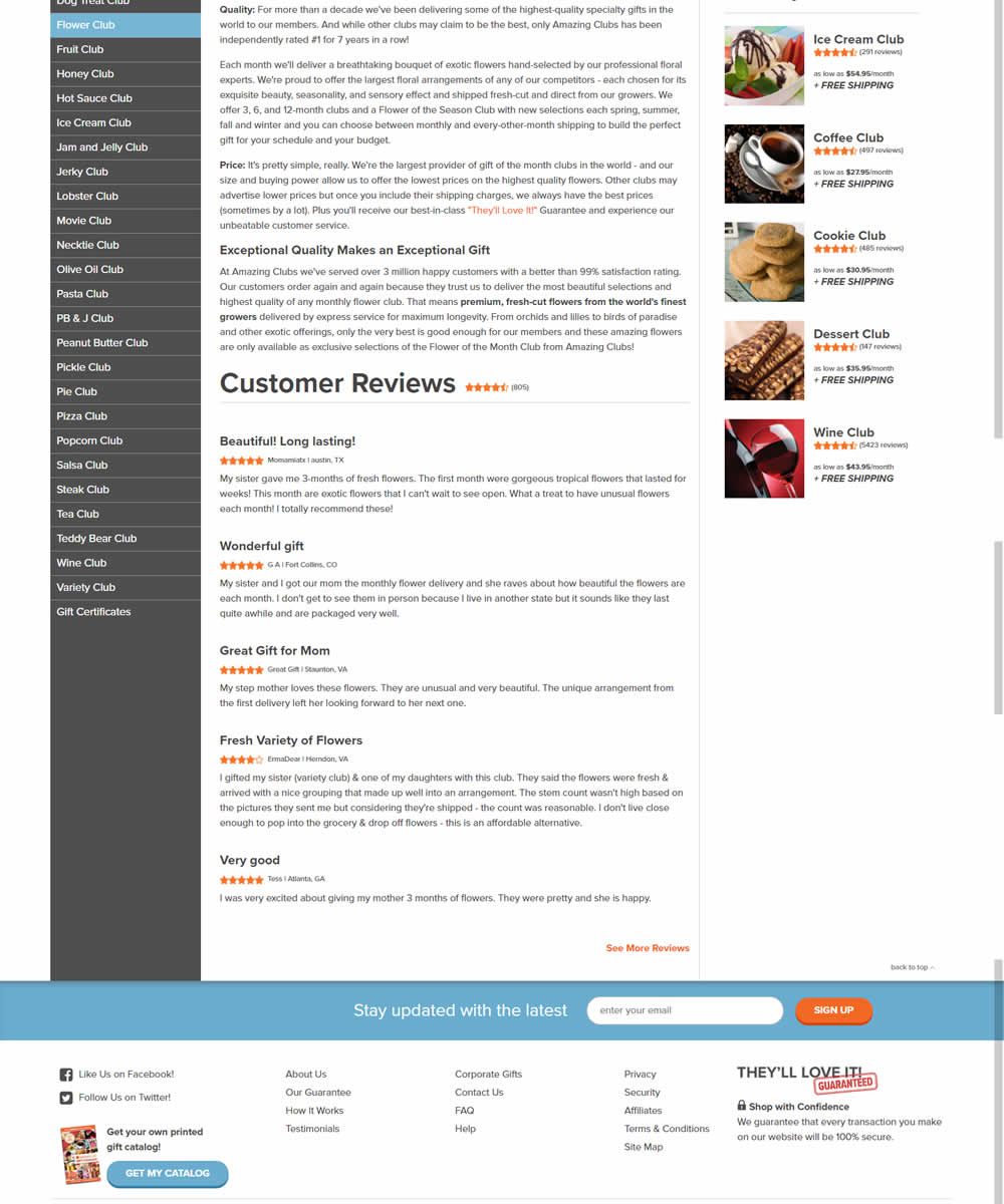
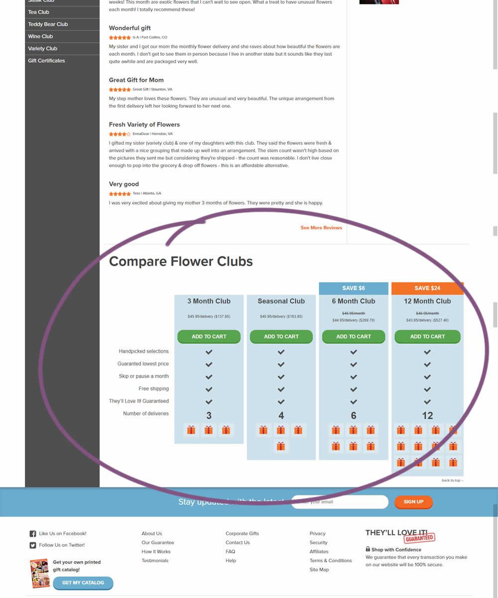
In this experiment, a comparison chart with various purchasing options was appended at the bottom of a product page.
Test #350 on
Expertinstitute.com
by  Ardit Veliu
Apr 29, 2021
Desktop
Content
X.X%
Leads
Ardit Tested Pattern #16: Welcome Mat - Partial On Expertinstitute.com

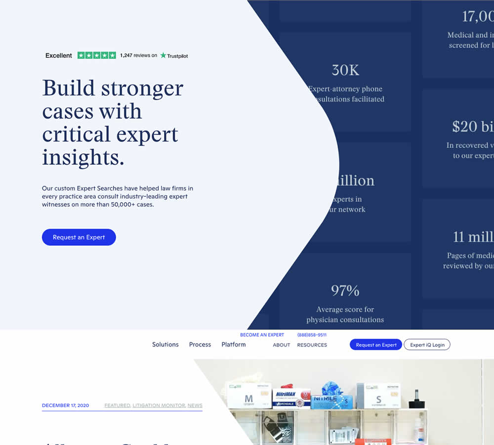
In this experiment, a lead generating section with a call to action (welcome mat) was appended at the top of article pages. Impact on lead generation was measured.
Test #349 on
Backstage.com
by  Stanley Zuo
Apr 27, 2021
Mobile
Global
X.X%
Sales
Stanley Tested Pattern #49: Above The Fold Call To Action On Backstage.com
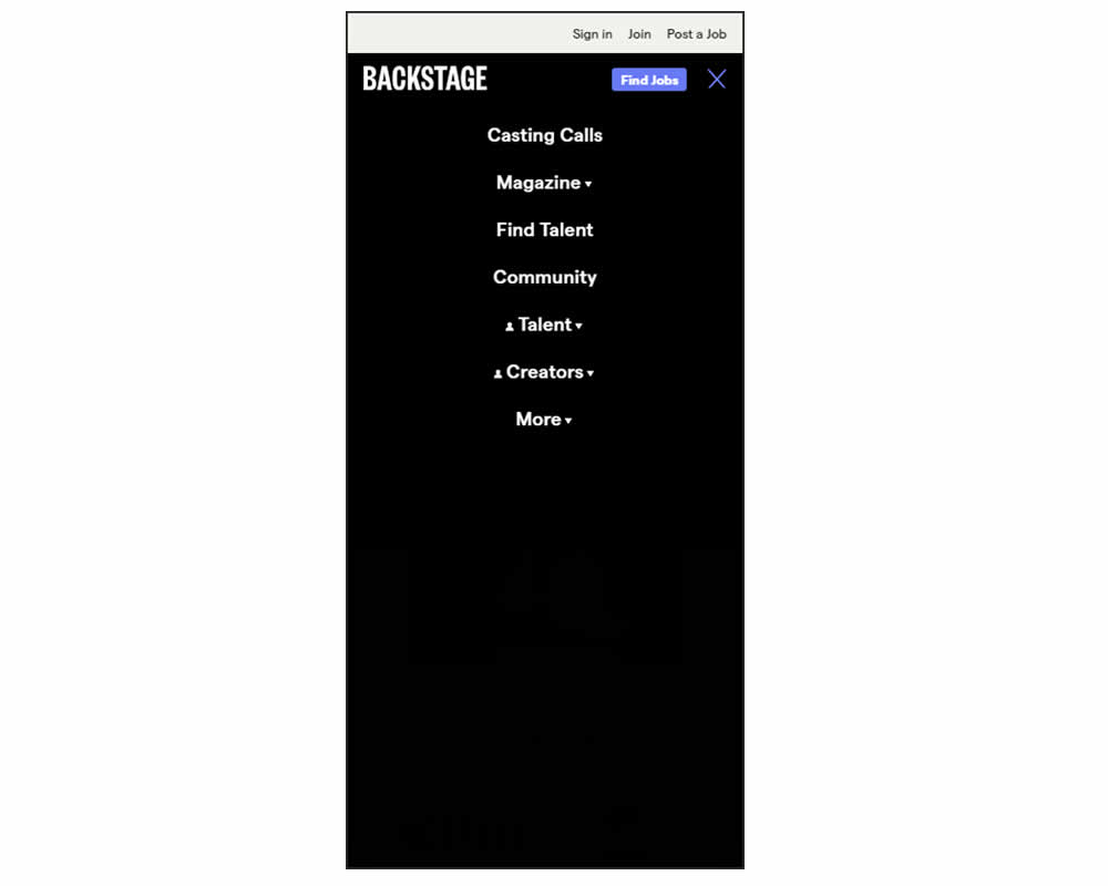
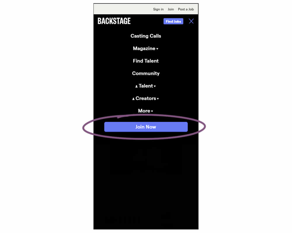
In this experiment, a simple "Join Now" button was added inside an expanded mobile navigation menu. Clicking the button would start a multiple step membership subscription process. Impact on subscription starts and final sales were tracked.
Test #348 on
Flukenetworks.com
by  Marika Francisco
Apr 22, 2021
Desktop
Home & Landing
X.X%
Progression
Marika Tested Pattern #97: Bigger Form Fields On Flukenetworks.com
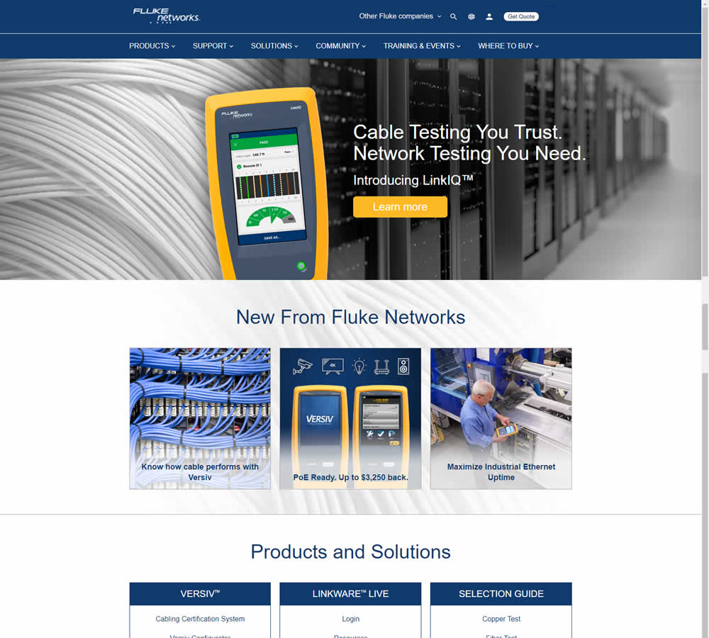
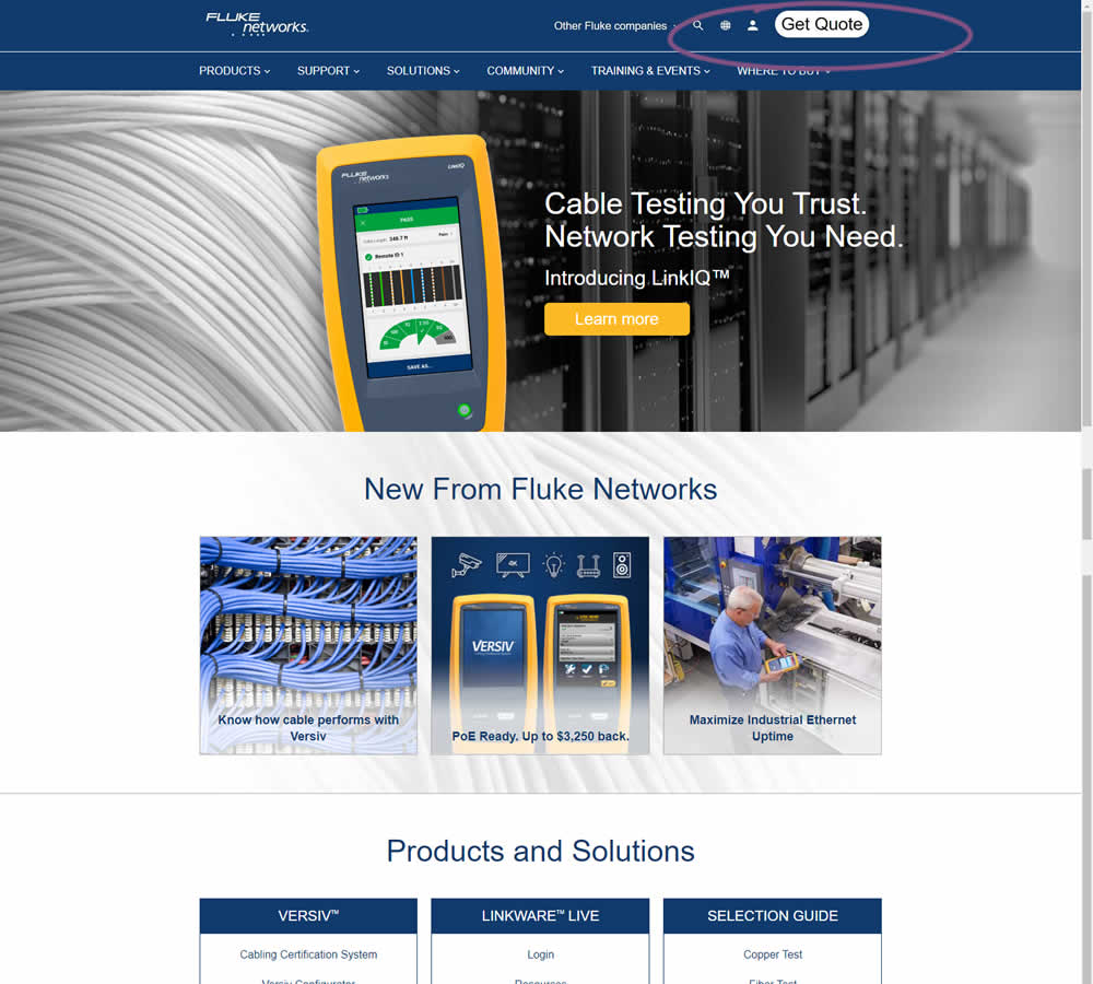
In this simple experiment, the size of the "Get Quote" button in the top navigation was increased.