All Latest 620 A/B Tests
MOST RECENT TESTS
Test #632 on
Online.metro-cc.ru
by  Andrey Andreev
Jan 30, 2026
Desktop
Mobile
Checkout
X.X%
Sales
Andrey Tested Pattern #65: Add More For Extra Incentive On Online.metro-cc.ru
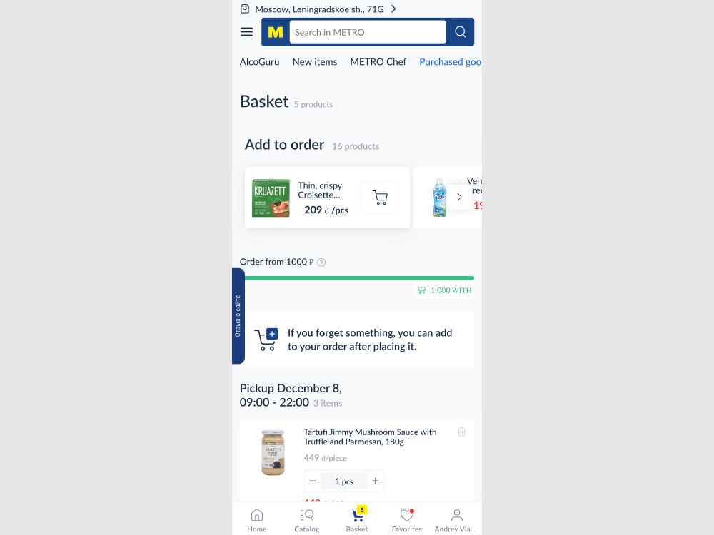
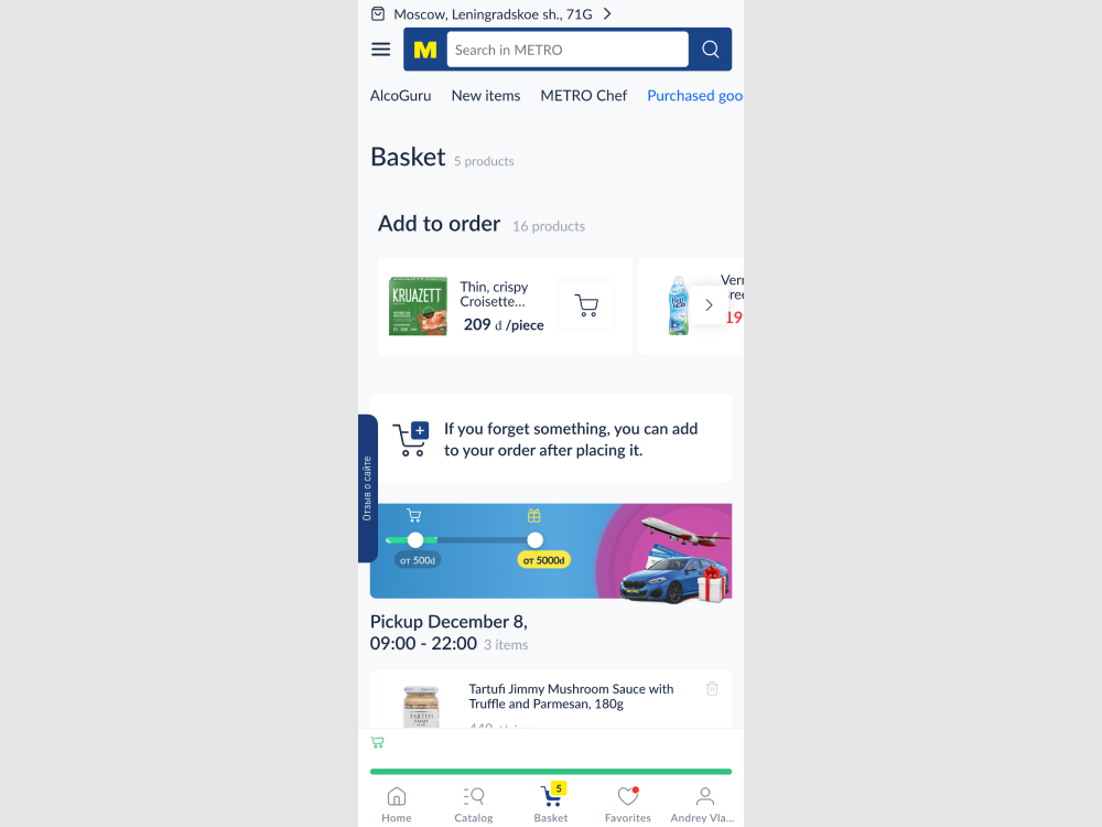
In this experiment, two changes were made to the checkout page: (1) the minimum basket size requirement was made more visible using a floating element, and (2) an additional threshold was introduced to encourage customers to add more items by offering a free gift at a higher spend level. The impact on sales was measured.
Which A Or B Actually Wins? Find Out Before You Test.
Members see every test result — the winners, the flat ones, and the losers — along with exact effects and sample sizes. Use it to estimate your tests and prioritize by probability, not gut feel. Start every experiment with the odds on your side.
Test #620 on
Online.metro-cc.ru
by  Andrey Andreev
Nov 24, 2025
Desktop
Product
X.X%
Sales
Andrey Tested Pattern #42: Countdown Timer On Online.metro-cc.ru
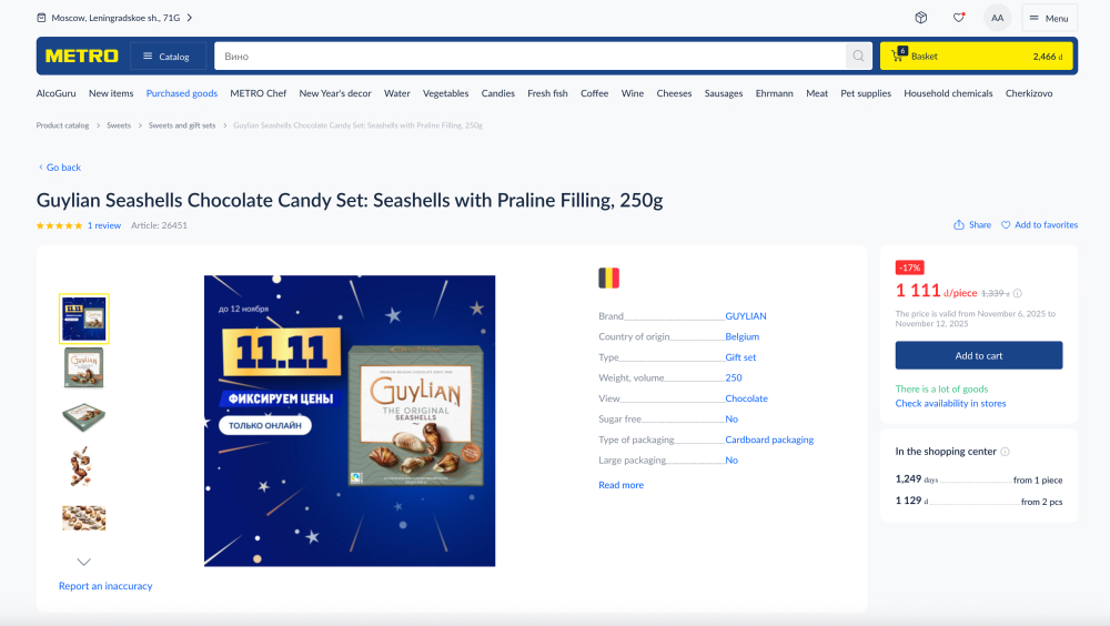

In this experiment, 96 hours before the end of a promotion, a countdown timer was displayed on the desktop with a 80/20 split. Also excluded new users. Impact on sales was measured.
Test #611 on
Finn.com
by  Maksim Meged
Sep 24, 2025
Desktop
Mobile
Listing
X.X%
Sales
Maksim Tested Pattern #114: Less Or More Visible Prices On Finn.com
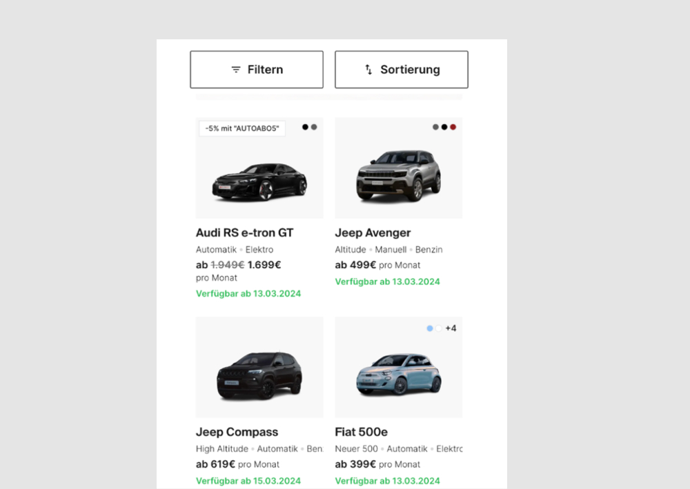
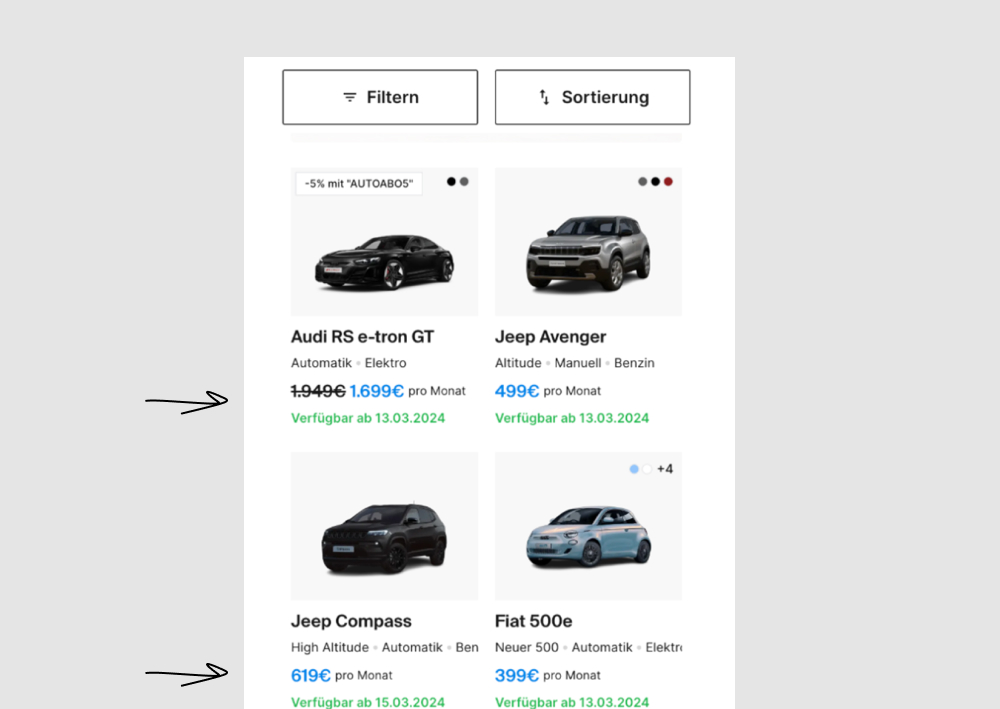
In this experiment, price was made more visible using size and a higher contrast color. Impact on progressions and bookings was measured.
Test #579 on
Jared.com
by  Craig Kistler
Feb 23, 2025
Mobile
Product
X.X%
Sales
Craig Tested Pattern #21: What It's Worth On Jared.com
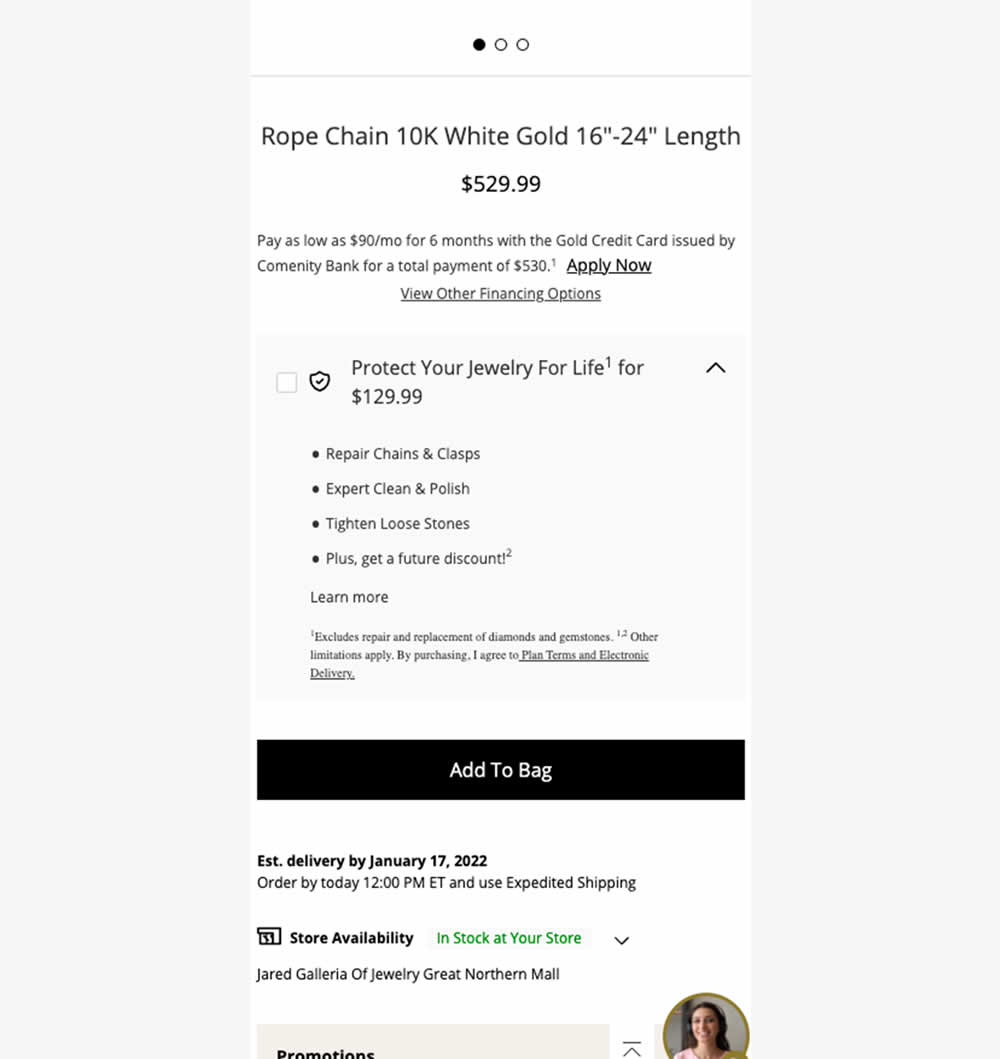
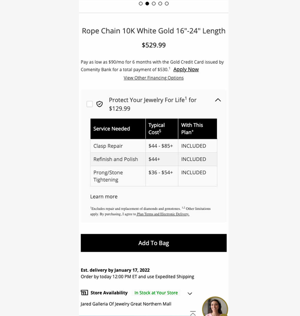
In this experiment, typical dollar values of typical coverages for an extended protection plan were shown. This ran on a product page of a jewelery site. Impact on on adds to cart, sales and uptake of the upsell was measured. Traffic split was 25/75.
Test #564 on
Hellostake.com
by  Louis Alston
Nov 26, 2024
Desktop
Mobile
Home & Landing
X.X%
Signups
Louis Tested Pattern #114: Less Or More Visible Prices On Hellostake.com


In this a/b test, the headline was changed to reflect pricing information (informing that trades are starting at $3). Impact on progression and signups was measured.
Test #560 on
Finn.com
by  Daria Kurchinskaia
Oct 22, 2024
Mobile
Desktop
Checkout
X.X%
Signups
Daria Tested Pattern #46: Pay Later On Finn.com
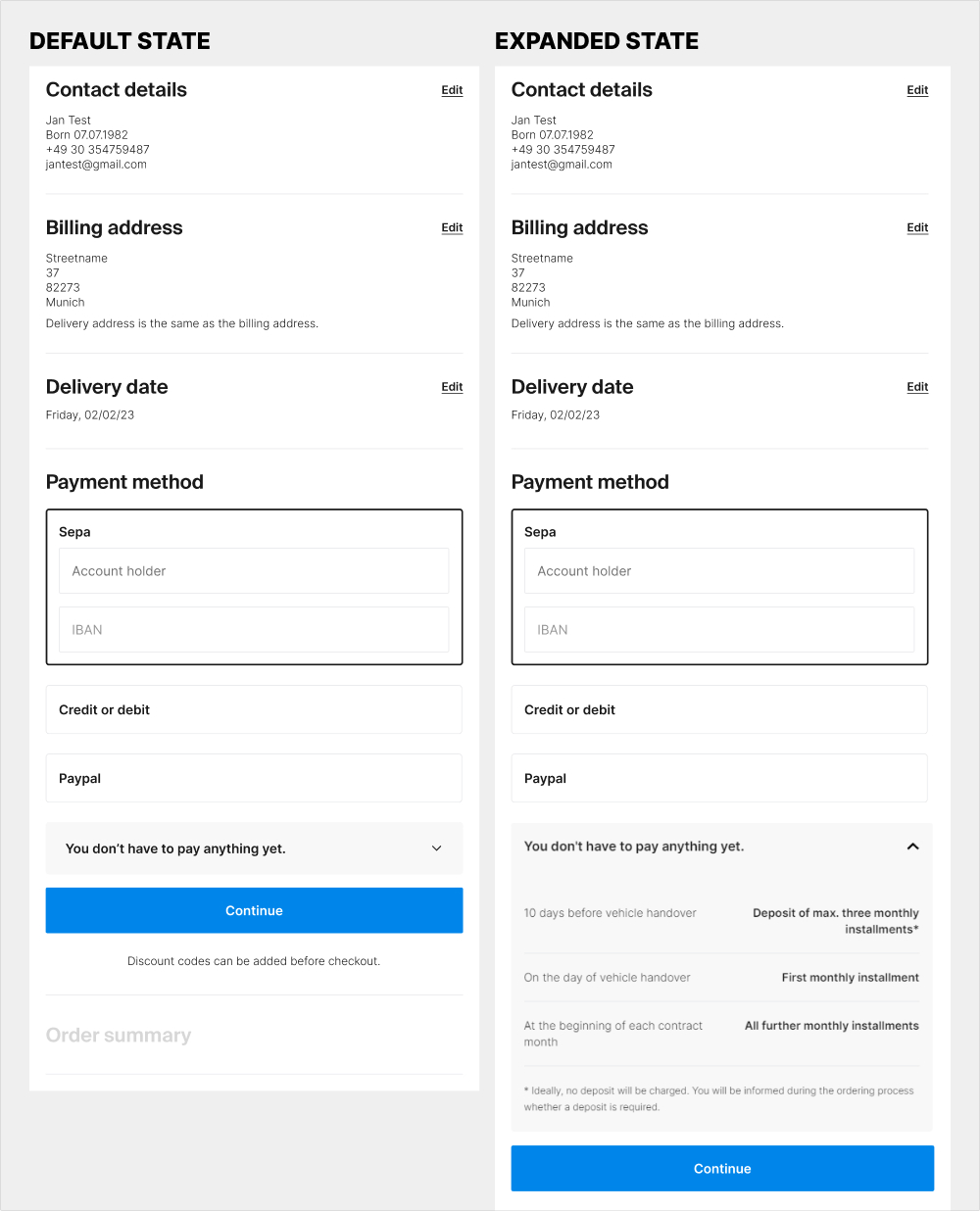
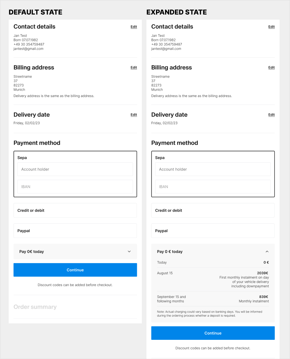
The idea of this experiment was at least two fold. 1) the variation attempted to clarify that there is no payment today with the copy "Pay 0€ today" on the collapsed state of the payment amount. 2) clarify the payment terms with exact dates and amounts for future payments.
Test #556 on
Snocks.com
by  Melina Hess
Oct 08, 2024
Mobile
Product
X.X%
Sales
Melina Tested Pattern #65: Add More For Extra Incentive On Snocks.com
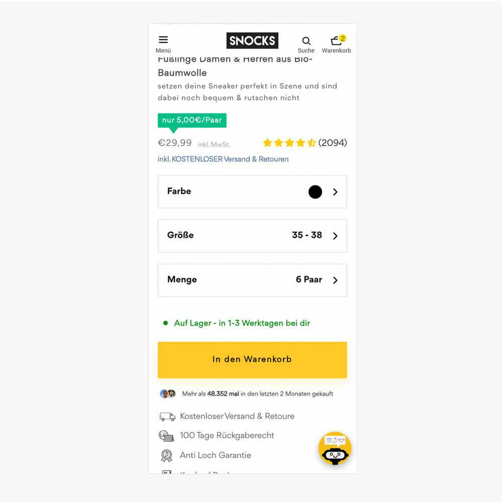
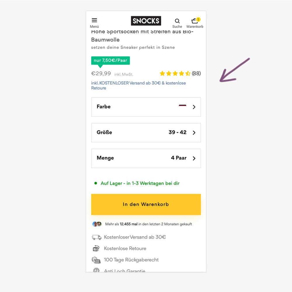
In this experiment, free shipping was a/b tested against free shipping with a 30€ purchase or higher. Hence, in the variation, customers needed to reach a cart amount total in order to be eligible for the free shipping.
Test #548 on
Livefresh.de
by  Melina Hess
Aug 13, 2024
Desktop
Mobile
Product
X.X%
Sales
Melina Tested Pattern #17: Least Or Most Expensive First On Livefresh.de
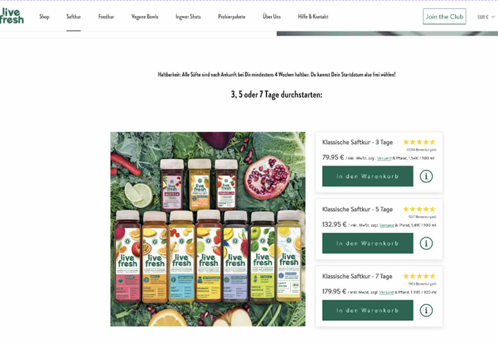
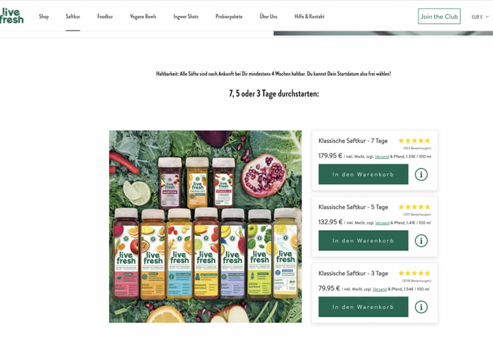
In this product landing page experiment, the plan sort order was rearranged. In the control it was sorted from least expensive to most expensive. In the variation, the plans were shown as most expensive first. Impact on sales and revenue was measured.
Test #531 on
Aboalarm.de
by  Katharina Lay
May 03, 2024
Desktop
Mobile
Checkout
X.X%
Sales
Katharina Tested Pattern #128: Standard Or Superscript Price Format On Aboalarm.de
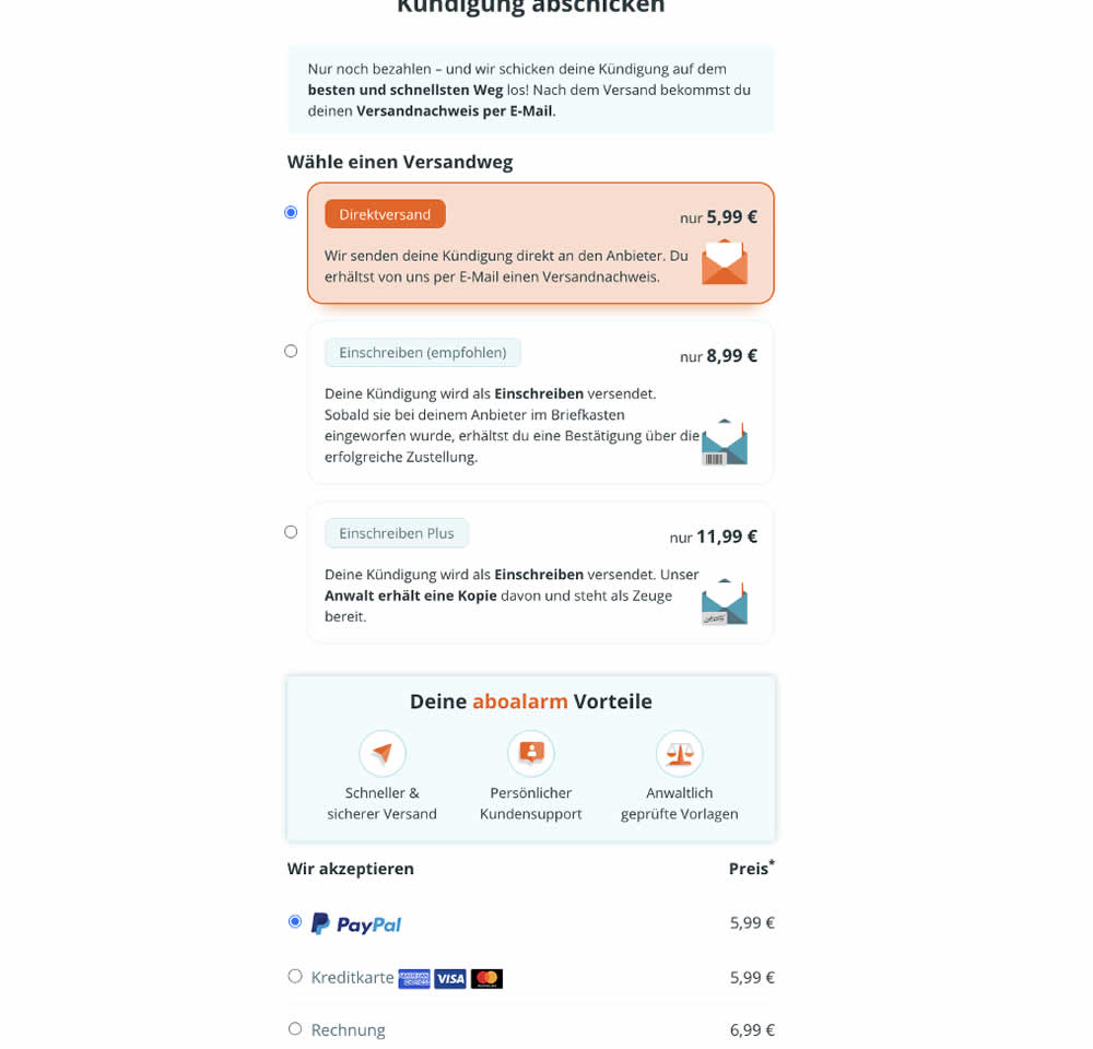
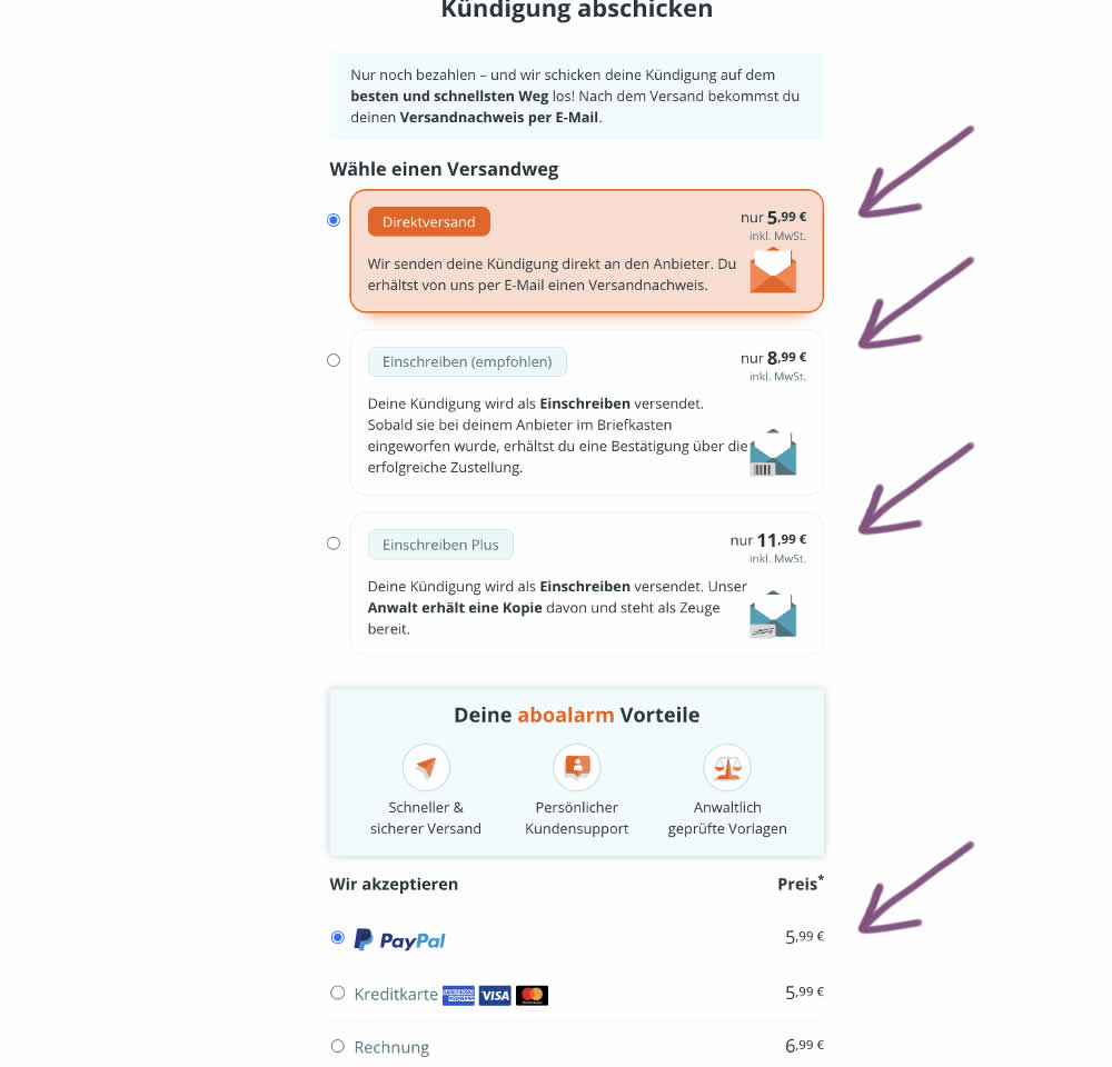
In this experiment, the font of the euro cents amount was made smaller. Additional copy was also added underneath the price reinforcing that tax was already included in the price. Impact on transactions was measured.
Test #515 on
by  Jakub Linowski
Jan 31, 2024
Desktop
Mobile
Home & Landing
X.X%
Sales
Jakub Tested Pattern #69: Autodiscounting
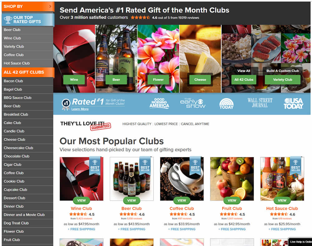
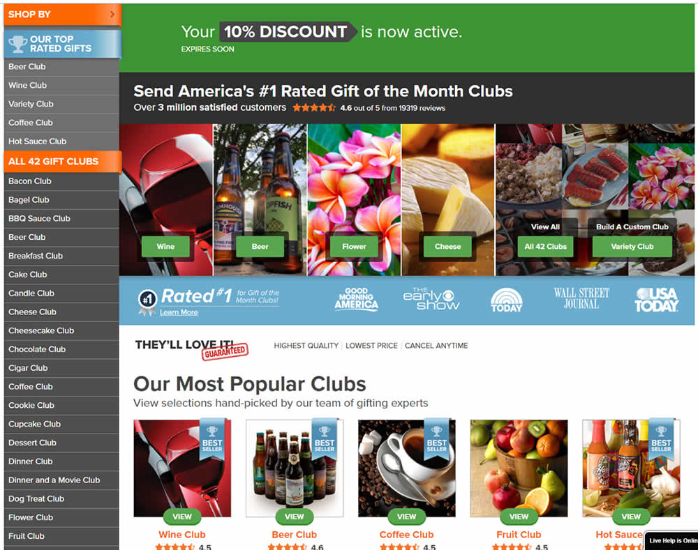
In this experiment, people who saw an offer (in an email or popup) would see a more visible site wide reinforcement of their earned discount being active. In the control, the discount was only shown during checkout. In the variation, it was shown throughout the web site on the homepage and product detail pages.
Test #512 on
Snocks.com
by  Melina Hess
Jan 17, 2024
Mobile
Product
X.X%
Sales
Melina Tested Pattern #65: Add More For Extra Incentive On Snocks.com
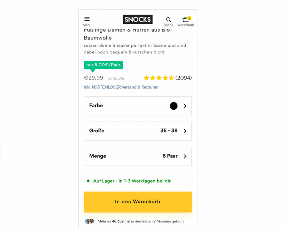
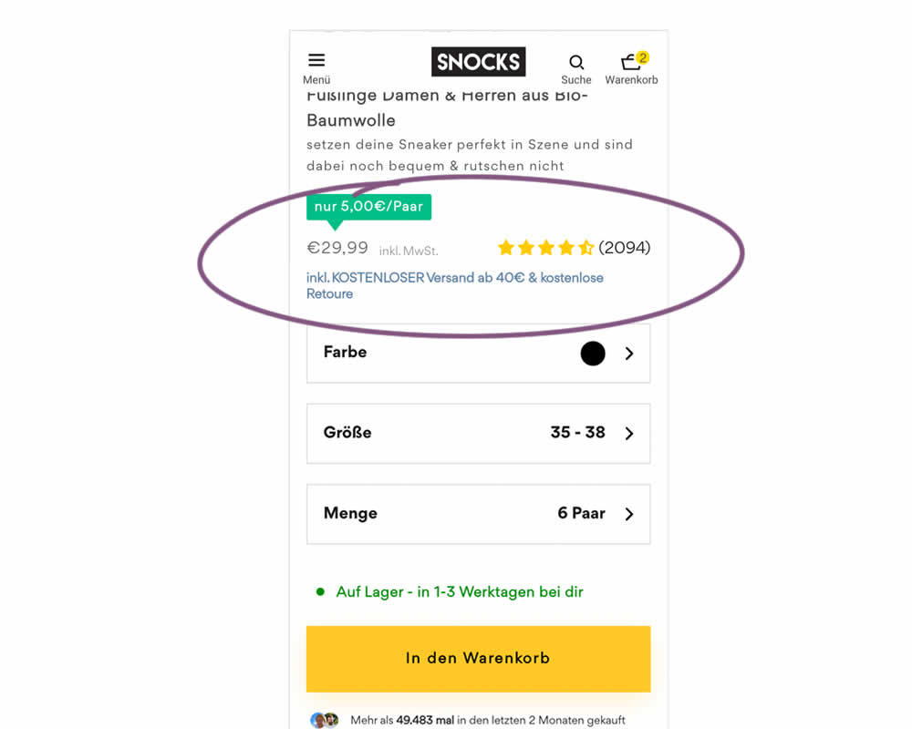
In this experiment, free shipping was a/b tested against free shipping with a 40€ purchase or higher. Hence, in the variation, customers needed to reach a cart amount total in order to be eligible for the free shipping.
Test #504 on
Volders.de
by Michal Fiech
Nov 17, 2023
Desktop
Mobile
Pricing
X.X%
Revenue
Michal Tested Pattern #113: More Or Fewer Plans On Volders.de
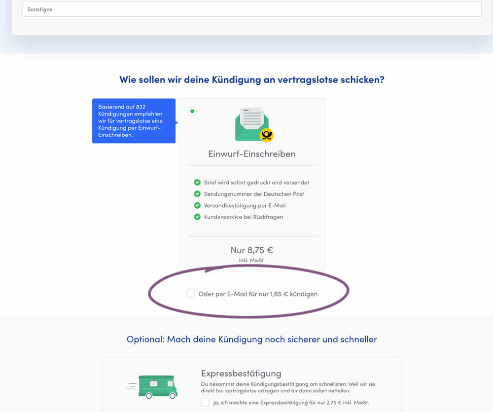
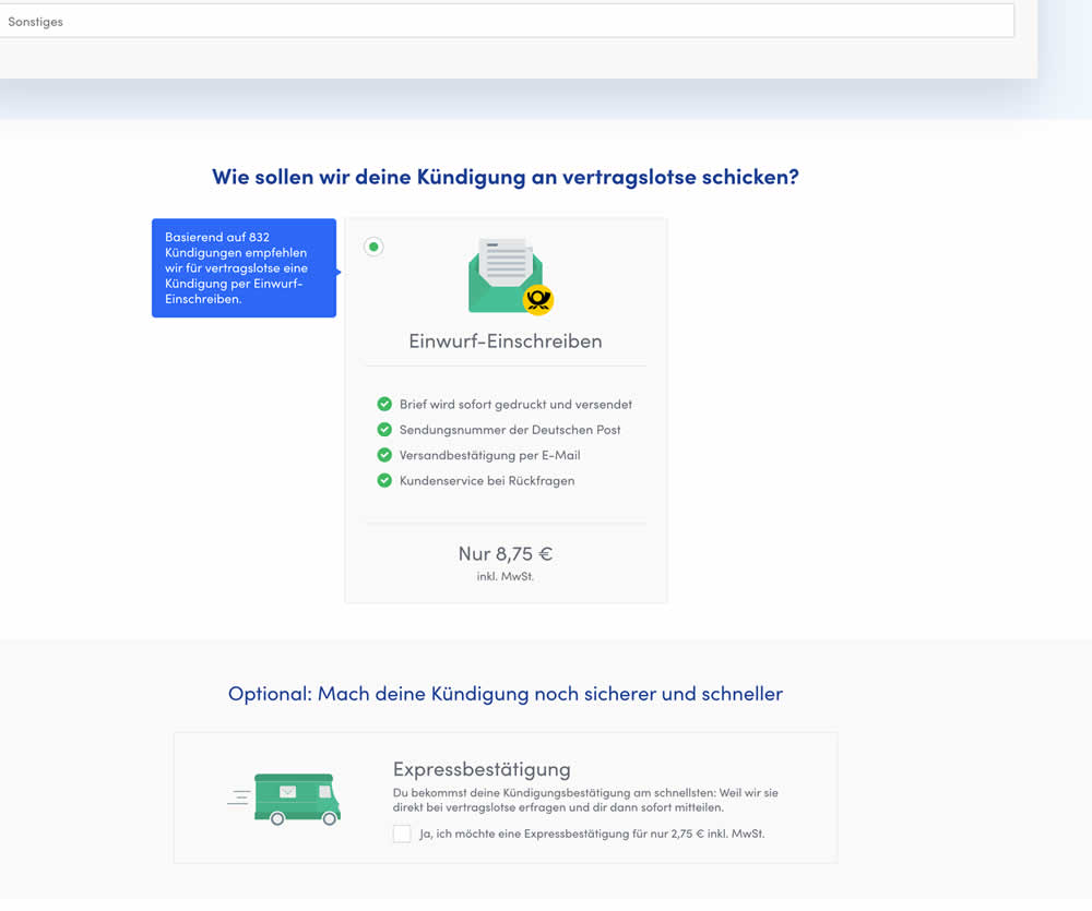
In this experiment, the cheapest pricing plan was removed from a set of 2 options. This only left the most expensive pricing plan as the option. Impact on sales and revenue was measured.
Test #493 on
by  Jakub Linowski
Sep 19, 2023
Desktop
Mobile
Product
X.X%
Sales
Jakub Tested Pattern #69: Autodiscounting
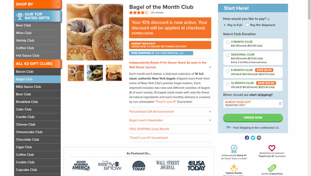
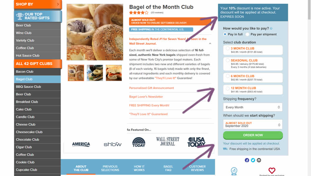
This experiment was technically a larger multi-change one that ran on product detail pages. The control showed an automatically applied coupon (for people opening up targeted emails with the discount). The variation attempted to make this better with the following changes:
- The discount message shifted closer towards the price / product selection (above the buy box)
- Removal of sale discount amounts and messages tied to longer durations (6 and 12 month duration)
- Reinforcing that the actual discount will be calculated further on checkout
Test #489 on
by  Jakub Linowski
Aug 14, 2023
Desktop
Mobile
Product
X.X%
Sales
Jakub Tested Pattern #78: Tags, Badges And Structured Information
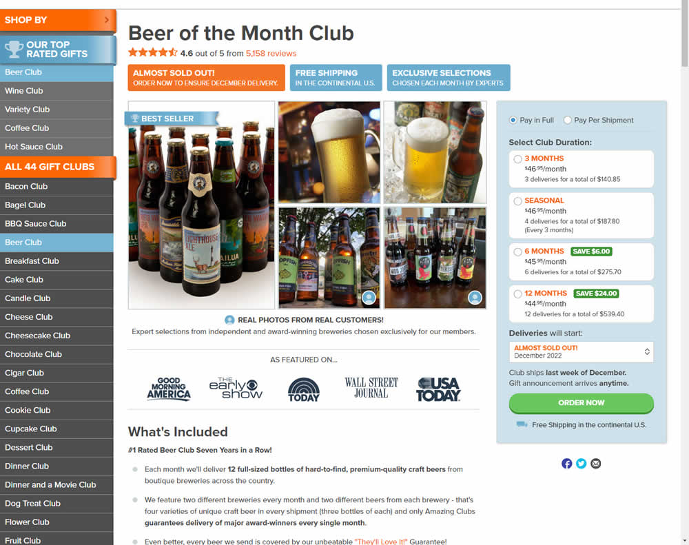
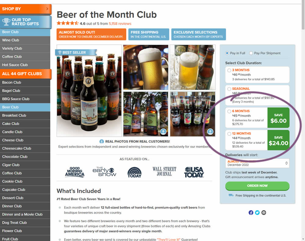
In this experiment, the size of a saving amount badge was enlarged. Instead of typical badge, the variation stretched the height of the saving information to the full height of the duration selector. The font size was also increased. Impact on overall sales was measured.
Test #478 on
Estilomma.com
by  José Álvarez
Jun 14, 2023
Mobile
Global
X.X%
Sales
José Tested Pattern #130: Less Or More Visible Offer Pages On Estilomma.com
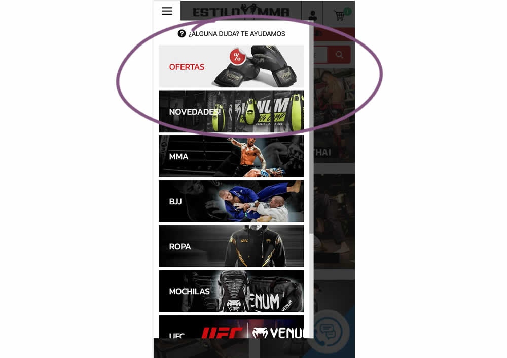
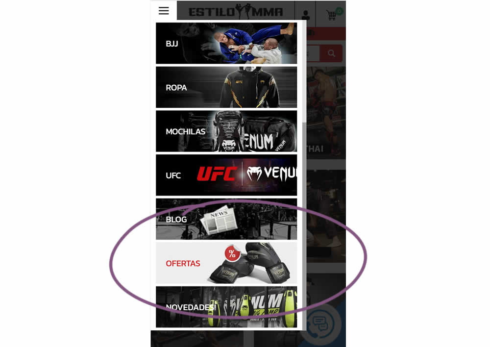
In this experiment, an offers page was shifted all the way down inside an expanded mobile navigation. The control showed it at the very top. The variation showed it at the bottom. (Note that the screen shot shows an already scrolled navigation - in the initial view, users would not be able to see the discount page right away, as it required some scrolling). Impact on overall sales was measured.
Test #463 on
Volders.de
by  Daria Kurchinskaia
Mar 25, 2023
Desktop
Checkout
X.X%
Sales
Daria Tested Pattern #115: Pricing Comparison Table On Volders.de
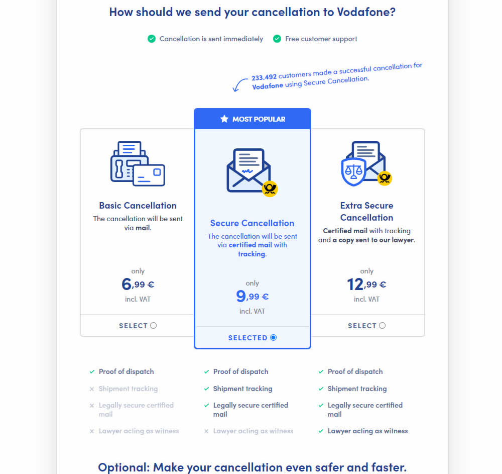
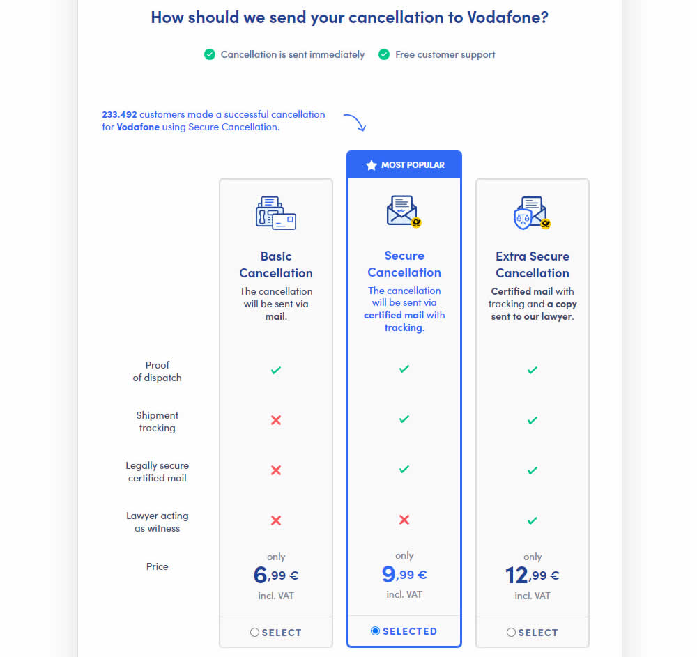
This experiment explored a pricing layout that enabled more feature comparisons. It also conveyed more clearly which features were missing between plans. The test has been inspired by this Netflix experiment. Impact on sales was measured.
Test #462 on
by  Jakub Linowski
Mar 24, 2023
Desktop
Mobile
Product
X.X%
Sales
Jakub Tested Pattern #128: Standard Or Superscript Price Format
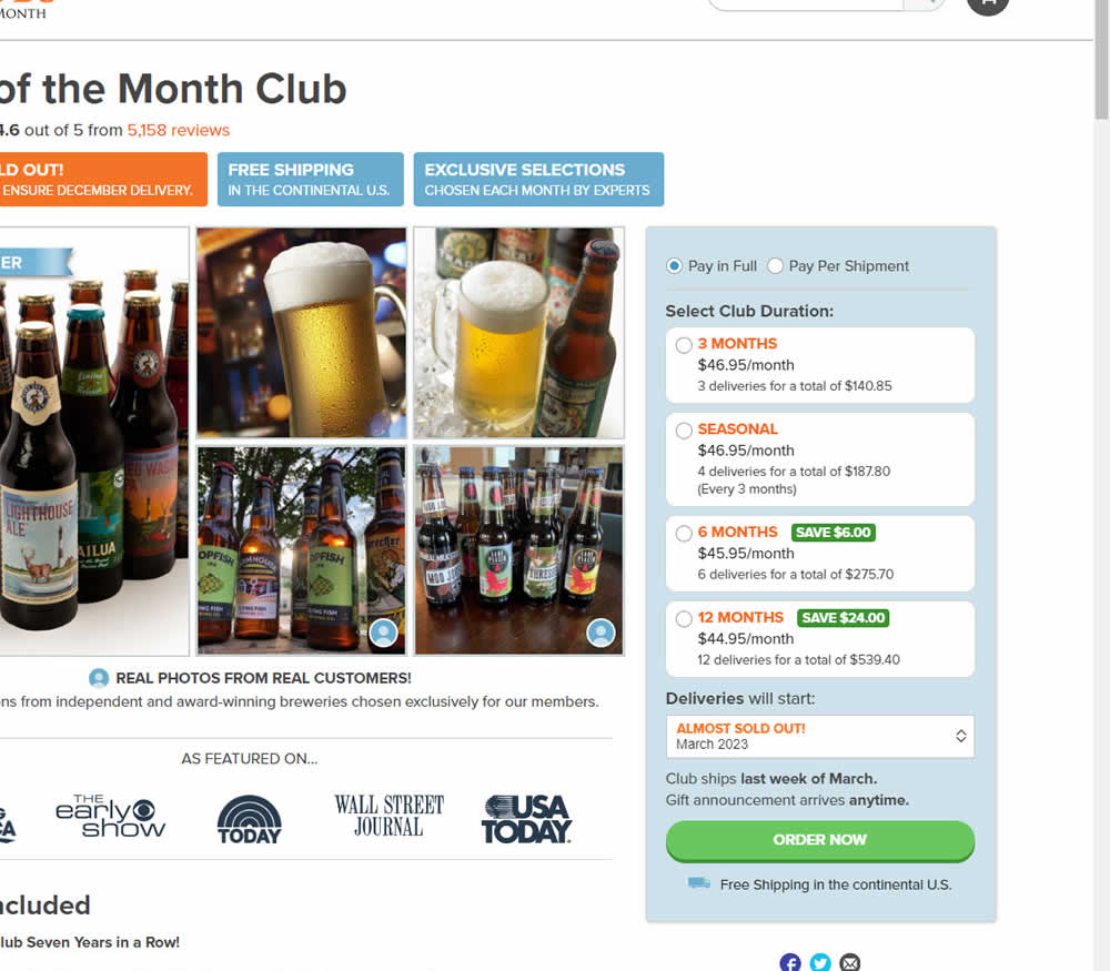
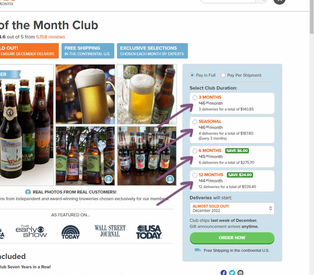
In this experiment, standard $ signs and cents were formatted into a smaller superscript. Impact on add-to-cart and sales was measured.
Test #448 on
Zapimoveis.com.br
by  Vinicius Barros Peixoto
Dec 30, 2022
Desktop
Mobile
Product
X.X%
Leads
Vinicius Tested Pattern #21: What It's Worth On Zapimoveis.com.br

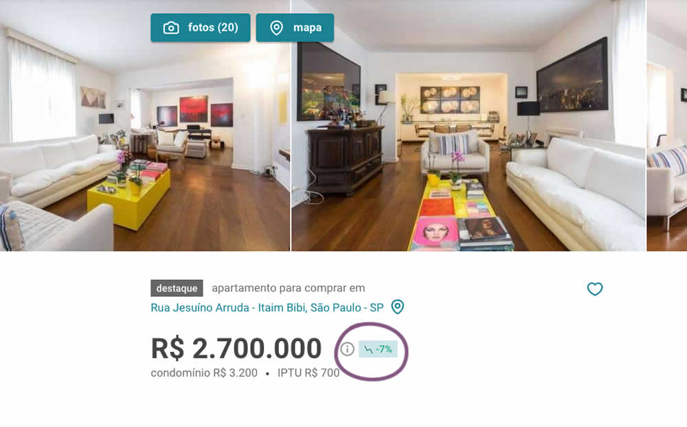
In this experiment, the B variation showed the relative discount in price from within the most recent 12 months as a percentage point. A tooltip was also shown which explained this message on hover.
Test #434 on
Learnwithhomer.com
by  Stanley Zuo
Sep 30, 2022
Mobile
Signup
X.X%
Signups
Stanley Tested Pattern #66: Complementary Upsell On Learnwithhomer.com
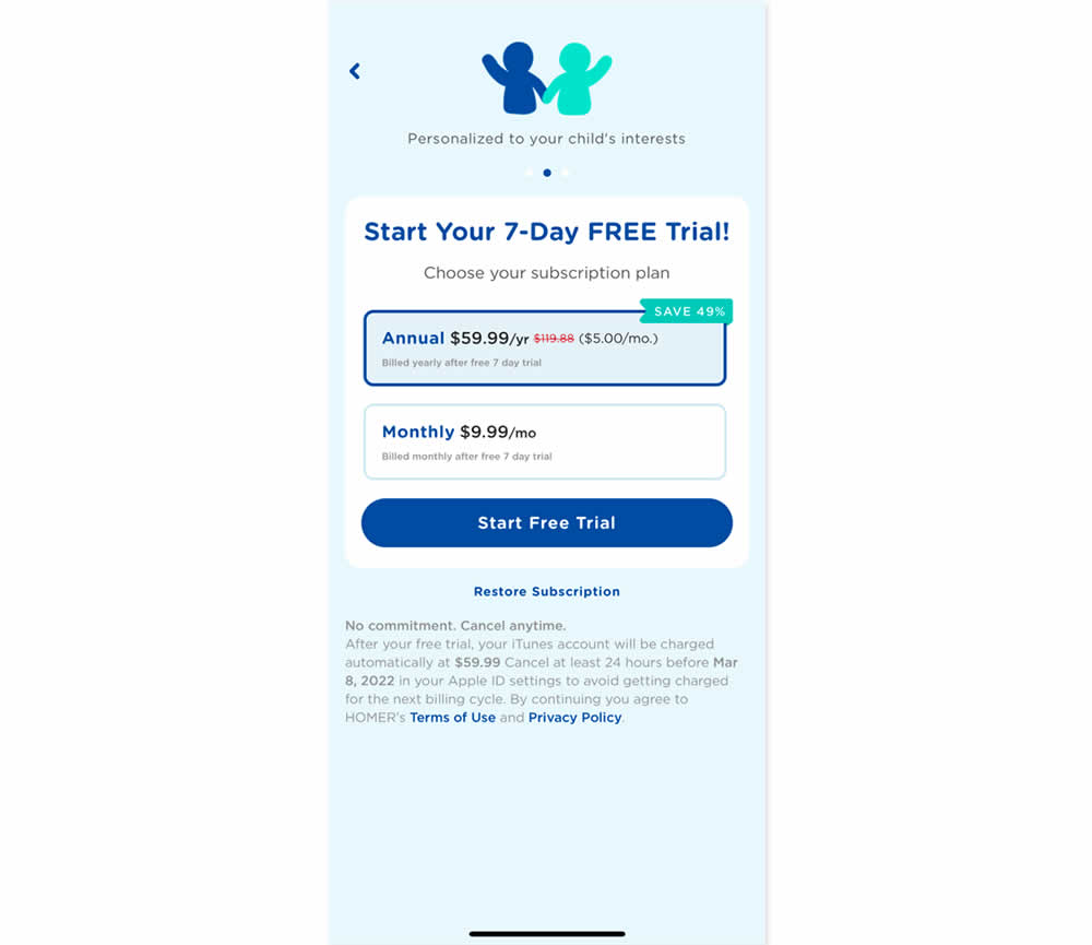
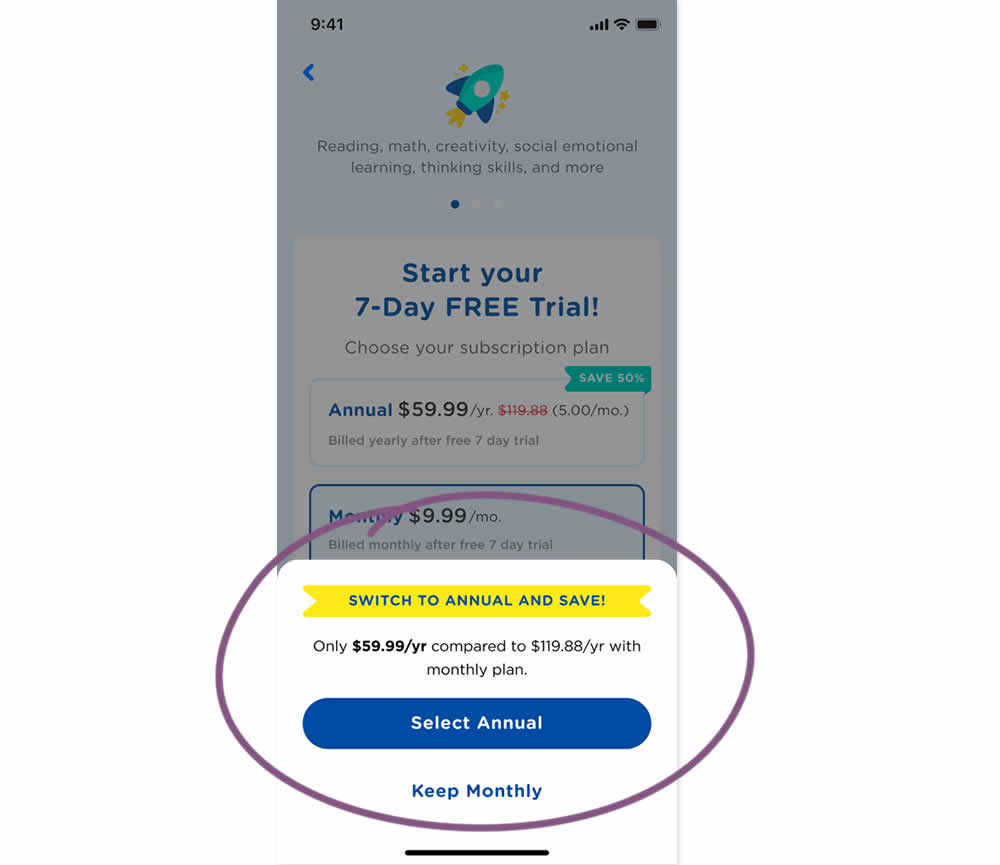
In this experiment, an upsell modal appeared during a signup funnel. In the variation, if users did not select a monthly plan, they were nudged to an annual one. Impact on overall and annual signups was measured.
Test #431 on
Volders.de
by  Daria Kurchinskaia
Sep 23, 2022
Desktop
Mobile
Pricing
X.X%
Sales
Daria Tested Pattern #21: What It's Worth On Volders.de
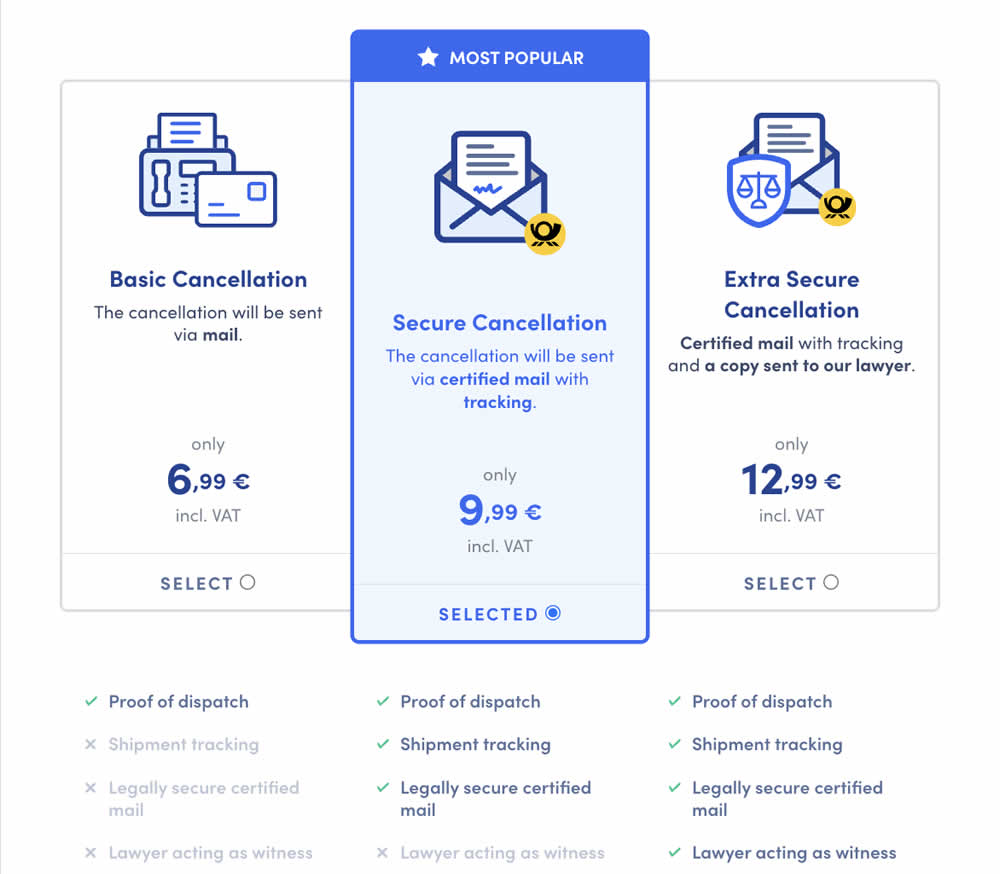
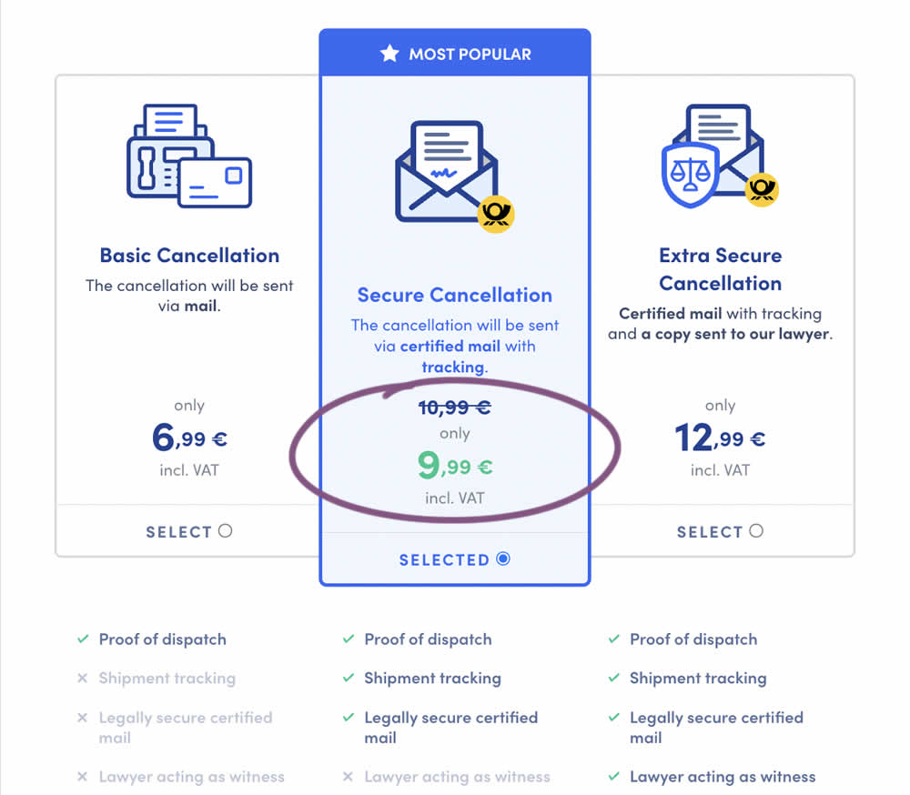
In this experiment, a historically higher price point was added as a crossed out anchor. The control only showed the current price. The variation showed the current price with the higher price crossed out. Impact on sales was measured.