All Latest 620 A/B Tests
MOST RECENT TESTS
Test #420 on
Designlab.com
by  Daniel Shapiro
Jul 12, 2022
Desktop
Mobile
Product
X.X%
Leads
Daniel Tested Pattern #115: Pricing Comparison Table On Designlab.com
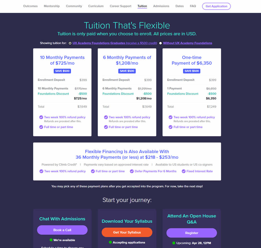
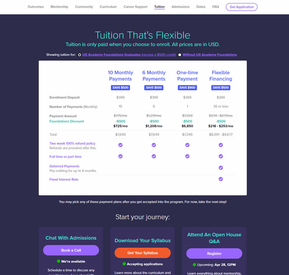
In this experiment, pricing plans were laid out horizontally for easier comparison. In the variation, most of the plan benefits, features and differences were also referenced using a single lable that was left-aligned. The idea was to make the variables aligned and therefore more comparable.
This pricing table appeared at the bottom of a long design program landing page. Impact on leads and applications was measured.
Which A Or B Actually Wins? Find Out Before You Test.
Members see every test result — the winners, the flat ones, and the losers — along with exact effects and sample sizes. Use it to estimate your tests and prioritize by probability, not gut feel. Start every experiment with the odds on your side.
Test #413 on
by  Jakub Linowski
May 26, 2022
Desktop
Mobile
Shopping Cart
X.X%
Sales
Jakub Tested Pattern #114: Less Or More Visible Prices
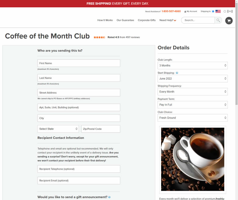
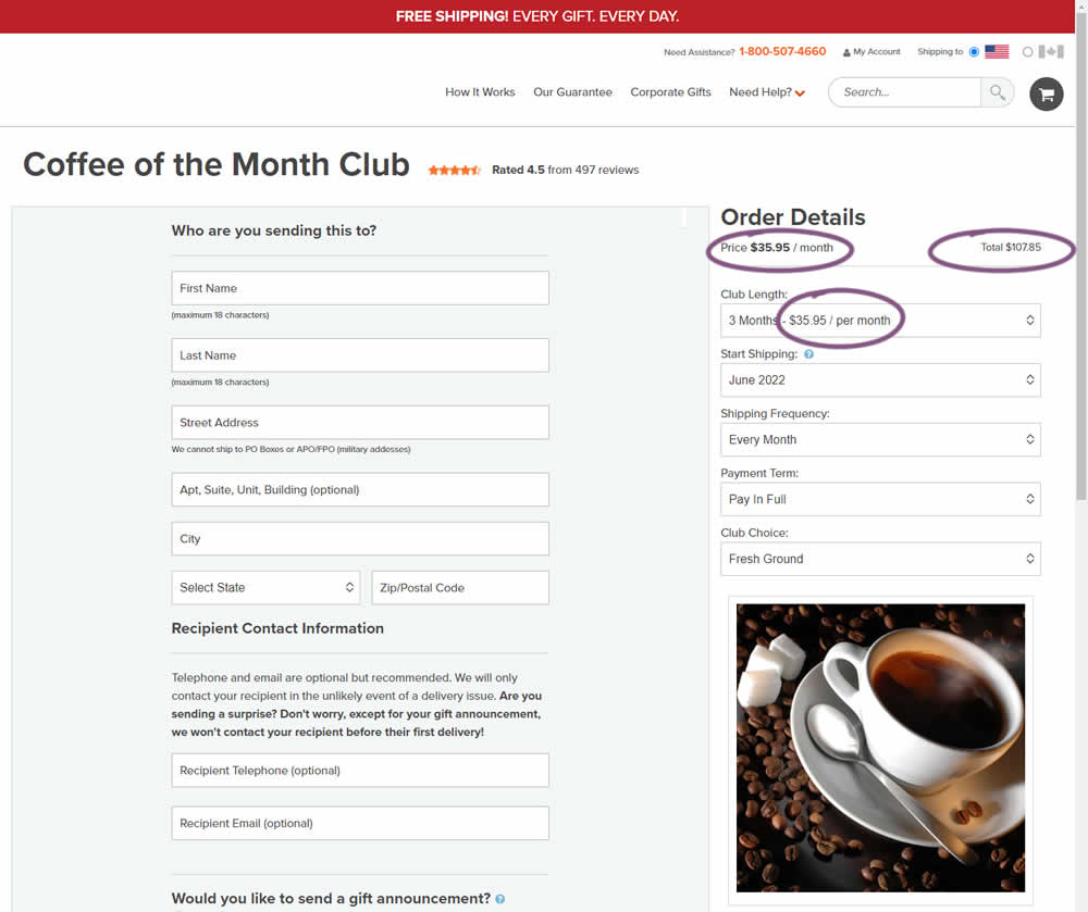
Should prices be displayed during an editing state on an add-to-cart screen (after adding-to-cart from a product detail page)? In this experiment, club pricing was added and shown in three areas after customers clicked on a small "edit details" links. The control did not have this pricing information (which was only shown on a product detail screen before).
Test #408 on
by  Jakub Linowski
Apr 29, 2022
Desktop
Mobile
Product
X.X%
Sales
Jakub Tested Pattern #67: Currency & Taxes
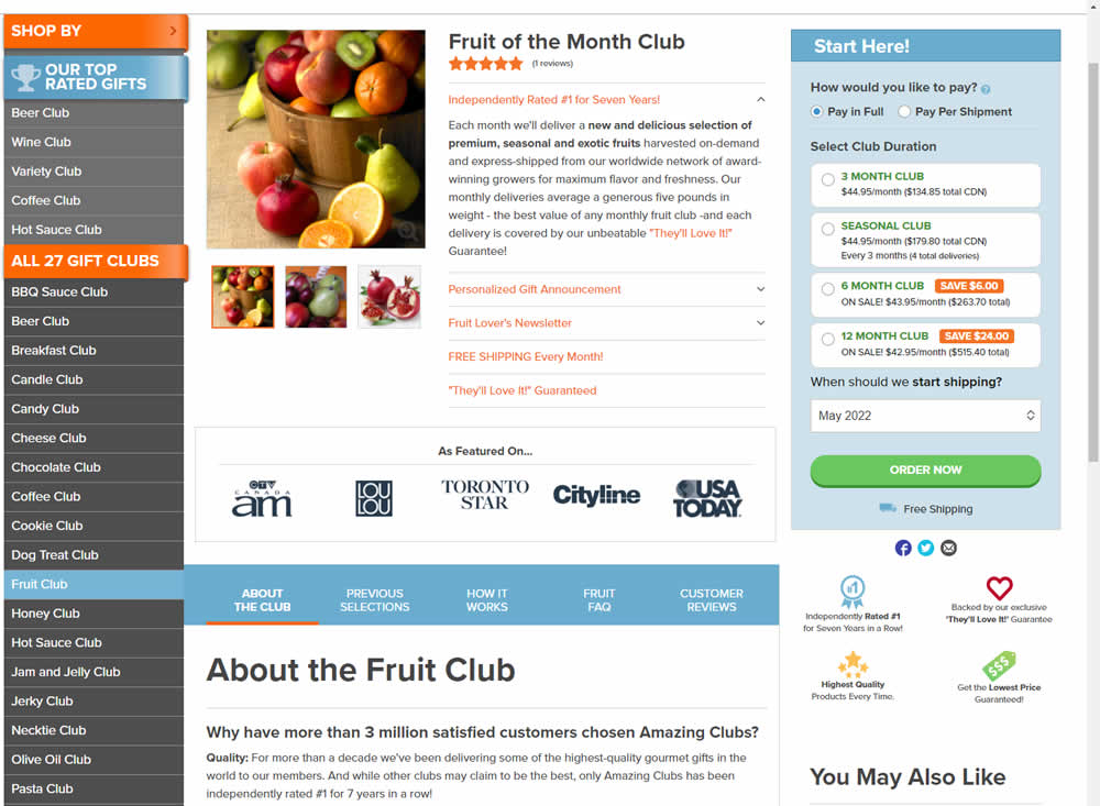
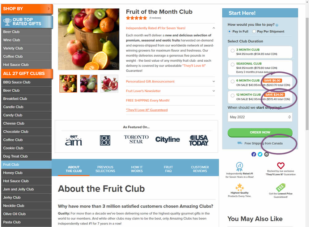
Here is a very simple experiment where CDN currency copy was appended to prices being shown on a Canadian ecommerce site. Additional copy ("from Canada") was appended to an existing shipping message.
Test #407 on
Snocks.com
by  Melina Hess
Apr 22, 2022
Desktop
Mobile
Product
X.X%
Sales
Melina Tested Pattern #125: Unit Prices On Snocks.com
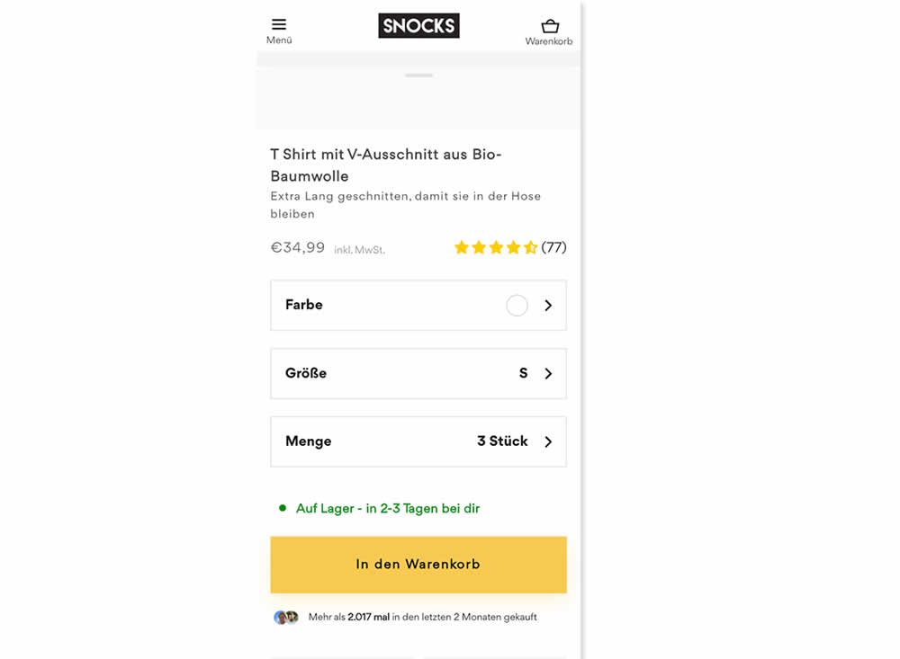
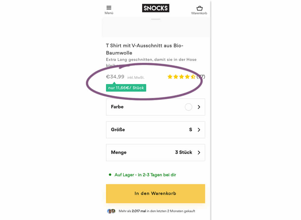
Here is an experiment with an added "price per pair" in the context of products with multiple items (packs).A high contrast badge-like copy was appended underneath the price which translates to "only $X per item". Impact on sales was measured.
Test #406 on
Chaos.com
by  Velin Penev
Apr 12, 2022
Desktop
Mobile
Product
X.X%
Sales
Velin Tested Pattern #112: Lower Price Frames On Chaos.com
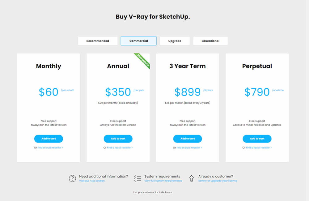
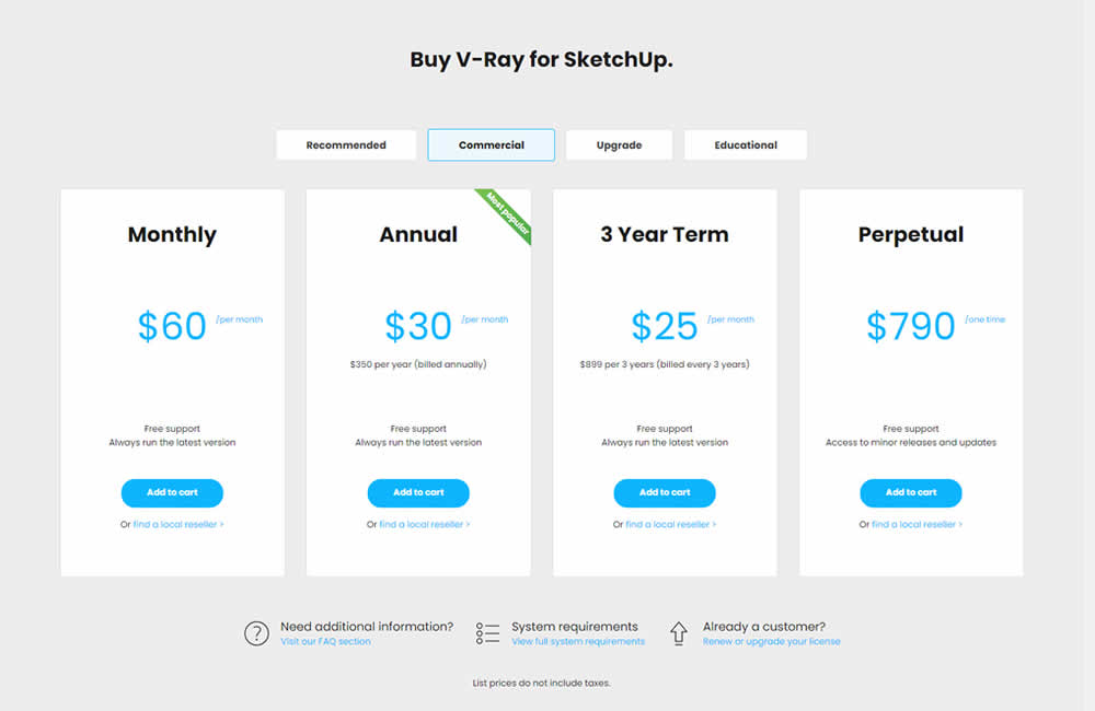
In this experiment, the pricing of three software plans was consistently framed into a more comparable monthly context. Whereas the control version only showed the total prices for each plan, the variation showed both the total and monthly prices. Impact on sales was measured.
Test #394 on
Chaos.com
by  Velin Penev
Jan 29, 2022
Desktop
Product
X.X%
Sales
Velin Tested Pattern #113: More Or Fewer Plans On Chaos.com
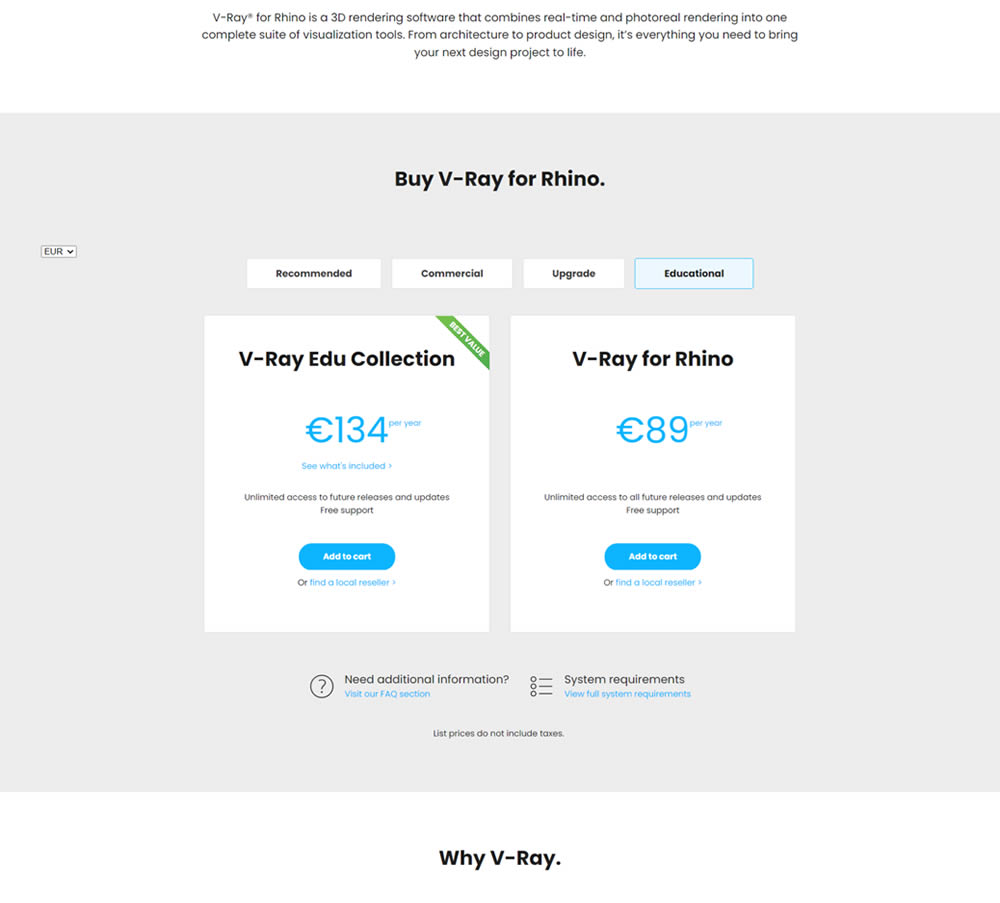
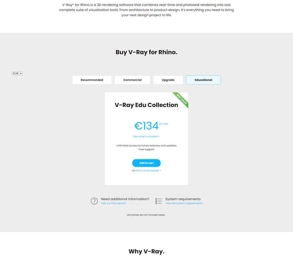
In this experiment, a two plan pricing plan (standalone product with a higher collection set) was tested against a single plan one (only a collection set). Impact on clicks and total sales was measured.
Test #393 on
Snocks.com
by  Melina Hess
Jan 19, 2022
Mobile
Shopping Cart
X.X%
Sales
Melina Tested Pattern #1: Remove Coupon Fields On Snocks.com
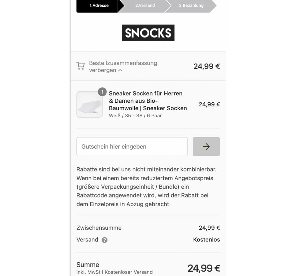
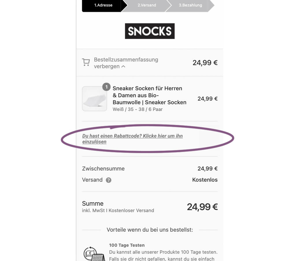
This experiment replaced a visible coupon field with a dynamic text link that would initially hide the form field. Only after clicking the text link would the coupon form field appear. The translation from German is "Do you have a coupon code? Click here to apply". Impact on completed transactions was measured.
Test #386 on
Learnwithhomer.com
by  Stanley Zuo
Nov 29, 2021
Desktop
Pricing
X.X%
Sales
Stanley Tested Pattern #112: Lower Price Frames On Learnwithhomer.com
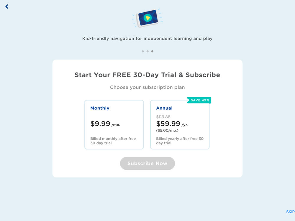
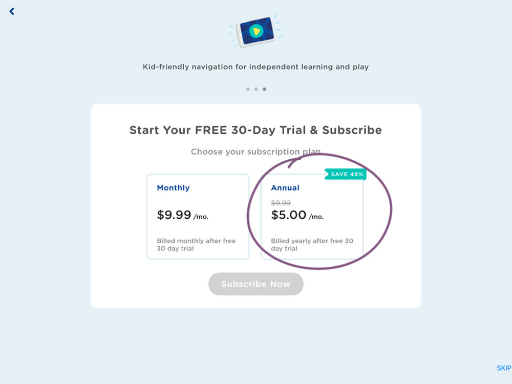
In this experiment, the annual plan was standardized and framed in a monthly price context (during the iOS signup flow). This made the annual plan more comparable to the monthly plan price. Impact on overall sales and annual plan sales was measured.
Test #379 on
Learnwithhomer.com
by  Stanley Zuo
Oct 15, 2021
Mobile
Pricing
X.X%
Sales
Stanley Tested Pattern #112: Lower Price Frames On Learnwithhomer.com
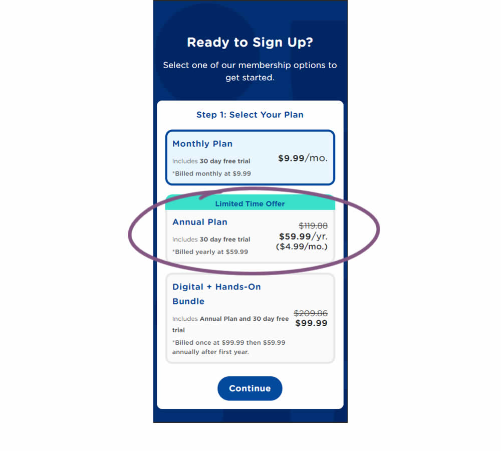
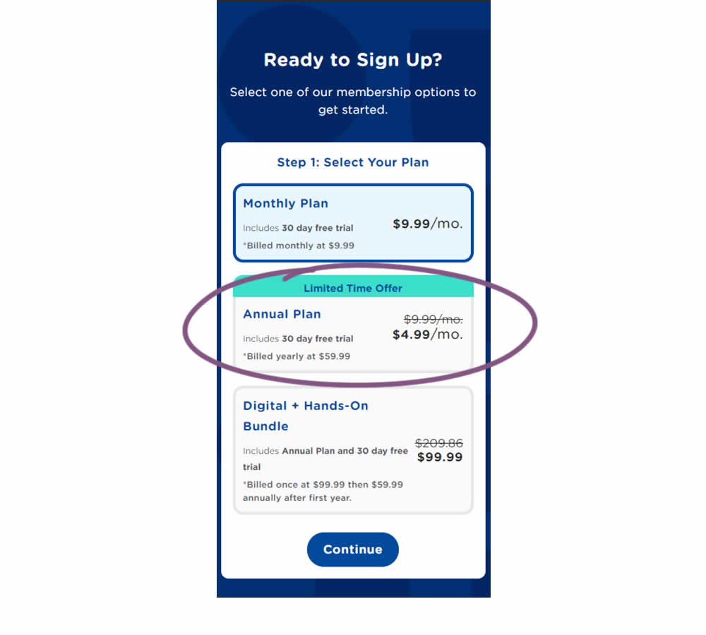
In this experiment, the annual plan was standardized and framed in a monthly price context. This was more comparable with the monthly plan price above. Please also note that the annual billing price was also kept and clearly stated. Impact on overall sales and annual plan sales was measured.
Test #361 on
Chaosgroup.com
by  Velin Penev
Jun 22, 2021
Desktop
Product
X.X%
Sales
Velin Tested Pattern #49: Above The Fold Call To Action On Chaosgroup.com
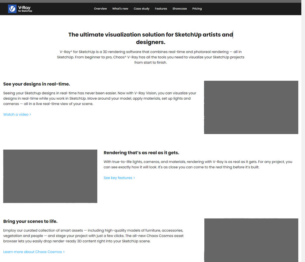
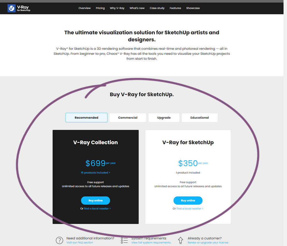
In this experiment, a pricing plan selector was shifted from the very bottom of a long product page towards (almost) the top. Impact on any transactions or sales was measured.
Test #357 on
Baremetrics.com
by  Brian Sierakowski
Jun 02, 2021
Desktop
Mobile
Pricing
X.X%
Signups
Brian Tested Pattern #113: More Or Fewer Plans On Baremetrics.com
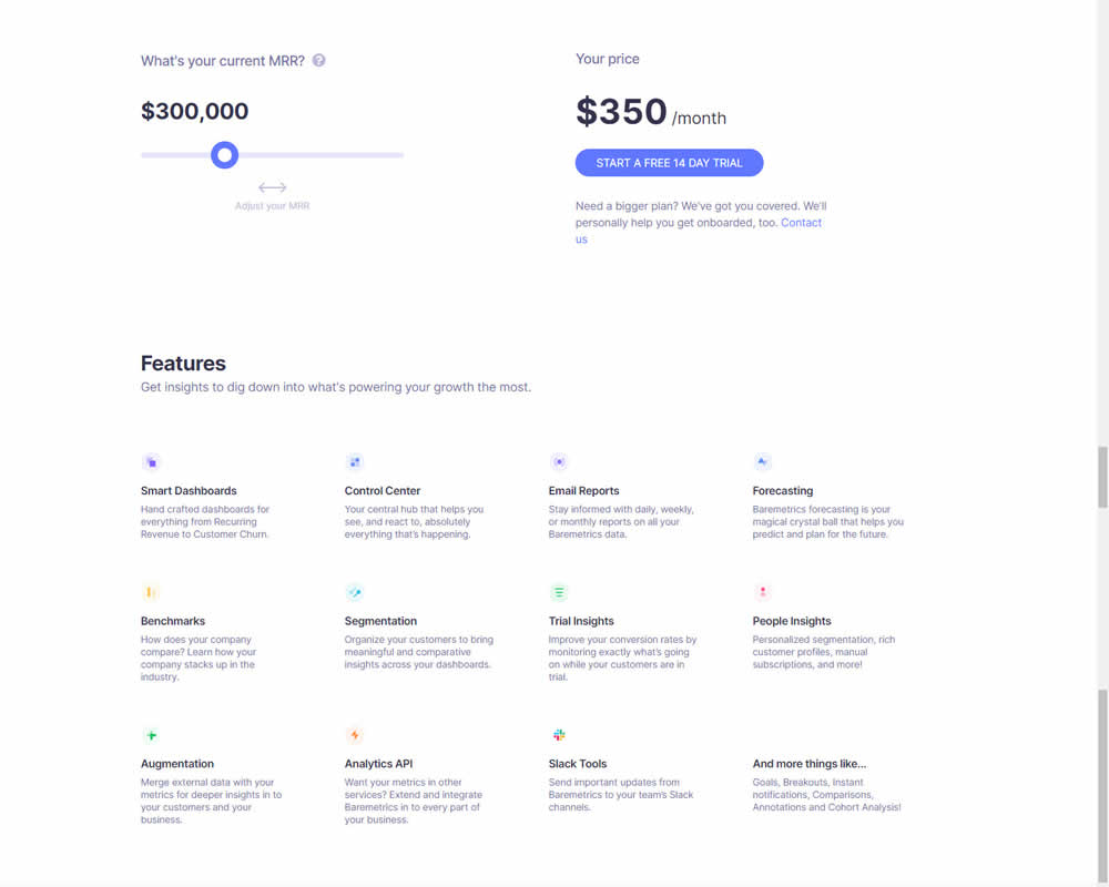
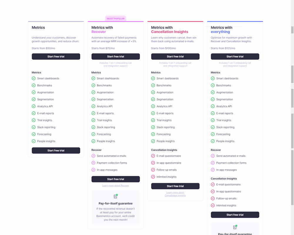
In this experiment, a single focus signup was transformed into a pricing comparison table. Impact on signups was measured.
Test #340 on
by  Jakub Linowski
Feb 25, 2021
Desktop
Checkout
X.X%
Sales
Jakub Tested Pattern #114: Less Or More Visible Prices
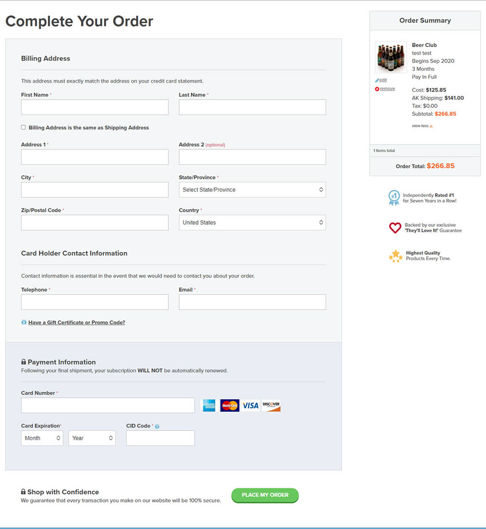

In this experiment, the variation added a second total price at the bottom of the checkout screen just above the checkout button. The impact on sales was measured.
Test #324 on
by  Jakub Linowski
Oct 30, 2020
Desktop
Mobile
Product
X.X%
Revenue
Jakub Tested Pattern #17: Least Or Most Expensive First
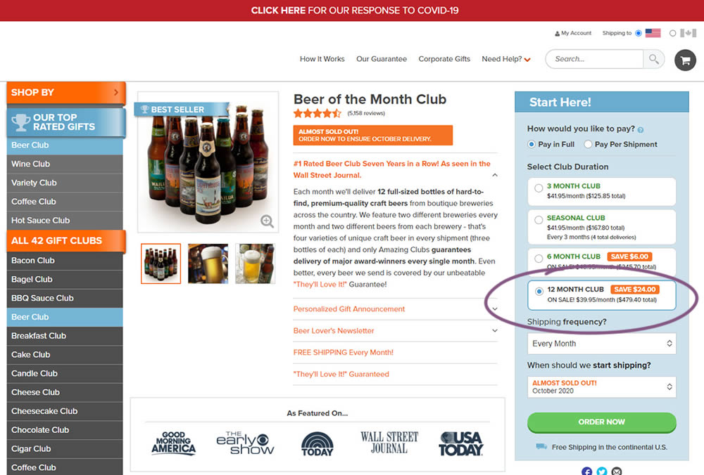
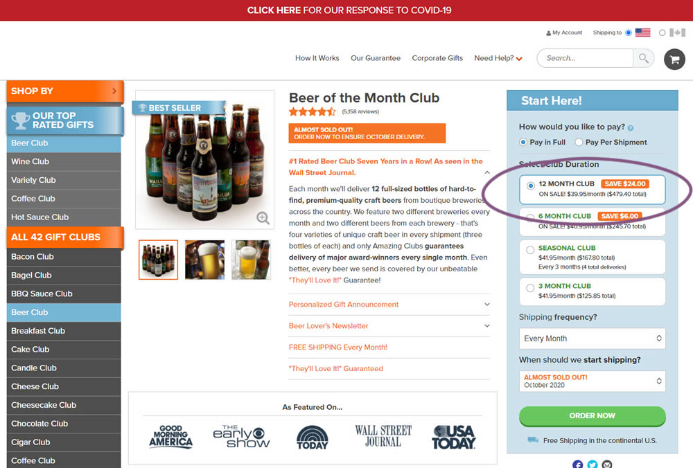
This experiment tested the order of purchase plans. The control version sorted the purchase options by the least expensive while the variation sorted them by the most expensive first. Impact on sales and revenue was measured.
Test #319 on
Backstage.com
by  Stanley Zuo
Sep 30, 2020
Desktop
Pricing
X.X%
Revenue
Stanley Tested Pattern #113: More Or Fewer Plans On Backstage.com
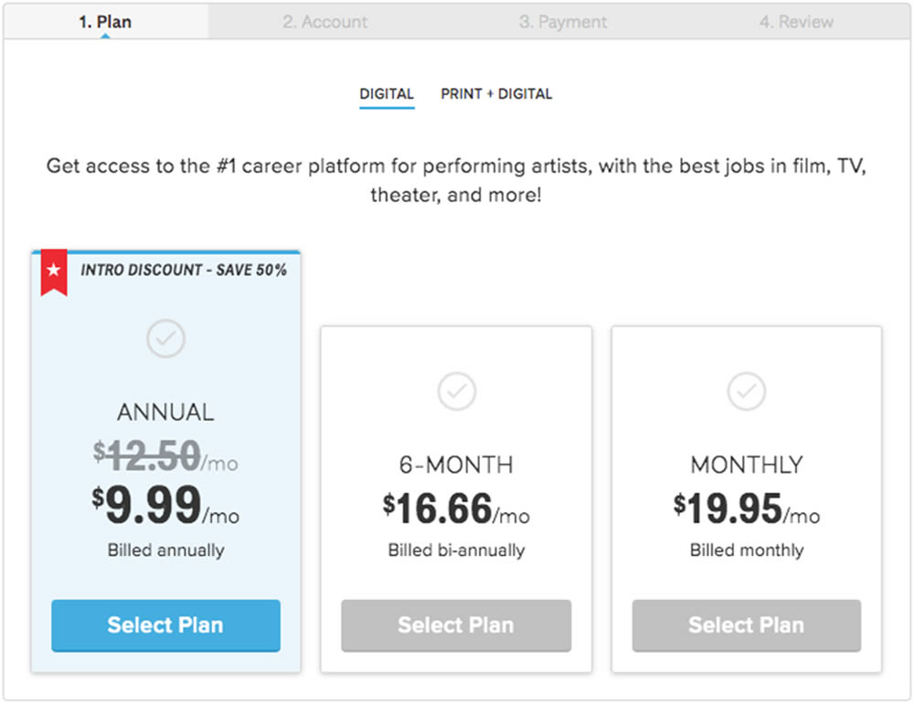
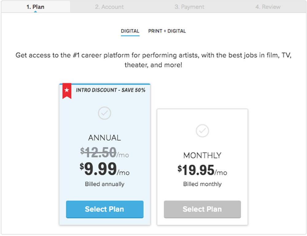
In this experiment, a 3 plan vs 2 plan pricing page was shown to potential customers. Impact on sales and revenue were measured.
Test #306 on
Backstage.com
by  Stanley Zuo
Jul 09, 2020
Desktop
Mobile
Pricing
X.X%
Sales
Stanley Tested Pattern #69: Autodiscounting On Backstage.com
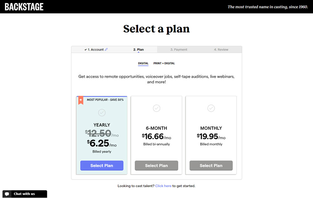
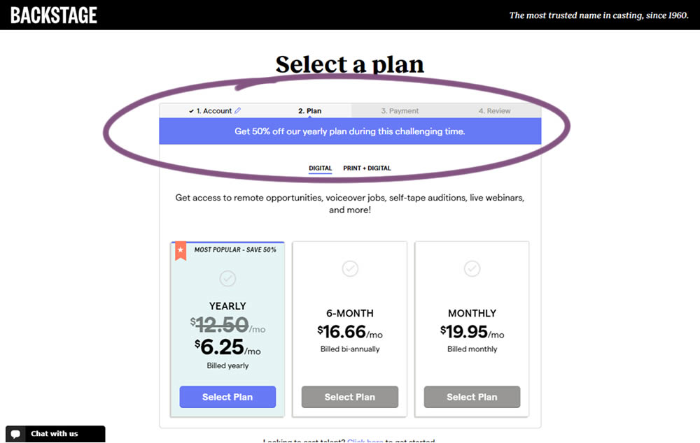
In this experiment, the only change was an added message at the top of the pricing screen, clarifying that there is an active discount on a yearly plan. The discount was already communicated with a strike-through price on the control version as well. The variation simply emphasized this aggressively.
Test #301 on
Zapimoveis.com.br
by  Vinicius Barros Peixoto
May 31, 2020
Desktop
Mobile
Product
X.X%
Leads
Vinicius Tested Pattern #21: What It's Worth On Zapimoveis.com.br


In this experiment, the B variation property prices were framed using higher and crossed out price points from 12 months ago - achieving a relative discount. A tooltip was also shown which explained the higher price point on hover. The example in the screenshot translates to "2% less compared to 12 months ago". This high-power experiment measured the number of leads that were generated on property (product) screens.
Test #293 on
Backstage.com
by  Stanley Zuo
Apr 14, 2020
Desktop
Mobile
Product
X.X%
Sales
Stanley Tested Pattern #114: Less Or More Visible Prices On Backstage.com
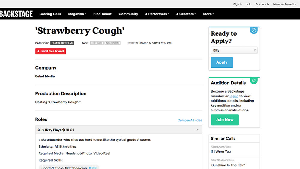
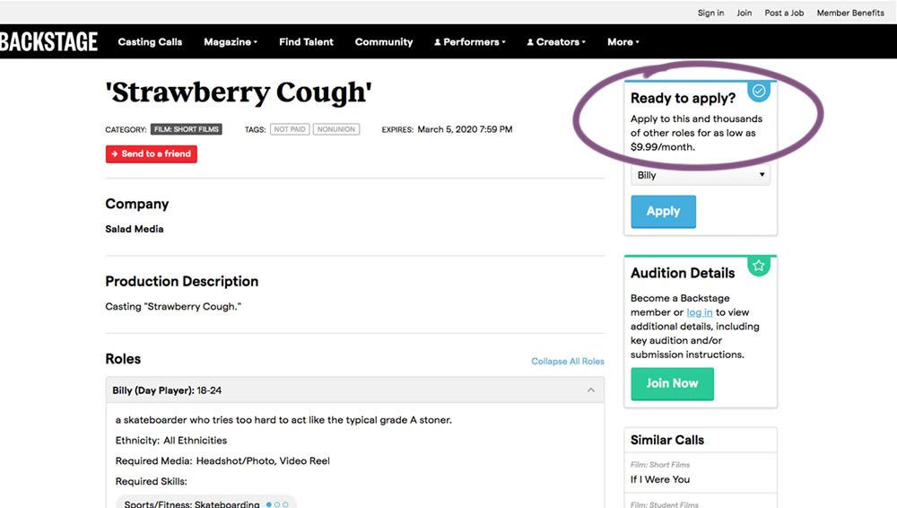
In this experiment on a casting call site, pricing information was shown beside the application button. This change shows the effect of setting a price expectation and being more clear that the application process is not free.
Test #292 on
Backstage.com
by  Stanley Zuo
Apr 13, 2020
Desktop
Mobile
Listing
X.X%
Sales
Stanley Tested Pattern #24: Visible Availability On Backstage.com
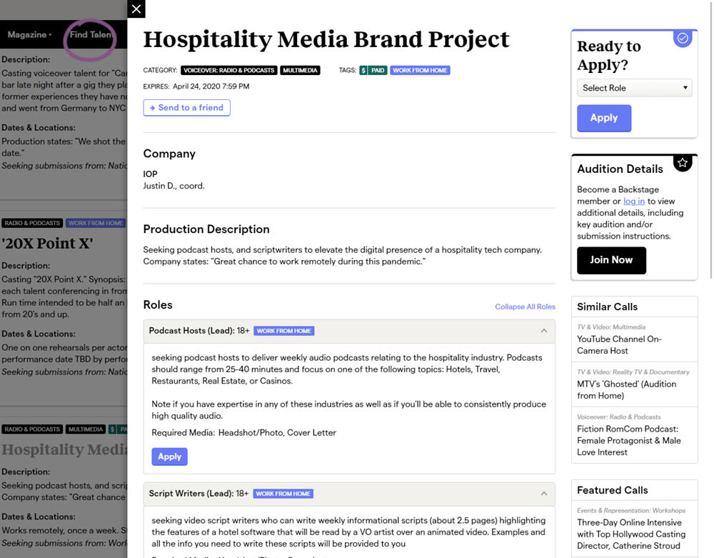
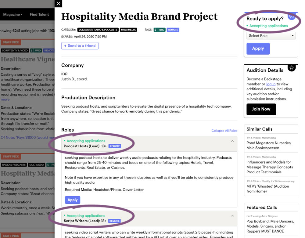
The core hypothesis of this experiment was that by showing clear availability (in green text) beside each casting call, more users would apply and become premium members. The experiment reports on two metrics: application starts (the first progression metric), and premium membership sales (measured a few steps further in the funnel).
Test #289 on
Prepagent.com
by  Arthur Sparks
Mar 23, 2020
Desktop
Pricing
X.X%
Revenue
Arthur Tested Pattern #17: Least Or Most Expensive First On Prepagent.com
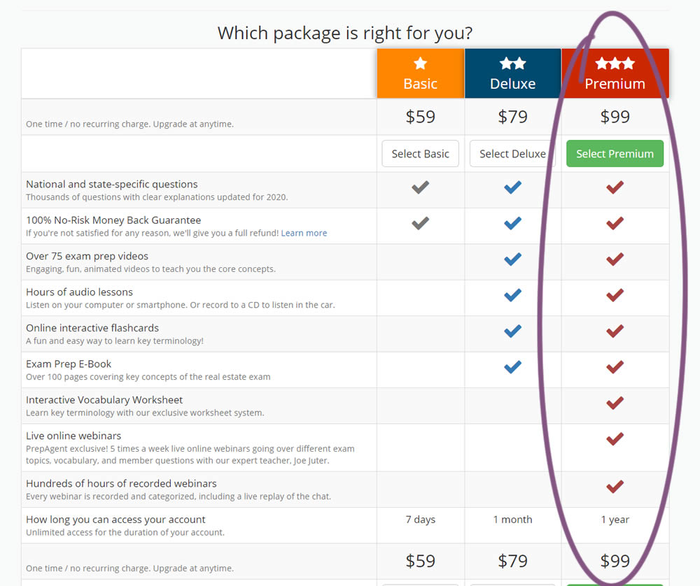
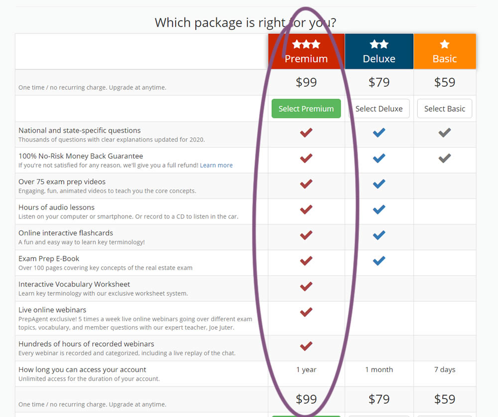
In this experiment, the order of pricing plans was rearranged as to show the most expensive one first.
Test #275 on
Prepagent.com
by  Arthur Sparks
Dec 31, 2019
Desktop
Pricing
X.X%
Revenue
Arthur Tested Pattern #114: Less Or More Visible Prices On Prepagent.com
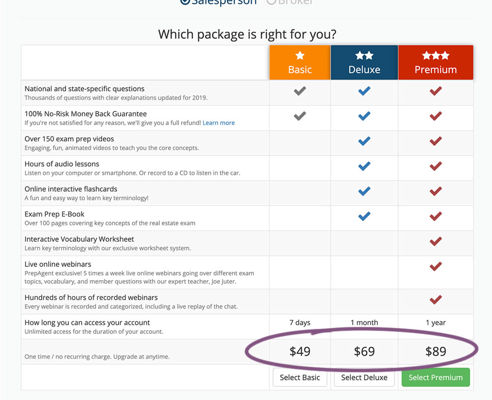
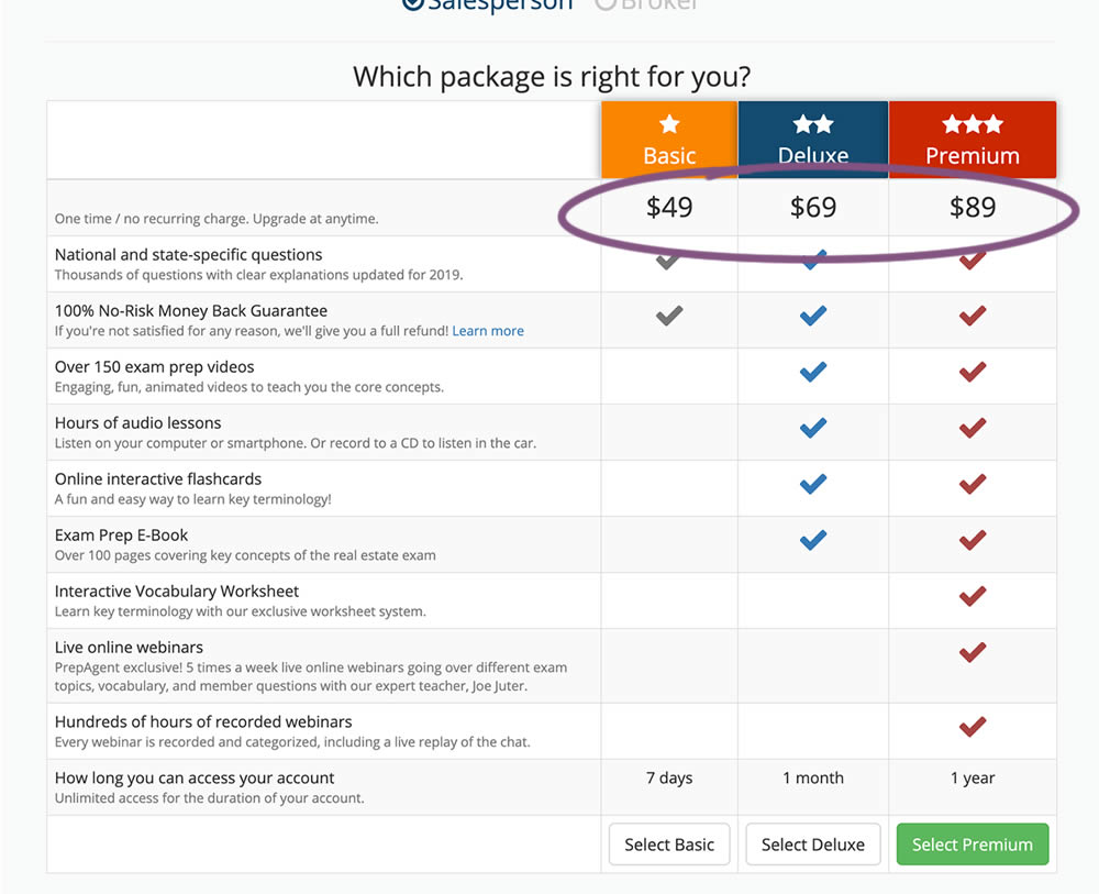
In this experiment, all three prices of each plan were shifted higher for greater visibility.