All Latest 620 A/B Tests
MOST RECENT TESTS
Test #428 on
Volders.de
by  Daria Kurchinskaia
Aug 16, 2022
Desktop
Mobile
Signup
X.X%
Sales
Daria Tested Pattern #26: Cart Reminder And Recently Viewed On Volders.de
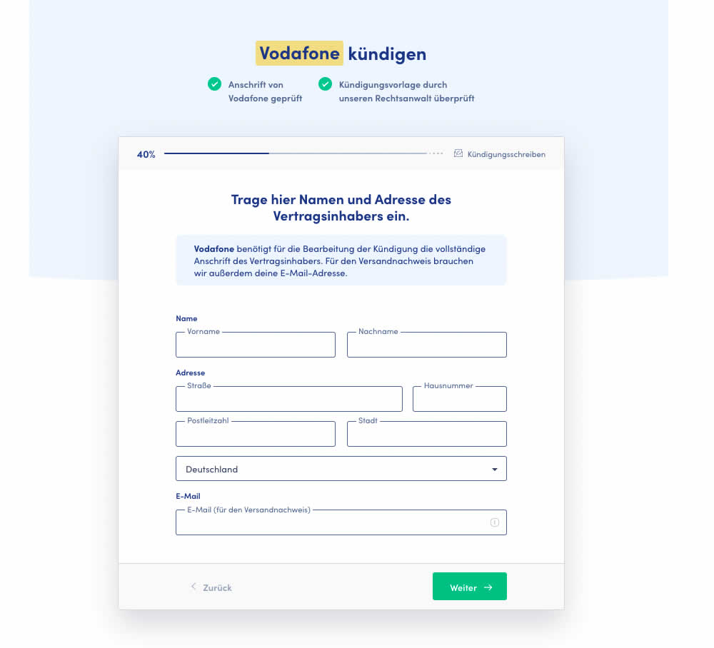
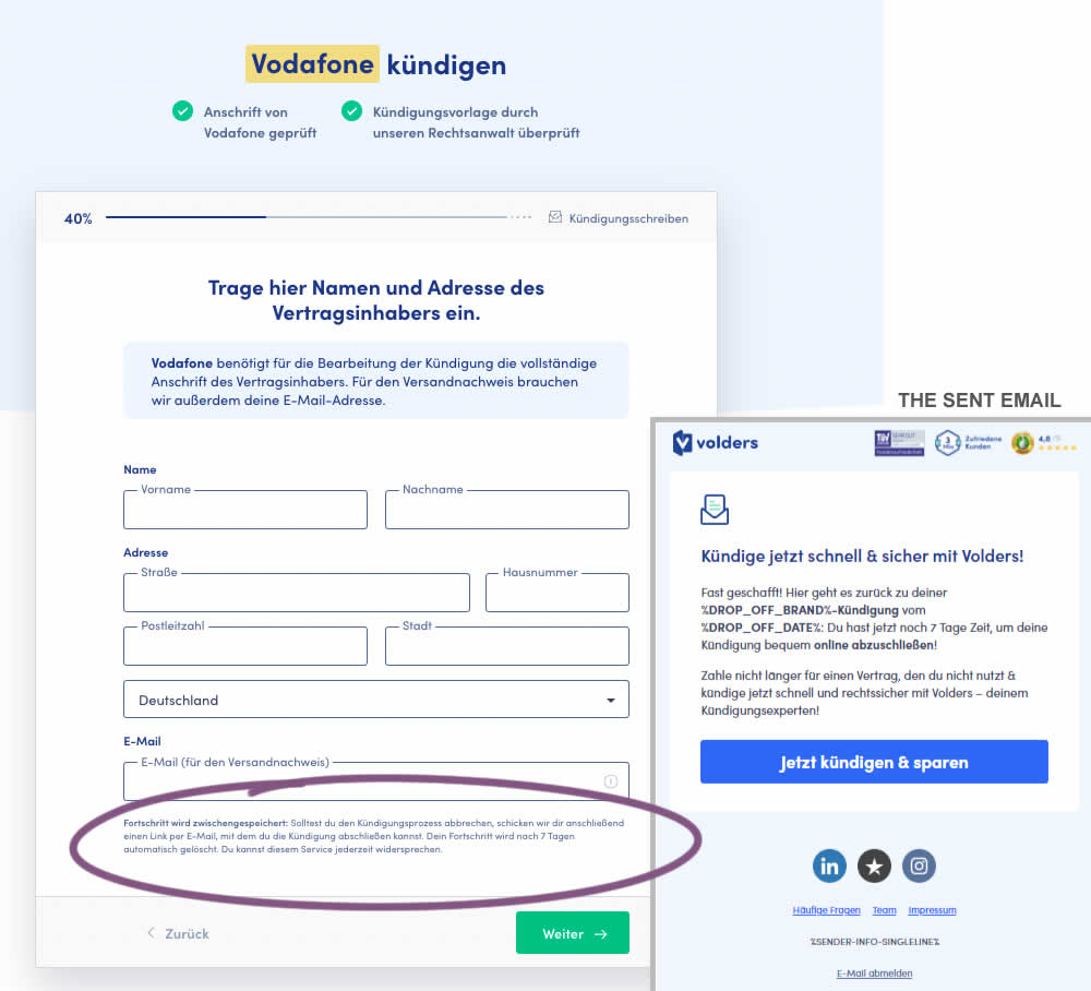
In this test 1) a passive hint communicated to users that their data will be saved for 7 days for them to be able to continue their cancellation later and 2) dropped off users were targeted with an email campaign within the first 4 hours after drop off. The reminder email linked users to a shipping page (checkout page) without them requiring to fill out their personal, contract information one more time.
Which A Or B Actually Wins? Find Out Before You Test.
Members see every test result — the winners, the flat ones, and the losers — along with exact effects and sample sizes. Use it to estimate your tests and prioritize by probability, not gut feel. Start every experiment with the odds on your side.
Test #429 on
Snocks.com
by  Melina Hess
Aug 16, 2022
Mobile
Desktop
Product
X.X%
Sales
Melina Tested Pattern #121: Free Shipping On Snocks.com
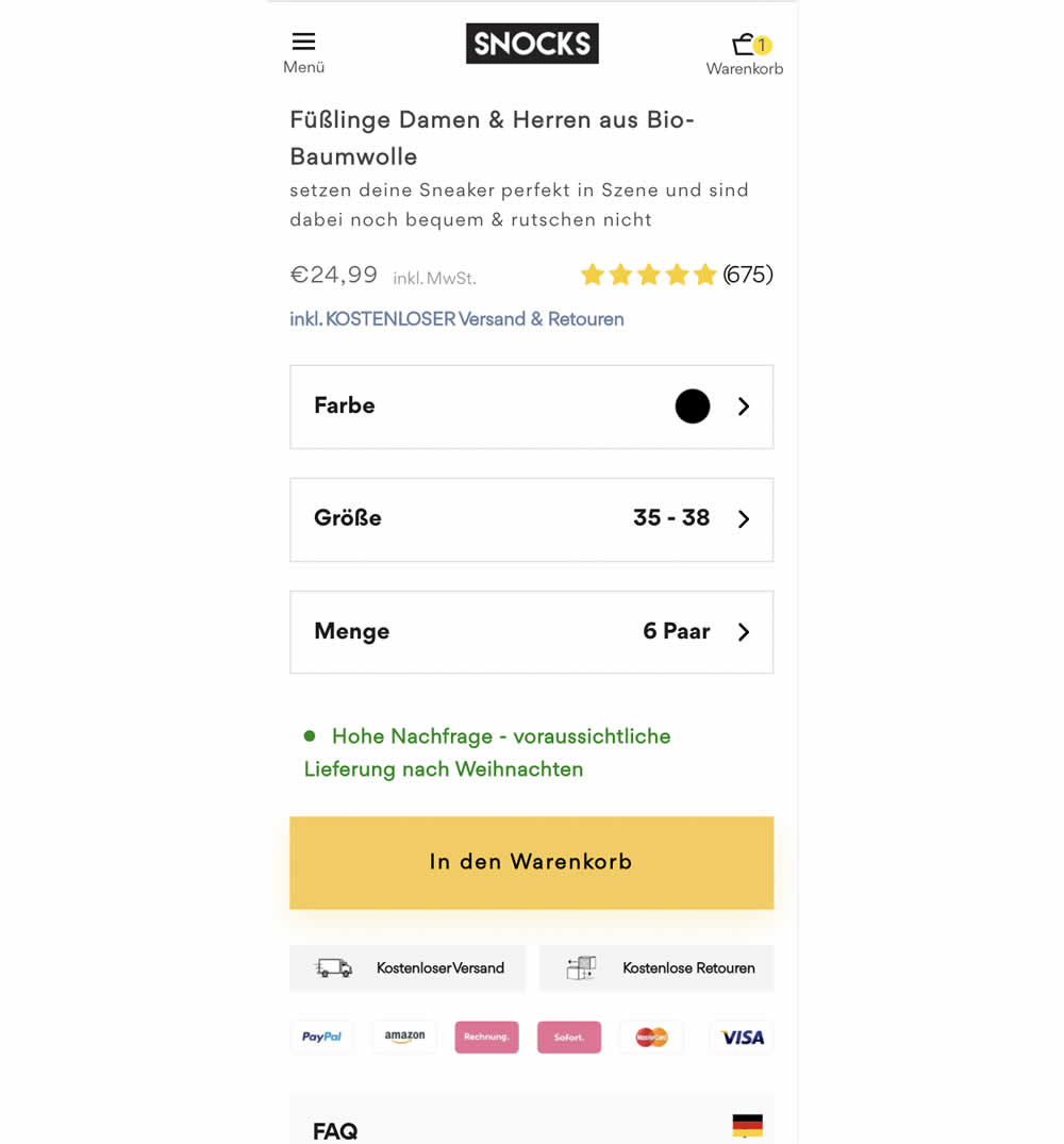
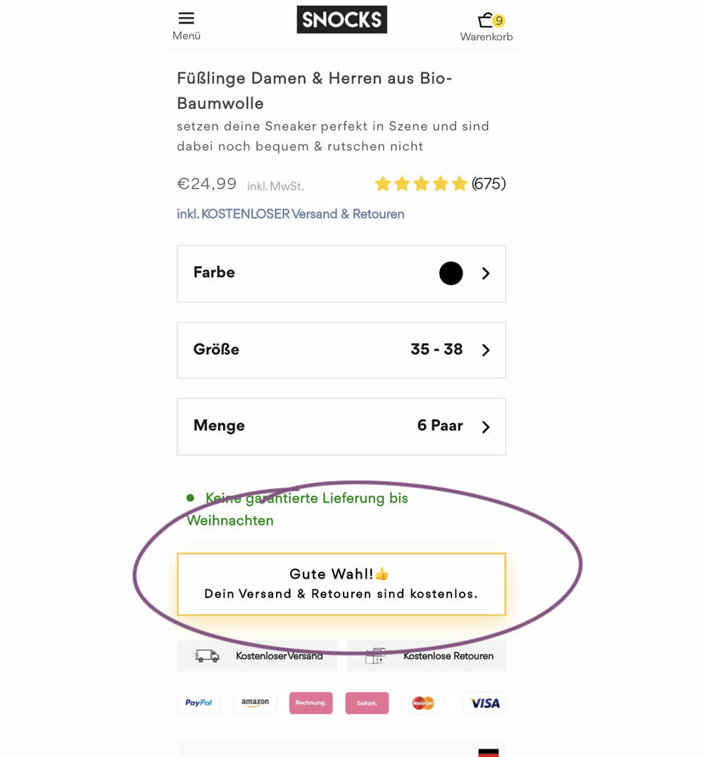
Upon clicking the Add-To-Cart button, the button label changed to a cheering message which congratulated the user on his choice and ensuring that shipping is free. Translation: "Good choice. Your shipping and returns are free."
Test #427 on
Designlab.com
by  Daniel Shapiro
Aug 10, 2022
Desktop
Mobile
Checkout
X.X%
Sales
Daniel Tested Pattern #28: Easiest Fields First On Designlab.com
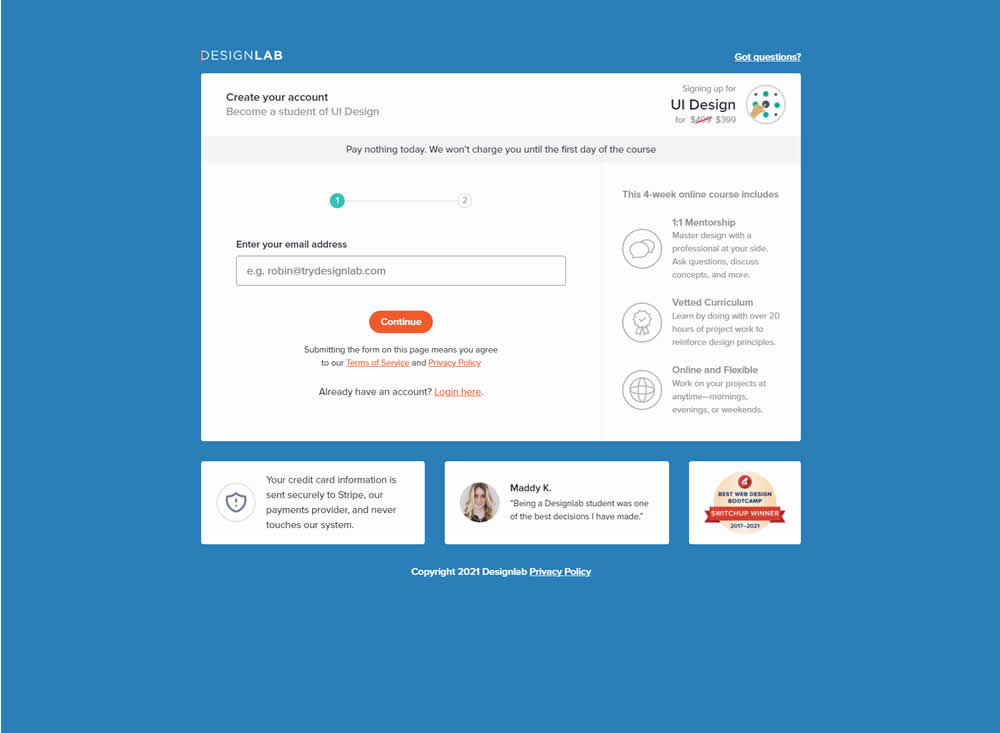
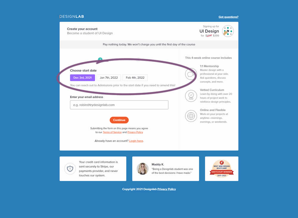
In this experiment, the course enrollment start date was moved from step 2 to step 1 of an enrollment / checkout flow. The test was run by Designlab - that offers design courses and education with a strong element of mentorship. Impact on progression to next step and completed transactions were measured.
Test #426 on
Phorest.com
by  Sorcha Mullis
Aug 09, 2022
Desktop
Mobile
Home & Landing
X.X%
Leads
Sorcha Tested Pattern #9: Multiple Steps On Phorest.com
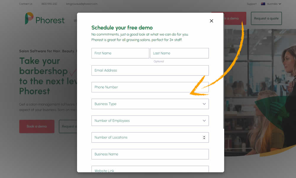
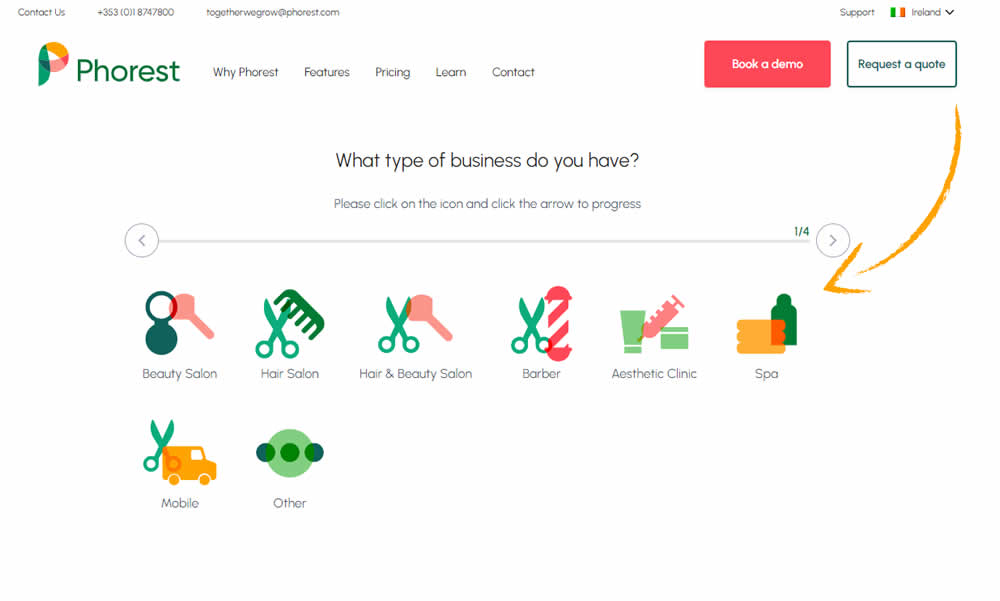
In this experiment, a single step popup modal was tested against a 4 step sign up funnel. Users entered the experiment on the homepage and the behavior of the two buttons, book a demo and get a quote, was adjusted. Impact on leads was measured.
Test #425 on
by  Jakub Linowski
Aug 03, 2022
Desktop
Product
X.X%
Sales
Jakub Tested Pattern #41: Sticky Call To Action
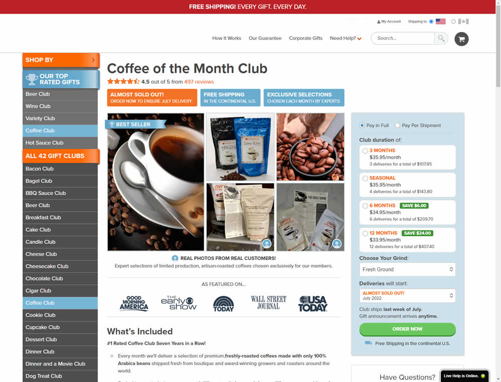
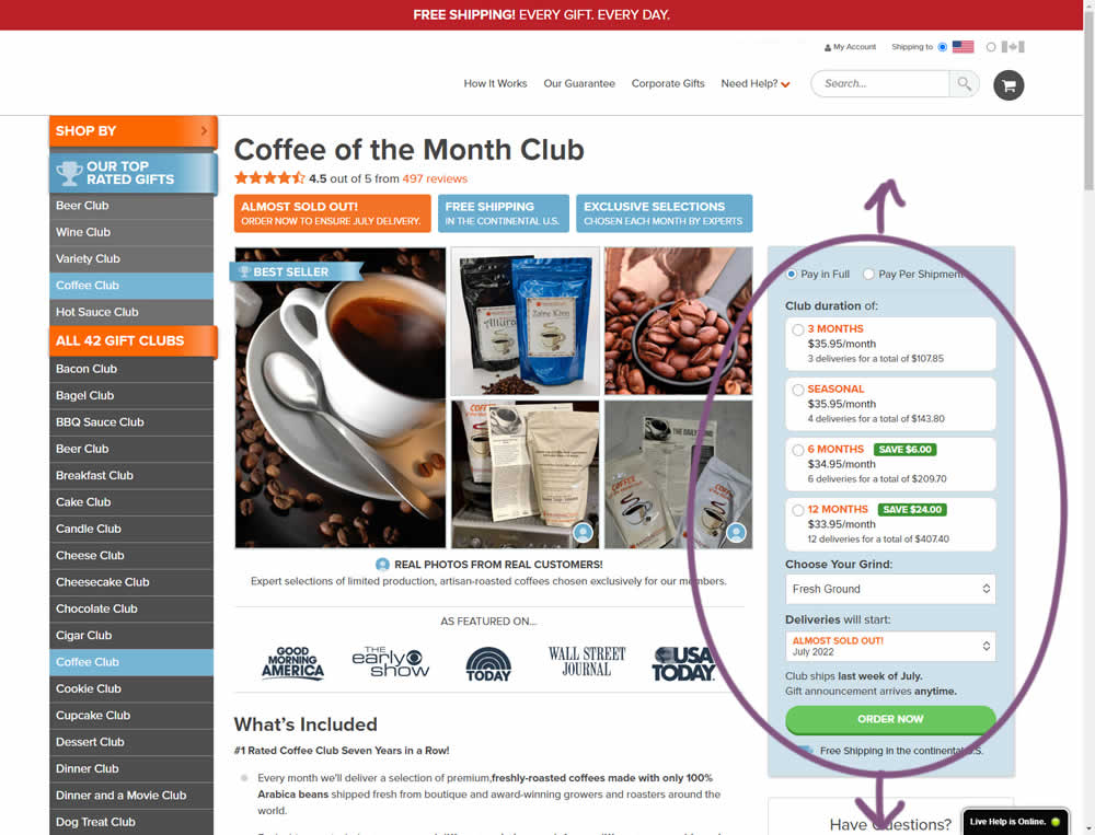
In this experiment, the complete buy box on a product detail page, floated along as users scrolled through the long screen. The variation made sure the product choice and order now button was always visible. Impact on adds-to-cart and sales was measured.
Test #424 on
by  Sandis Viksna
Jul 28, 2022
Desktop
Shopping Cart
X.X%
Sales
Sandis Tested Pattern #45: Benefit Bar
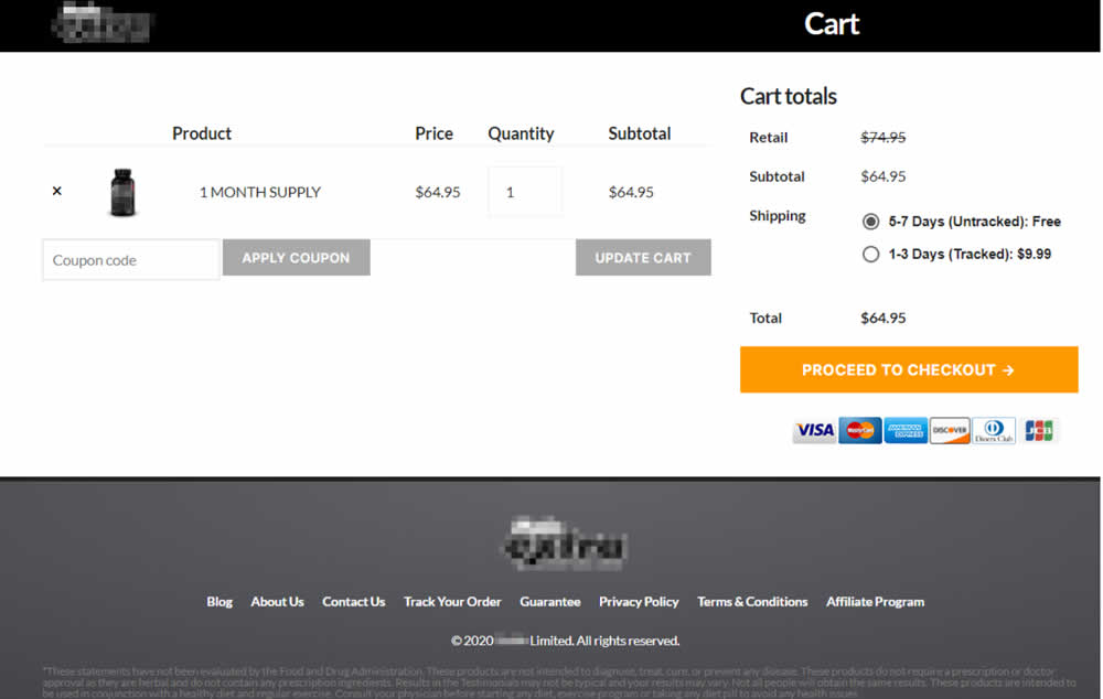
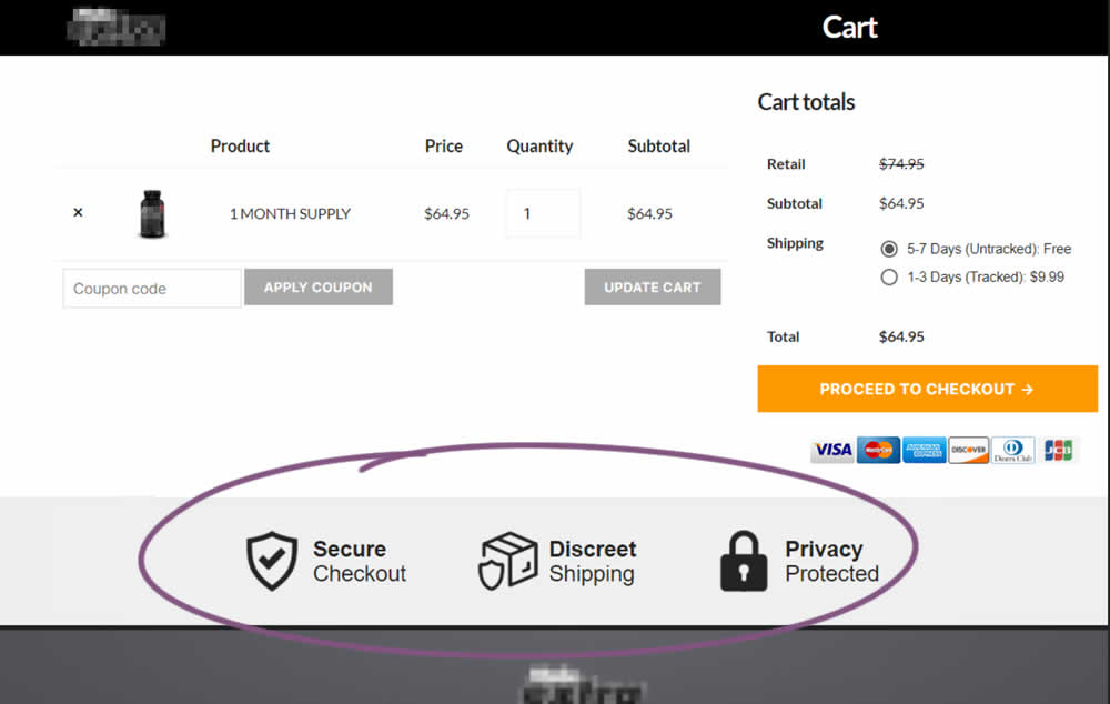
In this experiment, 3 reassurances were shown at the bottom of cart and checkout pages. The web site was selling health and nutrition products for males and one of the reassurances included "discreet shipping". Impact on sales was measured.
Test #423 on
Expertinstitute.com
by  Ardit Veliu
Jul 26, 2022
Desktop
Mobile
Home & Landing
X.X%
Leads
Ardit Tested Pattern #110: Optional Field Labels On Expertinstitute.com
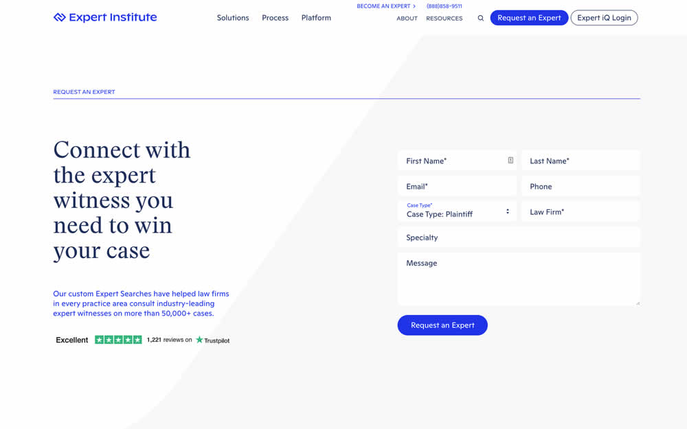
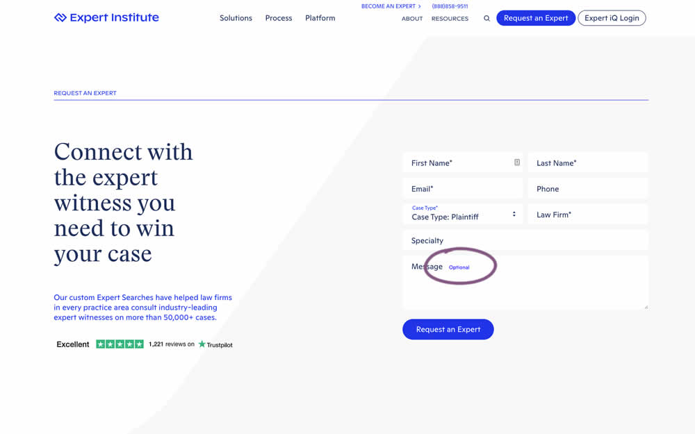
In this experiment, an "optional" label was shown near a message form field. Impact on overall leads was measured (requesting experts).
Test #422 on
Volders.de
by  Daria Kurchinskaia
Jul 22, 2022
Desktop
Mobile
Shopping Cart
X.X%
Sales
Daria Tested Pattern #3: Fewer Form Fields On Volders.de
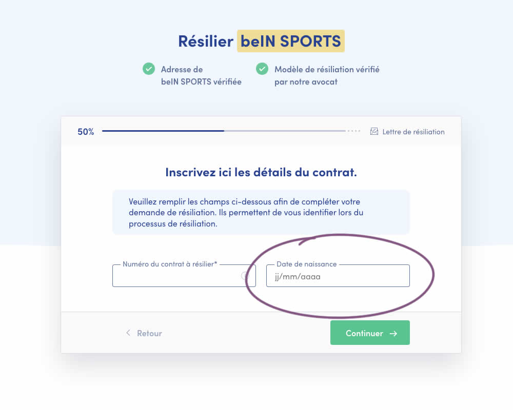
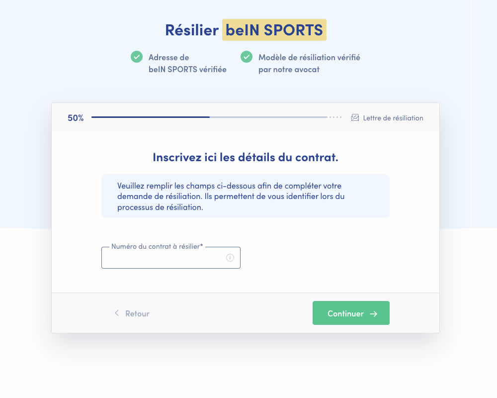
A birthdate field was removed during a signup process for a paid contract cancellation service. Impact on progression (next step) and sales (completed transactions) was measured.
Test #421 on
Amazon.com
by  Marika Francisco
Jul 15, 2022
Desktop
Mobile
Product
X.X%
Sales
Marika Tested Pattern #43: Long Titles On Amazon.com
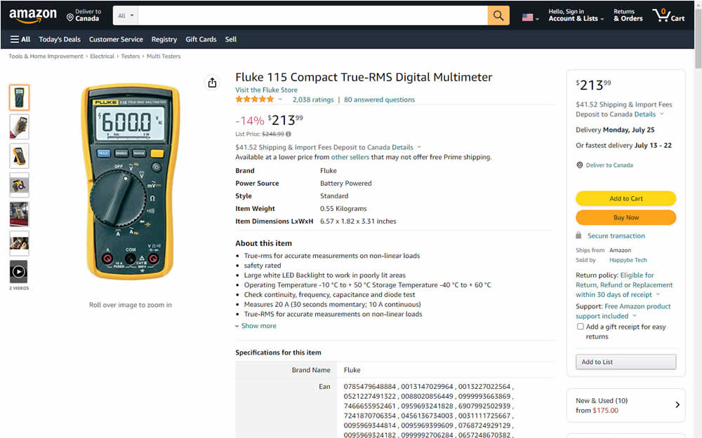
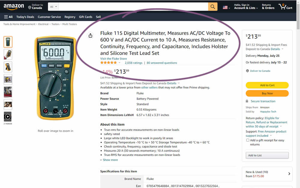
Fluke is an industrial manufacterer of measurement and calibration devices and they ran a test on their Amazon store for a series of their prodcts. Instead of using short product names, they tested longer and more descriptive ones. Impact was measured on sales.
Test #420 on
Designlab.com
by  Daniel Shapiro
Jul 12, 2022
Desktop
Mobile
Product
X.X%
Leads
Daniel Tested Pattern #115: Pricing Comparison Table On Designlab.com
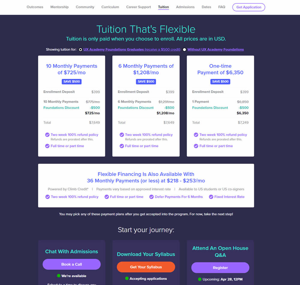
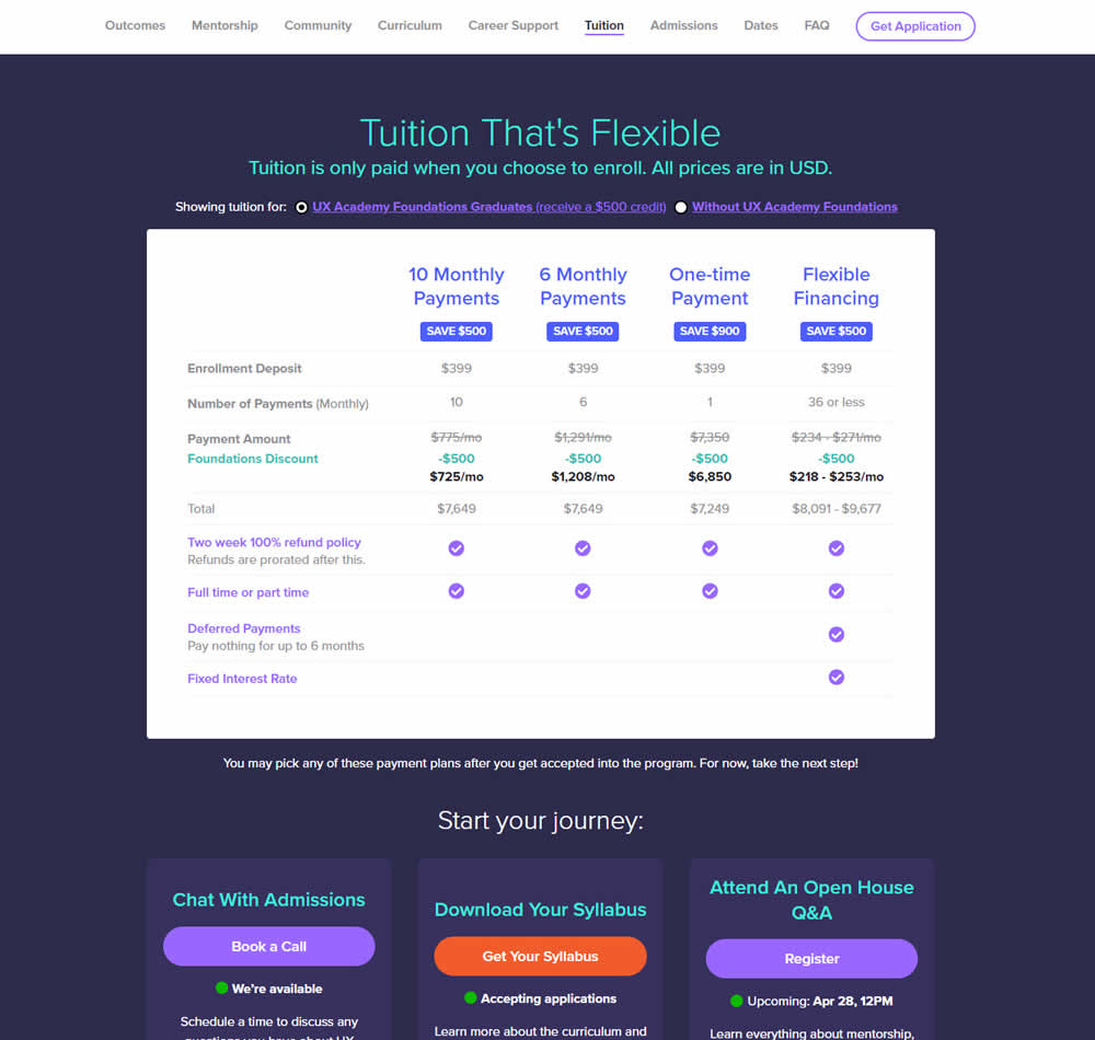
In this experiment, pricing plans were laid out horizontally for easier comparison. In the variation, most of the plan benefits, features and differences were also referenced using a single lable that was left-aligned. The idea was to make the variables aligned and therefore more comparable.
This pricing table appeared at the bottom of a long design program landing page. Impact on leads and applications was measured.
Test #419 on
by  Jakub Linowski
Jun 29, 2022
Desktop
Home & Landing
X.X%
Sales
Jakub Tested Pattern #68: Welcome Discount
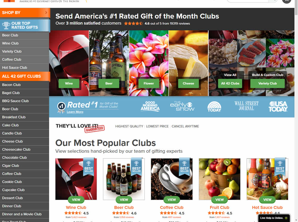
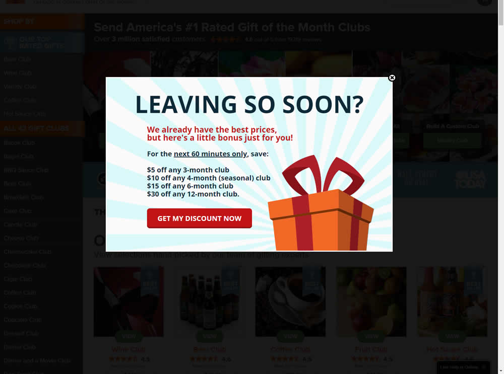
In this experiment, the presence of a discount modal (bigger discount for larger purchases) was tested on home and product pages. The trigger happend after a scroll down, a few second pause, and a mouse scroll up interaction. Impact on sales was measured.
Test #418 on
Online.metro-cc.ru
by  Andrey Andreev
Jun 28, 2022
Desktop
Mobile
Home & Landing
X.X%
Sales
Andrey Tested Pattern #135: Product Categories On Online.metro-cc.ru
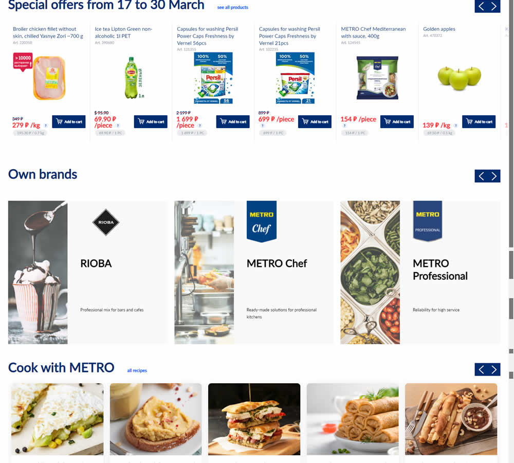
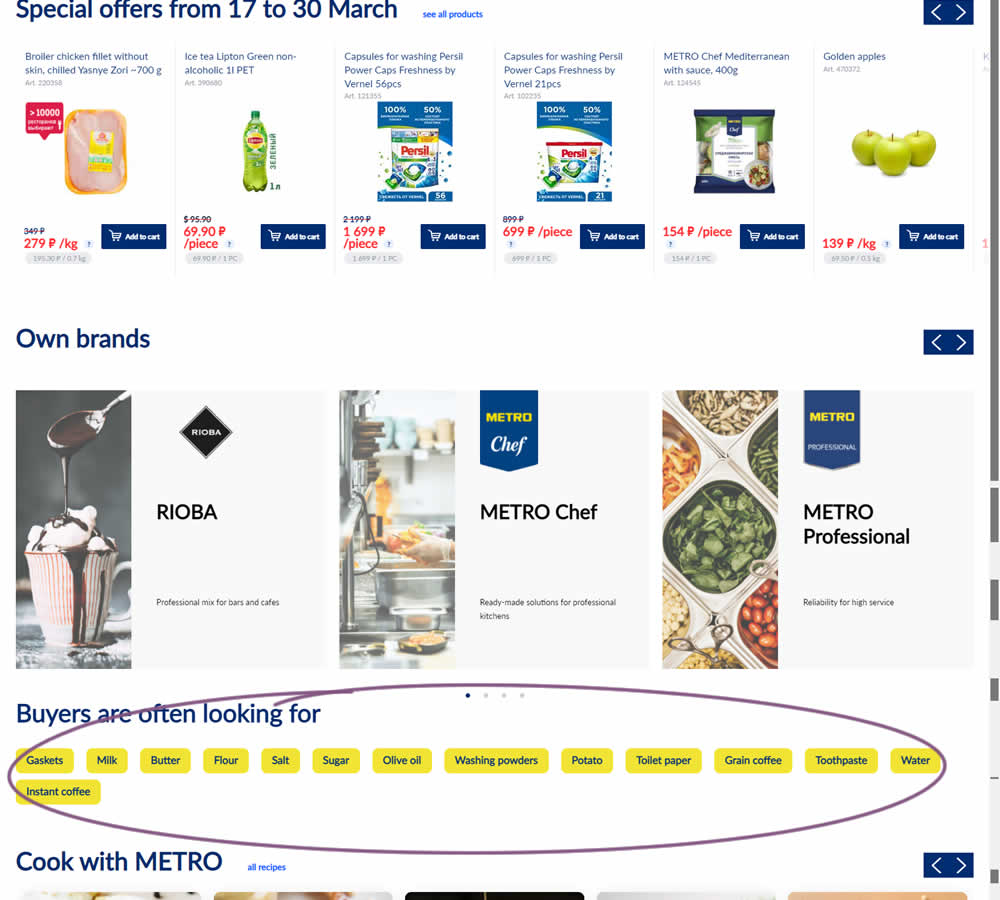
In this experiment, popular product category links were added near the bottom of the homepage of an online grocery store - Metro. Impact on completed sales was measured.
Test #417 on
Cxl.com
by  Ognjen Bošković
Jun 27, 2022
Desktop
Mobile
Signup
X.X%
Signups
Ognjen Tested Pattern #127: Vague Or Specific Benefits On Cxl.com
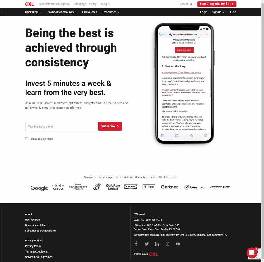
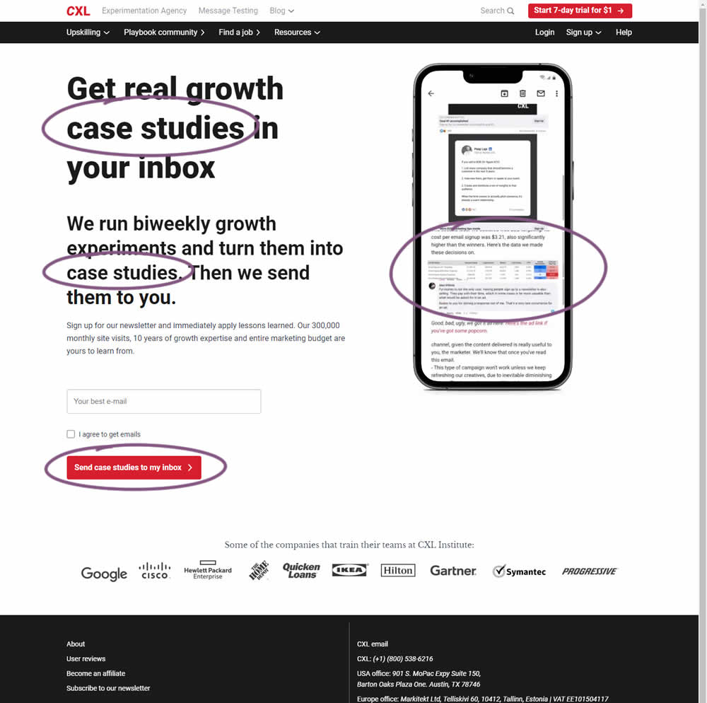
CXL ran an interesting experiment that (1) added more specificity on a newsletter subscription page as well as (2) reinforced it consistently. Most visibly, an abstract or vague headline statement (control) was changed to a benefit oriented one - hinting that subscribers will eventually receive valuable case studies. This message was further reinforced with supporting copy that explained where these case studies are obtained from along with the frequency of the delivery. This same message was also reinforced with an image of actual case studies. The call to action button was also adjusted to mimic the benefit.
Impact on newsletter signups was measured.
Test #416 on
Designlab.com
by  Daniel Shapiro
Jun 20, 2022
Desktop
Mobile
Product
X.X%
Sales
Daniel Tested Pattern #105: Lead Magnets On Designlab.com
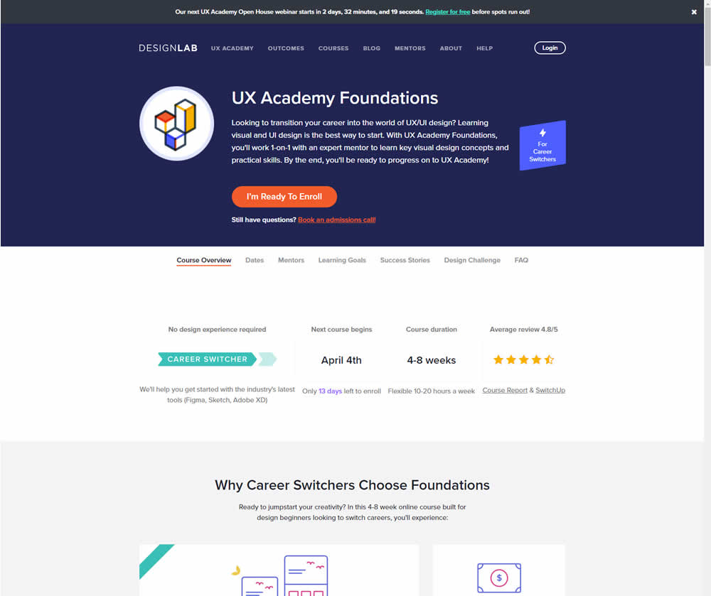
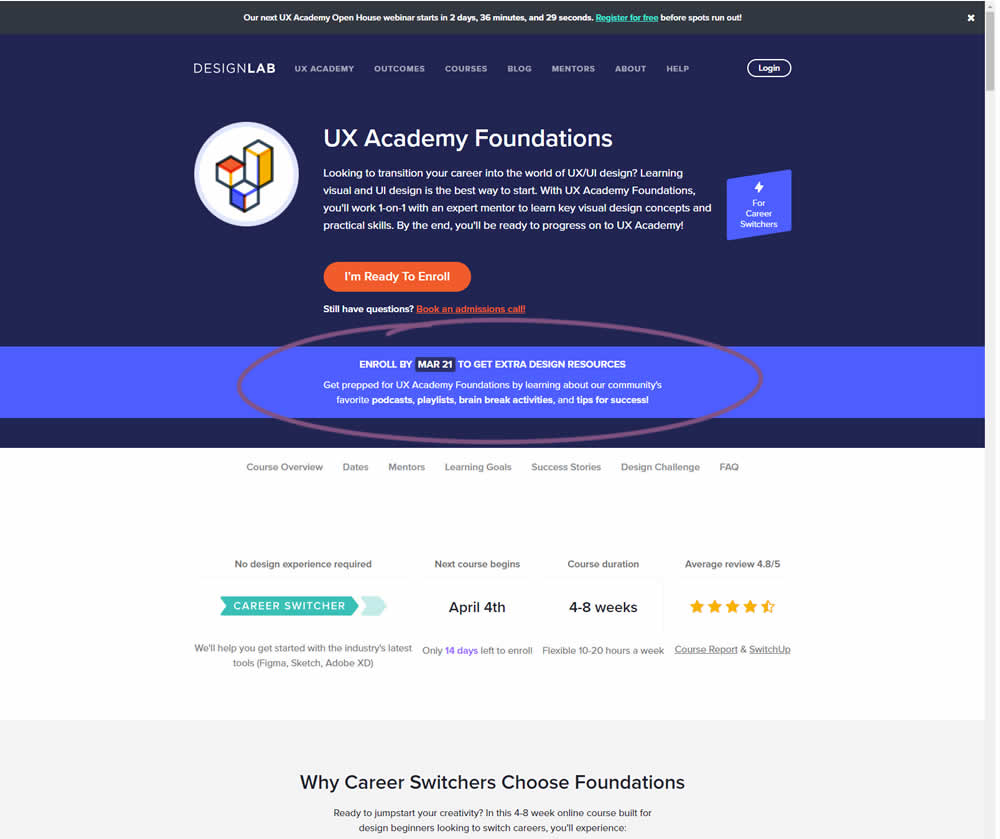
In this experiment, copy was added which communicated that students signing up for a course would receive extra design resources (the lead magnet). This was added in multiple states of the course page. Impact on lead generation and enrollment was measured.
Test #414 on
Volders.de
by  Frederik Fröhle
May 31, 2022
Desktop
Mobile
Checkout
X.X%
Sales
Frederik Tested Pattern #98: Auto Suggest On Volders.de
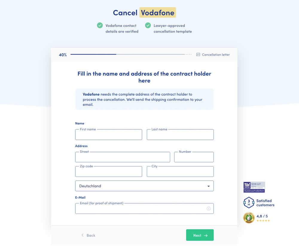
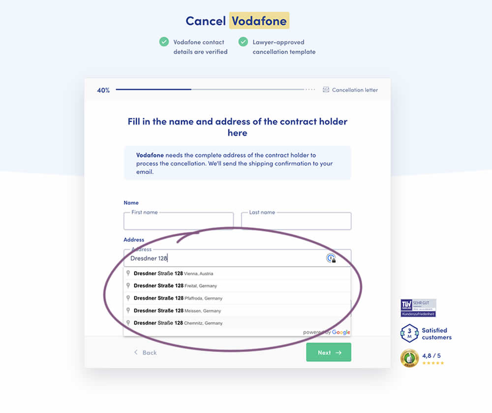
Does adding Google's address auto complete functionality to an address field help with higher form completions? This auto fill feature has been tested in the variation of a contract cancellation funnel. After selecting an auto completed address from a pulldown menu, the following fields were preselected: house number, zip code, city and country (potentially lowering friction?). Impact on successful form completions (contract cancellations) has been measured. Notice how the form also expanded progressively upon selecting the complete address in the variation.
Test #413 on
by  Jakub Linowski
May 26, 2022
Desktop
Mobile
Shopping Cart
X.X%
Sales
Jakub Tested Pattern #114: Less Or More Visible Prices
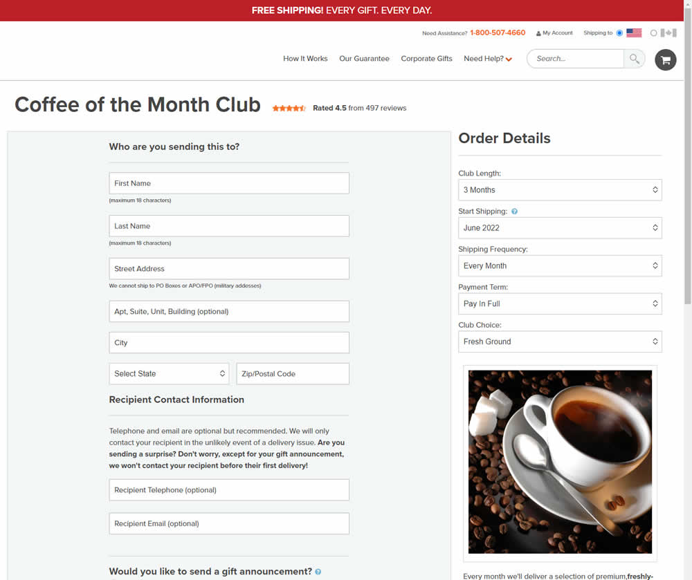
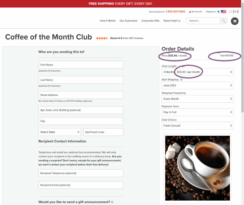
Should prices be displayed during an editing state on an add-to-cart screen (after adding-to-cart from a product detail page)? In this experiment, club pricing was added and shown in three areas after customers clicked on a small "edit details" links. The control did not have this pricing information (which was only shown on a product detail screen before).
Test #412 on
Volders.de
by  Frederik Fröhle
May 16, 2022
Desktop
Mobile
Checkout
X.X%
Sales
Frederik Tested Pattern #15: Bulleted Reassurances On Volders.de
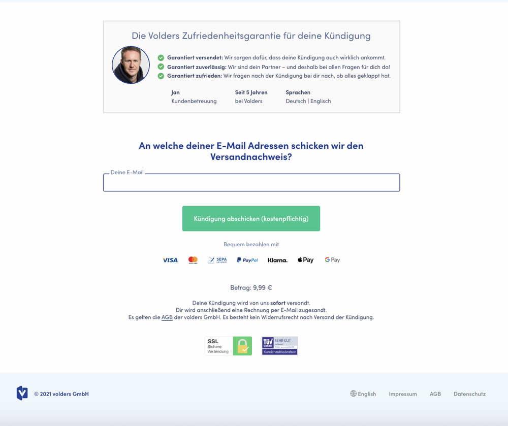
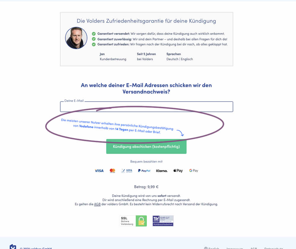
The Volders experimentation team assumed that adding information about how long it might take to get a cancellation confirmation near a CTA Button would result in higher cancellation requests (the paid service being offered).
The variation contained additional copy translated from German to: "Most of our users receive their cancellation confirmation from <vendor> within 14 days by email or letter."
Test #411 on
by  Ayat Shukairy
May 09, 2022
Desktop
Mobile
Product
X.X%
Sales
Ayat Tested Pattern #126: Bottom Or Left Thumbnails
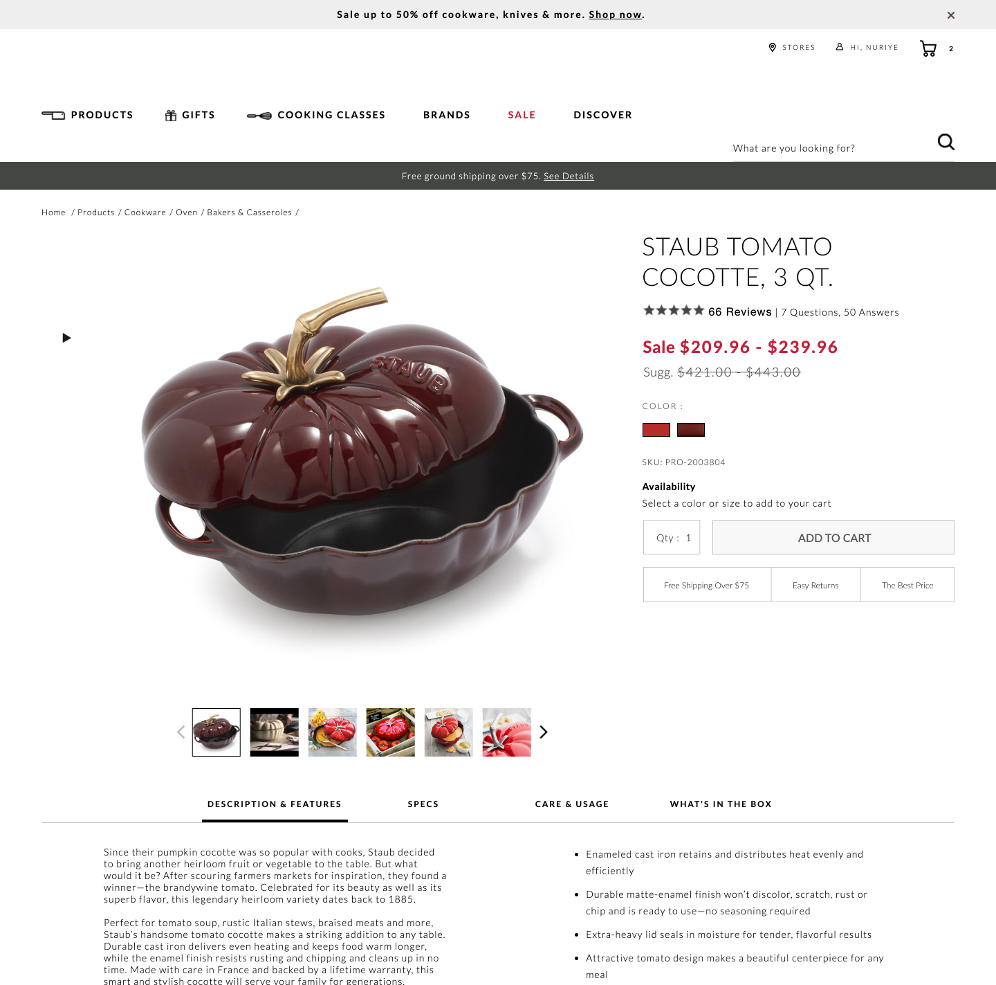
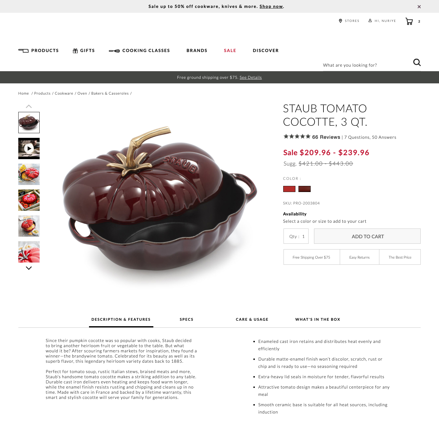
Bottom aligned thumbnails were shifted to the left side on a product image. Doing so, also shifted the product descriptions a little higher. Impact on adds-to-cart and total transactions was measured.
Test #410 on
Designlab.com
by  Daniel Shapiro
May 05, 2022
Desktop
Mobile
Home & Landing
X.X%
Sales
Daniel Tested Pattern #29: Surfaced Content On Designlab.com
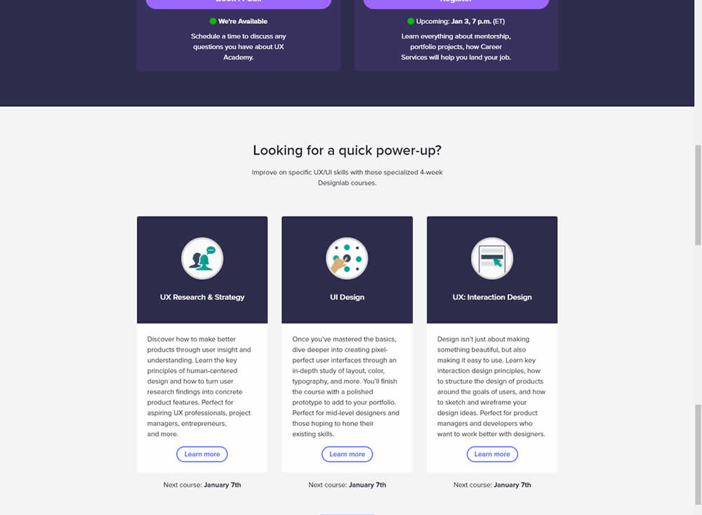
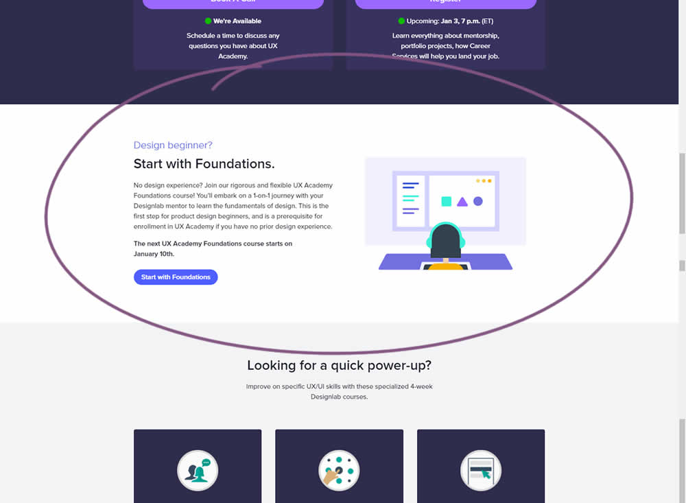
Does linking to a product detail page help? Or should a homepage simply focus on generic lead generation? In this homepage experiment, the presence of a component with a link to a detailed course landing page was tested. Impact on course enrollments was measured.
Test #409 on
Expertinstitute.com
by  Ardit Veliu
Apr 30, 2022
Desktop
Mobile
Signup
X.X%
Leads
Ardit Tested Pattern #20: Canned Response On Expertinstitute.com
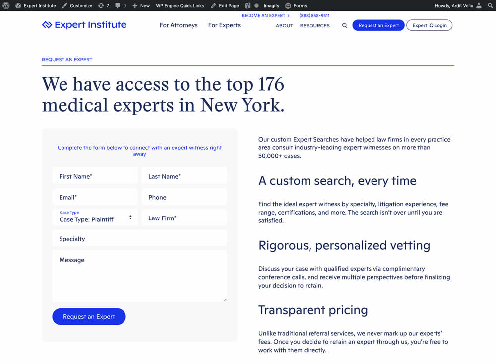
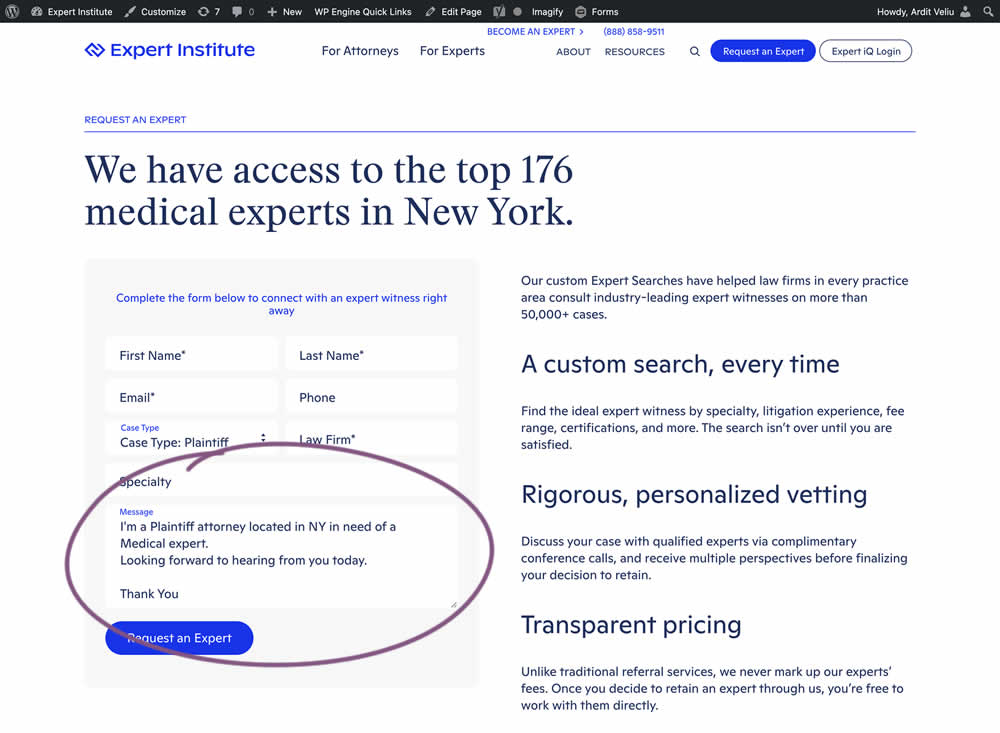
In this experiment, the copy of an input textarea on a lead form was used to summarize a user's choices. Instead of showing using a generic "Message" statement, the variation use the following formula: "I'm a [Lead Type] located in [State] looking for [Expert Type]. Looking forward to hearing from you today. Thank You." Impact of leads was measured.