All Latest 620 A/B Tests
MOST RECENT TESTS
Test #382 on
Snocks.com
by  Samuel Hess
Oct 31, 2021
Desktop
Product
X.X%
Sales
Samuel Tested Pattern #43: Long Titles On Snocks.com
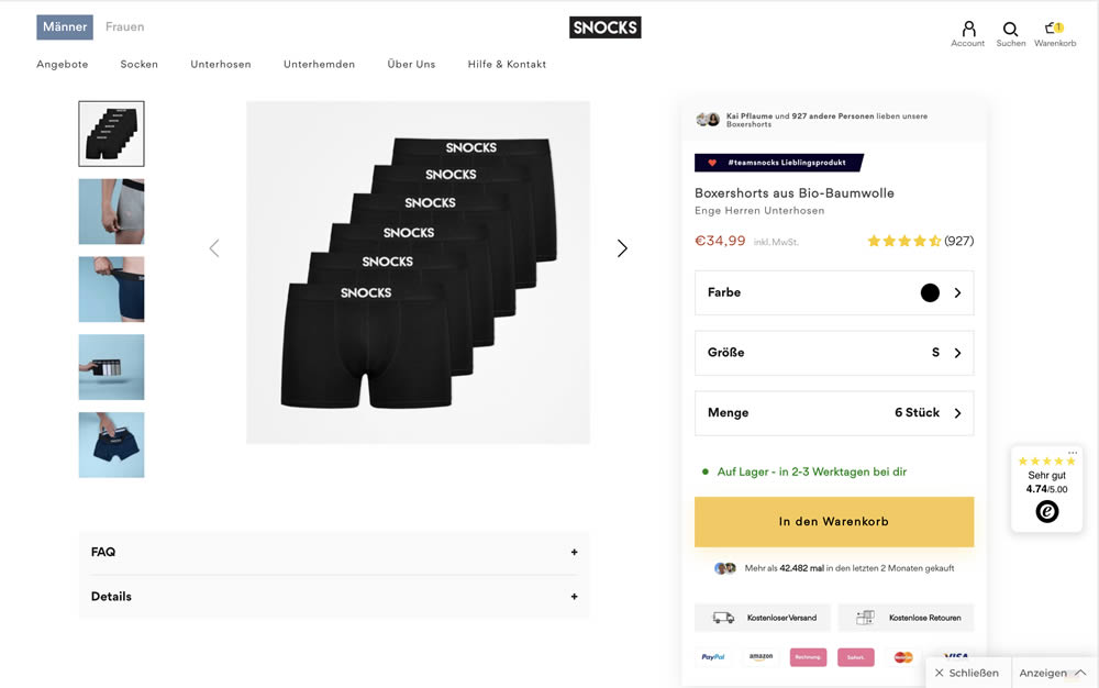
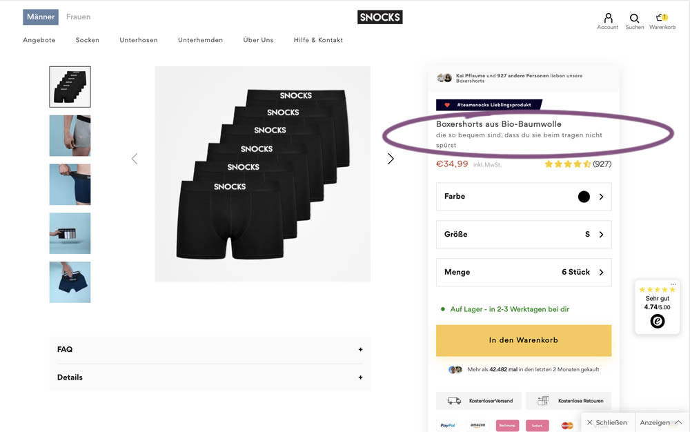
In this experiment, the variation contained a simple text change that described the quality of the product. According to Google Translate the text changed from "tight men's underpants" (control) to "are so comfortable that you don't feel them when you wear them" (variation).
Which A Or B Actually Wins? Find Out Before You Test.
Members see every test result — the winners, the flat ones, and the losers — along with exact effects and sample sizes. Use it to estimate your tests and prioritize by probability, not gut feel. Start every experiment with the odds on your side.
Test #381 on
Expertinstitute.com
by  Ardit Veliu
Oct 30, 2021
Desktop
Mobile
Home & Landing
X.X%
Leads
Ardit Tested Pattern #49: Above The Fold Call To Action On Expertinstitute.com


In this experiment, an extra button to a signup lead form was placed above the fold. In the control, the same button appeared further down on the page.
Test #380 on
Getninjas.com.br
by  Rodolfo Lugli
Oct 27, 2021
Desktop
Mobile
Home & Landing
X.X%
Leads
Rodolfo Tested Pattern #21: What It's Worth On Getninjas.com.br


In this experimemt, the average $ gain from a performed service category was shown on a landing page. Impact on leads was measured (people who would be signing up to offer a particular service).
Test #378 on
by  Jakub Linowski
Oct 07, 2021
Desktop
Mobile
Product
X.X%
Sales
Jakub Tested Pattern #119: Unselected Or Selected Defaults

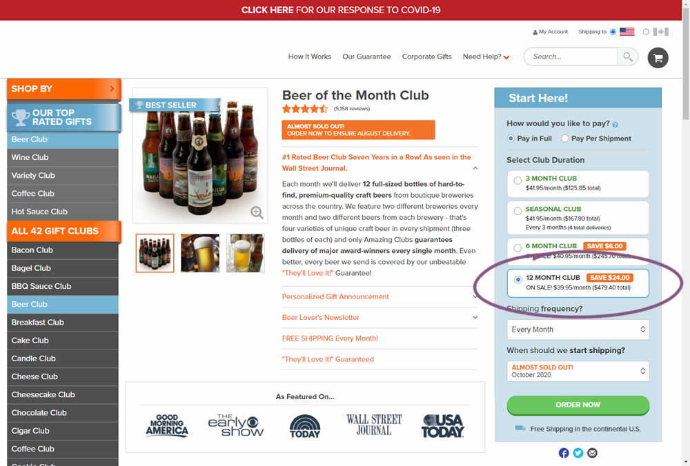
Here we have an experiment with a variation that preselected an option for a club duration. The control required customers to first express the choice for how many months they would like to order a product for. Whereas the variation defaulted to 12 months from the beginning.
Impact on adds-to-cart and sales was measured. The experiment unfortunately had to be stopped early due to another embedded variation that was performing poorly. And so it does not have many transactions.
Test #377 on
Adoramapix.com
by  Jakub Linowski
Sep 30, 2021
Desktop
Shopping Cart
X.X%
Sales
Jakub Tested Pattern #121: Free Shipping On Adoramapix.com
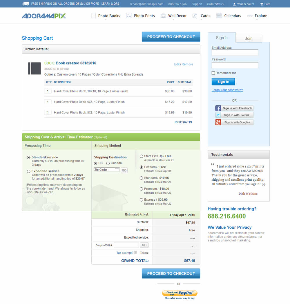
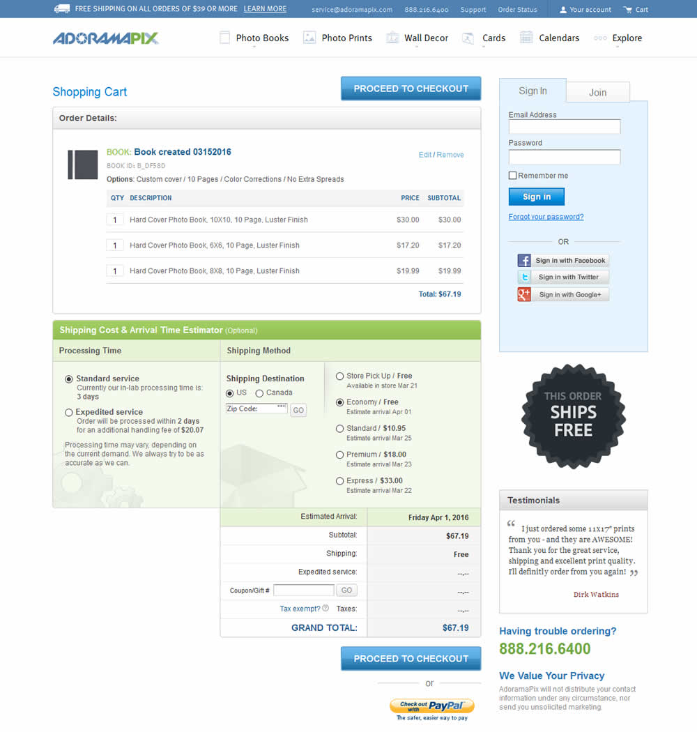
In this experiment, a big "free shipping" badge was added and defaulted to when available. Impact on progression to checkouts and completed sales was measured.
Test #376 on
Snocks.com
by  Samuel Hess
Sep 29, 2021
Mobile
Desktop
Product
X.X%
Sales
Samuel Tested Pattern #15: Bulleted Reassurances On Snocks.com
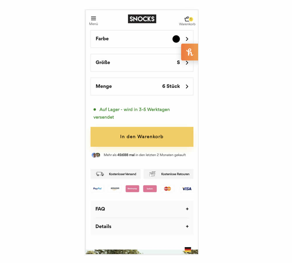
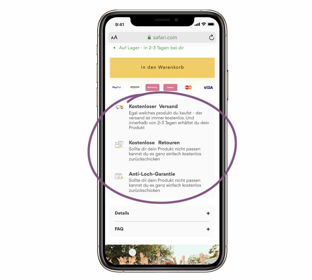
In this experiment, a series of reassurances were added just below the add to cart button. These included: "free shipping", "free returns" and an "anti-hole guarantee". The test ran on the product page of an socks ecommerce company. Impact on sales was measured.
Test #374 on
Expertinstitute.com
by  Ardit Veliu
Sep 15, 2021
Desktop
Mobile
Home & Landing
X.X%
Leads
Ardit Tested Pattern #9: Multiple Steps On Expertinstitute.com
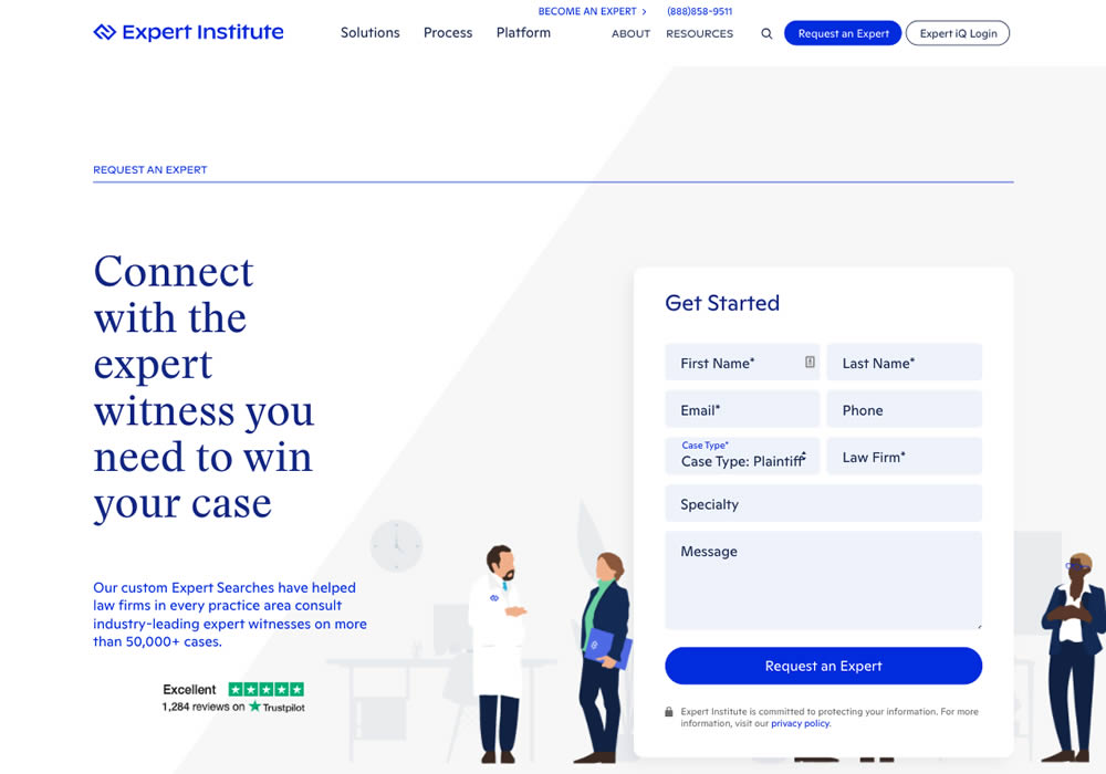

In this experiment, a lead form with numerous fields shown all at once, was broken down into 3 steps. The first step only asked for a Specialty choice that expanded into a list of options. Impact on full form completions was measured.
Test #372 on
Fluke.com
by  Marika Francisco
Aug 30, 2021
Desktop
Product
X.X%
Sales
Marika Tested Pattern #122: Zigzag Layout On Fluke.com
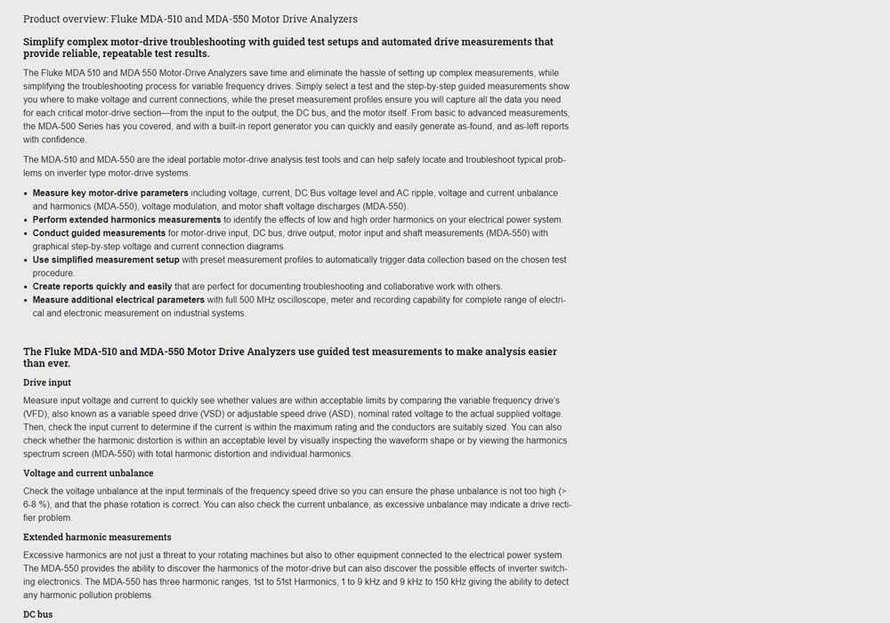

In this experiment, product descriptions were changed to an alternating zig zag layout with images. Impact on adds-to-cart and sales was measured.
Test #371 on
by  Jakub Linowski
Aug 18, 2021
Desktop
Listing
X.X%
Sales
Jakub Tested Pattern #51: Shortcut Buttons
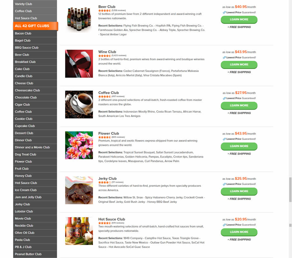
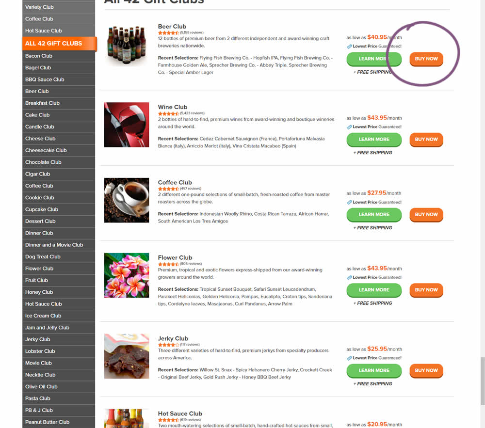
In this experiment, the variation added an extra "Buy Now" button that linked directly into the cart process. The variation only had a learn more button linking directly to a product page.
Test #370 on
Thomasnet.com
by  Julian Gaviria
Aug 16, 2021
Desktop
Mobile
Listing
X.X%
Progression
Julian Tested Pattern #88: Action Button On Thomasnet.com

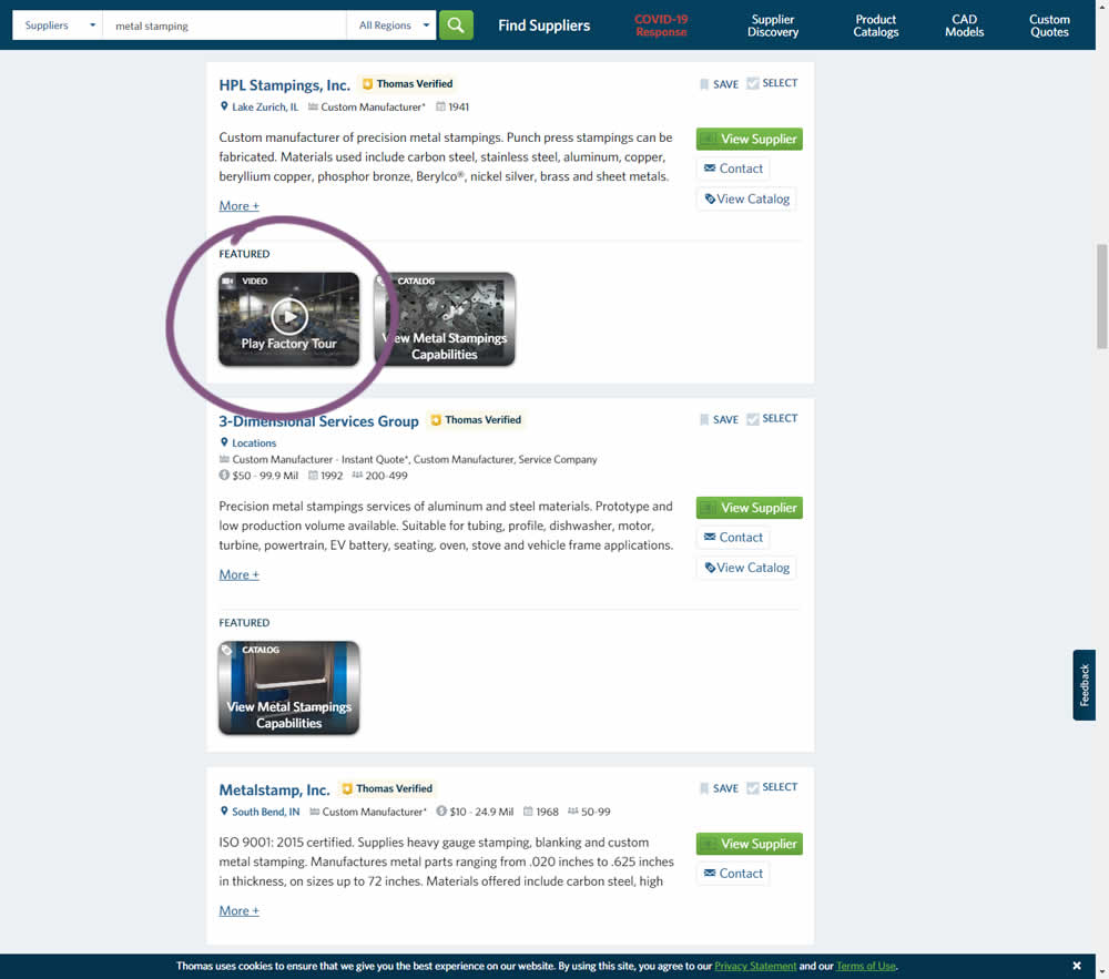
This experiment added the simple verb ("play") before the "factory video" label to encourage more video plays. Impact on progression / clicks was measured.
Test #369 on
Getninjas.com.br
by  Rodolfo Lugli
Aug 05, 2021
Desktop
Mobile
Home & Landing
X.X%
Leads
Rodolfo Tested Pattern #7: Social Counts On Getninjas.com.br
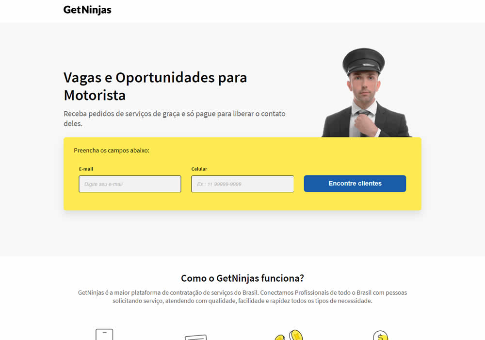
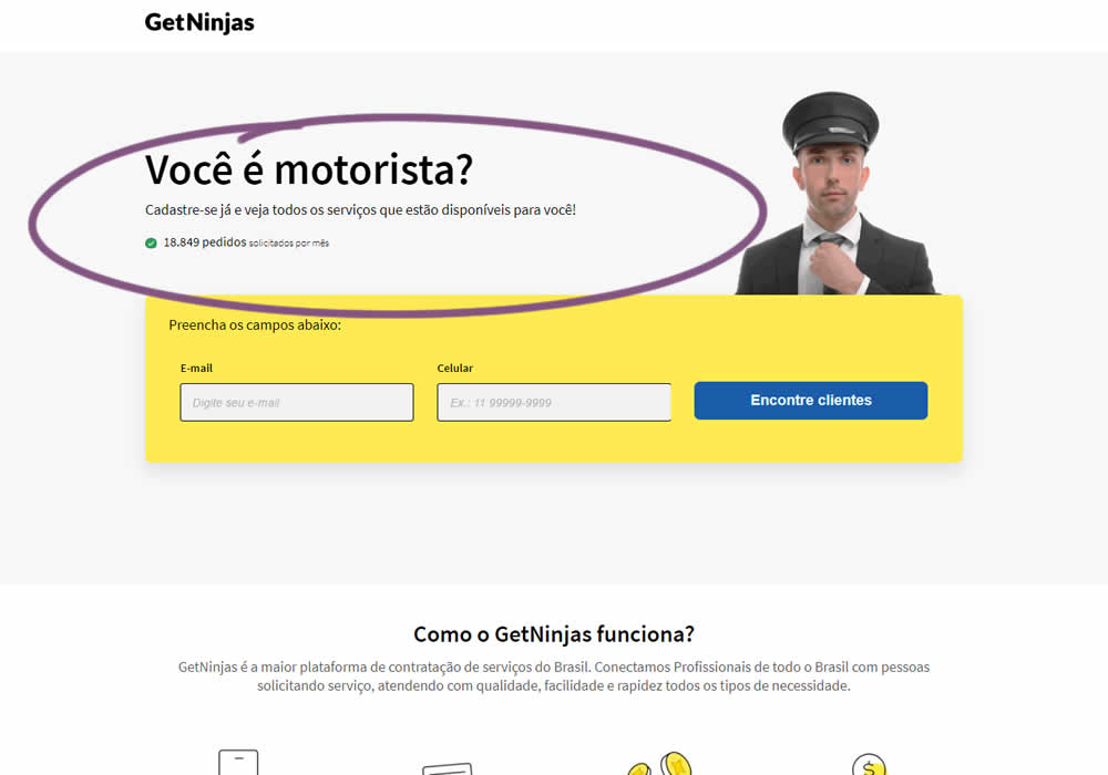
In this experimemt, the number of service requests per month were shown that people can expect after signing up in a given category. Impact on leads was measured (people who would be signing up to offer a particular service).
Test #368 on
Mvideo.ru
by  Andrey Andreev
Aug 02, 2021
Desktop
Home & Landing
X.X%
Sales
Andrey Tested Pattern #135: Product Categories On Mvideo.ru
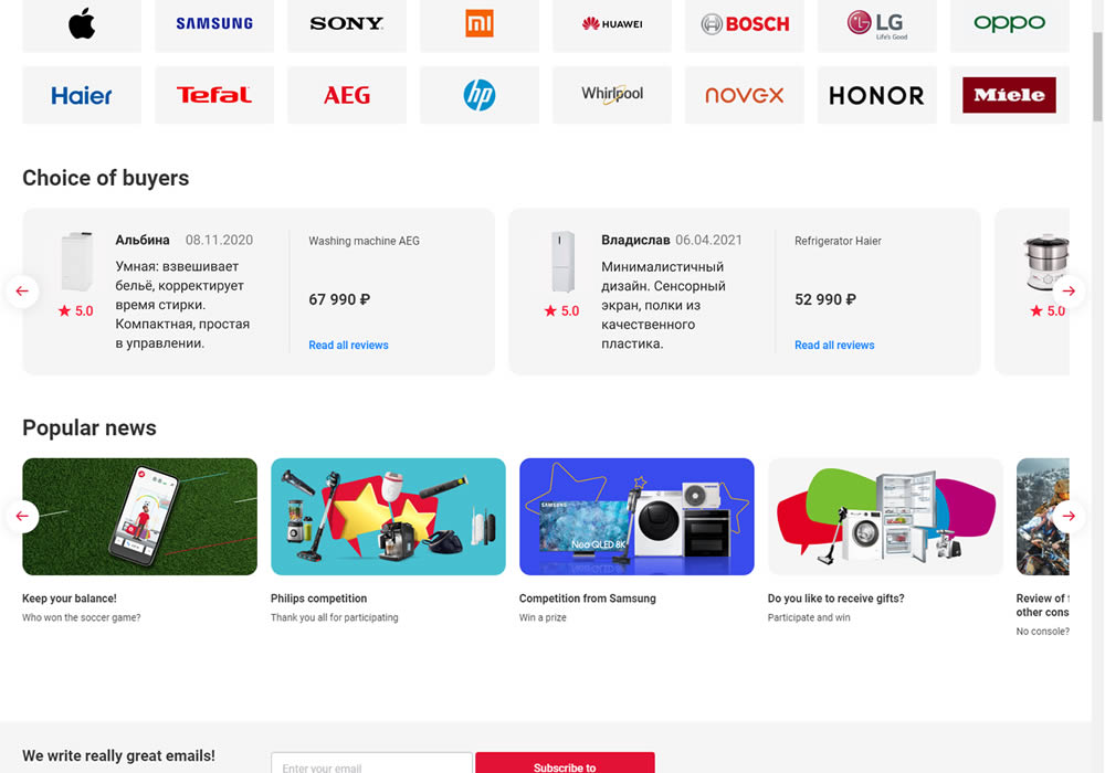
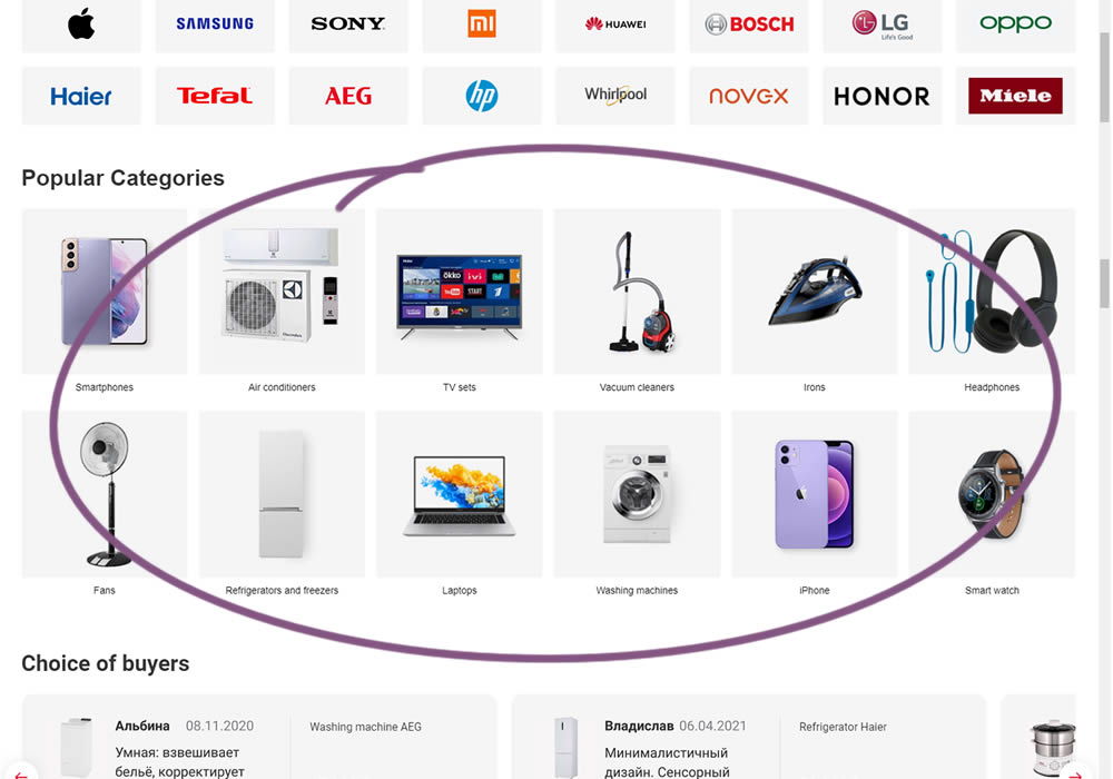
In this experiment, popular categories were added at the bottom of a long ecommerce homepage. Impact on total sales was measured.
Test #367 on
Backstage.com
by  Stanley Zuo
Jul 22, 2021
Desktop
Mobile
Signup
X.X%
Sales
Stanley Tested Pattern #124: Confirmed Selection On Backstage.com
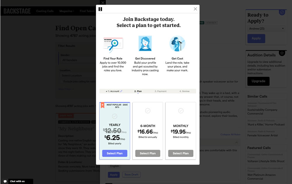
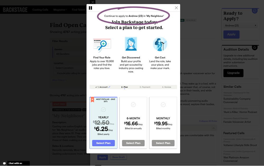
In this experiment, a confiming text was added at the top of a signup modal. The text reinforced the selection from a previous listing page, giving a good reason for continuing the signup process.
Test #366 on
Mvideo.ru
by  Andrey Andreev
Jul 14, 2021
Desktop
Mobile
Product
X.X%
Sales
Andrey Tested Pattern #93: Auto Next On Mvideo.ru
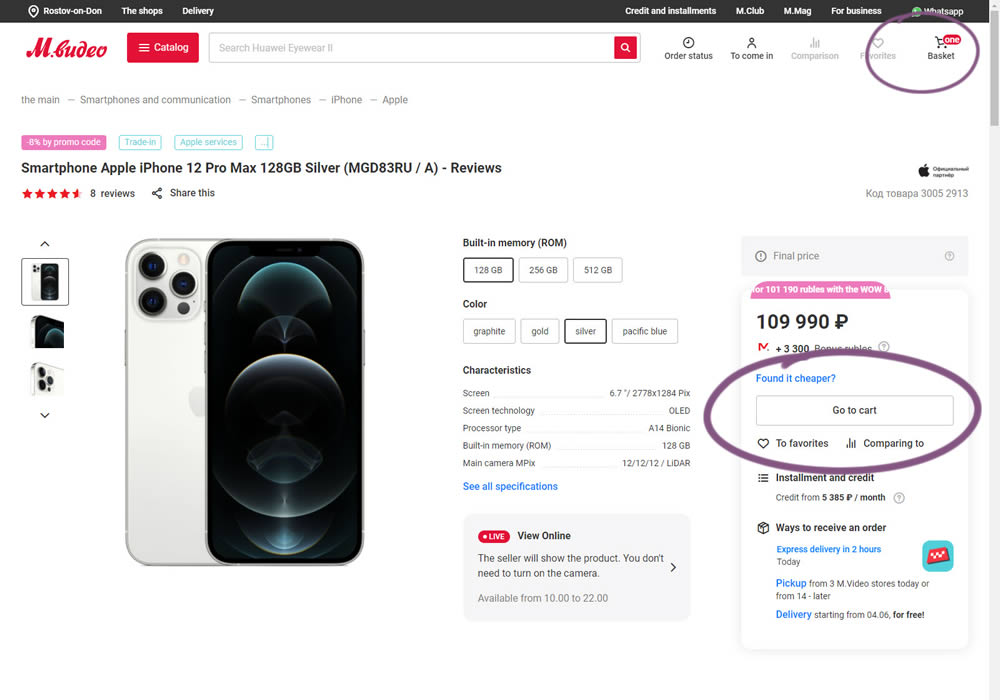
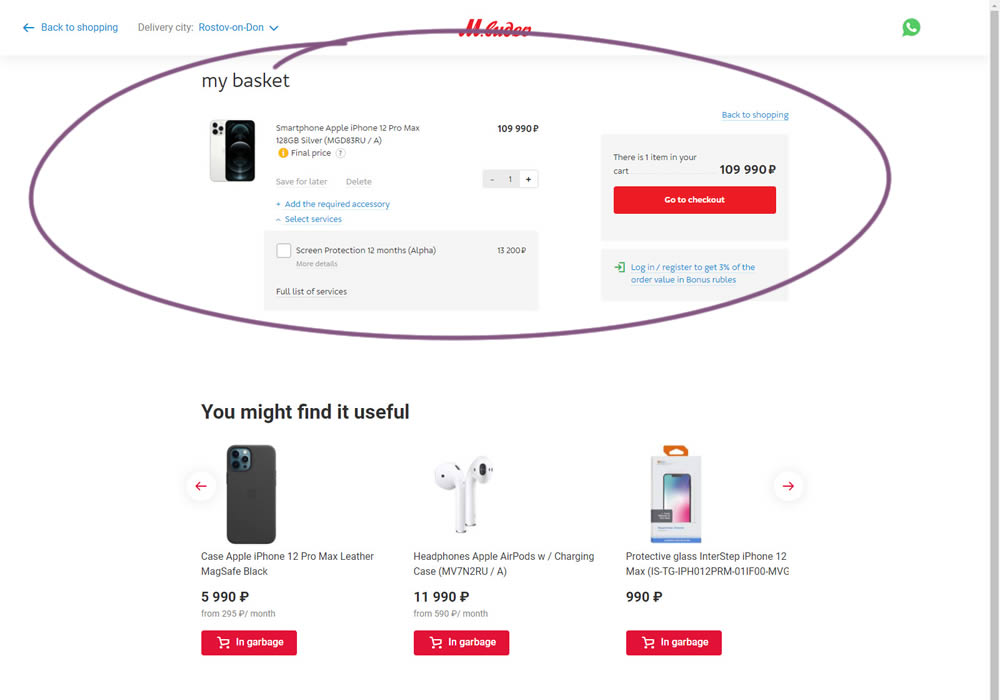
In this experiment, the interaction on a product page was changed. In the control (A), after clicking "add to cart", the customer would remain on the product page with an updated basket and the button changing to "Go To Cart". The variation (B) however took customers forward automatically to the cart.
Test #364 on
Lotuscrafts.eu
by  Samuel Hess
Jul 06, 2021
Desktop
Product
X.X%
Sales
Samuel Tested Pattern #122: Zigzag Layout On Lotuscrafts.eu
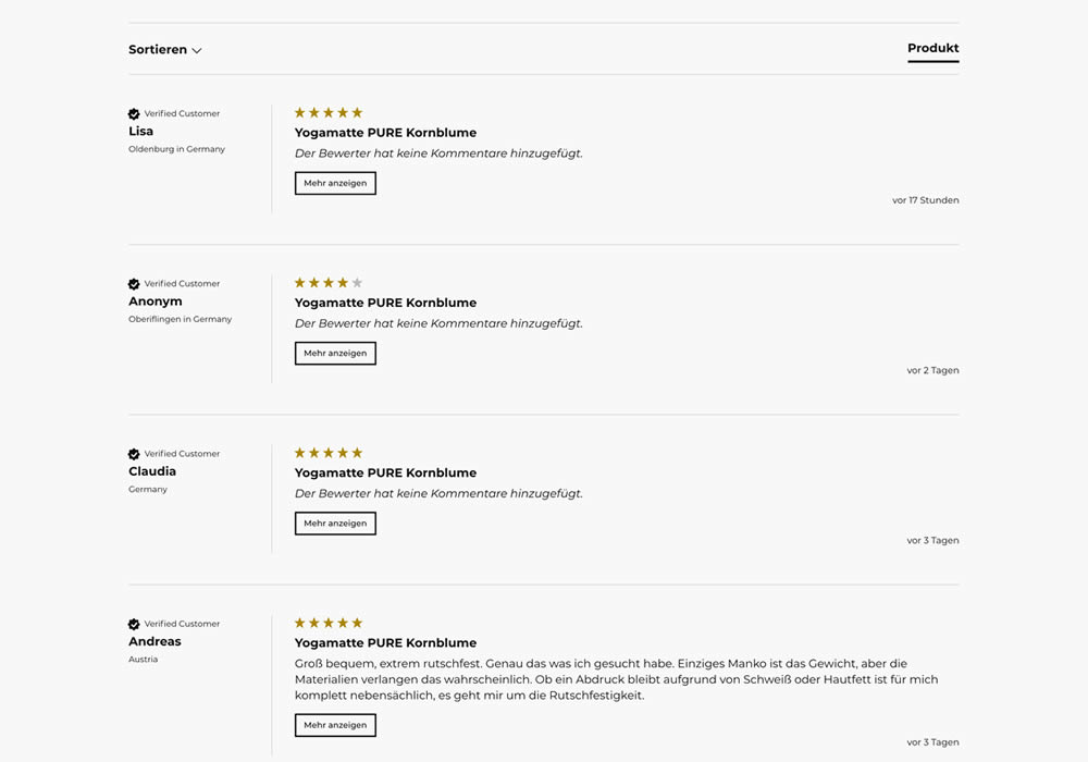
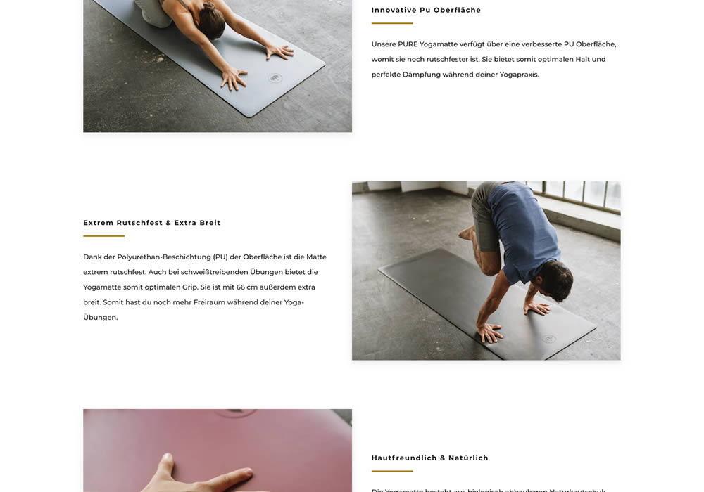
In this experiment, product descriptions or qualities were added using a zigzag layout pattern composed of photos and extra copy. This sections was appended between existing copy and testimonials. Some of the copy highlights included wording such as "innovative surface", "non-slip and wide", and "skin-friendly". Impact on adds-to-cart and sales was measured.
Test #363 on
by  Jakub Linowski
Jul 05, 2021
Desktop
Mobile
Product
X.X%
Sales
Jakub Tested Pattern #30: Authentic Photos
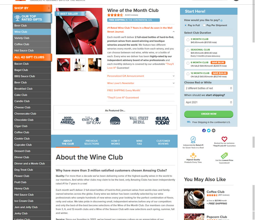
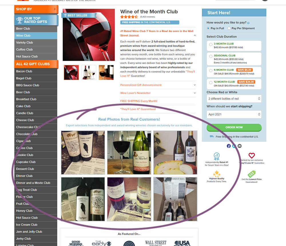
In this experiment, six product photos from were added which showed the actual products (including unboxing images).
Test #362 on
Vivareal.com.br
by  Vinicius Barros Peixoto
Jun 23, 2021
Desktop
Mobile
Product
X.X%
Leads
Vinicius Tested Pattern #7: Social Counts On Vivareal.com.br
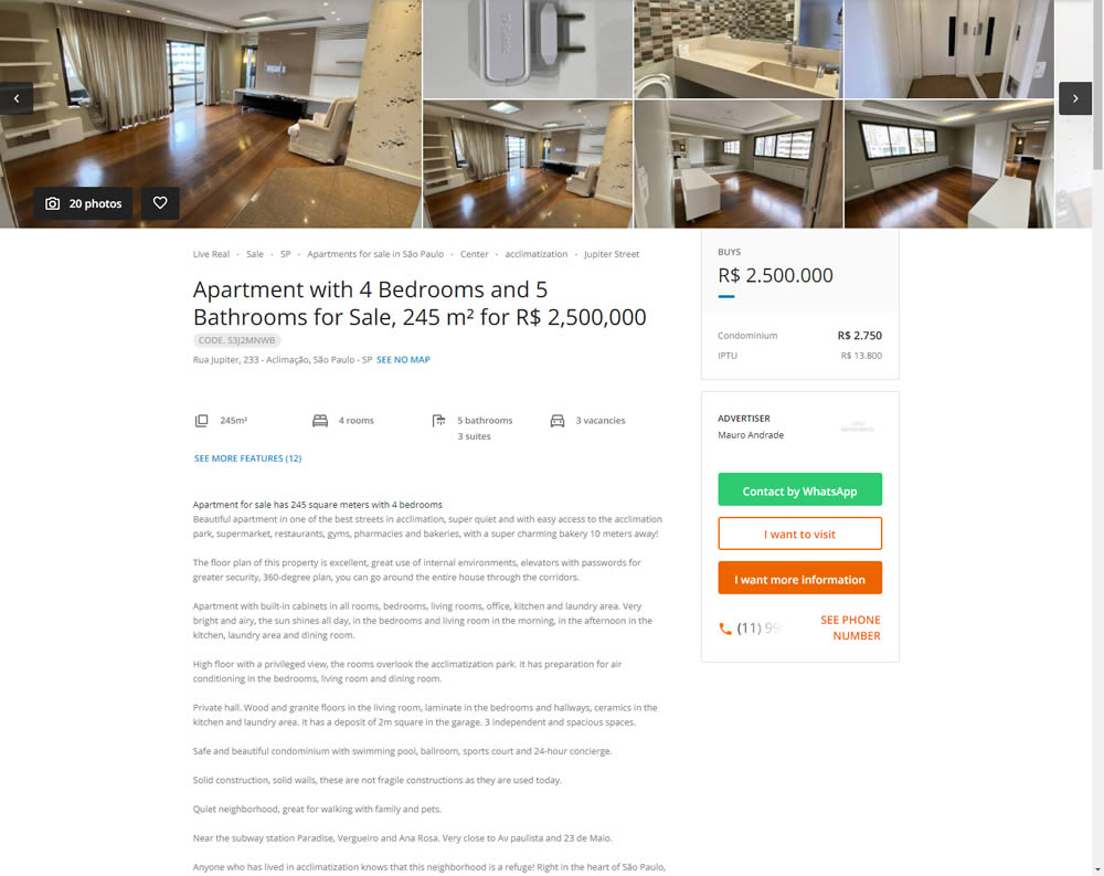
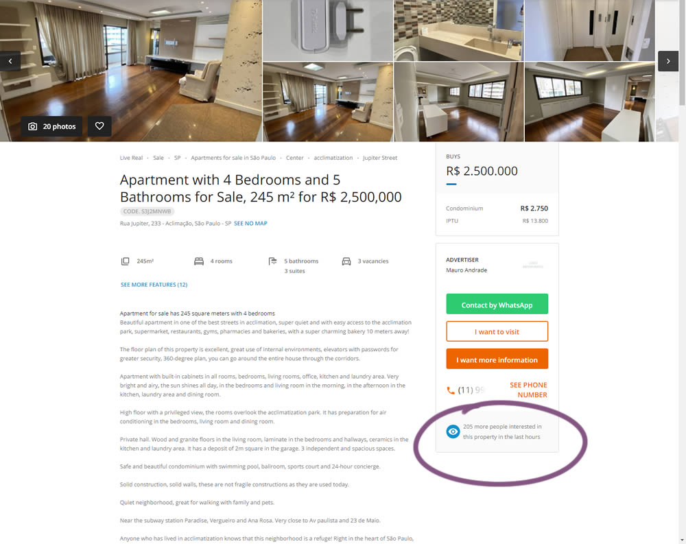
In this experiment, the number of recent property views was displayed under the call to action. Impact on overall lead generation was measured. (Translated using Google from Brazilian Portuguese.)
Test #361 on
Chaosgroup.com
by  Velin Penev
Jun 22, 2021
Desktop
Product
X.X%
Sales
Velin Tested Pattern #49: Above The Fold Call To Action On Chaosgroup.com
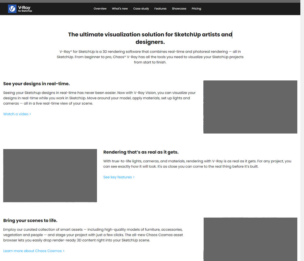
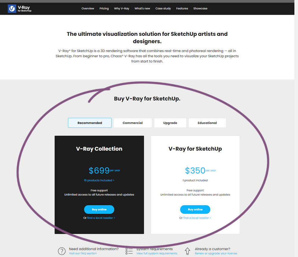
In this experiment, a pricing plan selector was shifted from the very bottom of a long product page towards (almost) the top. Impact on any transactions or sales was measured.
Test #360 on
by  Jakub Linowski
Jun 16, 2021
Desktop
Product
X.X%
Sales
Jakub Tested Pattern #60: Repeated Bottom Call To Action
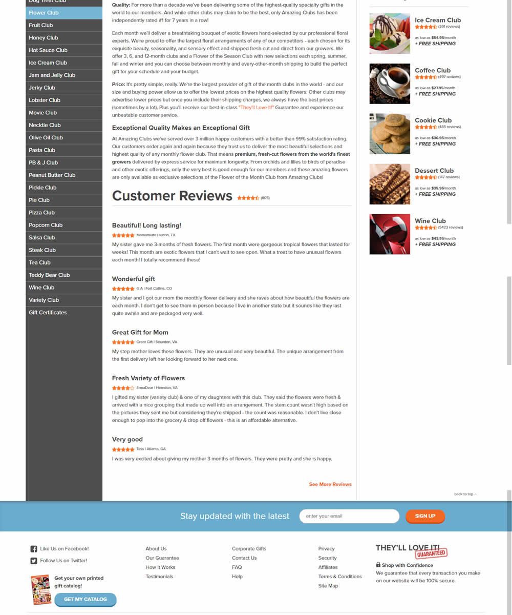
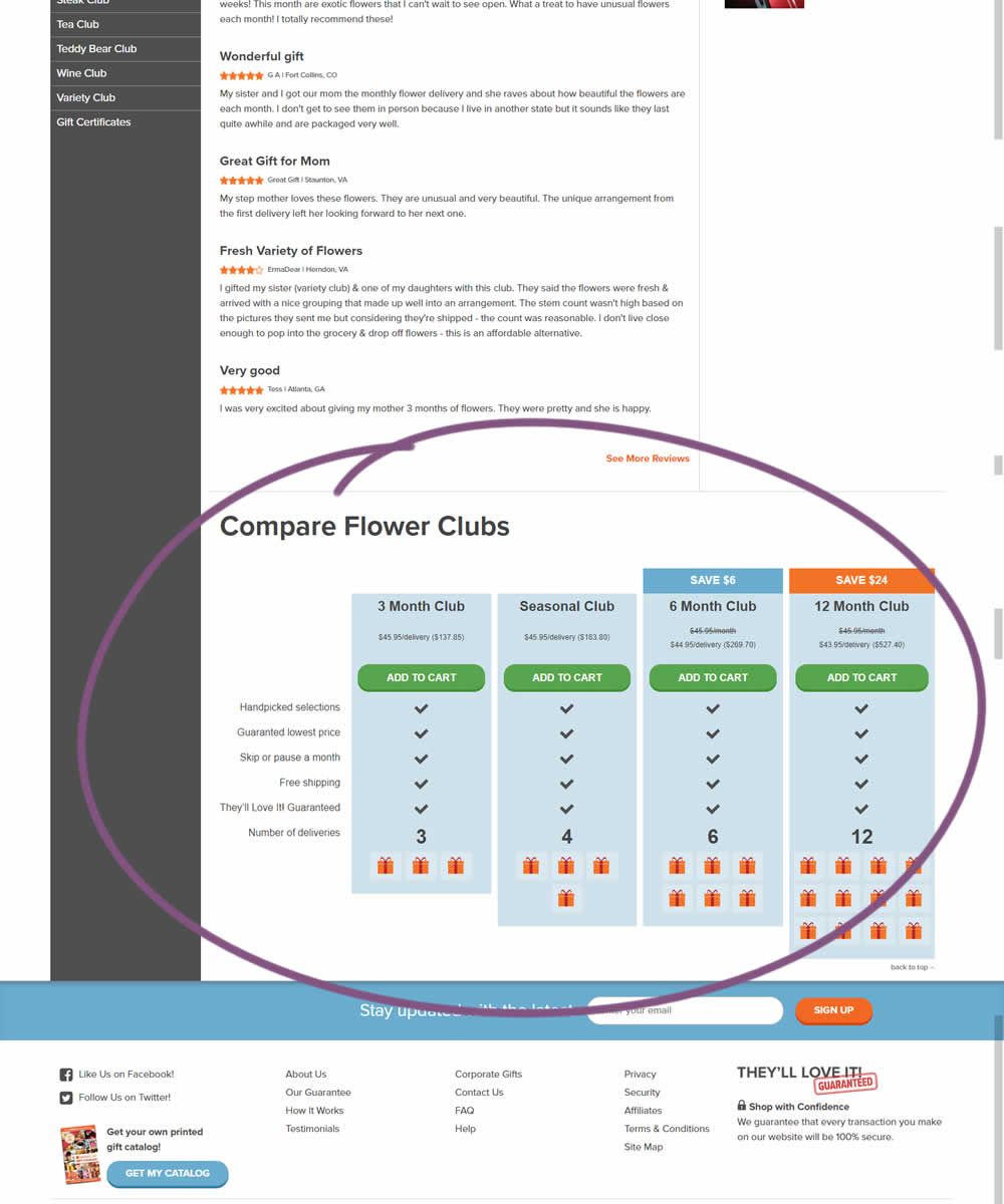
In this experiment, a comparison chart with various purchasing options was appended at the bottom of a product page.
Test #359 on
Snocks.com
by  Samuel Hess
Jun 11, 2021
Desktop
Mobile
Product
X.X%
Sales
Samuel Tested Pattern #43: Long Titles On Snocks.com
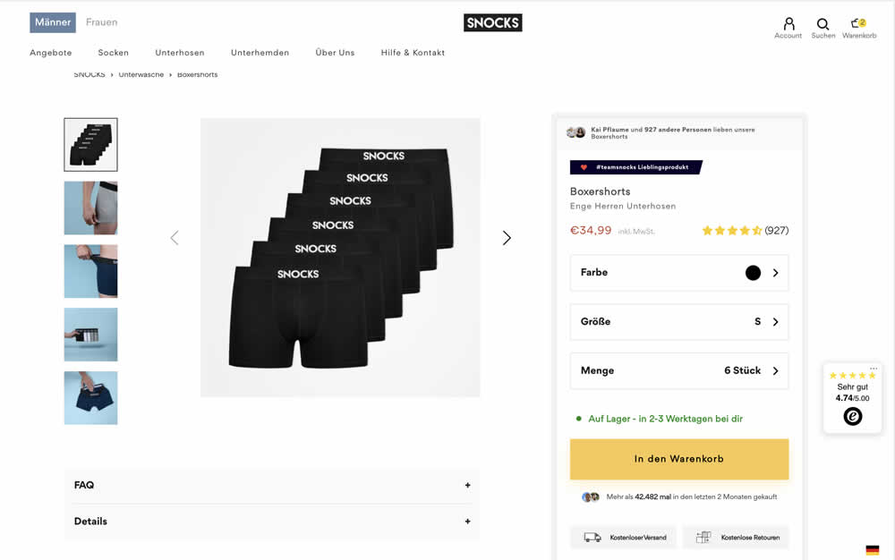
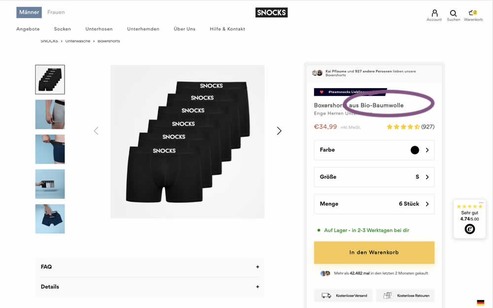
In this experiment, product titles were extended with descriptive copy. Instead of just showing the product name, "with organic cotton" was appended on product and category/listing pages. Impact to adds to cart and sales was measured.