All Latest 620 A/B Tests
Test #281 on
Backstage.com
by  Stanley Zuo
Jan 31, 2020
Desktop
Listing
X.X%
Sales
Stanley Tested Pattern #116: Links Or Buttons On Backstage.com
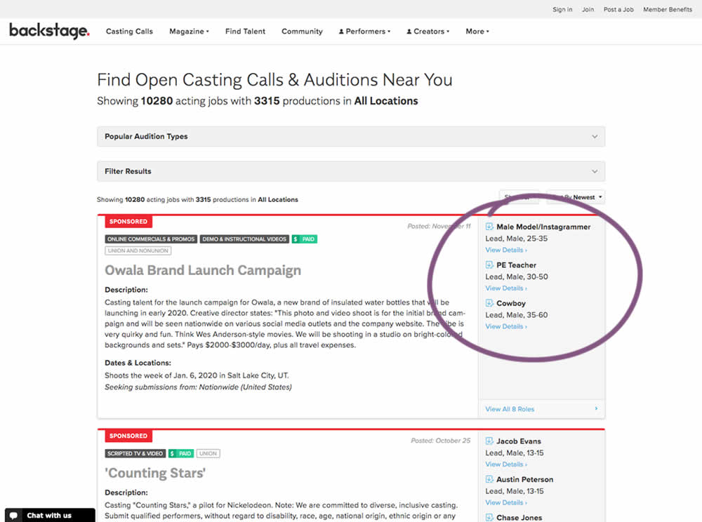
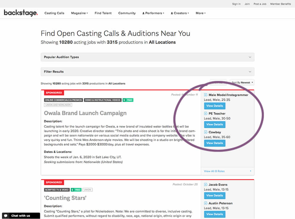
In this experiment, multiple view detail links for a listing tile were turned into higher contrast buttons.
Which A Or B Actually Wins? Find Out Before You Test.
Members see every test result — the winners, the flat ones, and the losers — along with exact effects and sample sizes. Use it to estimate your tests and prioritize by probability, not gut feel. Start every experiment with the odds on your side.
Test #280 on
Volders.de
by  Alexander Krieger
Jan 24, 2020
Desktop
Mobile
Signup
X.X%
Sales
Alexander Tested Pattern #3: Fewer Form Fields On Volders.de
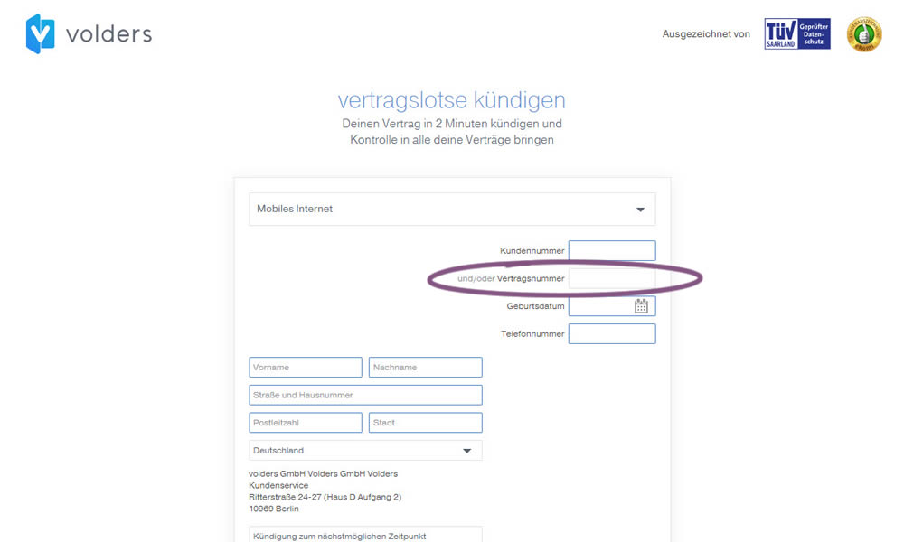
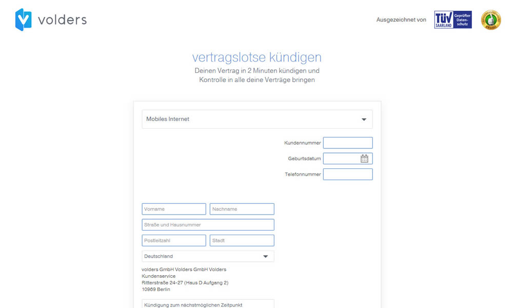
In this experiment on a contract cancellation funnel, one field was removed - a secondary contract ID. The control and variation both had a primary "customer ID" with which to identify and cancel someone's contract with.
Test #279 on
Umbraco.com
by  Lars Skjold Iversen
Jan 16, 2020
Desktop
Mobile
Home & Landing
X.X%
Sales
Lars Tested Pattern #79: Product Highlights On Umbraco.com
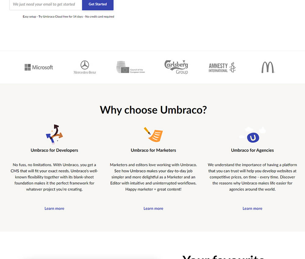
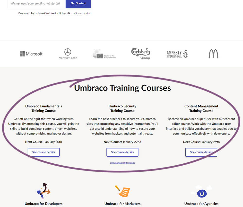
In this experiment, 3 additional course links with descriptions were added to the homepage. The idea was to increase course sales aside of the Saas subscription signups.
Test #278 on
by  Someone
Jan 15, 2020
Mobile
Shopping Cart
X.X%
Sales
Someone Tested Pattern #64: Tunnel
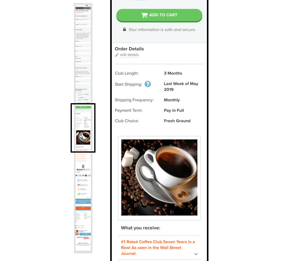
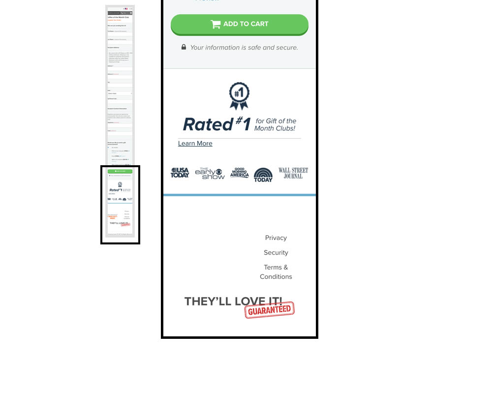
In this experiment, multiple elemenets were removed from the bottom of the cart page. This was done to see if they were potential distractions that hindered the purchase process. The elements included such things as: Order details (visible on other pages), large product photo, a "what you receive" section with selling points, more reassurances, and a newsletter subscribe box.
Test #277 on
Prepagent.com
by  Arthur Sparks
Jan 03, 2020
Desktop
Pricing
X.X%
Sales
Arthur Tested Pattern #115: Pricing Comparison Table On Prepagent.com
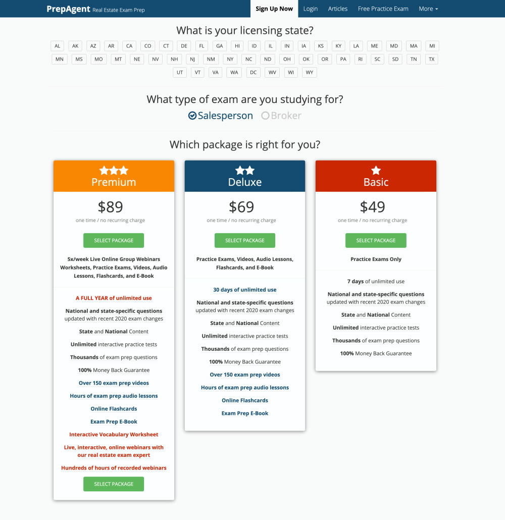
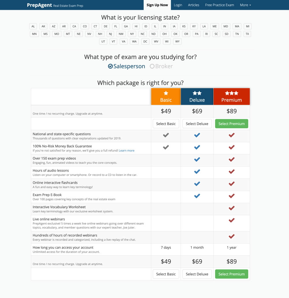
In this experiment, side-by-side plan features were aligned and changed to a comparison table with checkmarks for easier comparison.
Test #275 on
Prepagent.com
by  Arthur Sparks
Dec 31, 2019
Desktop
Pricing
X.X%
Sales
Arthur Tested Pattern #114: Less Or More Visible Prices On Prepagent.com
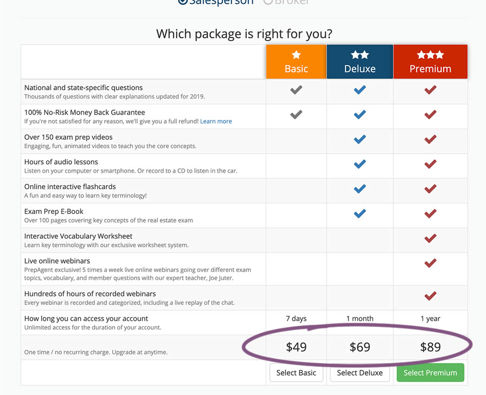
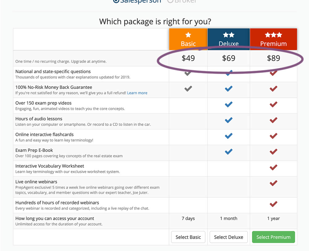
In this experiment, all three prices of each plan were shifted higher for greater visibility.
Test #274 on
by  Someone
Dec 16, 2019
Desktop
Mobile
Checkout
X.X%
Sales
Someone Tested Pattern #1: Remove Coupon Fields
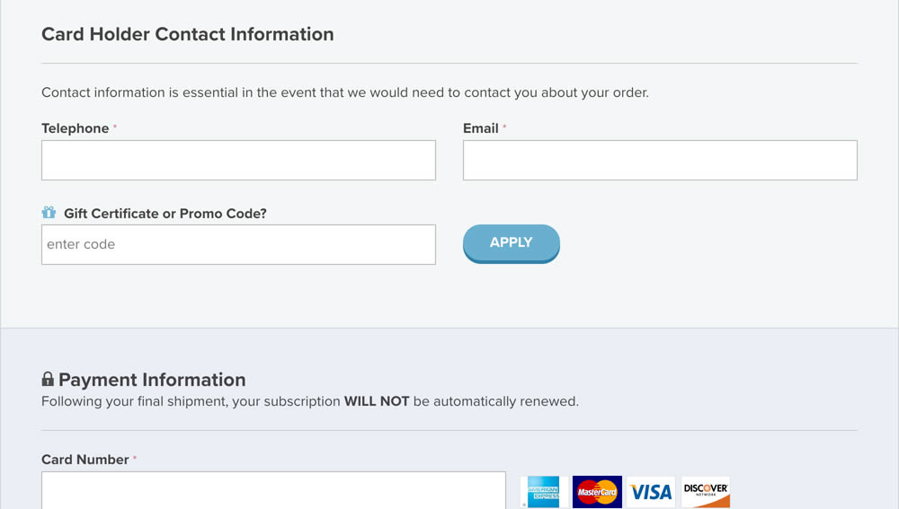
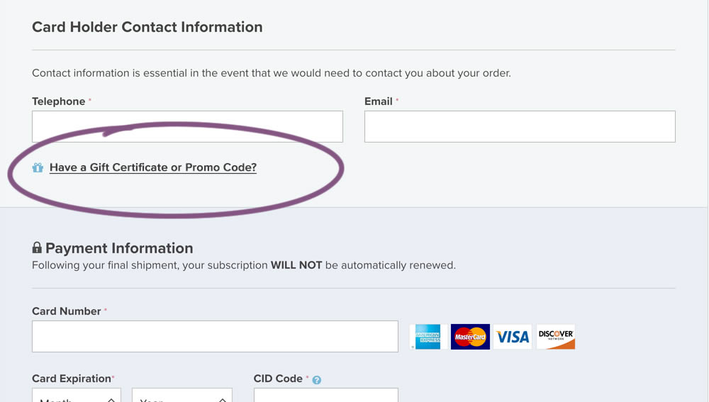
In this experiment, a fully visible coupon field (A) was made less visible by turning it into a default collaped link (B). Clicking on the link caused the coupon field to appear.
Test #272 on
Backstage.com
by  Stanley Zuo
Dec 03, 2019
Desktop
Pricing
X.X%
Sales
Stanley Tested Pattern #113: More Or Fewer Plans On Backstage.com
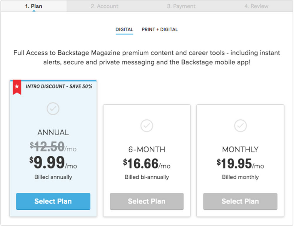
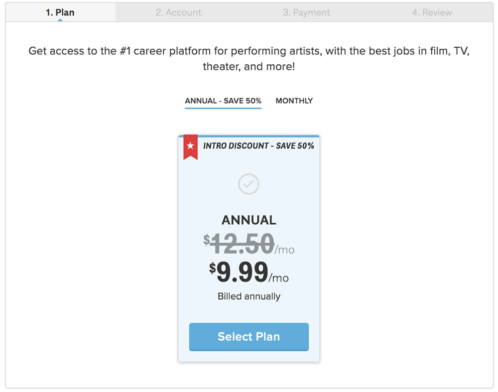
In this experiment, the three pricing plans were condensed into a single recommended plan (annual), with a secondary option to choose the monthly plan.
Test #270 on
Dentalplans.com
by  J.R. Hernandez
Nov 19, 2019
Desktop
Listing
X.X%
Sales
J.R. Tested Pattern #37: List Or Grid View On Dentalplans.com
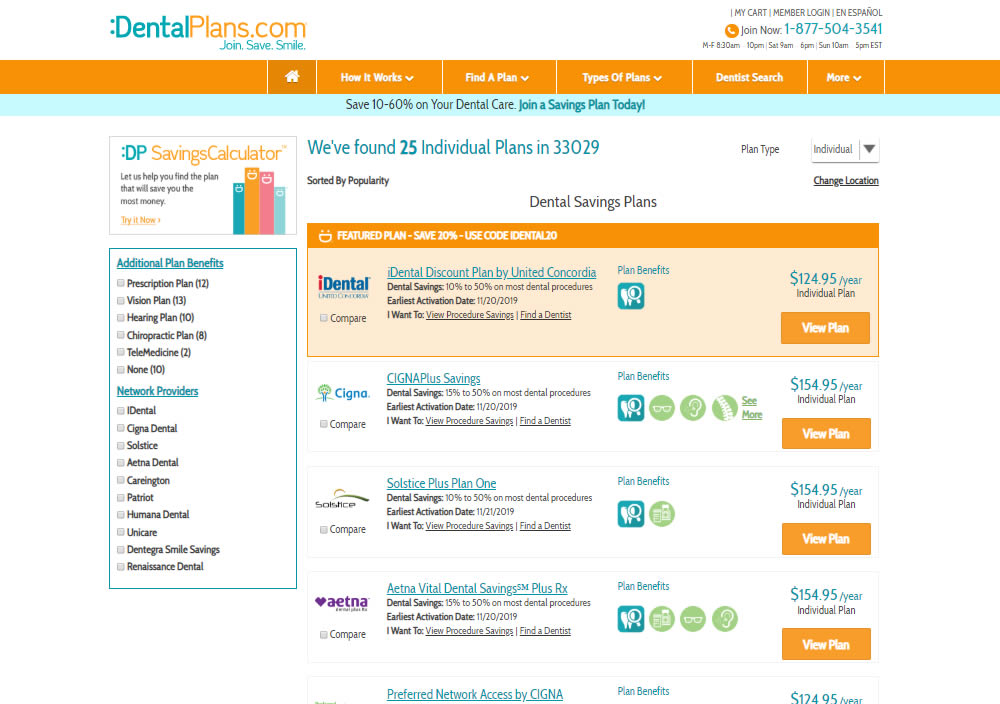
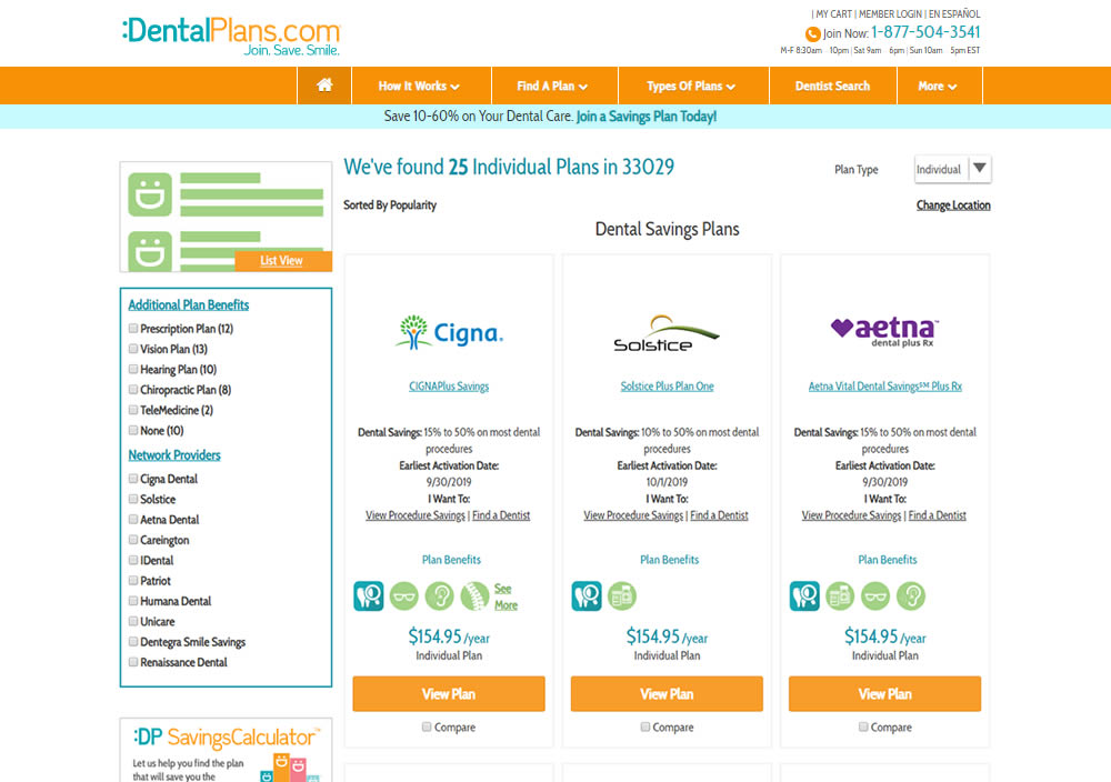
In this experiment, a list view was tested against a grid view.
Test #268 on
Backstage.com
by  Stanley Zuo
Nov 08, 2019
Mobile
Listing
X.X%
Sales
Stanley Tested Pattern #14: Exposed Menu Options On Backstage.com
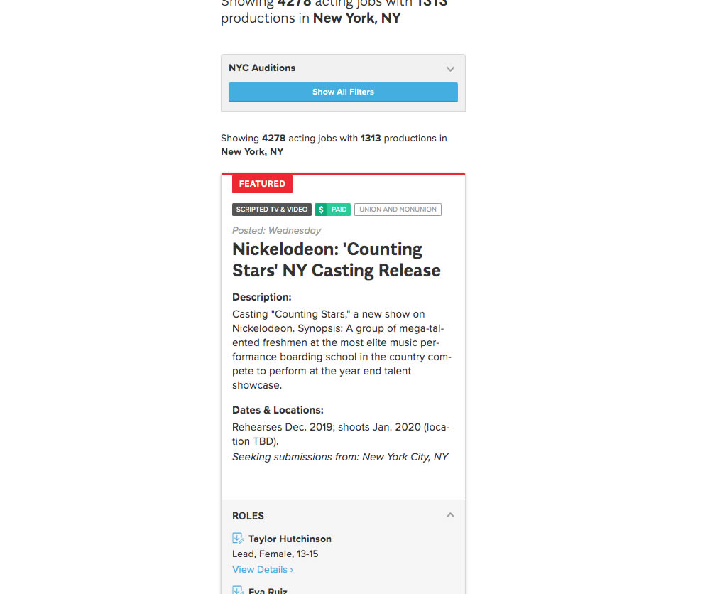
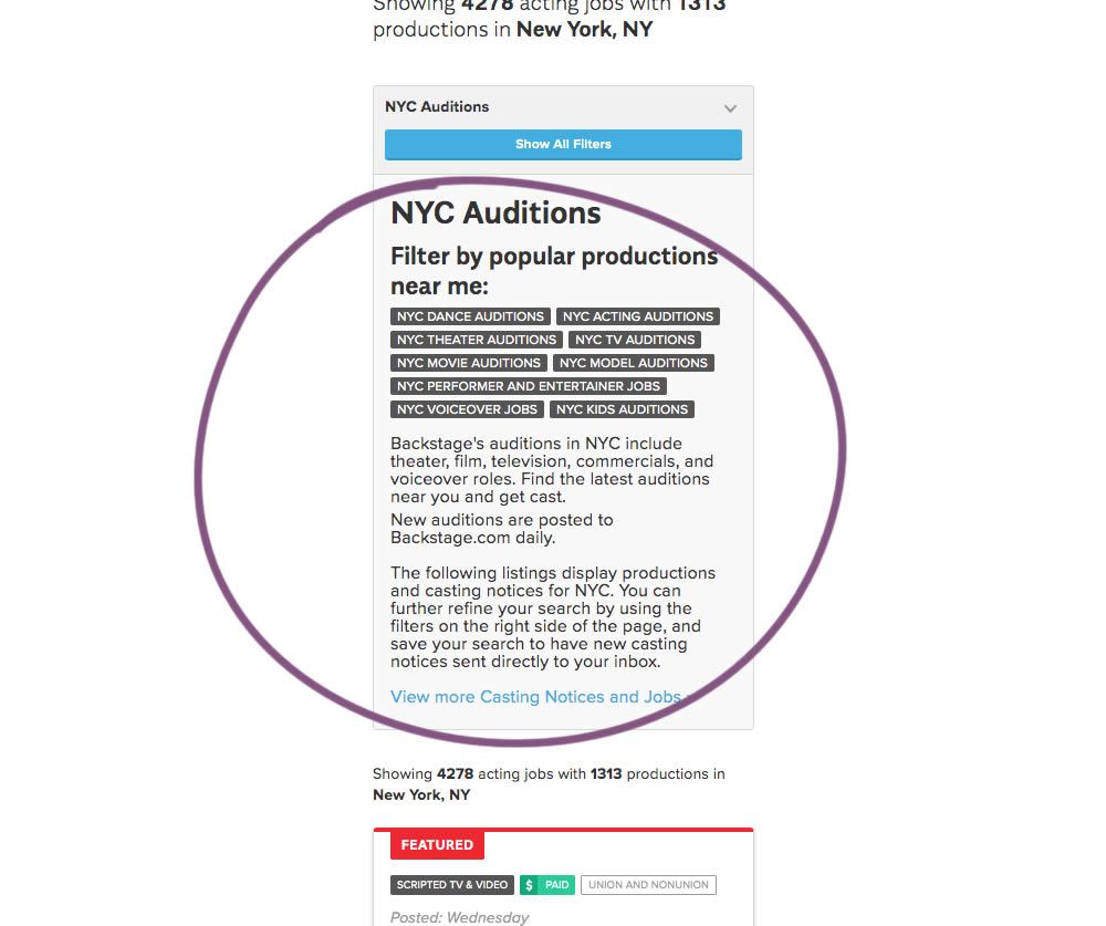
The change in this experiment was an exposed SEO panel (B) with a number of clickable filter options.
Test #267 on
Backstage.com
by  Stanley Zuo
Nov 05, 2019
Mobile
Checkout
X.X%
Sales
Stanley Tested Pattern #99: Progress Bar On Backstage.com
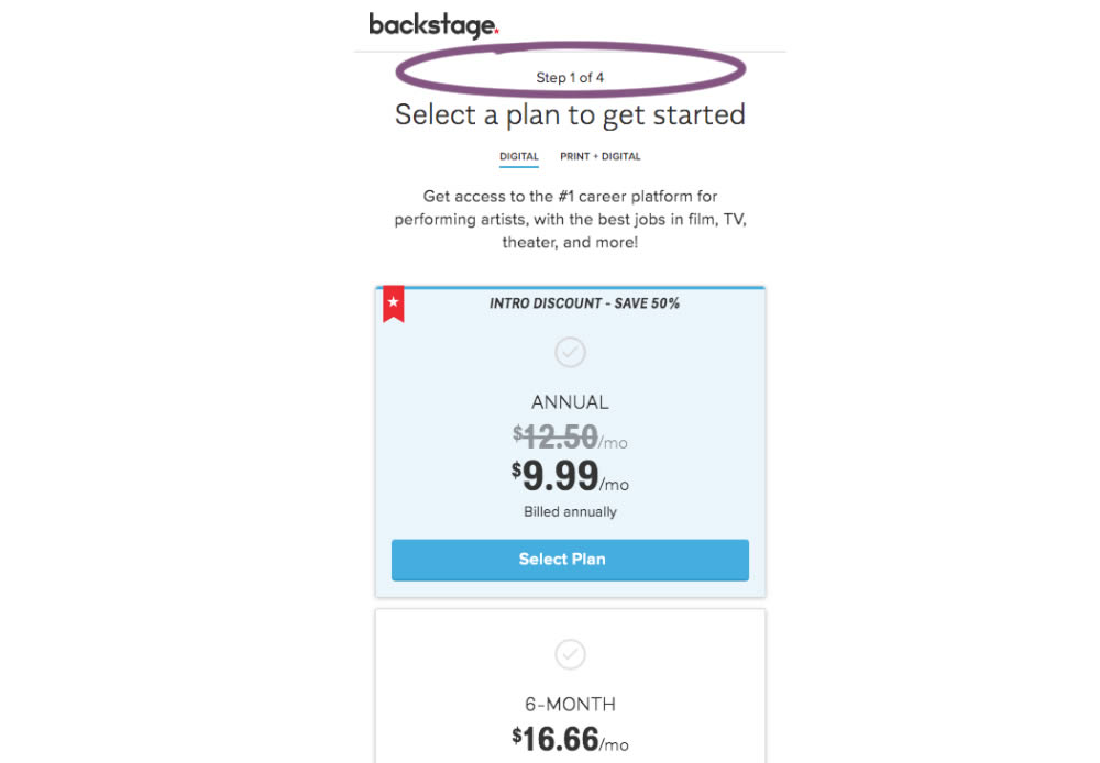
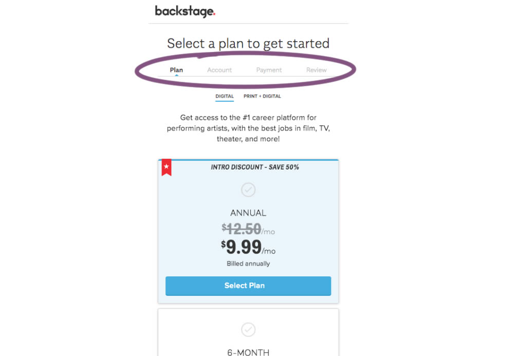
A "Step X of 4" progress bar was tested against a fully visible one that was also clickable.
Test #266 on
by  Someone
Oct 25, 2019
Desktop
Mobile
Product
X.X%
Sales
Someone Tested Pattern #4: Testimonials
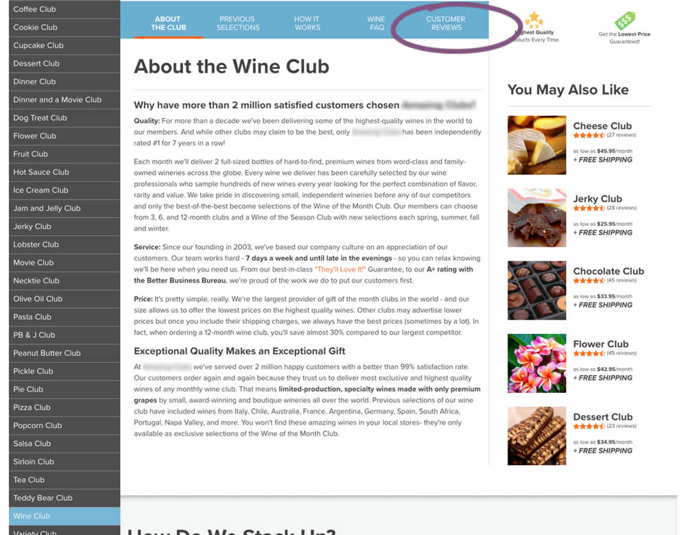
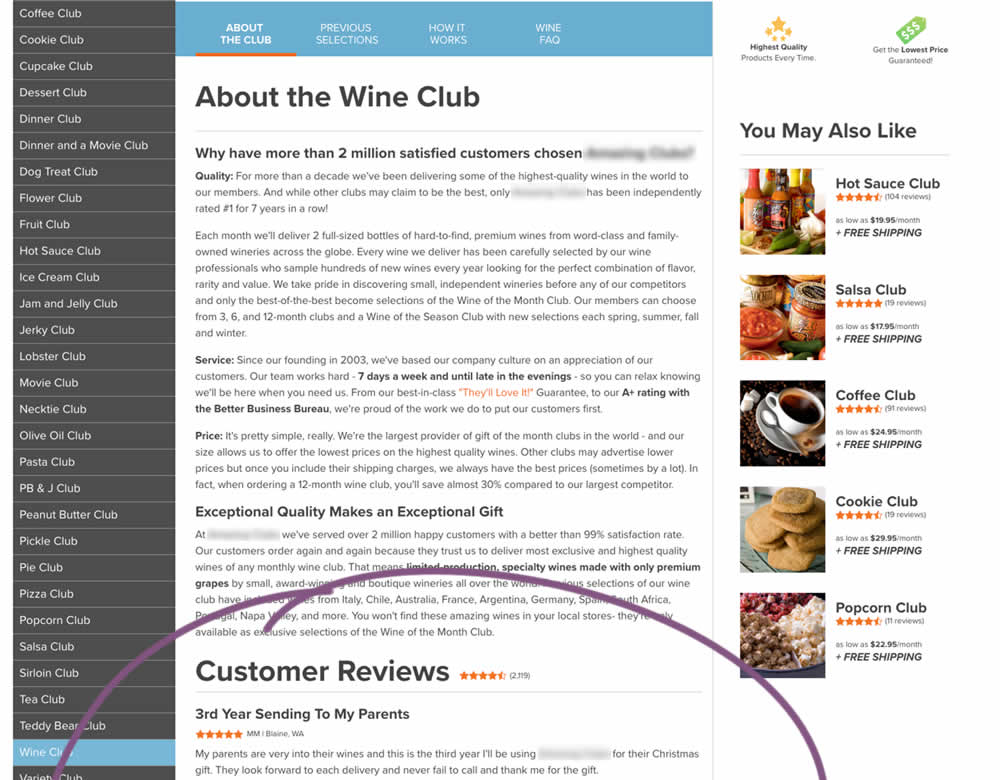
In this experiment, a product page showed customer reviews at the bottom of the page (B) instead of hiding them under a tab (A).
Test #265 on
Poll-app.com
by  Pierre Olivier Martel
Oct 17, 2019
Desktop
Mobile
Pricing
X.X%
Sales
Pierre Olivier Tested Pattern #112: Lower Price Frames On Poll-app.com
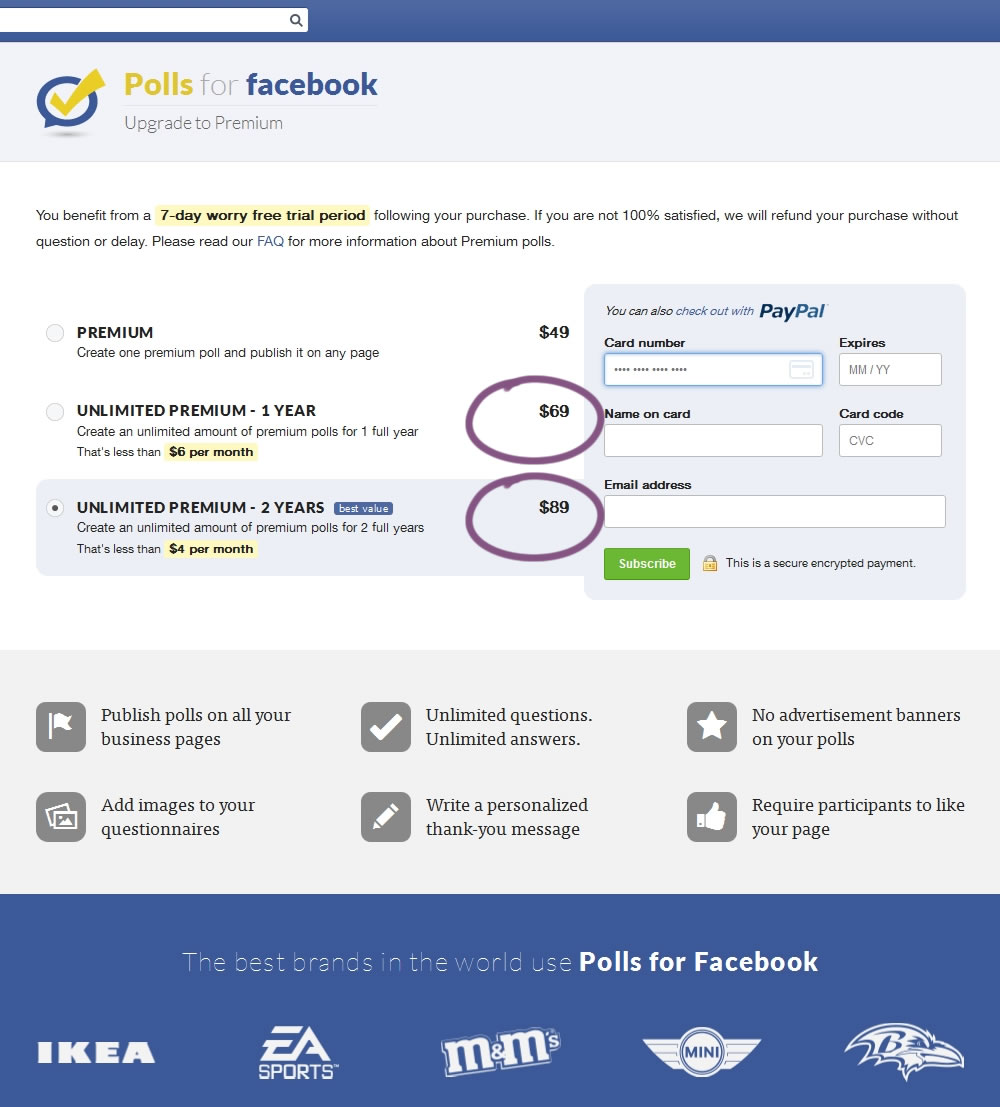
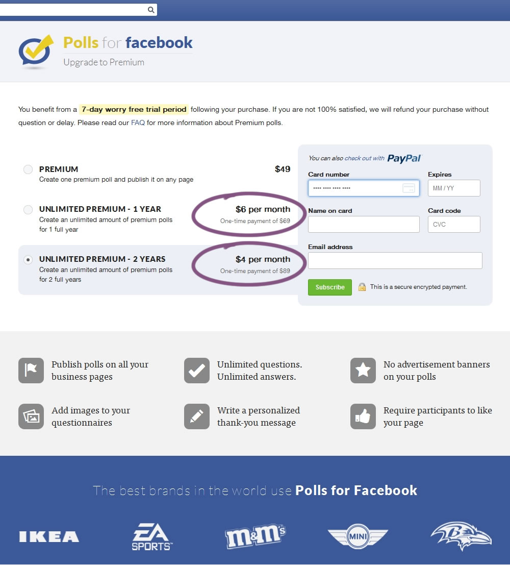
In this experiment, the $69 payment was explained as $6 per month over 1 year, and the $89 was explained as $4 per month over 2 years.
Test #264 on
Kenhub.com
by  Niels Hapke
Oct 05, 2019
Desktop
Mobile
Global
X.X%
Sales
Niels Tested Pattern #41: Sticky Call To Action On Kenhub.com
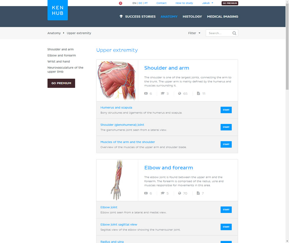
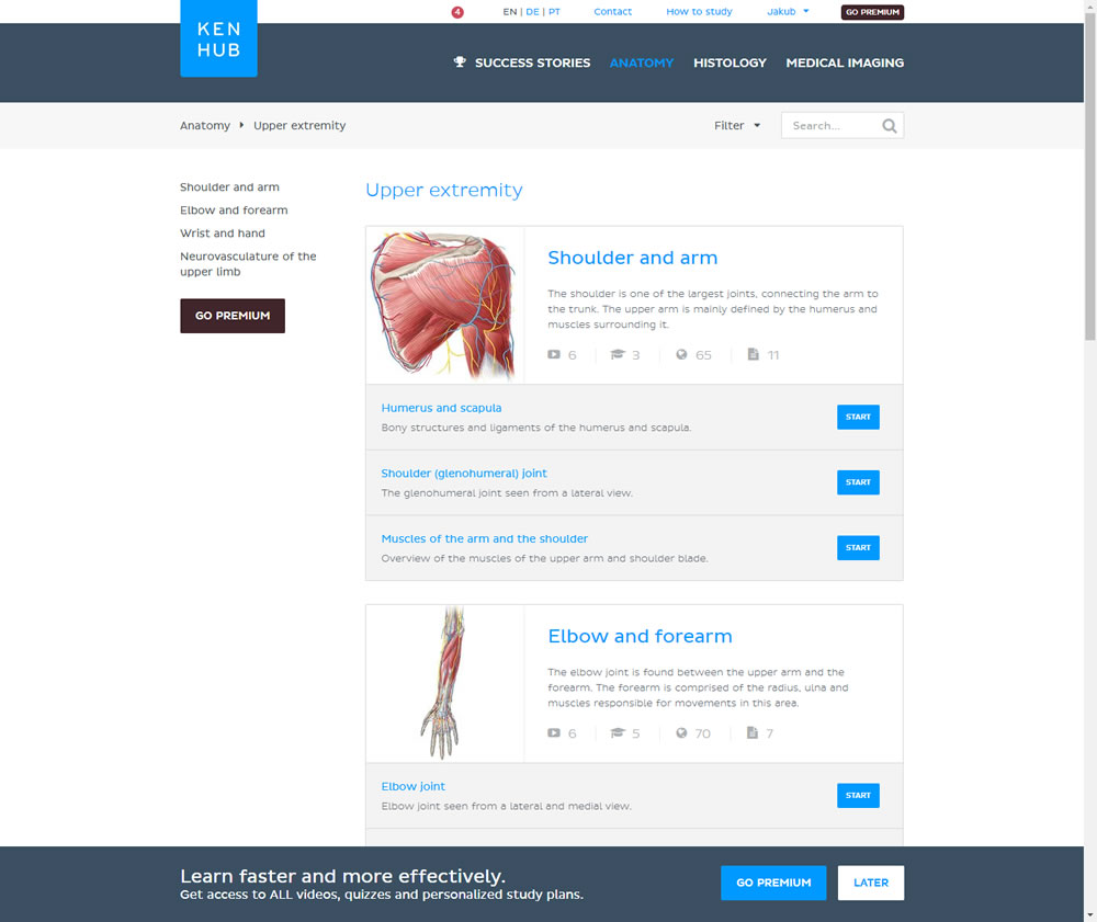
In this experiment users saw a sticky bar advertising the benefits of a Premium account across the bottom of the website, wherever they navigate. The sticky call to action appeared with a 4 second delay and was floating.
Test #261 on
Valkexclusief.nl
by  Online Dialogue
Sep 20, 2019
Desktop
Checkout
X.X%
Sales
Online Tested Pattern #111: Field Explanations On Valkexclusief.nl
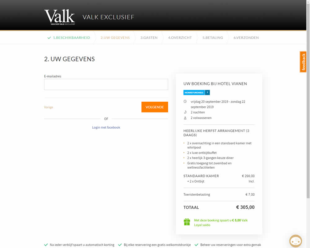
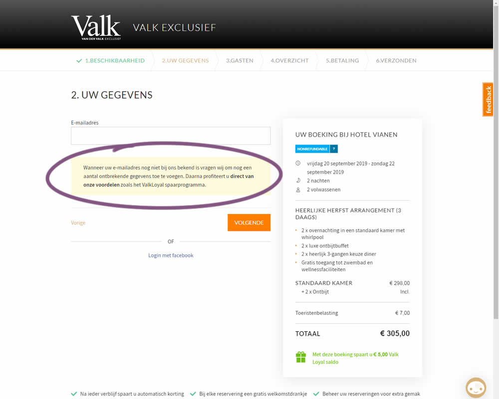
In this experiment on Valk Exclusief's web site, a reason was provided for why the e-mail address is being collected. Google translation of the added text is as follows: "If your e-mail address is not yet known to us, we will ask you to add some missing information. Then you immediately benefit from our benefits such as the ValkLoyal savings program."
Test #260 on
Valkexclusief.nl
by  Online Dialogue
Sep 16, 2019
Desktop
Home & Landing
X.X%
Sales
Online Tested Pattern #45: Benefit Bar On Valkexclusief.nl
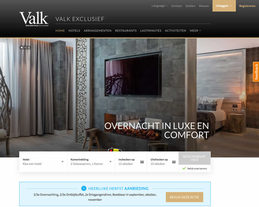
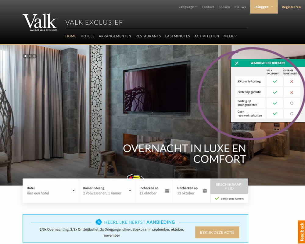
In this experiment on Valk Exclusief's web site, a transparent overview of the benefits for booking hotels was shown. The copy translates to: "Why should you book here? - 5€ Loyalty Discount - Best Price Guarantee - Discount On Packages - No Reservation Costs. Valk is a 150 year hotel chain in the Netherlands.
Test #254 on
Volders.de
by  Alexander Krieger
Aug 16, 2019
Desktop
Mobile
Signup
X.X%
Sales
Alexander Tested Pattern #17: Least Or Most Expensive First On Volders.de
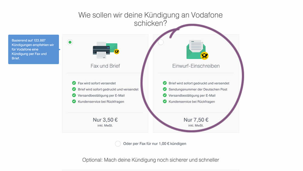
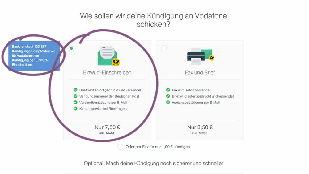
In this experiment, 4 things were adjusted in the variation: the highest pricing plan was shifted to the left, it was set as the default one, the recommendation was also adjusted to point to the highest plan, and one benefit from the lowest plan was removed (customer support).
Test #40 on
Adoramapix.com
by  Herman Klein
Aug 13, 2019
Desktop
Product
X.X%
Sales
Herman Tested Pattern #85: Benefit Button On Adoramapix.com
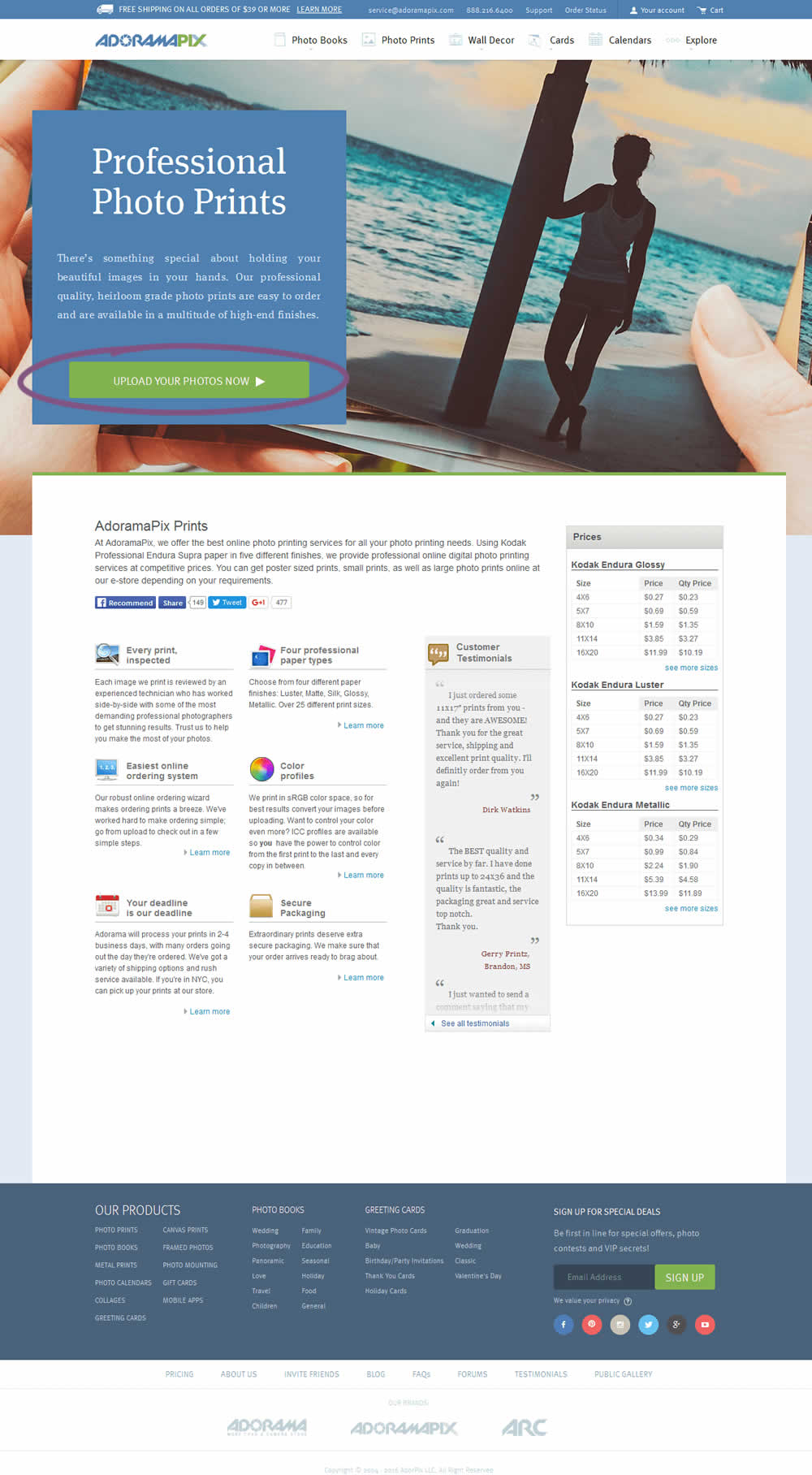
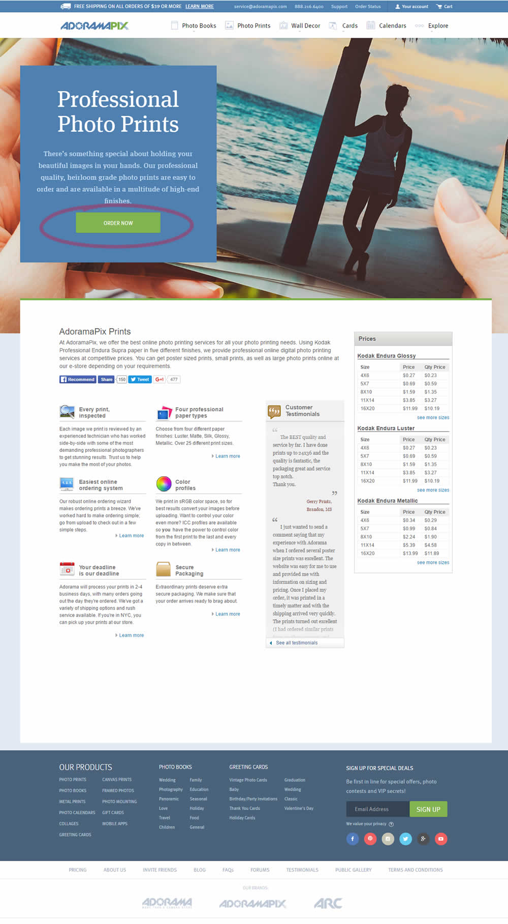
In this experiment only the button label changed. The control had a more immediate (next step-oriented) button label of "Upload Your Photos Now". The variation tried a more benefit-oriented button of "Order Now" (hinting at paying and obtaining the product).
Test #253 on
Volders.de
by  Alexander Krieger
Aug 08, 2019
Desktop
Mobile
Signup
X.X%
Sales
Alexander Tested Pattern #17: Least Or Most Expensive First On Volders.de
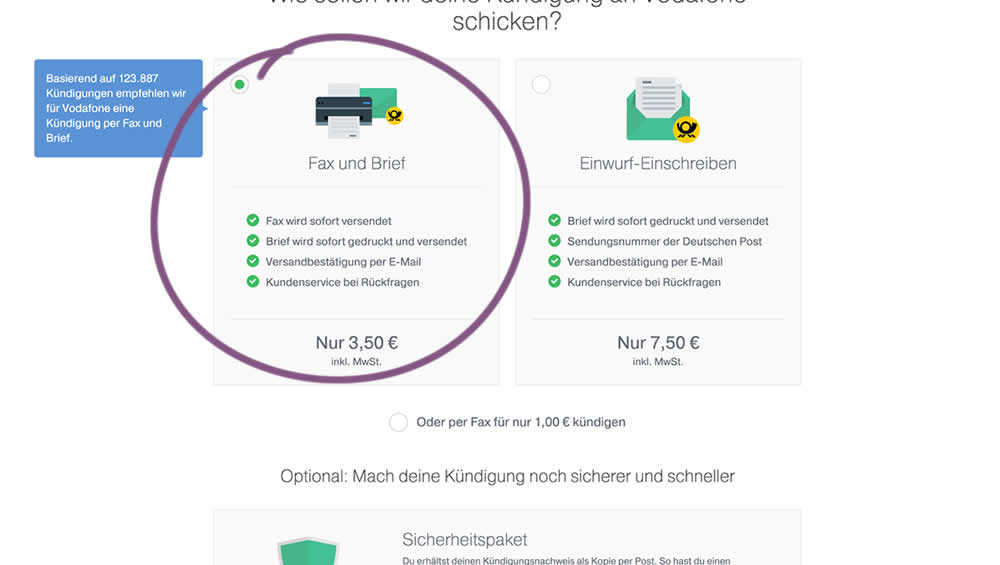
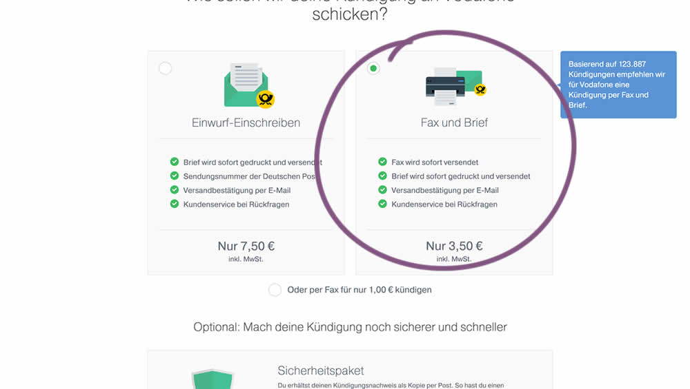
In this experiment, two pricing plans were inverted to show the most expensive plan first (in the variation).
Test #248 on
Volders.de
by  Alexander Krieger
Jul 16, 2019
Desktop
Signup
X.X%
Sales
Alexander Tested Pattern #20: Canned Response On Volders.de

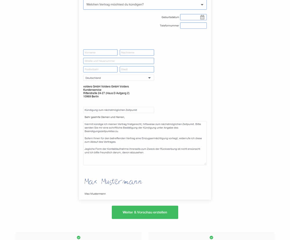
In this experiment, an editable contract cancellation letter was tested against a non-editable one. The editable letter first appeared in a text state, which required a click on a link in order for it to be transformed into an editable textarea field.