All Latest 617 A/B Tests
Test #311 on
Backstage.com
by  Stanley Zuo
Aug 11, 2020
Desktop
Mobile
Home & Landing
X.X%
Sales
Stanley Tested Pattern #118: Category Images On Backstage.com
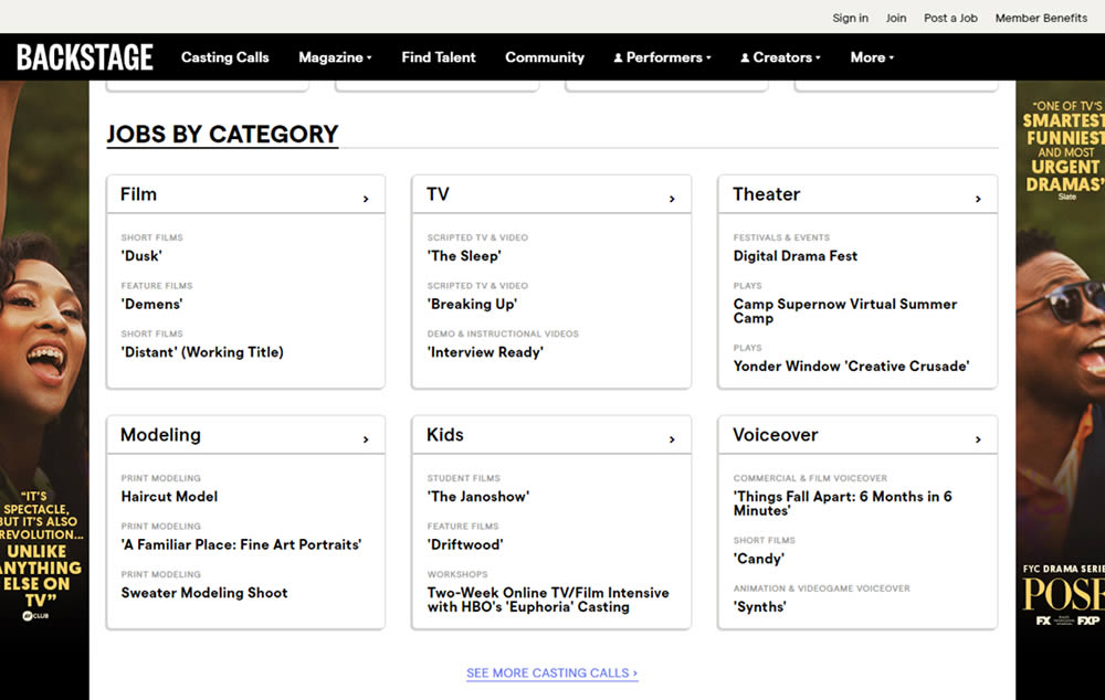
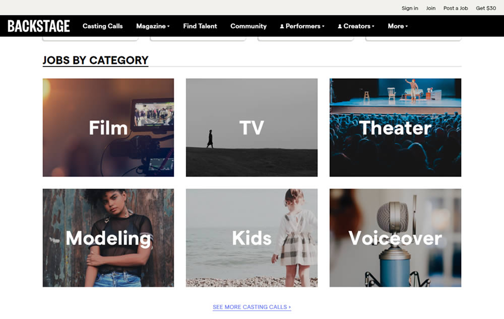
In this experiment, category links (linking to casting call search results) were replaced with tile images. In addition, 2 levels of categories were also replaced with a single text link for each tile. Finally, the font size of the link titles was also increased.
Which A Or B Actually Wins? Find Out Before You Test.
Members see every test result — the winners, the flat ones, and the losers — along with exact effects and sample sizes. Use it to estimate your tests and prioritize by probability, not gut feel. Start every experiment with the odds on your side.
Test #310 on
Backstage.com
by  Stanley Zuo
Jul 25, 2020
Mobile
Listing
X.X%
Sales
Stanley Tested Pattern #77: Filled Or Ghost Buttons On Backstage.com
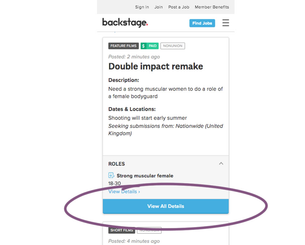
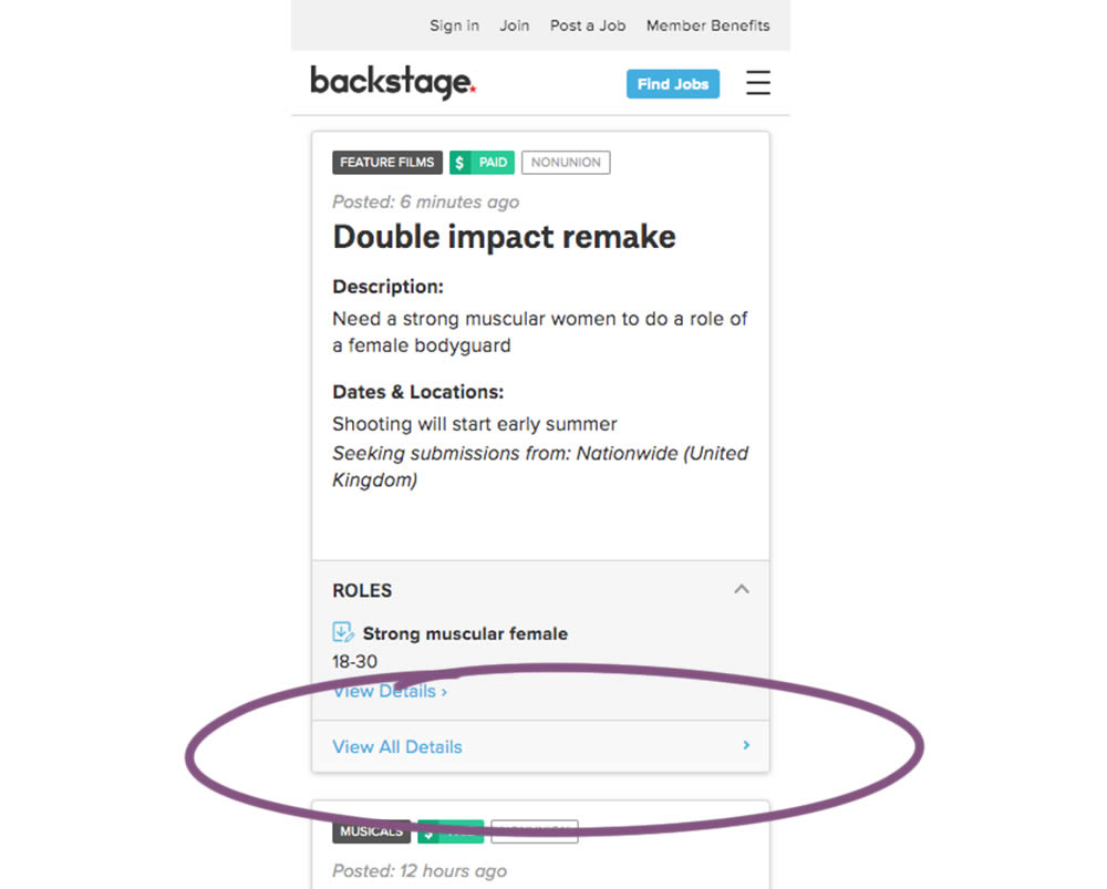
In this experiment, the style of a button leading to view detailed casting calls on a listing page was changed. In the A version the style was a filled high contrast blue background, and the B variation had a feint "ghost button" style.
Test #306 on
Backstage.com
by  Stanley Zuo
Jul 09, 2020
Desktop
Mobile
Pricing
X.X%
Sales
Stanley Tested Pattern #69: Autodiscounting On Backstage.com
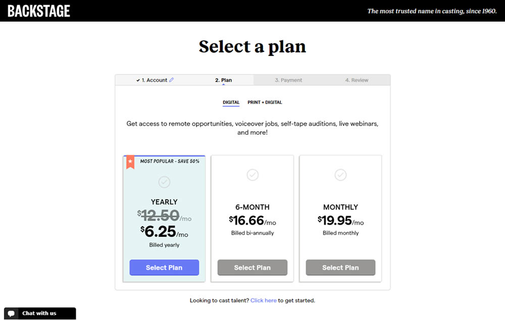
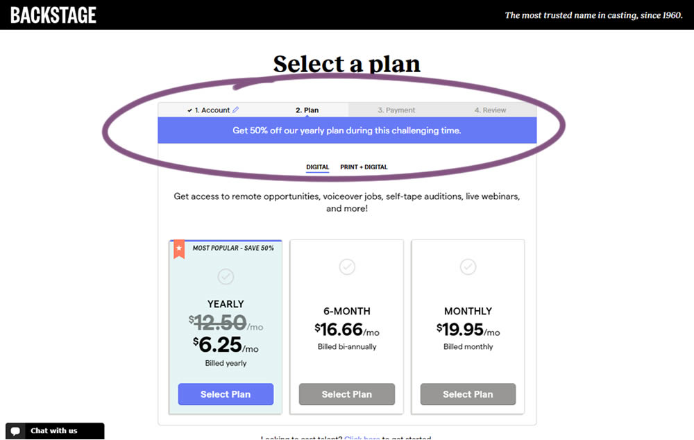
In this experiment, the only change was an added message at the top of the pricing screen, clarifying that there is an active discount on a yearly plan. The discount was already communicated with a strike-through price on the control version as well. The variation simply emphasized this aggressively.
Test #305 on
Volders.de
by Michal Fiech
Jun 30, 2020
Mobile
Desktop
Home & Landing
X.X%
Sales
Michal Tested Pattern #94: Visible Search On Volders.de

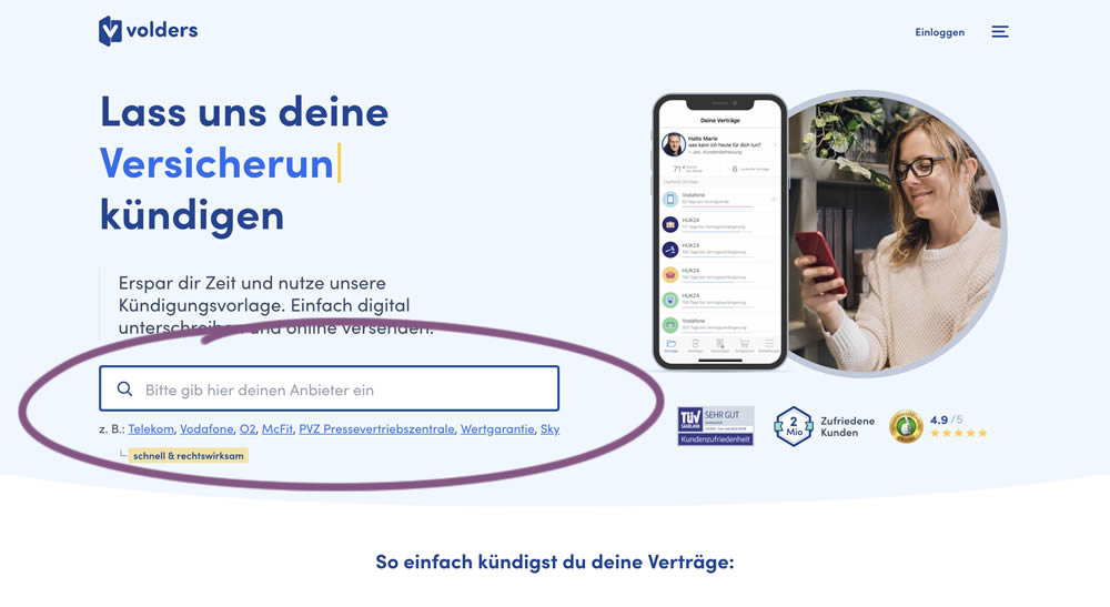
In this experiment, a search input field (to look for companies) along with most popular links (also company names) were displayed on the homepage of a leading contract cancellation service. The control (A) version instead had a button that sent users to a next page where the same selection could be made - only later. The measurable success criteria were the number of paid cancellations - a few steps down the funnel.
Test #61 on
by  Someone
Jun 26, 2020
Desktop
Checkout
X.X%
Sales
Someone Tested Pattern #9: Multiple Steps
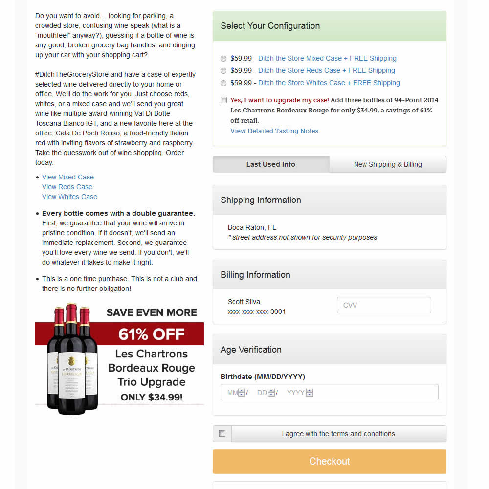
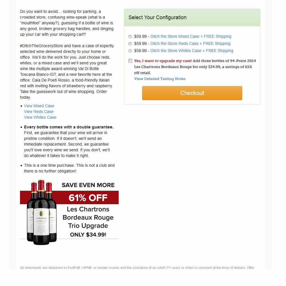
In this experiment, a single screen checkout was turned into a series of smaller steps in variation B. This was achieved by showing fewer fields on the first step, and shifting the remaining ones into a 3 step modal popup. The experiment measured successful transactions (sales).
Test #302 on
Volders.de
by Michal Fiech
Jun 09, 2020
Desktop
Mobile
Signup
X.X%
Sales
Michal Tested Pattern #83: Progressive Fields On Volders.de
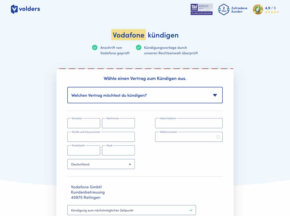
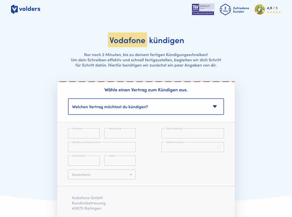
In this experiment a long form (A) was replaced with a progressive form interaction (B). Most of the form fields would appear in a grey-disabled style, until the prerequioste fields were first filled out.
Test #299 on
Backstage.com
by  Stanley Zuo
May 22, 2020
Desktop
Mobile
Listing
X.X%
Sales
Stanley Tested Pattern #60: Repeated Bottom Call To Action On Backstage.com
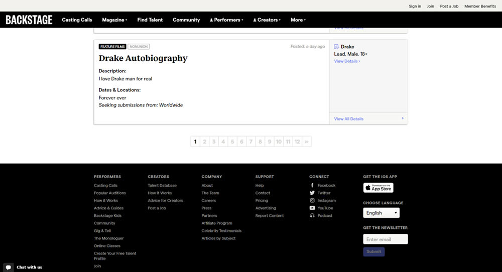
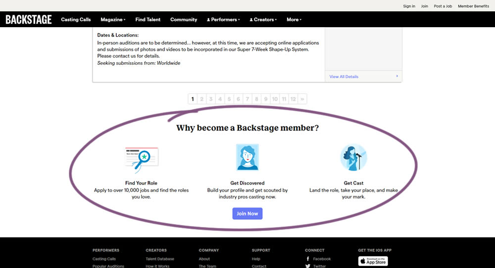
In this experiment, at the bottom of a search results screen, a membership join button was added along with 3 encouraging reasons. The experiment measured membership funnel starts, as well as paid membership transactions (sales).
Test #297 on
Trydesignlab.com
by  Daniel Shapiro
May 04, 2020
Desktop
Home & Landing
X.X%
Sales
Daniel Tested Pattern #41: Sticky Call To Action On Trydesignlab.com


In this experiment, a sticky "Enroll" button was shown on a course landing page. The button lead to a payment funnel to allow enrolling/paying for a course. The exeperiment measured inital progression into this funnel as well as the deeper completed sales metric.
Test #296 on
Backstage.com
by  Stanley Zuo
Apr 30, 2020
Mobile
Content
X.X%
Sales
Stanley Tested Pattern #23: Inline Link Nudge On Backstage.com
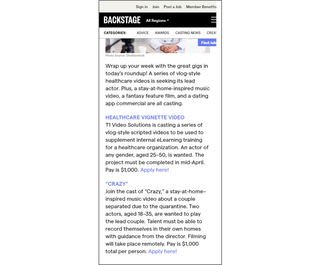
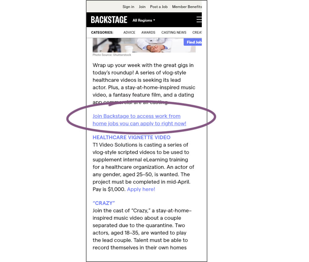
In this simple experiment, a text link to a join page was injected on an article page. The hypothesis was that more users would signup as a result of this subtle trigger.
Test #293 on
Backstage.com
by  Stanley Zuo
Apr 14, 2020
Desktop
Mobile
Product
X.X%
Sales
Stanley Tested Pattern #114: Less Or More Visible Prices On Backstage.com
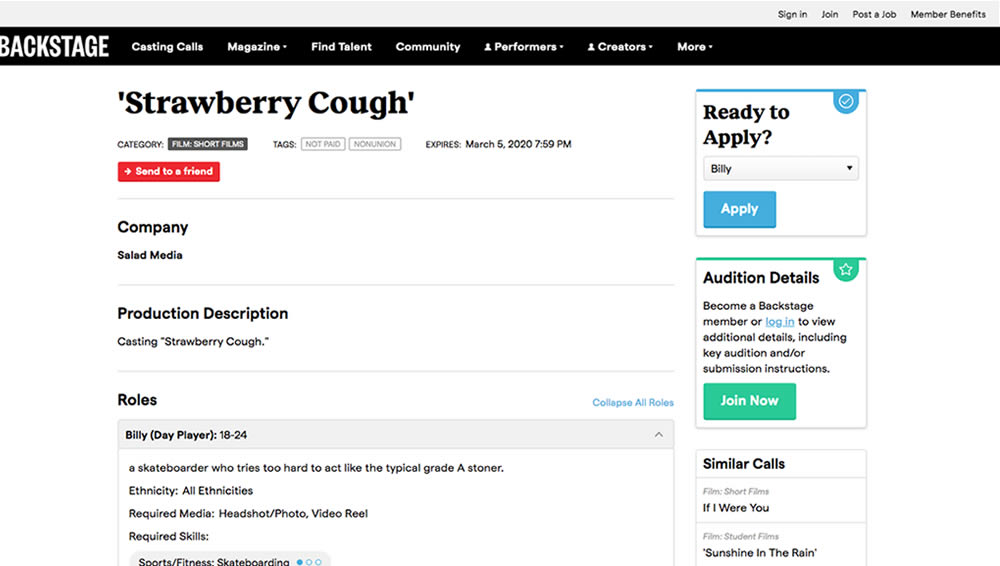
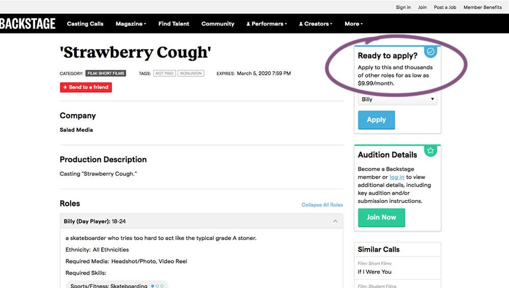
In this experiment on a casting call site, pricing information was shown beside the application button. This change shows the effect of setting a price expectation and being more clear that the application process is not free.
Test #292 on
Backstage.com
by  Stanley Zuo
Apr 13, 2020
Desktop
Mobile
Listing
X.X%
Sales
Stanley Tested Pattern #24: Visible Availability On Backstage.com
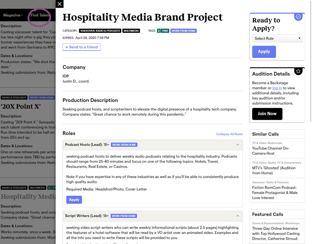
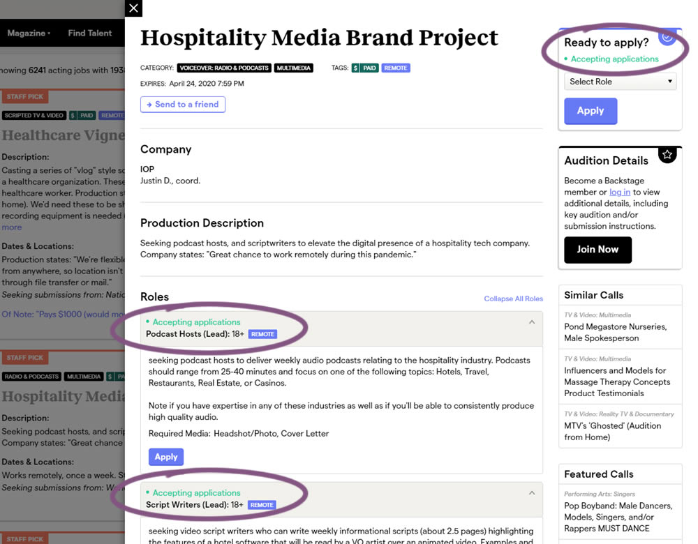
The core hypothesis of this experiment was that by showing clear availability (in green text) beside each casting call, more users would apply and become premium members. The experiment reports on two metrics: application starts (the first progression metric), and premium membership sales (measured a few steps further in the funnel).
Test #289 on
Prepagent.com
by  Arthur Sparks
Mar 23, 2020
Desktop
Pricing
X.X%
Sales
Arthur Tested Pattern #17: Least Or Most Expensive First On Prepagent.com
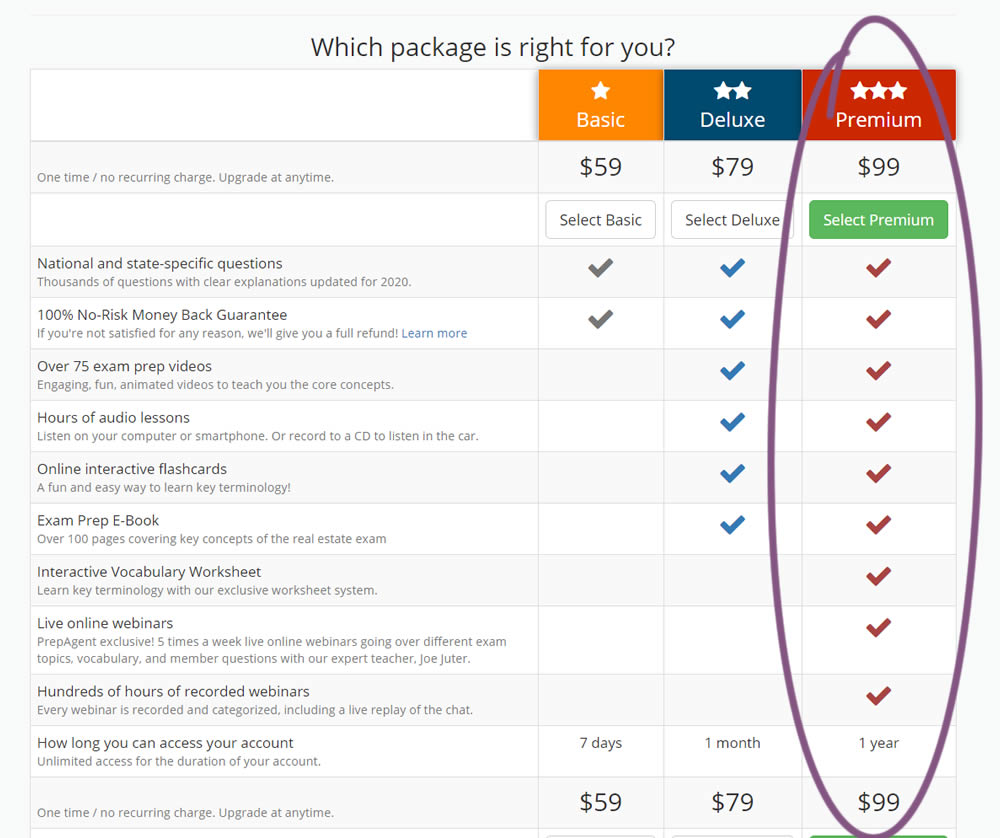
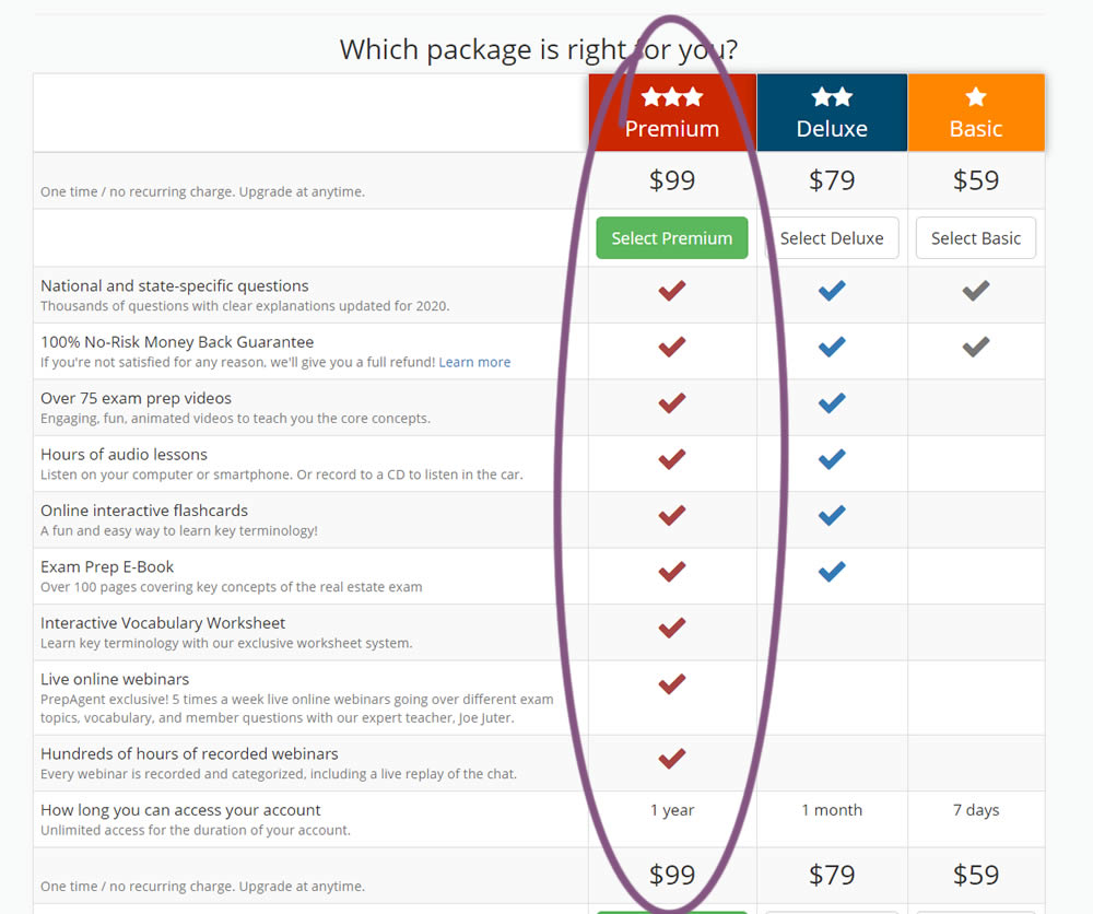
In this experiment, the order of pricing plans was rearranged as to show the most expensive one first.
Test #290 on
Prepagent.com
by  Arthur Sparks
Mar 23, 2020
Desktop
Pricing
X.X%
Sales
Arthur Tested Pattern #14: Exposed Menu Options On Prepagent.com
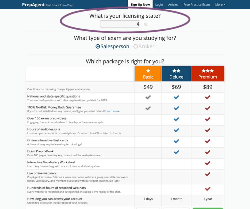
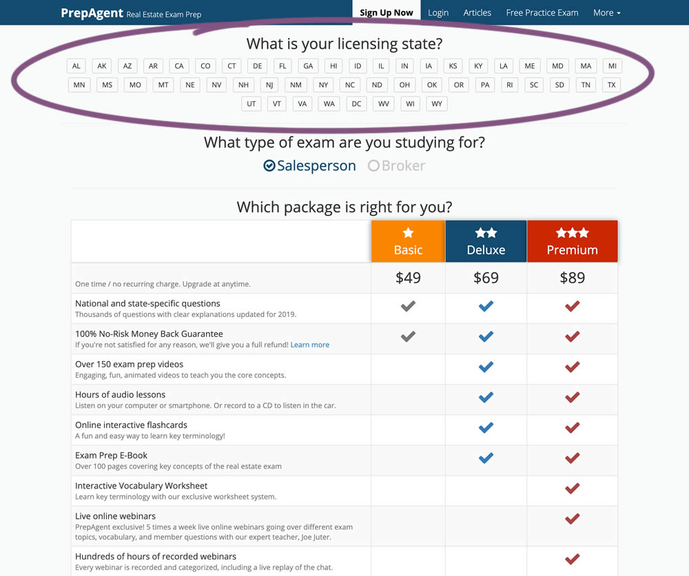
In this experiment, a simple pulldown menu (for US state selection) was replaced with all state options shown as selectable buttons. The states were also abbreviated.
Test #287 on
Goodui.org
by  Jakub Linowski
Mar 04, 2020
Desktop
Mobile
Pricing
X.X%
Sales
Jakub Tested Pattern #117: Company Logos On Goodui.org
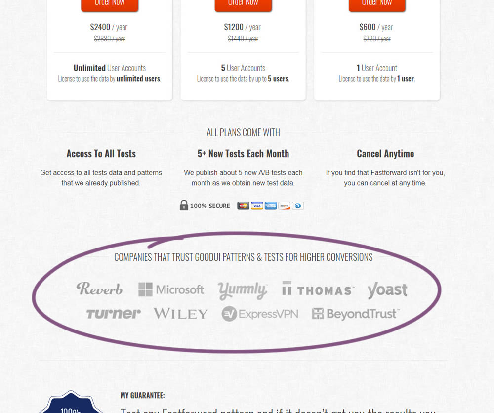
In this experiment, a handful of customers and contributors from GoodUI were added on a pricing page to test the effect on sales.
Test #286 on
Volders.de
by  Alexander Krieger
Feb 28, 2020
Desktop
Mobile
Home & Landing
X.X%
Sales
Alexander Tested Pattern #9: Multiple Steps On Volders.de
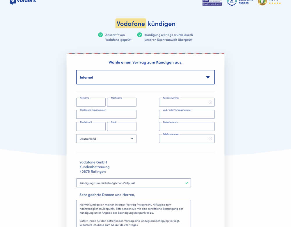
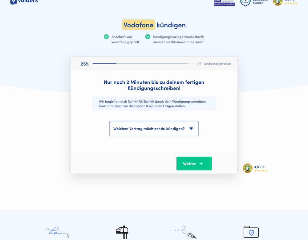
In this experiment, a long contract cancellation landing page (control) was broken down into 4 steps with 1 final summary step (variation).
Test #285 on
Ibood.com
by  Lukas Jorissen
Feb 27, 2020
Desktop
Product
X.X%
Sales
Lukas Tested Pattern #7: Social Counts On Ibood.com
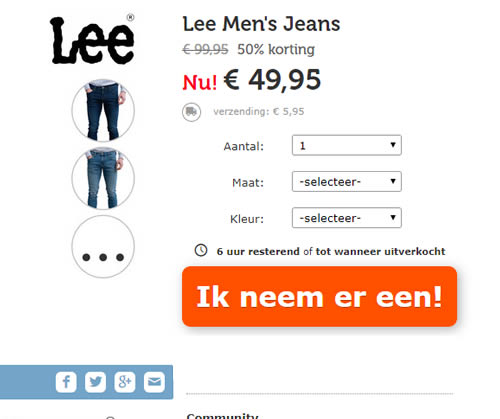
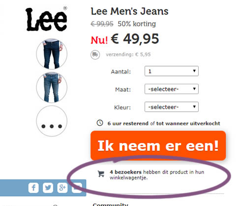
In this experiment, realtime social proof information has been added below an add-to-cart button. The variation shows how many users that have viewed, or placed a product into their basket. Translated to "4 visitors have this product in their shopping cart."
Test #283 on
Kenhub.com
by  Niels Hapke
Feb 08, 2020
Desktop
Mobile
Global
X.X%
Sales
Niels Tested Pattern #42: Countdown Timer On Kenhub.com
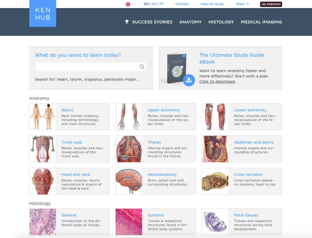
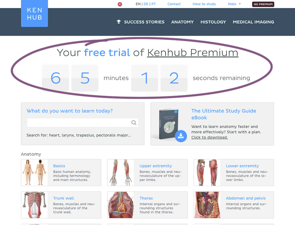
In this experiment, registered trial users were shown a 65 minute counter on multiple pages (dashboard, listing, quiz, articles) encouraging them to get a full subscription and study all content. Both A and B experiences offered the same limited content for trial users. After the 65 minutes came to an end, the B variation showed an additional "Go Premium" button on all pages, but continued to offer the same limited content.
Test #281 on
Backstage.com
by  Stanley Zuo
Jan 31, 2020
Desktop
Listing
X.X%
Sales
Stanley Tested Pattern #116: Links Or Buttons On Backstage.com
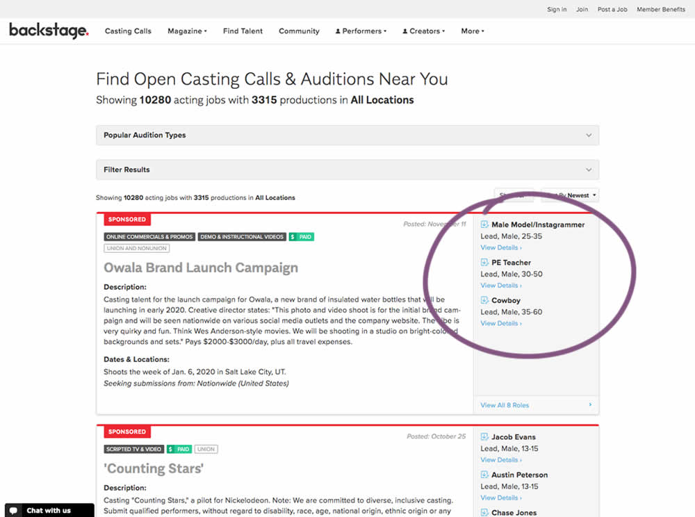
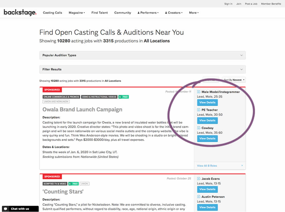
In this experiment, multiple view detail links for a listing tile were turned into higher contrast buttons.
Test #280 on
Volders.de
by  Alexander Krieger
Jan 24, 2020
Desktop
Mobile
Signup
X.X%
Sales
Alexander Tested Pattern #3: Fewer Form Fields On Volders.de
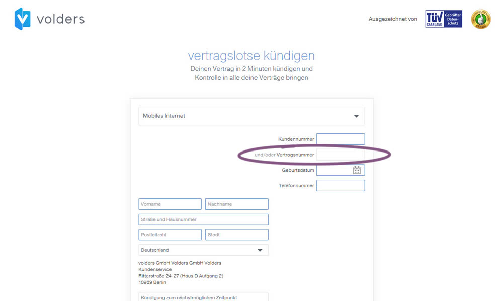
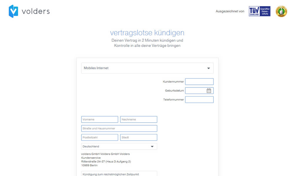
In this experiment on a contract cancellation funnel, one field was removed - a secondary contract ID. The control and variation both had a primary "customer ID" with which to identify and cancel someone's contract with.
Test #279 on
Umbraco.com
by  Lars Skjold Iversen
Jan 16, 2020
Desktop
Mobile
Home & Landing
X.X%
Sales
Lars Tested Pattern #79: Product Highlights On Umbraco.com
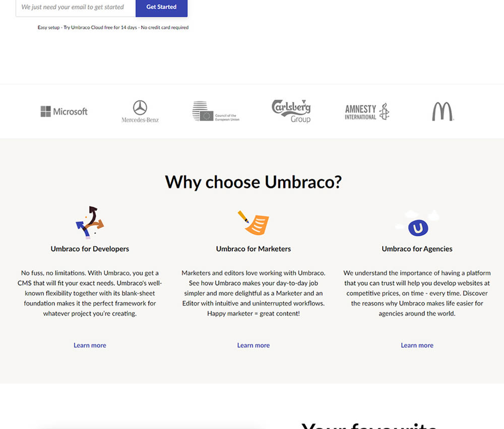
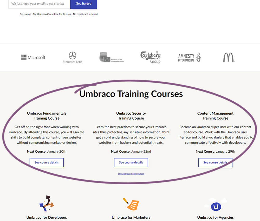
In this experiment, 3 additional course links with descriptions were added to the homepage. The idea was to increase course sales aside of the Saas subscription signups.