All Latest 620 A/B Tests
Test #486 on
Livefresh.de
by  Pascal Dietz
Aug 03, 2023
Mobile
Product
X.X%
Sales
Pascal Tested Pattern #78: Tags, Badges And Structured Information On Livefresh.de
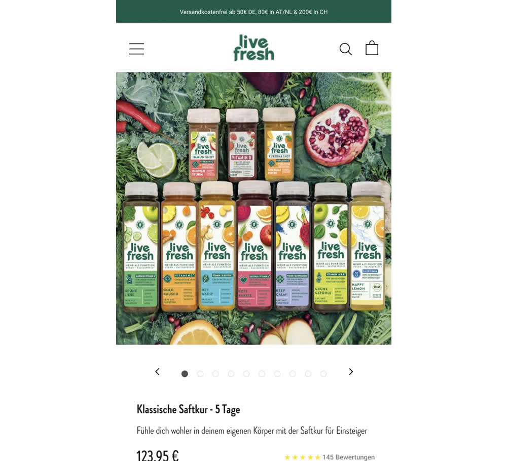
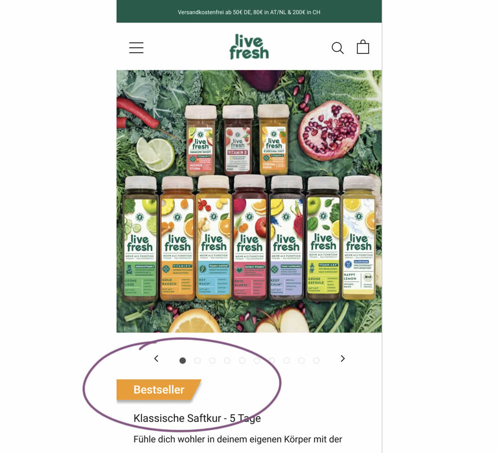
Does a "Bestseller" badge increase sales? This experiment tested exactly this by adding a visible badge on a juice cleansing product detail page.
Which A Or B Actually Wins? Find Out Before You Test.
Members see every test result — the winners, the flat ones, and the losers — along with exact effects and sample sizes. Use it to estimate your tests and prioritize by probability, not gut feel. Start every experiment with the odds on your side.
Test #485 on
Livefresh.de
by  Pascal Dietz
Jul 27, 2023
Mobile
Product
X.X%
Sales
Pascal Tested Pattern #131: Authority On Livefresh.de
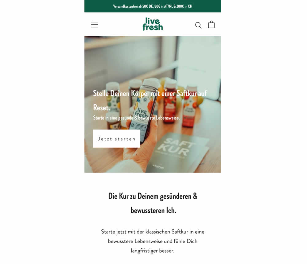
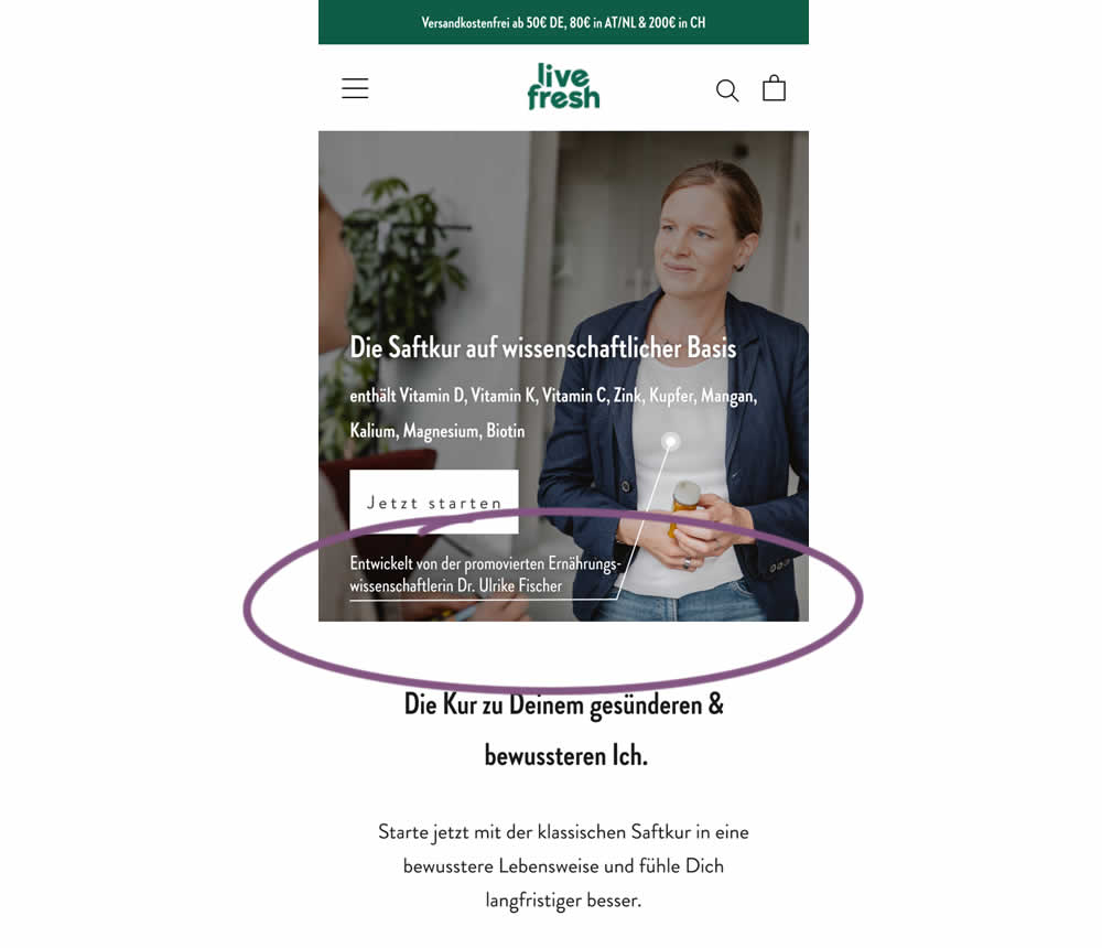
In this experiment a juice cleanse product (developed by Dr. Ulrike Fischer) was supported with statements and visuals to reinforce her as a doctor and an authority figure. The control only referenced the product itself. Google translations include:
A) Headline: "Reset your body with a juice cleanse"
B) Headline: "The juice cleanse with a scientific basis"
B) Listed out specific vitamins and supplements.
B) Added Subheadline: "Developed by Dr. Ulrike Fischer, who holds a doctorate in nutritional science"
Test #484 on
Snocks.com
by  Melina Hess
Jul 21, 2023
Desktop
Mobile
Product
X.X%
Sales
Melina Tested Pattern #80: Persistent Filters On Snocks.com
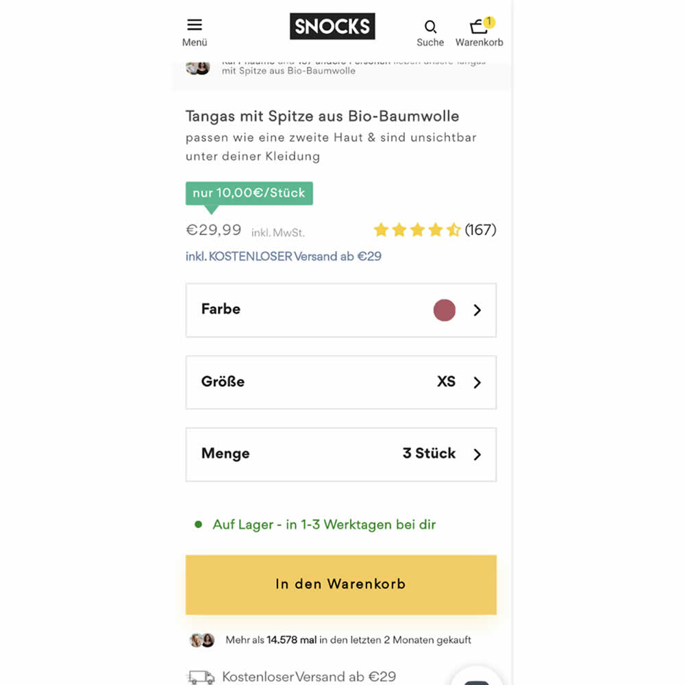
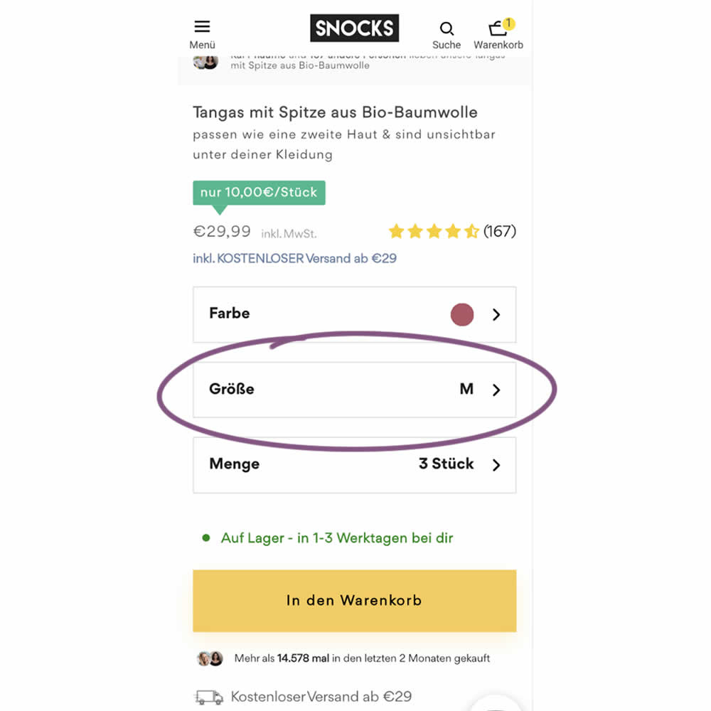
In this experiment, the variation remembered and prefilled user's size choices for the duration of the session. The control version always started with a fixed product size value (ex: XS). The variation prefilled them between products or screen refreshes. Impact on sales was measured.
Test #483 on
Menufy.com
by  Aleksandr Elesev
Jul 17, 2023
Desktop
Checkout
X.X%
Sales
Aleksandr Tested Pattern #124: Confirmed Selection On Menufy.com
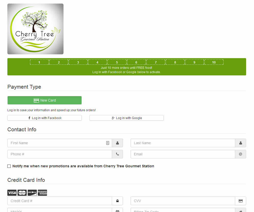
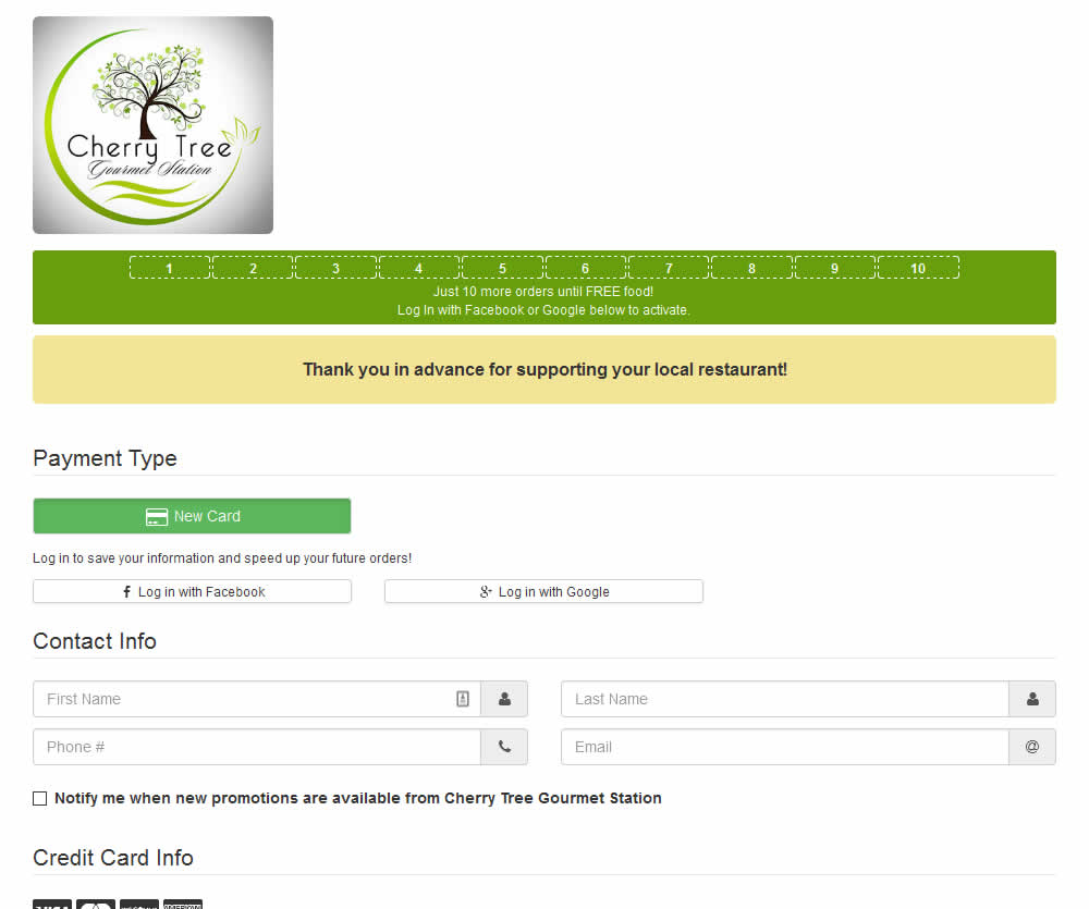
In this experiment, a thanking confirmation message was appended at the top of the checkout screen of a local food delivery service. Impact on completed transactions was measured.
Test #481 on
Backstage.com
by  Stanley Zuo
Jul 14, 2023
Desktop
Mobile
Checkout
X.X%
Sales
Stanley Tested Pattern #15: Bulleted Reassurances On Backstage.com
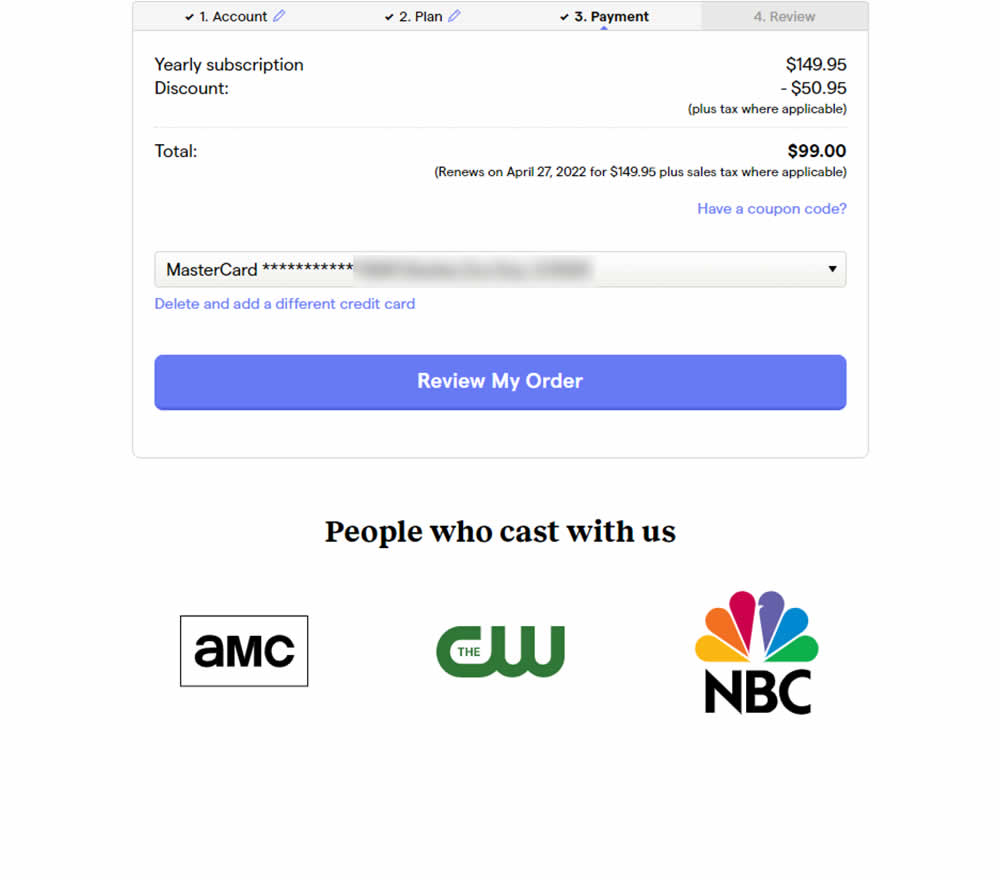
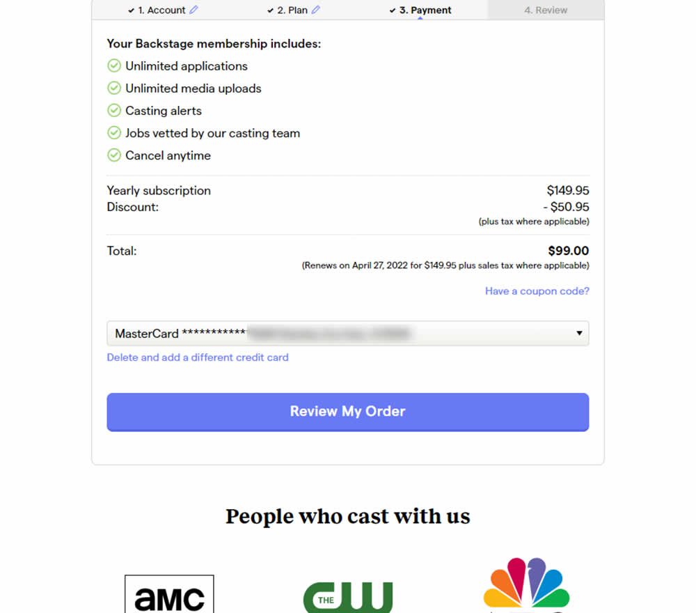
In this experiment, selling points and benefits of a subscription were placed as bullets at the top of a checkout page. The benefits highlighted things such as: unlimited applications, access to vetted jobs and the ability to cancel anytime. Impact on sales was measured.
Test #482 on
by  Jakub Linowski
Jul 13, 2023
Desktop
Mobile
Checkout
X.X%
Sales
Jakub Tested Pattern #124: Confirmed Selection
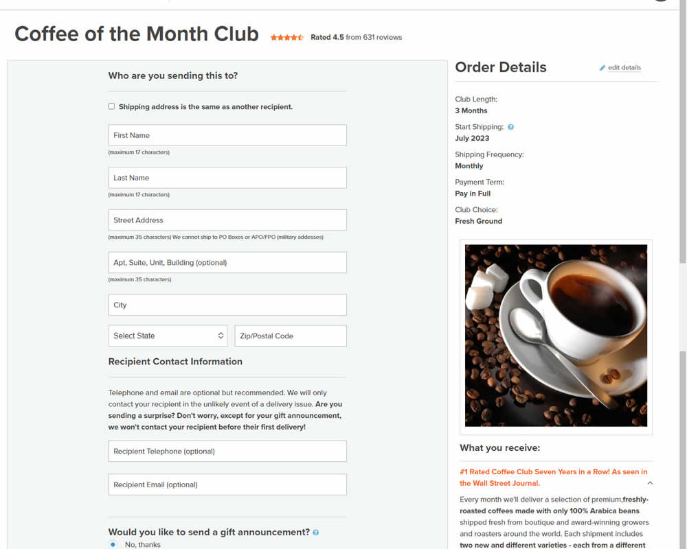
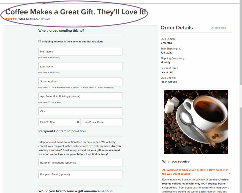
In this experiment, the choice of adding a product to cart was confirmed with a further positive message in the header of the next step (on the add to cart page). Once users left the product detail page, instead of simply stating the product name, the title was rephrased as "Product [X] Makes a Great Gift. They'll Love It!". I view this as a higher "intensity" experiment, given that the add-to-cart page was in some way already confirming the choice. Impact on sales was measured.
Test #479 on
Aboalarm.de
by  Daria Kurchinskaia
Jun 15, 2023
Desktop
Mobile
Checkout
X.X%
Sales
Daria Tested Pattern #15: Bulleted Reassurances On Aboalarm.de
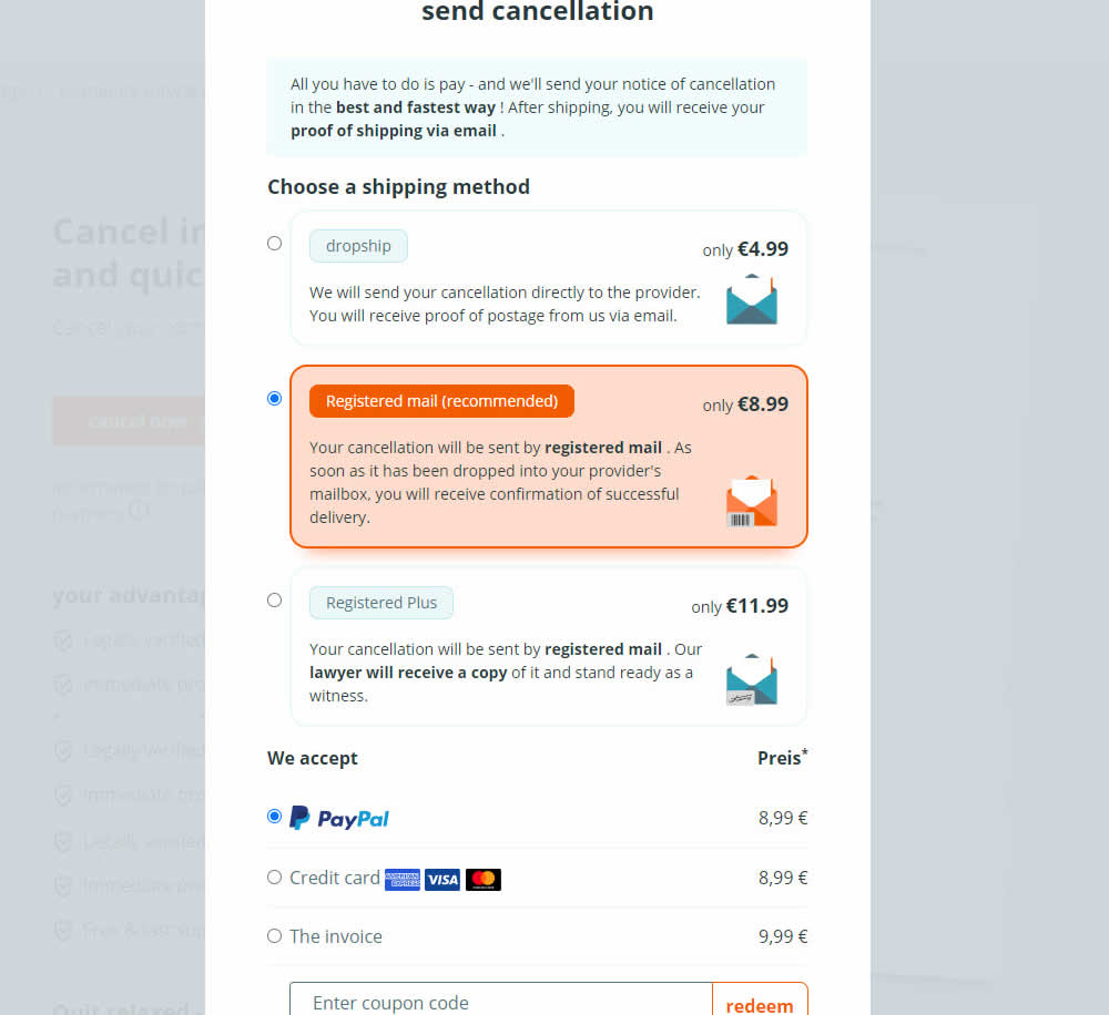
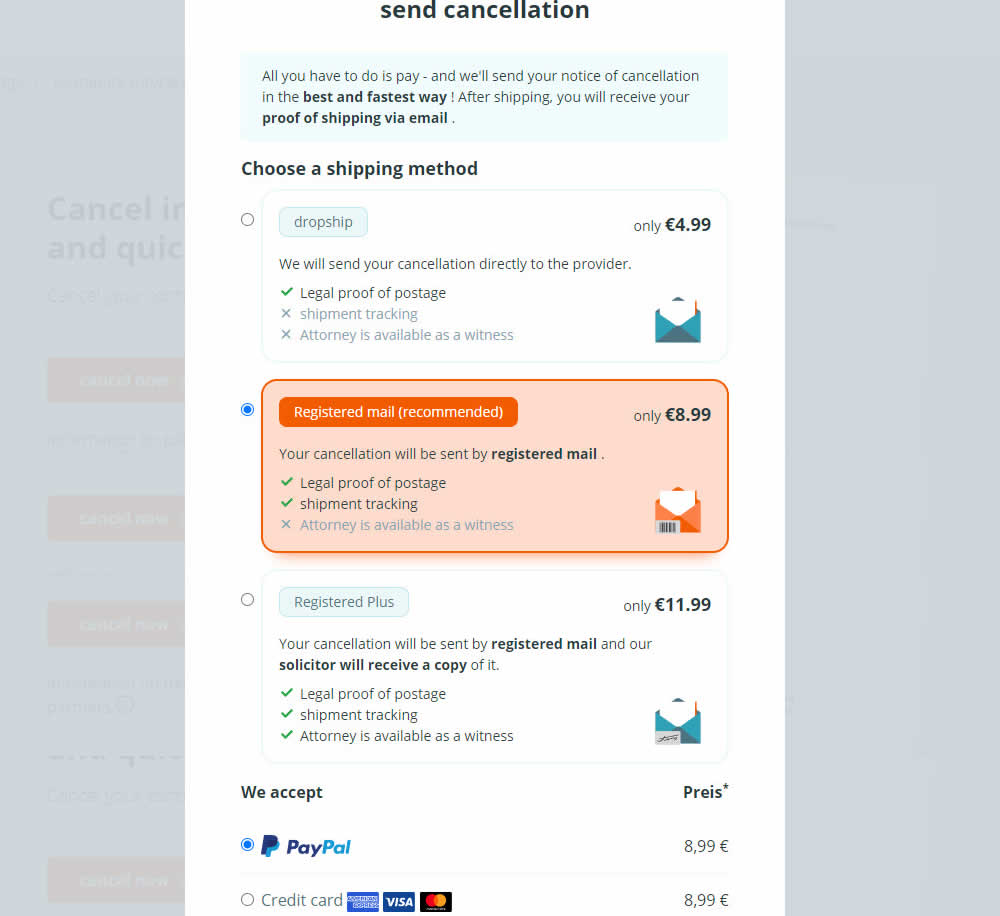
In this experiment, a list of benefits were shown for each of the 3 plans on the last step of a contract cancelation service. Benefit items not included in the lower plans were also shown with grayed out styles (and an "x"). Clearly the higher paid plan had all the benefits listed. Impact on transactions was measured.
Test #480 on
Aboalarm.de
by  Daria Kurchinskaia
Jun 15, 2023
Desktop
Mobile
Checkout
X.X%
Sales
Daria Tested Pattern #15: Bulleted Reassurances On Aboalarm.de

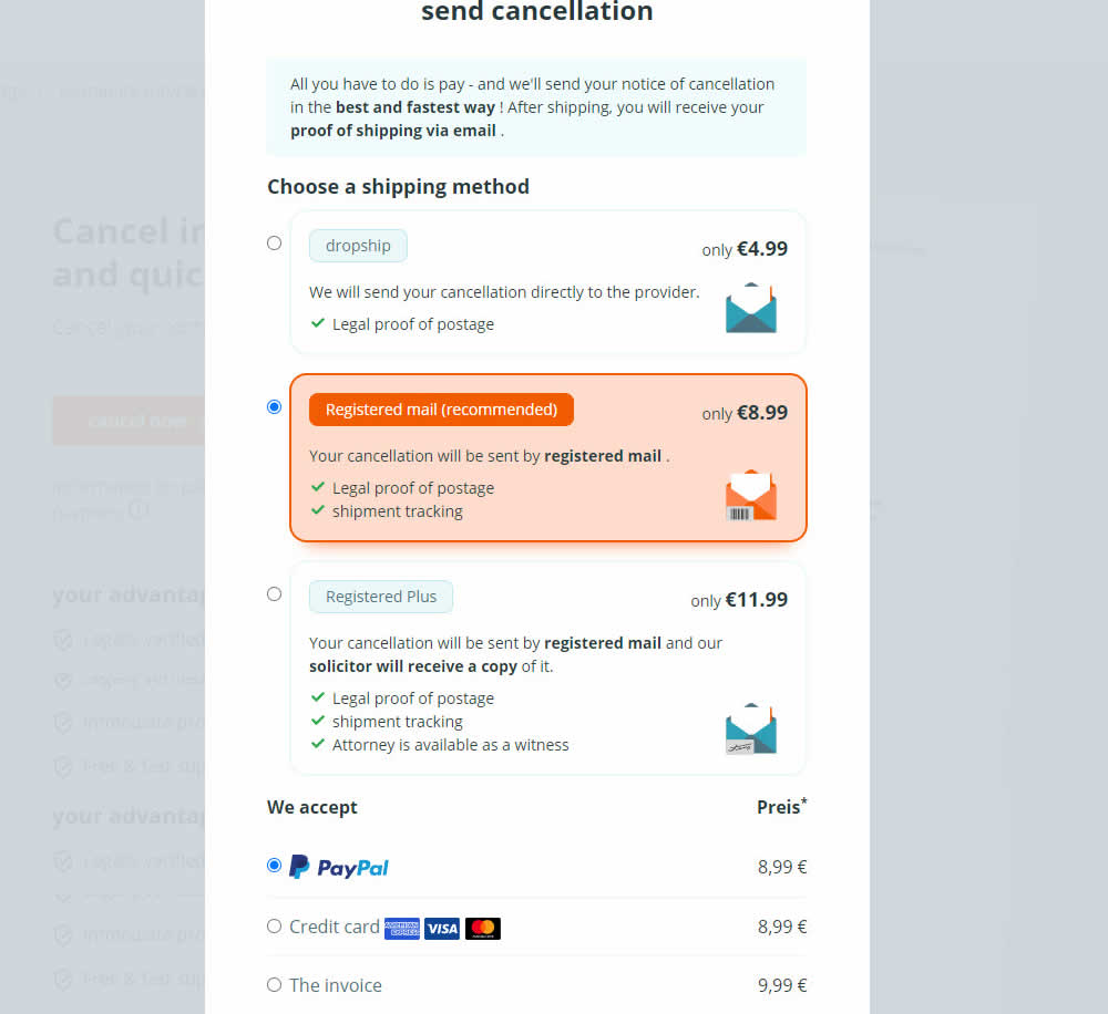
In this experiment, a list of benefits were shown for each of the 3 plans on the last step of a contract cancelation service. The lowest plan only had one benefit, whereas the highest plan had 3. Impact on transactions was measured.
Test #478 on
Estilomma.com
by  José Álvarez
Jun 14, 2023
Mobile
Global
X.X%
Sales
José Tested Pattern #130: Less Or More Visible Offer Pages On Estilomma.com
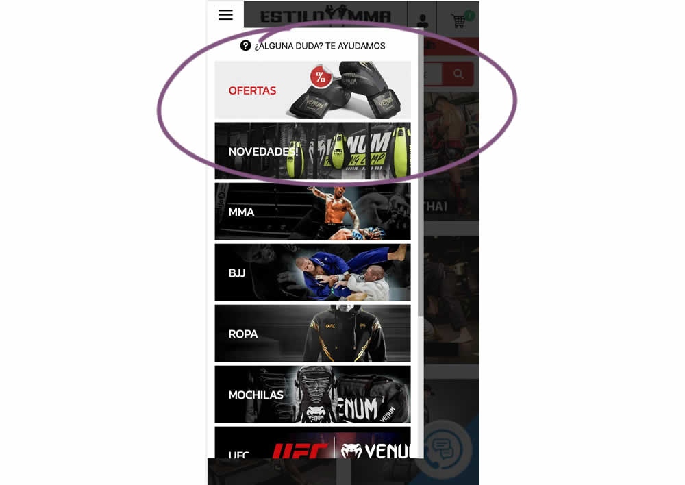
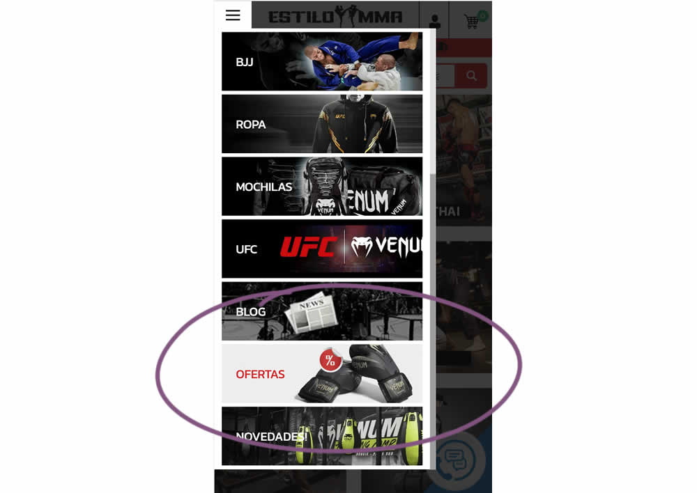
In this experiment, an offers page was shifted all the way down inside an expanded mobile navigation. The control showed it at the very top. The variation showed it at the bottom. (Note that the screen shot shows an already scrolled navigation - in the initial view, users would not be able to see the discount page right away, as it required some scrolling). Impact on overall sales was measured.
Test #477 on
Snocks.com
by  Melina Hess
Jun 09, 2023
Mobile
Desktop
Product
X.X%
Sales
Melina Tested Pattern #95: Clickable Product Previews On Snocks.com
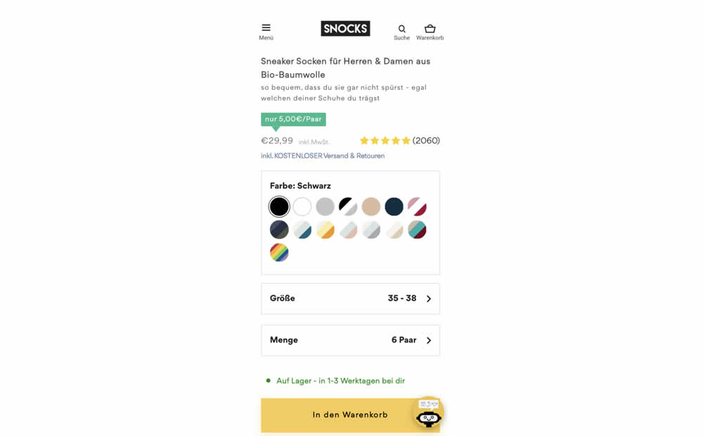
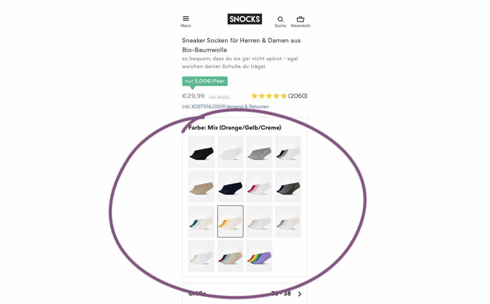
In this experiment, product color swatches were replaced with real product photos. Whereas the control showed the colors as more abstract circles. Impact on sales was measured.
Test #476 on
by  Devesh Khanal
Jun 08, 2023
Mobile
Product
X.X%
Sales
Devesh Tested Pattern #95: Clickable Product Previews
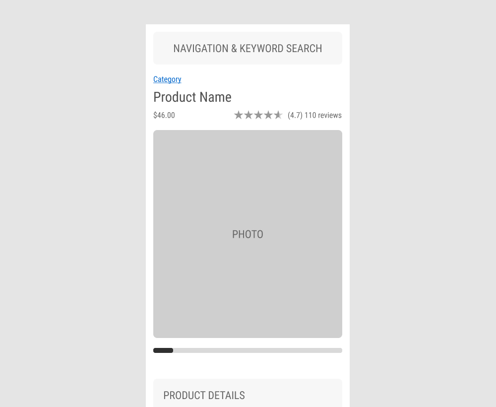
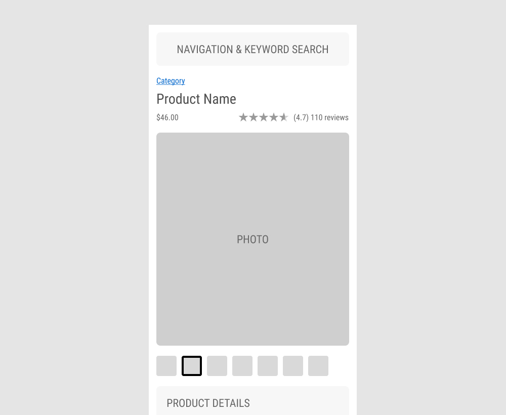
The GrowthRock team ran an experiment on one of their client's product detail pages. Instead of using a scrollbar (for mulitple images), clickable product photo thumbnails were used instead. Impact on sales was measured.
Test #475 on
Online.metro-cc.ru
by  Andrey Andreev
Jun 07, 2023
Desktop
Mobile
Listing
X.X%
Sales
Andrey Tested Pattern #36: Fewer Or More Results On Online.metro-cc.ru
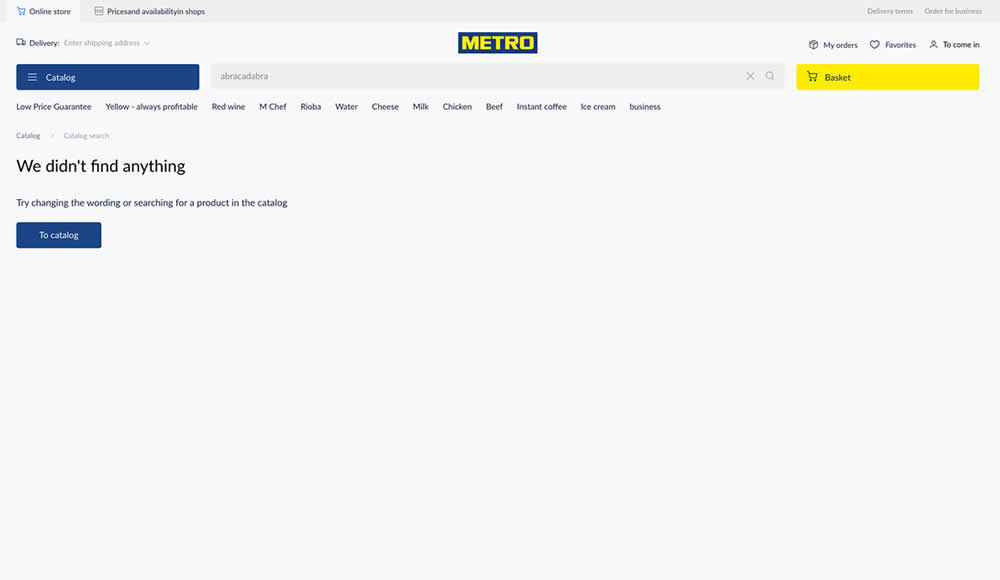
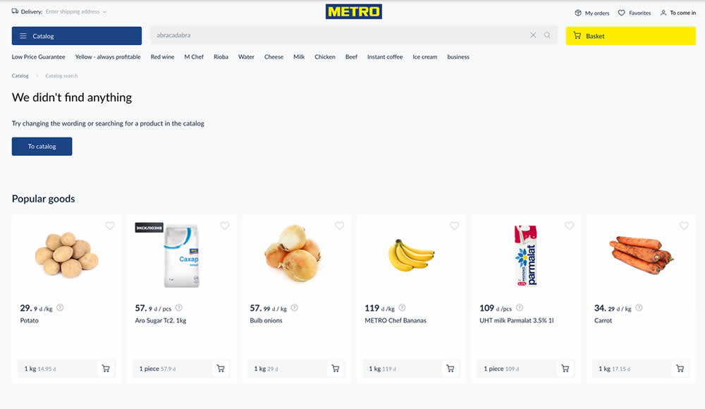
Are more (popular) product results better than none at all? In this experiment, popular products were shown during an empty search result. Impact on sales was measured.
Test #473 on
by  Jakub Linowski
May 26, 2023
Desktop
Home & Landing
X.X%
Sales
Jakub Tested Pattern #19: Benefit Testimonials
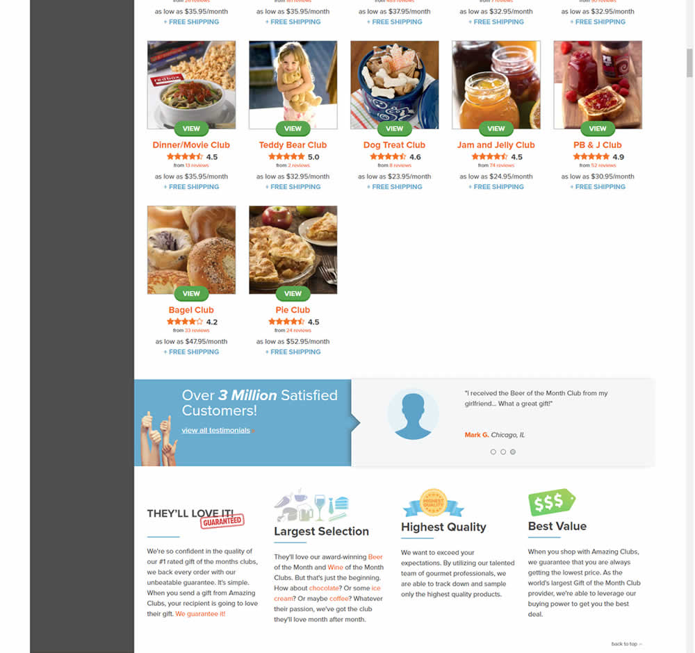
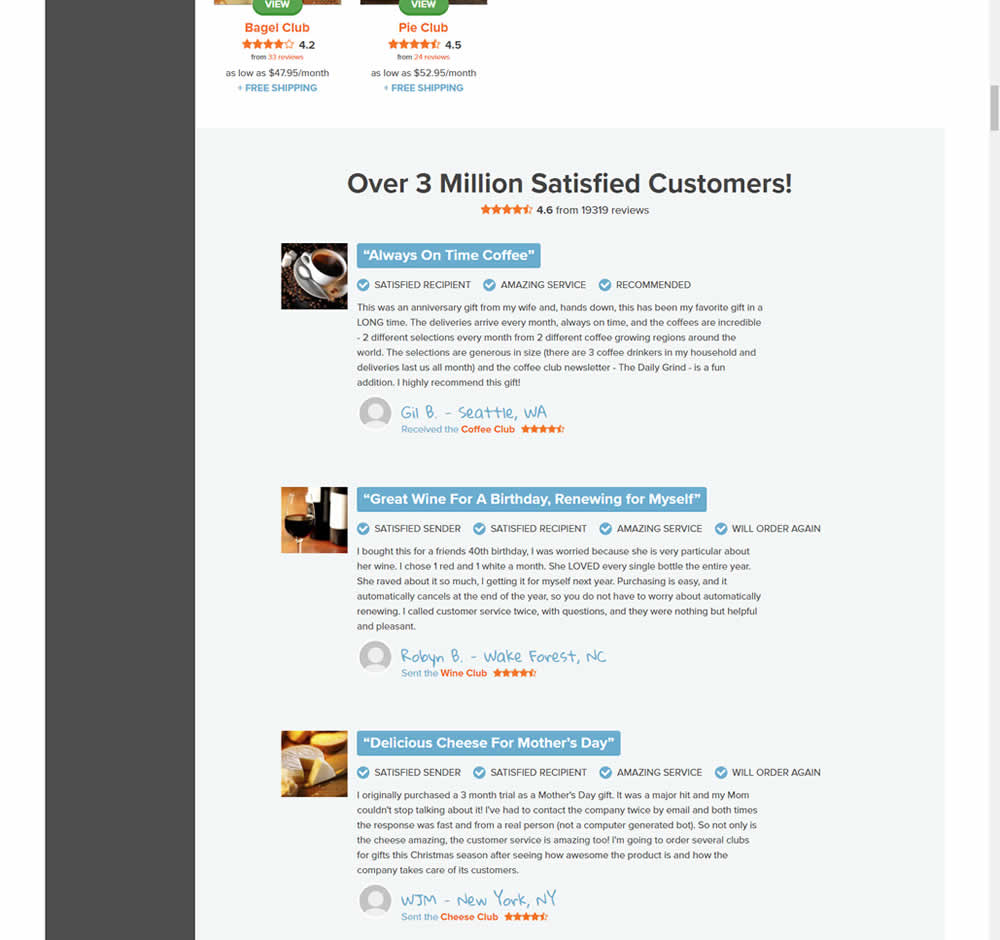
In this experiment, very short form testimonials (with a reference to over 3 million customers) were replaced with 3 more elaborate ones. These elaborate or benefit testimonials contained: highlighted statements, star reviews, emphasized location, tag summaries and photos of the purchased product. The control also contained a 3 testimonial carousel interaction.
This test appeared at the bottom of a longer homepage with additional product listings above.
Test #470 on
Formelskin.de
by  Alexander Krieger
May 12, 2023
Mobile
Signup
X.X%
Sales
Alexander Tested Pattern #3: Fewer Form Fields On Formelskin.de
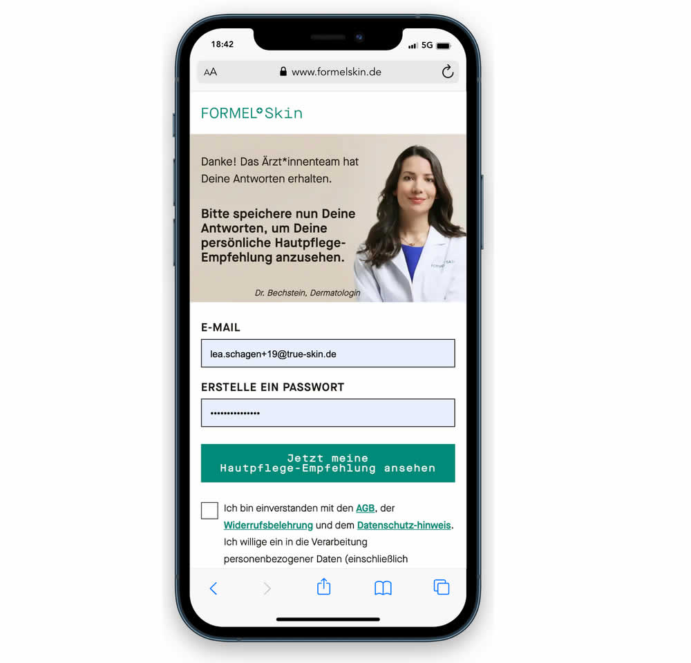
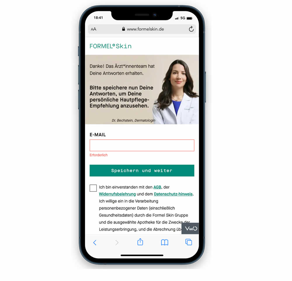
In this experiment, a password field was removed from a signup / account creation step. Instead of asking for a password, users received an email with an auto-generated password. This experiment ran on mobile and impact on sales (post-signup) was measured.
Test #467 on
by  Jakub Linowski
Apr 27, 2023
Desktop
Mobile
Product
X.X%
Sales
Jakub Tested Pattern #108: Frequently Asked Questions

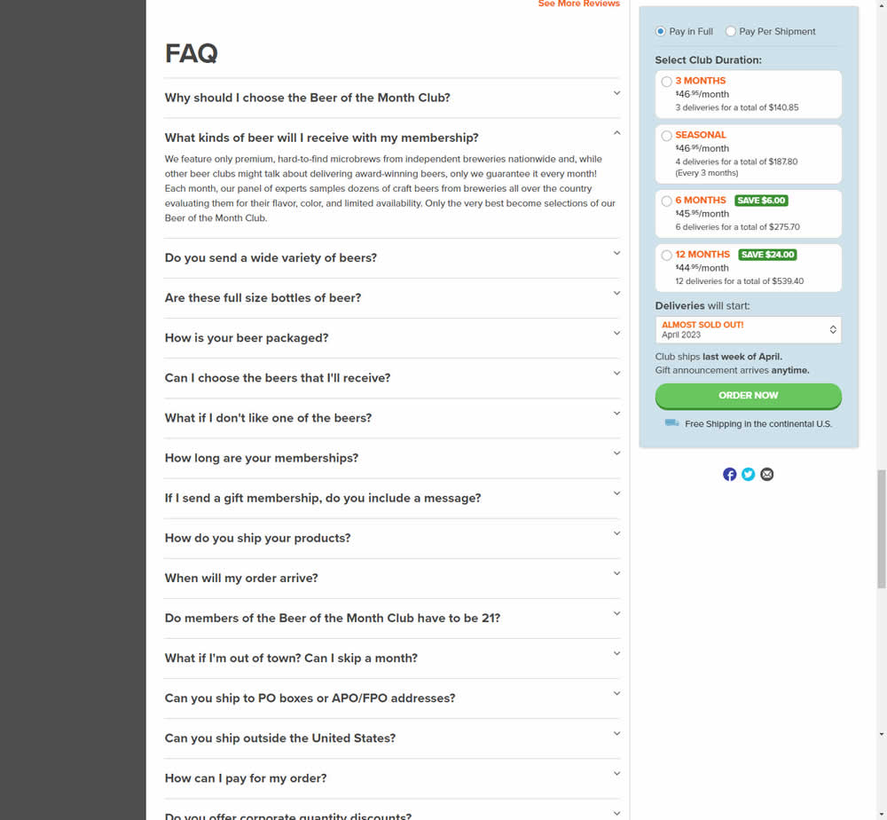
In this experiment, an FAQ section was added near the bottom of a long product page. The reviews were collapsed by default, but expandable upon clicking. Impact on adds-to-cart and sales was measured.
Test #466 on
Volders.de
by  Daria Kurchinskaia
Apr 26, 2023
Desktop
Signup
X.X%
Sales
Daria Tested Pattern #4: Testimonials On Volders.de
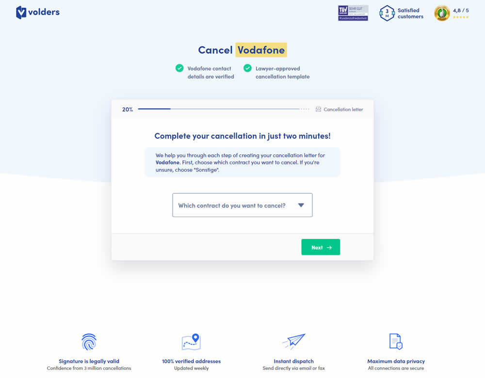
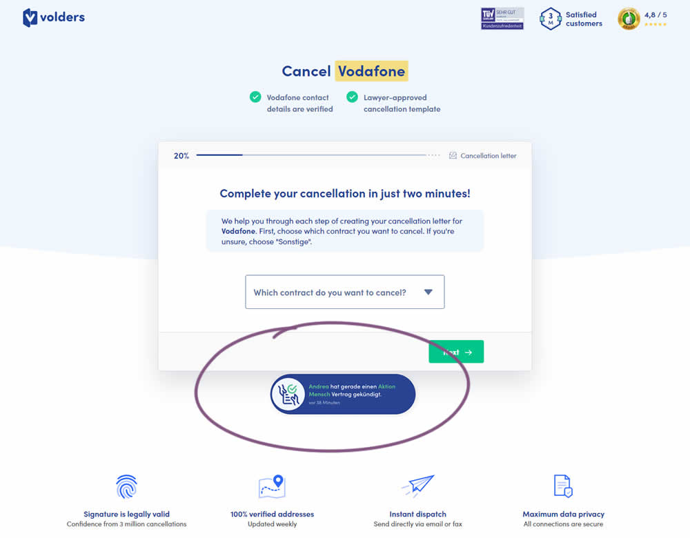
In this experiment, a social proof popups were added to the signup / funnel pages for a contract cancellation service. The added social testimonials appeared as other customers used the service, anywhere except on the final checkout page. Additionaly, the interval at which these messaged appeared was 60 seconds, and they were shown for 10s. The messages translated to "[Name] had recently canncelled a contract with [Company], in the last 38 minutes". Impact on sales was measured.
Test #463 on
Volders.de
by  Daria Kurchinskaia
Mar 25, 2023
Desktop
Checkout
X.X%
Sales
Daria Tested Pattern #115: Pricing Comparison Table On Volders.de
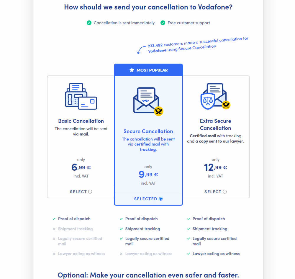
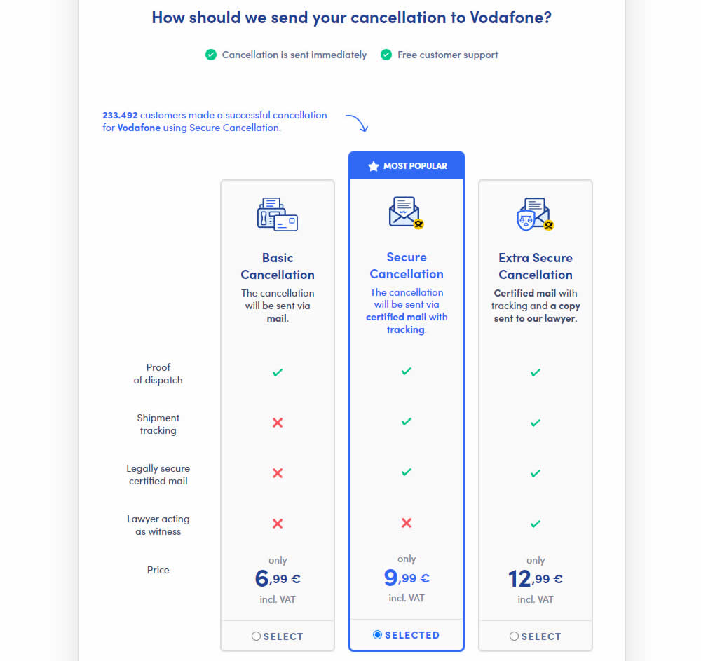
This experiment explored a pricing layout that enabled more feature comparisons. It also conveyed more clearly which features were missing between plans. The test has been inspired by this Netflix experiment. Impact on sales was measured.
Test #462 on
by  Jakub Linowski
Mar 24, 2023
Desktop
Mobile
Product
X.X%
Sales
Jakub Tested Pattern #128: Standard Or Superscript Price Format
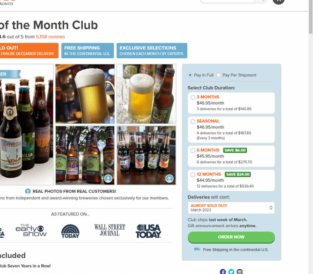
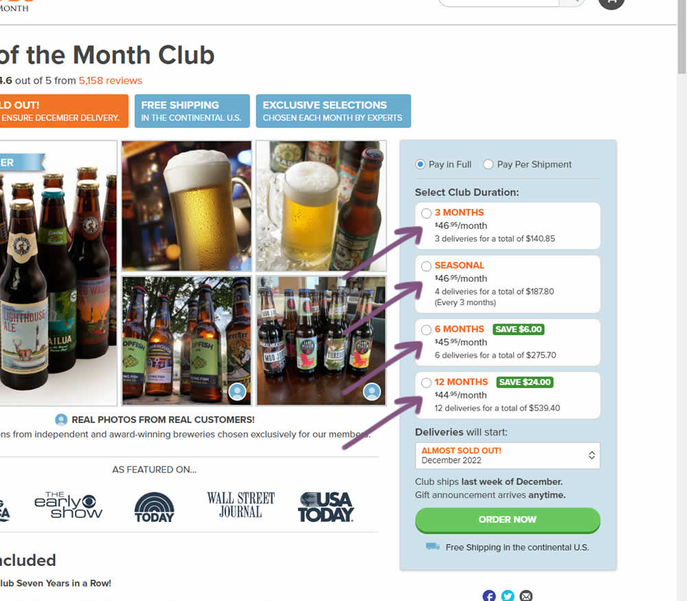
In this experiment, standard $ signs and cents were formatted into a smaller superscript. Impact on add-to-cart and sales was measured.
Test #461 on
Snocks.com
by  Melina Hess
Mar 23, 2023
Mobile
Product
X.X%
Sales
Melina Tested Pattern #15: Bulleted Reassurances On Snocks.com
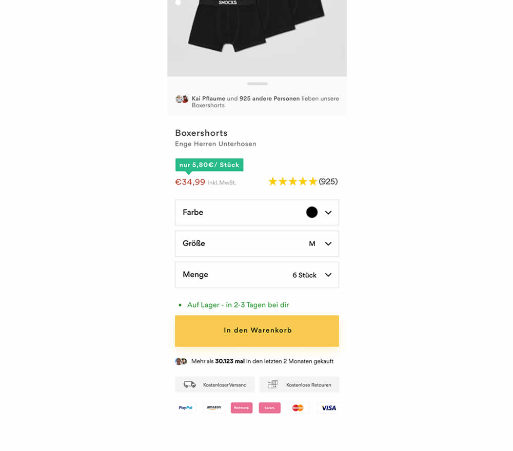
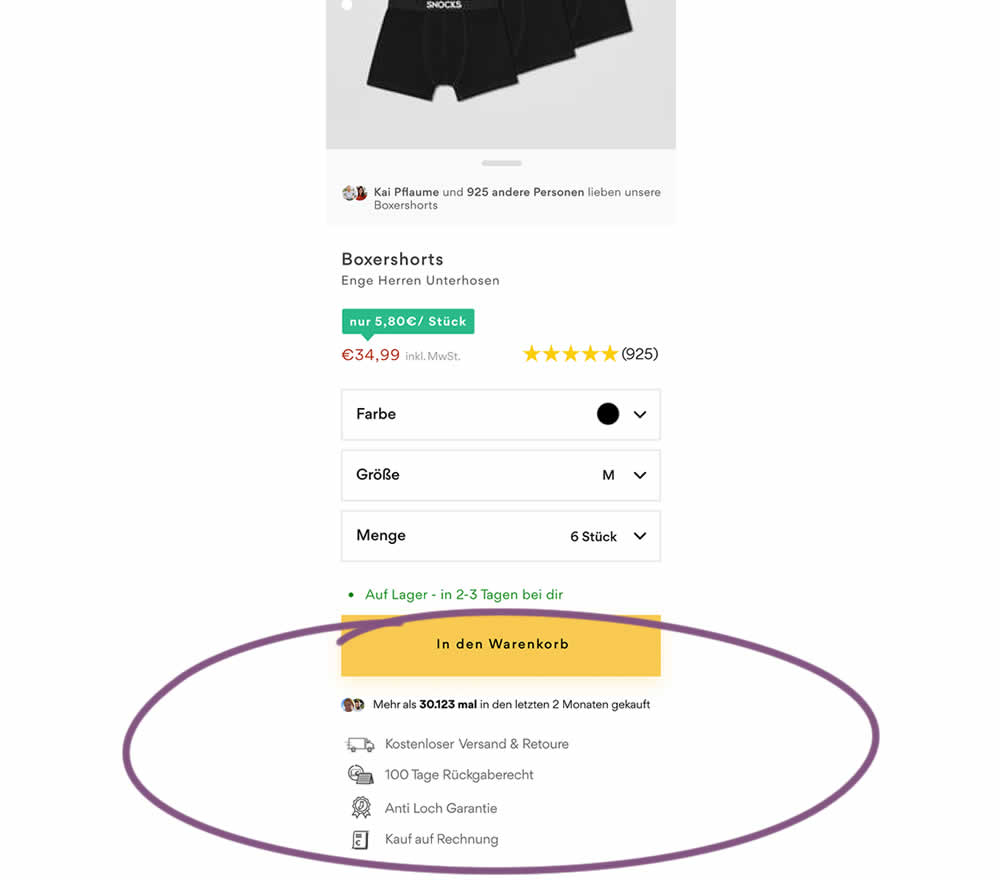
In this product detail page experiment, reassurances under the add-to-cart button were rearranged. The control contained copy about: free shipping and free returns formatted as two gray boxes, with a variety of payment methods and their corresponding logos underneath.
The variation used a more convention bulleted, line-by-line format. It also contained free shipping and returns, but also elaborated with "100 day returns", an "anti-hole guarantee", and "purchase with invoice" (perhaps more popular in Germany?). Impact on sales was measured.
Test #460 on
Backstage.com
by  Stanley Zuo
Mar 21, 2023
Mobile
Listing
X.X%
Sales
Stanley Tested Pattern #41: Sticky Call To Action On Backstage.com
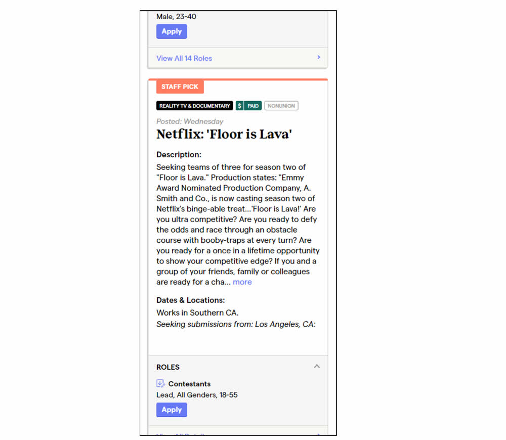
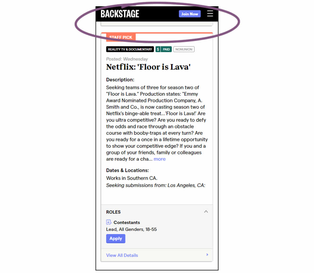
In this experiment, a floating top navigation was shown with a "Join" button. In the control, the navigation was only visible at the top of the page. Also keep in mind that signup starts were also triggered throughout multiple CTAs throughout the page and from particular job detail pages. The a/b test ran on a listing page of Backstage - a casting call job site. Impact on signups and checkouts was measured.