All Latest 620 A/B Tests
Test #579 on
Jared.com
by  Craig Kistler
Feb 23, 2025
Mobile
Product
X.X%
Sales
Craig Tested Pattern #21: What It's Worth On Jared.com
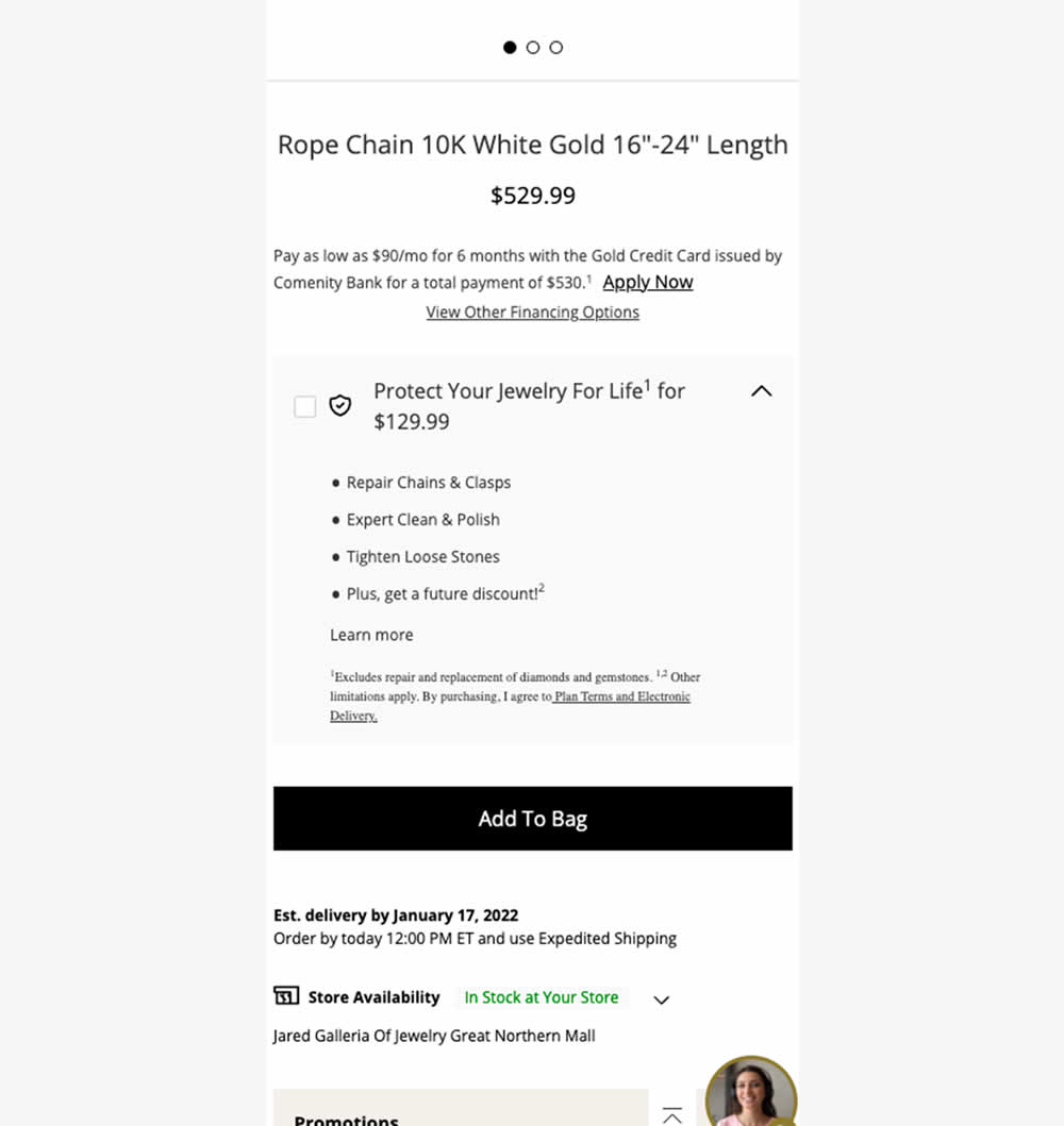
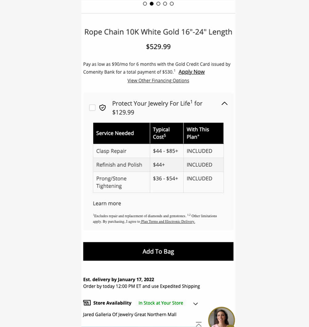
In this experiment, typical dollar values of typical coverages for an extended protection plan were shown. This ran on a product page of a jewelery site. Impact on on adds to cart, sales and uptake of the upsell was measured. Traffic split was 25/75.
Which A Or B Actually Wins? Find Out Before You Test.
Members see every test result — the winners, the flat ones, and the losers — along with exact effects and sample sizes. Use it to estimate your tests and prioritize by probability, not gut feel. Start every experiment with the odds on your side.
Test #578 on
by  Jakub Linowski
Feb 20, 2025
Mobile
Product
X.X%
Sales
Jakub Tested Pattern #48: Video Testimonials
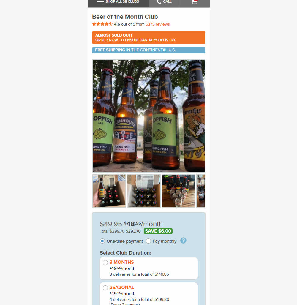
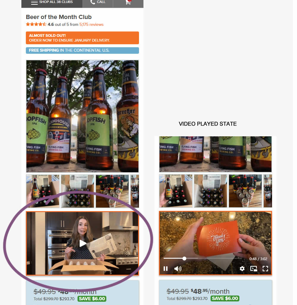
In this experiment, a video unboxing and product overview video was added on product pages. After pressing play, the video started playing with the controls only appearing for a short time before fading away.
Notice the confounding from pushing the buy box further down.
Impact on adds to cart and sales was measured.
Test #577 on
by  Jakub Linowski
Feb 19, 2025
Desktop
Product
X.X%
Sales
Jakub Tested Pattern #48: Video Testimonials
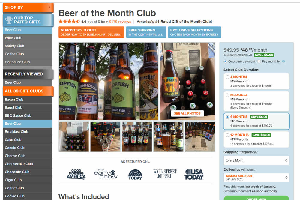
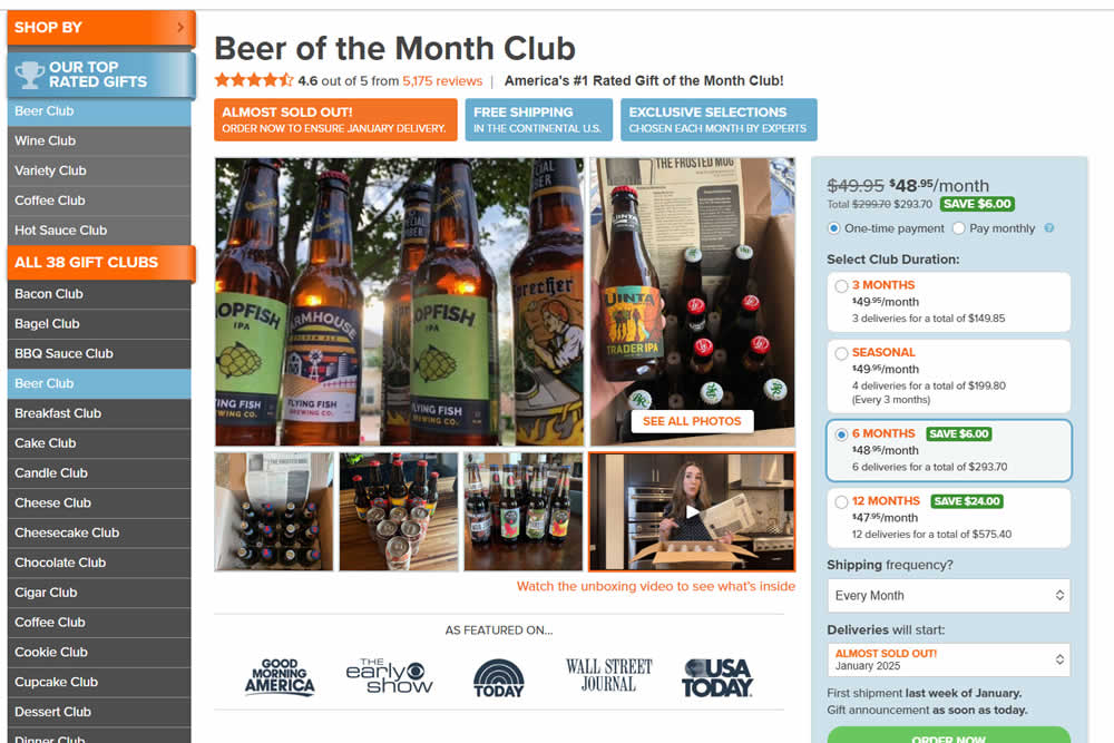
In this experiment, a video unboxing and product overview video was added on product pages. After pressing play, the video expanded to a full column width (taking over the middle column while replacing the 5 small square photo tiles and growing in height.) The video in its play state also contained a prominent (X) icon that allowed users to stop and revert to the original state.
Impact on adds to cart and sales was measured.
Test #574 on
Myer.com.au
by  Jay Kim
Jan 30, 2025
Mobile
Product
X.X%
Sales
Jay Tested Pattern #41: Sticky Call To Action On Myer.com.au
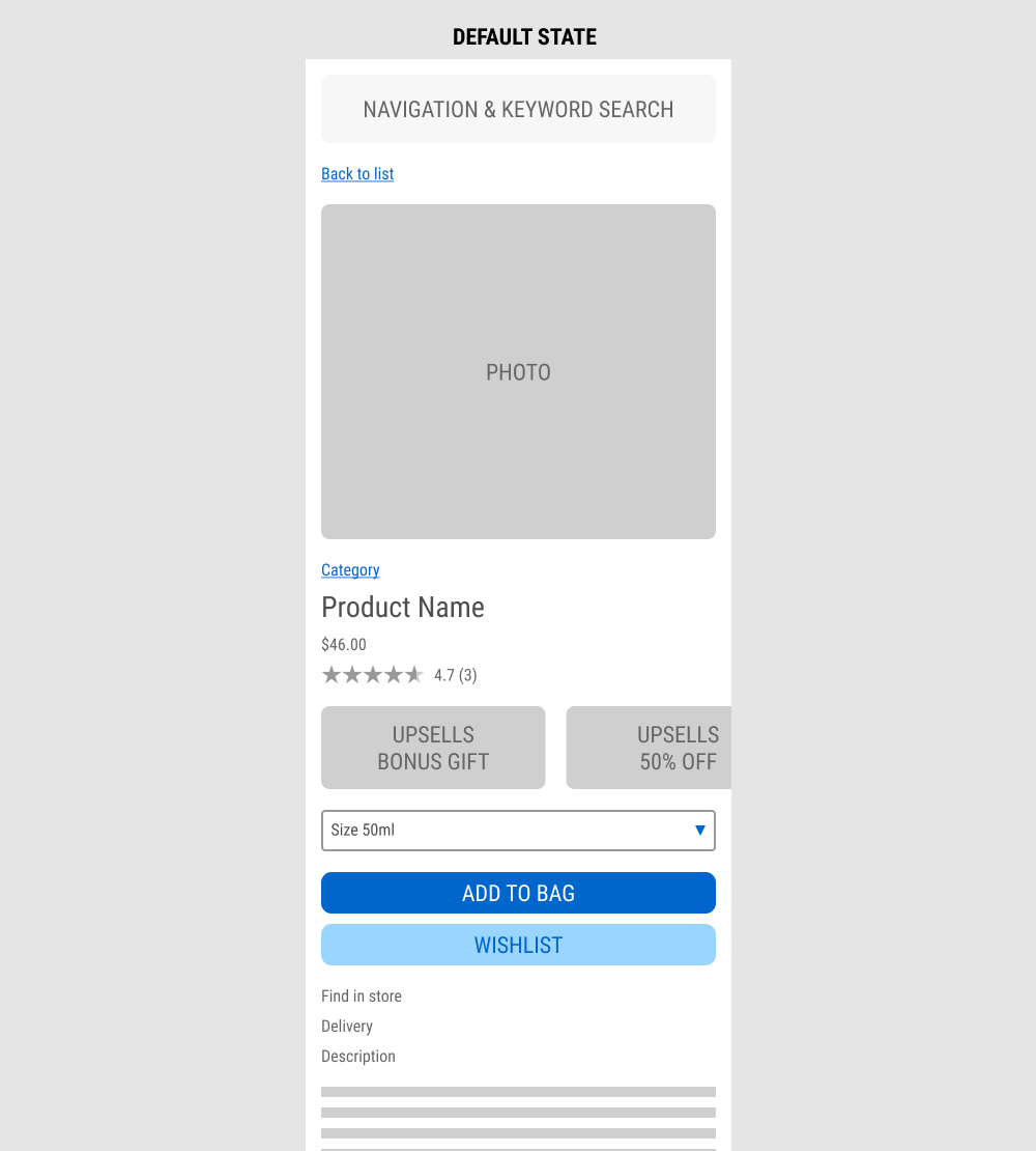
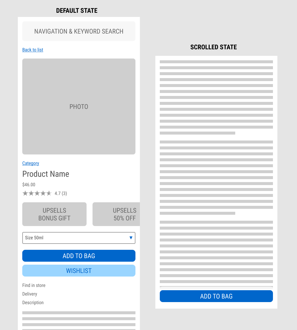
In this experiment published by Jay Kim, a sticky add to cart button was added on mobile product detail pages. It appeared after the scroll depth past the original add to cart button. Impact to adds to cart and completed sales was measured.
Test #573 on
Online.metro-cc.ru
by  Andrey Andreev
Jan 28, 2025
Mobile
Shopping Cart
X.X%
Sales
Andrey Tested Pattern #41: Sticky Call To Action On Online.metro-cc.ru
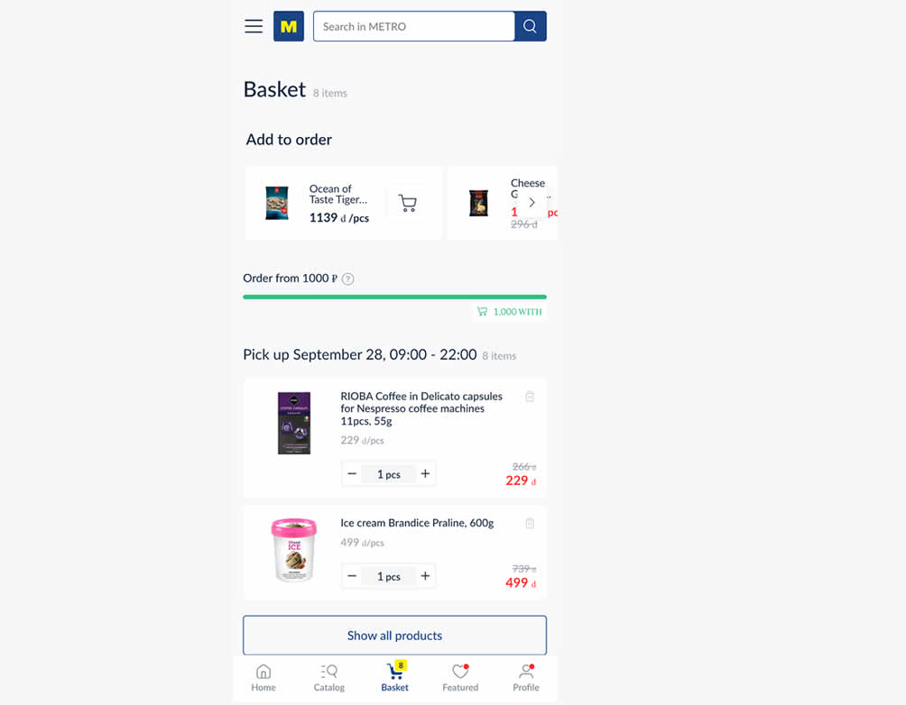
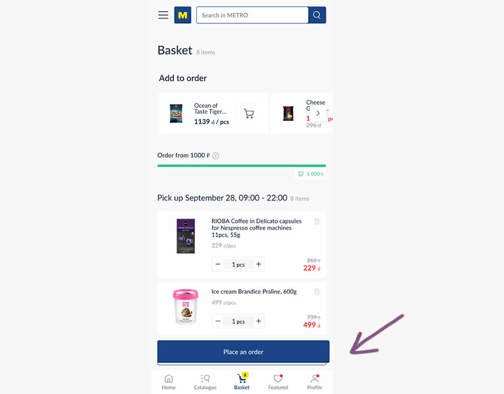
In this experiment, a floating "Place order" button was added to a mobile shopping cart screen. Impact on progression (to checkout) and sales was measured.
Test #571 on
by  Jakub Linowski
Jan 03, 2025
Desktop
Mobile
Product
X.X%
Sales
Jakub Tested Pattern #30: Authentic Photos
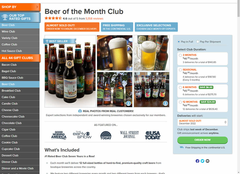
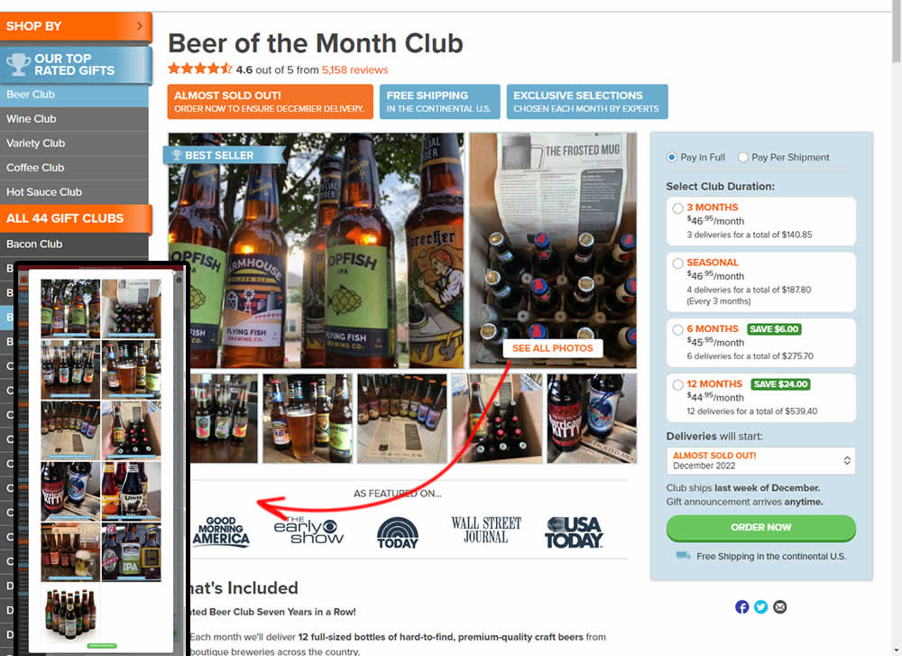
In this experiment, additional customer product photos were shown at the top of the product page. A "Show More Photos" button was also added which launched a modal with additional and larger images. Impact on sales was measured.
Test #570 on
Livefresh.de
by  Melina Hess
Dec 30, 2024
Desktop
Mobile
Home & Landing
X.X%
Sales
Melina Tested Pattern #79: Product Highlights On Livefresh.de
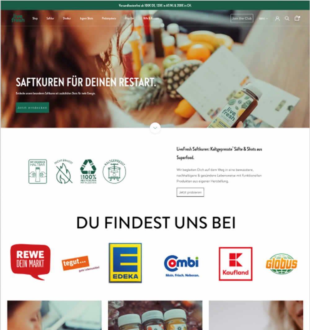
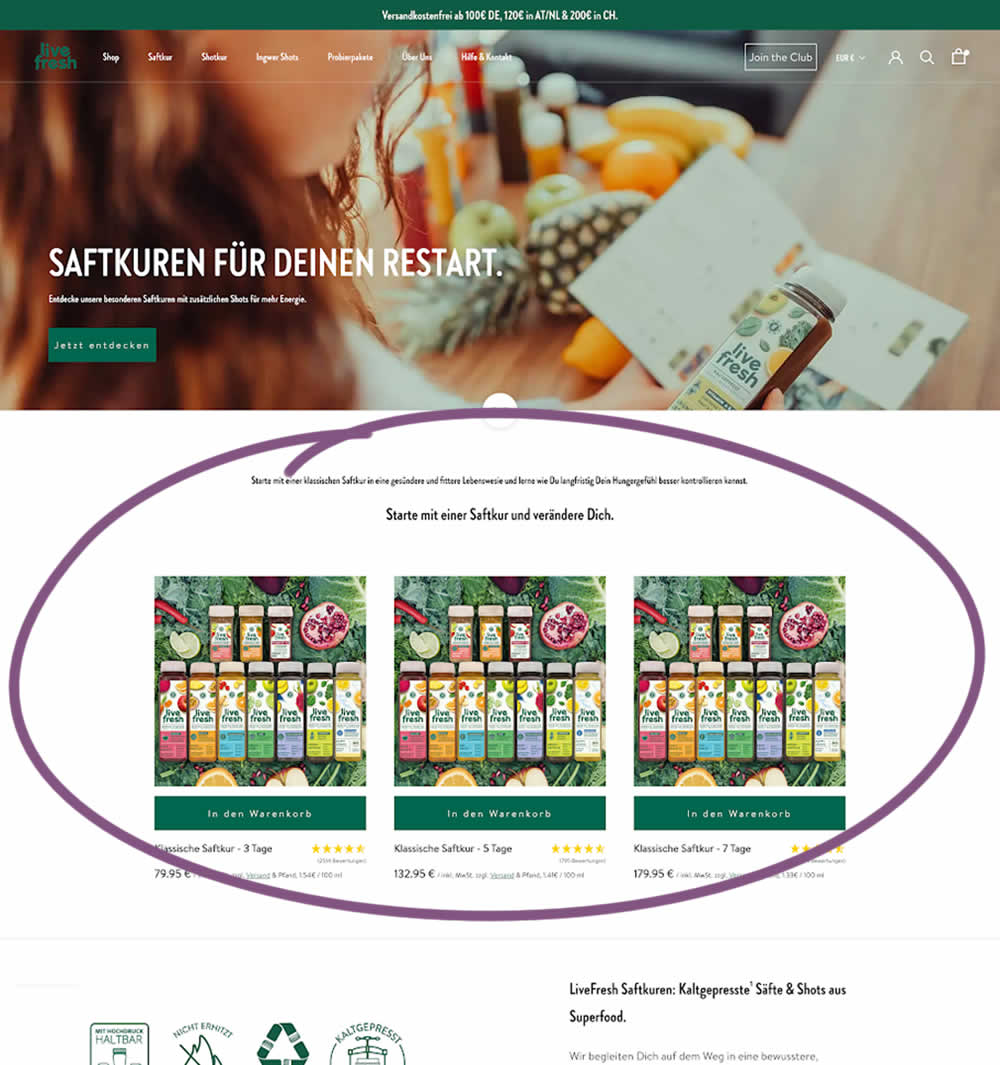
In this experiment, three popular juice products were shown higher on the variation (instead of lower in the control). Impact on sales was measured.
Test #569 on
Snocks.com
by  Melina Hess
Dec 29, 2024
Mobile
Product
X.X%
Sales
Melina Tested Pattern #124: Confirmed Selection On Snocks.com
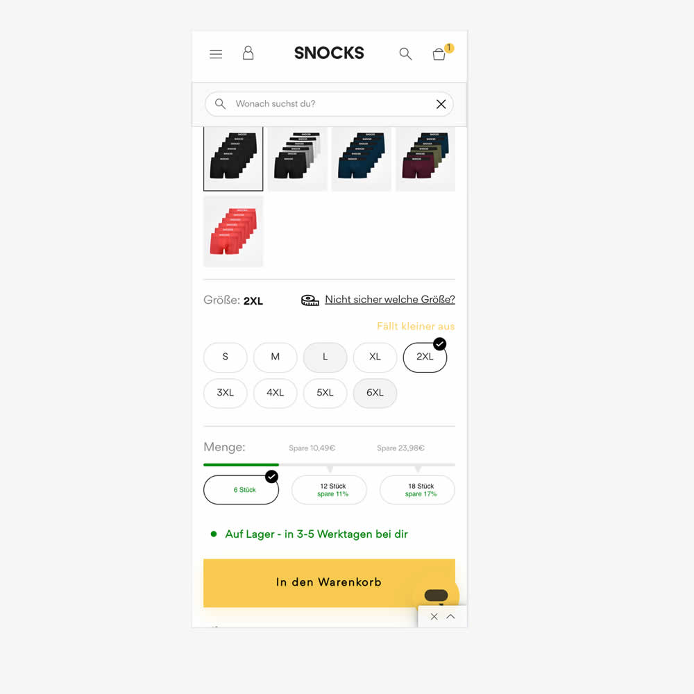
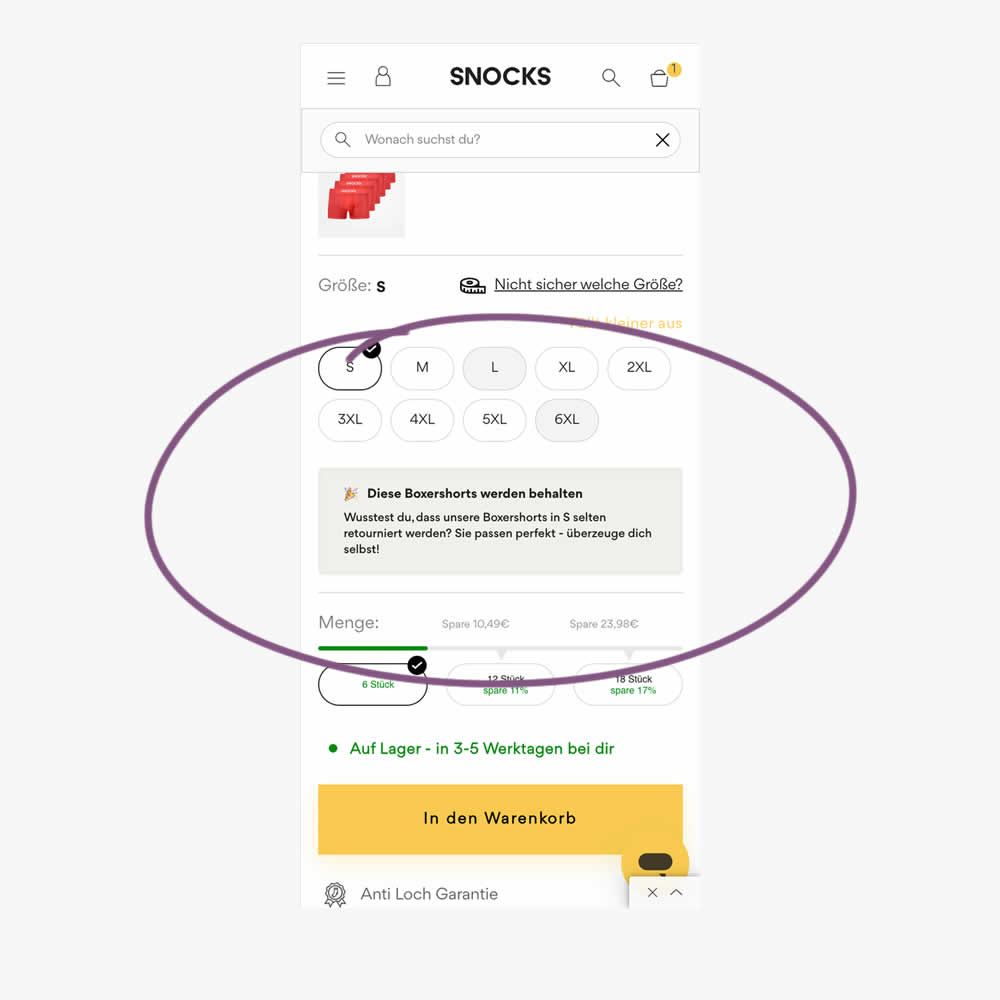
In this experiment, reaffirming copy was added for particular size options in the variation. Here is the translation from German:
"These boxer shorts will be kept. Did you know that our boxer shorts in S are rarely returned? They fit perfectly - see for yourself!"
Impact on sales was measured.
Test #568 on
by  Jakub Linowski
Dec 22, 2024
X.X%
Sales
Jakub Tested Pattern #80: Persistent Filters
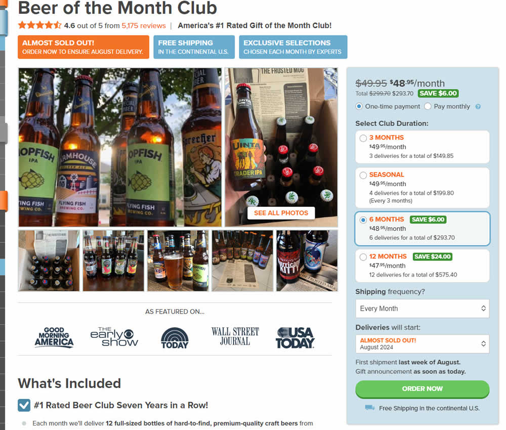
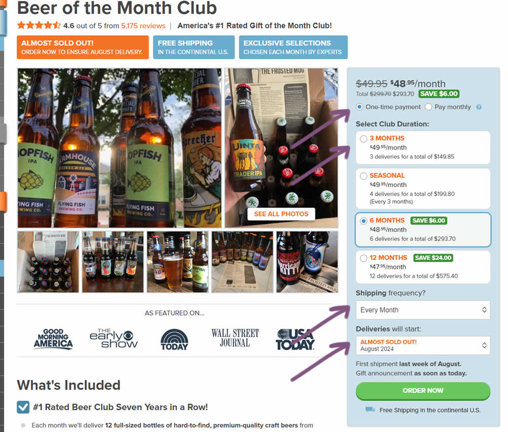
In this experiment, "persistence" of 4 product choices was added in the variation. When users made a product selection such as: duration, payment terms, starting month or shipping frequency, their choices were remembered and defaulted on next visits, reloads or when viewing other products. Impact on adds to cart and sales was measured.
Test #567 on
Online.metro-cc.ru
by  Andrey Andreev
Dec 18, 2024
Mobile
Desktop
Home & Landing
X.X%
Sales
Andrey Tested Pattern #135: Product Categories On Online.metro-cc.ru
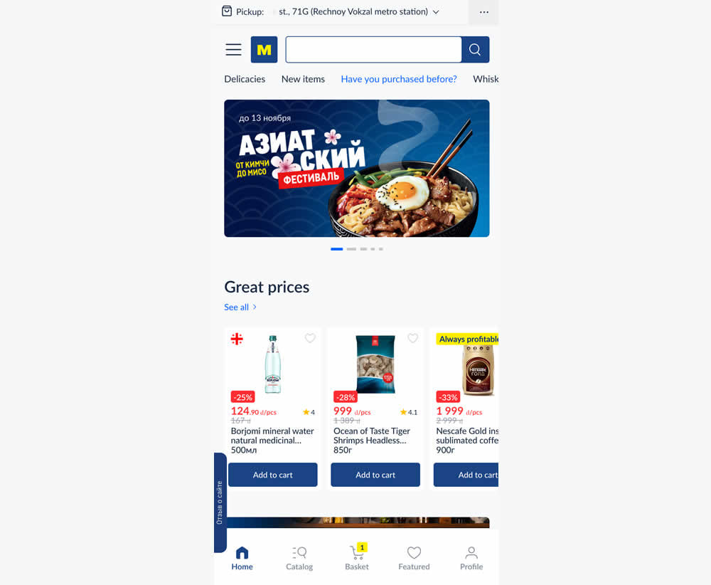
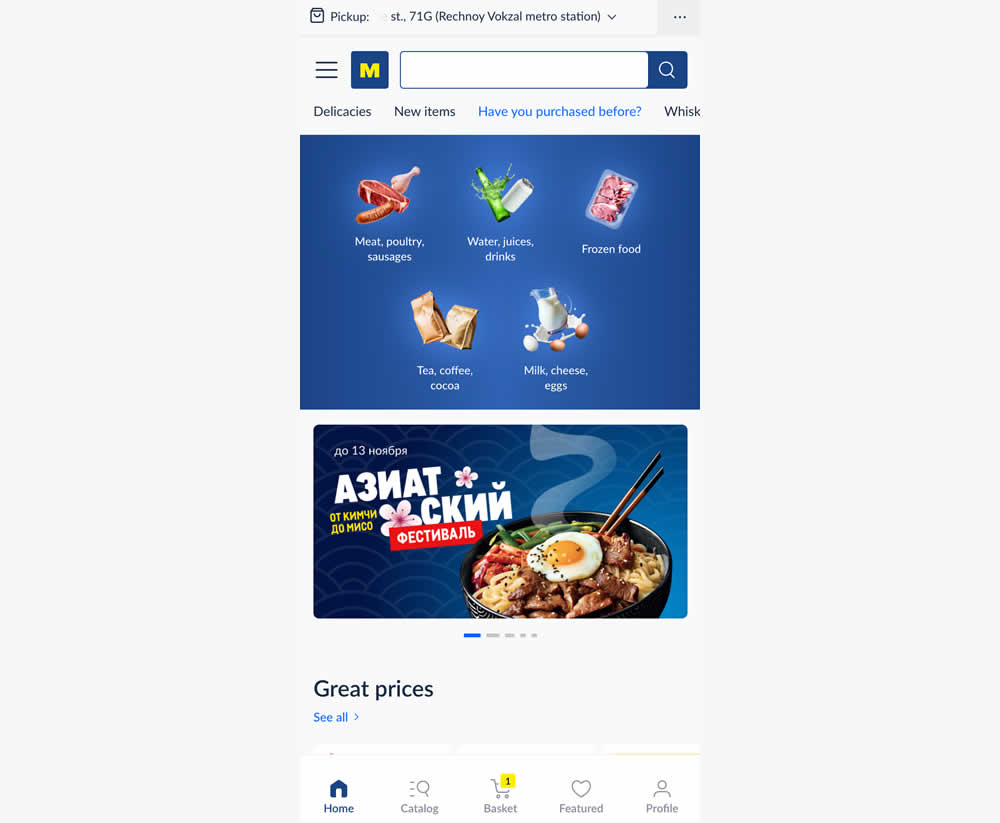
In this experiment, the variation added popular categories with links at the top of the homepage. This was done for all sets of user segments: new and returning. Impact on transactions was measured.
Test #566 on
Banter.com
by  Craig Kistler
Dec 11, 2024
Desktop
Product
X.X%
Sales
Craig Tested Pattern #66: Complementary Upsell On Banter.com
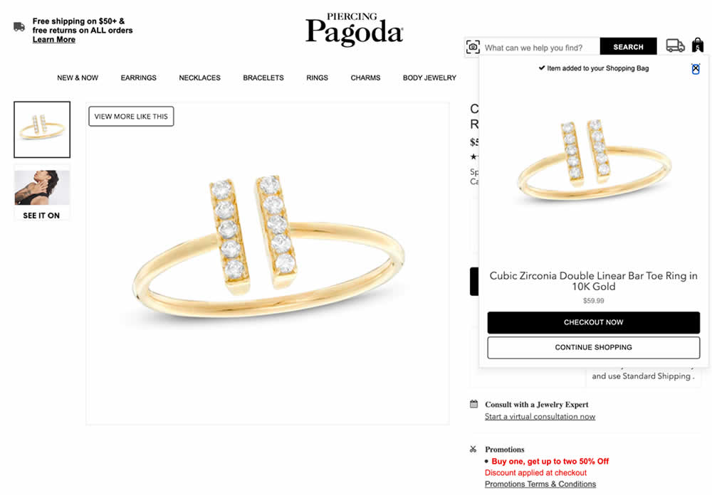
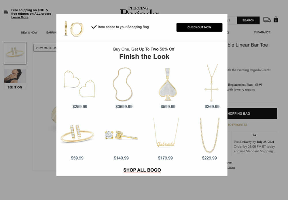
In this experiment, a modal based message was shown to encourage extra products being added as complementary upsells. In the control, the promotion text appeared at the bottom as red text ("Buy one, get up to two 50% Off"). Whereas in the variation, specific products were shown on the modal (post add-to-cart). Impact on adds-to-cart, sales and average revenue was measured.
Test #562 on
by  Jakub Linowski
Nov 13, 2024
Desktop
Mobile
Checkout
X.X%
Sales
Jakub Tested Pattern #99: Progress Bar
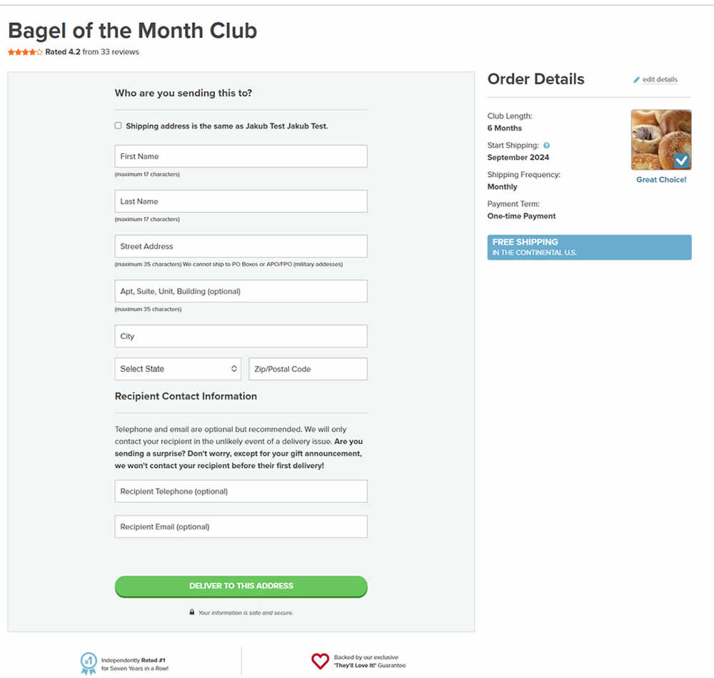
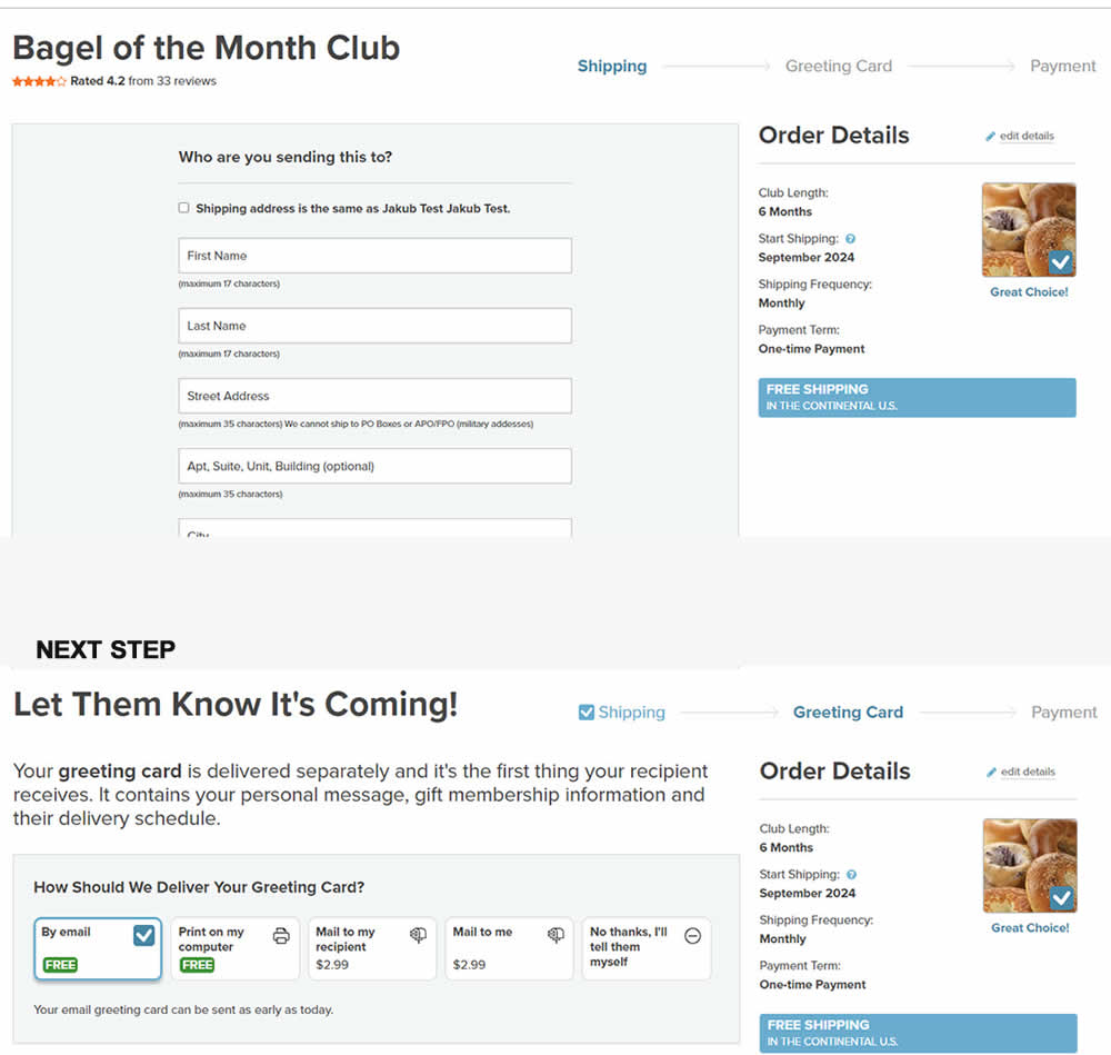
In this experiment, a 3 step progress bar was added starting on a checkout funnel (dedicated add-to-cart page, greeting card step and order summary). The progress bar also showed any completed steps as a "checked off" state. More so, users were able to use the progress bar as a navigation item to any previously completed and currently active steps. Impact on sales was measured.
Test #561 on
Aboalarm.de
by  Katharina Lay
Nov 07, 2024
Desktop
Signup
X.X%
Sales
Katharina Tested Pattern #40: Blurred Product Background On Aboalarm.de
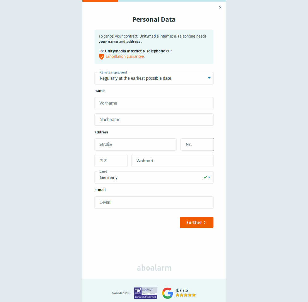
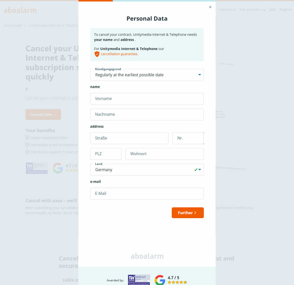
In this experiment, as a multi-step sign up funnel launched as a modal, there was a different treatment of the background. In the A version the background was a flat color, whereas in the B version the background used a transparent opacity to show through the landing page underneath. Impact on sign ups was measured.
Test #557 on
Obsbygg.no
by  Joachim Furuseth
Oct 17, 2024
Desktop
Product
X.X%
Sales
Joachim Tested Pattern #41: Sticky Call To Action On Obsbygg.no
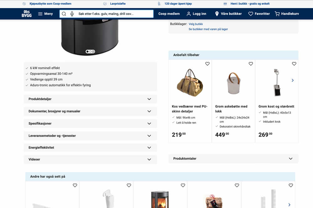
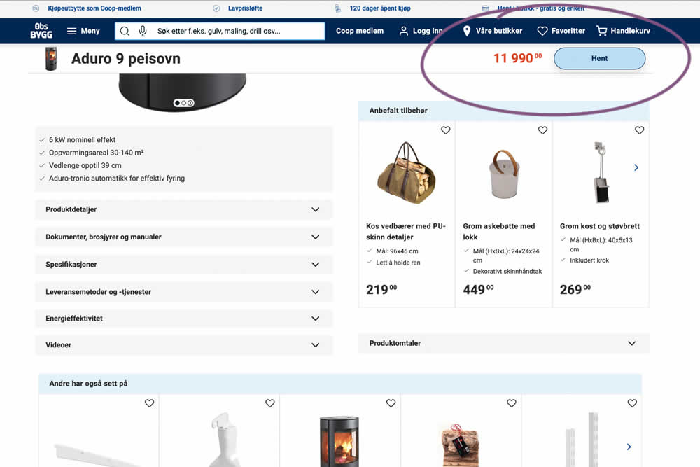
A sticky floating navigation bar was tested on product pages. The floating navigation contained: the product name, price and an add to cart button (add to cart). Impact on sales was measured. (Desktop Only)
Test #558 on
Obsbygg.no
by  Joachim Furuseth
Oct 17, 2024
Mobile
Product
X.X%
Sales
Joachim Tested Pattern #41: Sticky Call To Action On Obsbygg.no
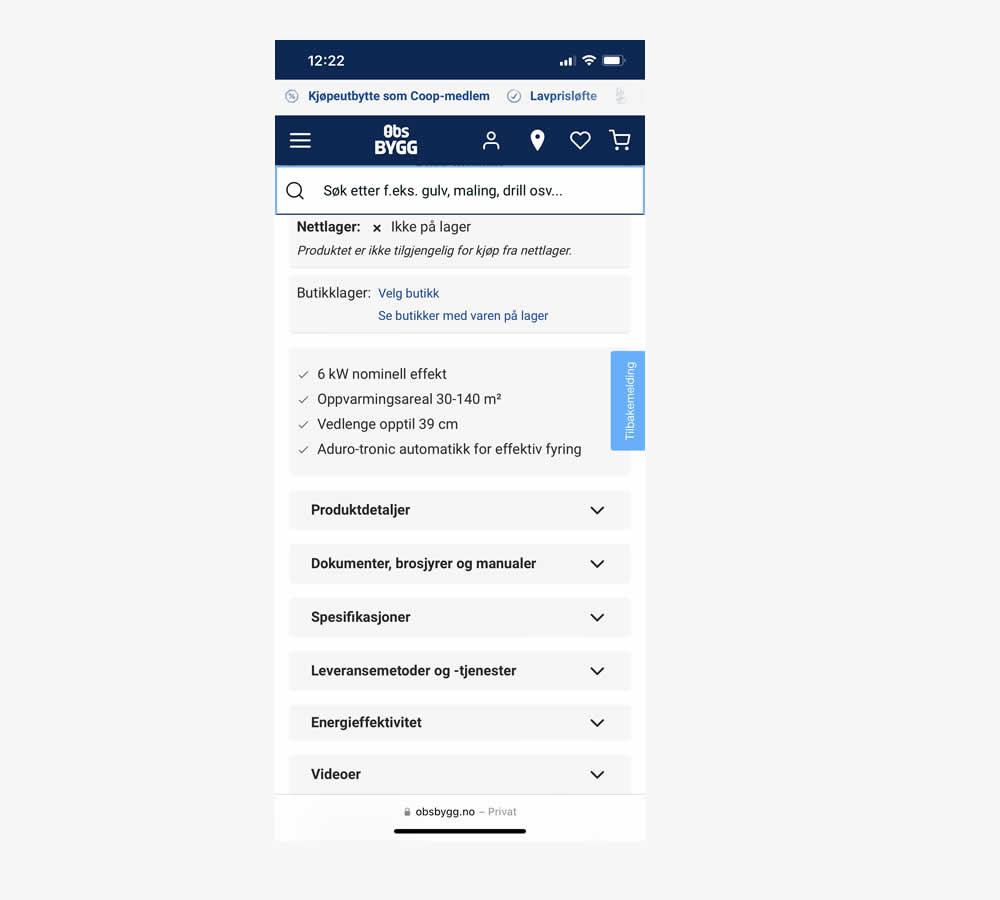
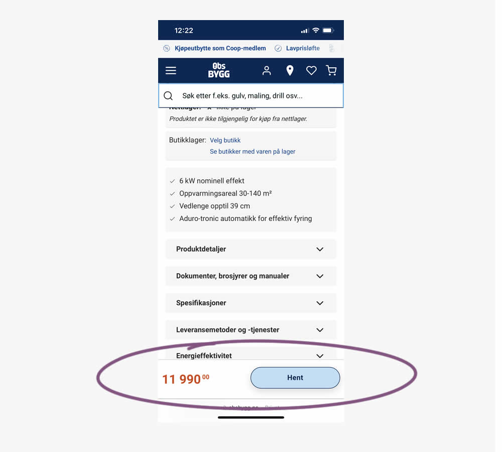
A sticky floating navigation bar was tested on product pages. The floating navigation contained: the product name, price and an add to cart button (add to cart). Impact on sales was measured. (Mobile Only)
Test #556 on
Snocks.com
by  Melina Hess
Oct 08, 2024
Mobile
Product
X.X%
Sales
Melina Tested Pattern #65: Add More For Extra Incentive On Snocks.com
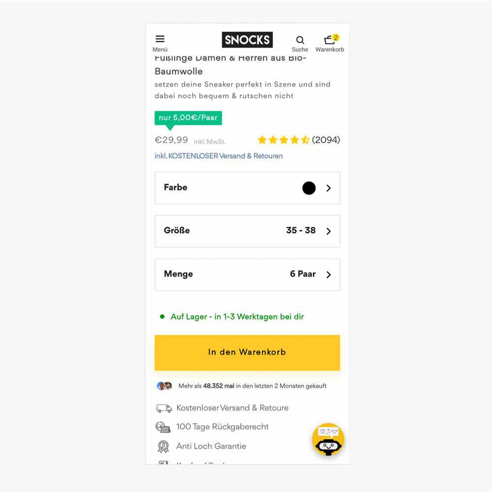
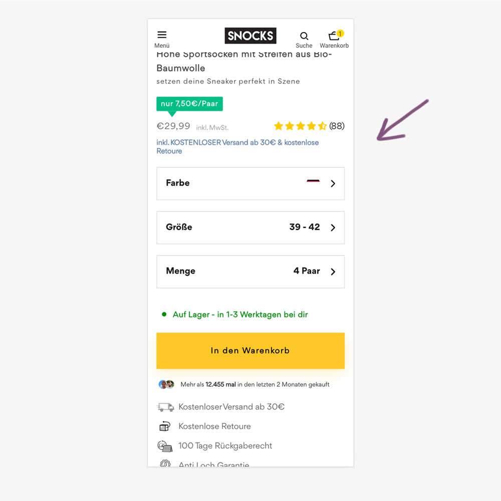
In this experiment, free shipping was a/b tested against free shipping with a 30€ purchase or higher. Hence, in the variation, customers needed to reach a cart amount total in order to be eligible for the free shipping.
Test #554 on
Obs.no
by  Joachim Furuseth
Sep 30, 2024
Desktop
Product
X.X%
Sales
Joachim Tested Pattern #41: Sticky Call To Action On Obs.no
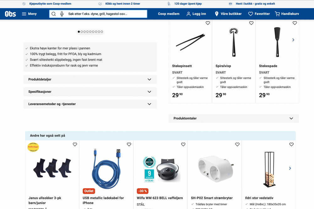
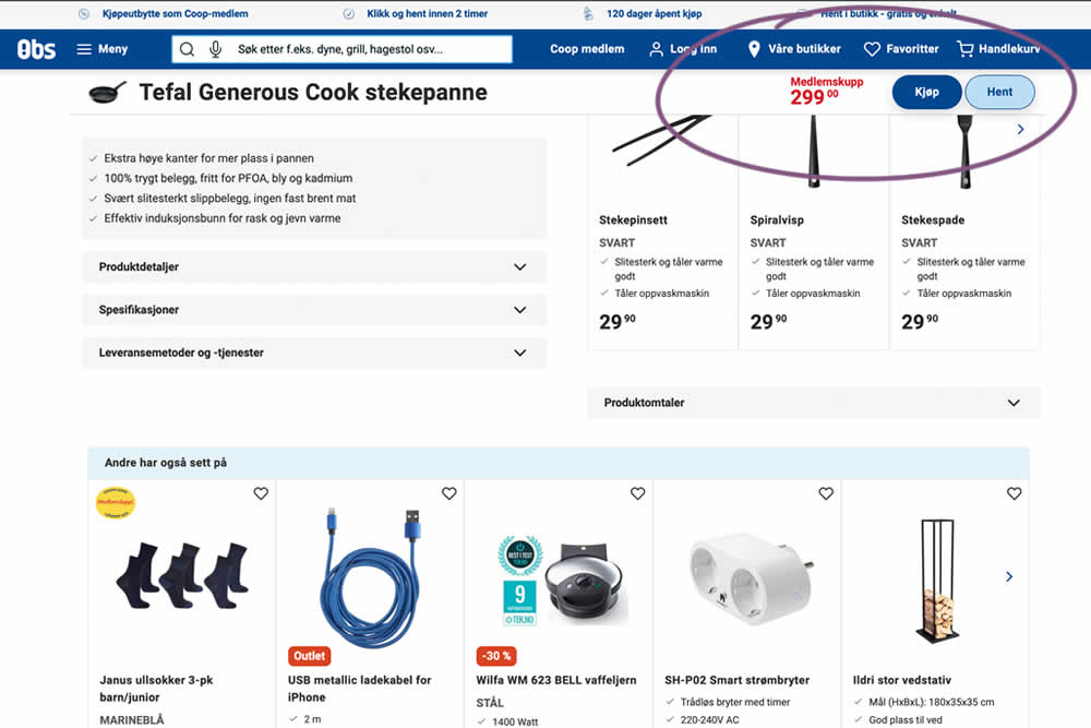
A sticky floating navigation bar was tested on product pages. The floating navigation contained: the product name, price and two add to cart buttons (add to cart; pickup in store). Impact on sales was measured. (Desktop Only)
Test #555 on
Obs.no
by  Joachim Furuseth
Sep 30, 2024
Mobile
Product
X.X%
Sales
Joachim Tested Pattern #41: Sticky Call To Action On Obs.no
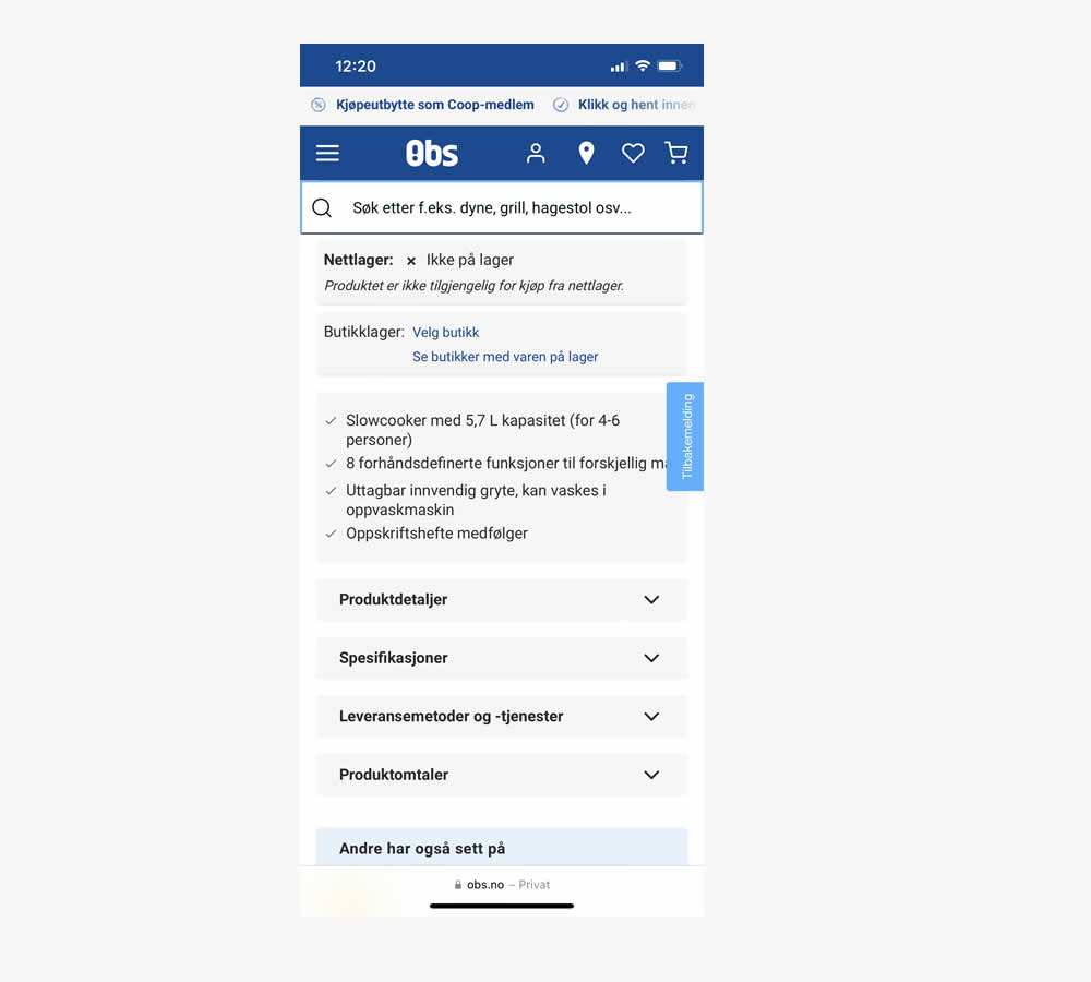
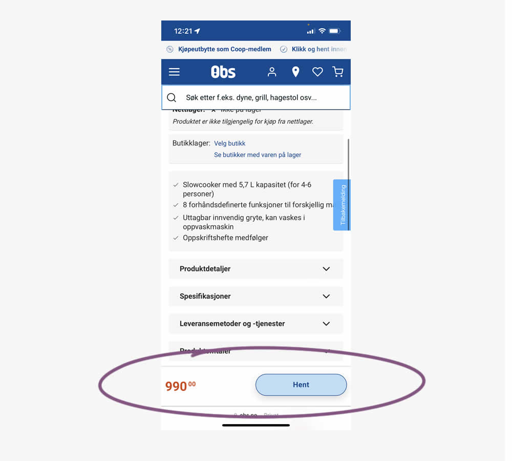
A sticky floating navigation bar was tested on product pages. The floating navigation contained: the product name, price and two add to cart buttons (add to cart; pickup in store). Impact on sales was measured. (Mobile only)
Test #553 on
Online.metro-cc.ru
by  Andrey Andreev
Sep 27, 2024
Mobile
Desktop
Checkout
X.X%
Sales
Andrey Tested Pattern #69: Autodiscounting On Online.metro-cc.ru
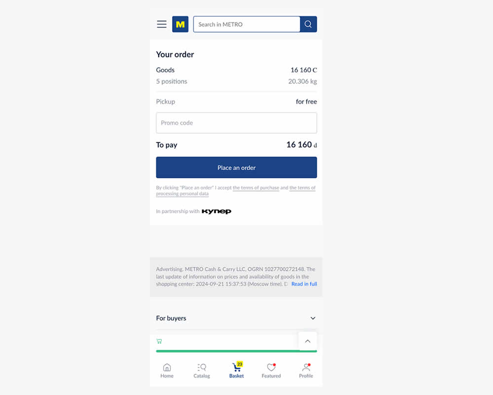
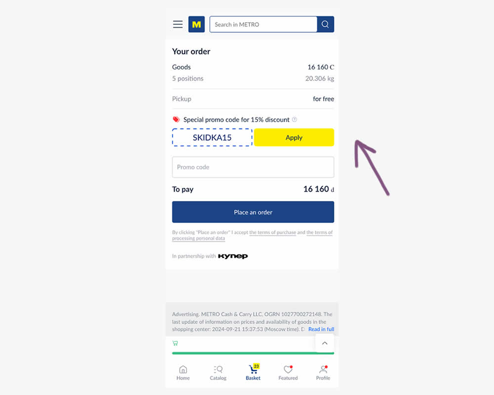
In this experiment, a preset coupon code with -15% amount and an easy to "apply" button was shown to new users who have never made a purchase. In the variation, the an empty coupon field was shown. Impact and transactions and revenue was measured.
Test #550 on
Online.metro-cc.ru
by  Andrey Andreev
Aug 14, 2024
Mobile
Listing
X.X%
Sales
Andrey Tested Pattern #137: Visible Filters On Online.metro-cc.ru
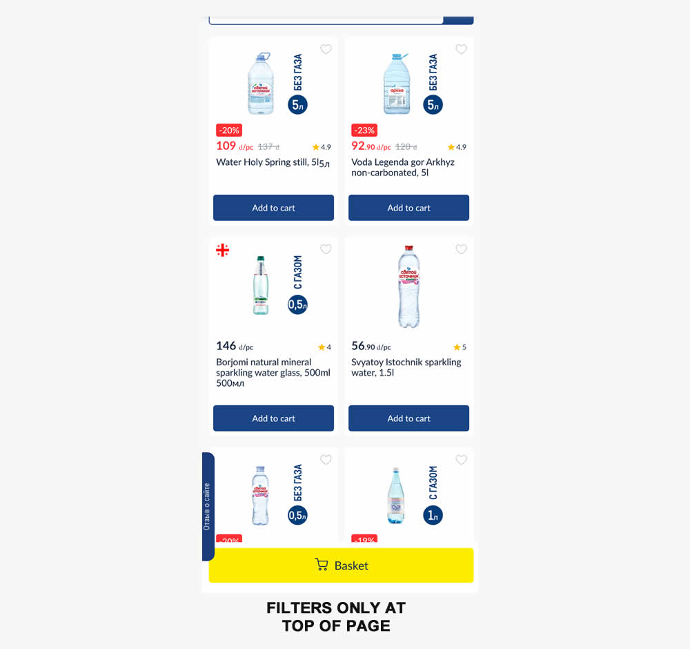
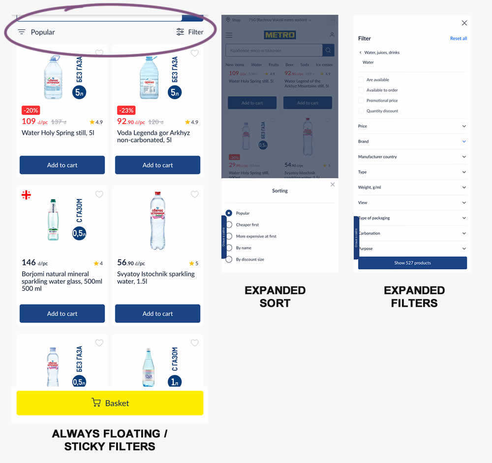
Instead of only displaying sort and filters at the top of a listing page, the variation always had them visible with a sticky/floating interaction. Impact on sales was measured.