All Latest 620 A/B Tests
Test #355 on
by  Jakub Linowski
May 28, 2021
Desktop
Mobile
Home & Landing
X.X%
Sales
Jakub Tested Pattern #79: Product Highlights

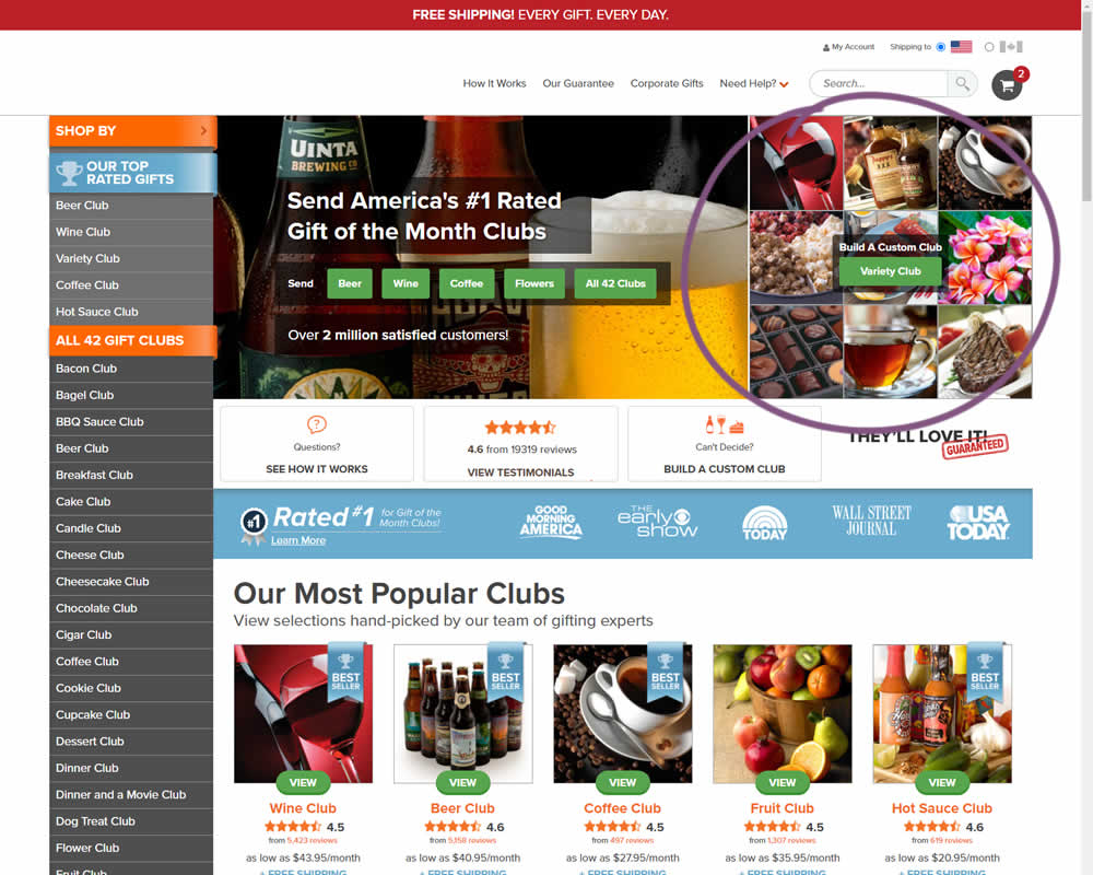
In this experiment, an extra product choice was added to the header of a homepage. Instead of only highlighting a set of four specific products, the option to build custom variety one, was added.
Which A Or B Actually Wins? Find Out Before You Test.
Members see every test result — the winners, the flat ones, and the losers — along with exact effects and sample sizes. Use it to estimate your tests and prioritize by probability, not gut feel. Start every experiment with the odds on your side.
Test #354 on
Mvideo.ru
by  Andrey Andreev
May 25, 2021
Desktop
Mobile
Product
X.X%
Sales
Andrey Tested Pattern #69: Autodiscounting On Mvideo.ru
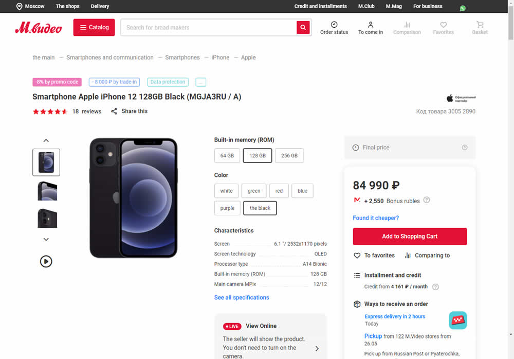
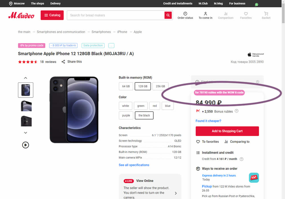
In this experiment, the discounted price was shown along with an active promotion. The control only showed that the relative -8% discount was present with the pre-discounted price.
Test #78 on
Mvideo.ru
by  Andrey Andreev
May 06, 2021
Desktop
Mobile
Listing
X.X%
Sales
Andrey Tested Pattern #90: Out Of Stock Or In Stock Products On Mvideo.ru
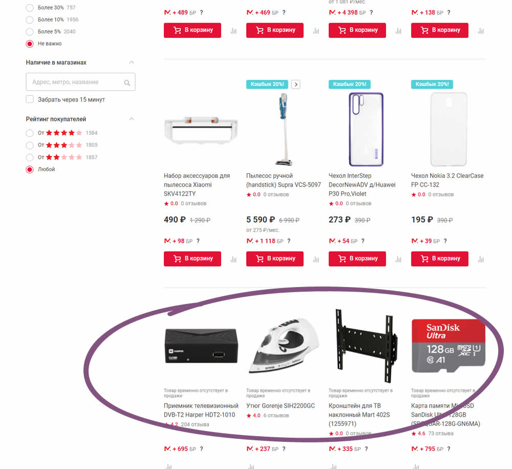
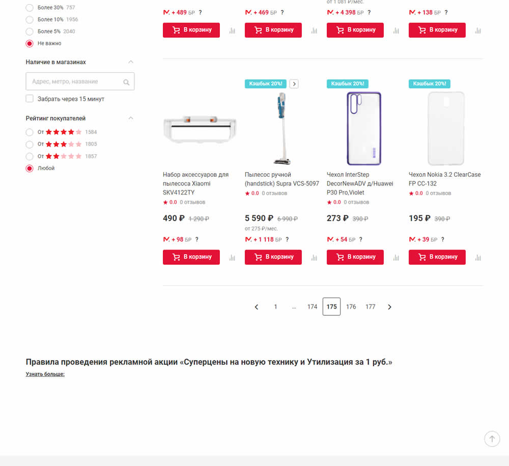
In this experiment, products which were out of stock were removed from listing pages and replaced with in stock ones (not visible in the screenshot).
Test #349 on
Backstage.com
by  Stanley Zuo
Apr 27, 2021
Mobile
Global
X.X%
Sales
Stanley Tested Pattern #49: Above The Fold Call To Action On Backstage.com
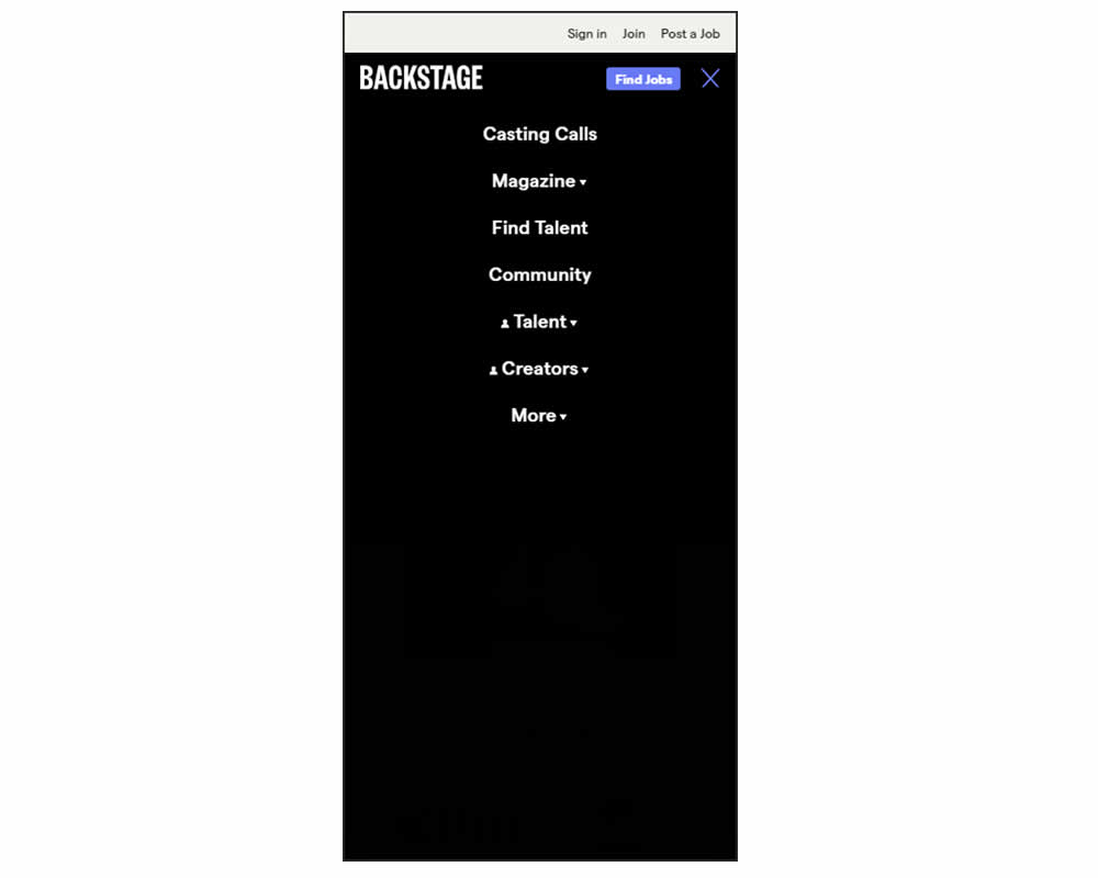
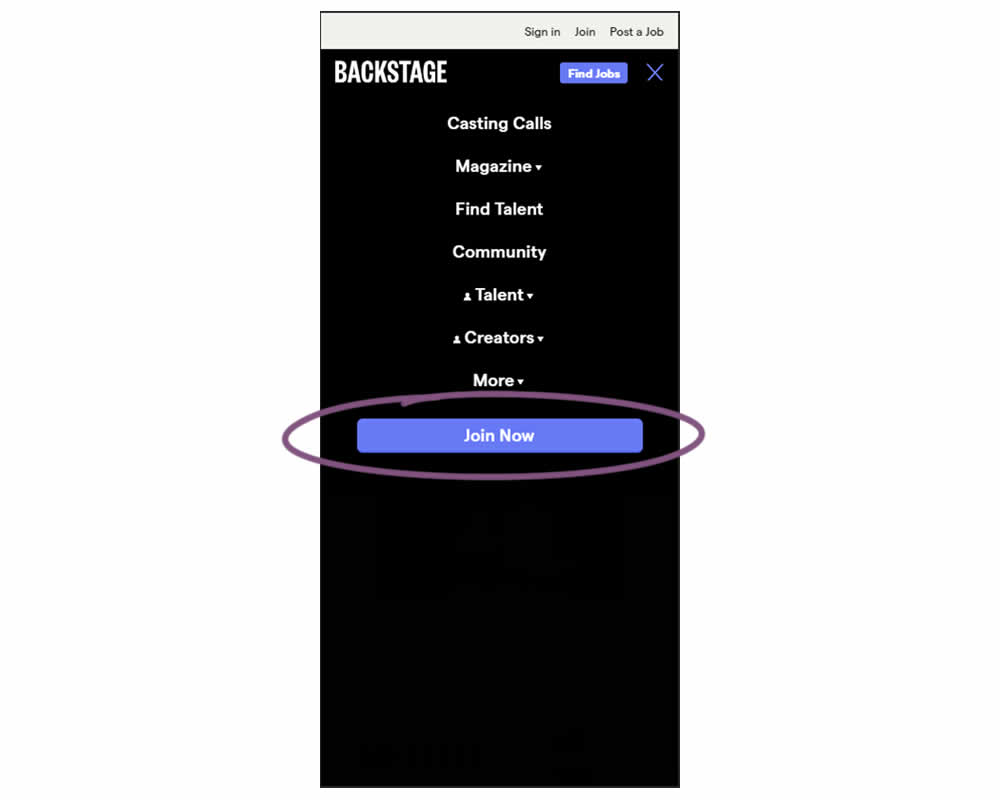
In this experiment, a simple "Join Now" button was added inside an expanded mobile navigation menu. Clicking the button would start a multiple step membership subscription process. Impact on subscription starts and final sales were tracked.
Test #347 on
by  Jakub Linowski
Apr 07, 2021
Desktop
Mobile
Home & Landing
X.X%
Sales
Jakub Tested Pattern #26: Cart Reminder And Recently Viewed
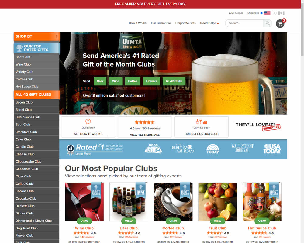
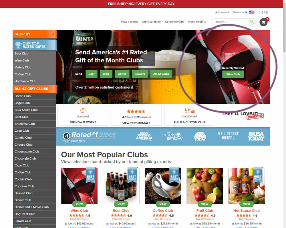
In this experiment, when customers viewed a product and returned to the homepage, they would then see the most recently viewed one - a delicate nudge. The experiment ran with full traffic and impact on sales was measured.
Test #346 on
by  Stanley Zuo
Mar 30, 2021
Desktop
Mobile
Home & Landing
X.X%
Sales
Stanley Tested Pattern #117: Company Logos
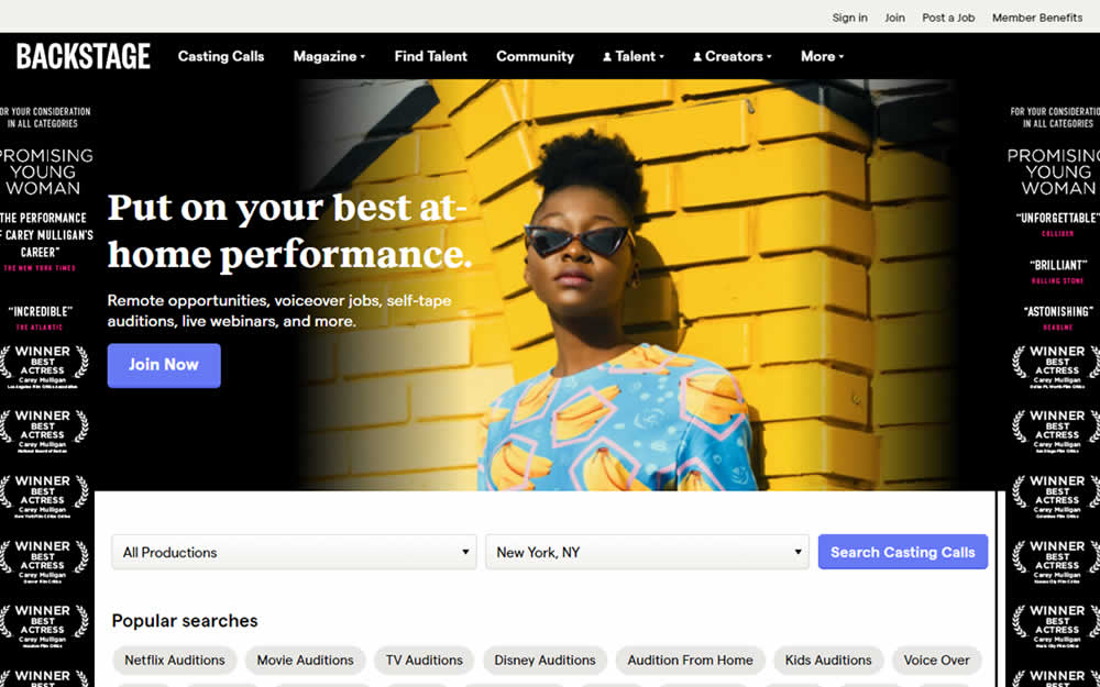

In this homepage experiment, company logos were added to the homepage. These were example clients or companies that Backstage works with and offers casting (job) listing from. Impact on the registration flow and membership checkouts was measured.
Test #343 on
Snocks.com
by  Samuel Hess
Mar 12, 2021
Desktop
Mobile
Product
X.X%
Sales
Samuel Tested Pattern #122: Zigzag Layout On Snocks.com

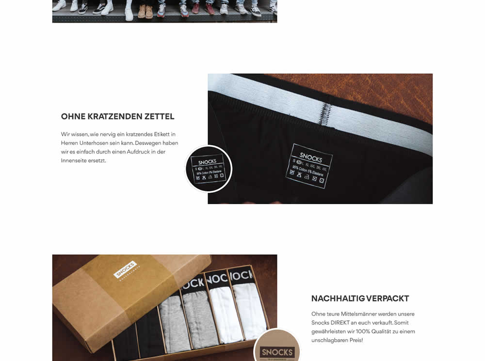
In this experiment, the content on a product page was reorganized into a zigzagging (alternating layout) along with reinforcing photos. Impact on adds-to-cart and total sales was measured.
Test #344 on
by  Jakub Linowski
Mar 11, 2021
Desktop
Checkout
X.X%
Sales
Jakub Tested Pattern #108: Frequently Asked Questions
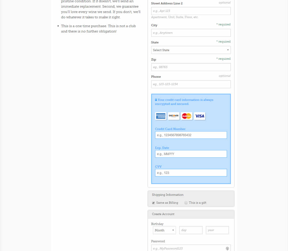
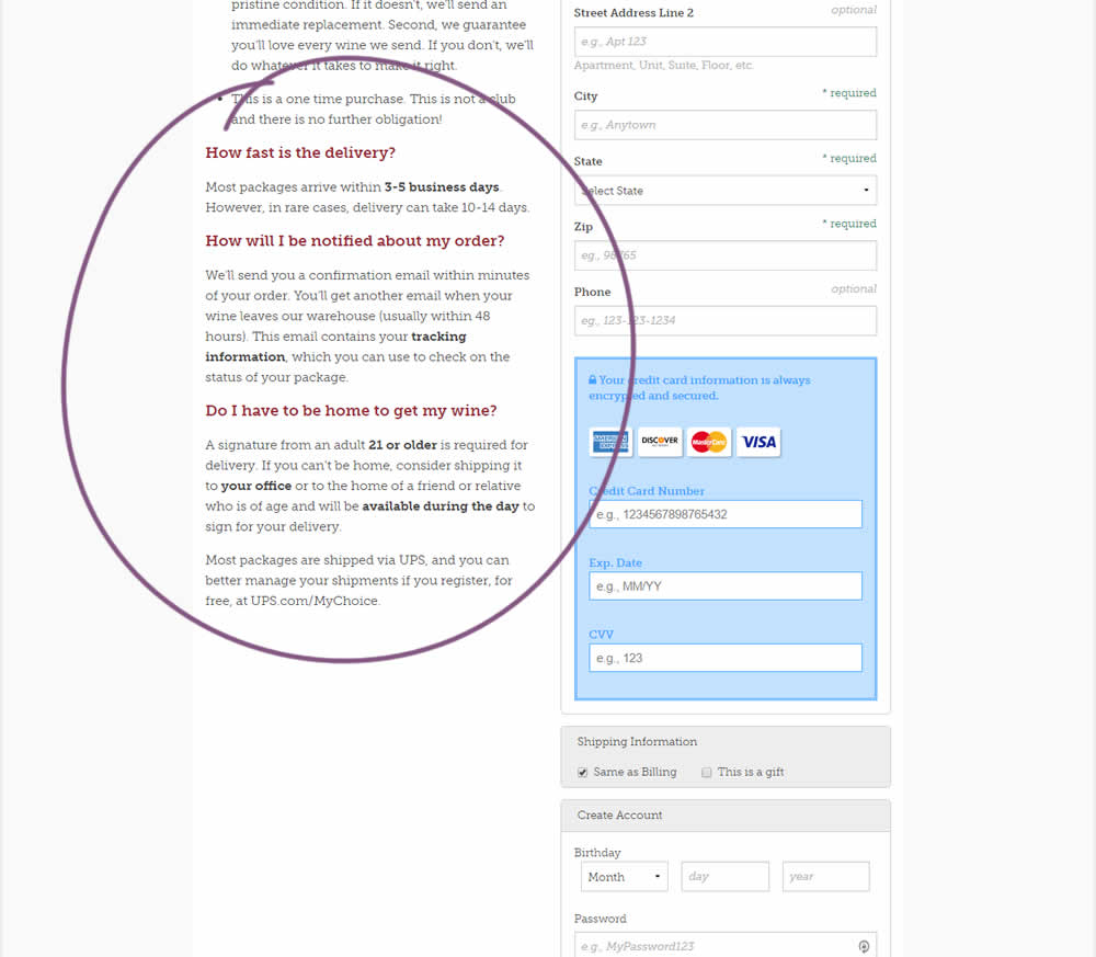
Three common delivery questions were answered at the bottom of a checkout page.
Test #340 on
by  Jakub Linowski
Feb 25, 2021
Desktop
Checkout
X.X%
Sales
Jakub Tested Pattern #114: Less Or More Visible Prices


In this experiment, the variation added a second total price at the bottom of the checkout screen just above the checkout button. The impact on sales was measured.
Test #336 on
Backstage.com
by  Stanley Zuo
Jan 28, 2021
Desktop
Mobile
Listing
X.X%
Sales
Stanley Tested Pattern #51: Shortcut Buttons On Backstage.com
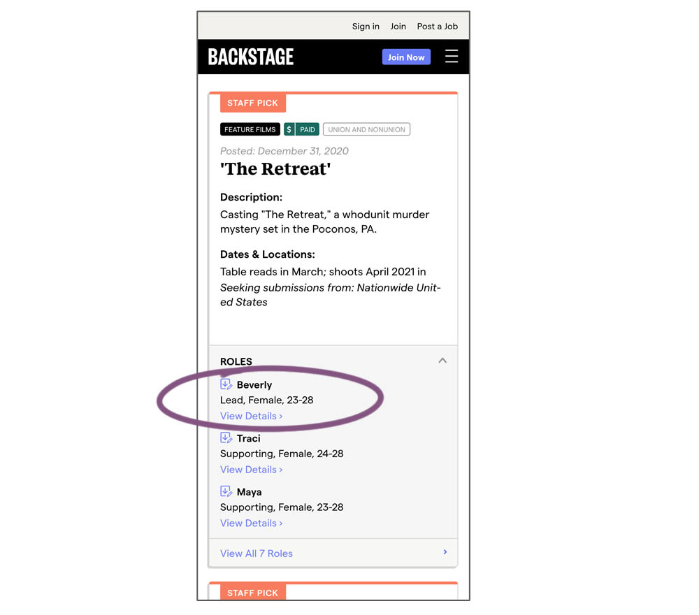
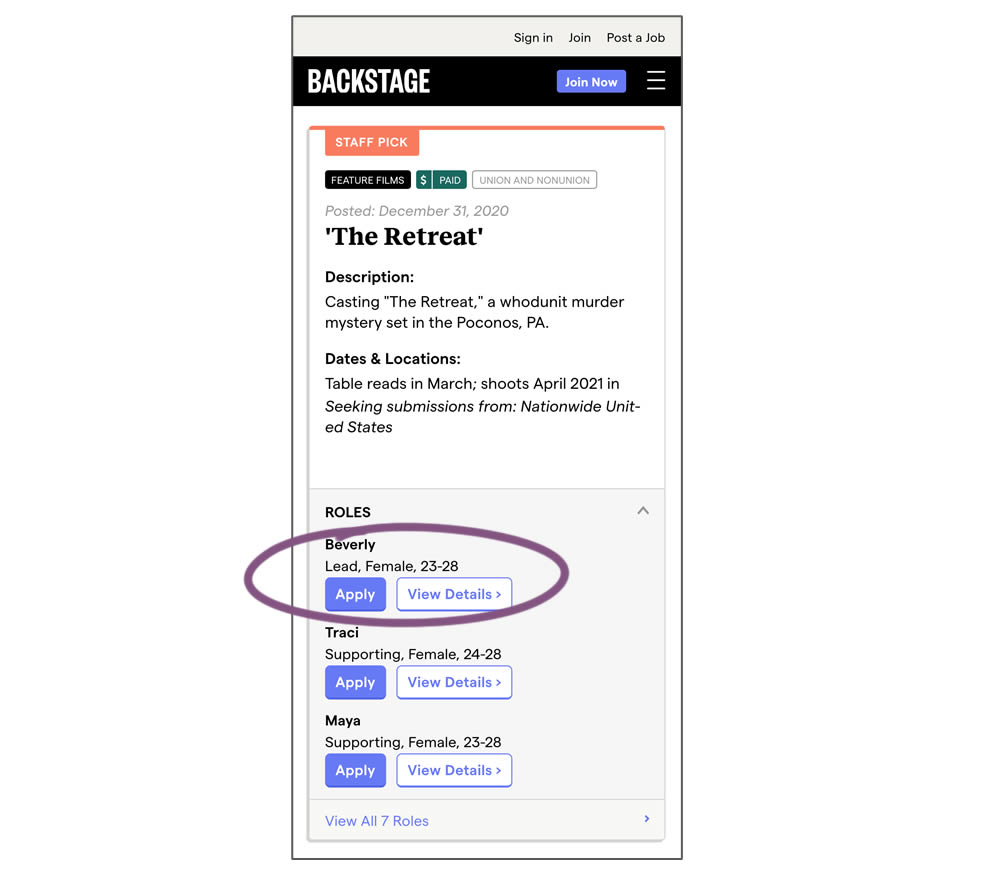
In this experiment, a listing page was expanded to show two actions (apply and view details) instead of a single one (view details only). This variation enabled users with a shortcut action to apply for roles one step earlier (and start membership flows for new users).
Test #337 on
Backstage.com
by  Stanley Zuo
Jan 28, 2021
Desktop
Mobile
Listing
X.X%
Sales
Stanley Tested Pattern #51: Shortcut Buttons On Backstage.com
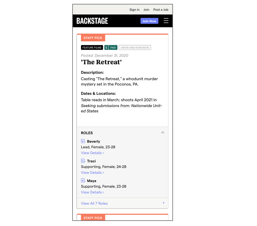
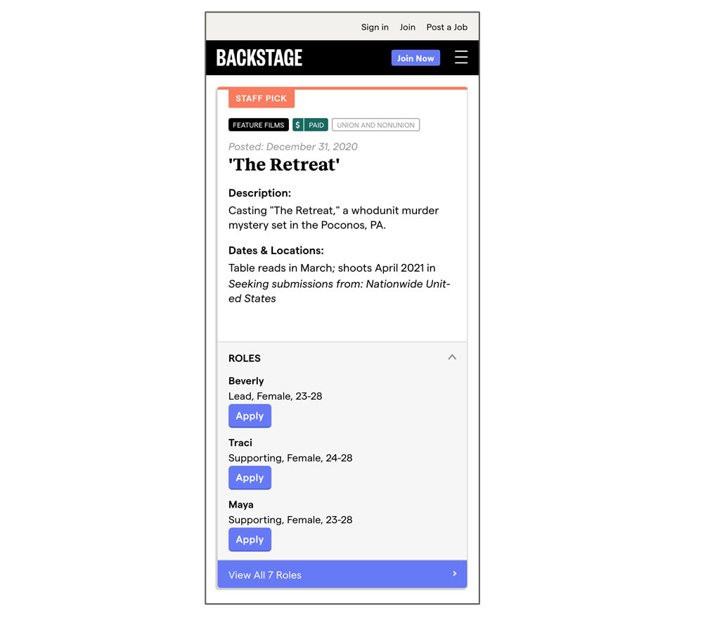
In this experiment, a listing page was expanded to show two actions (apply and view details) instead of a single one (view details only). In the variant, the "view detail" links were replaced with "apply links" starting a job application (and membership flows) sooner.
Test #335 on
by  Jakub Linowski
Jan 27, 2021
Desktop
Mobile
Home & Landing
X.X%
Sales
Jakub Tested Pattern #32: Condensed List
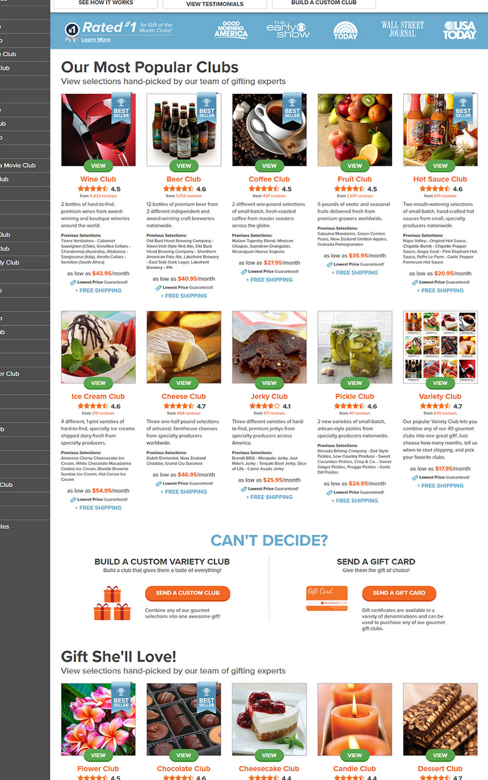
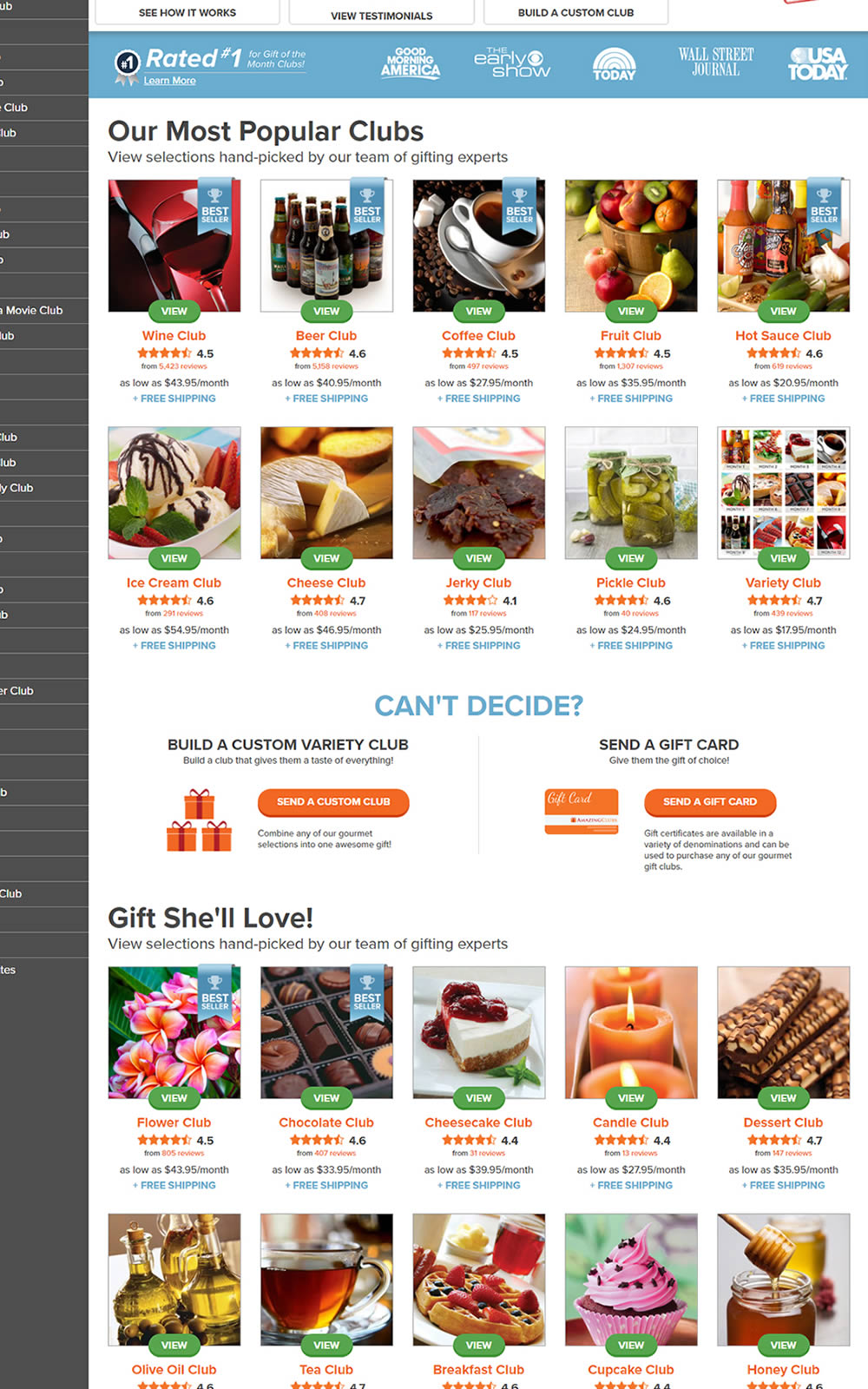
The variation here has more condensed product tiles being shown on a homepage. Two pieces of information were removed: product descriptions and past selections. Impact on product page visits and total sales was measured.
Test #331 on
by  Jakub Linowski
Dec 30, 2020
Desktop
Mobile
Product
X.X%
Sales
Jakub Tested Pattern #121: Free Shipping

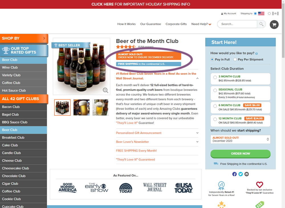
In this little experiment, an extra "Free Shipping" message was added on a product page. It's prominence was increased by using white copy on a darker blue background. Impact on adds-to-cart and total sales was measured.
Test #332 on
by  Jakub Linowski
Dec 30, 2020
Desktop
Mobile
Product
X.X%
Sales
Jakub Tested Pattern #121: Free Shipping
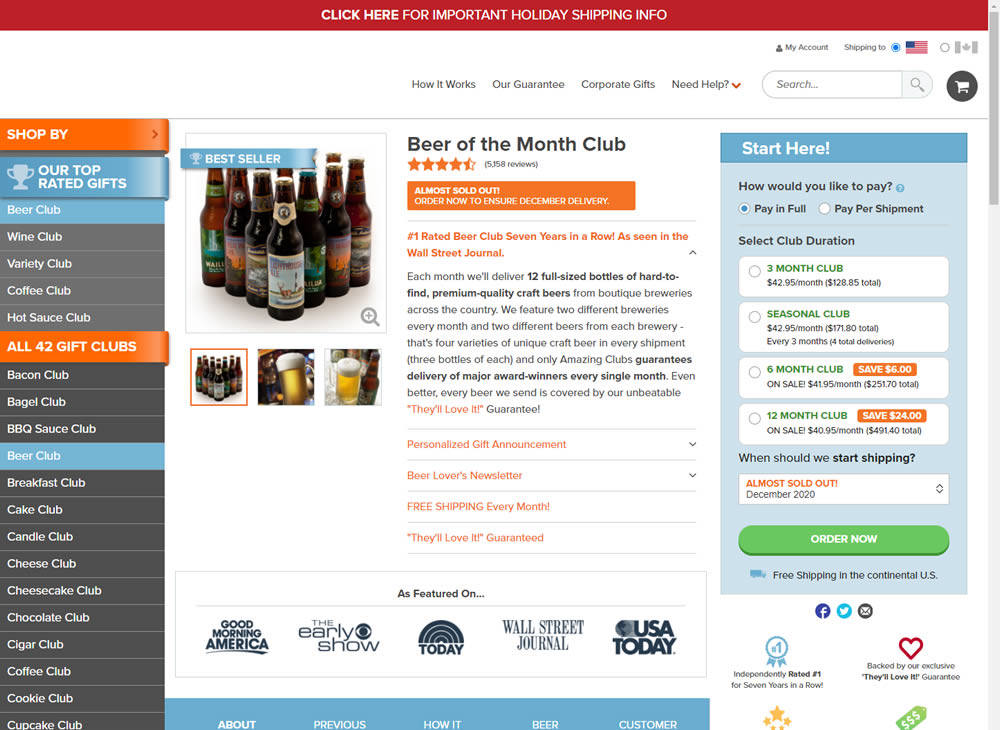
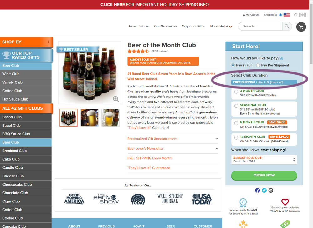
In this experiment, an extra "Free Shipping" message was added on a product page - at the top of the buy box with an add-to-cart call to action. It's prominence was increased by using white copy on a darker blue background. Impact on adds-to-cart and total sales was measured.
Test #329 on
Snocks.com
by  Samuel Hess
Dec 23, 2020
Mobile
Home & Landing
X.X%
Sales
Samuel Tested Pattern #14: Exposed Menu Options On Snocks.com
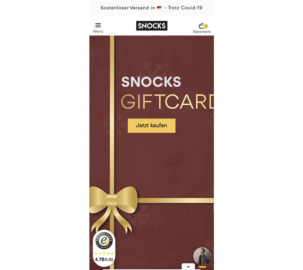
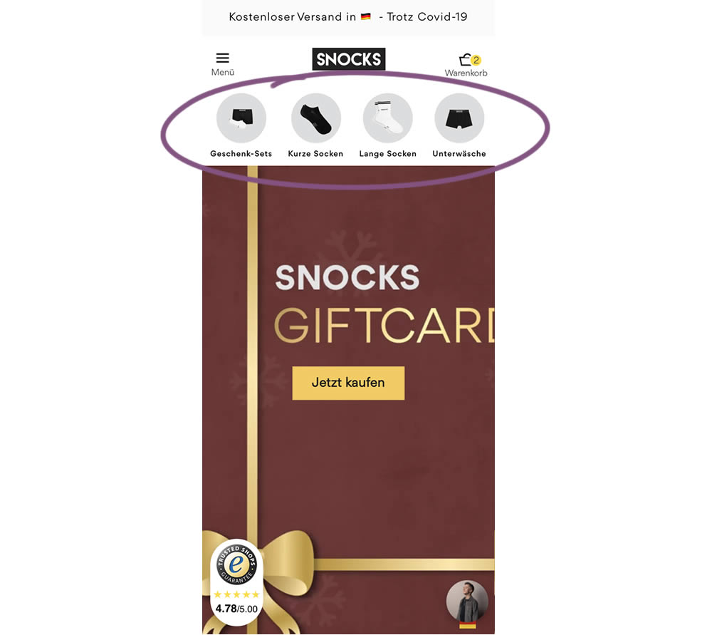
In this homepage experiment, a series of product categories were shown more visible near the top of the screen (instead of only being shown inside the hamburger menu). They linked up to corresponding listing pages with such items as: gifts, short socks, long socks, and underwear. Impact on adds-to-cart and total sales was measured.
Test #325 on
Snocks.com
by  Samuel Hess
Nov 24, 2020
Desktop
Global
X.X%
Sales
Samuel Tested Pattern #45: Benefit Bar On Snocks.com
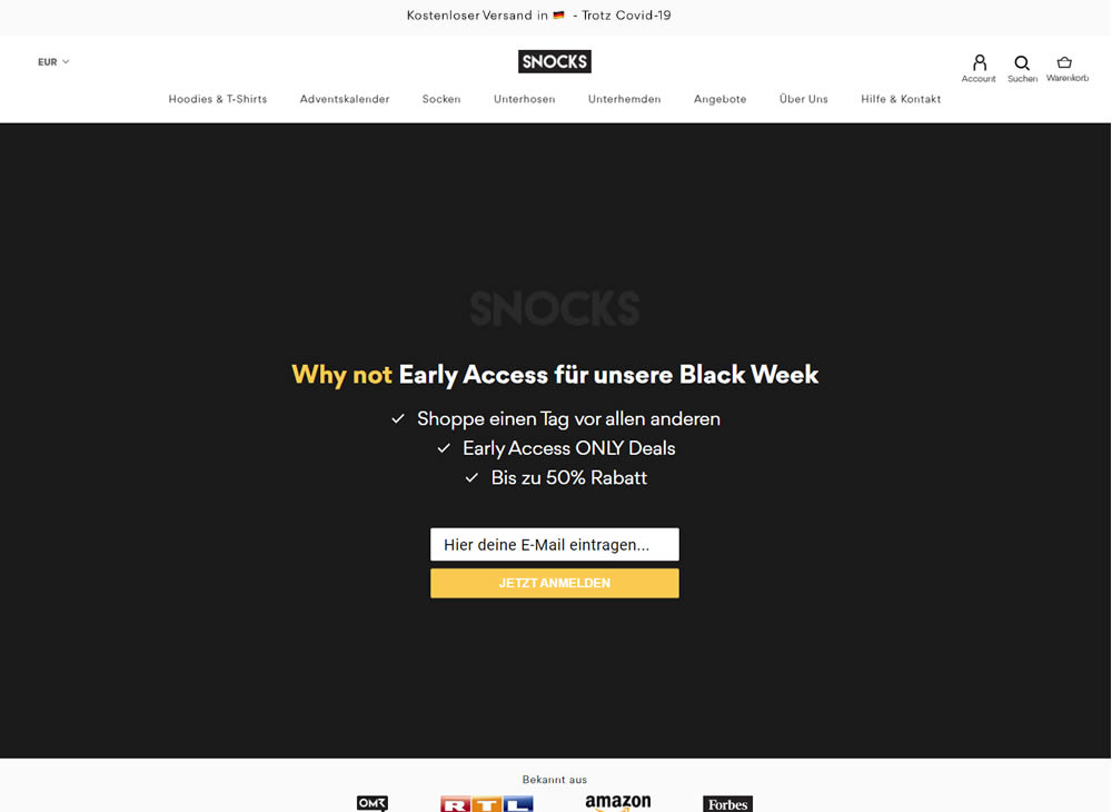
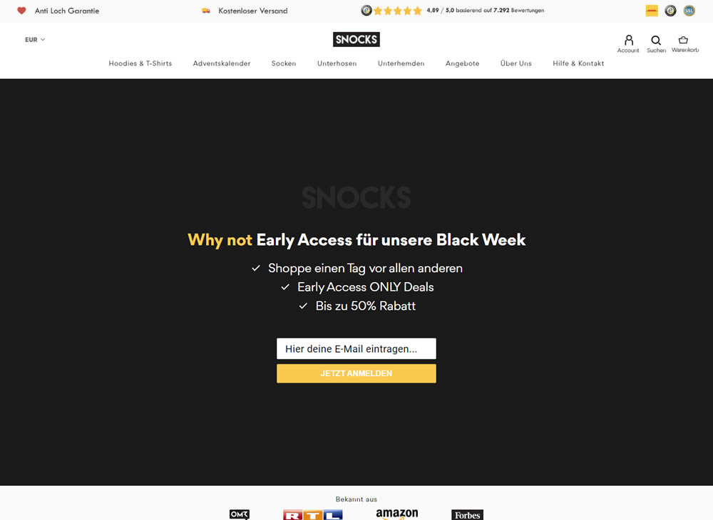
In this experiment, a set of reassurances and reviews were added in the header of this ecommerce website. Translating from German, these read: "Anti Hole Guarantee", "Free Shipping" and "X Ratings out of Y Reviews".
Test #324 on
by  Jakub Linowski
Oct 30, 2020
Desktop
Mobile
Product
X.X%
Sales
Jakub Tested Pattern #17: Least Or Most Expensive First
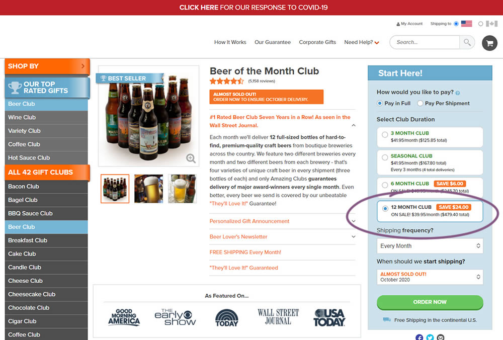
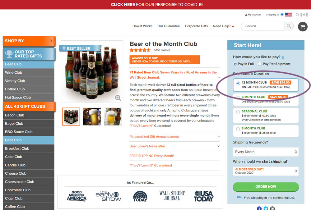
This experiment tested the order of purchase plans. The control version sorted the purchase options by the least expensive while the variation sorted them by the most expensive first. Impact on sales and revenue was measured.
Test #323 on
Backstage.com
by  Stanley Zuo
Oct 29, 2020
Mobile
Signup
X.X%
Sales
Stanley Tested Pattern #117: Company Logos On Backstage.com
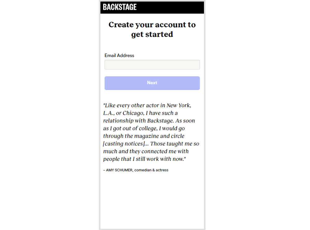
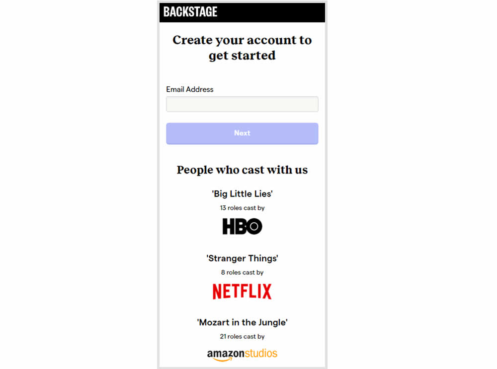
In this experiment, the variation replaced a text testimonial with high-profile production companies that have cast with Backstage. The logos were shown during the signup and checkout flow.
Test #320 on
by  Jakub Linowski
Oct 20, 2020
Desktop
Checkout
X.X%
Sales
Jakub Tested Pattern #49: Above The Fold Call To Action
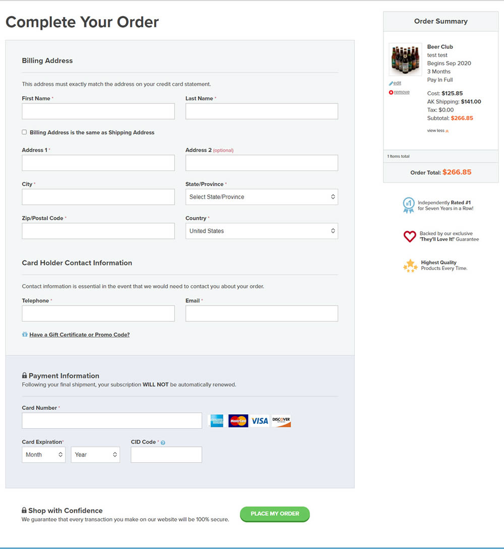
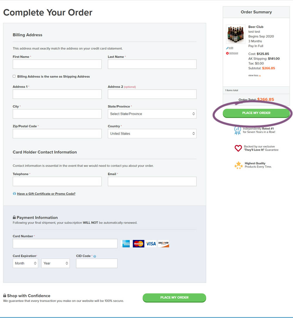
An extra "Place Order" button was duplicated above the fold on this checkout page. The control had a similar button further down at the bottom of the screen. The impact on total sales was measured from this change.
Test #319 on
Backstage.com
by  Stanley Zuo
Sep 30, 2020
Desktop
Pricing
X.X%
Sales
Stanley Tested Pattern #113: More Or Fewer Plans On Backstage.com
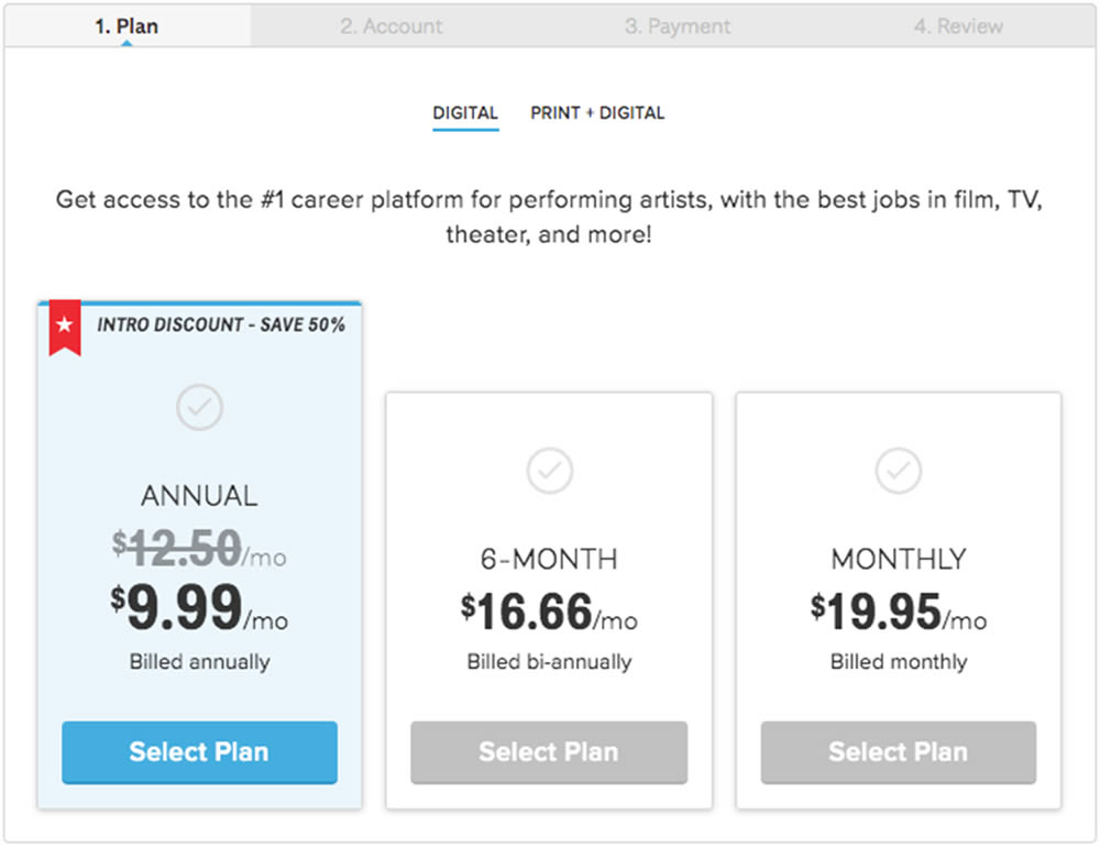
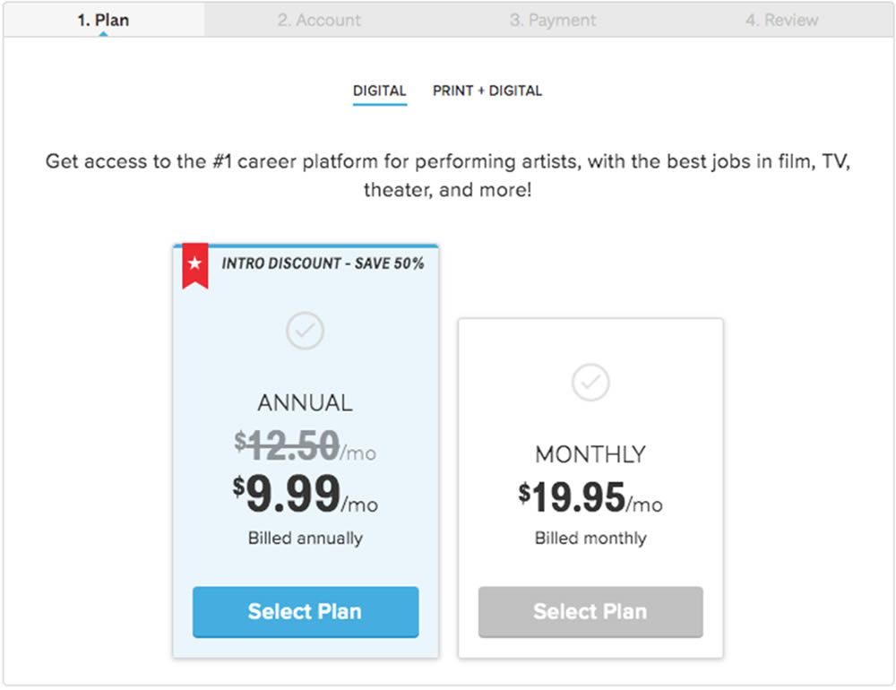
In this experiment, a 3 plan vs 2 plan pricing page was shown to potential customers. Impact on sales and revenue were measured.