All Latest 620 A/B Tests
MOST RECENT TESTS
Test #642 on
by  Frazer Mawson
Mar 27, 2026
Mobile
Shopping Cart
X.X%
Sales
Frazer Tested Pattern #41: Sticky Call To Action
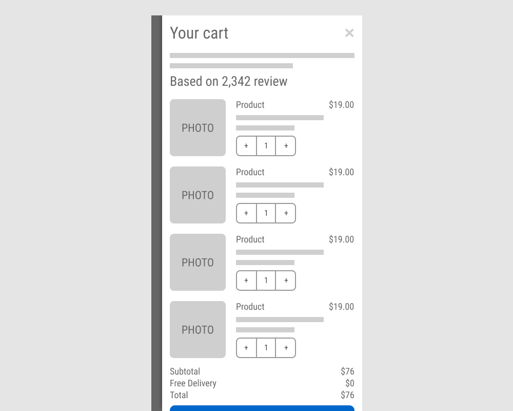
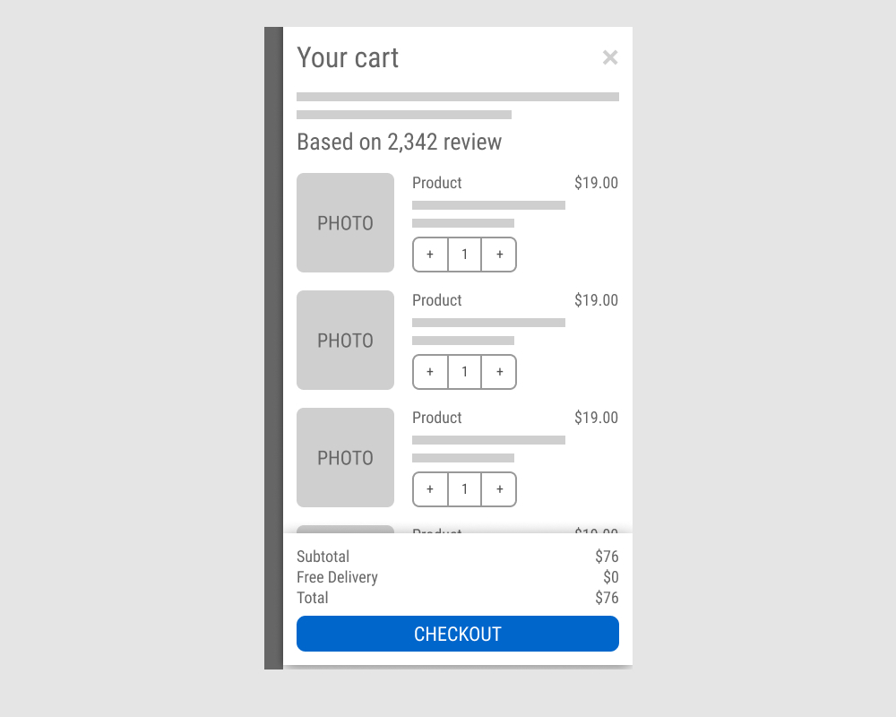
The A version showed a non-sticky checkout button at the bottom of a flyout cart. The B variation added a sticky bar with a price summary and checkout button, keeping it always visible. Impact on sales was measured.
Which A Or B Actually Wins? Find Out Before You Test.
Members see every test result — the winners, the flat ones, and the losers — along with exact effects and sample sizes. Use it to estimate your tests and prioritize by probability, not gut feel. Start every experiment with the odds on your side.
Test #638 on
by  Frazer Mawson
Feb 28, 2026
Mobile
Product
X.X%
Sales
Frazer Tested Pattern #41: Sticky Call To Action
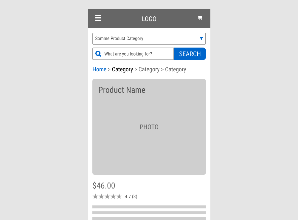
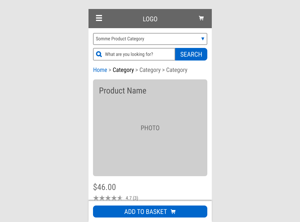
A floating Add to Basket button was added to a product page. Impact on sales was measured.
Test #631 on
by  Frazer Mawson
Jan 29, 2026
Mobile
Shopping Cart
X.X%
Sales
Frazer Tested Pattern #41: Sticky Call To Action
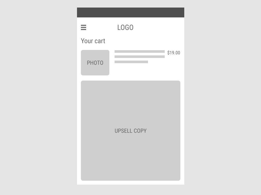
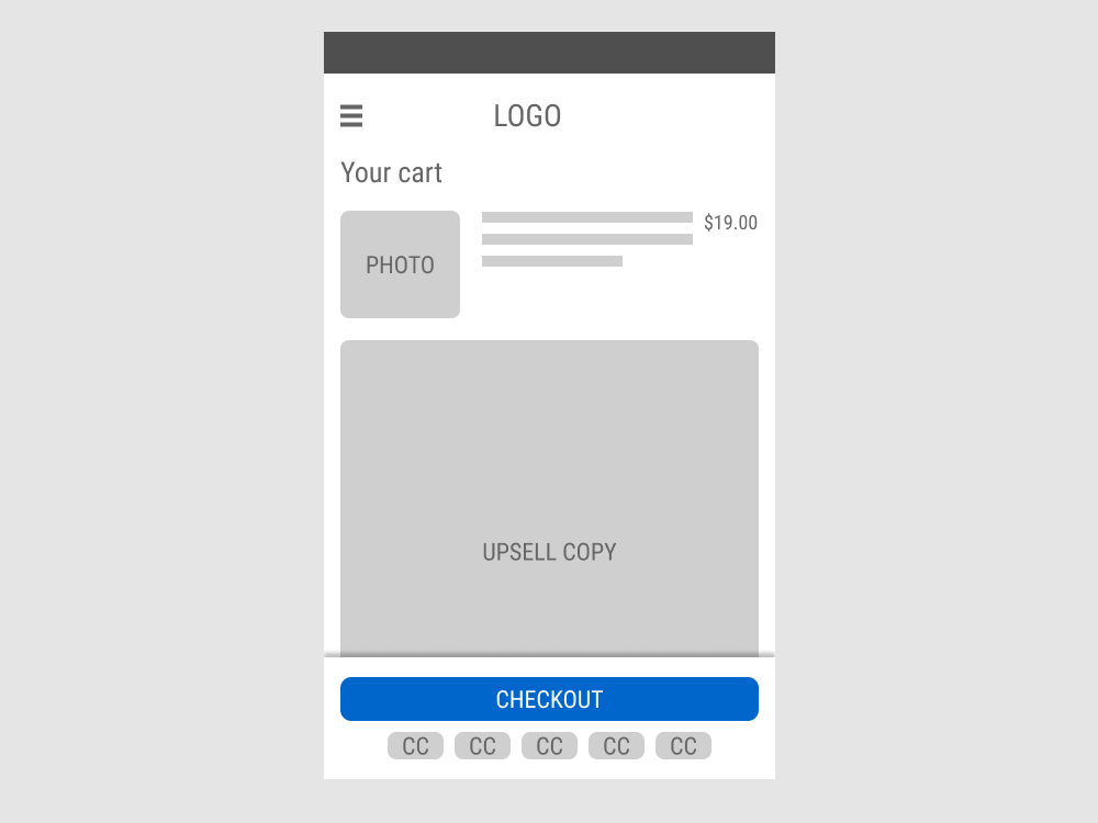
In this experiment, the shopping cart screen displayed a floating “Checkout” button with common credit card icons that directed users to the checkout page when clicked. In the control, the button was positioned inline, further down the page. Impact on progression to checkout and total sales were measured.
Test #627 on
by  Jakub Linowski
Dec 29, 2025
Product
X.X%
Sales
Jakub Tested Pattern #26: Cart Reminder And Recently Viewed
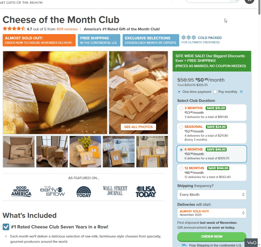
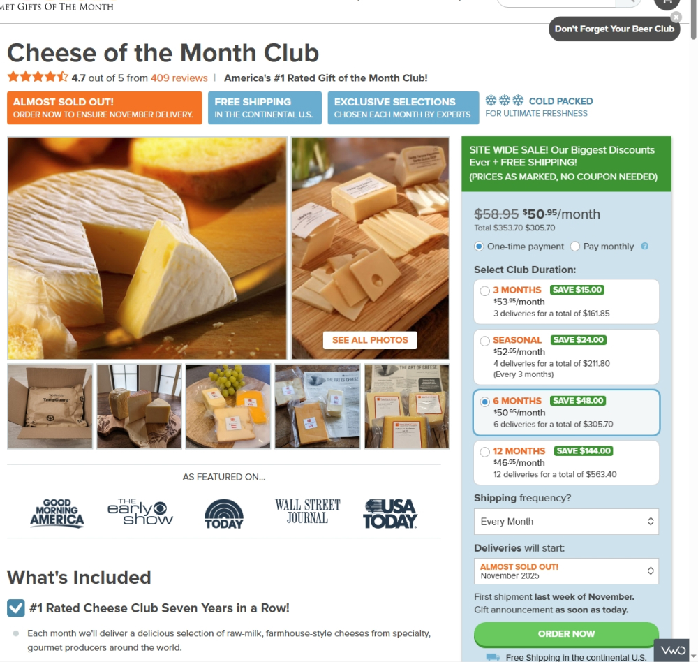
In this tightly triggered experiment, users who (1) did not complete a purchase and (2) visited a different product page saw a button in the top-right corner labeled “Don’t Forget Your Club.” Clicking this button resumed the checkout process at the point where they left off, without requiring the same information to be re-entered.
Test #624 on
by  Frazer Mawson
Dec 22, 2025
Mobile
Checkout
X.X%
Sales
Frazer Tested Pattern #41: Sticky Call To Action
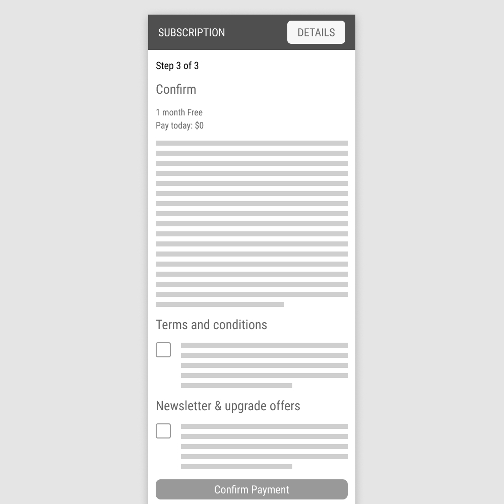
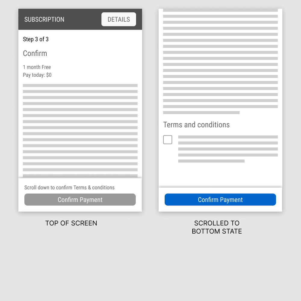
In this experiment, a floating "Confirm Payment" button was added on the last step of a checkout flow. The button appeared with two different states: in a disabled state, leading to the terms and conditions; and in an active state, after checking off the terms. Impact on purchases was measured.
Test #607 on
Backstage.com
by  Stanley Zuo
Aug 26, 2025
Mobile
Listing
X.X%
Sales
Stanley Tested Pattern #51: Shortcut Buttons On Backstage.com


In this experiment, additional "apply" buttons were shown on listing tiles which lead users one step further in the application process. These buttons were also shown with multiple role details. Impact on progression and job application starts was measured.
Test #598 on
by  Jakub Linowski
Jun 27, 2025
Desktop
Mobile
Product
X.X%
Sales
Jakub Tested Pattern #26: Cart Reminder And Recently Viewed
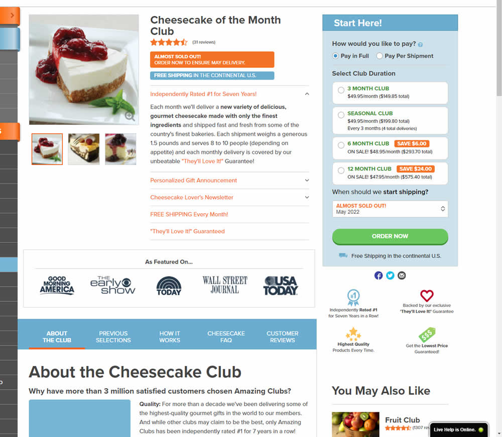
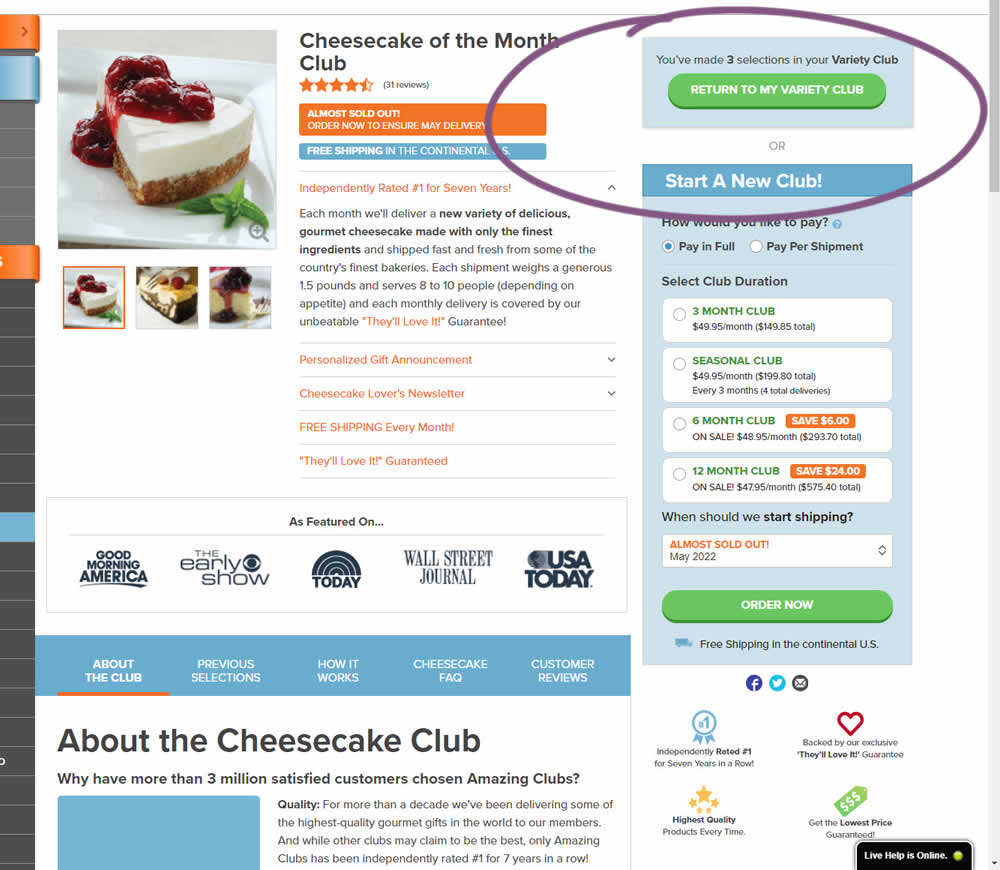
This experiment started when a user started a custom product build and visited any other product page. In the variation, a resume button appeared that would bring the customers back to their custom build. Impact on checkouts and sales was measured.
Test #594 on
Obs.no
by  Joachim Furuseth
May 28, 2025
Mobile
Product
X.X%
Sales
Joachim Tested Pattern #141: Square or Rounded Buttons On Obs.no
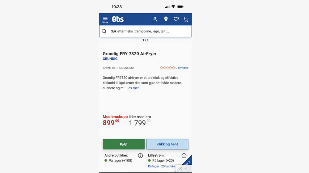
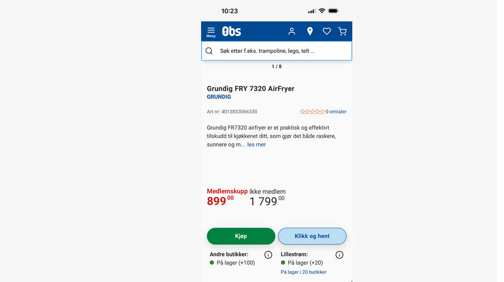
In this experiment, add-to-cart buttons on product details pages were rounded to 20px (variation), whereas the control had square buttons. Impact on adds to cart and purchases were measured.
Test #593 on
Obs.no
by  Joachim Furuseth
May 27, 2025
Desktop
Product
X.X%
Sales
Joachim Tested Pattern #141: Square or Rounded Buttons On Obs.no

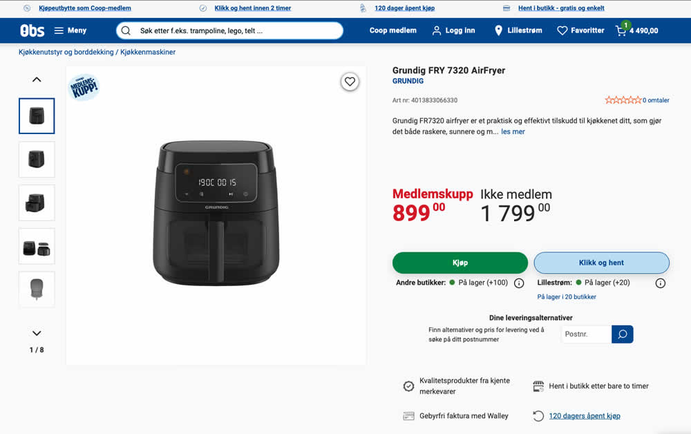
In this experiment, add-to-cart buttons on product details pages were rounded to 20px (variation), whereas the control had square buttons. Impact on adds to cart and purchases were measured.
Test #591 on
Obsbygg.no
by  Joachim Furuseth
May 25, 2025
Desktop
Product
X.X%
Sales
Joachim Tested Pattern #141: Square or Rounded Buttons On Obsbygg.no
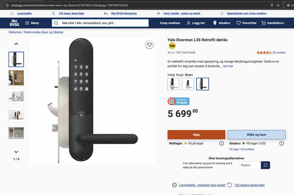
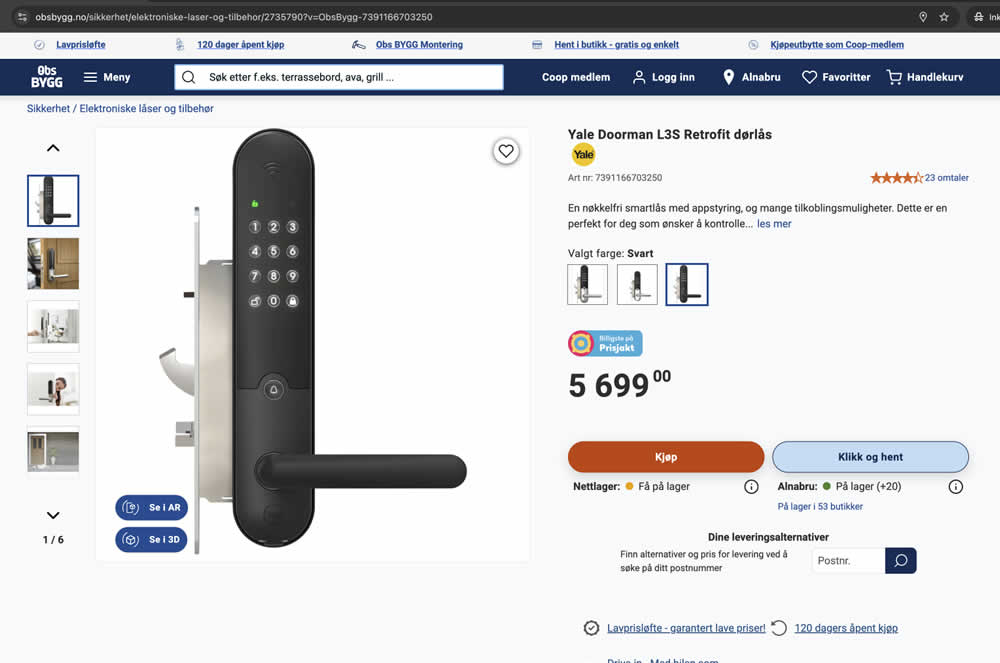
In this experiment, add-to-cart buttons on product details pages were rounded to 20px (variation), whereas the control had square buttons. Impact on adds to cart and purchases were measured.
Test #592 on
Obsbygg.no
by  Joachim Furuseth
May 25, 2025
Mobile
Product
X.X%
Sales
Joachim Tested Pattern #141: Square or Rounded Buttons On Obsbygg.no
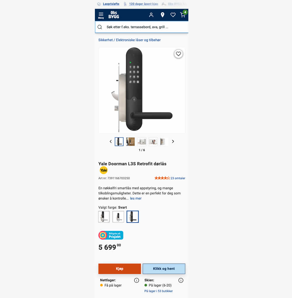
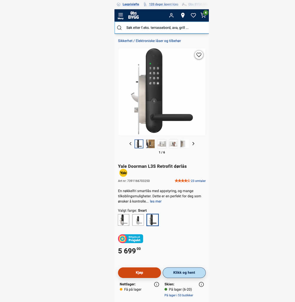
In this experiment, add-to-cart buttons on product details pages were rounded to 20px (variation), whereas the control had square buttons. Impact on adds to cart and purchases were measured.
Test #582 on
Online.metro-cc.ru
by  Andrey Andreev
Mar 22, 2025
Desktop
Mobile
Listing
X.X%
Sales
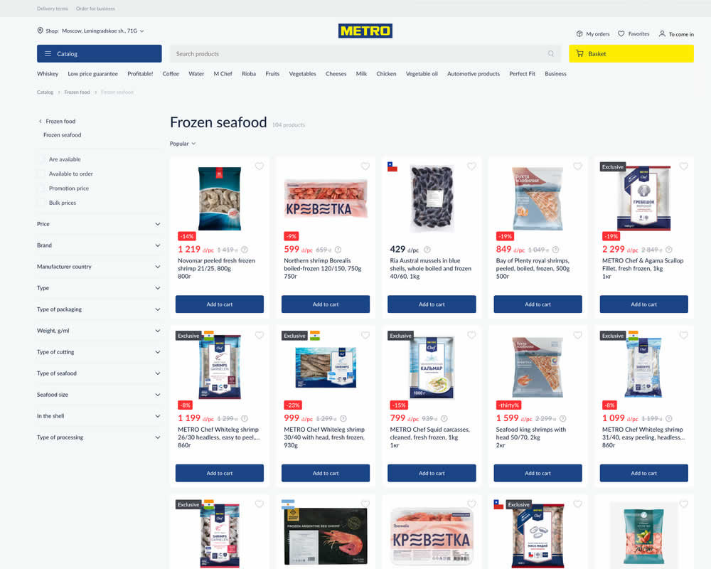
Andrey Tested Pattern #77: Filled Or Ghost Buttons On Online.metro-cc.ru
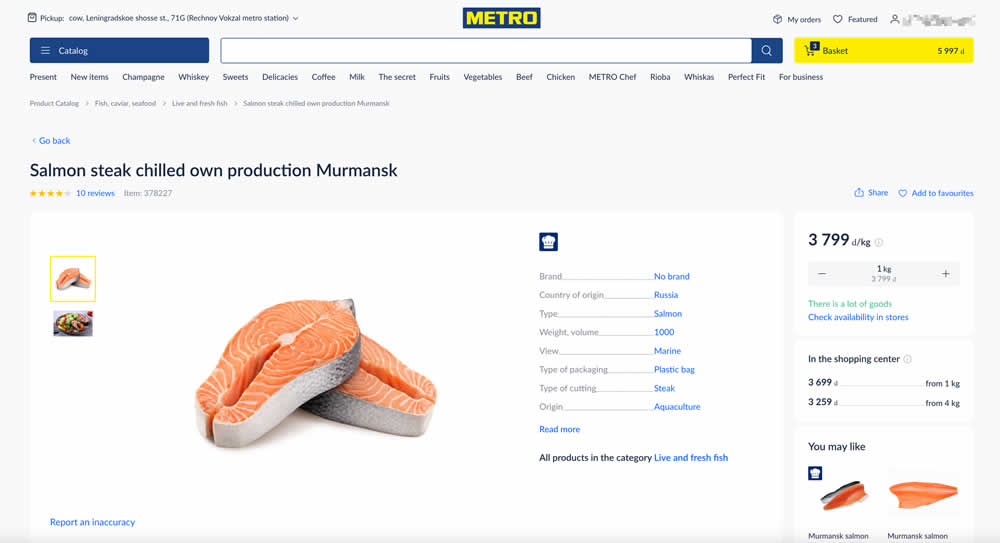
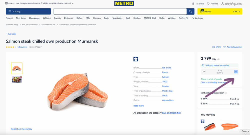
In this experiment, the plus and minus quantity icons near the add to cart button were tested with different contrasts. The control had a higher contrast from a solid background color, and the variant was lower contrast. Impact on add to cart and sales was measured. (A/B test was inverted to B/A in order to fit the pattern).
Test #574 on
Myer.com.au
by  Jay Kim
Jan 30, 2025
Mobile
Product
X.X%
Sales
Jay Tested Pattern #41: Sticky Call To Action On Myer.com.au
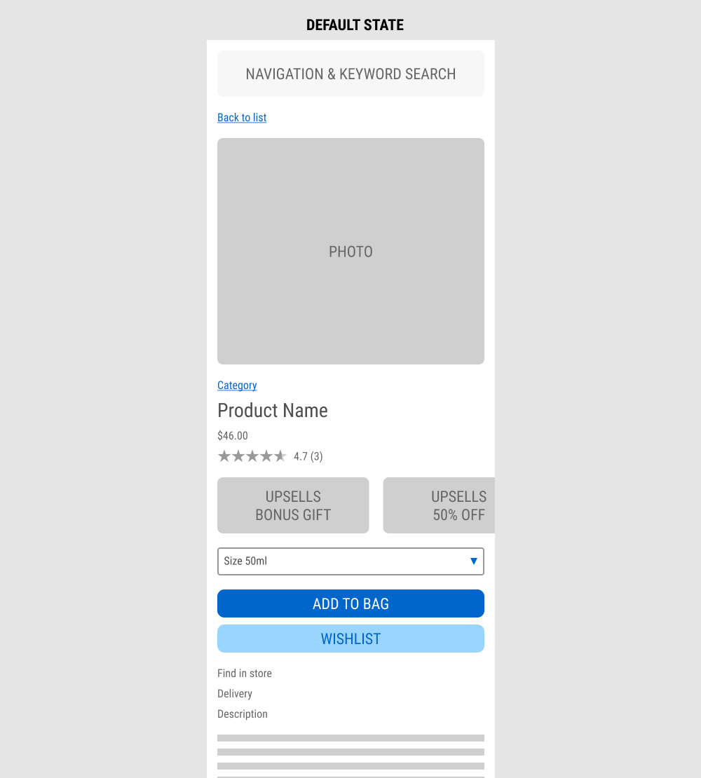
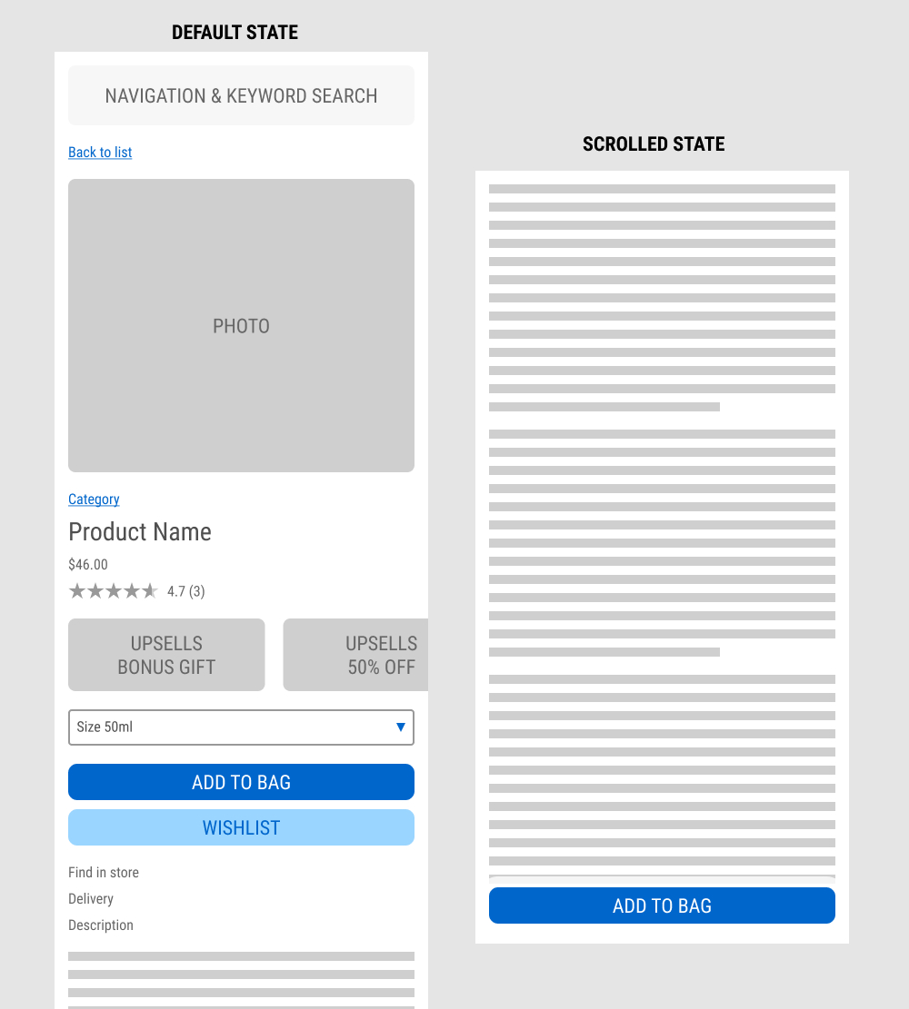
In this experiment published by Jay Kim, a sticky add to cart button was added on mobile product detail pages. It appeared after the scroll depth past the original add to cart button. Impact to adds to cart and completed sales was measured.
Test #572 on
by  Deborah O'Malley
Jan 27, 2025
Mobile
Product
X.X%
Progression
Deborah Tested Pattern #41: Sticky Call To Action


In this experiment from GuessTheTest.com, the control variation only showed the primary add-to-cart button further down on the page. The variation however turned the button into a floating one once users scrolled on the page. Impact on button clicks was measured.
Test #539 on
Snocks.com
by  Melina Hess
Jun 24, 2024
Desktop
Global
X.X%
Sales
Melina Tested Pattern #135: Product Categories On Snocks.com
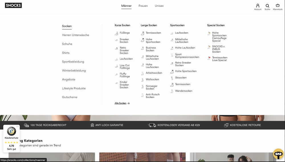
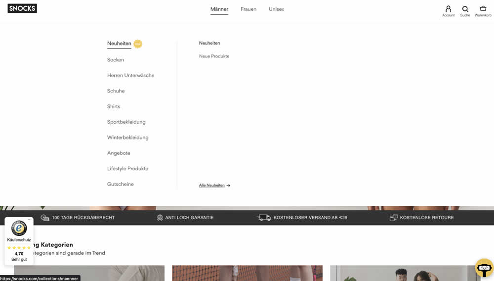
In this experiment, two different navigation defaults were tested against each other. In one version we can see 1) more popular products with 2) more categorical granularity being shown in the expanded state. In the other version we see "new products" being shown as the default (with a lot fewer product subcategories) to choose from.
Test #538 on
Volders.de
by  Daria Kurchinskaia
Jun 20, 2024
Desktop
Mobile
Checkout
X.X%
Sales
Daria Tested Pattern #77: Filled Or Ghost Buttons On Volders.de
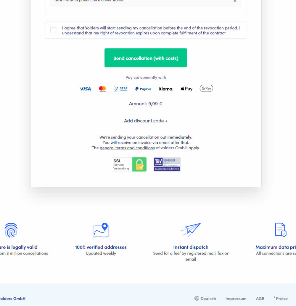
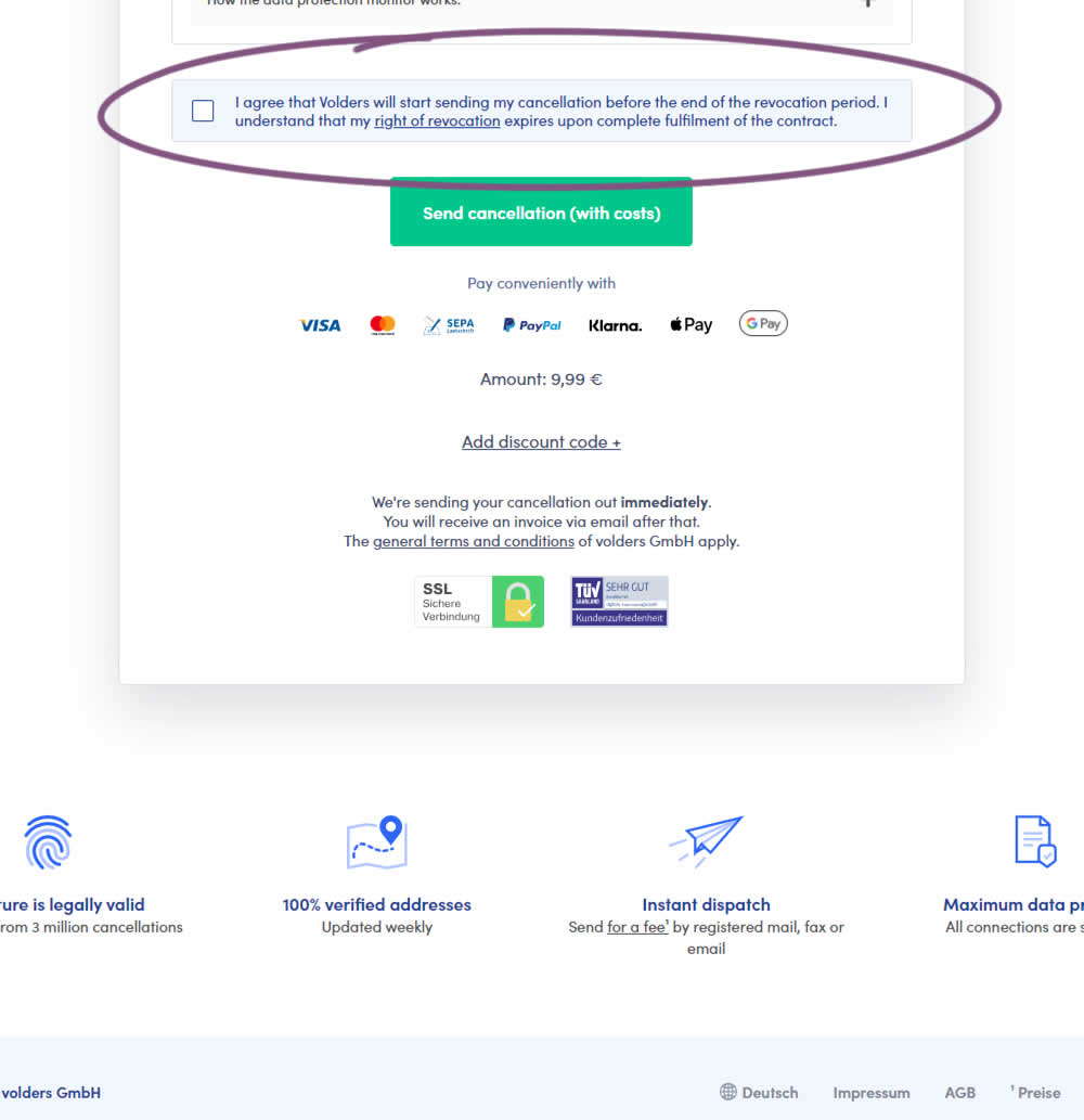
In this experiment, a less visible (ghost button style) legal confirmation box, was tested against a more visible one (filled state with higher contrast). Impact on error rates (from submitting an incomplete form) and sales was measured.
Test #526 on
Online.metro-cc.ru
by  Andrey Andreev
Apr 17, 2024
Desktop
Mobile
Global
X.X%
Sales
Andrey Tested Pattern #77: Filled Or Ghost Buttons On Online.metro-cc.ru
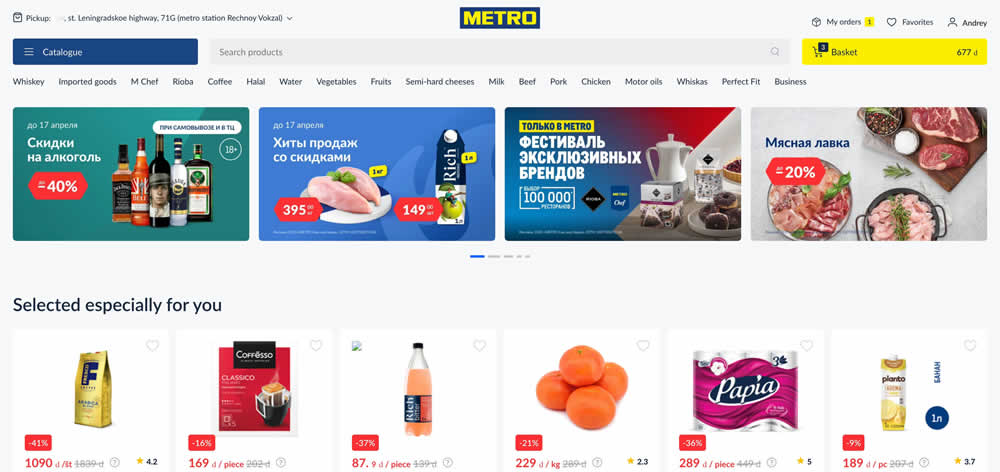
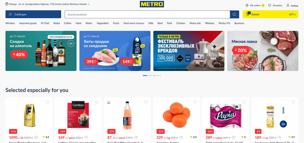
In this experiment, a higher contrast search bar with a blue border and a filled blue button style was tested against a more feint style. Impact on searches and purchases was measured. (A/B test was inverted to B/A in order to fit the filled-vs-ghost button pattern).
Test #520 on
Asics.com
by  Andrey Prokhorov
Feb 29, 2024
Mobile
Product
X.X%
Revenue
Andrey Tested Pattern #51: Shortcut Buttons On Asics.com
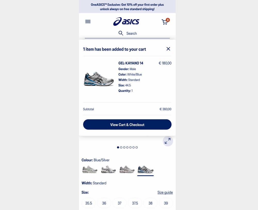
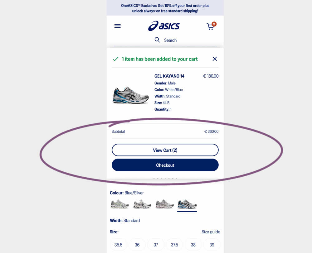
This experiment started when users would click add-to-cart on product detail pages. In both the control and variation, a modal would appear. In the control the modal contained a "View Cart and Checkout" button that lead users to the cart page. In the variation the modal showed separate "View Cart" and "Checkout" buttons. The a/b test variation also introduced a green confirmation message about the product being added to cart. Impact on transactions and revenue was measured.
Test #511 on
Online.metro-cc.ru
by  Andrey Andreev
Jan 09, 2024
Desktop
Home & Landing
X.X%
Sales
Andrey Tested Pattern #79: Product Highlights On Online.metro-cc.ru
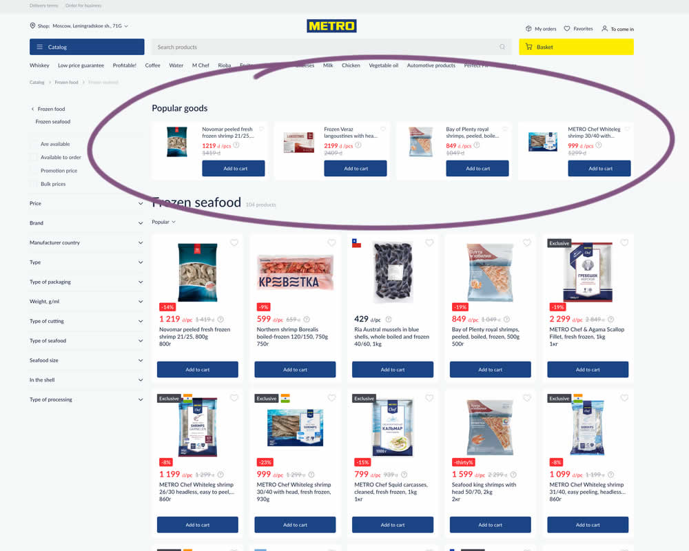
In this experiment, popular products were shown at the top of the homepage. Impact to sale was measured.
Test #460 on
Backstage.com
by  Stanley Zuo
Mar 21, 2023
Mobile
Listing
X.X%
Sales
Stanley Tested Pattern #41: Sticky Call To Action On Backstage.com
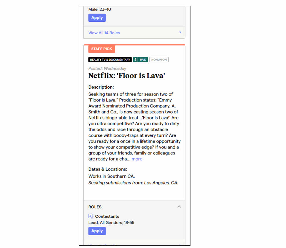
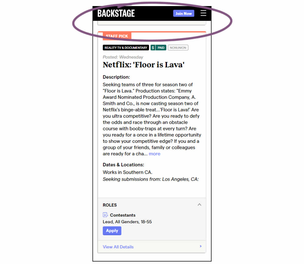
In this experiment, a floating top navigation was shown with a "Join" button. In the control, the navigation was only visible at the top of the page. Also keep in mind that signup starts were also triggered throughout multiple CTAs throughout the page and from particular job detail pages. The a/b test ran on a listing page of Backstage - a casting call job site. Impact on signups and checkouts was measured.