Airbnb Attempts A Big Property Page Redesign But It Is Rejected After This A/B Test
Over two months ago I managed to detect this exciting product/property page redesign on Airbnb with at least 17 UI changes. Unfortunately, as hard as the Airbnb team must have worked on these layout improvements, we now can see that the experiment has ended and the old control version (A) remains the better performer. Here are some of my criticisms of what might have worked better or worse based on many other evidence-based patterns that we have access to.

B - Nov 21, 2019 Screenshot

Highlighted UI Changes From This Leak
-
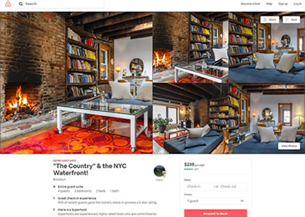
Shifted Title
It looks like the property title was shifted above the photo in the B variation. The titles might also have become slightly smaller and the review metadata has also been positioned closer underneath. Are these changes any better or worse? I honestly don't know.
-
Smaller And More Padded Photos
Moving on, we can also see that the layout was narrowed forcing the photos to become narrower, while also gaining additional padding. I also don't know if this is better or worse and I wish Airbnb could test this in isolation so that we could find out. :) (Reminder: sometime in the past we obtained one little hint of evidence that too tall photos might be somewhat inferior but that could be slightly different).
-
Less Visible Buttons - Possibly Worse
The control version used secondary buttons for things like: Share, Save and View Photos. The first two actions were turned into links - possibly less visible. Whereas the third action (View Photos) also lost some visibility by being repositioned onto a white surface (away from a higher contrast background photo).
-
Singled Out Host Picture
In the variation we see a host profile picture that has lost its label. :) It's right aligned and looks singled out. If I had to guess, I would make a tiny bet that this is slightly inferior.
-
Lots Of Primary Panel Changes - Very Likely Worse
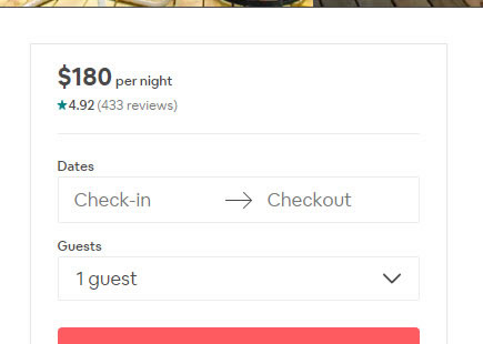
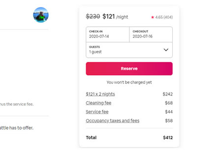
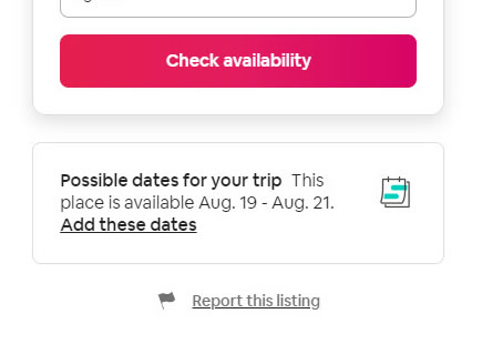
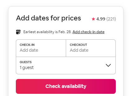
Here we can start seeing multiple changes to the primary checkout panel.
First of all notice how the customer rating summaries that were shifted into the header seem to have lost their prominence. Combined with the fact that the control's panel is floating (for the most of the page height), the reviews and ratings have more visibility in A which we know is probably a good thing.
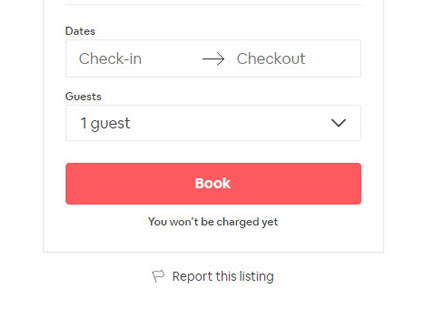
Secondly, the A version has a call to action that is proceeded with other choices that guests might wish to express: dates and guests. The B variation on the other hand removed this choice - and this could be one of those situations where gradual choice is actually beneficial.
More so, the messaging "You won't be charged today" looks like it disappeared. And yet, we also know that such forms of pay later messages are usually positive on conversions and sales.
Oh, and the button label in B also was changed to a less committal one - "Check Availability". Of course by losing the "Reserve" copy, perhaps some element of urgency or scarcity was also lost in the process. Here I'm not sure which one is better or worse.
This is very similar to Pattern #6: Customer Star Ratings
This is very similar to Pattern #11: Gradual Reassurance
This is very similar to Pattern #46: Pay Later
-
Bigger Icons
In variation B we can see some stylistic adjustments of using slightly larger icons.
-
New Translate Feature
The B variation also looks like it has a new (or at least more visible) translation feature. I'm not sure if this better or worse.
-
Towards Black Links And Ghost Buttons - Mostly Likely Worse
Somehow, someone thought that removing color from secondary links and buttons and making them the same black as standard text was better. We're somewhat asking ourselves the same question under the contrast pattern and although we're getting mixed results, I doubt that this was a wise move. Clickable items should stand out and color is an additional cue that can be used to trigger action.
Secondly, you might also notice that some secondary links were replaced with ghost buttons. Although we have stacking evidence against ghost buttons (compared to full colored ones), I'm not sure that in this case they are any worse compared to the smaller links. It would be interesting to see how ghost buttons compare to simple links - perhaps we could make a bet that due to the increased size, they might actually perform better?
-
Larger Section Subtitles
The font size of sections such as "Sleeping arrangements" and "Amenities" was increased slightly - possibly better or not? Subjectively this feels like a good move.
-
More Amenities
More amenity properties have been displayed for better or for worse. :)
-
Stretched Layout
Starting at the reviews section, we can see a full width layout appearing. Subjectively, I feel that the labels and their corresponding line bars are too far apart. For example: the "Stylish space" has a corresponding count of 58 and this number is actually closer to the next "Amazing amenities" label - potentially misleading with a false association.
-
Fewer Testimonials & Reviews - Possibly Worse
With the shift towards a two column layout, 7 visible reviews were truncated into 4, while also having removed guests' replies. Given that showing more reviews might be actually better, I'm going to bet that this might have been a negative change.
This is very similar to Pattern #4: Testimonials
-
From Reviews Pagination To Show All
Furthermore, we see that the pagination feature for all reviews was replaced with a "Show all 489 reviews" button. This raises more question - are people less inclined to look at such a huge number of results instead of using the pagination with a smaller subset of reviews? Not sure - just a hypothesis.
-
Wider Map
Clearly the map in the B variation is wider with a stronger location indicator in the center. I can't see how this change could have had a negative effect.
-
Oh ... The Fragmented Calendar
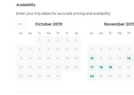
The calendar starts fragmented: it's asking for the same thing (check-in date) twice by showing both an input field and a calendar. This doesn't feel right at all.
More so, the original calendar made use of stronger visual cues for unavailable (disabled grey) and available dates (green). The B variation however dulled both styles closer together - removing important cues. I know that the A variation is actually better because Airbnb ran this calendar style change seaprately in isolation and we'll be covering this in a separate article.
-
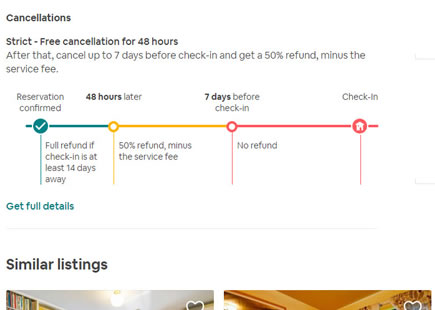
More "More Places To Stay" - Most Likely Better
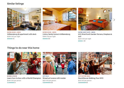
Notice how the total number of "places to stay" was increase to 4 from 3. From other experiments we can detect signal that this might be a good move.
This is very similar to Pattern #36: Fewer Or More Results
-
More Padding In Footer
The B variation also increased the padding of all link items in the footer - probably a good thing I'd guess.
How To Do Big Leap Experiments?
If the outcome of this experiment in fact was negative, I can't help to notice that there is a common mistake in how these bigger experiments are designed in the first place. The mistake is not of having too many changes. Instead, it's about having too many changes with mixed probabilities (better and worse changes combined together) that are cancelling each other out. We have observed Amazon and Netflix also make this mistake.
Instead of mixing both negative and positive changes, I would advise to separate the probable positive patterns from the probable negative ones, or unknowns. When an experiment is designed to only contain highly probable positive changes, its likelihood to detect a big improvement, increases. So I do believe there is more upside to some of the ideas tried above.
Watch: How To Run Bigger Experiments if you're interested more about the topic.

Comments
Emily S. 6 years ago ↑0↓0
Hi,
Thank you for this experiment breakdown. I found it helpful and learned a lot while reading through your article. However, I think it's outdated, as Airbnb seems to have rolled out multiple (but not all) parts of this experiment. Would you be able to update this article at some point in the near future? I'm curious to hear your guesses as to why some things worked and others didn't in this test. Thanks!
Reply