All Latest 620 A/B Tests
MOST RECENT TESTS
Test #640 on
Obs.no
by  Joachim Furuseth
Mar 24, 2026
Desktop
Checkout
X.X%
Sales
Joachim Tested Pattern #1: Remove Coupon Fields On Obs.no
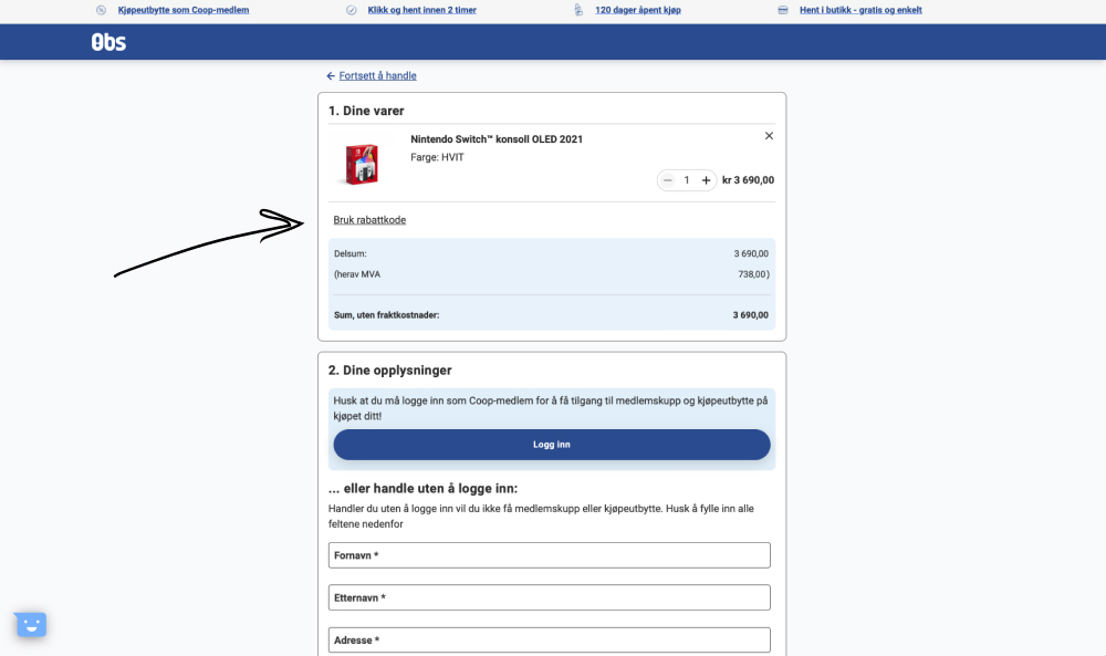
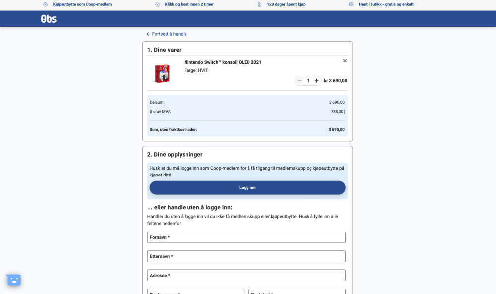
The control had a clickable link "Use discount code" which would reveal an input field for a coupon code. The variation removed this link and input field. Impact on purchases was measured. (Desktop only)
Which A Or B Actually Wins? Find Out Before You Test.
Members see every test result — the winners, the flat ones, and the losers — along with exact effects and sample sizes. Use it to estimate your tests and prioritize by probability, not gut feel. Start every experiment with the odds on your side.
Test #639 on
Obs.no
by  Joachim Furuseth
Mar 23, 2026
Mobile
Checkout
X.X%
Sales
Joachim Tested Pattern #1: Remove Coupon Fields On Obs.no
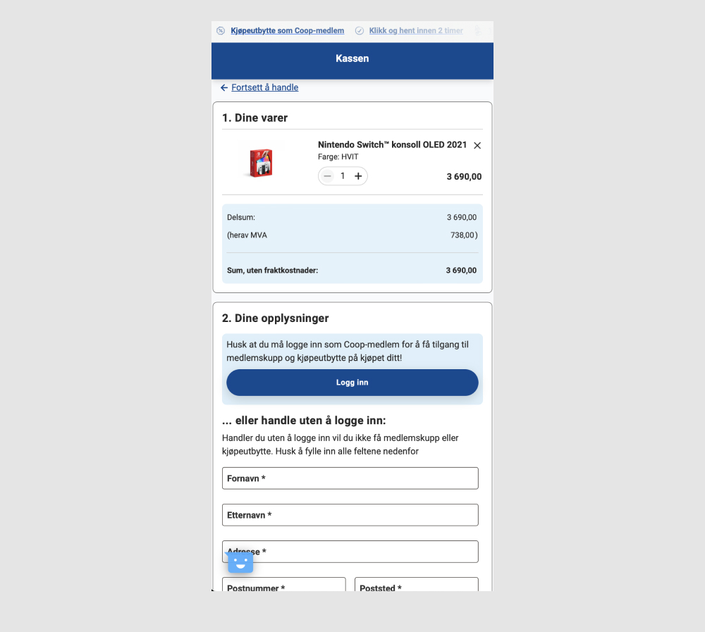
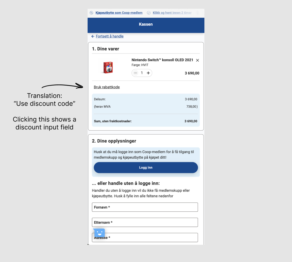
The control had a clickable link "Use discount code" which would reveal an input field for a coupon code. The variation removed this link and input field. Impact on purchases was measured. (Mobile only)
Test #634 on
Obsbygg.no
by  Joachim Furuseth
Feb 18, 2026
Mobile
Checkout
X.X%
Sales
Joachim Tested Pattern #1: Remove Coupon Fields On Obsbygg.no
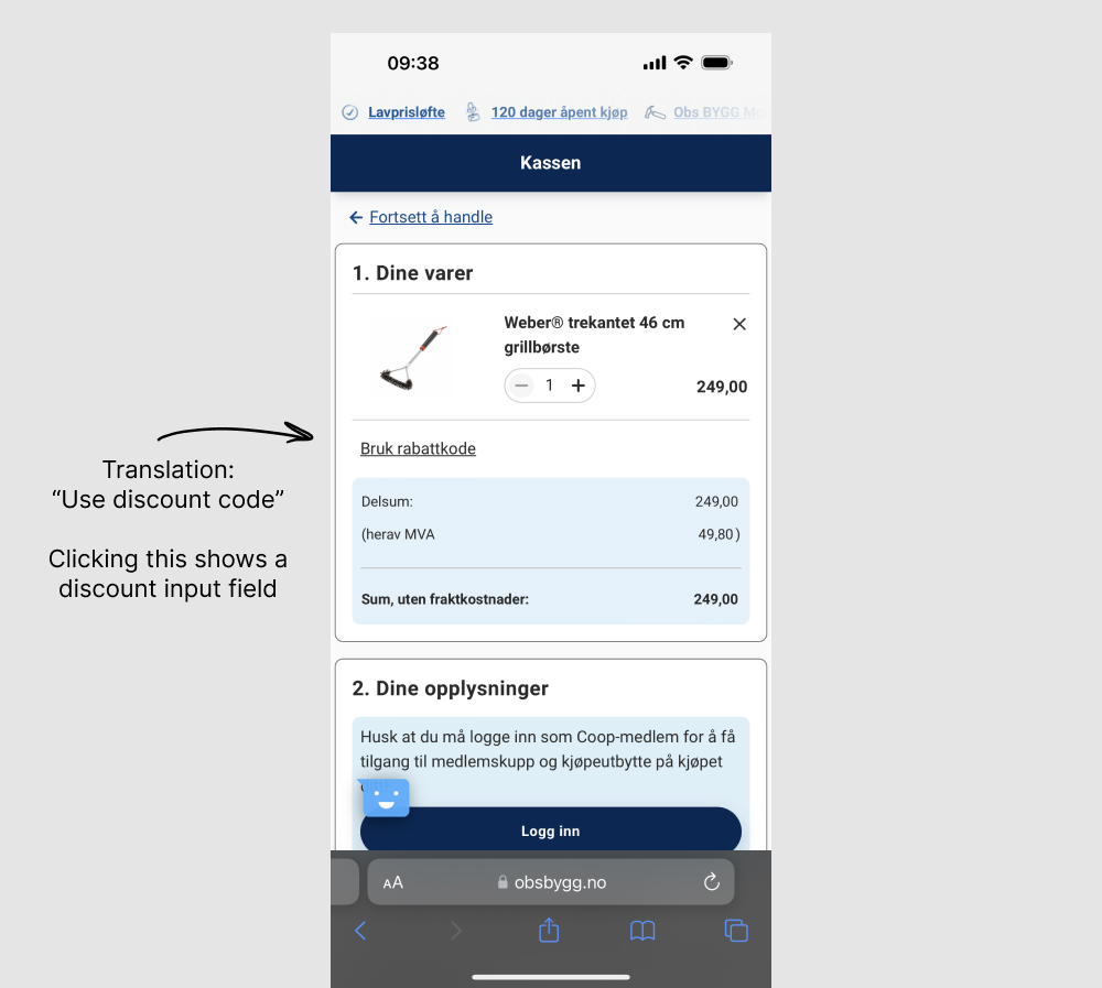
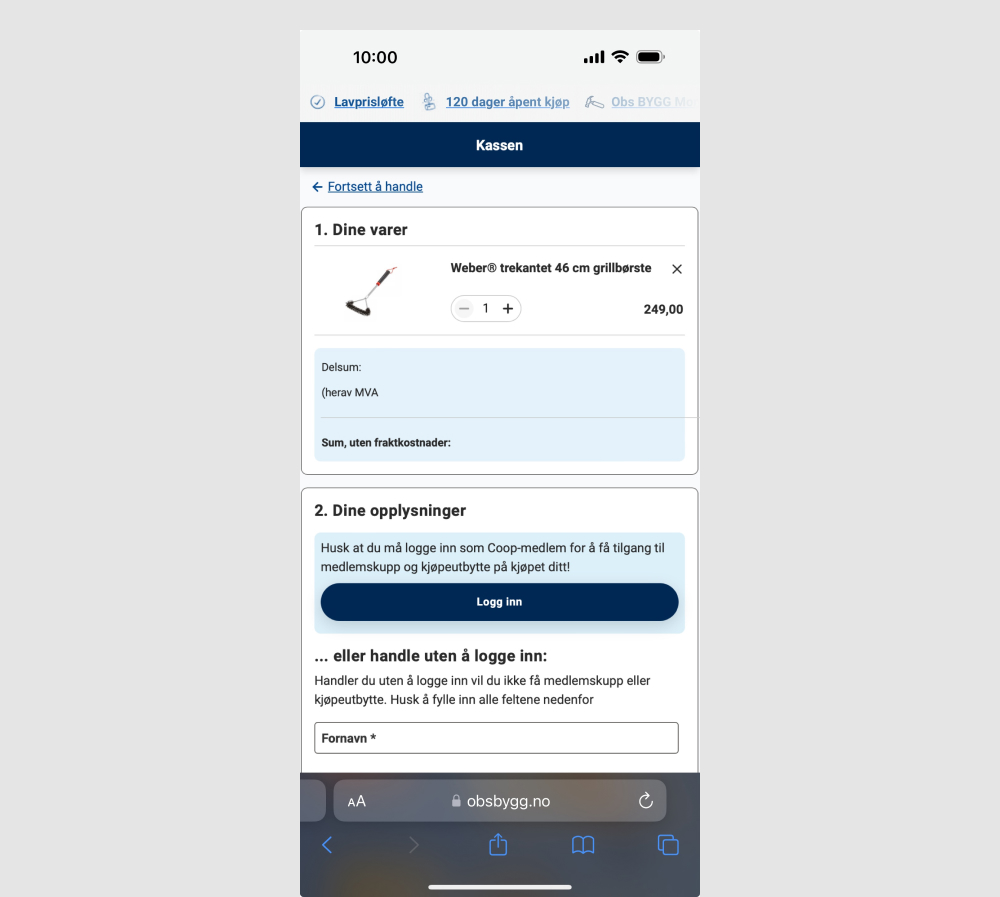
The control had a clickable link "Use discount code" which would reveal an input field for a coupon code. The variation removed this link and input field. Impact on purchases was measured. (Mobile only)
Test #635 on
Obsbygg.no
by  Joachim Furuseth
Feb 18, 2026
Desktop
Checkout
X.X%
Sales
Joachim Tested Pattern #1: Remove Coupon Fields On Obsbygg.no
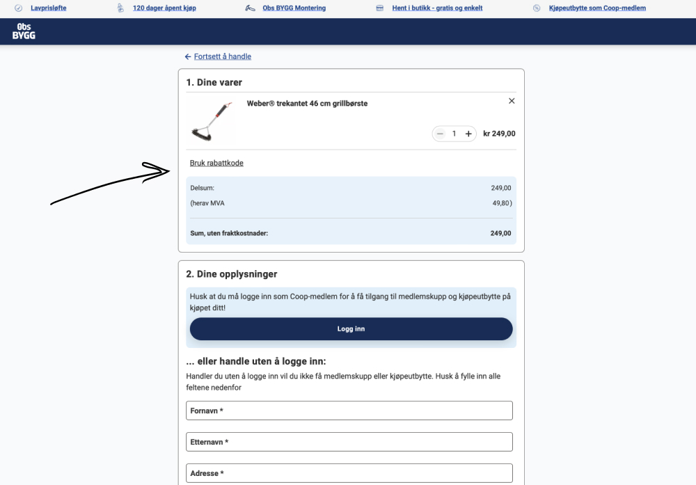
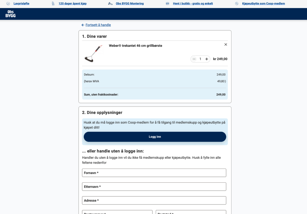
The control had a clickable link "Use discount code" which would reveal an input field for a coupon code. The variation removed this link and input field. Impact on purchases was measured. (Desktop only)
Test #629 on
by  Jakub Linowski
Jan 26, 2026
Desktop
Checkout
X.X%
Sales
Jakub Tested Pattern #98: Auto Suggest
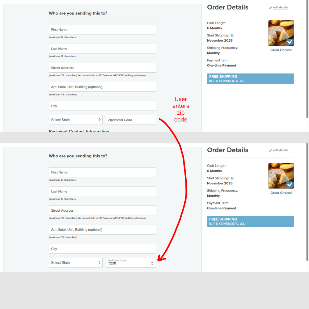
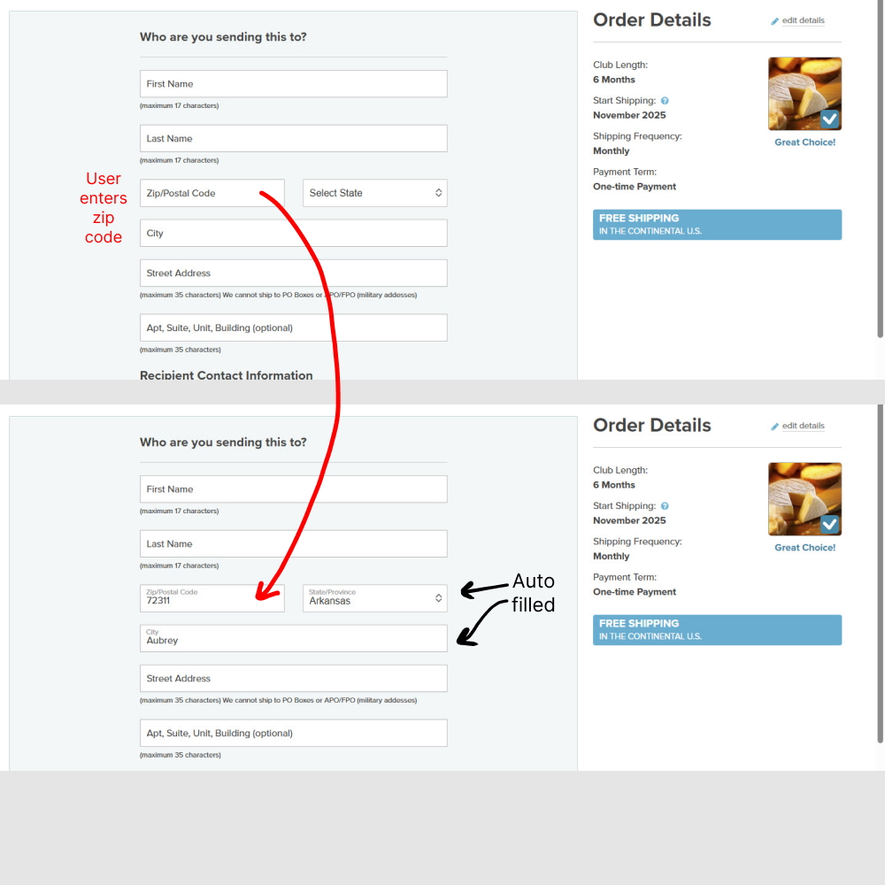
In this experiment (1) the zip code field position was moved up, right below the last name. And (2) entering the zip code would populate the state and city using an autofill API call. Impact on orders completed was measured.
Test #628 on
by  Jakub Linowski
Dec 30, 2025
Mobile
Checkout
X.X%
Sales
Jakub Tested Pattern #98: Auto Suggest
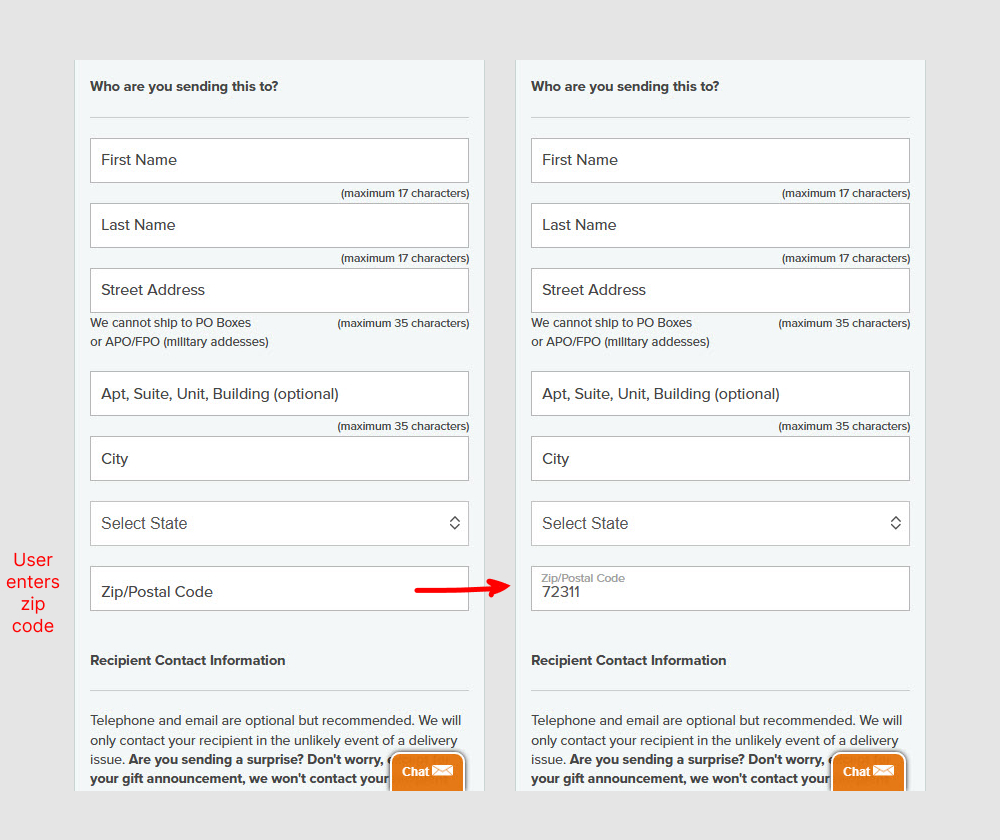

In this experiment (1) the zip code field position was moved up, right below the last name. And (2) entering the zip code would populate the state and city using an autofill API call. Impact on orders completed was measured.
Test #612 on
by  Frazer Mawson
Sep 28, 2025
Mobile
Checkout
X.X%
Sales
Frazer Tested Pattern #99: Progress Bar
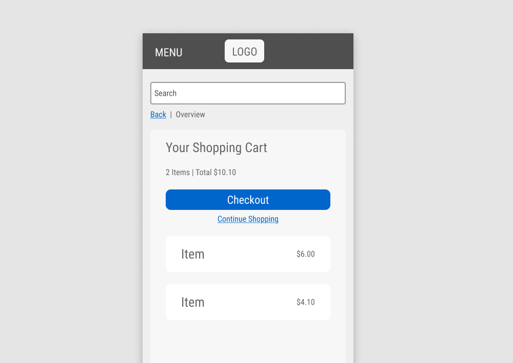
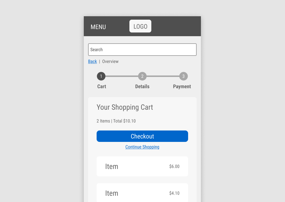
In this experiment, a 3 step progress bar was added at the top of an ecommerce checkout funnel. Impact on checkout progression and completed sales was measured.
Test #608 on
by  Frazer Mawson
Aug 28, 2025
Mobile
Signup
X.X%
Signups
Frazer Tested Pattern #99: Progress Bar
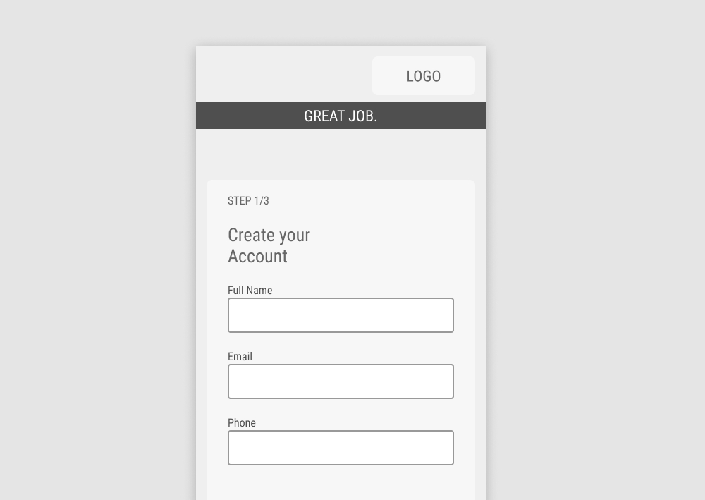
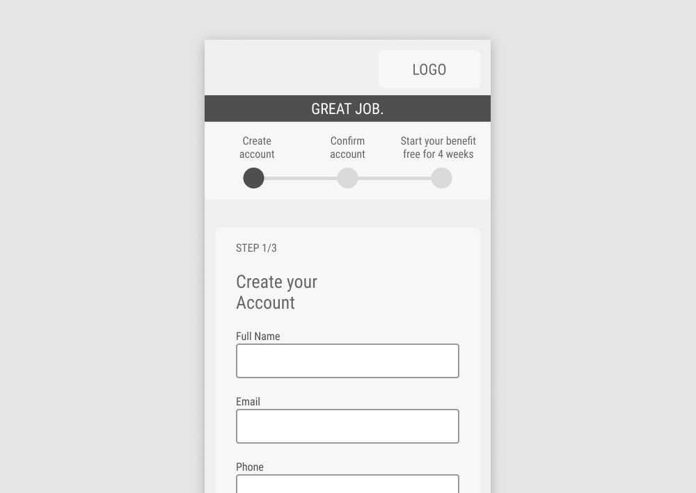
In this experiment, a 3 step progress bar was added at the top of a signup funnel. Impact on signups was measured.
Test #565 on
Umbraco.com
by  Lars Skjold Iversen
Nov 30, 2024
Desktop
Home & Landing
X.X%
Leads
Lars Tested Pattern #129: Right Or Left Aligned Forms On Umbraco.com
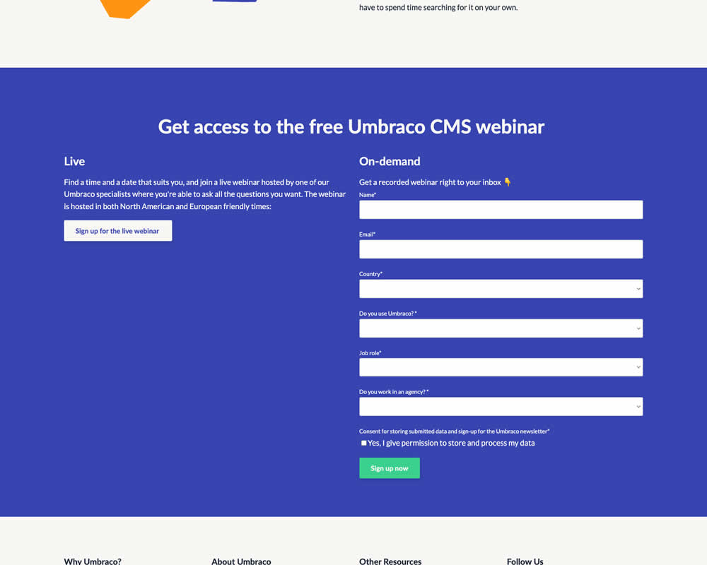
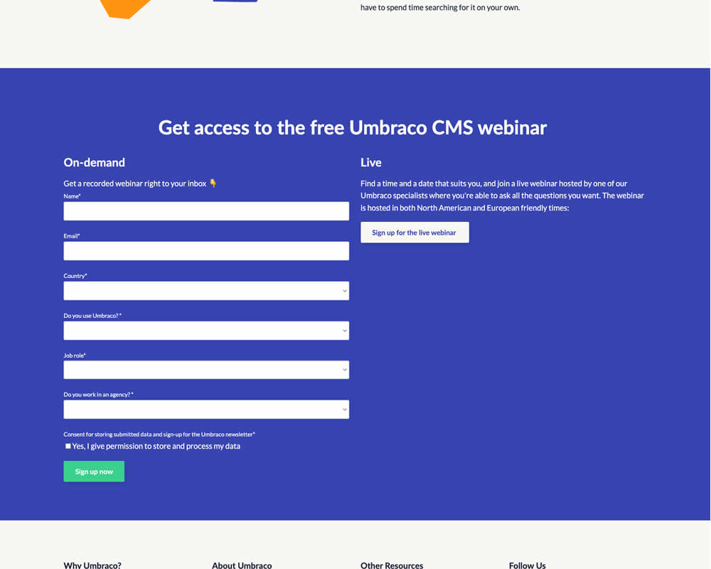
In this experiment, the right vs left position of a form (at the bottom of a landing page) was a/b tested. Impact on progression and form completion was measured.
Test #553 on
Online.metro-cc.ru
by  Andrey Andreev
Sep 27, 2024
Mobile
Desktop
Checkout
X.X%
Revenue
Andrey Tested Pattern #69: Autodiscounting On Online.metro-cc.ru
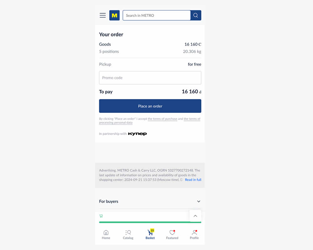
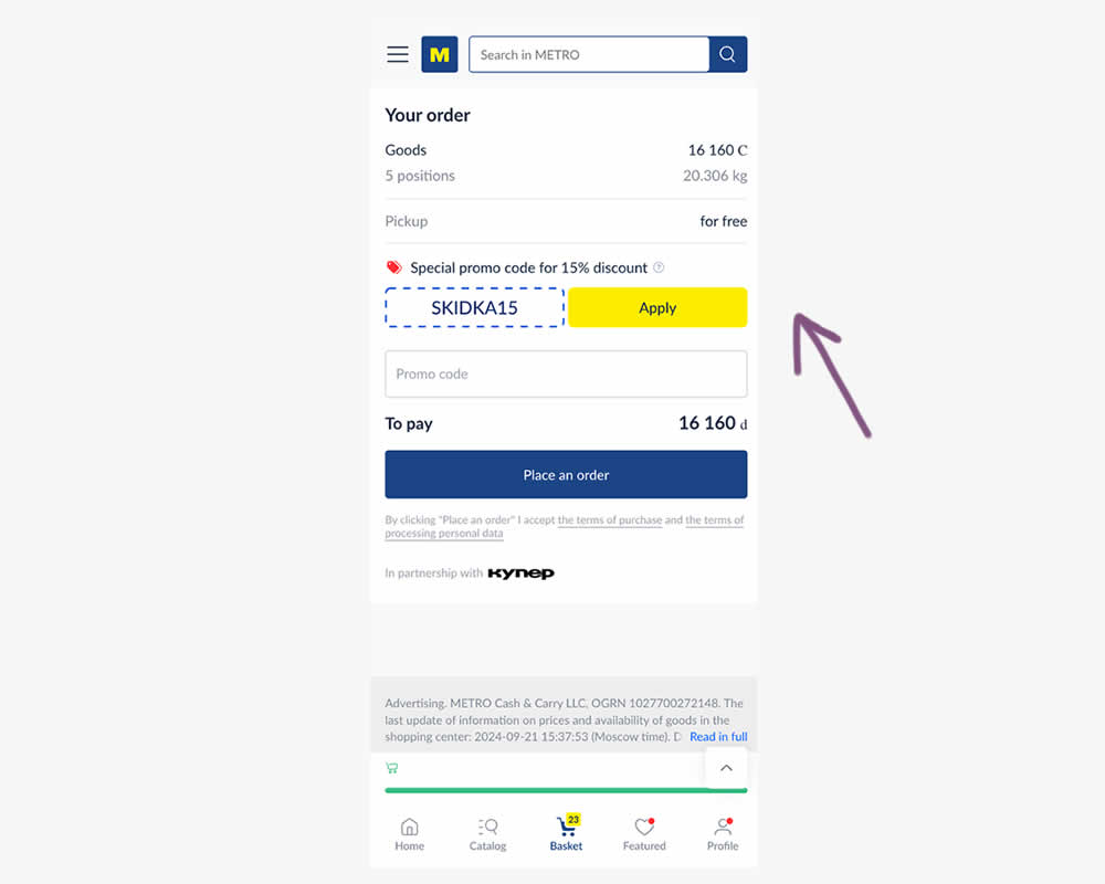
In this experiment, a preset coupon code with -15% amount and an easy to "apply" button was shown to new users who have never made a purchase. In the variation, the an empty coupon field was shown. Impact and transactions and revenue was measured.
Test #546 on
Finn.com
by  Maksim Meged
Aug 01, 2024
Desktop
Signup
X.X%
Signups
Maksim Tested Pattern #129: Right Or Left Aligned Forms On Finn.com
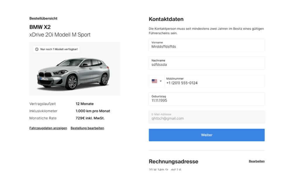
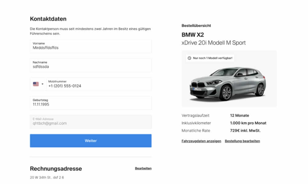
In this signup flow experiment, form fields on the right hand side (control) were shifted to the left column (variation). Impact on account creations and checkouts was measured.
Test #541 on
Online.metro-cc.ru
by  Andrey Andreev
Jul 10, 2024
Desktop
Listing
X.X%
Sales
Andrey Tested Pattern #137: Visible Filters On Online.metro-cc.ru
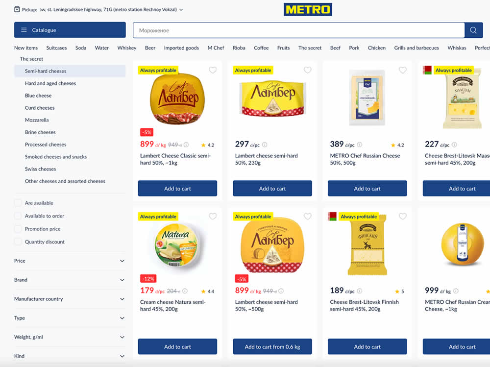
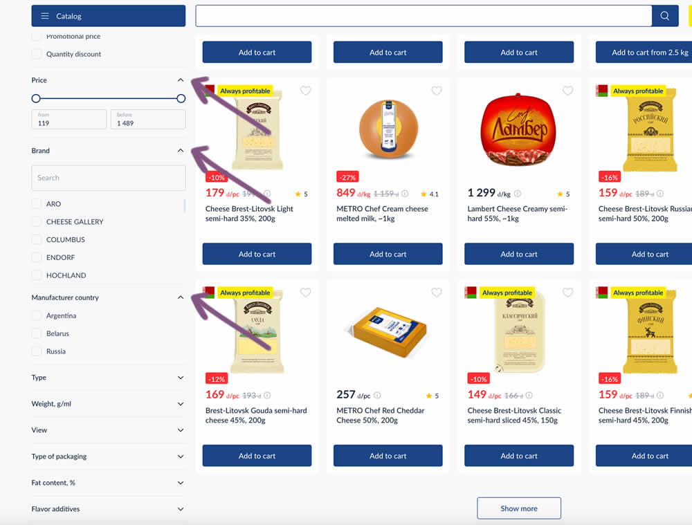
In this experiment, some side column filters were made more visible by being automatically expanded. These included: brand, price and country of manufacturing.
Test #536 on
by  Jakub Linowski
Jun 14, 2024
Desktop
Mobile
Checkout
X.X%
Sales
Jakub Tested Pattern #28: Easiest Fields First
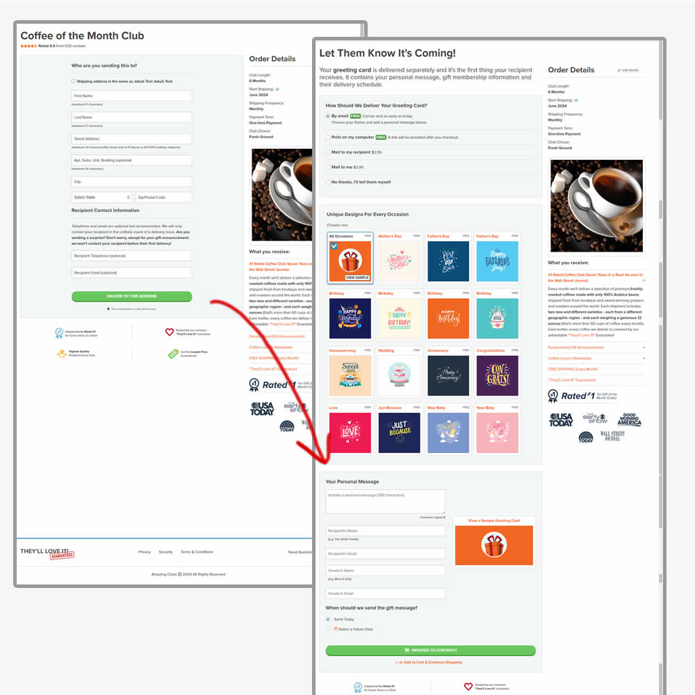

In this experiment, the order of the checkout flow was rearranged. In the control the first step of the checkout flow started with the shipping information step, followed by greeting card selection. In the variation this was rearranged (hypothesis was that the greeting card step was easier). Impact on sales was measured.
Test #530 on
by  Stanley Zuo
Apr 30, 2024
Desktop
Mobile
X.X%
Signups
Stanley Tested Pattern #28: Easiest Fields First On
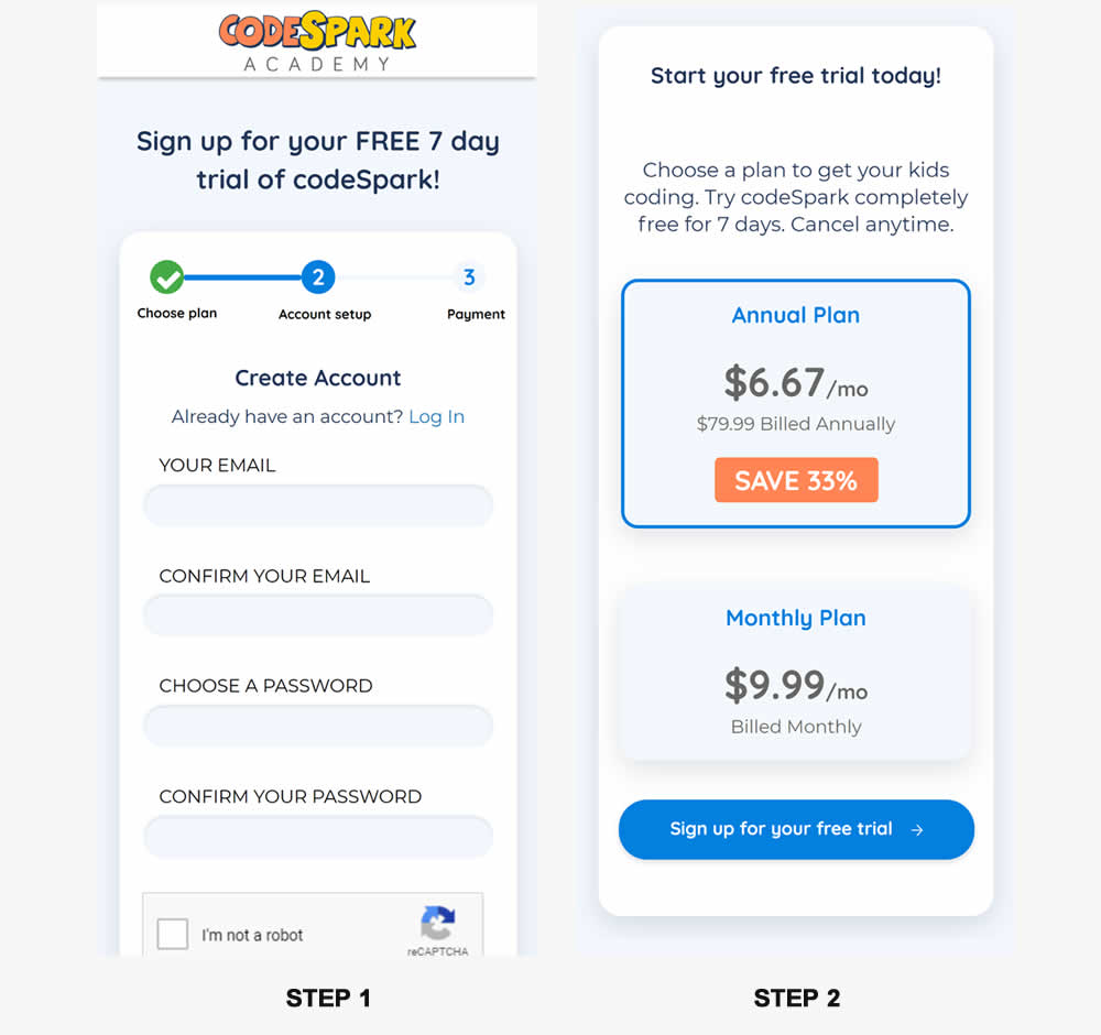
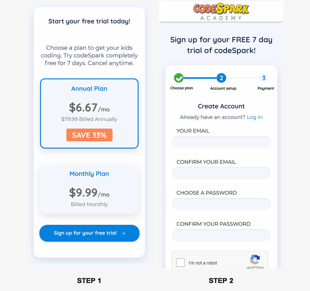
In this experiment, the order of two signup pages was tested: plan selection vs account creation. Here we have the account creation step first in the control and the the plan selection step first in the variation. (I flipped these around to match the pattern). Impact on signups was measured.
Test #525 on
by  Jakub Linowski
Mar 27, 2024
Desktop
Mobile
Product
X.X%
Sales
Jakub Tested Pattern #119: Unselected Or Selected Defaults
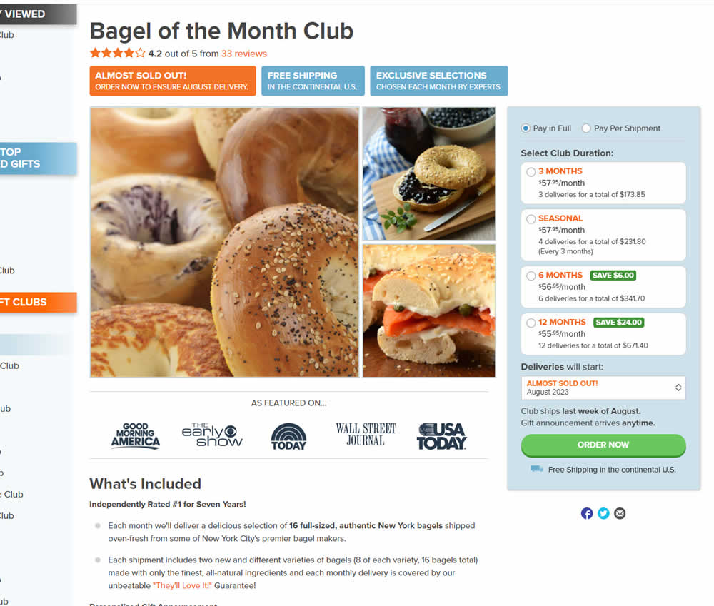
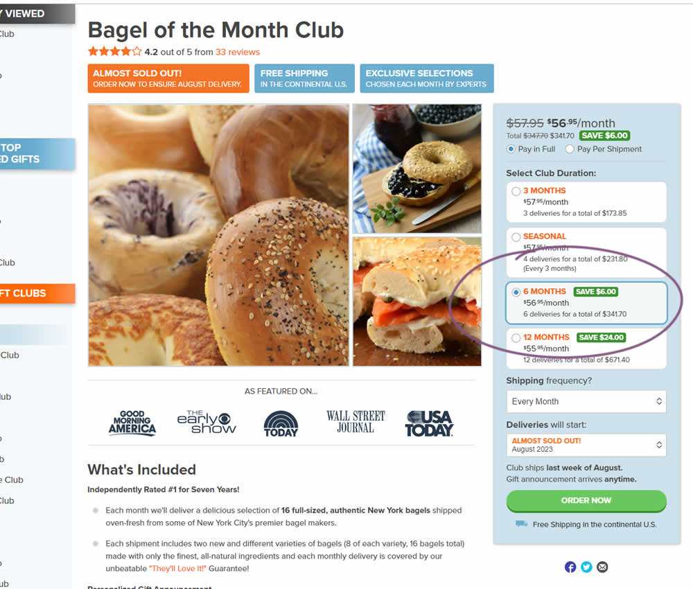
In this experiment, a club subscription duration was preselected to 6 in the variation. The control had no club durations preselected. As a result of preselecting a club duration, a more visible price also appeared at the top (sooner in the variation). Impact on sales was measured.
Test #495 on
Formelskin.de
by  Alexander Krieger
Sep 25, 2023
Mobile
Signup
X.X%
Sales
Alexander Tested Pattern #9: Multiple Steps On Formelskin.de
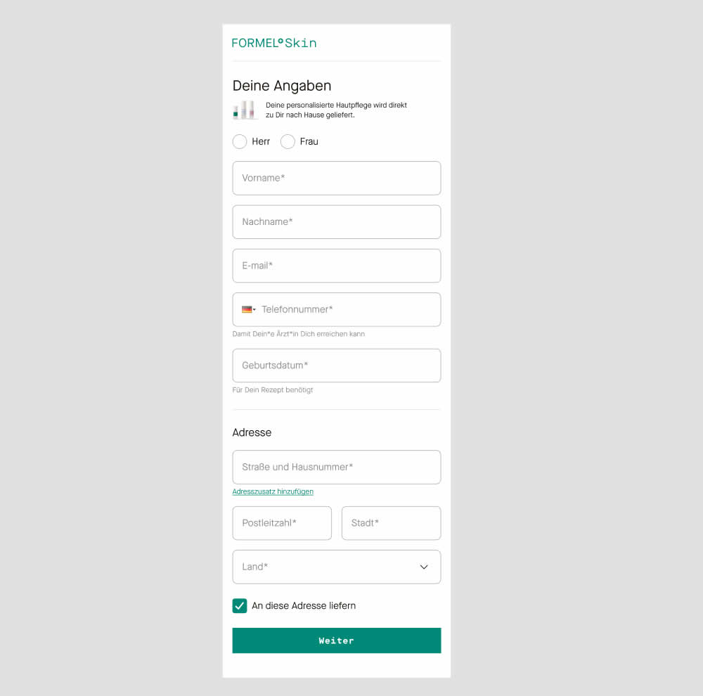
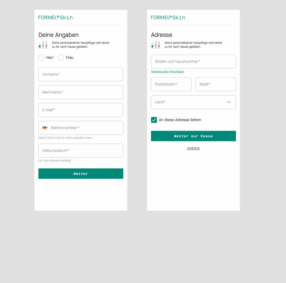
In this experiment two sections of a form on a single page (control) were broken out into 2 separate steps (variation). The two sections included personal details and shipping information. This step appeared after having received a product recommendation when filling out a questionnaire for a skin care product. Impact on next step progression and purchases was measured.
Test #490 on
by  Jakub Linowski
Aug 17, 2023
Desktop
Mobile
X.X%
Sales
Jakub Tested Pattern #9: Multiple Steps
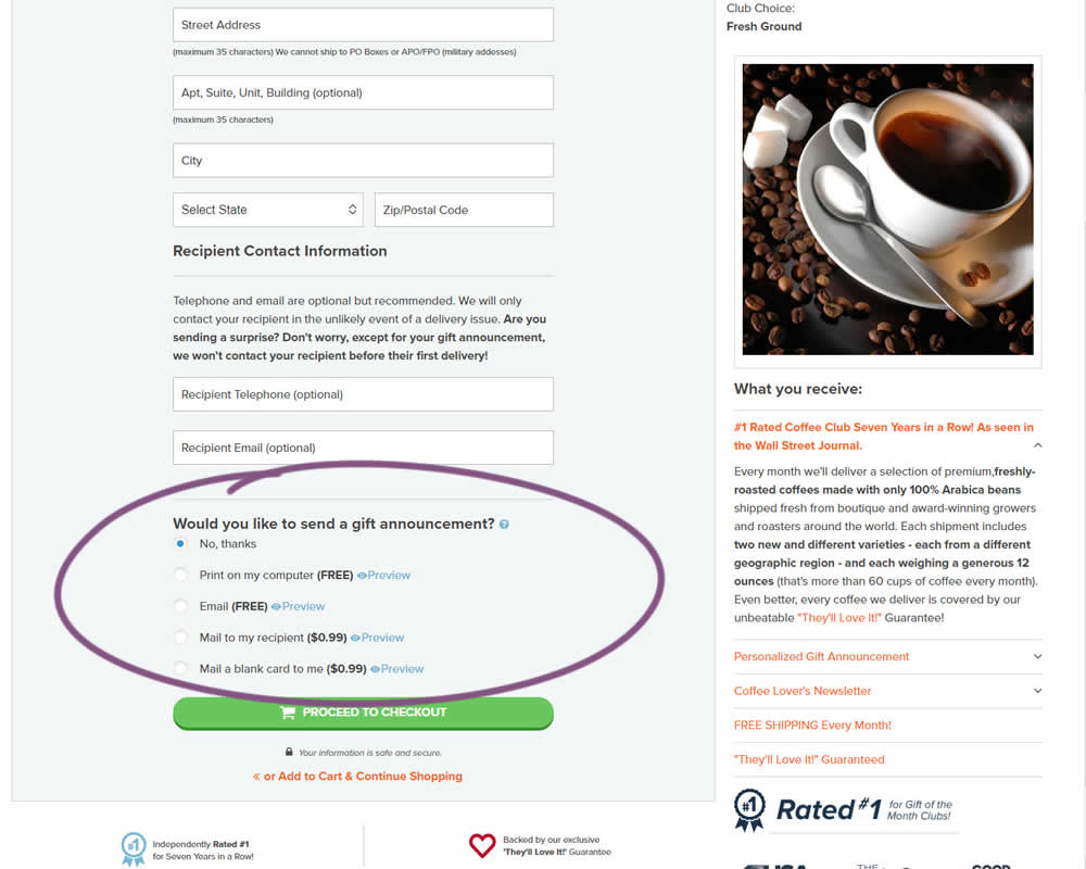
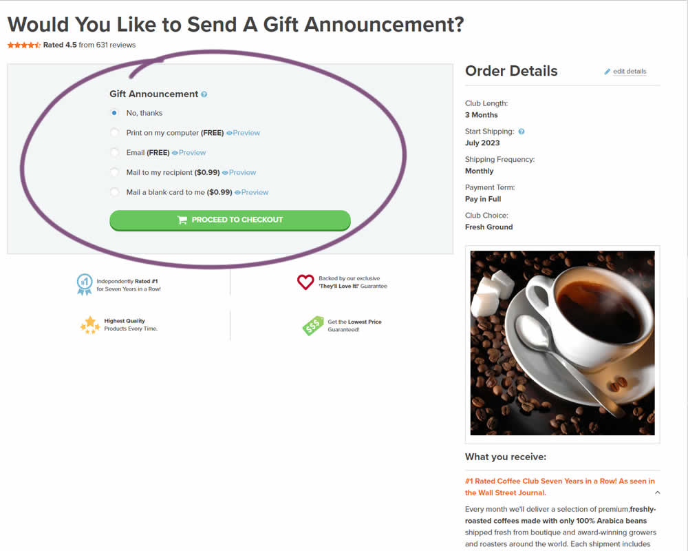
In this experiment, a section dedicated to choosing gift messages was taken out and separated into its own individial step. The change happened on the first step of a checkout flow and increased the flow by an additional step. Impact on checkouts and total sales was measured.
Test #470 on
Formelskin.de
by  Alexander Krieger
May 12, 2023
Mobile
Signup
X.X%
Sales
Alexander Tested Pattern #3: Fewer Form Fields On Formelskin.de
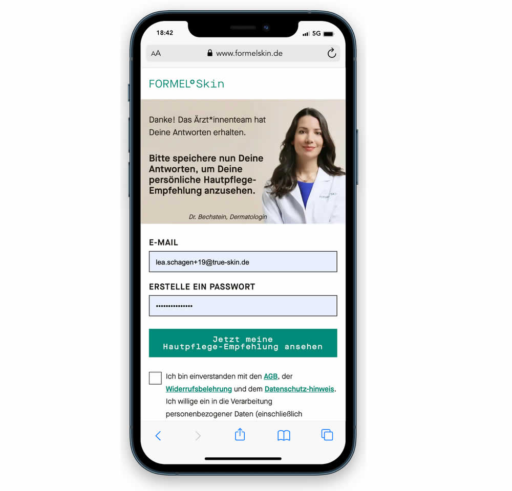
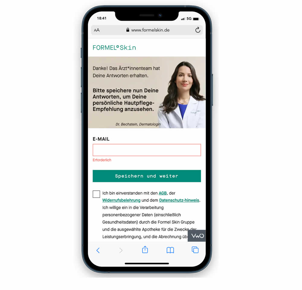
In this experiment, a password field was removed from a signup / account creation step. Instead of asking for a password, users received an email with an auto-generated password. This experiment ran on mobile and impact on sales (post-signup) was measured.
Test #469 on
by  Ardit Veliu
Apr 28, 2023
Desktop
Signup
X.X%
Leads
Ardit Tested Pattern #129: Right Or Left Aligned Forms
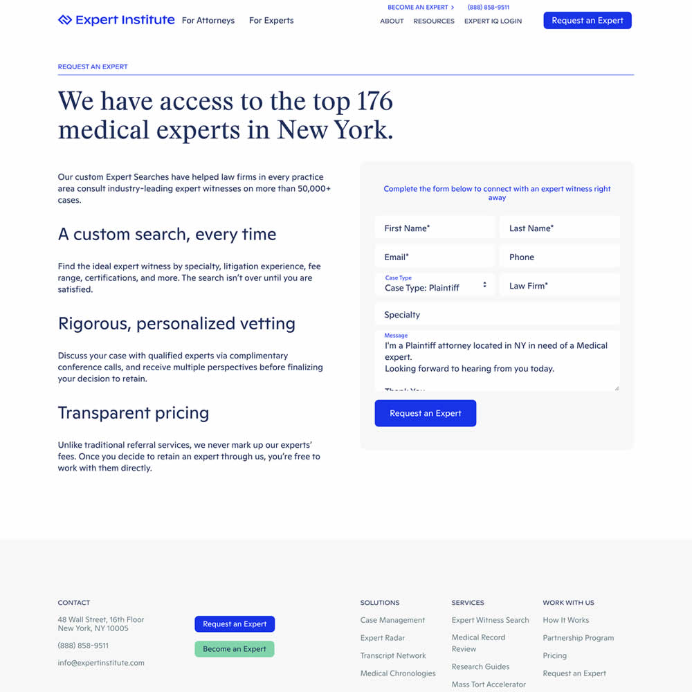
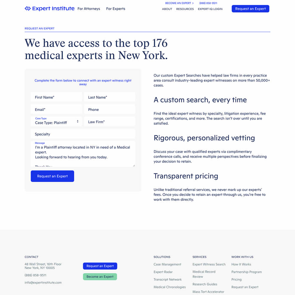
In this experiment, a right side form shifted in position to the left. Impact on leads was measured.
Test #456 on
Aboalarm.de
by  Daria Kurchinskaia
Feb 23, 2023
Desktop
Mobile
Signup
X.X%
Sales
Daria Tested Pattern #28: Easiest Fields First On Aboalarm.de
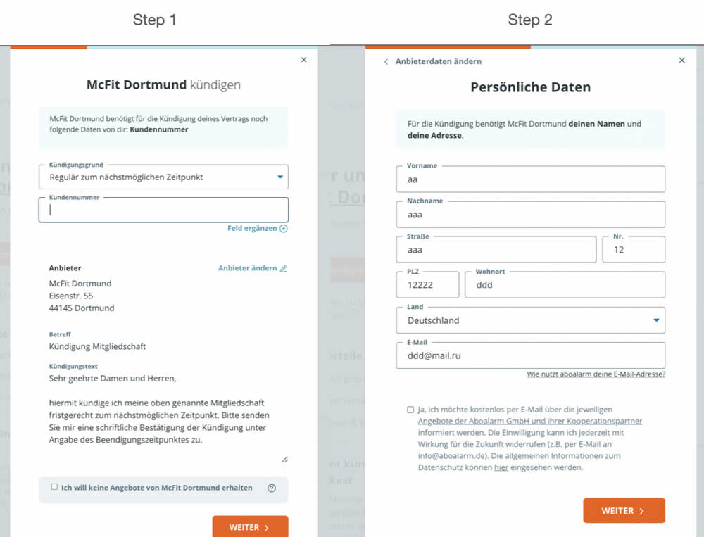
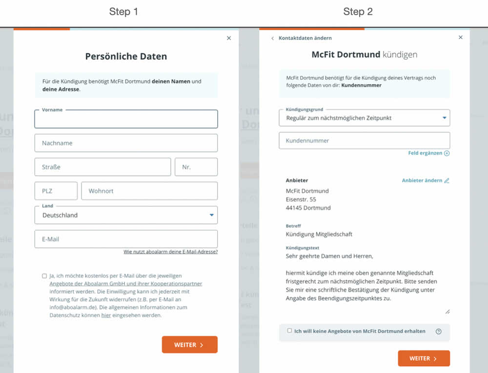
In this experiment, a more difficult step of a contract cancelation service flow was rearranged toward a later step. In the variation, the easier step (hypothetically) with personal details and address fields was placed as the first step. Whereas the step with contract or account numbers (hypothetically more difficult) were placed as the second step.