All Latest 620 A/B Tests
MOST RECENT TESTS
Test #621 on
Kay.com
by  Craig Kistler
Nov 26, 2025
Desktop
Mobile
Product
X.X%
Sales
Craig Tested Pattern #36: Fewer Or More Results On Kay.com
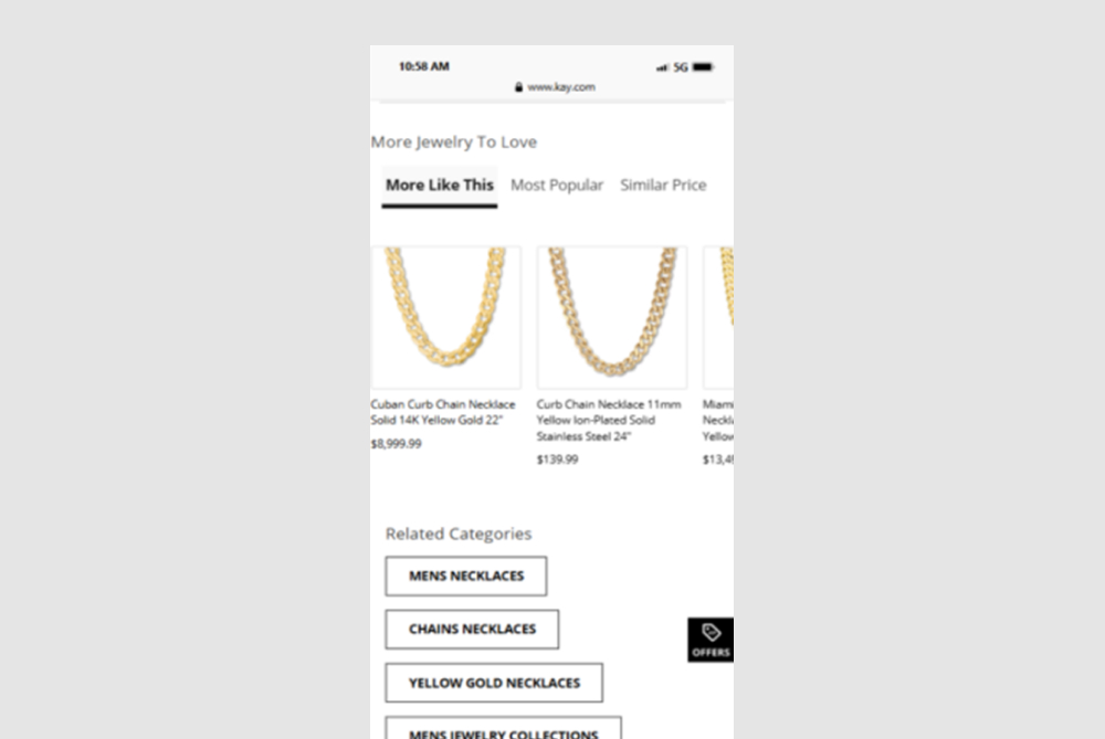
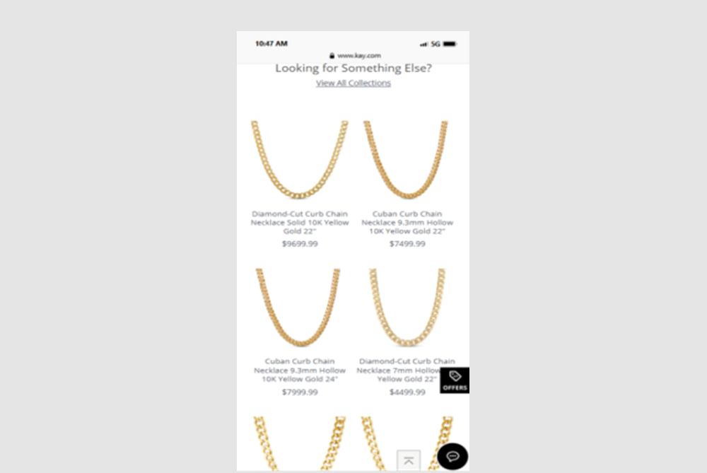
In this experiment, a horizontally scrolling set of products was replaced with an expanded and more visible grid of suggested products - enabling more discovery.
Which A Or B Actually Wins? Find Out Before You Test.
Members see every test result — the winners, the flat ones, and the losers — along with exact effects and sample sizes. Use it to estimate your tests and prioritize by probability, not gut feel. Start every experiment with the odds on your side.
Test #599 on
Finn.com
by  Tim Karcher
Jun 27, 2025
Mobile
Product
X.X%
Leads
Tim Tested Pattern #10: Postponed Modal Forms On Finn.com
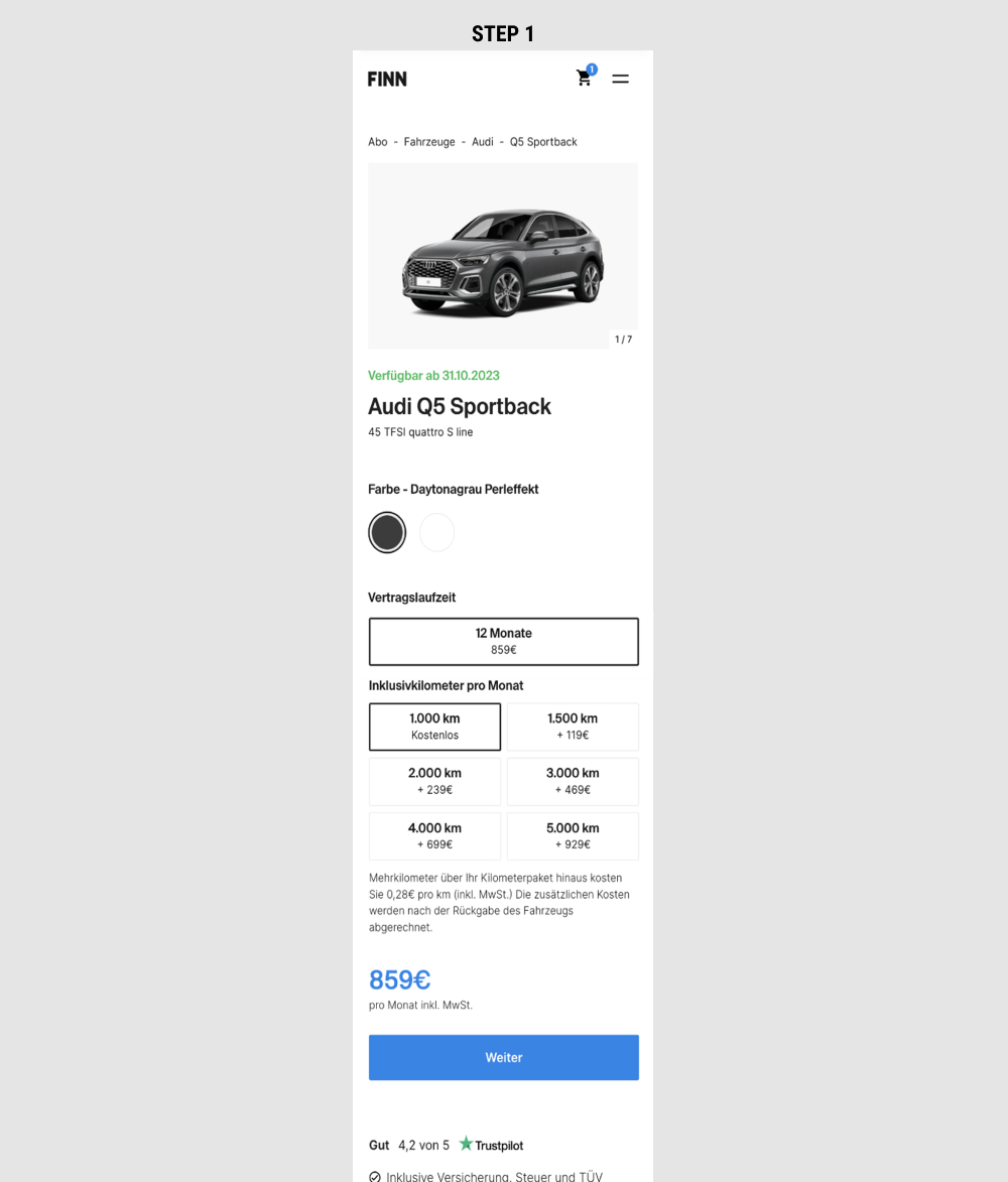
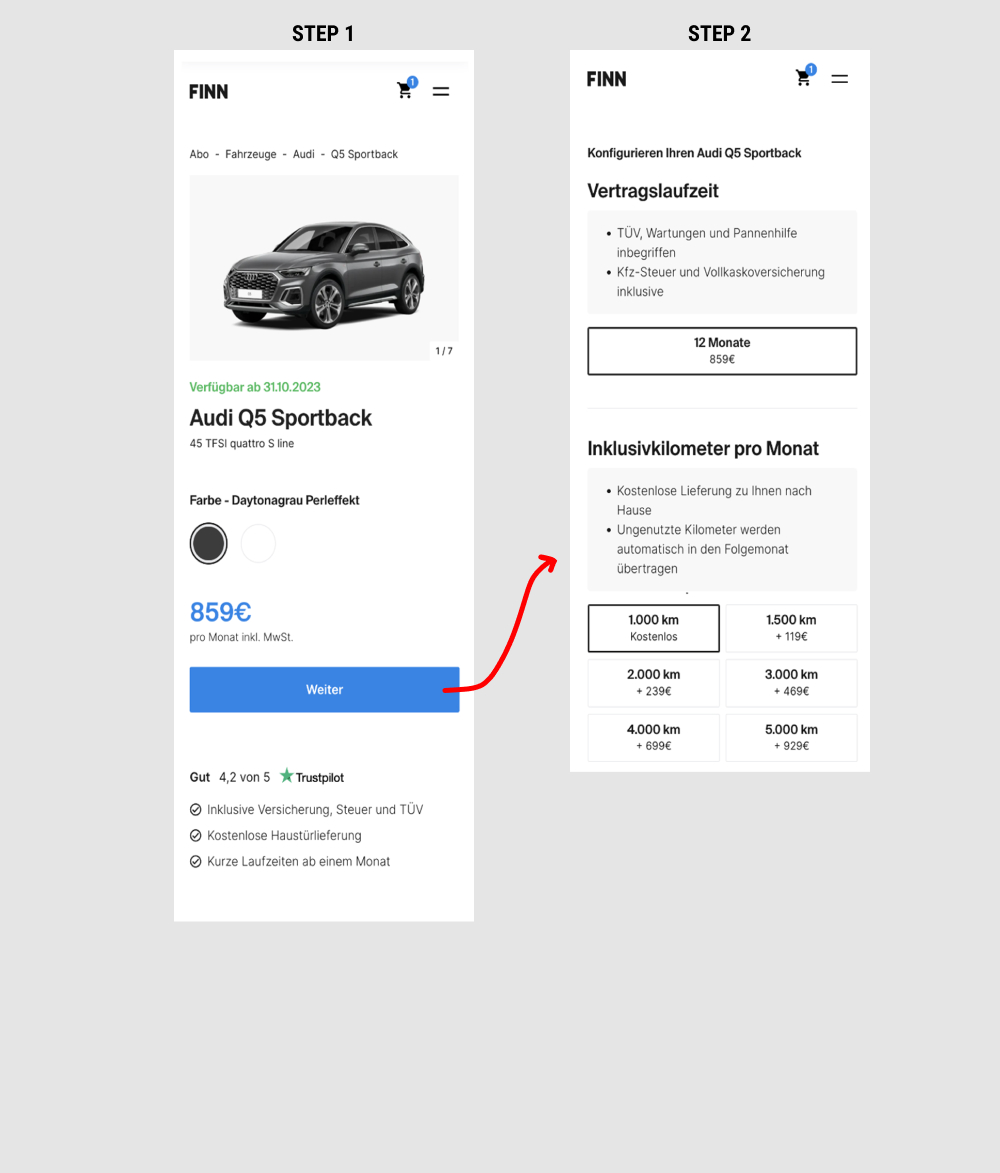
This is a heavily confounded multi-change experiment. In the variation, product choices on product detail pages were taken off and moved to a 2nd step (a new step). This also resulted in the price and primary button becoming more visible from an upward position shift. Impact on adds-to-cart and lead generation was measured.
Test #532 on
Finn.com
by  Maksim Meged
May 10, 2024
Mobile
Listing
X.X%
Sales
Maksim Tested Pattern #76: Infinite Scrolling Or Pagination On Finn.com


In this experiment, infinite scrolling was a/b tested against a paginated one.
Test #522 on
686.com
by  Adan Archila
Mar 18, 2024
Desktop
Listing
X.X%
Sales
Adan Tested Pattern #37: List Or Grid View On 686.com

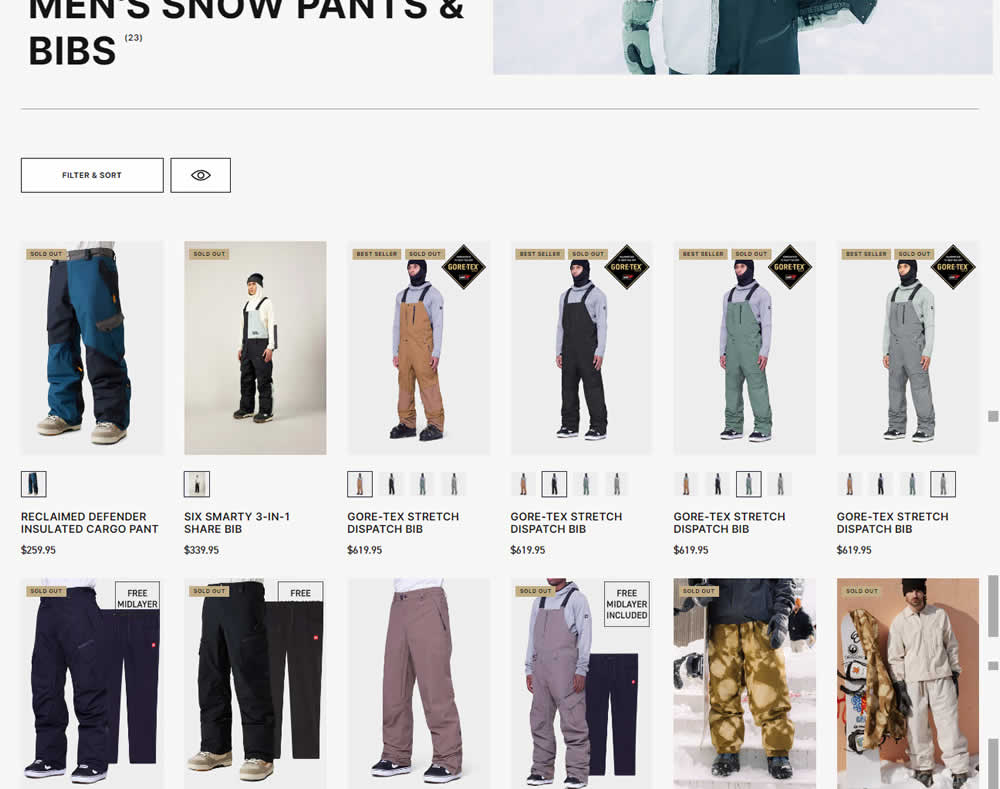
In this desktop experiment, 4 product tiles per page (control) were tested against 6. Impact on sales was measured.
Test #502 on
Fairment.de
by  Jona Eisenberger
Nov 06, 2023
Mobile
Listing
X.X%
Sales
Jona Tested Pattern #37: List Or Grid View On Fairment.de
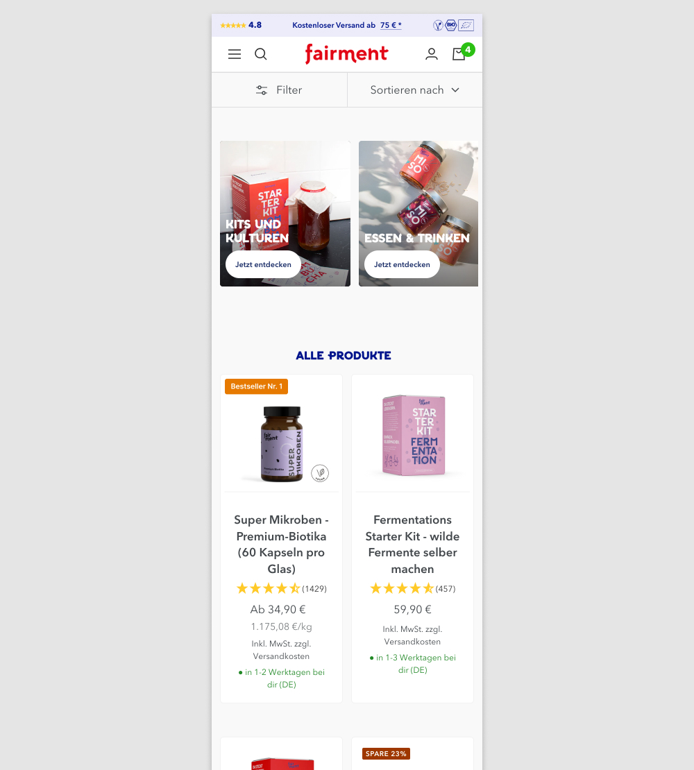
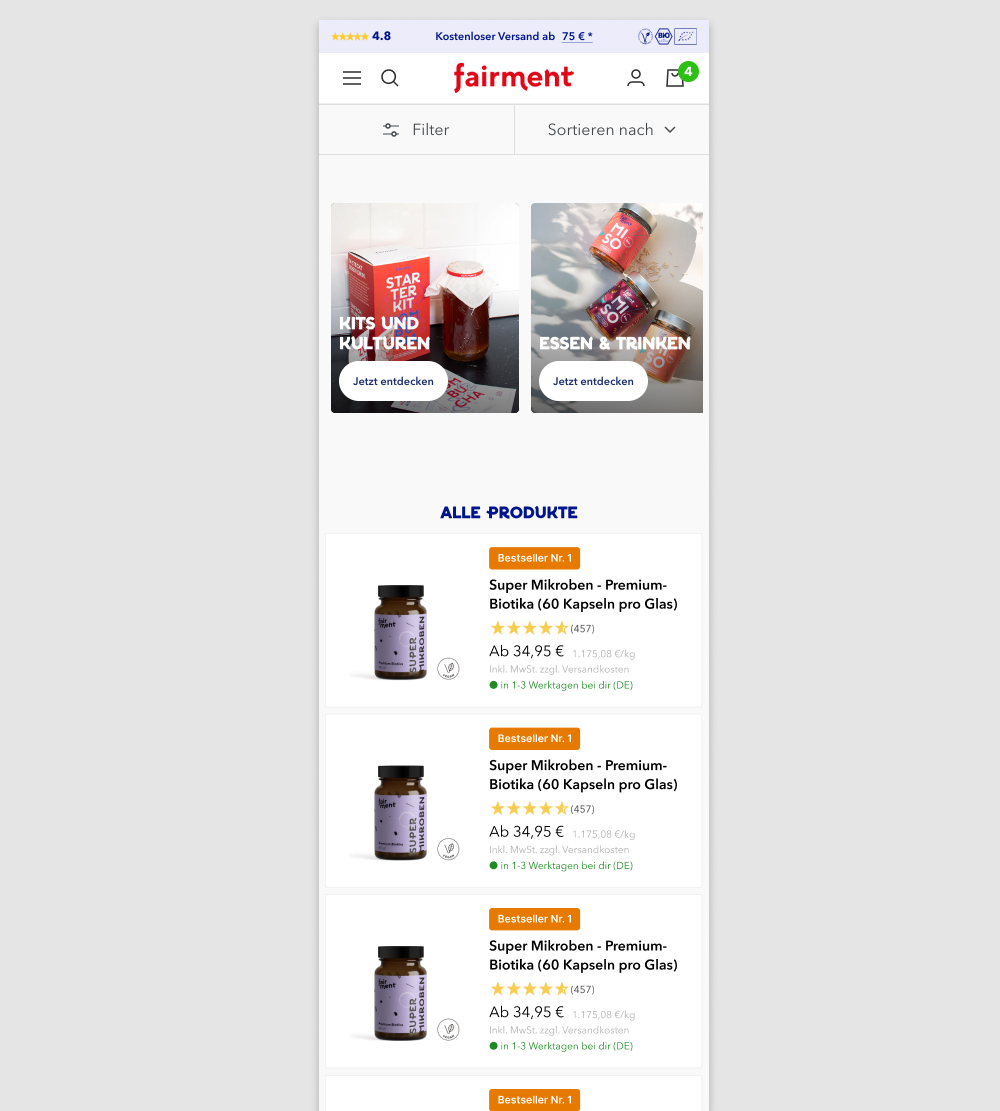
In this experiment, a two column grid layout (control) was tested against single column layout (variation) with the product information shown to the right. Please note that the screenshot shows repeated products only because it's been sourced from a Figma design file. In reality, the products in the variation were equally diverse as in the control.
(We've also flipped the A and B to match up with our grid pattern.)
Test #503 on
by  Jakub Linowski
Nov 05, 2023
Desktop
Mobile
Home & Landing
X.X%
Sales
Jakub Tested Pattern #36: Fewer Or More Results
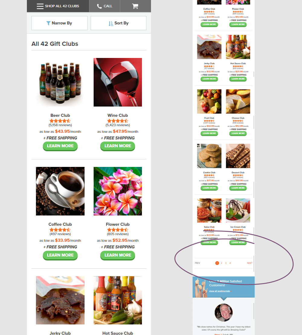
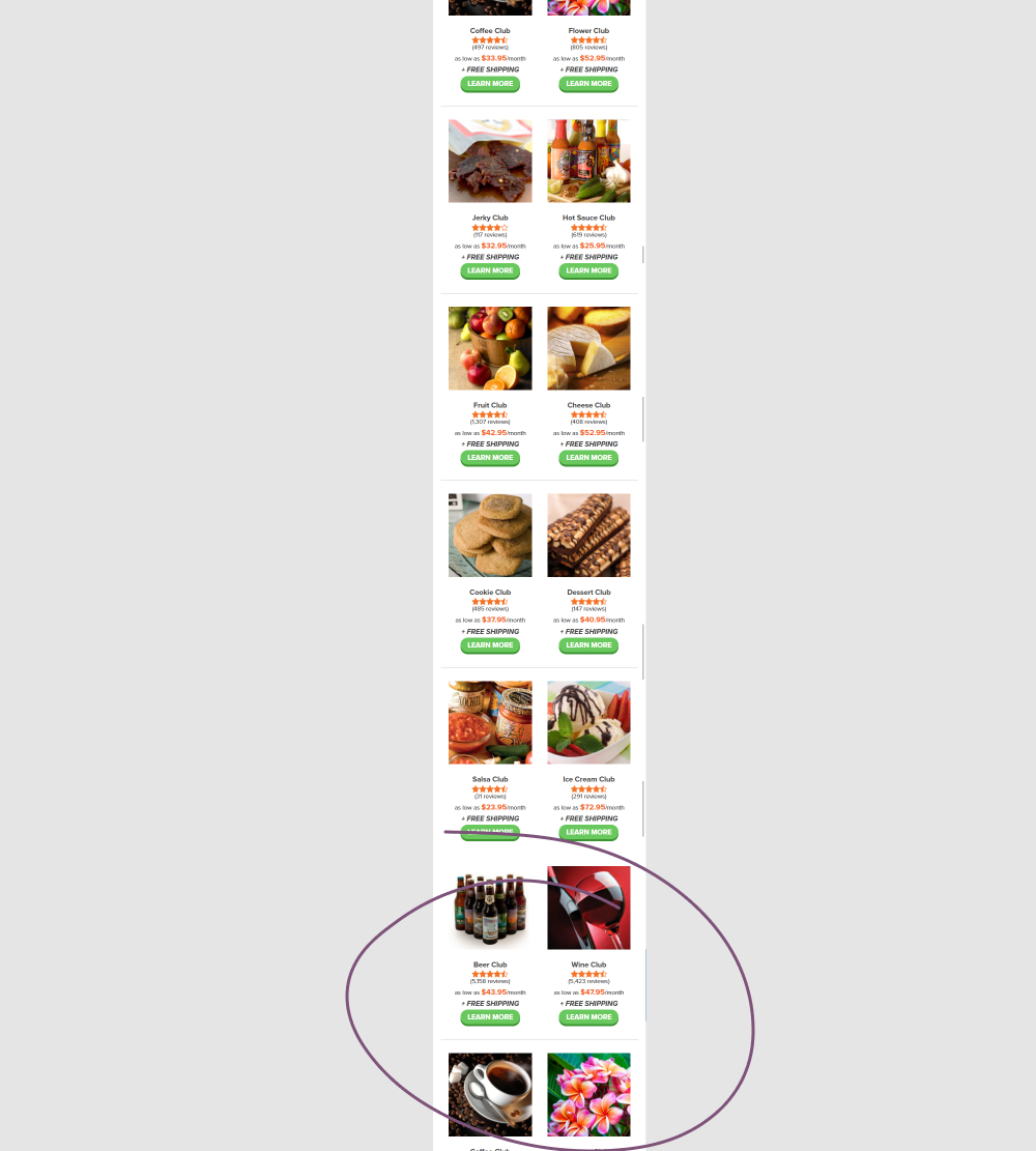
In this experiment, instead of showing 12 products per screen (with pagination), the variation showed all 42 products on a single screen. Impact on adds to cart and completed orders was measured.
Test #475 on
Online.metro-cc.ru
by  Andrey Andreev
Jun 07, 2023
Desktop
Mobile
Listing
X.X%
Sales
Andrey Tested Pattern #36: Fewer Or More Results On Online.metro-cc.ru
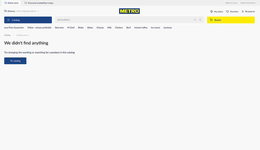
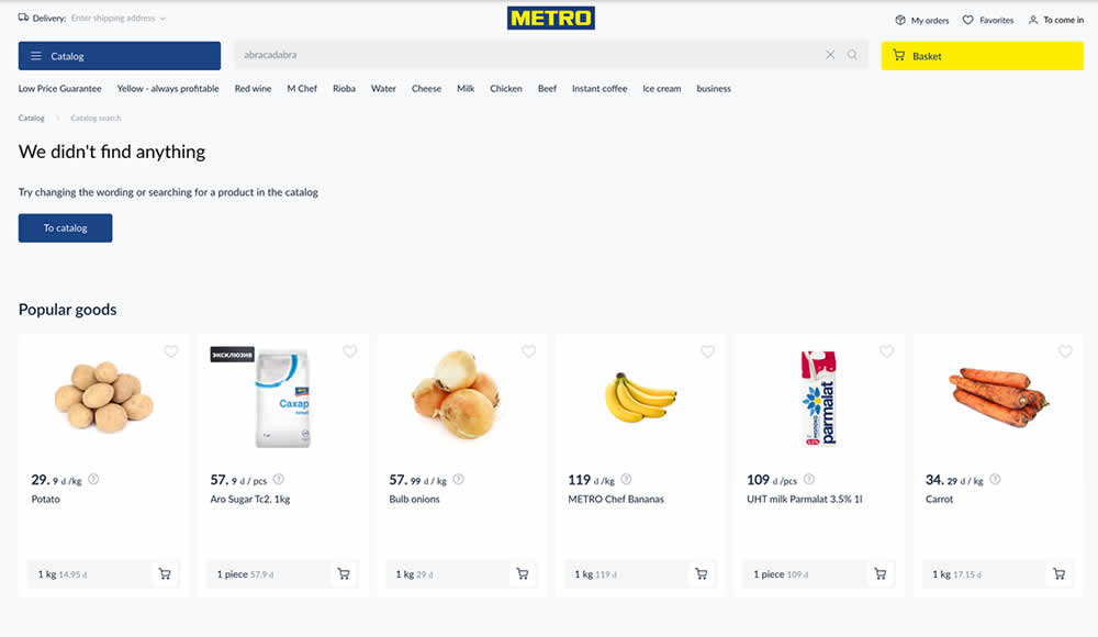
Are more (popular) product results better than none at all? In this experiment, popular products were shown during an empty search result. Impact on sales was measured.
Test #469 on
by  Ardit Veliu
Apr 28, 2023
Desktop
Signup
X.X%
Leads
Ardit Tested Pattern #129: Right Or Left Aligned Forms


In this experiment, a right side form shifted in position to the left. Impact on leads was measured.
Test #453 on
by  Jakub Linowski
Jan 31, 2023
Desktop
Mobile
Shopping Cart
X.X%
Sales
Jakub Tested Pattern #64: Tunnel
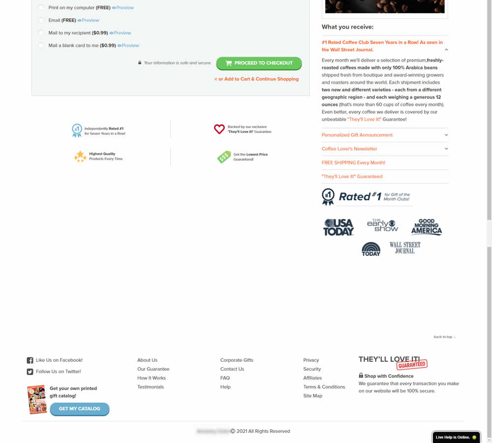
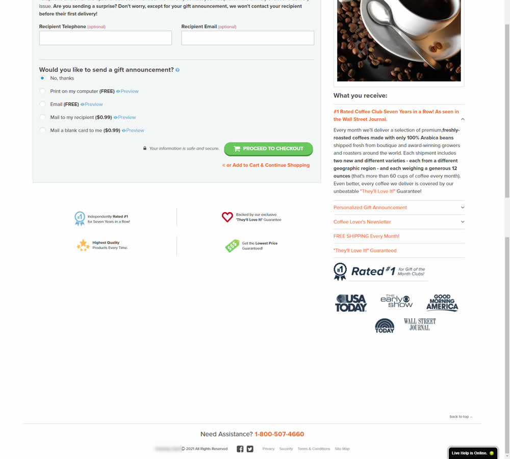
In this experiment, the footer was simplified with multiple elements being removed (catalog request, secondary links, and a guarantee). Additionally, a more prominent phone number was also displayed.
Test #454 on
Trenyrkarna.cz
by  Ondřej Ilinčev
Jan 31, 2023
Desktop
Mobile
Shopping Cart
X.X%
Sales
Ondřej Tested Pattern #64: Tunnel On Trenyrkarna.cz
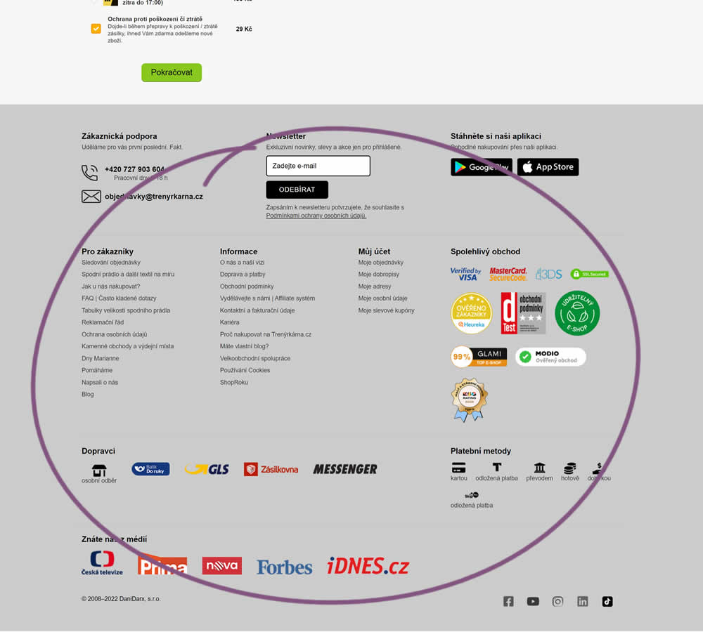
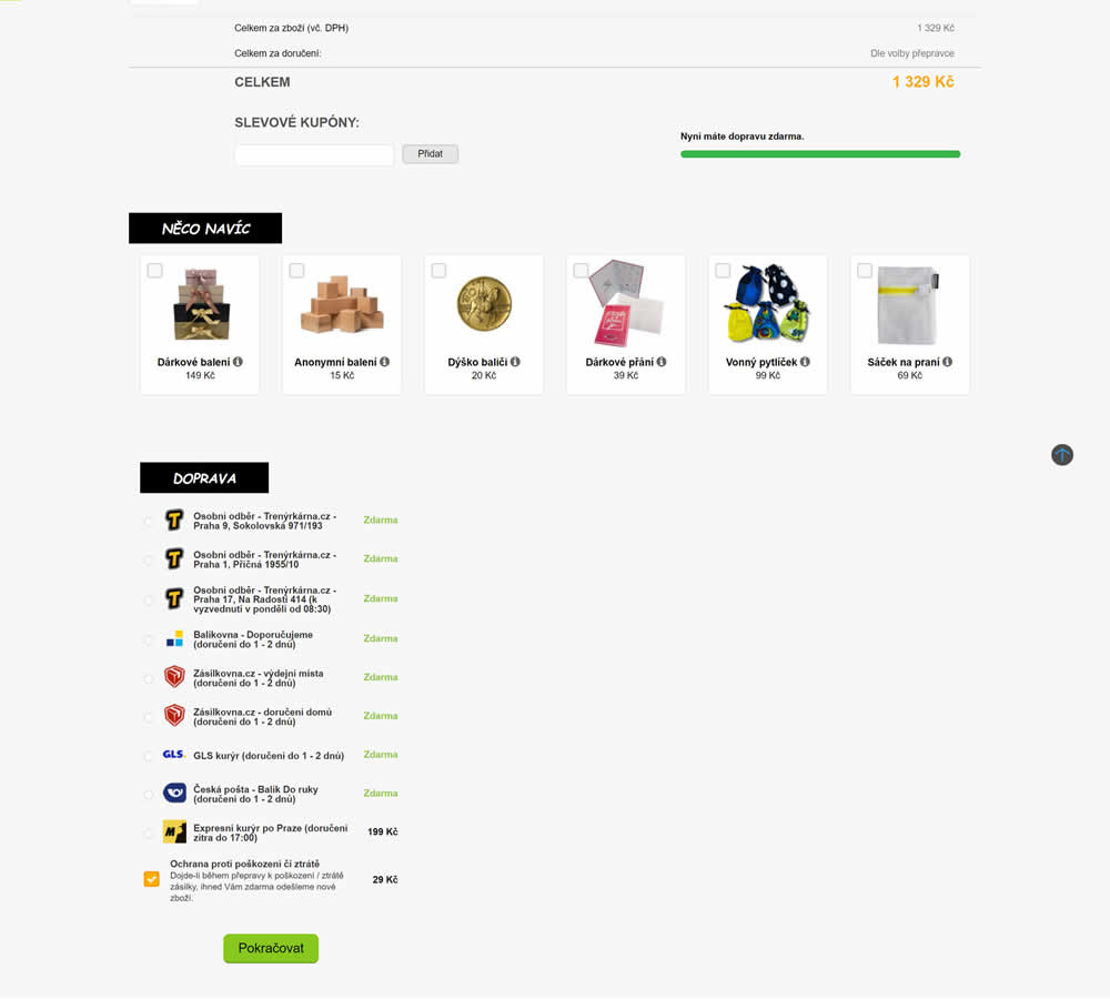
In this shopping cart experiment, a tall footer was completely removed. The footer contained elements such as: app download links, a newsletter signup, secondary web site links, trust symbols, social media icons and company contant information. Impact on sales was measured.
Test #420 on
Designlab.com
by  Daniel Shapiro
Jul 12, 2022
Desktop
Mobile
Product
X.X%
Leads
Daniel Tested Pattern #115: Pricing Comparison Table On Designlab.com


In this experiment, pricing plans were laid out horizontally for easier comparison. In the variation, most of the plan benefits, features and differences were also referenced using a single lable that was left-aligned. The idea was to make the variables aligned and therefore more comparable.
This pricing table appeared at the bottom of a long design program landing page. Impact on leads and applications was measured.
Test #401 on
Learnwithhomer.com
by  Stanley Zuo
Mar 11, 2022
Desktop
Home & Landing
X.X%
Signups
Stanley Tested Pattern #58: Full Height False Bottom On Learnwithhomer.com


Here the experiment contained a layout change. Standard content components with varied heights were tested against sections with false bottoms. That is the conntent blocks in the variation took up 100% height of the viewport. This change was also applied throughout the rest of the content blocks. Impact on overall signup rates was measured.
Test #392 on
by  Jakub Linowski
Dec 31, 2021
Desktop
Mobile
Product
X.X%
Sales
Jakub Tested Pattern #122: Zigzag Layout
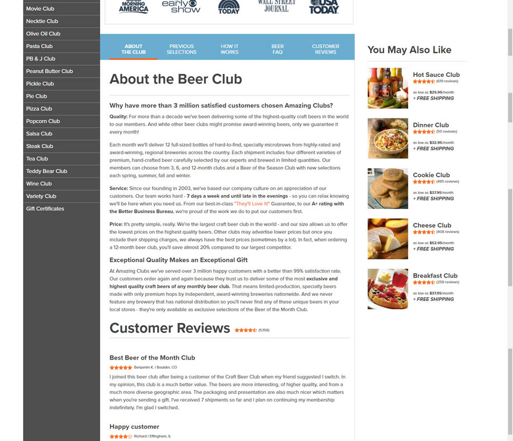
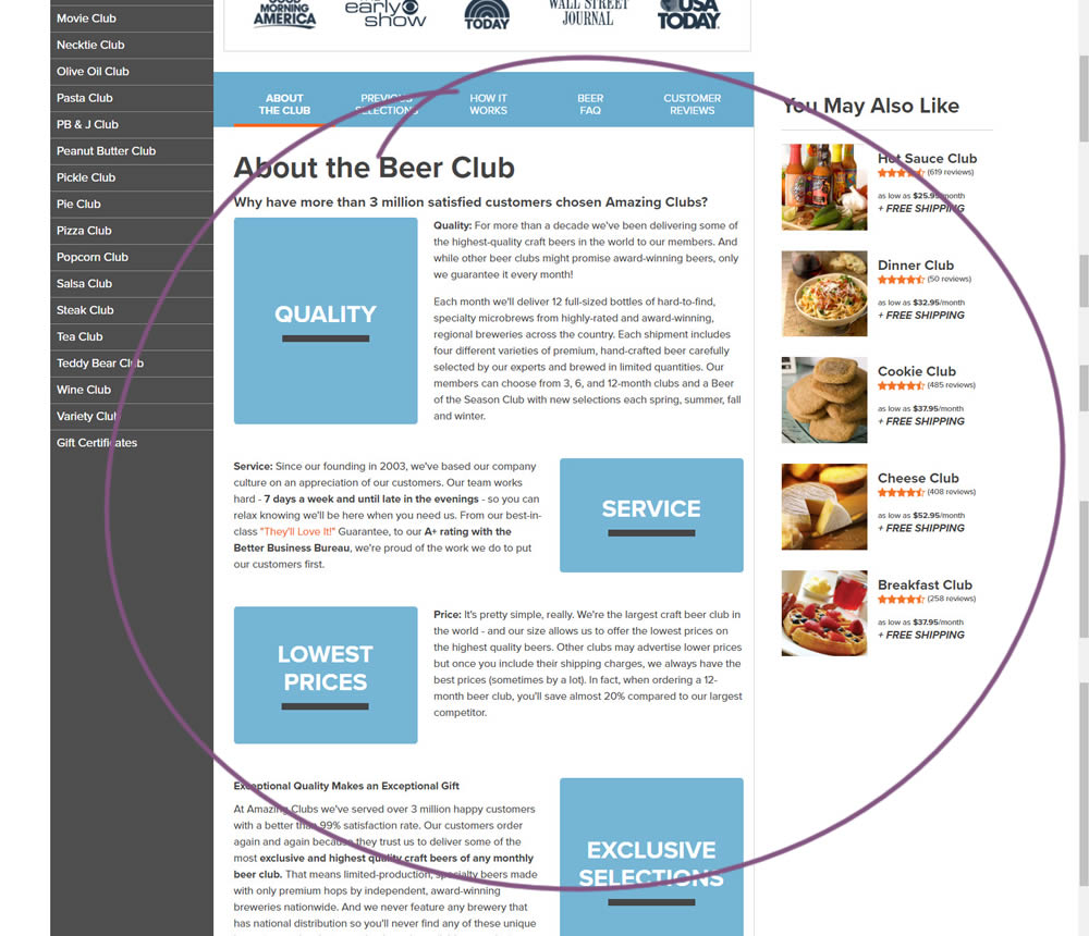
In this experiment, paragraph style copy was reorganized into a zig zag layout with key sections being reinforiced with copy-as-image statements. Impact on adds-to-cart and sales was measured.
Test #383 on
by  Jakub Linowski
Nov 11, 2021
Desktop
Checkout
X.X%
Sales
Jakub Tested Pattern #123: Single Or Double Column Form Fields
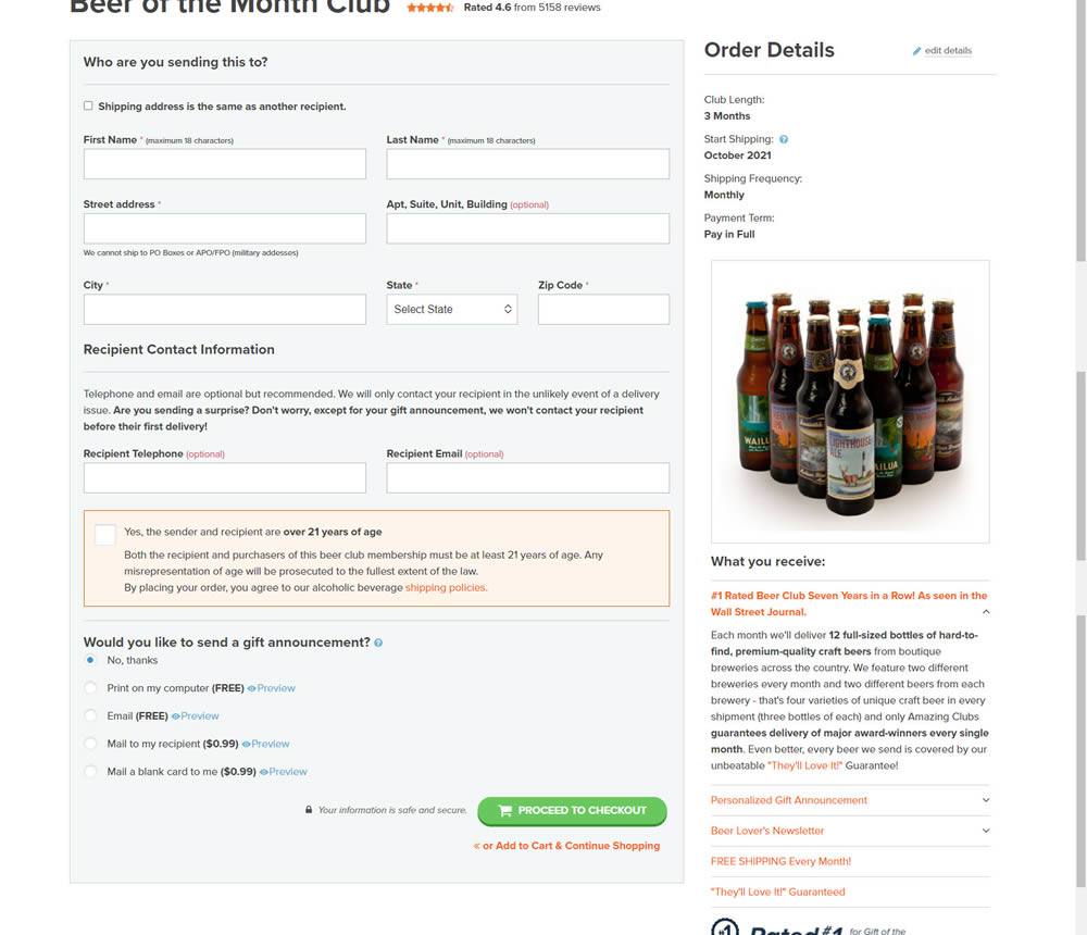
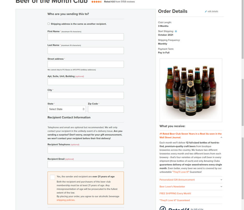
In this simple [inverted] experiment, the variation organized the form fields into a single column. The control had two columns of form fields.
Test #372 on
Fluke.com
by  Marika Francisco
Aug 30, 2021
Desktop
Product
X.X%
Sales
Marika Tested Pattern #122: Zigzag Layout On Fluke.com
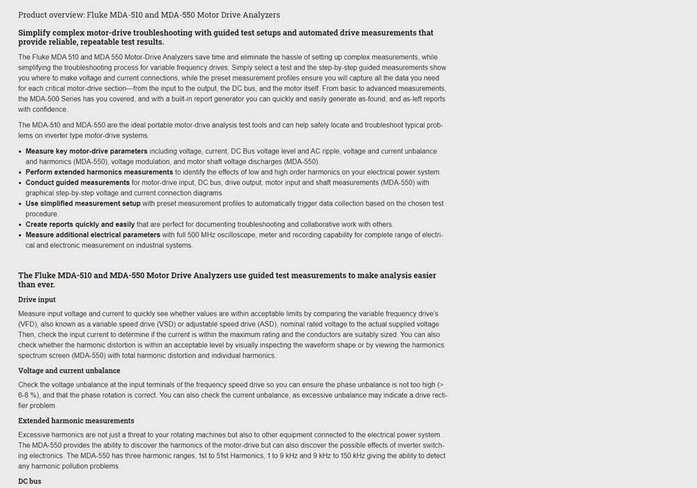

In this experiment, product descriptions were changed to an alternating zig zag layout with images. Impact on adds-to-cart and sales was measured.
Test #358 on
Preply.com
by  Gleb Hodorovskiy
Jun 03, 2021
Desktop
Home & Landing
X.X%
Sales
Gleb Tested Pattern #58: Full Height False Bottom On Preply.com


In this experiment, the header section of the homepage drastically focused around the call to action. This was done by removing elements and forcing a false bottom.
Test #353 on
Backstage.com
by  Stanley Zuo
May 12, 2021
Desktop
Product
X.X%
Signups
Stanley Tested Pattern #13: Centered Forms & Buttons On Backstage.com
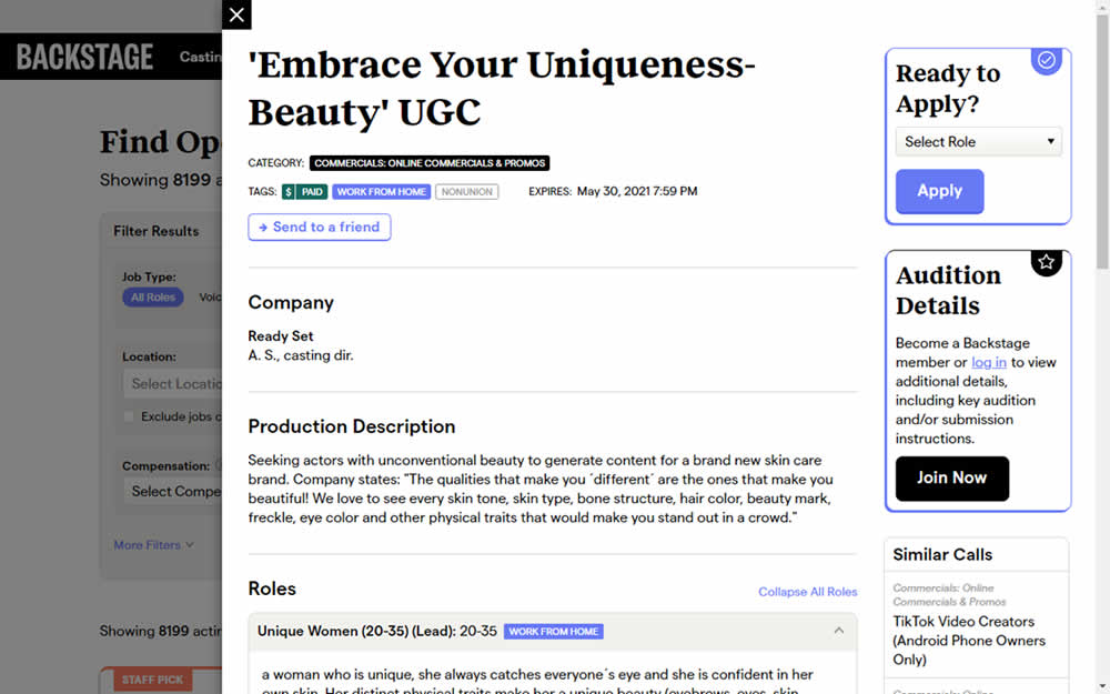
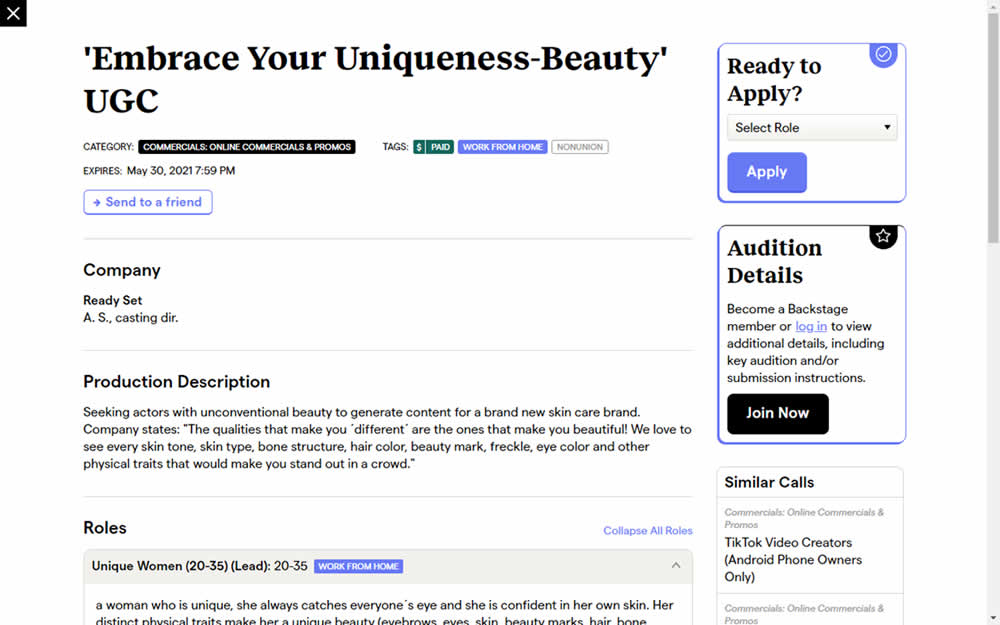
This experiment challanged a right aligned detail page. After clicking a result of a job role on a listing page, an overlay would appear on the right with the details. The variation used a full width screen instead - effectively centering the page.
Test #352 on
Us.flukecal.com
by  John Hickey
May 11, 2021
Desktop
Global
X.X%
Leads
John Tested Pattern #123: Single Or Double Column Form Fields On Us.flukecal.com
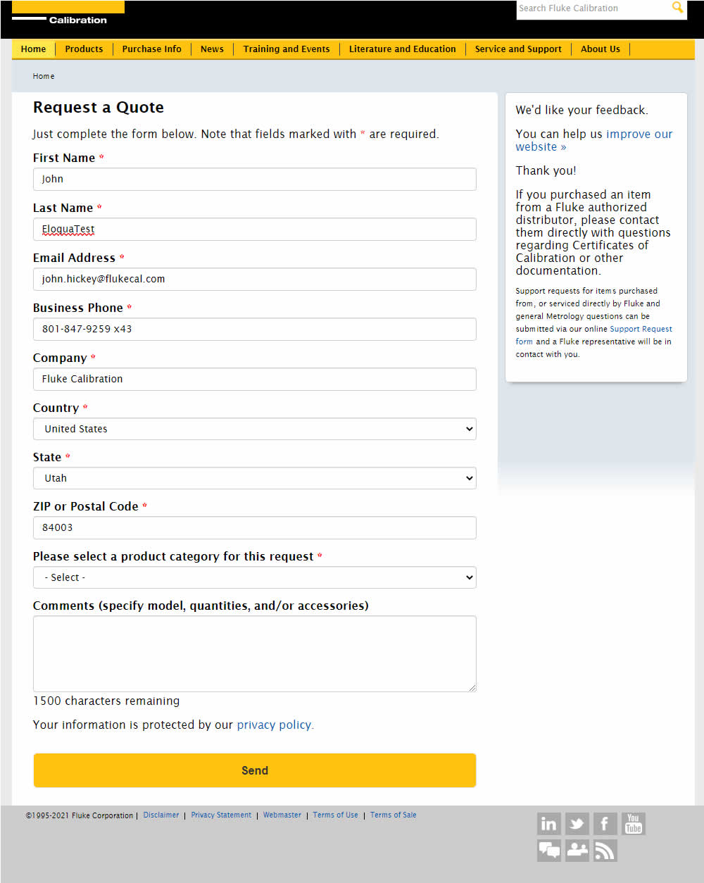
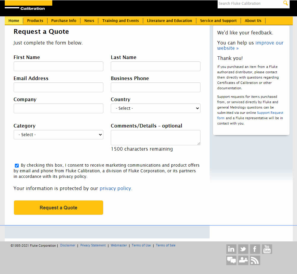
In this experiment, single column (longer) form fields were tested against a two column layout (more compact).
Test #350 on
Expertinstitute.com
by  Ardit Veliu
Apr 29, 2021
Desktop
Content
X.X%
Leads
Ardit Tested Pattern #16: Welcome Mat - Partial On Expertinstitute.com


In this experiment, a lead generating section with a call to action (welcome mat) was appended at the top of article pages. Impact on lead generation was measured.
Test #343 on
Snocks.com
by  Samuel Hess
Mar 12, 2021
Desktop
Mobile
Product
X.X%
Sales
Samuel Tested Pattern #122: Zigzag Layout On Snocks.com

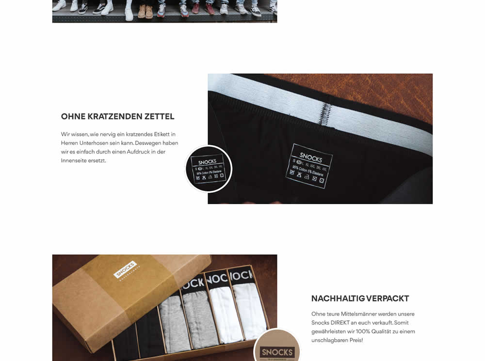
In this experiment, the content on a product page was reorganized into a zigzagging (alternating layout) along with reinforcing photos. Impact on adds-to-cart and total sales was measured.