All Latest 620 A/B Tests
MOST RECENT TESTS
Test #294 on
Umbraco.com
by  Lars Skjold Iversen
Apr 23, 2020
Desktop
Pricing
X.X%
Progression
Lars Tested Pattern #115: Pricing Comparison Table On Umbraco.com
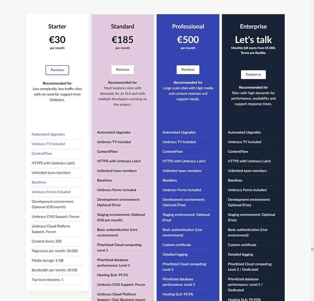
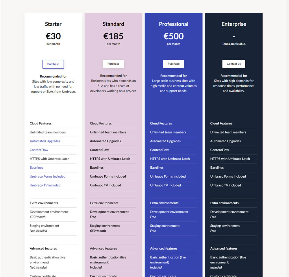
In this experiment, plan properties on a pricing page were horizontally aligned (for easier comparison). More so, labels and values were also broken on separate lines.
Which A Or B Actually Wins? Find Out Before You Test.
Members see every test result — the winners, the flat ones, and the losers — along with exact effects and sample sizes. Use it to estimate your tests and prioritize by probability, not gut feel. Start every experiment with the odds on your side.
Test #277 on
Prepagent.com
by  Arthur Sparks
Jan 03, 2020
Desktop
Pricing
X.X%
Revenue
Arthur Tested Pattern #115: Pricing Comparison Table On Prepagent.com
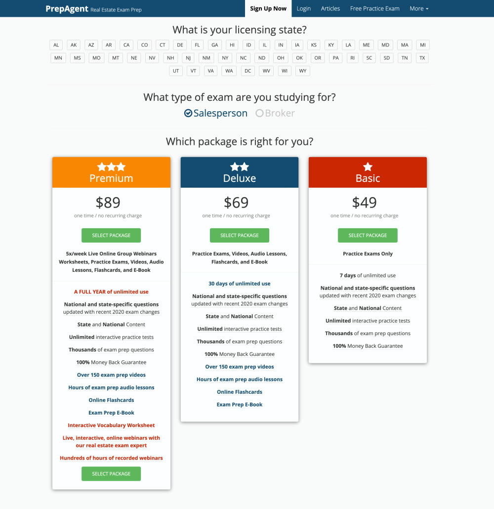
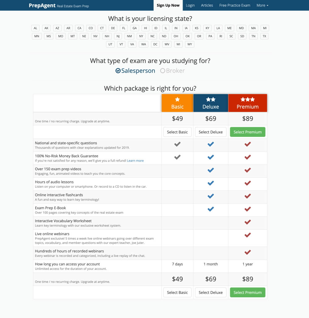
In this experiment, side-by-side plan features were aligned and changed to a comparison table with checkmarks for easier comparison.
Test #270 on
Dentalplans.com
by  J.R. Hernandez
Nov 19, 2019
Desktop
Listing
X.X%
Sales
J.R. Tested Pattern #37: List Or Grid View On Dentalplans.com
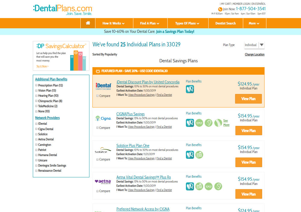
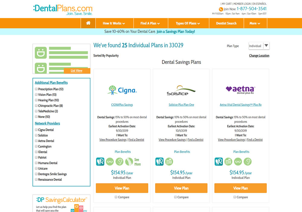
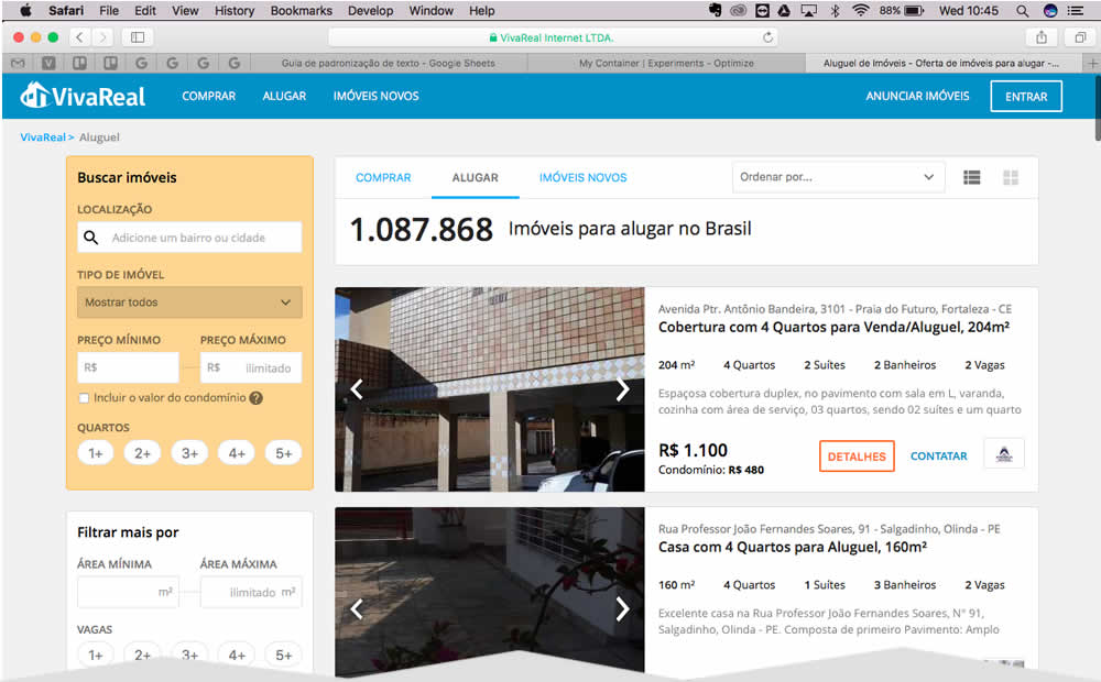
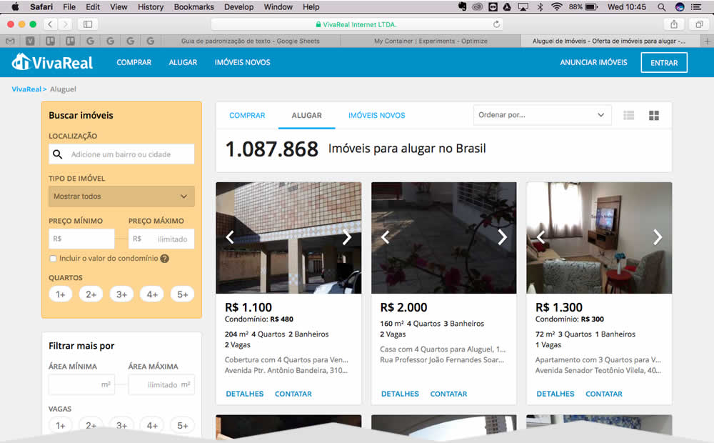
In this experiment, a list view was tested against a grid view.
Test #239 on
Volders.de
by  Alexander Krieger
May 02, 2019
Desktop
Home & Landing
X.X%
Progression
Alexander Tested Pattern #13: Centered Forms & Buttons On Volders.de

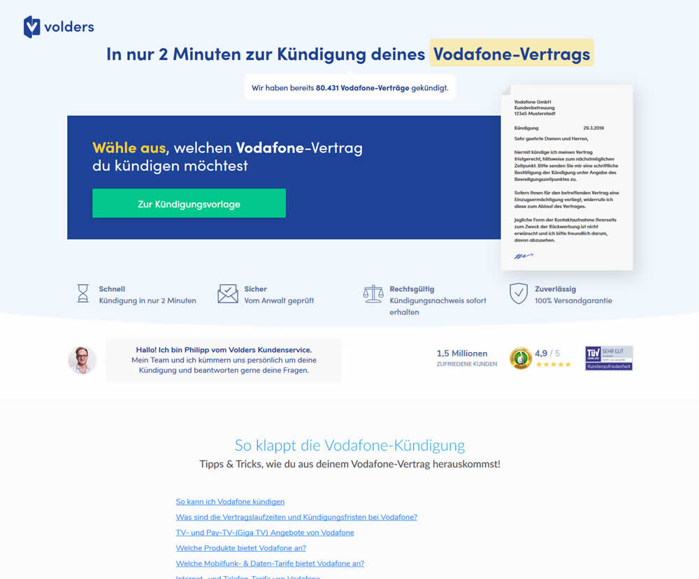
A contract cancellation landing page was tested for the effect of a single (wider CTA area with a left aligned button) vs two column layout (narrow CTA area with a right aligned button).
Test #235 on
Thomasnet.com
by  Julian Gaviria
Apr 02, 2019
Desktop
Mobile
Home & Landing
X.X%
Leads
Julian Tested Pattern #102: Expanded Or Condensed Layout On Thomasnet.com
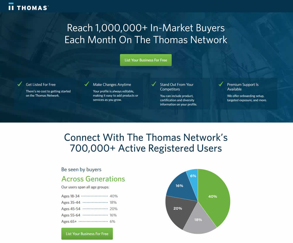

In this experiment, the layout was condensed from a taller to a shorter one.
Test #202 on
Kenhub.com
by  Niels Hapke
Oct 01, 2018
Desktop
Mobile
Checkout
X.X%
Sales
Niels Tested Pattern #13: Centered Forms & Buttons On Kenhub.com
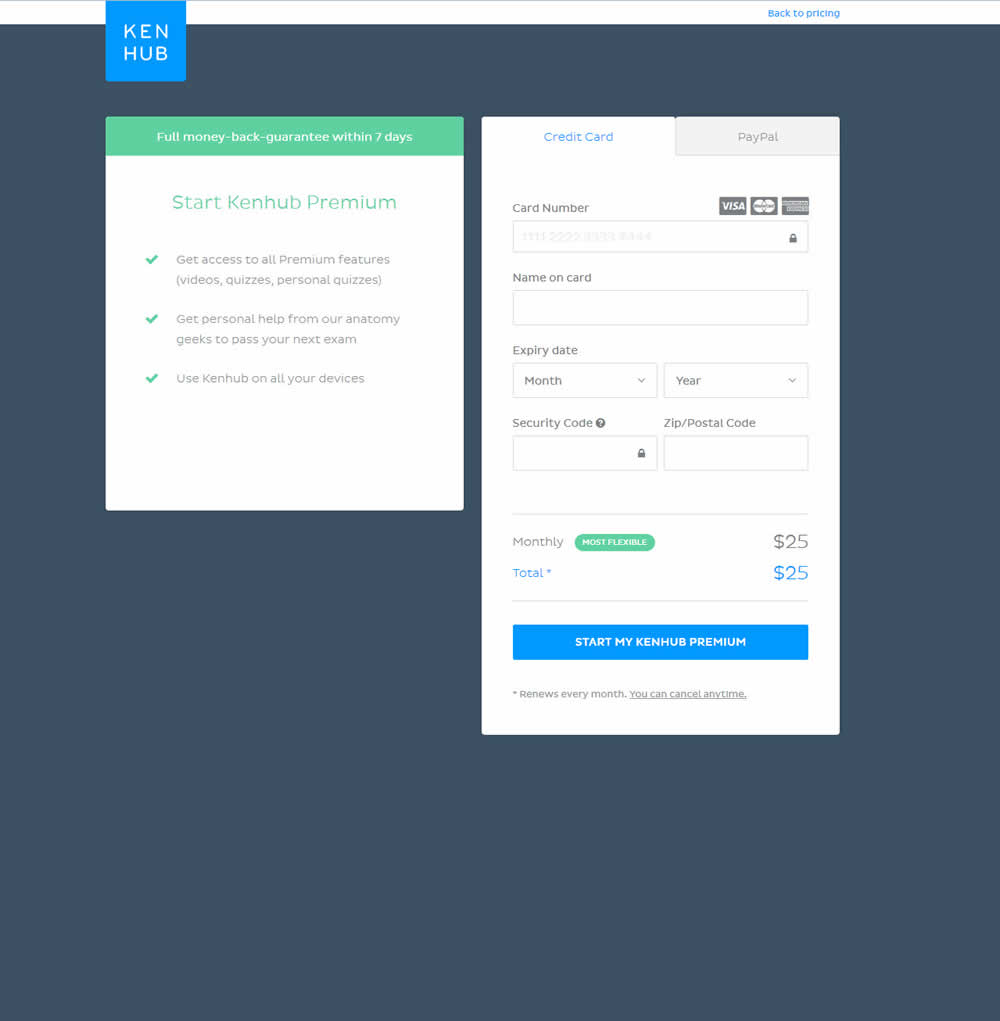
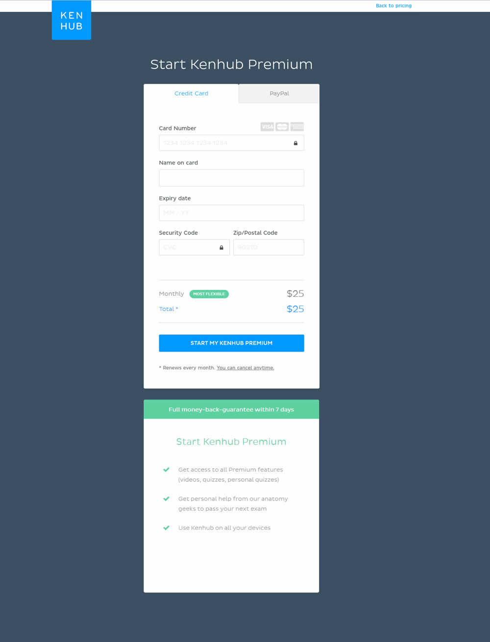
In this experiment, the form layout was adjusted by shifting the side benefits further down below the form.
Test #179 on
Yummly.com
by  Marcos Ciarrocchi
May 18, 2018
Desktop
Listing
X.X%
Signups
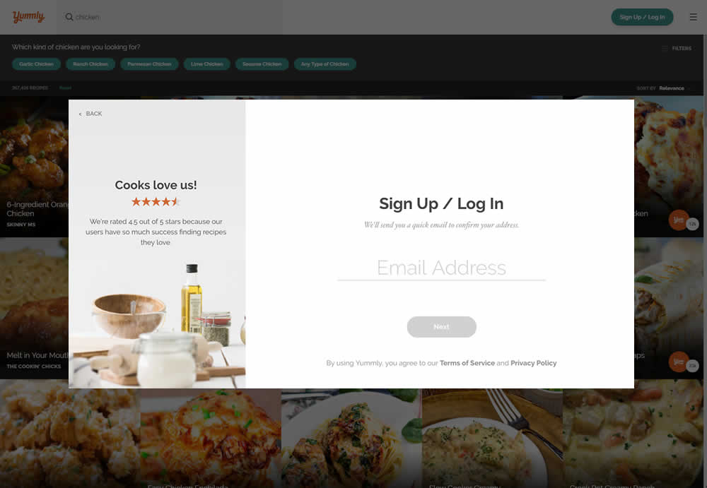
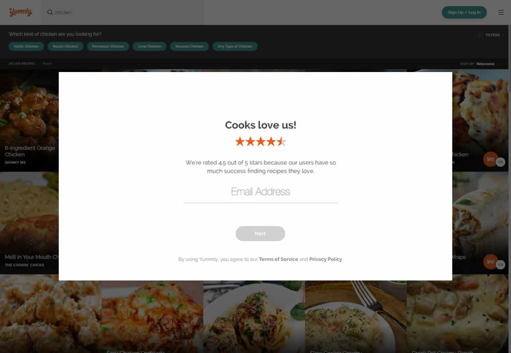
Marcos Tested Pattern #13: Centered Forms & Buttons On Yummly.com
Test #169 on
Mt.com
by  Vito Mediavilla
Apr 24, 2018
Desktop
Listing
X.X%
Leads
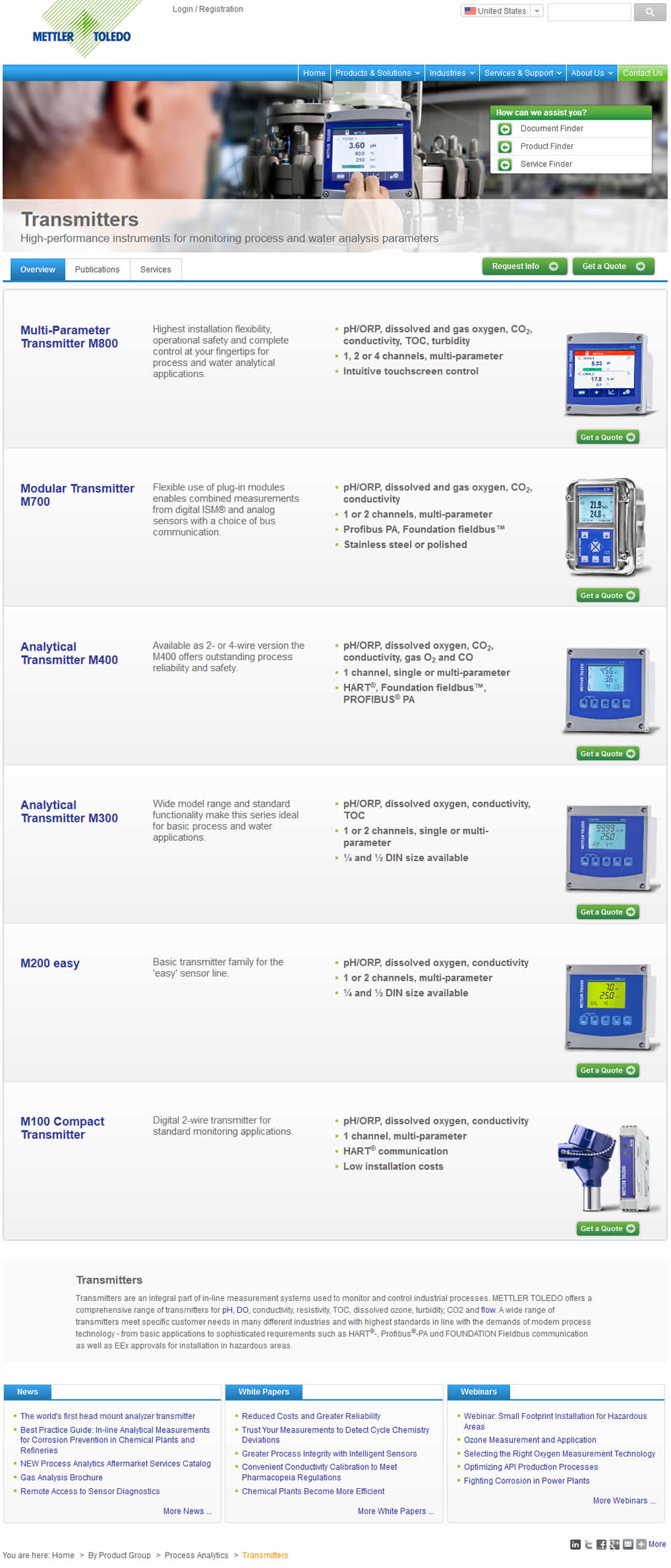
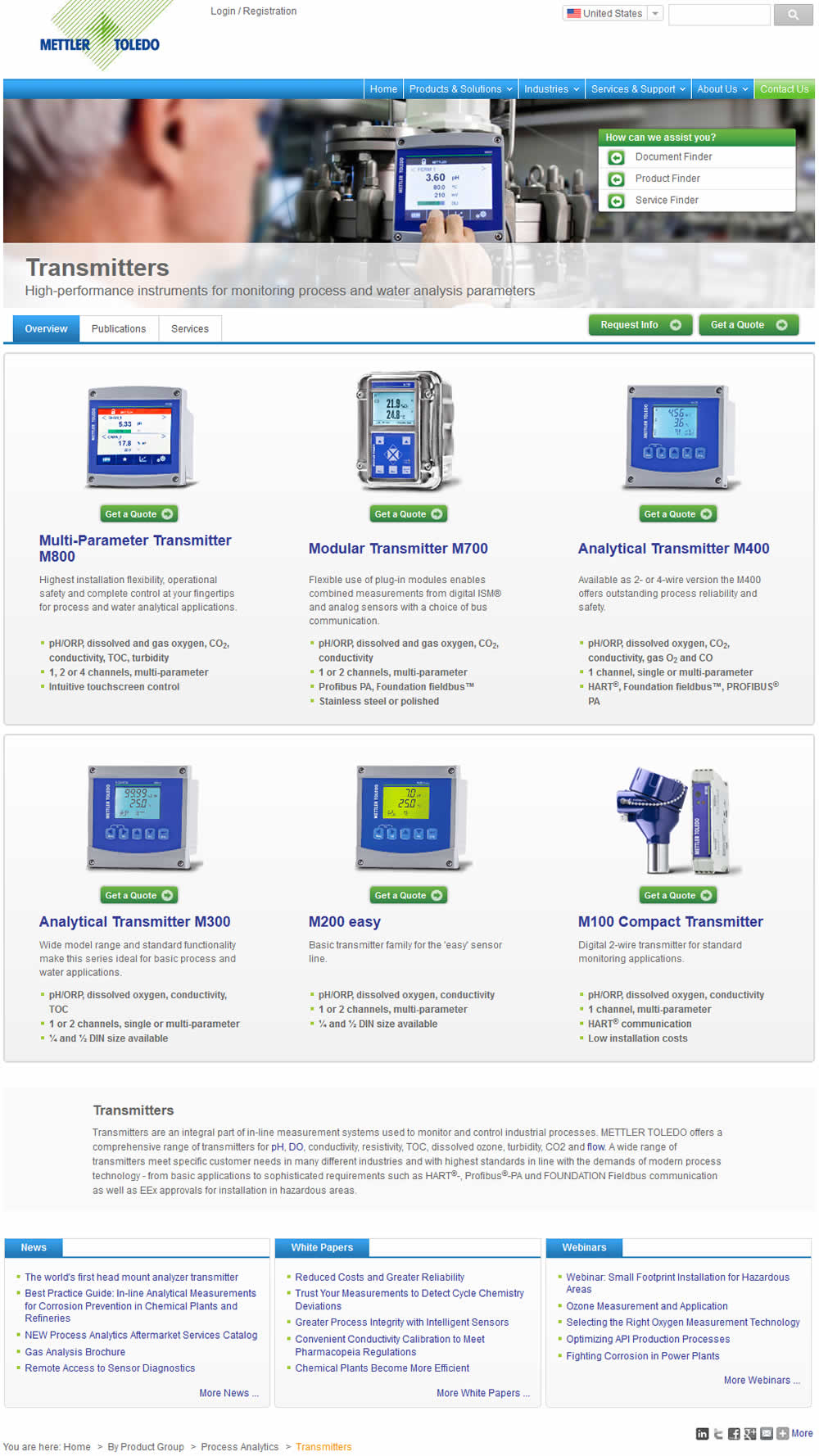
Vito Tested Pattern #37: List Or Grid View On Mt.com
Test #120 on
Vivareal.com.br
by  Rodrigo Maués
Nov 01, 2017
Desktop
Listing
X.X%
Leads
Rodrigo Tested Pattern #37: List Or Grid View On Vivareal.com.br
Test #111 on
Trydesignlab.com
by  Daniel Shapiro
Jul 01, 2017
Desktop
Home & Landing
X.X%
Signups
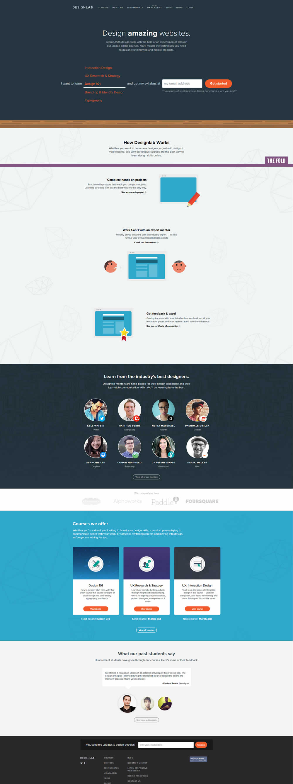
Daniel Tested Pattern #58: Full Height False Bottom On Trydesignlab.com

Test #108 on
Acousticalsurfaces.c...
by  Julian Gaviria
Jun 01, 2017
Desktop
Home & Landing
X.X%
Leads
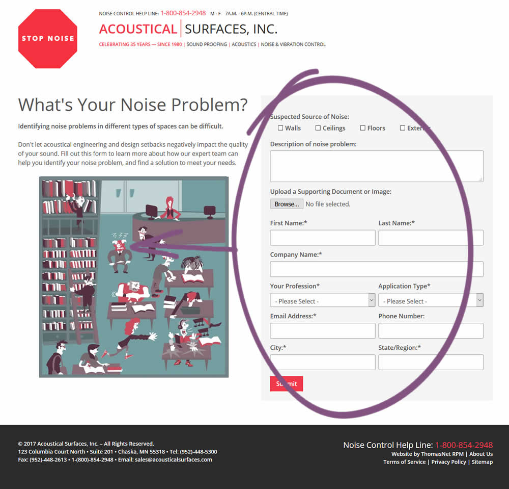
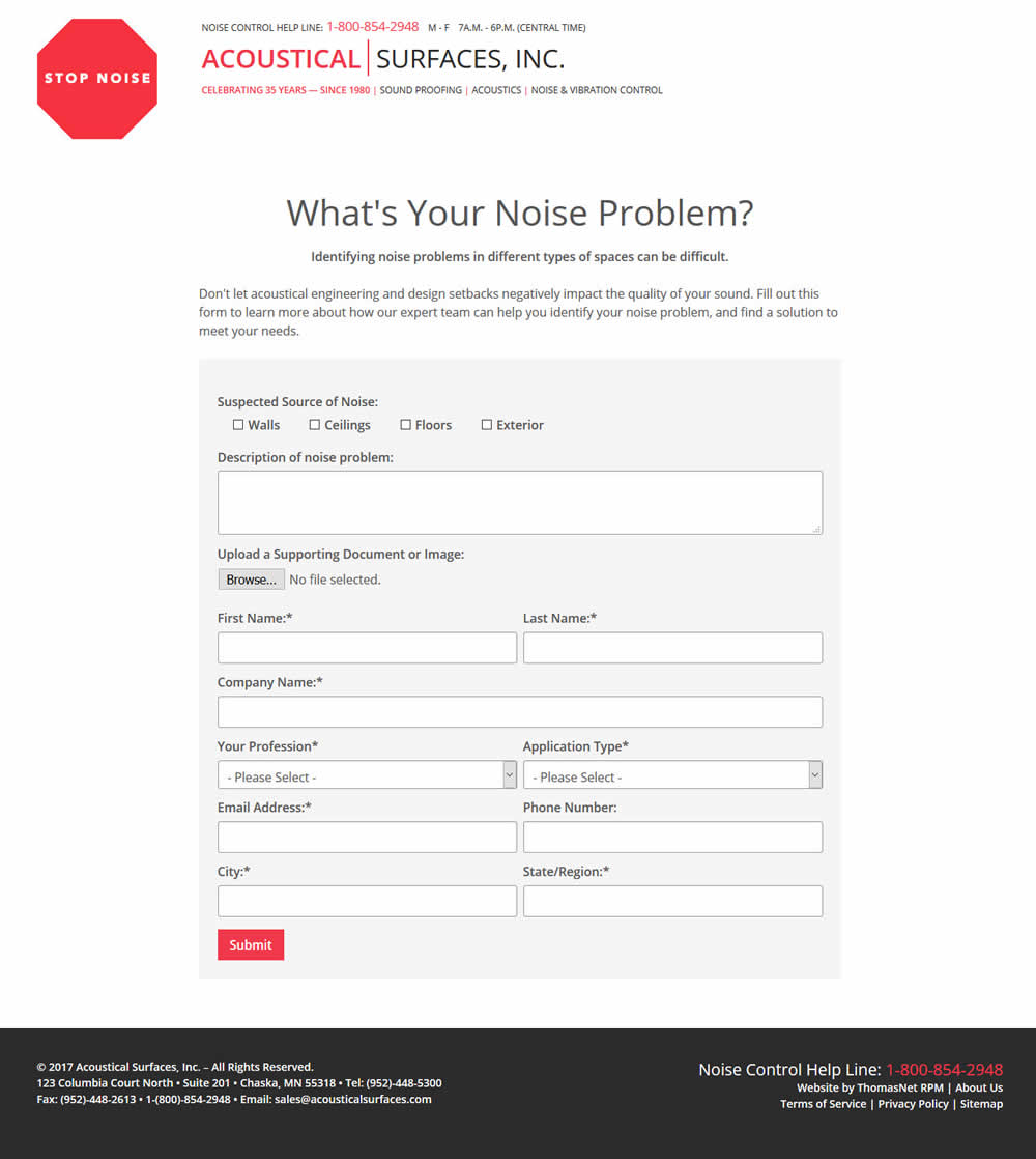
Julian Tested Pattern #13: Centered Forms & Buttons On Acousticalsurfaces.c...
Test #90 on
Vivareal.com.br
by  Rodrigo Maués
Apr 01, 2017
Desktop
Home & Landing
X.X%
Leads
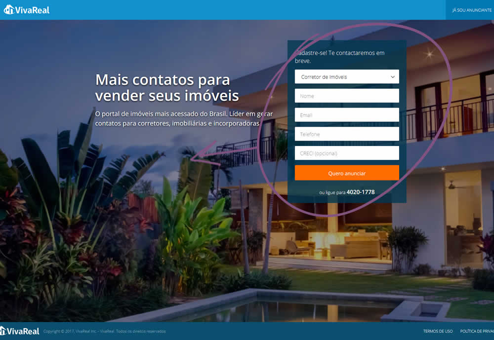
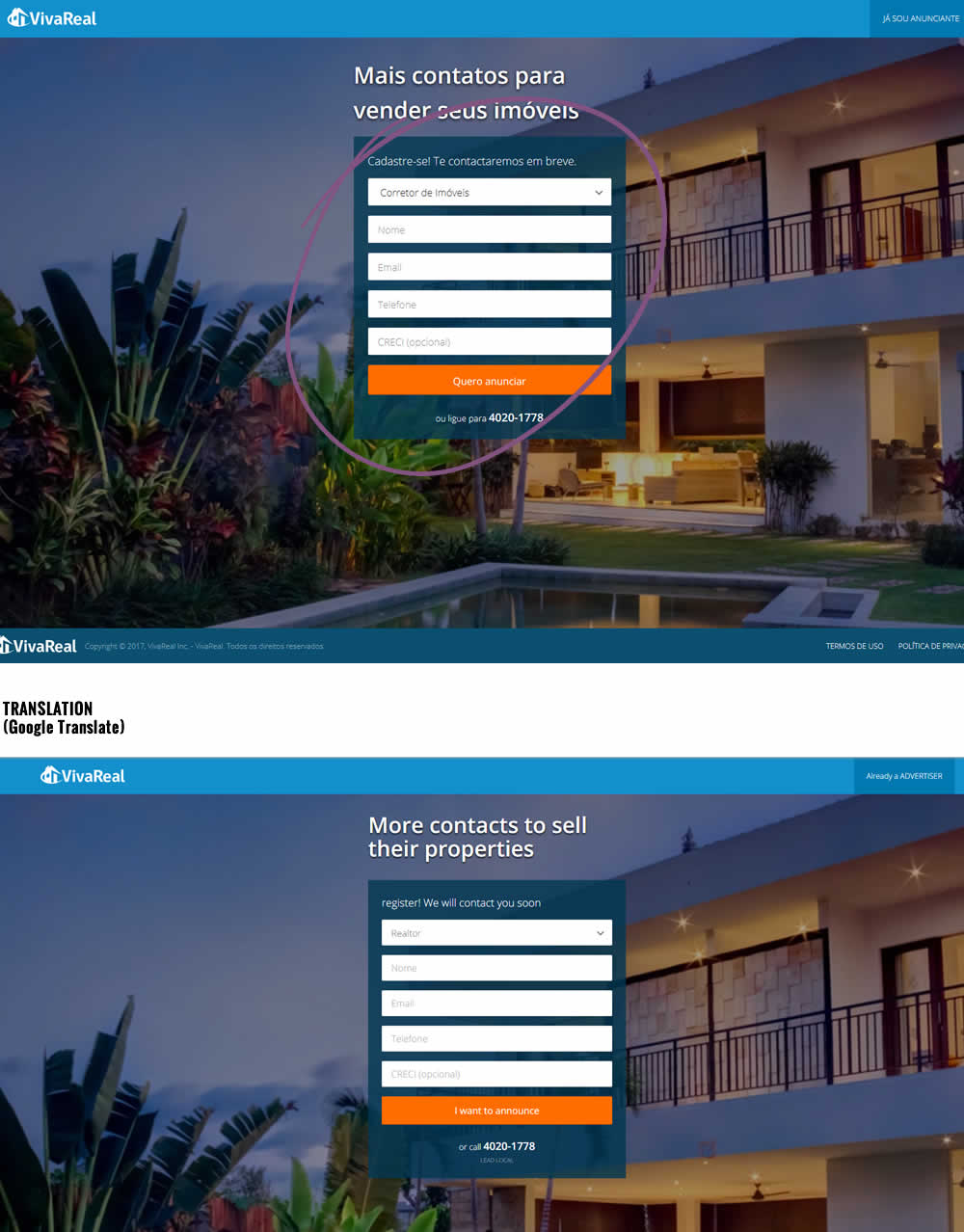
Rodrigo Tested Pattern #13: Centered Forms & Buttons On Vivareal.com.br
Test #76 on
Goodui.org
by  Jakub Linowski
Feb 01, 2017
Desktop
Home & Landing
X.X%
Signups
Jakub Tested Pattern #16: Welcome Mat - Partial On Goodui.org
