All Latest 615 A/B Tests
Become a member to unlock the abiltiy to see the highest impact a/b tests. Being able to see the actual test results and sort by impact allows growth and experimentation teams to take action on the biggest gains first
Test #643 on
Backstage.com
by  Stanley Zuo
Mar 28, 2026
Desktop
Mobile
Home & Landing
Stanley Tested Pattern #135: Product Categories On Backstage.com

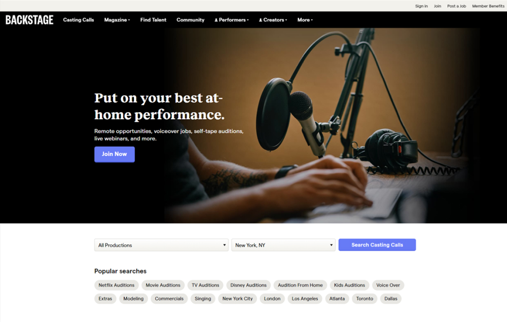
In this experiment, more popular search categories (pills) were shown on the homepage based on analyzed search volume. Impact on searches and email subscriptions were measured.
Test #637 on
Online.metro-cc.ru
by  Andrey Andreev
Feb 26, 2026
Mobile
Listing
Andrey Tested Pattern #137: Visible Filters On Online.metro-cc.ru

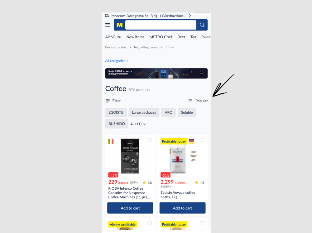
In this experiment, the sorting link (defaulting to popular) was swapped with the filter one. In the control, the sorting appeared on the left with the filter on the right, whereas in the variation these two were flipped. Impact on adds to cart and sales were measured.
Test #636 on
Backstage.com
by  Stanley Zuo
Feb 24, 2026
Desktop
Mobile
Pricing
Stanley Tested Pattern #114: Less Or More Visible Prices On Backstage.com
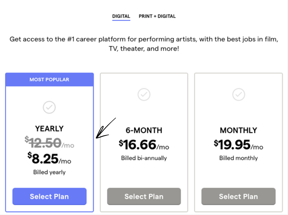
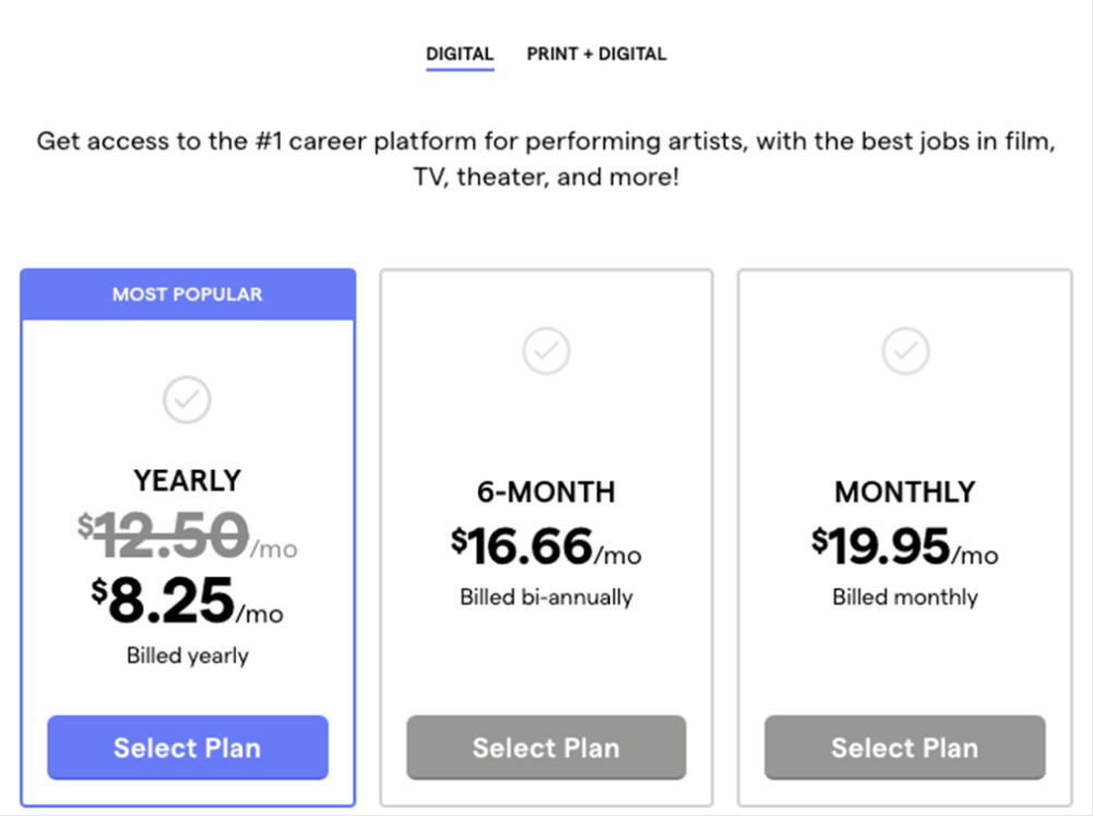
In this experiment, a larger vs smaller font size for the yearly price was tested. Impact on annual subscription clicks was measured. (The experiment has been inverted to fit the pattern.)
Test #633 on
Reverb.com
by  Nicholas Evans
Jan 31, 2026
Desktop
Mobile
Product
Nicholas Tested Pattern #103: Money Back Guarantee On Reverb.com
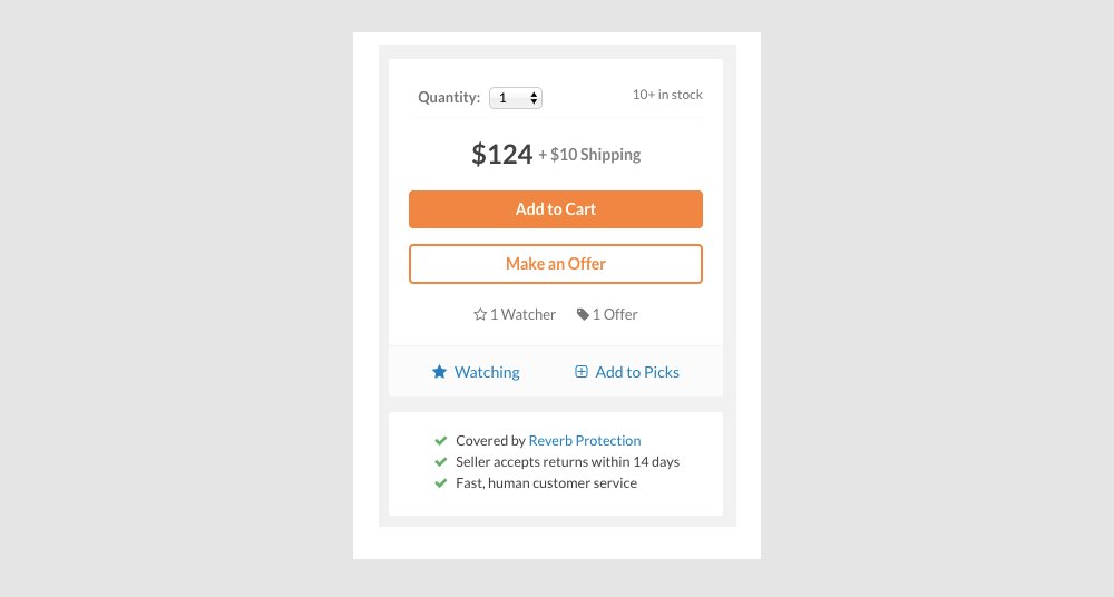
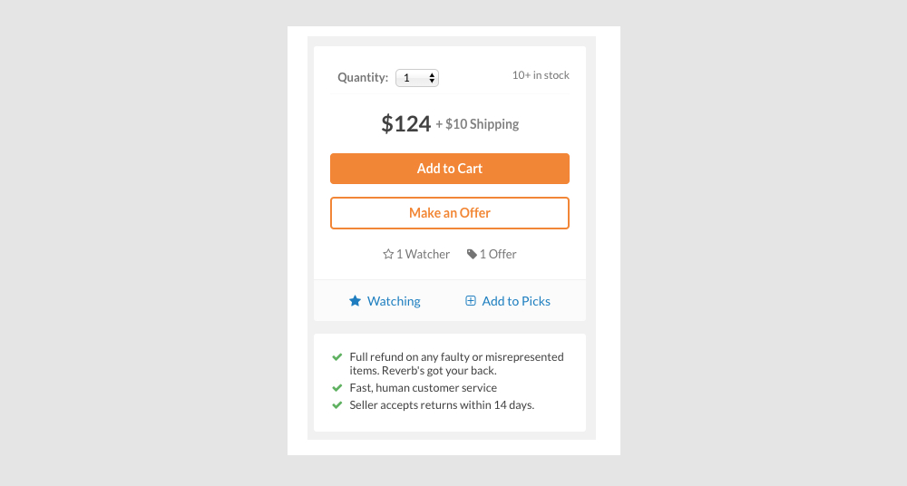
In this experiment, different reassurance messages were shown at the bottom of the add-to-cart widget on a product page. The variation emphasized full refunds for faulty or misrepresented items.
Test #632 on
Online.metro-cc.ru
by  Andrey Andreev
Jan 30, 2026
Desktop
Mobile
Checkout
Andrey Tested Pattern #65: Add More For Extra Incentive On Online.metro-cc.ru
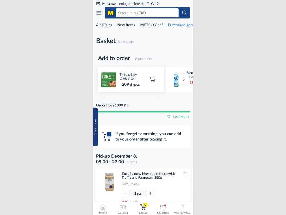
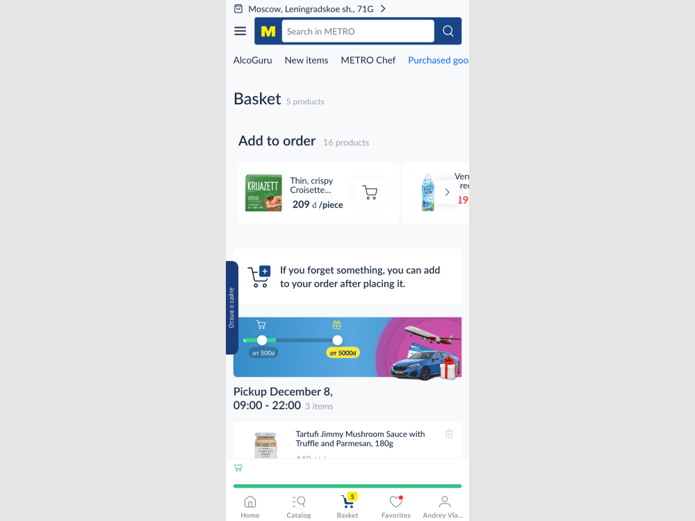
In this experiment, two changes were made to the checkout page: (1) the minimum basket size requirement was made more visible using a floating element, and (2) an additional threshold was introduced to encourage customers to add more items by offering a free gift at a higher spend level. The impact on sales was measured.
Test #629 on
by  Jakub Linowski
Jan 26, 2026
Desktop
Checkout
Jakub Tested Pattern #98: Auto Suggest
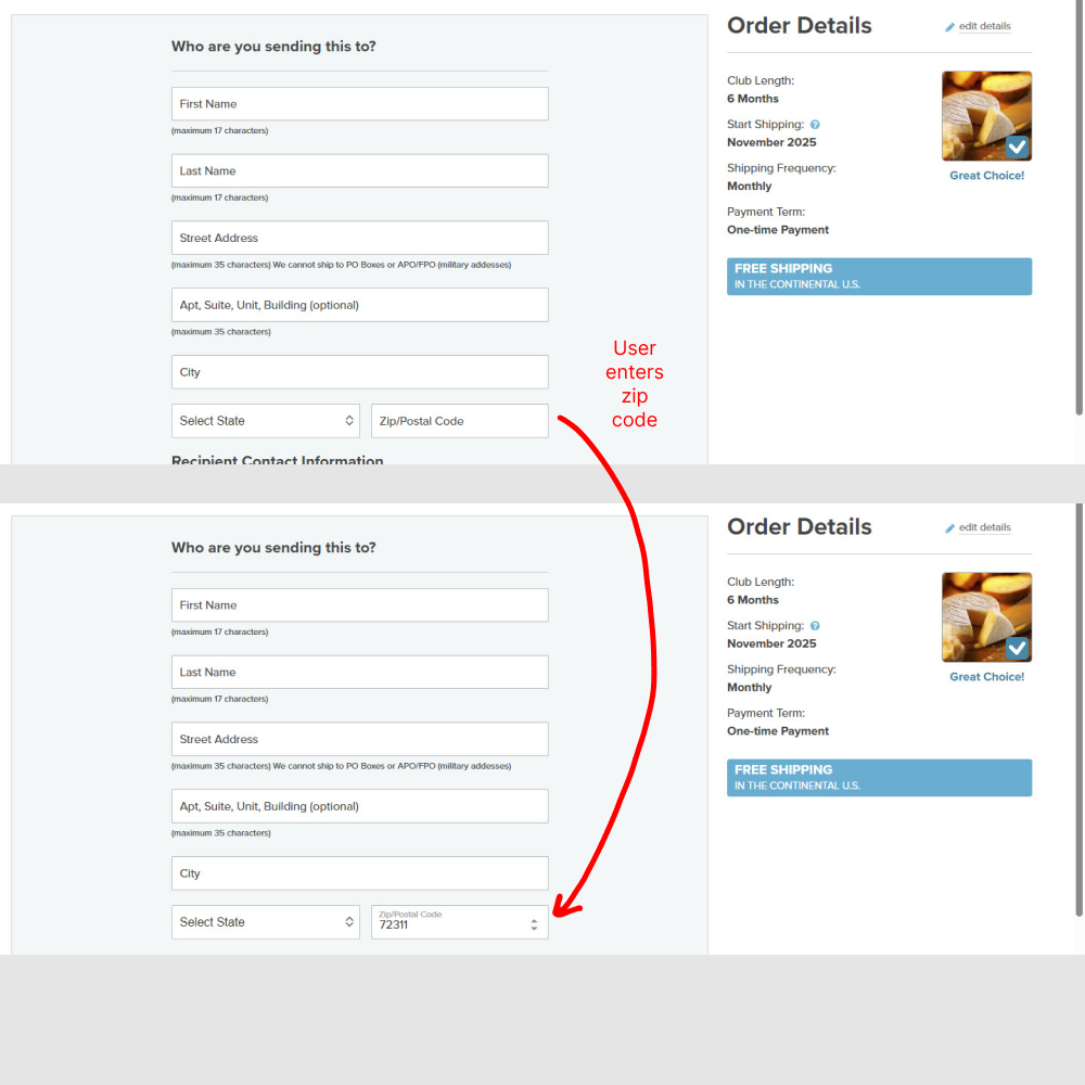
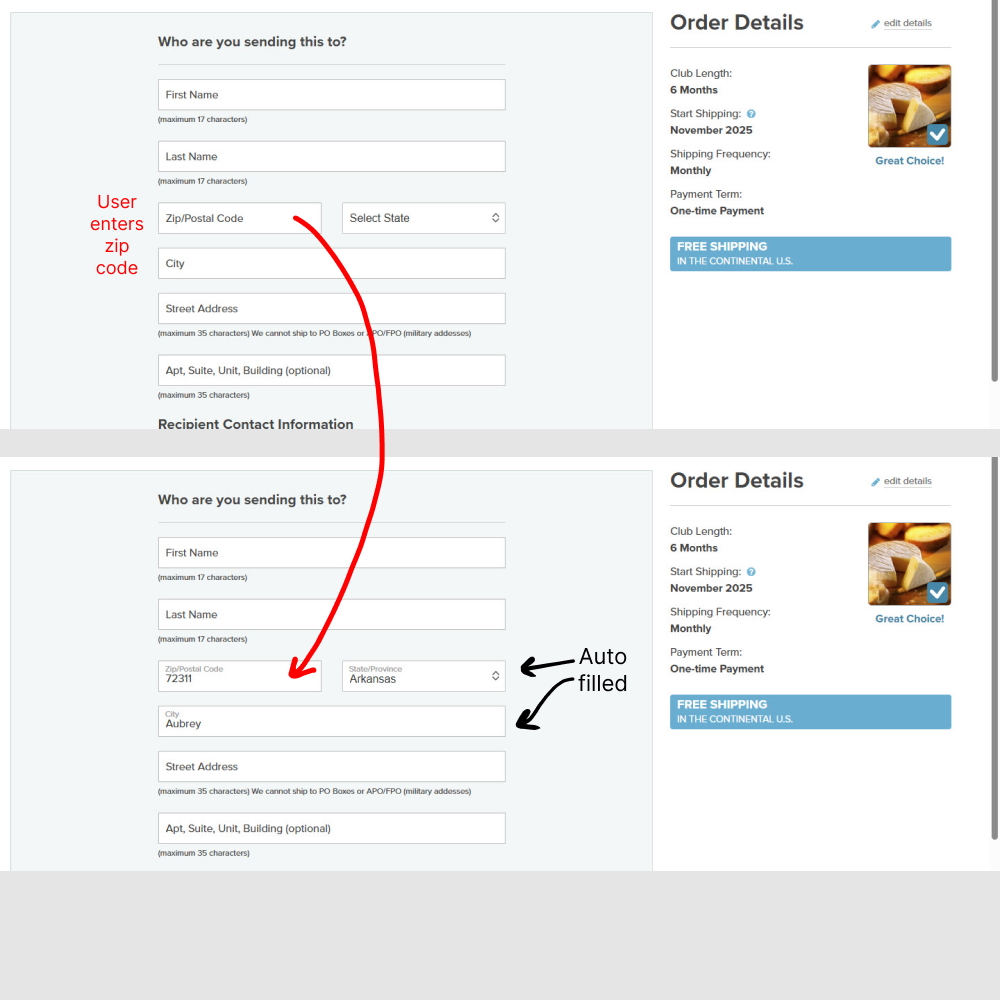
In this experiment (1) the zip code field position was moved up, right below the last name. And (2) entering the zip code would populate the state and city using an autofill API call. Impact on orders completed was measured.
Test #628 on
by  Jakub Linowski
Dec 30, 2025
Mobile
Checkout
Jakub Tested Pattern #98: Auto Suggest
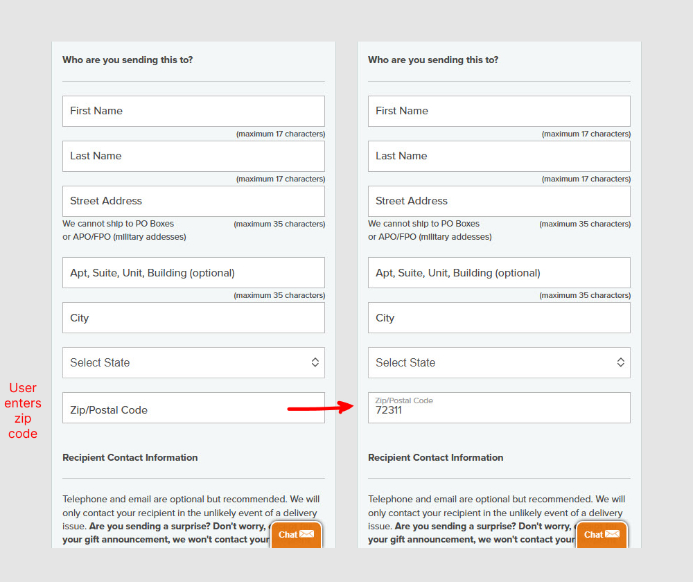

In this experiment (1) the zip code field position was moved up, right below the last name. And (2) entering the zip code would populate the state and city using an autofill API call. Impact on orders completed was measured.
Test #626 on
Jared.com
by  Craig Kistler
Dec 26, 2025
Desktop
Mobile
Listing
Craig Tested Pattern #118: Category Images On Jared.com
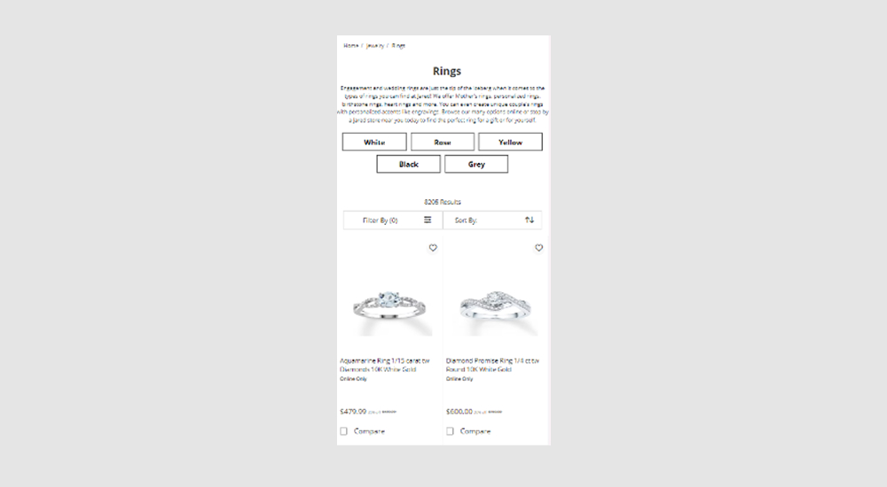
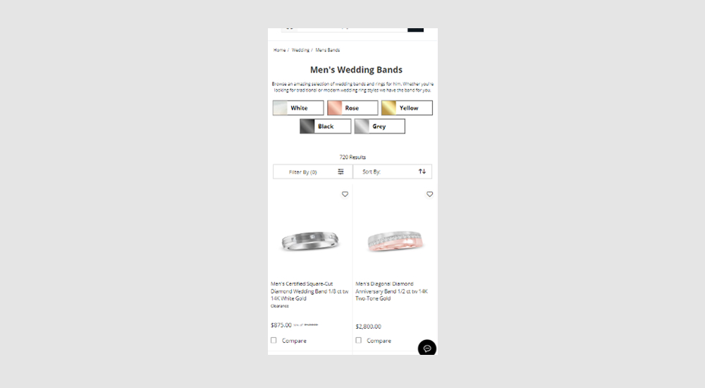
In this experiment, two types of UI filters for metal color choices were shown at the top of product listing pages. One variant only used category labels, while the other variant combined images with labels to reinforce the categories. Impact on filter usage, adds to cart and sales were measured.
Test #625 on
Online.metro-cc.ru
by  Andrey Andreev
Dec 23, 2025
Desktop
Mobile
Listing
Andrey Tested Pattern #90: Out Of Stock Or In Stock Products On Online.metro-cc.ru
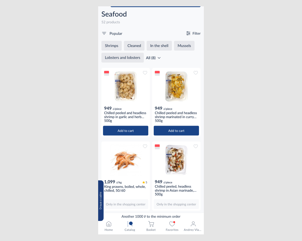
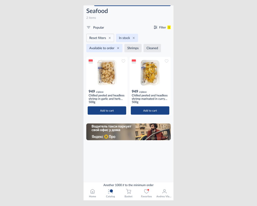
In this experiment, search results and listing pages received two additional filters to remove out-of-stock and in-store-only items. This reduced the number of results shown by default. The impact on add-to-cart actions, checkout flows, and completed sales was measured.
Test #624 on
by  Frazer Mawson
Dec 22, 2025
Mobile
Checkout
Frazer Tested Pattern #41: Sticky Call To Action
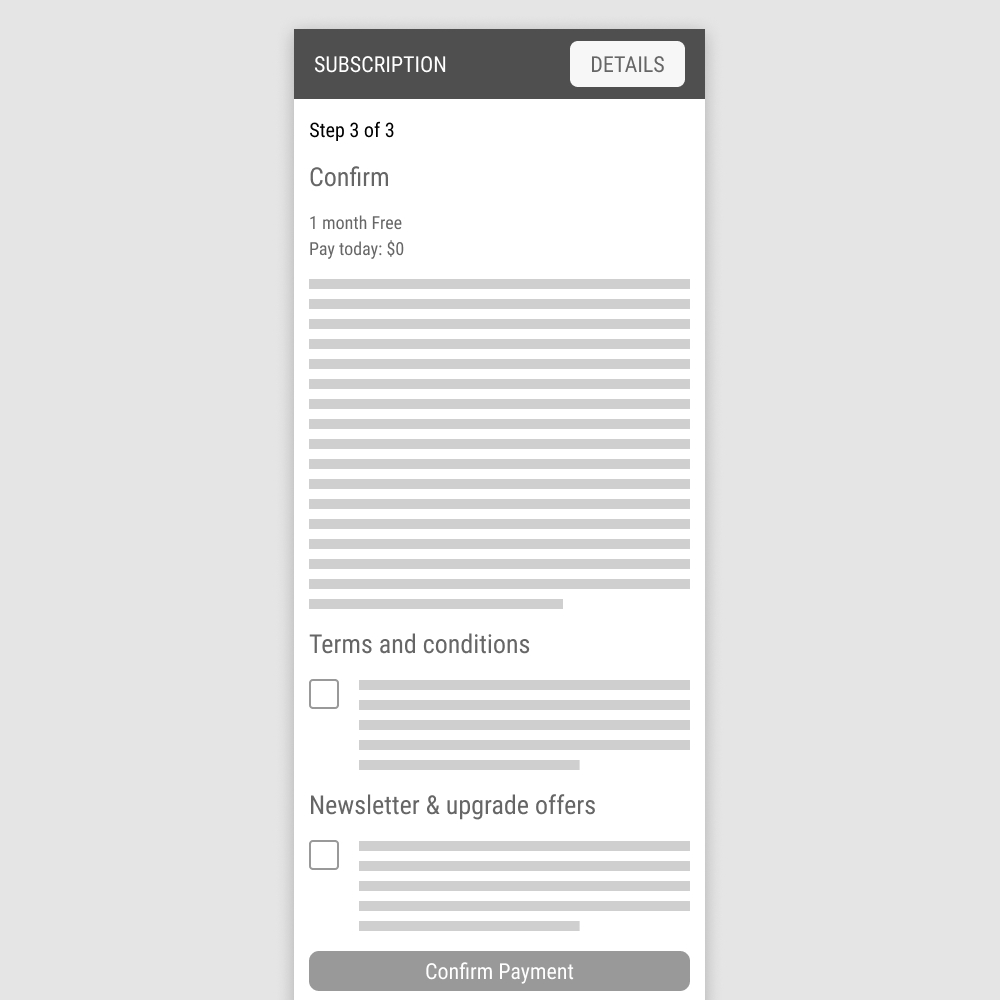
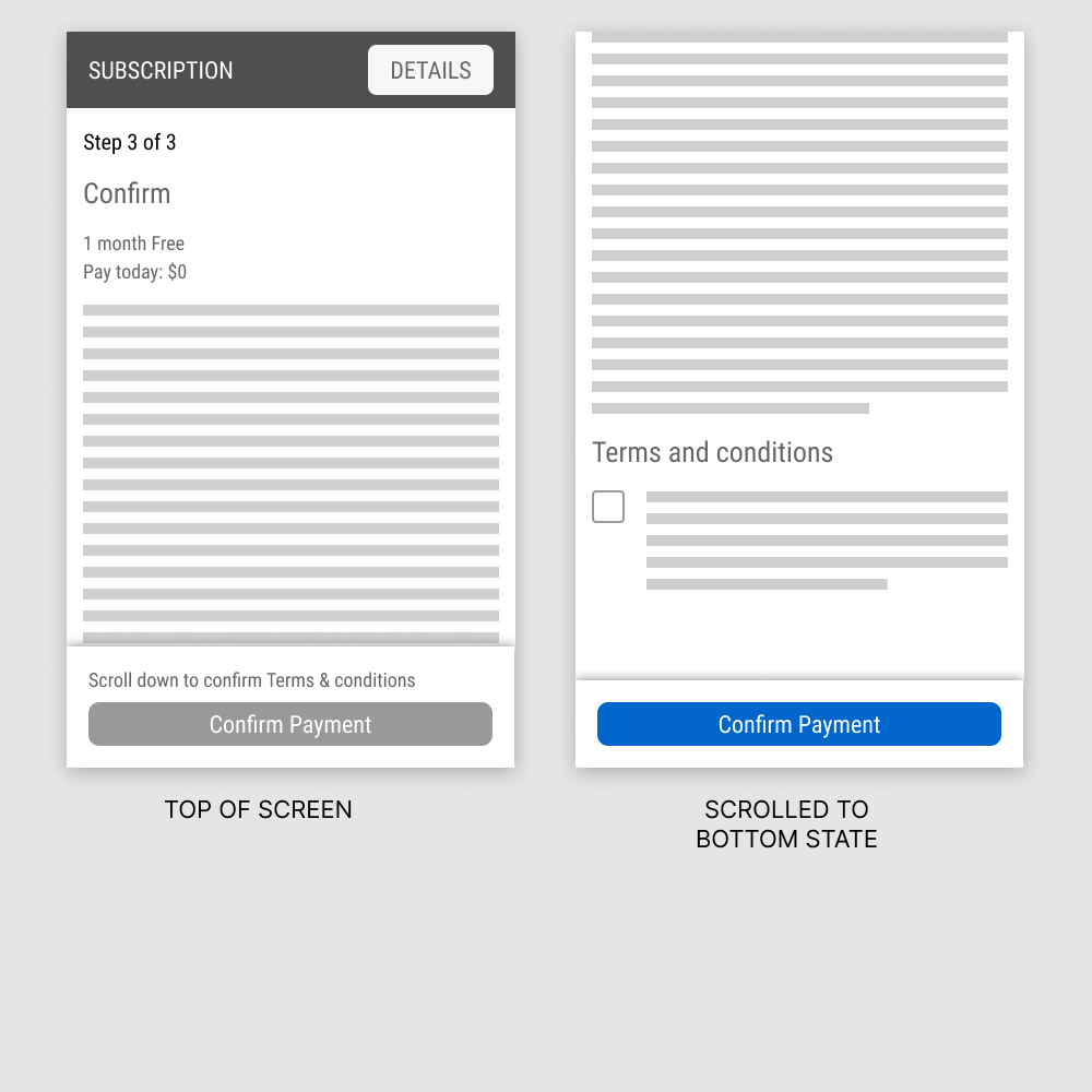
In this experiment, a floating "Confirm Payment" button was added on the last step of a checkout flow. The button appeared with two different states: in a disabled state, leading to the terms and conditions; and in an active state, after checking off the terms. Impact on purchases was measured.
Test #623 on
by  Jakub Linowski
Nov 29, 2025
Desktop
Mobile
Product
Jakub Tested Pattern #139: Page Level Navigation
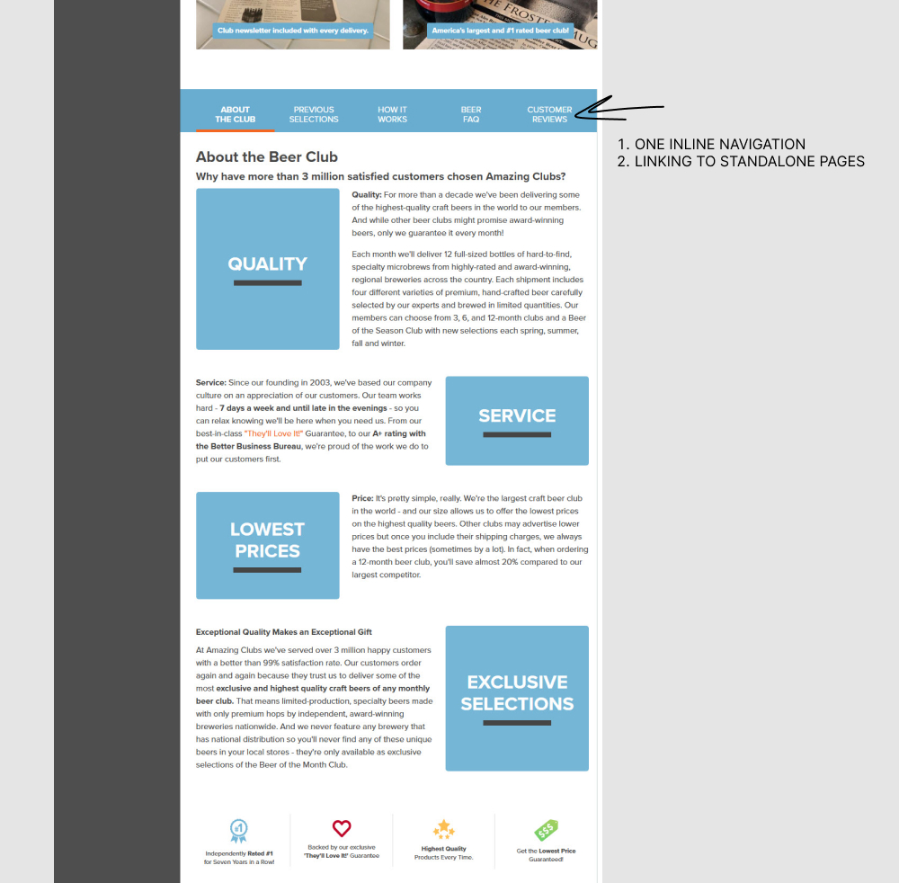
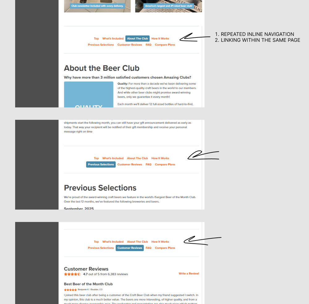
In this experiment, a single inline page navigation (going to external sub pages) was replaced with multiple and repeated inline page navigations (that linked within the same page). Impact on adds to cart an sales was measured.
Test #622 on
by  Frazer Mawson
Nov 27, 2025
Mobile
Checkout
Frazer Tested Pattern #99: Progress Bar
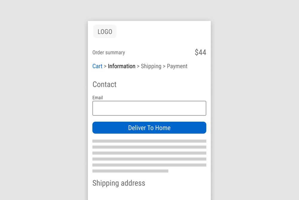
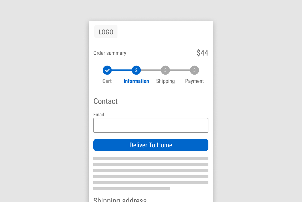
In this experiment, a breadcrumb was replaced with a circular progress bar (arguably more visible overall steps; but less visible/clickable accomplished steps). Impact on transactions was measured.
Test #621 on
Kay.com
by  Craig Kistler
Nov 26, 2025
Desktop
Mobile
Product
Craig Tested Pattern #36: Fewer Or More Results On Kay.com
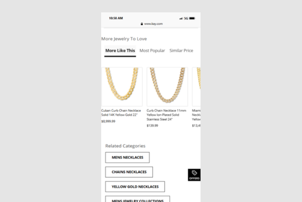
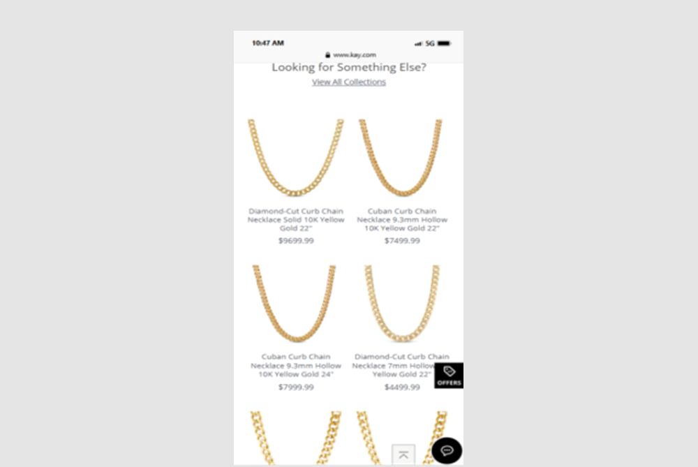
In this experiment, a horizontally scrolling set of products was replaced with an expanded and more visible grid of suggested products - enabling more discovery.
Test #618 on
Livefresh.de
by  Pascal Dietz
Oct 31, 2025
Desktop
Mobile
Home & Landing
Pascal Tested Pattern #11: Gradual Reassurance On Livefresh.de
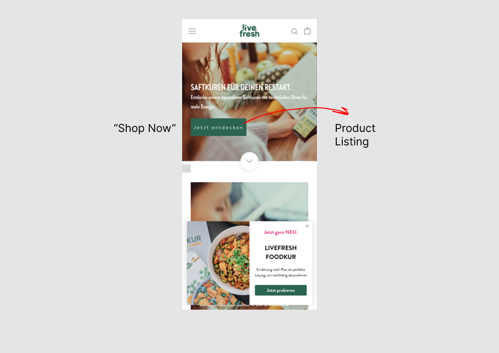
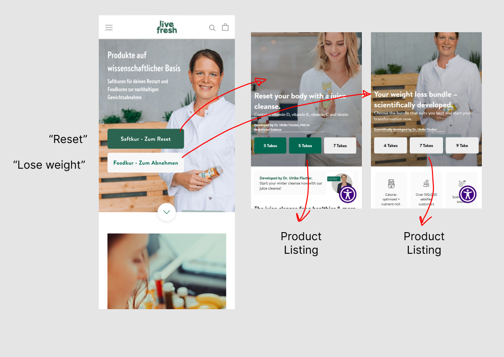
In this experiment, the homepage interaction, headline, and images were changed. In the control, users saw a single “Shop Now” button leading directly to products. In the variation, users first chose between “Reset” or “Lose Weight,” then selected a duration in days before being shown products. The impact on sales was measured.
Test #616 on
Finn.com
by  Maksim Meged
Oct 29, 2025
Mobile
Product
Maksim Tested Pattern #136: Earliest Availability On Finn.com
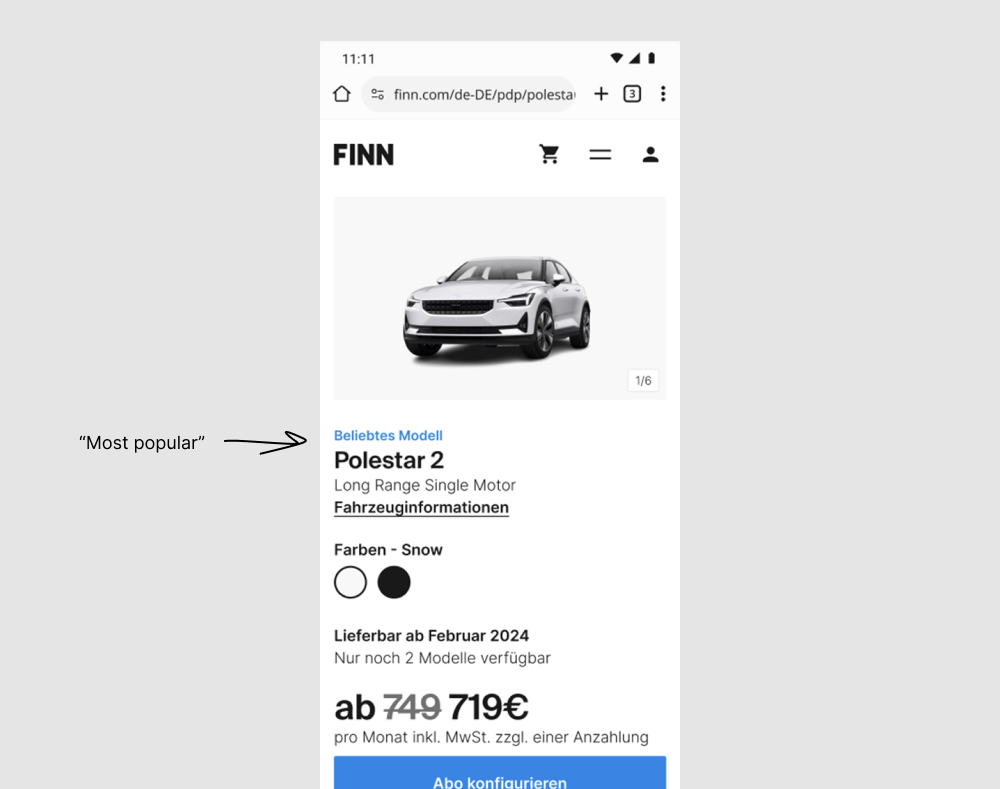
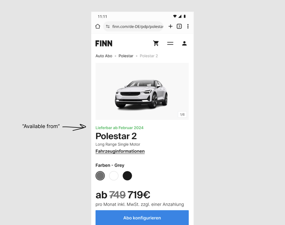
A number of copy tweaks were made in this experiment which was flipped around to match the earliest availability pattern (one of the more visible changes). Under this assumption, one of the more visible copy changes is the switch from using a blue "Most popular" tag towards a green "Available from [DATE]". The "available from" is also visible in the other version, except further down and with lower contrast. Impact on adds to cart and orders was measured.
Test #611 on
Finn.com
by  Maksim Meged
Sep 24, 2025
Desktop
Mobile
Listing
Maksim Tested Pattern #114: Less Or More Visible Prices On Finn.com
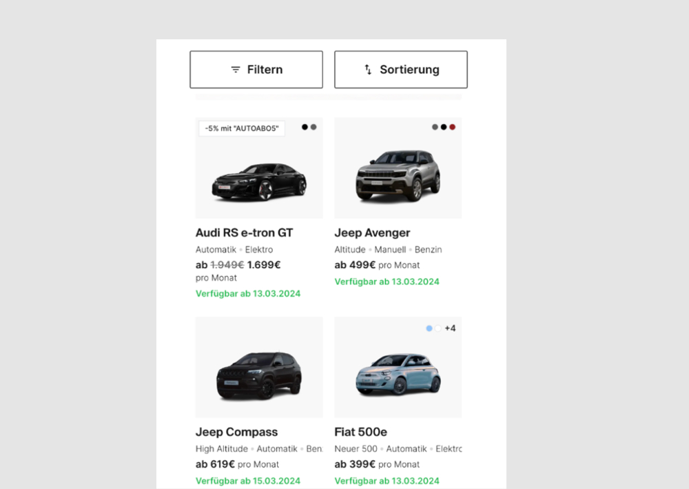
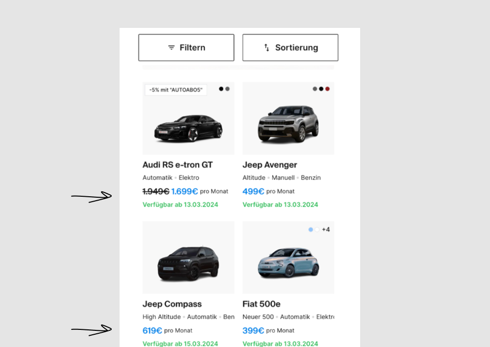
In this experiment, price was made more visible using size and a higher contrast color. Impact on progressions and bookings was measured.
Test #609 on
by  Melina Hess
Aug 31, 2025
Mobile
Product
Melina Tested Pattern #46: Pay Later
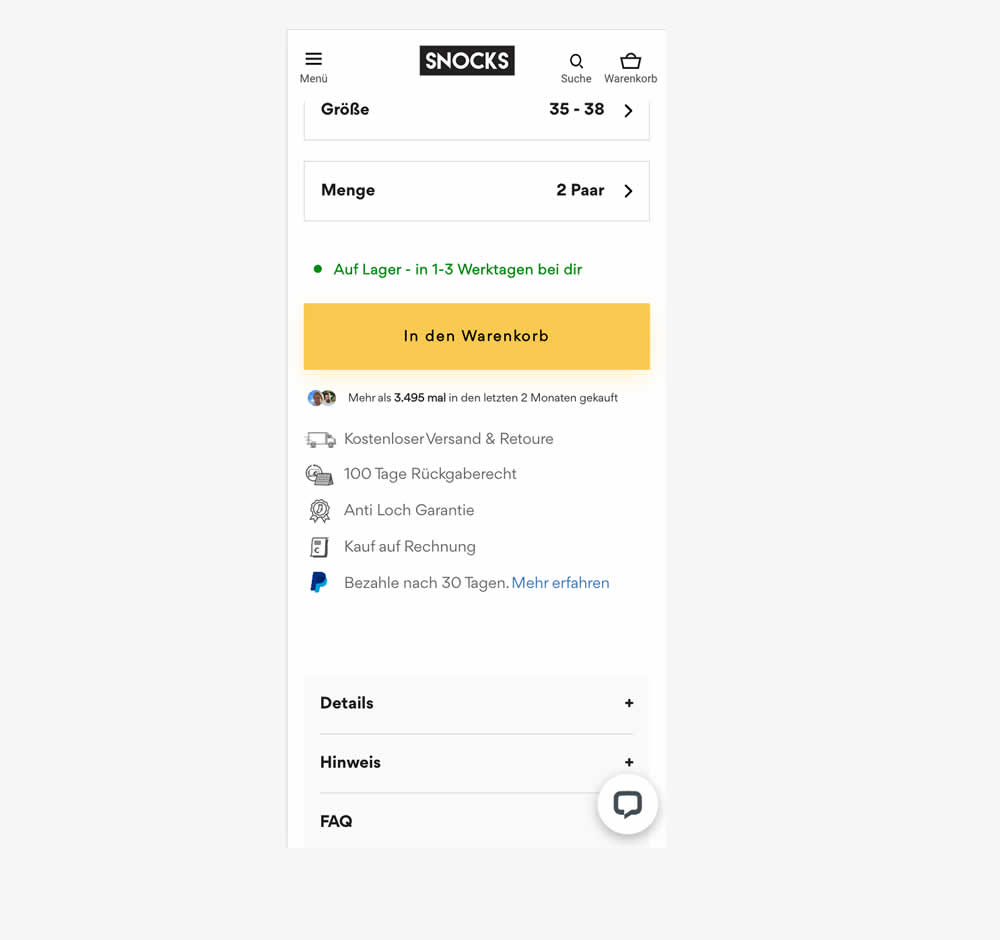
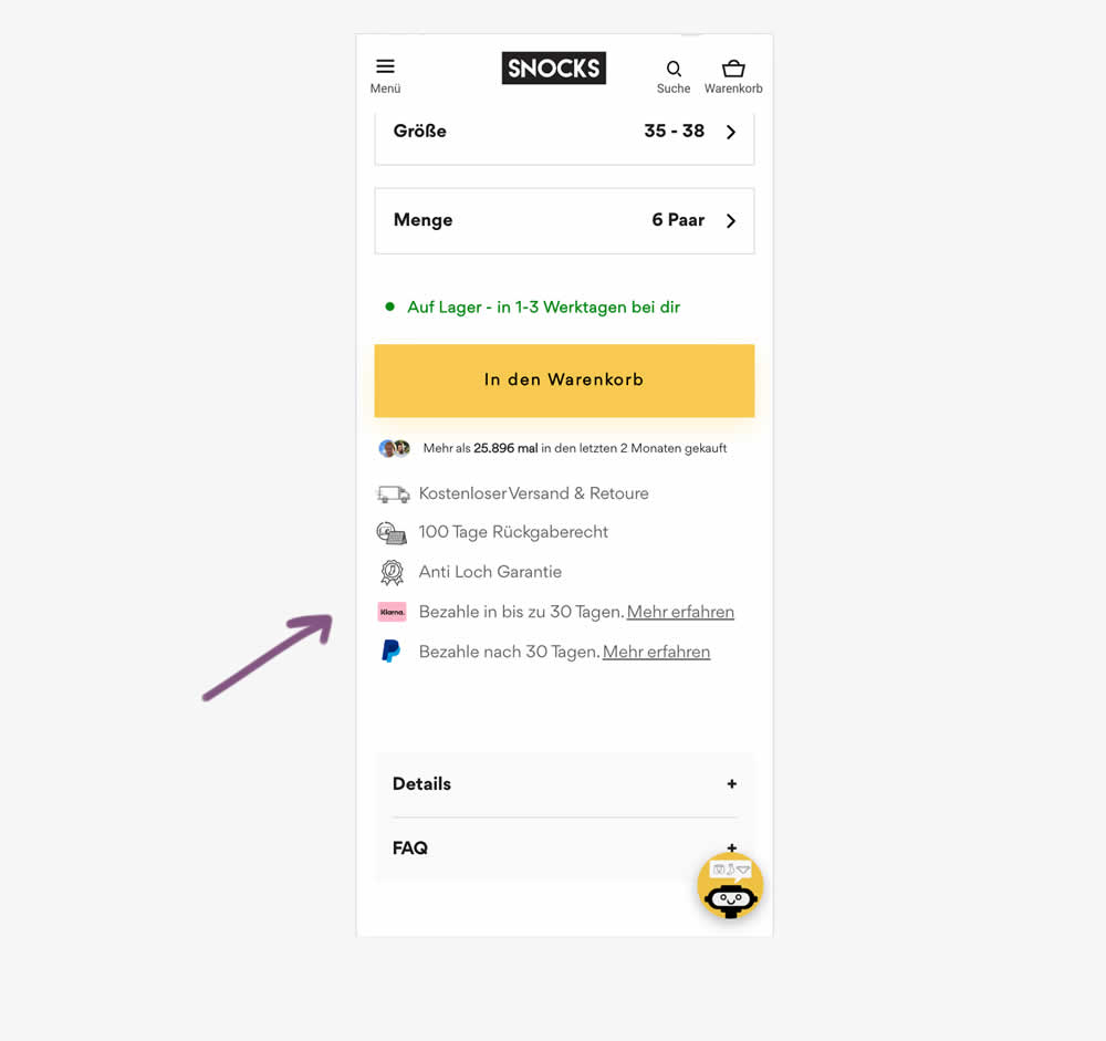
In this experiment, a Klarna buy now pay later badge was added to the PDP. It was added above the paypal buy now pay later badge in the benefit section below the ATC button. Impact on adds to cart and sales was measured.
Test #607 on
Backstage.com
by  Stanley Zuo
Aug 26, 2025
Mobile
Listing
Stanley Tested Pattern #51: Shortcut Buttons On Backstage.com


In this experiment, additional "apply" buttons were shown on listing tiles which lead users one step further in the application process. These buttons were also shown with multiple role details. Impact on progression and job application starts was measured.
Test #602 on
Finn.com
by  Tim Karcher
Jul 29, 2025
Desktop
Mobile
Signup
Tim Tested Pattern #134: Optional or Confident Recommendation On Finn.com
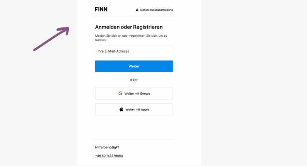
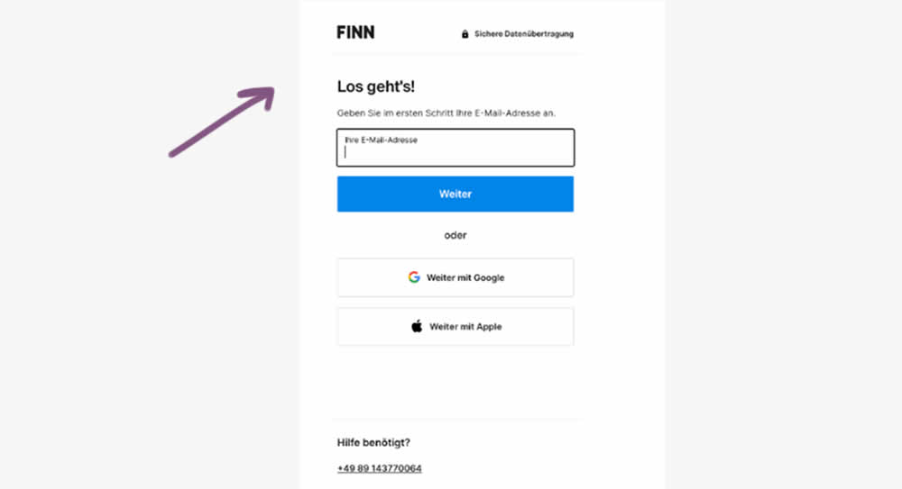
In this experiment, the control contained a headline with a somewhat ambiguous choice, asking users to "Login or Register". Whereas the variation communicated a simpler action headline: "Let's go". Down funnel impact was measured (post-registration) on product page views and adds to cart. (This also was an irregular split ratio; not a 50/50 split)
Test #599 on
Finn.com
by  Tim Karcher
Jun 27, 2025
Mobile
Product
Tim Tested Pattern #10: Postponed Modal Forms On Finn.com
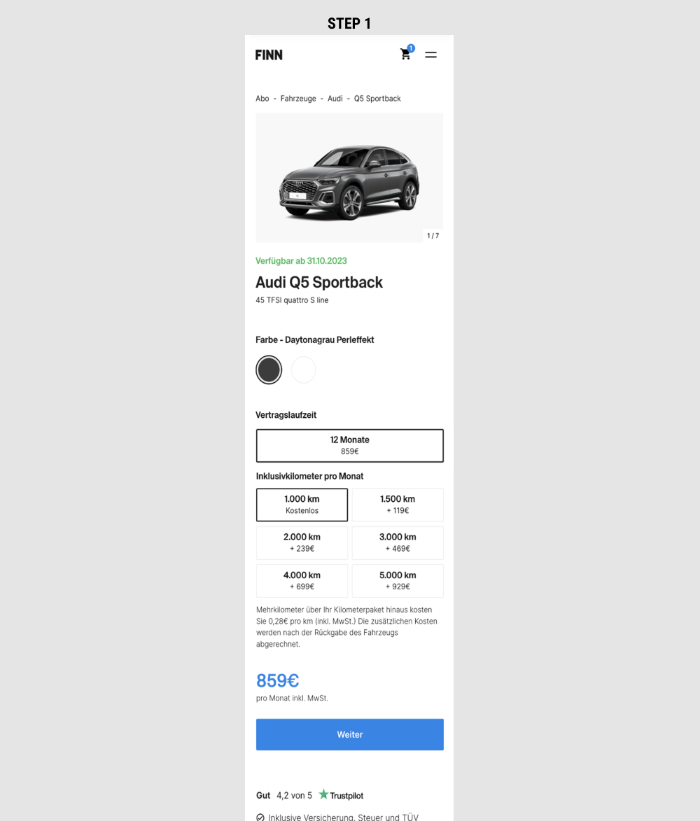
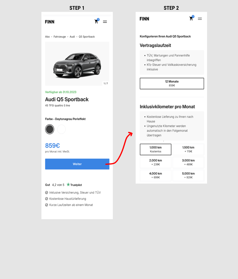
This is a heavily confounded multi-change experiment. In the variation, product choices on product detail pages were taken off and moved to a 2nd step (a new step). This also resulted in the price and primary button becoming more visible from an upward position shift. Impact on adds-to-cart and lead generation was measured.