All Latest 620 A/B Tests
Test #609 on
by  Melina Hess
Aug 31, 2025
Mobile
Product
X.X%
Sales
Melina Tested Pattern #46: Pay Later
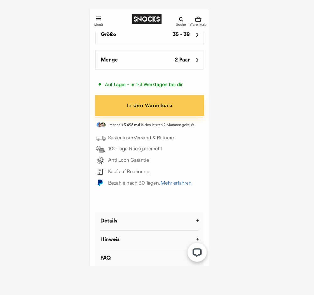
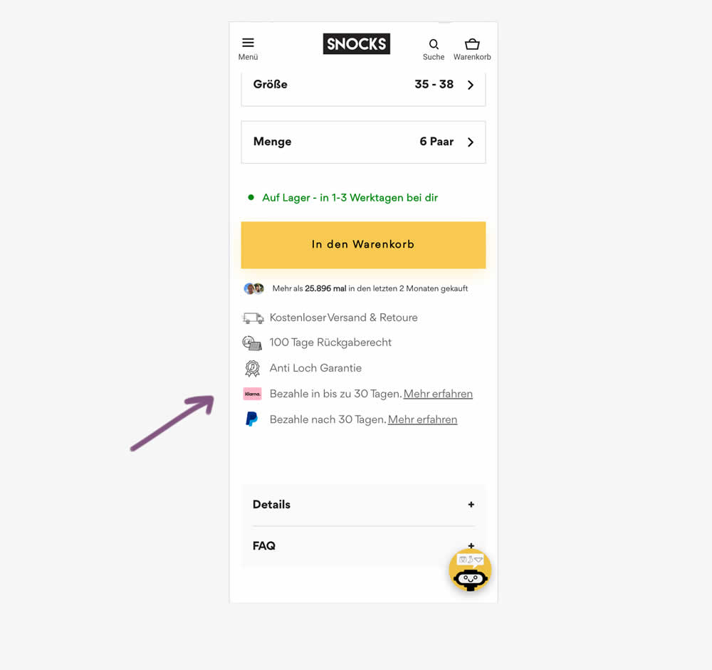
In this experiment, a Klarna buy now pay later badge was added to the PDP. It was added above the paypal buy now pay later badge in the benefit section below the ATC button. Impact on adds to cart and sales was measured.
Which A Or B Actually Wins? Find Out Before You Test.
Members see every test result — the winners, the flat ones, and the losers — along with exact effects and sample sizes. Use it to estimate your tests and prioritize by probability, not gut feel. Start every experiment with the odds on your side.
Test #607 on
Backstage.com
by  Stanley Zuo
Aug 26, 2025
Mobile
Listing
X.X%
Sales
Stanley Tested Pattern #51: Shortcut Buttons On Backstage.com


In this experiment, additional "apply" buttons were shown on listing tiles which lead users one step further in the application process. These buttons were also shown with multiple role details. Impact on progression and job application starts was measured.
Test #602 on
Finn.com
by  Tim Karcher
Jul 29, 2025
Desktop
Mobile
Signup
X.X%
Progression
Tim Tested Pattern #134: Optional or Confident Recommendation On Finn.com
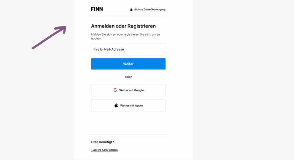
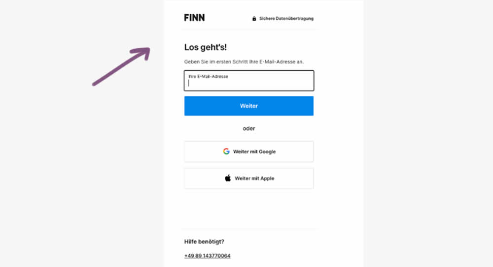
In this experiment, the control contained a headline with a somewhat ambiguous choice, asking users to "Login or Register". Whereas the variation communicated a simpler action headline: "Let's go". Down funnel impact was measured (post-registration) on product page views and adds to cart. (This also was an irregular split ratio; not a 50/50 split)
Test #599 on
Finn.com
by  Tim Karcher
Jun 27, 2025
Mobile
Product
X.X%
Leads
Tim Tested Pattern #10: Postponed Modal Forms On Finn.com
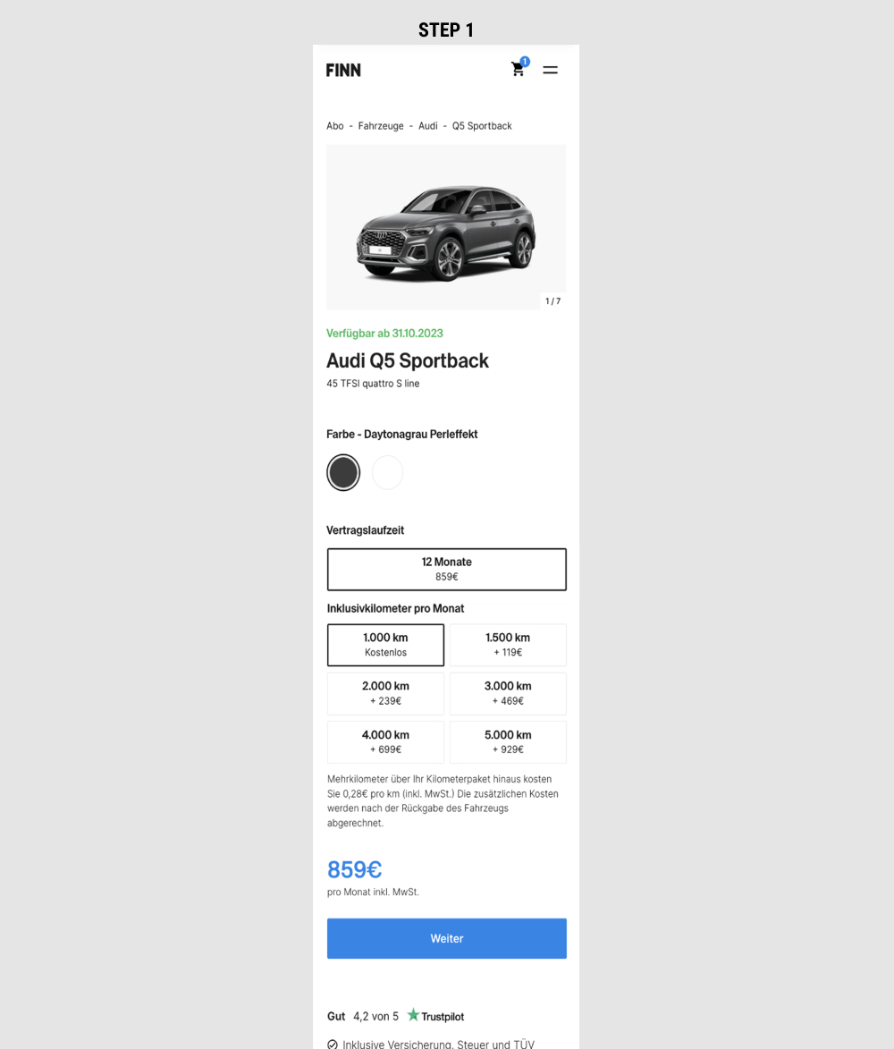
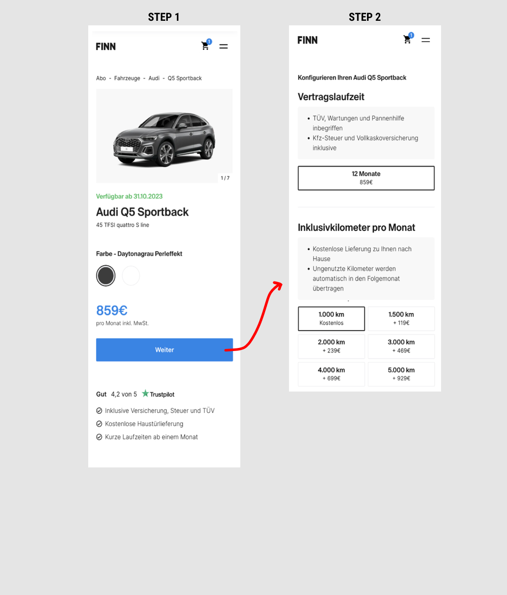
This is a heavily confounded multi-change experiment. In the variation, product choices on product detail pages were taken off and moved to a 2nd step (a new step). This also resulted in the price and primary button becoming more visible from an upward position shift. Impact on adds-to-cart and lead generation was measured.
Test #597 on
by  Frazer Mawson
Jun 26, 2025
Mobile
Product
X.X%
Sales
Frazer Tested Pattern #41: Sticky Call To Action
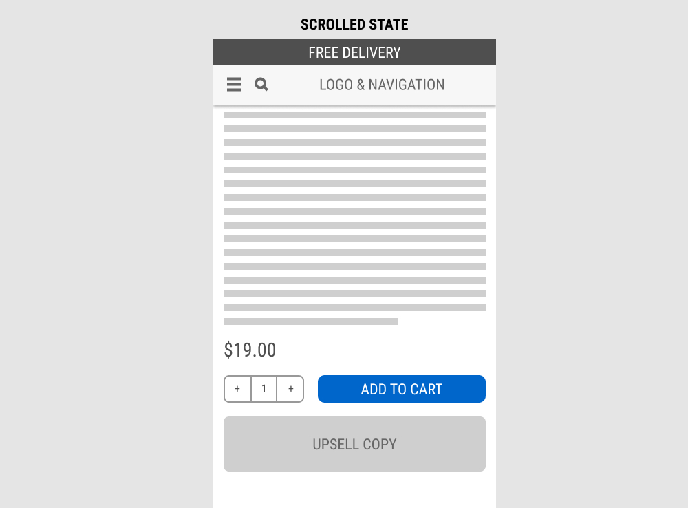
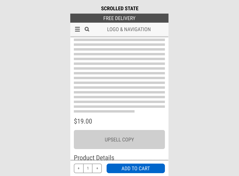
In this experiment, a fixed add-to-cart button along with the quantity selector was transformed into an always floating one. Impact on sales was measured. (Visitors are session based).
Test #595 on
by  Jakub Linowski
Jun 09, 2025
Mobile
Product
X.X%
Sales
Jakub Tested Pattern #114: Less Or More Visible Prices
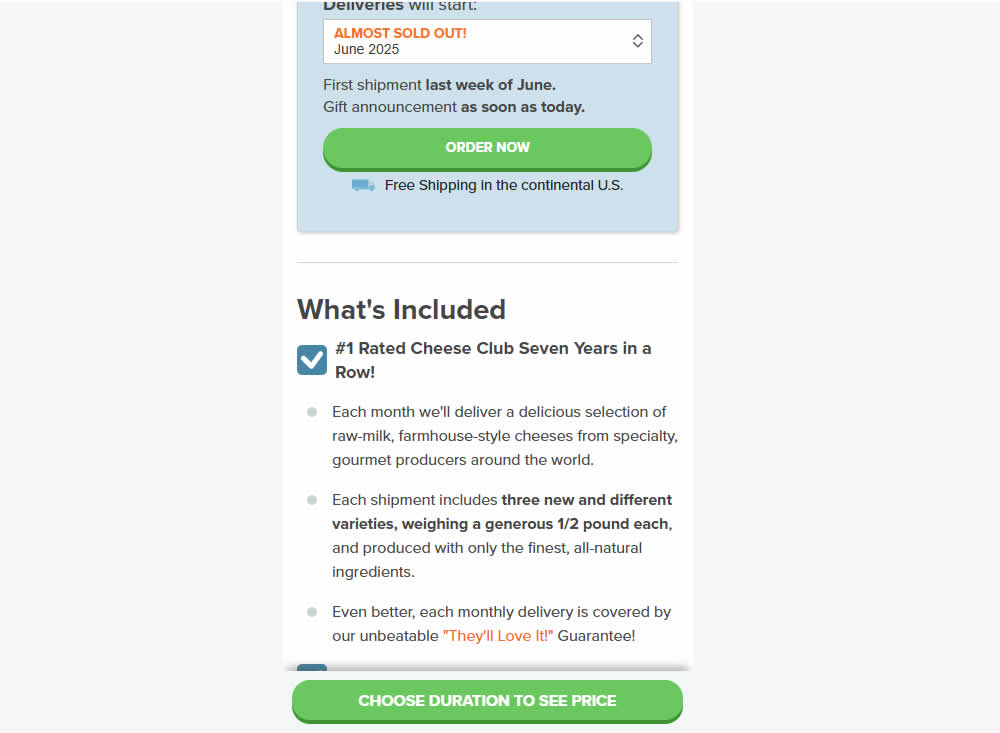
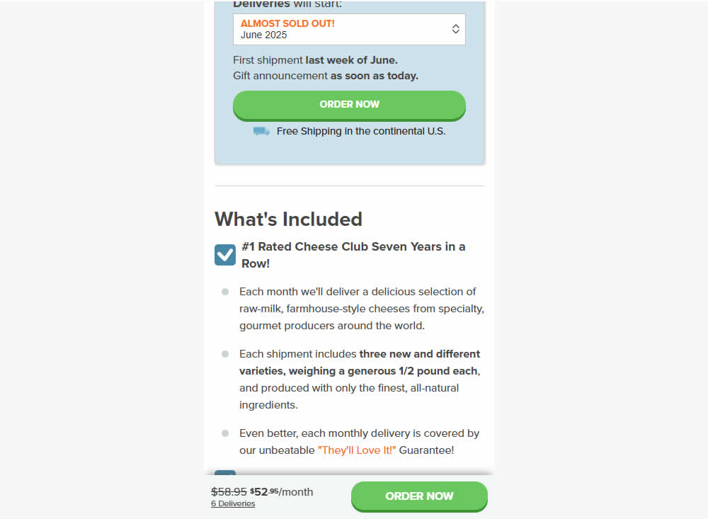
In this mobile product page experiment, the variation changed the look of the floating button area once a product was chosen.
The variation showed a button with 1) pricing totals along with 2) a link back to the edit area and 3) a button that allowed to add to cart directly. Whereas the control only linked back to the top of the page where the product selction was possible. Impact on adds-to-cart and sales was measured.
Test #594 on
Obs.no
by  Joachim Furuseth
May 28, 2025
Mobile
Product
X.X%
Sales
Joachim Tested Pattern #141: Square or Rounded Buttons On Obs.no
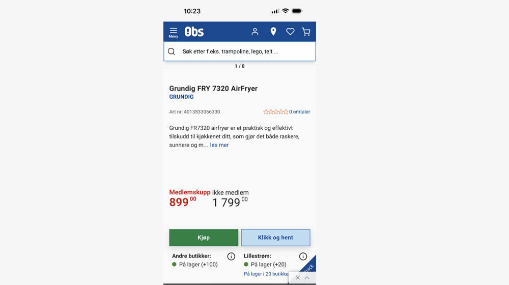
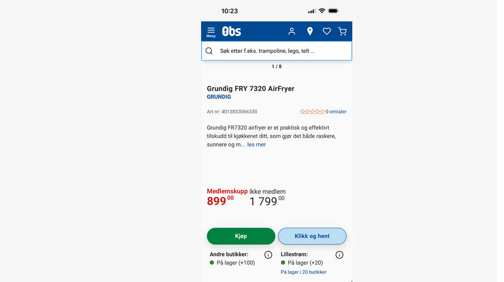
In this experiment, add-to-cart buttons on product details pages were rounded to 20px (variation), whereas the control had square buttons. Impact on adds to cart and purchases were measured.
Test #593 on
Obs.no
by  Joachim Furuseth
May 27, 2025
Desktop
Product
X.X%
Sales
Joachim Tested Pattern #141: Square or Rounded Buttons On Obs.no

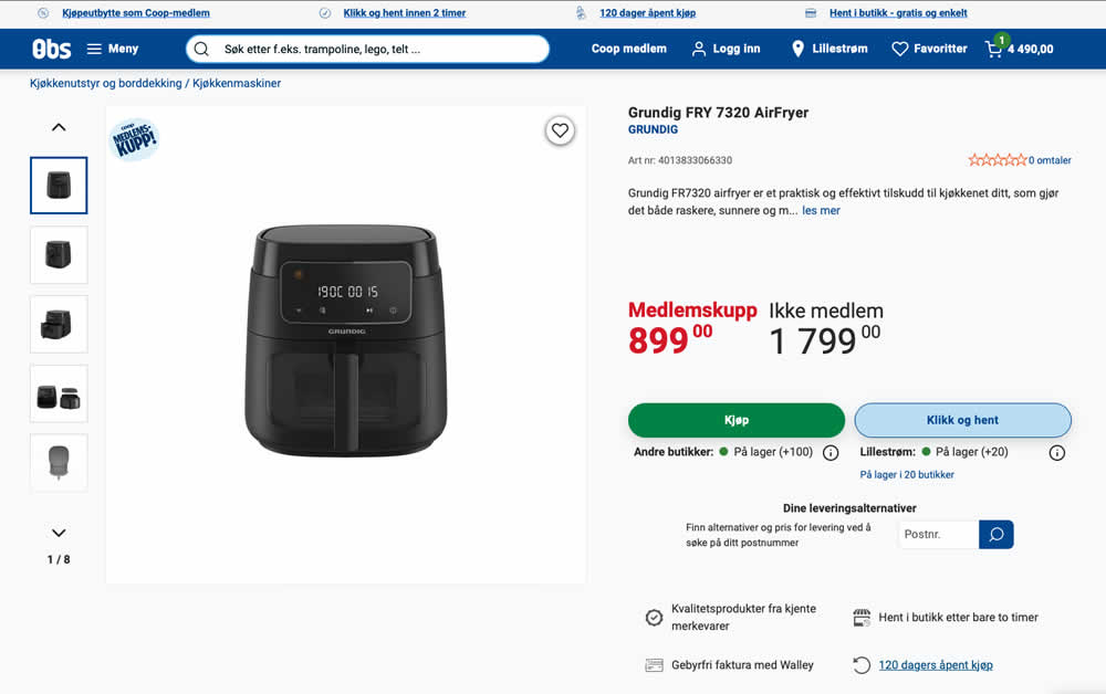
In this experiment, add-to-cart buttons on product details pages were rounded to 20px (variation), whereas the control had square buttons. Impact on adds to cart and purchases were measured.
Test #591 on
Obsbygg.no
by  Joachim Furuseth
May 25, 2025
Desktop
Product
X.X%
Sales
Joachim Tested Pattern #141: Square or Rounded Buttons On Obsbygg.no
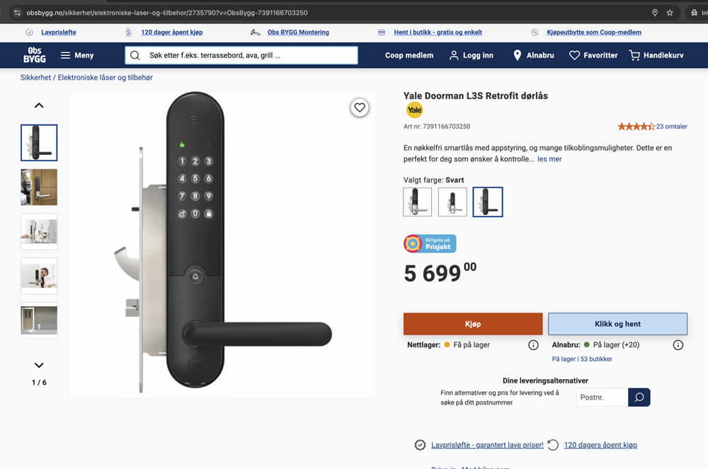
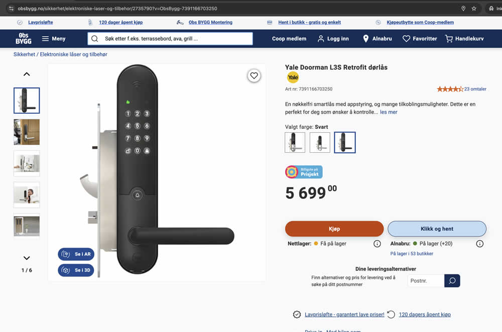
In this experiment, add-to-cart buttons on product details pages were rounded to 20px (variation), whereas the control had square buttons. Impact on adds to cart and purchases were measured.
Test #592 on
Obsbygg.no
by  Joachim Furuseth
May 25, 2025
Mobile
Product
X.X%
Sales
Joachim Tested Pattern #141: Square or Rounded Buttons On Obsbygg.no
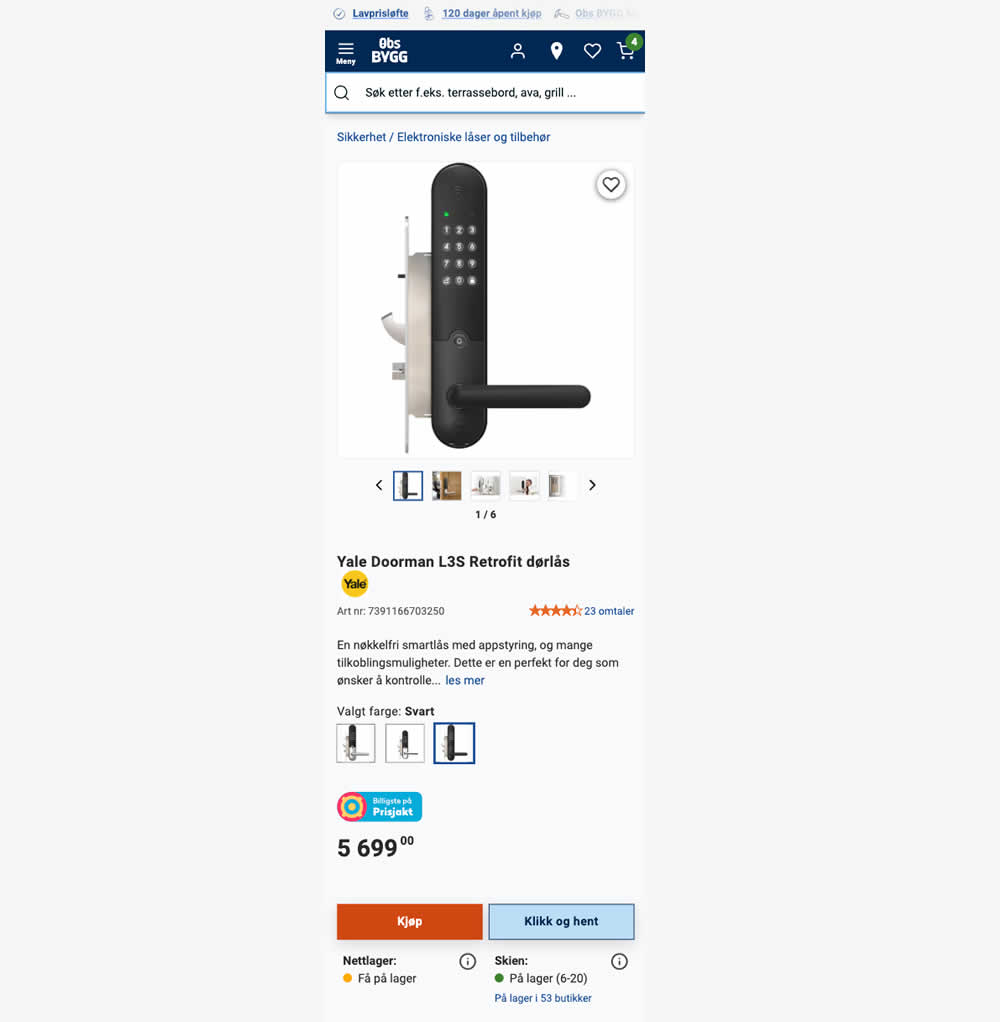
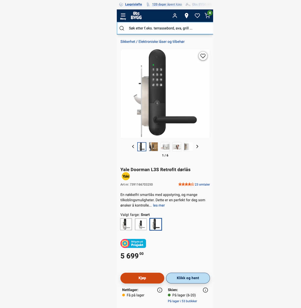
In this experiment, add-to-cart buttons on product details pages were rounded to 20px (variation), whereas the control had square buttons. Impact on adds to cart and purchases were measured.
Test #587 on
https://asics.com App
by  Andrey Prokhorov
Apr 26, 2025
Desktop
Product
X.X%
Sales
Andrey Tested Pattern #140: Product Descriptions
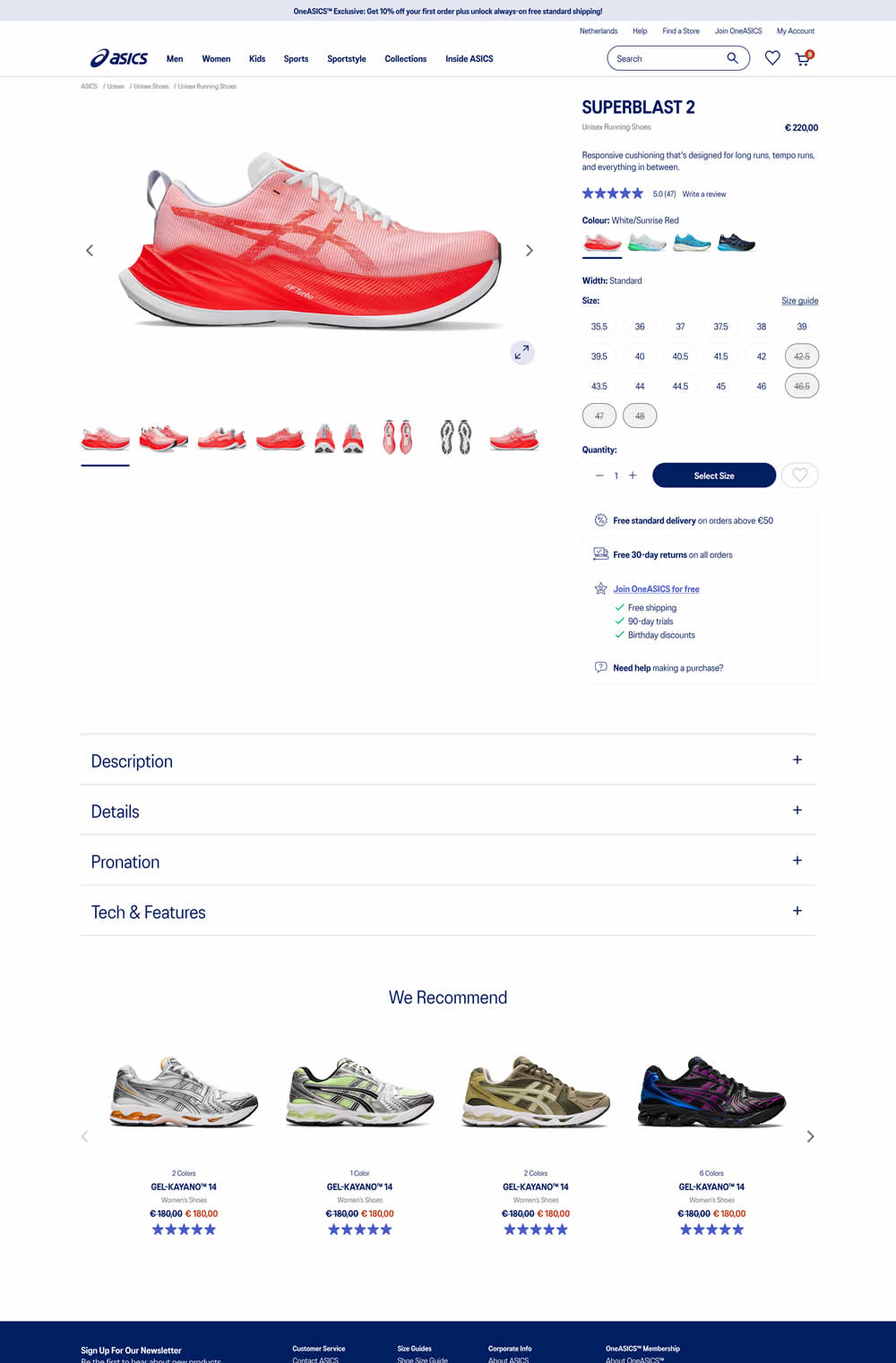
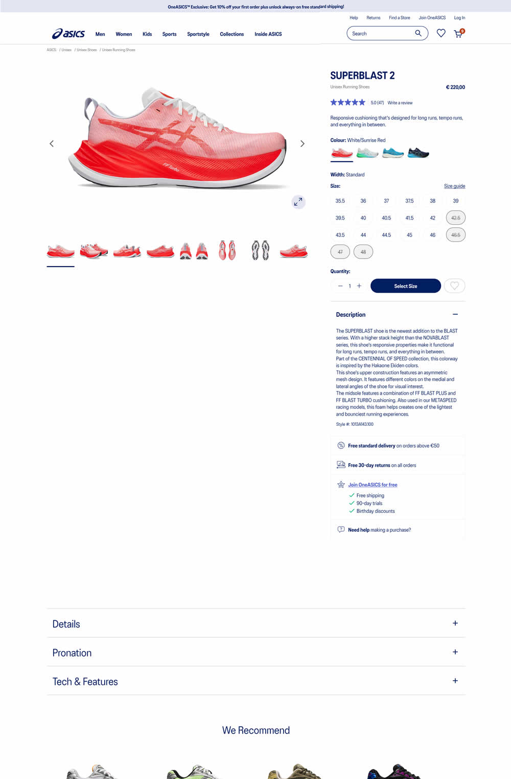
In this experiment, product descriptions were moved up on the page and expanded by default. As a result, related and product recommendation were pushed further down on the page. Impact on ATC and sales was measured.
Test #583 on
Backstage.com
by  Stanley Zuo
Mar 30, 2025
Desktop
Mobile
Listing
X.X%
Sales
Stanley Tested Pattern #24: Visible Availability On Backstage.com
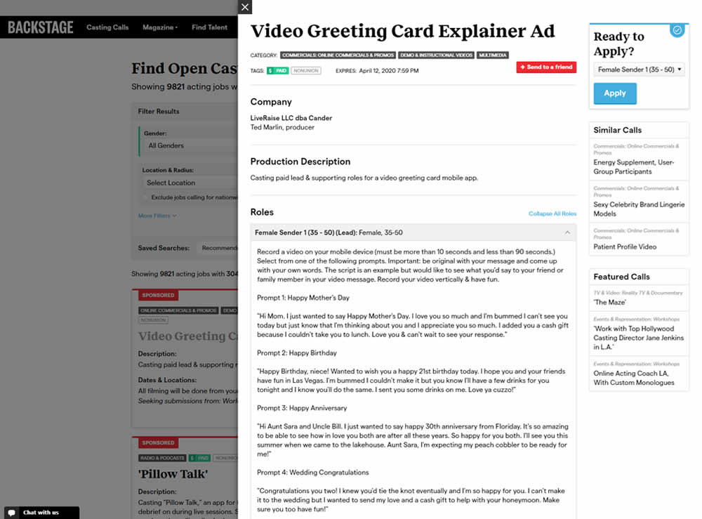
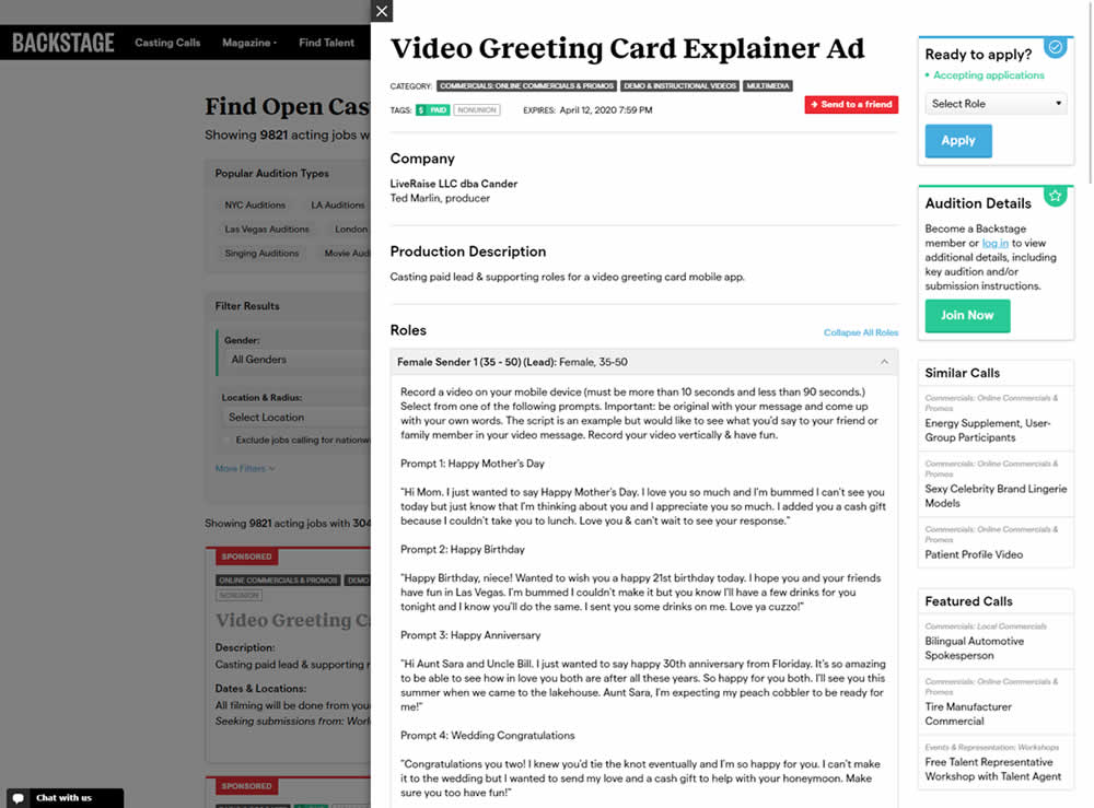
In this experiment, the active availability of a casting call (job offer) was was made more prominent using green text: "Accepting applications". The variation also made the "Join Now" button more prominent as an alternative path to signing up for a membership. The experiment reports on three metrics: clicks on apply, application starts and premium membership sales (measured a few steps further in the funnel).
Test #582 on
Online.metro-cc.ru
by  Andrey Andreev
Mar 22, 2025
Desktop
Mobile
Listing
X.X%
Sales
Andrey Tested Pattern #77: Filled Or Ghost Buttons On Online.metro-cc.ru
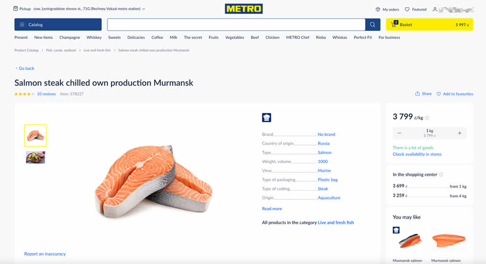
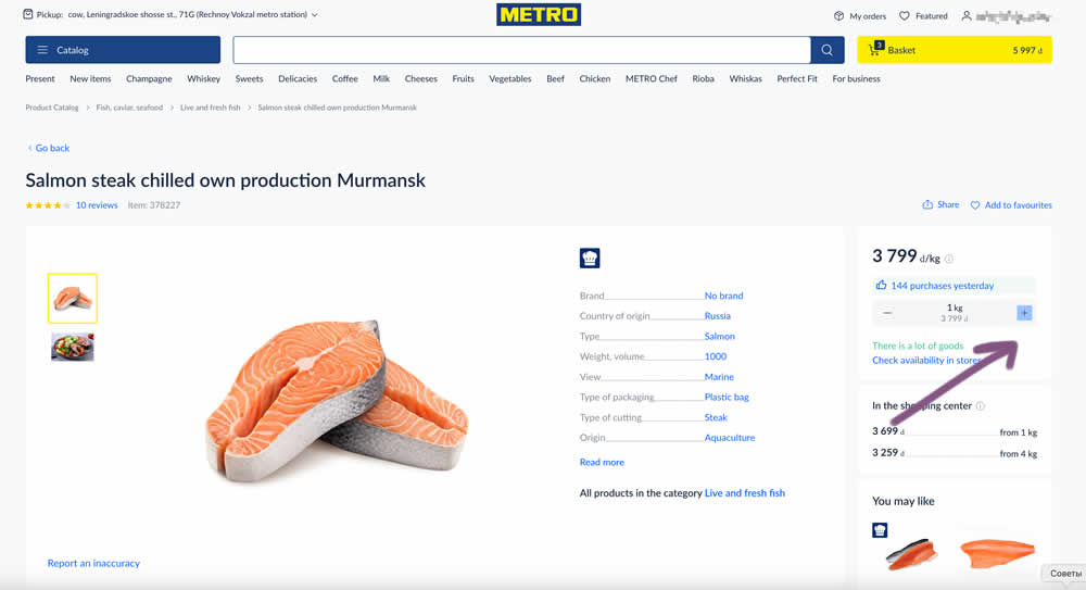
In this experiment, the plus and minus quantity icons near the add to cart button were tested with different contrasts. The control had a higher contrast from a solid background color, and the variant was lower contrast. Impact on add to cart and sales was measured. (A/B test was inverted to B/A in order to fit the pattern).
Test #581 on
Asics.com
by  Andrey Prokhorov
Mar 21, 2025
Desktop
Product
X.X%
Sales
Andrey Tested Pattern #104: Carousel Vs Static Grid Images On Asics.com
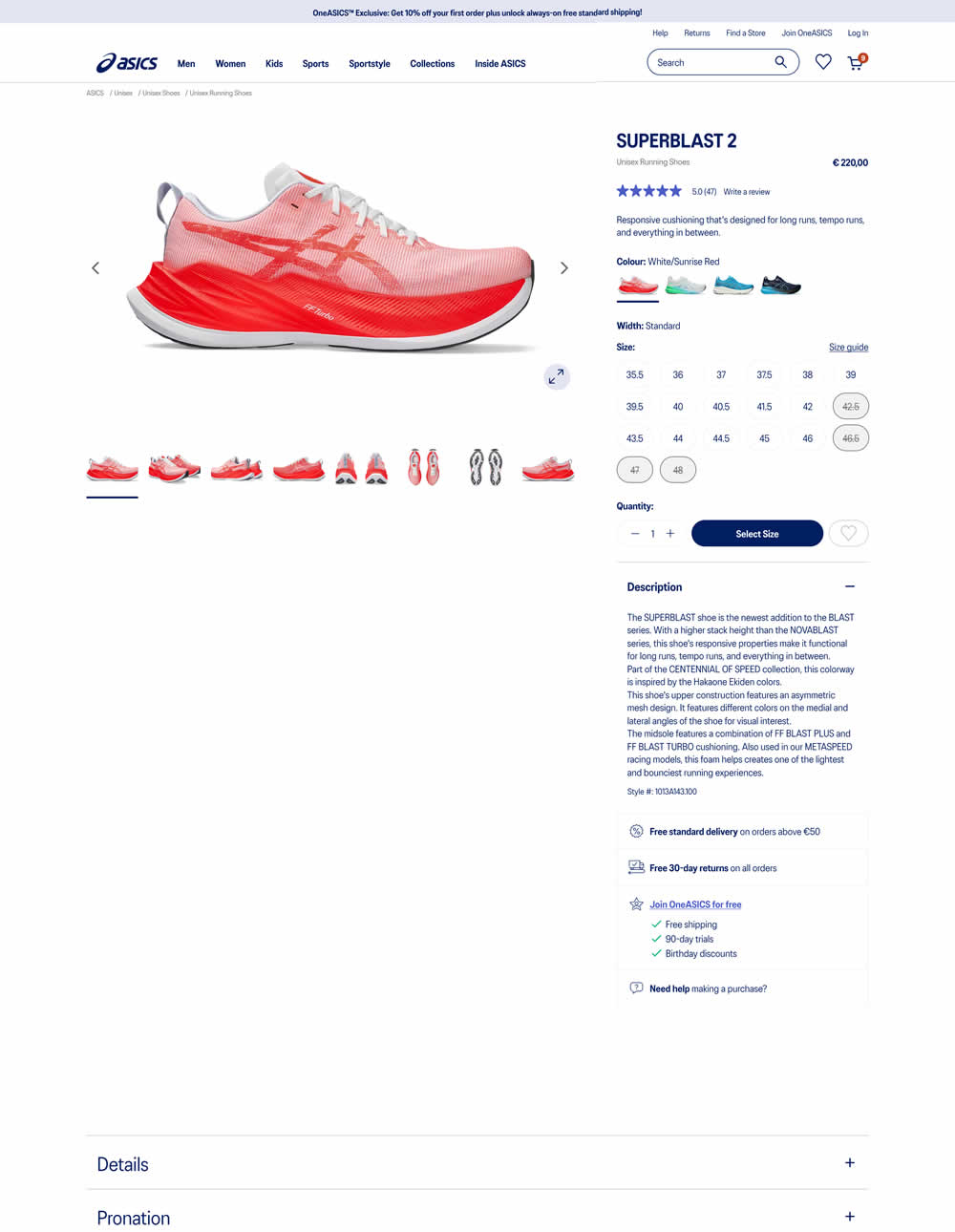
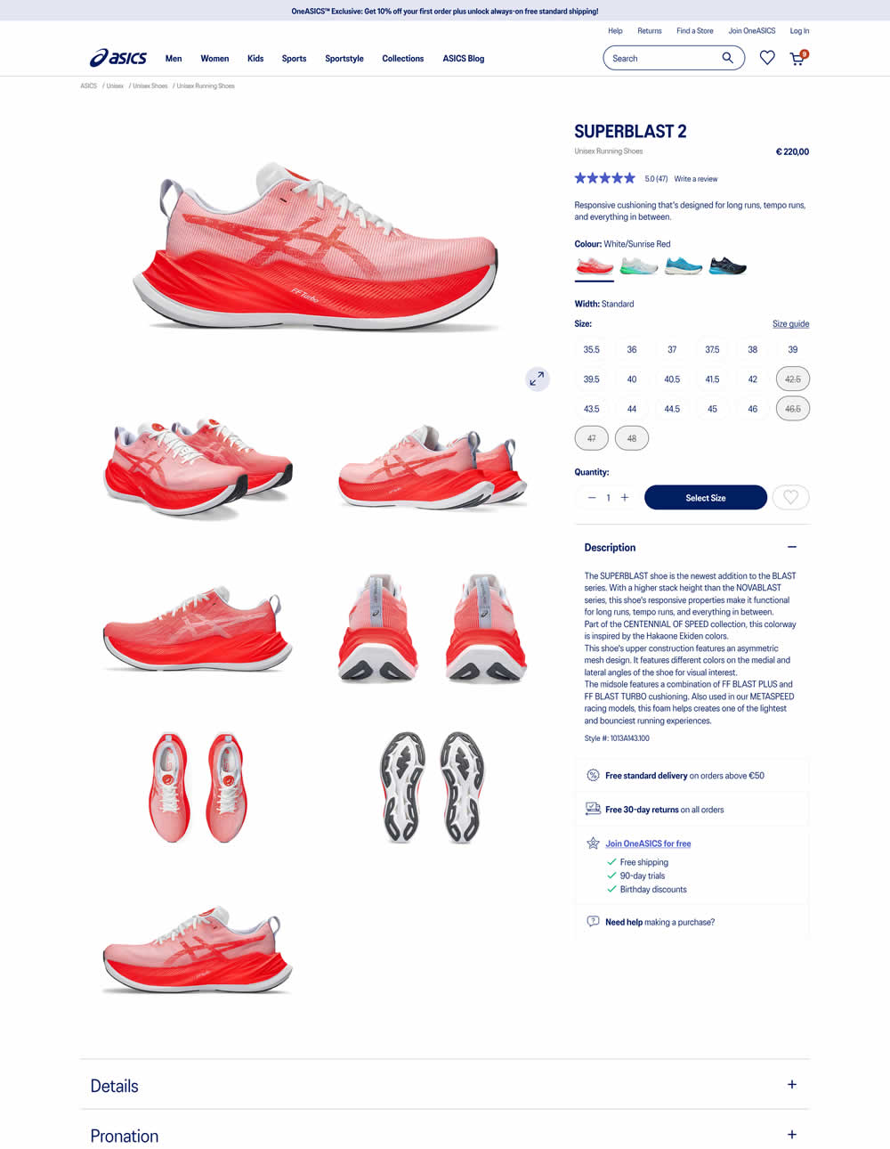
More product photos were exposed in the main column of the variation. Treatment used a collapsed gallery. Impact on ATC and sales was measured.
Test #580 on
Finn.com
by  Tim Karcher
Mar 06, 2025
Mobile
Signup
X.X%
Signups
Tim Tested Pattern #91: Forced Action On Finn.com
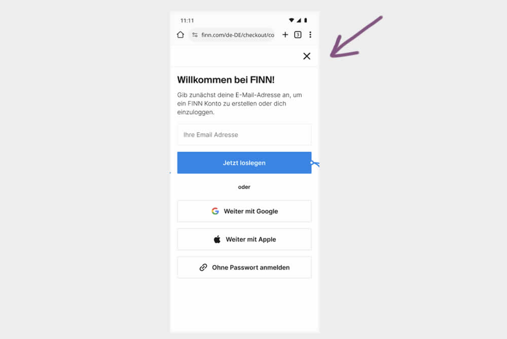
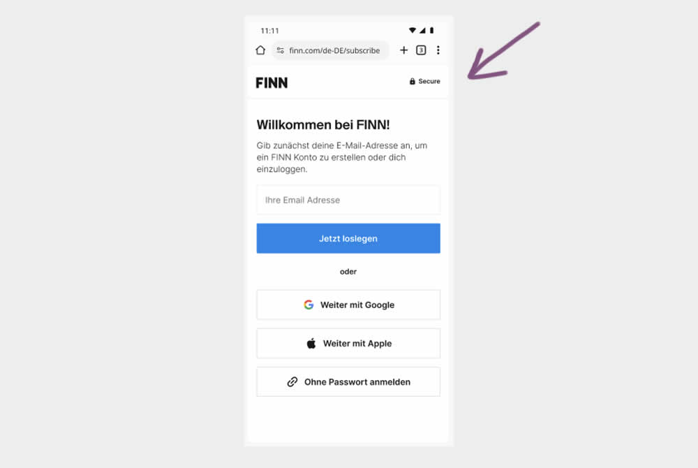
In this experiment, the control shows an (X) close option within a signup flow, whereas the variation had it removed. Clicking the close icon would collapse the signup modal and show the product page. Users were still able use the back and forward functionality.
(The test was inversed in order to fit the pattern). Impact on signups was measured.
Test #579 on
Jared.com
by  Craig Kistler
Feb 23, 2025
Mobile
Product
X.X%
Sales
Craig Tested Pattern #21: What It's Worth On Jared.com
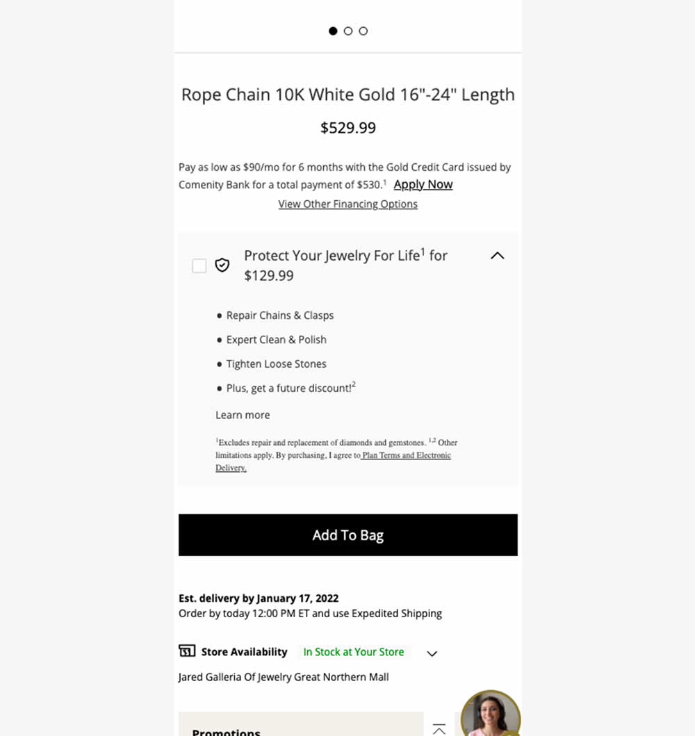
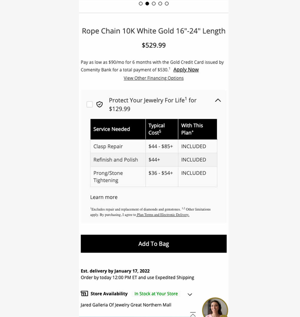
In this experiment, typical dollar values of typical coverages for an extended protection plan were shown. This ran on a product page of a jewelery site. Impact on on adds to cart, sales and uptake of the upsell was measured. Traffic split was 25/75.
Test #575 on
Finn.com
by  Tim Karcher
Feb 12, 2025
Desktop
Listing
X.X%
Leads
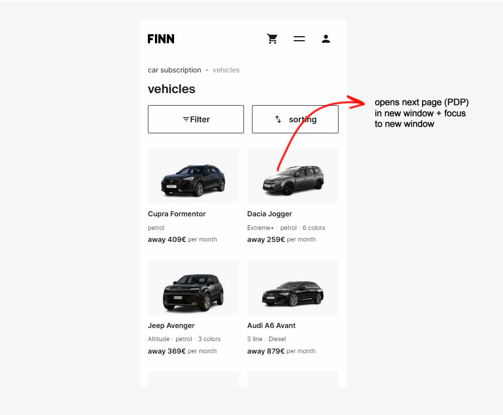
Tim Tested Pattern #34: Open In A New Tab On Finn.com
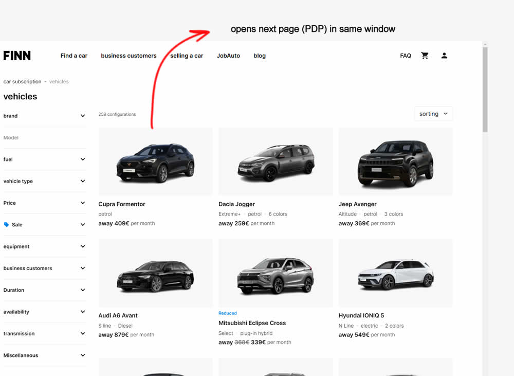
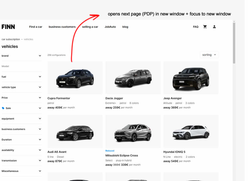
In this experiment, product listing were either opened in the same window (control) or opened in a new tab and focused on (variation). Impact on signups and sales was measured.
Test #576 on
Finn.com
by  Tim Karcher
Feb 12, 2025
Mobile
Listing
X.X%
Leads
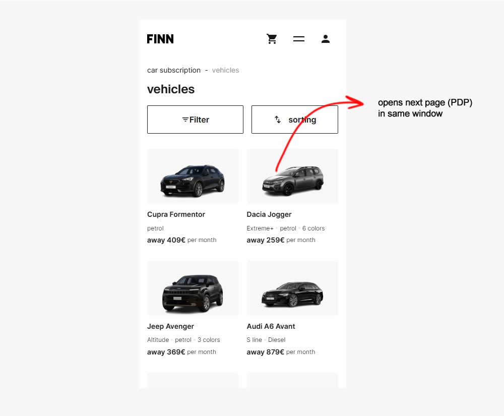
Tim Tested Pattern #34: Open In A New Tab On Finn.com
Test #571 on
by  Jakub Linowski
Jan 03, 2025
Desktop
Mobile
Product
X.X%
Sales
Jakub Tested Pattern #30: Authentic Photos
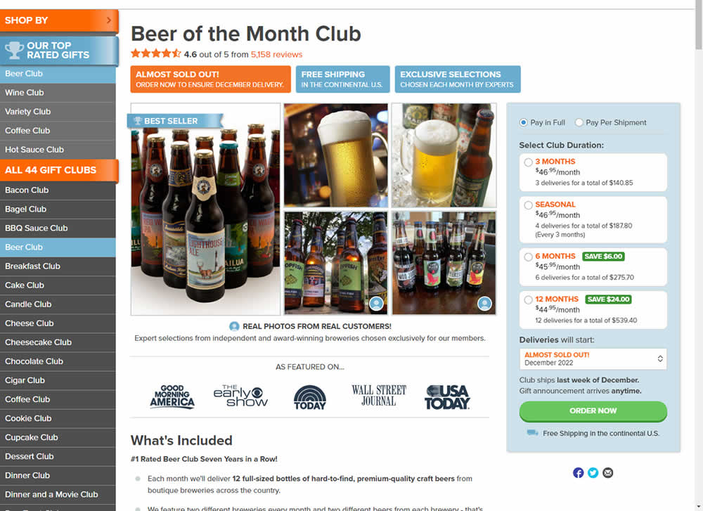
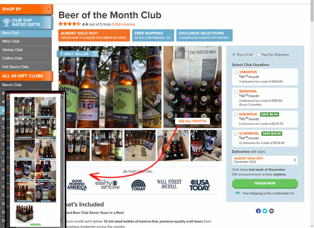
In this experiment, additional customer product photos were shown at the top of the product page. A "Show More Photos" button was also added which launched a modal with additional and larger images. Impact on sales was measured.
Test #570 on
Livefresh.de
by  Melina Hess
Dec 30, 2024
Desktop
Mobile
Home & Landing
X.X%
Sales
Melina Tested Pattern #79: Product Highlights On Livefresh.de
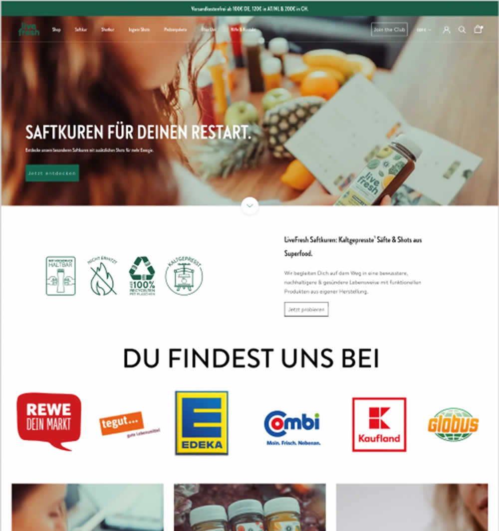
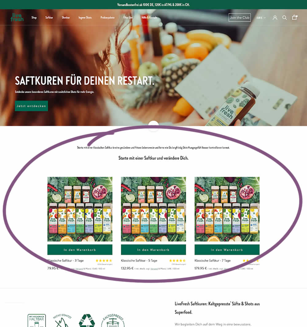
In this experiment, three popular juice products were shown higher on the variation (instead of lower in the control). Impact on sales was measured.