All Latest 620 A/B Tests
Test #489 on
by  Jakub Linowski
Aug 14, 2023
Desktop
Mobile
Product
X.X%
Sales
Jakub Tested Pattern #78: Tags, Badges And Structured Information
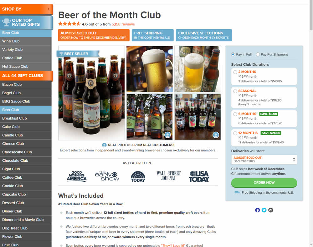
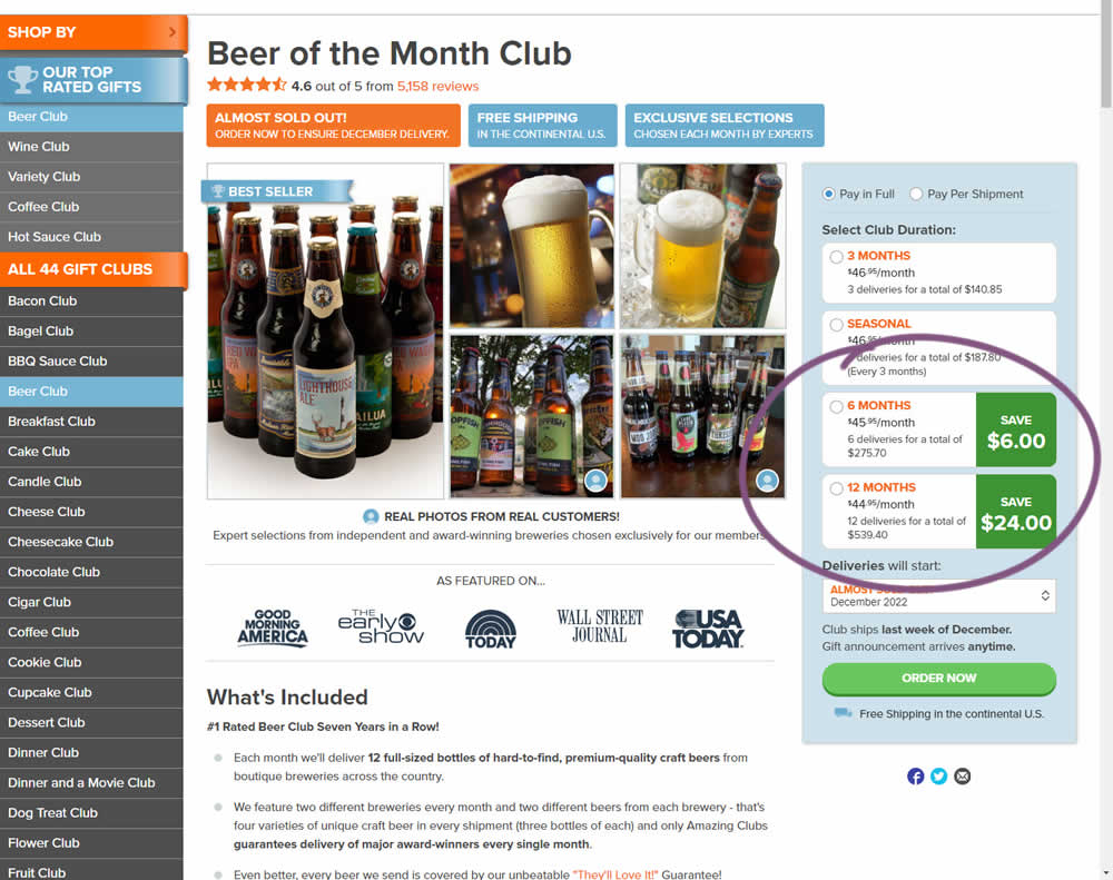
In this experiment, the size of a saving amount badge was enlarged. Instead of typical badge, the variation stretched the height of the saving information to the full height of the duration selector. The font size was also increased. Impact on overall sales was measured.
Which A Or B Actually Wins? Find Out Before You Test.
Members see every test result — the winners, the flat ones, and the losers — along with exact effects and sample sizes. Use it to estimate your tests and prioritize by probability, not gut feel. Start every experiment with the odds on your side.
Test #487 on
Learnwithhomer.com
by  Stanley Zuo
Aug 10, 2023
Mobile
Pricing
X.X%
Signups
Stanley Tested Pattern #78: Tags, Badges And Structured Information On Learnwithhomer.com
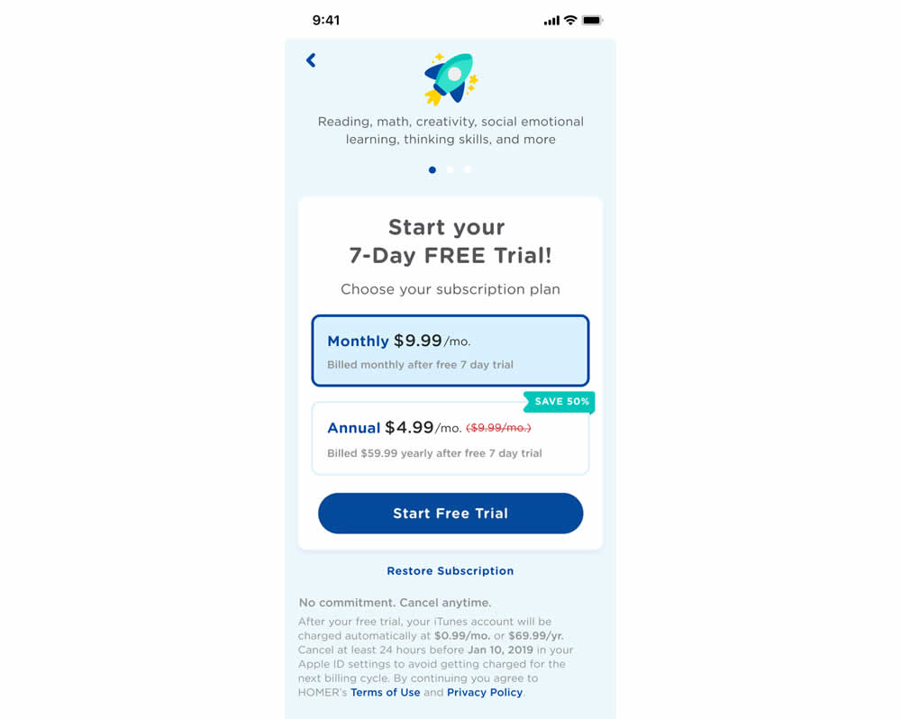
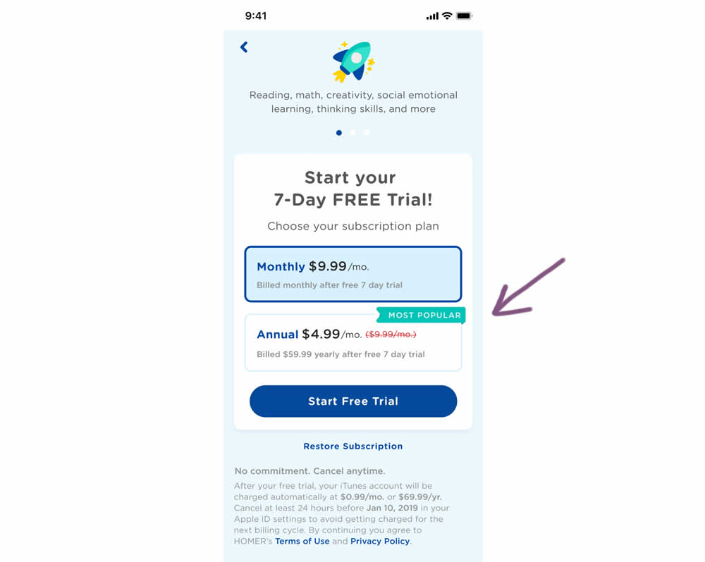
In this experiment, a "save 50%" badge was replaced with a "most popular" one with the intent of encouraging more users to select the higher priced plan. Impact on total and annual trial starts was measured.
Test #485 on
Livefresh.de
by  Pascal Dietz
Jul 27, 2023
Mobile
Product
X.X%
Sales
Pascal Tested Pattern #131: Authority On Livefresh.de
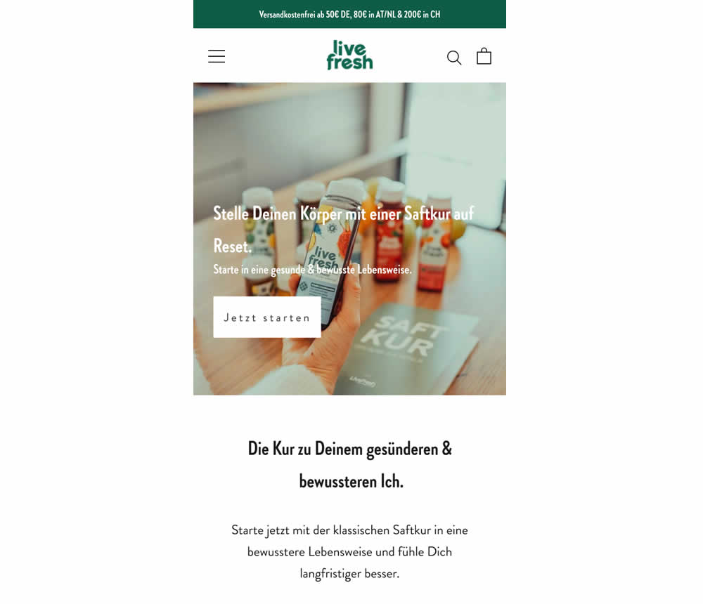
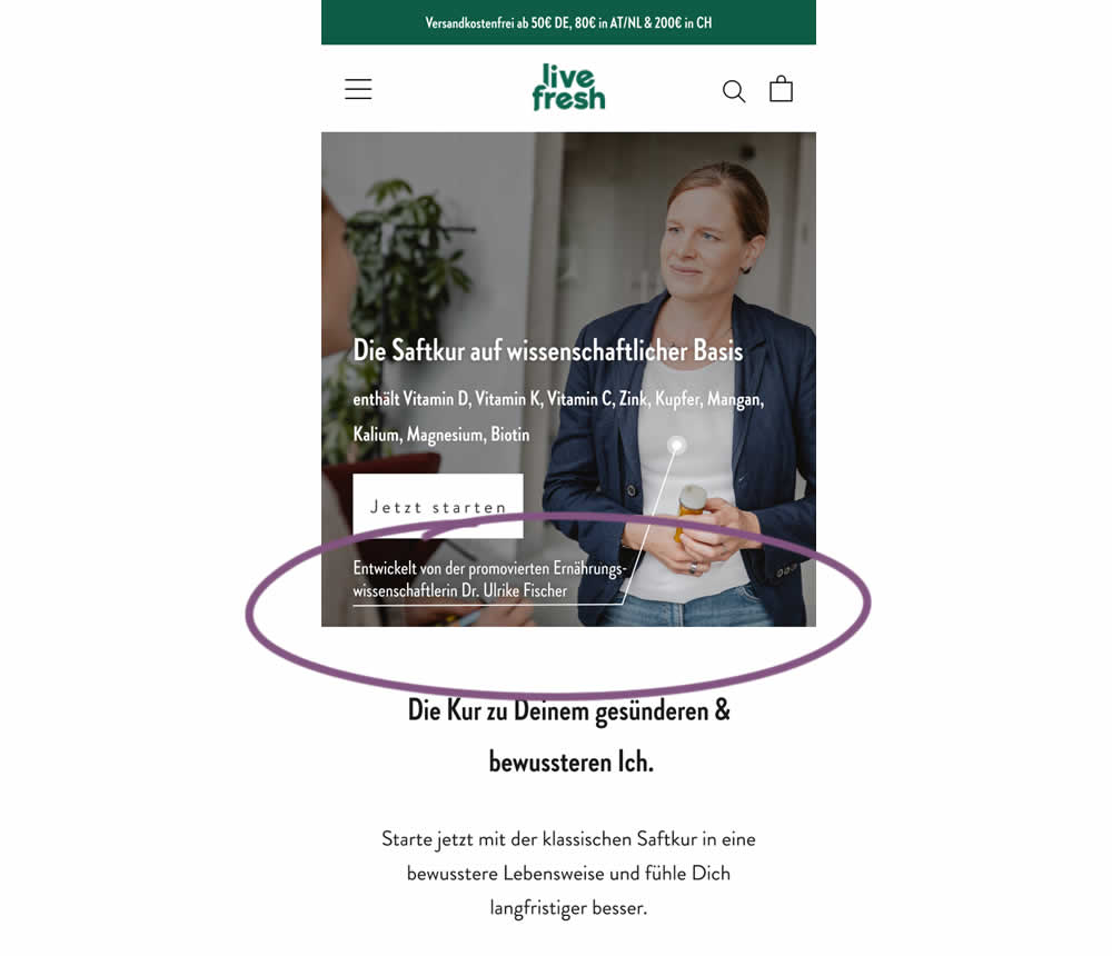
In this experiment a juice cleanse product (developed by Dr. Ulrike Fischer) was supported with statements and visuals to reinforce her as a doctor and an authority figure. The control only referenced the product itself. Google translations include:
A) Headline: "Reset your body with a juice cleanse"
B) Headline: "The juice cleanse with a scientific basis"
B) Listed out specific vitamins and supplements.
B) Added Subheadline: "Developed by Dr. Ulrike Fischer, who holds a doctorate in nutritional science"
Test #484 on
Snocks.com
by  Melina Hess
Jul 21, 2023
Desktop
Mobile
Product
X.X%
Sales
Melina Tested Pattern #80: Persistent Filters On Snocks.com
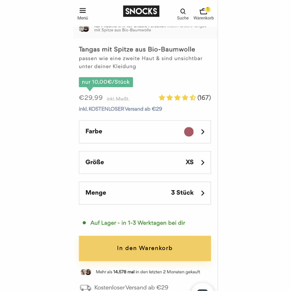
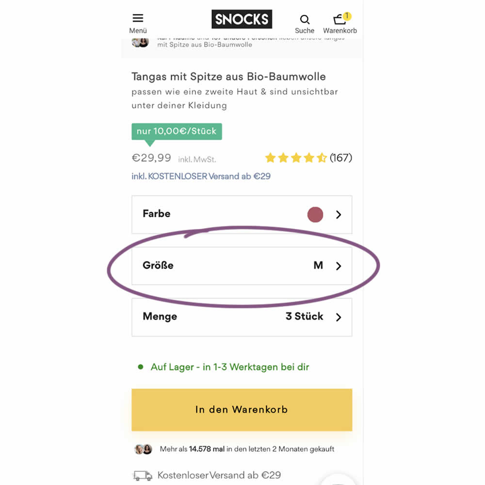
In this experiment, the variation remembered and prefilled user's size choices for the duration of the session. The control version always started with a fixed product size value (ex: XS). The variation prefilled them between products or screen refreshes. Impact on sales was measured.
Test #482 on
by  Jakub Linowski
Jul 13, 2023
Desktop
Mobile
Checkout
X.X%
Sales
Jakub Tested Pattern #124: Confirmed Selection
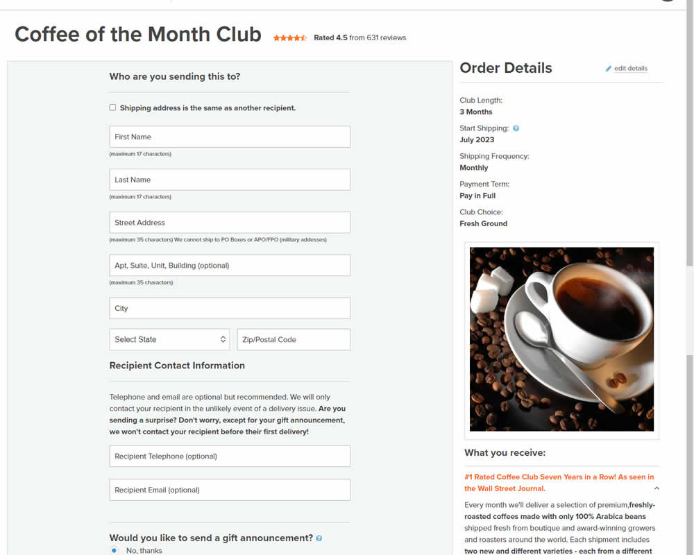
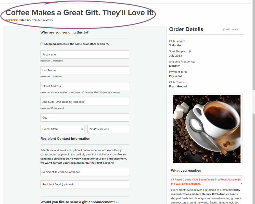
In this experiment, the choice of adding a product to cart was confirmed with a further positive message in the header of the next step (on the add to cart page). Once users left the product detail page, instead of simply stating the product name, the title was rephrased as "Product [X] Makes a Great Gift. They'll Love It!". I view this as a higher "intensity" experiment, given that the add-to-cart page was in some way already confirming the choice. Impact on sales was measured.
Test #478 on
Estilomma.com
by  José Álvarez
Jun 14, 2023
Mobile
Global
X.X%
Sales
José Tested Pattern #130: Less Or More Visible Offer Pages On Estilomma.com
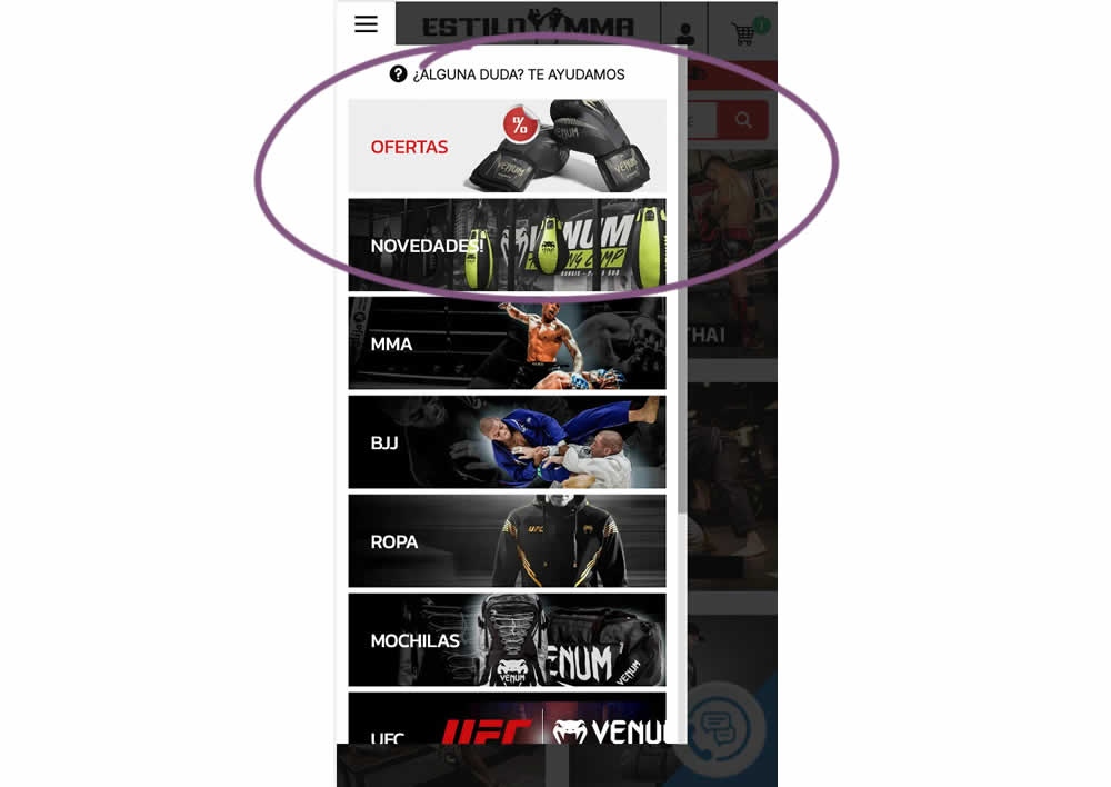
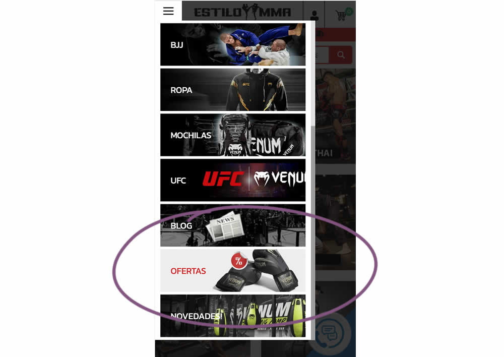
In this experiment, an offers page was shifted all the way down inside an expanded mobile navigation. The control showed it at the very top. The variation showed it at the bottom. (Note that the screen shot shows an already scrolled navigation - in the initial view, users would not be able to see the discount page right away, as it required some scrolling). Impact on overall sales was measured.
Test #477 on
Snocks.com
by  Melina Hess
Jun 09, 2023
Mobile
Desktop
Product
X.X%
Sales
Melina Tested Pattern #95: Clickable Product Previews On Snocks.com
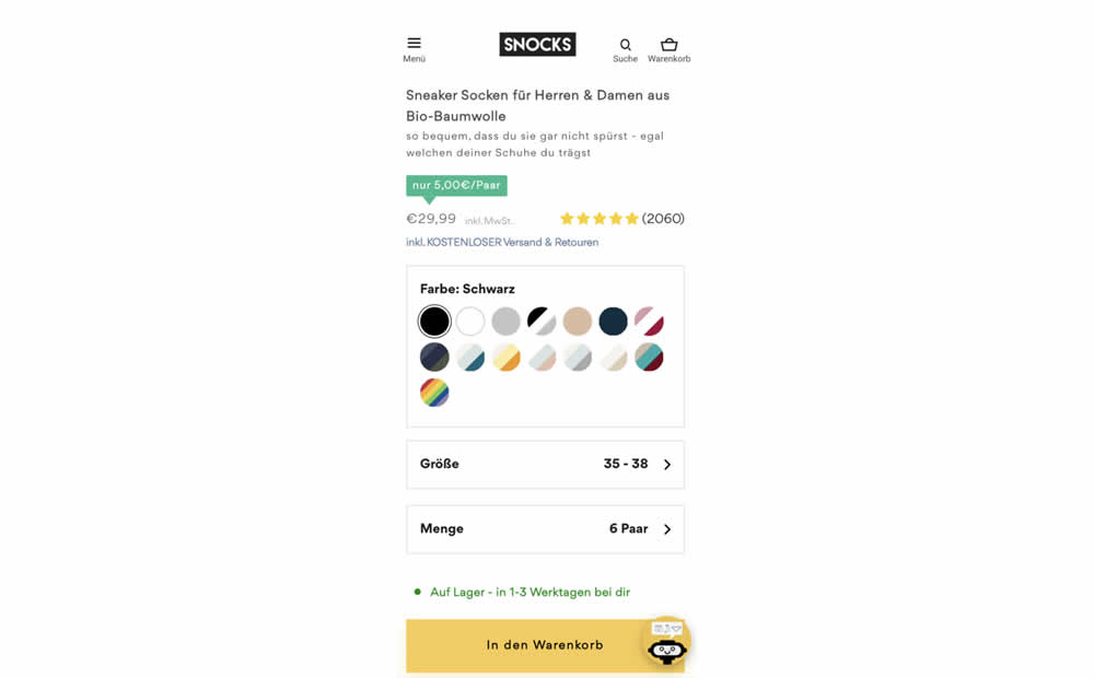
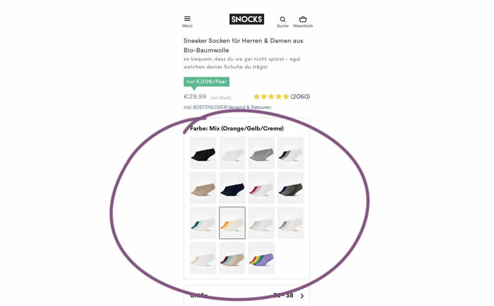
In this experiment, product color swatches were replaced with real product photos. Whereas the control showed the colors as more abstract circles. Impact on sales was measured.
Test #476 on
by  Devesh Khanal
Jun 08, 2023
Mobile
Product
X.X%
Sales
Devesh Tested Pattern #95: Clickable Product Previews
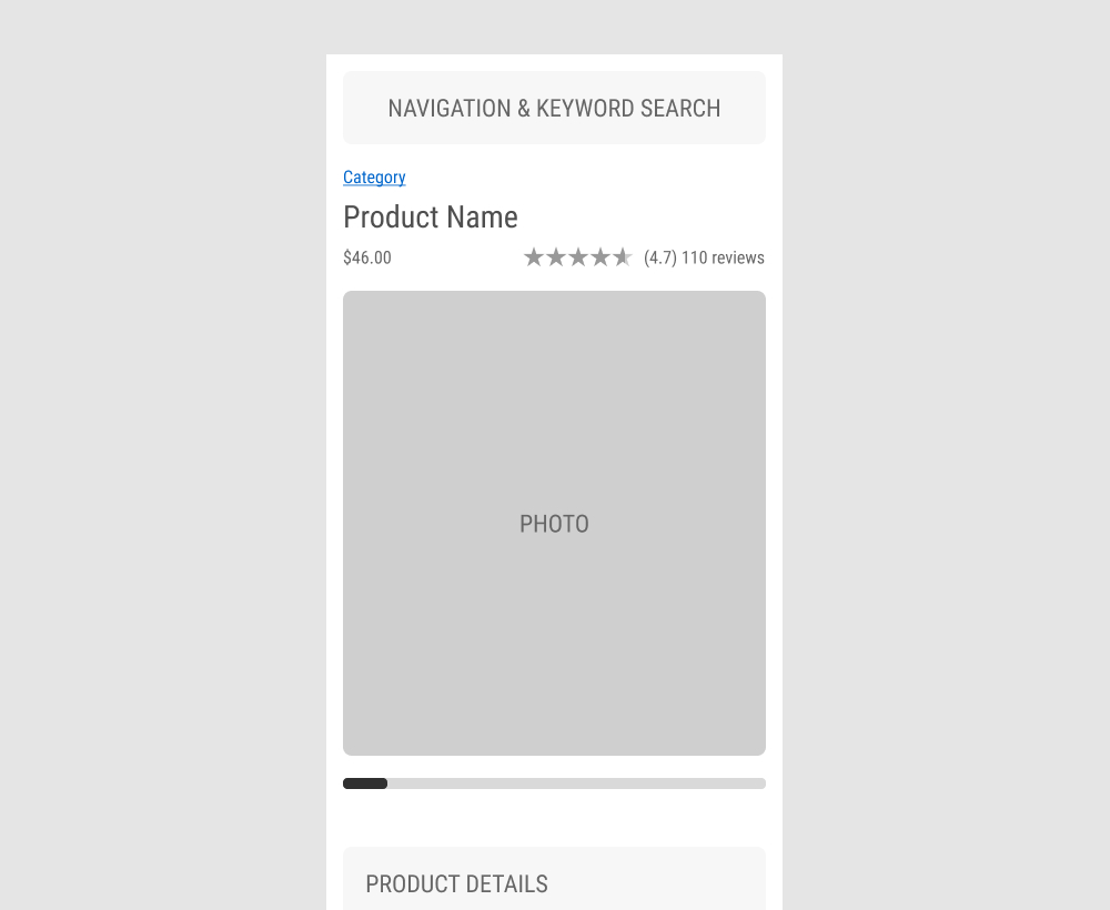
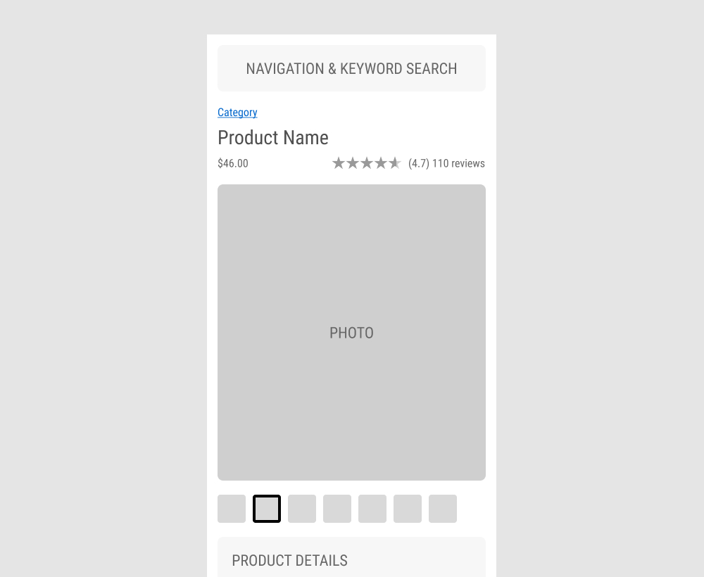
The GrowthRock team ran an experiment on one of their client's product detail pages. Instead of using a scrollbar (for mulitple images), clickable product photo thumbnails were used instead. Impact on sales was measured.
Test #473 on
by  Jakub Linowski
May 26, 2023
Desktop
Home & Landing
X.X%
Sales
Jakub Tested Pattern #19: Benefit Testimonials
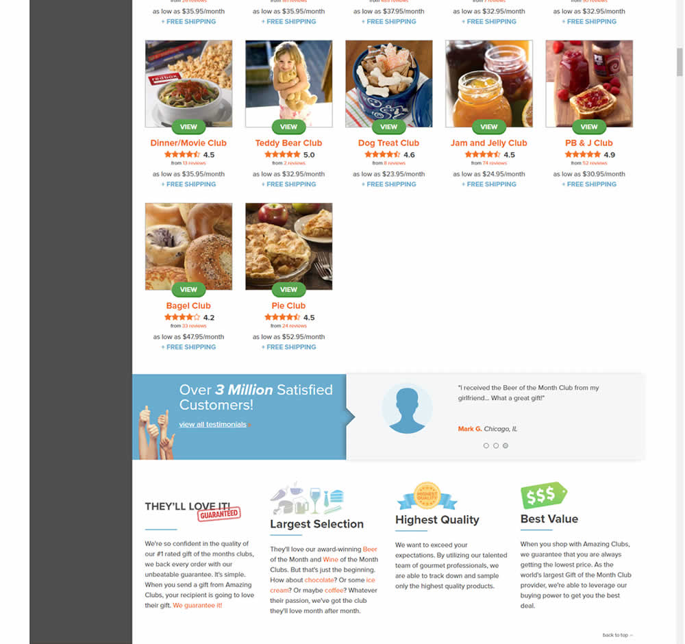
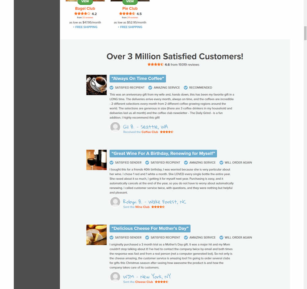
In this experiment, very short form testimonials (with a reference to over 3 million customers) were replaced with 3 more elaborate ones. These elaborate or benefit testimonials contained: highlighted statements, star reviews, emphasized location, tag summaries and photos of the purchased product. The control also contained a 3 testimonial carousel interaction.
This test appeared at the bottom of a longer homepage with additional product listings above.
Test #469 on
by  Ardit Veliu
Apr 28, 2023
Desktop
Signup
X.X%
Leads
Ardit Tested Pattern #129: Right Or Left Aligned Forms
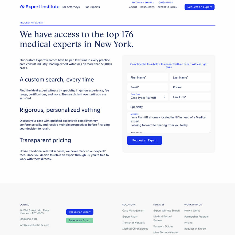
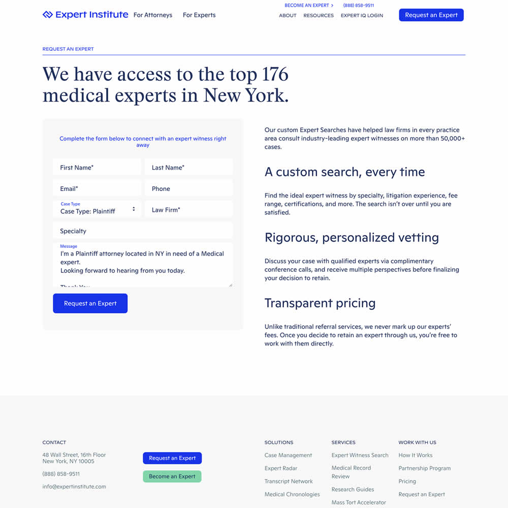
In this experiment, a right side form shifted in position to the left. Impact on leads was measured.
Test #468 on
Umbraco.com
by  Lars Skjold Iversen
Apr 28, 2023
Desktop
Mobile
Home & Landing
X.X%
Progression
Lars Tested Pattern #6: Customer Star Ratings On Umbraco.com
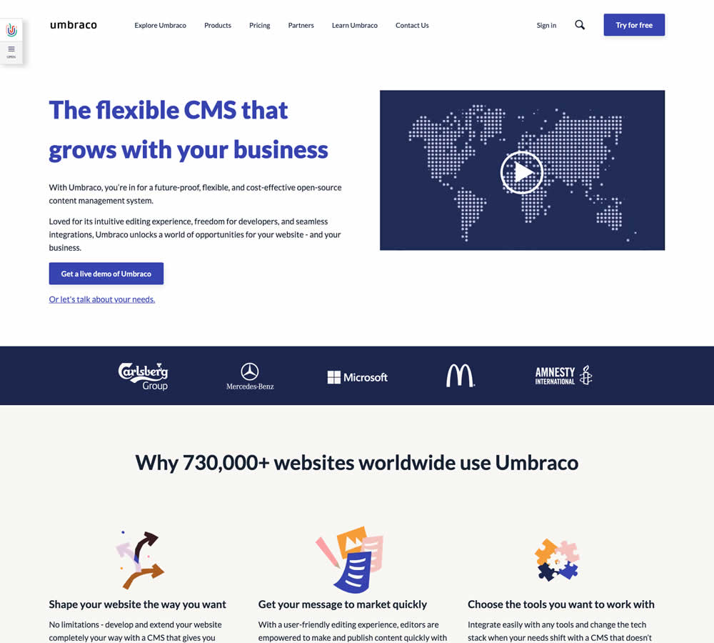
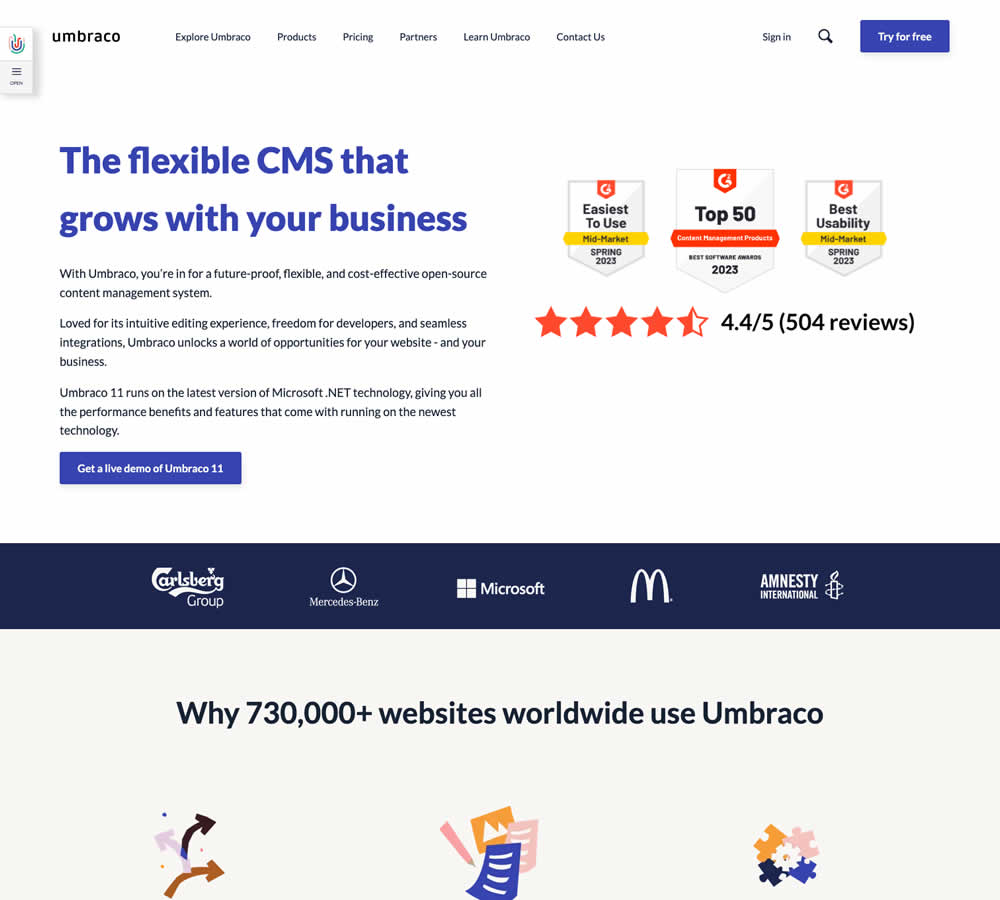
In this homepage experiment a number of changes were introduced - with perhaps the most prominent one being the replacement of a video component with customer review badges. Additional copy changes included reinforcement of the latest version number (v11) throughout the page, as well as a dedicated (v11) section in the middle of the page. Impact on demo signups was measured.
Test #465 on
by  Melina Hess
Apr 22, 2023
Desktop
Mobile
Product
X.X%
Revenue
Melina Tested Pattern #15: Bulleted Reassurances
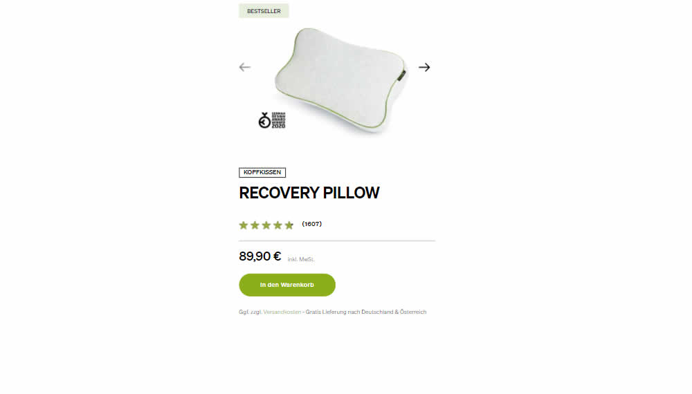
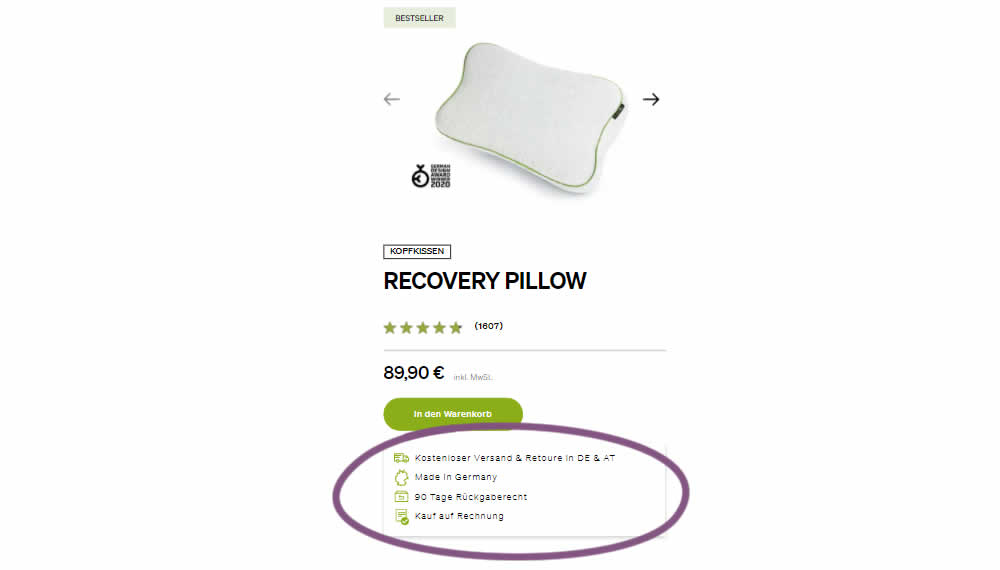
In this product detail page experiment, a number of reassurances were brought out visually in a lined or bulleted way. The 4 reassurances included: free shipping and returns; Made in Germany, 90 Day Returns; and Buy With Invoice (popular in Germany). Impact on revenue per user was measured. The control contained very feint copy (smaller and more subtle) about free shipping.
Test #463 on
Volders.de
by  Daria Kurchinskaia
Mar 25, 2023
Desktop
Checkout
X.X%
Sales
Daria Tested Pattern #115: Pricing Comparison Table On Volders.de
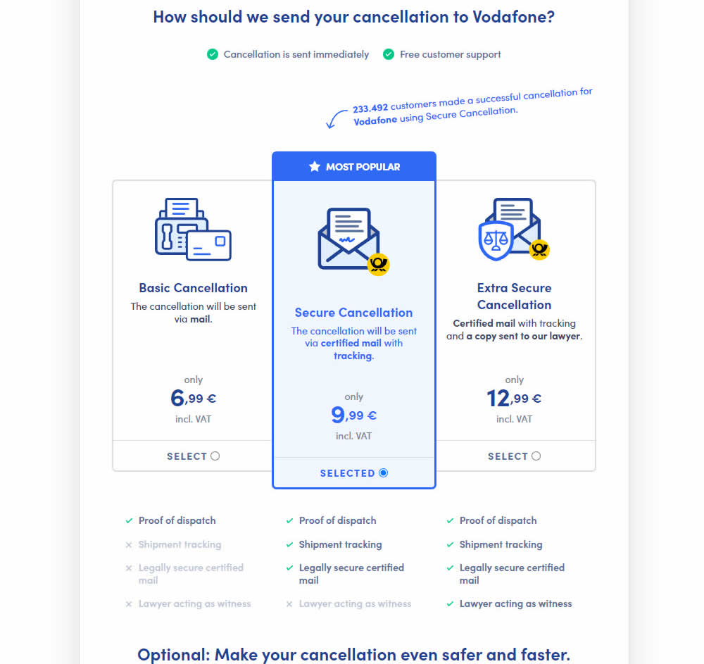
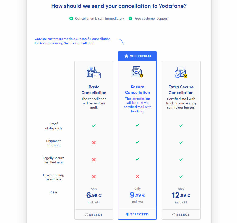
This experiment explored a pricing layout that enabled more feature comparisons. It also conveyed more clearly which features were missing between plans. The test has been inspired by this Netflix experiment. Impact on sales was measured.
Test #462 on
by  Jakub Linowski
Mar 24, 2023
Desktop
Mobile
Product
X.X%
Sales
Jakub Tested Pattern #128: Standard Or Superscript Price Format
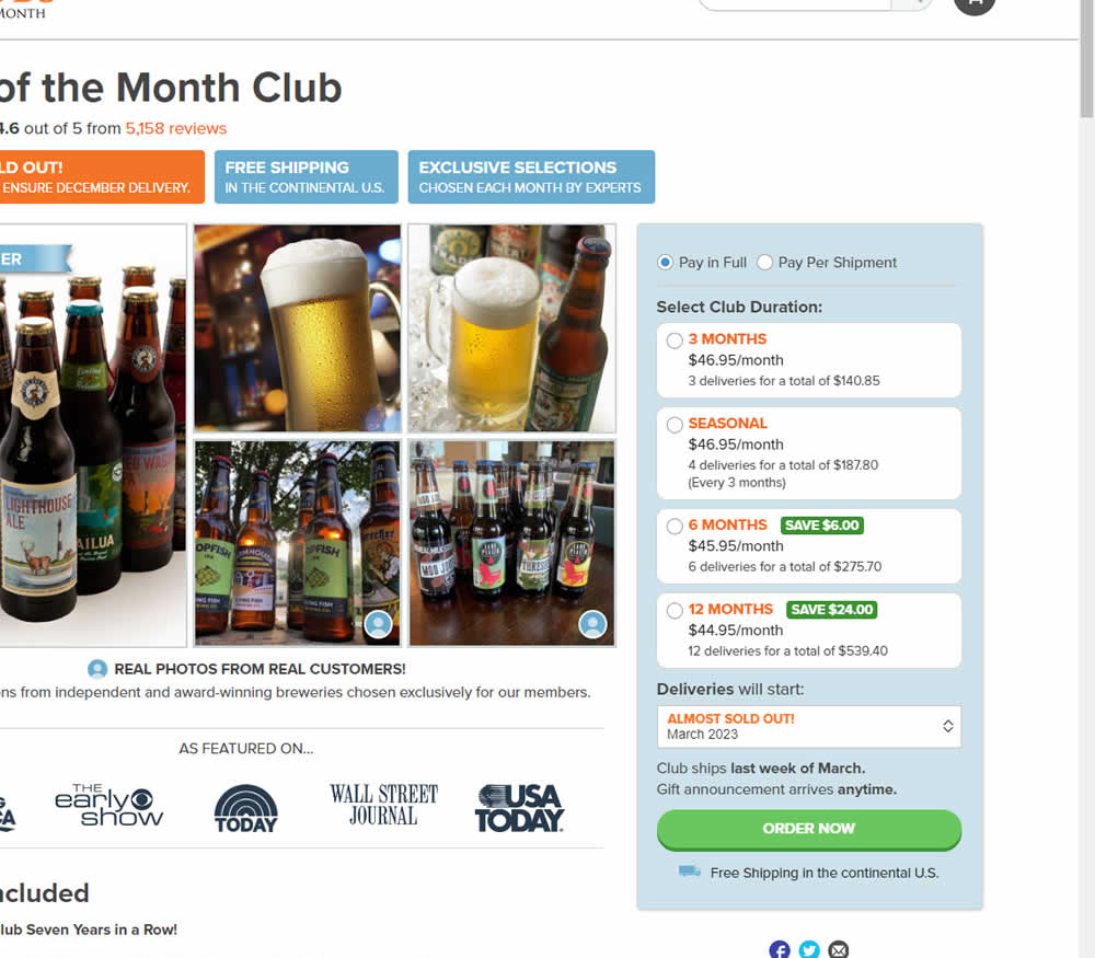
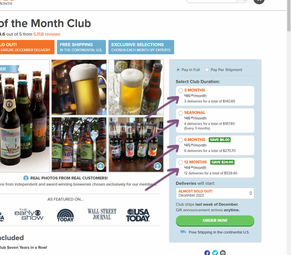
In this experiment, standard $ signs and cents were formatted into a smaller superscript. Impact on add-to-cart and sales was measured.
Test #461 on
Snocks.com
by  Melina Hess
Mar 23, 2023
Mobile
Product
X.X%
Sales
Melina Tested Pattern #15: Bulleted Reassurances On Snocks.com
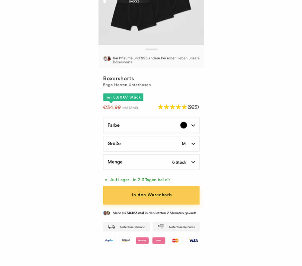
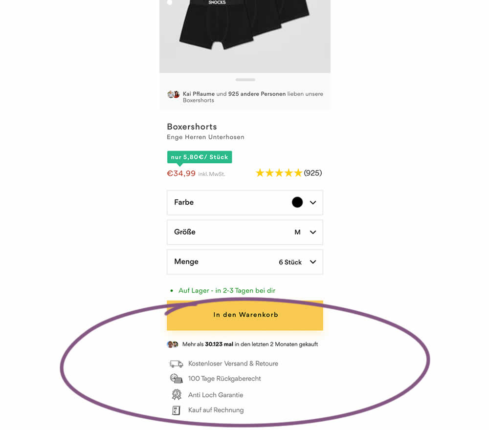
In this product detail page experiment, reassurances under the add-to-cart button were rearranged. The control contained copy about: free shipping and free returns formatted as two gray boxes, with a variety of payment methods and their corresponding logos underneath.
The variation used a more convention bulleted, line-by-line format. It also contained free shipping and returns, but also elaborated with "100 day returns", an "anti-hole guarantee", and "purchase with invoice" (perhaps more popular in Germany?). Impact on sales was measured.
Test #459 on
Snocks.com
by  Melina Hess
Feb 28, 2023
Desktop
Mobile
Listing
X.X%
Sales
Melina Tested Pattern #36: Fewer Or More Results On Snocks.com
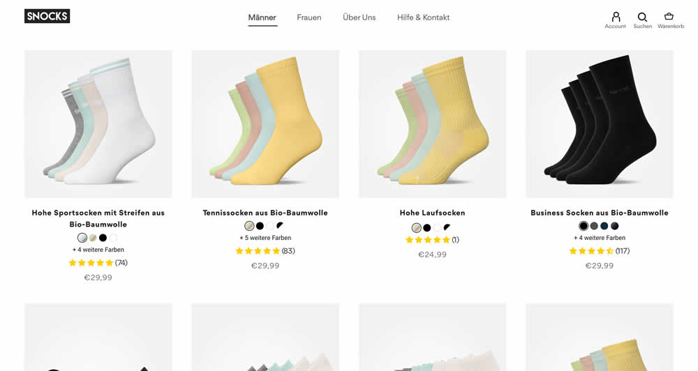
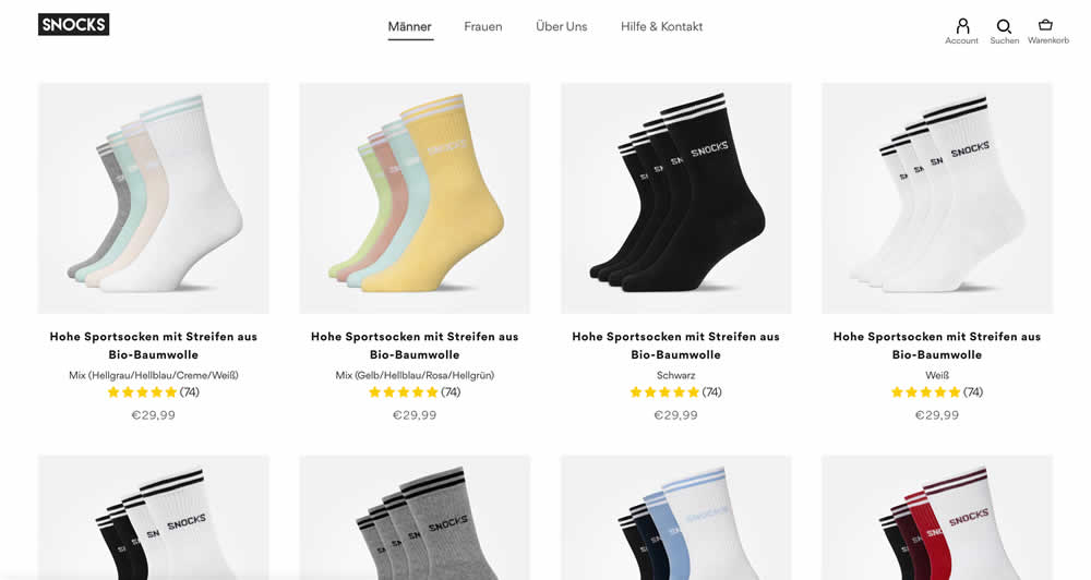
In this listing page experiment, color sets of the same product were tested against individual products with unique colors (with additional product tiles). Essentially, the A version here contained fewer product items (with color sets), while the B version contained more results and tiles (with grouped products). Impact on total sales was measured.
(The original control and variation was inverted, but was flipped to match the fewer or more results pattern).
Test #456 on
Aboalarm.de
by  Daria Kurchinskaia
Feb 23, 2023
Desktop
Mobile
Signup
X.X%
Sales
Daria Tested Pattern #28: Easiest Fields First On Aboalarm.de
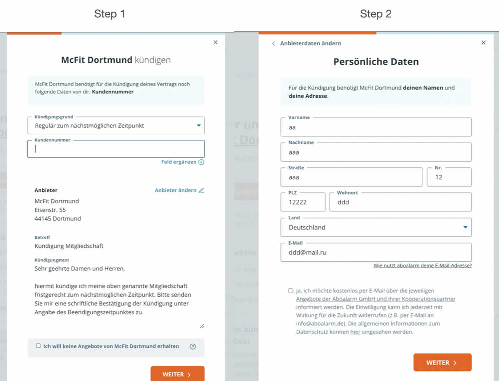
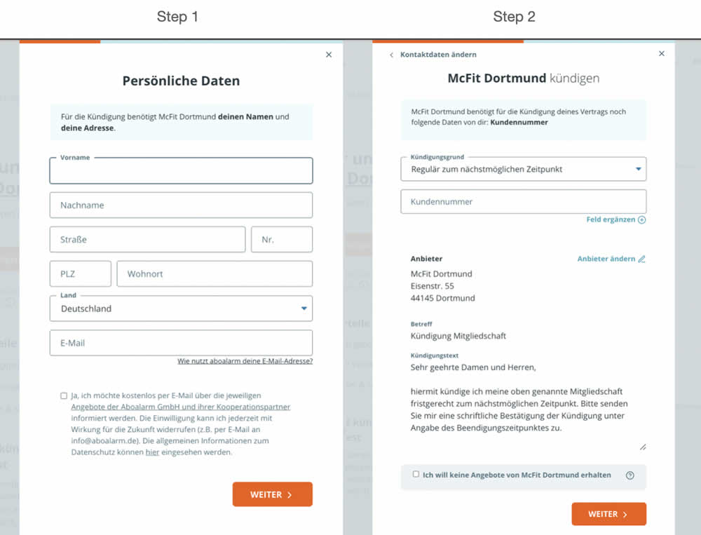
In this experiment, a more difficult step of a contract cancelation service flow was rearranged toward a later step. In the variation, the easier step (hypothetically) with personal details and address fields was placed as the first step. Whereas the step with contract or account numbers (hypothetically more difficult) were placed as the second step.
Test #440 on
Formelskin.de
by  Alexander Krieger
Nov 17, 2022
Mobile
Signup
X.X%
Sales
Alexander Tested Pattern #49: Above The Fold Call To Action On Formelskin.de
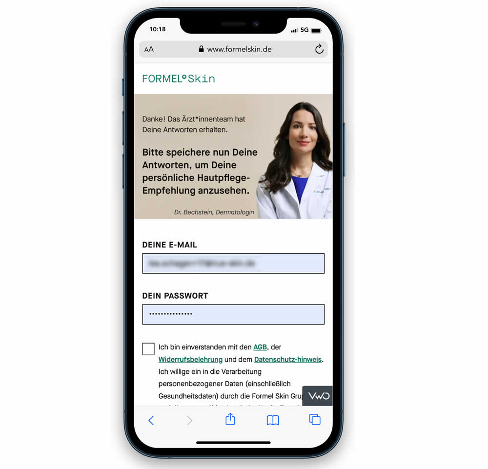
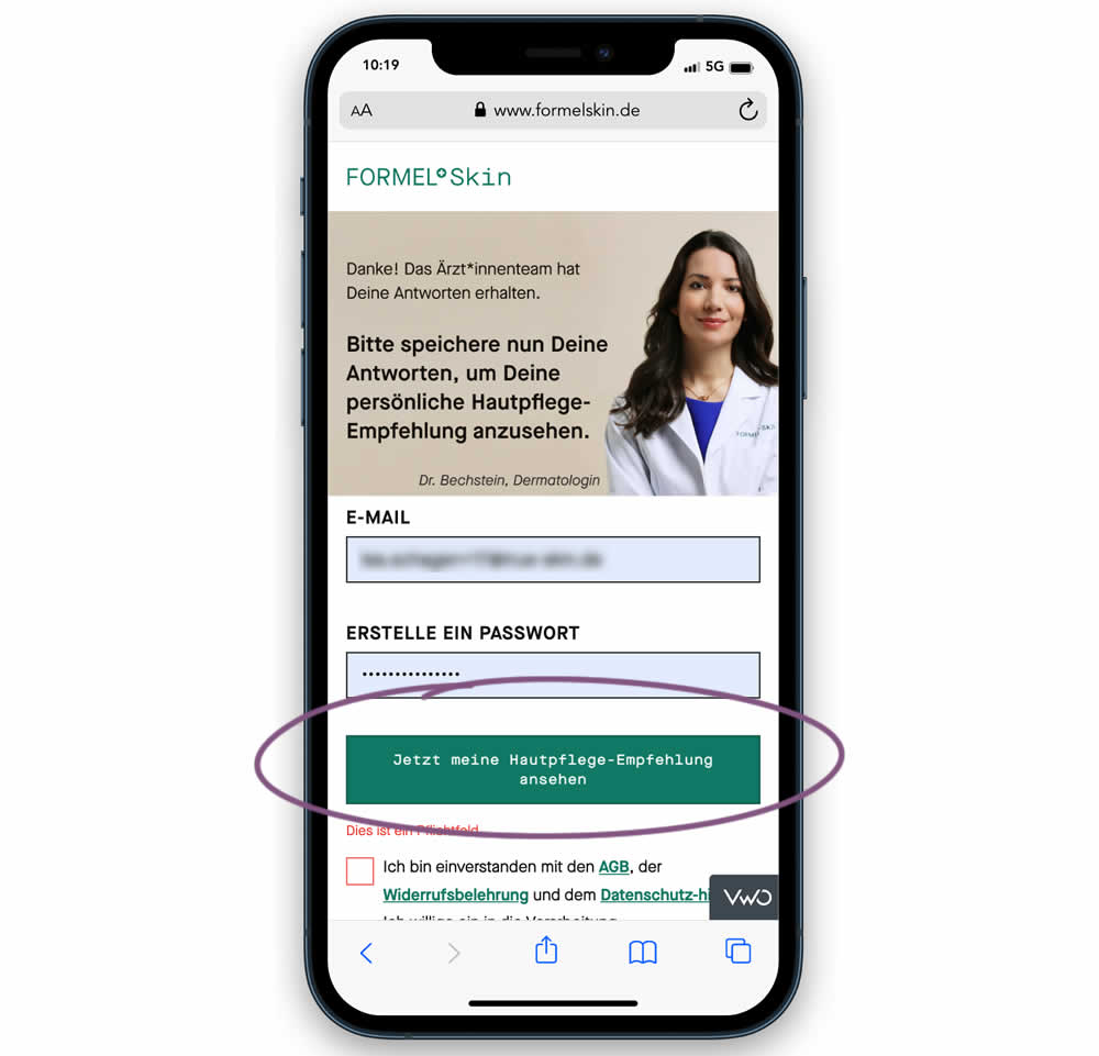
In this experiment, the call to action or button was raised above the legal text to be visible right away without scrolling. Additionally a error message was added for users that did not activate the checkbox to remind them that this is mandatory. Impact on signups and eventual follow-through to purchases (3 steps later) was measured.
Test #439 on
Designlab.com
by  Daniel Shapiro
Oct 31, 2022
Desktop
Mobile
Home & Landing
X.X%
Sales
Daniel Tested Pattern #18: Single Or Alternative Buttons On Designlab.com


This was a larger leap experiment with numerous changes to the header part of a design program landing page. One of the key changes however was a shift from a single to multiple call to actions for lead generation. In the control, all potential leads would first funnel through a single syllabus download flow. In the variation, users were given three visible choices: download syllabus, webinar signup and/or book a live call with admissions. Impact on overall generated leads was measured, as well as paid enrollments.
Test #435 on
Volders.de
by  Daria Kurchinskaia
Oct 17, 2022
Desktop
Mobile
Checkout
X.X%
Sales
Daria Tested Pattern #9: Multiple Steps On Volders.de
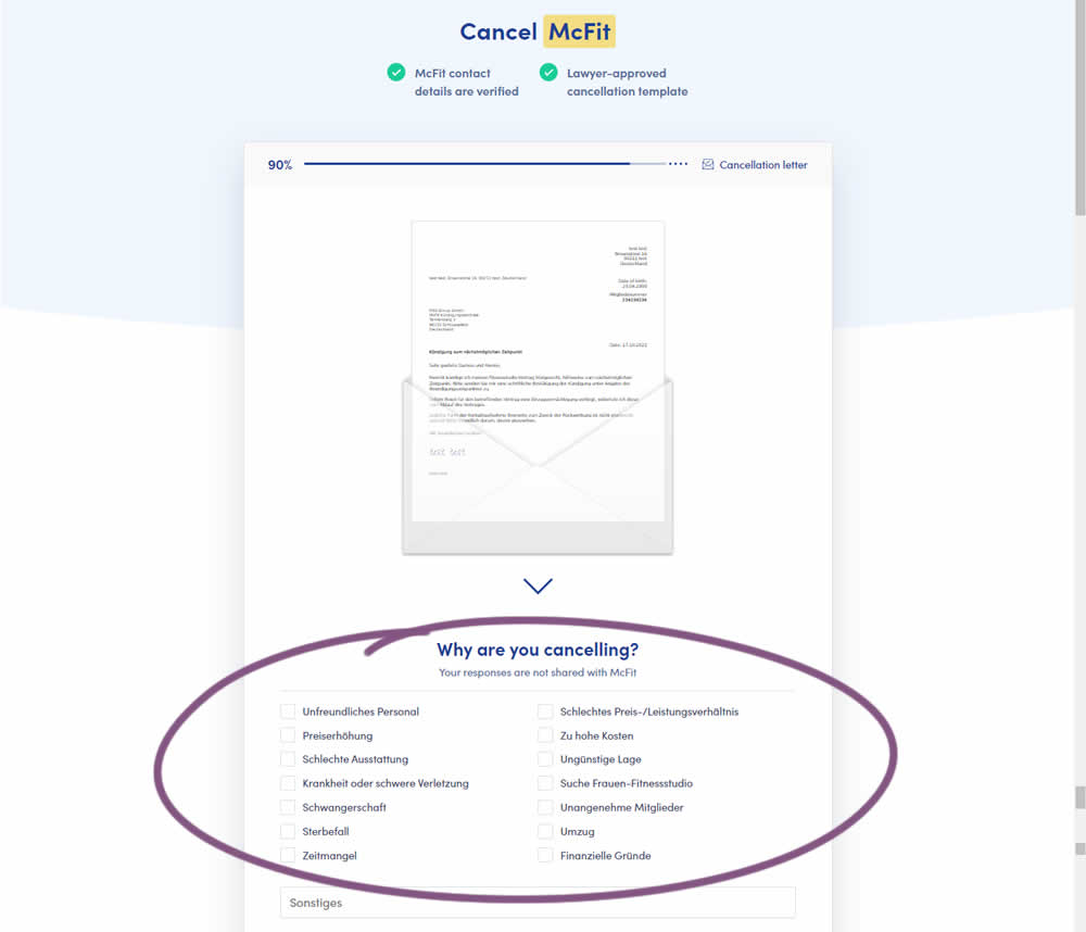
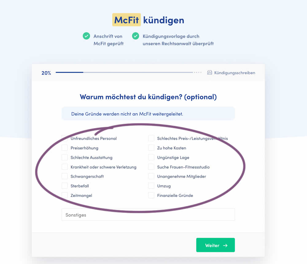
In this experiment, a question about a customer's reason for purchase was broken out into a separate step and moved earlier in the process. In the control, this question was asked in the final checkout step along with a plan selection (Step 4 of 4). In the variation, this question was shifted as a standalone first step (Step 1 of 5). Impact on completed purchases was measured (for a contract cancellation service in this case).