All Latest 620 A/B Tests
Test #311 on
Backstage.com
by  Stanley Zuo
Aug 11, 2020
Desktop
Mobile
Home & Landing
X.X%
Sales
Stanley Tested Pattern #118: Category Images On Backstage.com
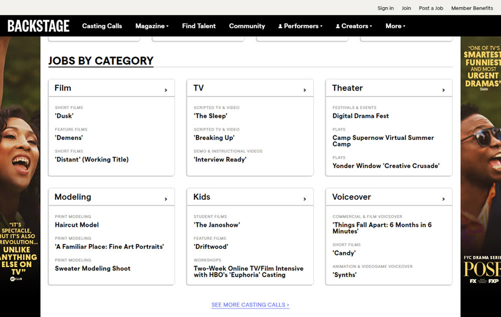
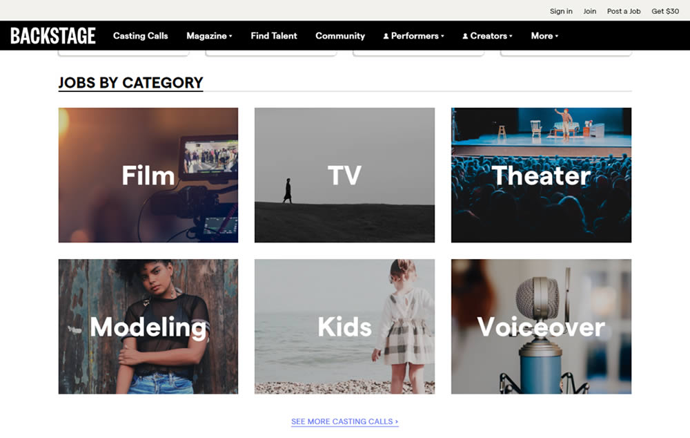
In this experiment, category links (linking to casting call search results) were replaced with tile images. In addition, 2 levels of categories were also replaced with a single text link for each tile. Finally, the font size of the link titles was also increased.
Which A Or B Actually Wins? Find Out Before You Test.
Members see every test result — the winners, the flat ones, and the losers — along with exact effects and sample sizes. Use it to estimate your tests and prioritize by probability, not gut feel. Start every experiment with the odds on your side.
Test #310 on
Backstage.com
by  Stanley Zuo
Jul 25, 2020
Mobile
Listing
X.X%
Sales
Stanley Tested Pattern #77: Filled Or Ghost Buttons On Backstage.com
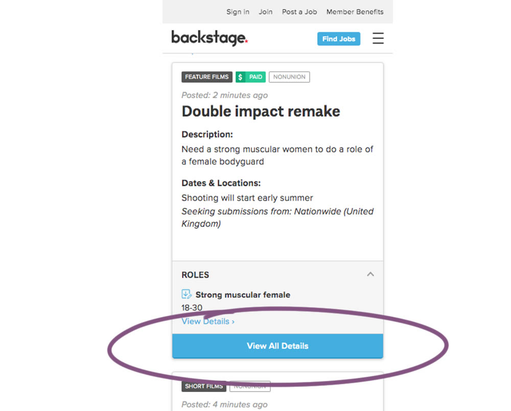
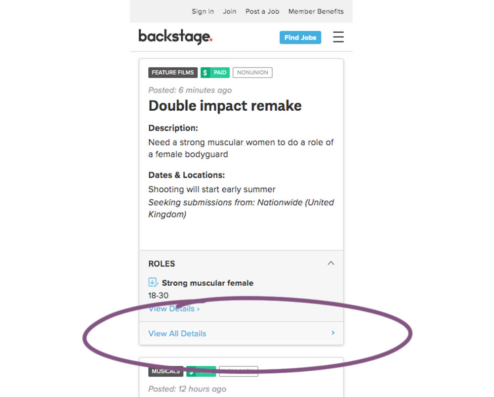
In this experiment, the style of a button leading to view detailed casting calls on a listing page was changed. In the A version the style was a filled high contrast blue background, and the B variation had a feint "ghost button" style.
Test #309 on
Thomasnet.com
by  Julian Gaviria
Jul 24, 2020
Desktop
Listing
X.X%
Progression
Julian Tested Pattern #72: Priming Step On Thomasnet.com
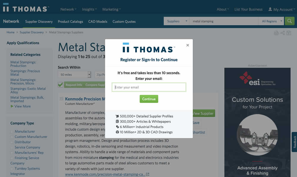
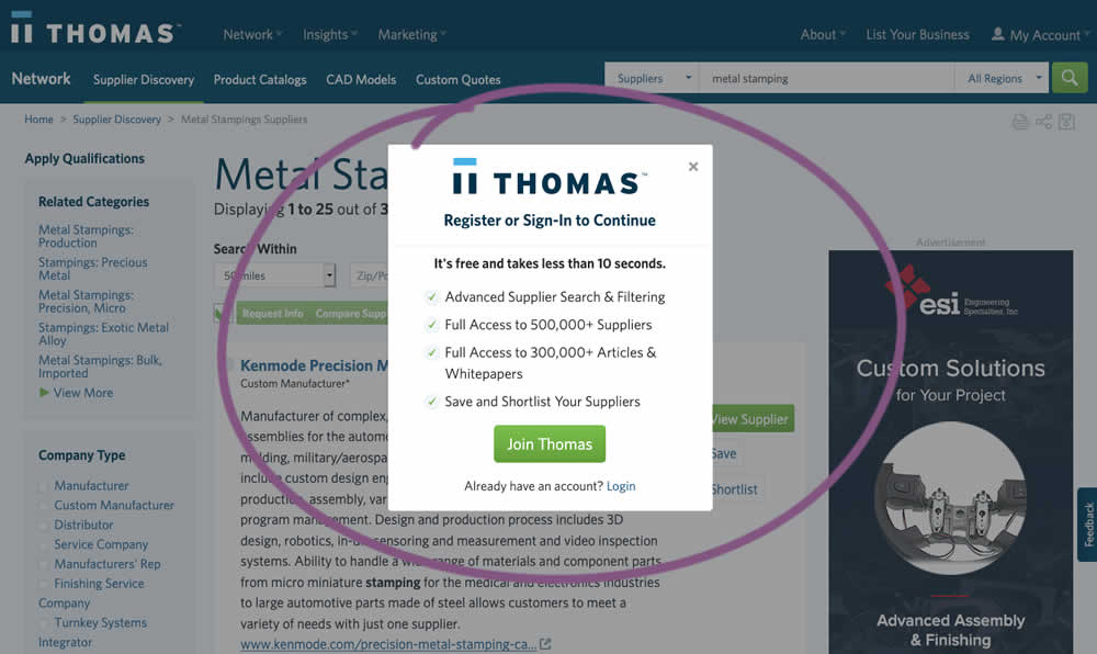
In this experiment, an extra step was prepended at the beginning of a multiple step signup modal flow. The signup modal would appear on listing pages after requests to contact a listed company. The idea was to prime users with benefits of signing up in order to increase their motivation to do so. The experiment measured the impact on the initial progression (to the step with the email form).
Test #307 on
Volders.de
by Michal Fiech
Jul 17, 2020
Desktop
Thank You
X.X%
Progression
Michal Tested Pattern #77: Filled Or Ghost Buttons On Volders.de
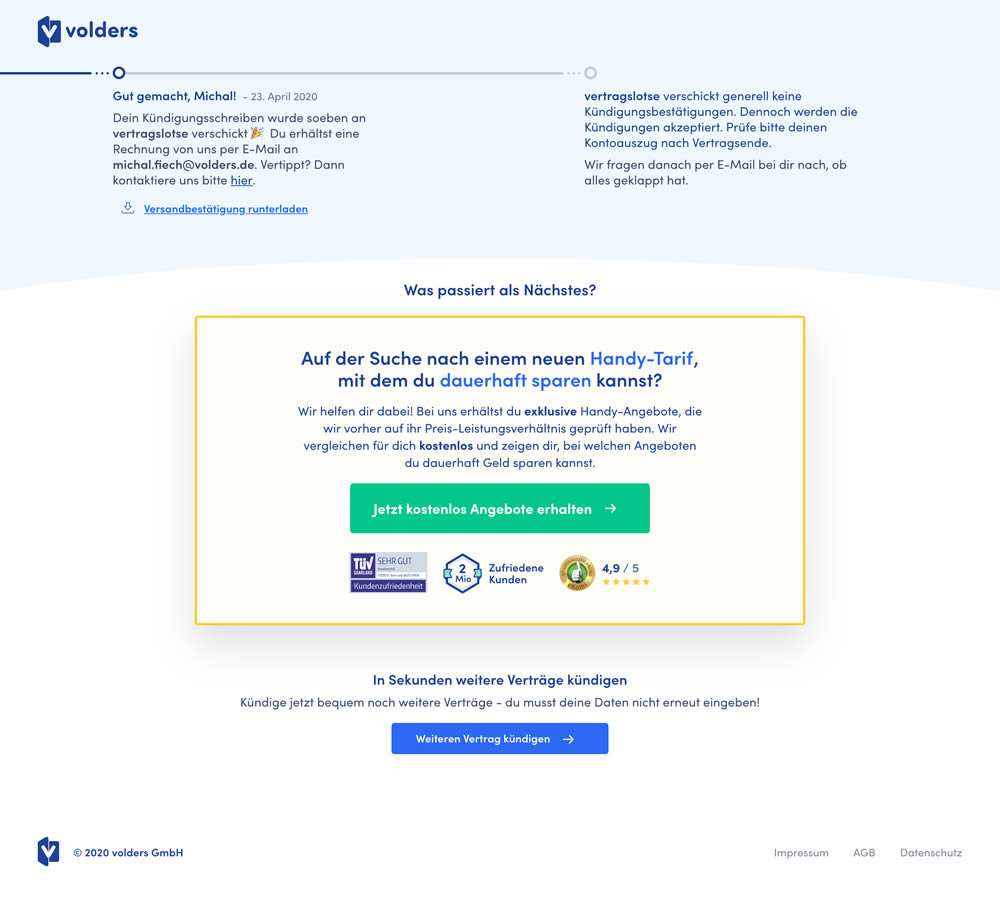
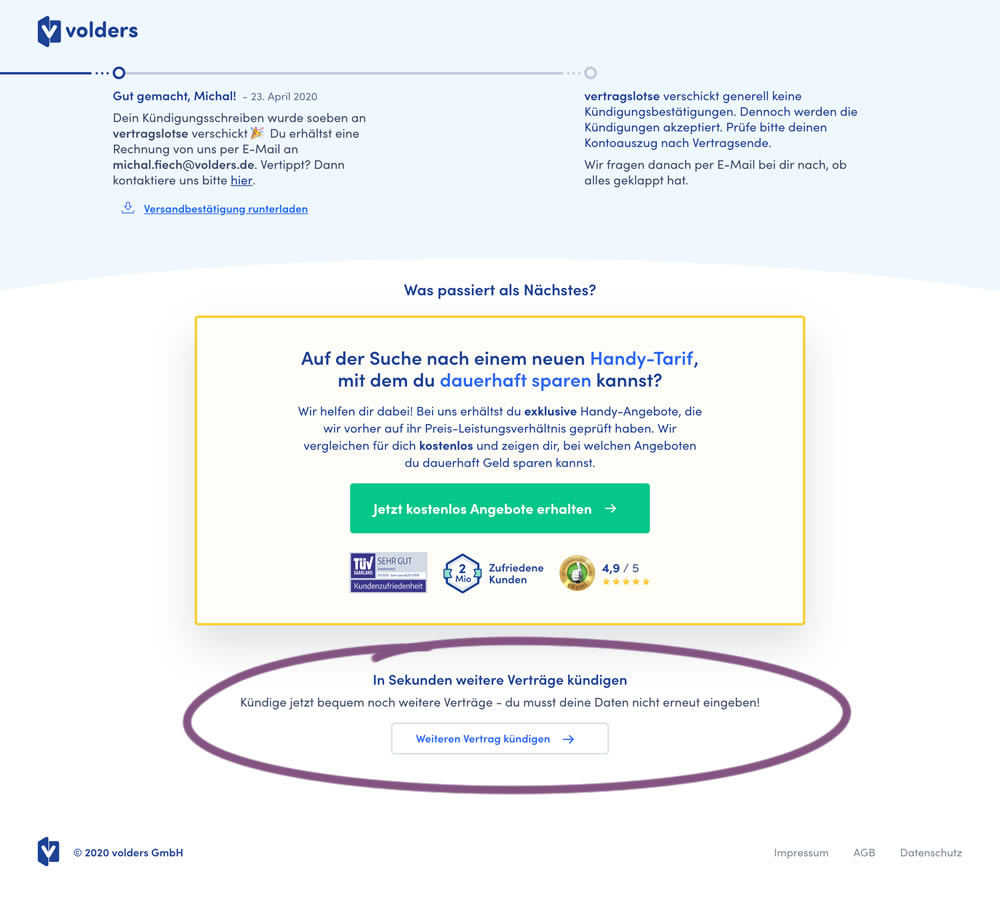
This experiment measured a shallow click goal on a button that would encourage to repeated the action that was just completed (in this case a contract cancellation). In the control version (A) a thank-you screen shows a filled button style, and the variant (B) there was a ghost button. As a note, I also flipped the A-B in this experiment for the purpose of matching it to our ghost button pattern, which means that Volders in fact was starting out with a ghost button to begin with.
Test #305 on
Volders.de
by Michal Fiech
Jun 30, 2020
Mobile
Desktop
Home & Landing
X.X%
Sales
Michal Tested Pattern #94: Visible Search On Volders.de

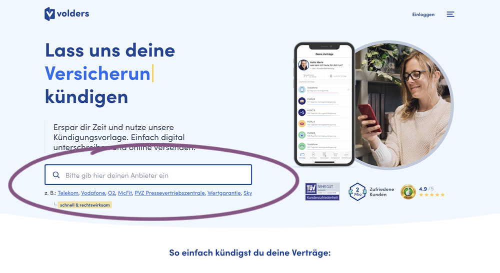
In this experiment, a search input field (to look for companies) along with most popular links (also company names) were displayed on the homepage of a leading contract cancellation service. The control (A) version instead had a button that sent users to a next page where the same selection could be made - only later. The measurable success criteria were the number of paid cancellations - a few steps down the funnel.
Test #304 on
Backstage.com
by  Stanley Zuo
Jun 29, 2020
Mobile
Product
X.X%
Signups
Stanley Tested Pattern #97: Bigger Form Fields On Backstage.com
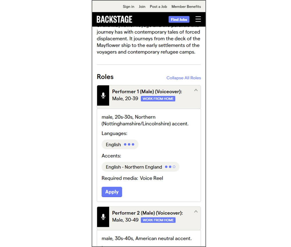
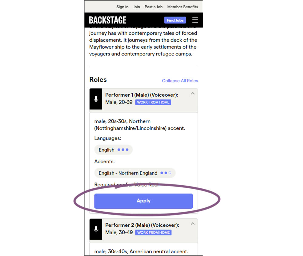
In this experiment, larger "Apply" buttons were shown on a casting detail page. The application funnel would take users through a series of steps leading to a paid membership subscription. The experiment measured initial progression and account signups (email signups).
Test #61 on
by  Someone
Jun 26, 2020
Desktop
Checkout
X.X%
Sales
Someone Tested Pattern #9: Multiple Steps
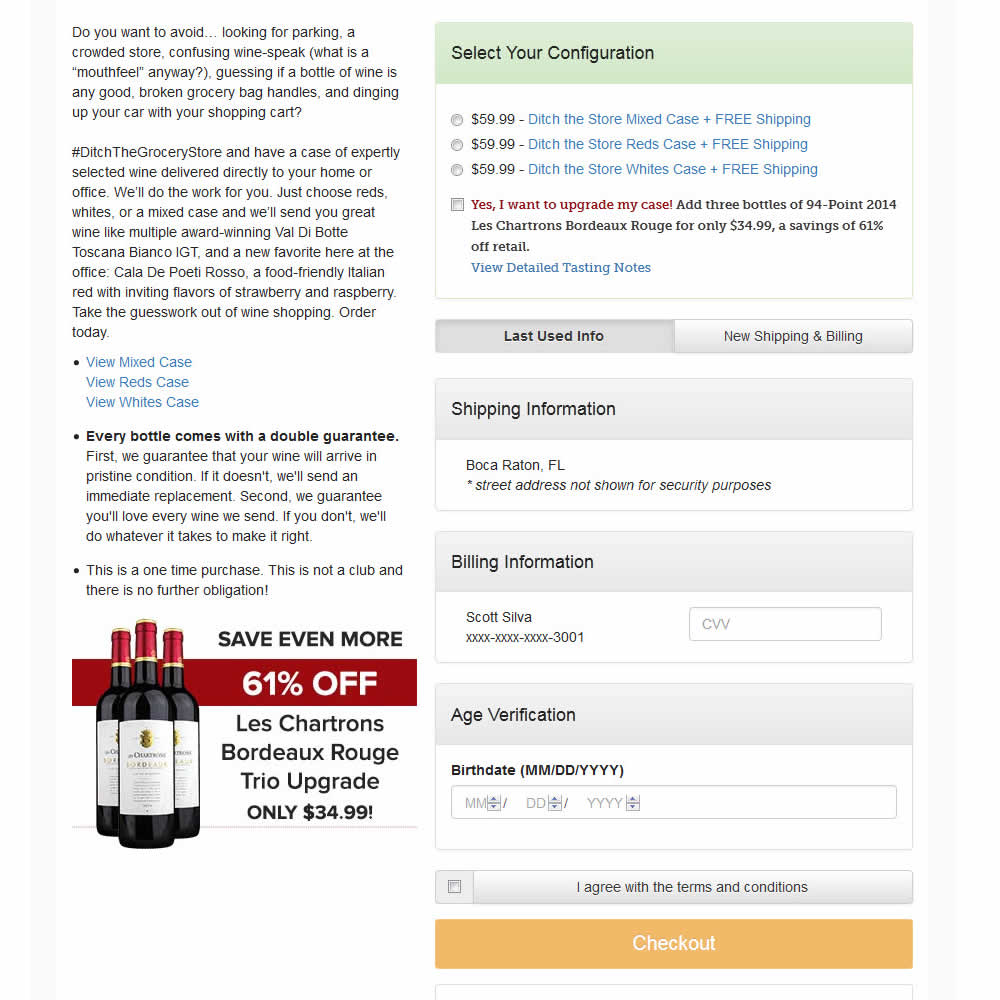
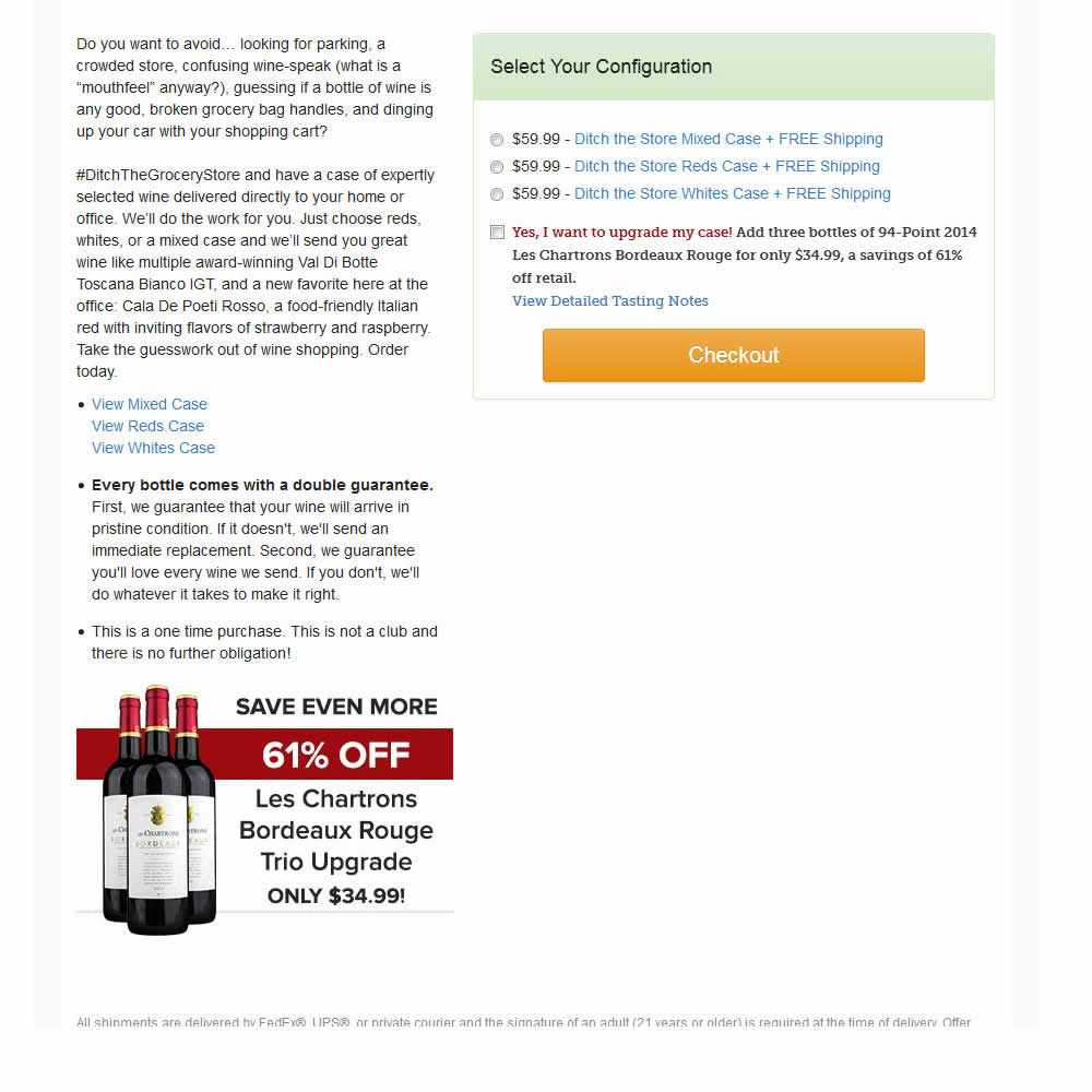
In this experiment, a single screen checkout was turned into a series of smaller steps in variation B. This was achieved by showing fewer fields on the first step, and shifting the remaining ones into a 3 step modal popup. The experiment measured successful transactions (sales).
Test #302 on
Volders.de
by Michal Fiech
Jun 09, 2020
Desktop
Mobile
Signup
X.X%
Sales
Michal Tested Pattern #83: Progressive Fields On Volders.de
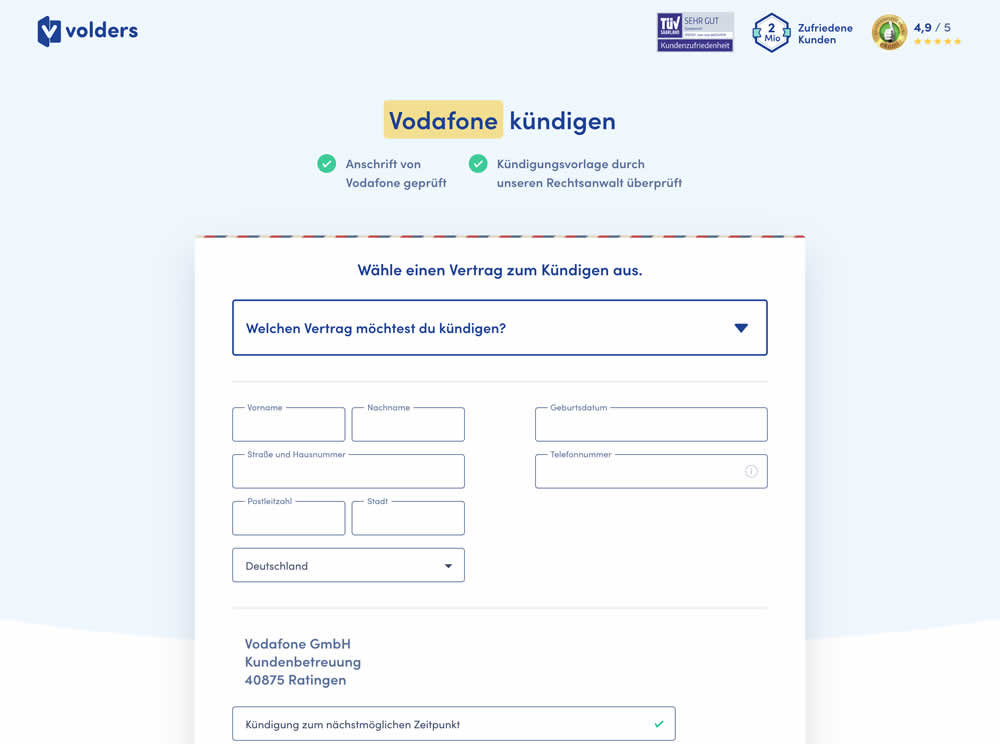
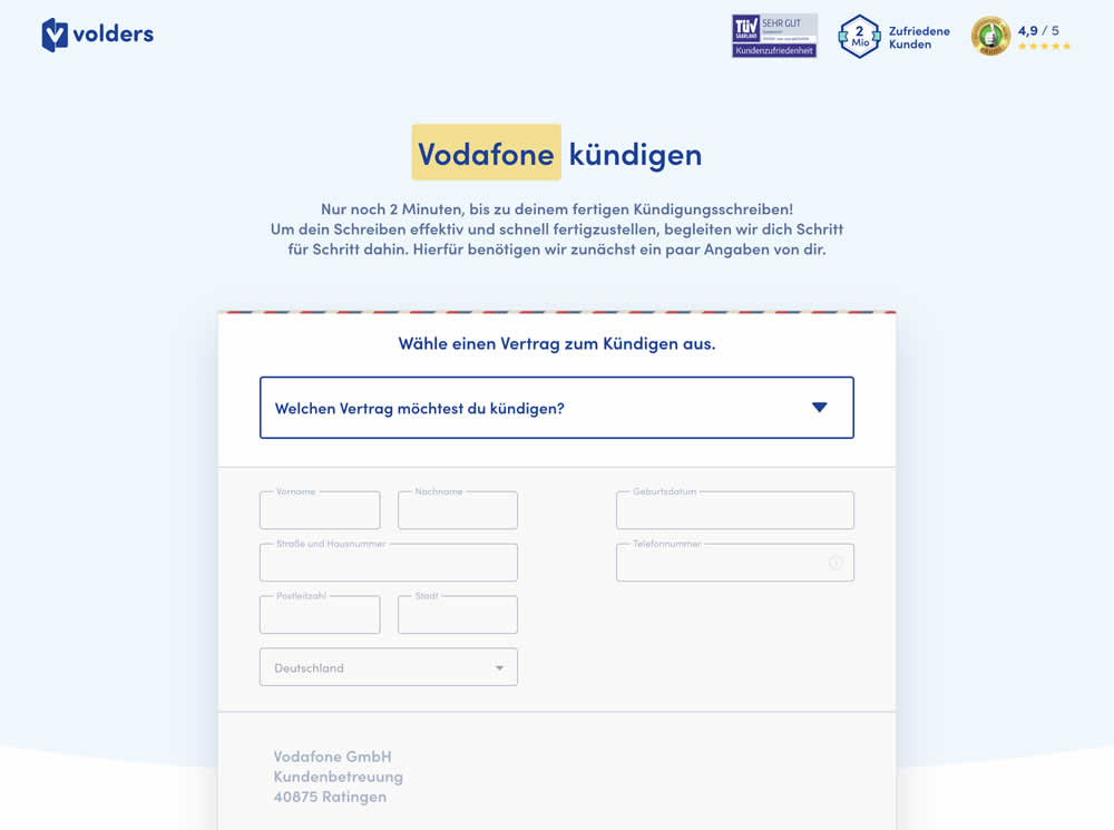
In this experiment a long form (A) was replaced with a progressive form interaction (B). Most of the form fields would appear in a grey-disabled style, until the prerequioste fields were first filled out.
Test #295 on
Thomasnet.com
by  Julian Gaviria
Apr 29, 2020
Desktop
Mobile
Content
X.X%
Engagement
Julian Tested Pattern #25: Nagging Results On Thomasnet.com
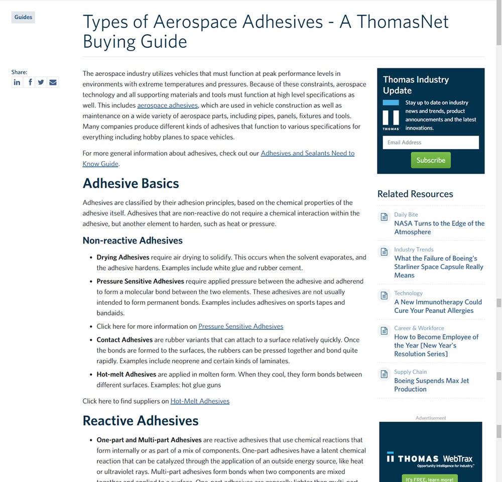
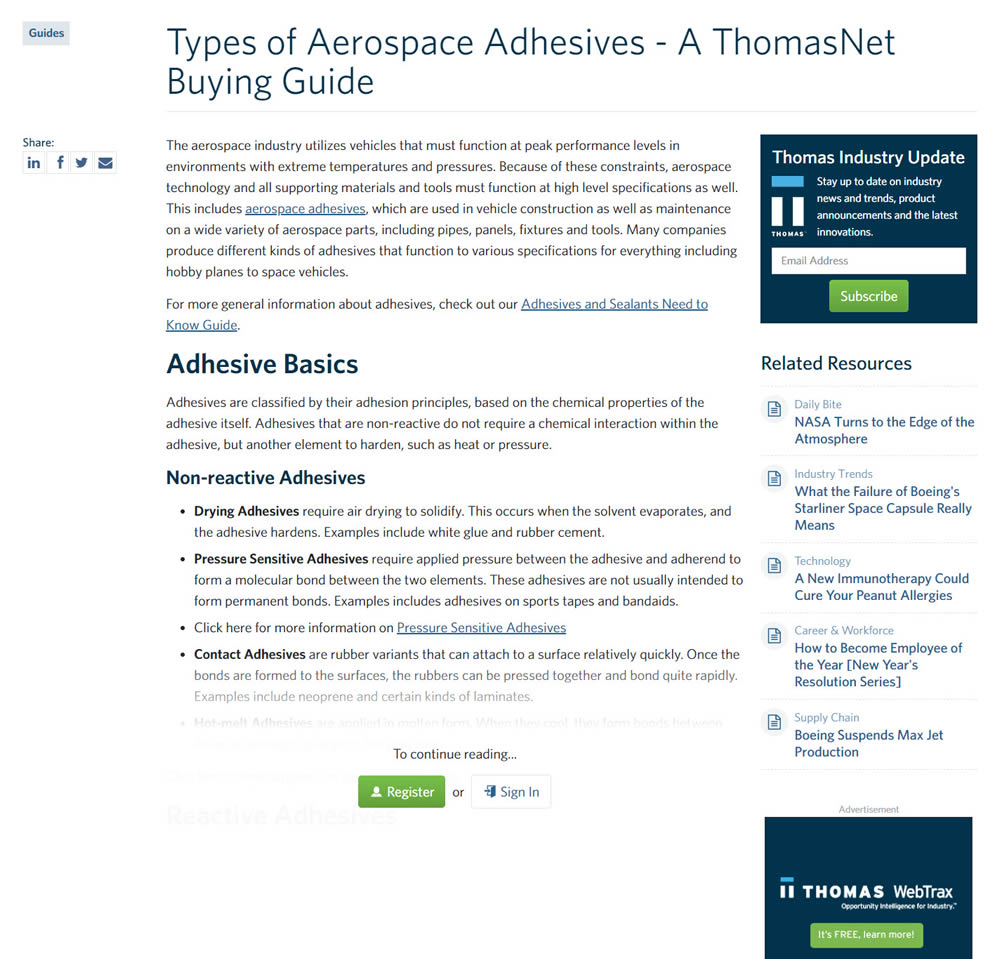
In this experiment, blog article pages were hidden behind a registration wall - requing a signup to access. The registration wall would appear after the first paragraph using gradual opacity to cover the rest of the article. We have published the effects of this change on registrations (signups) and on engagement (users viewing other more important company detail pages).
Test #294 on
Umbraco.com
by  Lars Skjold Iversen
Apr 23, 2020
Desktop
Pricing
X.X%
Progression
Lars Tested Pattern #115: Pricing Comparison Table On Umbraco.com
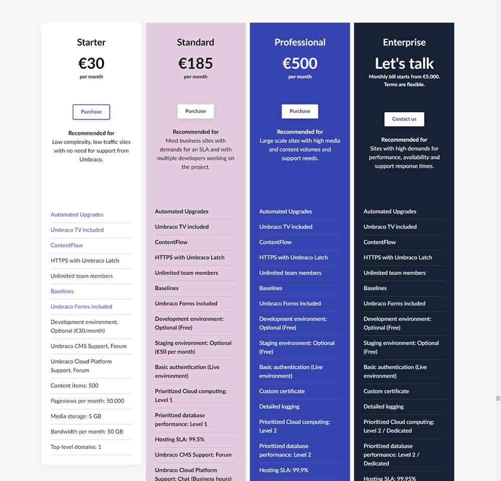
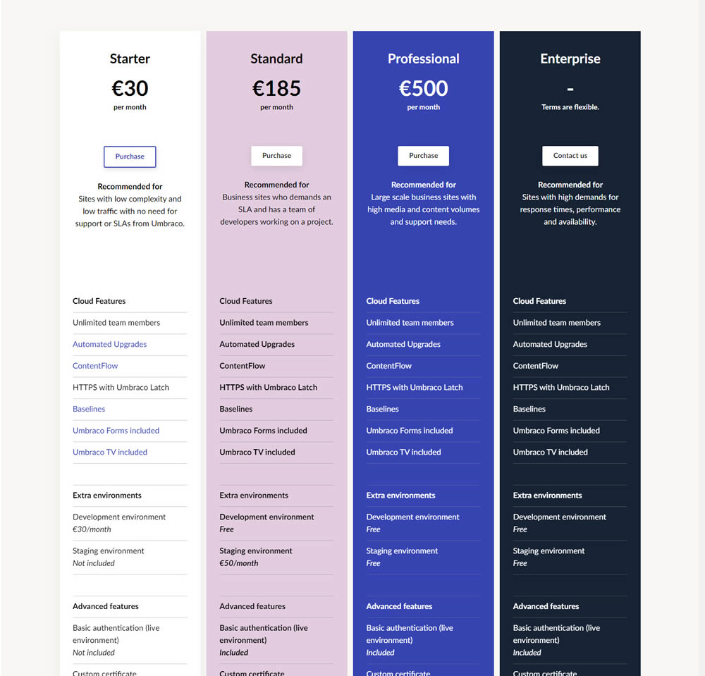
In this experiment, plan properties on a pricing page were horizontally aligned (for easier comparison). More so, labels and values were also broken on separate lines.
Test #289 on
Prepagent.com
by  Arthur Sparks
Mar 23, 2020
Desktop
Pricing
X.X%
Revenue
Arthur Tested Pattern #17: Least Or Most Expensive First On Prepagent.com
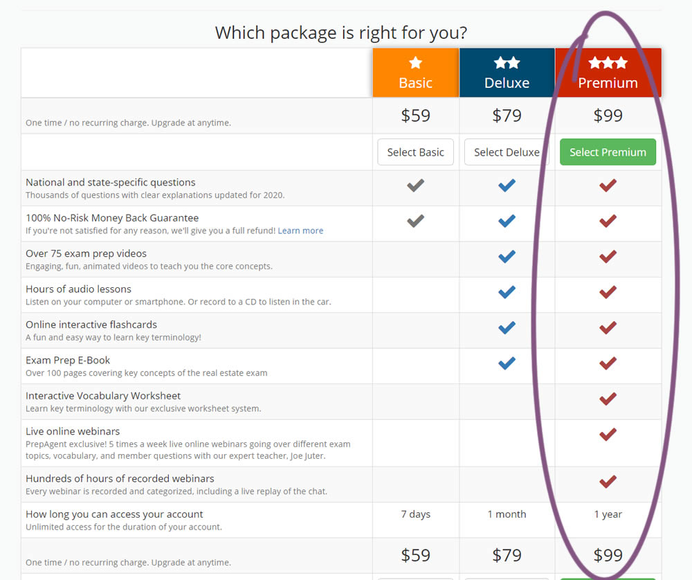
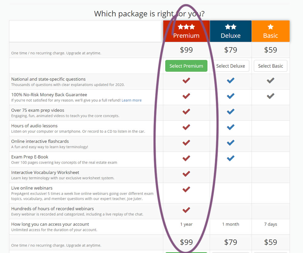
In this experiment, the order of pricing plans was rearranged as to show the most expensive one first.
Test #290 on
Prepagent.com
by  Arthur Sparks
Mar 23, 2020
Desktop
Pricing
X.X%
Sales
Arthur Tested Pattern #14: Exposed Menu Options On Prepagent.com
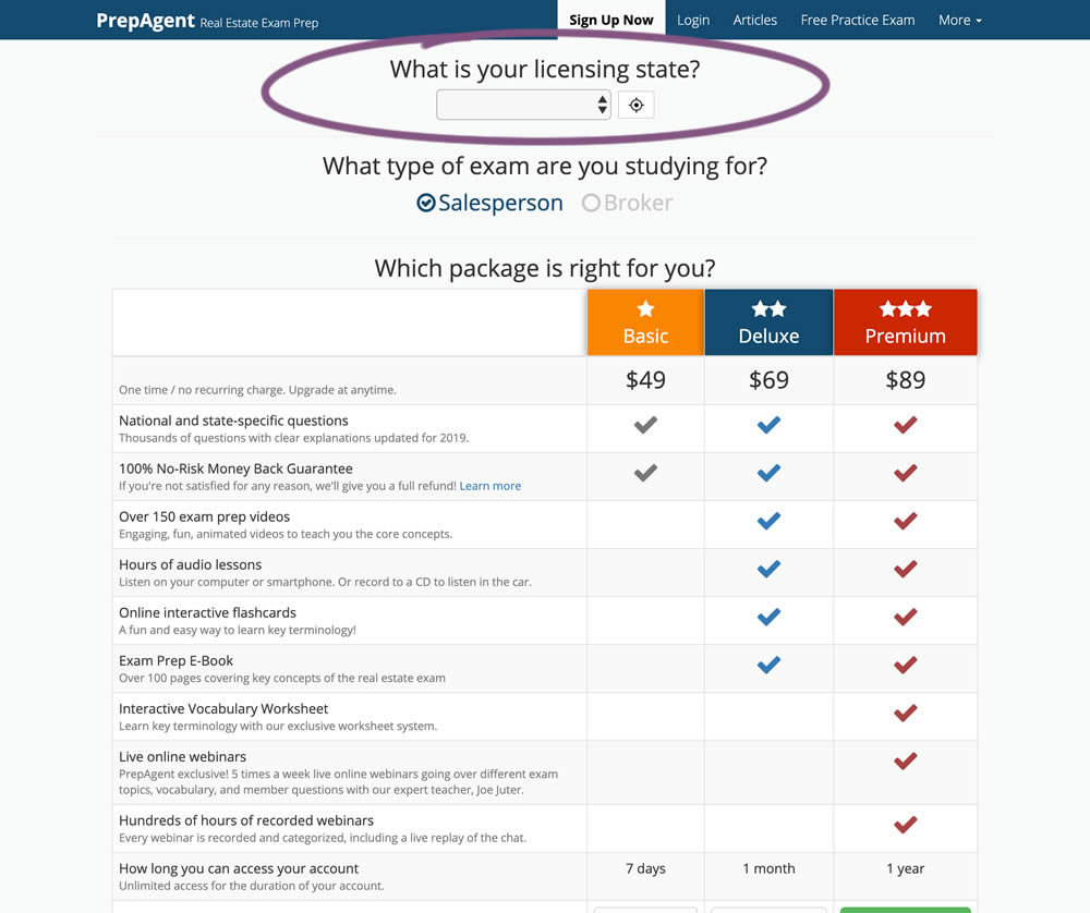
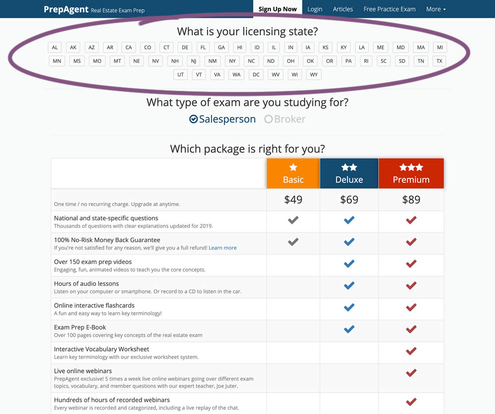
In this experiment, a simple pulldown menu (for US state selection) was replaced with all state options shown as selectable buttons. The states were also abbreviated.
Test #286 on
Volders.de
by  Alexander Krieger
Feb 28, 2020
Desktop
Mobile
Home & Landing
X.X%
Sales
Alexander Tested Pattern #9: Multiple Steps On Volders.de
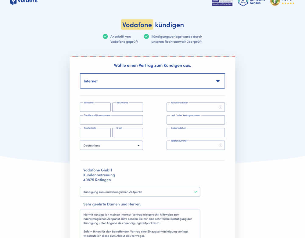
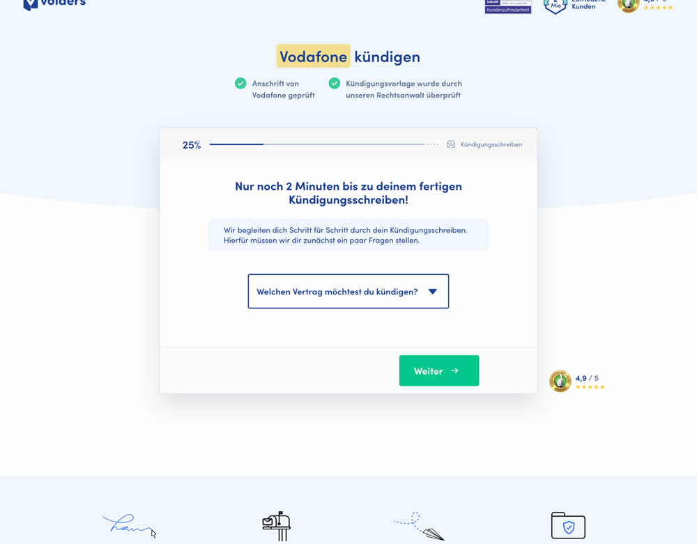
In this experiment, a long contract cancellation landing page (control) was broken down into 4 steps with 1 final summary step (variation).
Test #281 on
Backstage.com
by  Stanley Zuo
Jan 31, 2020
Desktop
Listing
X.X%
Sales
Stanley Tested Pattern #116: Links Or Buttons On Backstage.com
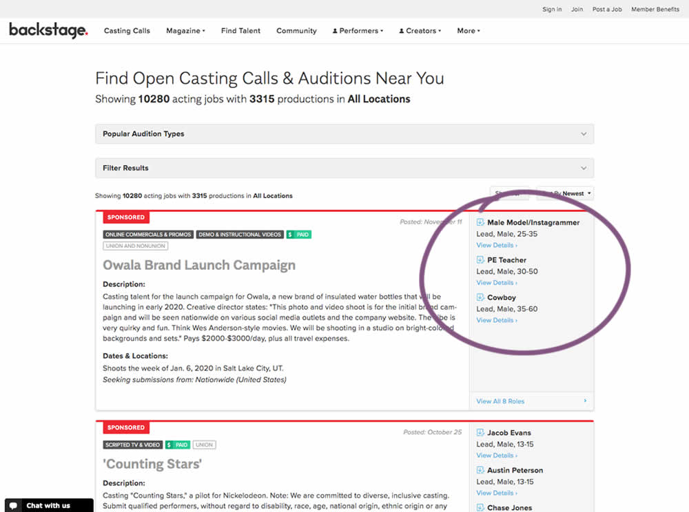
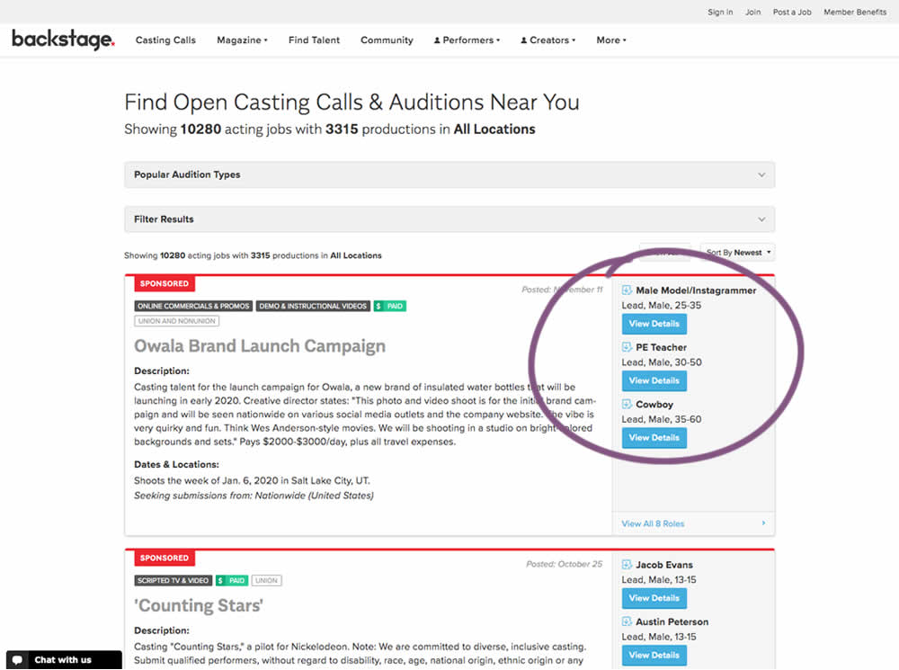
In this experiment, multiple view detail links for a listing tile were turned into higher contrast buttons.
Test #277 on
Prepagent.com
by  Arthur Sparks
Jan 03, 2020
Desktop
Pricing
X.X%
Revenue
Arthur Tested Pattern #115: Pricing Comparison Table On Prepagent.com
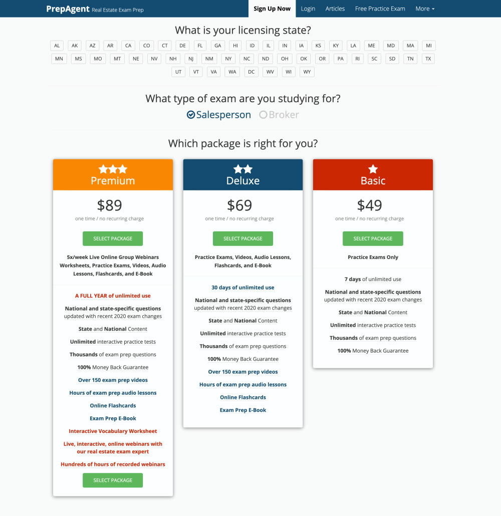
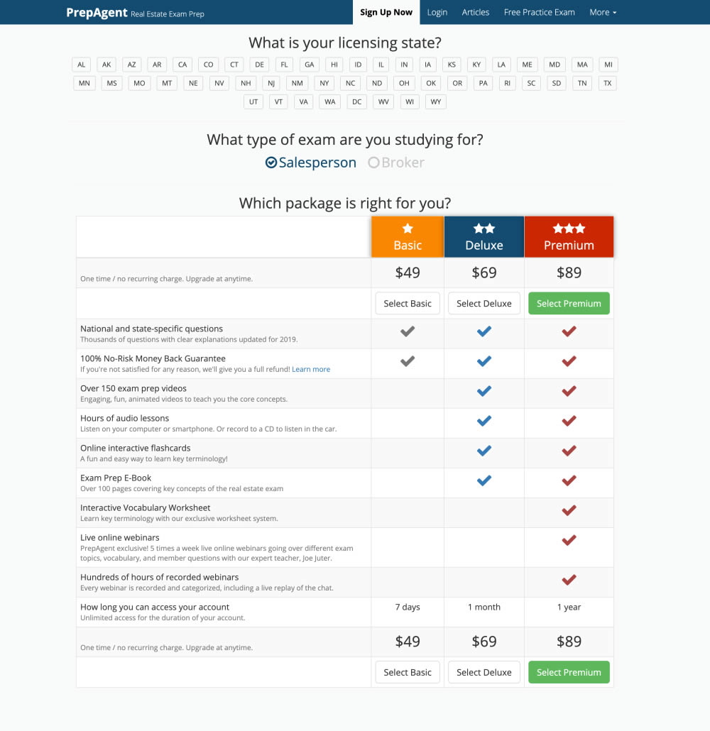
In this experiment, side-by-side plan features were aligned and changed to a comparison table with checkmarks for easier comparison.
Test #275 on
Prepagent.com
by  Arthur Sparks
Dec 31, 2019
Desktop
Pricing
X.X%
Revenue
Arthur Tested Pattern #114: Less Or More Visible Prices On Prepagent.com
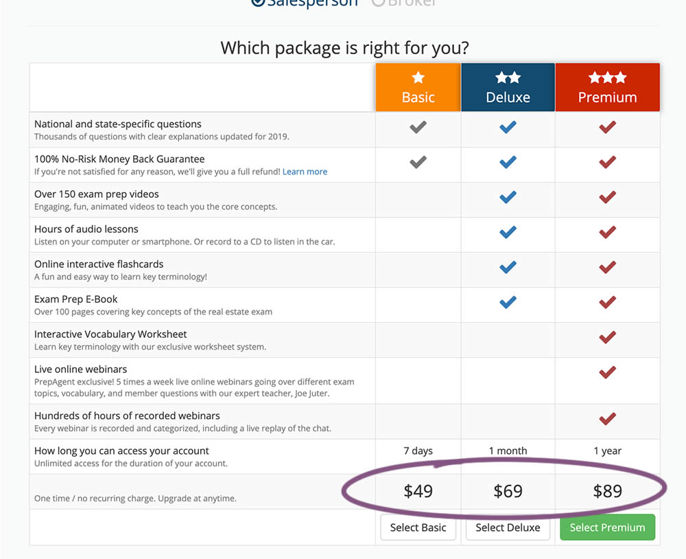
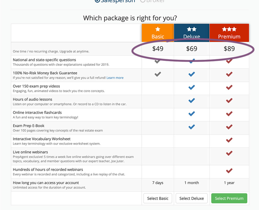
In this experiment, all three prices of each plan were shifted higher for greater visibility.
Test #276 on
Umbraco.com
by  Lars Skjold Iversen
Dec 31, 2019
Desktop
Mobile
Home & Landing
X.X%
Signups
Lars Tested Pattern #111: Field Explanations On Umbraco.com
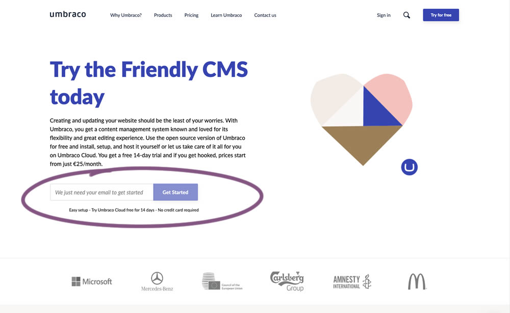
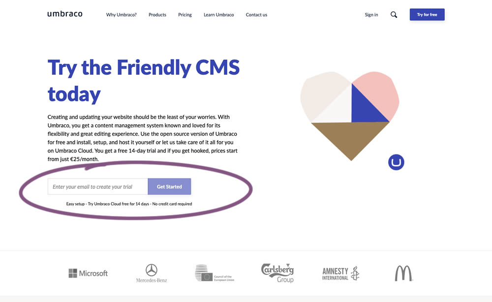
In this experiment, the idea was to move away from copy that was focusing on the needs of the company ("we need your email") towards copy that hinted at a customer benefit ("create your trial").
Test #273 on
Elevate App
by  Jesse Germinario
Dec 19, 2019
Mobile
Signup
X.X%
Signups
Jesse Tested Pattern #9: Multiple Steps
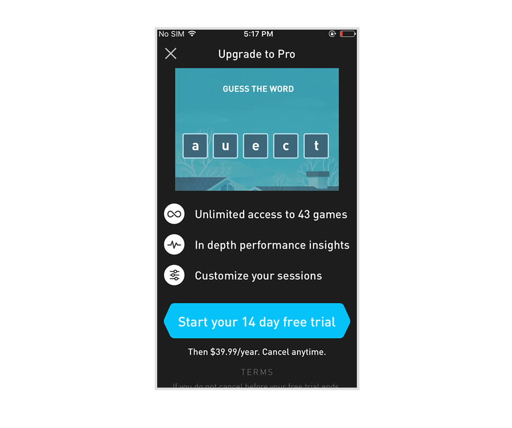
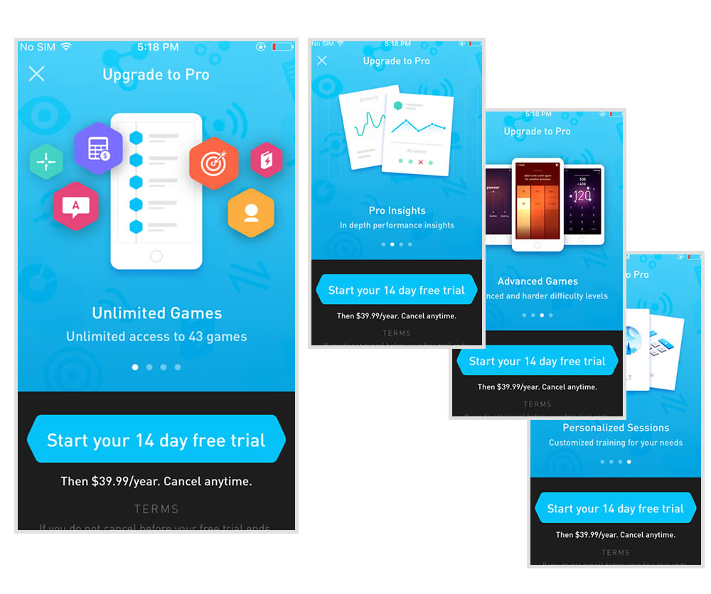
This experiment tests the impact of a different paywall screen on iOS. The current control paywall screen for 100% of iOS users was the animated pro screen. In this screen, users see an animation that gives shows glimpses of several Elevate games in action, as well as a bulleted list of key selling points for Pro. The proposed change (variant B) features a swipeable carousel of pages where each page has an image and some accompanying text explaining a different benefit of subscribing to Pro. The hypothesis is that we can lift conversion by showing users the alternate swiping paywall screen.
Test #274 on
by  Someone
Dec 16, 2019
Desktop
Mobile
Checkout
X.X%
Sales
Someone Tested Pattern #1: Remove Coupon Fields
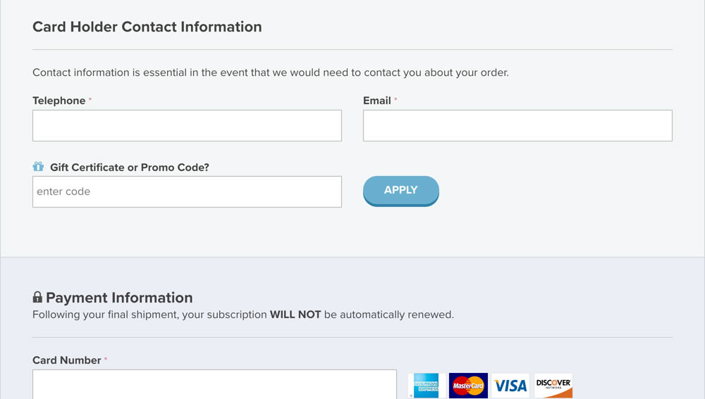
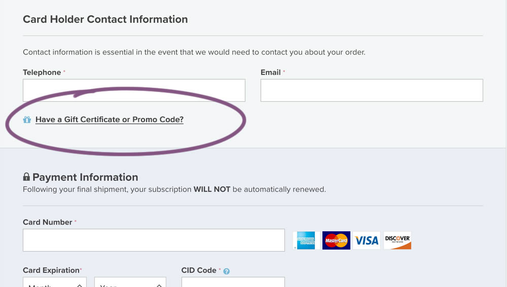
In this experiment, a fully visible coupon field (A) was made less visible by turning it into a default collaped link (B). Clicking on the link caused the coupon field to appear.
Test #272 on
Backstage.com
by  Stanley Zuo
Dec 03, 2019
Desktop
Pricing
X.X%
Revenue
Stanley Tested Pattern #113: More Or Fewer Plans On Backstage.com
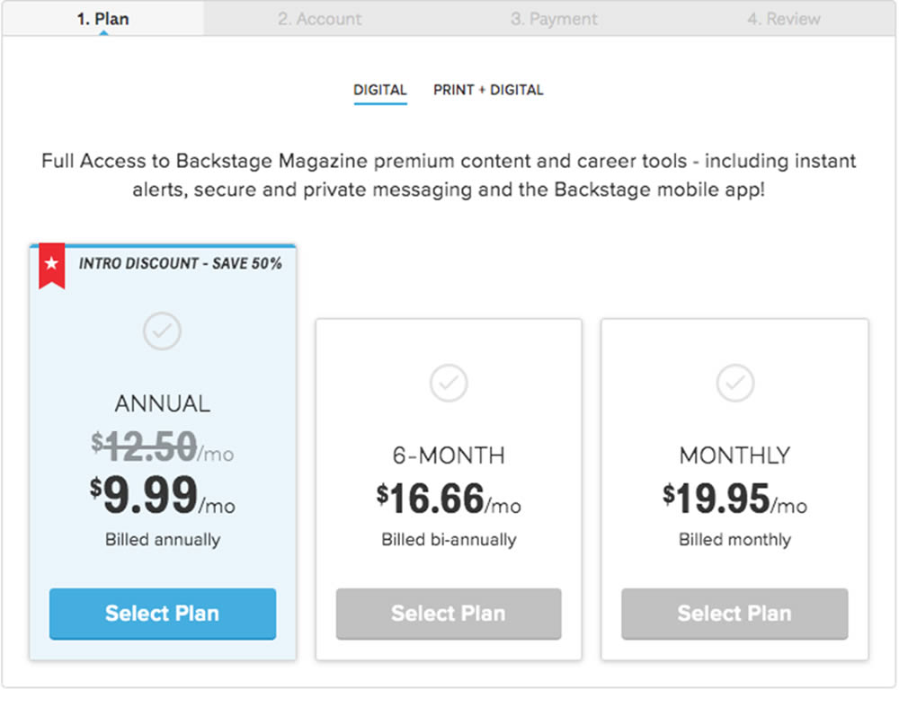
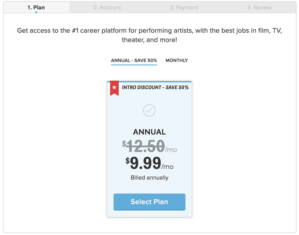
In this experiment, the three pricing plans were condensed into a single recommended plan (annual), with a secondary option to choose the monthly plan.