All Latest 617 A/B Tests
Test #527 on
by  Jakub Linowski
Apr 23, 2024
Desktop
Mobile
Product
X.X%
Sales
Jakub Tested Pattern #132: One Time Payment Copy
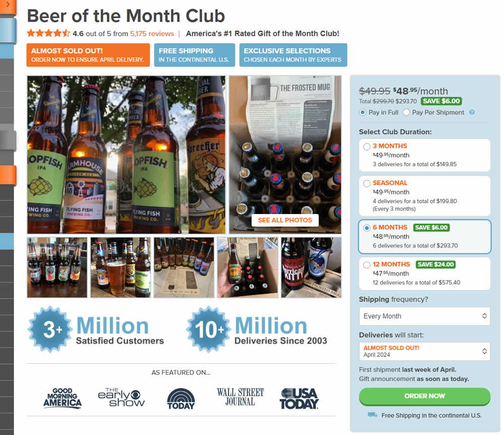
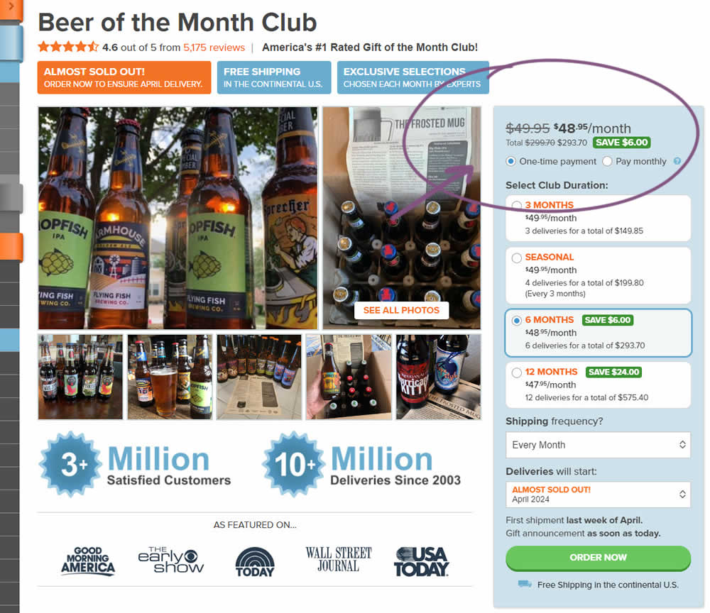
In this experiment, copy related to payment duration types (paid in full or ongoing) was changed. In the the control, one of the option used the "Pay in Full" copy, whereas the variation changed this to "One-time payment". Impact on sales was measured.
Which A Or B Actually Wins? Find Out Before You Test.
Members see every test result — the winners, the flat ones, and the losers — along with exact effects and sample sizes. Use it to estimate your tests and prioritize by probability, not gut feel. Start every experiment with the odds on your side.
Test #526 on
Online.metro-cc.ru
by  Andrey Andreev
Apr 17, 2024
Desktop
Mobile
Global
X.X%
Sales
Andrey Tested Pattern #77: Filled Or Ghost Buttons On Online.metro-cc.ru
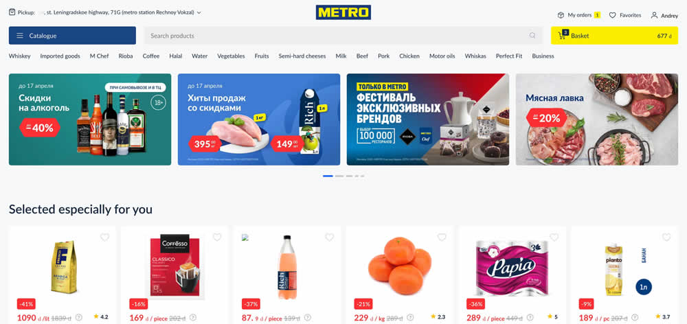
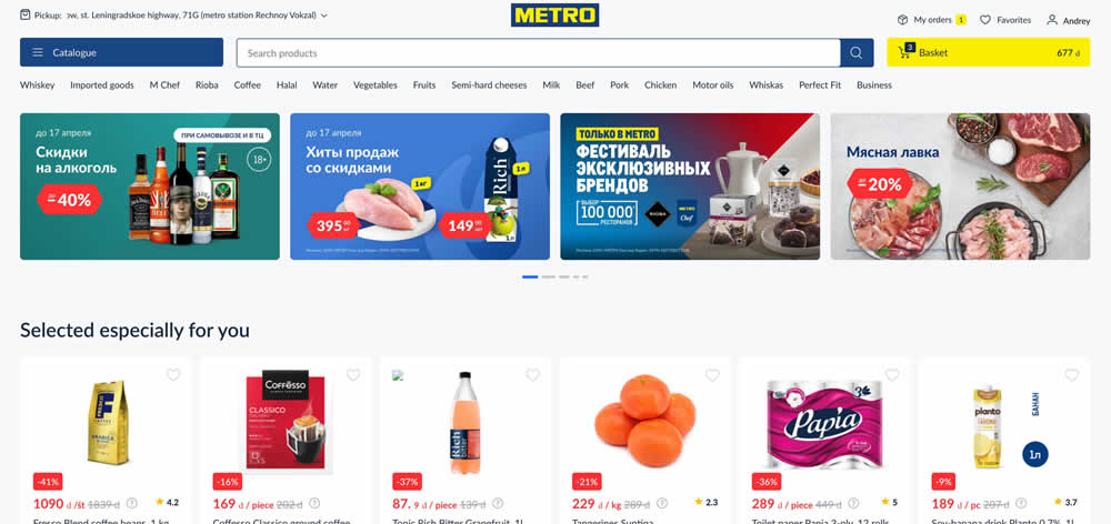
In this experiment, a higher contrast search bar with a blue border and a filled blue button style was tested against a more feint style. Impact on searches and purchases was measured. (A/B test was inverted to B/A in order to fit the filled-vs-ghost button pattern).
Test #525 on
by  Jakub Linowski
Mar 27, 2024
Desktop
Mobile
Product
X.X%
Sales
Jakub Tested Pattern #119: Unselected Or Selected Defaults
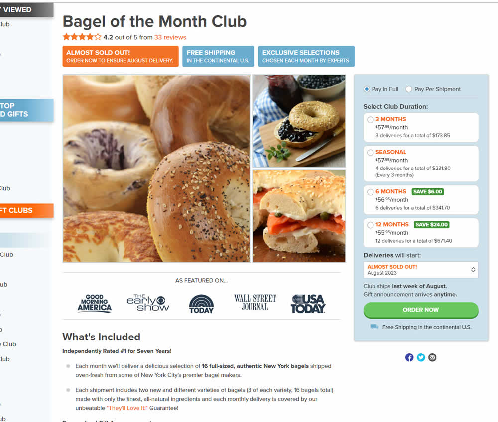
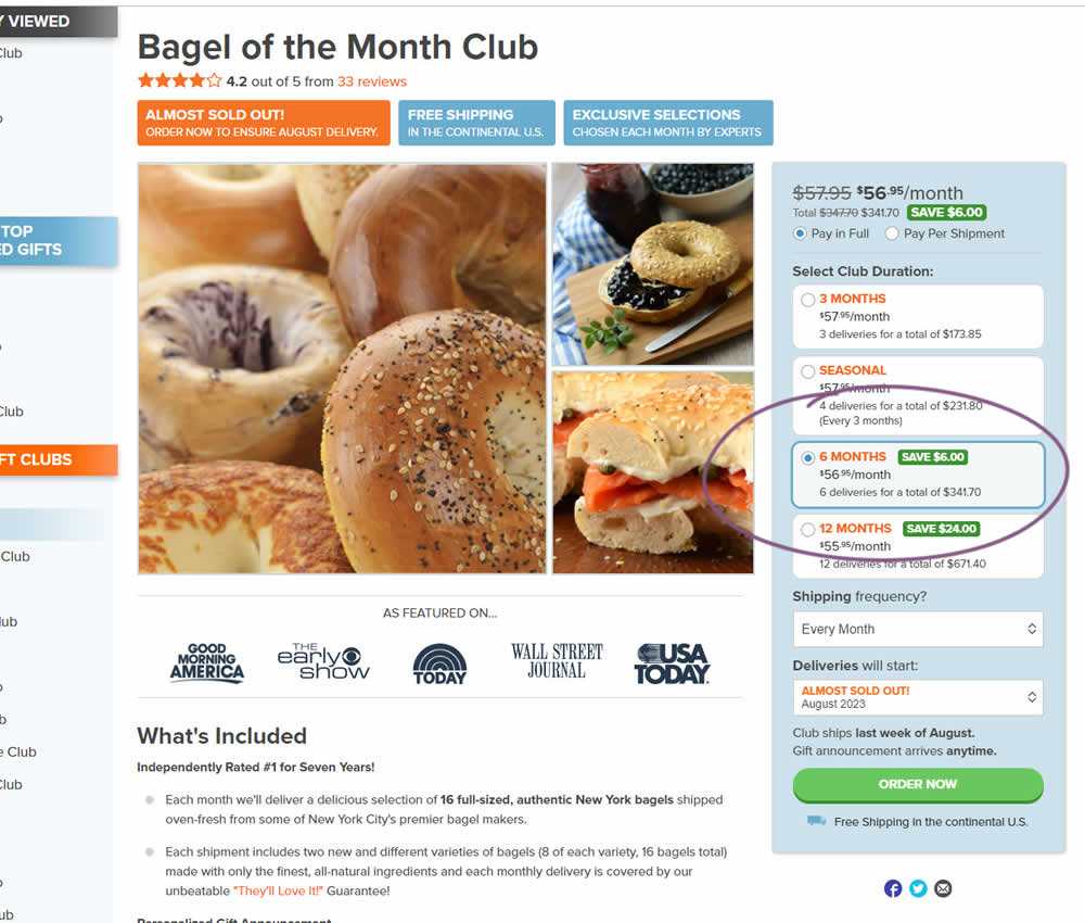
In this experiment, a club subscription duration was preselected to 6 in the variation. The control had no club durations preselected. As a result of preselecting a club duration, a more visible price also appeared at the top (sooner in the variation). Impact on sales was measured.
Test #522 on
686.com
by  Adan Archila
Mar 18, 2024
Desktop
Listing
X.X%
Sales
Adan Tested Pattern #37: List Or Grid View On 686.com
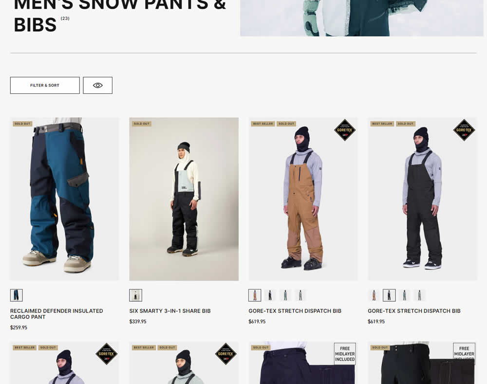
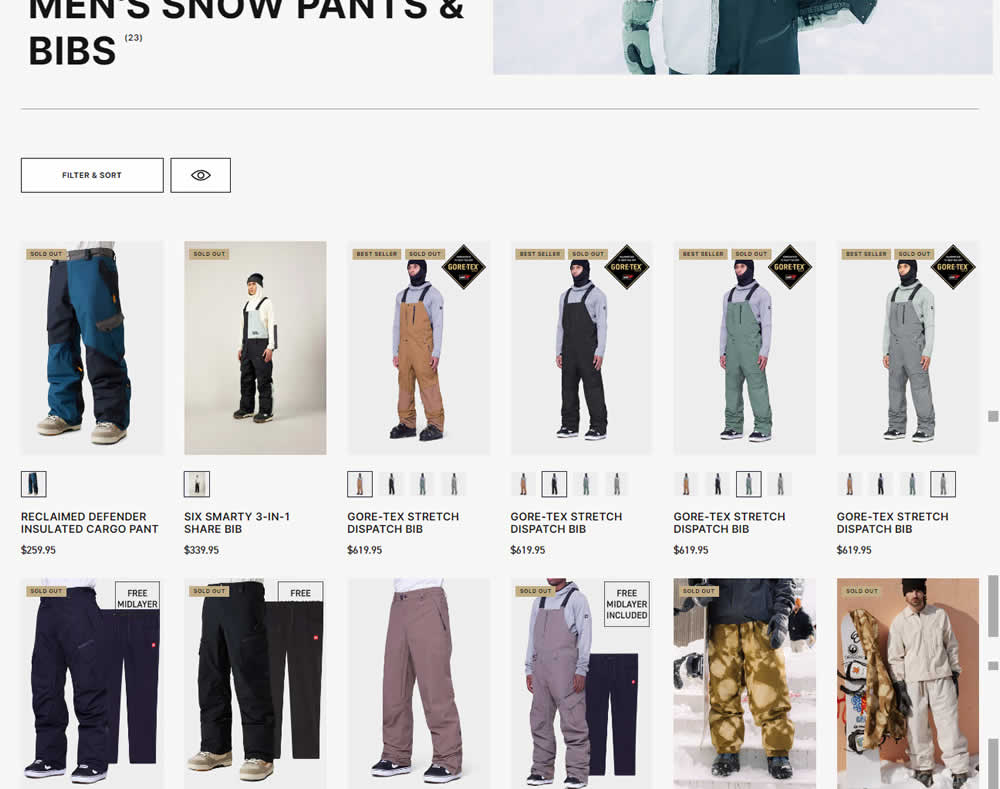
In this desktop experiment, 4 product tiles per page (control) were tested against 6. Impact on sales was measured.
Test #520 on
Asics.com
by  Andrey Prokhorov
Feb 29, 2024
Mobile
Product
X.X%
Revenue
Andrey Tested Pattern #51: Shortcut Buttons On Asics.com
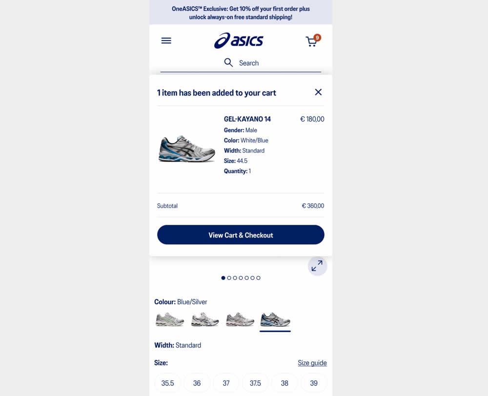
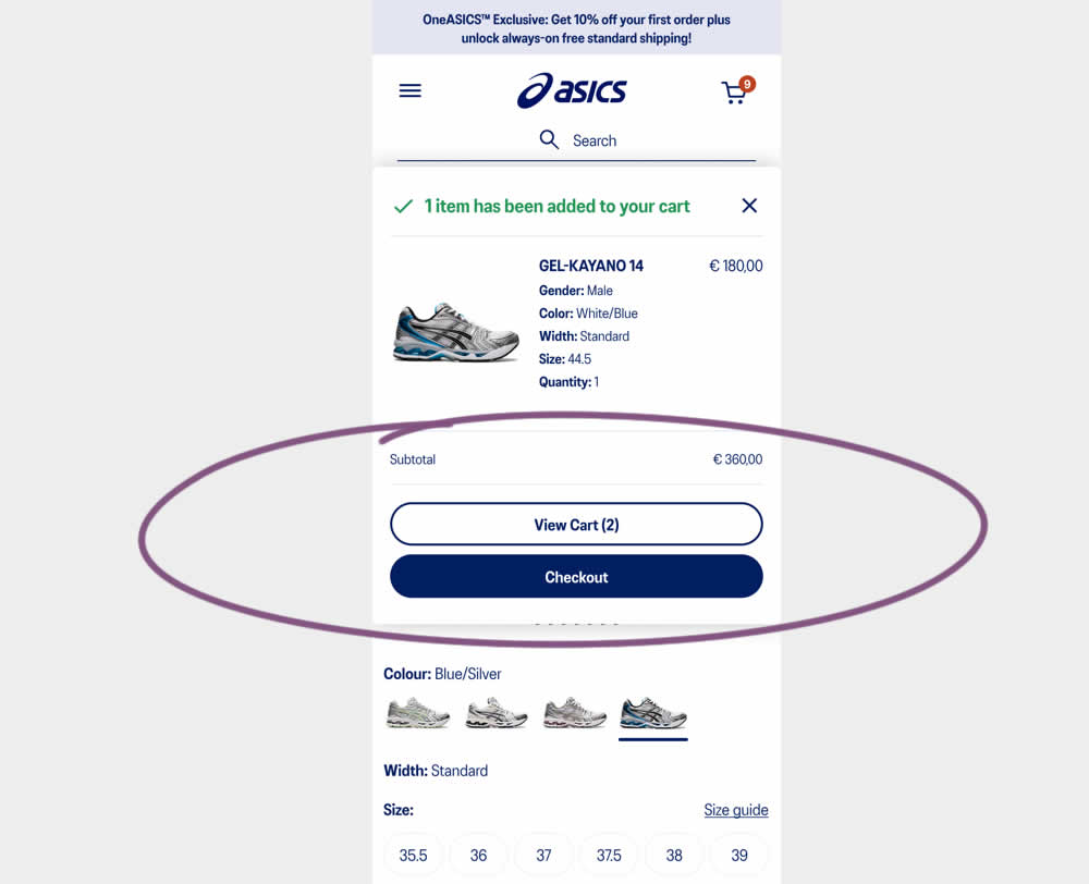
This experiment started when users would click add-to-cart on product detail pages. In both the control and variation, a modal would appear. In the control the modal contained a "View Cart and Checkout" button that lead users to the cart page. In the variation the modal showed separate "View Cart" and "Checkout" buttons. The a/b test variation also introduced a green confirmation message about the product being added to cart. Impact on transactions and revenue was measured.
Test #519 on
Volders.de
by  Katharina Lay
Feb 23, 2024
Desktop
Mobile
Checkout
X.X%
Sales
Katharina Tested Pattern #134: Optional or Confident Recommendation On Volders.de
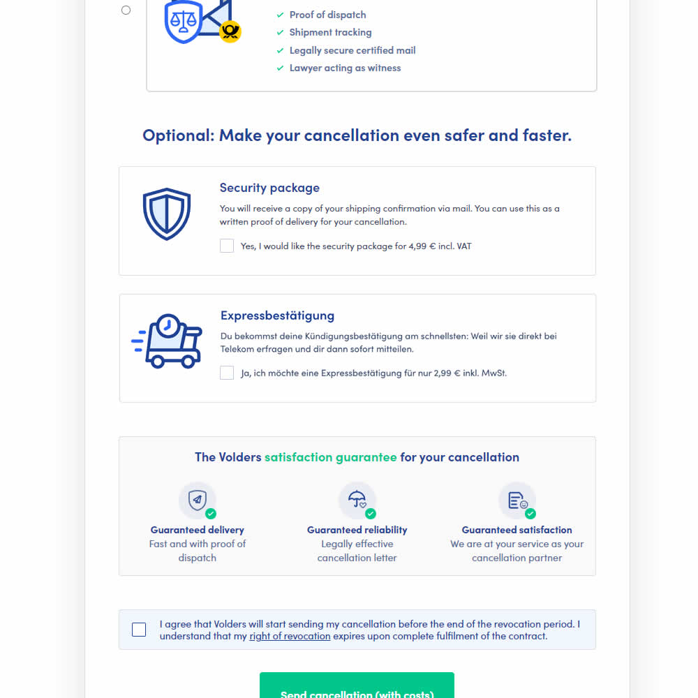
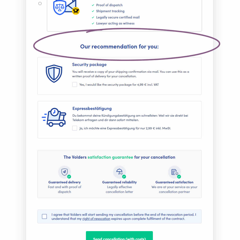
In this experiment, copy around an upsell was changed from using "optional" to "our recommendation for you". The idea was to recommend two upsells with more confidence. Impact on the two upsells (secure, and express) as well as overall transactions was measured.
Test #516 on
686.com
by  Adan Archila
Feb 05, 2024
Mobile
Listing
X.X%
Sales
Adan Tested Pattern #37: List Or Grid View On 686.com
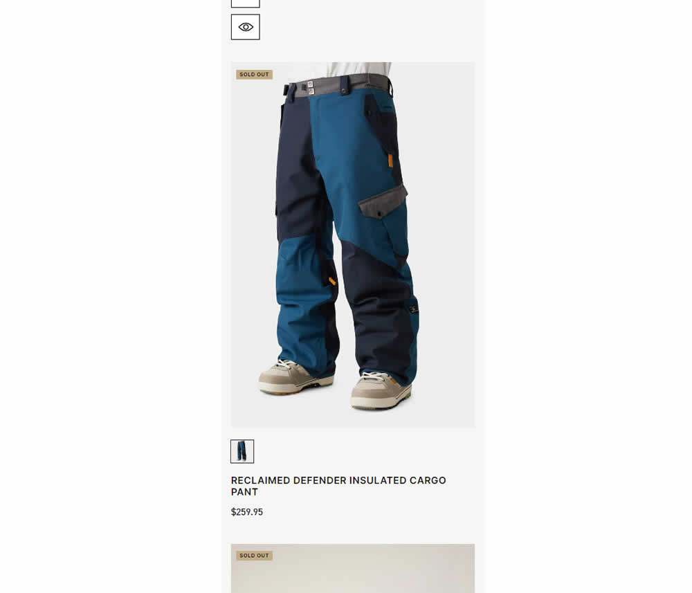
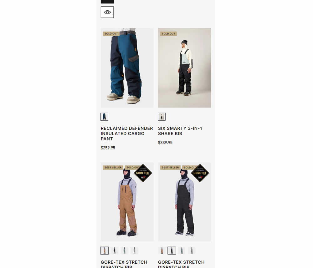
In this experiment, a one large product photo (control) was tested against a two-column layout with two smaller images (variation). Impact on sales was measured.
Test #514 on
Backstage.com
by  Stanley Zuo
Jan 24, 2024
Desktop
Listing
X.X%
Sales
Stanley Tested Pattern #97: Bigger Form Fields On Backstage.com
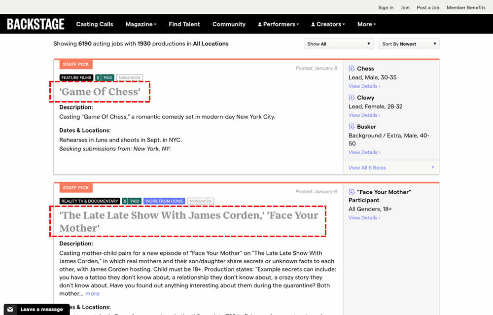
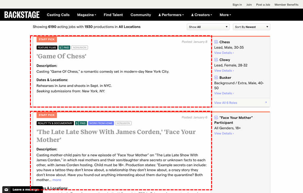
In this experiment, the click area of job listing tiles was expanded to the size of the full job tile. In the control, the click area was smaller - mostly only the job headline, along with additional "view more" links on the right hand column. Clicking the tile or headline would open up a new job details page in both control and variation. Impact on progression and membership sales was measured.
Test #512 on
Snocks.com
by  Melina Hess
Jan 17, 2024
Mobile
Product
X.X%
Sales
Melina Tested Pattern #65: Add More For Extra Incentive On Snocks.com
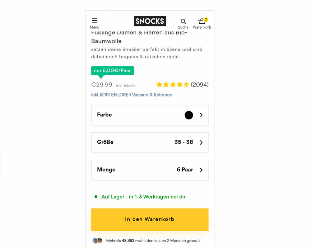
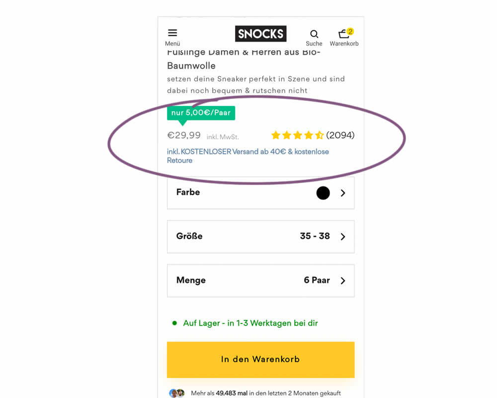
In this experiment, free shipping was a/b tested against free shipping with a 40€ purchase or higher. Hence, in the variation, customers needed to reach a cart amount total in order to be eligible for the free shipping.
Test #510 on
Formelskin.de
by  Alexander Krieger
Dec 21, 2023
Mobile
Home & Landing
X.X%
Sales
Alexander Tested Pattern #26: Cart Reminder And Recently Viewed On Formelskin.de
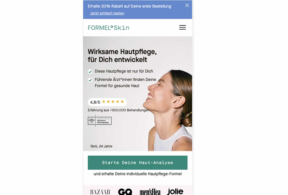
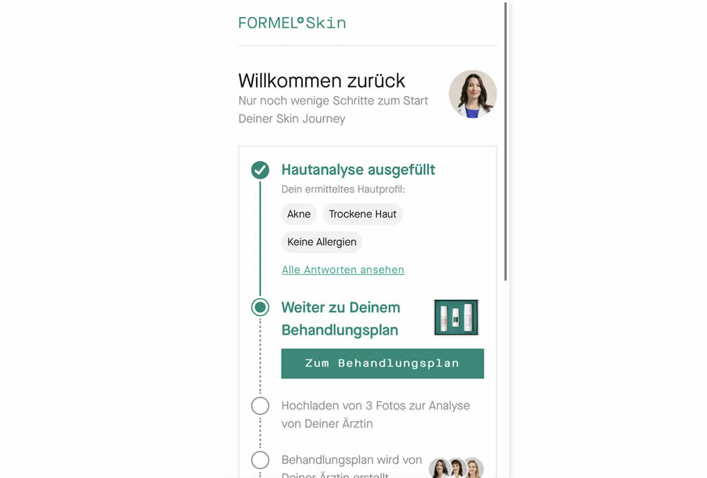
In this experiment, users that did not complete a purchase and came back to the homepage were shown two different experiences. In the control, users would see the homepage (essentially having to restart the purchase flow). Whereas, in the variation, users would be shown a "Welcome Back" summary view with the completed steps shown as completed and a quick resume button to the next incomplete step. Impact on completed sales was measured.
Test #508 on
Online.metro-cc.ru
by  Andrey Andreev
Dec 15, 2023
Mobile
Product
X.X%
Sales
Andrey Tested Pattern #93: Auto Next On Online.metro-cc.ru
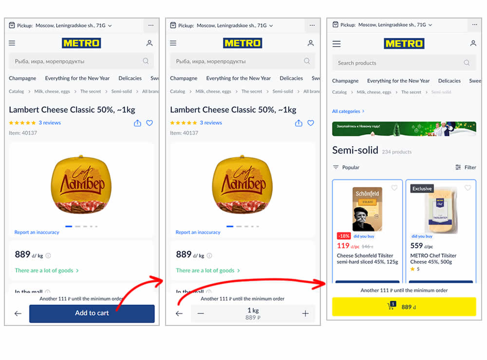
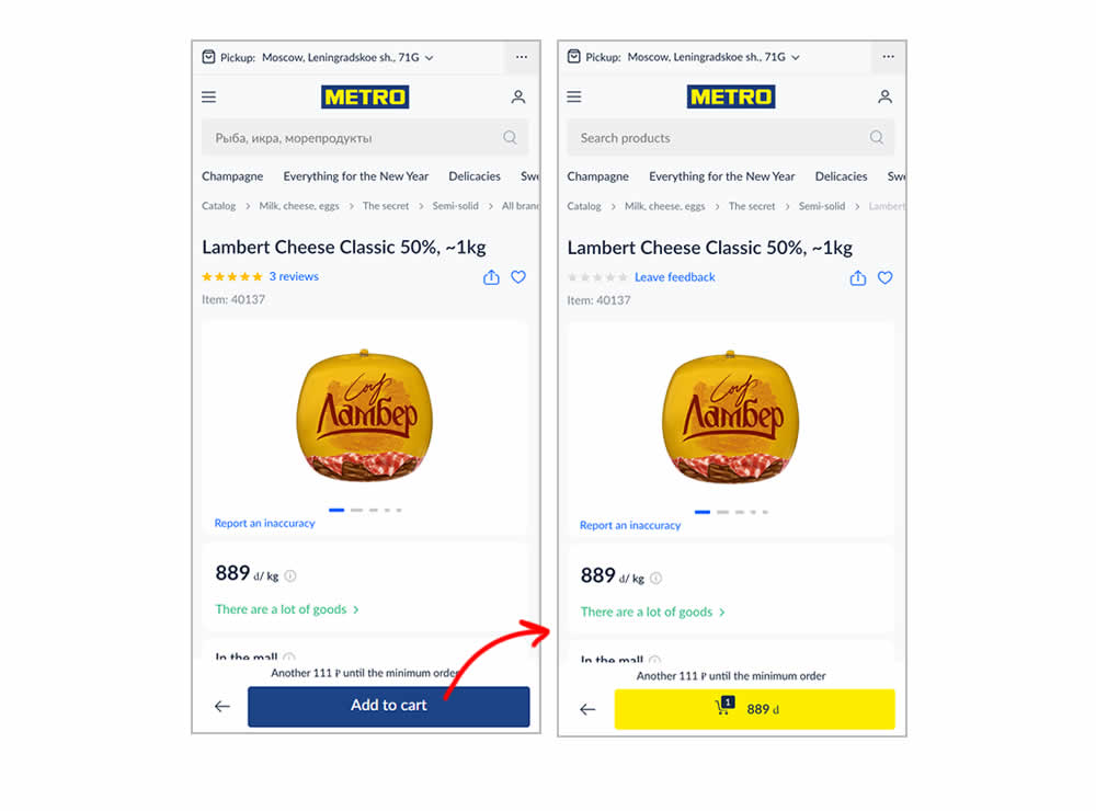
In this experiment, the variation transformed an add-to-cart button into a shopping cart one (making it a two step process). The control had an interaction where an add-to-cart button would become a quantity selection and then a shopping cart action (a three step process). In a way, the control kept users in a "dead-end" quantity selection middle state that required clicking the back button to continue the sale. Whereas the variation automatically moved users into the next step (closer towards being able to make a purchase). Impact on sales was measured.
Test #506 on
by  Jakub Linowski
Dec 07, 2023
Desktop
Mobile
Product
X.X%
Sales
Jakub Tested Pattern #4: Testimonials
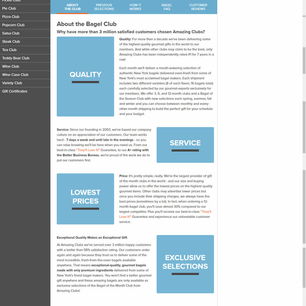
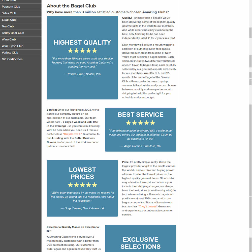
In this experiments, reinforcing section tiles were replaced with additional customer testimonials. Impact on adds to cart and sales was measured.
Test #505 on
Shmoodyapp.com
by  Michael McSweeney
Nov 28, 2023
Mobile
Signup
X.X%
Sales
Michael Tested Pattern #52: How It Works On Shmoodyapp.com
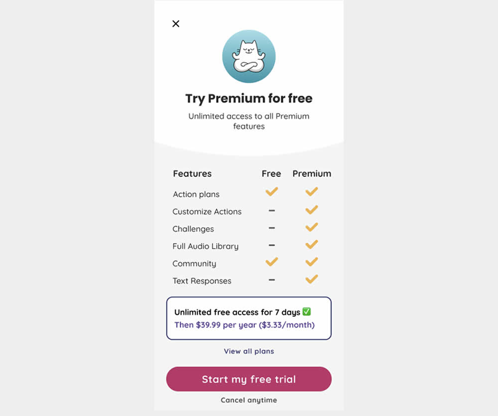
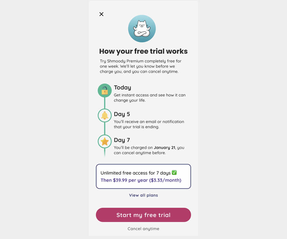
In this experiment, new paywall copy and messaging was used to encourage more users to signup and pay for access to a mental health app. The variation reinforced that users would be receiving a full featured application, with reminders about the upcoming billing. It reinforced that users will have a full week to decide and potentially cancel their application. Impact on lagging +7 day later transactions was measured.
Test #502 on
Fairment.de
by  Jona Eisenberger
Nov 06, 2023
Mobile
Listing
X.X%
Sales
Jona Tested Pattern #37: List Or Grid View On Fairment.de
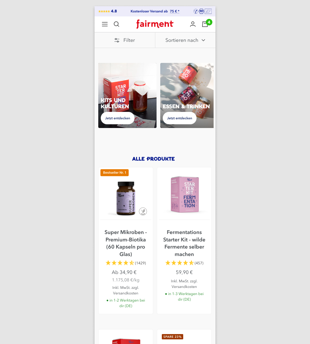
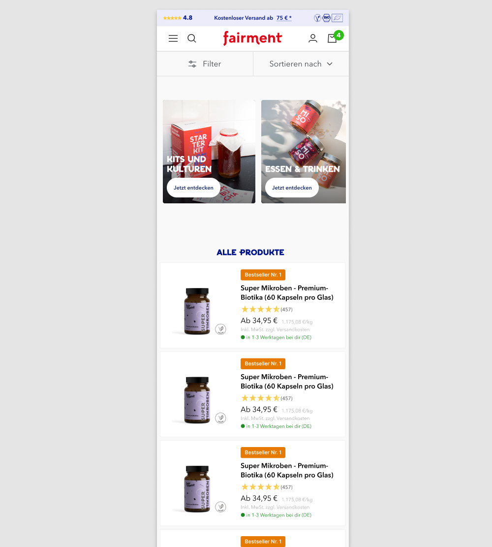
In this experiment, a two column grid layout (control) was tested against single column layout (variation) with the product information shown to the right. Please note that the screenshot shows repeated products only because it's been sourced from a Figma design file. In reality, the products in the variation were equally diverse as in the control.
(We've also flipped the A and B to match up with our grid pattern.)
Test #503 on
by  Jakub Linowski
Nov 05, 2023
Desktop
Mobile
Home & Landing
X.X%
Sales
Jakub Tested Pattern #36: Fewer Or More Results
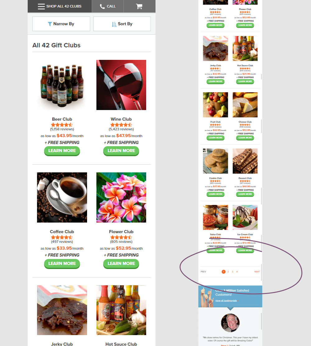
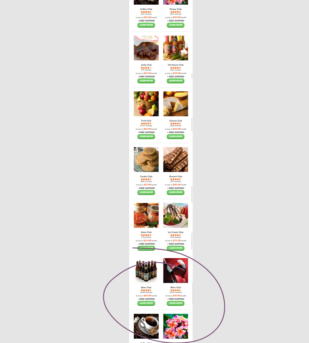
In this experiment, instead of showing 12 products per screen (with pagination), the variation showed all 42 products on a single screen. Impact on adds to cart and completed orders was measured.
Test #495 on
Formelskin.de
by  Alexander Krieger
Sep 25, 2023
Mobile
Signup
X.X%
Sales
Alexander Tested Pattern #9: Multiple Steps On Formelskin.de
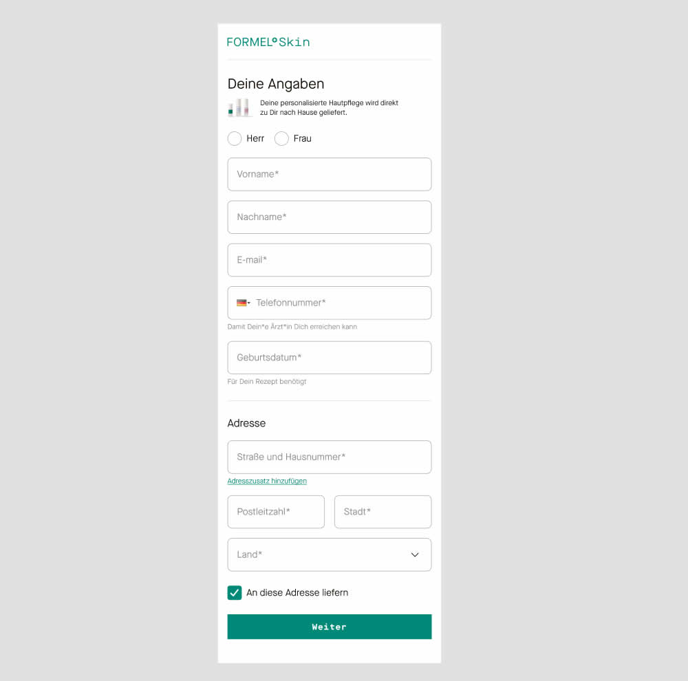
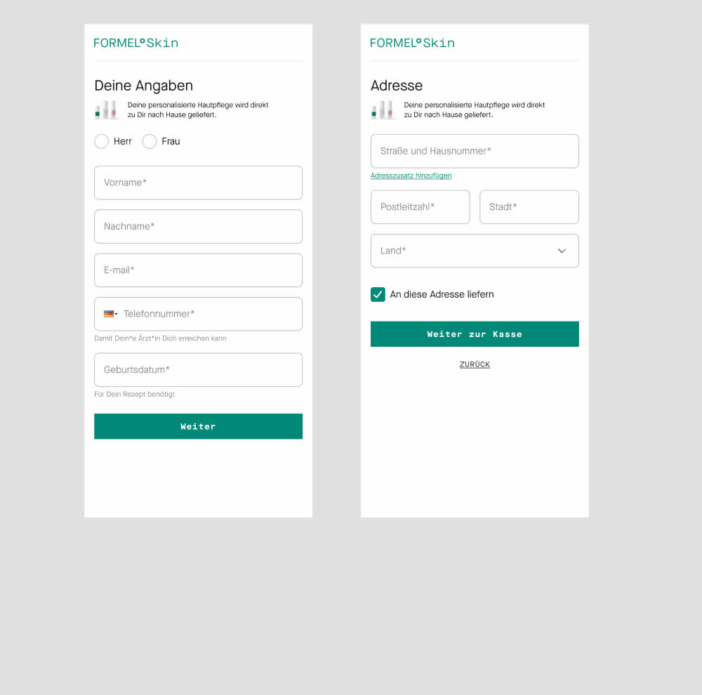
In this experiment two sections of a form on a single page (control) were broken out into 2 separate steps (variation). The two sections included personal details and shipping information. This step appeared after having received a product recommendation when filling out a questionnaire for a skin care product. Impact on next step progression and purchases was measured.
Test #493 on
by  Jakub Linowski
Sep 19, 2023
Desktop
Mobile
Product
X.X%
Sales
Jakub Tested Pattern #69: Autodiscounting
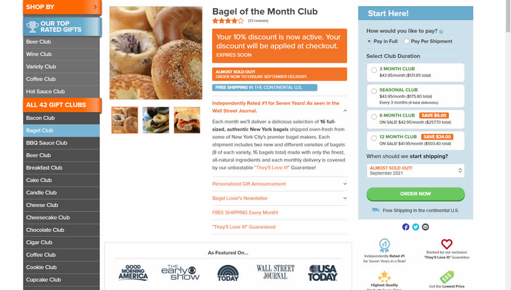
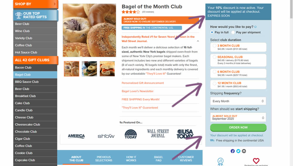
This experiment was technically a larger multi-change one that ran on product detail pages. The control showed an automatically applied coupon (for people opening up targeted emails with the discount). The variation attempted to make this better with the following changes:
- The discount message shifted closer towards the price / product selection (above the buy box)
- Removal of sale discount amounts and messages tied to longer durations (6 and 12 month duration)
- Reinforcing that the actual discount will be calculated further on checkout
Test #490 on
by  Jakub Linowski
Aug 17, 2023
Desktop
Mobile
X.X%
Sales
Jakub Tested Pattern #9: Multiple Steps
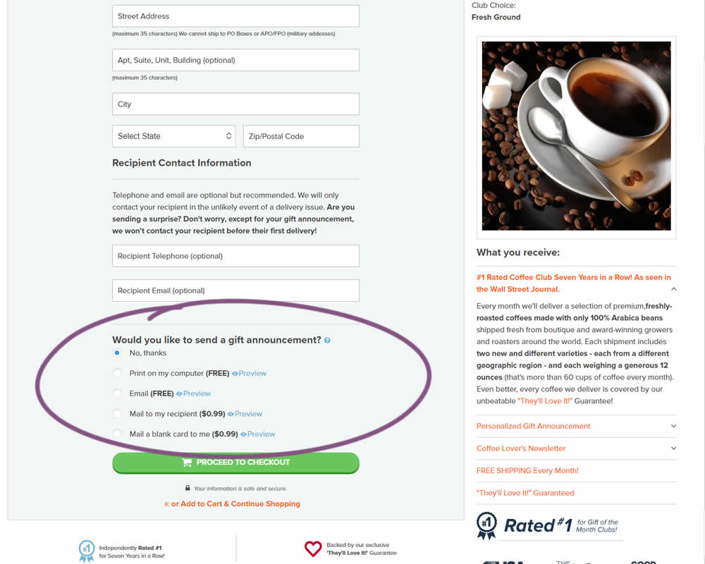
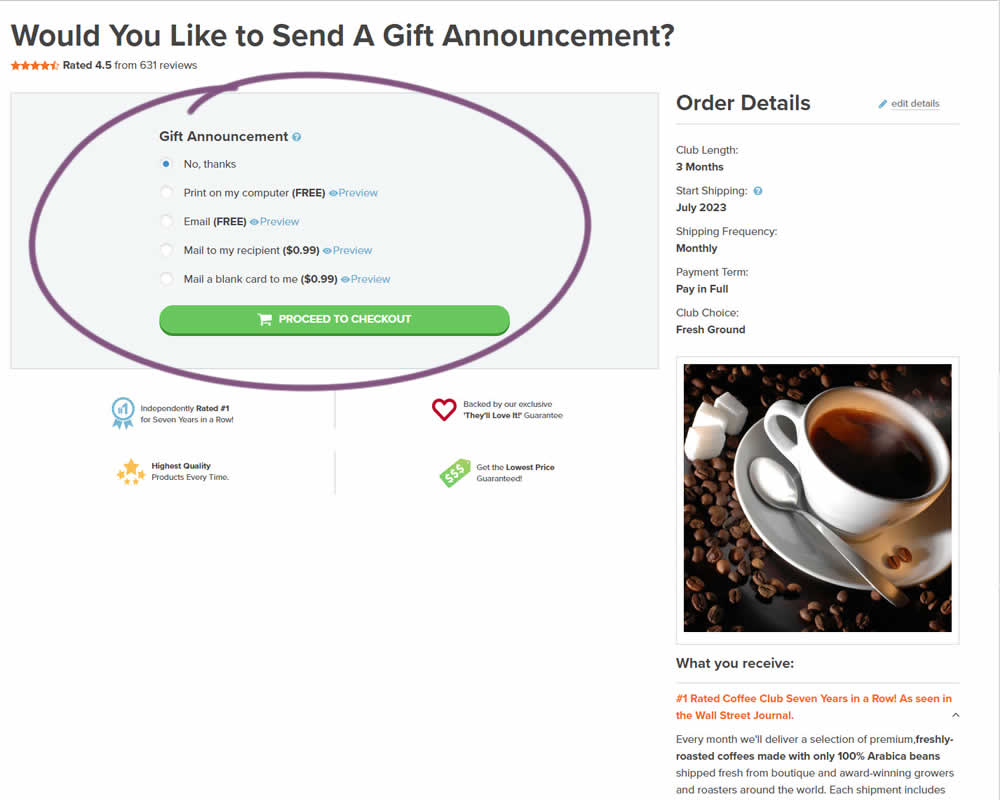
In this experiment, a section dedicated to choosing gift messages was taken out and separated into its own individial step. The change happened on the first step of a checkout flow and increased the flow by an additional step. Impact on checkouts and total sales was measured.
Test #489 on
by  Jakub Linowski
Aug 14, 2023
Desktop
Mobile
Product
X.X%
Sales
Jakub Tested Pattern #78: Tags, Badges And Structured Information
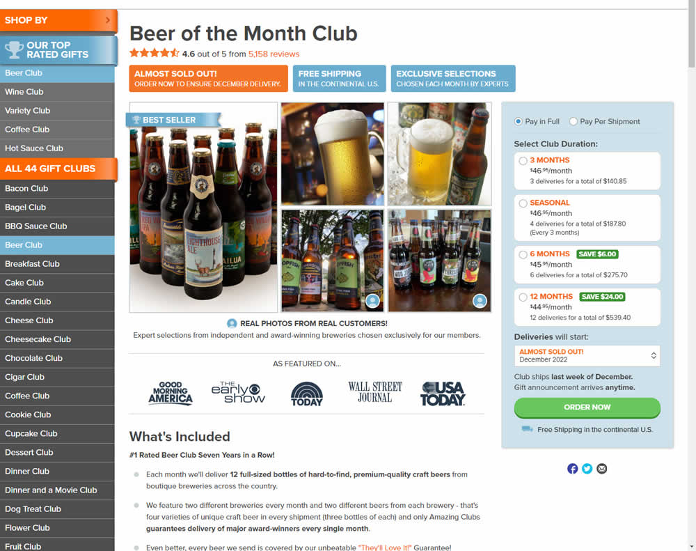
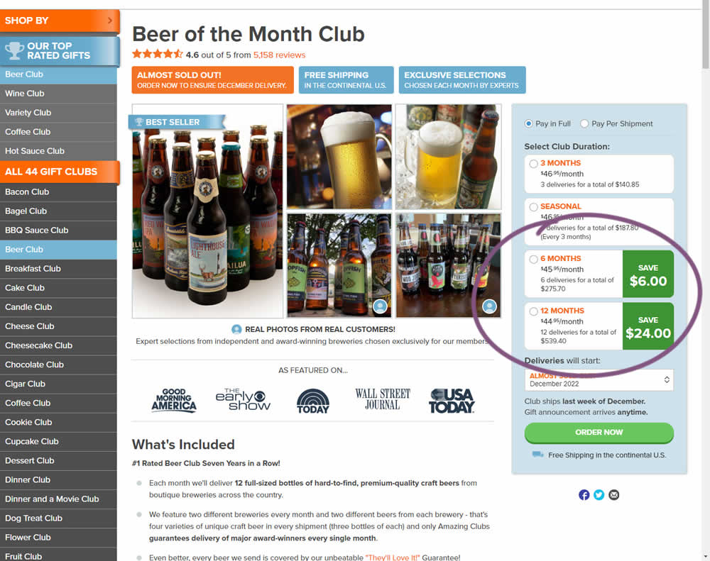
In this experiment, the size of a saving amount badge was enlarged. Instead of typical badge, the variation stretched the height of the saving information to the full height of the duration selector. The font size was also increased. Impact on overall sales was measured.
Test #487 on
Learnwithhomer.com
by  Stanley Zuo
Aug 10, 2023
Mobile
Pricing
X.X%
Signups
Stanley Tested Pattern #78: Tags, Badges And Structured Information On Learnwithhomer.com
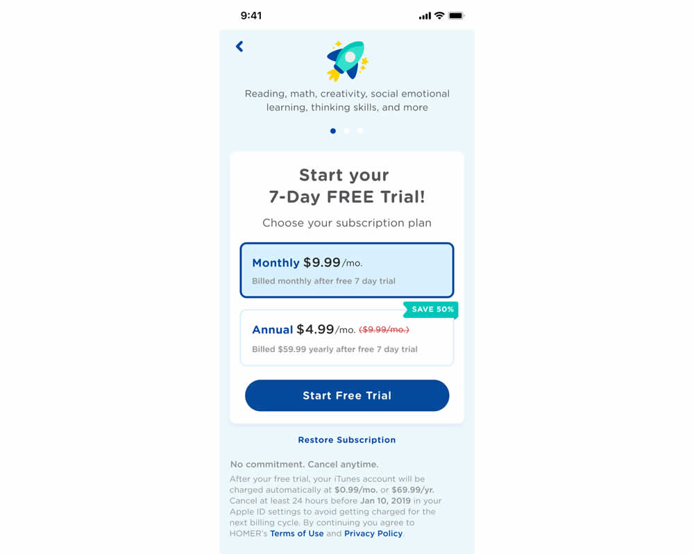
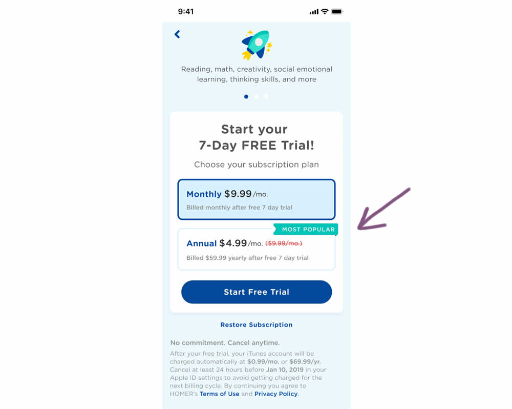
In this experiment, a "save 50%" badge was replaced with a "most popular" one with the intent of encouraging more users to select the higher priced plan. Impact on total and annual trial starts was measured.