All Latest 620 A/B Tests
Test #169 on
Mt.com
by  Vito Mediavilla
Apr 24, 2018
Desktop
Listing
X.X%
Leads
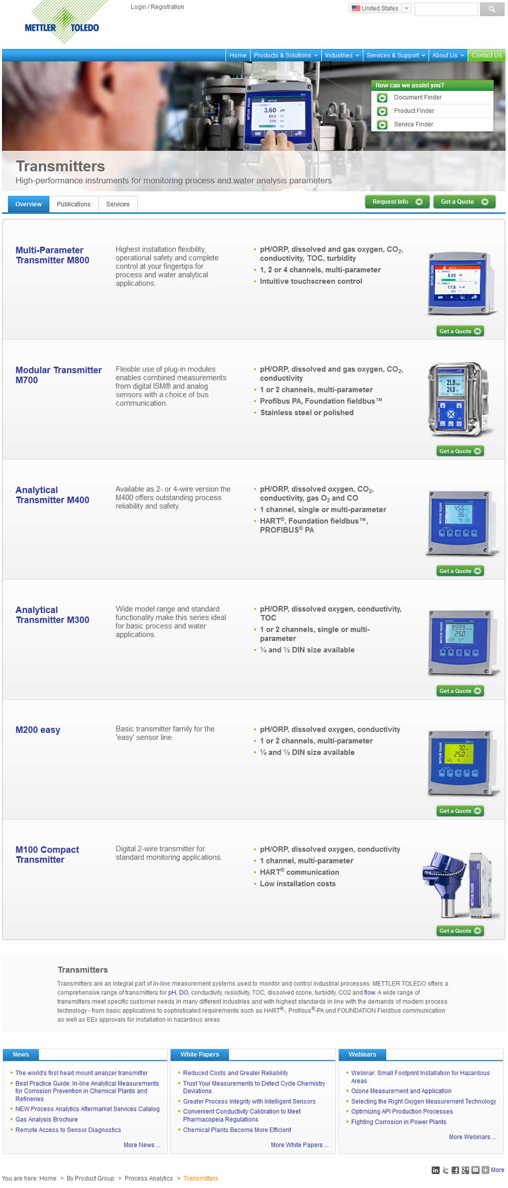
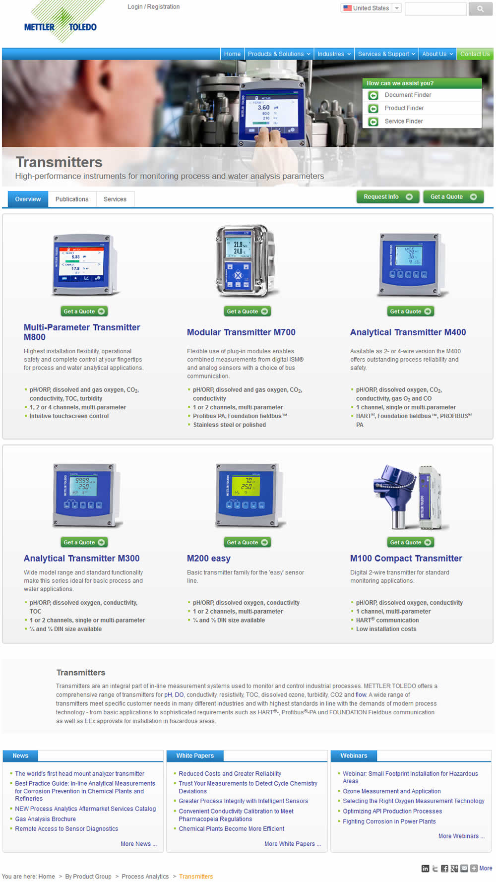
Vito Tested Pattern #37: List Or Grid View On Mt.com
Which A Or B Actually Wins? Find Out Before You Test.
Members see every test result — the winners, the flat ones, and the losers — along with exact effects and sample sizes. Use it to estimate your tests and prioritize by probability, not gut feel. Start every experiment with the odds on your side.
Test #170 on
Goodui.org
by  Jakub Linowski
Apr 24, 2018
Desktop
Mobile
Home & Landing
X.X%
Sales
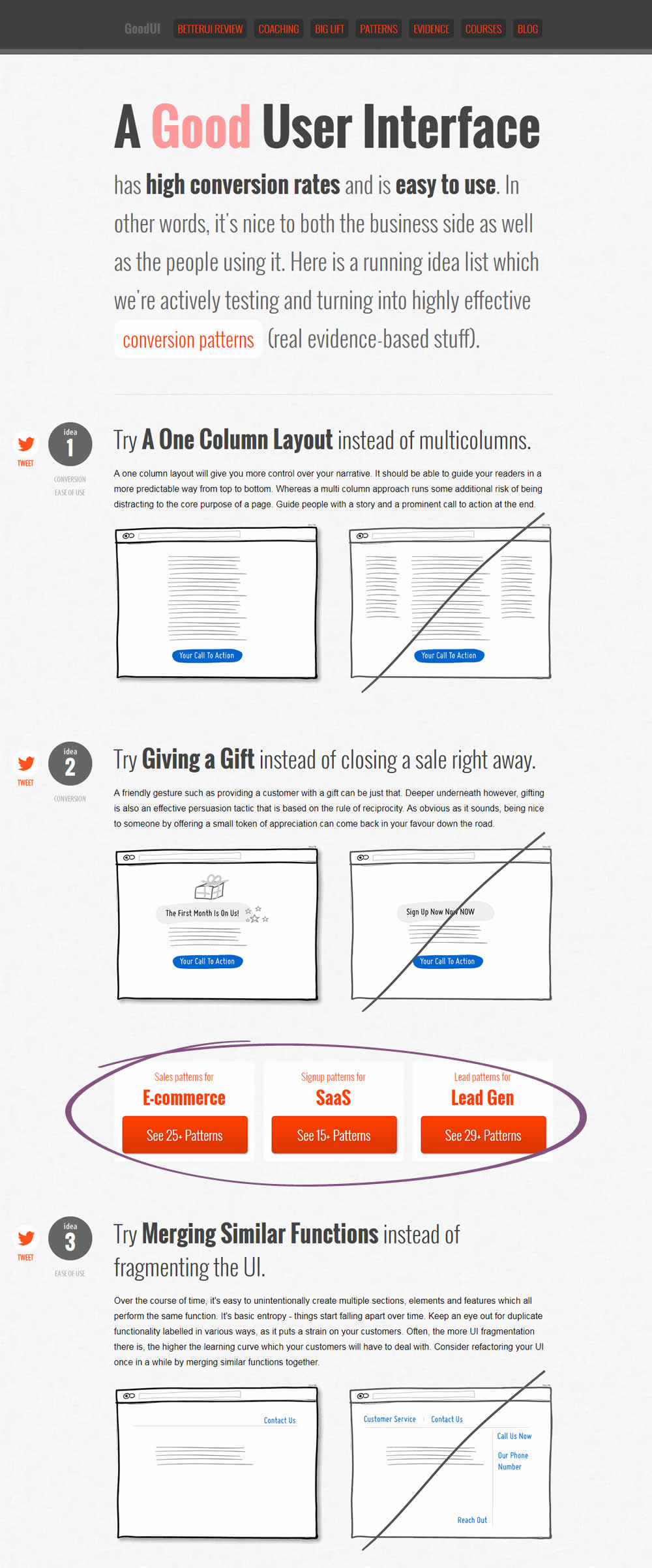
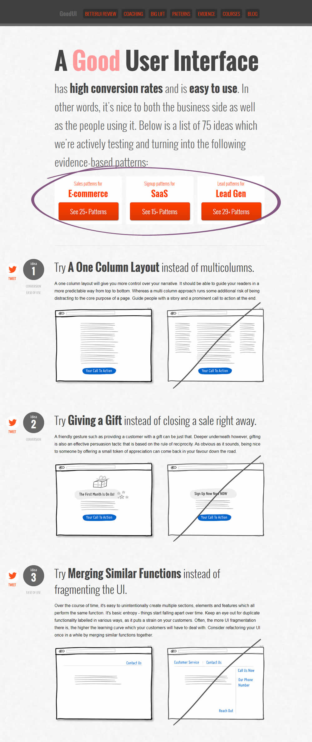
Jakub Tested Pattern #49: Above The Fold Call To Action On Goodui.org
Test #166 on
Olark.com
by  Sunir Shah
Apr 05, 2018
Desktop
Mobile
Home & Landing
X.X%
Sales
Sunir Tested Pattern #12: Payment First On Olark.com
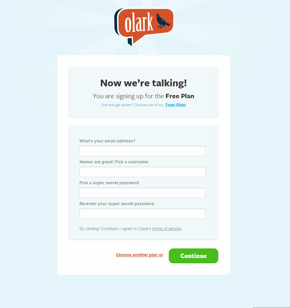
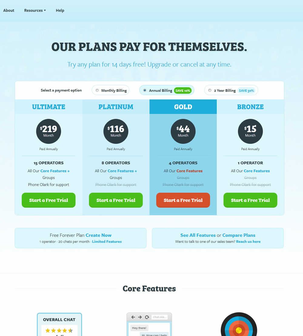
Olark's homepage was directing users towards a free forever trial - with followup nudges to upgrade some days later. The variation B of the experiment tested a more aggressive push to a pricing page page - with options to select a paid plan, as well as provide a credit card (getting the payment conversation out of the way sooner).
Test #164 on
Examine.com
by  Martin Wong
Apr 04, 2018
Desktop
Mobile
Thank You
X.X%
Sales
Martin Tested Pattern #50: Autoplay Video On Examine.com
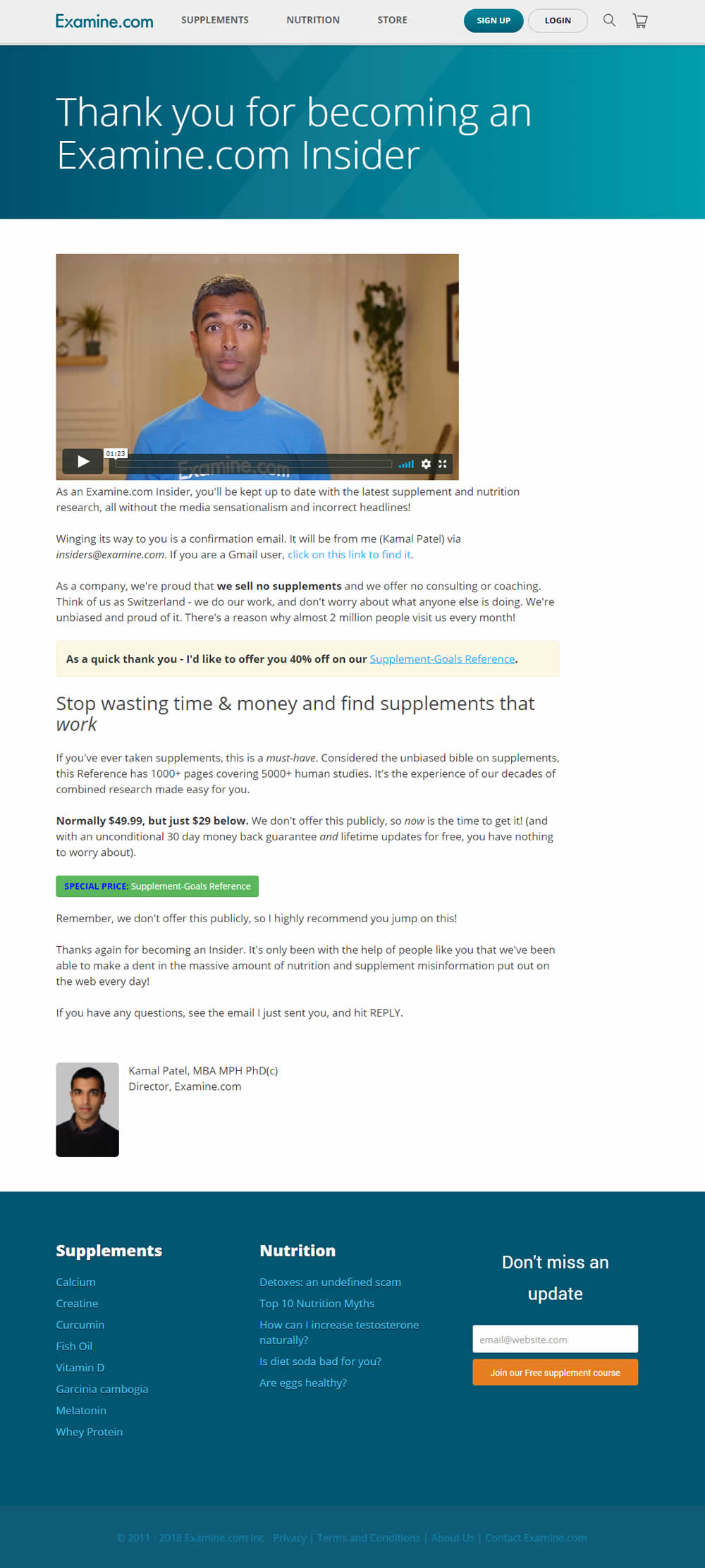
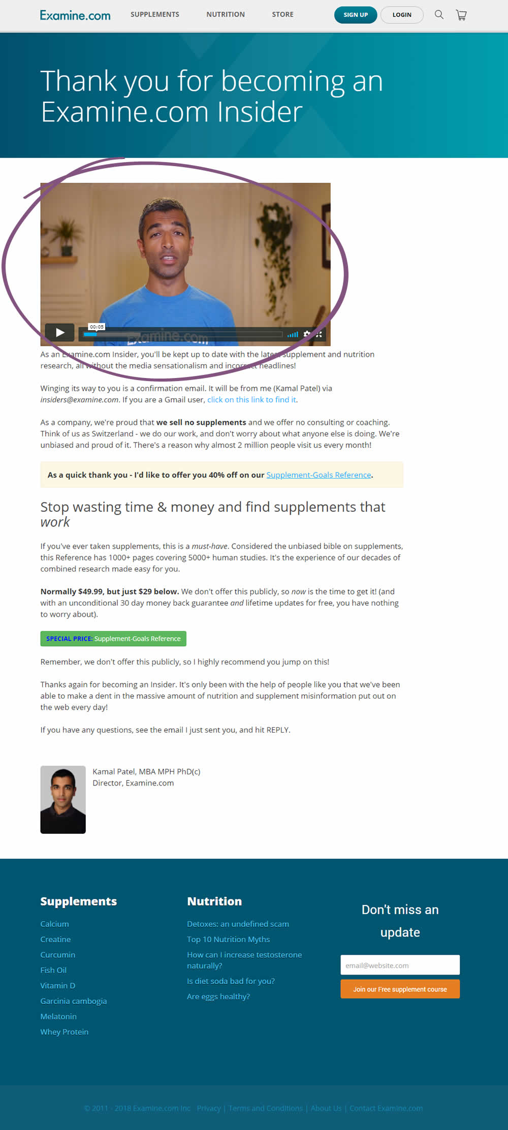
In this test, the variation autoplayed the video (with sound). The thank you page offered a discount on a cross-sell product - The Supplement Goal Reference. The video first communicate a sincere thank you, followed by the product cross-sell.
Test #163 on
Lovehoney.co.uk
by  Matthew Curry
Mar 27, 2018
Mobile
Desktop
Product
X.X%
Revenue
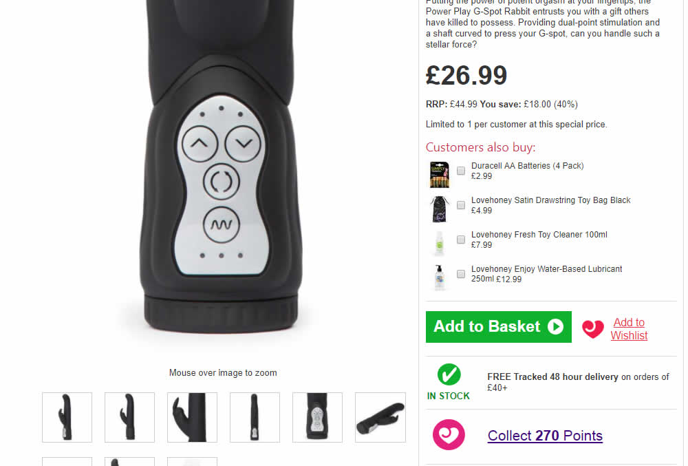
Matthew Tested Pattern #62: Urgent Next Day Delivery On Lovehoney.co.uk

Test #161 on
Examine.com
by  Martin Wong
Mar 19, 2018
Desktop
Mobile
Home & Landing
X.X%
Signups
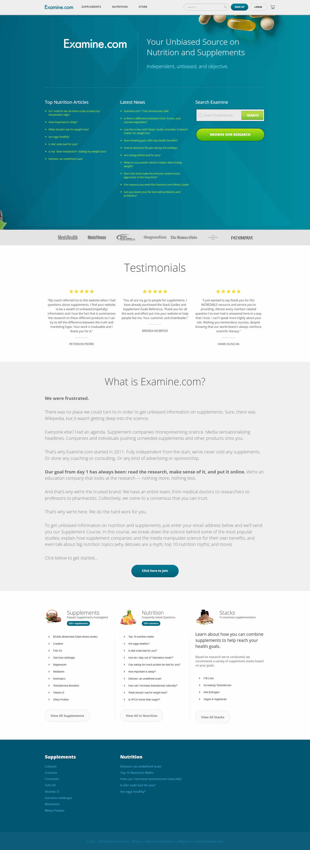
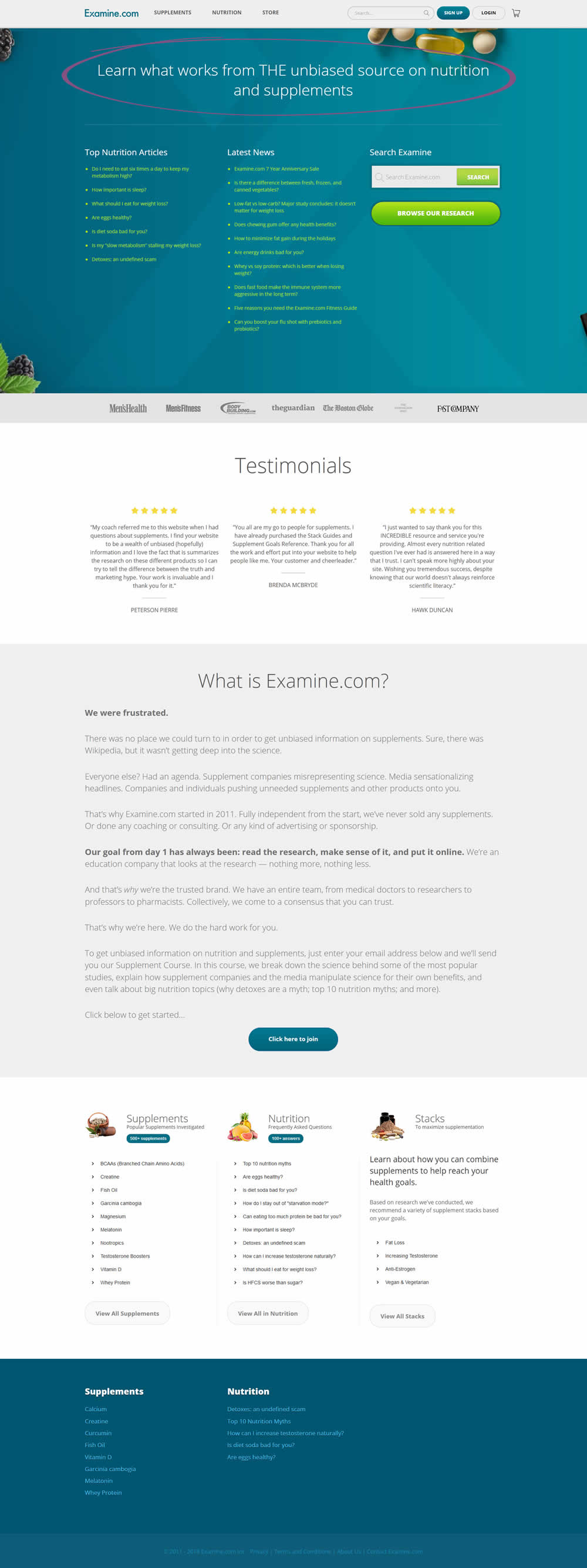
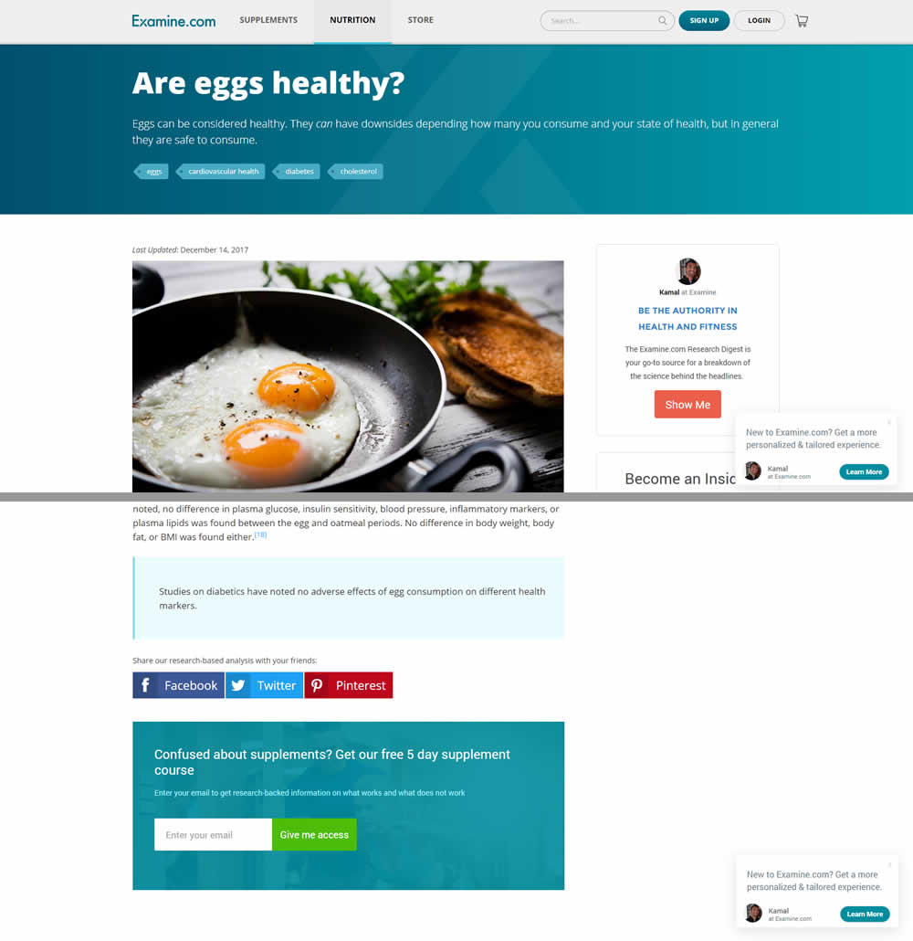
Martin Tested Pattern #22: Empowering Headline On Examine.com
Test #154 on
Reverb.com
by  Nicholas Evans
Feb 20, 2018
Desktop
Mobile
Product
X.X%
Signups
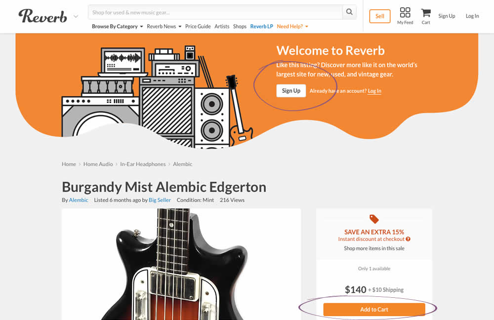
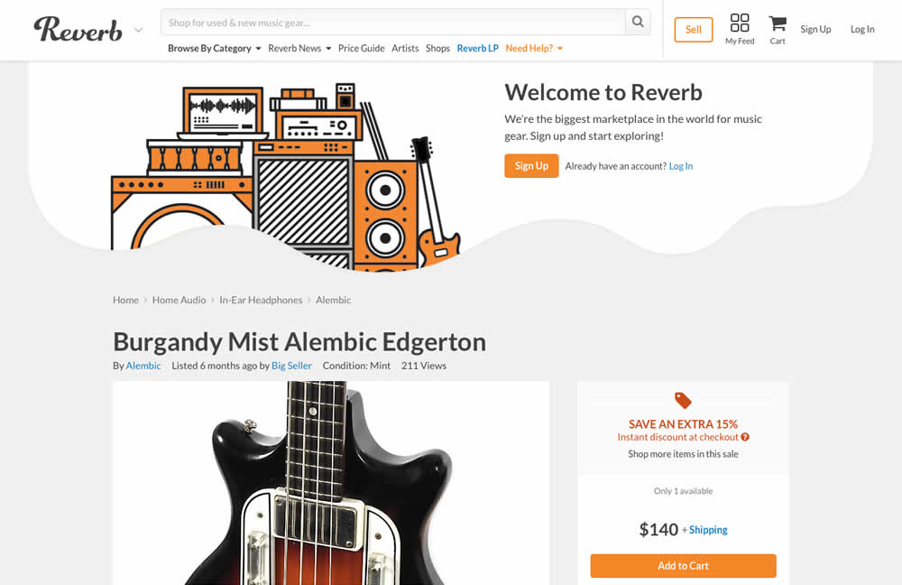
Nicholas Tested Pattern #59: Inverted Or Consistent Button Styles On Reverb.com
Test #153 on
Goodui.org
by  Jakub Linowski
Feb 19, 2018
Desktop
Mobile
Home & Landing
X.X%
Signups
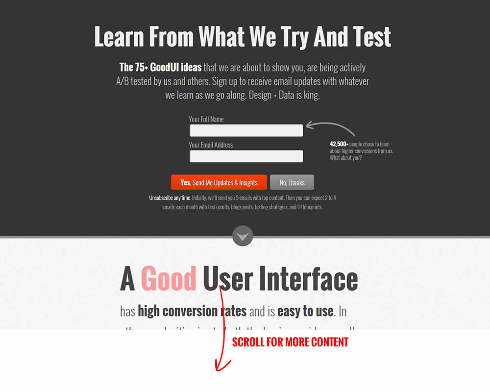
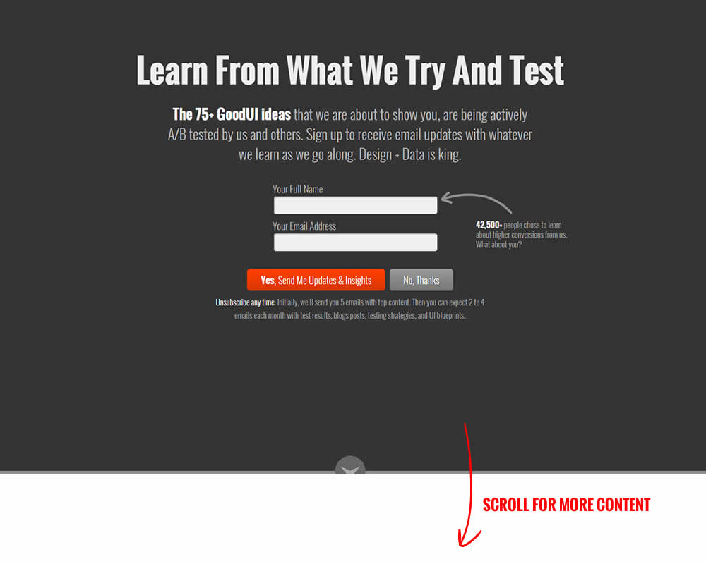
Jakub Tested Pattern #58: Full Height False Bottom On Goodui.org
Test #148 on
Kenhub.com
by  Niels Hapke
Feb 01, 2018
Desktop
Mobile
Home & Landing
X.X%
Signups
Niels Tested Pattern #53: Problem-Solution Headline On Kenhub.com


Test #146 on
Goodui.org
by  Jakub Linowski
Jan 25, 2018
Desktop
Mobile
Home & Landing
X.X%
Leads
Jakub Tested Pattern #49: Above The Fold Call To Action On Goodui.org


Test #147 on
Reverb.com
by  Nicholas Evans
Jan 25, 2018
Desktop
Mobile
Product
X.X%
Sales
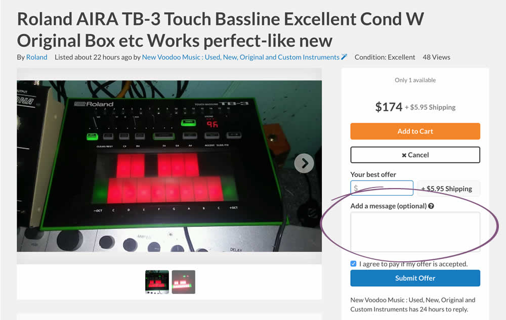
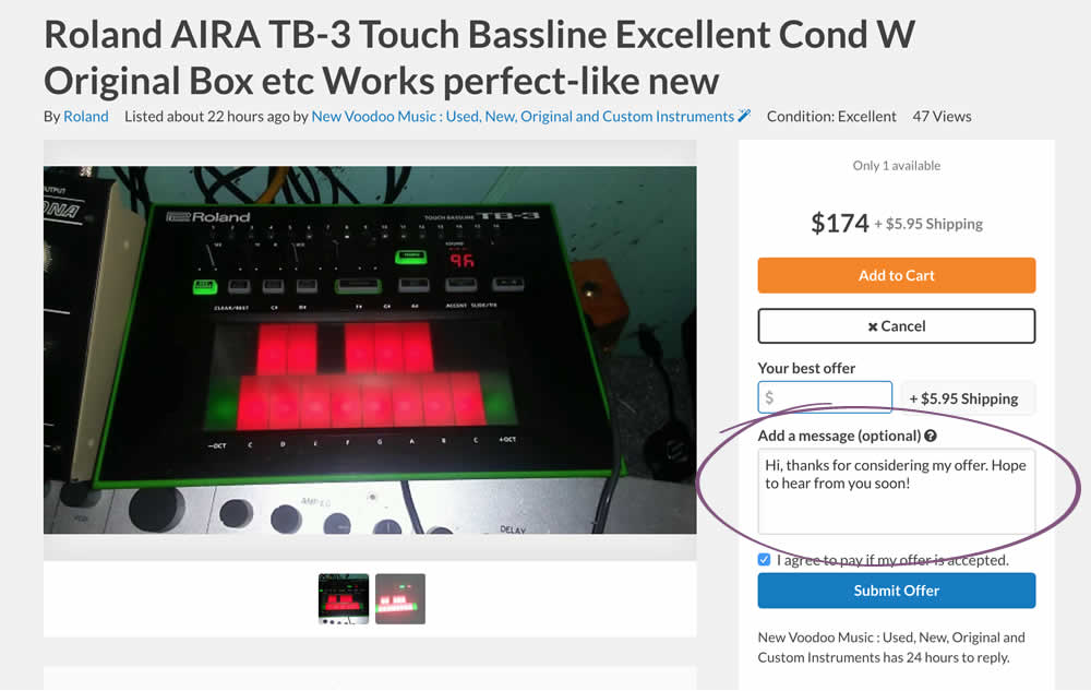
Nicholas Tested Pattern #20: Canned Response On Reverb.com
Test #145 on
Normanrecords.com
by  Nathon Raine
Jan 18, 2018
Desktop
Checkout
X.X%
Sales
Nathon Tested Pattern #1: Remove Coupon Fields On Normanrecords.com
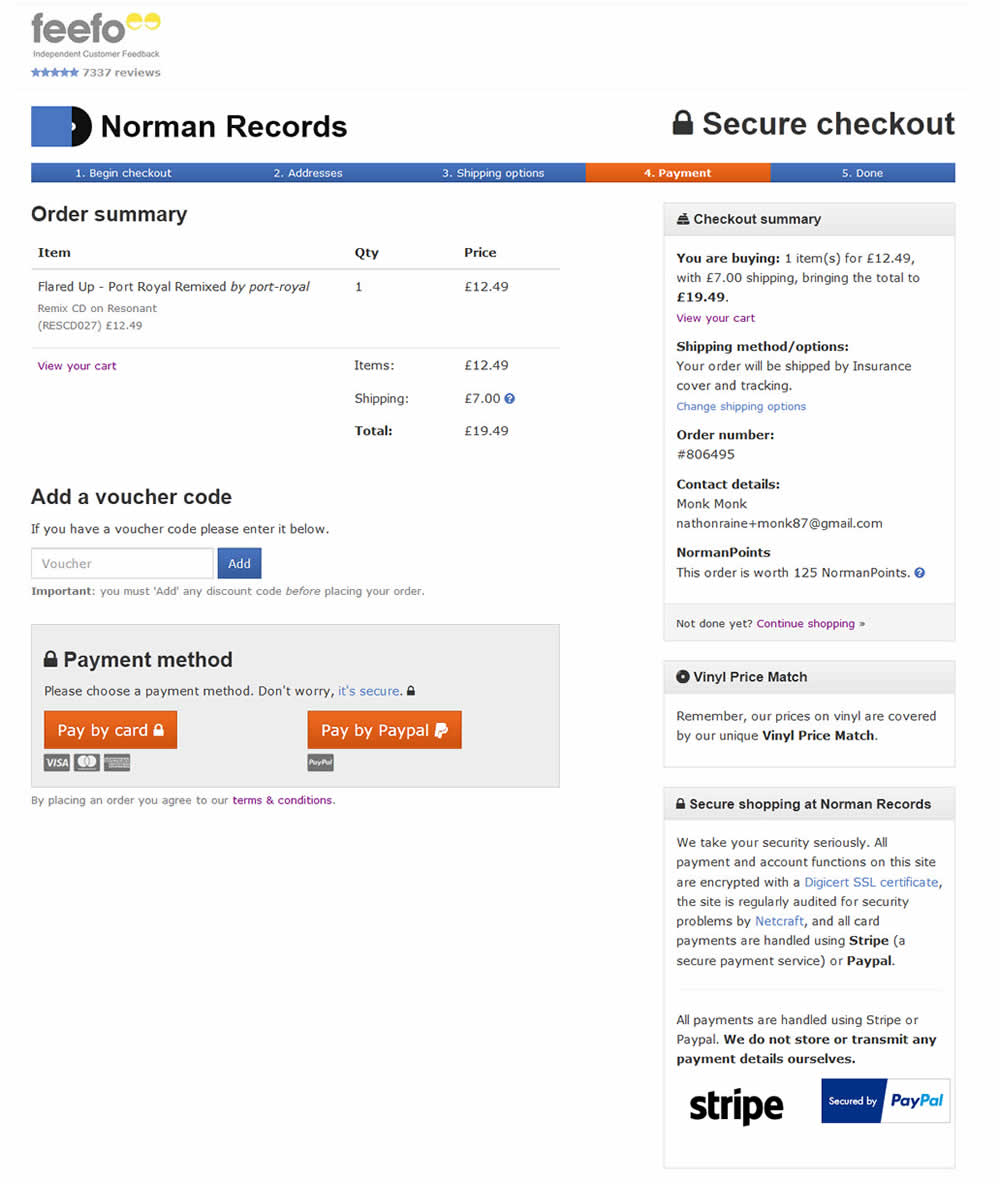
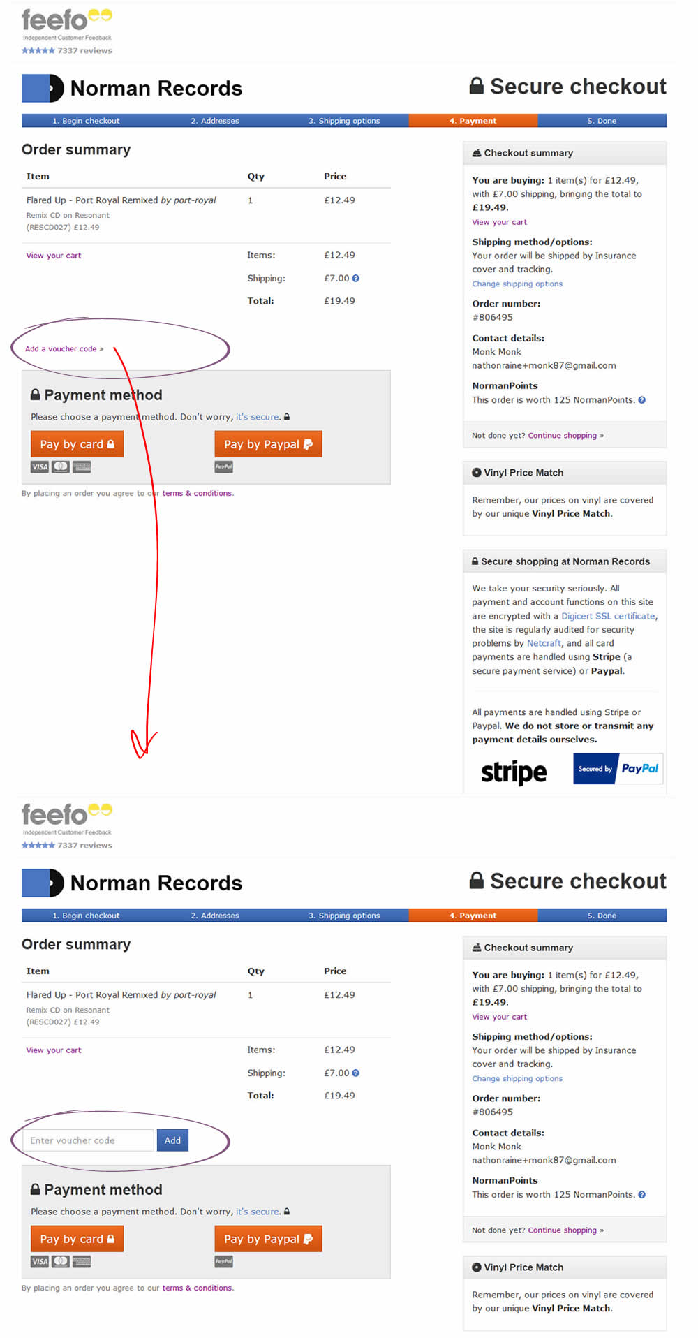
In this test the coupon field was replaced with a small link that would bring the field back if needed. This is a more suble approach than just completely removing the coupon field. It still allows for the use of coupon fields by those customers which are truly searching for a way to enter their aquired codes.
Test #143 on
Vivareal.com.br
by  Rodrigo Maués
Jan 14, 2018
Desktop
Listing
X.X%
Leads
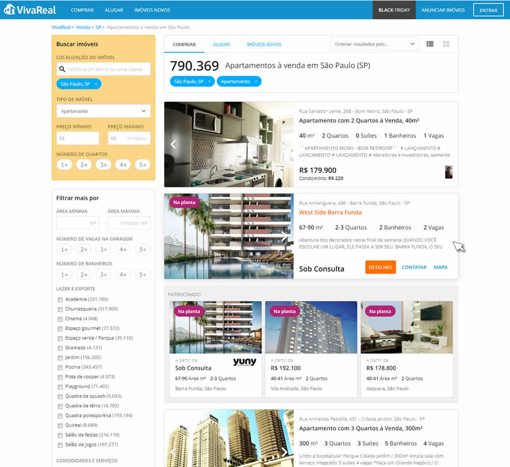
Rodrigo Tested Pattern #56: Hover Button On Vivareal.com.br

Test #144 on
Examine.com
by  Martin Wong
Jan 14, 2018
Desktop
Mobile
Product
X.X%
Sales
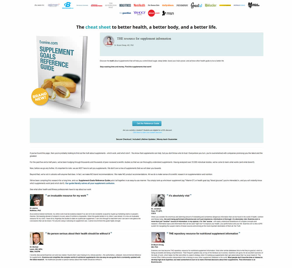
Martin Tested Pattern #27: More For Less Headline On Examine.com

Test #142 on
Streamlineicons.com
by  Vincent Le moign
Jan 13, 2018
Desktop
Product
X.X%
Progression
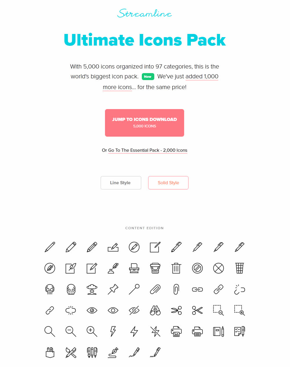
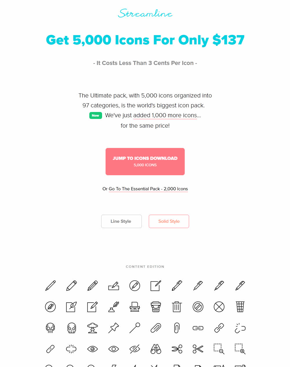
Vincent Tested Pattern #27: More For Less Headline On Streamlineicons.com
Test #141 on
Trydesignlab.com
by  Daniel Shapiro
Jan 05, 2018
Desktop
Mobile
Product
X.X%
Leads
Daniel Tested Pattern #49: Above The Fold Call To Action On Trydesignlab.com


The variation introduced a call to action at the top of the screen that linked to a form deep down on a long course page.
Test #131 on
Kenhub.com
by  Niels Hapke
Dec 11, 2017
Desktop
Home & Landing
X.X%
Signups
Niels Tested Pattern #11: Gradual Reassurance On Kenhub.com


Test #130 on
Kenhub.com
by  Niels Hapke
Dec 07, 2017
Desktop
Pricing
X.X%
Revenue
Niels Tested Pattern #17: Least Or Most Expensive First On Kenhub.com


In this experiment, the plans were sorted by the most expensive first, left to right (variation).
Test #126 on
Rollbar.com
by  Mike Smith
Nov 22, 2017
Desktop
Signup
X.X%
Signups
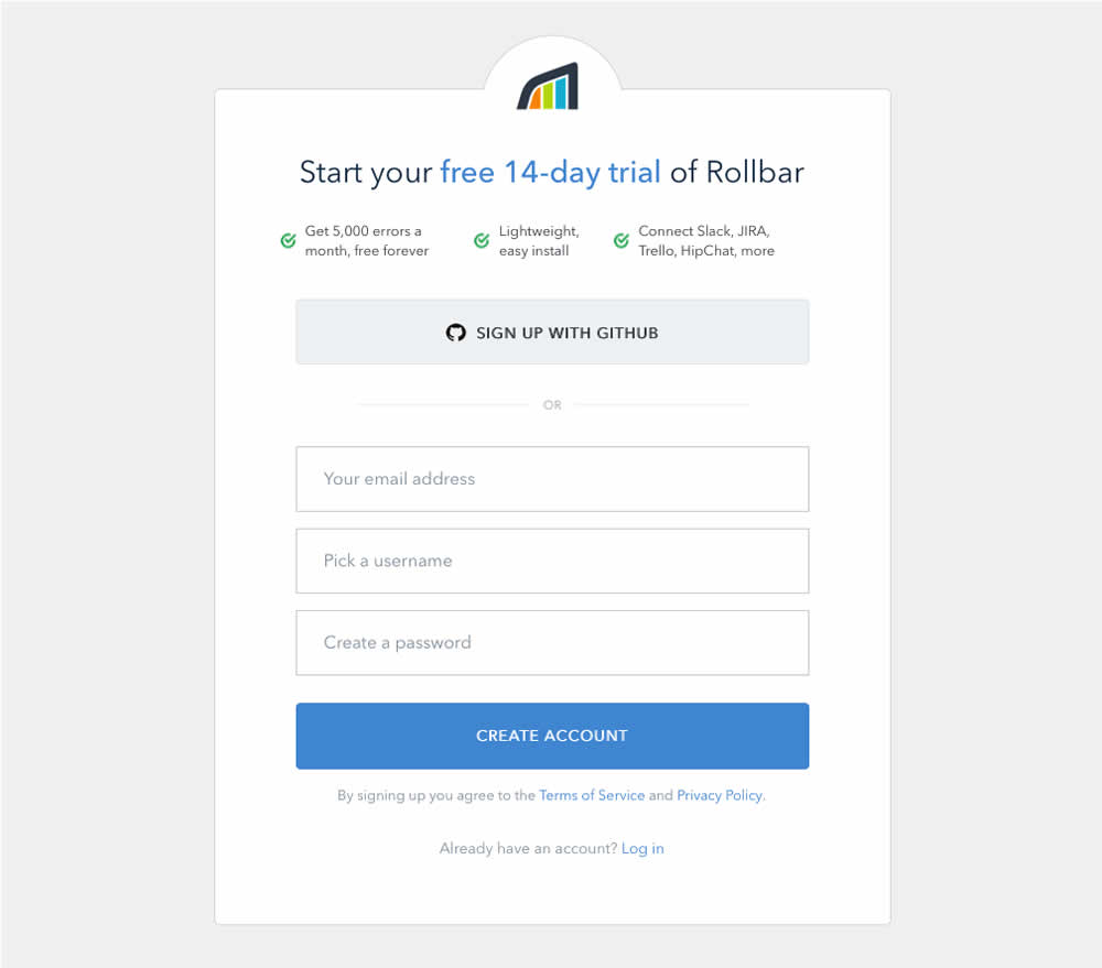
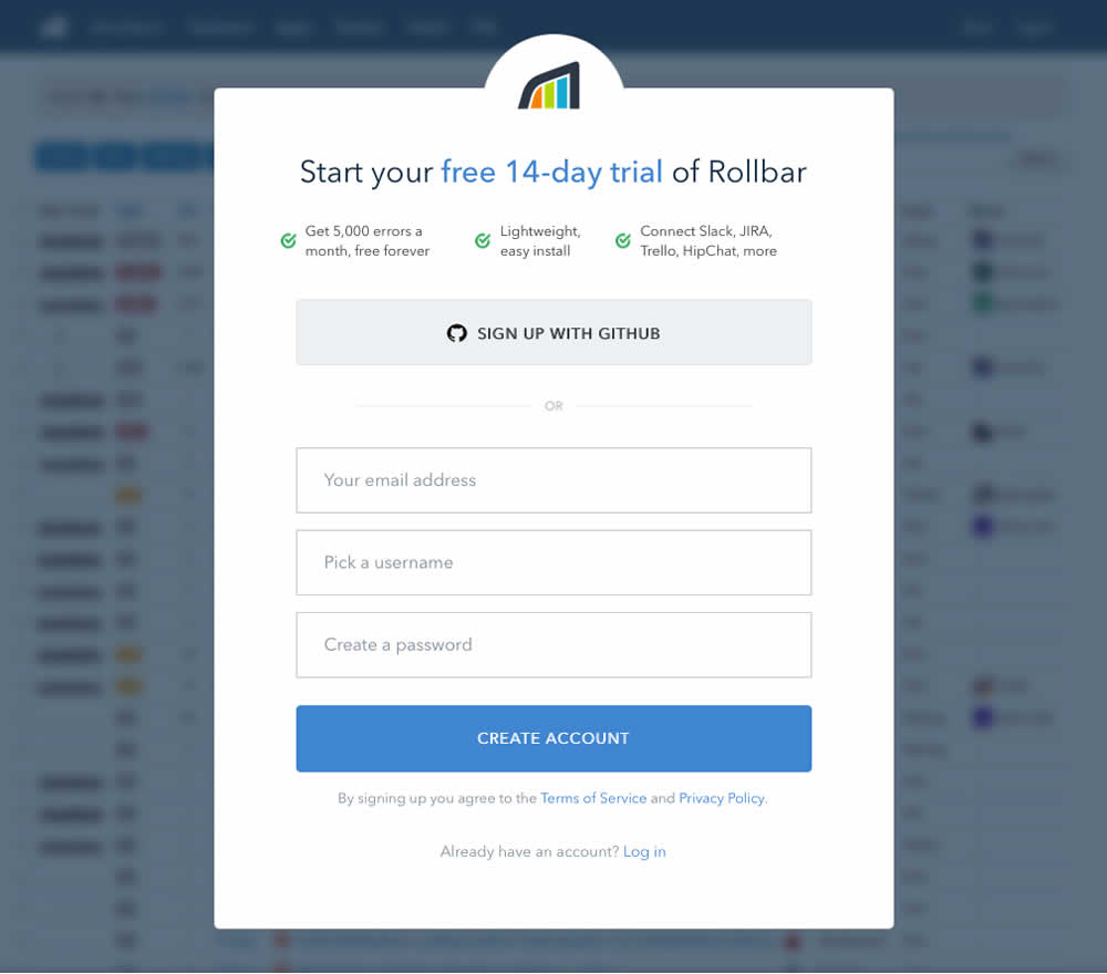
Mike Tested Pattern #40: Blurred Product Background On Rollbar.com
Test #120 on
Vivareal.com.br
by  Rodrigo Maués
Nov 01, 2017
Desktop
Listing
X.X%
Leads
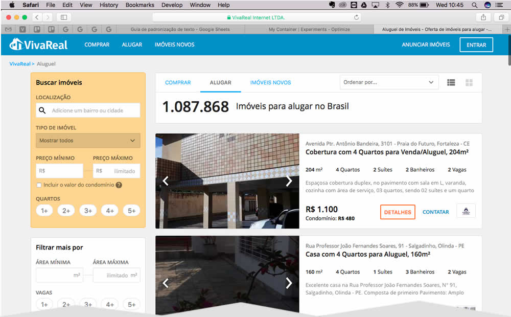
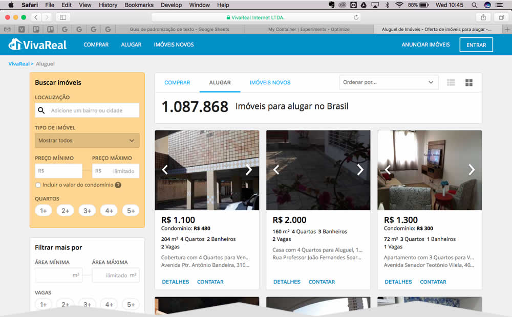
Rodrigo Tested Pattern #37: List Or Grid View On Vivareal.com.br
