All Latest 620 A/B Tests
MOST RECENT TESTS
Test #553 on
Online.metro-cc.ru
by  Andrey Andreev
Sep 27, 2024
Mobile
Desktop
Checkout
X.X%
Revenue
Andrey Tested Pattern #69: Autodiscounting On Online.metro-cc.ru
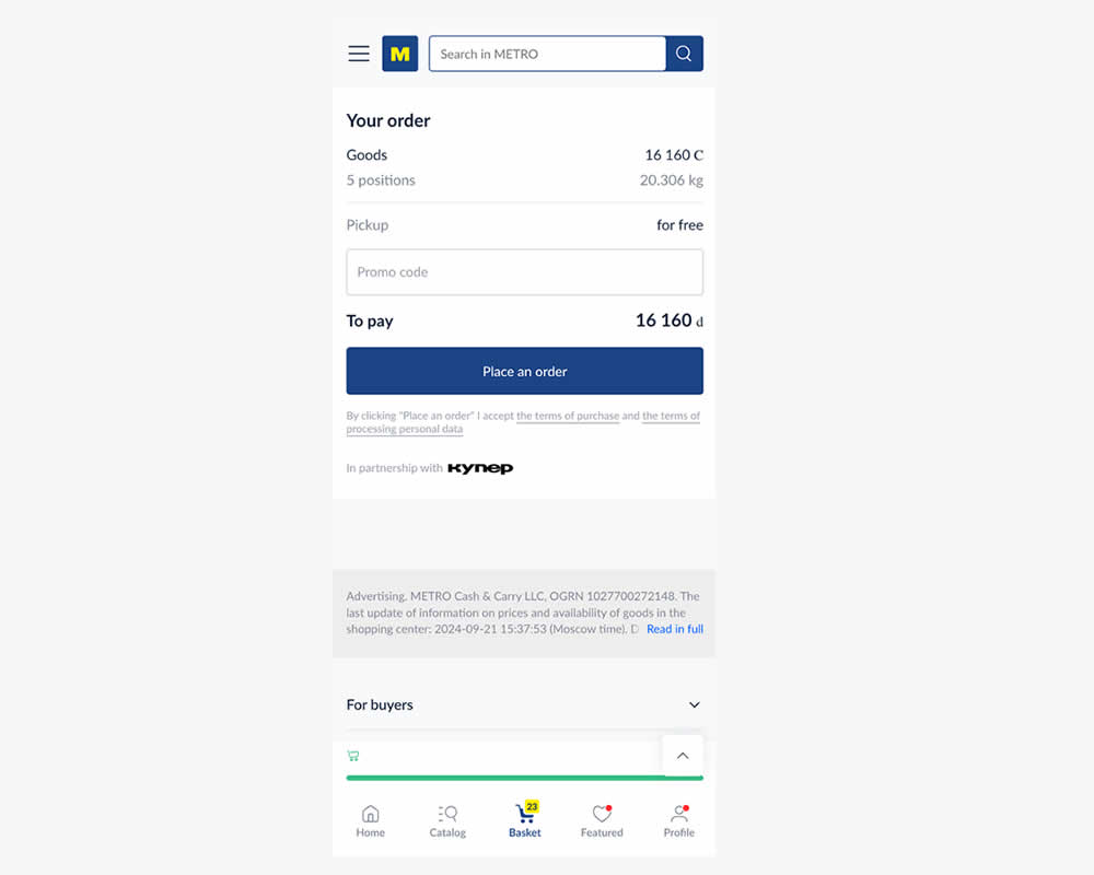
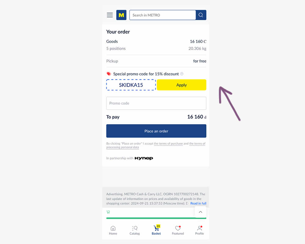
In this experiment, a preset coupon code with -15% amount and an easy to "apply" button was shown to new users who have never made a purchase. In the variation, the an empty coupon field was shown. Impact and transactions and revenue was measured.
Which A Or B Actually Wins? Find Out Before You Test.
Members see every test result — the winners, the flat ones, and the losers — along with exact effects and sample sizes. Use it to estimate your tests and prioritize by probability, not gut feel. Start every experiment with the odds on your side.
Test #552 on
Tourradar.com
by  Clemens Grave
Sep 19, 2024
Product
X.X%
Progression
Clemens Tested Pattern #15: Bulleted Reassurances On Tourradar.com
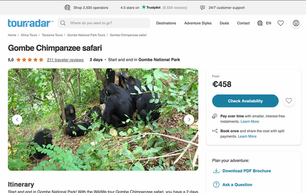

In this experiment, existing reassurance copy was changed. The control contained copy that focused on splitting payments and paying over time. The variation challenged this and showed a best price guarantee and the ability to earn credits.
Test #549 on
Kay.com
by  Craig Kistler
Aug 13, 2024
Desktop
Listing
X.X%
Sales
Craig Tested Pattern #138: Visible Payment Options On Kay.com
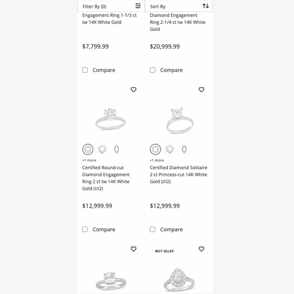
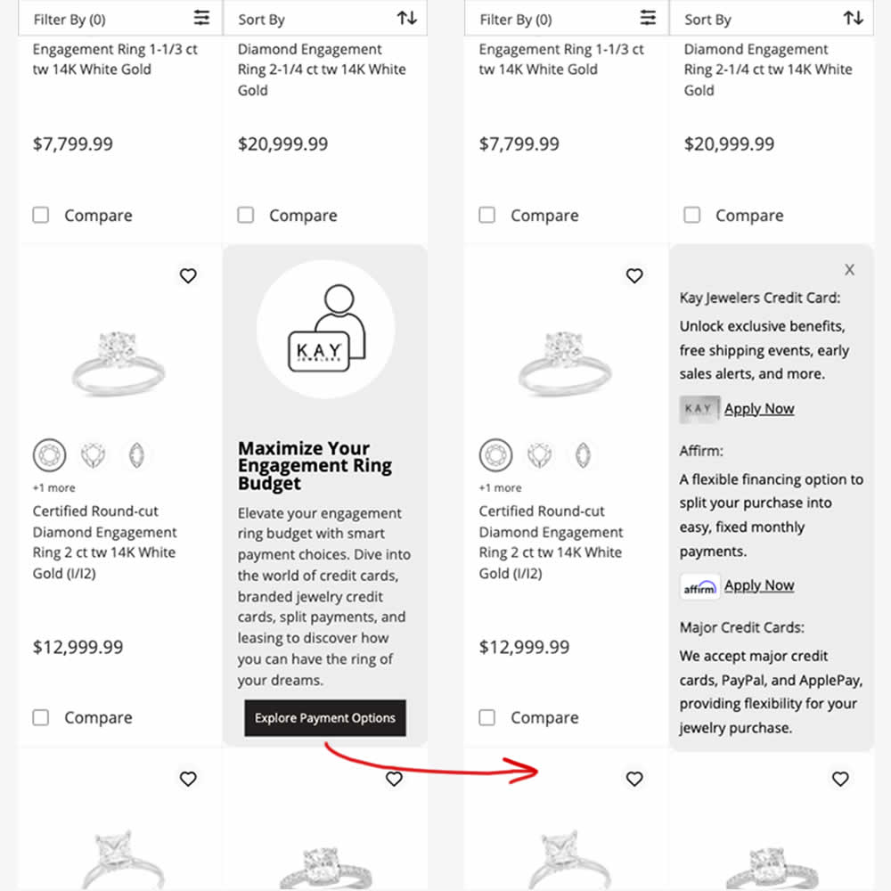
In this experiment, an inline panel was shown as a product tile. The panel informed customers about a variety of payment options (with detailed information being further presented after a button click). Impact on sales was measured.
Test #543 on
by  Jakub Linowski
Jul 22, 2024
Desktop
Mobile
Product
X.X%
Sales
Jakub Tested Pattern #7: Social Counts
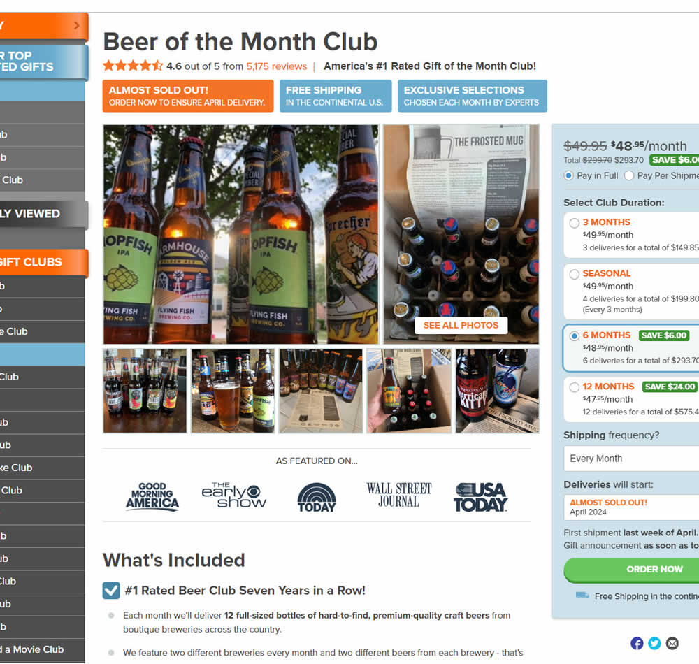
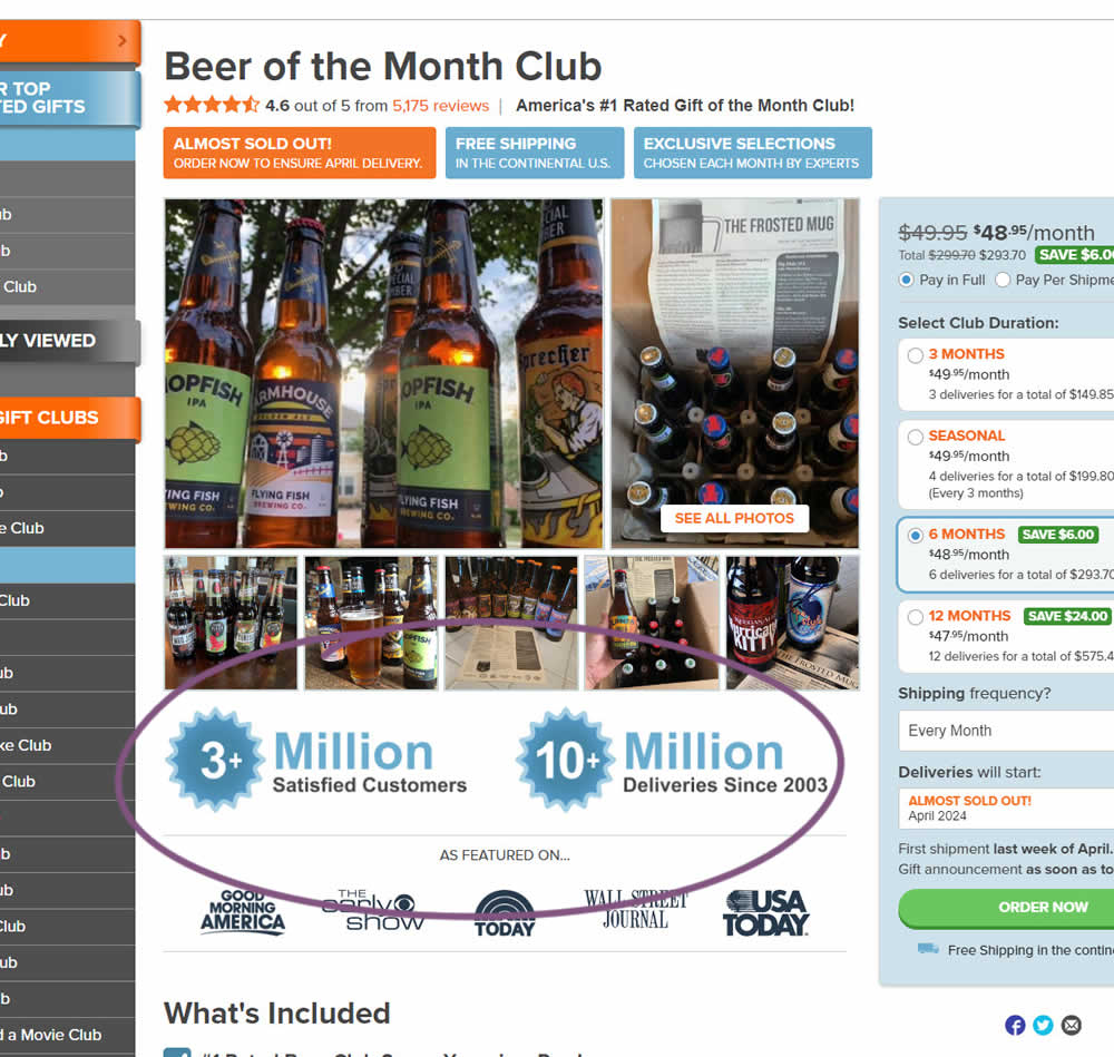
In this experiment, social proof copy was added just below product photos. The copy emphasied that "3 million satisfied customers" and "10 million deliveries since 2003". Impact on sales was measured.
Test #542 on
Expertinstitute.com
by  Ardit Veliu
Jul 17, 2024
Desktop
Home & Landing
X.X%
Leads
Ardit Tested Pattern #108: Frequently Asked Questions On Expertinstitute.com
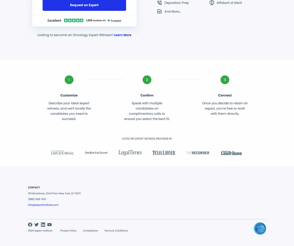
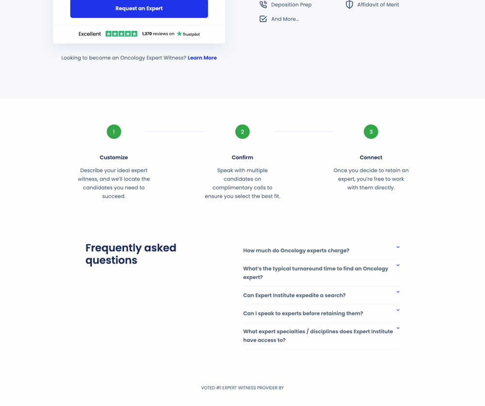
In this experiment, a Frequently Asked Questions section was added near the bottom of a short lead gen form. This test ran on one of Expert Institute's landing pages for their expert witness seeking services. Impact on leads was measured.
Test #540 on
Finn.com
by  Maksim Meged
Jun 28, 2024
Mobile
Listing
X.X%
Sales
Maksim Tested Pattern #136: Earliest Availability On Finn.com
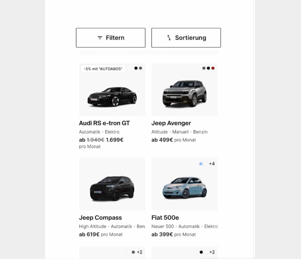
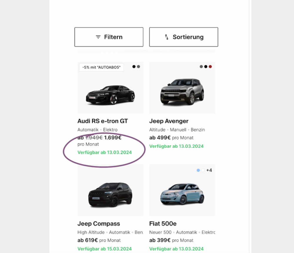
In this experiment, the earliest availability dates were displayed underneath product tiles on listing pages. This was a/b tested on a car rental service website. Impact on product adds-to-cart as well as transactions was measured.
Test #531 on
Aboalarm.de
by  Katharina Lay
May 03, 2024
Desktop
Mobile
Checkout
X.X%
Sales
Katharina Tested Pattern #128: Standard Or Superscript Price Format On Aboalarm.de
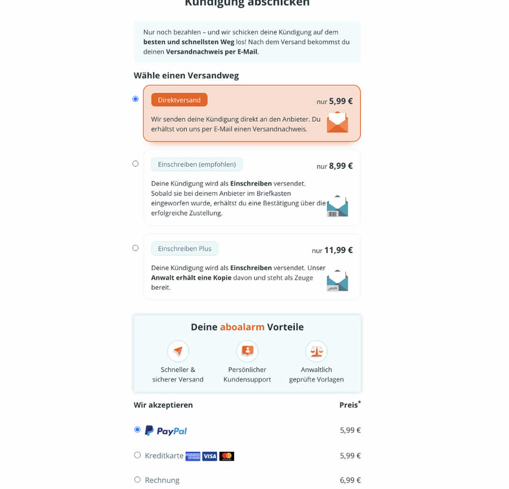
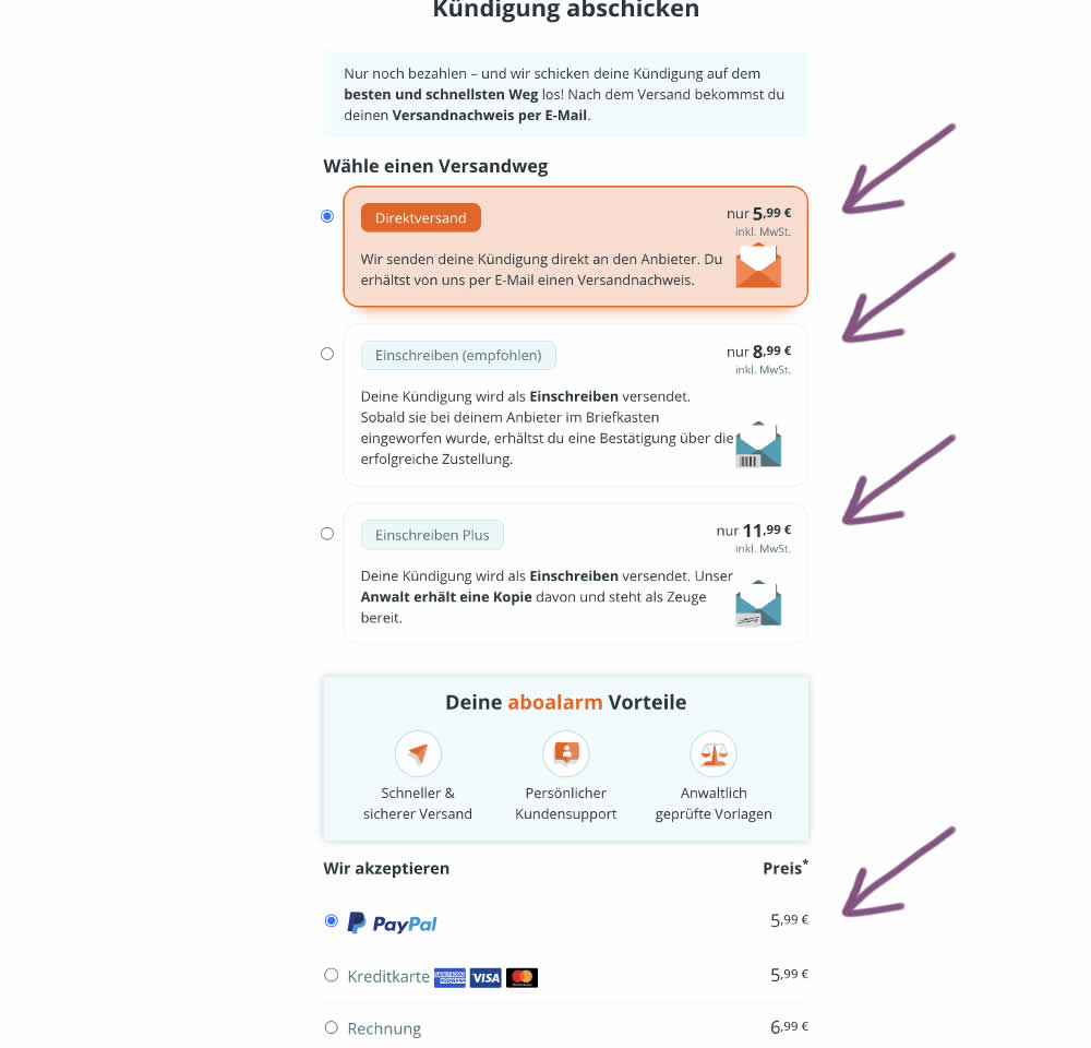
In this experiment, the font of the euro cents amount was made smaller. Additional copy was also added underneath the price reinforcing that tax was already included in the price. Impact on transactions was measured.
Test #527 on
by  Jakub Linowski
Apr 23, 2024
Desktop
Mobile
Product
X.X%
Sales
Jakub Tested Pattern #132: One Time Payment Copy
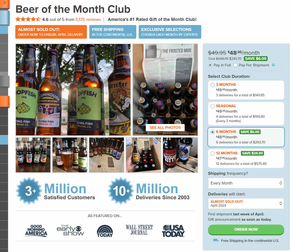
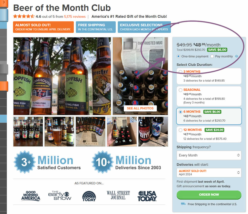
In this experiment, copy related to payment duration types (paid in full or ongoing) was changed. In the the control, one of the option used the "Pay in Full" copy, whereas the variation changed this to "One-time payment". Impact on sales was measured.
Test #519 on
Volders.de
by  Katharina Lay
Feb 23, 2024
Desktop
Mobile
Checkout
X.X%
Sales
Katharina Tested Pattern #134: Optional or Confident Recommendation On Volders.de
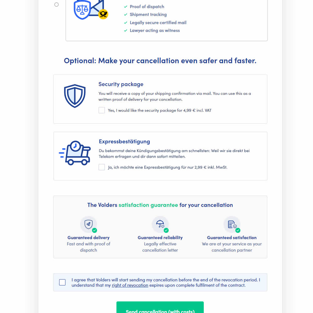
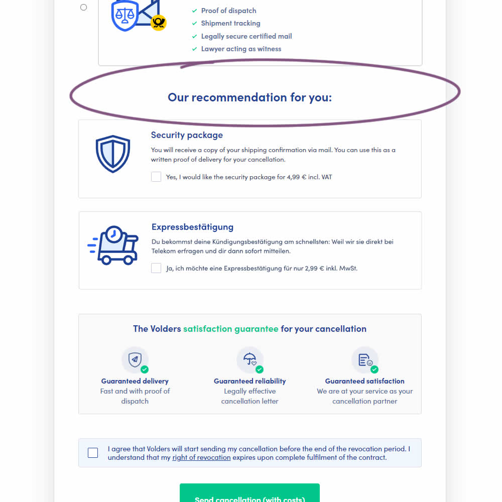
In this experiment, copy around an upsell was changed from using "optional" to "our recommendation for you". The idea was to recommend two upsells with more confidence. Impact on the two upsells (secure, and express) as well as overall transactions was measured.
Test #518 on
by  Jakub Linowski
Feb 14, 2024
Mobile
Checkout
X.X%
Sales
Jakub Tested Pattern #64: Tunnel
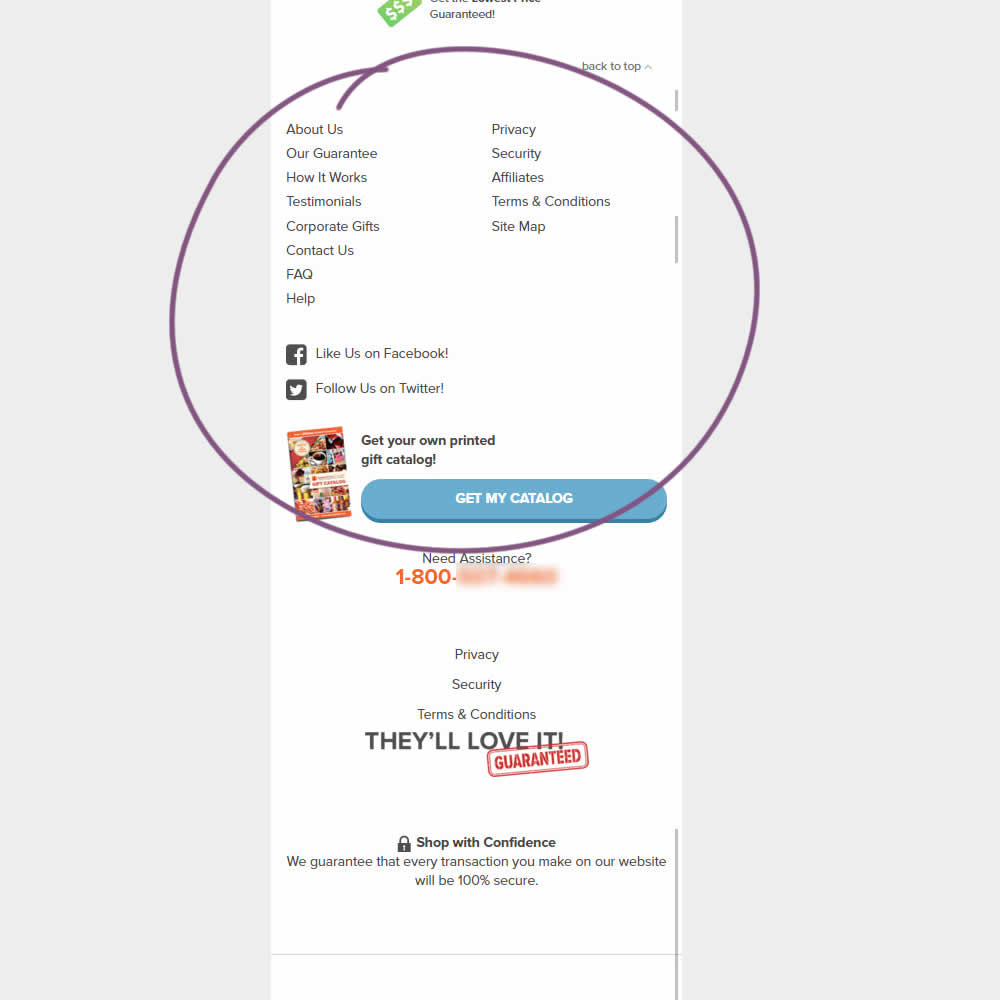
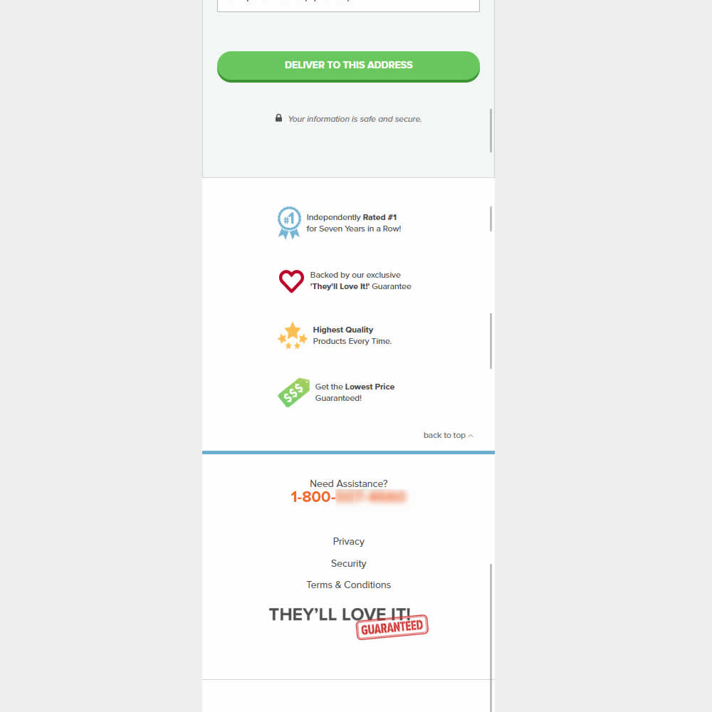
This was an experiment on the first checkout step where users would enter shipping information. The control had a longer footer with more additional sitewide links and a call to action to a newsletter. The variation removed these elements and kept the focus on the shipping information task. Impact on progression to next step and sales was measured.
Test #517 on
Aboalarm.de
by  Daria Kurchinskaia
Feb 12, 2024
Desktop
Checkout
X.X%
Sales
Daria Tested Pattern #78: Tags, Badges And Structured Information On Aboalarm.de
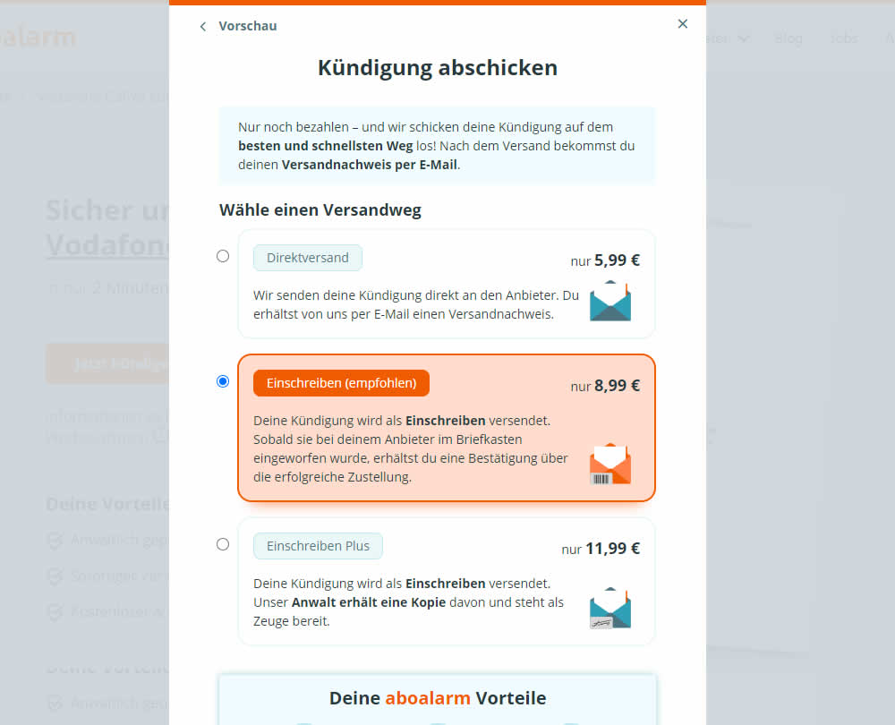
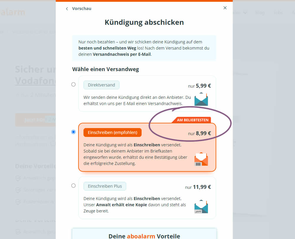
In this experiment, a "most popular" badge ("am beliebsten") was appended to the middle plan of a contract cancellation service. Impact on overall purchases and revenue was measured.
Test #515 on
by  Jakub Linowski
Jan 31, 2024
Desktop
Mobile
Home & Landing
X.X%
Sales
Jakub Tested Pattern #69: Autodiscounting
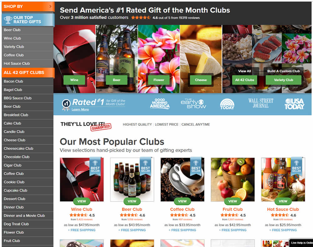
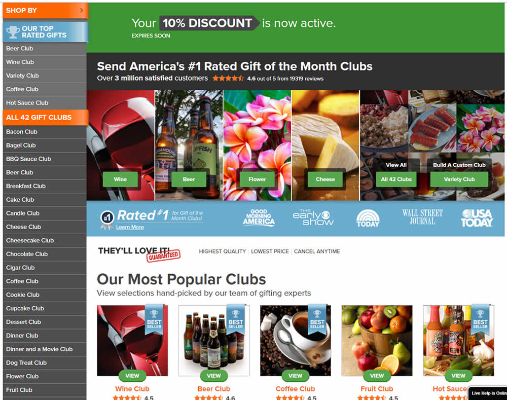
In this experiment, people who saw an offer (in an email or popup) would see a more visible site wide reinforcement of their earned discount being active. In the control, the discount was only shown during checkout. In the variation, it was shown throughout the web site on the homepage and product detail pages.
Test #513 on
Dripl.de
by  Jona Eisenberger
Jan 23, 2024
Mobile
Desktop
Product
X.X%
Sales
Jona Tested Pattern #15: Bulleted Reassurances On Dripl.de
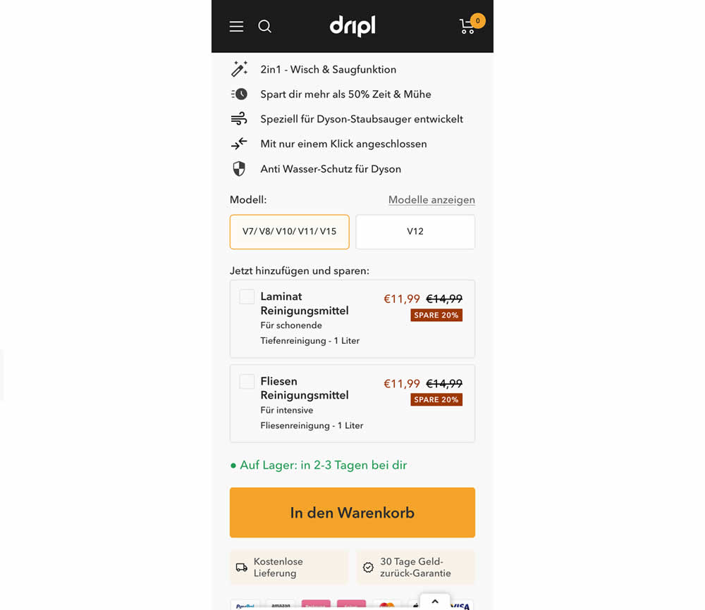
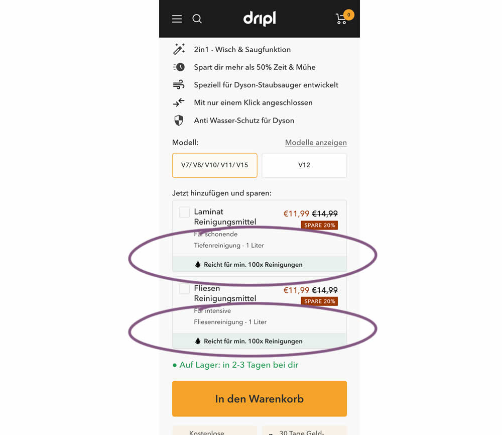
In this experiment of a floor cleaning product, a reassurance about product uses was appended to two cleaning agent upsells. In the control users saw the 2 standard upsells for laminate and tiles. And in the variation the copy "Right for me. 100x Cleanings" (uses) was appended.
Test #512 on
Snocks.com
by  Melina Hess
Jan 17, 2024
Mobile
Product
X.X%
Sales
Melina Tested Pattern #65: Add More For Extra Incentive On Snocks.com
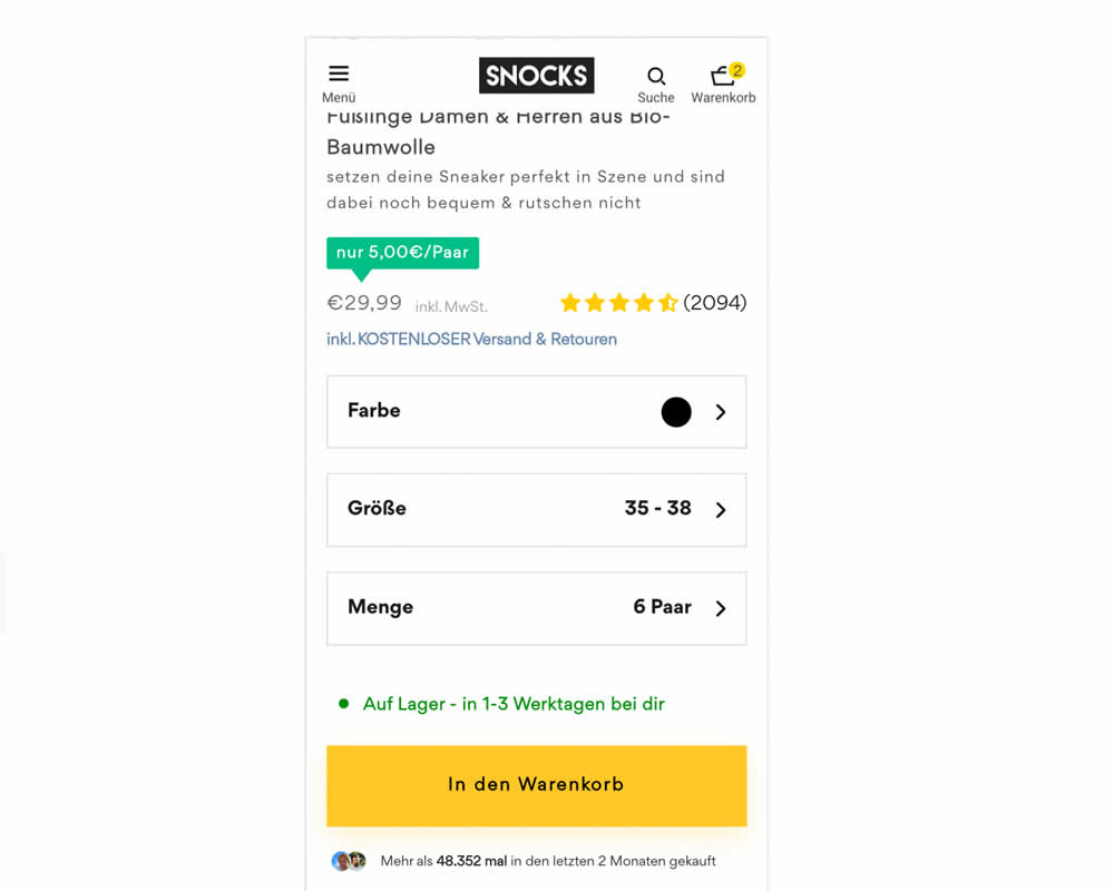
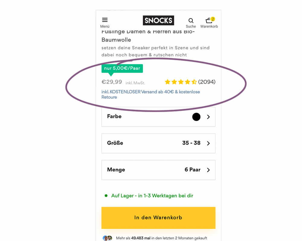
In this experiment, free shipping was a/b tested against free shipping with a 40€ purchase or higher. Hence, in the variation, customers needed to reach a cart amount total in order to be eligible for the free shipping.
Test #507 on
Fairment.de
by  Jona Eisenberger
Dec 11, 2023
Mobile
Listing
X.X%
Sales
Jona Tested Pattern #133: Product Availability On Fairment.de
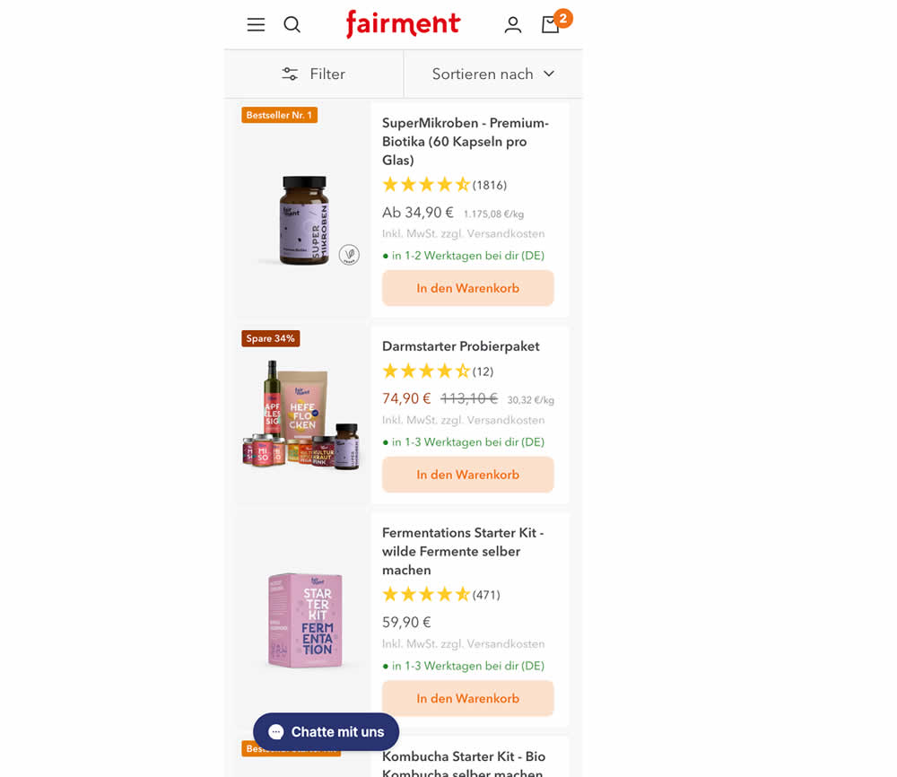
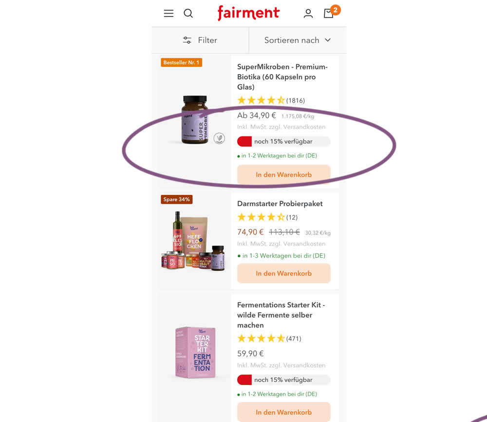
In this experiment, product availabiltiy bars were shown on products with low stock. This was shown on listing pages. Impact on adds to cart and sales was measured.
Test #506 on
by  Jakub Linowski
Dec 07, 2023
Desktop
Mobile
Product
X.X%
Sales
Jakub Tested Pattern #4: Testimonials
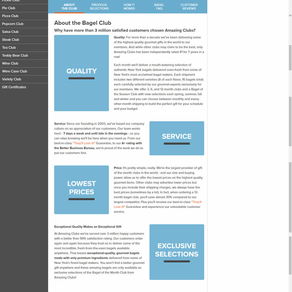
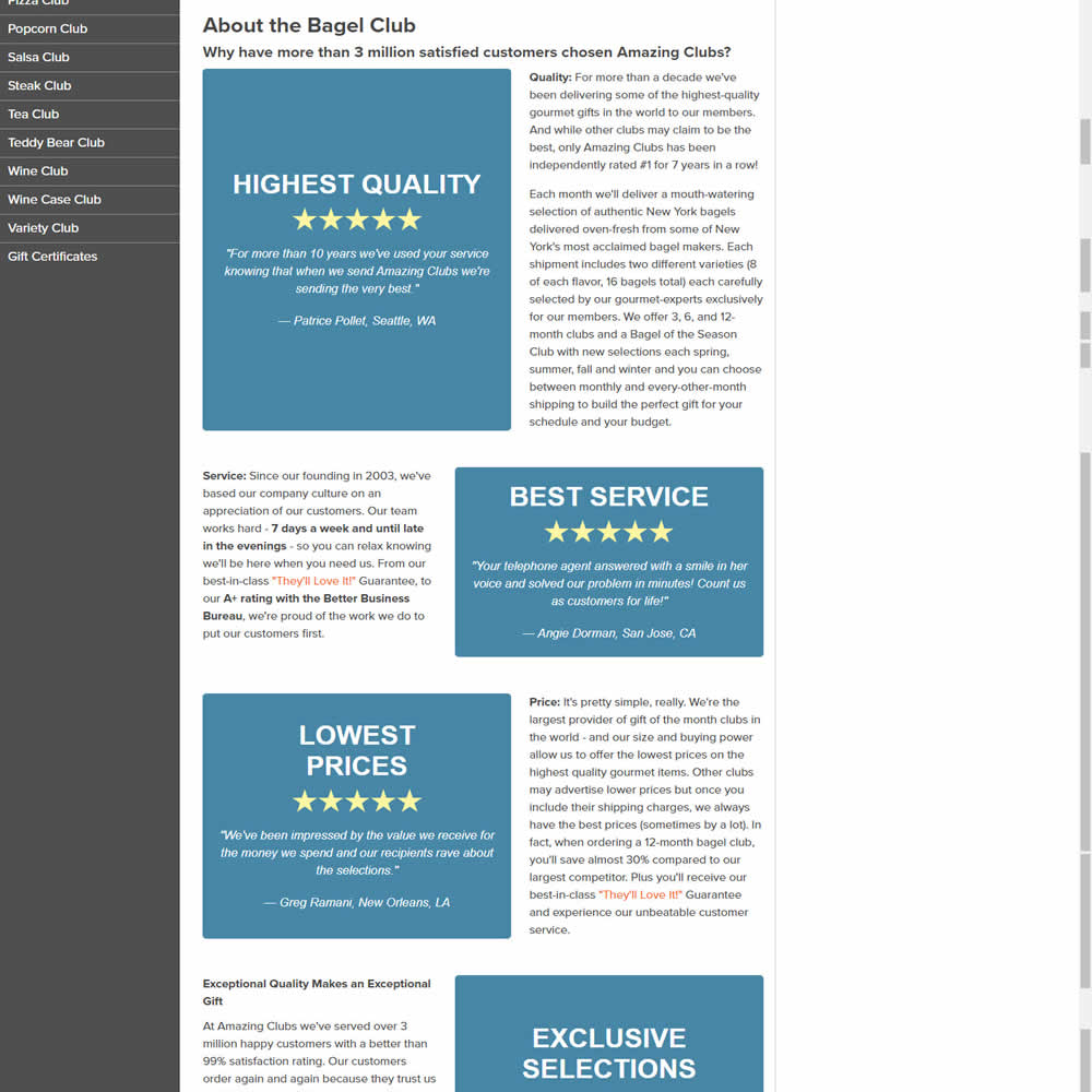
In this experiments, reinforcing section tiles were replaced with additional customer testimonials. Impact on adds to cart and sales was measured.
Test #505 on
Shmoodyapp.com
by  Michael McSweeney
Nov 28, 2023
Mobile
Signup
X.X%
Sales
Michael Tested Pattern #52: How It Works On Shmoodyapp.com
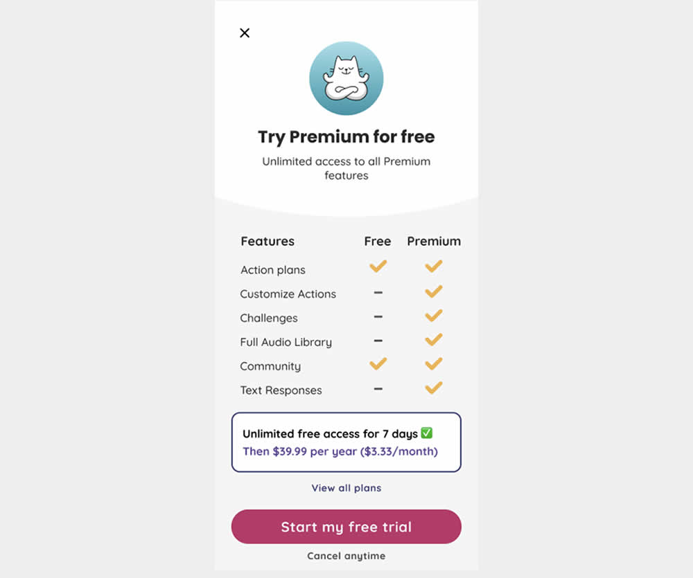
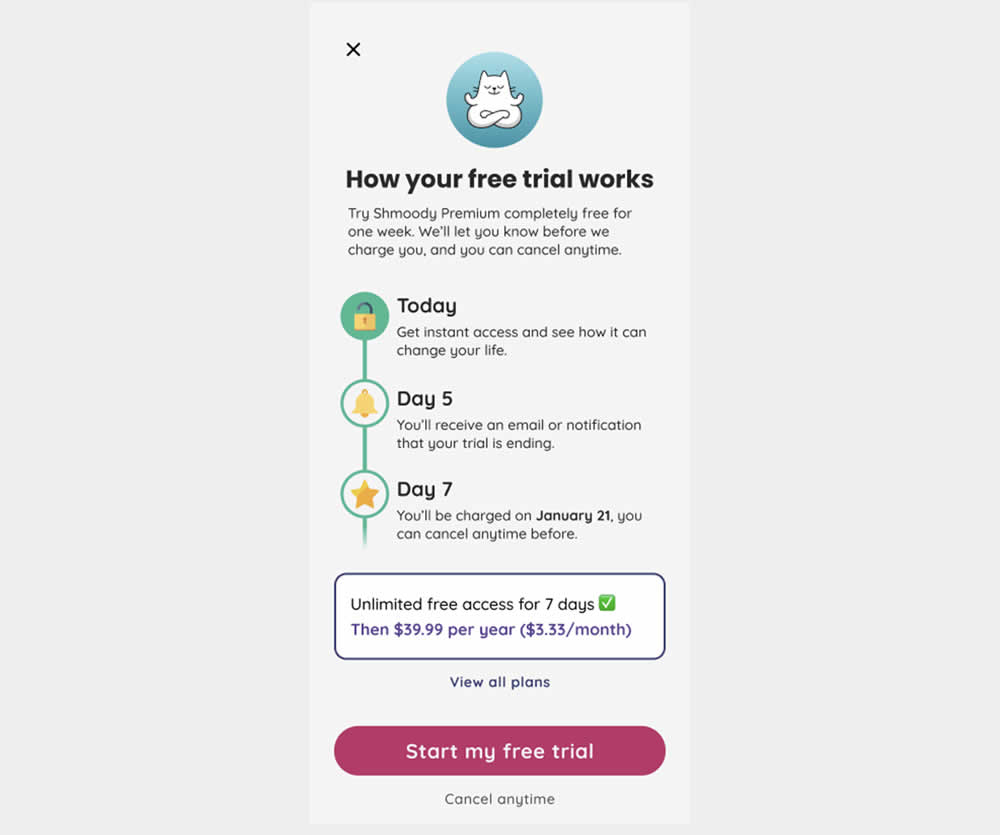
In this experiment, new paywall copy and messaging was used to encourage more users to signup and pay for access to a mental health app. The variation reinforced that users would be receiving a full featured application, with reminders about the upcoming billing. It reinforced that users will have a full week to decide and potentially cancel their application. Impact on lagging +7 day later transactions was measured.
Test #501 on
Volders.de
by  Daria Kurchinskaia
Nov 02, 2023
Desktop
Mobile
Pricing
X.X%
Sales
Daria Tested Pattern #132: One Time Payment Copy On Volders.de
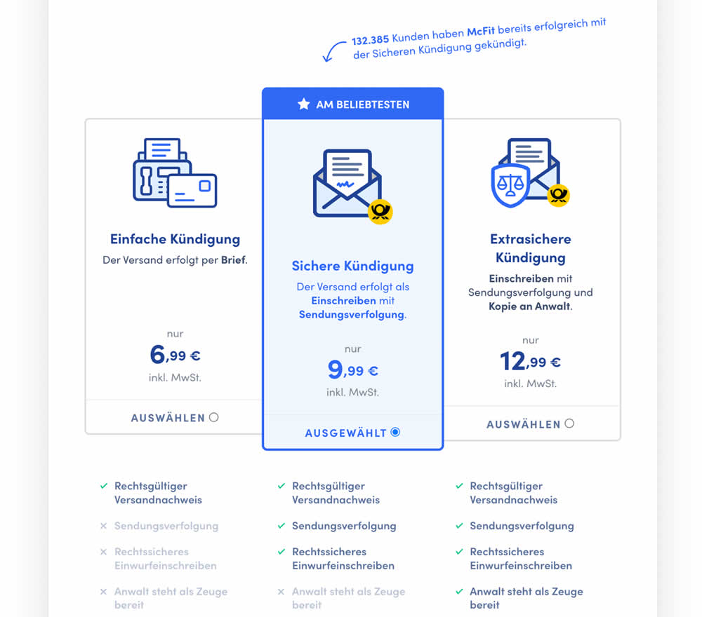
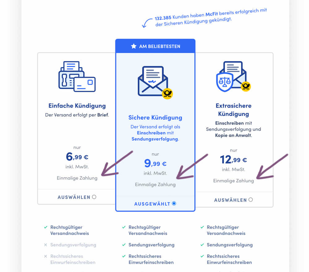
In this experiment, the wording "one-time payment" was appended below all three pricing plans for a contract cancelation service. Impact on orders placed was measured. (Translated from German: "Einmalige Zahlung").
Test #500 on
Kayoutlet.com
by  Craig Kistler
Oct 25, 2023
Mobile
Product
X.X%
Sales
Craig Tested Pattern #7: Social Counts On Kayoutlet.com
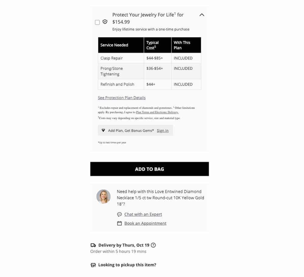
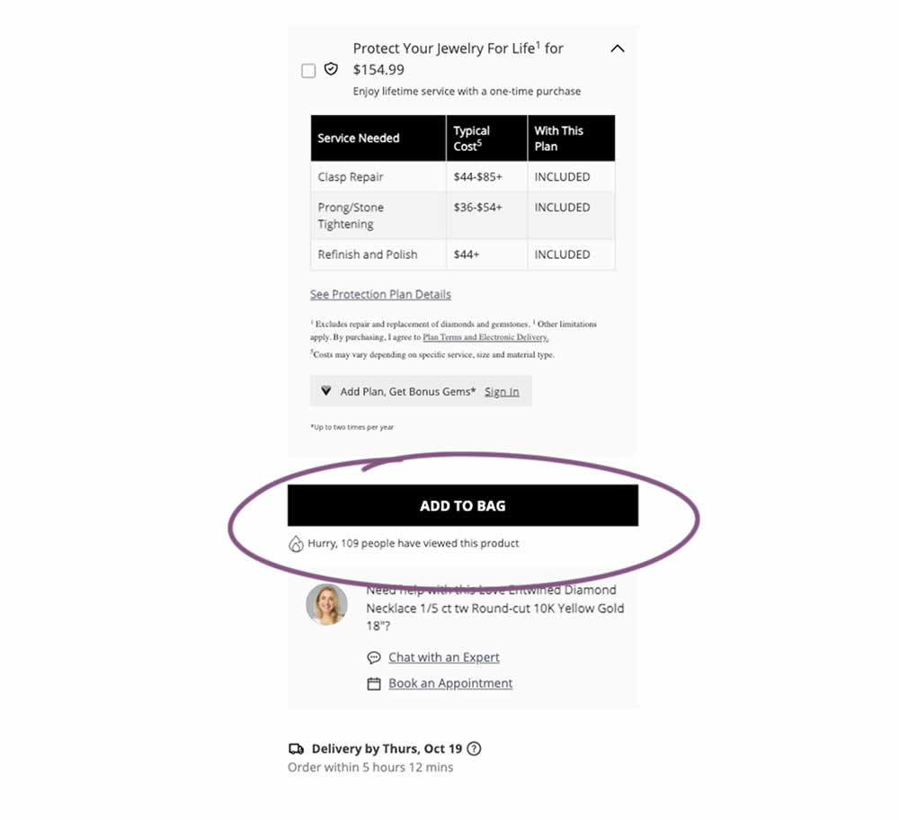
This was a replication attempt similar to experiment 497. A social proof message was added below add to cart buttons on product detail pages. Impact on adds to cart and transactions was measured.
Test #498 on
by  Jakub Linowski
Oct 19, 2023
Desktop
Mobile
Product
X.X%
Sales
Jakub Tested Pattern #7: Social Counts
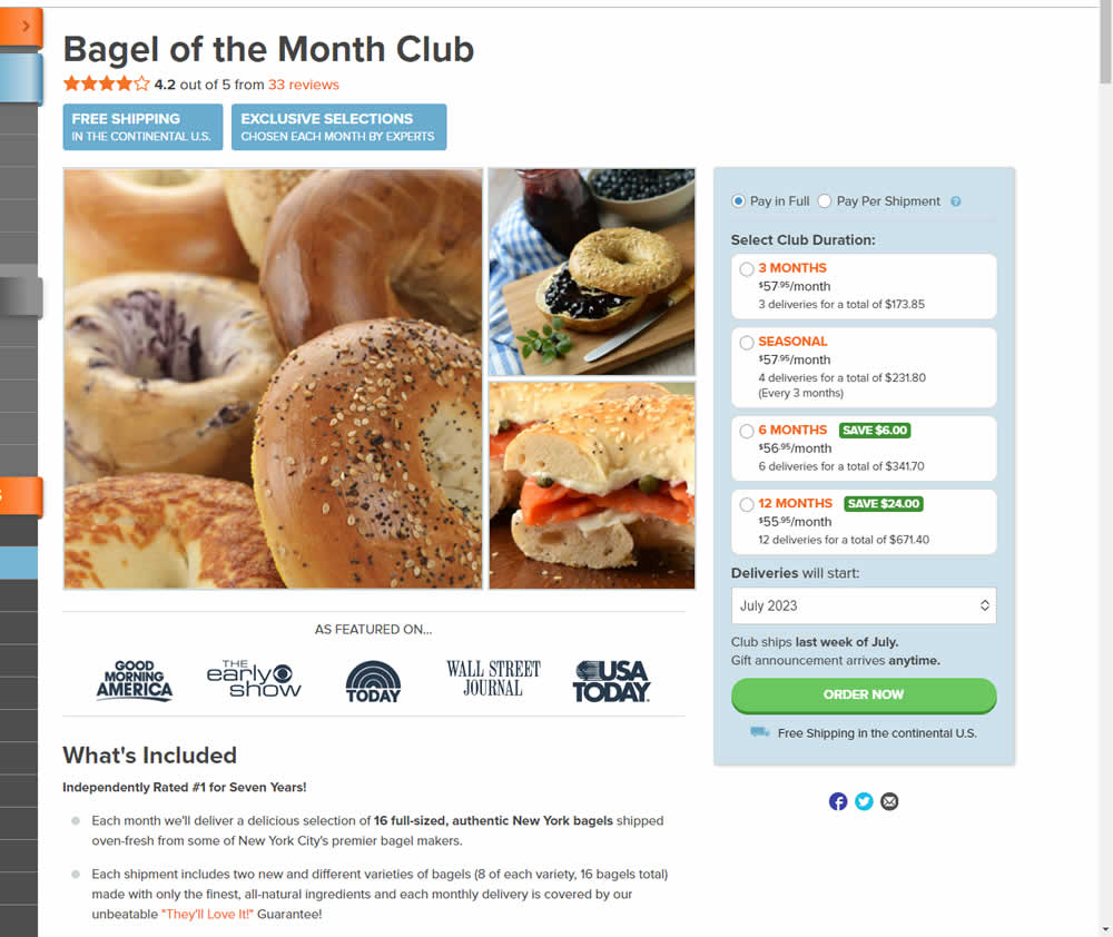
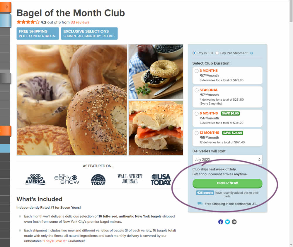
In this experiment, the variation tracked how many people would add something to cart over the last 24 hours and display that just below the add to cart button. Impact on adds to cart and transactions was measured.