All Latest 620 A/B Tests
MOST RECENT TESTS
Test #452 on
Volders.de
by  Daria Kurchinskaia
Jan 30, 2023
Desktop
Mobile
Checkout
X.X%
Sales
Daria Tested Pattern #62: Urgent Next Day Delivery On Volders.de
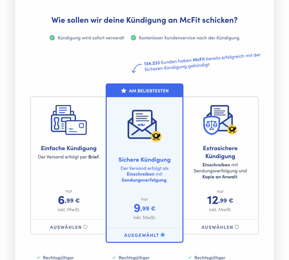
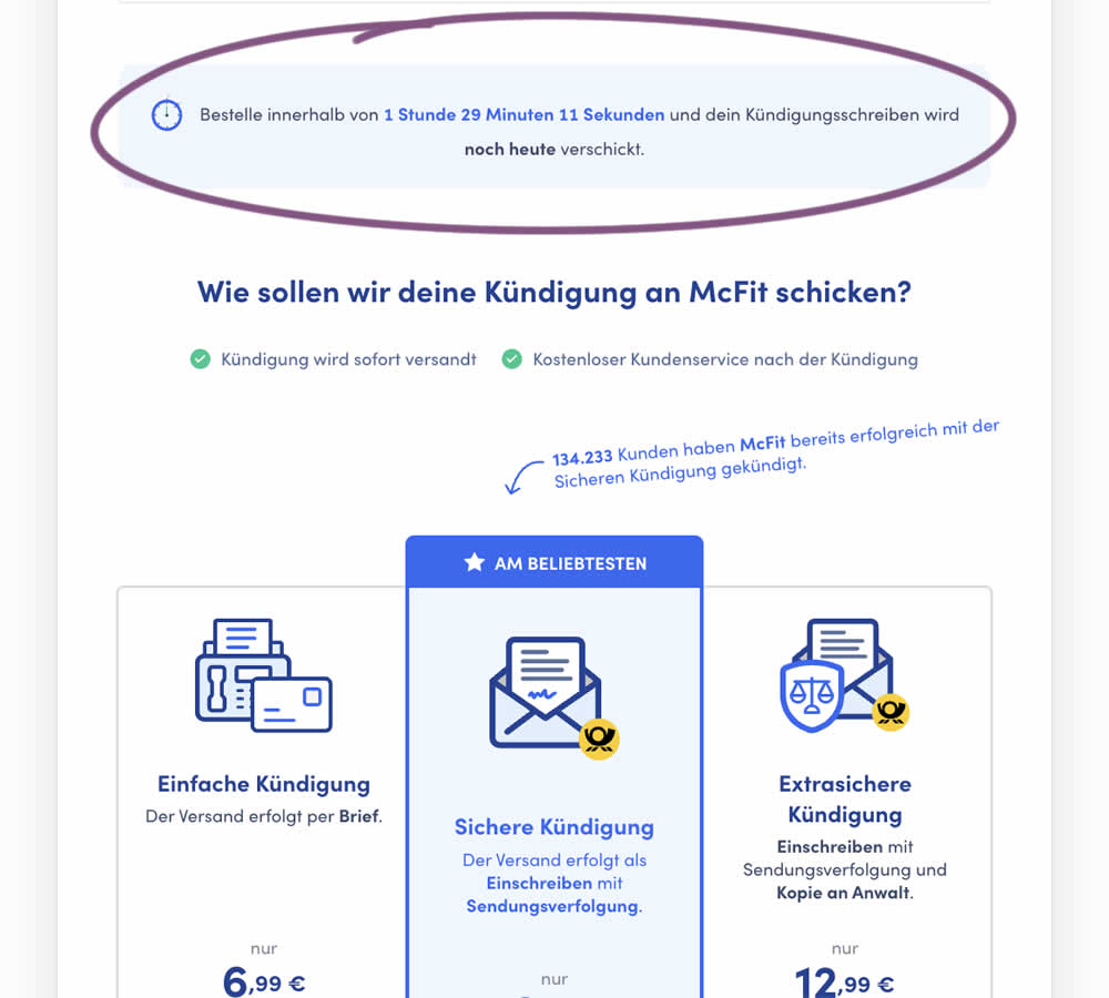
In this experiment, a count down timer was added near the top of a checkout page. The timer was only shown before 1pm and clarified that the serivce (contract cancellation) will be initiated on the same day if users act before a cut off time. Impact on completed payments was measured.
Which A Or B Actually Wins? Find Out Before You Test.
Members see every test result — the winners, the flat ones, and the losers — along with exact effects and sample sizes. Use it to estimate your tests and prioritize by probability, not gut feel. Start every experiment with the odds on your side.
Test #451 on
Fluke.com
by  Marika Francisco
Jan 25, 2023
Desktop
Product
X.X%
Sales
Marika Tested Pattern #115: Pricing Comparison Table On Fluke.com
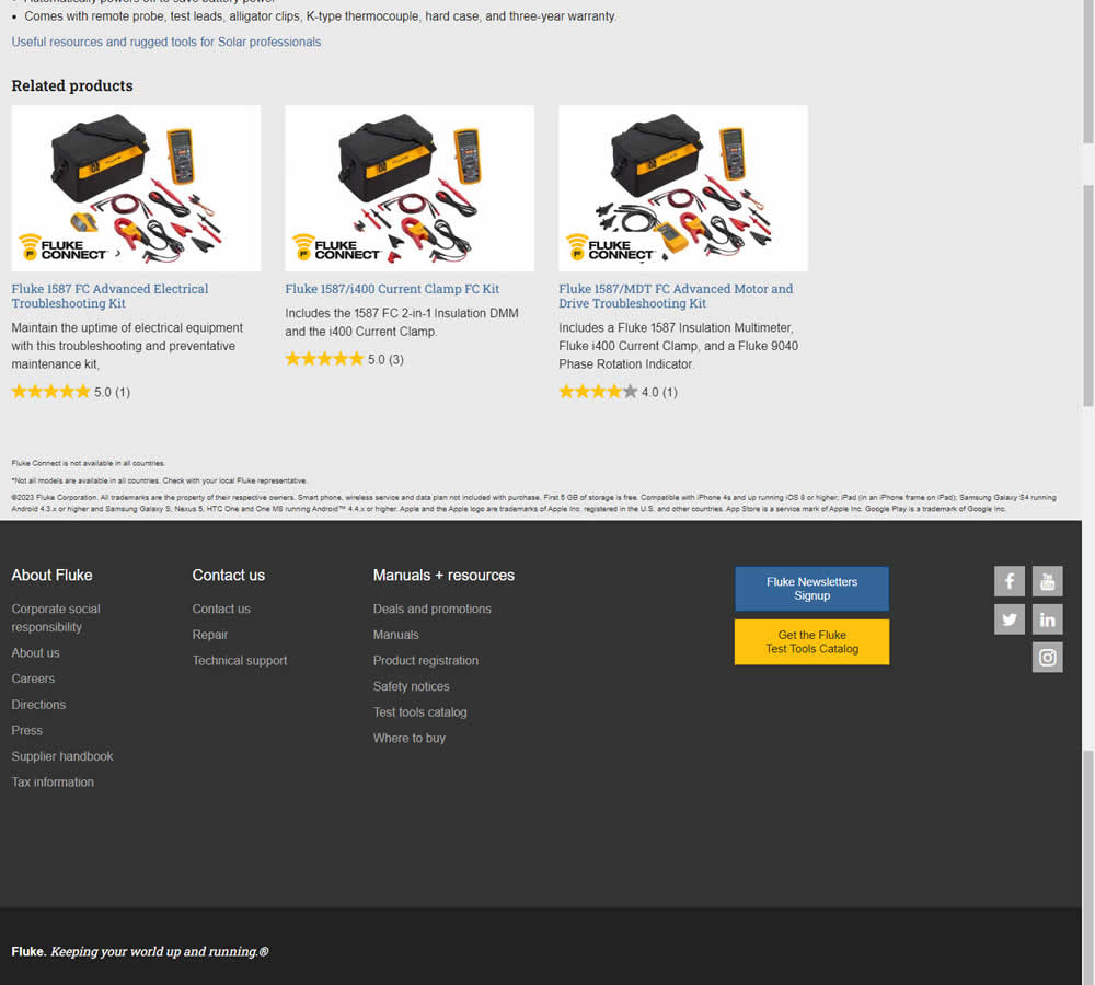
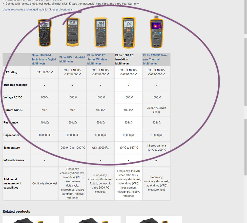
In this experiment, a product comparison table was added in the middle of a product detail page. The comparison table contained products from the same class or family of products. Clicking on the photo thumbnails also allowed customers to visit the specific detail page. Impact on adds to cart and transactions was measured.
Test #445 on
Phorest.com
by  Sorcha Mullis
Dec 14, 2022
Desktop
Mobile
Home & Landing
X.X%
Leads
Sorcha Tested Pattern #33: Example Situations On Phorest.com
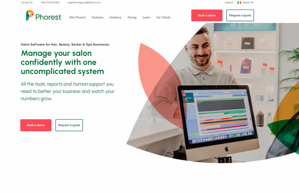
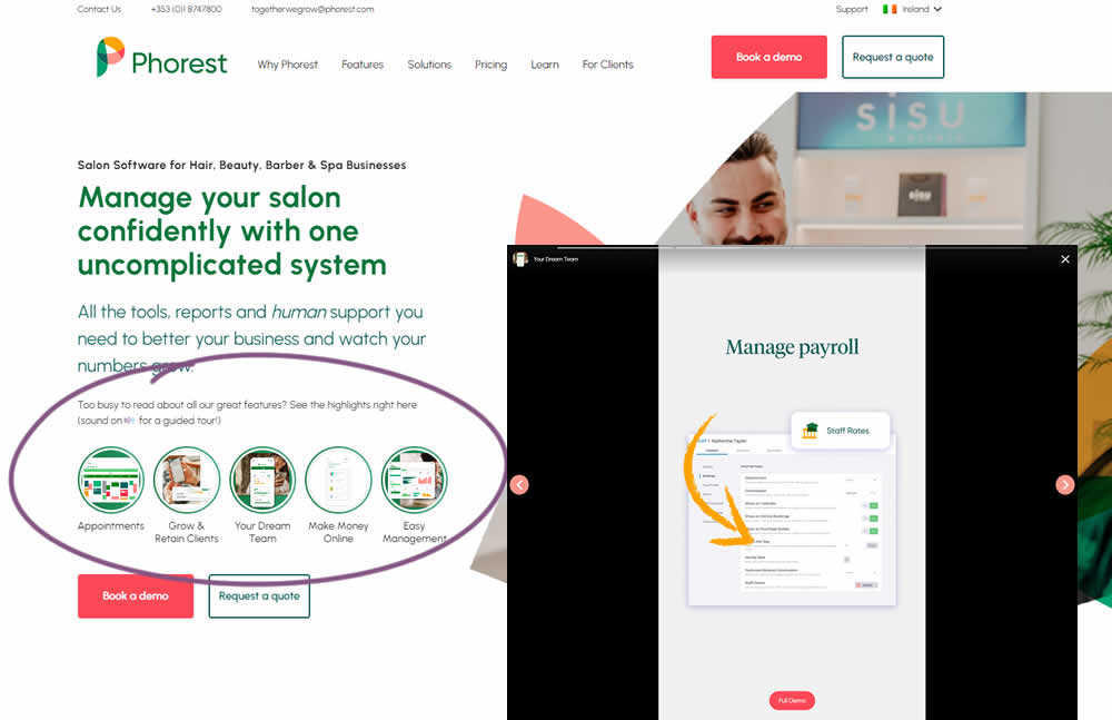
In this experiment, five clickable feature elements were surfaced on the homepage. Clicking on any of these 5 elements launched an Instastory-like short 10 second video in full screen. These videos explained the key features of the software being offered. Impact on lead generation was measured.
Test #442 on
Volders.de
by  Daria Kurchinskaia
Nov 27, 2022
Desktop
Mobile
Home & Landing
X.X%
Sales
Daria Tested Pattern #4: Testimonials On Volders.de

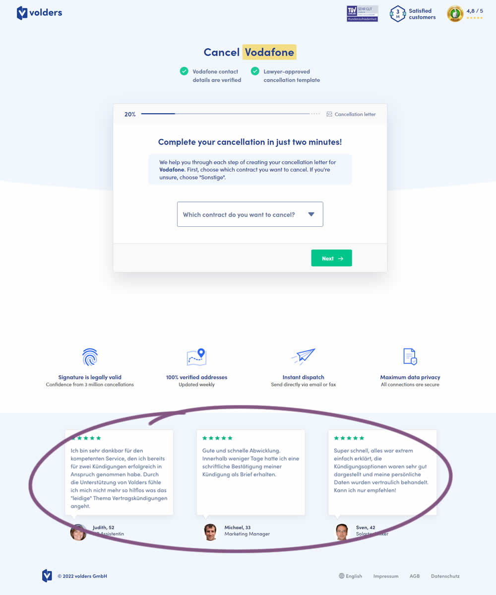
In this experiment, three testimonials were appended at the bottom of landing pages of a contract cancelation service (paid). These testimonials were also shown throughout the complete signup funnel (4 more steps). Impact on progression (step 2) and final completed purchases were measured.
Test #443 on
Volders.de
by  Daria Kurchinskaia
Nov 27, 2022
Desktop
Mobile
Home & Landing
X.X%
Sales
Daria Tested Pattern #4: Testimonials On Volders.de
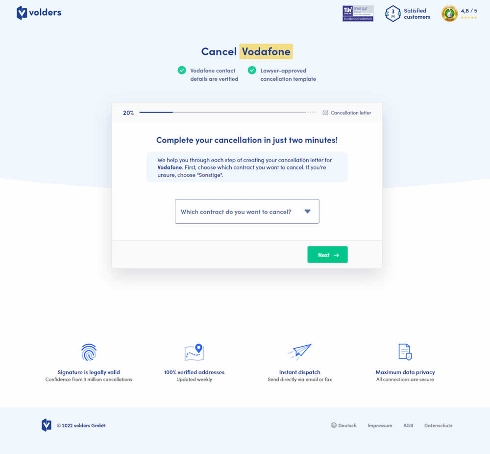
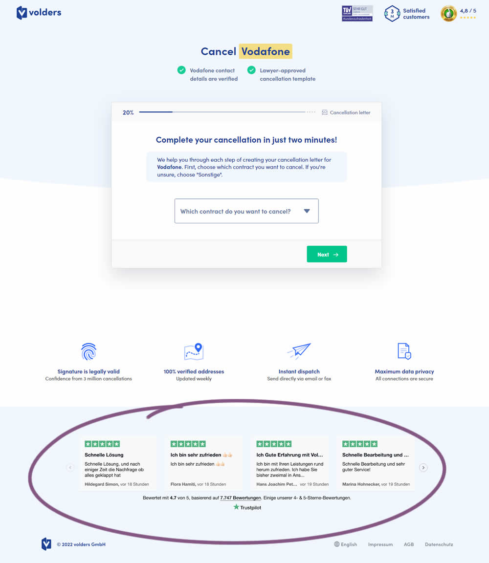
In this experiment, four TrustPilot reviews were appended at the bottom of landing pages of a contract cancelation service (paid). These reviews were also shown throughout the complete signup funnel (4 more steps). Impact on progression (step 2) and final completed purchases were measured.
Test #439 on
Designlab.com
by  Daniel Shapiro
Oct 31, 2022
Desktop
Mobile
Home & Landing
X.X%
Sales
Daniel Tested Pattern #18: Single Or Alternative Buttons On Designlab.com

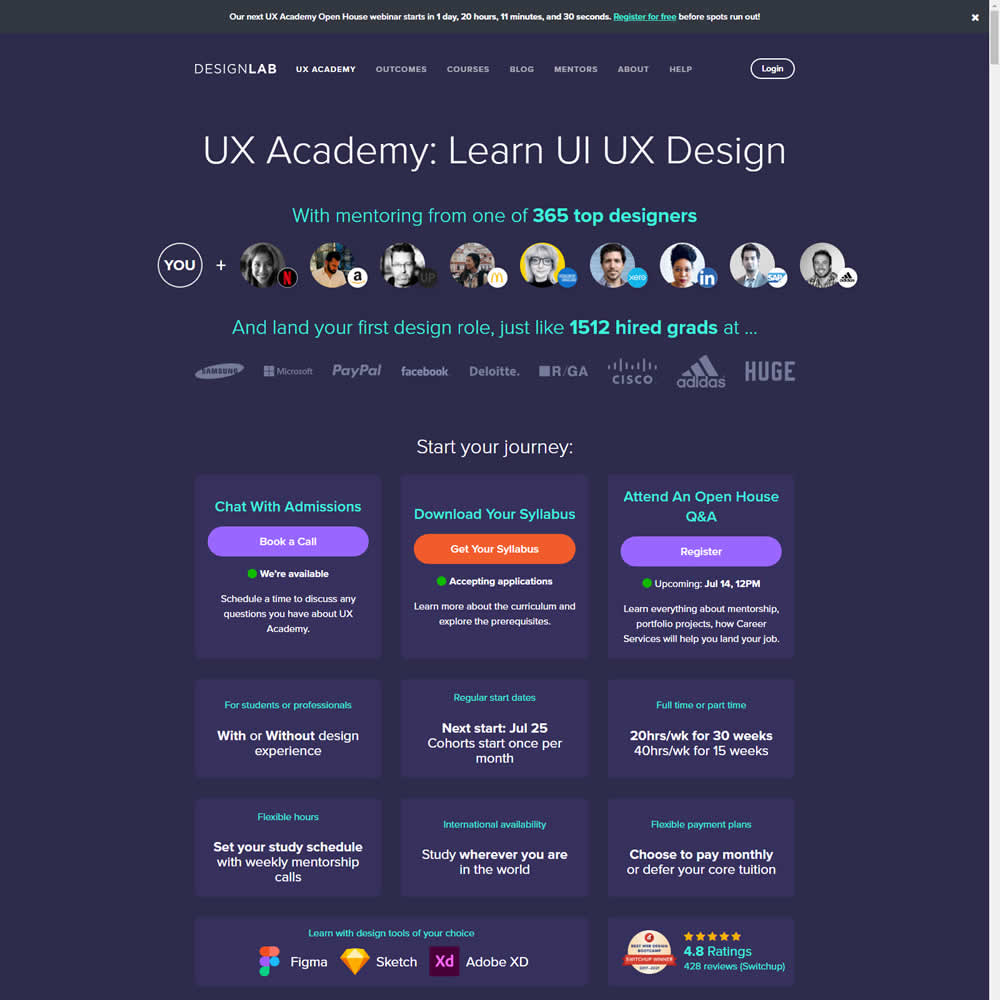
This was a larger leap experiment with numerous changes to the header part of a design program landing page. One of the key changes however was a shift from a single to multiple call to actions for lead generation. In the control, all potential leads would first funnel through a single syllabus download flow. In the variation, users were given three visible choices: download syllabus, webinar signup and/or book a live call with admissions. Impact on overall generated leads was measured, as well as paid enrollments.
Test #436 on
Designlab.com
by  Daniel Shapiro
Oct 25, 2022
Desktop
Mobile
Home & Landing
X.X%
Sales
Daniel Tested Pattern #7: Social Counts On Designlab.com
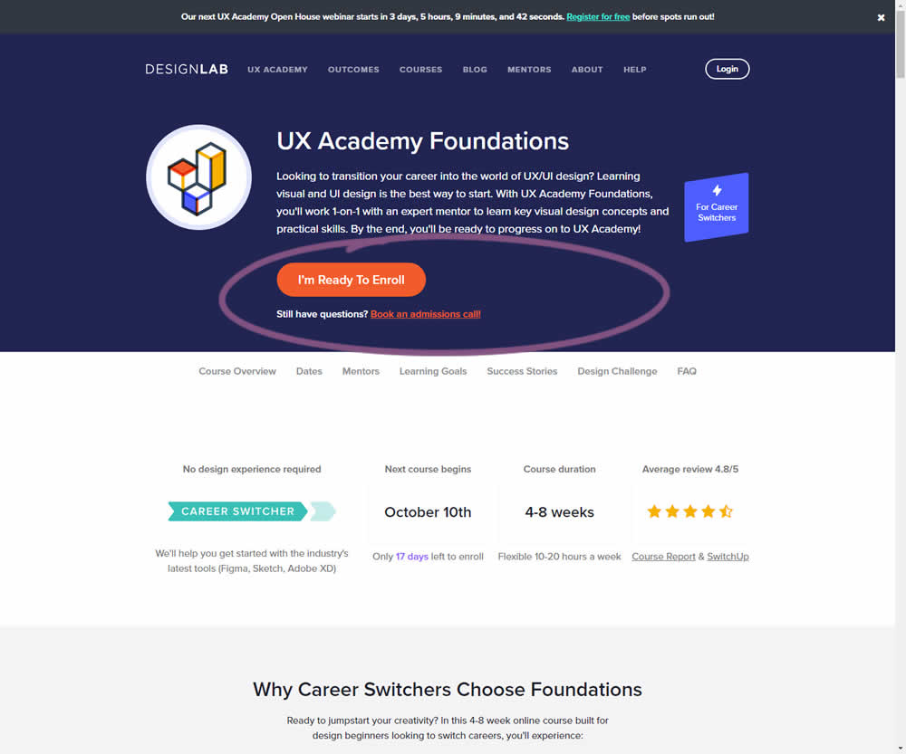
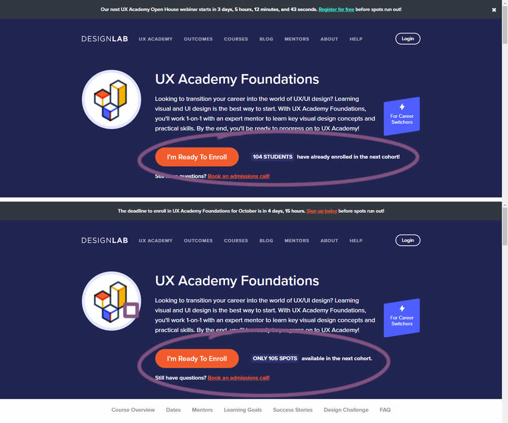
In this experiment, social proof and scarcity messages were shown on a course enrollment landing page. When students were starting to sign up at the beginning of each month (with greater availability), a simpler "X students have already enrolled in the next cohort" message was used.
Later in the month when fewer spots were available, a more scarce message was used with the following copy "ONLY X SPOTS available in the next cohort".
In both cases, the numbers were accurate and dynamically updated.
Test #429 on
Snocks.com
by  Melina Hess
Aug 16, 2022
Mobile
Desktop
Product
X.X%
Sales
Melina Tested Pattern #121: Free Shipping On Snocks.com
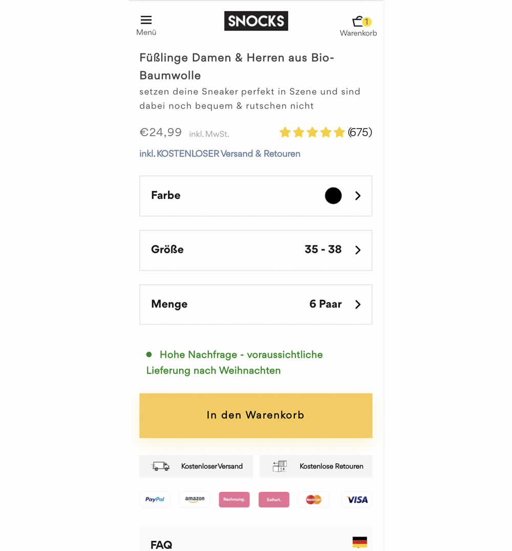
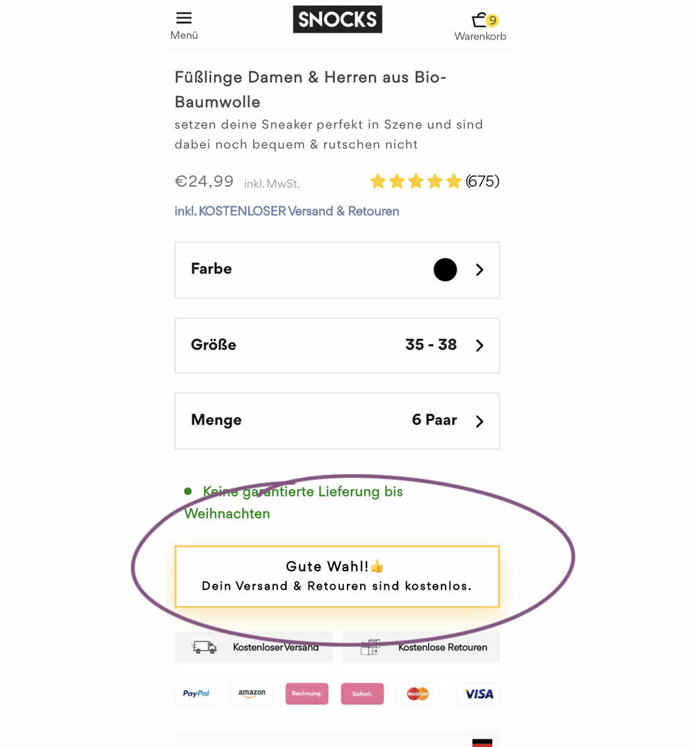
Upon clicking the Add-To-Cart button, the button label changed to a cheering message which congratulated the user on his choice and ensuring that shipping is free. Translation: "Good choice. Your shipping and returns are free."
Test #424 on
by  Sandis Viksna
Jul 28, 2022
Desktop
Shopping Cart
X.X%
Sales
Sandis Tested Pattern #45: Benefit Bar
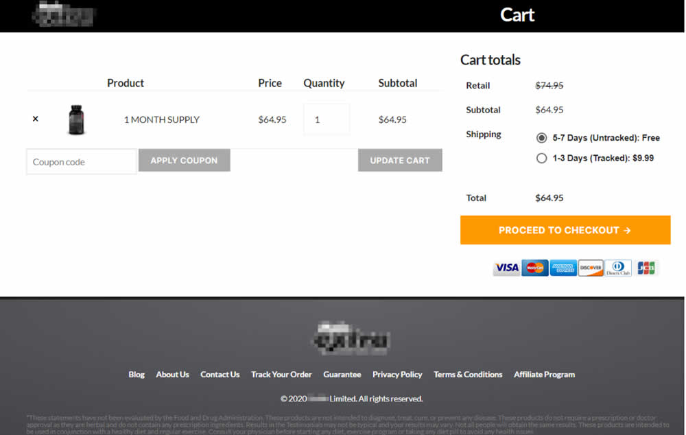
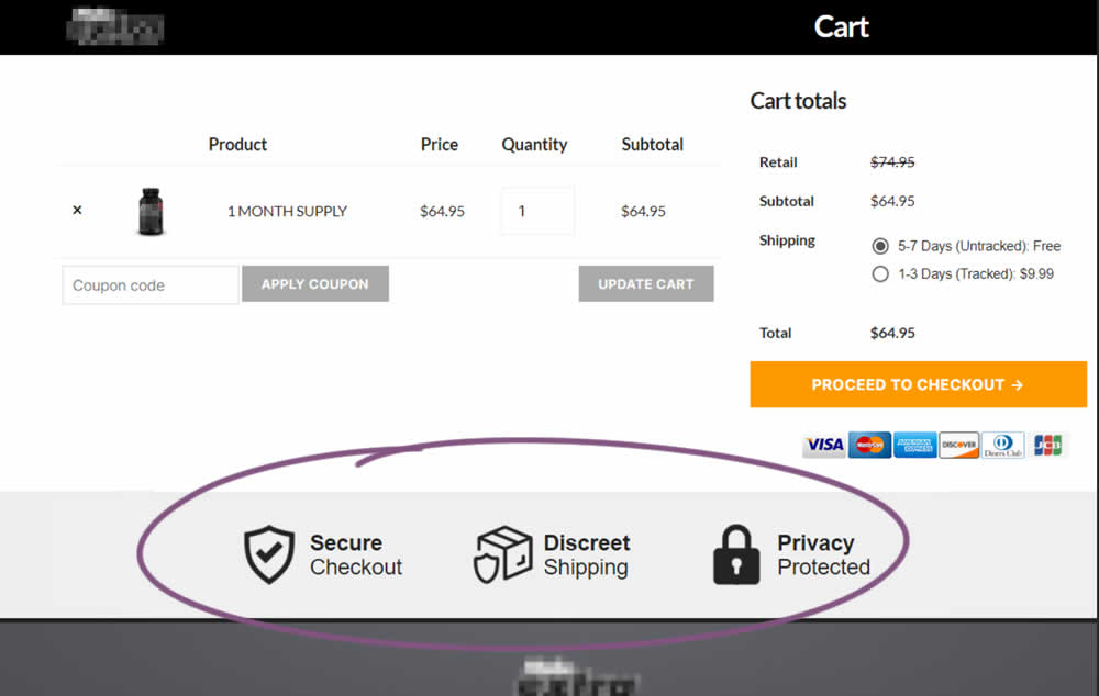
In this experiment, 3 reassurances were shown at the bottom of cart and checkout pages. The web site was selling health and nutrition products for males and one of the reassurances included "discreet shipping". Impact on sales was measured.
Test #423 on
Expertinstitute.com
by  Ardit Veliu
Jul 26, 2022
Desktop
Mobile
Home & Landing
X.X%
Leads
Ardit Tested Pattern #110: Optional Field Labels On Expertinstitute.com
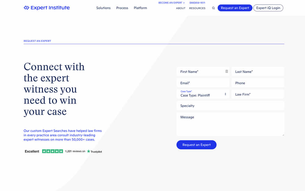
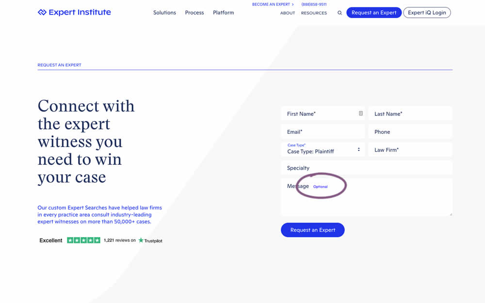
In this experiment, an "optional" label was shown near a message form field. Impact on overall leads was measured (requesting experts).
Test #421 on
Amazon.com
by  Marika Francisco
Jul 15, 2022
Desktop
Mobile
Product
X.X%
Sales
Marika Tested Pattern #43: Long Titles On Amazon.com
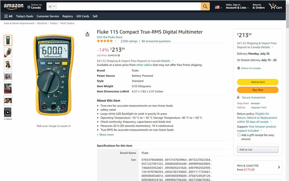
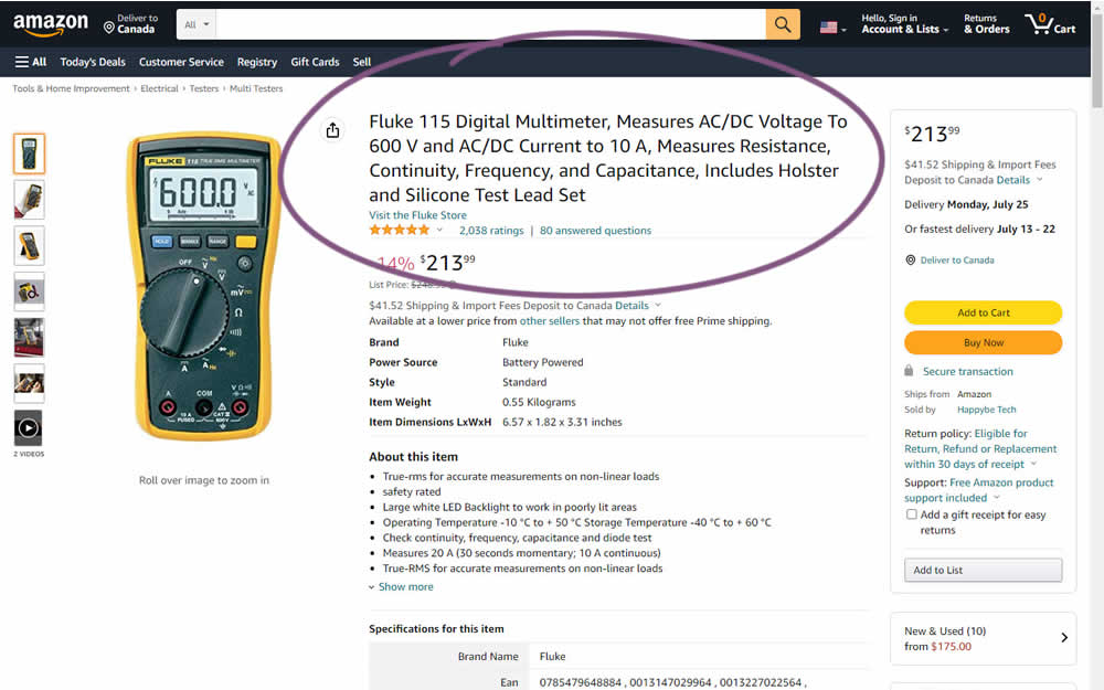
Fluke is an industrial manufacterer of measurement and calibration devices and they ran a test on their Amazon store for a series of their prodcts. Instead of using short product names, they tested longer and more descriptive ones. Impact was measured on sales.
Test #417 on
Cxl.com
by  Ognjen Bošković
Jun 27, 2022
Desktop
Mobile
Signup
X.X%
Signups
Ognjen Tested Pattern #127: Vague Or Specific Benefits On Cxl.com
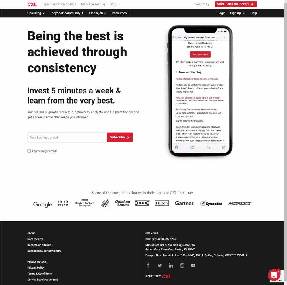
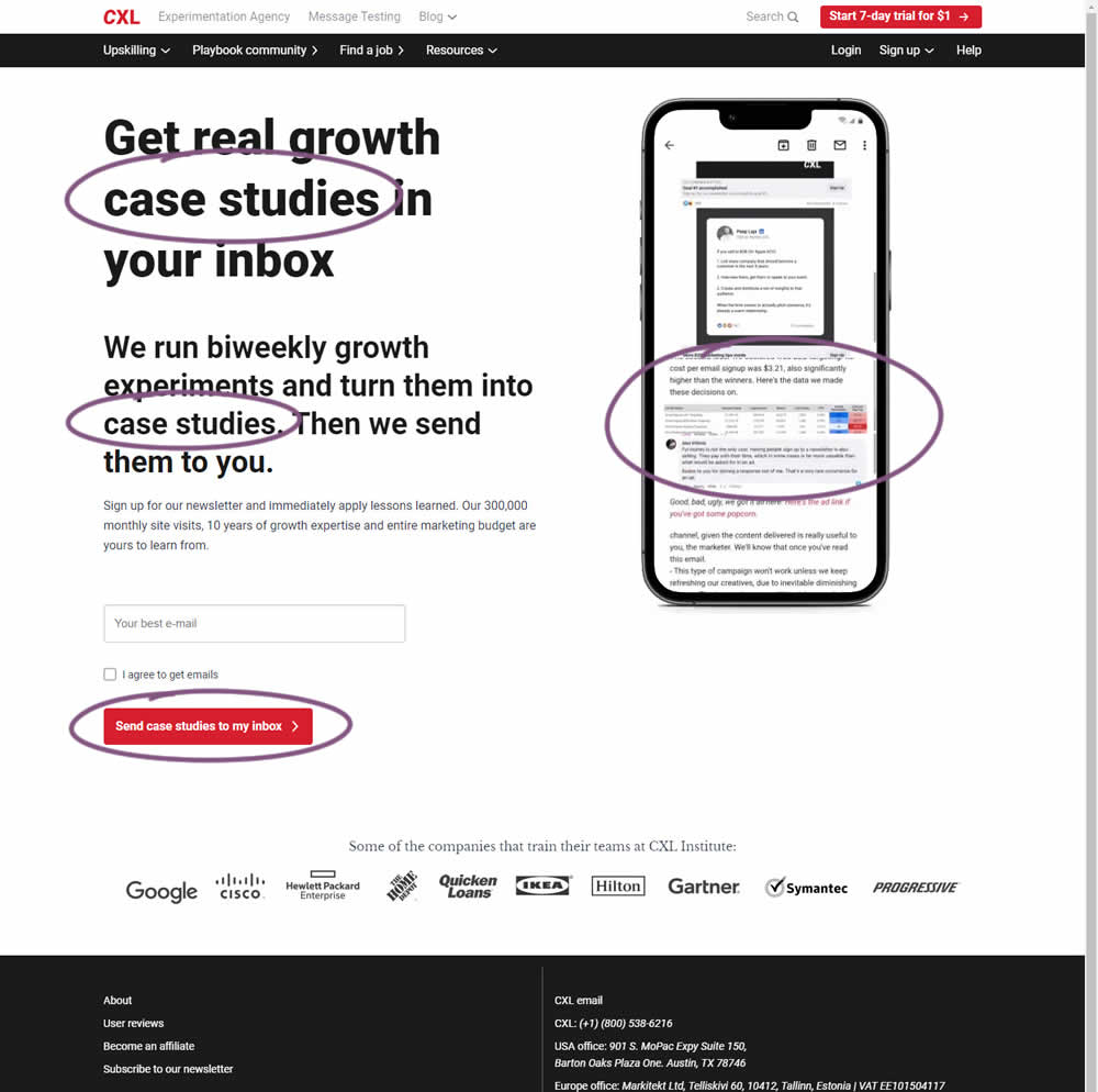
CXL ran an interesting experiment that (1) added more specificity on a newsletter subscription page as well as (2) reinforced it consistently. Most visibly, an abstract or vague headline statement (control) was changed to a benefit oriented one - hinting that subscribers will eventually receive valuable case studies. This message was further reinforced with supporting copy that explained where these case studies are obtained from along with the frequency of the delivery. This same message was also reinforced with an image of actual case studies. The call to action button was also adjusted to mimic the benefit.
Impact on newsletter signups was measured.
Test #416 on
Designlab.com
by  Daniel Shapiro
Jun 20, 2022
Desktop
Mobile
Product
X.X%
Sales
Daniel Tested Pattern #105: Lead Magnets On Designlab.com

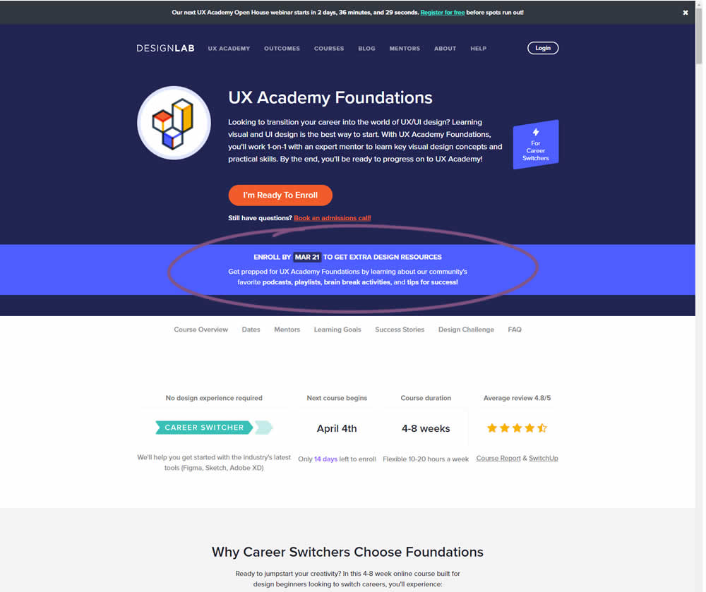
In this experiment, copy was added which communicated that students signing up for a course would receive extra design resources (the lead magnet). This was added in multiple states of the course page. Impact on lead generation and enrollment was measured.
Test #412 on
Volders.de
by  Frederik Fröhle
May 16, 2022
Desktop
Mobile
Checkout
X.X%
Sales
Frederik Tested Pattern #15: Bulleted Reassurances On Volders.de
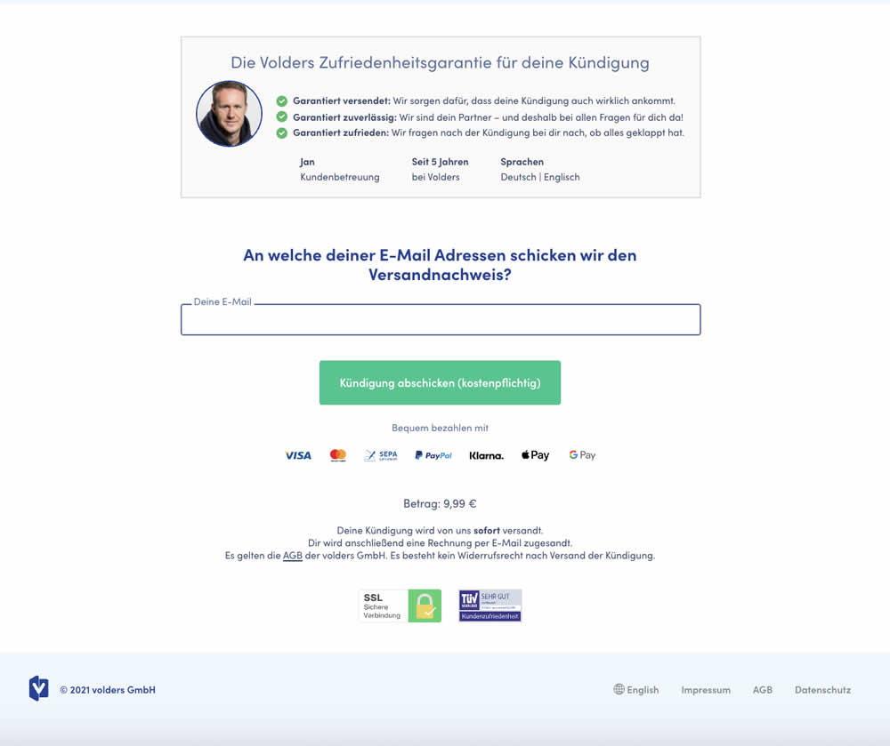
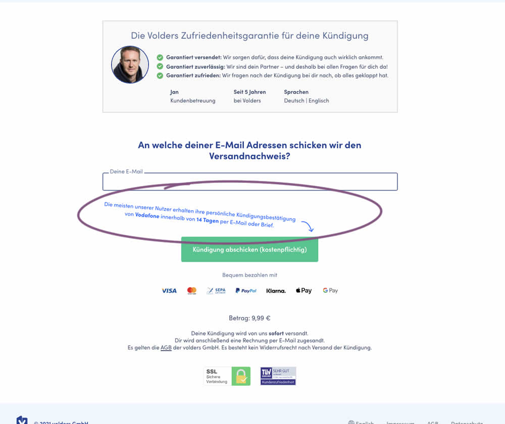
The Volders experimentation team assumed that adding information about how long it might take to get a cancellation confirmation near a CTA Button would result in higher cancellation requests (the paid service being offered).
The variation contained additional copy translated from German to: "Most of our users receive their cancellation confirmation from <vendor> within 14 days by email or letter."
Test #409 on
Expertinstitute.com
by  Ardit Veliu
Apr 30, 2022
Desktop
Mobile
Signup
X.X%
Leads
Ardit Tested Pattern #20: Canned Response On Expertinstitute.com
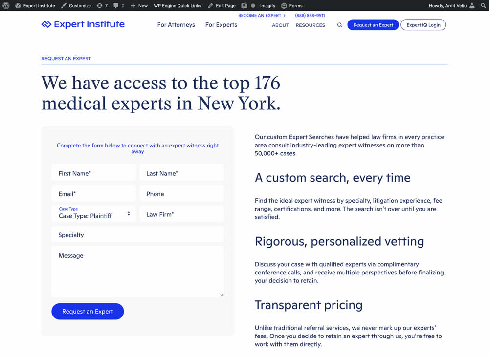
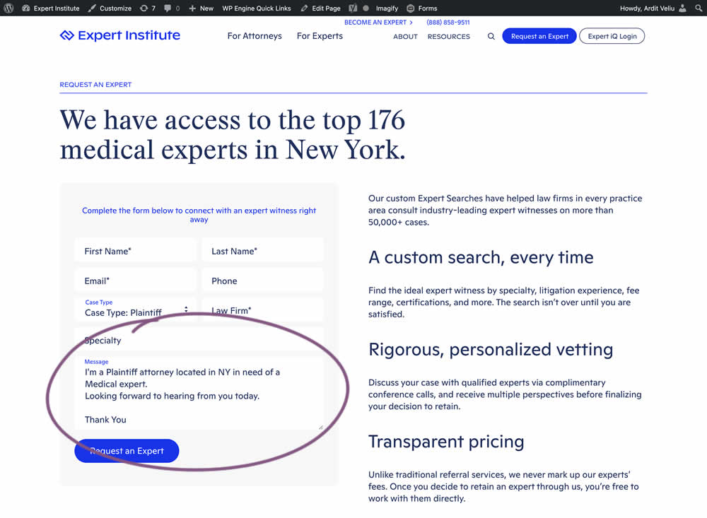
In this experiment, the copy of an input textarea on a lead form was used to summarize a user's choices. Instead of showing using a generic "Message" statement, the variation use the following formula: "I'm a [Lead Type] located in [State] looking for [Expert Type]. Looking forward to hearing from you today. Thank You." Impact of leads was measured.
Test #408 on
by  Jakub Linowski
Apr 29, 2022
Desktop
Mobile
Product
X.X%
Sales
Jakub Tested Pattern #67: Currency & Taxes
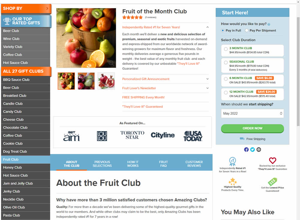
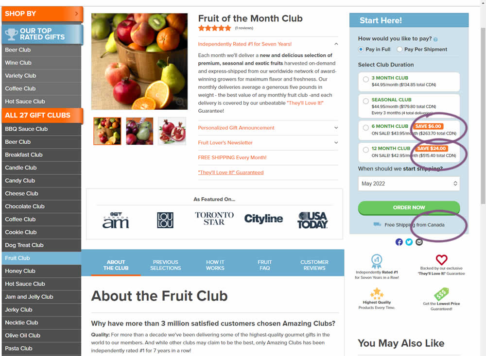
Here is a very simple experiment where CDN currency copy was appended to prices being shown on a Canadian ecommerce site. Additional copy ("from Canada") was appended to an existing shipping message.
Test #407 on
Snocks.com
by  Melina Hess
Apr 22, 2022
Desktop
Mobile
Product
X.X%
Sales
Melina Tested Pattern #125: Unit Prices On Snocks.com
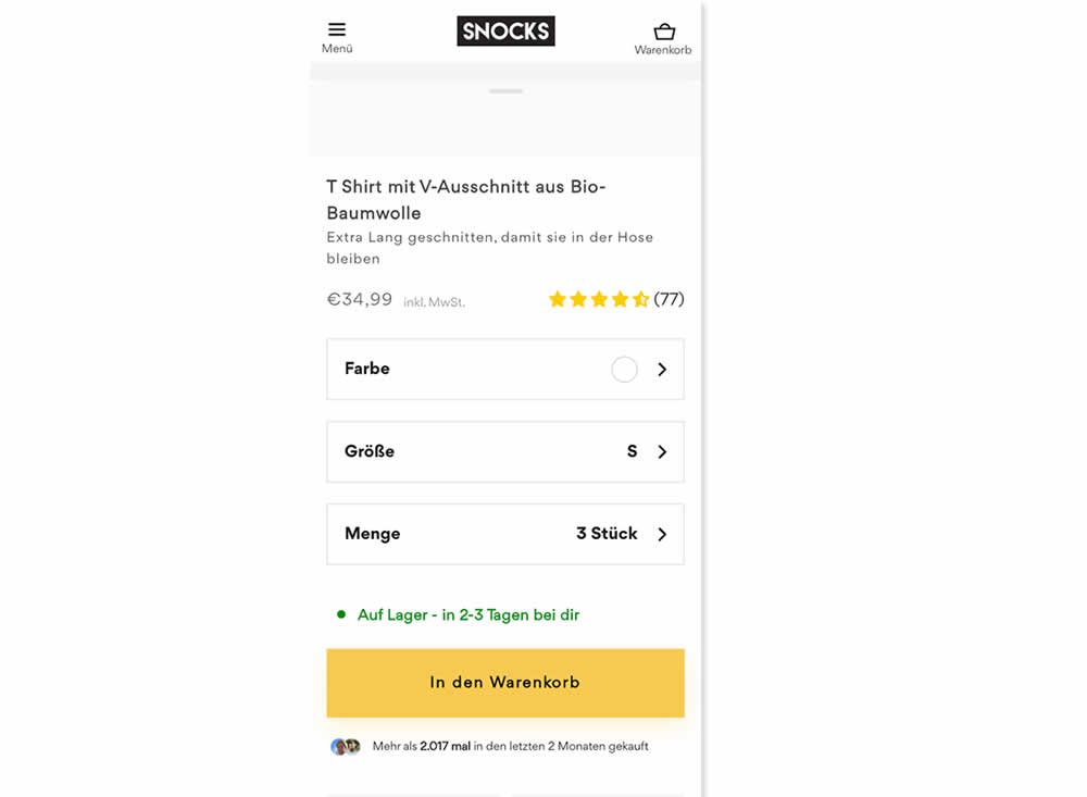
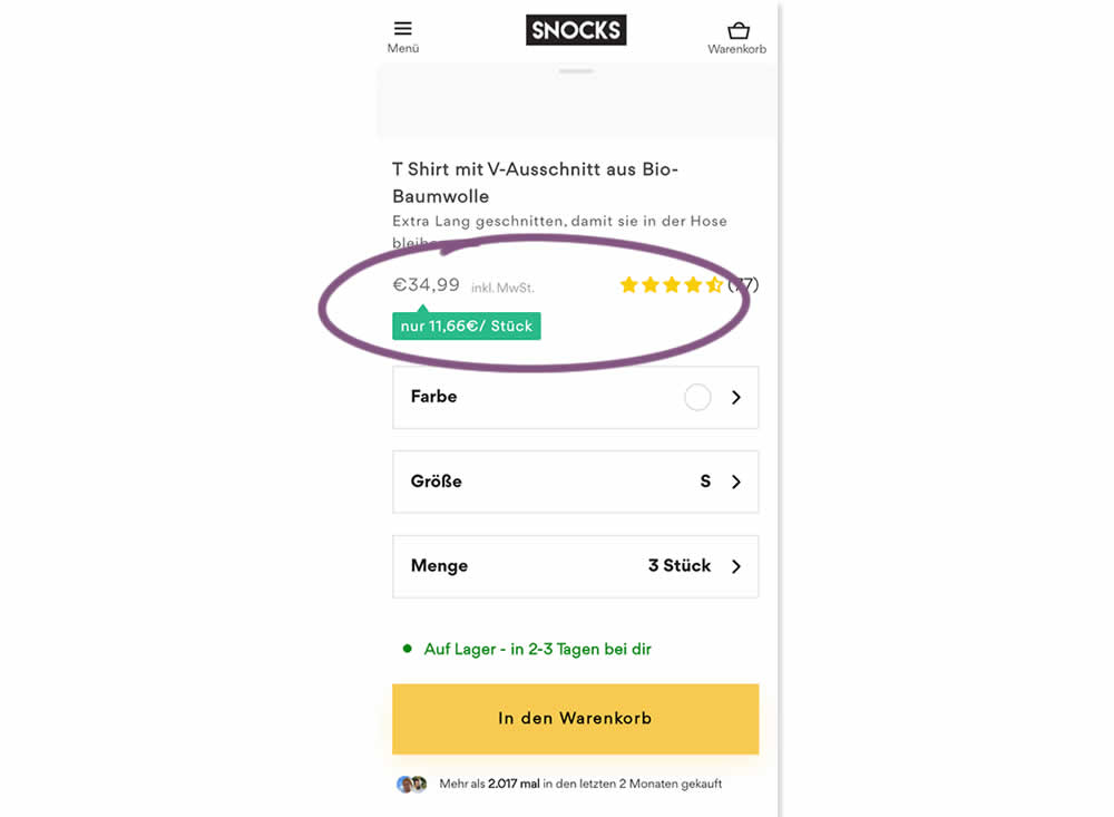
Here is an experiment with an added "price per pair" in the context of products with multiple items (packs).A high contrast badge-like copy was appended underneath the price which translates to "only $X per item". Impact on sales was measured.
Test #406 on
Chaos.com
by  Velin Penev
Apr 12, 2022
Desktop
Mobile
Product
X.X%
Sales
Velin Tested Pattern #112: Lower Price Frames On Chaos.com
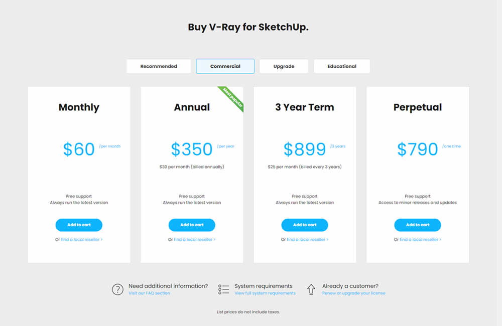
In this experiment, the pricing of three software plans was consistently framed into a more comparable monthly context. Whereas the control version only showed the total prices for each plan, the variation showed both the total and monthly prices. Impact on sales was measured.
Test #403 on
by  Jakub Linowski
Mar 29, 2022
Desktop
Mobile
Checkout
X.X%
Sales
Jakub Tested Pattern #42: Countdown Timer
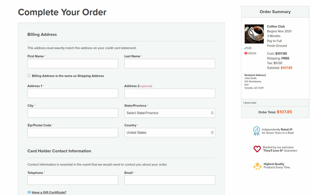
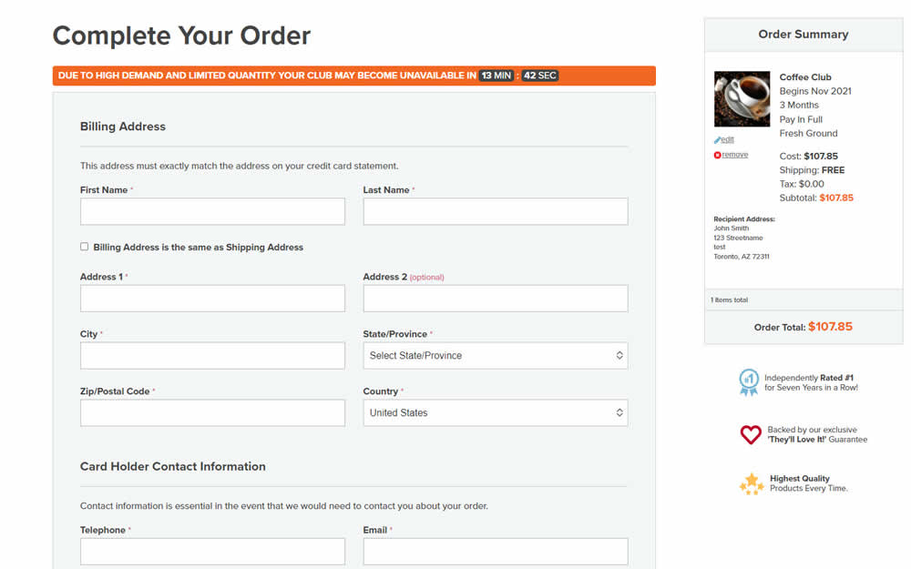
In this experiment, an urgency related message with a dynamic countdown timer was added on the final checkout screen. Impact on sales was measured.
Test #402 on
Snocks.com
by  Melina Hess
Mar 25, 2022
Mobile
Product
X.X%
Sales
Melina Tested Pattern #103: Money Back Guarantee On Snocks.com
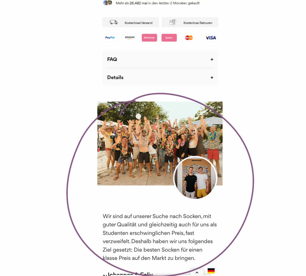
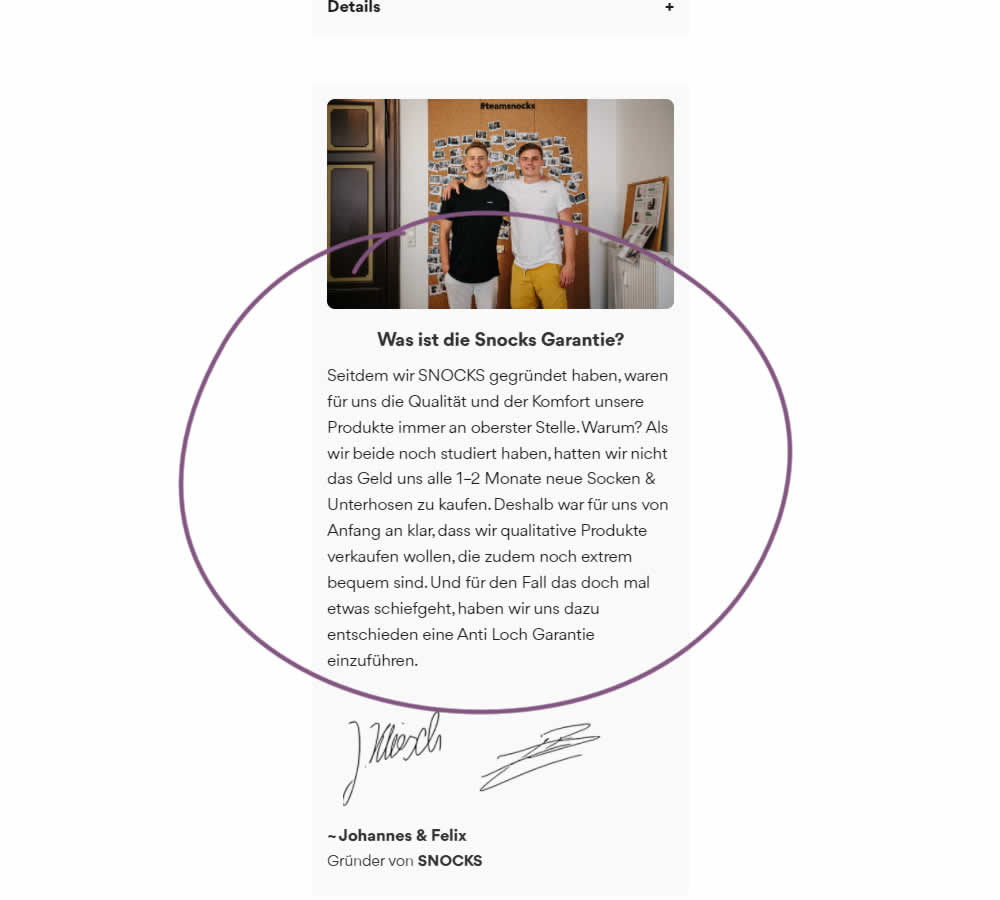
In this experiment on a product screen, a message about quality (from the founders) was reformatted to reinforce the "Anti Hole Guarantee" (in the context of socks). The founders were also made more prominent and their signature added as well. Interestingly, the actual guarantee copy (and its important detail about a 6 month product replacement) was present further down on both the control and variation.
The translation of the new copy (Google Translate) reads:
Since we founded SNOCKS, the quality and comfort of our products have always been our top priority. Why? When we both were still studying, we didn't have the money to buy new socks & underpants every 1-2 months. That's why it was clear to us from the start that we wanted to sell quality products that are also extremely comfortable. And just in case something goes wrong, we have decided to introduce an anti-hole guarantee.