All Latest 620 A/B Tests
MOST RECENT TESTS
Test #497 on
Jared.com
by  Craig Kistler
Oct 16, 2023
Mobile
Product
X.X%
Sales
Craig Tested Pattern #7: Social Counts On Jared.com
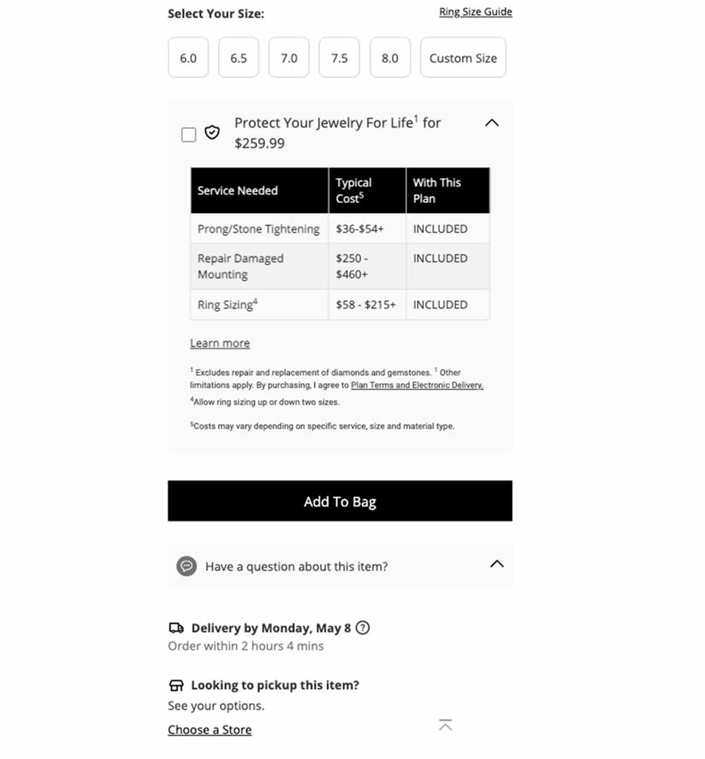
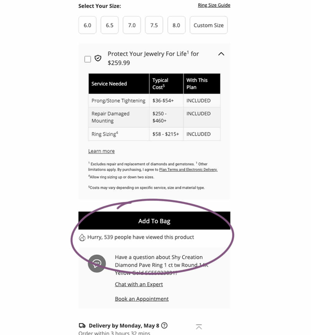
In this experiment, a social proof message was added below add to cart buttons on product detail pages. The copy read "Hurry, X people have viewed this product". Impact on adds to cart and transactions was measured.
Which A Or B Actually Wins? Find Out Before You Test.
Members see every test result — the winners, the flat ones, and the losers — along with exact effects and sample sizes. Use it to estimate your tests and prioritize by probability, not gut feel. Start every experiment with the odds on your side.
Test #496 on
Livefresh.de
by  Pascal Dietz
Oct 03, 2023
Desktop
Mobile
Product
X.X%
Sales
Pascal Tested Pattern #43: Long Titles On Livefresh.de
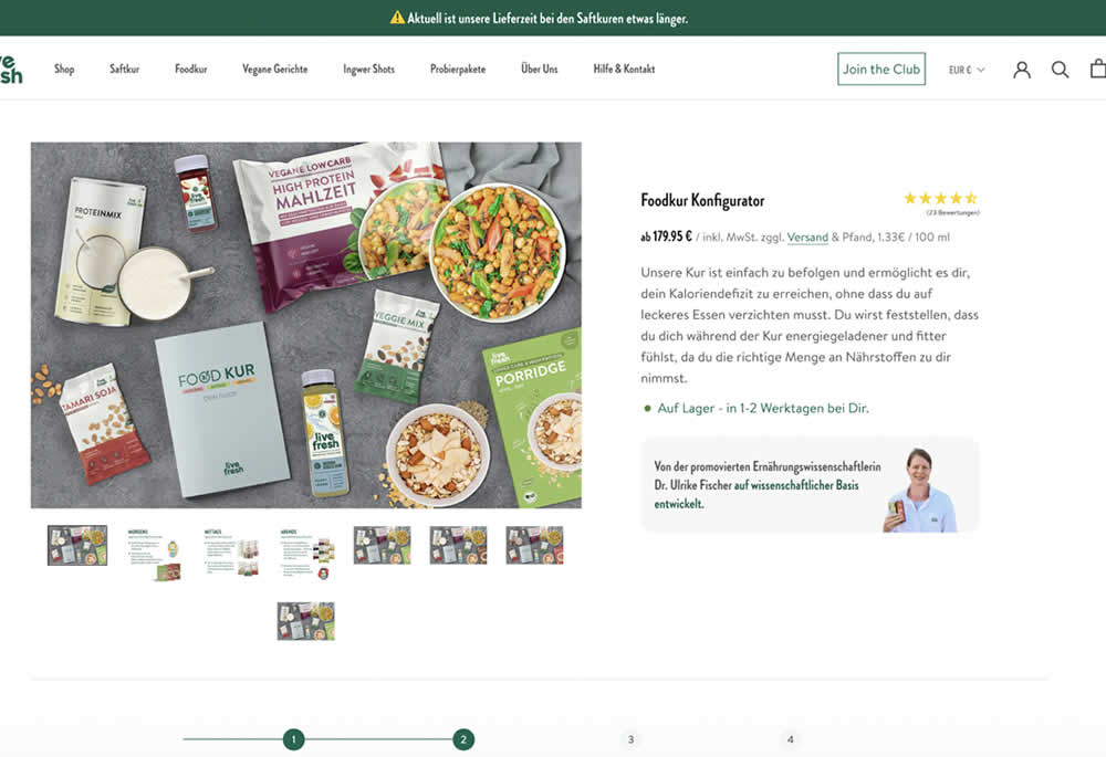
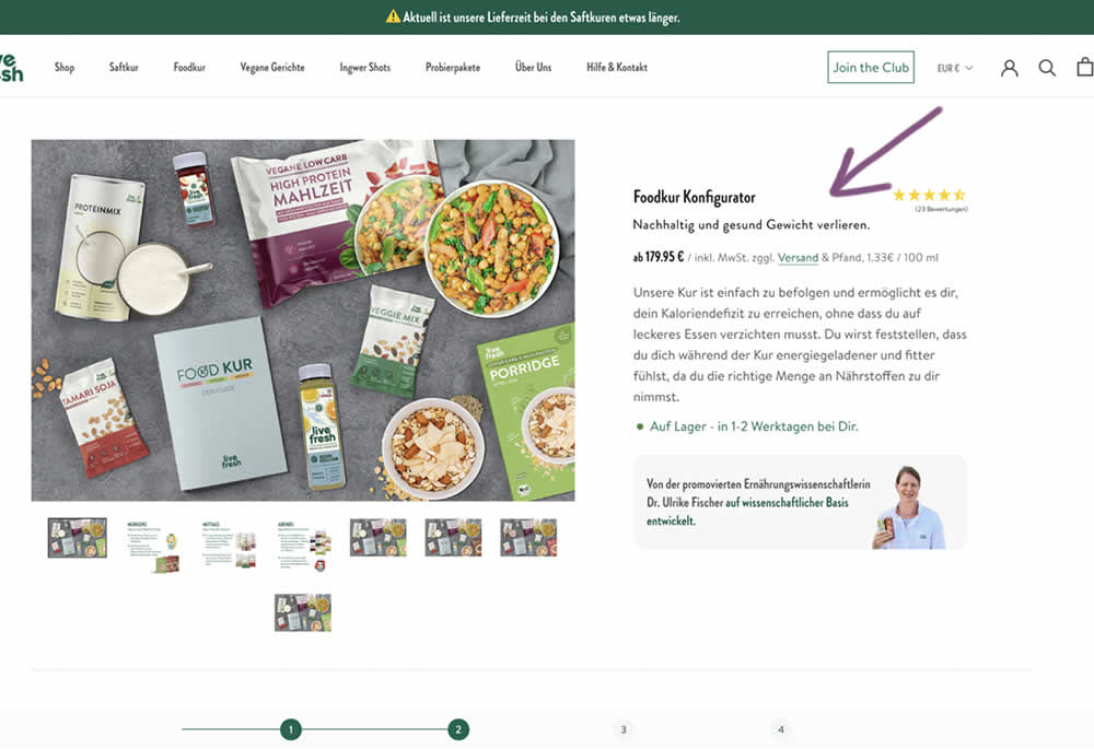
In this product detail page experiment a simple subheadline was appended to a new product. The tagline read "Lose weight sustainably and healthily." (Google translated from German "Nachhaltig und gesund Gewicht verlieren."). Impact on sales and revenue was measured.
Test #493 on
by  Jakub Linowski
Sep 19, 2023
Desktop
Mobile
Product
X.X%
Sales
Jakub Tested Pattern #69: Autodiscounting
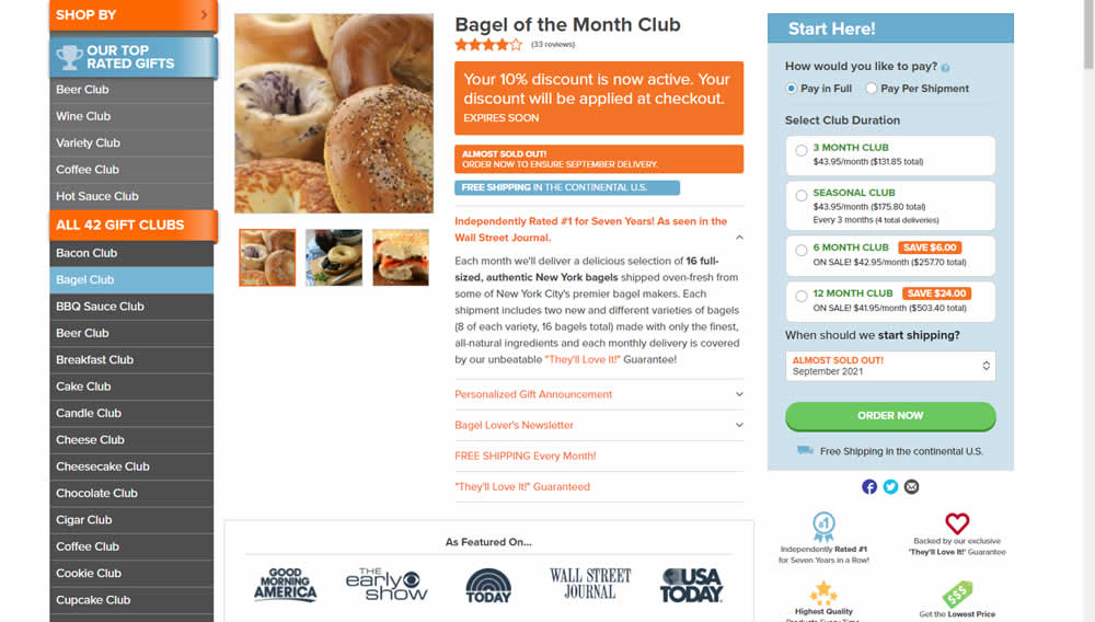
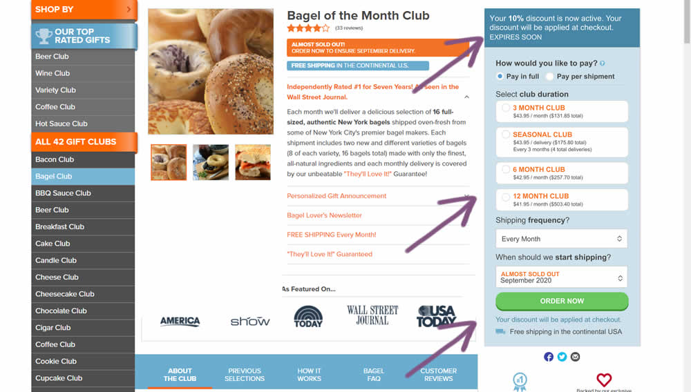
This experiment was technically a larger multi-change one that ran on product detail pages. The control showed an automatically applied coupon (for people opening up targeted emails with the discount). The variation attempted to make this better with the following changes:
- The discount message shifted closer towards the price / product selection (above the buy box)
- Removal of sale discount amounts and messages tied to longer durations (6 and 12 month duration)
- Reinforcing that the actual discount will be calculated further on checkout
Test #489 on
by  Jakub Linowski
Aug 14, 2023
Desktop
Mobile
Product
X.X%
Sales
Jakub Tested Pattern #78: Tags, Badges And Structured Information
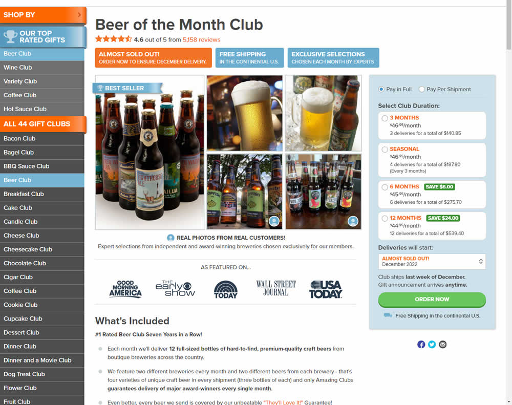
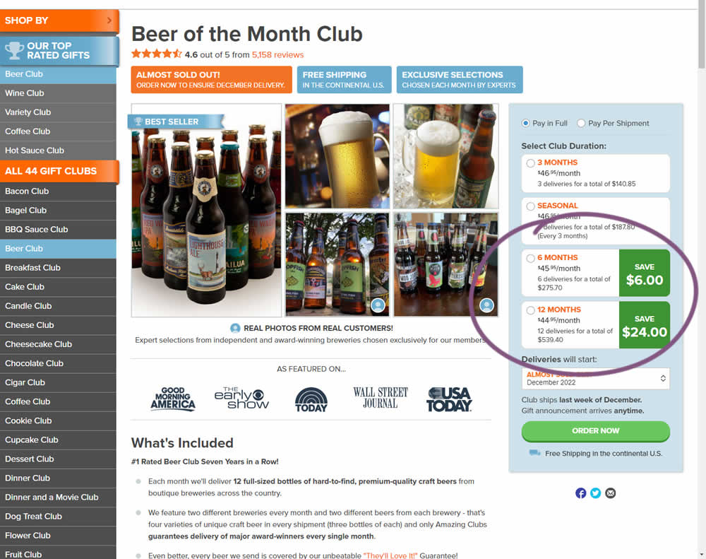
In this experiment, the size of a saving amount badge was enlarged. Instead of typical badge, the variation stretched the height of the saving information to the full height of the duration selector. The font size was also increased. Impact on overall sales was measured.
Test #488 on
Metro-cc.ru
by  Andrey Andreev
Aug 11, 2023
Mobile
Product
X.X%
Sales
Andrey Tested Pattern #4: Testimonials On Metro-cc.ru
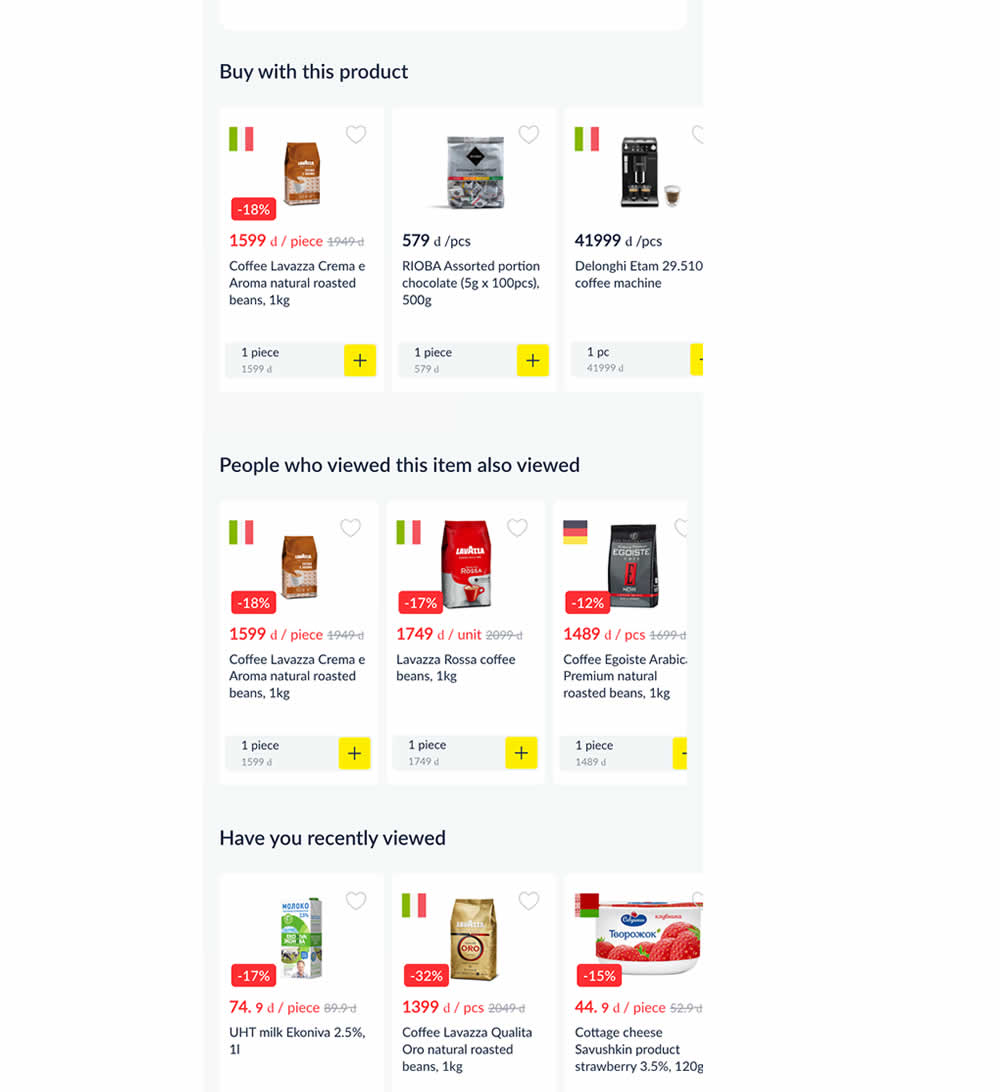
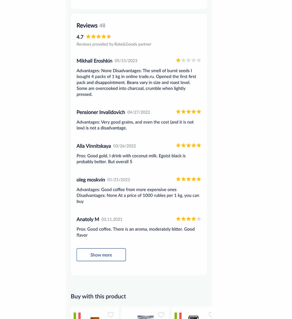
In this experiment, customer reviews were shown on product detail pages. Impact on adds to cart and sales was measured.
Test #487 on
Learnwithhomer.com
by  Stanley Zuo
Aug 10, 2023
Mobile
Pricing
X.X%
Signups
Stanley Tested Pattern #78: Tags, Badges And Structured Information On Learnwithhomer.com
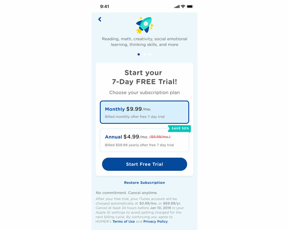
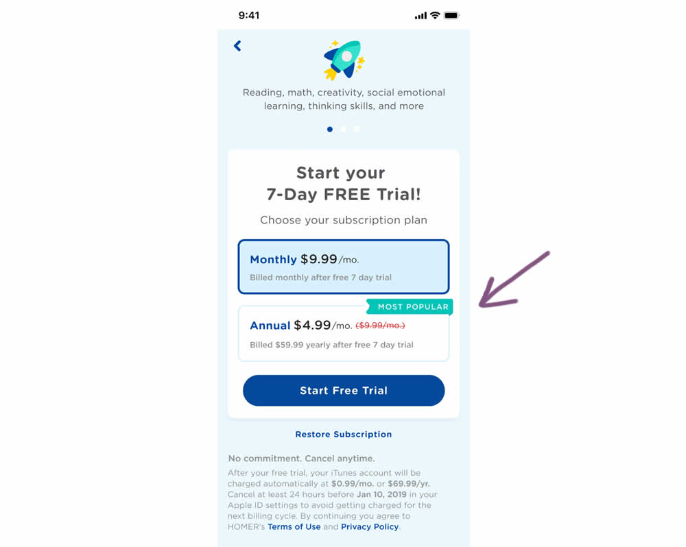
In this experiment, a "save 50%" badge was replaced with a "most popular" one with the intent of encouraging more users to select the higher priced plan. Impact on total and annual trial starts was measured.
Test #486 on
Livefresh.de
by  Pascal Dietz
Aug 03, 2023
Mobile
Product
X.X%
Sales
Pascal Tested Pattern #78: Tags, Badges And Structured Information On Livefresh.de
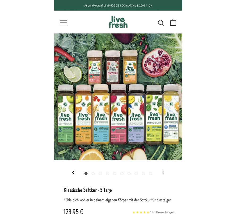
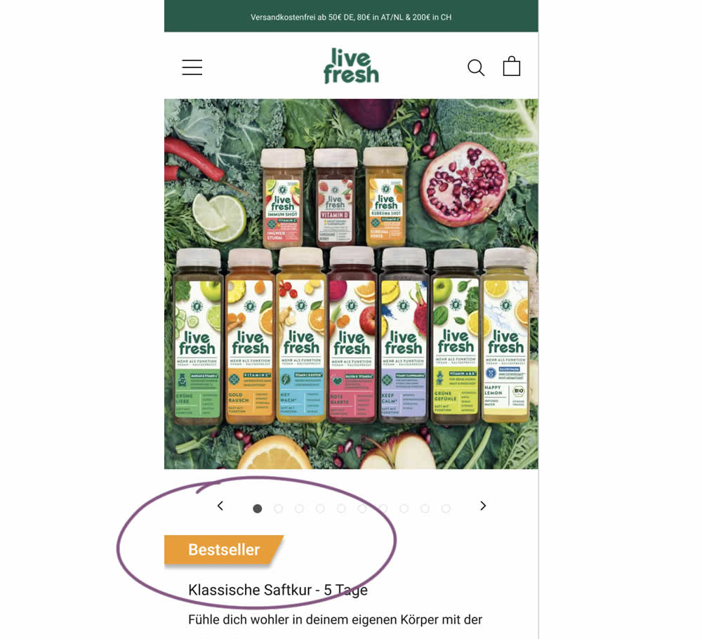
Does a "Bestseller" badge increase sales? This experiment tested exactly this by adding a visible badge on a juice cleansing product detail page.
Test #485 on
Livefresh.de
by  Pascal Dietz
Jul 27, 2023
Mobile
Product
X.X%
Sales
Pascal Tested Pattern #131: Authority On Livefresh.de
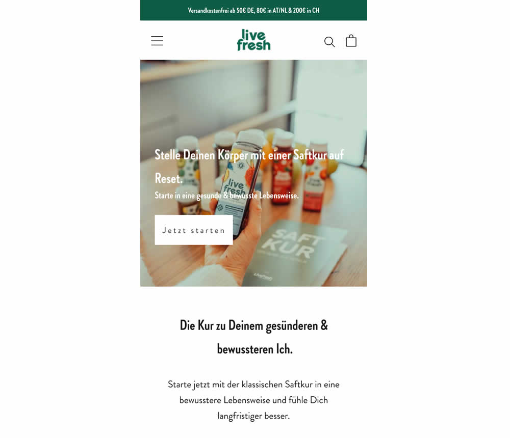
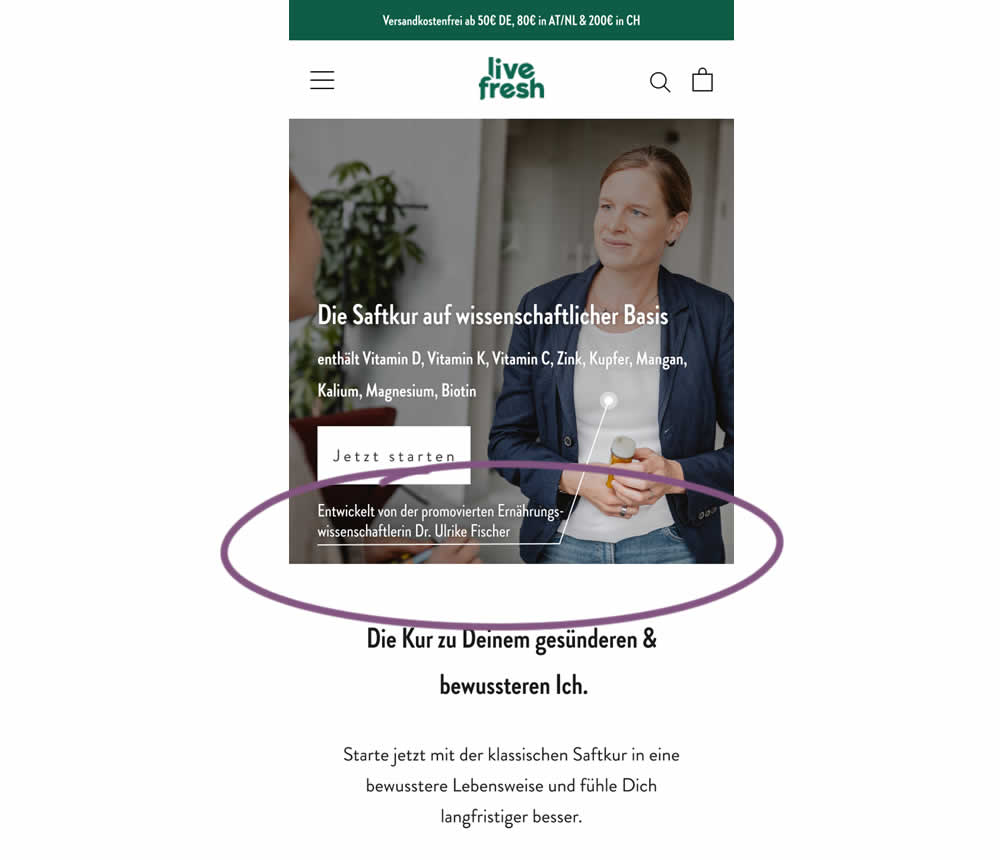
In this experiment a juice cleanse product (developed by Dr. Ulrike Fischer) was supported with statements and visuals to reinforce her as a doctor and an authority figure. The control only referenced the product itself. Google translations include:
A) Headline: "Reset your body with a juice cleanse"
B) Headline: "The juice cleanse with a scientific basis"
B) Listed out specific vitamins and supplements.
B) Added Subheadline: "Developed by Dr. Ulrike Fischer, who holds a doctorate in nutritional science"
Test #483 on
Menufy.com
by  Aleksandr Elesev
Jul 17, 2023
Desktop
Checkout
X.X%
Sales
Aleksandr Tested Pattern #124: Confirmed Selection On Menufy.com
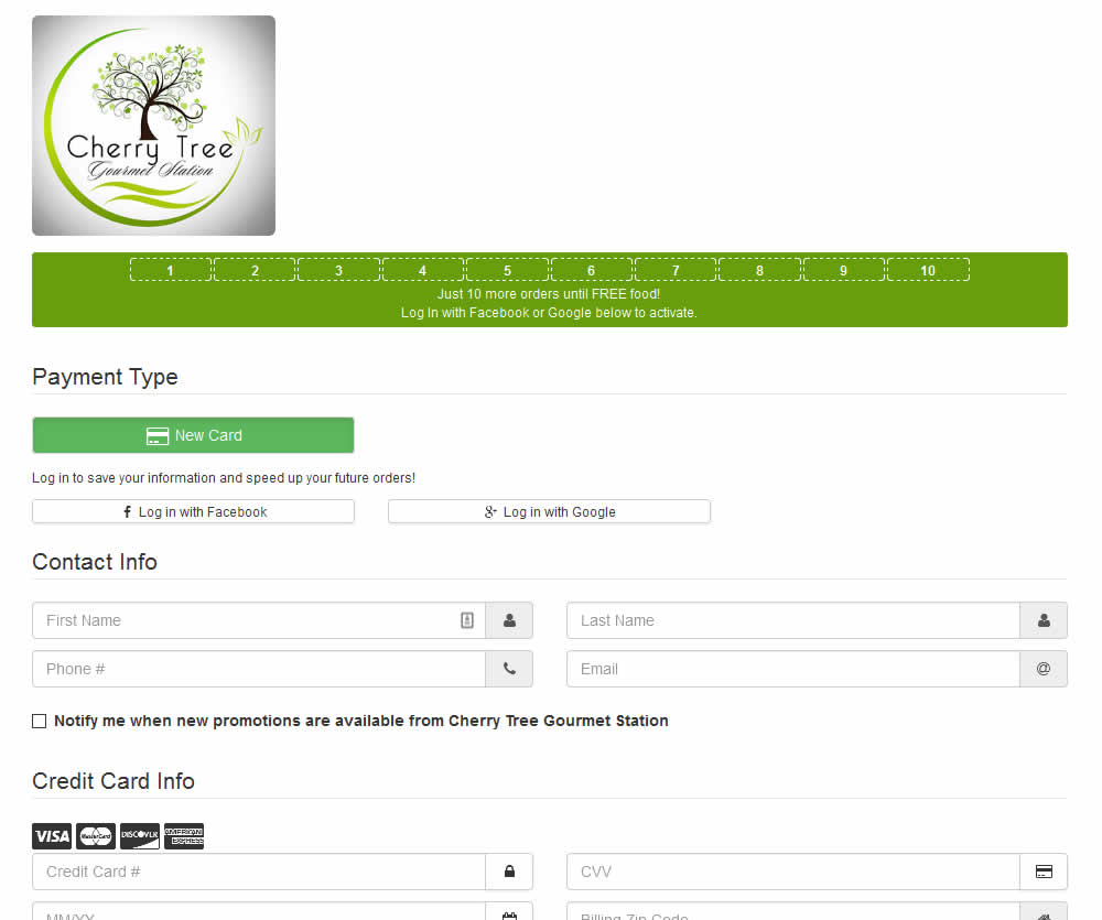
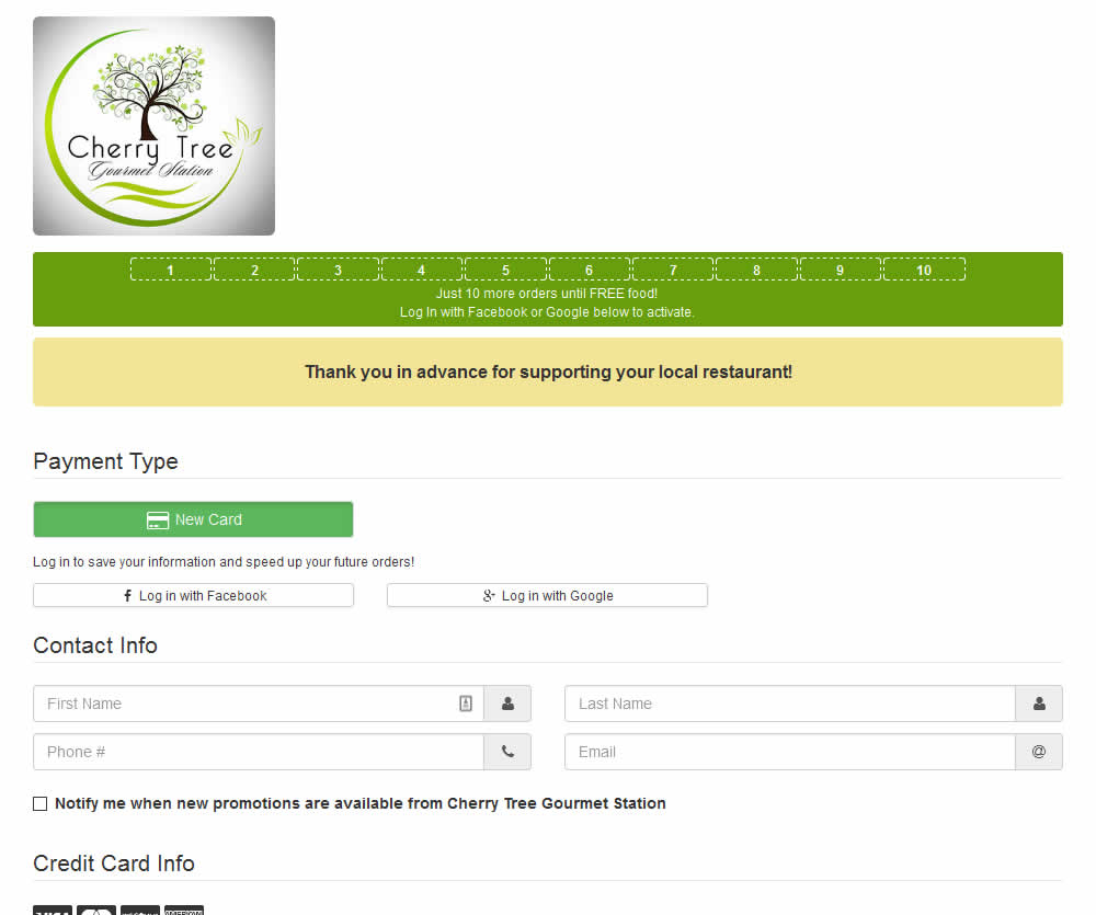
In this experiment, a thanking confirmation message was appended at the top of the checkout screen of a local food delivery service. Impact on completed transactions was measured.
Test #481 on
Backstage.com
by  Stanley Zuo
Jul 14, 2023
Desktop
Mobile
Checkout
X.X%
Sales
Stanley Tested Pattern #15: Bulleted Reassurances On Backstage.com
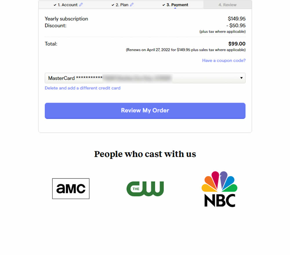
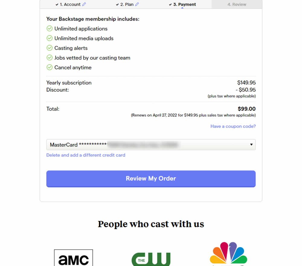
In this experiment, selling points and benefits of a subscription were placed as bullets at the top of a checkout page. The benefits highlighted things such as: unlimited applications, access to vetted jobs and the ability to cancel anytime. Impact on sales was measured.
Test #482 on
by  Jakub Linowski
Jul 13, 2023
Desktop
Mobile
Checkout
X.X%
Sales
Jakub Tested Pattern #124: Confirmed Selection
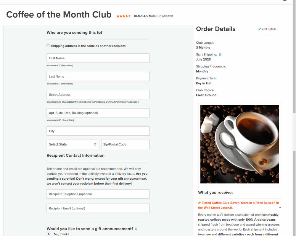
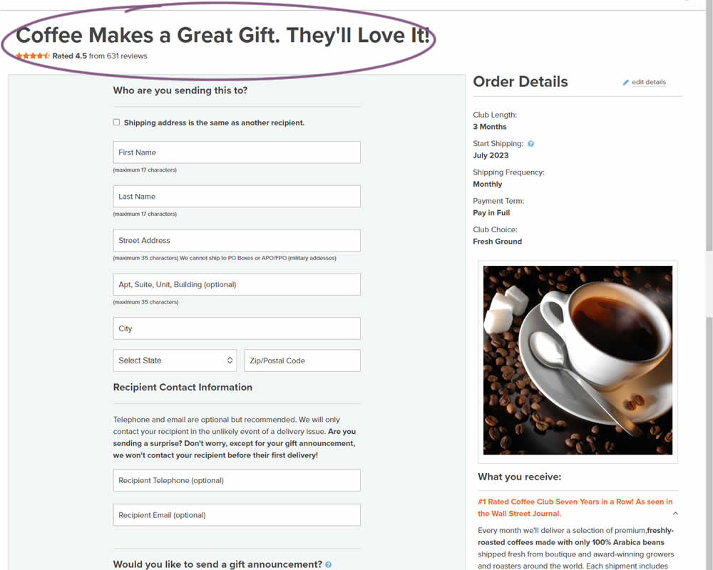
In this experiment, the choice of adding a product to cart was confirmed with a further positive message in the header of the next step (on the add to cart page). Once users left the product detail page, instead of simply stating the product name, the title was rephrased as "Product [X] Makes a Great Gift. They'll Love It!". I view this as a higher "intensity" experiment, given that the add-to-cart page was in some way already confirming the choice. Impact on sales was measured.
Test #479 on
Aboalarm.de
by  Daria Kurchinskaia
Jun 15, 2023
Desktop
Mobile
Checkout
X.X%
Sales
Daria Tested Pattern #15: Bulleted Reassurances On Aboalarm.de
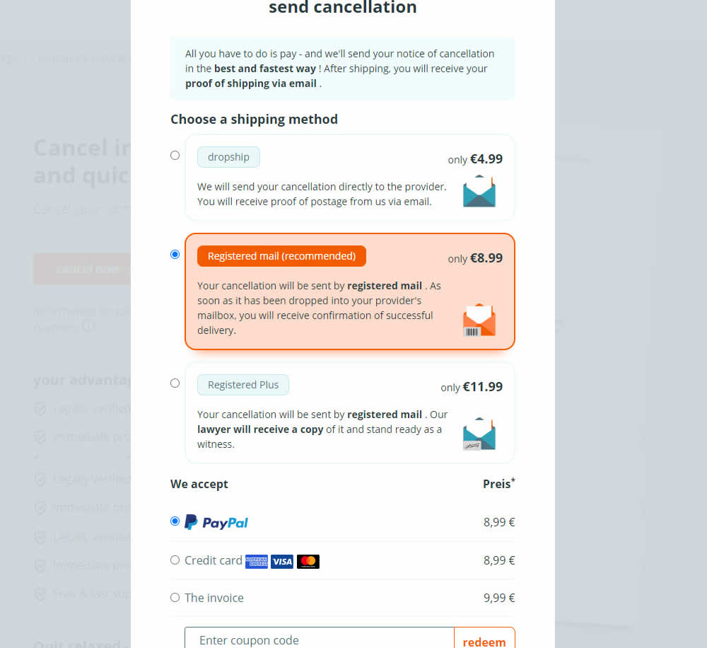
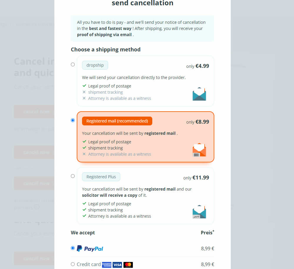
In this experiment, a list of benefits were shown for each of the 3 plans on the last step of a contract cancelation service. Benefit items not included in the lower plans were also shown with grayed out styles (and an "x"). Clearly the higher paid plan had all the benefits listed. Impact on transactions was measured.
Test #480 on
Aboalarm.de
by  Daria Kurchinskaia
Jun 15, 2023
Desktop
Mobile
Checkout
X.X%
Sales
Daria Tested Pattern #15: Bulleted Reassurances On Aboalarm.de

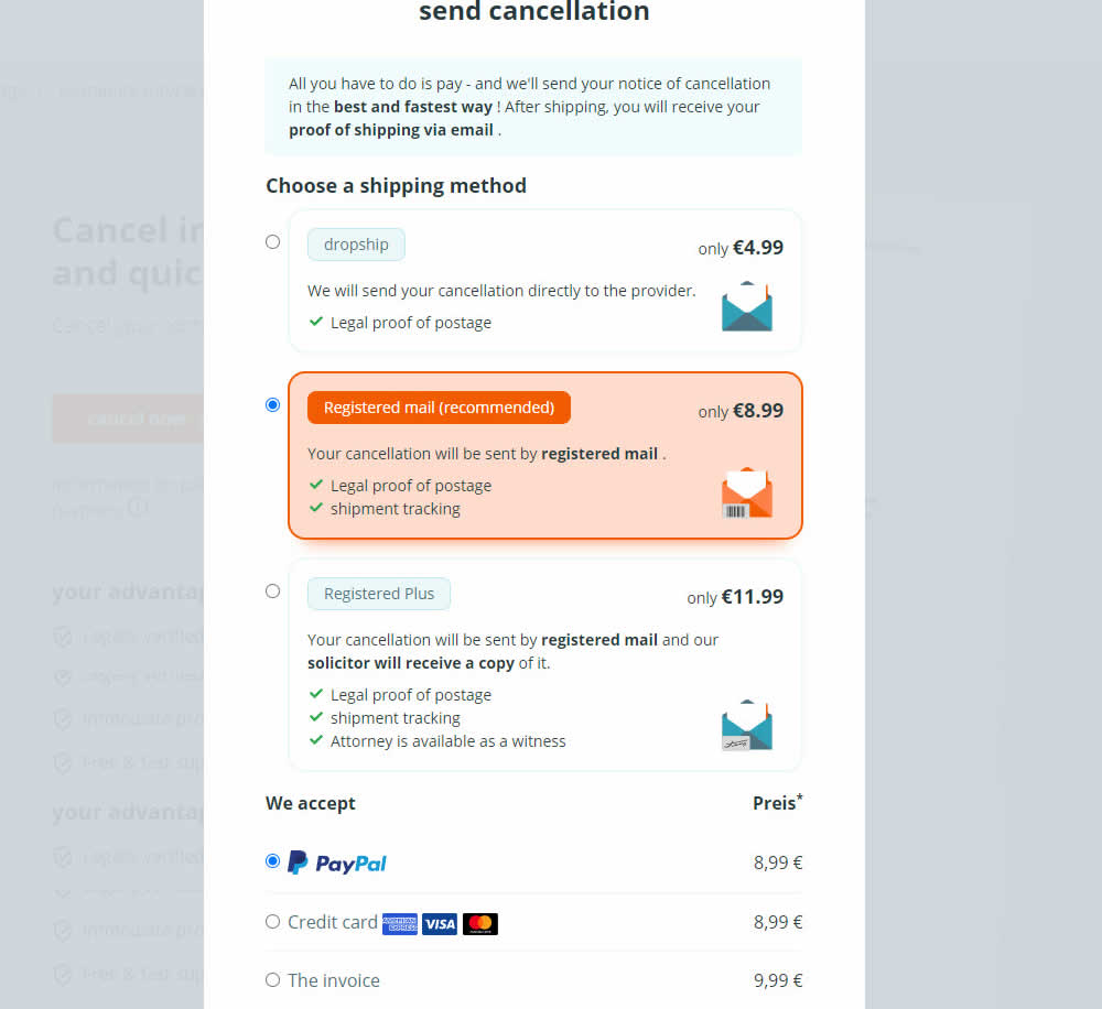
In this experiment, a list of benefits were shown for each of the 3 plans on the last step of a contract cancelation service. The lowest plan only had one benefit, whereas the highest plan had 3. Impact on transactions was measured.
Test #475 on
Online.metro-cc.ru
by  Andrey Andreev
Jun 07, 2023
Desktop
Mobile
Listing
X.X%
Sales
Andrey Tested Pattern #36: Fewer Or More Results On Online.metro-cc.ru
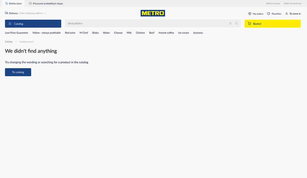
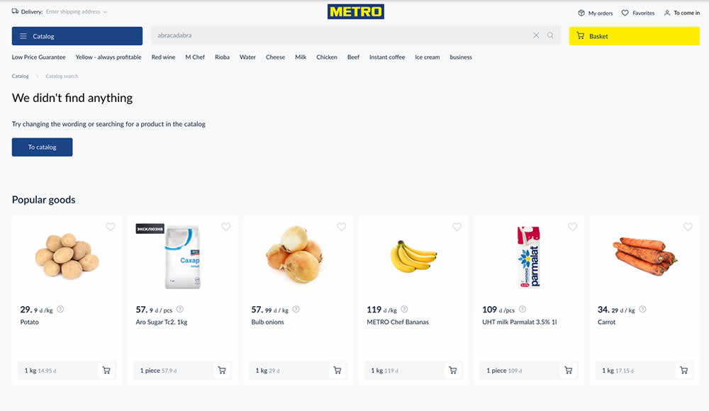
Are more (popular) product results better than none at all? In this experiment, popular products were shown during an empty search result. Impact on sales was measured.
Test #468 on
Umbraco.com
by  Lars Skjold Iversen
Apr 28, 2023
Desktop
Mobile
Home & Landing
X.X%
Progression
Lars Tested Pattern #6: Customer Star Ratings On Umbraco.com
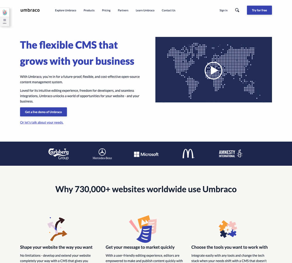
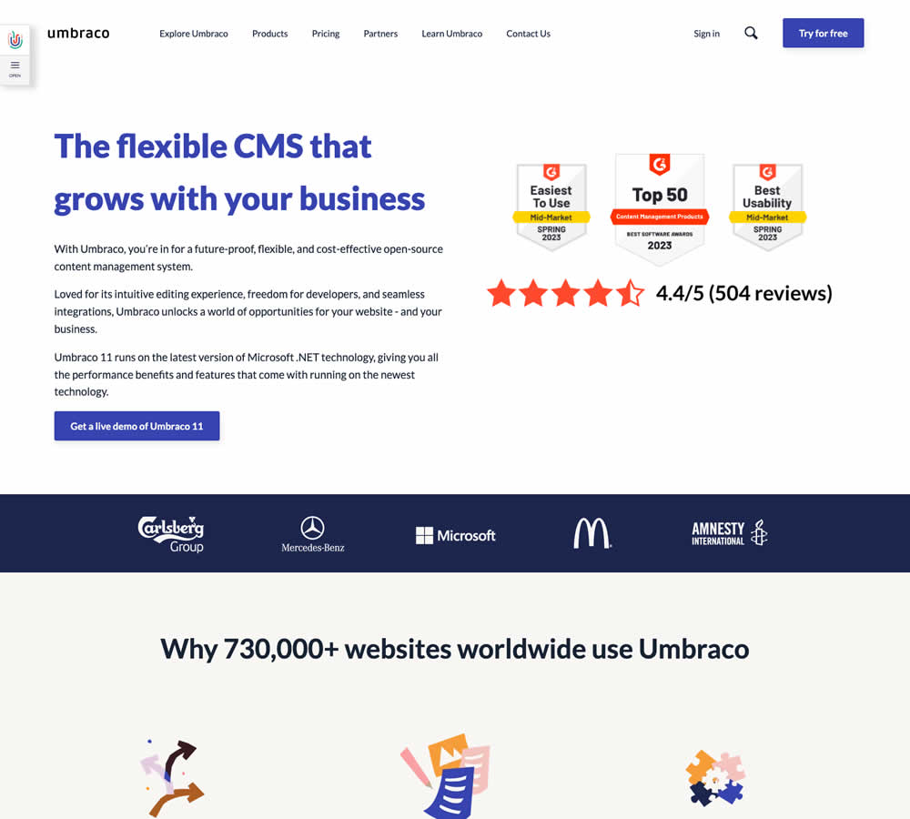
In this homepage experiment a number of changes were introduced - with perhaps the most prominent one being the replacement of a video component with customer review badges. Additional copy changes included reinforcement of the latest version number (v11) throughout the page, as well as a dedicated (v11) section in the middle of the page. Impact on demo signups was measured.
Test #467 on
by  Jakub Linowski
Apr 27, 2023
Desktop
Mobile
Product
X.X%
Sales
Jakub Tested Pattern #108: Frequently Asked Questions

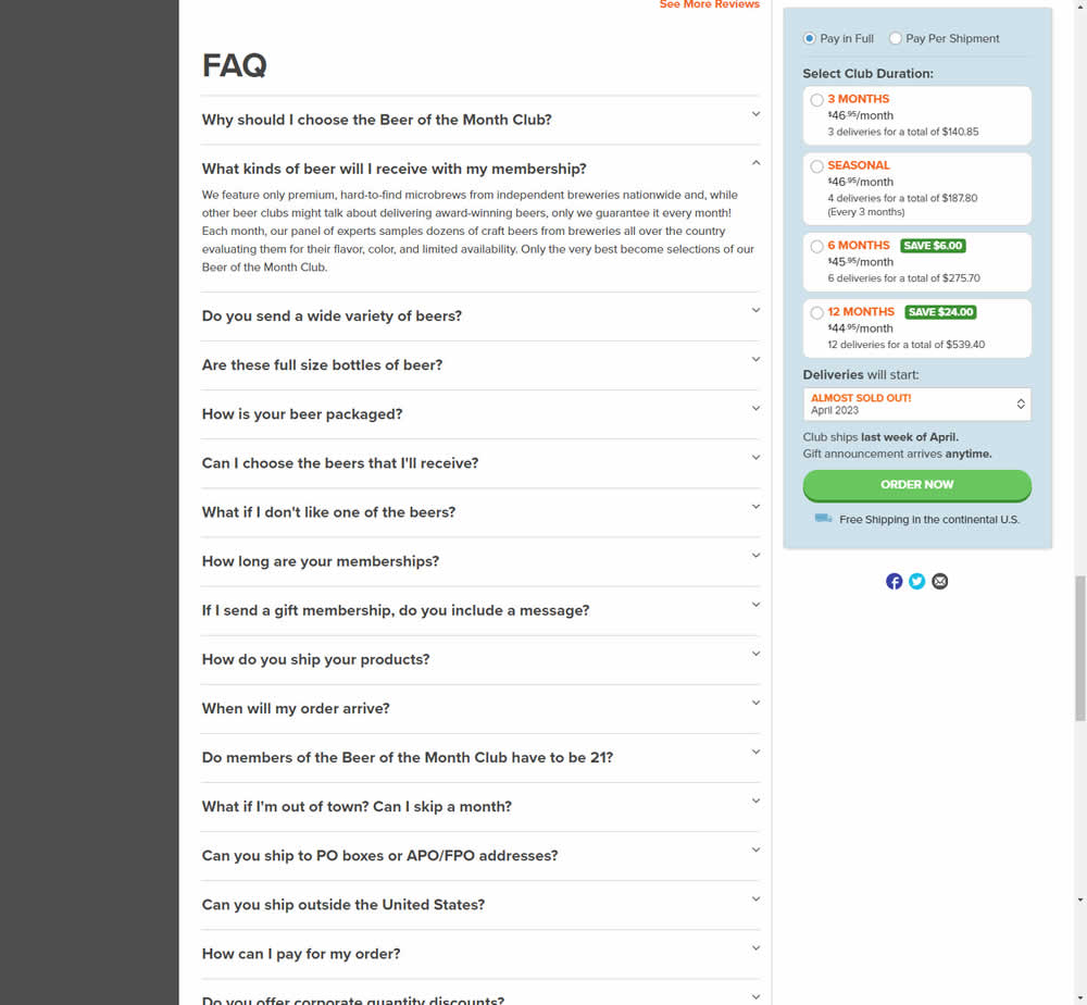
In this experiment, an FAQ section was added near the bottom of a long product page. The reviews were collapsed by default, but expandable upon clicking. Impact on adds-to-cart and sales was measured.
Test #465 on
by  Melina Hess
Apr 22, 2023
Desktop
Mobile
Product
X.X%
Revenue
Melina Tested Pattern #15: Bulleted Reassurances
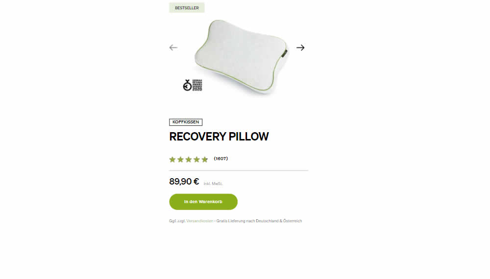
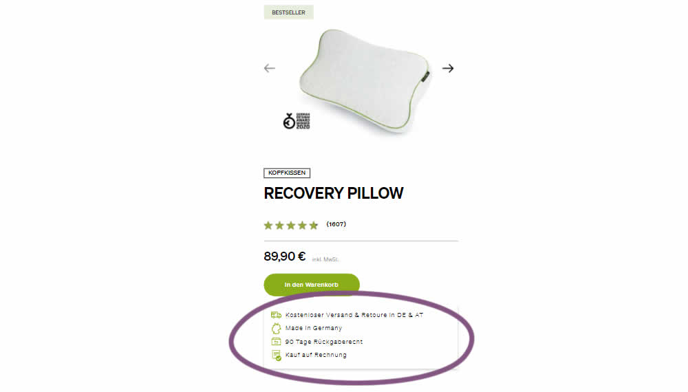
In this product detail page experiment, a number of reassurances were brought out visually in a lined or bulleted way. The 4 reassurances included: free shipping and returns; Made in Germany, 90 Day Returns; and Buy With Invoice (popular in Germany). Impact on revenue per user was measured. The control contained very feint copy (smaller and more subtle) about free shipping.
Test #464 on
Expertinstitute.com
by  Ardit Veliu
Mar 31, 2023
Desktop
Mobile
Home & Landing
X.X%
Leads
Ardit Tested Pattern #7: Social Counts On Expertinstitute.com
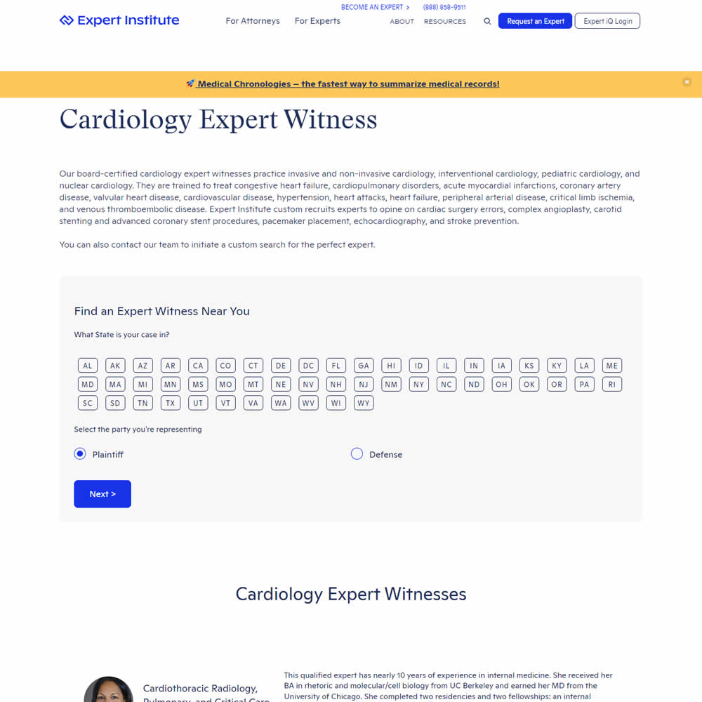
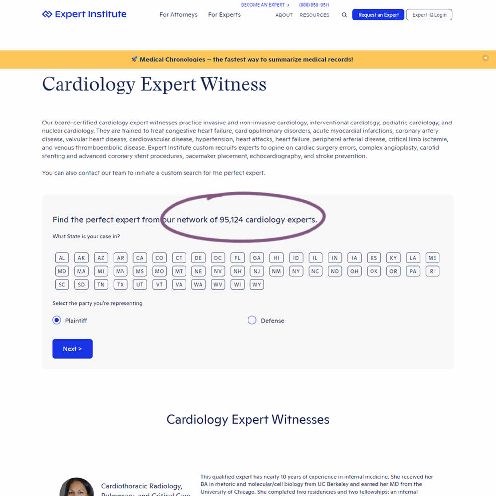
In this experiment, copy was added which showed the number of experts (in a given category) a person may gain access to after filling out a lead form. The context of this is a lead-gen landing page where people are seeking experts for legal purposes. Impact on initial progression (of a multi step form) and completed leads was measured.
Test #461 on
Snocks.com
by  Melina Hess
Mar 23, 2023
Mobile
Product
X.X%
Sales
Melina Tested Pattern #15: Bulleted Reassurances On Snocks.com
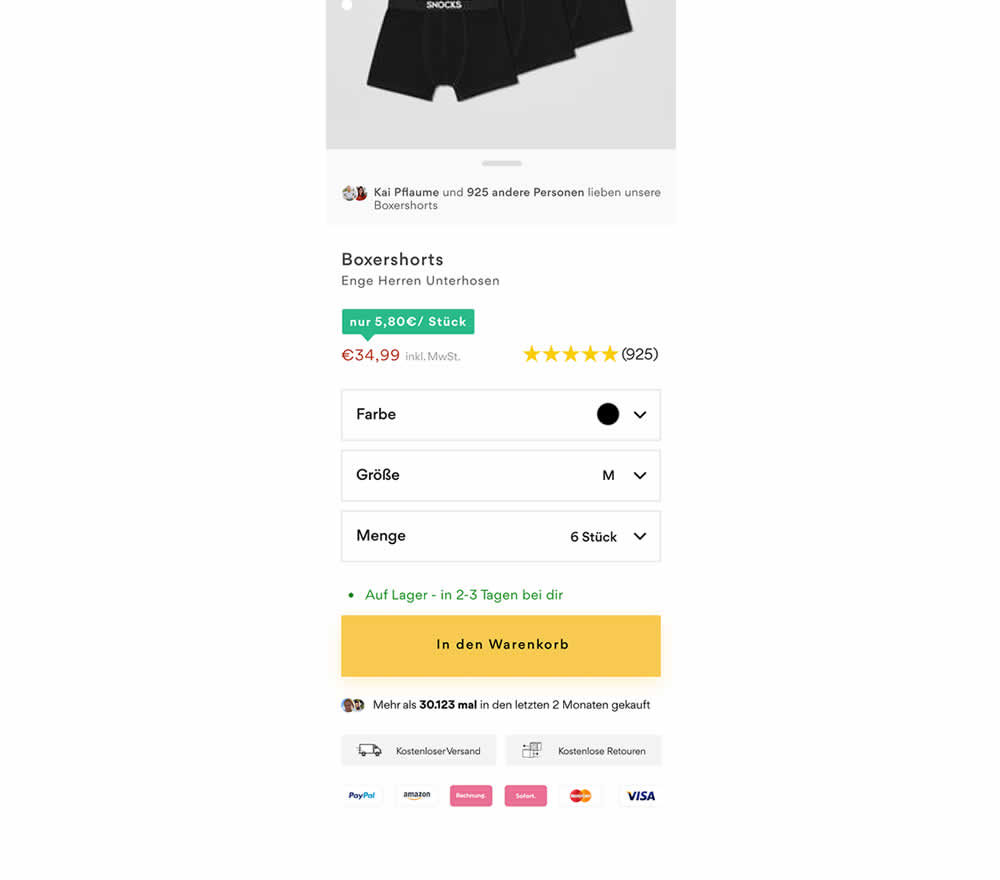
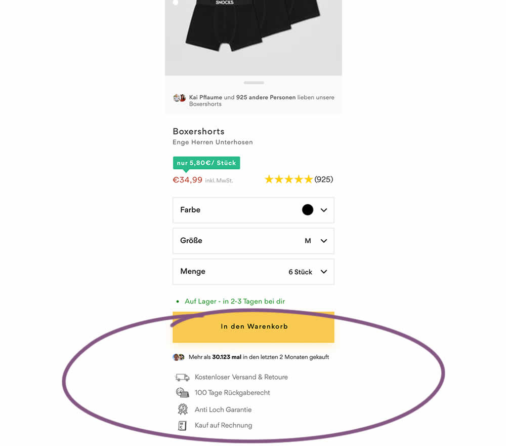
In this product detail page experiment, reassurances under the add-to-cart button were rearranged. The control contained copy about: free shipping and free returns formatted as two gray boxes, with a variety of payment methods and their corresponding logos underneath.
The variation used a more convention bulleted, line-by-line format. It also contained free shipping and returns, but also elaborated with "100 day returns", an "anti-hole guarantee", and "purchase with invoice" (perhaps more popular in Germany?). Impact on sales was measured.
Test #453 on
by  Jakub Linowski
Jan 31, 2023
Desktop
Mobile
Shopping Cart
X.X%
Sales
Jakub Tested Pattern #64: Tunnel
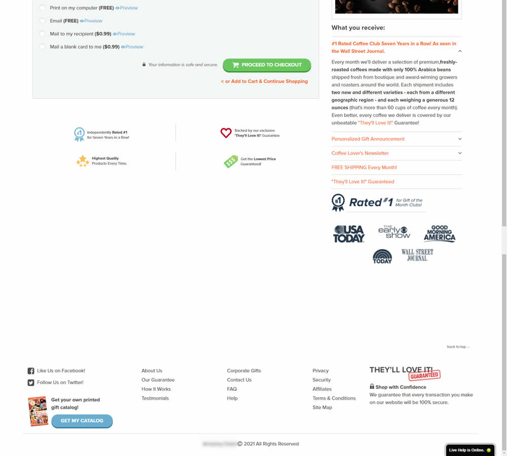
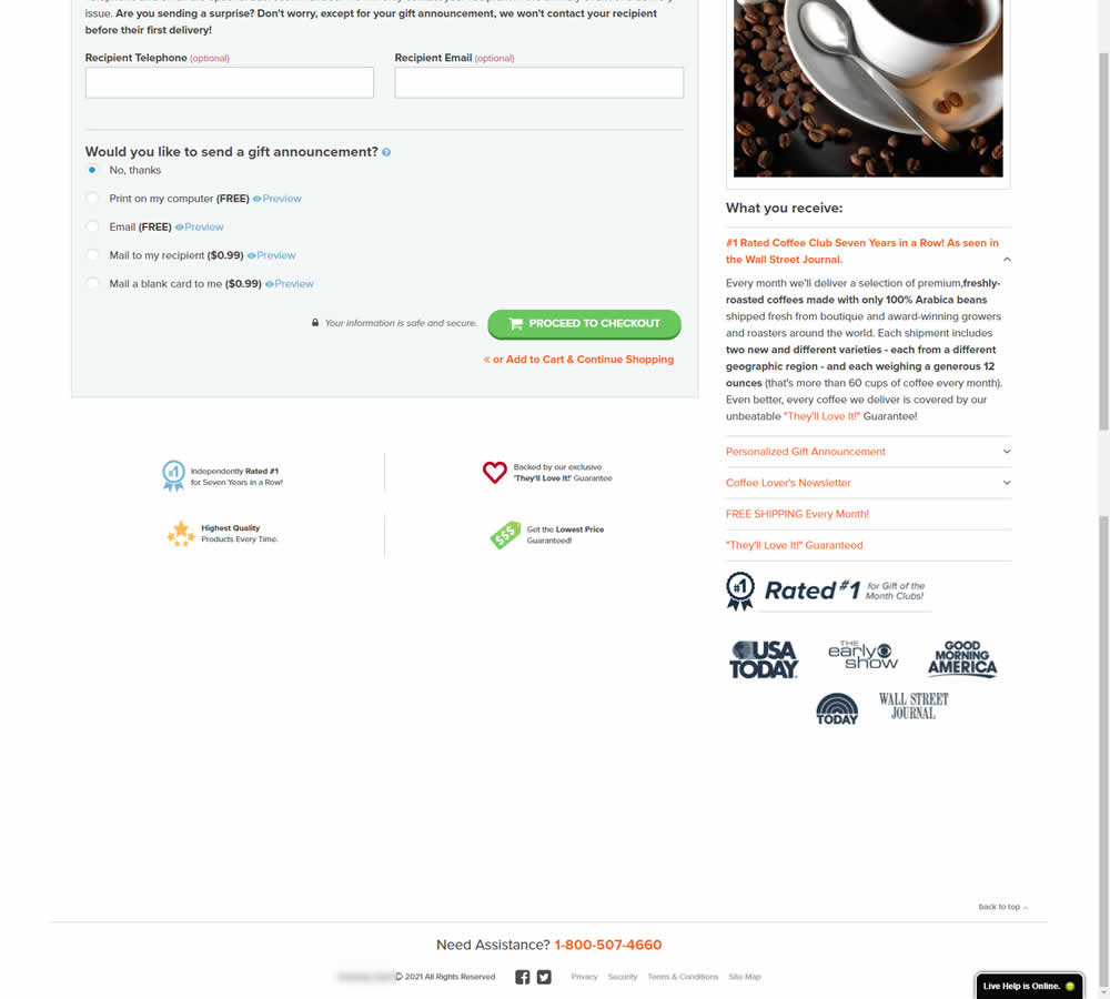
In this experiment, the footer was simplified with multiple elements being removed (catalog request, secondary links, and a guarantee). Additionally, a more prominent phone number was also displayed.