All Latest 620 A/B Tests
MOST RECENT TESTS
Test #211 on
Skype App
by  Ronny Kohavi
Nov 20, 2018
Mobile
Global
X.X%
Progression
Ronny Tested Pattern #2: Icon Labels
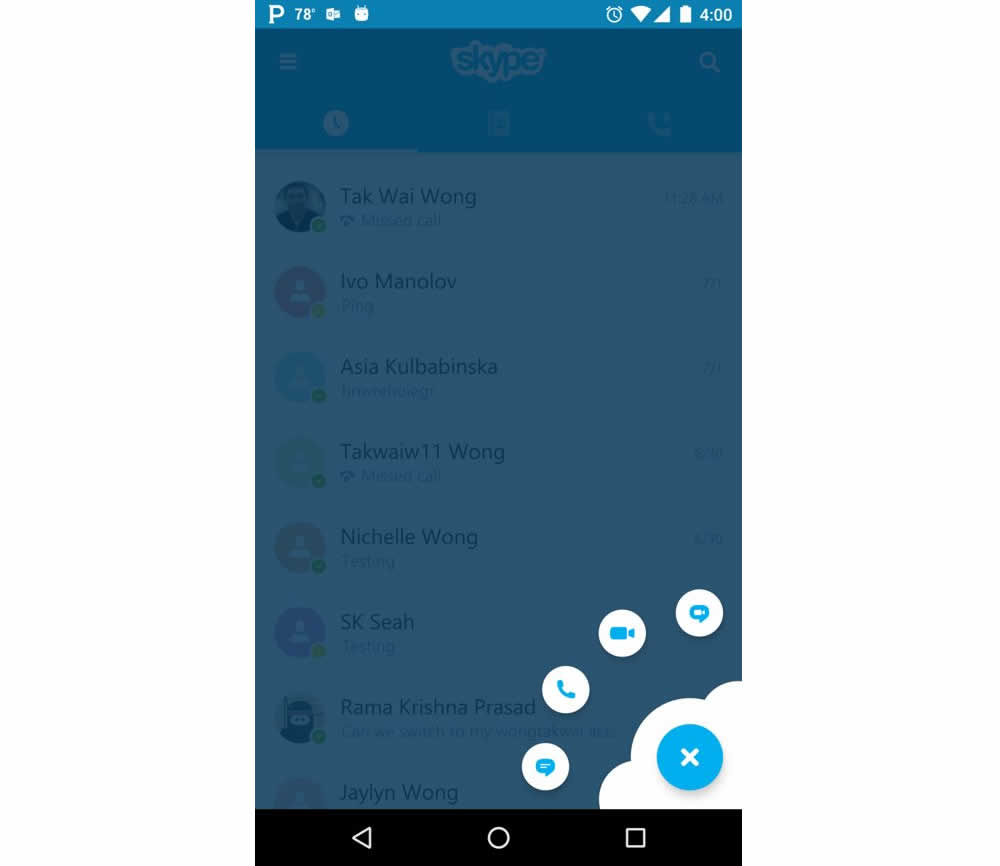
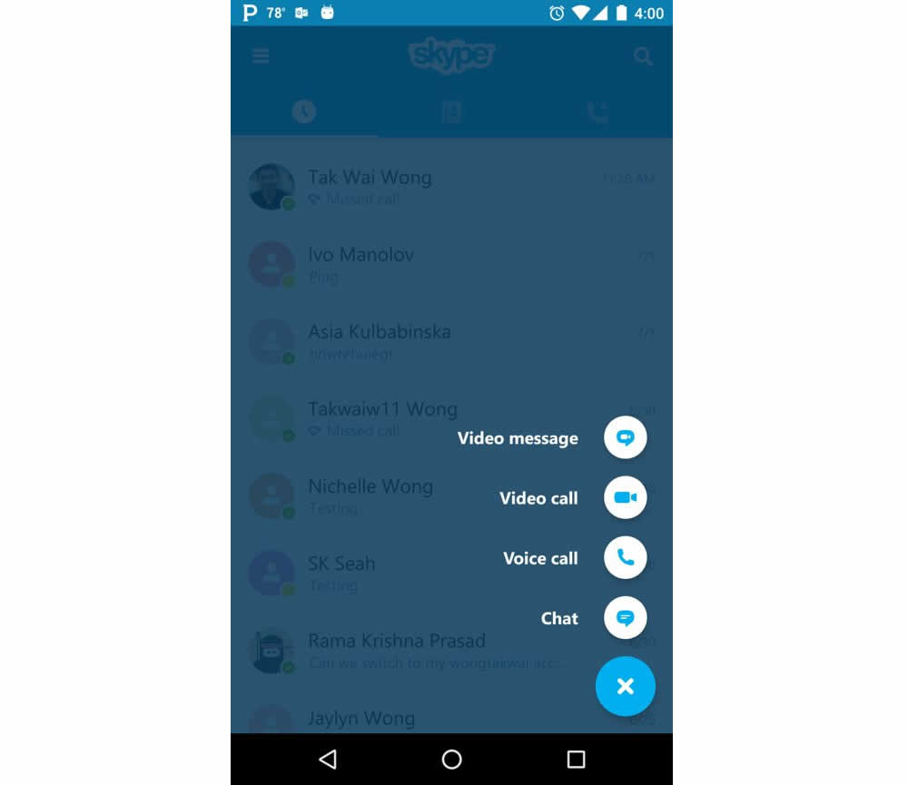
Microsoft Skype ran an experiment for the mobile segment of the Skype application with a treatment having combined icons with corresponding labels. The control only showed icons.
Which A Or B Actually Wins? Find Out Before You Test.
Members see every test result — the winners, the flat ones, and the losers — along with exact effects and sample sizes. Use it to estimate your tests and prioritize by probability, not gut feel. Start every experiment with the odds on your side.
Test #204 on
Kenhub.com
by  Niels Hapke
Oct 11, 2018
Desktop
Mobile
Global
X.X%
Sales
Niels Tested Pattern #85: Benefit Button On Kenhub.com
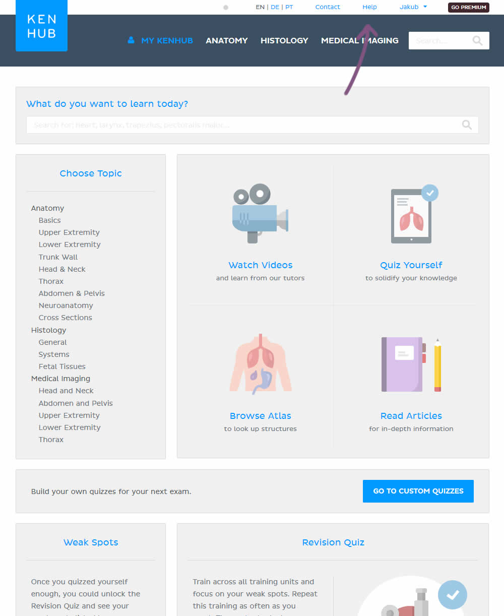
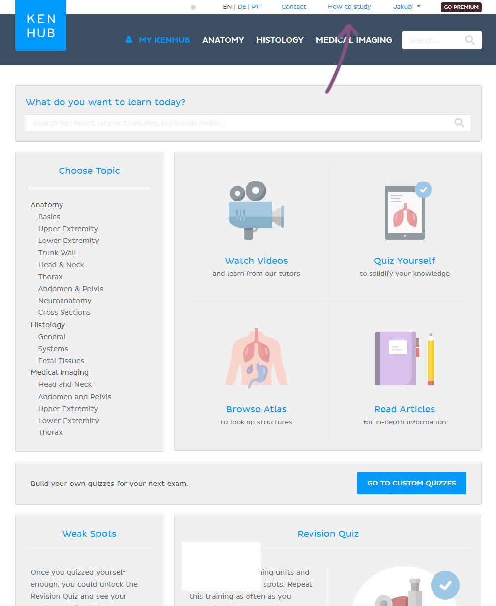
In the variation, the "Help" section was reworded to "How to study".
Test #201 on
by  Ben Labay
Sep 19, 2018
Desktop
Mobile
Thank You
X.X%
Sales
Ben Tested Pattern #7: Social Counts
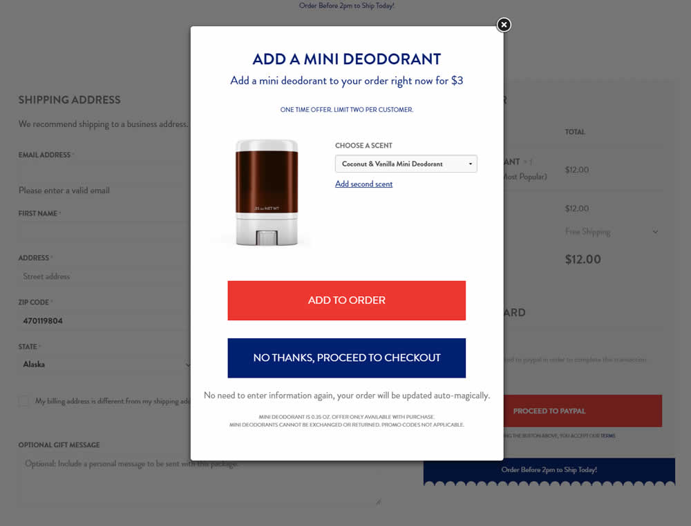
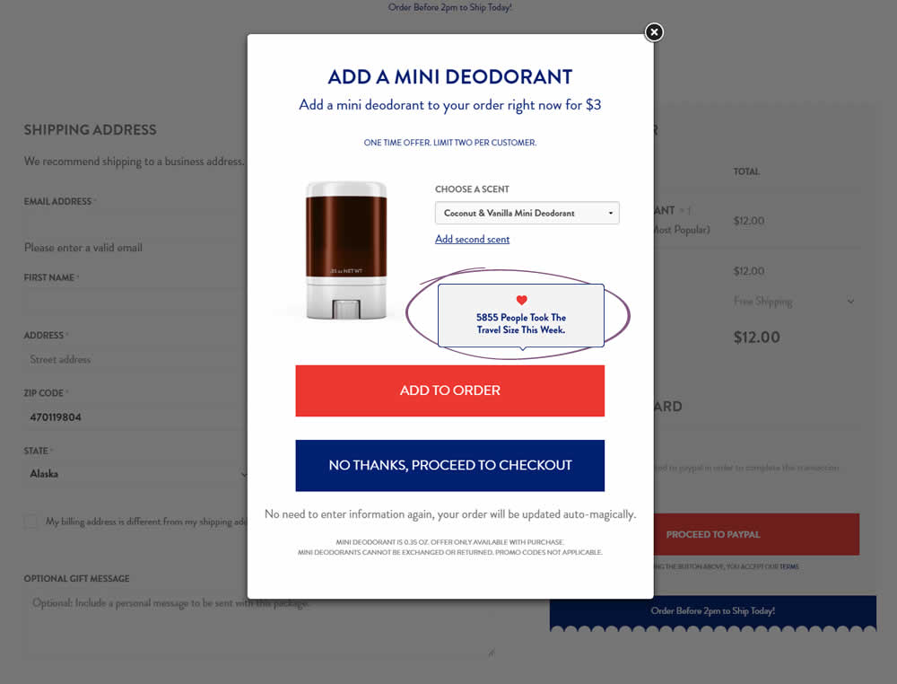
In this test the upsell modal had an added text box with number of people that day who took the offer. The test hypothesis was that social proof will add motivation to take an action and the offer.
Test #200 on
Trydesignlab.com
by  Will Anderson
Sep 14, 2018
Desktop
Mobile
Home & Landing
X.X%
Sales
Will Tested Pattern #52: How It Works On Trydesignlab.com
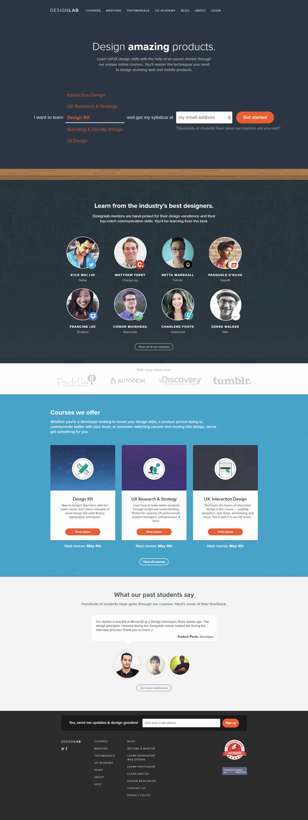

In this experiment, a "How It Works" content section was removed.
Test #197 on
Reverb.com
by  Nicholas Evans
Sep 04, 2018
Desktop
Product
X.X%
Sales
Nicholas Tested Pattern #4: Testimonials On Reverb.com
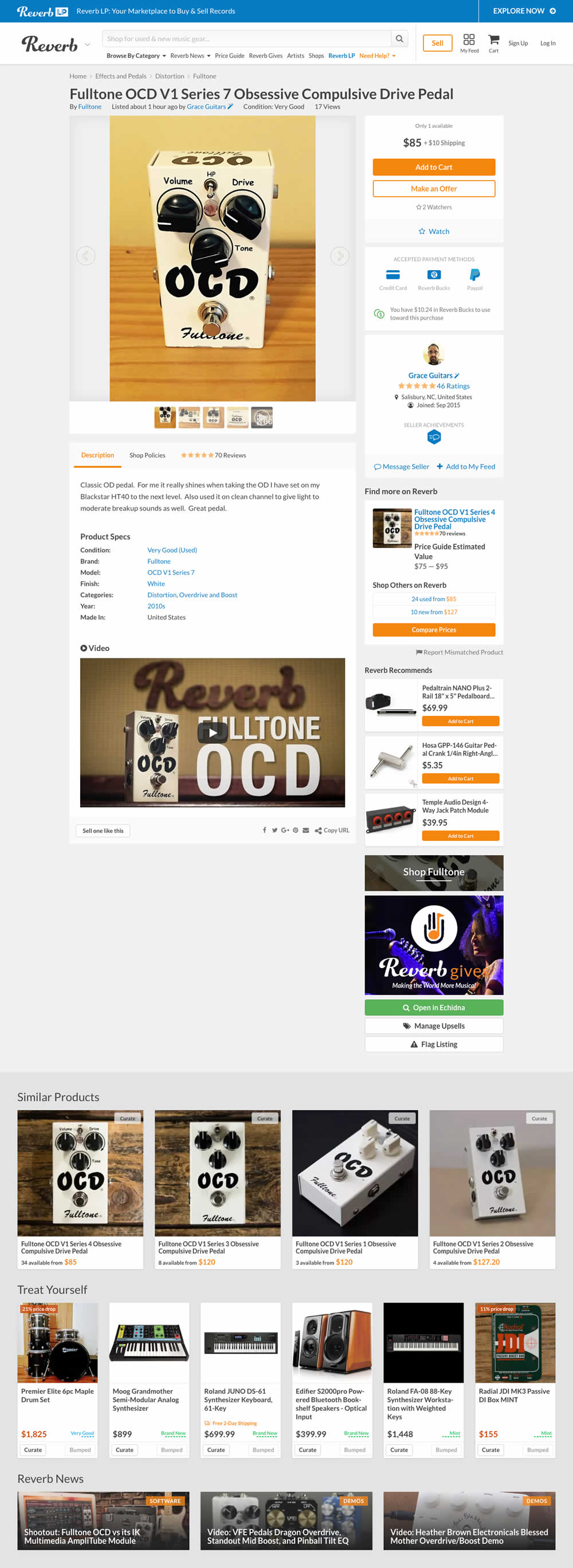

In the variation, customer reviews were exposed from a less visible tab view.
Test #195 on
Yummly.com
by  Kimberly Cheung
Aug 13, 2018
Desktop
Mobile
Listing
X.X%
Signups
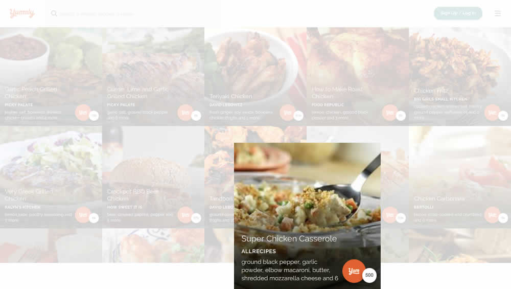
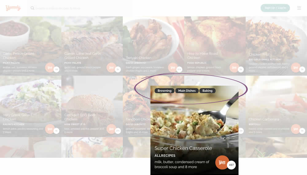
Kimberly Tested Pattern #78: Tags, Badges And Structured Information On Yummly.com
Test #192 on
Refactoring.guru
by  Alexander Shvets
Aug 07, 2018
Desktop
Mobile
Product
X.X%
Sales
Alexander Tested Pattern #4: Testimonials On Refactoring.guru


In this experiment, a number of customer reviews were added at the middle of a product page.
Test #191 on
Diamondcandles.com
by  Peep Laja
Jul 26, 2018
Mobile
Global
X.X%
Sales
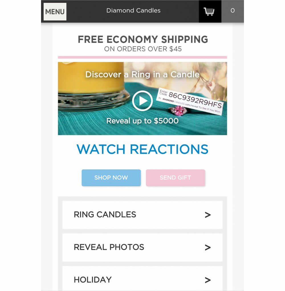
Peep Tested Pattern #2: Icon Labels On Diamondcandles.com

Test #190 on
Diamondcandles.com
by  Peep Laja
Jul 26, 2018
Mobile
Global
X.X%
Sales
Peep Tested Pattern #2: Icon Labels On Diamondcandles.com

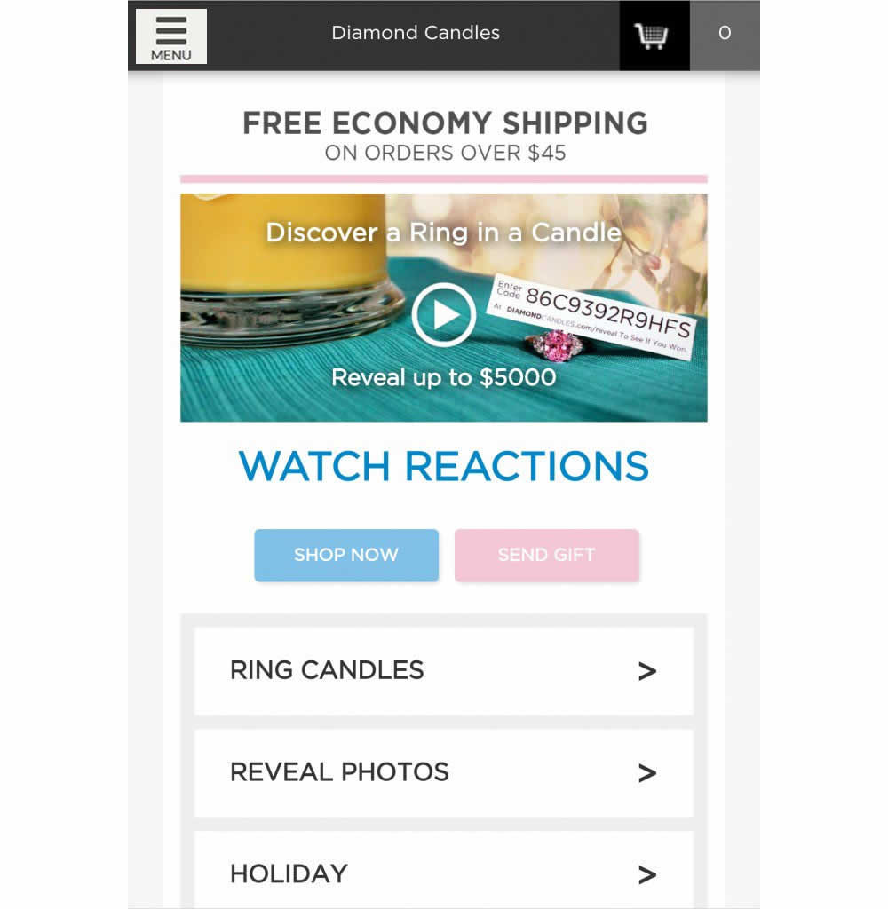
This test has explored numerous hamburger menu variations and has been covered in detail over at https://conversionxl.com/blog/testing-hamburger-icon-revenue/ - Thanks Peep Laja for sharing. Here we reported on a consistent increase in both menu clicks and sales.
Test #189 on
Yummly.com
by  Kimberly Cheung
Jul 23, 2018
Desktop
Mobile
Signup
X.X%
Signups
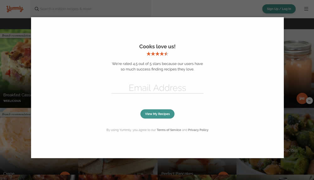
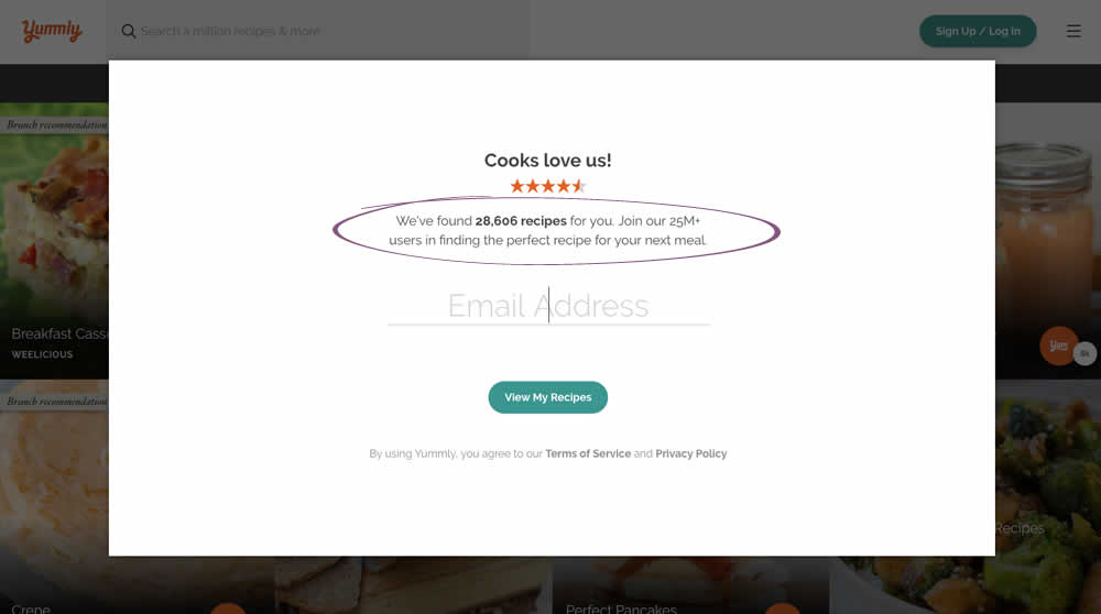
Kimberly Tested Pattern #7: Social Counts On Yummly.com
Test #188 on
Thomasnet.com
by  Julian Gaviria
Jul 11, 2018
Desktop
Mobile
Home & Landing
X.X%
Progression
Julian Tested Pattern #4: Testimonials On Thomasnet.com
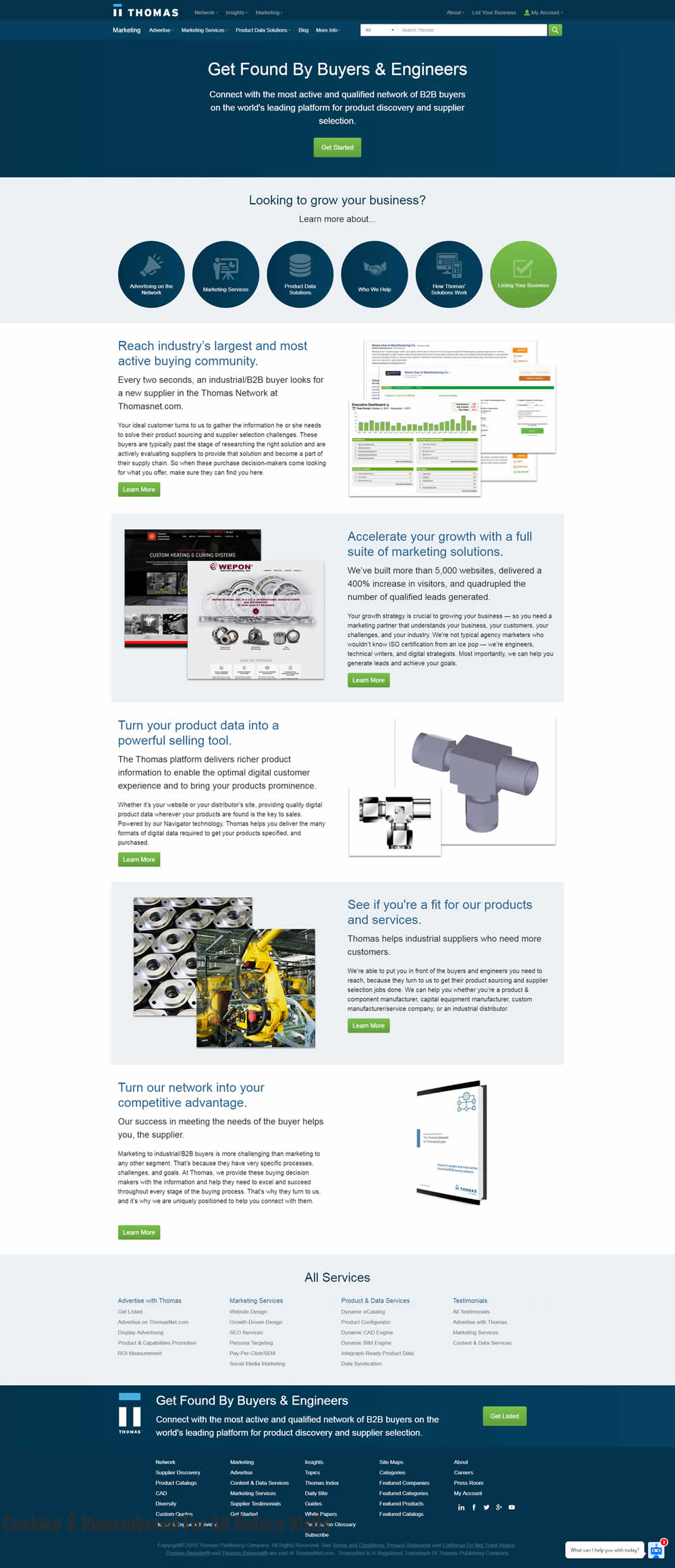
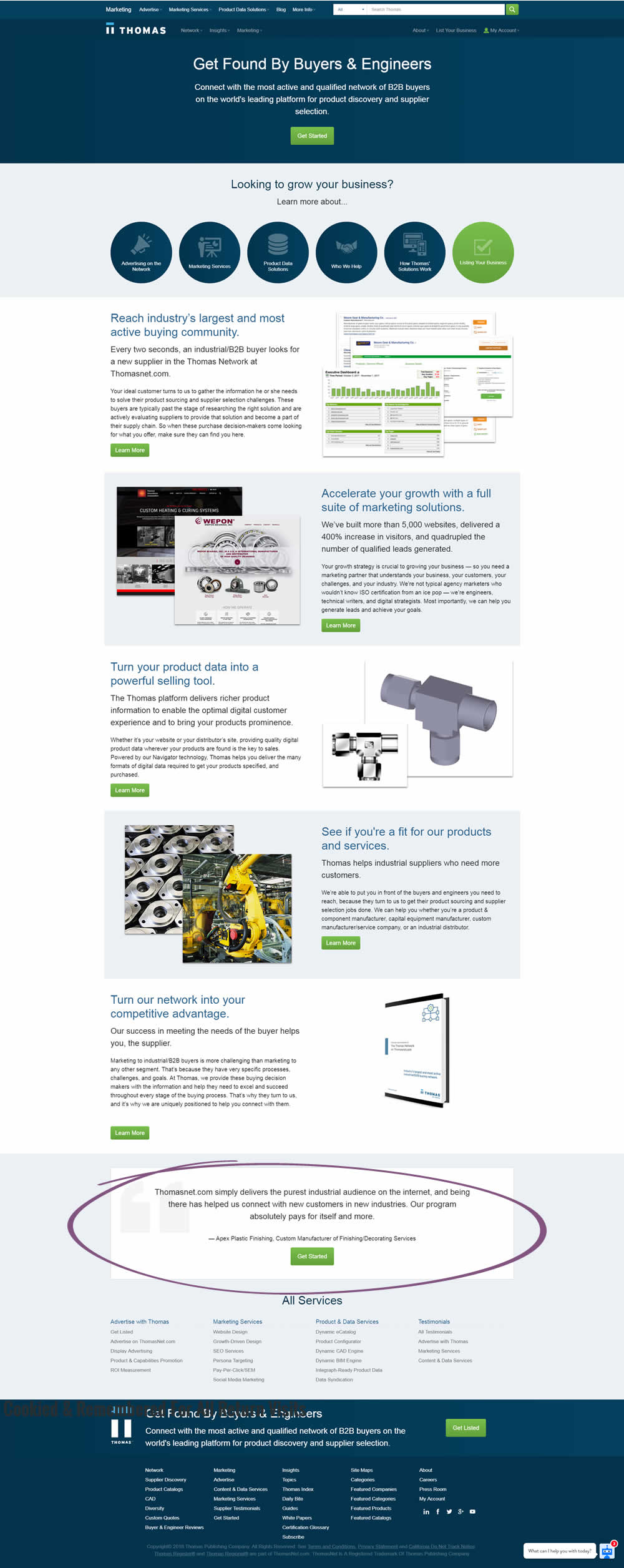
In this experiment, a testimonial with a repeated call to action was placed at the bottom of a landing page.
Test #184 on
Bomgar.com
by  Lee Elkins
Jun 25, 2018
Desktop
Mobile
Home & Landing
X.X%
Signups
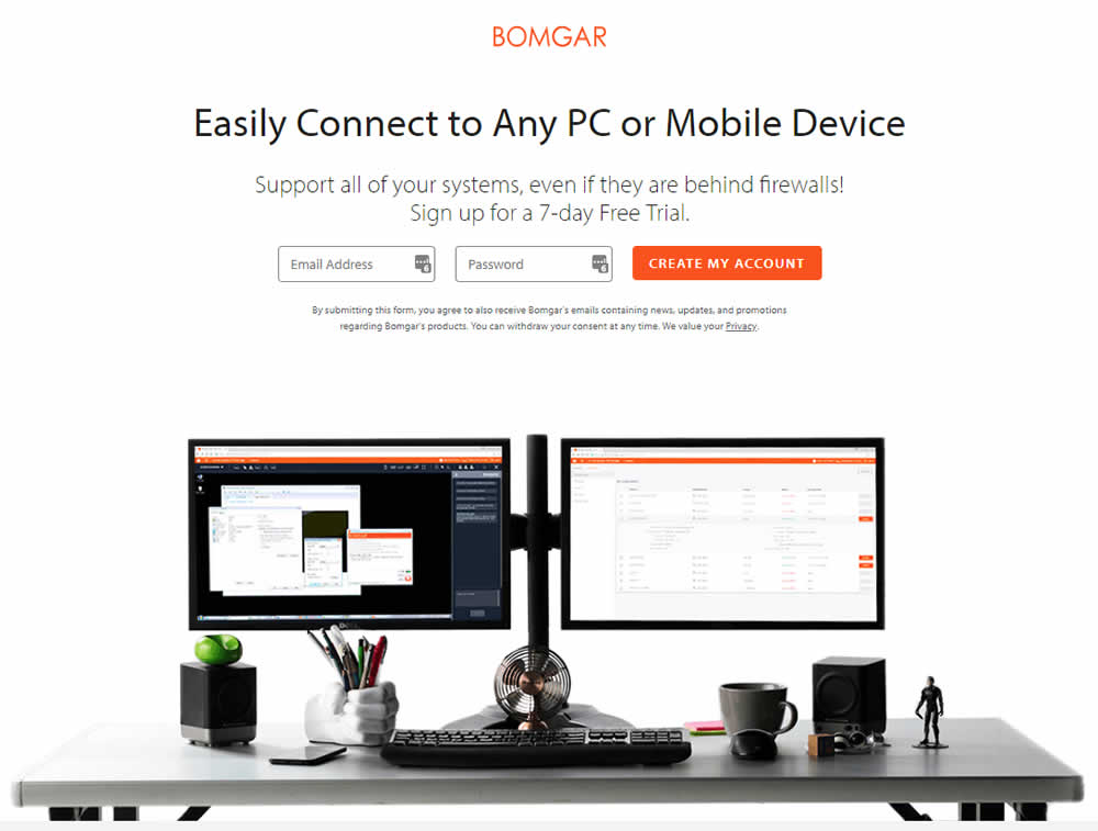
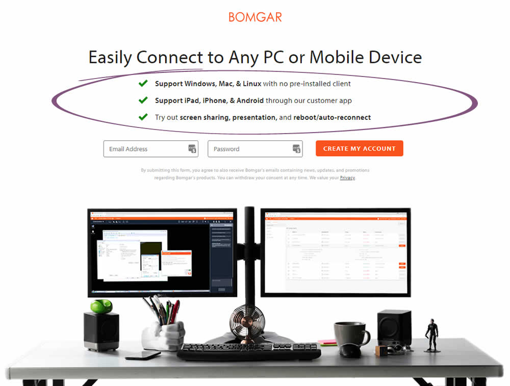
Lee Tested Pattern #15: Bulleted Reassurances On Bomgar.com
Test #183 on
Trydesignlab.com
by  Daniel Shapiro
Jun 19, 2018
Desktop
Mobile
Product
X.X%
Signups
Daniel Tested Pattern #46: Pay Later On Trydesignlab.com


Test #181 on
Yummly.com
by  Kimberly Cheung
Jun 04, 2018
Desktop
Mobile
Signup
X.X%
Signups
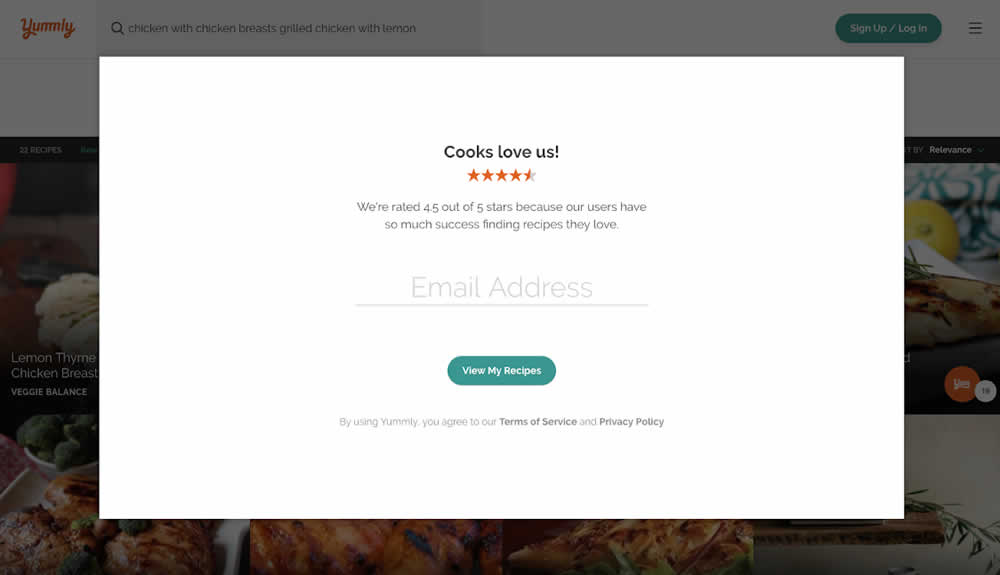
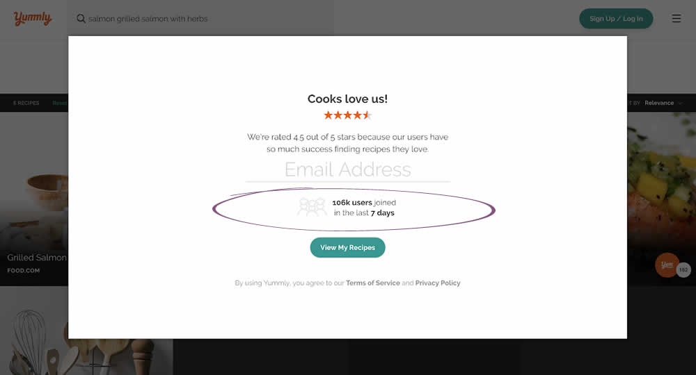
Kimberly Tested Pattern #7: Social Counts On Yummly.com
Test #180 on
Radhabeauty.com
by  Viljo Vabrit
Jun 03, 2018
Mobile
Global
X.X%
Sales
Viljo Tested Pattern #45: Benefit Bar On Radhabeauty.com


Test #176 on
Kenhub.com
by  Niels Hapke
May 16, 2018
Desktop
Mobile
Checkout
X.X%
Sales
Niels Tested Pattern #4: Testimonials On Kenhub.com
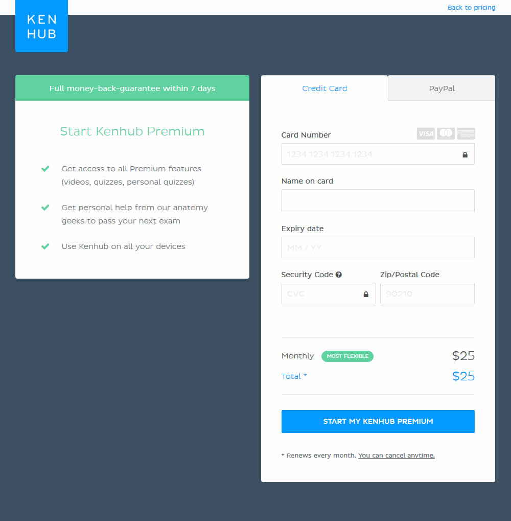
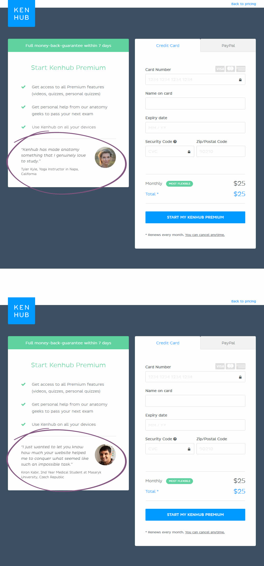
In this experiment, testimonials were added on a checkout screen.
Test #174 on
Examine.com
by  Martin Wong
May 13, 2018
Desktop
Mobile
Checkout
X.X%
Sales
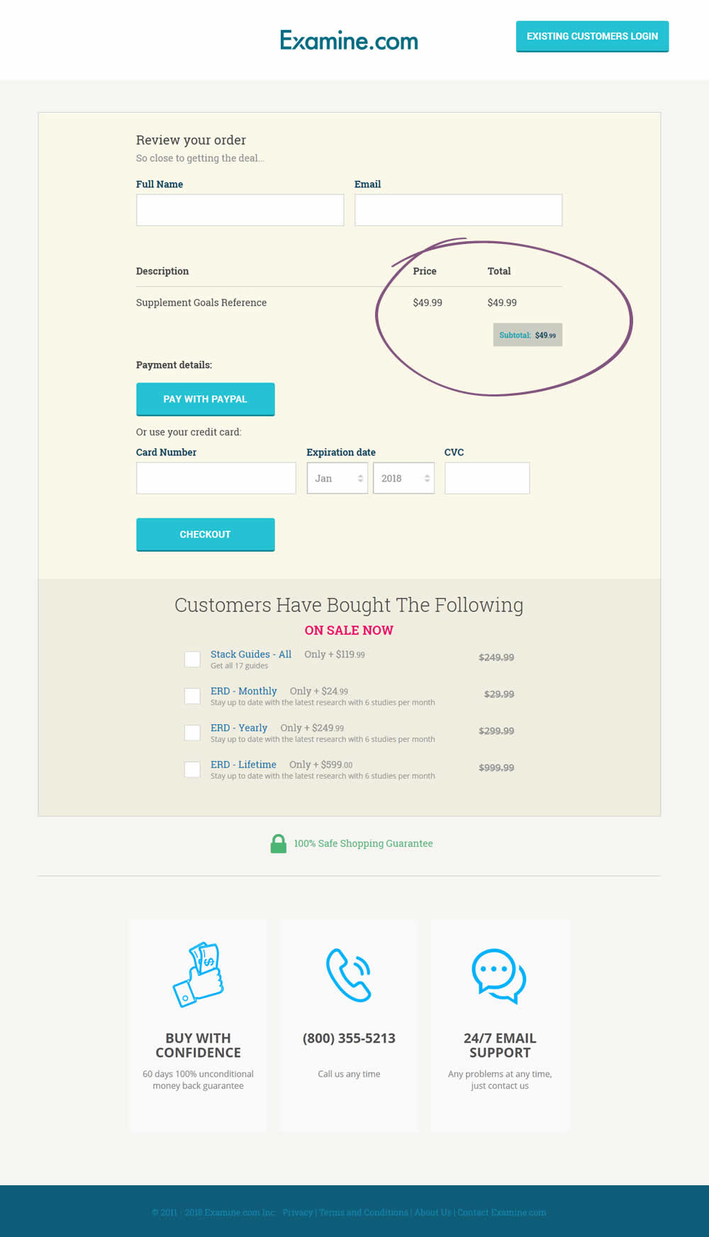
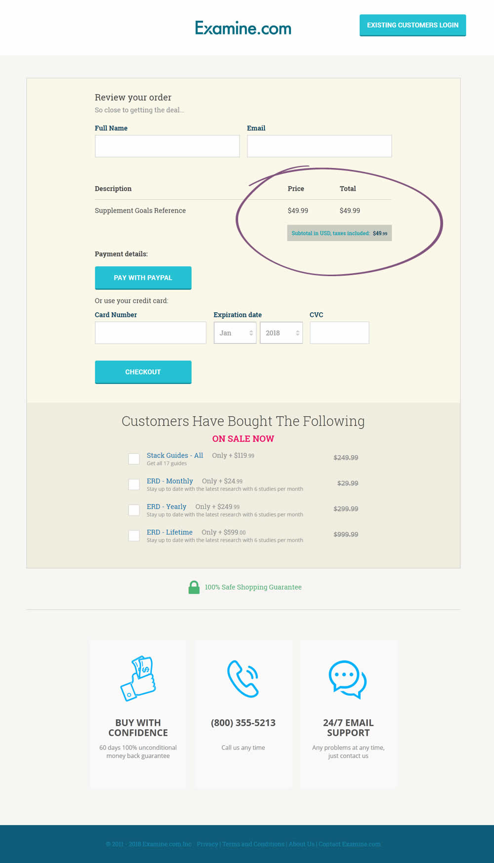
Martin Tested Pattern #67: Currency & Taxes On Examine.com
Test #168 on
Akademiafotografii.p...
by Grzegorz Jancewicz
Apr 23, 2018
Desktop
Listing
X.X%
Leads
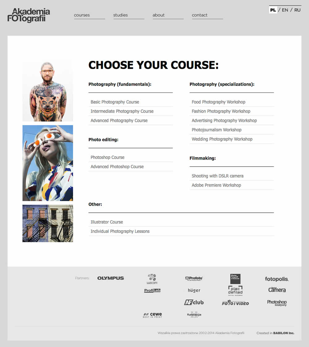
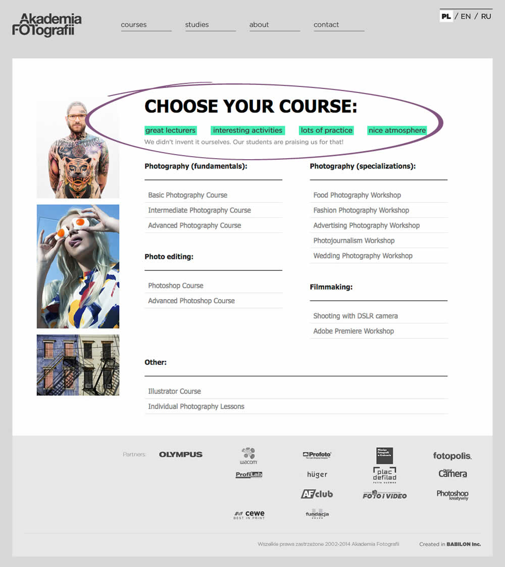
Grzegorz Tested Pattern #45: Benefit Bar On Akademiafotografii.p...
Test #163 on
Lovehoney.co.uk
by  Matthew Curry
Mar 27, 2018
Mobile
Desktop
Product
X.X%
Revenue
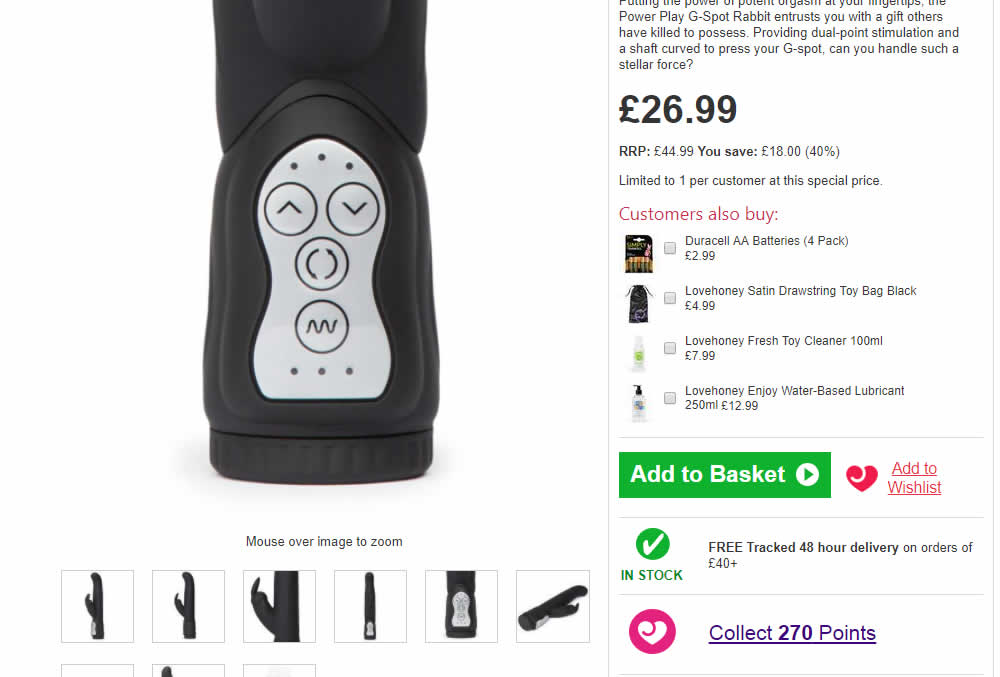
Matthew Tested Pattern #62: Urgent Next Day Delivery On Lovehoney.co.uk

Test #157 on
Bobandlush.com
by  Viljo Vabrit
Mar 06, 2018
Desktop
Product
X.X%
Sales
Viljo Tested Pattern #62: Urgent Next Day Delivery On Bobandlush.com
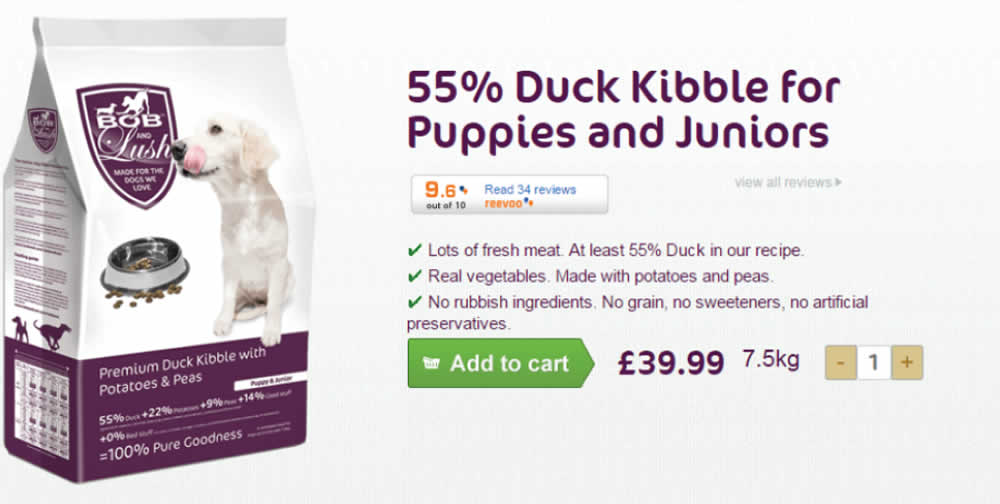
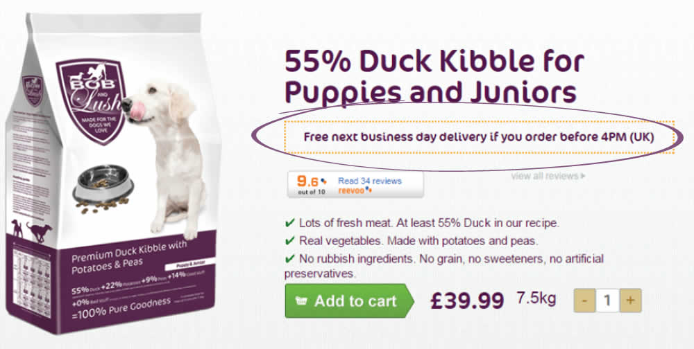
Hypothesis - Urgency leads to higher conversions as people have less time to think and will instead follow their impulse to complete the purchase now rather than later.
The Treatment - From Monday to Friday, before 4 PM, we added the urgency message “Free next business day delivery if you order before 4 PM (UK)”. We placed the urgency message just below the product name ensuring that it fell into the reading pattern of all visitors interested in the products. To ensure the treatment was only shown at the right time and for the right people we added a condition: MON, TUE, WED, THU, FRI before 4 PM; UK IP.