All Latest 620 A/B Tests
MOST RECENT TESTS
Test #359 on
Snocks.com
by  Samuel Hess
Jun 11, 2021
Desktop
Mobile
Product
X.X%
Sales
Samuel Tested Pattern #43: Long Titles On Snocks.com
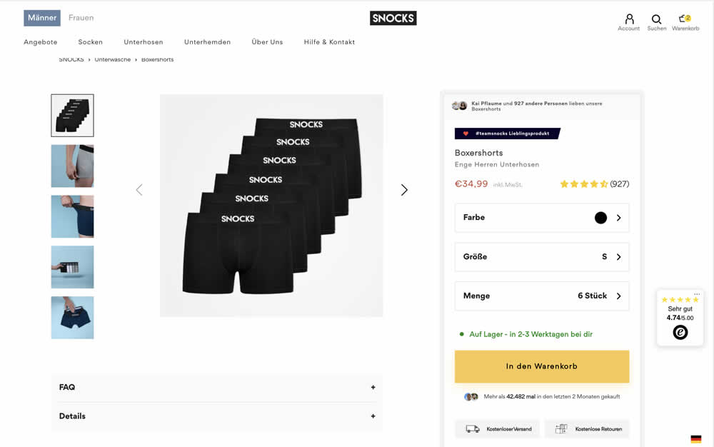
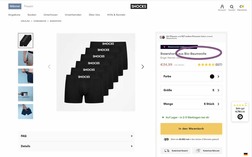
In this experiment, product titles were extended with descriptive copy. Instead of just showing the product name, "with organic cotton" was appended on product and category/listing pages. Impact to adds to cart and sales was measured.
Which A Or B Actually Wins? Find Out Before You Test.
Members see every test result — the winners, the flat ones, and the losers — along with exact effects and sample sizes. Use it to estimate your tests and prioritize by probability, not gut feel. Start every experiment with the odds on your side.
Test #354 on
Mvideo.ru
by  Andrey Andreev
May 25, 2021
Desktop
Mobile
Product
X.X%
Revenue
Andrey Tested Pattern #69: Autodiscounting On Mvideo.ru
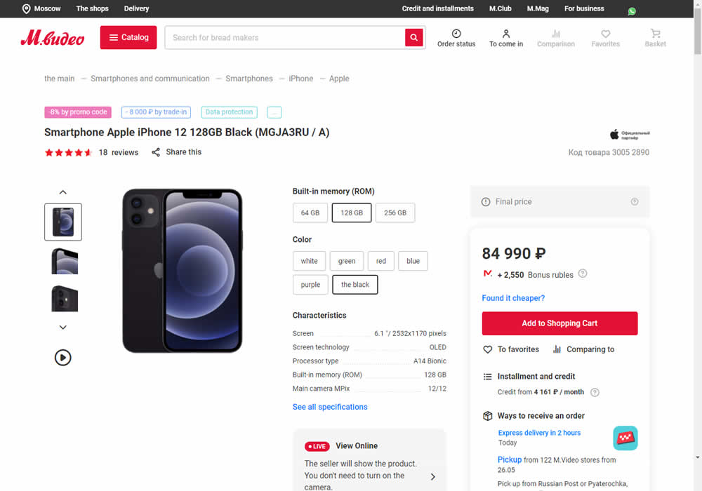
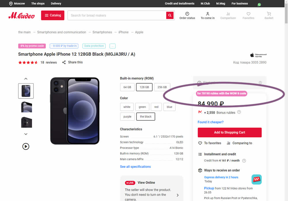
In this experiment, the discounted price was shown along with an active promotion. The control only showed that the relative -8% discount was present with the pre-discounted price.
Test #104 on
3dhubs.com
by  Rob Draaijer
Mar 31, 2021
Desktop
Listing
X.X%
Leads
Rob Tested Pattern #15: Bulleted Reassurances On 3dhubs.com
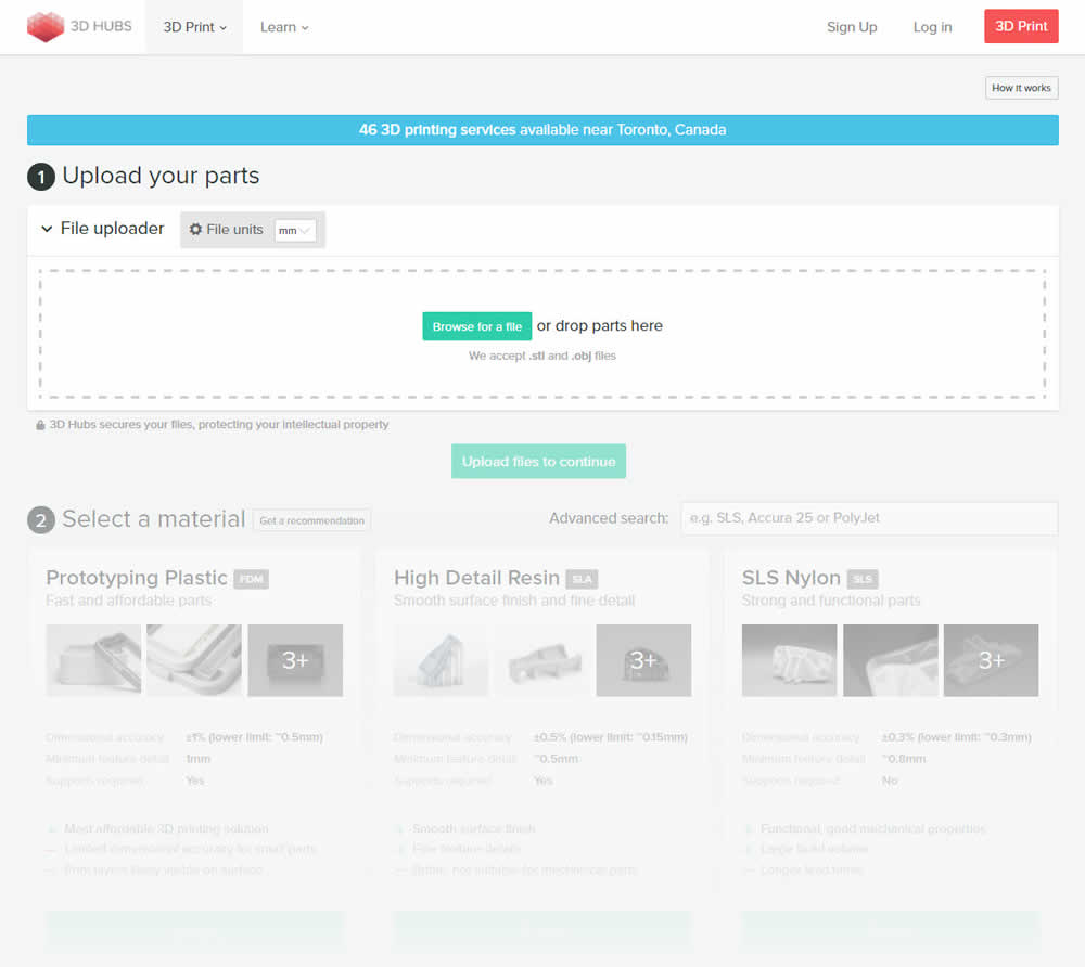
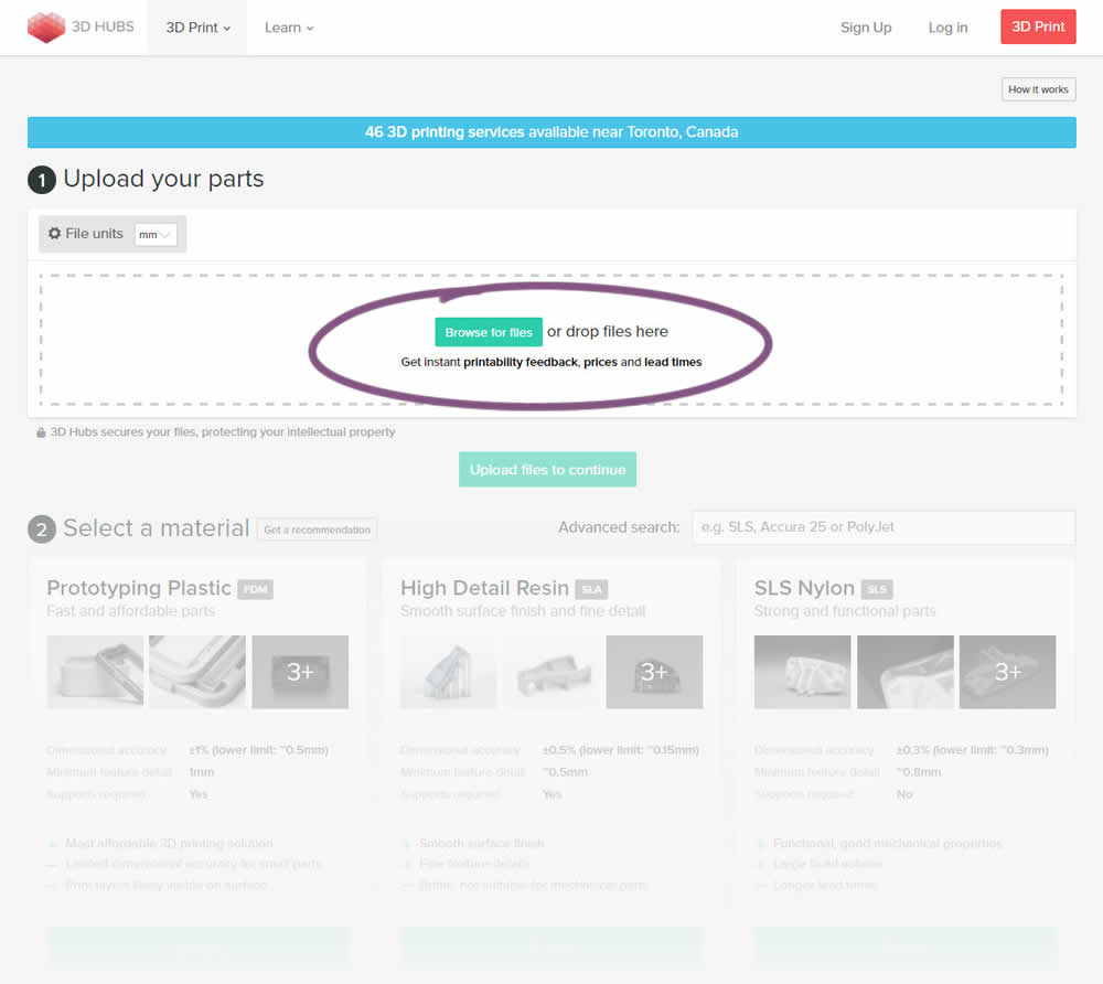
This experiment attempted to increase the number of leads on a lead-funnel. As the first step, users were being asked to upload a file. The control showed the file types that were allowed, whereas the variation changed the copy to show a number of benefits for taking that action. The text-based benefits included the: receiving feedback, prices and lead times.
Test #344 on
by  Jakub Linowski
Mar 11, 2021
Desktop
Checkout
X.X%
Sales
Jakub Tested Pattern #108: Frequently Asked Questions
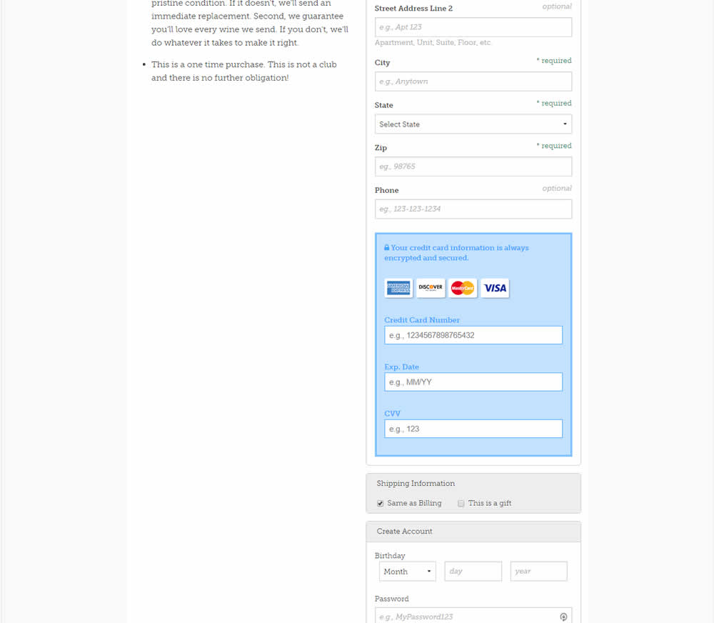
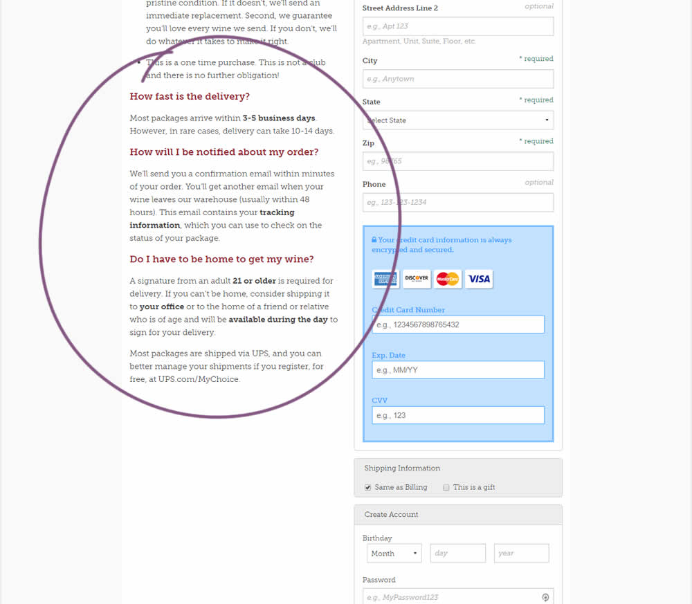
Three common delivery questions were answered at the bottom of a checkout page.
Test #339 on
Expertinstitute.com
by  Ardit Veliu
Feb 23, 2021
Desktop
Home & Landing
X.X%
Leads
Ardit Tested Pattern #33: Example Situations On Expertinstitute.com

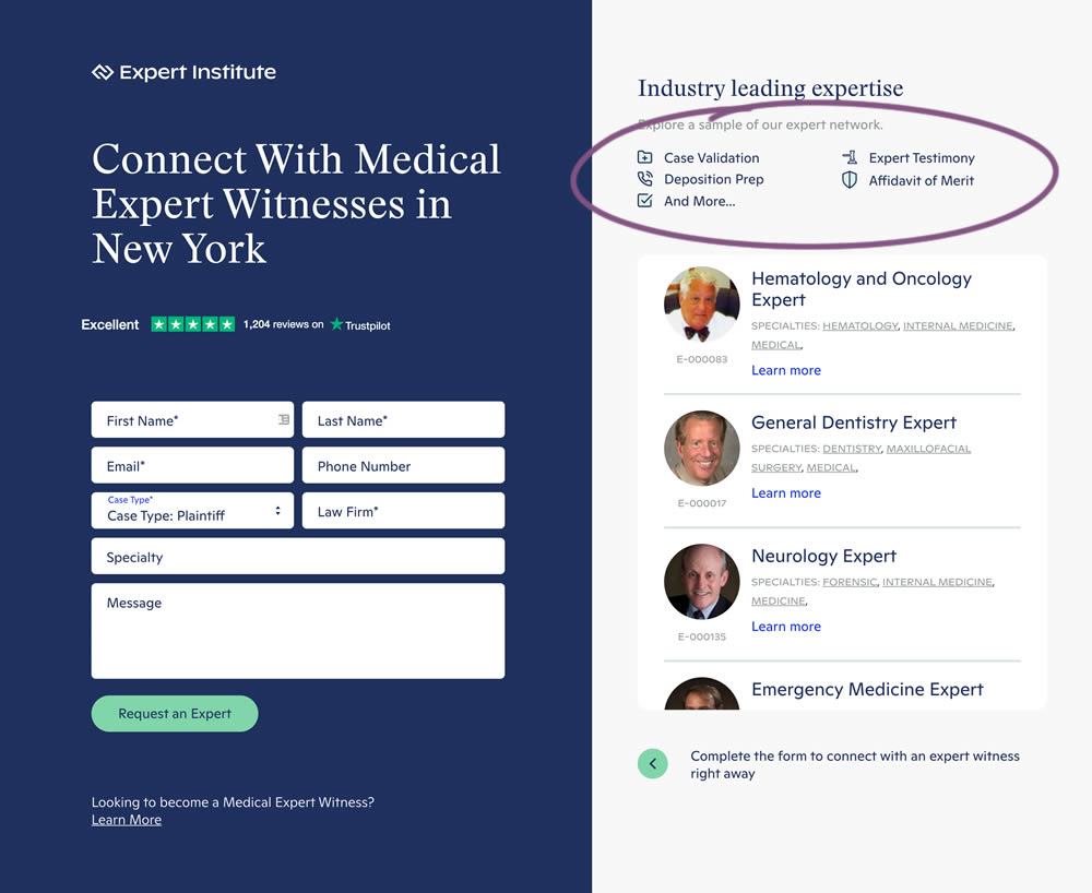
In this experiment, a number of use cases examples were added to illustrate the situations in which experts could help.
Test #335 on
by  Jakub Linowski
Jan 27, 2021
Desktop
Mobile
Home & Landing
X.X%
Sales
Jakub Tested Pattern #32: Condensed List
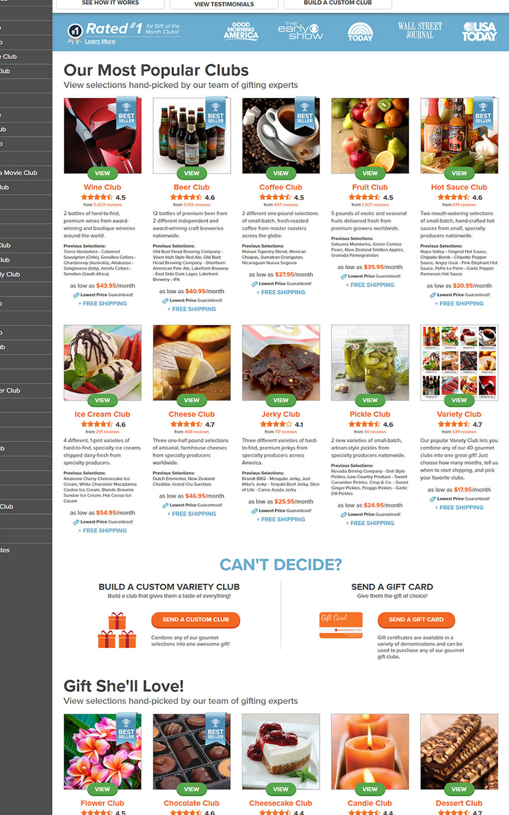
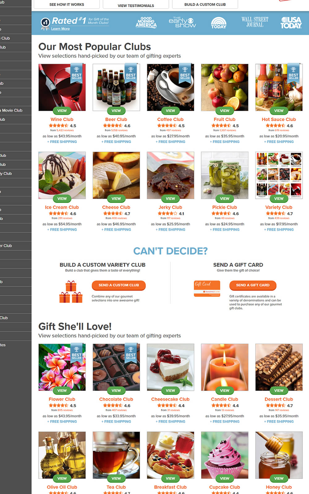
The variation here has more condensed product tiles being shown on a homepage. Two pieces of information were removed: product descriptions and past selections. Impact on product page visits and total sales was measured.
Test #334 on
Thomasnet.com
by  Kyle Phillips
Jan 25, 2021
Desktop
Mobile
Global
X.X%
Progression
Kyle Tested Pattern #2: Icon Labels On Thomasnet.com
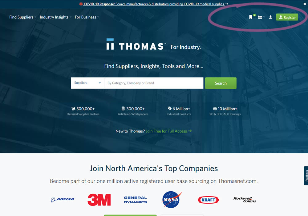
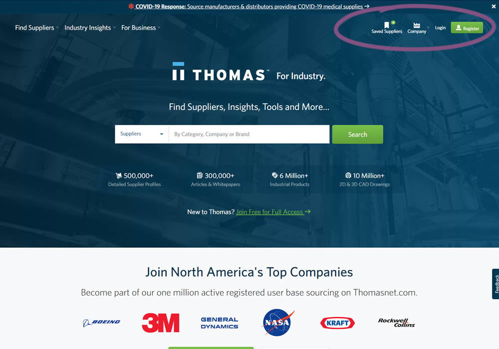
This experiment measured the impact of adding text labels to three icon-only nav items.
Test #331 on
by  Jakub Linowski
Dec 30, 2020
Desktop
Mobile
Product
X.X%
Sales
Jakub Tested Pattern #121: Free Shipping

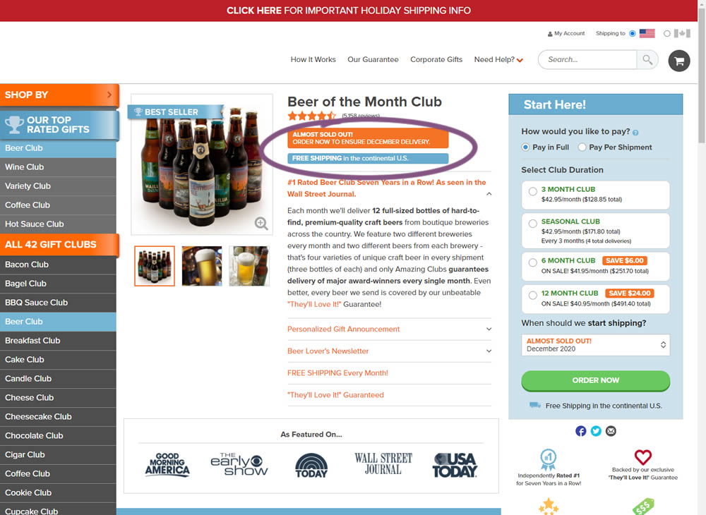
In this little experiment, an extra "Free Shipping" message was added on a product page. It's prominence was increased by using white copy on a darker blue background. Impact on adds-to-cart and total sales was measured.
Test #332 on
by  Jakub Linowski
Dec 30, 2020
Desktop
Mobile
Product
X.X%
Sales
Jakub Tested Pattern #121: Free Shipping
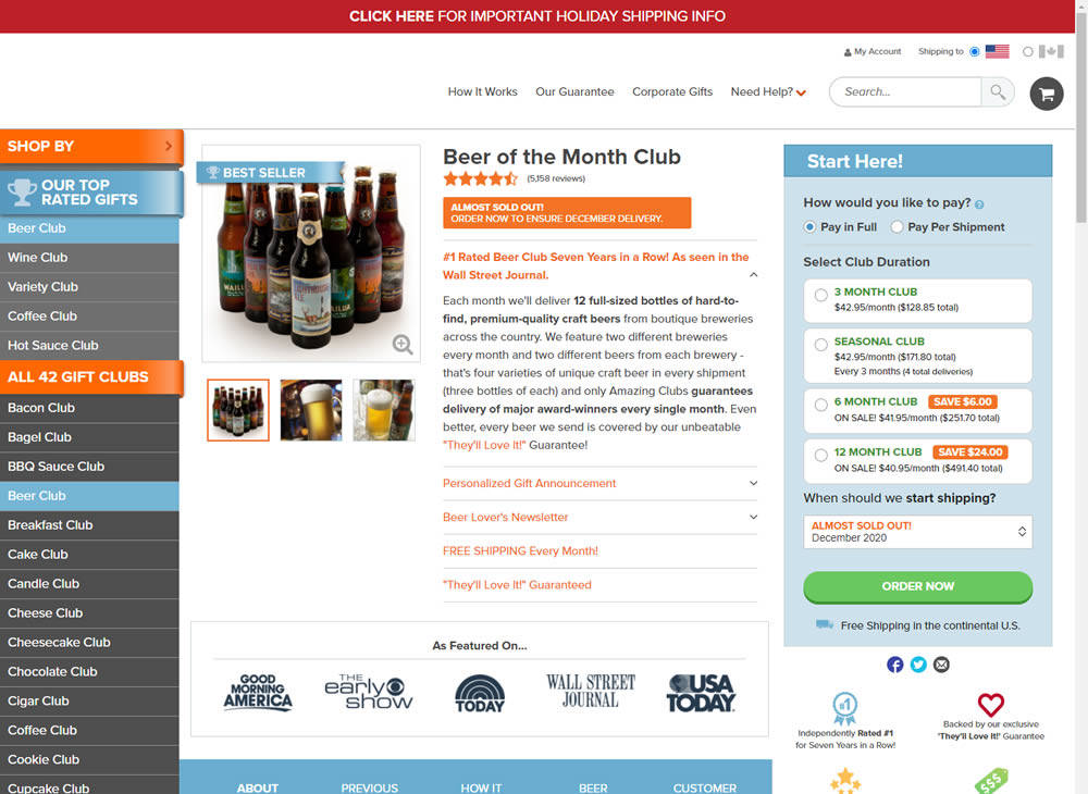
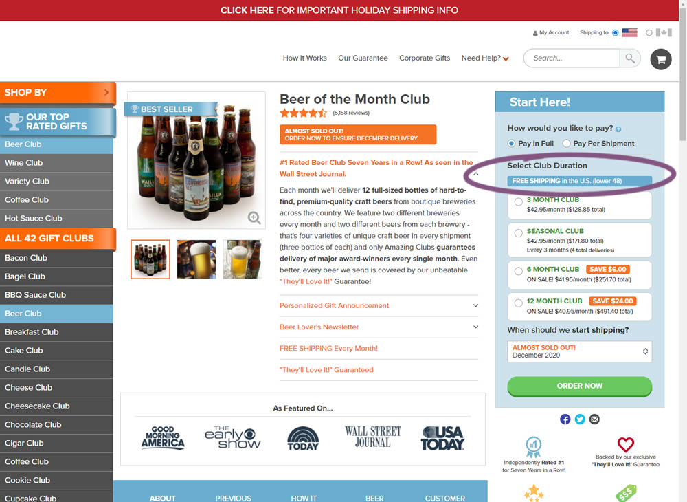
In this experiment, an extra "Free Shipping" message was added on a product page - at the top of the buy box with an add-to-cart call to action. It's prominence was increased by using white copy on a darker blue background. Impact on adds-to-cart and total sales was measured.
Test #318 on
Thomasnet.com
by  Kyle Phillips
Sep 29, 2020
Desktop
Mobile
Content
X.X%
Signups
Kyle Tested Pattern #60: Repeated Bottom Call To Action On Thomasnet.com
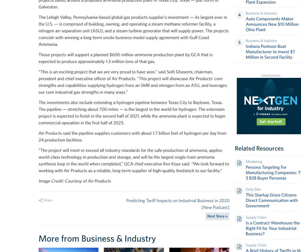
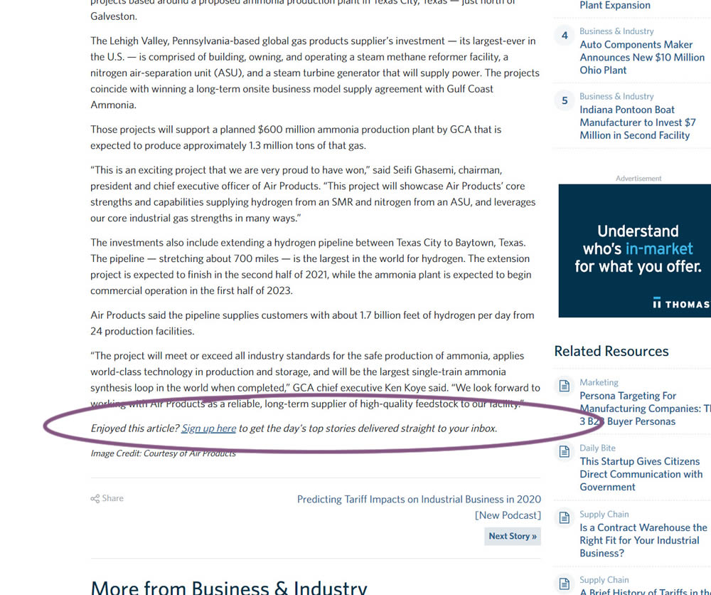
In this experiment, a simple link to a newsletter signup landing page was added at the bottom of an article. The newsletter landing page then encouraged users to provide their email address for future article updates.
Test #316 on
Trydesignlab.com
by  Daniel Shapiro
Sep 24, 2020
Desktop
Mobile
Home & Landing
X.X%
Signups
Daniel Tested Pattern #22: Empowering Headline On Trydesignlab.com


In this experiment, the headline was changed to focus more on the end-goal of the UX Academy program - that of landing your first UI/UX role.
Test #99 on
Vivareal.com.br
by  Rodrigo Maués
Sep 23, 2020
Desktop
Mobile
Product
X.X%
Leads
Rodrigo Tested Pattern #24: Visible Availability On Vivareal.com.br
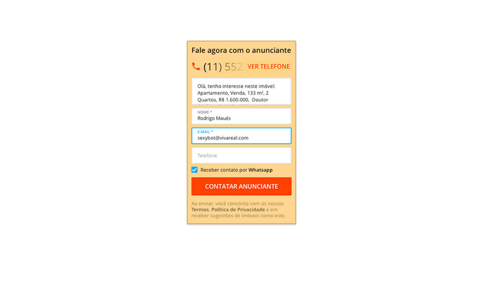
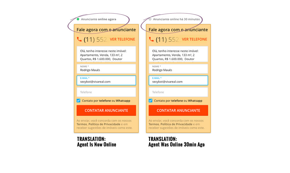
In this experiment, a lead form on a listing page showed whether an agent was recently online or not. The diplayed had two statuses: either indicating that someone is online now, or the most recent time they were online in minutes.
Test #315 on
Backstage.com
by  Stanley Zuo
Aug 22, 2020
Mobile
Signup
X.X%
Sales
Stanley Tested Pattern #7: Social Counts On Backstage.com
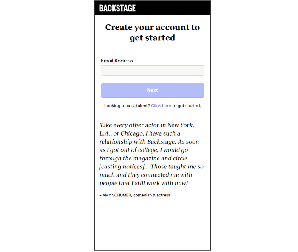
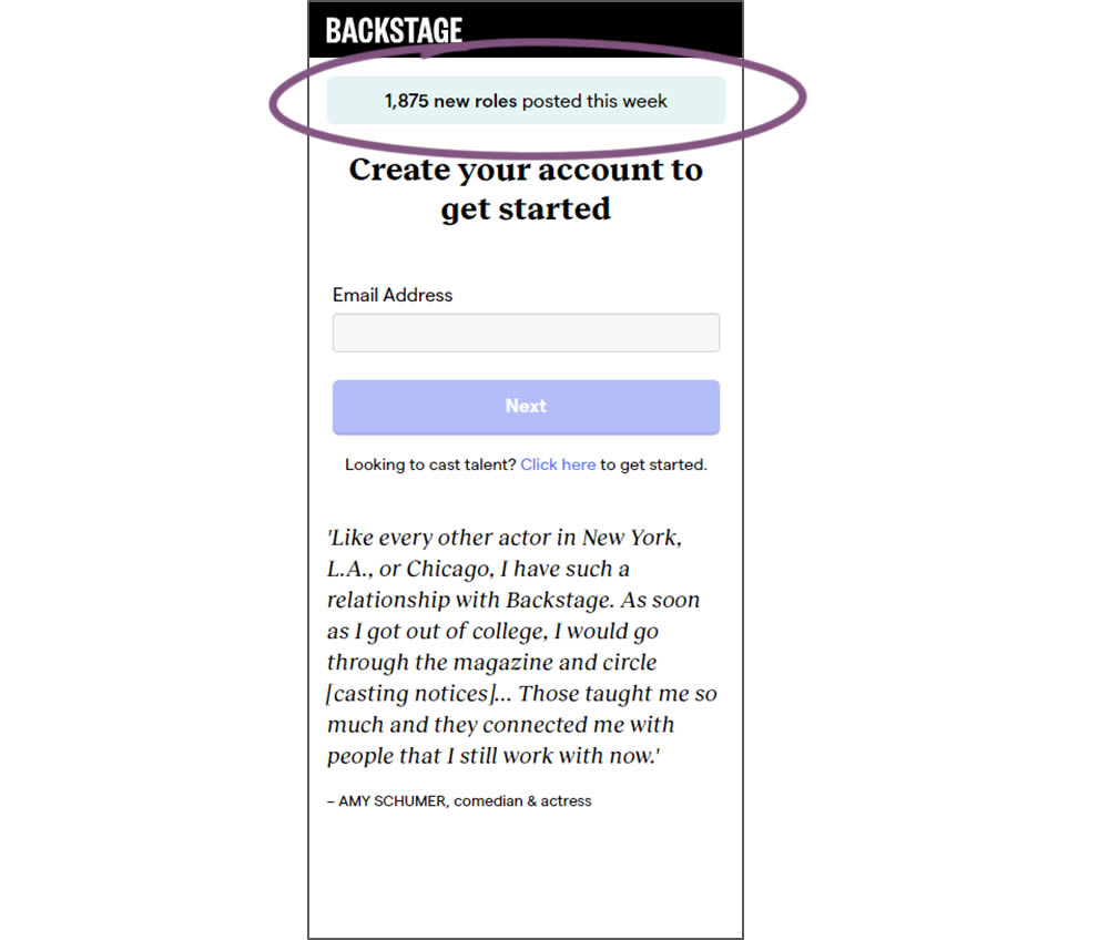
In this experiment, a dynamic number of job postings was displayed during the signup process - reinforcing the value of signing up for membership access.
Test #314 on
Zapimoveis.com.br
by  Vinicius Barros Peixoto
Aug 21, 2020
Desktop
Mobile
Product
X.X%
Leads
Vinicius Tested Pattern #43: Long Titles On Zapimoveis.com.br
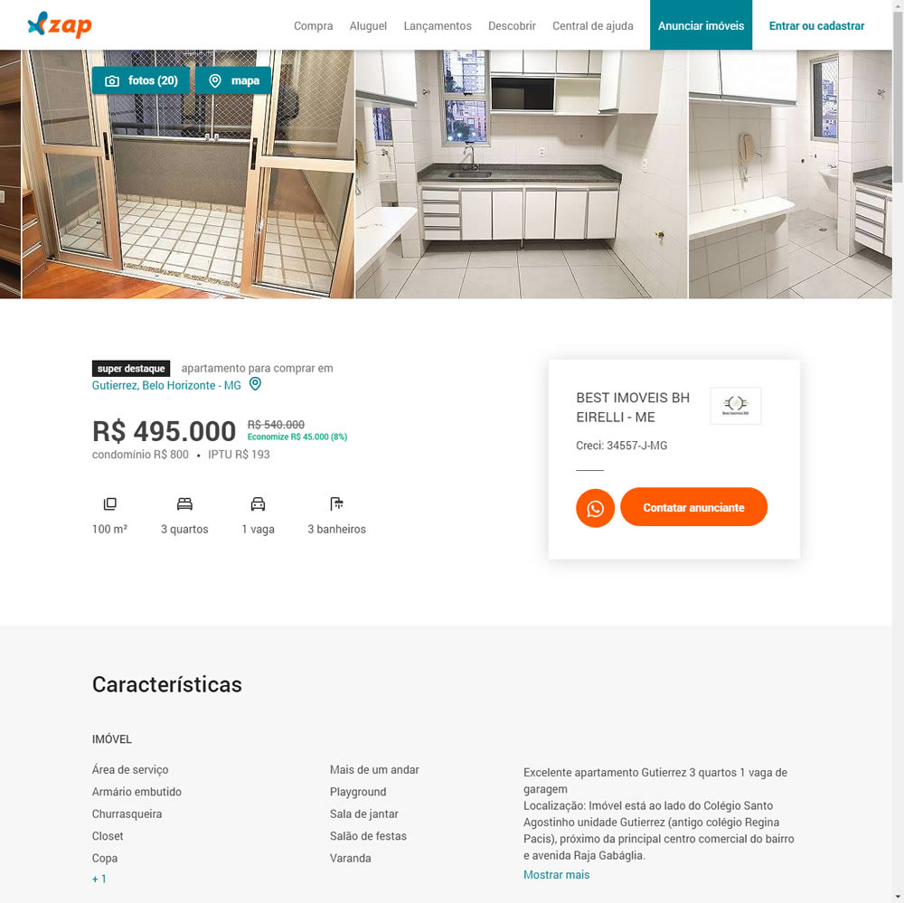
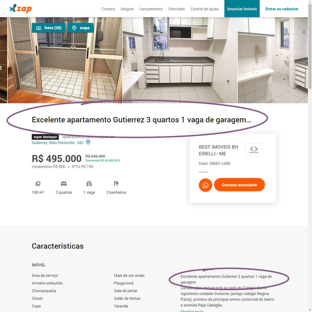
In this experiment, a dynamic page title was generated and added at the top of the screen. The first few words from a property description were used to dynamically generate these titles. The effect on leads was measured.
Test #308 on
Umbraco.com
by  Lars Skjold Iversen
Jul 23, 2020
Desktop
Home & Landing
X.X%
Signups
Lars Tested Pattern #4: Testimonials On Umbraco.com
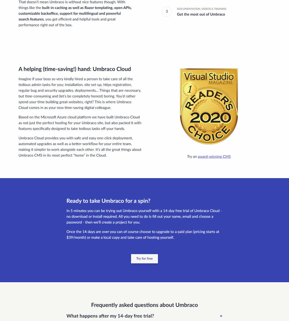

In this experiment, three testimonials were added mid way though on a CMS landing page. At the end of the customer testimonials an additional trial signup button was also added - which was also the primary metric.
Test #306 on
Backstage.com
by  Stanley Zuo
Jul 09, 2020
Desktop
Mobile
Pricing
X.X%
Sales
Stanley Tested Pattern #69: Autodiscounting On Backstage.com
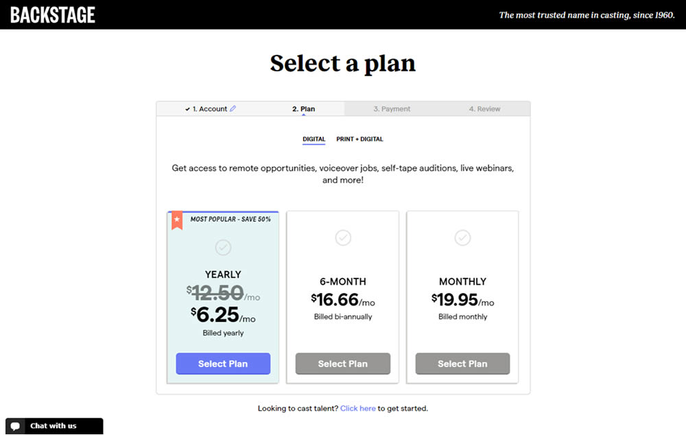
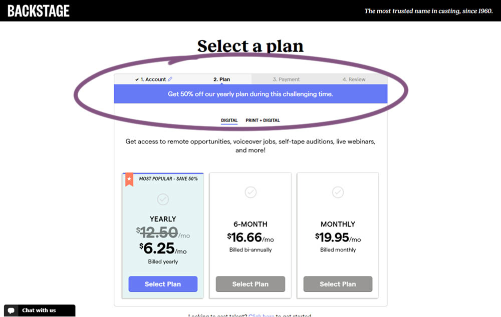
In this experiment, the only change was an added message at the top of the pricing screen, clarifying that there is an active discount on a yearly plan. The discount was already communicated with a strike-through price on the control version as well. The variation simply emphasized this aggressively.
Test #299 on
Backstage.com
by  Stanley Zuo
May 22, 2020
Desktop
Mobile
Listing
X.X%
Sales
Stanley Tested Pattern #60: Repeated Bottom Call To Action On Backstage.com
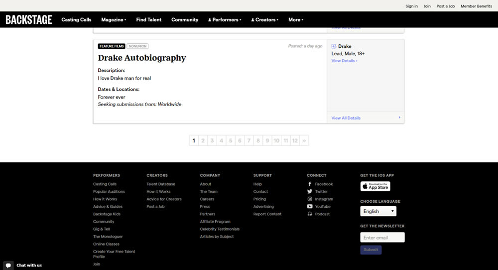
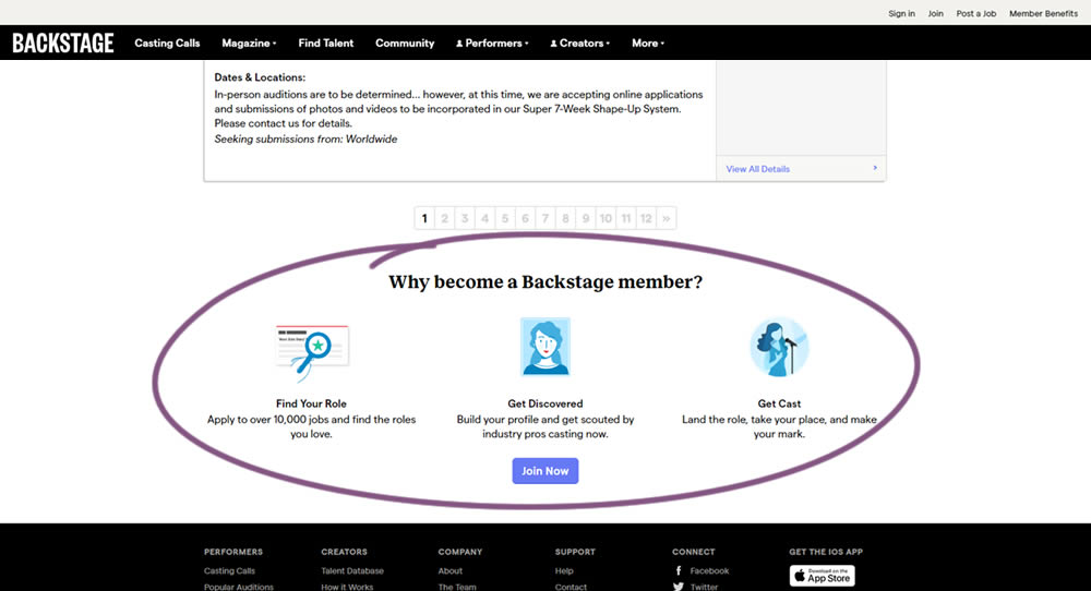
In this experiment, at the bottom of a search results screen, a membership join button was added along with 3 encouraging reasons. The experiment measured membership funnel starts, as well as paid membership transactions (sales).
Test #285 on
Ibood.com
by  Lukas Jorissen
Feb 27, 2020
Desktop
Product
X.X%
Sales
Lukas Tested Pattern #7: Social Counts On Ibood.com
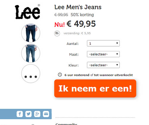
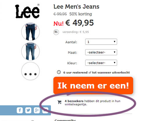
In this experiment, realtime social proof information has been added below an add-to-cart button. The variation shows how many users that have viewed, or placed a product into their basket. Translated to "4 visitors have this product in their shopping cart."
Test #284 on
Thomasnet.com
by  Julian Gaviria
Feb 19, 2020
Desktop
Mobile
Listing
X.X%
Leads
Julian Tested Pattern #78: Tags, Badges And Structured Information On Thomasnet.com
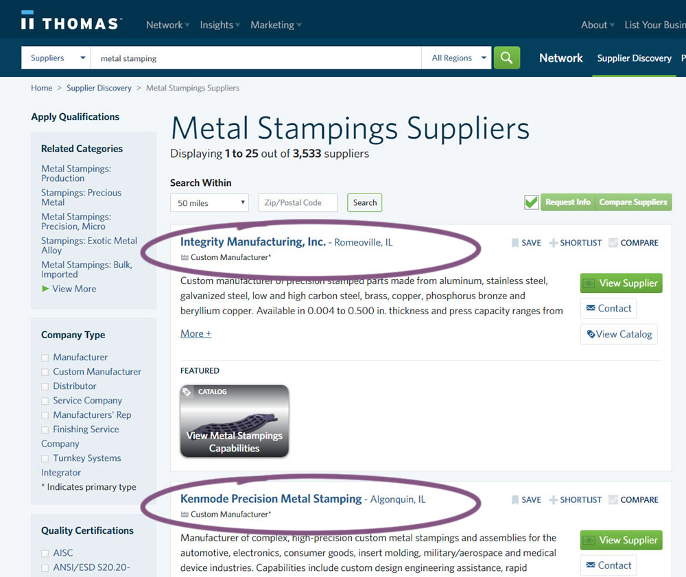
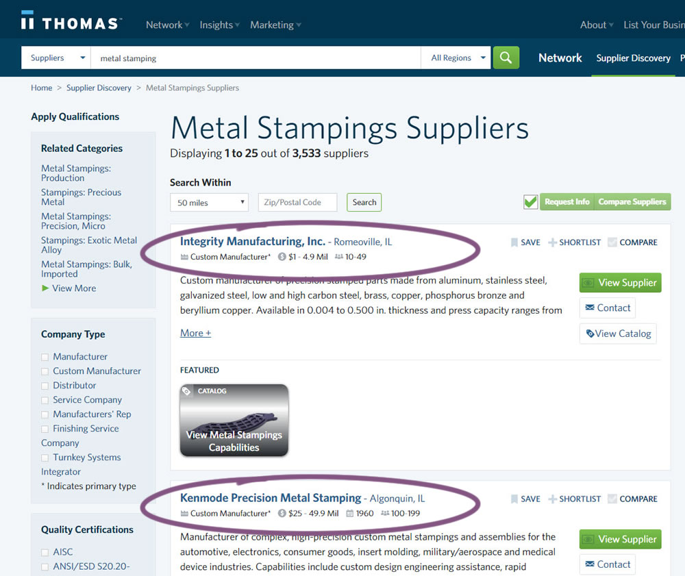
In this experiment, structured data tags were displayed on a listing page to help potential buyers make better decisions. The additional information about the listed companies included: annual revenue, employee count, and year of establishment.
Test #279 on
Umbraco.com
by  Lars Skjold Iversen
Jan 16, 2020
Desktop
Mobile
Home & Landing
X.X%
Sales
Lars Tested Pattern #79: Product Highlights On Umbraco.com
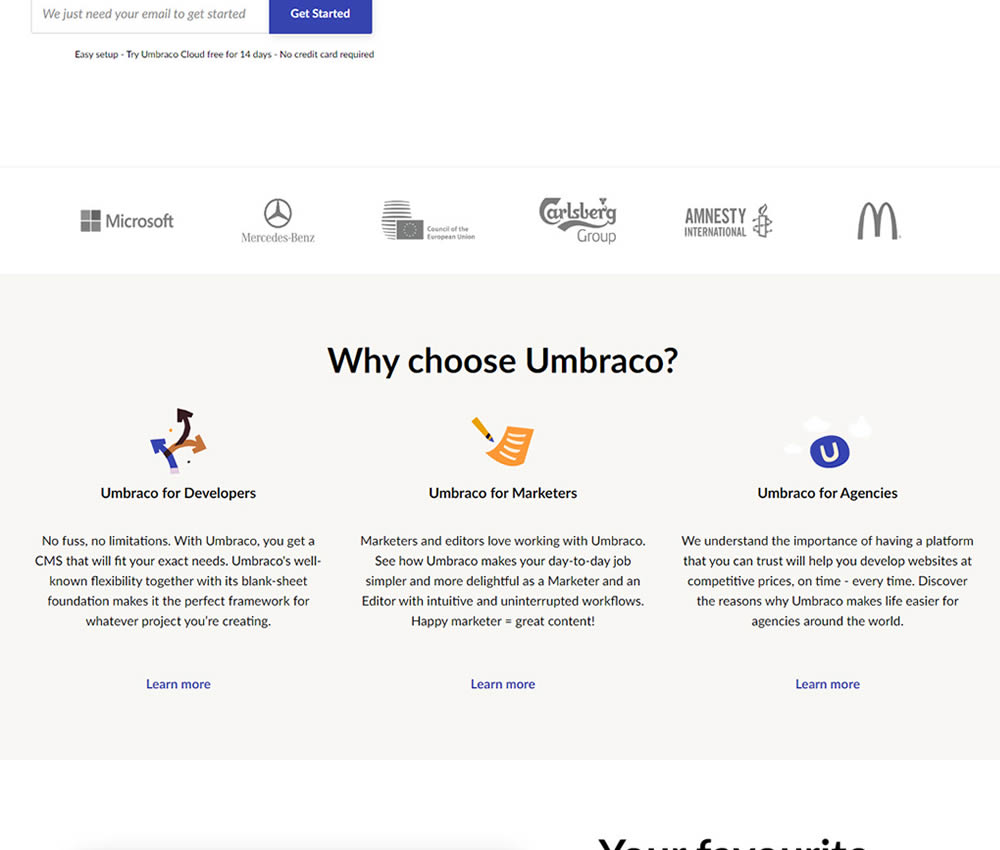
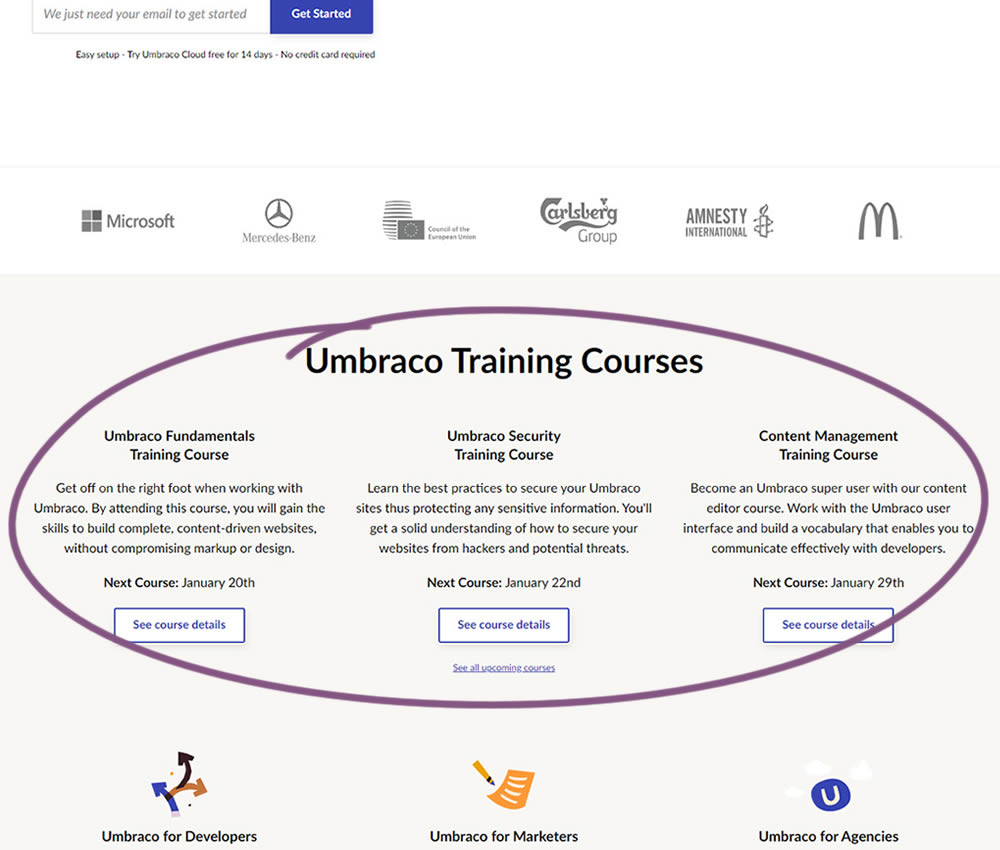
In this experiment, 3 additional course links with descriptions were added to the homepage. The idea was to increase course sales aside of the Saas subscription signups.