All Latest 620 A/B Tests
MOST RECENT TESTS
Test #400 on
by  Herman Klein
Mar 06, 2022
Desktop
Shopping Cart
X.X%
Sales
Herman Tested Pattern #65: Add More For Extra Incentive

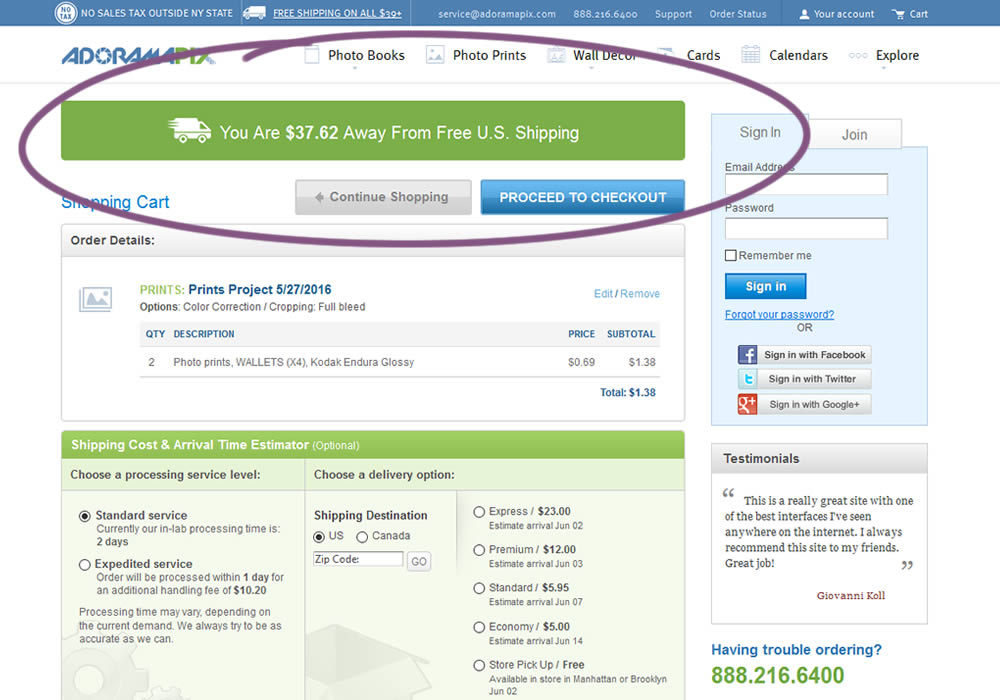
In this experiment, customers who were not yet eligible for free shipping (with cart amounts under $39) were presented with an encouraging message to add more and earn free shipping. Impact on progression to checkout and sales was measured.
Which A Or B Actually Wins? Find Out Before You Test.
Members see every test result — the winners, the flat ones, and the losers — along with exact effects and sample sizes. Use it to estimate your tests and prioritize by probability, not gut feel. Start every experiment with the odds on your side.
Test #398 on
Adoramapix.com
by  Herman Klein
Feb 25, 2022
Desktop
Shopping Cart
X.X%
Sales
Herman Tested Pattern #121: Free Shipping On Adoramapix.com
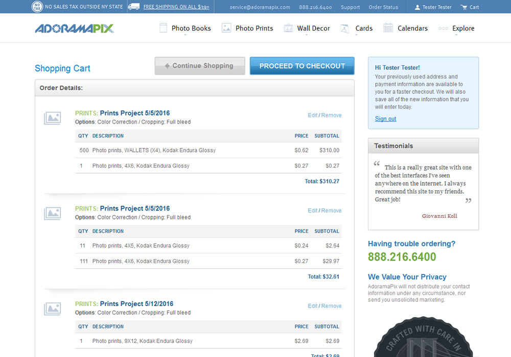
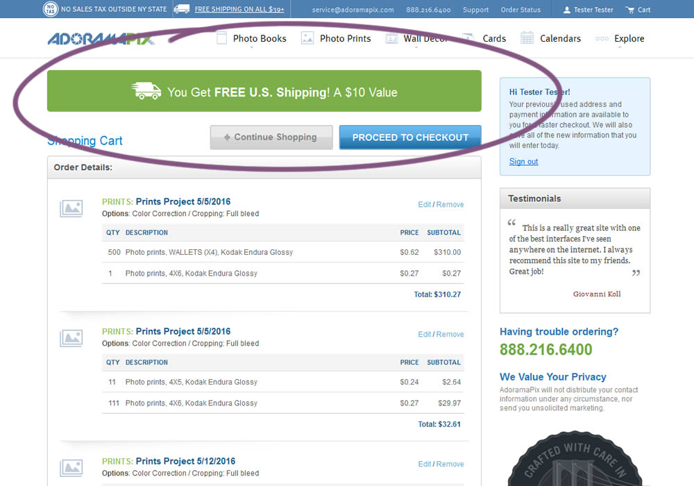
In this experiment, customers were eligible for free shipping (with cart amounts of $39 or more) were presented with an earned free shipping message. The variation also showed the value of the earned free shipping - (for example $10). Impact on progression to checkout and sales was measured.
Test #397 on
Snocks.com
by  Melina Hess
Feb 24, 2022
Mobile
Product
X.X%
Revenue
Melina Tested Pattern #121: Free Shipping On Snocks.com
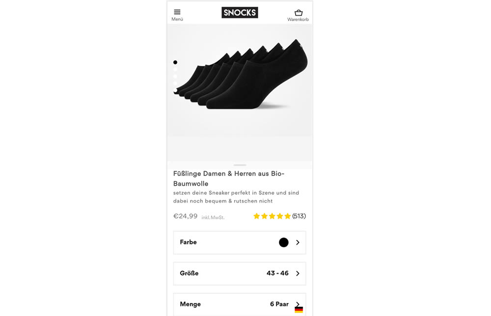
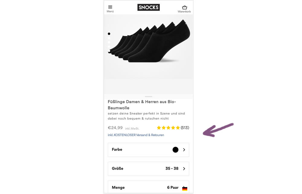
In this experiment a "Free Shipping & Returns" message was added just below the price information.
Test #396 on
Depositphotos.com
by  Gleb Hodorovskiy
Feb 13, 2022
Desktop
Listing
X.X%
Revenue
Gleb Tested Pattern #124: Confirmed Selection On Depositphotos.com
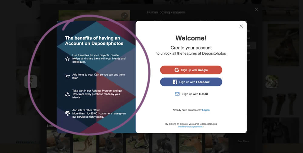
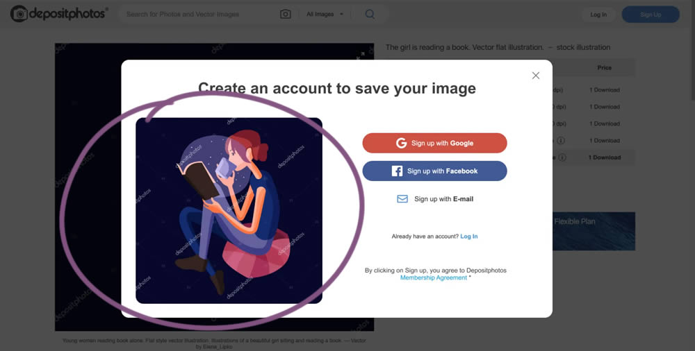
In this experiment from Conversionrate.store, the framing of the registration message was changed from a generic account creation one to a specific image selected by the user. The experiment started on a listing page of a stock photography / illustration site. The control showed a more generic message with benefits for signing up and making the purchase. Whereas the variation repeated the actual image that customers clicked on from listing pages - establishing continuity as well as providing a reason for signing up. Impact on sales was measured.
Test #395 on
by  Jakub Linowski
Jan 31, 2022
Desktop
Mobile
Product
X.X%
Sales
Jakub Tested Pattern #52: How It Works
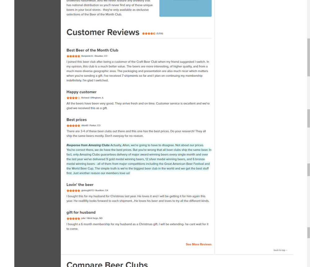
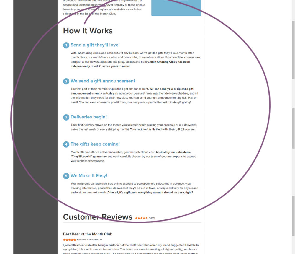
In this experiment, a How It Works section was appended on a product detail page just above product reviews.
Test #5 on
Busyteacher.org
by  Andrei Zakhareuski
Jan 23, 2022
Desktop
Mobile
Product
X.X%
Sales
Andrei Tested Pattern #21: What It's Worth On Busyteacher.org
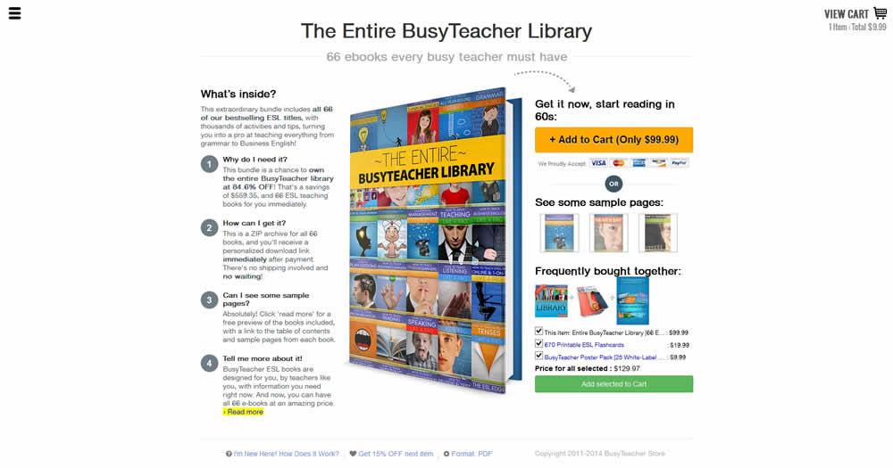
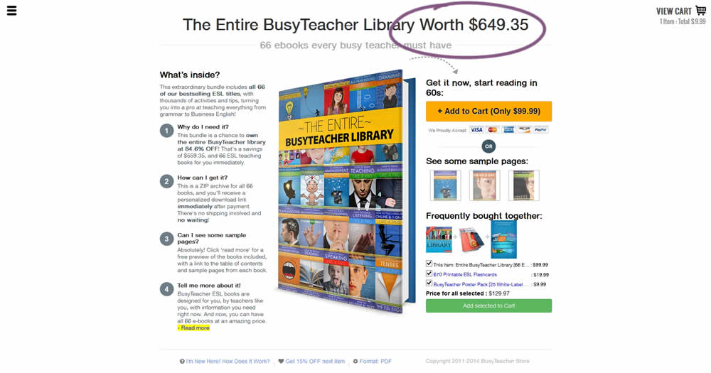
The variation included a simple extention of the headline to include the full dollar worth of a discounted bundle deal.
Test #391 on
Backstage.com
by  Stanley Zuo
Dec 30, 2021
Desktop
Mobile
Listing
X.X%
Signups
Stanley Tested Pattern #82: Onboarding Callouts On Backstage.com
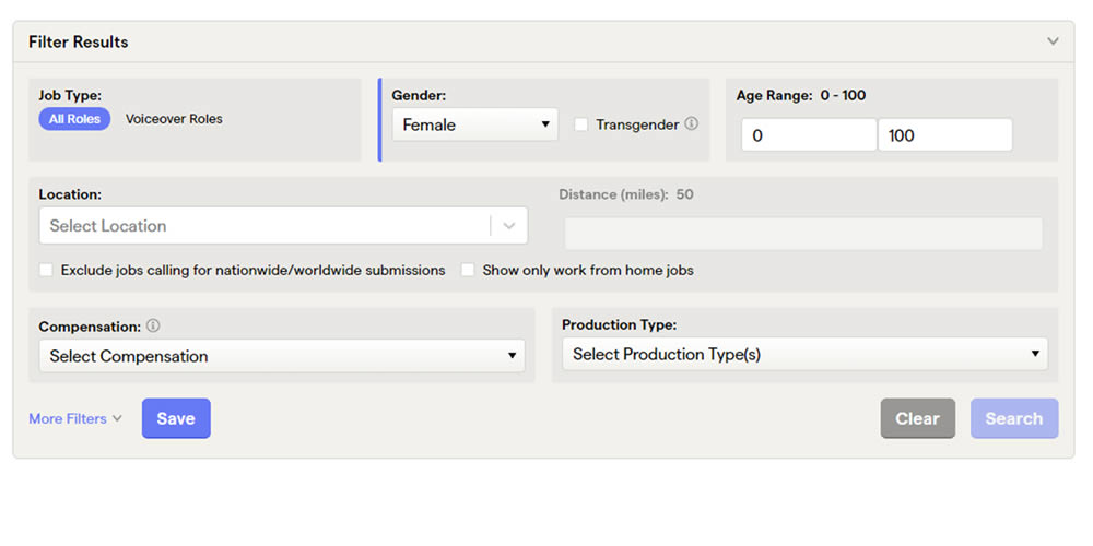
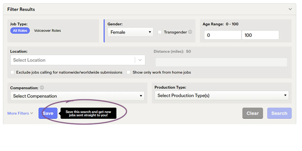
This experiment added a small nudge or callout to encourage more signups. Attention was directed towards the save function, which lead to the signup flow for anyone not signed it. Impact on signups was measured.
Test #385 on
Snocks.com
by  Samuel Hess
Nov 25, 2021
Mobile
Product
X.X%
Sales
Samuel Tested Pattern #63: Trust Seals On Snocks.com
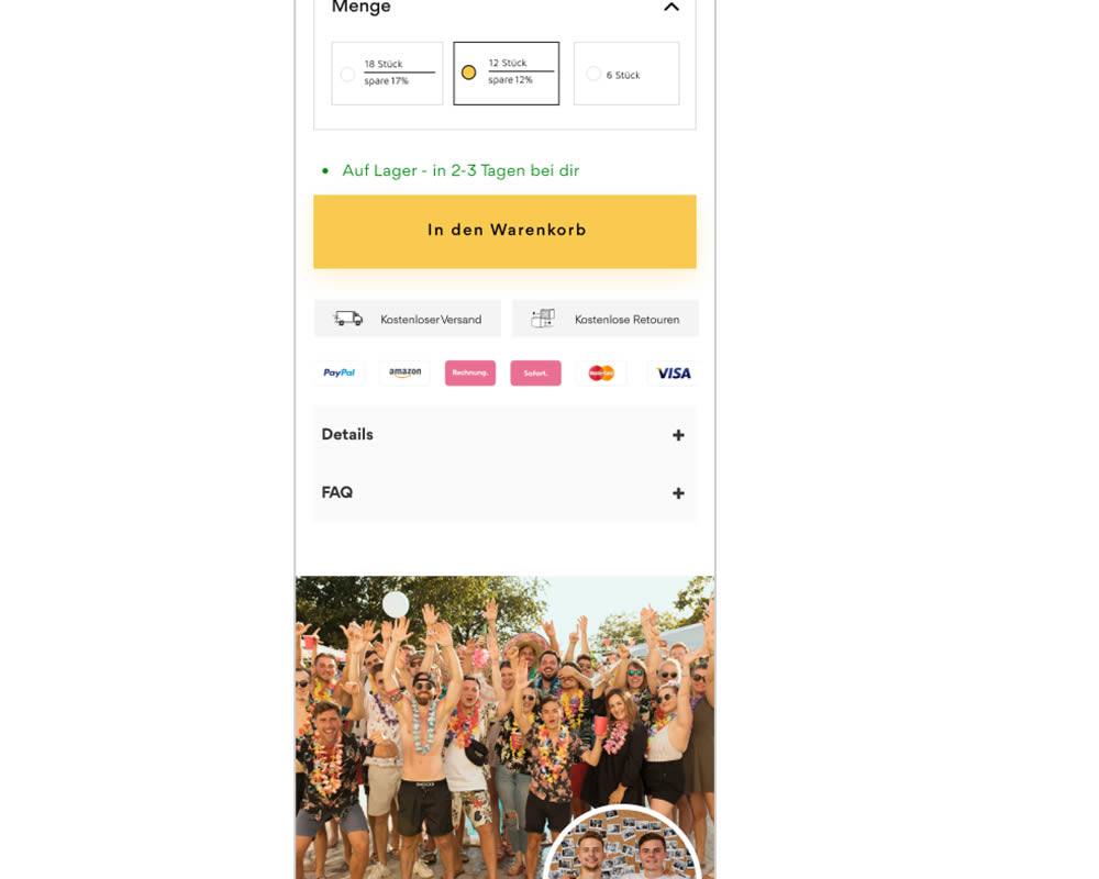
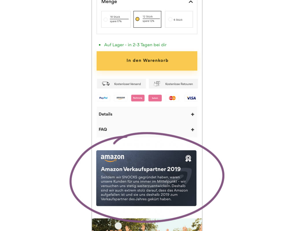
In this experiment, a simple Amazon badge was added on a product page. The translated (Google) language read: "Since we founded snocks, our customers have always been our focus - we are constantly trying to develop further. That's why we're extremely proud that Amazon attracted attention and that they named us Sales Partner of the Year in 2019."
Test #384 on
Mariemur.com
by  Gleb Hodorovskiy
Nov 17, 2021
Mobile
Shopping Cart
X.X%
Sales
Gleb Tested Pattern #103: Money Back Guarantee On Mariemur.com
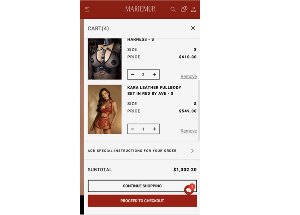
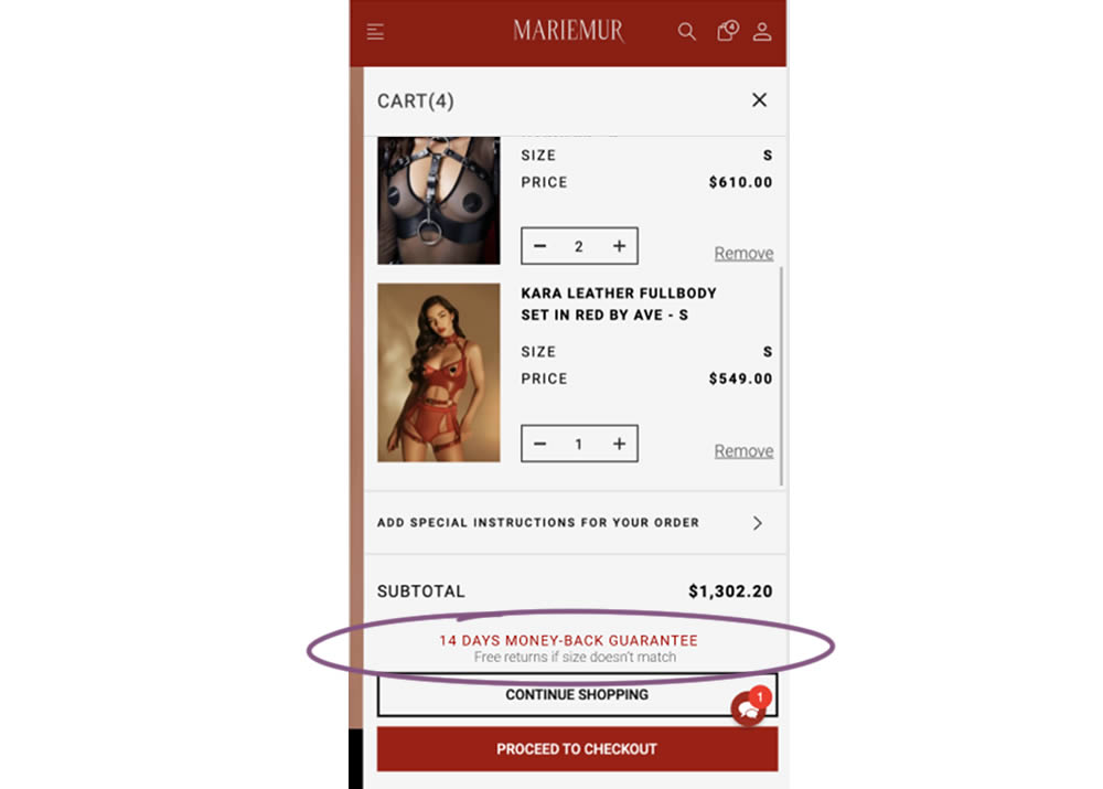
In this experiment from Conversionrate.store, a 14 day money back guarantee was added to a shopping cart of a lingerie online store. Secondary text further elaborated this with the following copy "Free returns if size doesn’t match". Impact on transactions was measured.
Test #382 on
Snocks.com
by  Samuel Hess
Oct 31, 2021
Desktop
Product
X.X%
Sales
Samuel Tested Pattern #43: Long Titles On Snocks.com
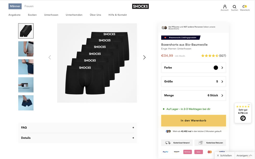
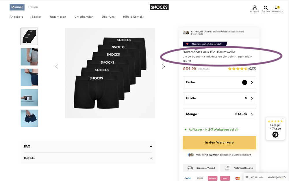
In this experiment, the variation contained a simple text change that described the quality of the product. According to Google Translate the text changed from "tight men's underpants" (control) to "are so comfortable that you don't feel them when you wear them" (variation).
Test #380 on
Getninjas.com.br
by  Rodolfo Lugli
Oct 27, 2021
Desktop
Mobile
Home & Landing
X.X%
Leads
Rodolfo Tested Pattern #21: What It's Worth On Getninjas.com.br


In this experimemt, the average $ gain from a performed service category was shown on a landing page. Impact on leads was measured (people who would be signing up to offer a particular service).
Test #377 on
Adoramapix.com
by  Jakub Linowski
Sep 30, 2021
Desktop
Shopping Cart
X.X%
Sales
Jakub Tested Pattern #121: Free Shipping On Adoramapix.com
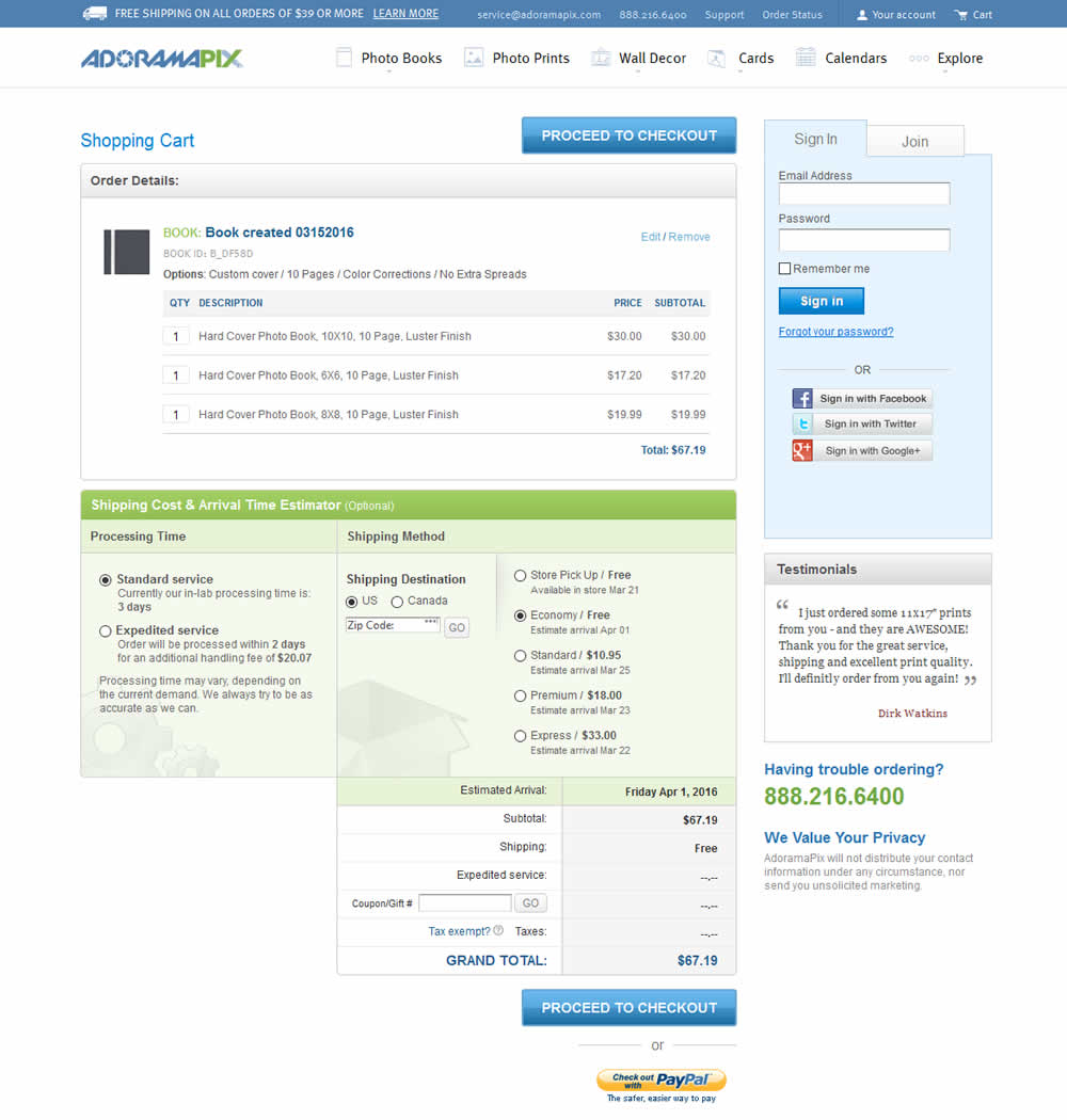
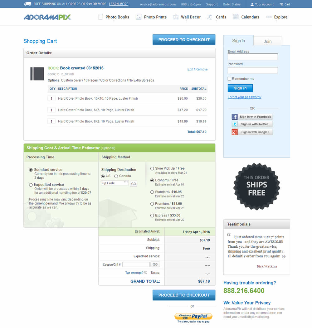
In this experiment, a big "free shipping" badge was added and defaulted to when available. Impact on progression to checkouts and completed sales was measured.
Test #376 on
Snocks.com
by  Samuel Hess
Sep 29, 2021
Mobile
Desktop
Product
X.X%
Sales
Samuel Tested Pattern #15: Bulleted Reassurances On Snocks.com
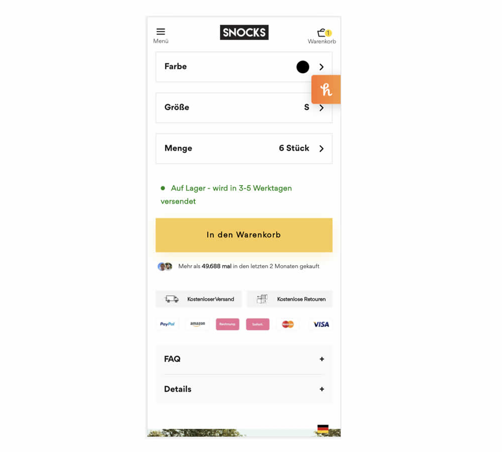
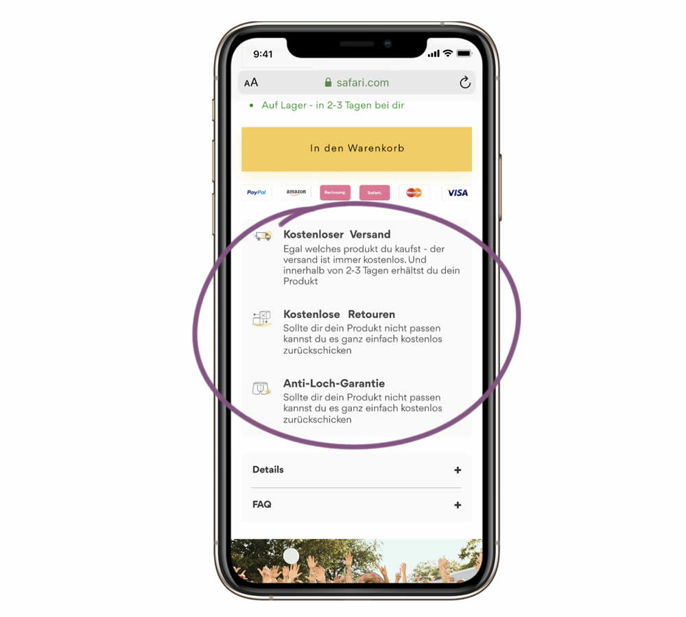
In this experiment, a series of reassurances were added just below the add to cart button. These included: "free shipping", "free returns" and an "anti-hole guarantee". The test ran on the product page of an socks ecommerce company. Impact on sales was measured.
Test #373 on
Backstage.com
by  Stanley Zuo
Sep 06, 2021
Mobile
Listing
X.X%
Sales
Stanley Tested Pattern #32: Condensed List On Backstage.com
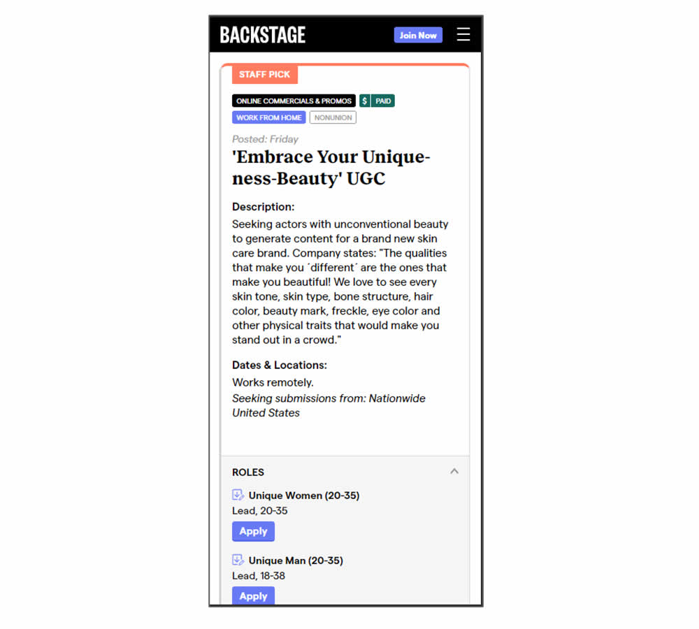
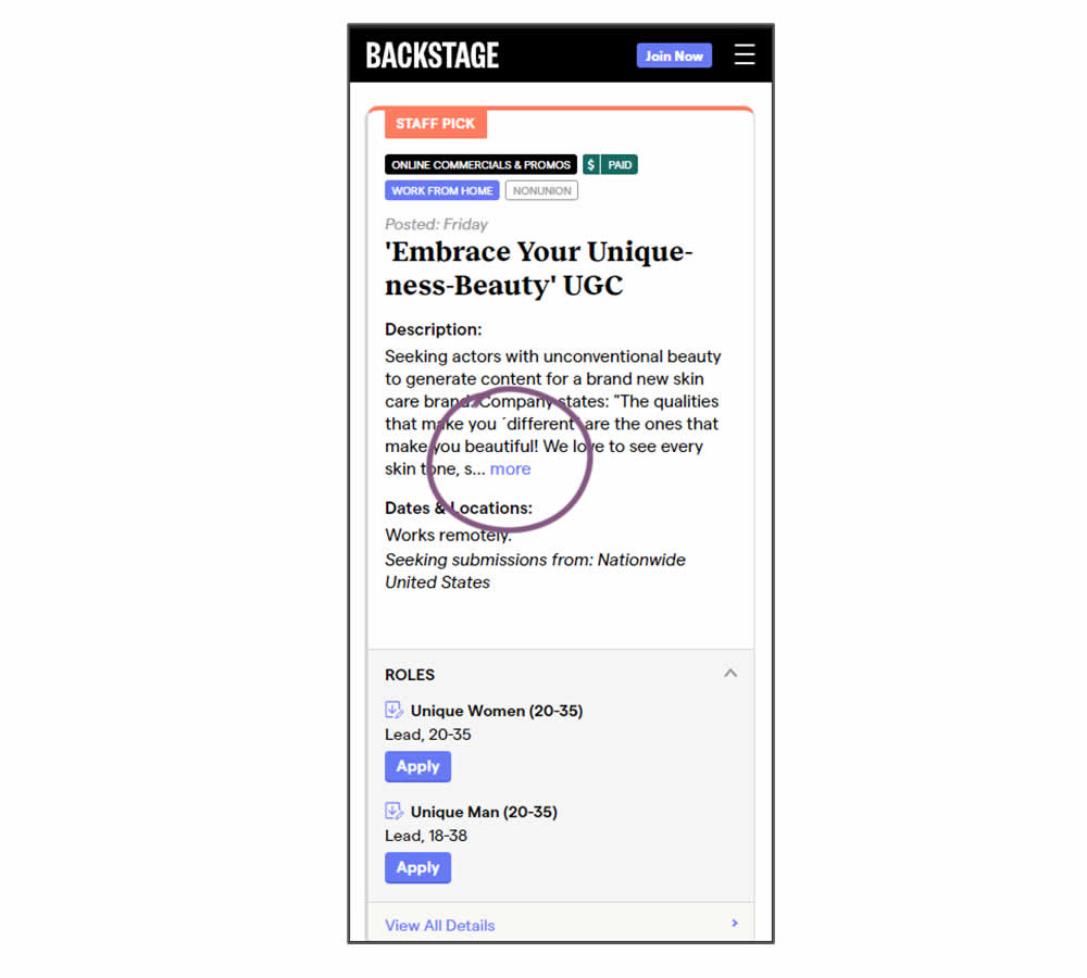
In this experiment, listing descriptions were shortened dynamically using exposable "more" links. This way, the variation showed shorter listings and therefore more listings per screens. Impact on listing clicks (progression) along with membership starts was measured.
Test #370 on
Thomasnet.com
by  Julian Gaviria
Aug 16, 2021
Desktop
Mobile
Listing
X.X%
Progression
Julian Tested Pattern #88: Action Button On Thomasnet.com

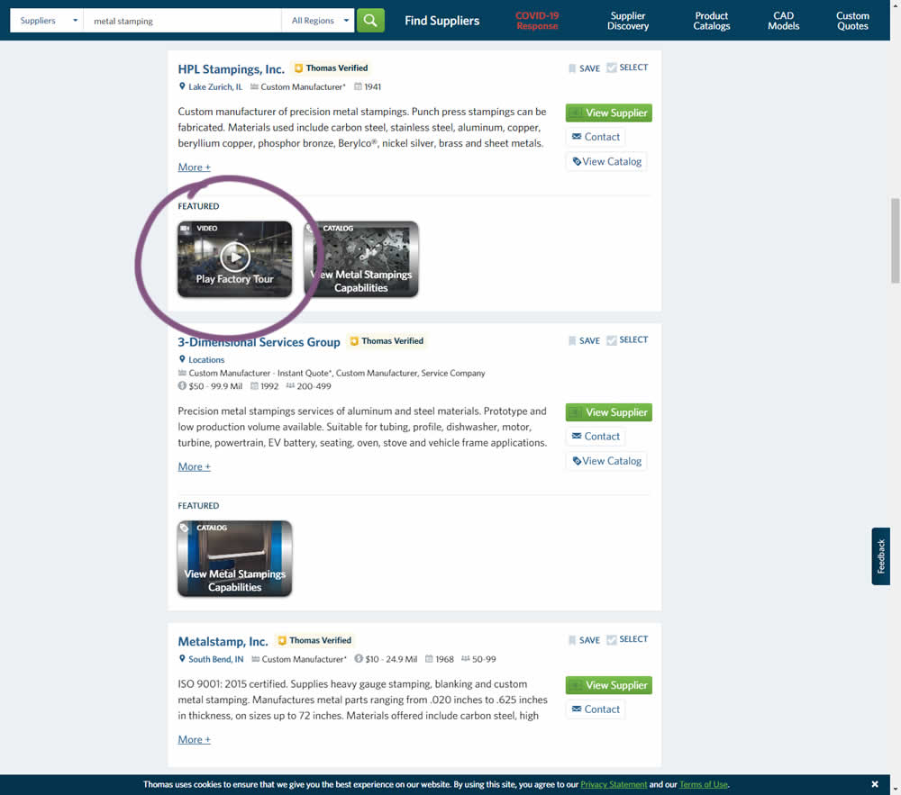
This experiment added the simple verb ("play") before the "factory video" label to encourage more video plays. Impact on progression / clicks was measured.
Test #369 on
Getninjas.com.br
by  Rodolfo Lugli
Aug 05, 2021
Desktop
Mobile
Home & Landing
X.X%
Leads
Rodolfo Tested Pattern #7: Social Counts On Getninjas.com.br
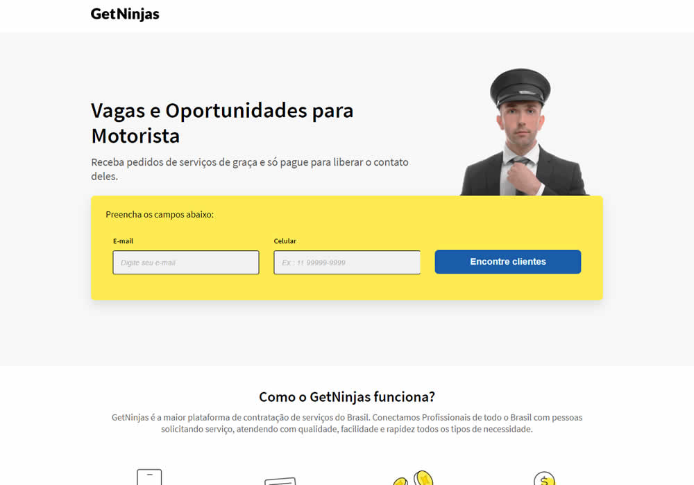
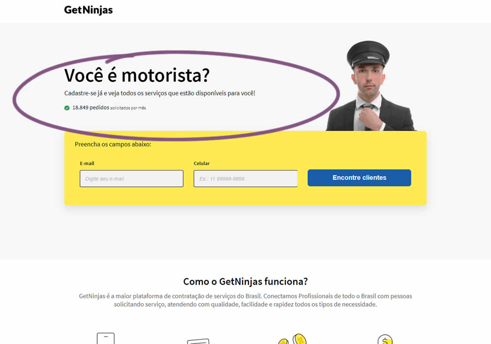
In this experimemt, the number of service requests per month were shown that people can expect after signing up in a given category. Impact on leads was measured (people who would be signing up to offer a particular service).
Test #367 on
Backstage.com
by  Stanley Zuo
Jul 22, 2021
Desktop
Mobile
Signup
X.X%
Sales
Stanley Tested Pattern #124: Confirmed Selection On Backstage.com
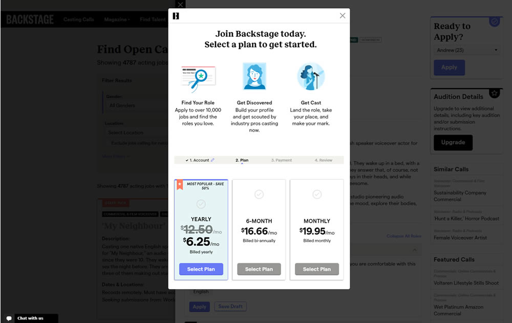
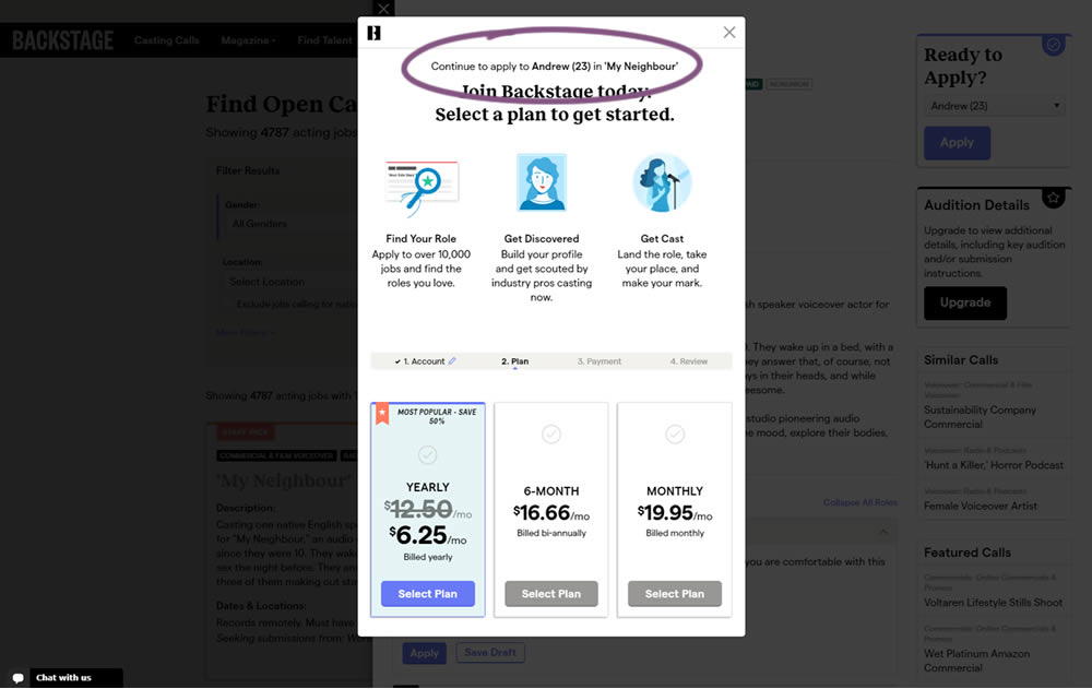
In this experiment, a confiming text was added at the top of a signup modal. The text reinforced the selection from a previous listing page, giving a good reason for continuing the signup process.
Test #365 on
Mvideo.ru
by  Andrey Andreev
Jul 13, 2021
Mobile
Product
X.X%
Sales
Andrey Tested Pattern #4: Testimonials On Mvideo.ru
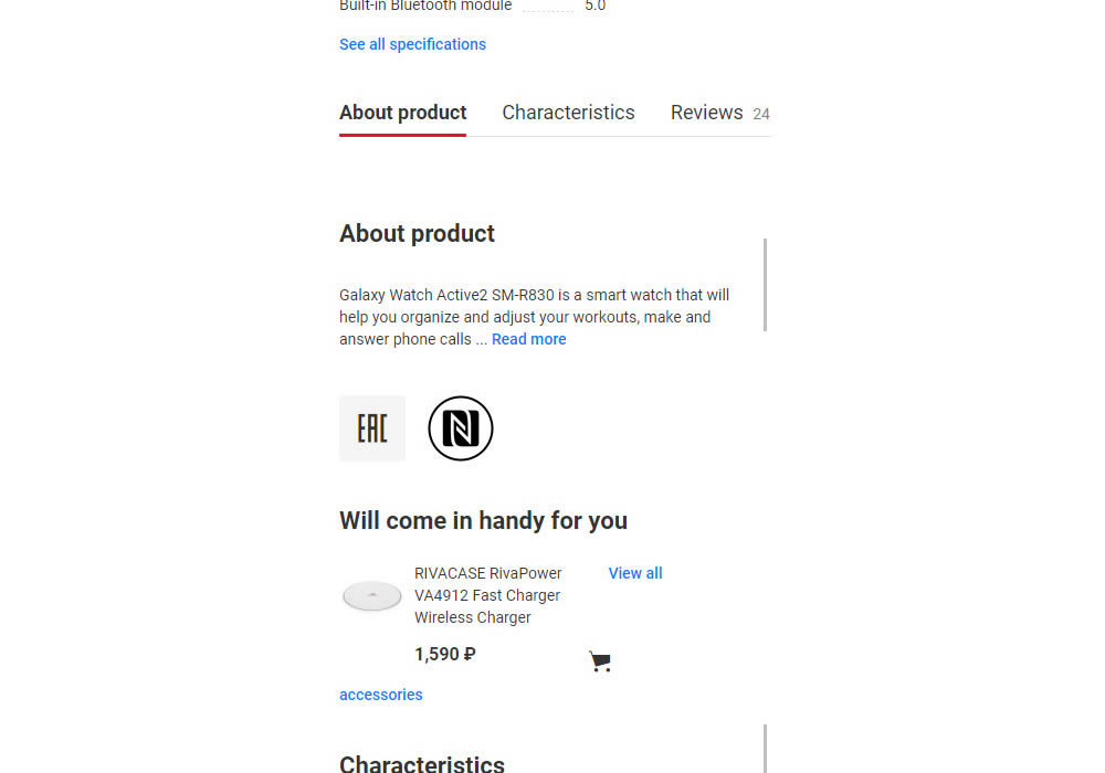
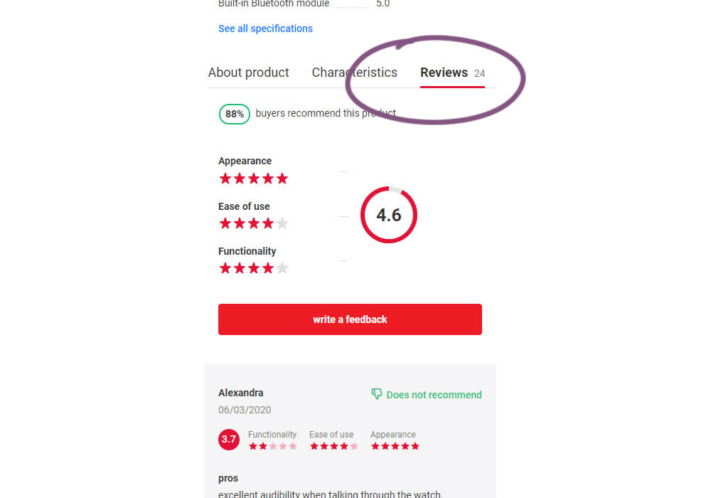
In this experiment, reviews on product pages were exposed completely. Instead of hiding them under a clickable tab, they were shown by default in the variation. Impact on sales was measured.
Test #364 on
Lotuscrafts.eu
by  Samuel Hess
Jul 06, 2021
Desktop
Product
X.X%
Sales
Samuel Tested Pattern #122: Zigzag Layout On Lotuscrafts.eu
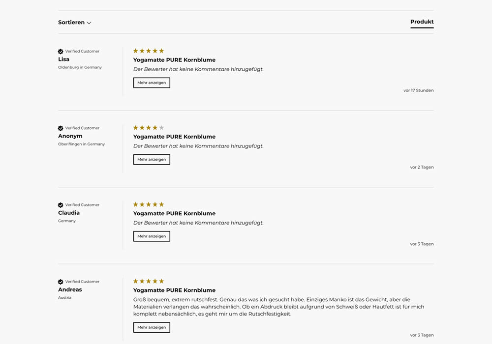
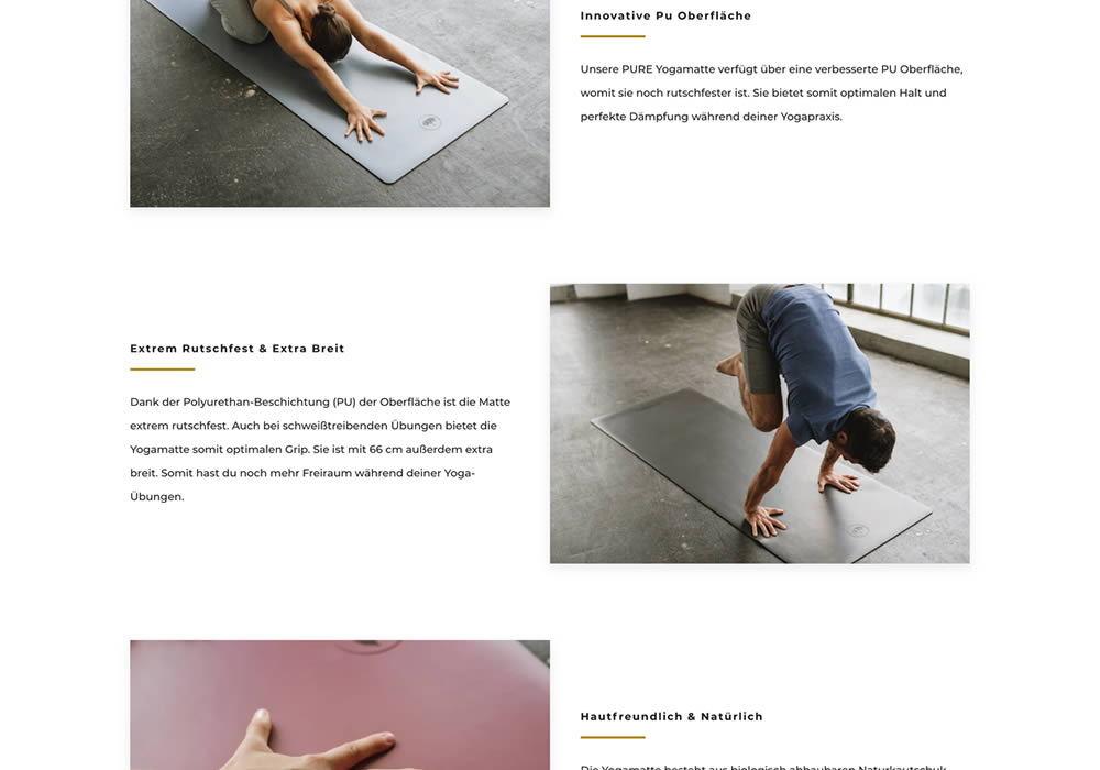
In this experiment, product descriptions or qualities were added using a zigzag layout pattern composed of photos and extra copy. This sections was appended between existing copy and testimonials. Some of the copy highlights included wording such as "innovative surface", "non-slip and wide", and "skin-friendly". Impact on adds-to-cart and sales was measured.
Test #362 on
Vivareal.com.br
by  Vinicius Barros Peixoto
Jun 23, 2021
Desktop
Mobile
Product
X.X%
Leads
Vinicius Tested Pattern #7: Social Counts On Vivareal.com.br
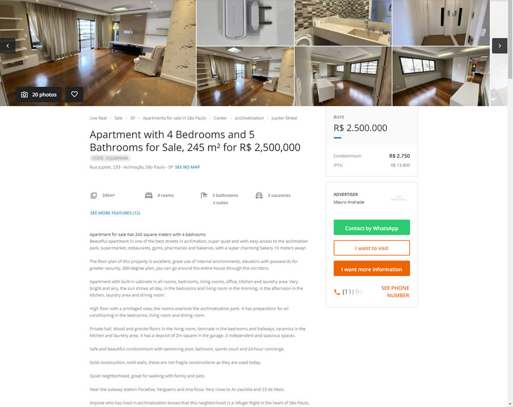
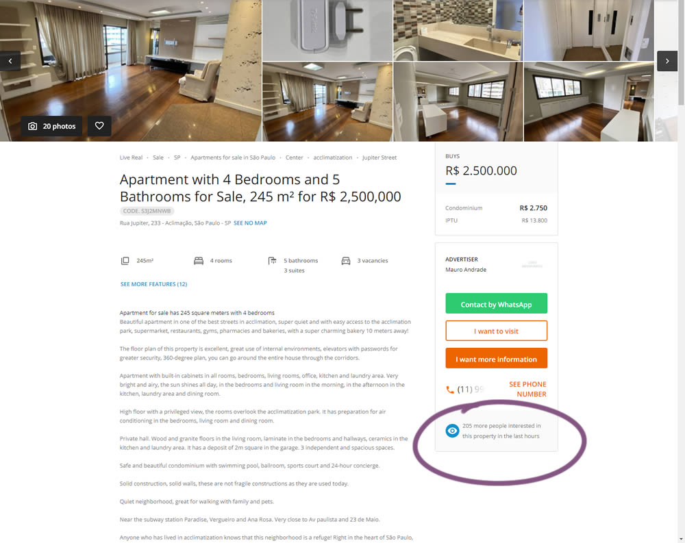
In this experiment, the number of recent property views was displayed under the call to action. Impact on overall lead generation was measured. (Translated using Google from Brazilian Portuguese.)