All Latest 620 A/B Tests
MOST RECENT TESTS
Test #649 on
Online.metro-cc.ru
by  Andrey Andreev
Apr 28, 2026
Desktop
Mobile
Global
X.X%
Sales
Andrey Tested Pattern #82: Onboarding Callouts On Online.metro-cc.ru
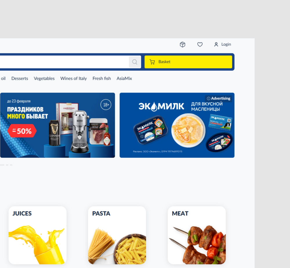
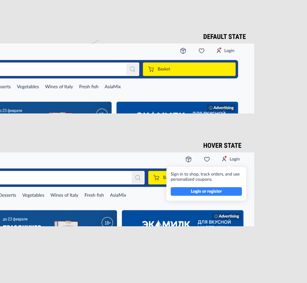
In this experiment, a red dot was added to the login link, along with a hover state that clarified the benefits of doing so. Impact on adds to cart and sales was measured.
Which A Or B Actually Wins? Find Out Before You Test.
Members see every test result — the winners, the flat ones, and the losers — along with exact effects and sample sizes. Use it to estimate your tests and prioritize by probability, not gut feel. Start every experiment with the odds on your side.
Test #647 on
by  Jakub Linowski
Apr 27, 2026
Mobile
Product
X.X%
Sales
Jakub Tested Pattern #79: Product Highlights
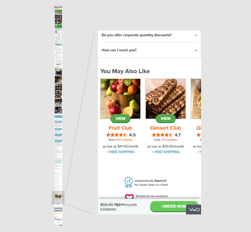
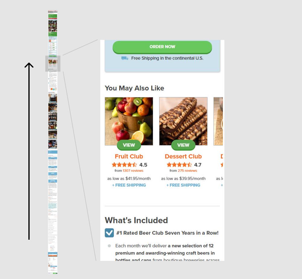
In this experiment, a set of 5 alternative product recommendations were moved from the very bottom of the page (control) to the top (variation). These "You May Also Like " recommendations were moved just above the existing product descriptions. Impact on adds to cart and sales was measured.
Test #646 on
by  Jakub Linowski
Apr 25, 2026
Desktop
Product
X.X%
Sales
Jakub Tested Pattern #79: Product Highlights
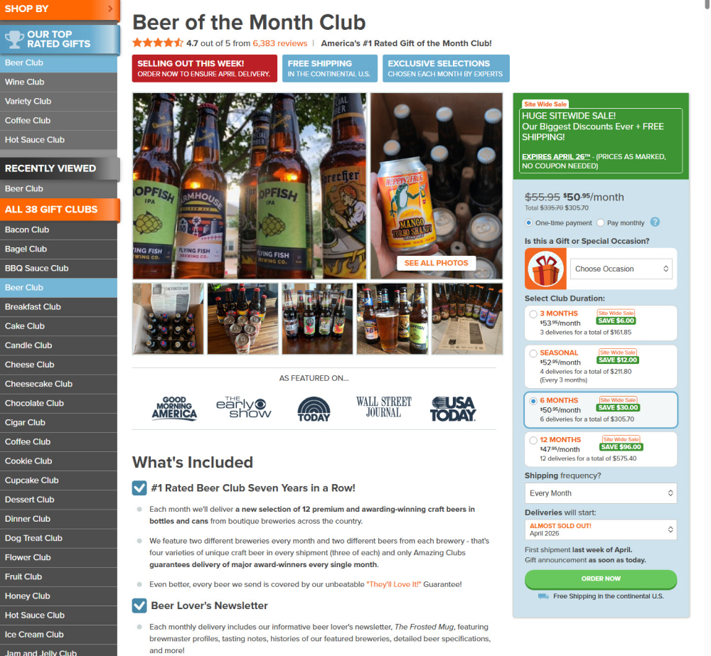
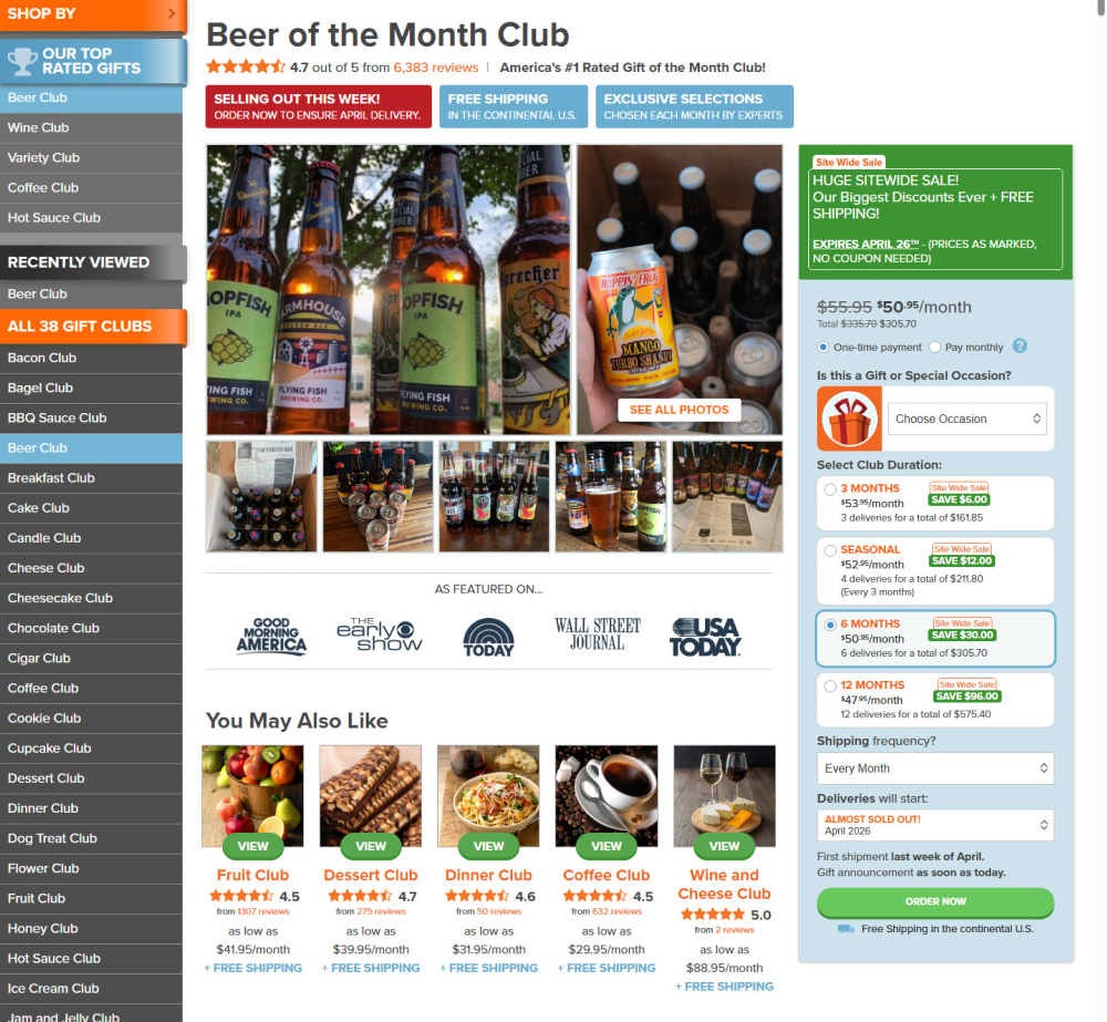
In this experiment, a set of 5 alternative product recommendations were moved from the very bottom of the page (control) to the top (variation). These "You May Also Like " recommendations were moved just above the existing product descriptions. Impact on adds to cart and sales was measured.
Test #644 on
Obsbygg.no
by  Joachim Furuseth
Apr 16, 2026
Desktop
Listing
X.X%
Progression
Joachim Tested Pattern #34: Open In A New Tab On Obsbygg.no
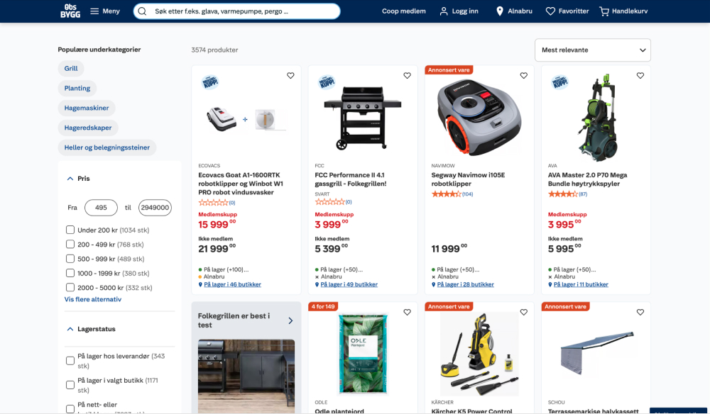
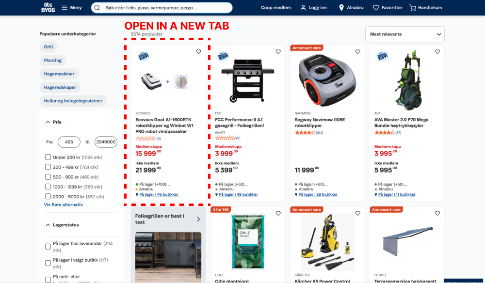
This experiment ran on desktop only, on all our regular product listing and search result page. In the control, clicking on products would open them up in the same page, whereas in the variation, the links opened in a new tab. Impact on adds-to-cart were measured.
Test #645 on
Obs.no
by  Joachim Furuseth
Apr 16, 2026
Desktop
Listing
X.X%
Progression
Joachim Tested Pattern #34: Open In A New Tab On Obs.no
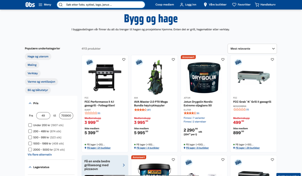
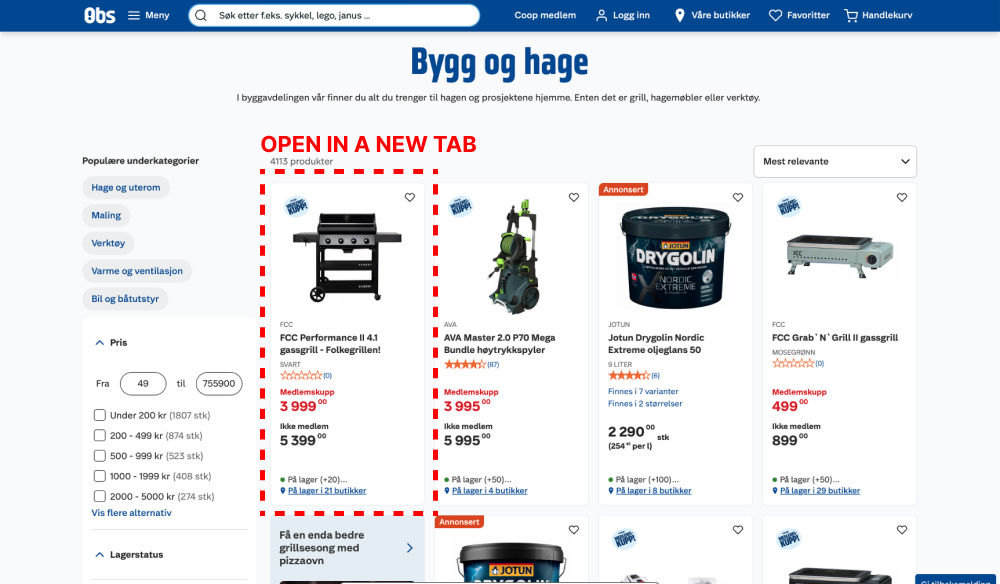
This experiment ran on desktop only, on all our regular product listing and search result page. In the control, clicking on products would open them up in the same page, whereas in the variation, the links opened in a new tab. Impact on adds-to-cart were measured.
Test #643 on
Backstage.com
by  Stanley Zuo
Mar 28, 2026
Desktop
Mobile
Home & Landing
X.X%
Signups
Stanley Tested Pattern #135: Product Categories On Backstage.com

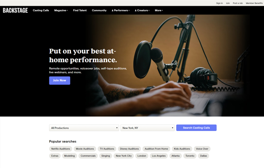
In this experiment, more popular search categories (pills) were shown on the homepage based on analyzed search volume. Impact on searches and email subscriptions were measured.
Test #642 on
by  Frazer Mawson
Mar 27, 2026
Mobile
Shopping Cart
X.X%
Sales
Frazer Tested Pattern #41: Sticky Call To Action
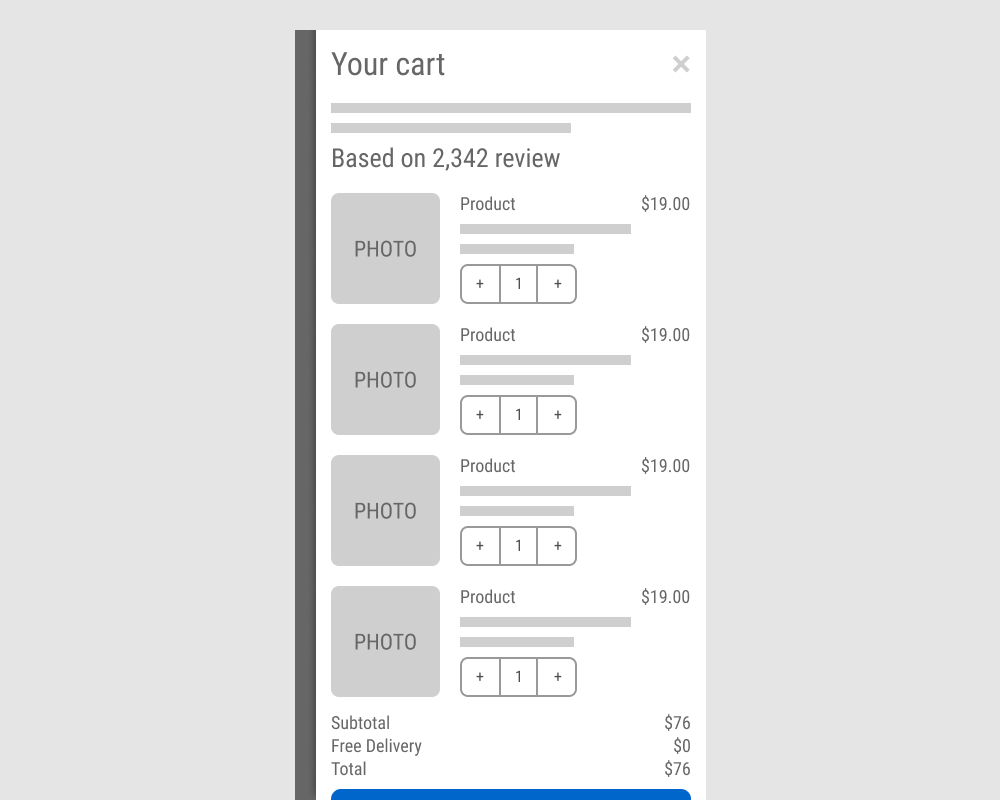
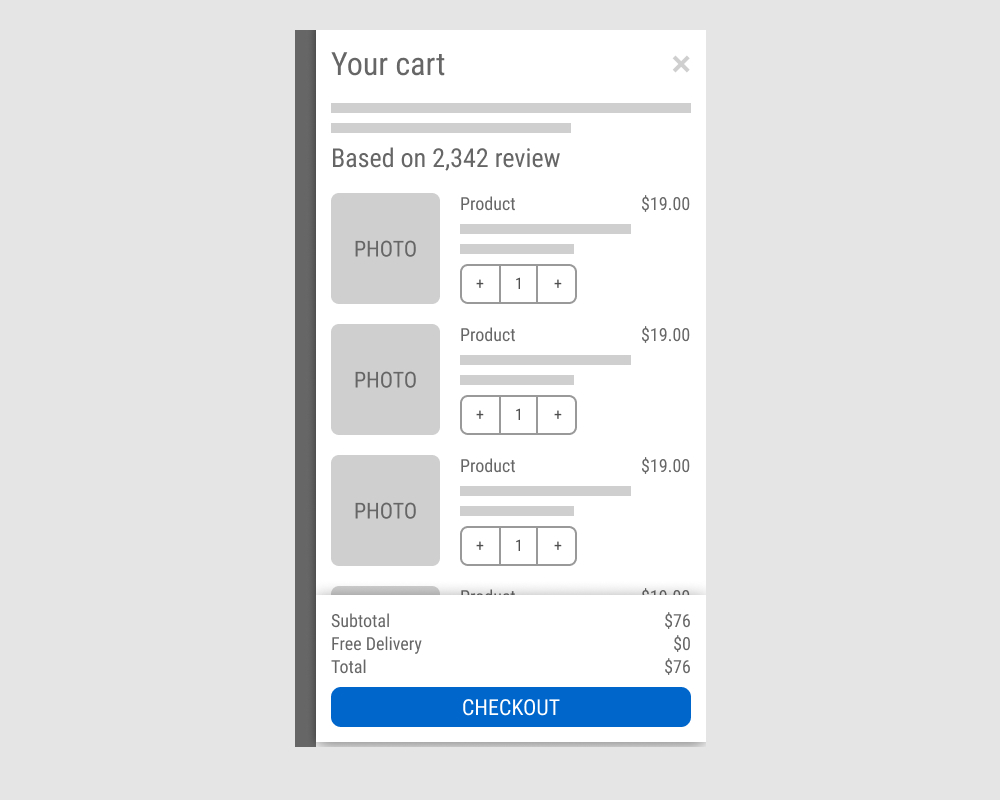
The A version showed a non-sticky checkout button at the bottom of a flyout cart. The B variation added a sticky bar with a price summary and checkout button, keeping it always visible. Impact on sales was measured.
Test #641 on
Kay.com
by  Craig Kistler
Mar 26, 2026
Desktop
Mobile
Global
X.X%
Sales
Craig Tested Pattern #130: Less Or More Visible Offer Pages On Kay.com
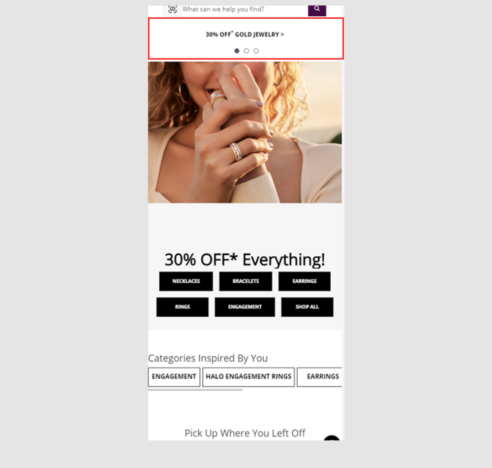
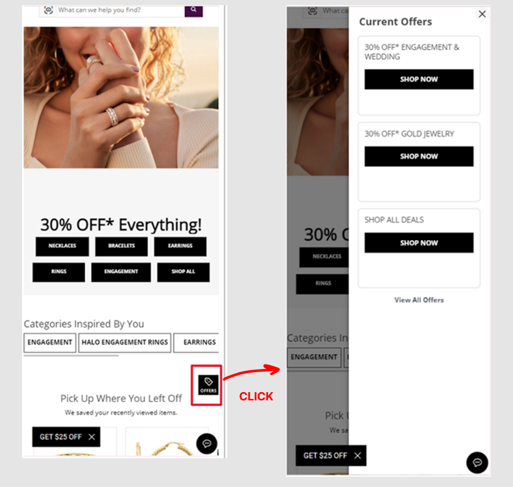
A global flyout drawer was added that consolidated sale promotions into one centralized location, replacing the customary placement of promotions throughout the site.
Test #640 on
Obs.no
by  Joachim Furuseth
Mar 24, 2026
Desktop
Checkout
X.X%
Sales
Joachim Tested Pattern #1: Remove Coupon Fields On Obs.no
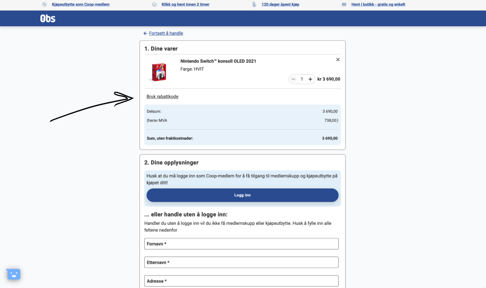
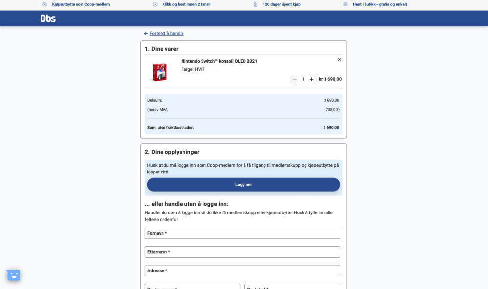
The control had a clickable link "Use discount code" which would reveal an input field for a coupon code. The variation removed this link and input field. Impact on purchases was measured. (Desktop only)
Test #639 on
Obs.no
by  Joachim Furuseth
Mar 23, 2026
Mobile
Checkout
X.X%
Sales
Joachim Tested Pattern #1: Remove Coupon Fields On Obs.no
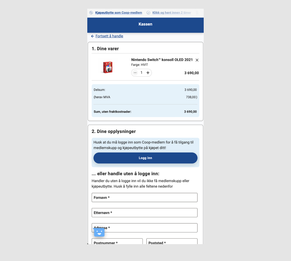
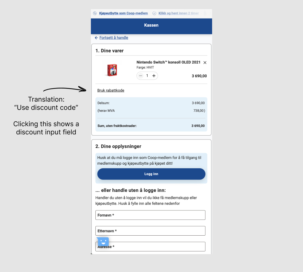
The control had a clickable link "Use discount code" which would reveal an input field for a coupon code. The variation removed this link and input field. Impact on purchases was measured. (Mobile only)
Test #638 on
by  Frazer Mawson
Feb 28, 2026
Mobile
Product
X.X%
Sales
Frazer Tested Pattern #41: Sticky Call To Action
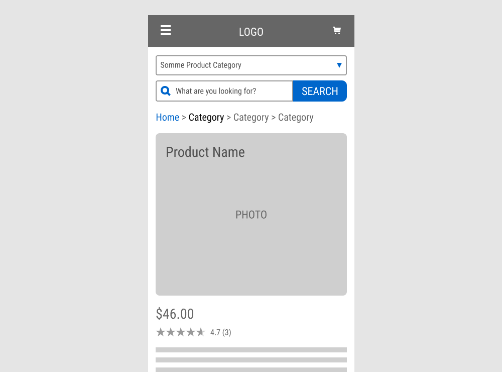
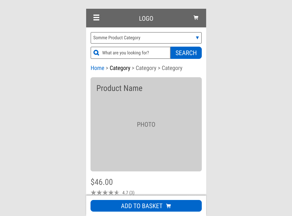
A floating Add to Basket button was added to a product page. Impact on sales was measured.
Test #637 on
Online.metro-cc.ru
by  Andrey Andreev
Feb 26, 2026
Mobile
Listing
X.X%
Sales
Andrey Tested Pattern #137: Visible Filters On Online.metro-cc.ru

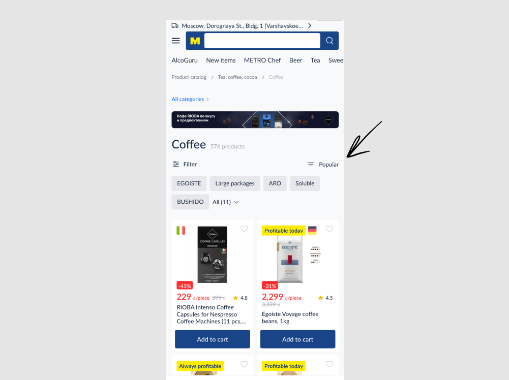
In this experiment, the sorting link (defaulting to popular) was swapped with the filter one. In the control, the sorting appeared on the left with the filter on the right, whereas in the variation these two were flipped. Impact on adds to cart and sales were measured.
Test #636 on
Backstage.com
by  Stanley Zuo
Feb 24, 2026
Desktop
Mobile
Pricing
X.X%
Progression
Stanley Tested Pattern #114: Less Or More Visible Prices On Backstage.com
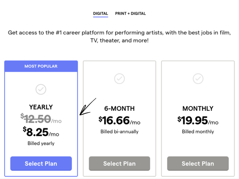
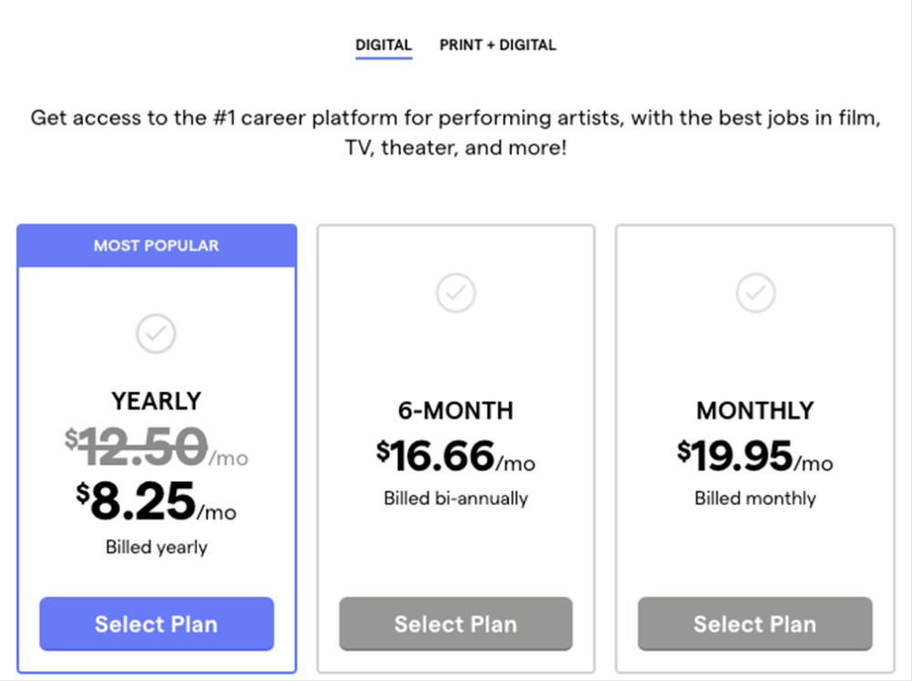
In this experiment, a larger vs smaller font size for the yearly price was tested. Impact on annual subscription clicks was measured. (The experiment has been inverted to fit the pattern.)
Test #634 on
Obsbygg.no
by  Joachim Furuseth
Feb 18, 2026
Mobile
Checkout
X.X%
Sales
Joachim Tested Pattern #1: Remove Coupon Fields On Obsbygg.no
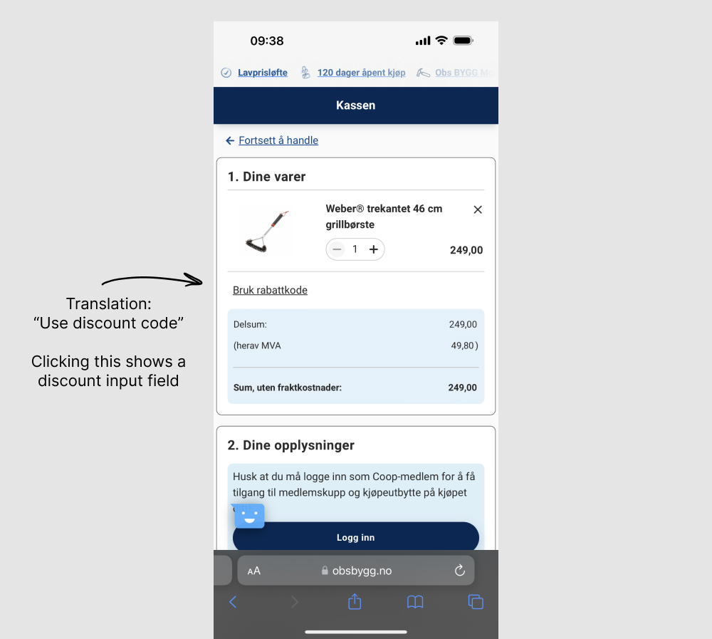
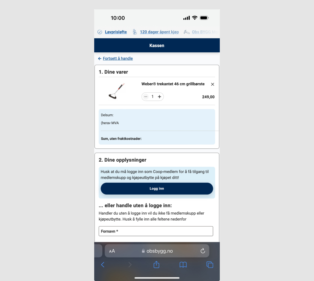
The control had a clickable link "Use discount code" which would reveal an input field for a coupon code. The variation removed this link and input field. Impact on purchases was measured. (Mobile only)
Test #635 on
Obsbygg.no
by  Joachim Furuseth
Feb 18, 2026
Desktop
Checkout
X.X%
Sales
Joachim Tested Pattern #1: Remove Coupon Fields On Obsbygg.no
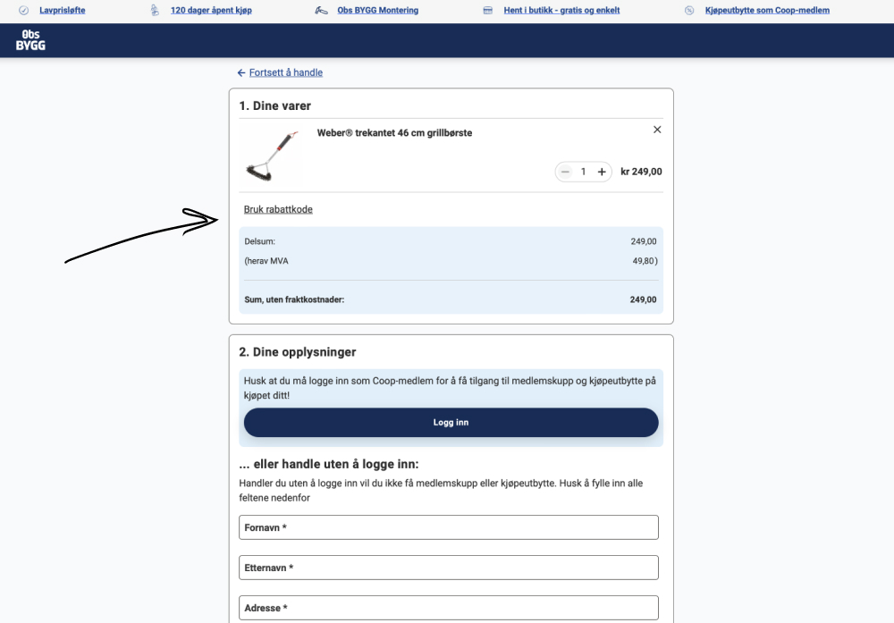
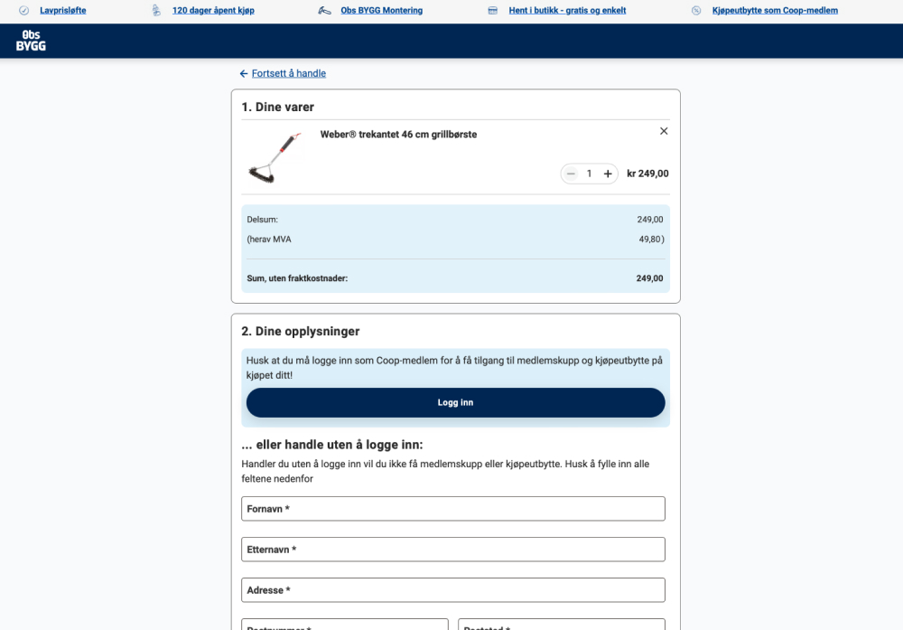
The control had a clickable link "Use discount code" which would reveal an input field for a coupon code. The variation removed this link and input field. Impact on purchases was measured. (Desktop only)
Test #633 on
Reverb.com
by  Nicholas Evans
Jan 31, 2026
Desktop
Mobile
Product
X.X%
Sales
Nicholas Tested Pattern #103: Money Back Guarantee On Reverb.com
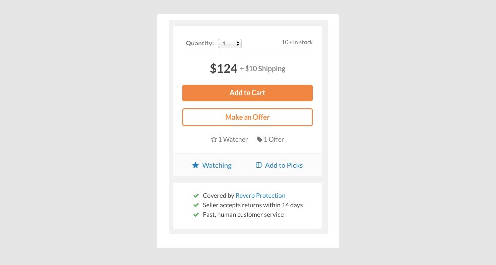
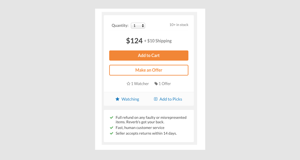
In this experiment, different reassurance messages were shown at the bottom of the add-to-cart widget on a product page. The variation emphasized full refunds for faulty or misrepresented items.
Test #632 on
Online.metro-cc.ru
by  Andrey Andreev
Jan 30, 2026
Desktop
Mobile
Checkout
X.X%
Sales
Andrey Tested Pattern #65: Add More For Extra Incentive On Online.metro-cc.ru
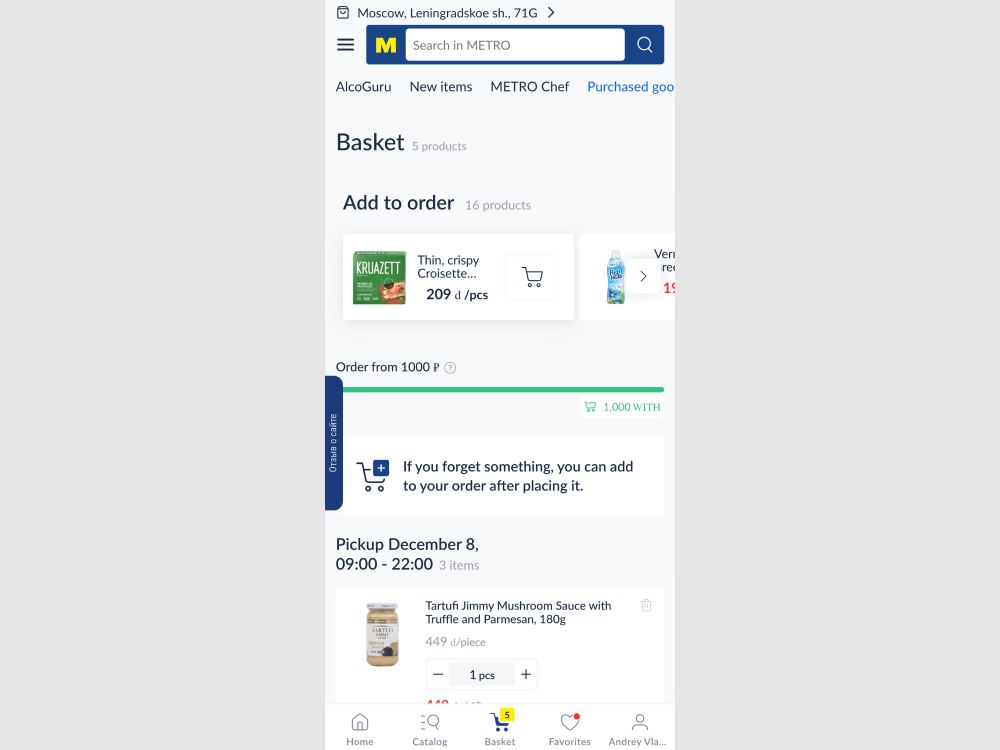
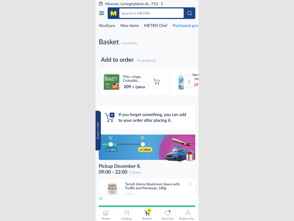
In this experiment, two changes were made to the checkout page: (1) the minimum basket size requirement was made more visible using a floating element, and (2) an additional threshold was introduced to encourage customers to add more items by offering a free gift at a higher spend level. The impact on sales was measured.
Test #631 on
by  Frazer Mawson
Jan 29, 2026
Mobile
Shopping Cart
X.X%
Sales
Frazer Tested Pattern #41: Sticky Call To Action
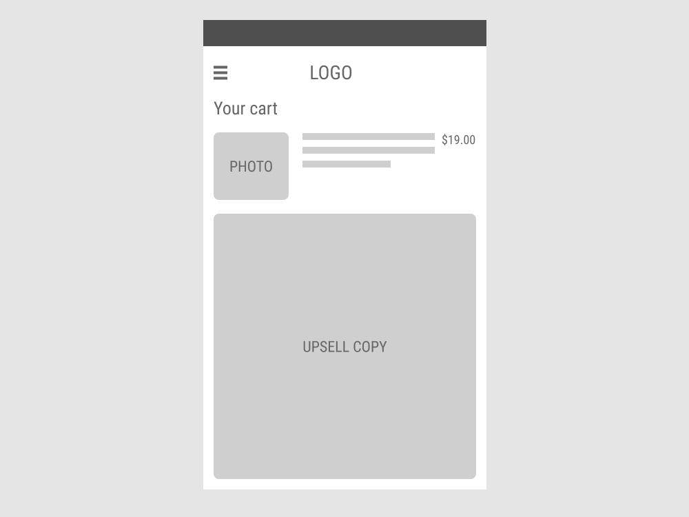
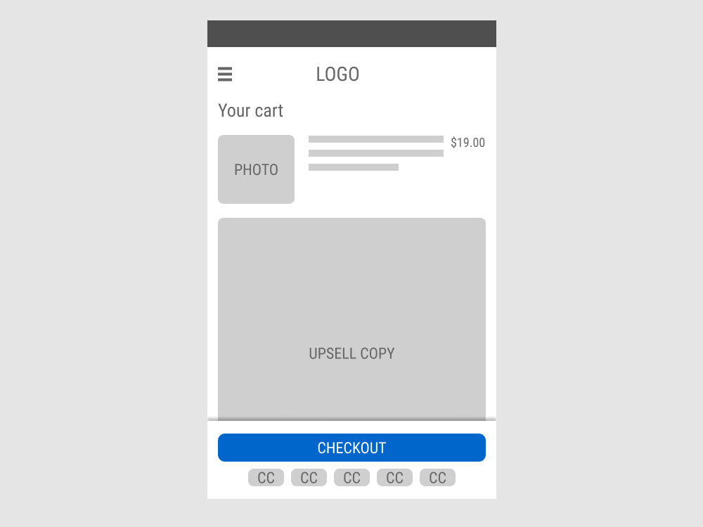
In this experiment, the shopping cart screen displayed a floating “Checkout” button with common credit card icons that directed users to the checkout page when clicked. In the control, the button was positioned inline, further down the page. Impact on progression to checkout and total sales were measured.
Test #630 on
Kay.com
by  Craig Kistler
Jan 27, 2026
Desktop
Mobile
Product
X.X%
Sales
Craig Tested Pattern #21: What It's Worth On Kay.com
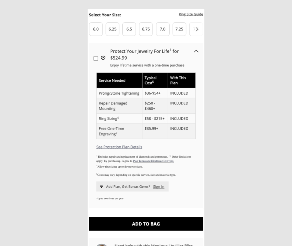
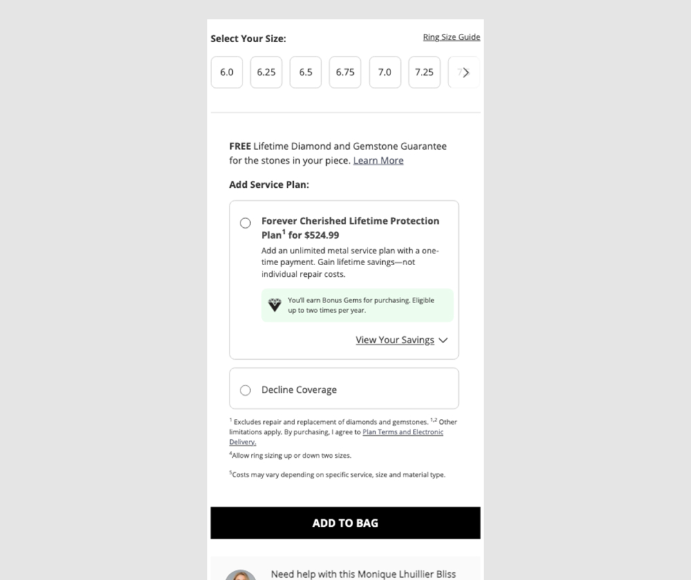
In this experiment, a pricing table (an upsell of product protection plan coverages) was tested against a more explicit yes/no toggle for including the plan. Impact was measured on adds to cart, orders, and upsell rate, using an 80/20 traffic split.
Test #629 on
by  Jakub Linowski
Jan 26, 2026
Desktop
Checkout
X.X%
Sales
Jakub Tested Pattern #98: Auto Suggest
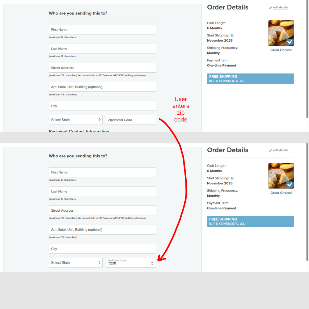
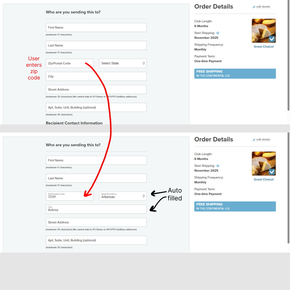
In this experiment (1) the zip code field position was moved up, right below the last name. And (2) entering the zip code would populate the state and city using an autofill API call. Impact on orders completed was measured.