All Latest 620 A/B Tests
MOST RECENT TESTS
Test #468 on
Umbraco.com
by  Lars Skjold Iversen
Apr 28, 2023
Desktop
Mobile
Home & Landing
X.X%
Progression
Lars Tested Pattern #6: Customer Star Ratings On Umbraco.com
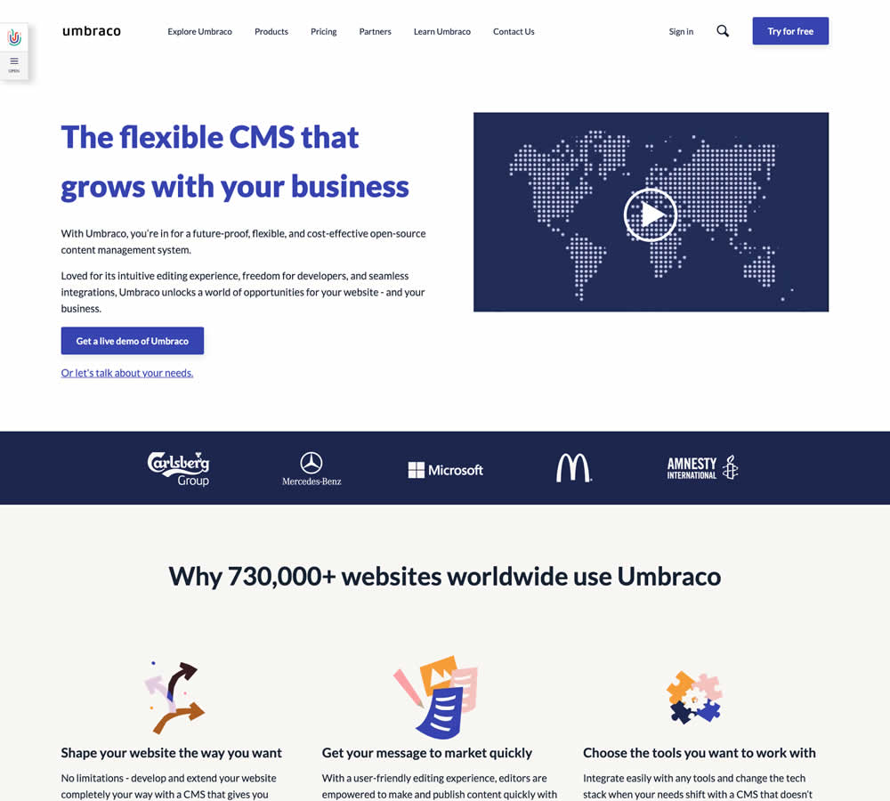
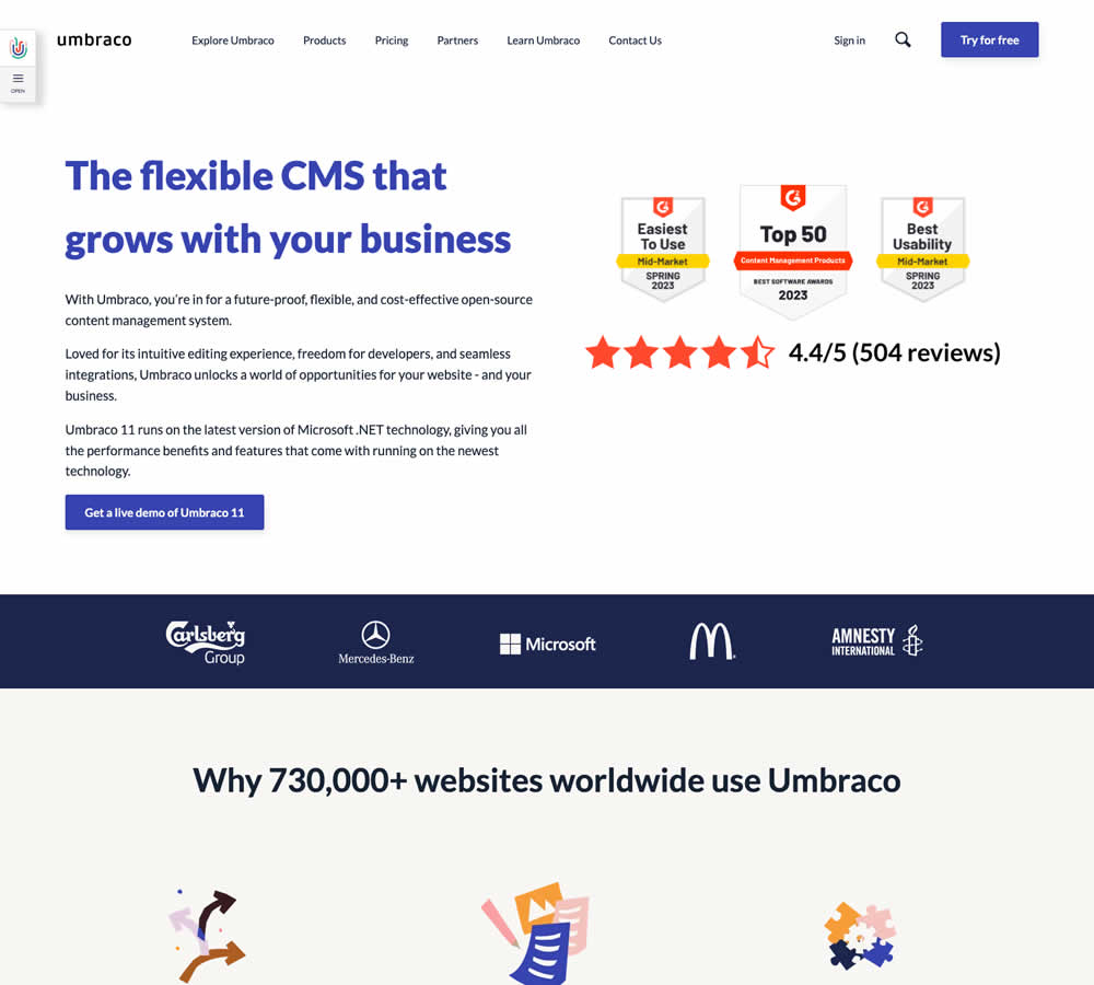
In this homepage experiment a number of changes were introduced - with perhaps the most prominent one being the replacement of a video component with customer review badges. Additional copy changes included reinforcement of the latest version number (v11) throughout the page, as well as a dedicated (v11) section in the middle of the page. Impact on demo signups was measured.
Which A Or B Actually Wins? Find Out Before You Test.
Members see every test result — the winners, the flat ones, and the losers — along with exact effects and sample sizes. Use it to estimate your tests and prioritize by probability, not gut feel. Start every experiment with the odds on your side.
Test #467 on
by  Jakub Linowski
Apr 27, 2023
Desktop
Mobile
Product
X.X%
Sales
Jakub Tested Pattern #108: Frequently Asked Questions

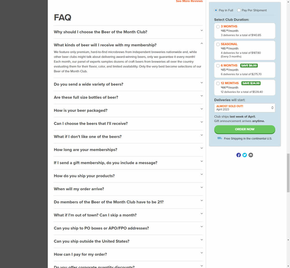
In this experiment, an FAQ section was added near the bottom of a long product page. The reviews were collapsed by default, but expandable upon clicking. Impact on adds-to-cart and sales was measured.
Test #466 on
Volders.de
by  Daria Kurchinskaia
Apr 26, 2023
Desktop
Signup
X.X%
Sales
Daria Tested Pattern #4: Testimonials On Volders.de

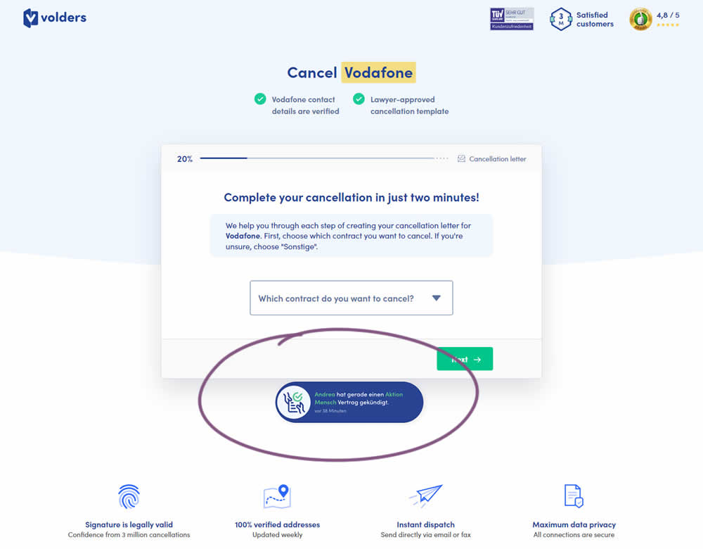
In this experiment, a social proof popups were added to the signup / funnel pages for a contract cancellation service. The added social testimonials appeared as other customers used the service, anywhere except on the final checkout page. Additionaly, the interval at which these messaged appeared was 60 seconds, and they were shown for 10s. The messages translated to "[Name] had recently canncelled a contract with [Company], in the last 38 minutes". Impact on sales was measured.
Test #465 on
by  Melina Hess
Apr 22, 2023
Desktop
Mobile
Product
X.X%
Revenue
Melina Tested Pattern #15: Bulleted Reassurances
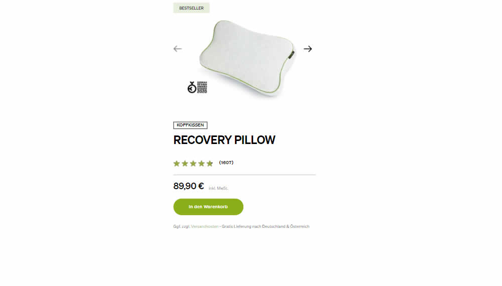
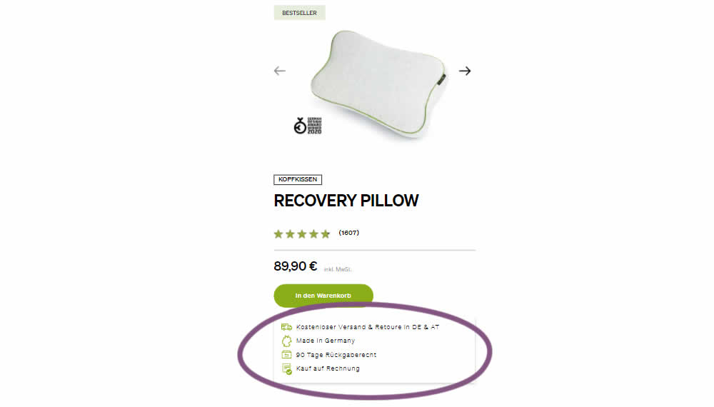
In this product detail page experiment, a number of reassurances were brought out visually in a lined or bulleted way. The 4 reassurances included: free shipping and returns; Made in Germany, 90 Day Returns; and Buy With Invoice (popular in Germany). Impact on revenue per user was measured. The control contained very feint copy (smaller and more subtle) about free shipping.
Test #464 on
Expertinstitute.com
by  Ardit Veliu
Mar 31, 2023
Desktop
Mobile
Home & Landing
X.X%
Leads
Ardit Tested Pattern #7: Social Counts On Expertinstitute.com
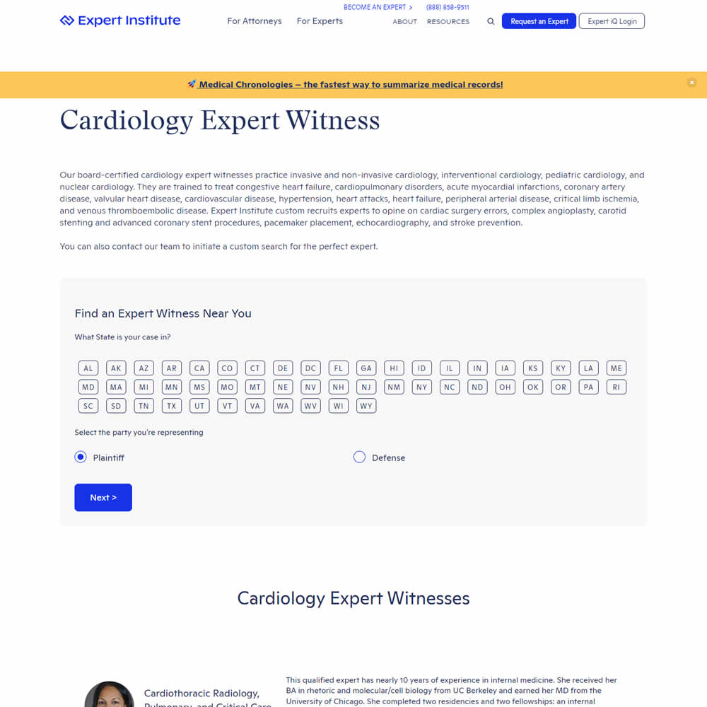
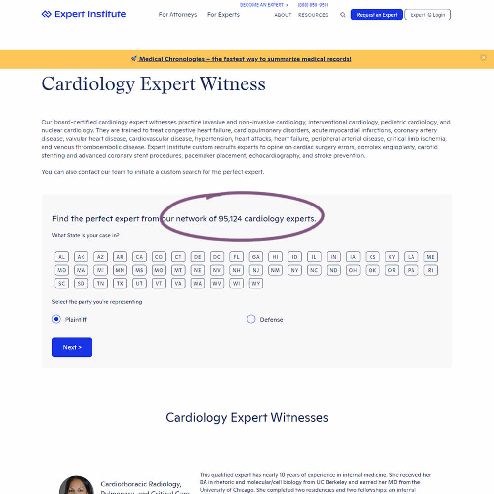
In this experiment, copy was added which showed the number of experts (in a given category) a person may gain access to after filling out a lead form. The context of this is a lead-gen landing page where people are seeking experts for legal purposes. Impact on initial progression (of a multi step form) and completed leads was measured.
Test #463 on
Volders.de
by  Daria Kurchinskaia
Mar 25, 2023
Desktop
Checkout
X.X%
Sales
Daria Tested Pattern #115: Pricing Comparison Table On Volders.de
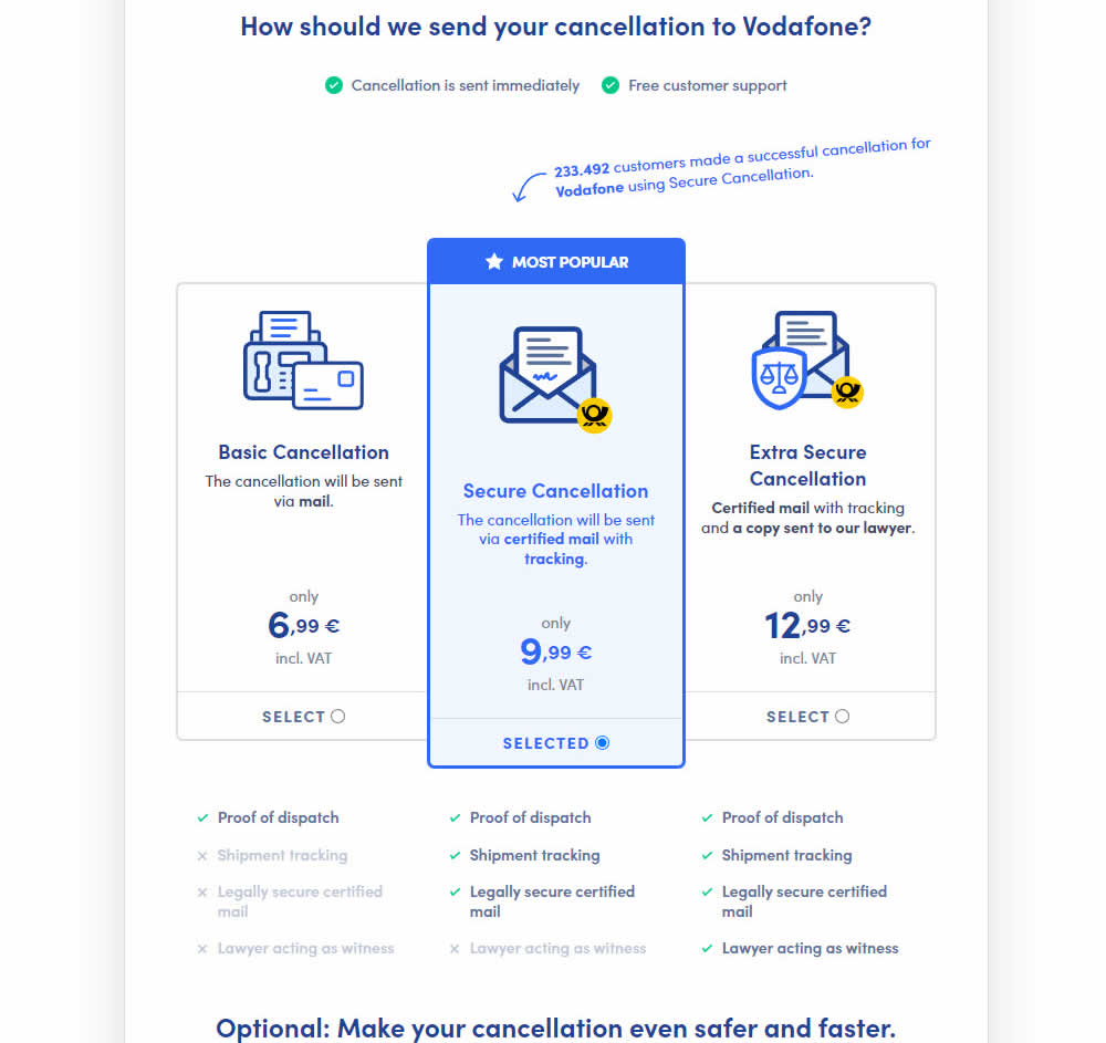
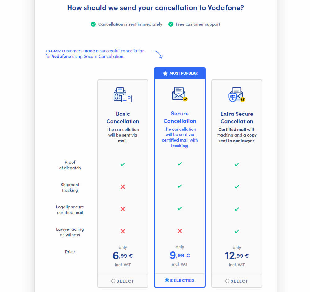
This experiment explored a pricing layout that enabled more feature comparisons. It also conveyed more clearly which features were missing between plans. The test has been inspired by this Netflix experiment. Impact on sales was measured.
Test #462 on
by  Jakub Linowski
Mar 24, 2023
Desktop
Mobile
Product
X.X%
Sales
Jakub Tested Pattern #128: Standard Or Superscript Price Format
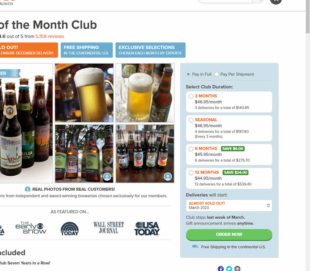
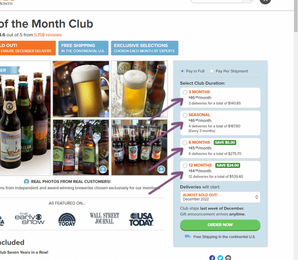
In this experiment, standard $ signs and cents were formatted into a smaller superscript. Impact on add-to-cart and sales was measured.
Test #461 on
Snocks.com
by  Melina Hess
Mar 23, 2023
Mobile
Product
X.X%
Sales
Melina Tested Pattern #15: Bulleted Reassurances On Snocks.com
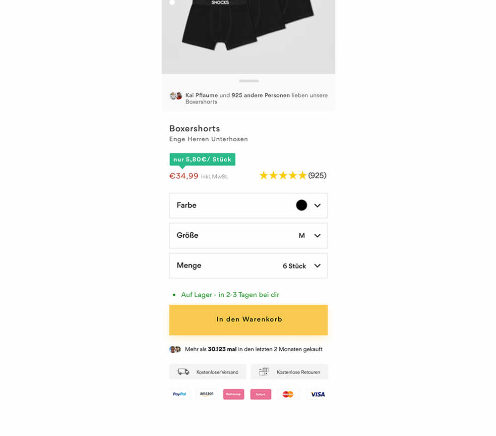
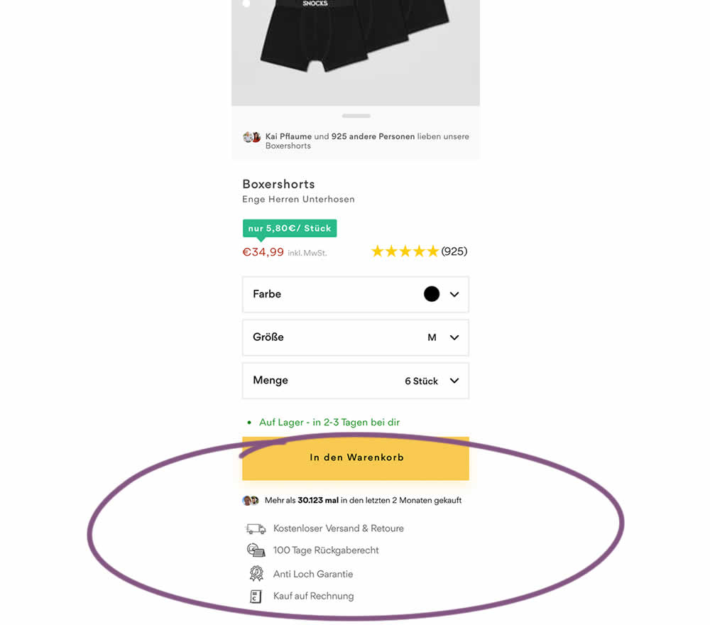
In this product detail page experiment, reassurances under the add-to-cart button were rearranged. The control contained copy about: free shipping and free returns formatted as two gray boxes, with a variety of payment methods and their corresponding logos underneath.
The variation used a more convention bulleted, line-by-line format. It also contained free shipping and returns, but also elaborated with "100 day returns", an "anti-hole guarantee", and "purchase with invoice" (perhaps more popular in Germany?). Impact on sales was measured.
Test #460 on
Backstage.com
by  Stanley Zuo
Mar 21, 2023
Mobile
Listing
X.X%
Sales
Stanley Tested Pattern #41: Sticky Call To Action On Backstage.com
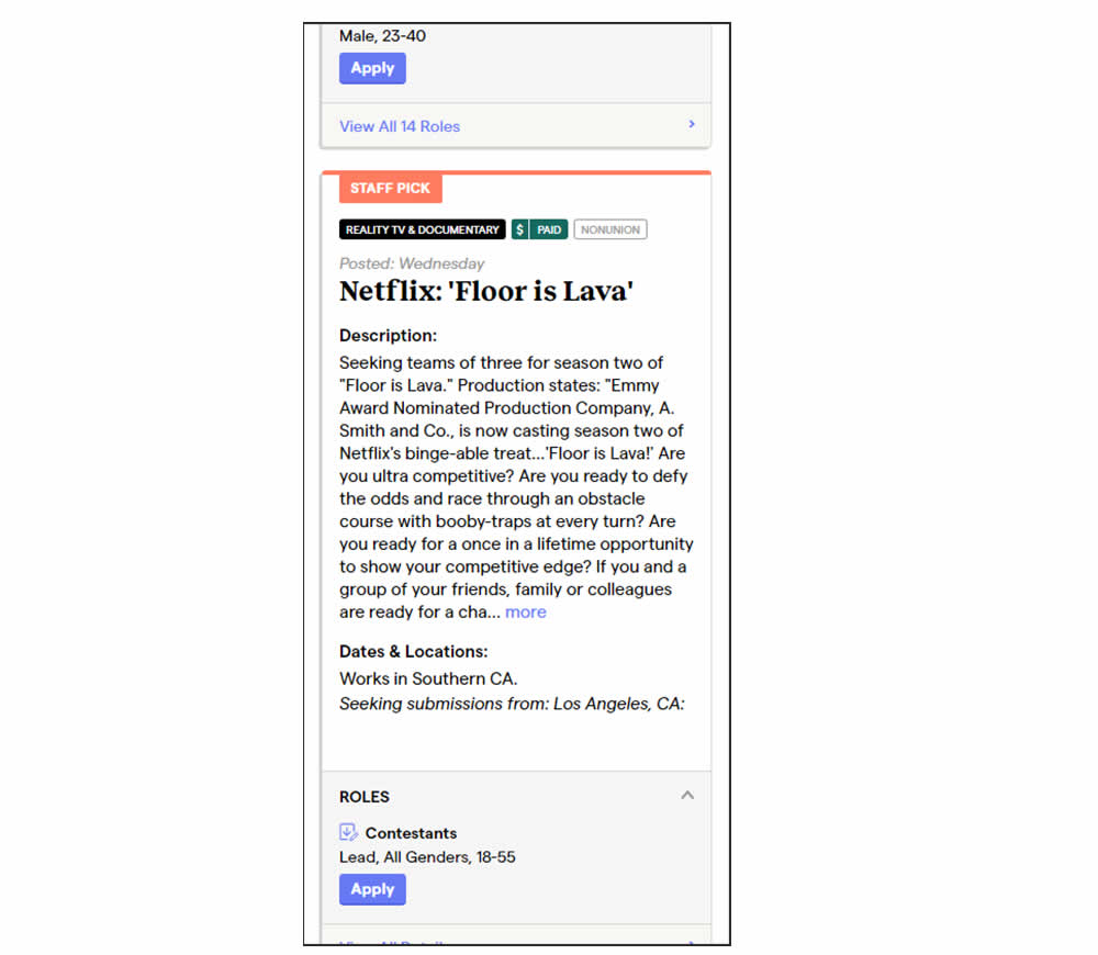
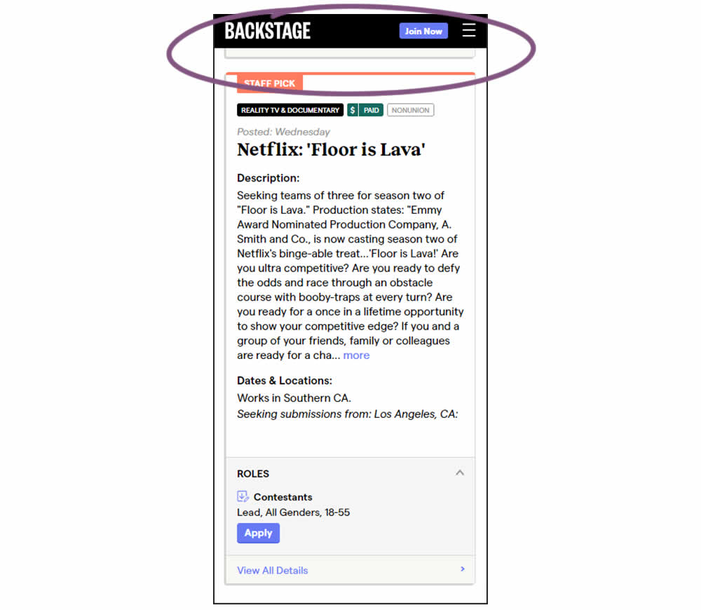
In this experiment, a floating top navigation was shown with a "Join" button. In the control, the navigation was only visible at the top of the page. Also keep in mind that signup starts were also triggered throughout multiple CTAs throughout the page and from particular job detail pages. The a/b test ran on a listing page of Backstage - a casting call job site. Impact on signups and checkouts was measured.
Test #459 on
Snocks.com
by  Melina Hess
Feb 28, 2023
Desktop
Mobile
Listing
X.X%
Sales
Melina Tested Pattern #36: Fewer Or More Results On Snocks.com
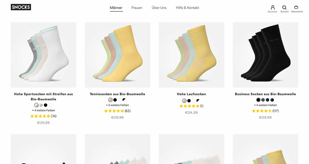
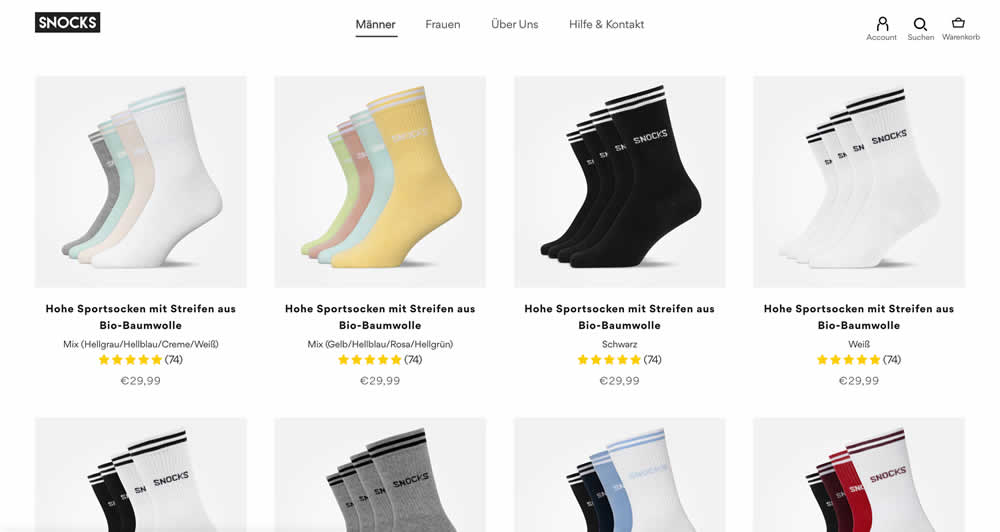
In this listing page experiment, color sets of the same product were tested against individual products with unique colors (with additional product tiles). Essentially, the A version here contained fewer product items (with color sets), while the B version contained more results and tiles (with grouped products). Impact on total sales was measured.
(The original control and variation was inverted, but was flipped to match the fewer or more results pattern).
Test #458 on
Volders.de
by  Daria Kurchinskaia
Feb 27, 2023
Desktop
Mobile
Checkout
X.X%
Sales
Daria Tested Pattern #103: Money Back Guarantee On Volders.de
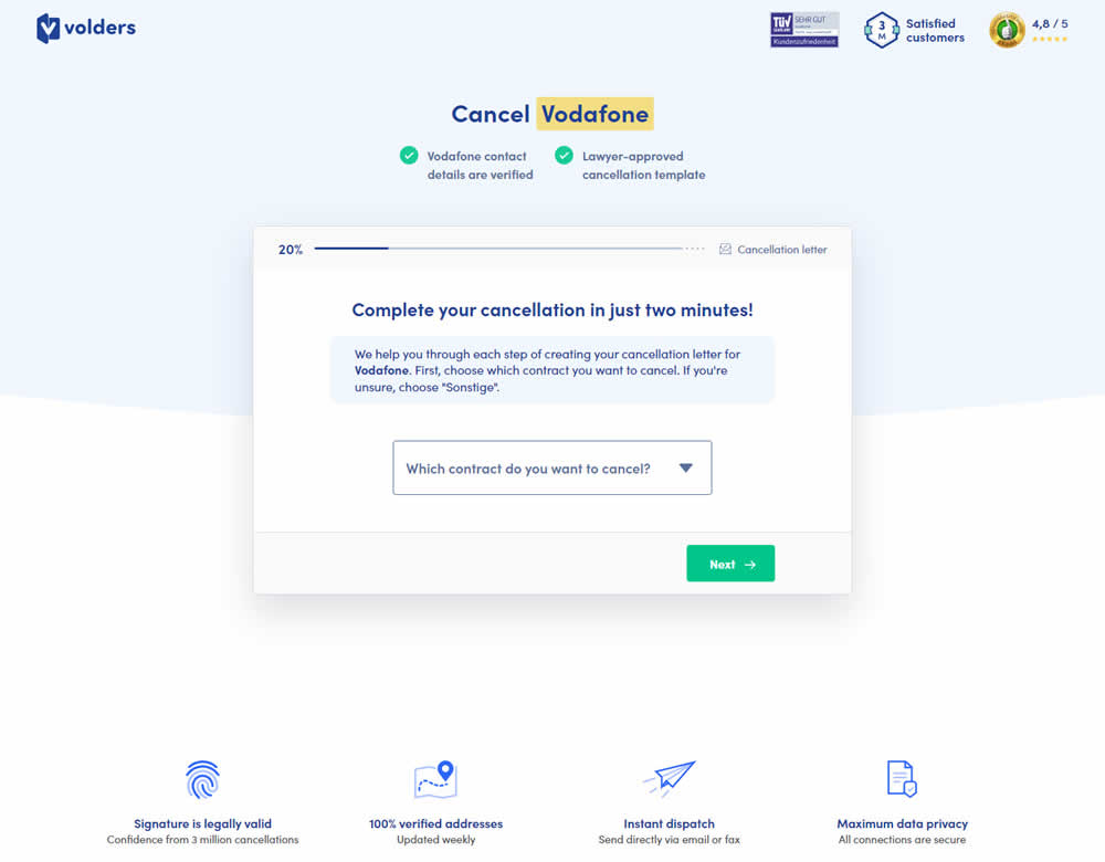
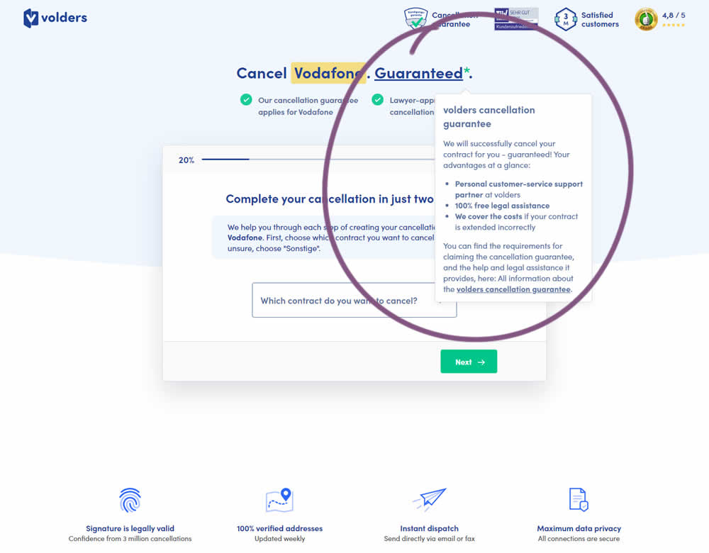
In this experiment, a cancelation guarantee was added believing it would make users feel safer while canceling their contracts with Volders (the paid service being offered). The variation appended a Guarantee in the headline as a hyperlink with an explanatory tooltip shown on hover. This variation change was added to multiple screens throughout the checkout flow (a 5 step process).
Test #457 on
by  Jakub Linowski
Feb 26, 2023
Desktop
Mobile
Shopping Cart
X.X%
Sales
Jakub Tested Pattern #64: Tunnel
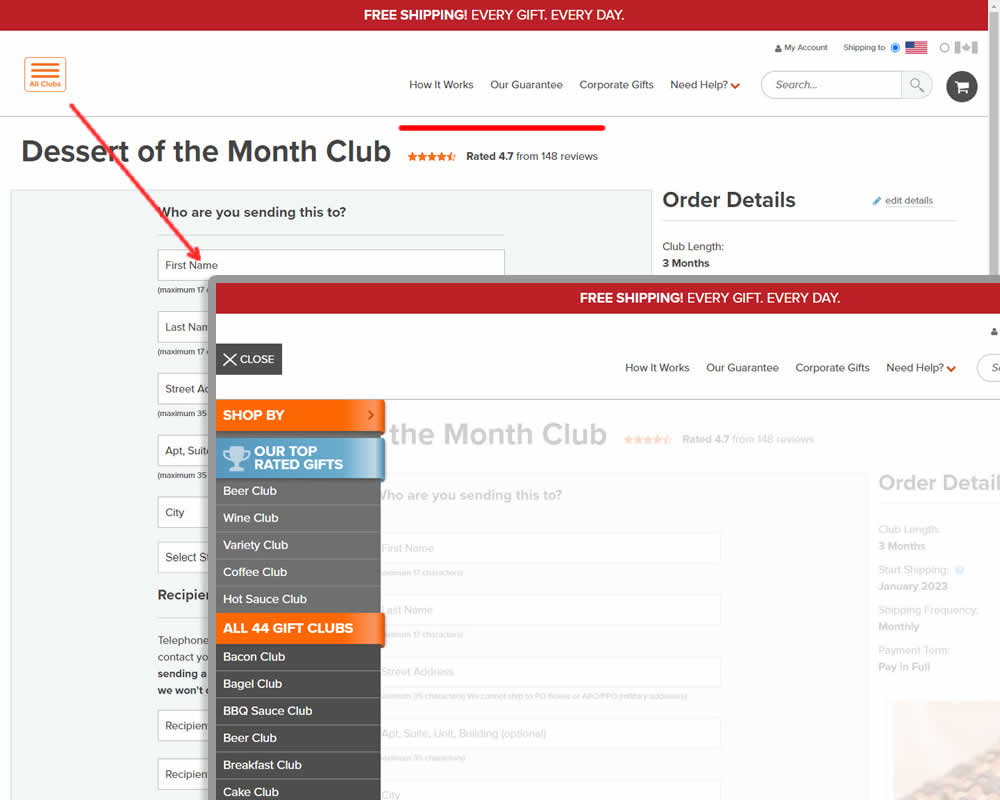
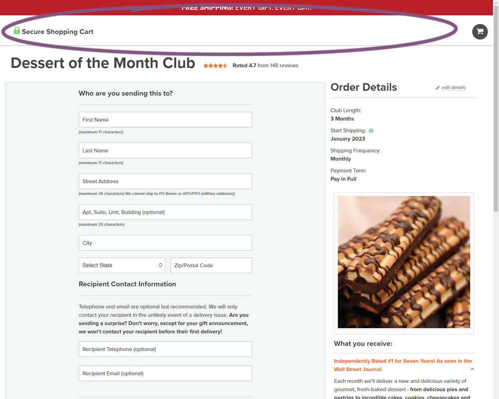
In this experiment, hamburger navigation with product links, was removed from the shopping / add to cart page. Tertiary links (How It Works, Guarantee details and support pages) were also removed, while a "Secure Checkout" message was brought into the header. This header version was already present on the next checkout page, and was copied over one step earlier. The idea was to keep customers within the checkout flow. Impact on sales was measured.
Test #456 on
Aboalarm.de
by  Daria Kurchinskaia
Feb 23, 2023
Desktop
Mobile
Signup
X.X%
Sales
Daria Tested Pattern #28: Easiest Fields First On Aboalarm.de
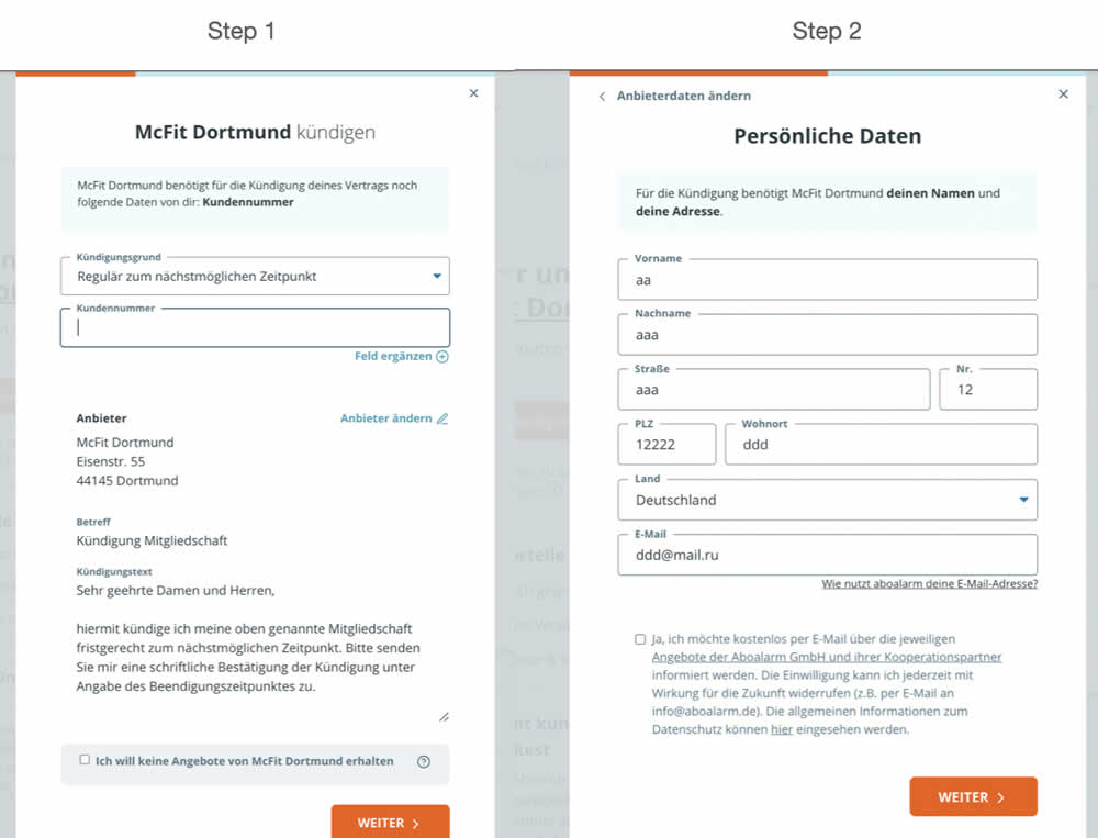
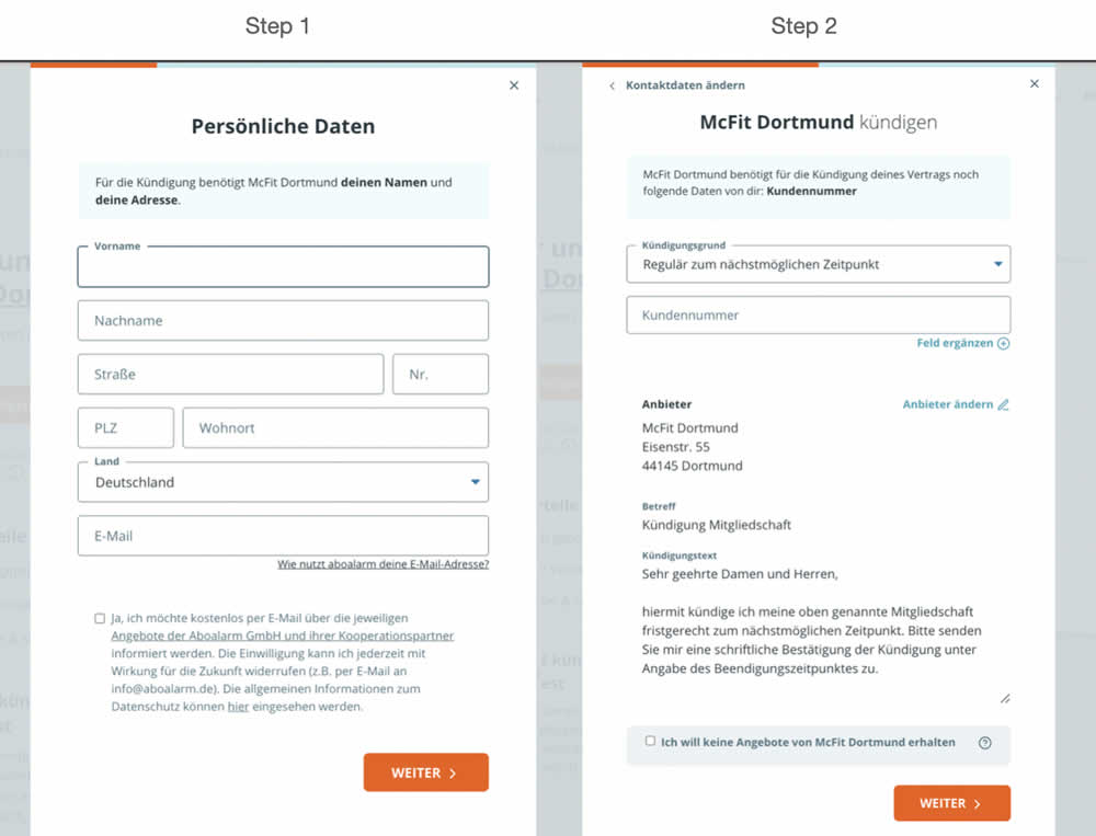
In this experiment, a more difficult step of a contract cancelation service flow was rearranged toward a later step. In the variation, the easier step (hypothetically) with personal details and address fields was placed as the first step. Whereas the step with contract or account numbers (hypothetically more difficult) were placed as the second step.
Test #455 on
Expertinstitute.com
by  Ardit Veliu
Feb 16, 2023
Desktop
Mobile
Home & Landing
X.X%
Leads
Ardit Tested Pattern #117: Company Logos On Expertinstitute.com
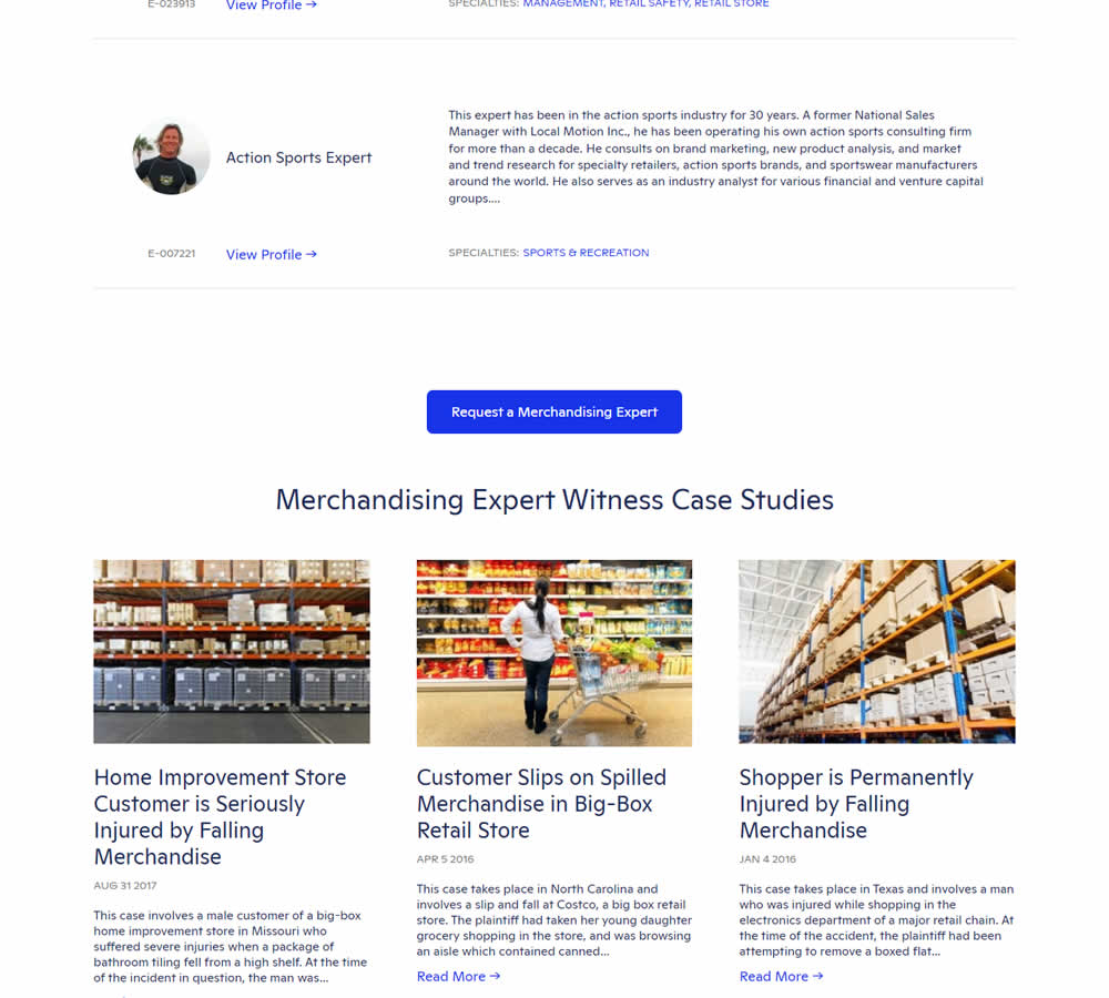

In this experiment, supporting university logos were appended near the primary call to action for additional credibility. These logos were placed around the middle of long landing pages on Expert Institute's web site (where experts for legal advice are searched). Impact on total leads was measured.
Test #454 on
Trenyrkarna.cz
by  Ondřej Ilinčev
Jan 31, 2023
Desktop
Mobile
Shopping Cart
X.X%
Sales
Ondřej Tested Pattern #64: Tunnel On Trenyrkarna.cz
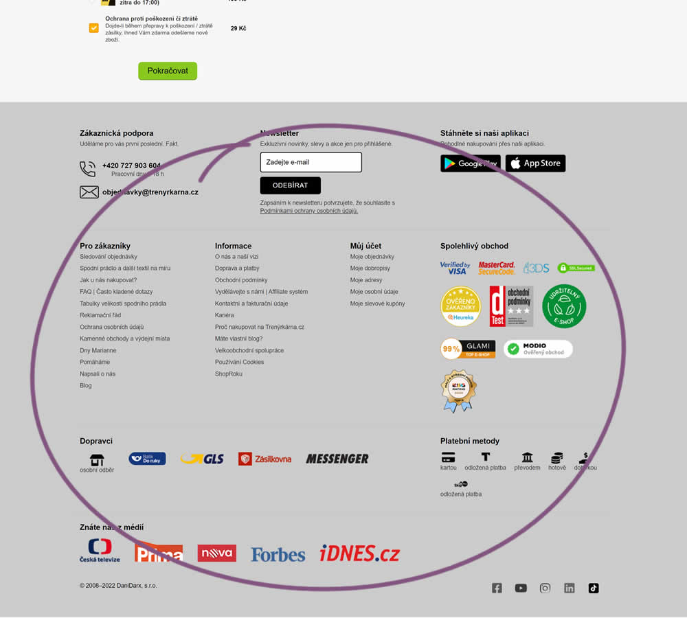
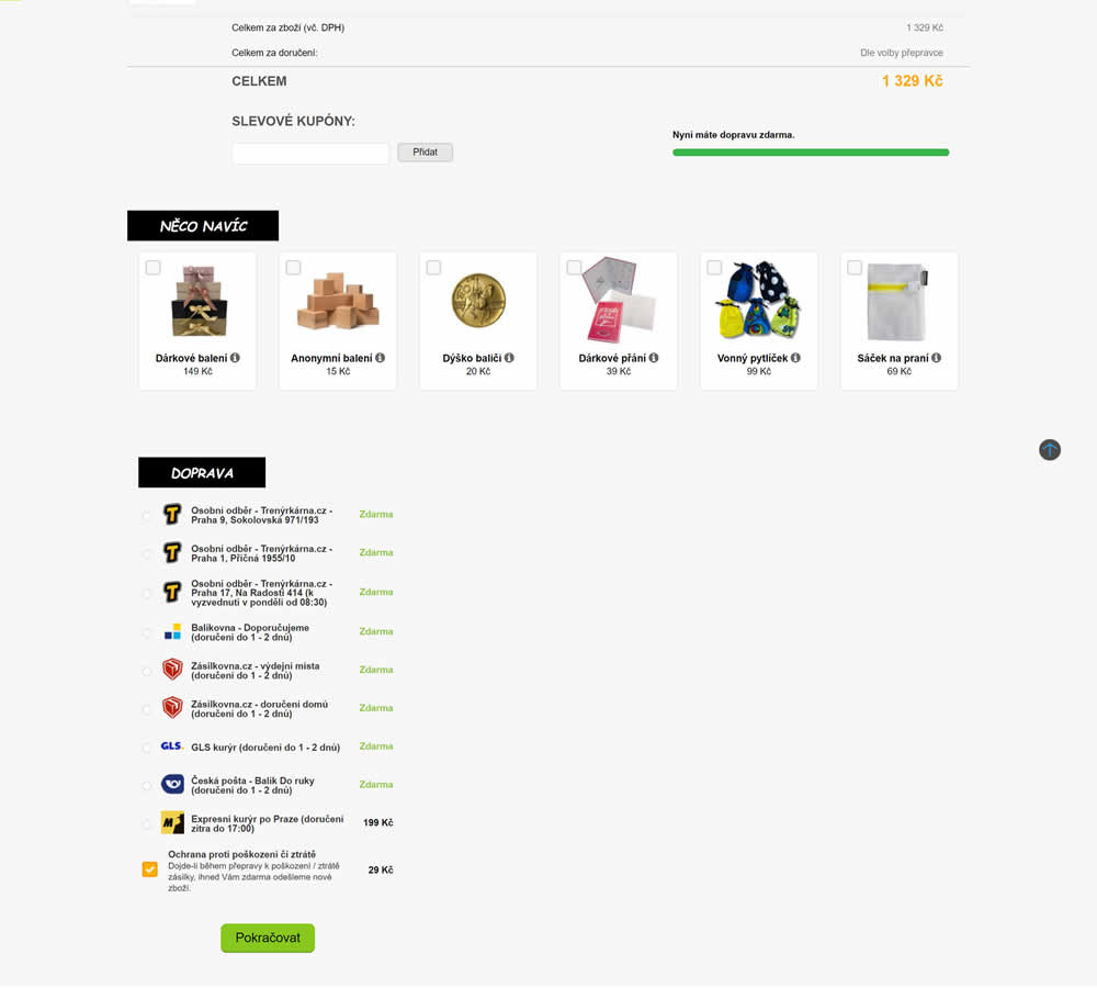
In this shopping cart experiment, a tall footer was completely removed. The footer contained elements such as: app download links, a newsletter signup, secondary web site links, trust symbols, social media icons and company contant information. Impact on sales was measured.
Test #453 on
by  Jakub Linowski
Jan 31, 2023
Desktop
Mobile
Shopping Cart
X.X%
Sales
Jakub Tested Pattern #64: Tunnel
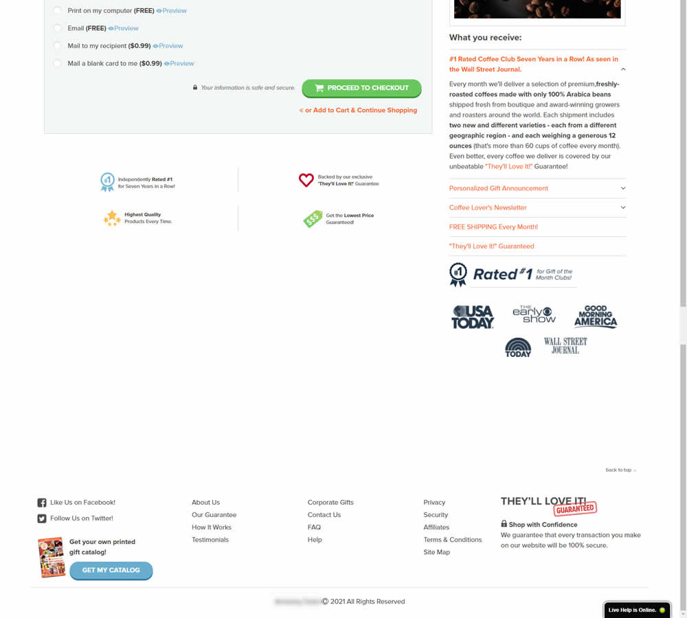
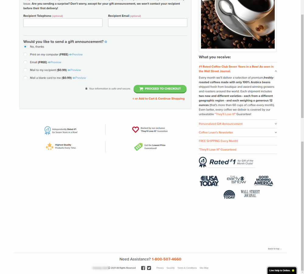
In this experiment, the footer was simplified with multiple elements being removed (catalog request, secondary links, and a guarantee). Additionally, a more prominent phone number was also displayed.
Test #452 on
Volders.de
by  Daria Kurchinskaia
Jan 30, 2023
Desktop
Mobile
Checkout
X.X%
Sales
Daria Tested Pattern #62: Urgent Next Day Delivery On Volders.de
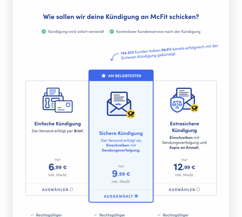
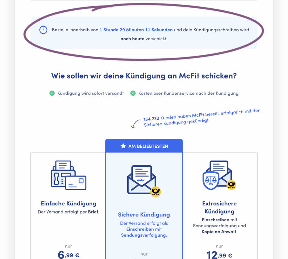
In this experiment, a count down timer was added near the top of a checkout page. The timer was only shown before 1pm and clarified that the serivce (contract cancellation) will be initiated on the same day if users act before a cut off time. Impact on completed payments was measured.
Test #451 on
Fluke.com
by  Marika Francisco
Jan 25, 2023
Desktop
Product
X.X%
Sales
Marika Tested Pattern #115: Pricing Comparison Table On Fluke.com
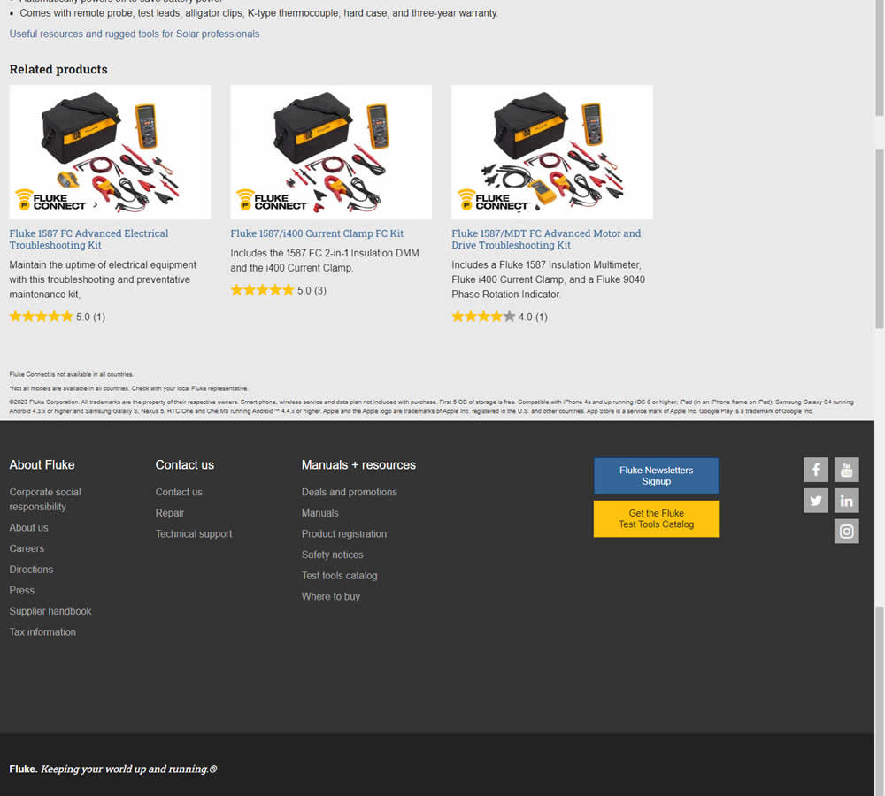
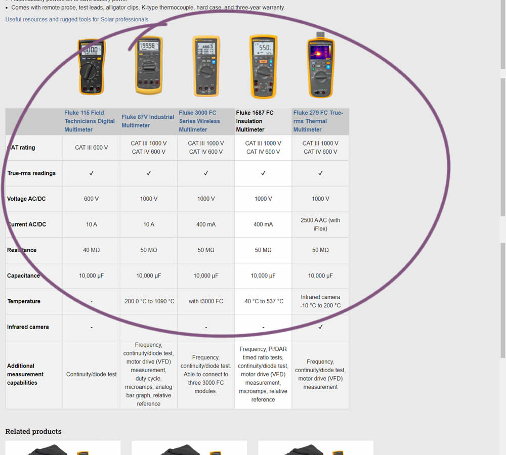
In this experiment, a product comparison table was added in the middle of a product detail page. The comparison table contained products from the same class or family of products. Clicking on the photo thumbnails also allowed customers to visit the specific detail page. Impact on adds to cart and transactions was measured.
Test #450 on
Trenyrkarna.cz
by  Ondřej Ilinčev
Jan 20, 2023
Desktop
Shopping Cart
X.X%
Sales
Ondřej Tested Pattern #64: Tunnel On Trenyrkarna.cz
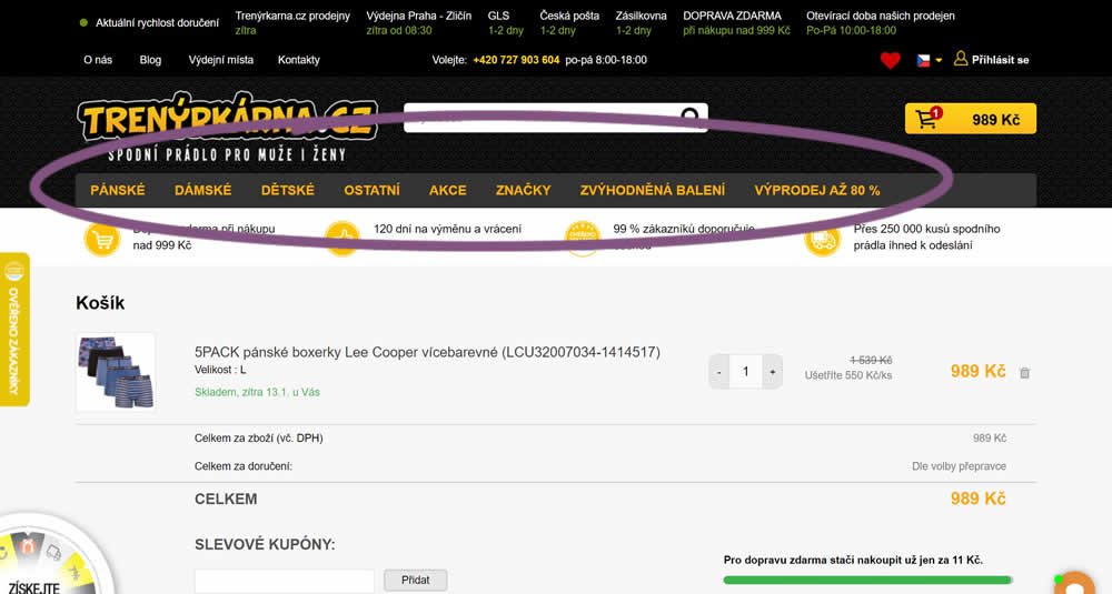
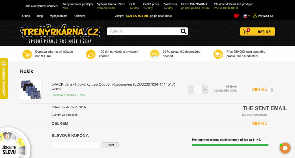
In this experiment, top category navigation (with fly out categories) was removed from the shopping cart of an online store. Impact on sale transactions was measured.
Test #449 on
Snocks.com
by  Melina Hess
Dec 31, 2022
Desktop
Mobile
Product
X.X%
Sales
Melina Tested Pattern #78: Tags, Badges And Structured Information On Snocks.com
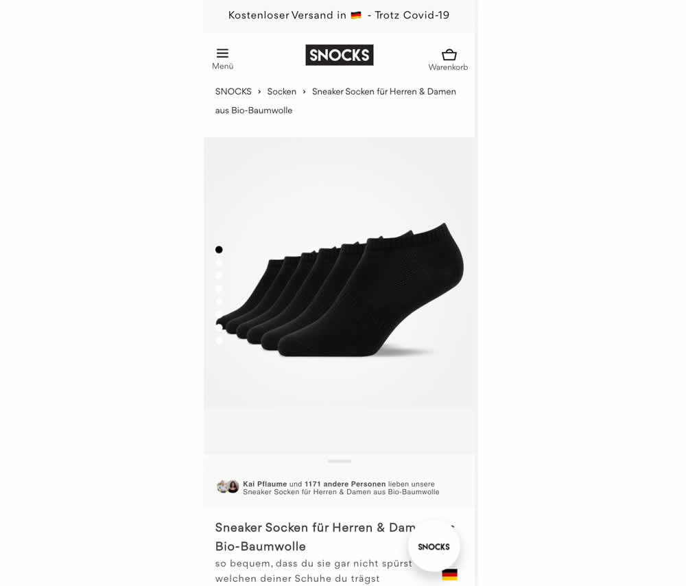
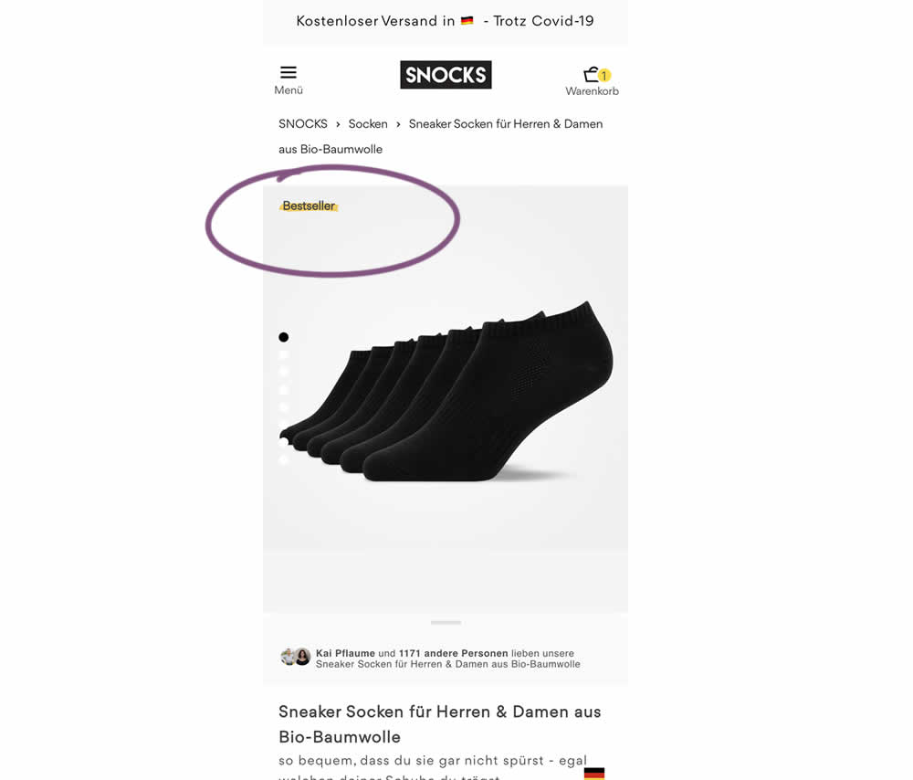
In this experiment, bestselling product colors were highlighted with a bestseller badge on product listing and product detail pages.