All Latest 620 A/B Tests
MOST RECENT TESTS
Test #568 on
by  Jakub Linowski
Dec 22, 2024
X.X%
Sales
Jakub Tested Pattern #80: Persistent Filters
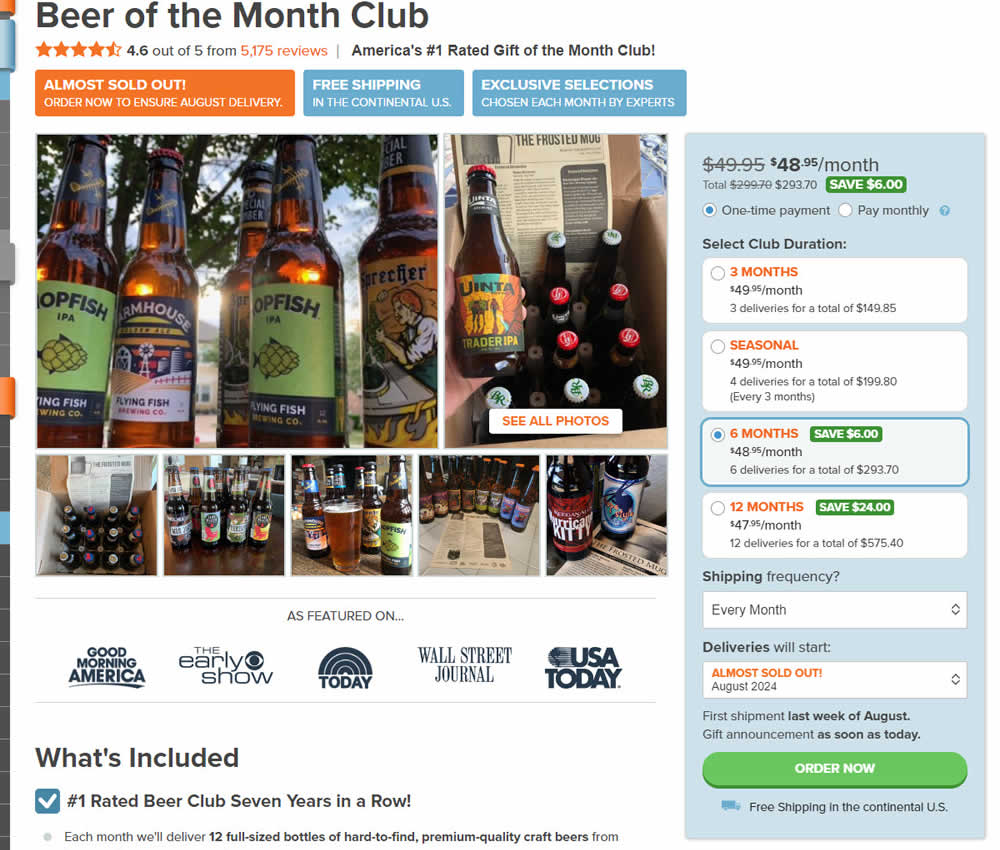
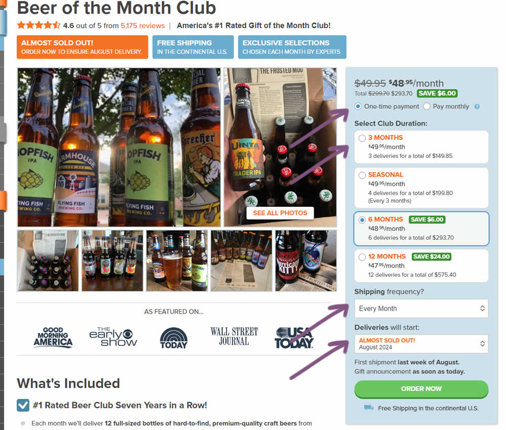
In this experiment, "persistence" of 4 product choices was added in the variation. When users made a product selection such as: duration, payment terms, starting month or shipping frequency, their choices were remembered and defaulted on next visits, reloads or when viewing other products. Impact on adds to cart and sales was measured.
Which A Or B Actually Wins? Find Out Before You Test.
Members see every test result — the winners, the flat ones, and the losers — along with exact effects and sample sizes. Use it to estimate your tests and prioritize by probability, not gut feel. Start every experiment with the odds on your side.
Test #567 on
Online.metro-cc.ru
by  Andrey Andreev
Dec 18, 2024
Mobile
Desktop
Home & Landing
X.X%
Sales
Andrey Tested Pattern #135: Product Categories On Online.metro-cc.ru
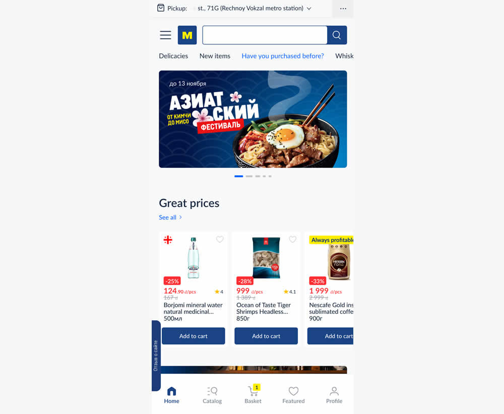
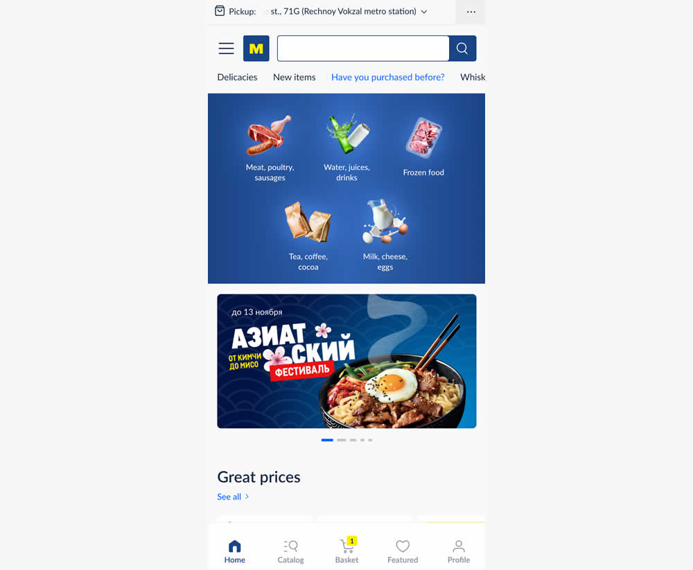
In this experiment, the variation added popular categories with links at the top of the homepage. This was done for all sets of user segments: new and returning. Impact on transactions was measured.
Test #566 on
Banter.com
by  Craig Kistler
Dec 11, 2024
Desktop
Product
X.X%
Revenue
Craig Tested Pattern #66: Complementary Upsell On Banter.com
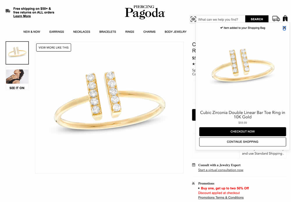
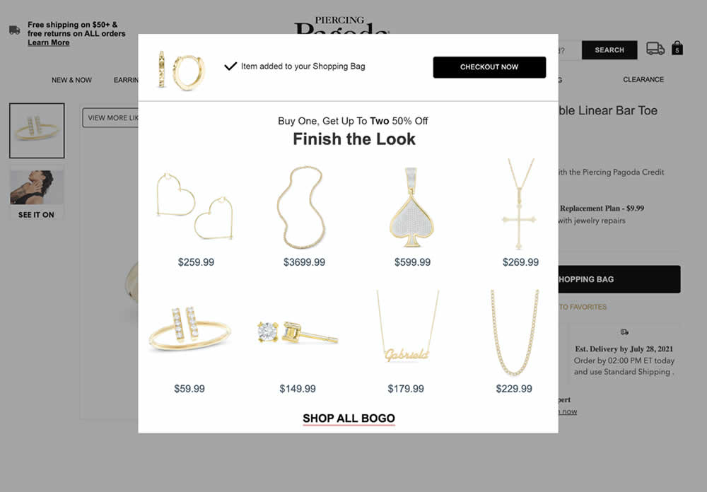
In this experiment, a modal based message was shown to encourage extra products being added as complementary upsells. In the control, the promotion text appeared at the bottom as red text ("Buy one, get up to two 50% Off"). Whereas in the variation, specific products were shown on the modal (post add-to-cart). Impact on adds-to-cart, sales and average revenue was measured.
Test #565 on
Umbraco.com
by  Lars Skjold Iversen
Nov 30, 2024
Desktop
Home & Landing
X.X%
Leads
Lars Tested Pattern #129: Right Or Left Aligned Forms On Umbraco.com
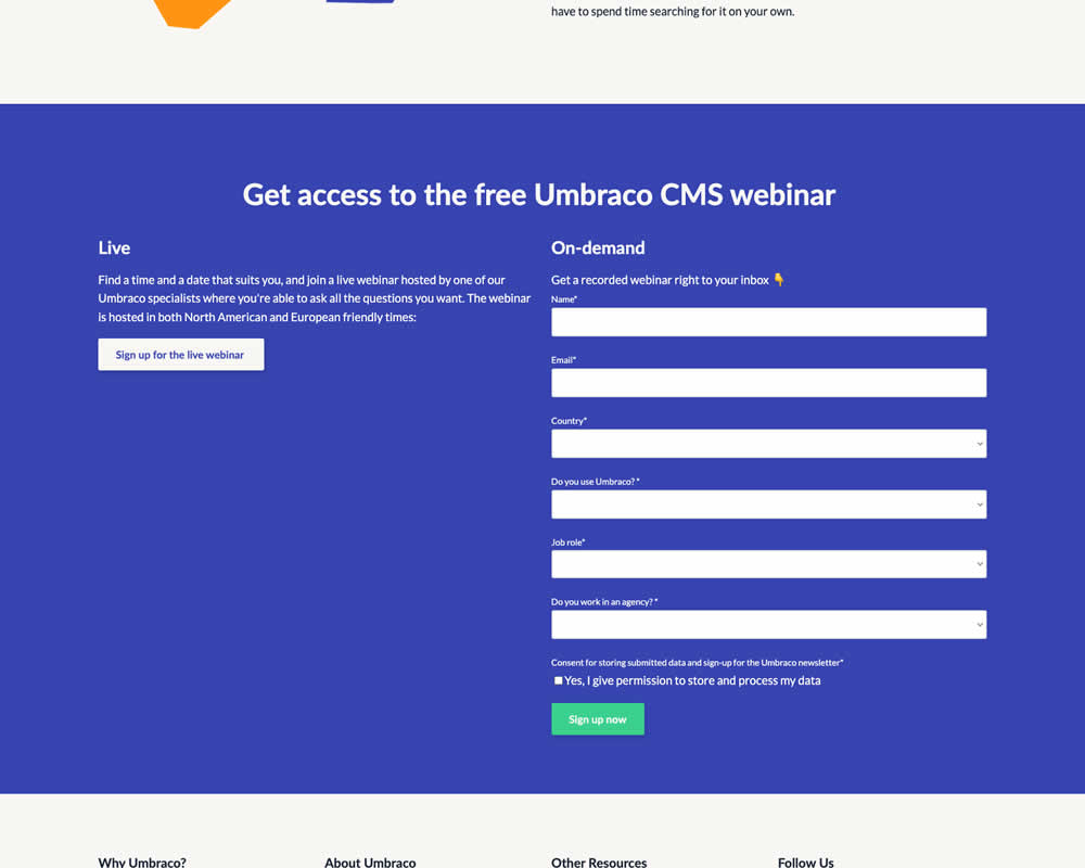
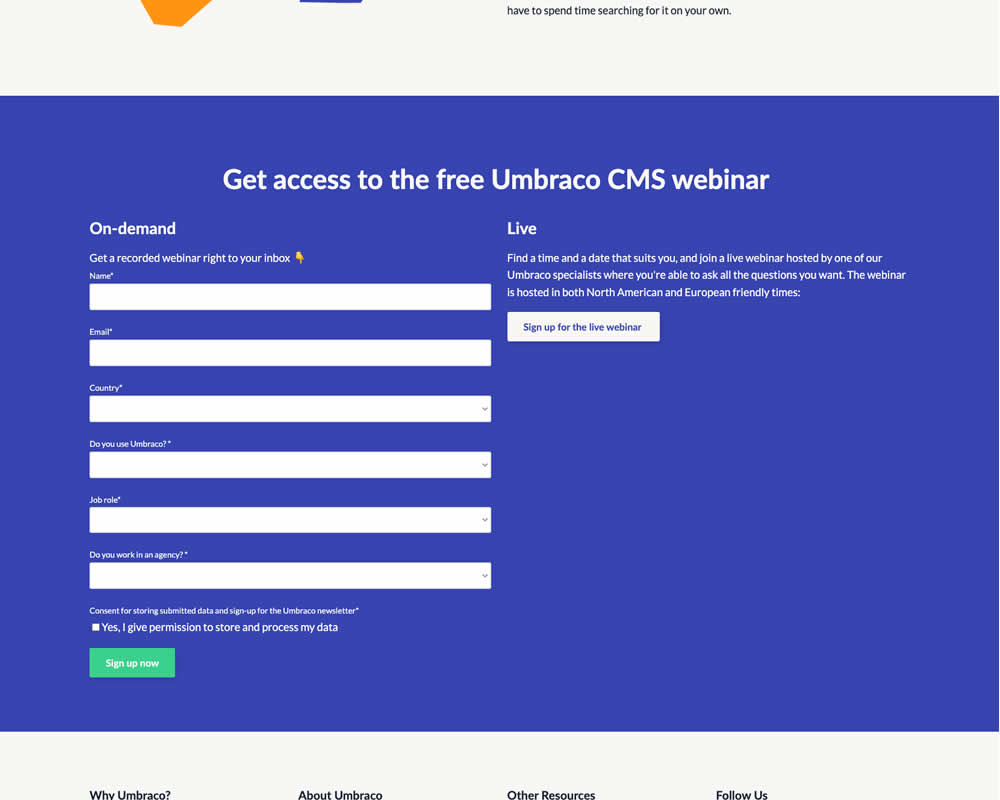
In this experiment, the right vs left position of a form (at the bottom of a landing page) was a/b tested. Impact on progression and form completion was measured.
Test #564 on
Hellostake.com
by  Louis Alston
Nov 26, 2024
Desktop
Mobile
Home & Landing
X.X%
Signups
Louis Tested Pattern #114: Less Or More Visible Prices On Hellostake.com

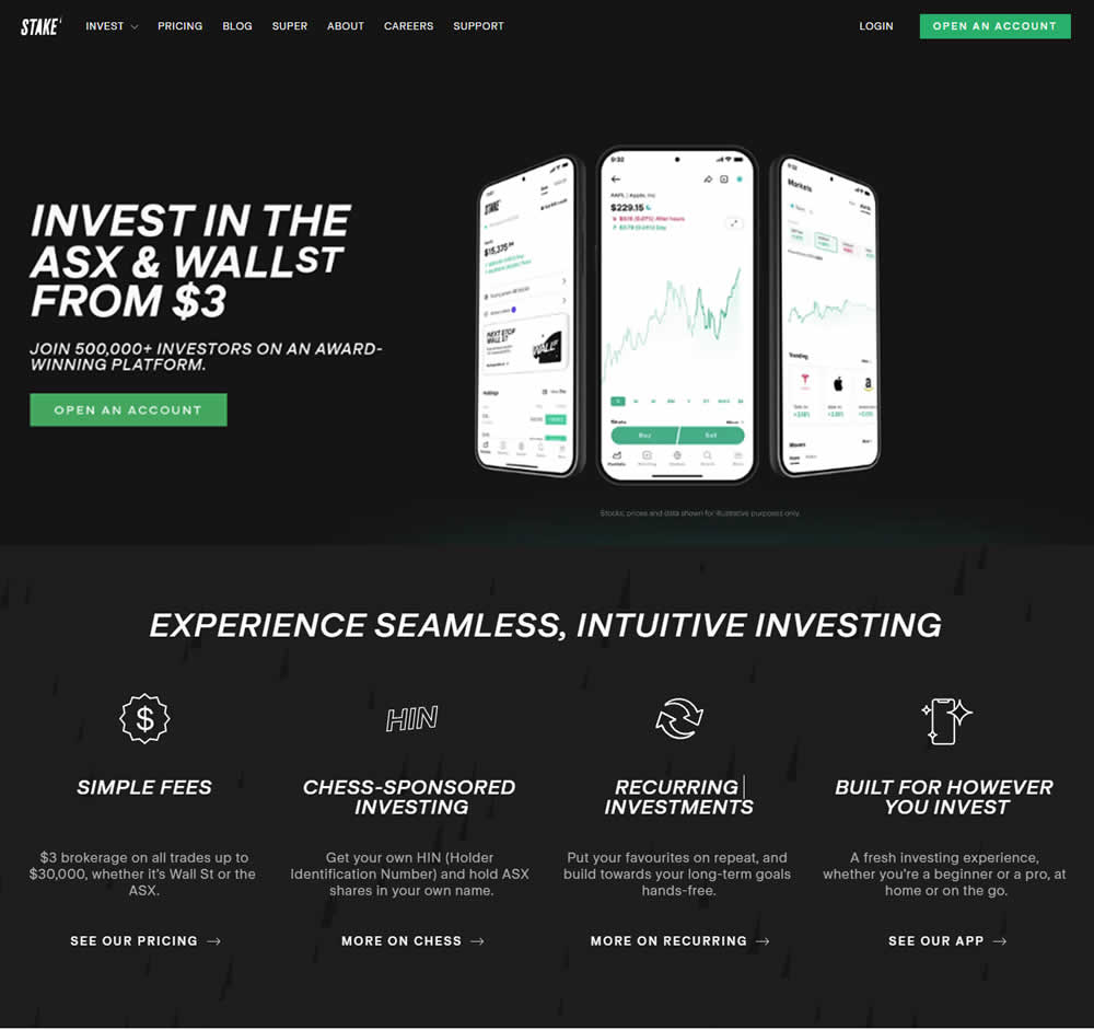
In this a/b test, the headline was changed to reflect pricing information (informing that trades are starting at $3). Impact on progression and signups was measured.
Test #563 on
Expertinstitute.com
by  Ardit Veliu
Nov 19, 2024
Desktop
Home & Landing
X.X%
Leads
Ardit Tested Pattern #108: Frequently Asked Questions On Expertinstitute.com


In this RETEST experiment, a Frequently Asked Questions section was added near the bottom of a short lead gen form. This test ran on one of Expert Institute's landing pages for their expert witness seeking services. Impact on leads was measured. It was also triggered by users who scrolled at least 100px downwards towards the FAQ section.
Test #562 on
by  Jakub Linowski
Nov 13, 2024
Desktop
Mobile
Checkout
X.X%
Sales
Jakub Tested Pattern #99: Progress Bar
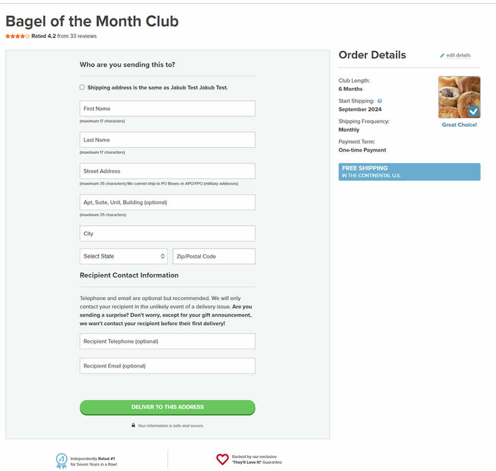
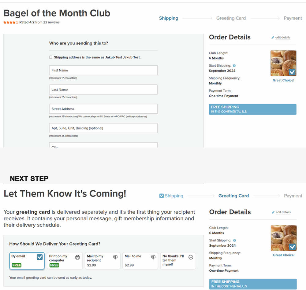
In this experiment, a 3 step progress bar was added starting on a checkout funnel (dedicated add-to-cart page, greeting card step and order summary). The progress bar also showed any completed steps as a "checked off" state. More so, users were able to use the progress bar as a navigation item to any previously completed and currently active steps. Impact on sales was measured.
Test #561 on
Aboalarm.de
by  Katharina Lay
Nov 07, 2024
Desktop
Signup
X.X%
Sales
Katharina Tested Pattern #40: Blurred Product Background On Aboalarm.de
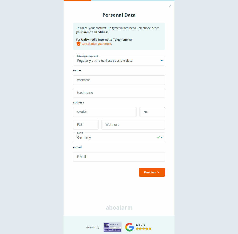
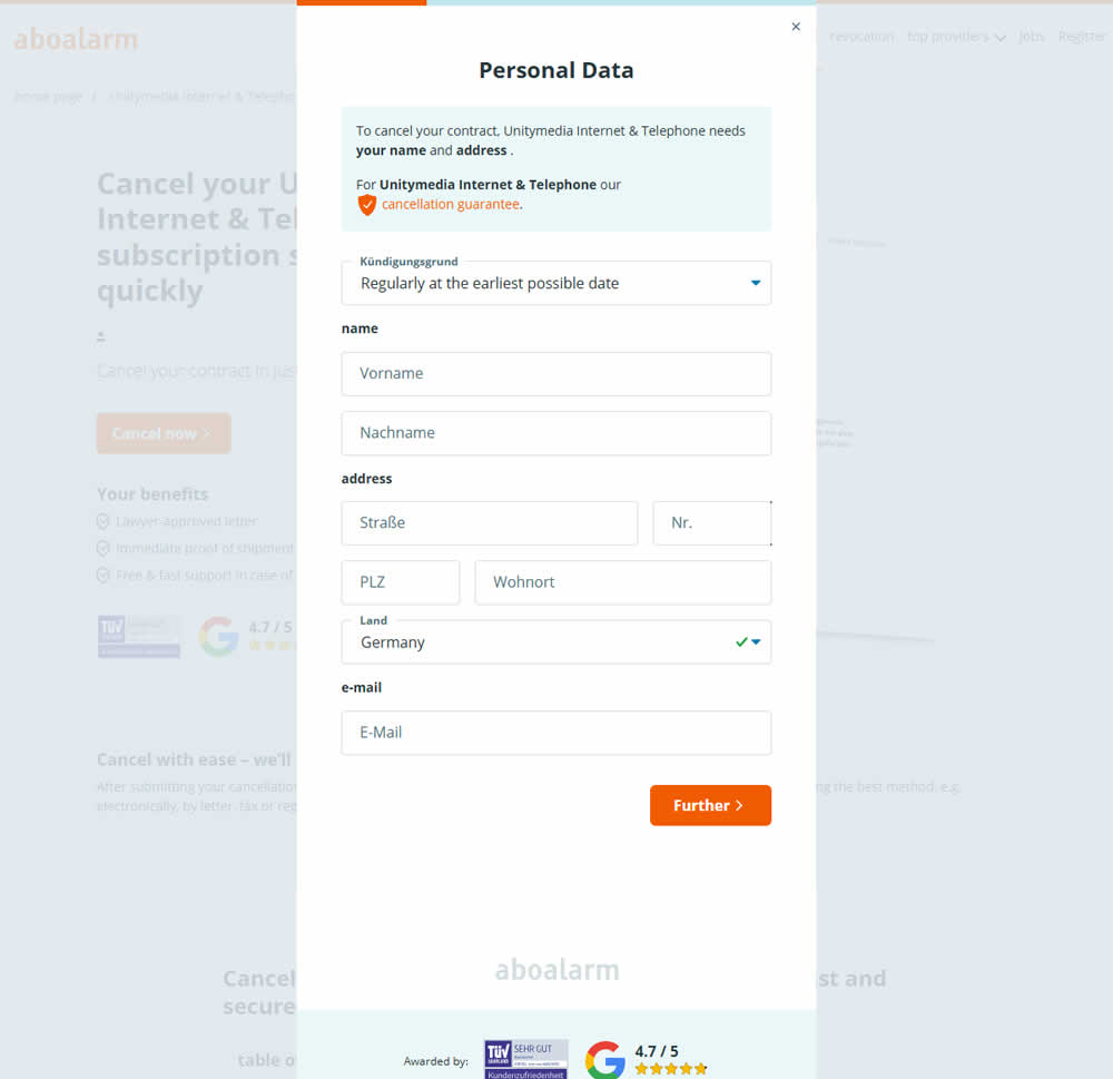
In this experiment, as a multi-step sign up funnel launched as a modal, there was a different treatment of the background. In the A version the background was a flat color, whereas in the B version the background used a transparent opacity to show through the landing page underneath. Impact on sign ups was measured.
Test #560 on
Finn.com
by  Daria Kurchinskaia
Oct 22, 2024
Mobile
Desktop
Checkout
X.X%
Signups
Daria Tested Pattern #46: Pay Later On Finn.com
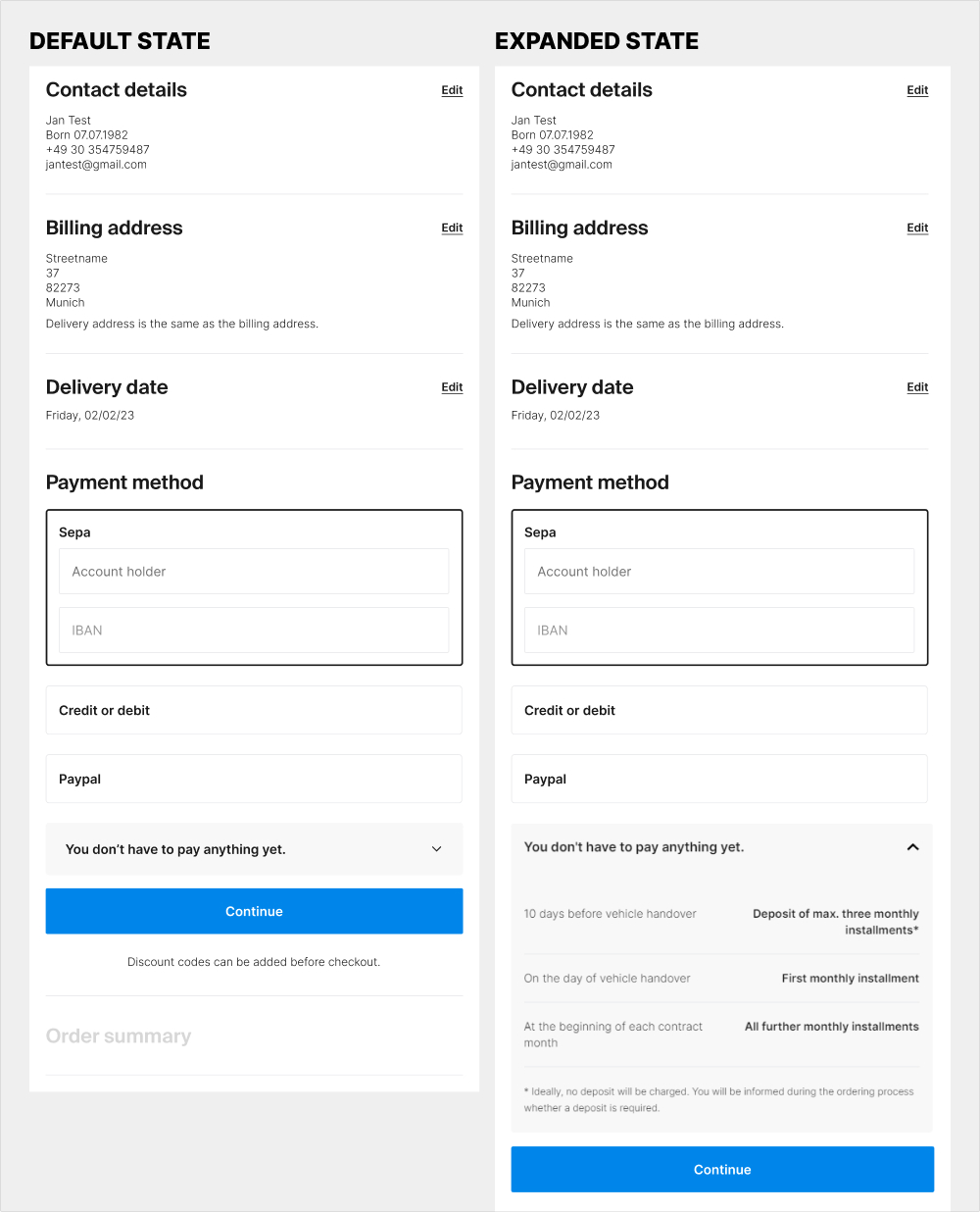
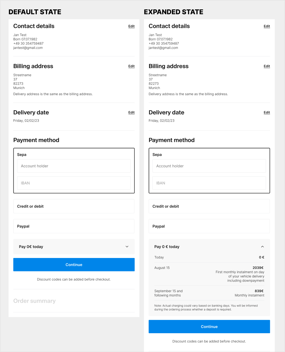
The idea of this experiment was at least two fold. 1) the variation attempted to clarify that there is no payment today with the copy "Pay 0€ today" on the collapsed state of the payment amount. 2) clarify the payment terms with exact dates and amounts for future payments.
Test #559 on
Tourradar.com
by  Clemens Grave
Oct 18, 2024
Desktop
Listing
X.X%
Progression
Clemens Tested Pattern #137: Visible Filters On Tourradar.com
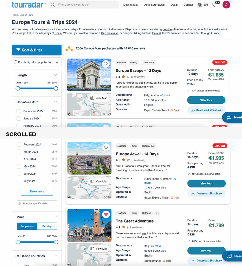

In this experiment, left column filters (control) were tested against top-aligned and sticky filters (variation). The hypothesis was to increase their visibility. Impact on their use and progression to next step (product/tour detail page) were measured.
Test #557 on
Obsbygg.no
by  Joachim Furuseth
Oct 17, 2024
Desktop
Product
X.X%
Sales
Joachim Tested Pattern #41: Sticky Call To Action On Obsbygg.no
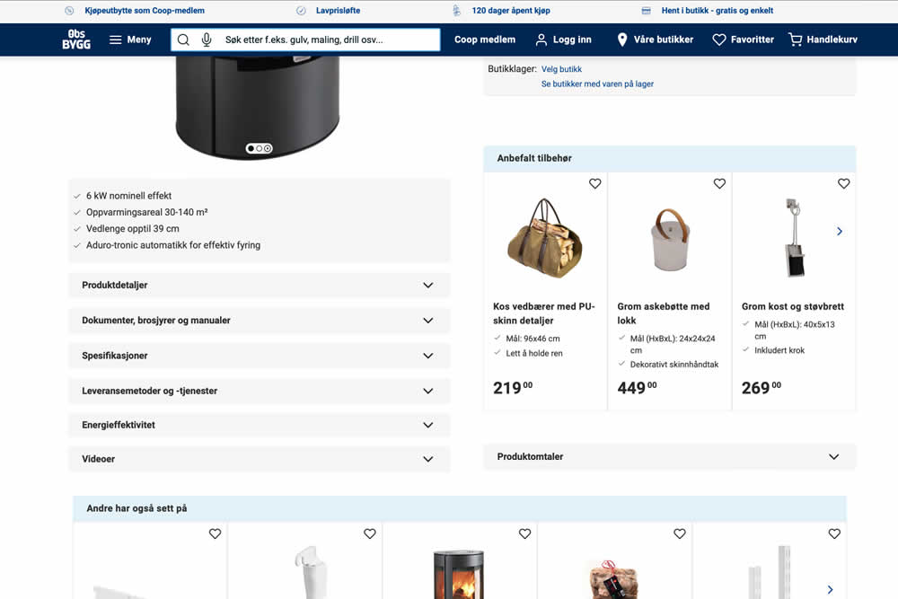
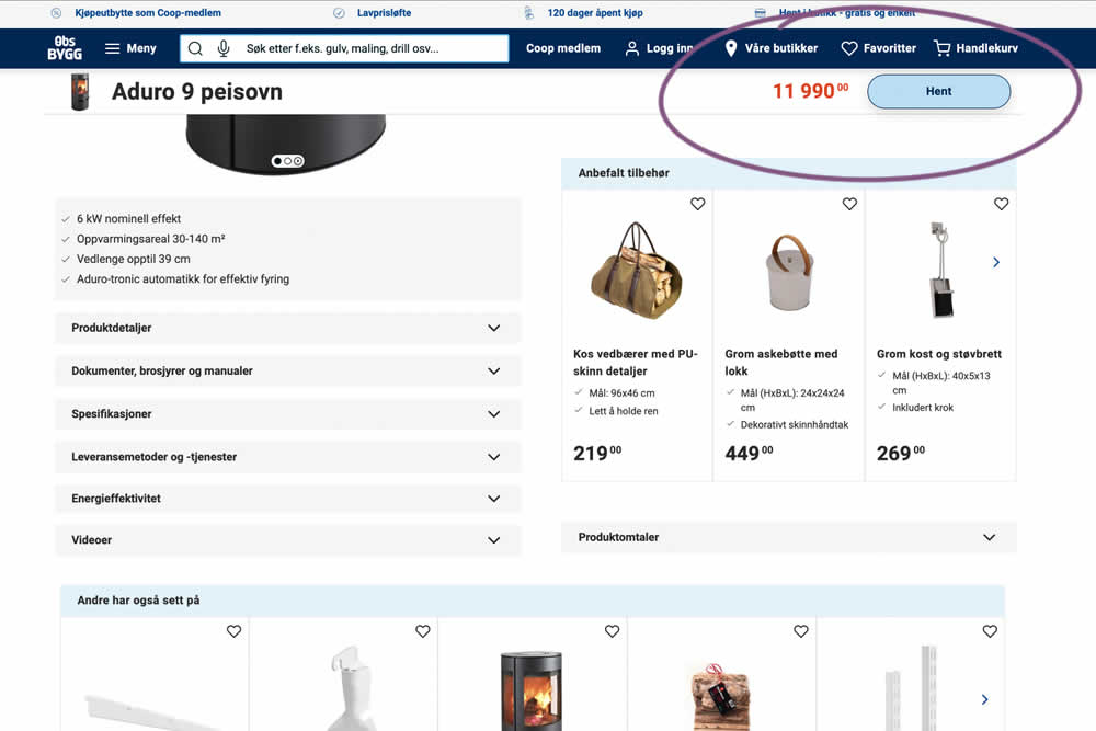
A sticky floating navigation bar was tested on product pages. The floating navigation contained: the product name, price and an add to cart button (add to cart). Impact on sales was measured. (Desktop Only)
Test #558 on
Obsbygg.no
by  Joachim Furuseth
Oct 17, 2024
Mobile
Product
X.X%
Sales
Joachim Tested Pattern #41: Sticky Call To Action On Obsbygg.no
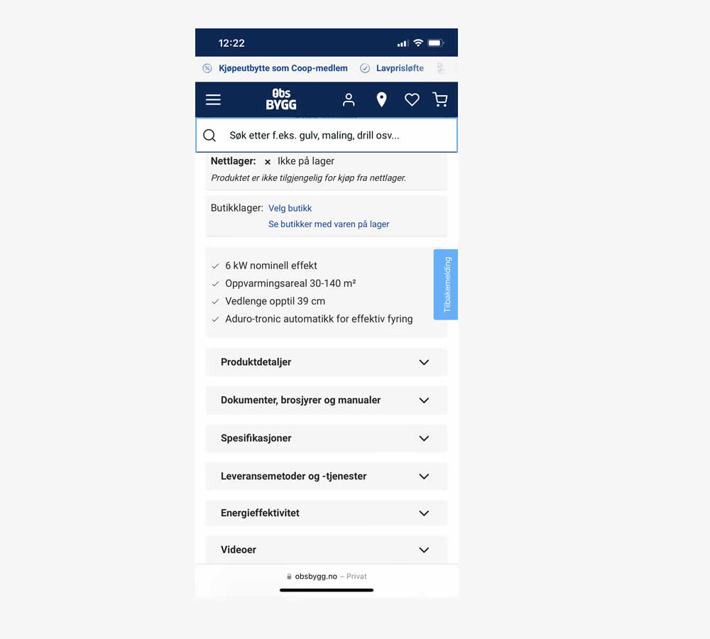
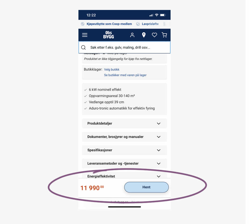
A sticky floating navigation bar was tested on product pages. The floating navigation contained: the product name, price and an add to cart button (add to cart). Impact on sales was measured. (Mobile Only)
Test #556 on
Snocks.com
by  Melina Hess
Oct 08, 2024
Mobile
Product
X.X%
Sales
Melina Tested Pattern #65: Add More For Extra Incentive On Snocks.com
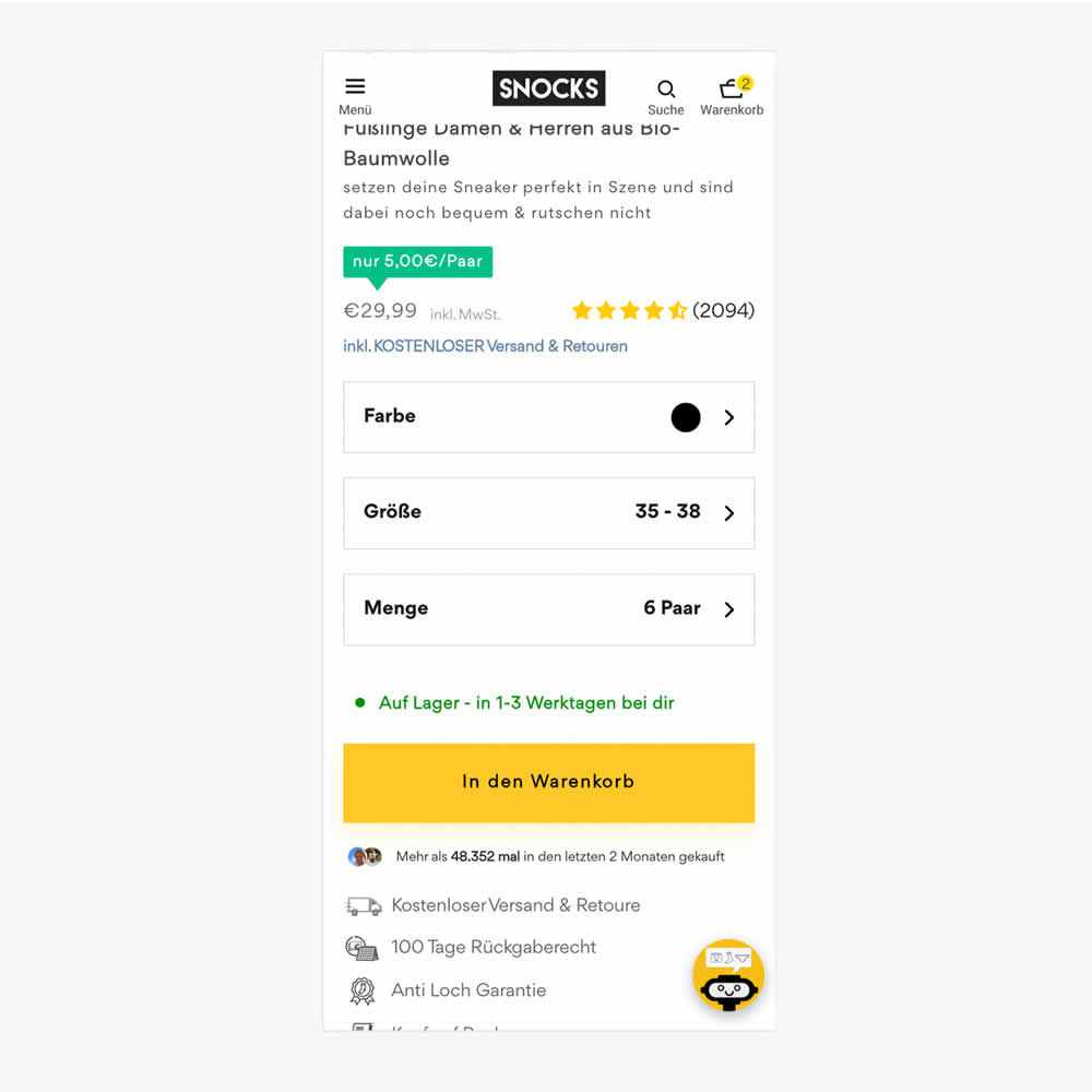
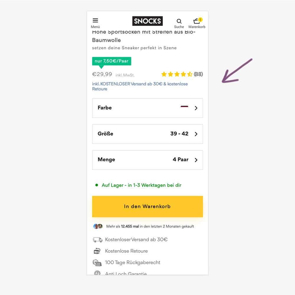
In this experiment, free shipping was a/b tested against free shipping with a 30€ purchase or higher. Hence, in the variation, customers needed to reach a cart amount total in order to be eligible for the free shipping.
Test #554 on
Obs.no
by  Joachim Furuseth
Sep 30, 2024
Desktop
Product
X.X%
Sales
Joachim Tested Pattern #41: Sticky Call To Action On Obs.no
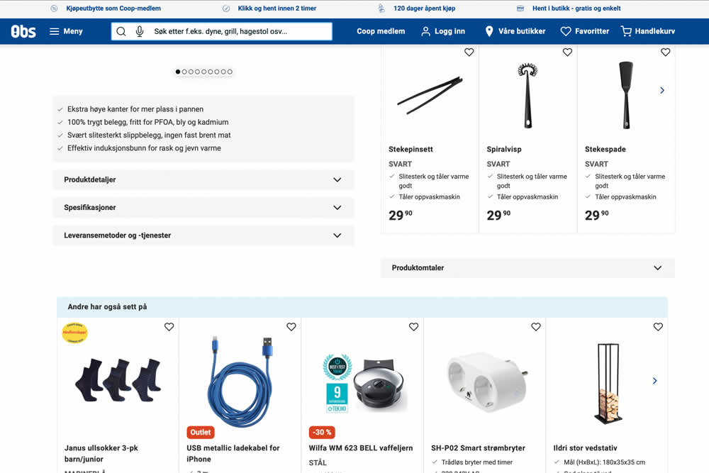
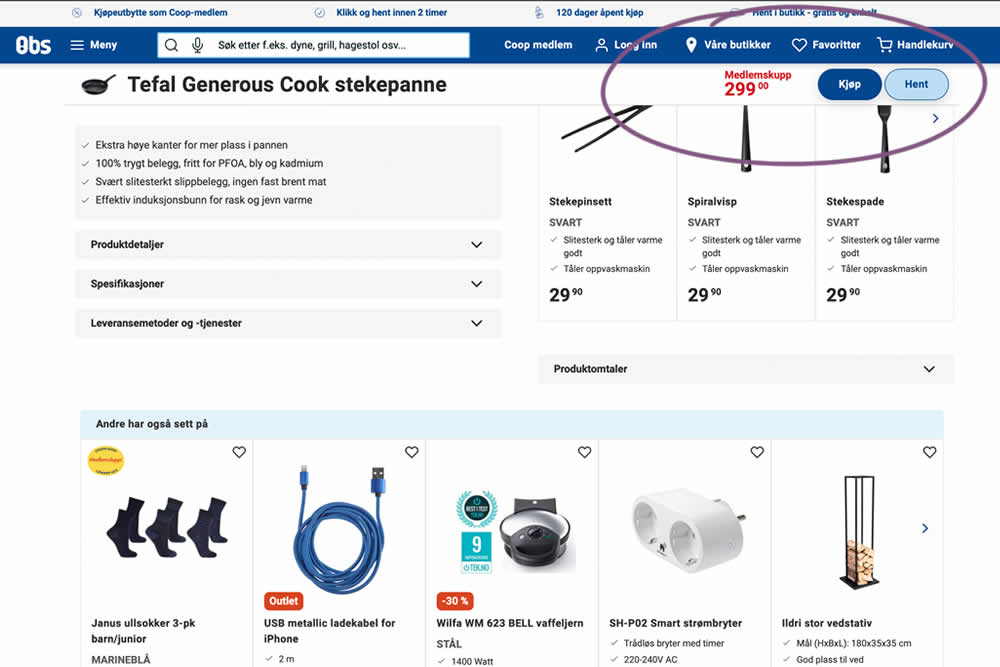
A sticky floating navigation bar was tested on product pages. The floating navigation contained: the product name, price and two add to cart buttons (add to cart; pickup in store). Impact on sales was measured. (Desktop Only)
Test #555 on
Obs.no
by  Joachim Furuseth
Sep 30, 2024
Mobile
Product
X.X%
Sales
Joachim Tested Pattern #41: Sticky Call To Action On Obs.no
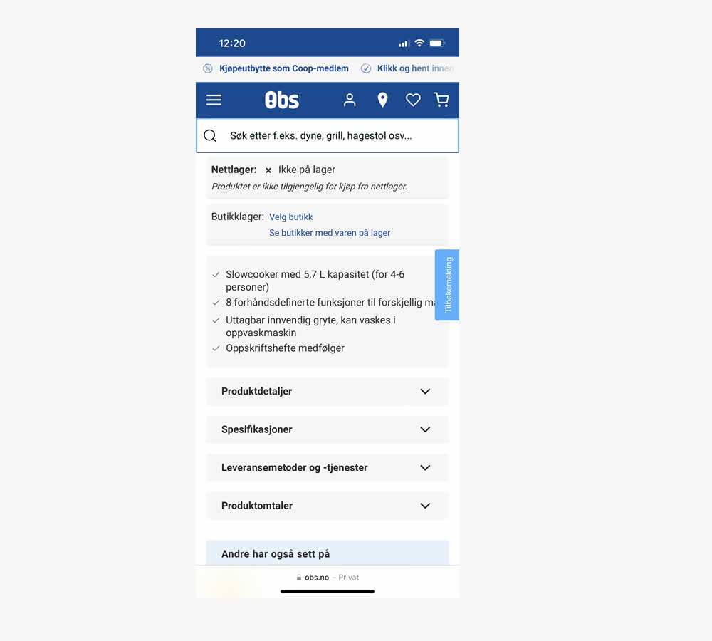
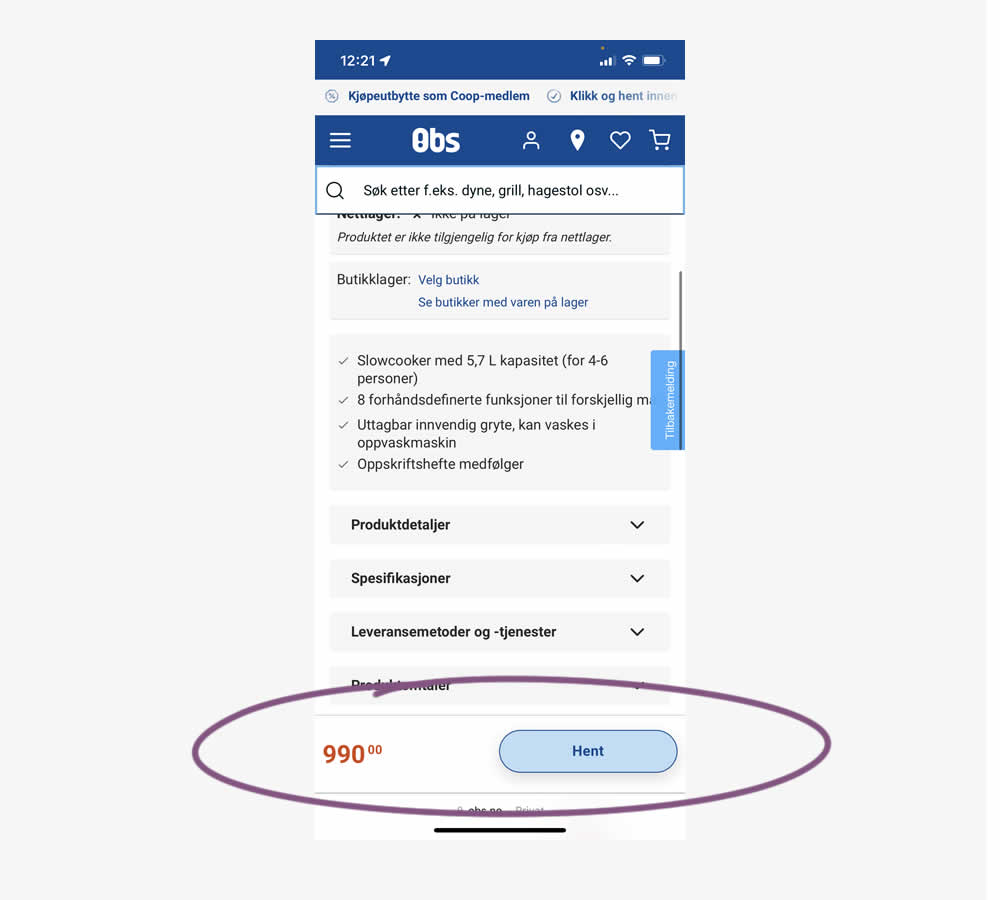
A sticky floating navigation bar was tested on product pages. The floating navigation contained: the product name, price and two add to cart buttons (add to cart; pickup in store). Impact on sales was measured. (Mobile only)
Test #553 on
Online.metro-cc.ru
by  Andrey Andreev
Sep 27, 2024
Mobile
Desktop
Checkout
X.X%
Revenue
Andrey Tested Pattern #69: Autodiscounting On Online.metro-cc.ru
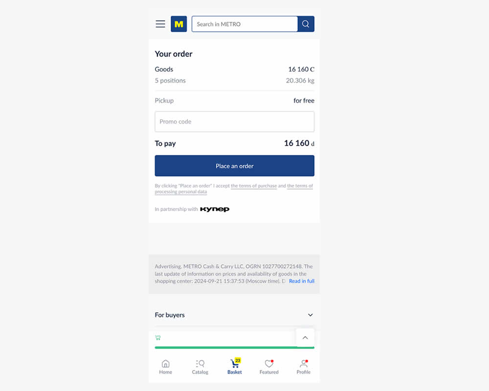
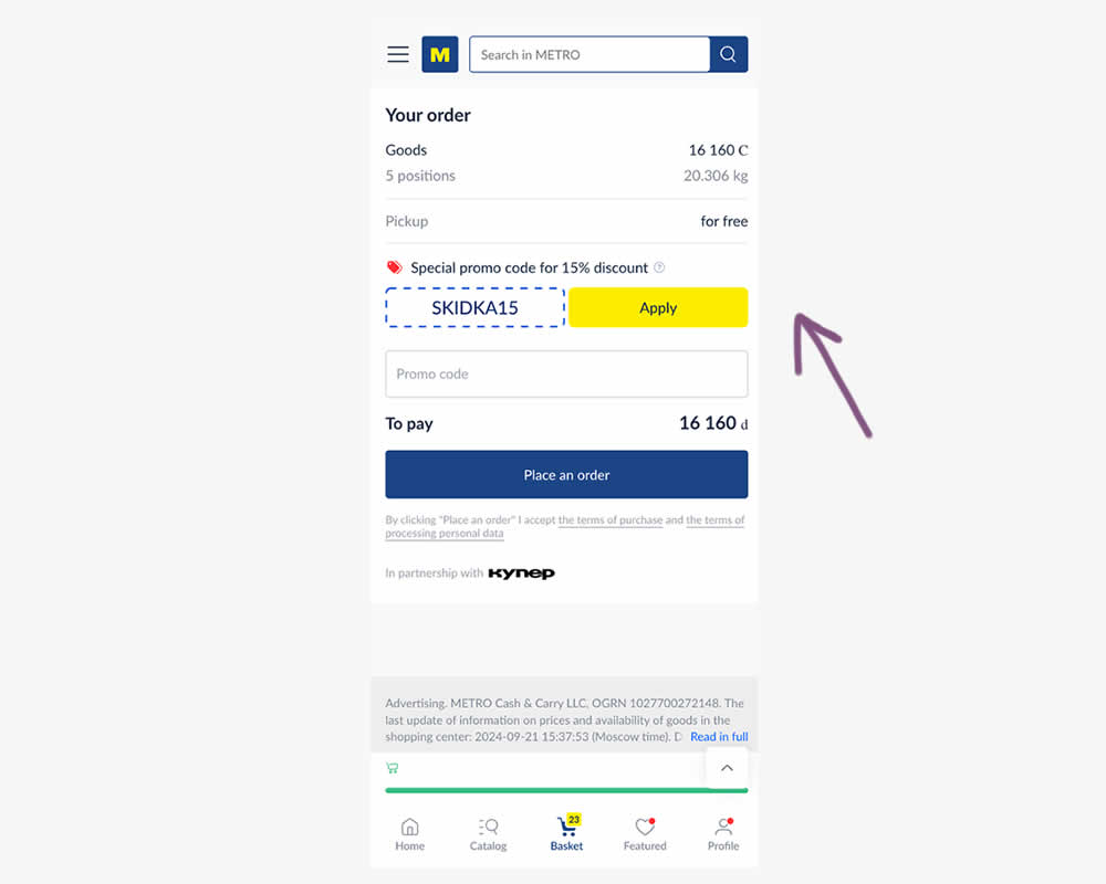
In this experiment, a preset coupon code with -15% amount and an easy to "apply" button was shown to new users who have never made a purchase. In the variation, the an empty coupon field was shown. Impact and transactions and revenue was measured.
Test #552 on
Tourradar.com
by  Clemens Grave
Sep 19, 2024
Product
X.X%
Progression
Clemens Tested Pattern #15: Bulleted Reassurances On Tourradar.com
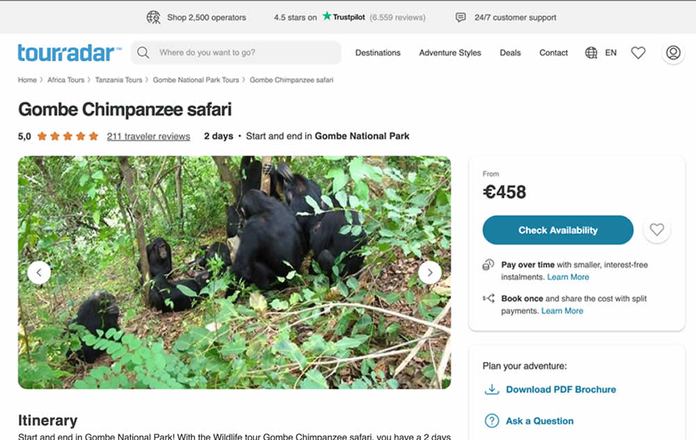

In this experiment, existing reassurance copy was changed. The control contained copy that focused on splitting payments and paying over time. The variation challenged this and showed a best price guarantee and the ability to earn credits.
Test #551 on
Tourradar.com
by  Clemens Grave
Sep 04, 2024
Desktop
Product
X.X%
Progression
Clemens Tested Pattern #139: Page Level Navigation On Tourradar.com
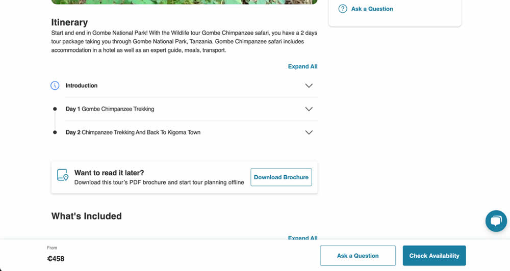
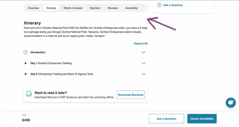
In this experiment, a floating page level navigation was added near the top of the product pages (under the main image). The navigation links included: Overview, Itinerary, What's Included, Operator, Reviews and Availability. Impact on next step progression was measured.
Test #550 on
Online.metro-cc.ru
by  Andrey Andreev
Aug 14, 2024
Mobile
Listing
X.X%
Sales
Andrey Tested Pattern #137: Visible Filters On Online.metro-cc.ru
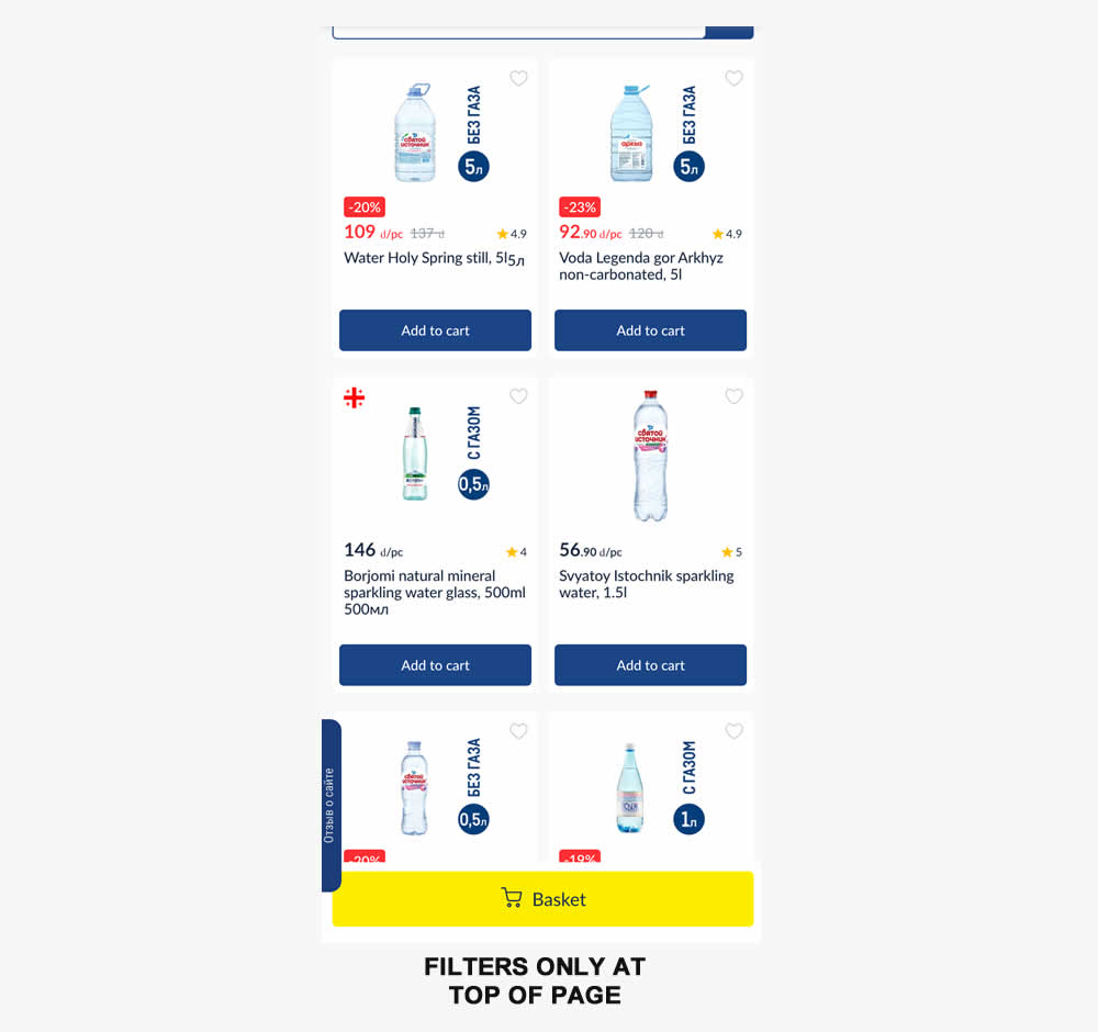
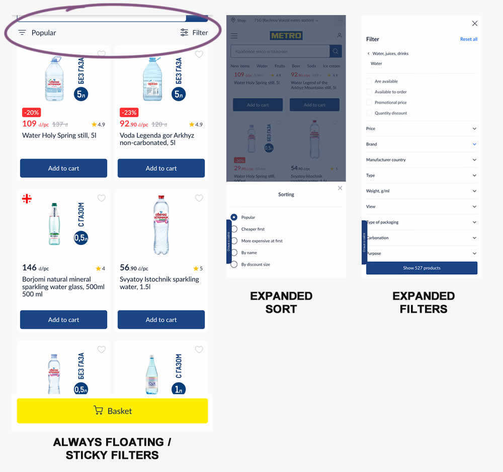
Instead of only displaying sort and filters at the top of a listing page, the variation always had them visible with a sticky/floating interaction. Impact on sales was measured.
Test #548 on
Livefresh.de
by  Melina Hess
Aug 13, 2024
Desktop
Mobile
Product
X.X%
Sales
Melina Tested Pattern #17: Least Or Most Expensive First On Livefresh.de
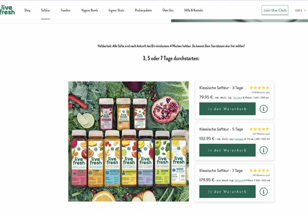
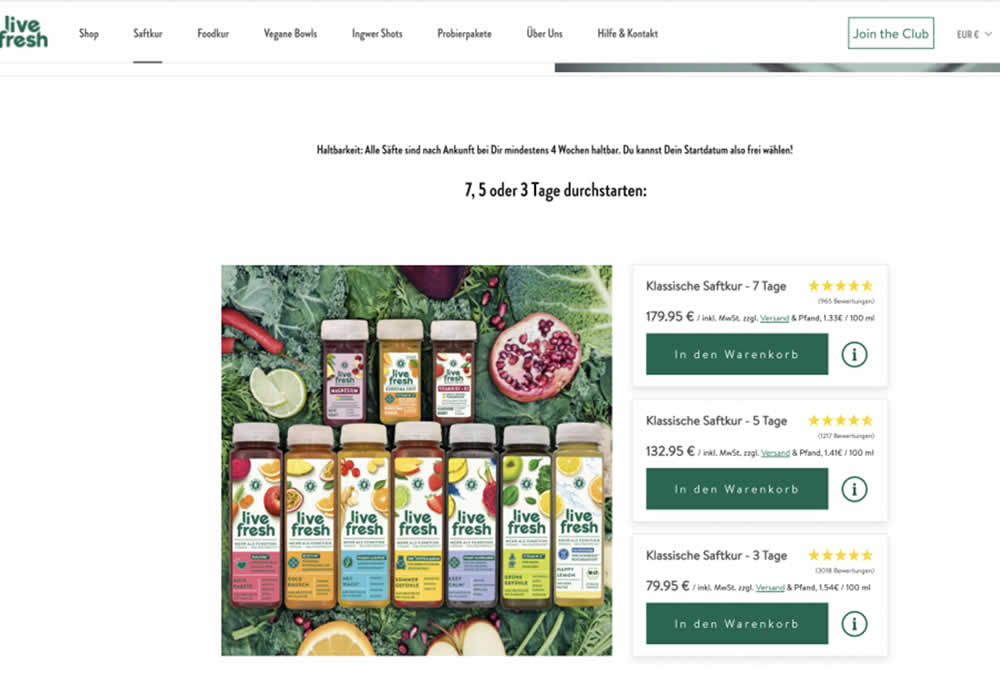
In this product landing page experiment, the plan sort order was rearranged. In the control it was sorted from least expensive to most expensive. In the variation, the plans were shown as most expensive first. Impact on sales and revenue was measured.