All Latest 620 A/B Tests
MOST RECENT TESTS
Test #481 on
Backstage.com
by  Stanley Zuo
Jul 14, 2023
Desktop
Mobile
Checkout
X.X%
Sales
Stanley Tested Pattern #15: Bulleted Reassurances On Backstage.com
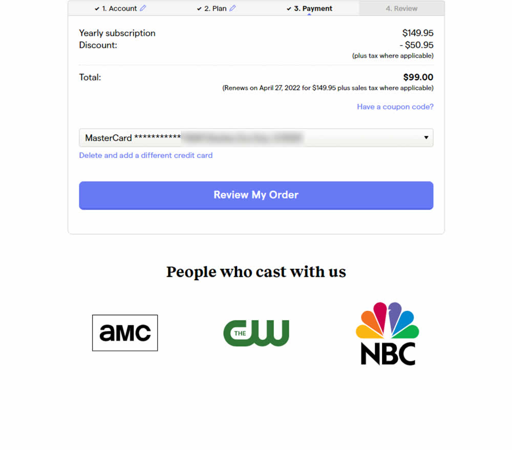
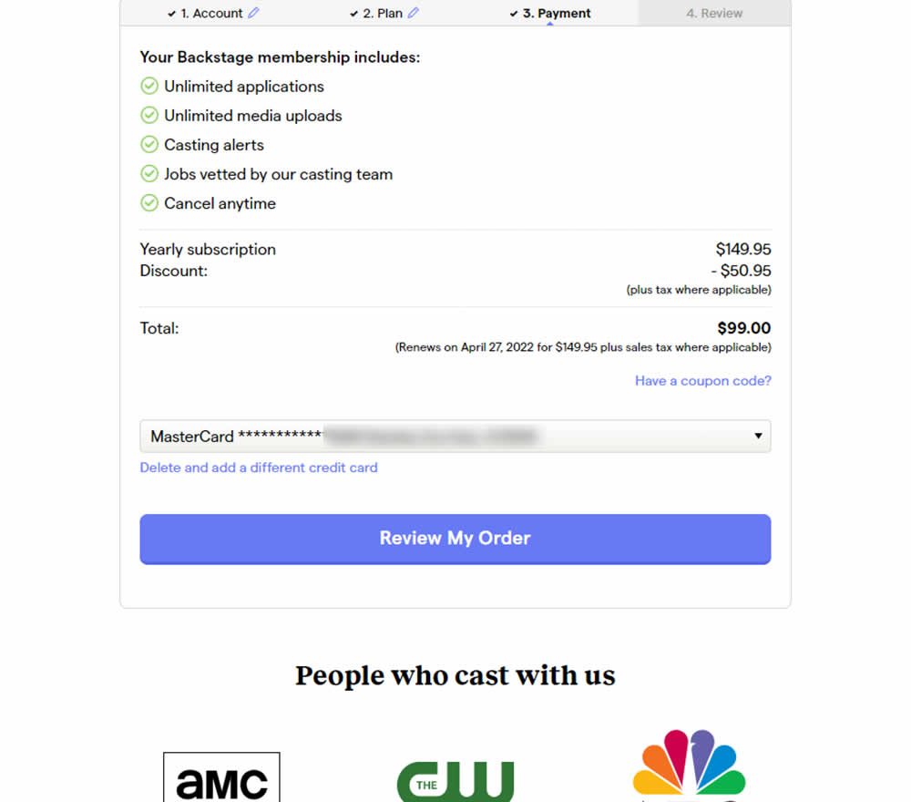
In this experiment, selling points and benefits of a subscription were placed as bullets at the top of a checkout page. The benefits highlighted things such as: unlimited applications, access to vetted jobs and the ability to cancel anytime. Impact on sales was measured.
Which A Or B Actually Wins? Find Out Before You Test.
Members see every test result — the winners, the flat ones, and the losers — along with exact effects and sample sizes. Use it to estimate your tests and prioritize by probability, not gut feel. Start every experiment with the odds on your side.
Test #482 on
by  Jakub Linowski
Jul 13, 2023
Desktop
Mobile
Checkout
X.X%
Sales
Jakub Tested Pattern #124: Confirmed Selection
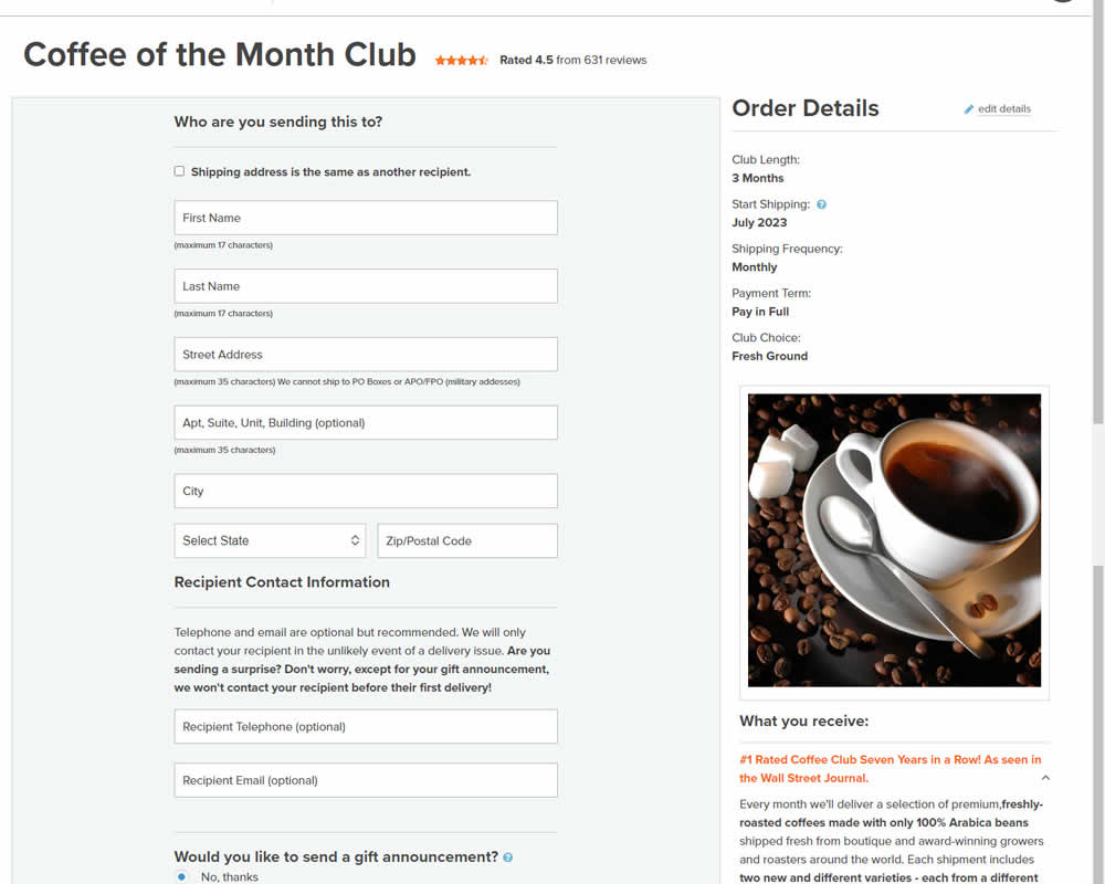
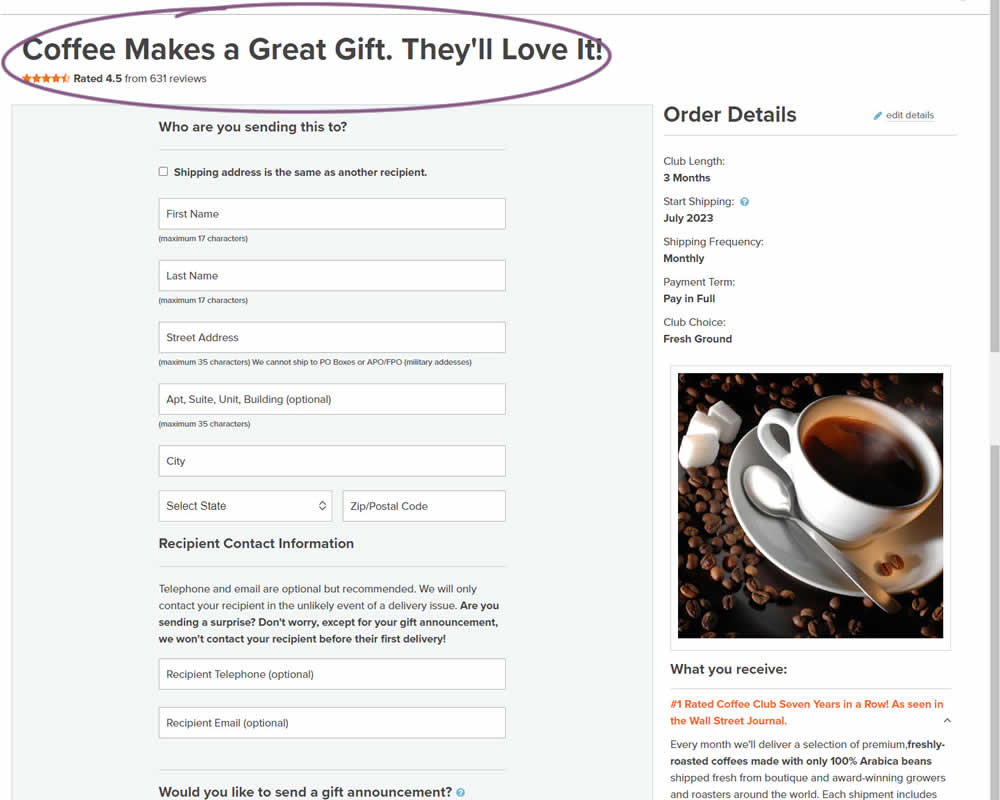
In this experiment, the choice of adding a product to cart was confirmed with a further positive message in the header of the next step (on the add to cart page). Once users left the product detail page, instead of simply stating the product name, the title was rephrased as "Product [X] Makes a Great Gift. They'll Love It!". I view this as a higher "intensity" experiment, given that the add-to-cart page was in some way already confirming the choice. Impact on sales was measured.
Test #480 on
Aboalarm.de
by  Daria Kurchinskaia
Jun 15, 2023
Desktop
Mobile
Checkout
X.X%
Sales
Daria Tested Pattern #15: Bulleted Reassurances On Aboalarm.de

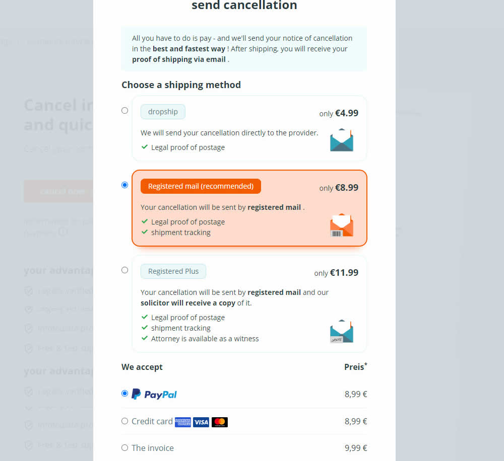
In this experiment, a list of benefits were shown for each of the 3 plans on the last step of a contract cancelation service. The lowest plan only had one benefit, whereas the highest plan had 3. Impact on transactions was measured.
Test #479 on
Aboalarm.de
by  Daria Kurchinskaia
Jun 15, 2023
Desktop
Mobile
Checkout
X.X%
Sales
Daria Tested Pattern #15: Bulleted Reassurances On Aboalarm.de
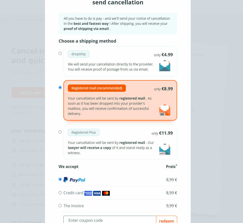
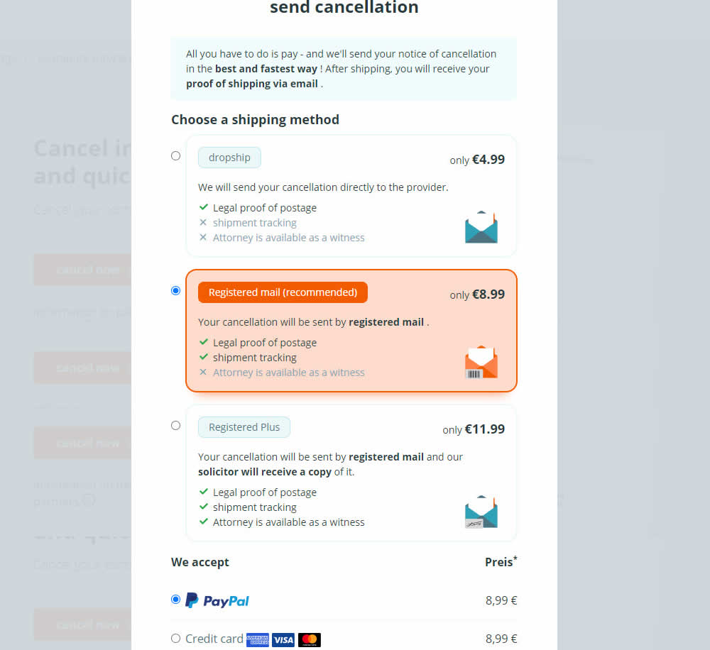
In this experiment, a list of benefits were shown for each of the 3 plans on the last step of a contract cancelation service. Benefit items not included in the lower plans were also shown with grayed out styles (and an "x"). Clearly the higher paid plan had all the benefits listed. Impact on transactions was measured.
Test #478 on
Estilomma.com
by  José Álvarez
Jun 14, 2023
Mobile
Global
X.X%
Sales
José Tested Pattern #130: Less Or More Visible Offer Pages On Estilomma.com
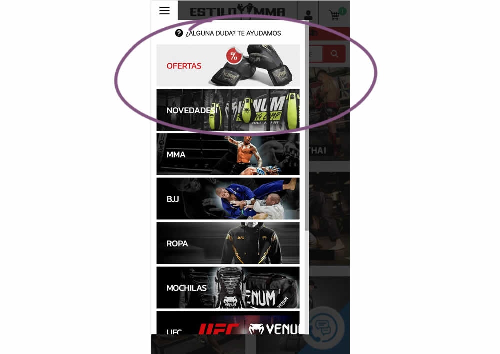
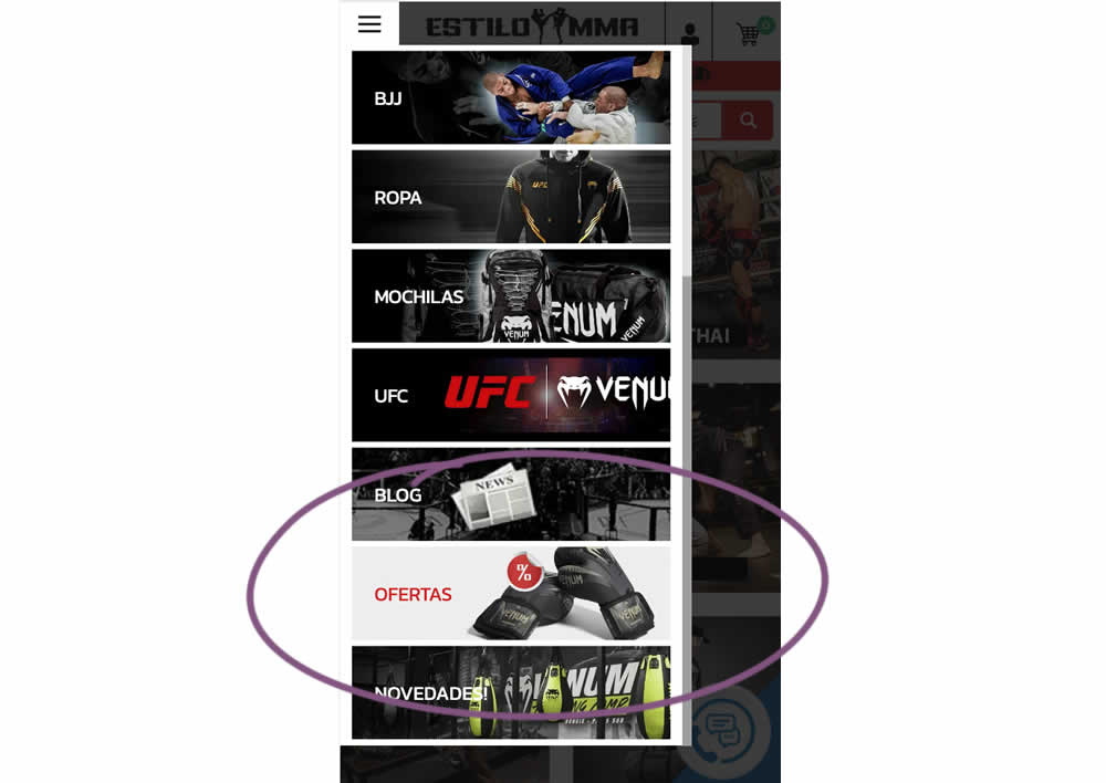
In this experiment, an offers page was shifted all the way down inside an expanded mobile navigation. The control showed it at the very top. The variation showed it at the bottom. (Note that the screen shot shows an already scrolled navigation - in the initial view, users would not be able to see the discount page right away, as it required some scrolling). Impact on overall sales was measured.
Test #477 on
Snocks.com
by  Melina Hess
Jun 09, 2023
Mobile
Desktop
Product
X.X%
Sales
Melina Tested Pattern #95: Clickable Product Previews On Snocks.com
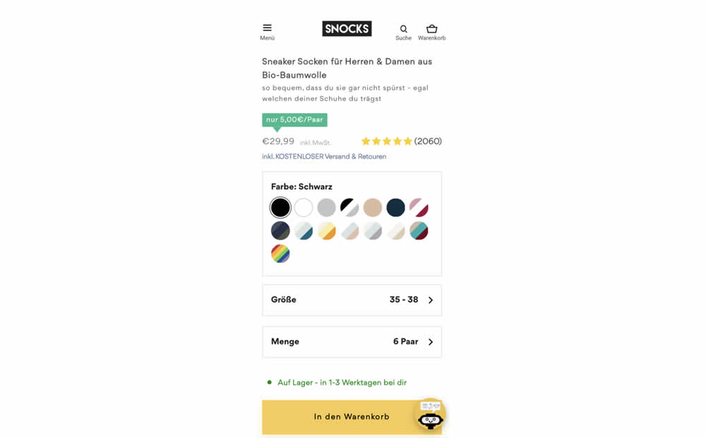
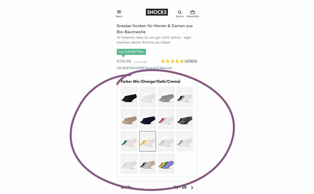
In this experiment, product color swatches were replaced with real product photos. Whereas the control showed the colors as more abstract circles. Impact on sales was measured.
Test #476 on
by  Devesh Khanal
Jun 08, 2023
Mobile
Product
X.X%
Sales
Devesh Tested Pattern #95: Clickable Product Previews
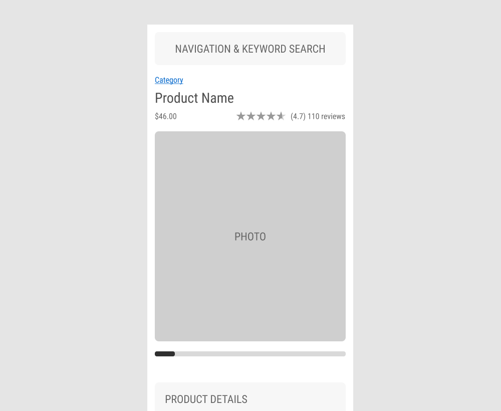
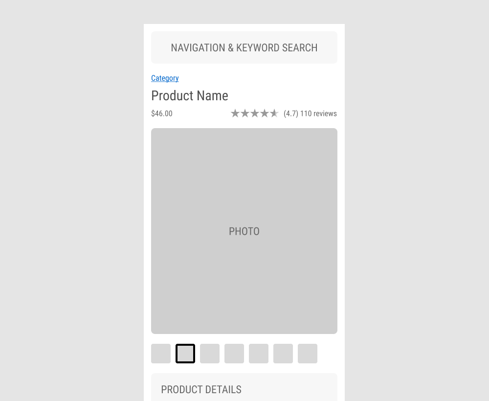
The GrowthRock team ran an experiment on one of their client's product detail pages. Instead of using a scrollbar (for mulitple images), clickable product photo thumbnails were used instead. Impact on sales was measured.
Test #475 on
Online.metro-cc.ru
by  Andrey Andreev
Jun 07, 2023
Desktop
Mobile
Listing
X.X%
Sales
Andrey Tested Pattern #36: Fewer Or More Results On Online.metro-cc.ru
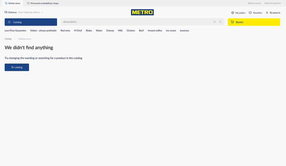
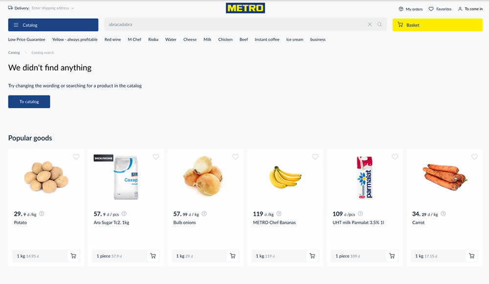
Are more (popular) product results better than none at all? In this experiment, popular products were shown during an empty search result. Impact on sales was measured.
Test #474 on
Rollbar.com
by  Mike Smith
May 27, 2023
Desktop
Mobile
Home & Landing
X.X%
Signups
Mike Tested Pattern #4: Testimonials On Rollbar.com
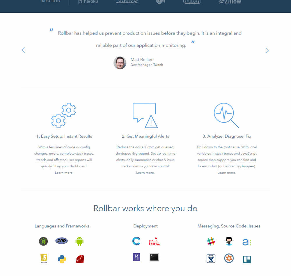
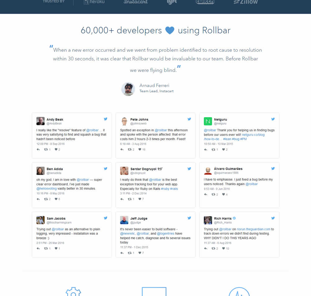
In this experiment, 9 Twitter card style testimonials were appended onto the homepage of Rollbar. These were image / screenshots recreations without links to the actual tweets.
Test #471 on
Expertinstitute.com
by  Ardit Veliu
May 25, 2023
Desktop
Mobile
Home & Landing
X.X%
Leads
Ardit Tested Pattern #48: Video Testimonials On Expertinstitute.com

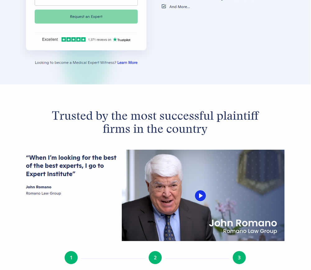
In this experiment, a video testimonial was added mid page onto a signup / lead form page.
Test #472 on
Expertinstitute.com
by  Ardit Veliu
May 25, 2023
Desktop
Mobile
Home & Landing
X.X%
Leads
Ardit Tested Pattern #48: Video Testimonials On Expertinstitute.com
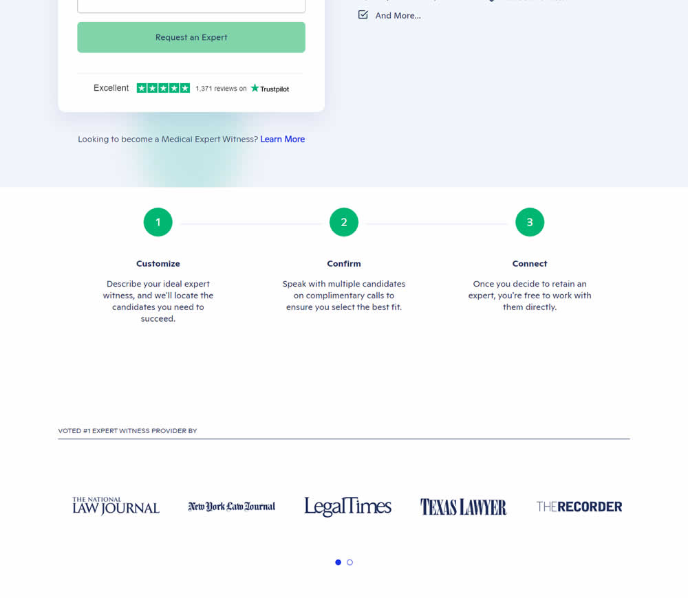
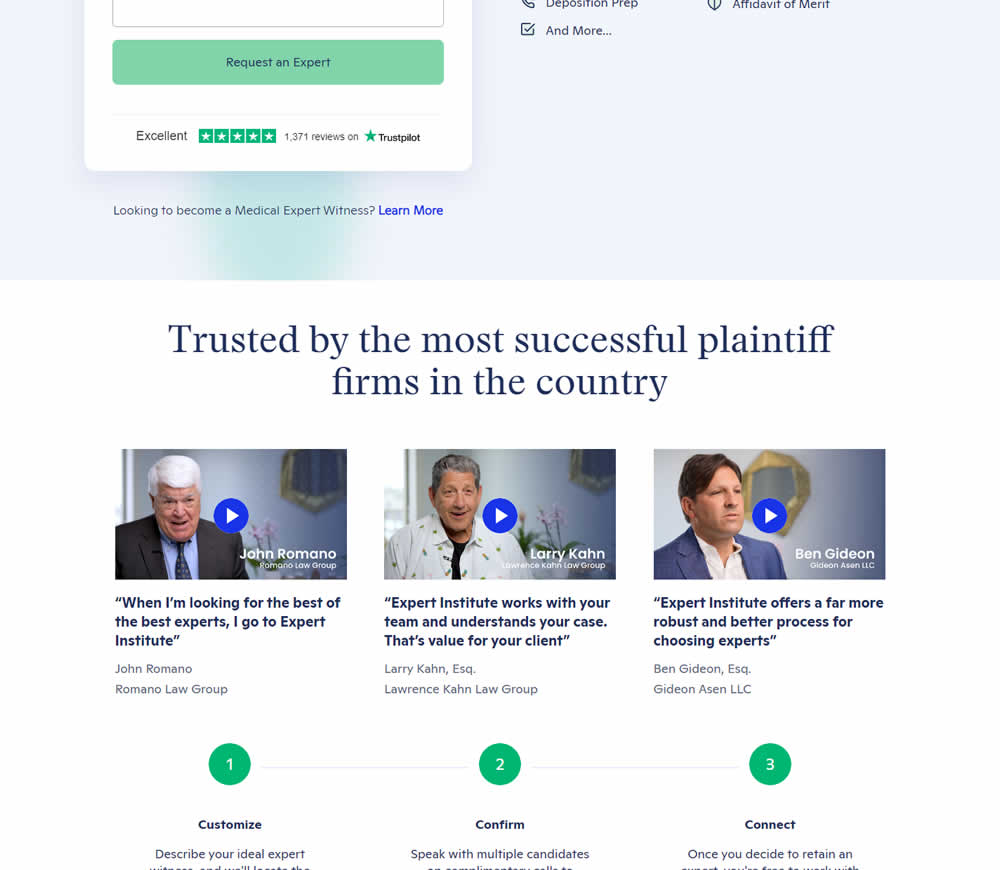
In this experiment, three video testimonials were added mid page onto a signup / lead form page.
Test #470 on
Formelskin.de
by  Alexander Krieger
May 12, 2023
Mobile
Signup
X.X%
Sales
Alexander Tested Pattern #3: Fewer Form Fields On Formelskin.de
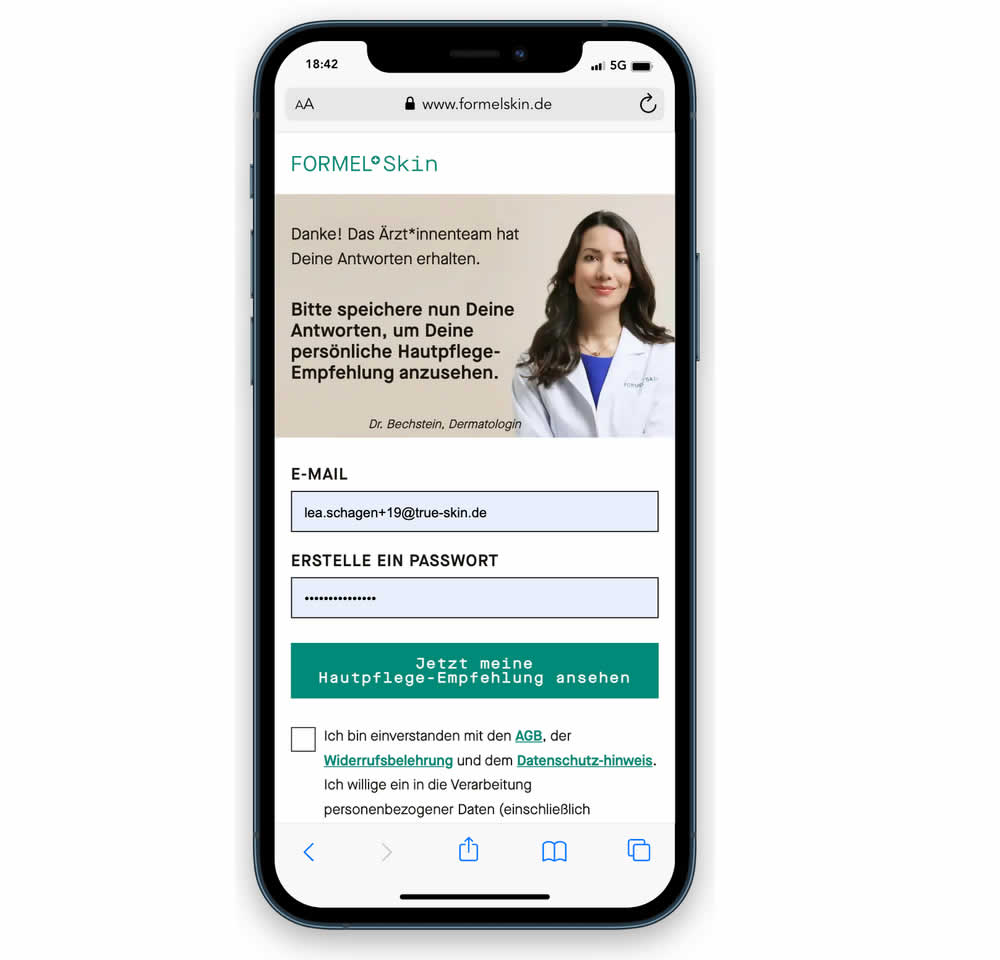
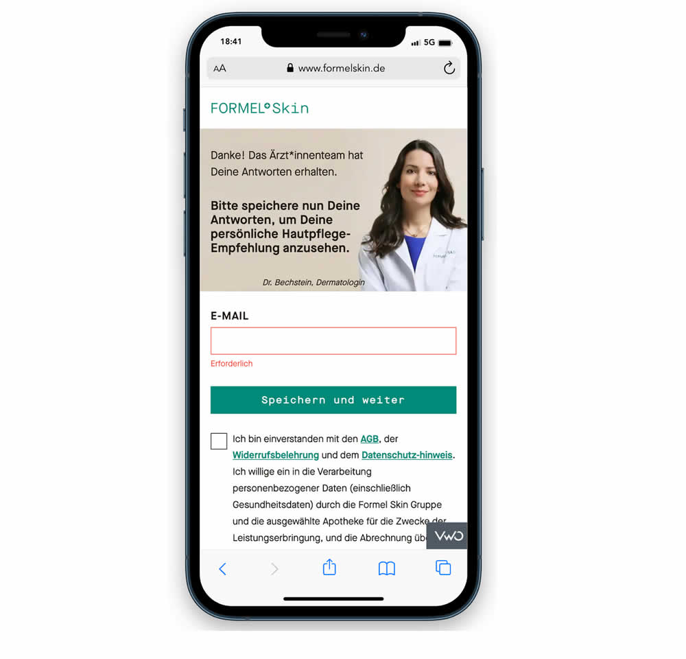
In this experiment, a password field was removed from a signup / account creation step. Instead of asking for a password, users received an email with an auto-generated password. This experiment ran on mobile and impact on sales (post-signup) was measured.
Test #468 on
Umbraco.com
by  Lars Skjold Iversen
Apr 28, 2023
Desktop
Mobile
Home & Landing
X.X%
Progression
Lars Tested Pattern #6: Customer Star Ratings On Umbraco.com
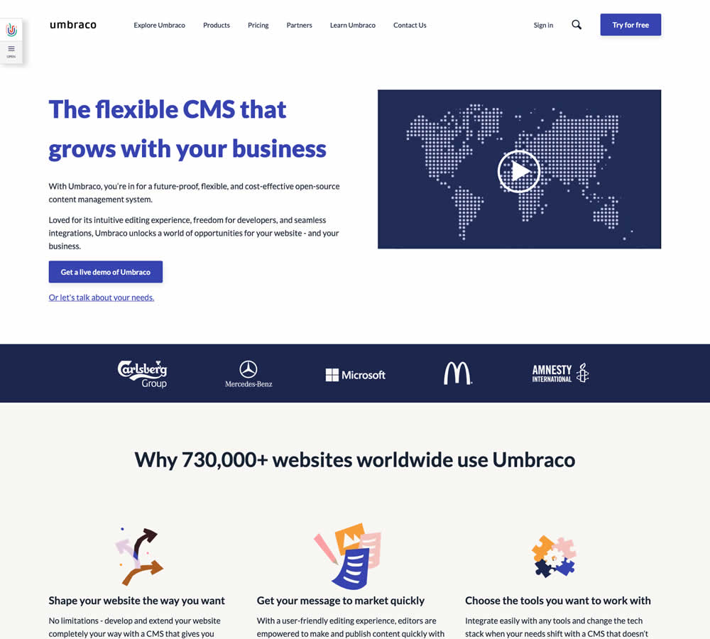
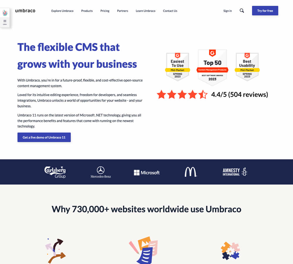
In this homepage experiment a number of changes were introduced - with perhaps the most prominent one being the replacement of a video component with customer review badges. Additional copy changes included reinforcement of the latest version number (v11) throughout the page, as well as a dedicated (v11) section in the middle of the page. Impact on demo signups was measured.
Test #467 on
by  Jakub Linowski
Apr 27, 2023
Desktop
Mobile
Product
X.X%
Sales
Jakub Tested Pattern #108: Frequently Asked Questions

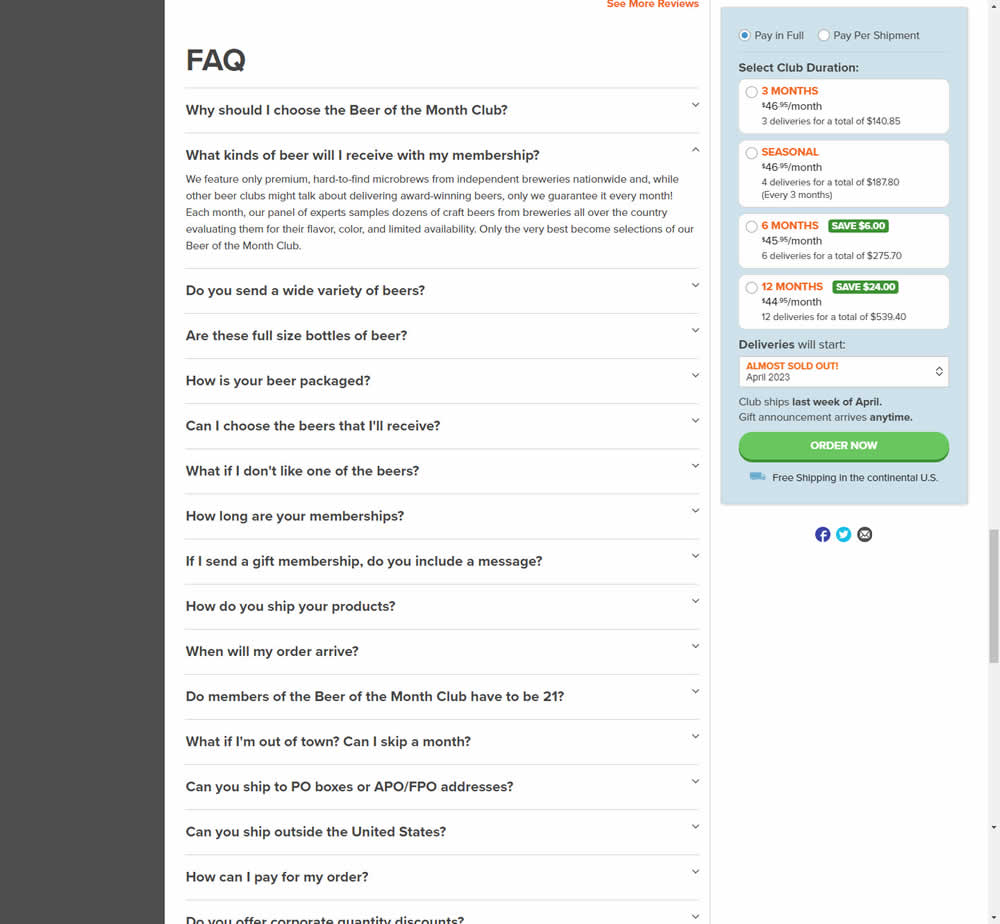
In this experiment, an FAQ section was added near the bottom of a long product page. The reviews were collapsed by default, but expandable upon clicking. Impact on adds-to-cart and sales was measured.
Test #465 on
by  Melina Hess
Apr 22, 2023
Desktop
Mobile
Product
X.X%
Revenue
Melina Tested Pattern #15: Bulleted Reassurances
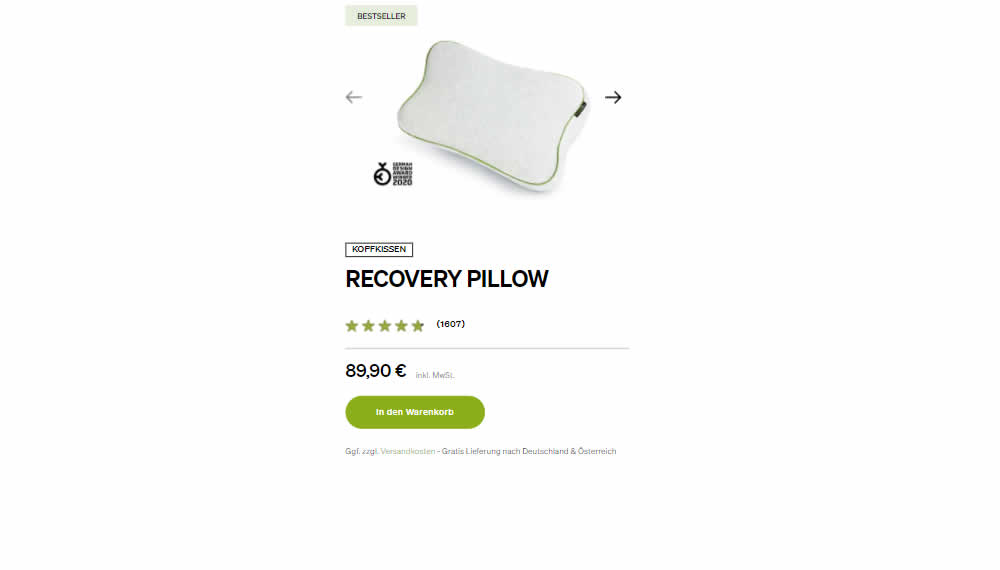
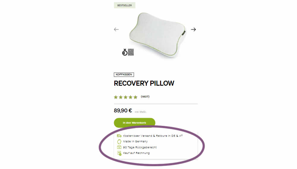
In this product detail page experiment, a number of reassurances were brought out visually in a lined or bulleted way. The 4 reassurances included: free shipping and returns; Made in Germany, 90 Day Returns; and Buy With Invoice (popular in Germany). Impact on revenue per user was measured. The control contained very feint copy (smaller and more subtle) about free shipping.
Test #464 on
Expertinstitute.com
by  Ardit Veliu
Mar 31, 2023
Desktop
Mobile
Home & Landing
X.X%
Leads
Ardit Tested Pattern #7: Social Counts On Expertinstitute.com
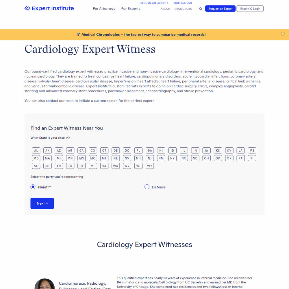
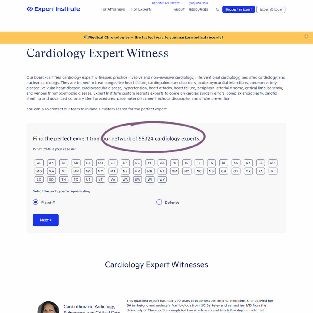
In this experiment, copy was added which showed the number of experts (in a given category) a person may gain access to after filling out a lead form. The context of this is a lead-gen landing page where people are seeking experts for legal purposes. Impact on initial progression (of a multi step form) and completed leads was measured.
Test #462 on
by  Jakub Linowski
Mar 24, 2023
Desktop
Mobile
Product
X.X%
Sales
Jakub Tested Pattern #128: Standard Or Superscript Price Format
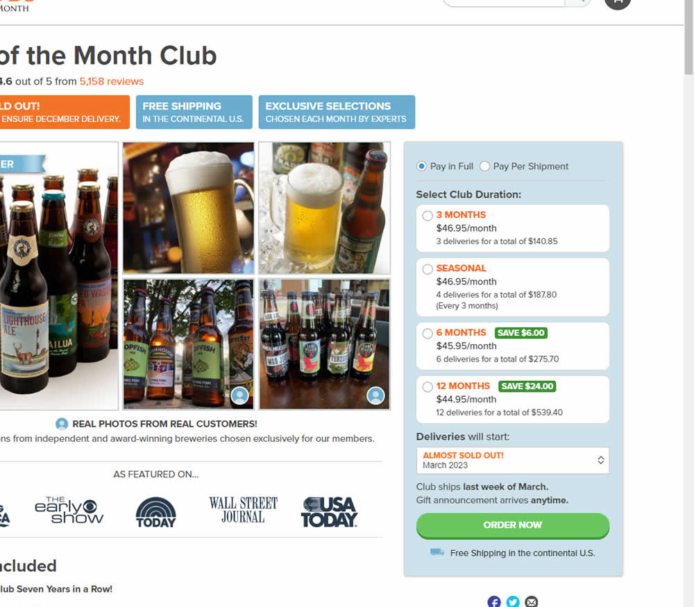
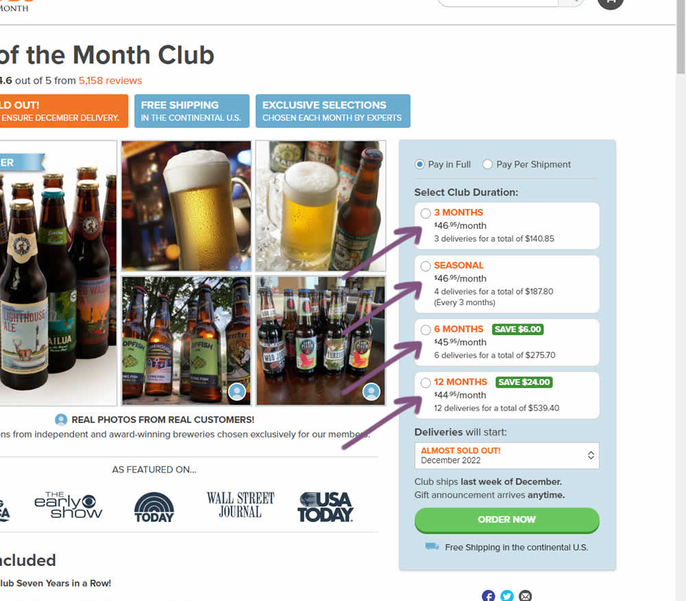
In this experiment, standard $ signs and cents were formatted into a smaller superscript. Impact on add-to-cart and sales was measured.
Test #461 on
Snocks.com
by  Melina Hess
Mar 23, 2023
Mobile
Product
X.X%
Sales
Melina Tested Pattern #15: Bulleted Reassurances On Snocks.com
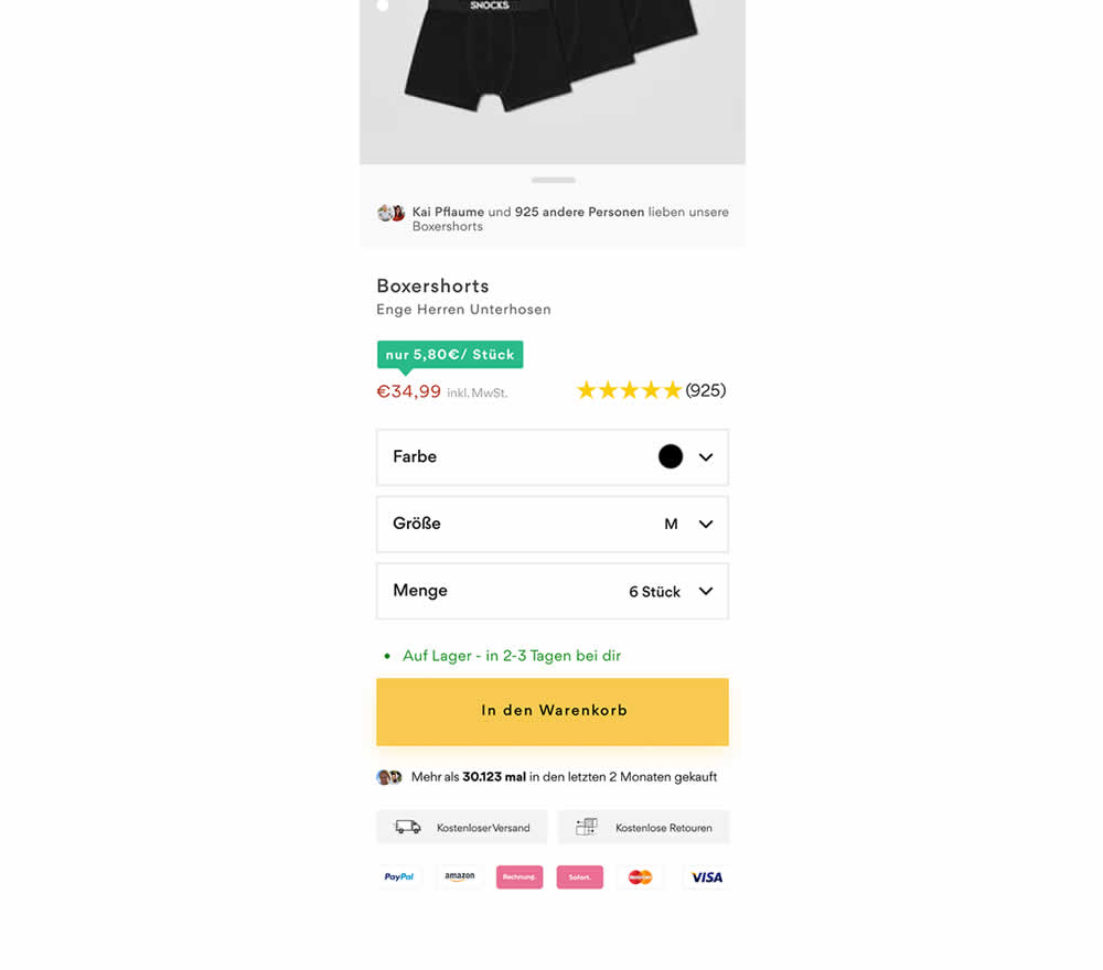
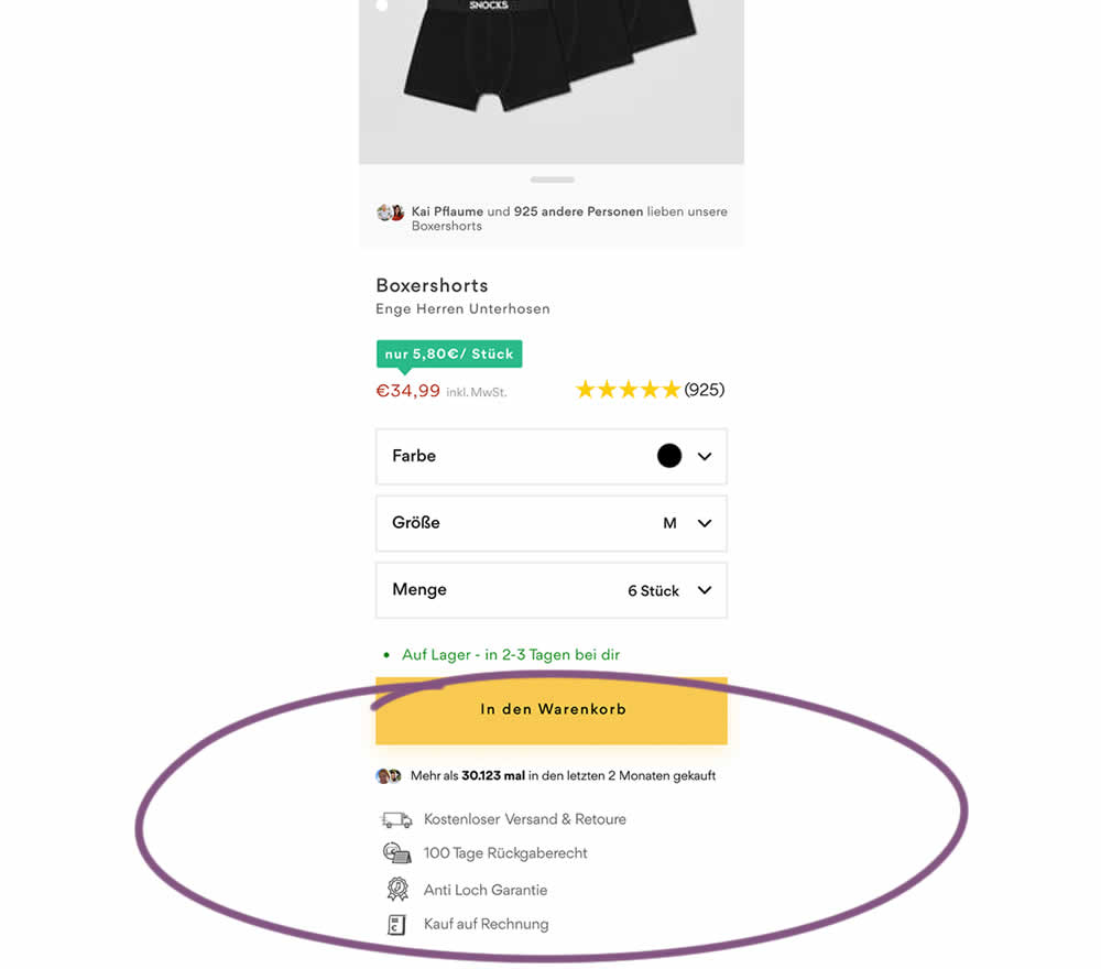
In this product detail page experiment, reassurances under the add-to-cart button were rearranged. The control contained copy about: free shipping and free returns formatted as two gray boxes, with a variety of payment methods and their corresponding logos underneath.
The variation used a more convention bulleted, line-by-line format. It also contained free shipping and returns, but also elaborated with "100 day returns", an "anti-hole guarantee", and "purchase with invoice" (perhaps more popular in Germany?). Impact on sales was measured.
Test #460 on
Backstage.com
by  Stanley Zuo
Mar 21, 2023
Mobile
Listing
X.X%
Sales
Stanley Tested Pattern #41: Sticky Call To Action On Backstage.com
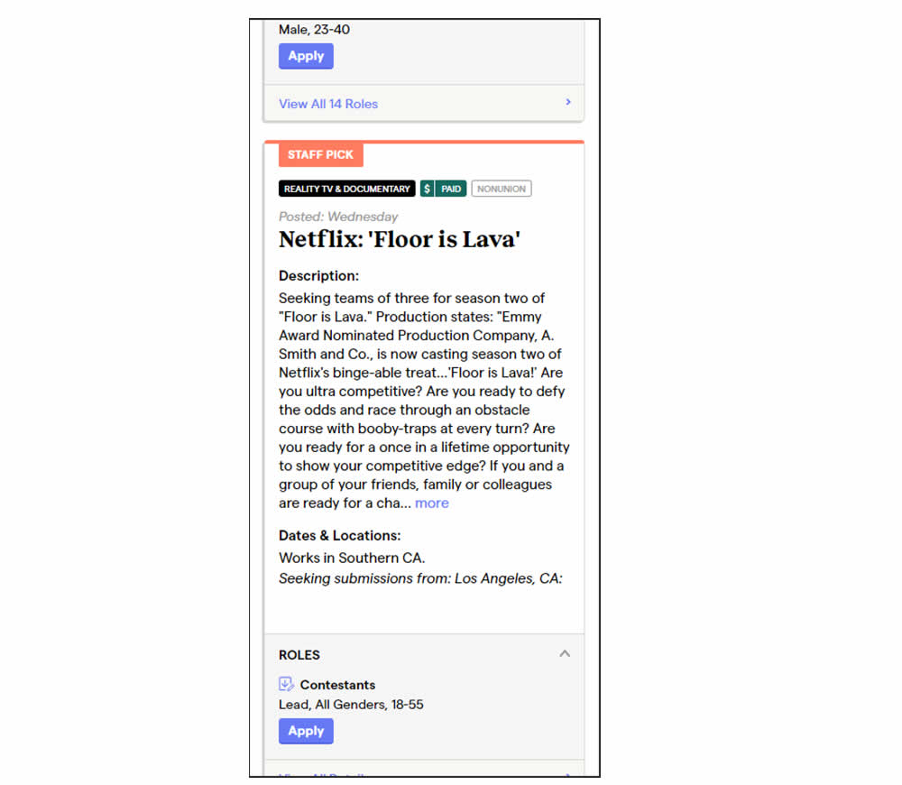
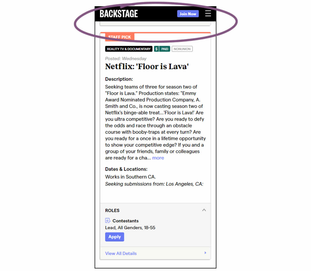
In this experiment, a floating top navigation was shown with a "Join" button. In the control, the navigation was only visible at the top of the page. Also keep in mind that signup starts were also triggered throughout multiple CTAs throughout the page and from particular job detail pages. The a/b test ran on a listing page of Backstage - a casting call job site. Impact on signups and checkouts was measured.
Test #459 on
Snocks.com
by  Melina Hess
Feb 28, 2023
Desktop
Mobile
Listing
X.X%
Sales
Melina Tested Pattern #36: Fewer Or More Results On Snocks.com
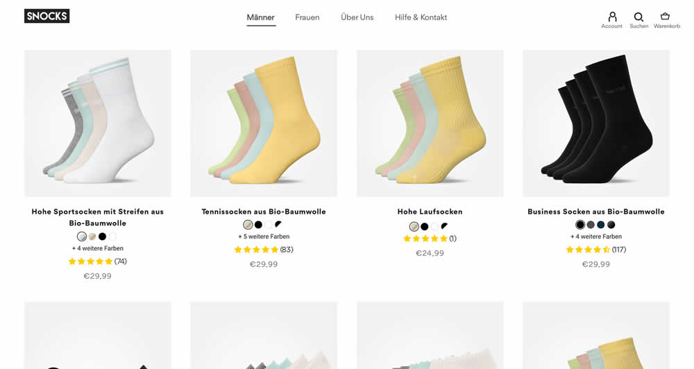
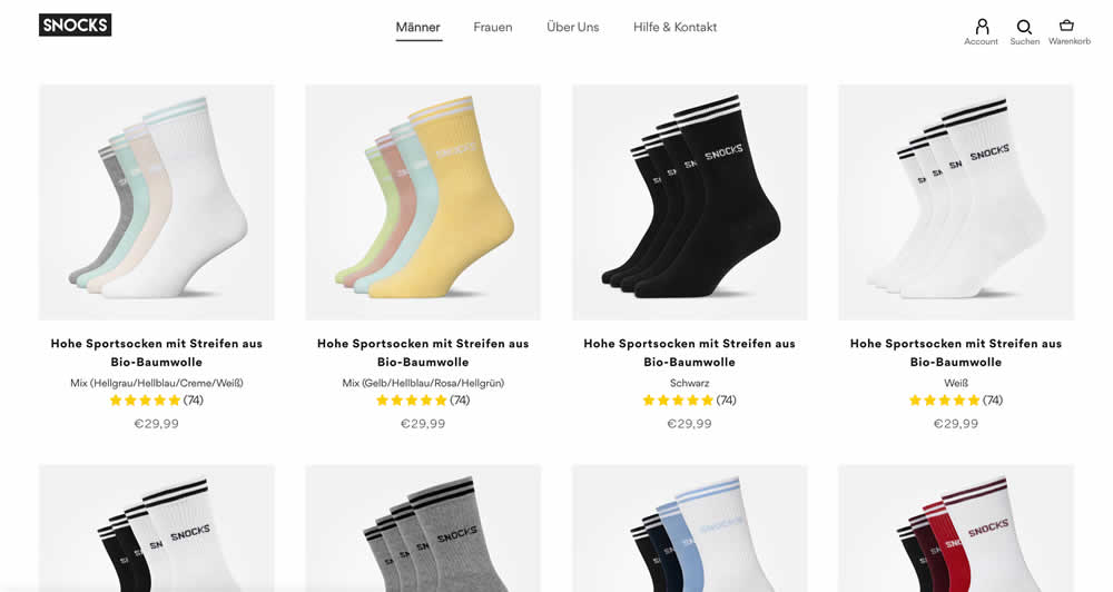
In this listing page experiment, color sets of the same product were tested against individual products with unique colors (with additional product tiles). Essentially, the A version here contained fewer product items (with color sets), while the B version contained more results and tiles (with grouped products). Impact on total sales was measured.
(The original control and variation was inverted, but was flipped to match the fewer or more results pattern).