All Latest 620 A/B Tests
MOST RECENT TESTS
Test #412 on
Volders.de
by  Frederik Fröhle
May 16, 2022
Desktop
Mobile
Checkout
X.X%
Sales
Frederik Tested Pattern #15: Bulleted Reassurances On Volders.de
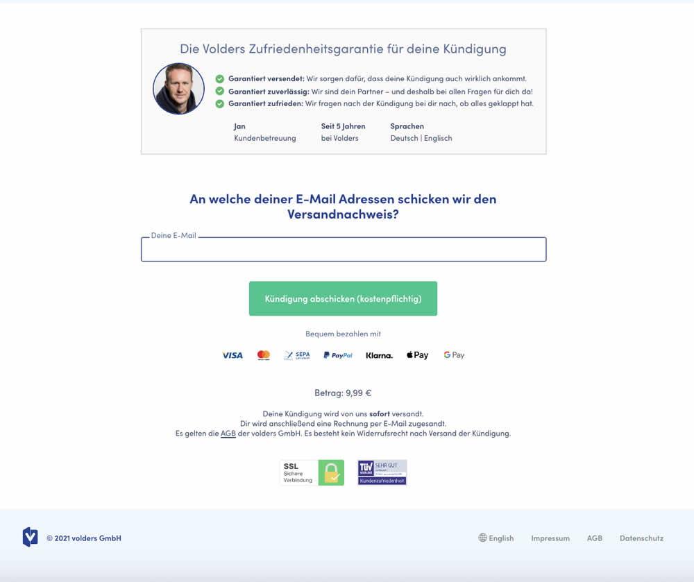
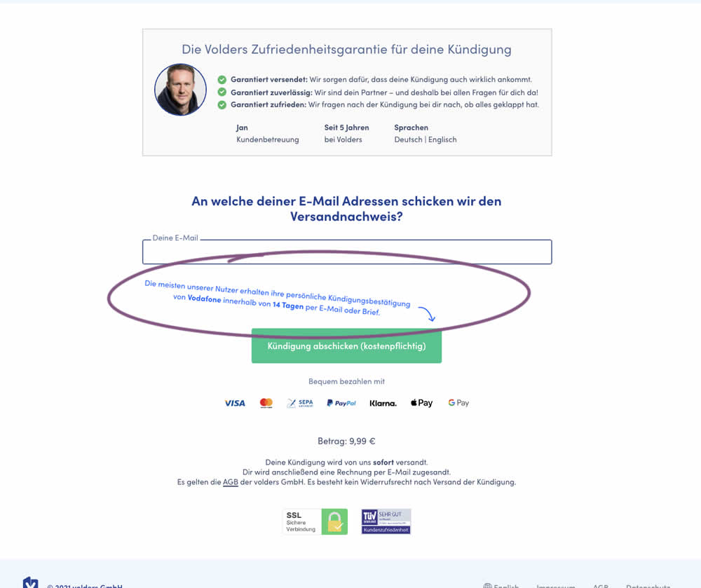
The Volders experimentation team assumed that adding information about how long it might take to get a cancellation confirmation near a CTA Button would result in higher cancellation requests (the paid service being offered).
The variation contained additional copy translated from German to: "Most of our users receive their cancellation confirmation from <vendor> within 14 days by email or letter."
Which A Or B Actually Wins? Find Out Before You Test.
Members see every test result — the winners, the flat ones, and the losers — along with exact effects and sample sizes. Use it to estimate your tests and prioritize by probability, not gut feel. Start every experiment with the odds on your side.
Test #411 on
by  Ayat Shukairy
May 09, 2022
Desktop
Mobile
Product
X.X%
Sales
Ayat Tested Pattern #126: Bottom Or Left Thumbnails
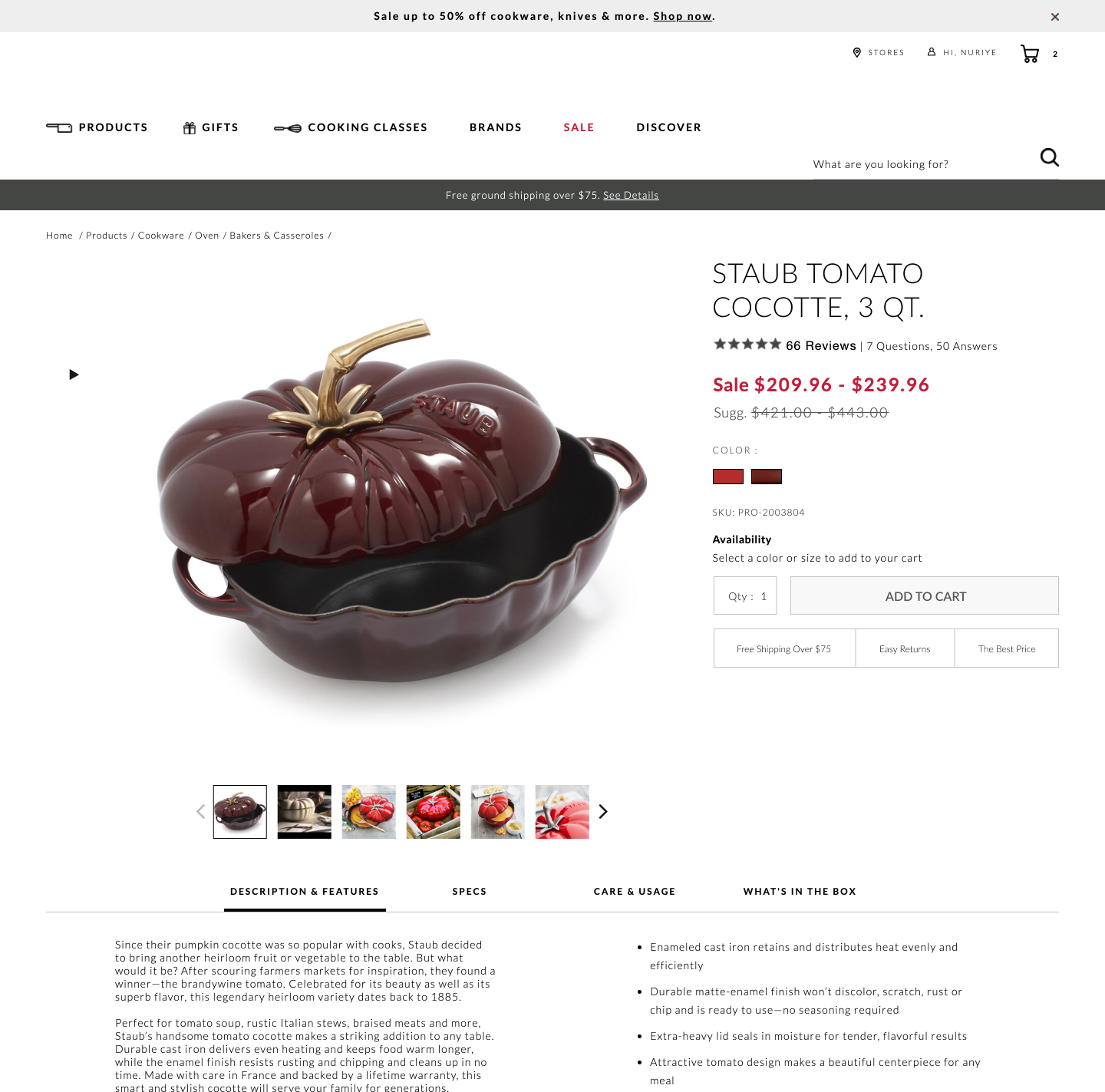
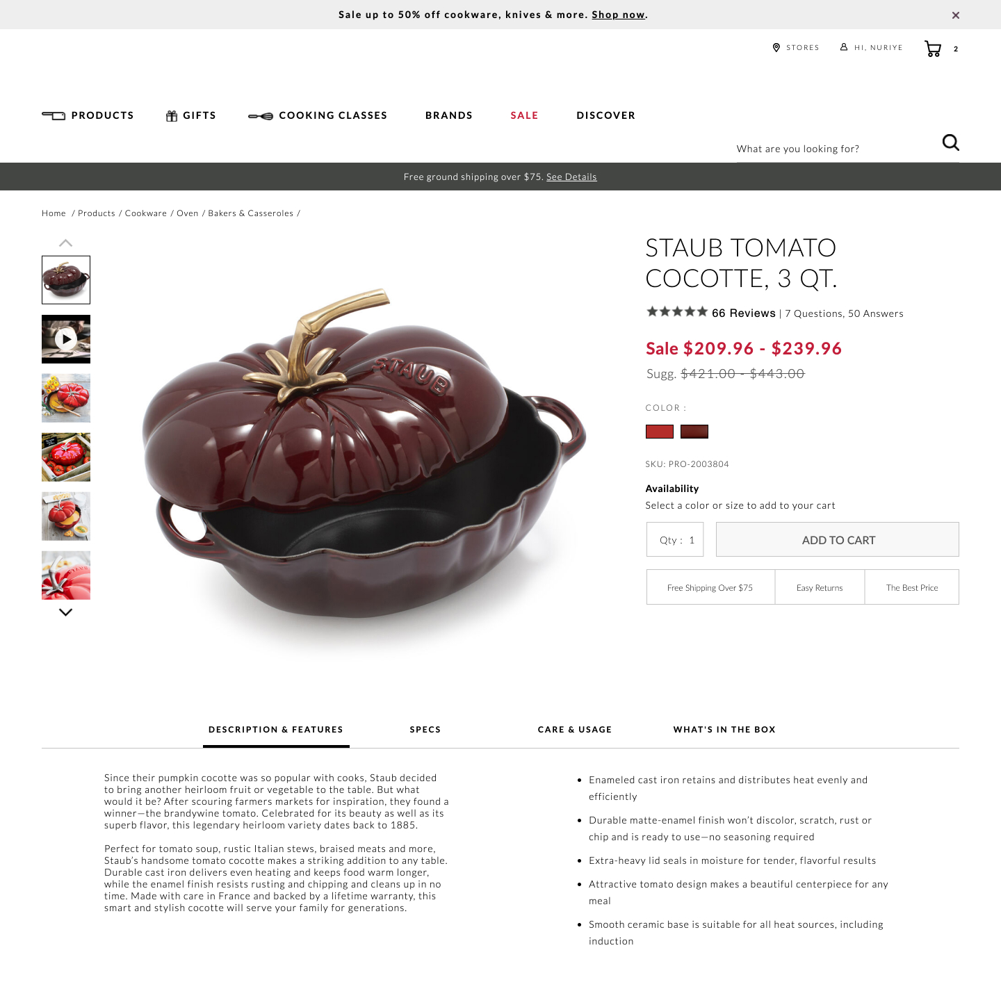
Bottom aligned thumbnails were shifted to the left side on a product image. Doing so, also shifted the product descriptions a little higher. Impact on adds-to-cart and total transactions was measured.
Test #410 on
Designlab.com
by  Daniel Shapiro
May 05, 2022
Desktop
Mobile
Home & Landing
X.X%
Sales
Daniel Tested Pattern #29: Surfaced Content On Designlab.com
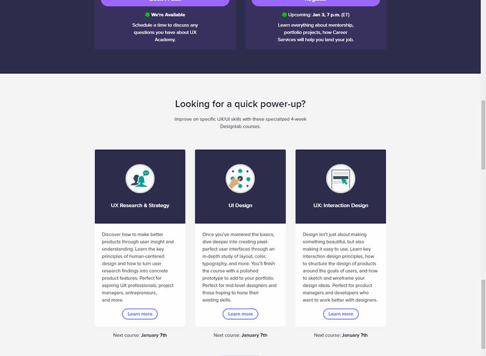
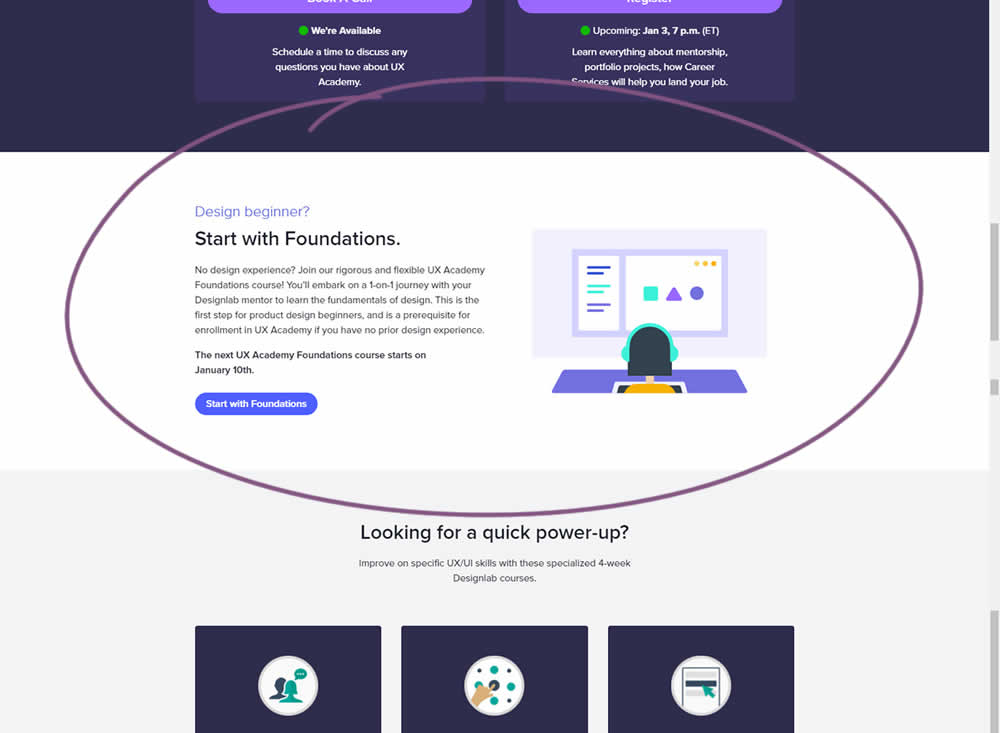
Does linking to a product detail page help? Or should a homepage simply focus on generic lead generation? In this homepage experiment, the presence of a component with a link to a detailed course landing page was tested. Impact on course enrollments was measured.
Test #409 on
Expertinstitute.com
by  Ardit Veliu
Apr 30, 2022
Desktop
Mobile
Signup
X.X%
Leads
Ardit Tested Pattern #20: Canned Response On Expertinstitute.com
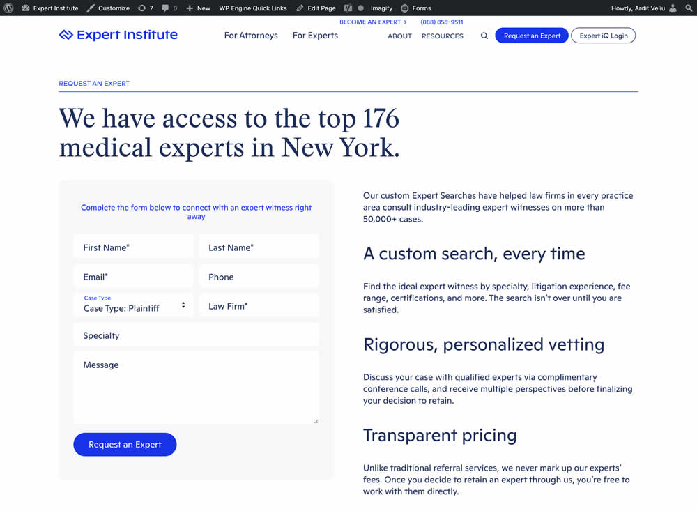
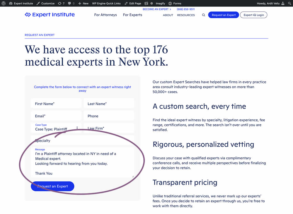
In this experiment, the copy of an input textarea on a lead form was used to summarize a user's choices. Instead of showing using a generic "Message" statement, the variation use the following formula: "I'm a [Lead Type] located in [State] looking for [Expert Type]. Looking forward to hearing from you today. Thank You." Impact of leads was measured.
Test #408 on
by  Jakub Linowski
Apr 29, 2022
Desktop
Mobile
Product
X.X%
Sales
Jakub Tested Pattern #67: Currency & Taxes
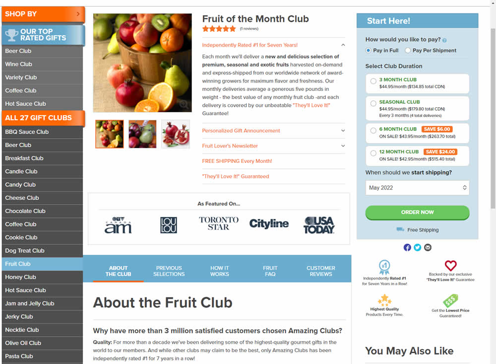
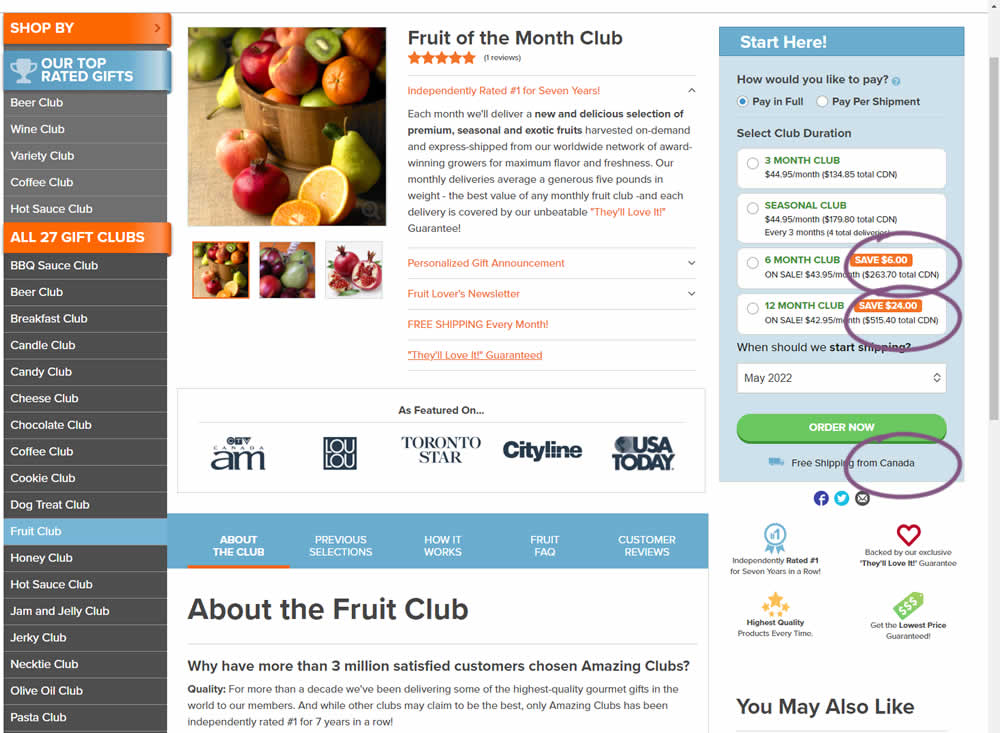
Here is a very simple experiment where CDN currency copy was appended to prices being shown on a Canadian ecommerce site. Additional copy ("from Canada") was appended to an existing shipping message.
Test #407 on
Snocks.com
by  Melina Hess
Apr 22, 2022
Desktop
Mobile
Product
X.X%
Sales
Melina Tested Pattern #125: Unit Prices On Snocks.com
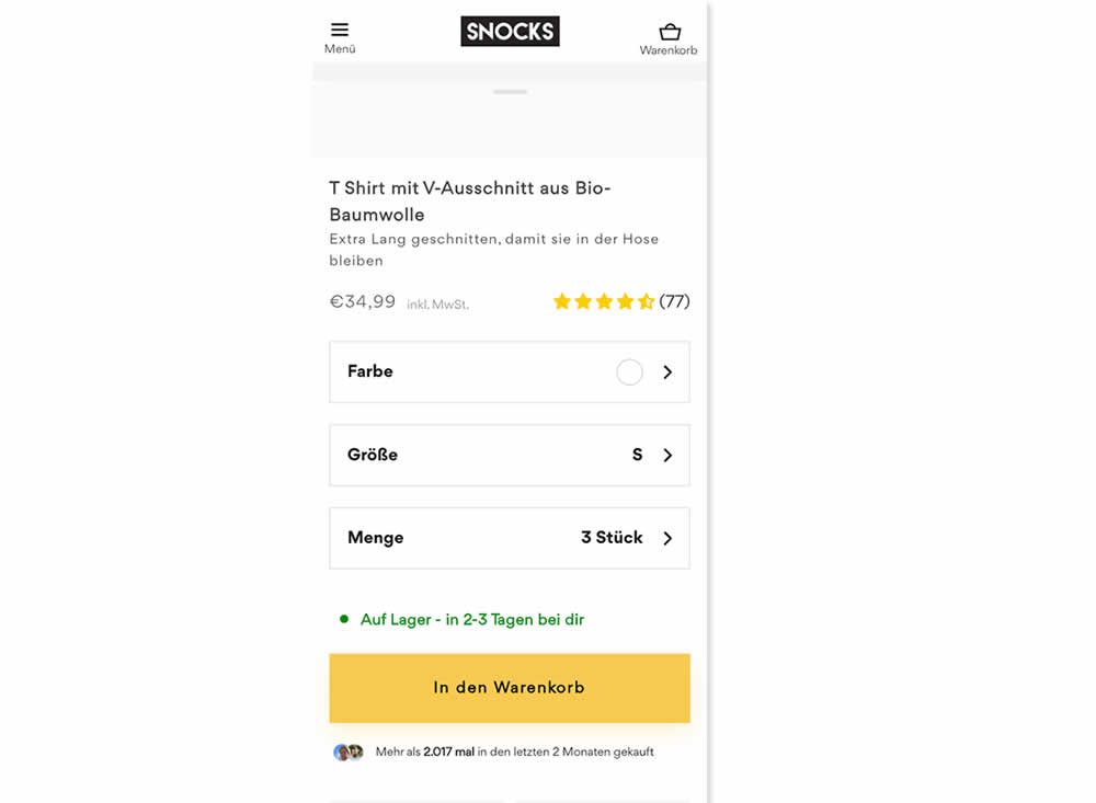
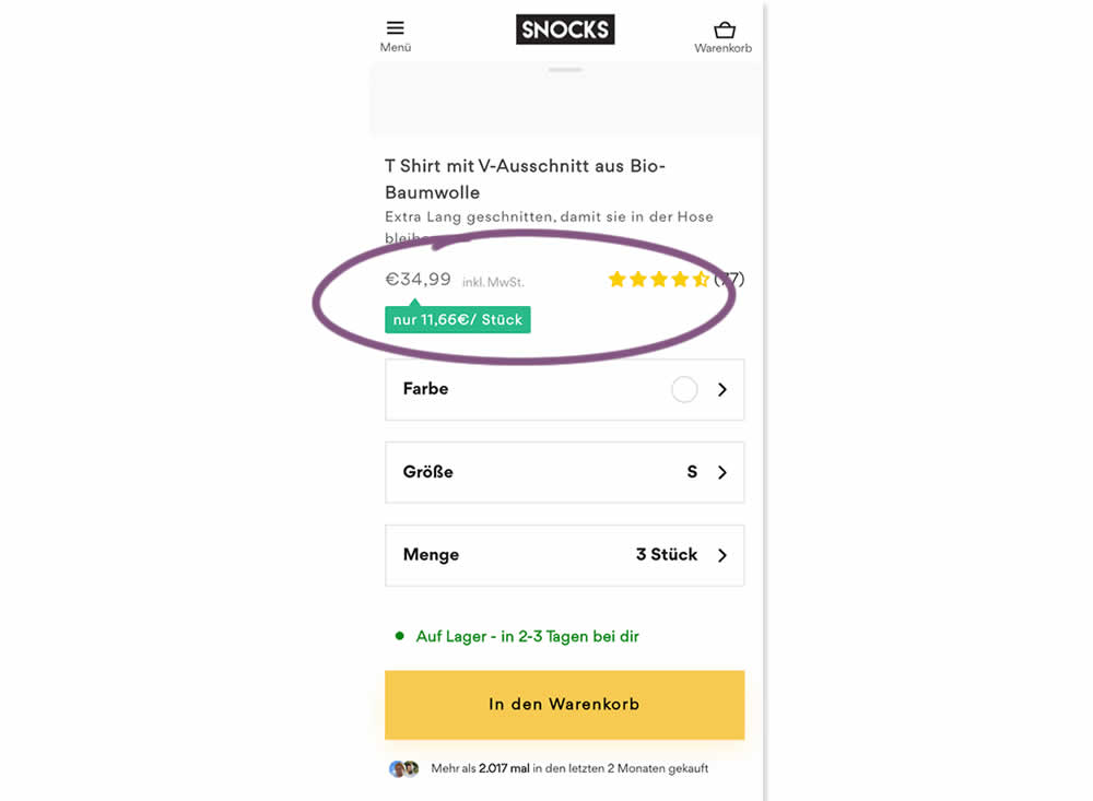
Here is an experiment with an added "price per pair" in the context of products with multiple items (packs).A high contrast badge-like copy was appended underneath the price which translates to "only $X per item". Impact on sales was measured.
Test #406 on
Chaos.com
by  Velin Penev
Apr 12, 2022
Desktop
Mobile
Product
X.X%
Sales
Velin Tested Pattern #112: Lower Price Frames On Chaos.com
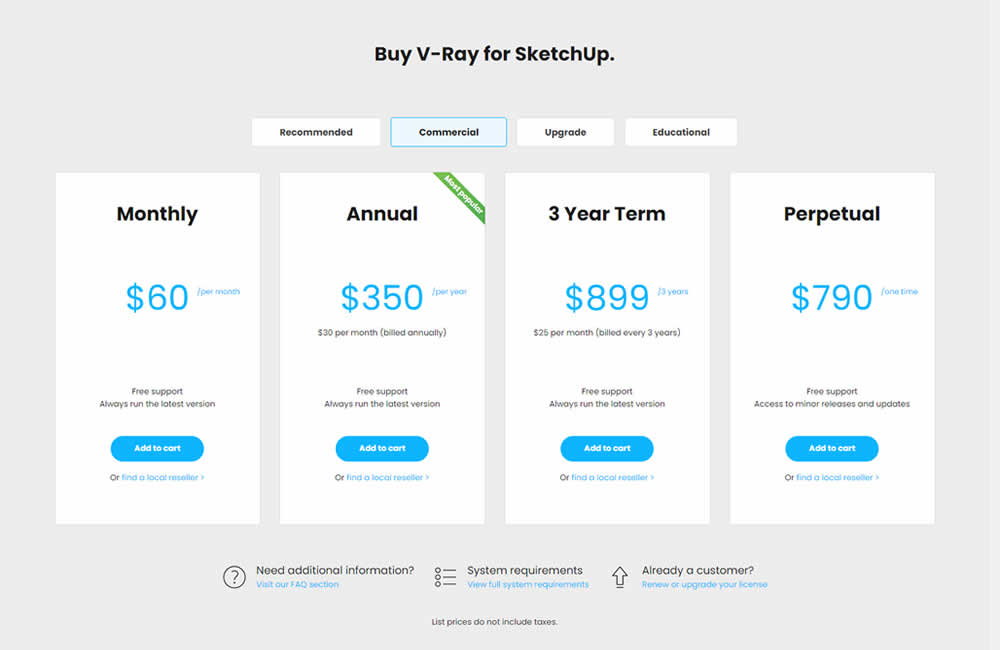
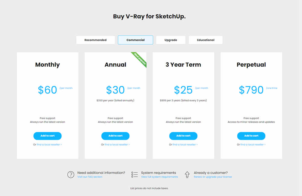
In this experiment, the pricing of three software plans was consistently framed into a more comparable monthly context. Whereas the control version only showed the total prices for each plan, the variation showed both the total and monthly prices. Impact on sales was measured.
Test #405 on
Learnwithhomer.com
by  Stanley Zuo
Apr 07, 2022
Mobile
Signup
X.X%
Sales
Stanley Tested Pattern #119: Unselected Or Selected Defaults On Learnwithhomer.com
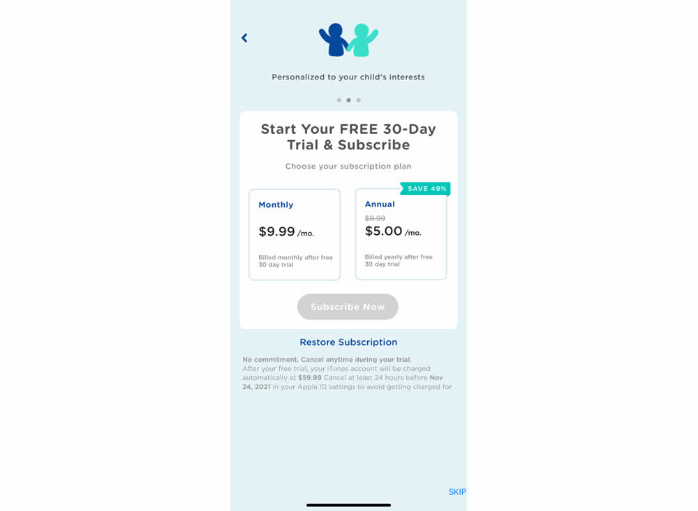
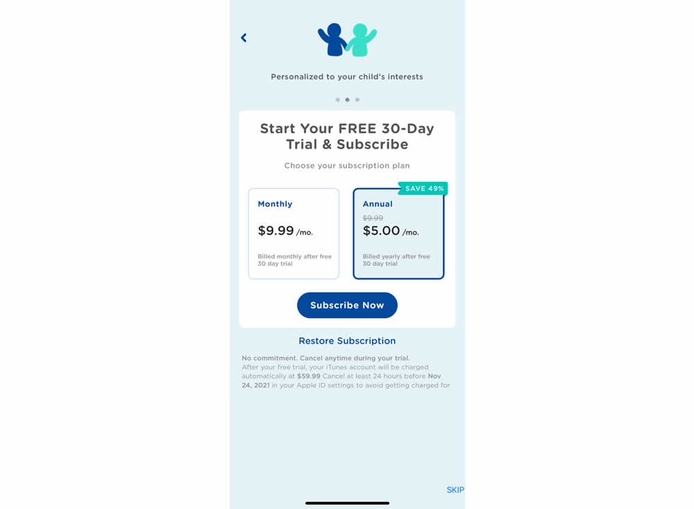
In this experiment, the annual plan was preselected instead of starting off unselected in the control. Impact on two metrics was measured: any plan and annual plan purchases.
Test #404 on
Expertinstitute.com
by  Ardit Veliu
Mar 31, 2022
Desktop
Mobile
Signup
X.X%
Leads
Ardit Tested Pattern #97: Bigger Form Fields On Expertinstitute.com
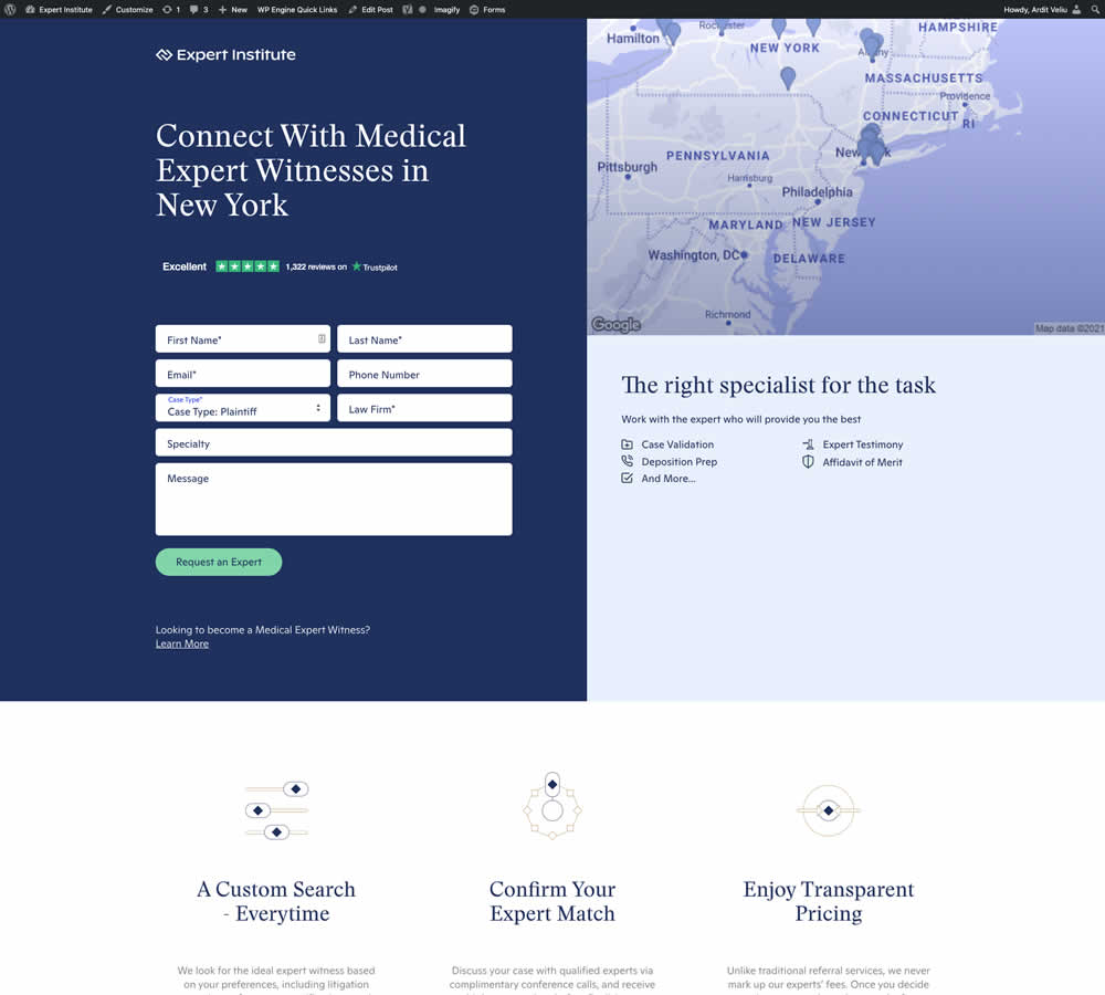
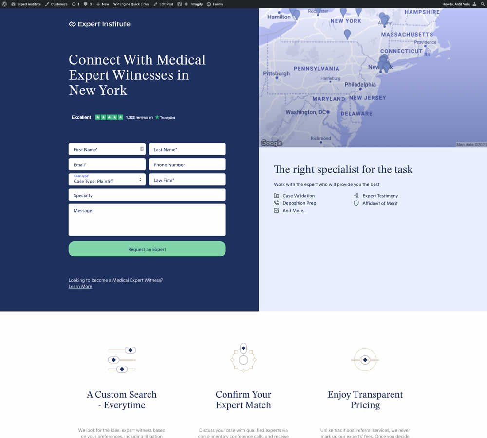
In this experiment, the button width was extended to the full width of the form above. Impact on leads was measured.
Test #403 on
by  Jakub Linowski
Mar 29, 2022
Desktop
Mobile
Checkout
X.X%
Sales
Jakub Tested Pattern #42: Countdown Timer
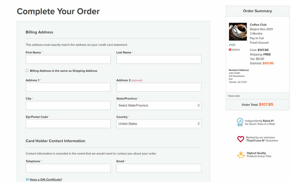
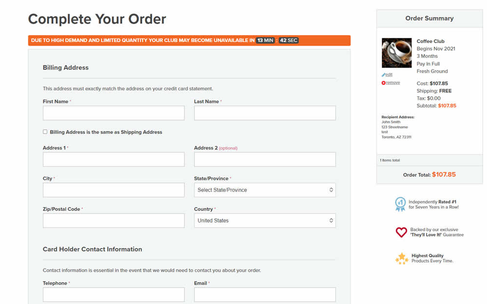
In this experiment, an urgency related message with a dynamic countdown timer was added on the final checkout screen. Impact on sales was measured.
Test #402 on
Snocks.com
by  Melina Hess
Mar 25, 2022
Mobile
Product
X.X%
Sales
Melina Tested Pattern #103: Money Back Guarantee On Snocks.com
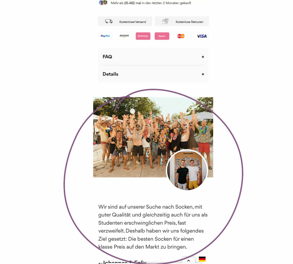
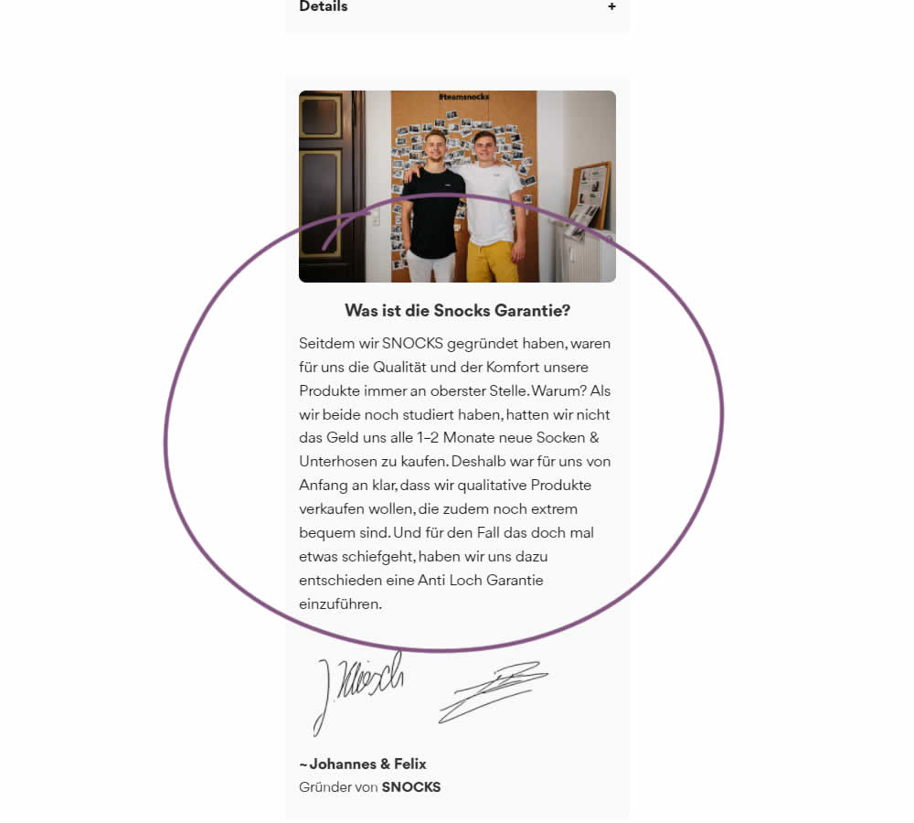
In this experiment on a product screen, a message about quality (from the founders) was reformatted to reinforce the "Anti Hole Guarantee" (in the context of socks). The founders were also made more prominent and their signature added as well. Interestingly, the actual guarantee copy (and its important detail about a 6 month product replacement) was present further down on both the control and variation.
The translation of the new copy (Google Translate) reads:
Since we founded SNOCKS, the quality and comfort of our products have always been our top priority. Why? When we both were still studying, we didn't have the money to buy new socks & underpants every 1-2 months. That's why it was clear to us from the start that we wanted to sell quality products that are also extremely comfortable. And just in case something goes wrong, we have decided to introduce an anti-hole guarantee.
Test #399 on
by  Jakub Linowski
Feb 27, 2022
Desktop
Mobile
Checkout
X.X%
Progression
Jakub Tested Pattern #35: Floating Labels
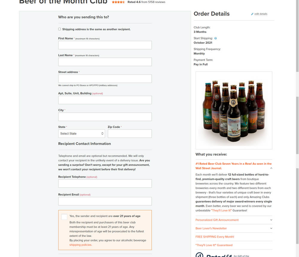
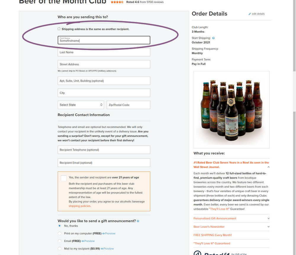
In this experiment, top-aligned field labels were tested against floating labels (with labels floating inside the form field itself).
Test #397 on
Snocks.com
by  Melina Hess
Feb 24, 2022
Mobile
Product
X.X%
Revenue
Melina Tested Pattern #121: Free Shipping On Snocks.com
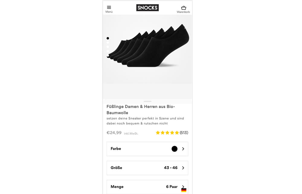
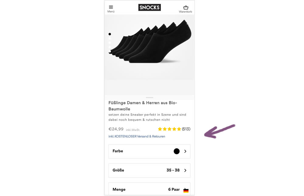
In this experiment a "Free Shipping & Returns" message was added just below the price information.
Test #123 on
Getninjas.com.br
by  Rodolfo Lugli
Feb 11, 2022
Mobile
Thank You
X.X%
Engagement
Rodolfo Tested Pattern #71: Personalized Next Step On Getninjas.com.br

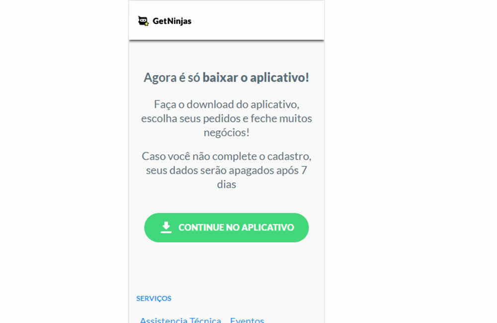
In this experiment, two app download buttons were tested against a single OS personalized one. In the control, both branded App Store and Google Play buttons were shown statically. Whereas in the variation a single download (stylized consistently with site wide button styles) button was shown depending on the user's operating system. Impact on application download was measured.
Test #395 on
by  Jakub Linowski
Jan 31, 2022
Desktop
Mobile
Product
X.X%
Sales
Jakub Tested Pattern #52: How It Works
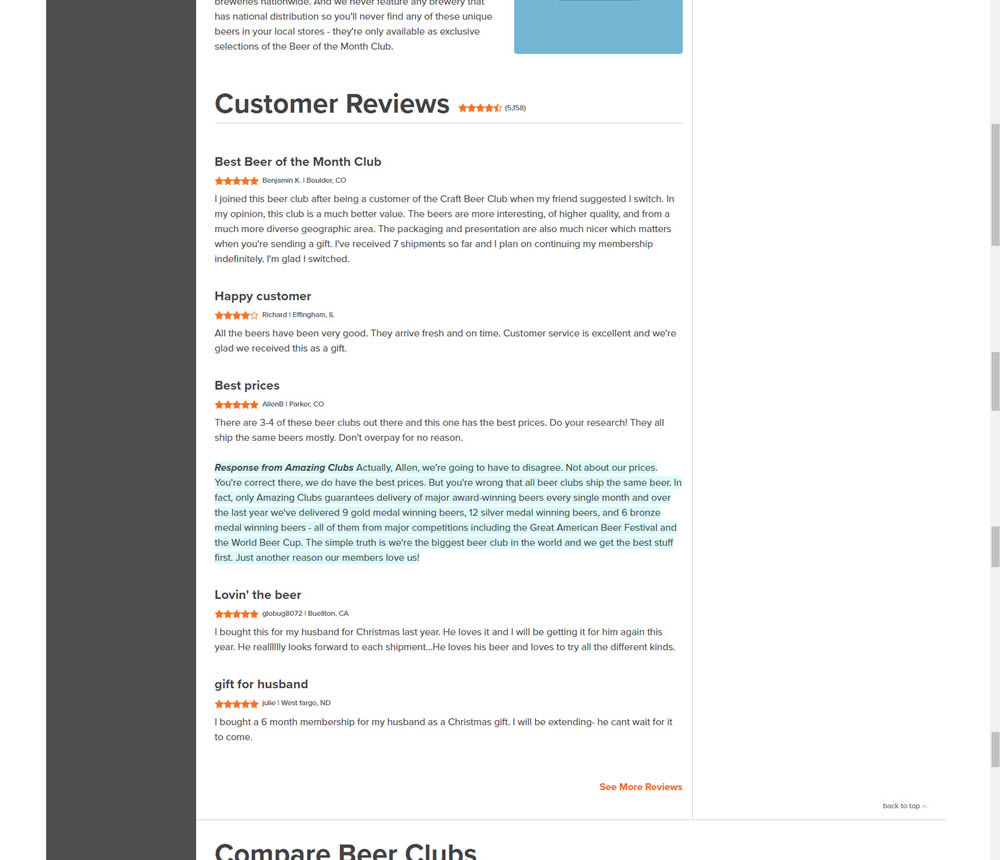
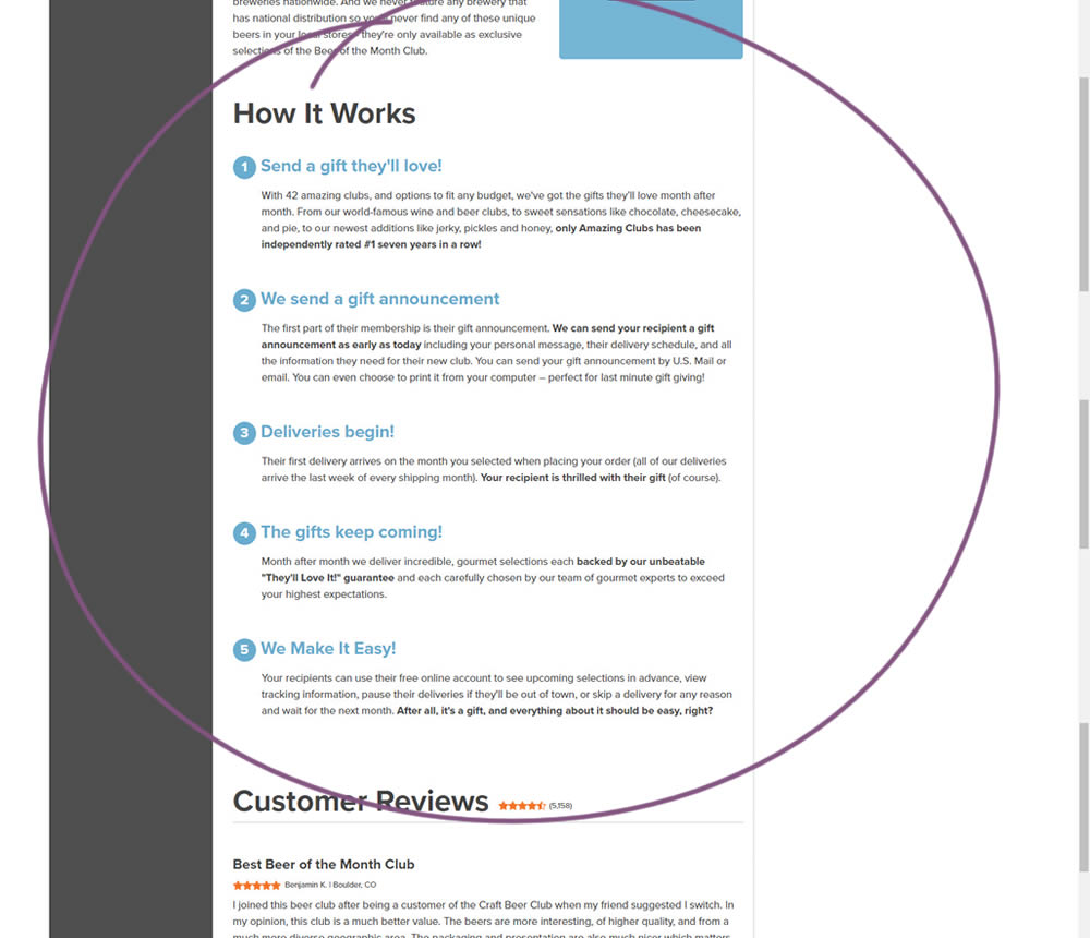
In this experiment, a How It Works section was appended on a product detail page just above product reviews.
Test #5 on
Busyteacher.org
by  Andrei Zakhareuski
Jan 23, 2022
Desktop
Mobile
Product
X.X%
Sales
Andrei Tested Pattern #21: What It's Worth On Busyteacher.org
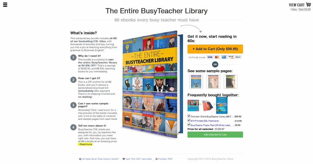
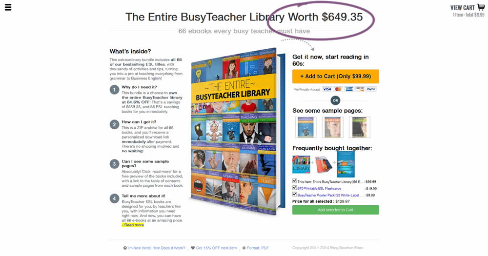
The variation included a simple extention of the headline to include the full dollar worth of a discounted bundle deal.
Test #122 on
Designlab.com
by  Daniel Shapiro
Jan 22, 2022
Desktop
Mobile
Product
X.X%
Leads
Daniel Tested Pattern #30: Authentic Photos On Designlab.com
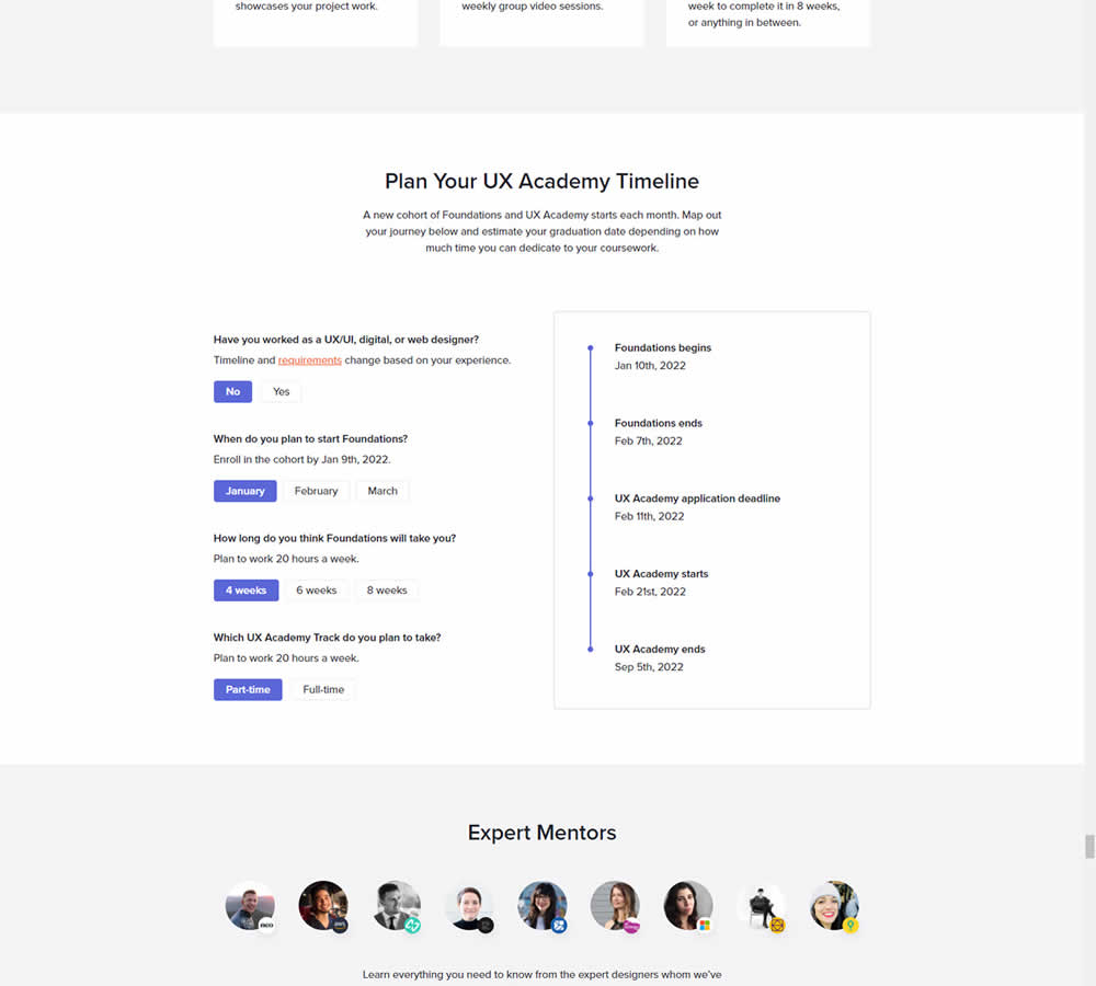
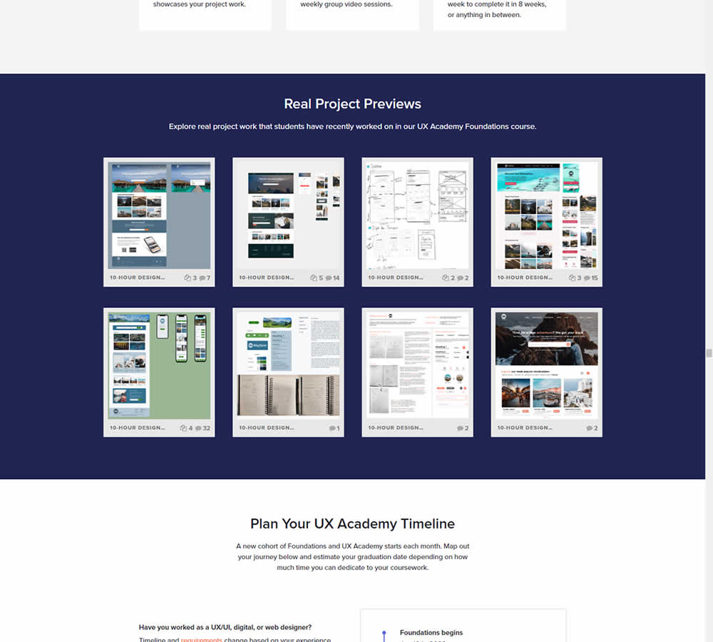
In this experiment for an online design course, the variation had an extra section with student work previews. The previews were not clickable but were added just below the fold. Impact on leads was measured by potential students requesting a syllabus through an online form throughout the long landing page.
Test #393 on
Snocks.com
by  Melina Hess
Jan 19, 2022
Mobile
Shopping Cart
X.X%
Sales
Melina Tested Pattern #1: Remove Coupon Fields On Snocks.com
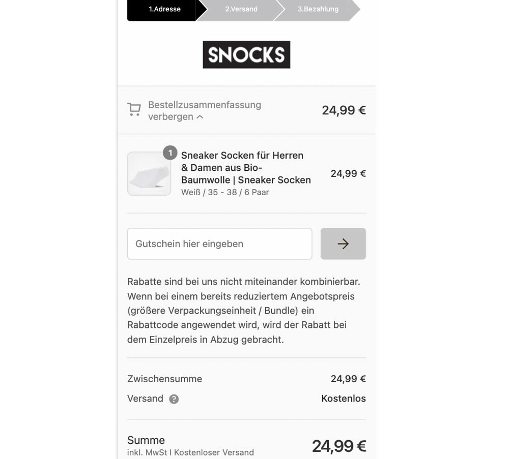
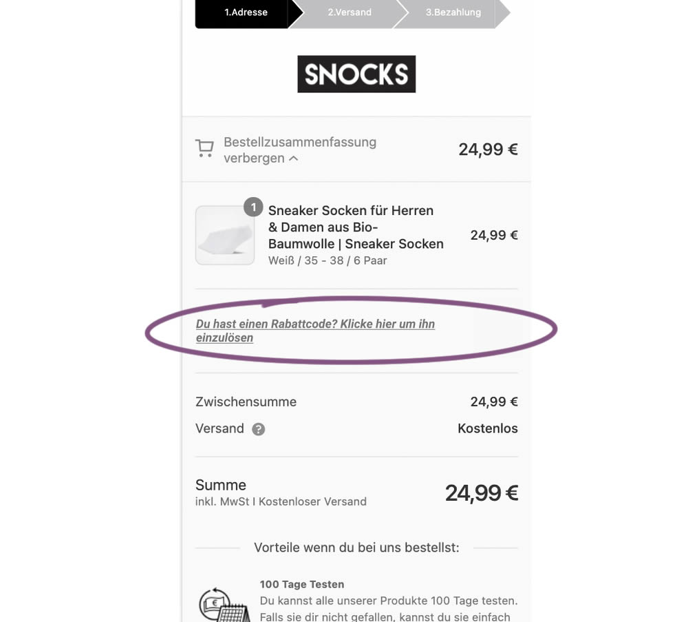
This experiment replaced a visible coupon field with a dynamic text link that would initially hide the form field. Only after clicking the text link would the coupon form field appear. The translation from German is "Do you have a coupon code? Click here to apply". Impact on completed transactions was measured.
Test #392 on
by  Jakub Linowski
Dec 31, 2021
Desktop
Mobile
Product
X.X%
Sales
Jakub Tested Pattern #122: Zigzag Layout
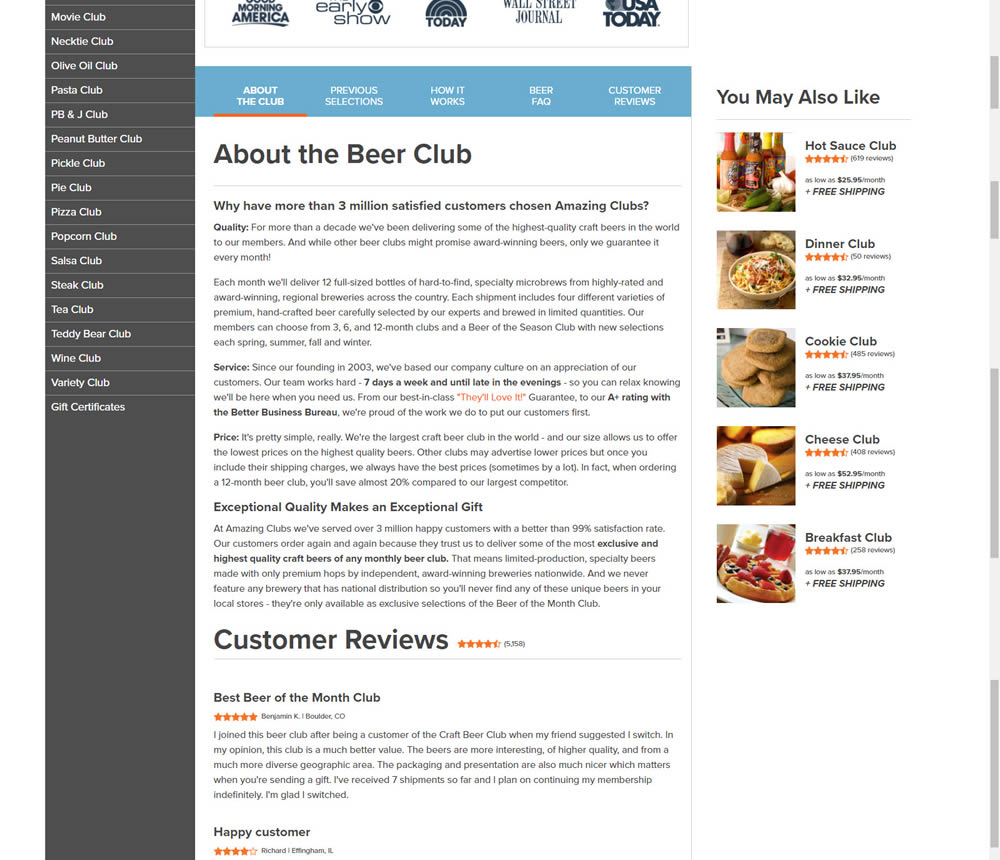
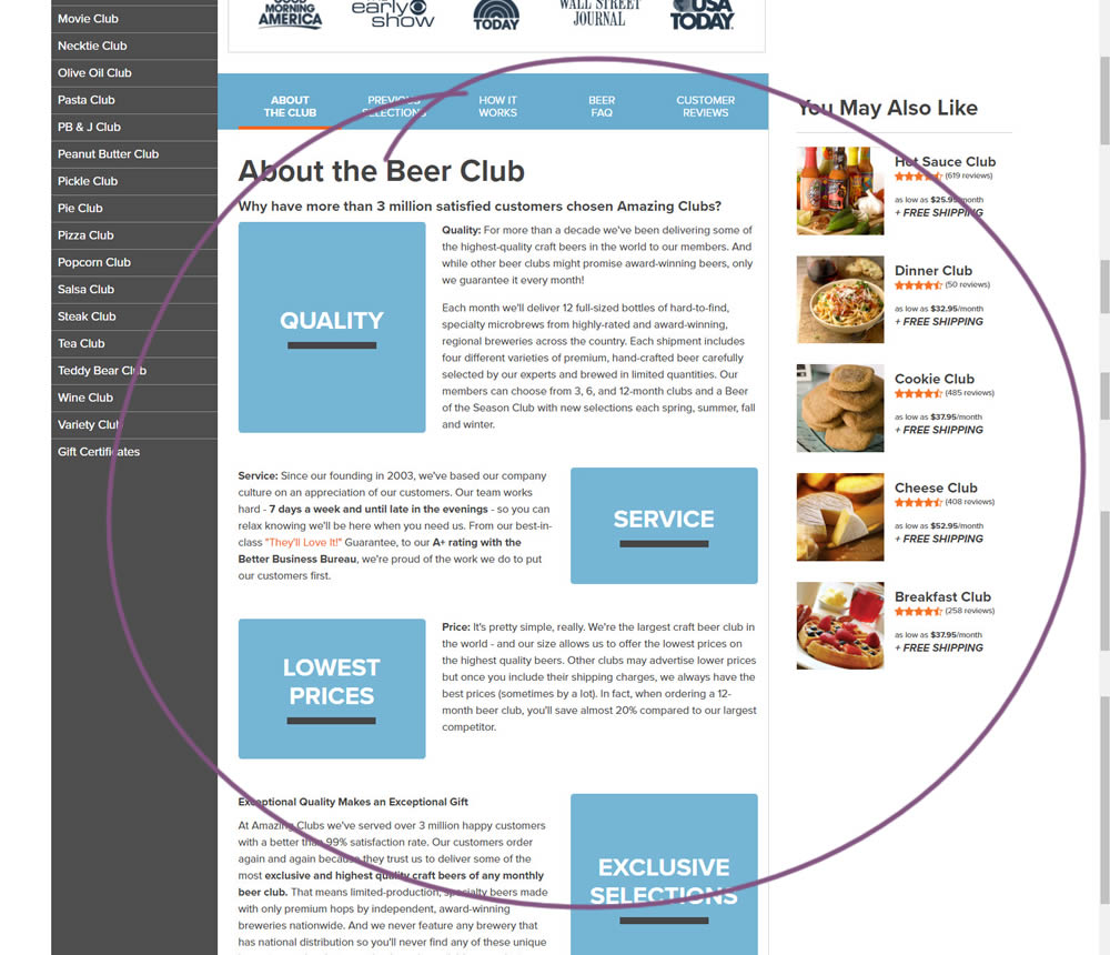
In this experiment, paragraph style copy was reorganized into a zig zag layout with key sections being reinforiced with copy-as-image statements. Impact on adds-to-cart and sales was measured.
Test #391 on
Backstage.com
by  Stanley Zuo
Dec 30, 2021
Desktop
Mobile
Listing
X.X%
Signups
Stanley Tested Pattern #82: Onboarding Callouts On Backstage.com
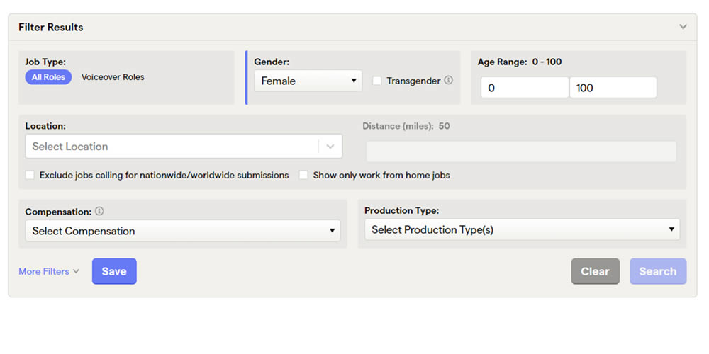
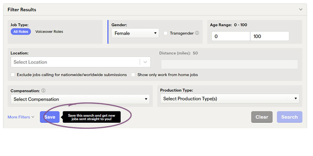
This experiment added a small nudge or callout to encourage more signups. Attention was directed towards the save function, which lead to the signup flow for anyone not signed it. Impact on signups was measured.