All Latest 620 A/B Tests
MOST RECENT TESTS
Test #362 on
Vivareal.com.br
by  Vinicius Barros Peixoto
Jun 23, 2021
Desktop
Mobile
Product
X.X%
Leads
Vinicius Tested Pattern #7: Social Counts On Vivareal.com.br
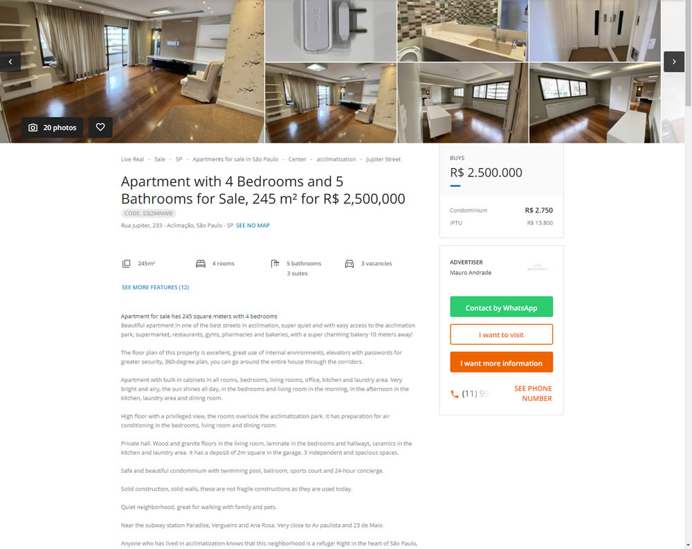
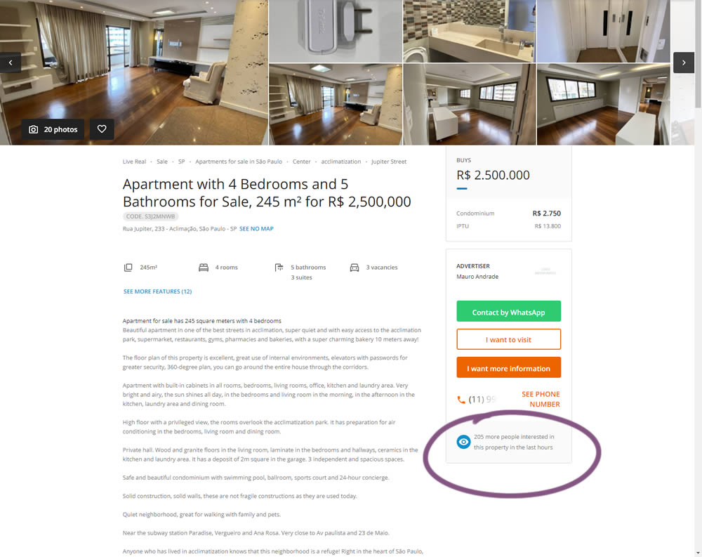
In this experiment, the number of recent property views was displayed under the call to action. Impact on overall lead generation was measured. (Translated using Google from Brazilian Portuguese.)
Which A Or B Actually Wins? Find Out Before You Test.
Members see every test result — the winners, the flat ones, and the losers — along with exact effects and sample sizes. Use it to estimate your tests and prioritize by probability, not gut feel. Start every experiment with the odds on your side.
Test #359 on
Snocks.com
by  Samuel Hess
Jun 11, 2021
Desktop
Mobile
Product
X.X%
Sales
Samuel Tested Pattern #43: Long Titles On Snocks.com
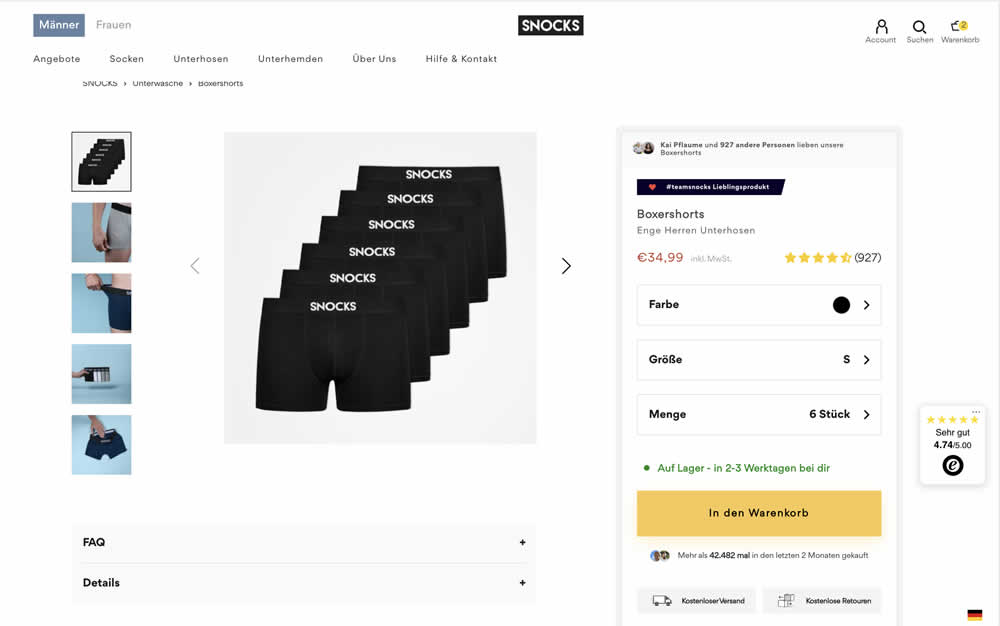
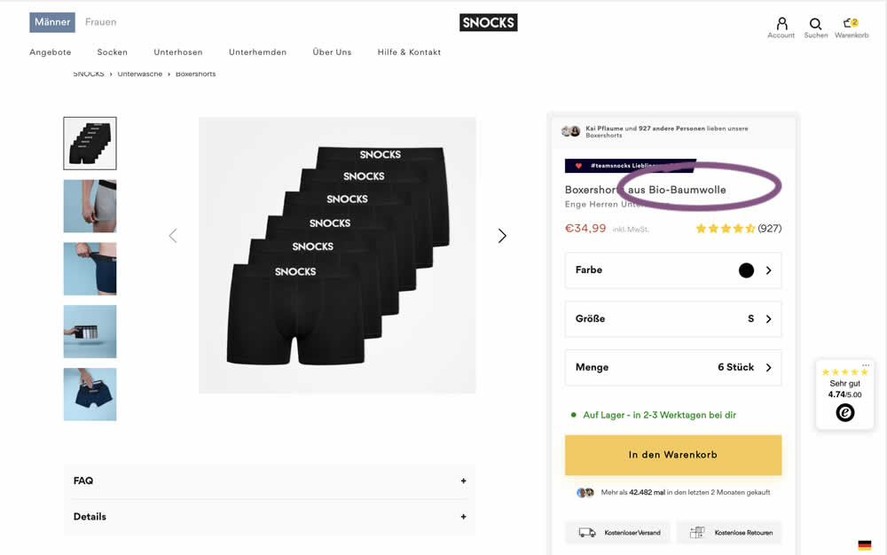
In this experiment, product titles were extended with descriptive copy. Instead of just showing the product name, "with organic cotton" was appended on product and category/listing pages. Impact to adds to cart and sales was measured.
Test #357 on
Baremetrics.com
by  Brian Sierakowski
Jun 02, 2021
Desktop
Mobile
Pricing
X.X%
Signups
Brian Tested Pattern #113: More Or Fewer Plans On Baremetrics.com
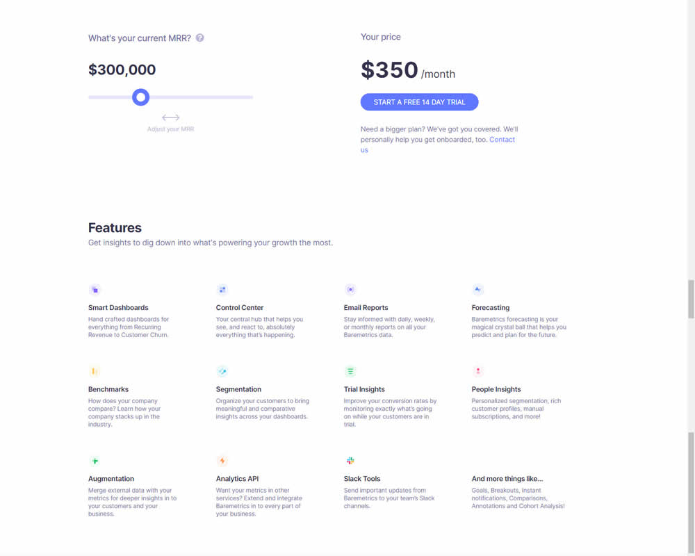
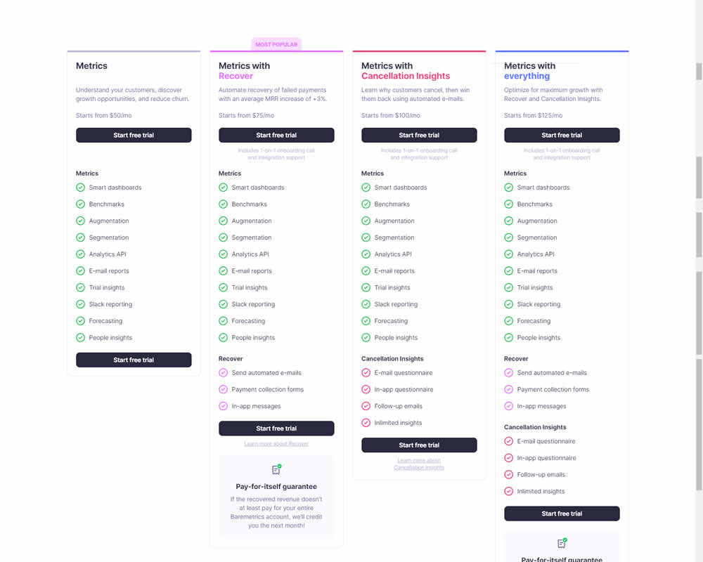
In this experiment, a single focus signup was transformed into a pricing comparison table. Impact on signups was measured.
Test #356 on
Mvideo.ru
by  Andrey Andreev
May 29, 2021
Desktop
Mobile
Home & Landing
X.X%
Sales
Andrey Tested Pattern #135: Product Categories On Mvideo.ru
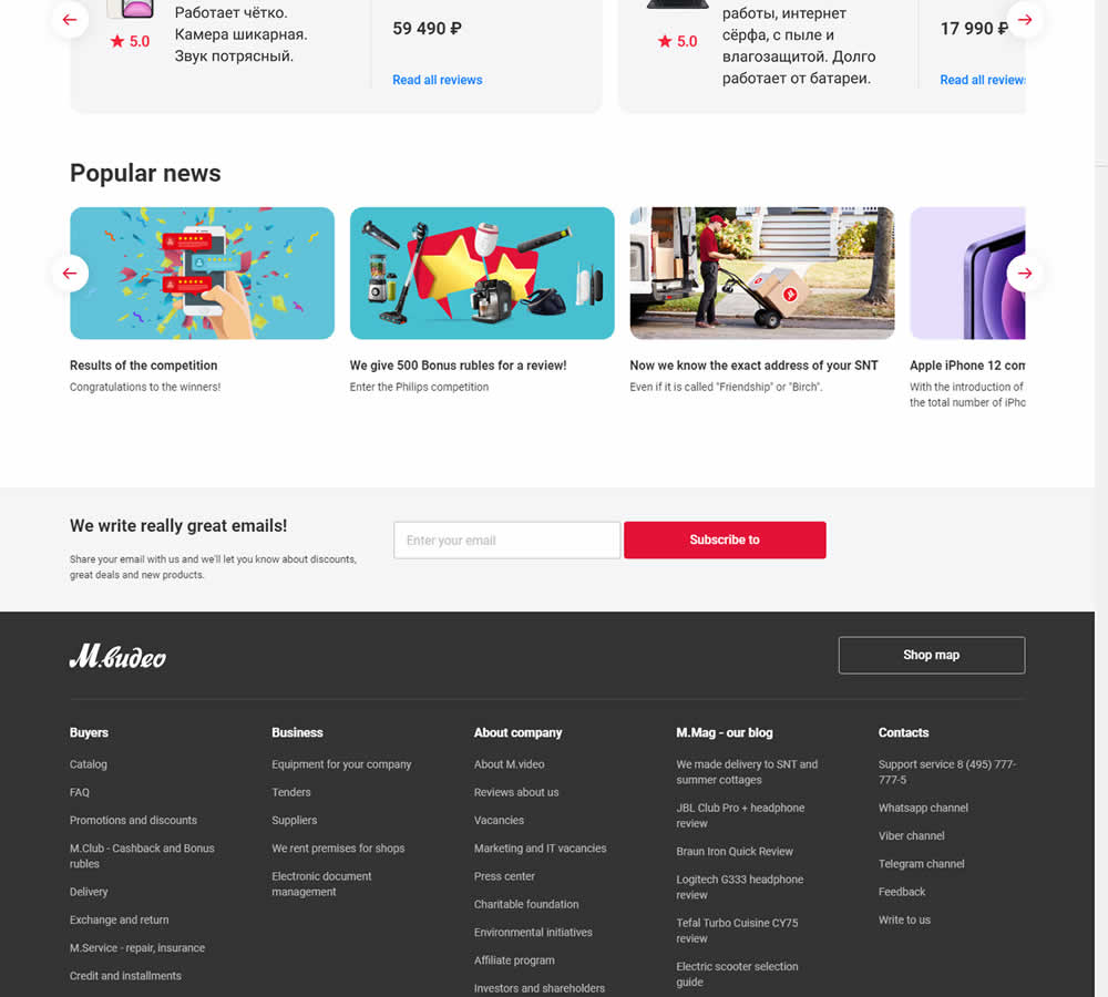
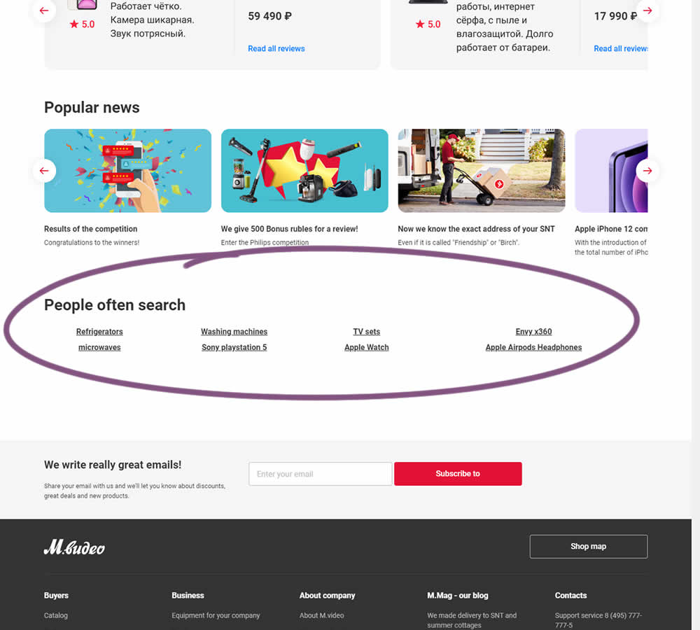
In this experiment, popular search terms were added at the bottom of a long e-commerce homepage. Hence, the variation showed additional search triggers that lead to results pages. (Translated from Russian using Google Translate)
Test #355 on
by  Jakub Linowski
May 28, 2021
Desktop
Mobile
Home & Landing
X.X%
Sales
Jakub Tested Pattern #79: Product Highlights

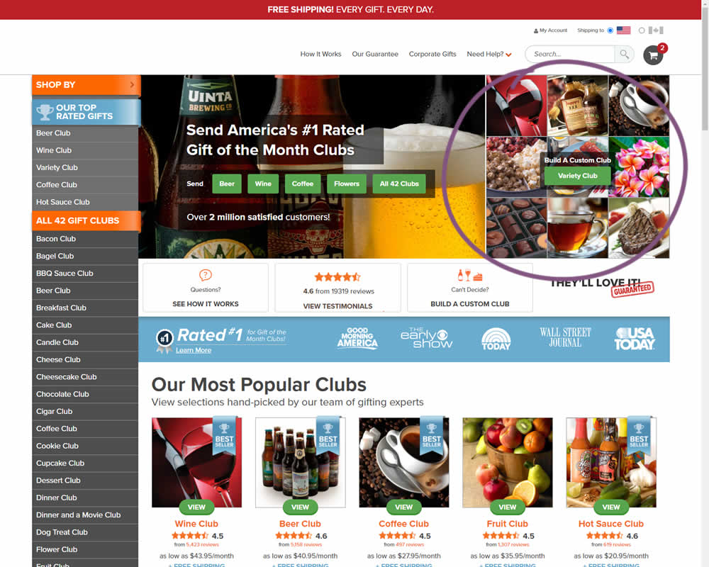
In this experiment, an extra product choice was added to the header of a homepage. Instead of only highlighting a set of four specific products, the option to build custom variety one, was added.
Test #354 on
Mvideo.ru
by  Andrey Andreev
May 25, 2021
Desktop
Mobile
Product
X.X%
Revenue
Andrey Tested Pattern #69: Autodiscounting On Mvideo.ru
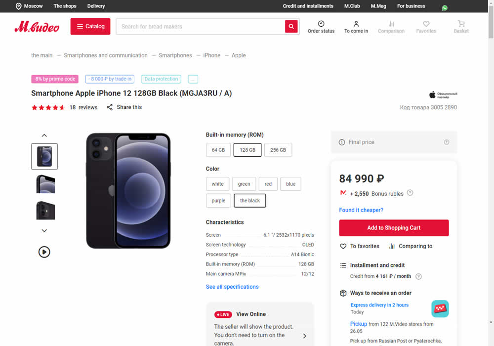
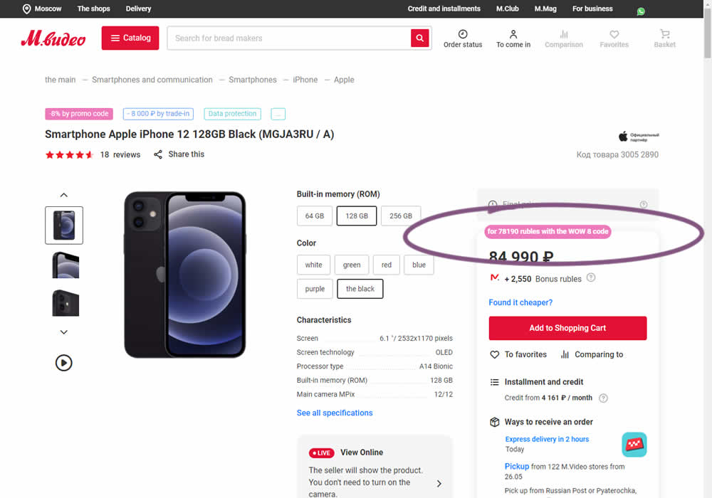
In this experiment, the discounted price was shown along with an active promotion. The control only showed that the relative -8% discount was present with the pre-discounted price.
Test #78 on
Mvideo.ru
by  Andrey Andreev
May 06, 2021
Desktop
Mobile
Listing
X.X%
Sales
Andrey Tested Pattern #90: Out Of Stock Or In Stock Products On Mvideo.ru
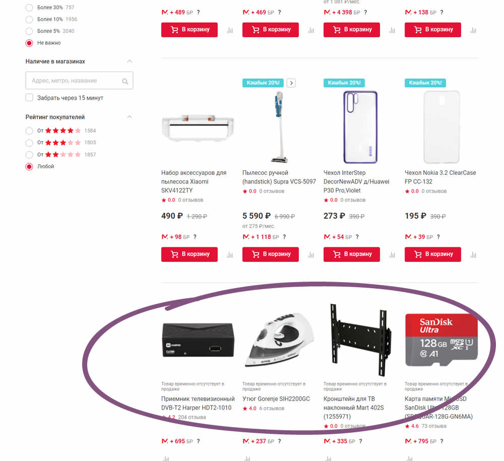
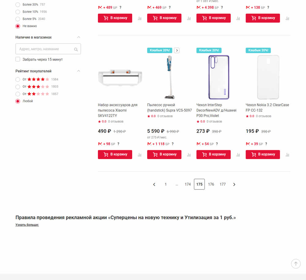
In this experiment, products which were out of stock were removed from listing pages and replaced with in stock ones (not visible in the screenshot).
Test #351 on
Baremetrics.com
by  Brian Sierakowski
Apr 30, 2021
Desktop
Mobile
Home & Landing
X.X%
Signups
Brian Tested Pattern #11: Gradual Reassurance On Baremetrics.com
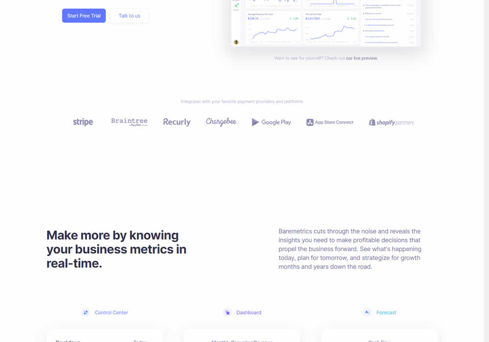
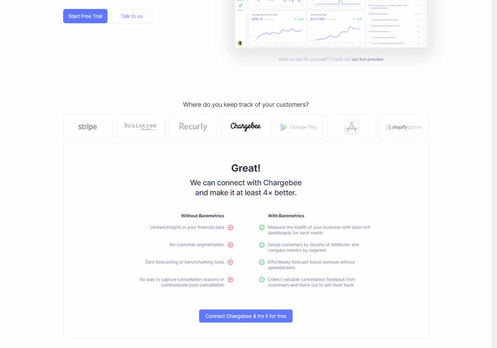
In this experiment, static integration logos were replaced with selectable ones that reassured users to signup. After clicking an integration logo, a comparison chart would appear showing how Baremetrics improves upon a selected payment processor, along with a call to signup. Impact on signups was measured.
Test #349 on
Backstage.com
by  Stanley Zuo
Apr 27, 2021
Mobile
Global
X.X%
Sales
Stanley Tested Pattern #49: Above The Fold Call To Action On Backstage.com
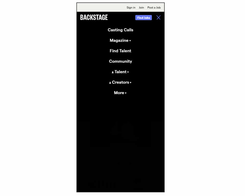
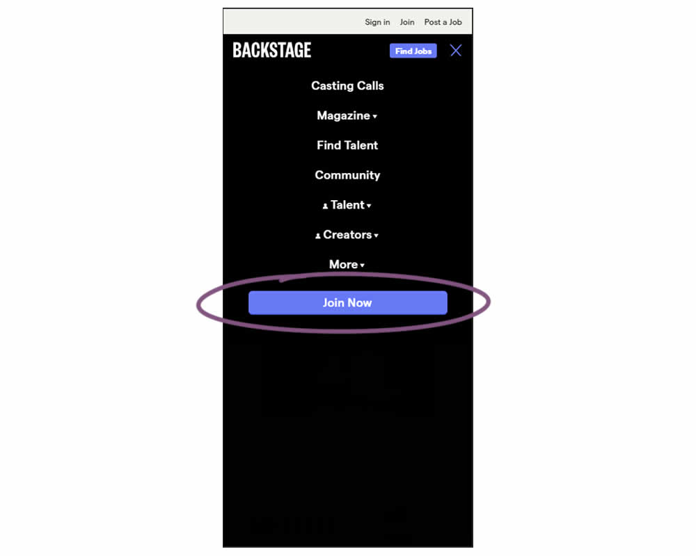
In this experiment, a simple "Join Now" button was added inside an expanded mobile navigation menu. Clicking the button would start a multiple step membership subscription process. Impact on subscription starts and final sales were tracked.
Test #347 on
by  Jakub Linowski
Apr 07, 2021
Desktop
Mobile
Home & Landing
X.X%
Sales
Jakub Tested Pattern #26: Cart Reminder And Recently Viewed
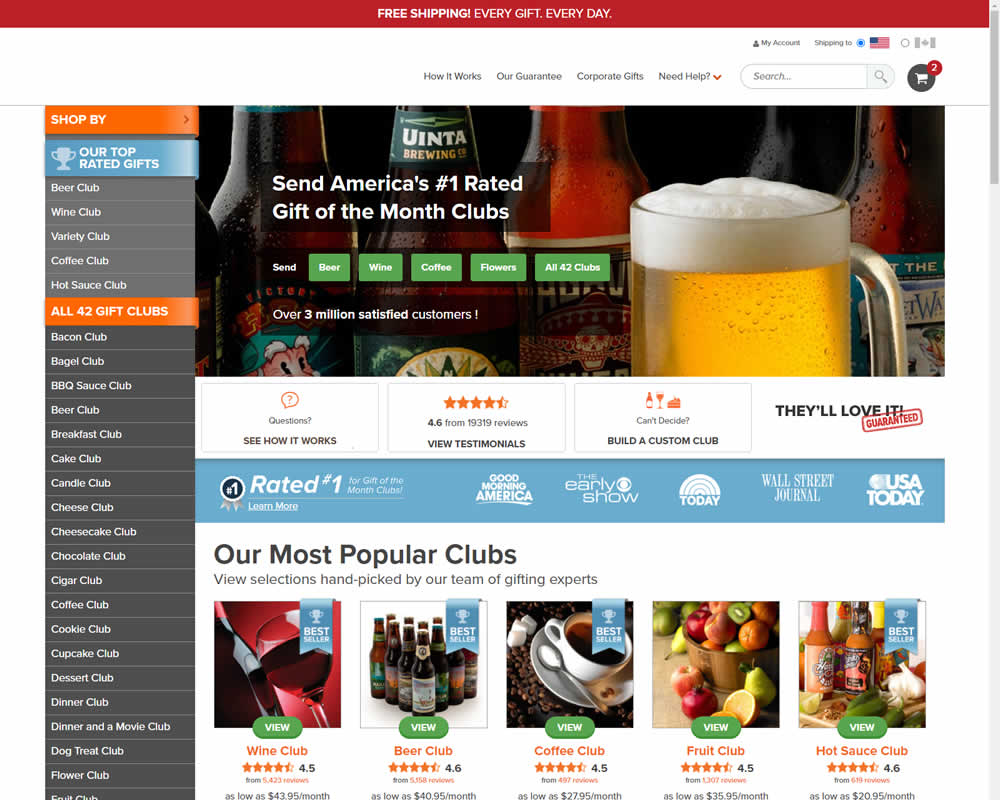
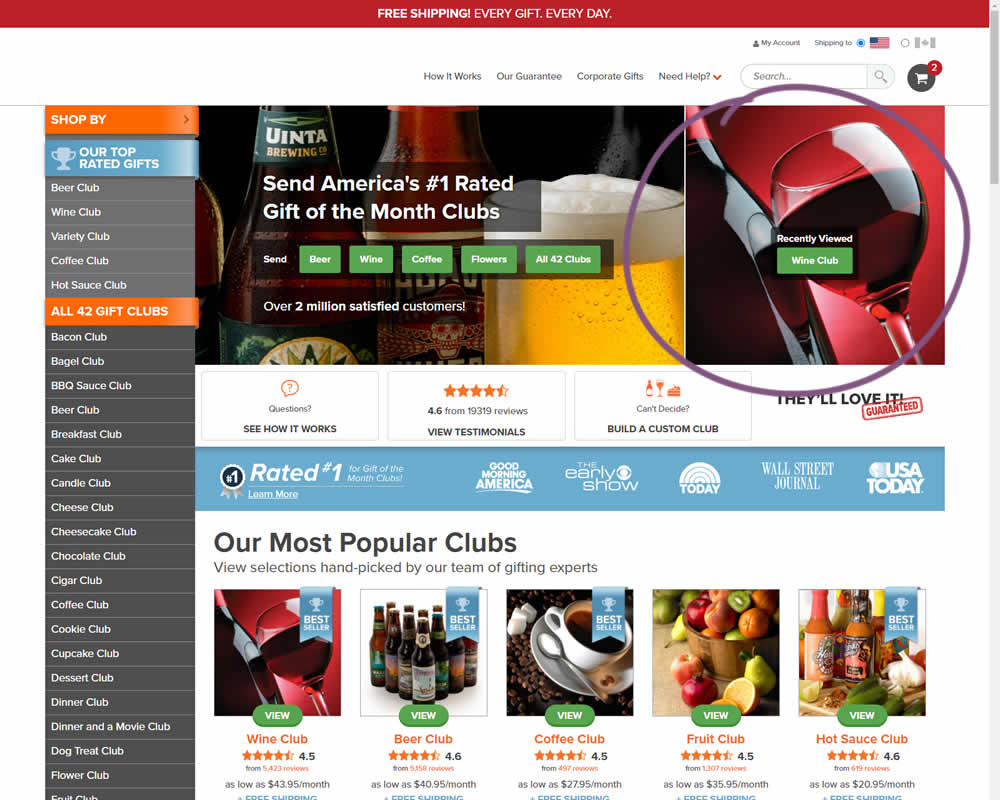
In this experiment, when customers viewed a product and returned to the homepage, they would then see the most recently viewed one - a delicate nudge. The experiment ran with full traffic and impact on sales was measured.
Test #346 on
by  Stanley Zuo
Mar 30, 2021
Desktop
Mobile
Home & Landing
X.X%
Sales
Stanley Tested Pattern #117: Company Logos
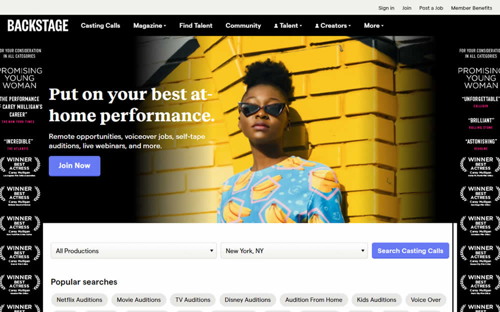

In this homepage experiment, company logos were added to the homepage. These were example clients or companies that Backstage works with and offers casting (job) listing from. Impact on the registration flow and membership checkouts was measured.
Test #343 on
Snocks.com
by  Samuel Hess
Mar 12, 2021
Desktop
Mobile
Product
X.X%
Sales
Samuel Tested Pattern #122: Zigzag Layout On Snocks.com

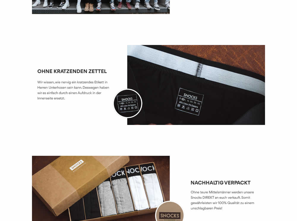
In this experiment, the content on a product page was reorganized into a zigzagging (alternating layout) along with reinforcing photos. Impact on adds-to-cart and total sales was measured.
Test #342 on
Backstage.com
by  Stanley Zuo
Feb 28, 2021
Desktop
Mobile
Listing
X.X%
Engagement
Stanley Tested Pattern #25: Nagging Results On Backstage.com
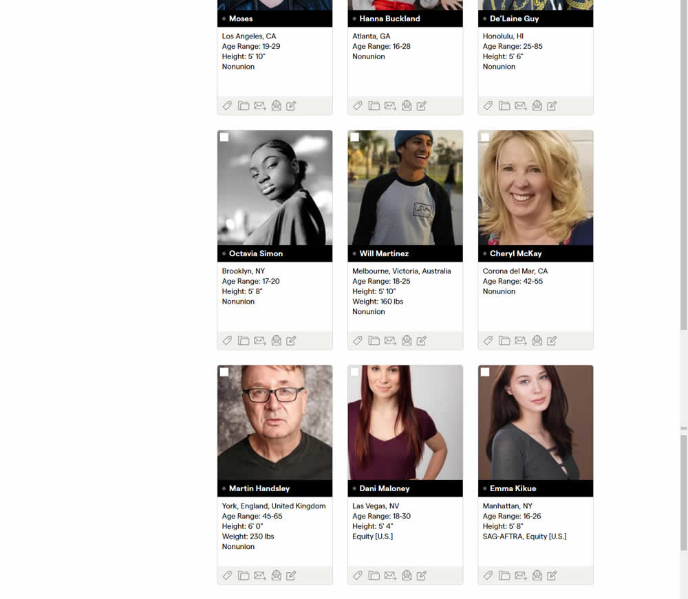
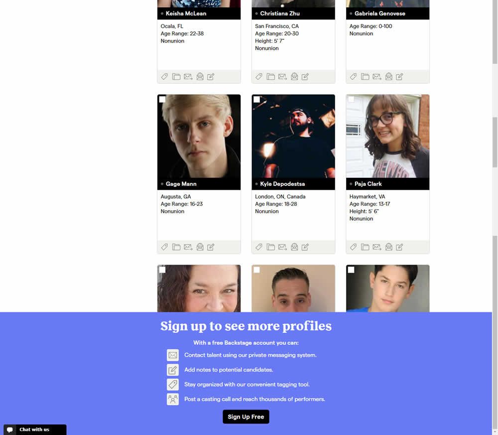
In this experiment, a registration wall was added on a listing page of casting call profiles. The registration wall appeared after the first 9 listings or so and encouraged users to sign up. Impact on registrations was measured, along with an engagement metric of "posting a job".
Test #86 on
Vivareal.com.br
by  Rodrigo Maués
Feb 28, 2021
Mobile
Desktop
Product
X.X%
Leads
Rodrigo Tested Pattern #3: Fewer Form Fields On Vivareal.com.br
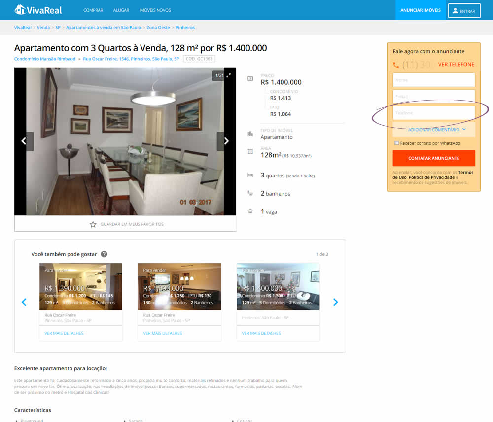
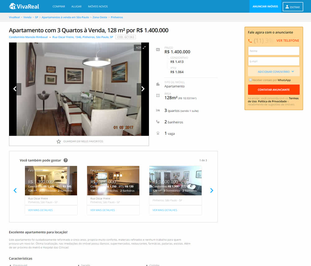
In this experiment, the telephone field was removed from a lead form on a property page. Impact on leads was measured.
Test #341 on
by  Alex James
Feb 25, 2021
Desktop
Mobile
Signup
X.X%
Signups
Alex Tested Pattern #35: Floating Labels
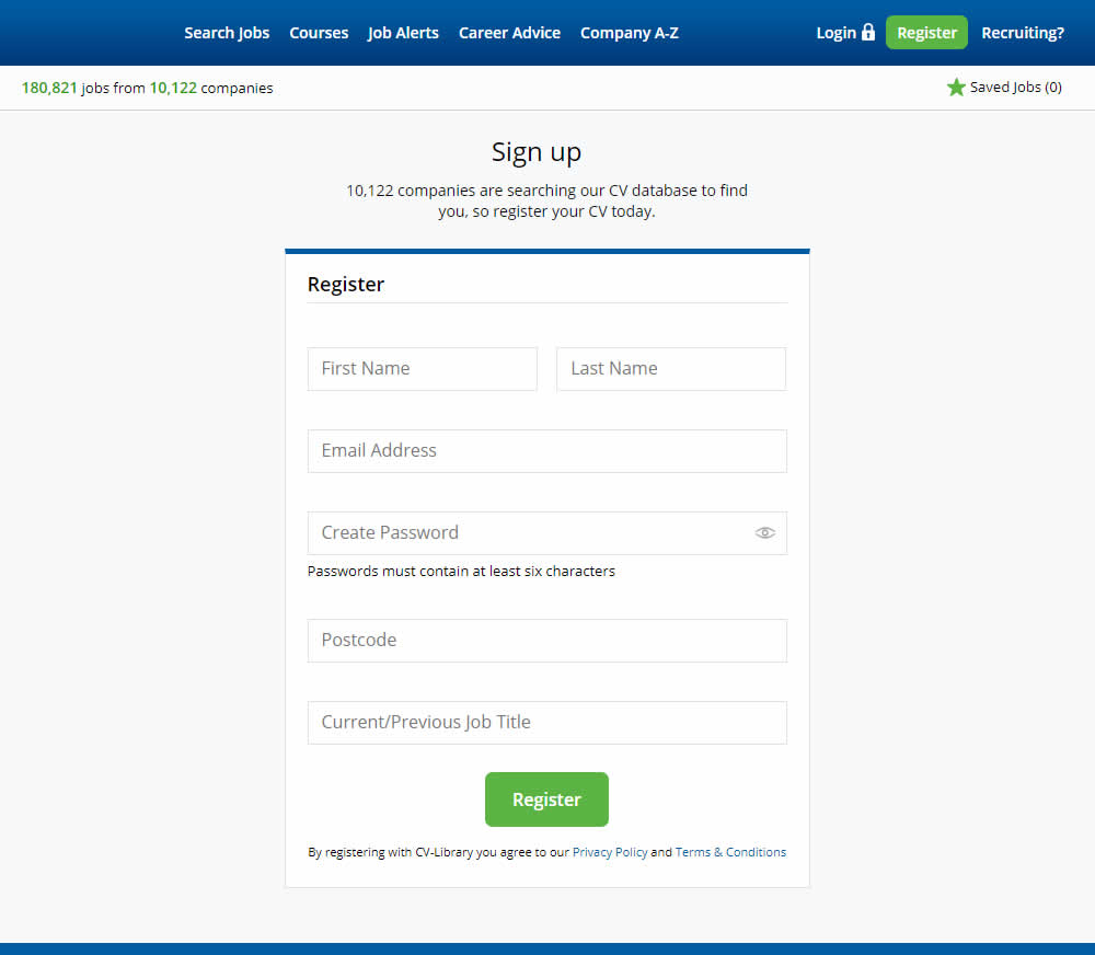
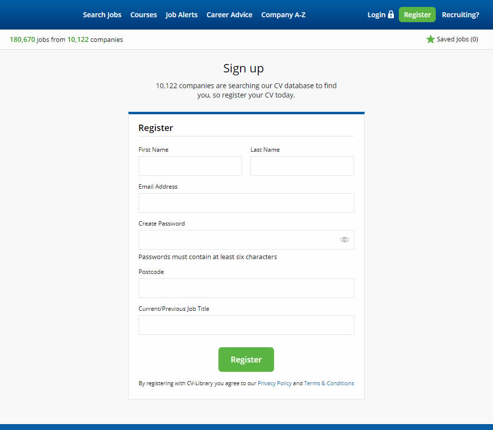
This experiment shows a comparison between floating-field labels vs top-aligned labels. Form labels first appeared inline and as users would begin typing, they floated to the top of the field. In the other version, fixed field labels were shown above the form fields at all times. Impact on signups was measured.
Test #338 on
Umbraco.com
by  Lars Skjold Iversen
Jan 29, 2021
Desktop
Mobile
Home & Landing
X.X%
Signups
Lars Tested Pattern #63: Trust Seals On Umbraco.com
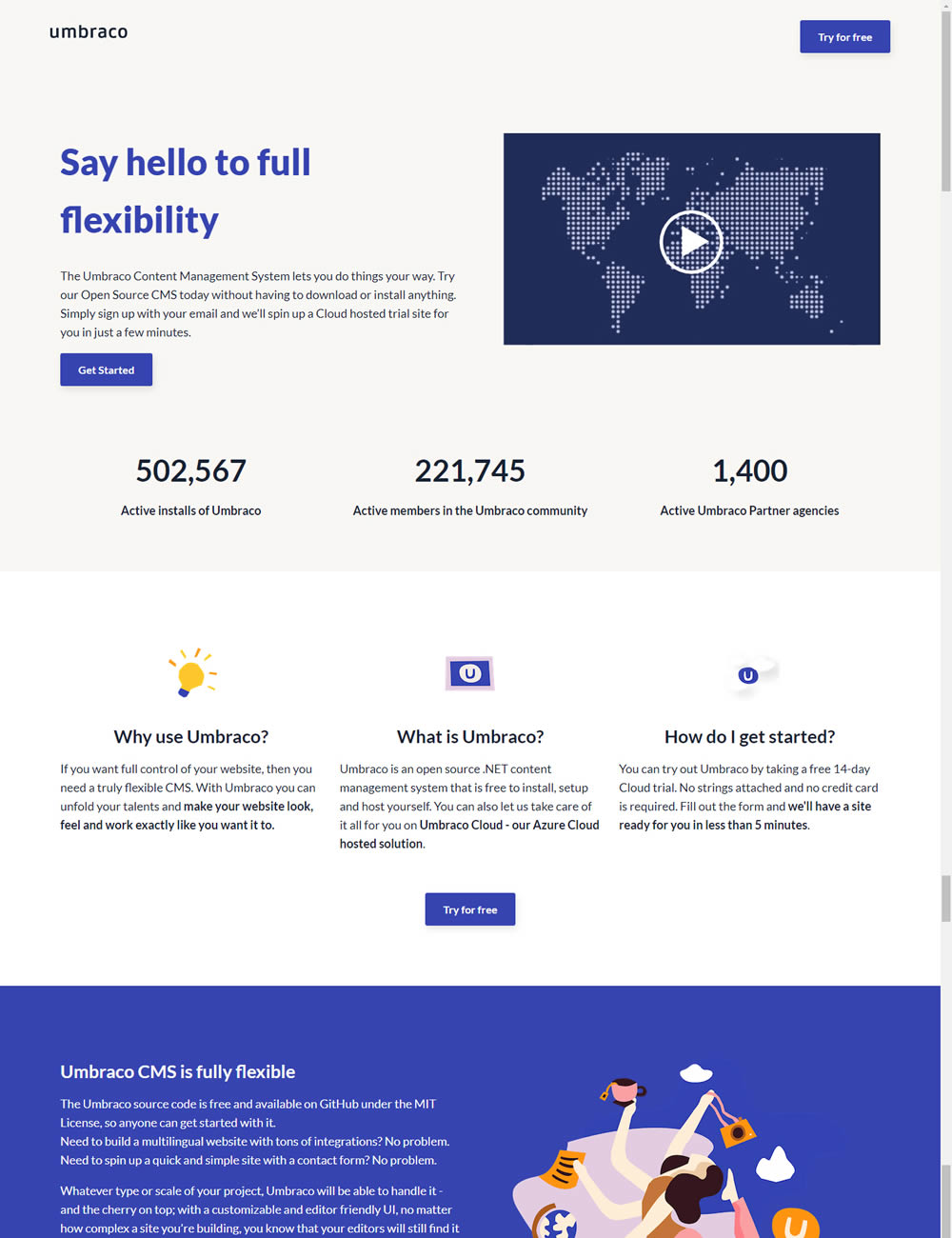
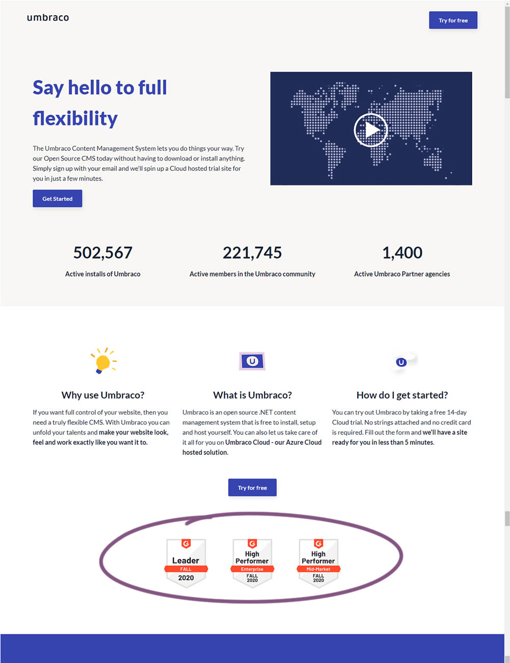
In this experiment, the variation added three G2 badges or awards. The intent was to measure the impact of this change on signups for Umbraco.
Test #336 on
Backstage.com
by  Stanley Zuo
Jan 28, 2021
Desktop
Mobile
Listing
X.X%
Sales
Stanley Tested Pattern #51: Shortcut Buttons On Backstage.com
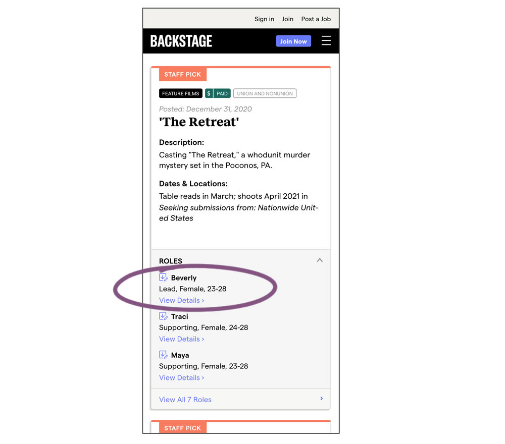
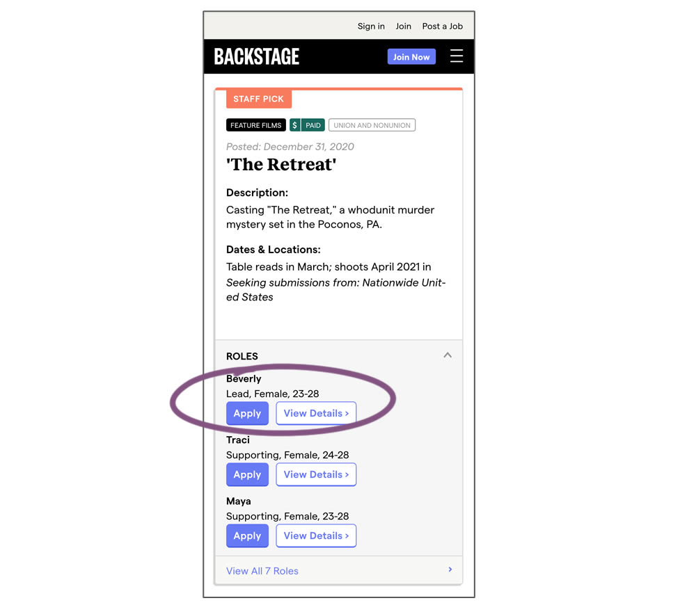
In this experiment, a listing page was expanded to show two actions (apply and view details) instead of a single one (view details only). This variation enabled users with a shortcut action to apply for roles one step earlier (and start membership flows for new users).
Test #337 on
Backstage.com
by  Stanley Zuo
Jan 28, 2021
Desktop
Mobile
Listing
X.X%
Sales
Stanley Tested Pattern #51: Shortcut Buttons On Backstage.com
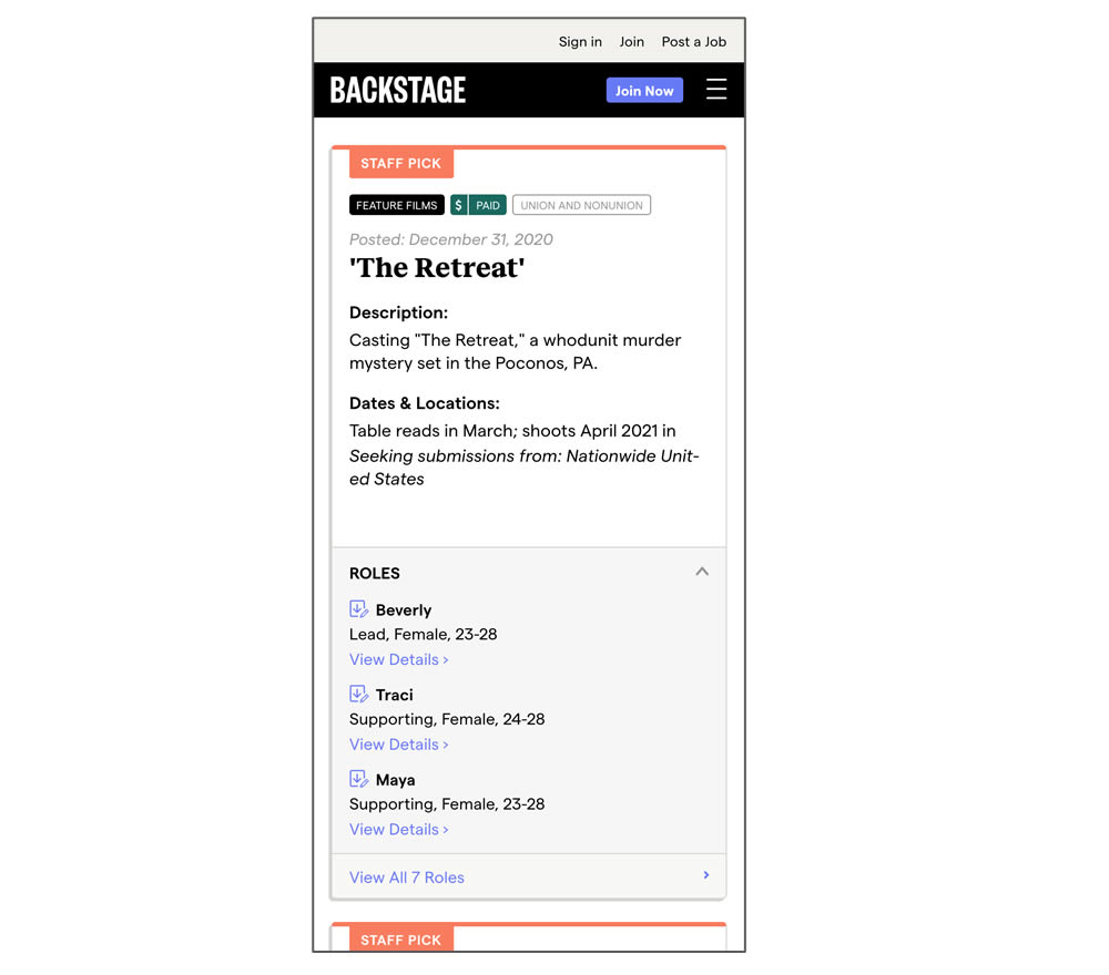
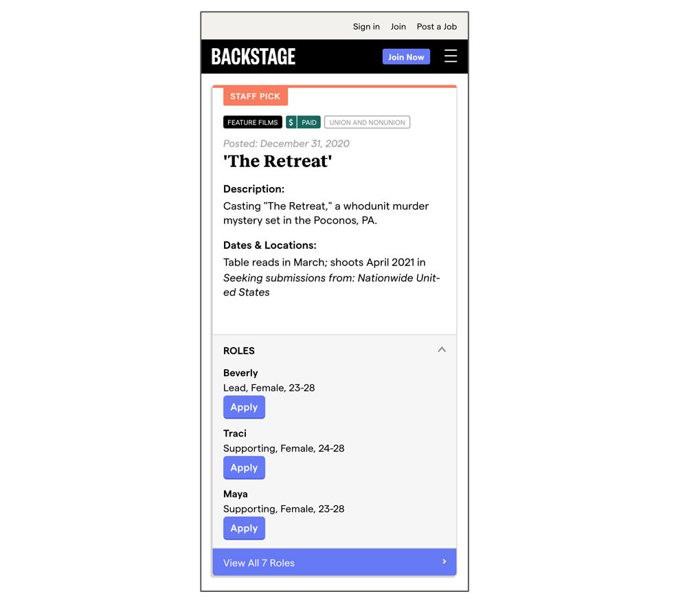
In this experiment, a listing page was expanded to show two actions (apply and view details) instead of a single one (view details only). In the variant, the "view detail" links were replaced with "apply links" starting a job application (and membership flows) sooner.
Test #335 on
by  Jakub Linowski
Jan 27, 2021
Desktop
Mobile
Home & Landing
X.X%
Sales
Jakub Tested Pattern #32: Condensed List
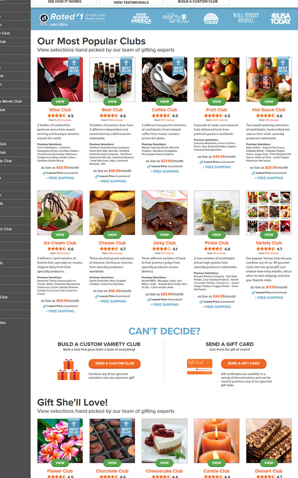
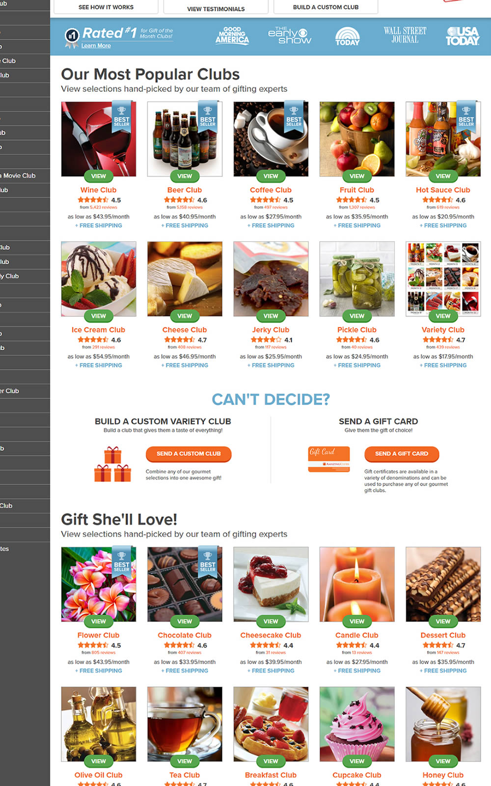
The variation here has more condensed product tiles being shown on a homepage. Two pieces of information were removed: product descriptions and past selections. Impact on product page visits and total sales was measured.
Test #334 on
Thomasnet.com
by  Kyle Phillips
Jan 25, 2021
Desktop
Mobile
Global
X.X%
Progression
Kyle Tested Pattern #2: Icon Labels On Thomasnet.com


This experiment measured the impact of adding text labels to three icon-only nav items.