All Latest 620 A/B Tests
MOST RECENT TESTS
Test #282 on
Thomasnet.com
by  Julian Gaviria
Feb 07, 2020
Desktop
Mobile
Listing
X.X%
Leads
Julian Tested Pattern #51: Shortcut Buttons On Thomasnet.com
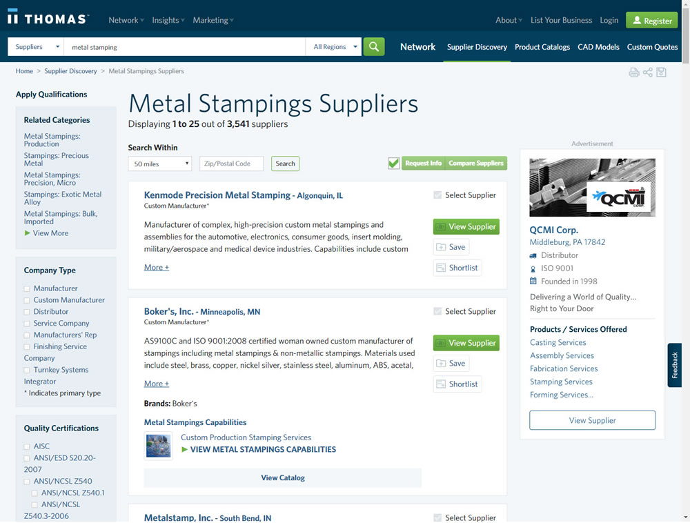
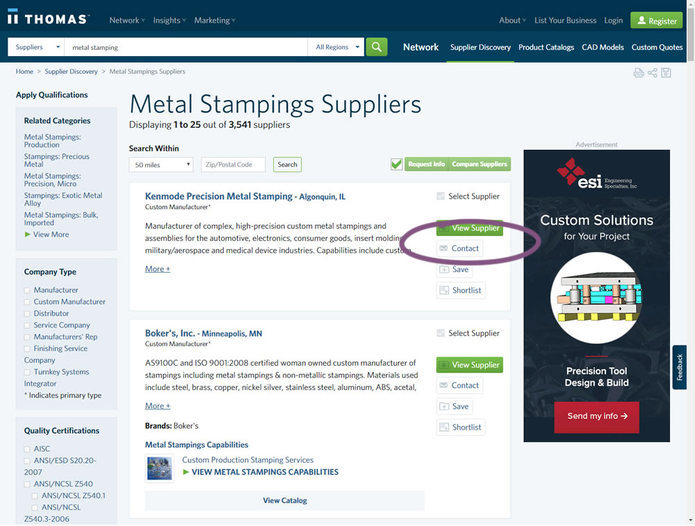
In this experiment, a contact button was added to a listing / search results page to make it faster to contact a company. This same button was also visible on the company detail page.
Which A Or B Actually Wins? Find Out Before You Test.
Members see every test result — the winners, the flat ones, and the losers — along with exact effects and sample sizes. Use it to estimate your tests and prioritize by probability, not gut feel. Start every experiment with the odds on your side.
Test #280 on
Volders.de
by  Alexander Krieger
Jan 24, 2020
Desktop
Mobile
Signup
X.X%
Sales
Alexander Tested Pattern #3: Fewer Form Fields On Volders.de
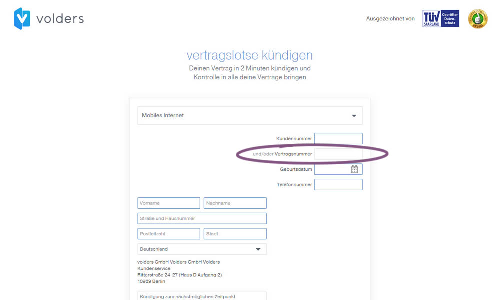
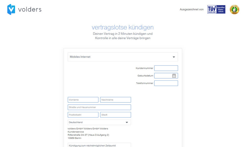
In this experiment on a contract cancellation funnel, one field was removed - a secondary contract ID. The control and variation both had a primary "customer ID" with which to identify and cancel someone's contract with.
Test #279 on
Umbraco.com
by  Lars Skjold Iversen
Jan 16, 2020
Desktop
Mobile
Home & Landing
X.X%
Sales
Lars Tested Pattern #79: Product Highlights On Umbraco.com
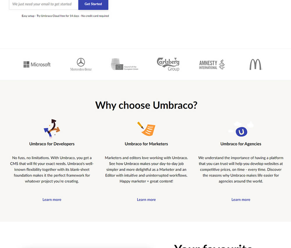
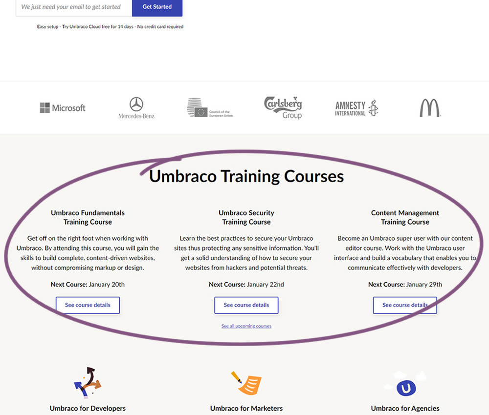
In this experiment, 3 additional course links with descriptions were added to the homepage. The idea was to increase course sales aside of the Saas subscription signups.
Test #278 on
by  Someone
Jan 15, 2020
Mobile
Shopping Cart
X.X%
Sales
Someone Tested Pattern #64: Tunnel
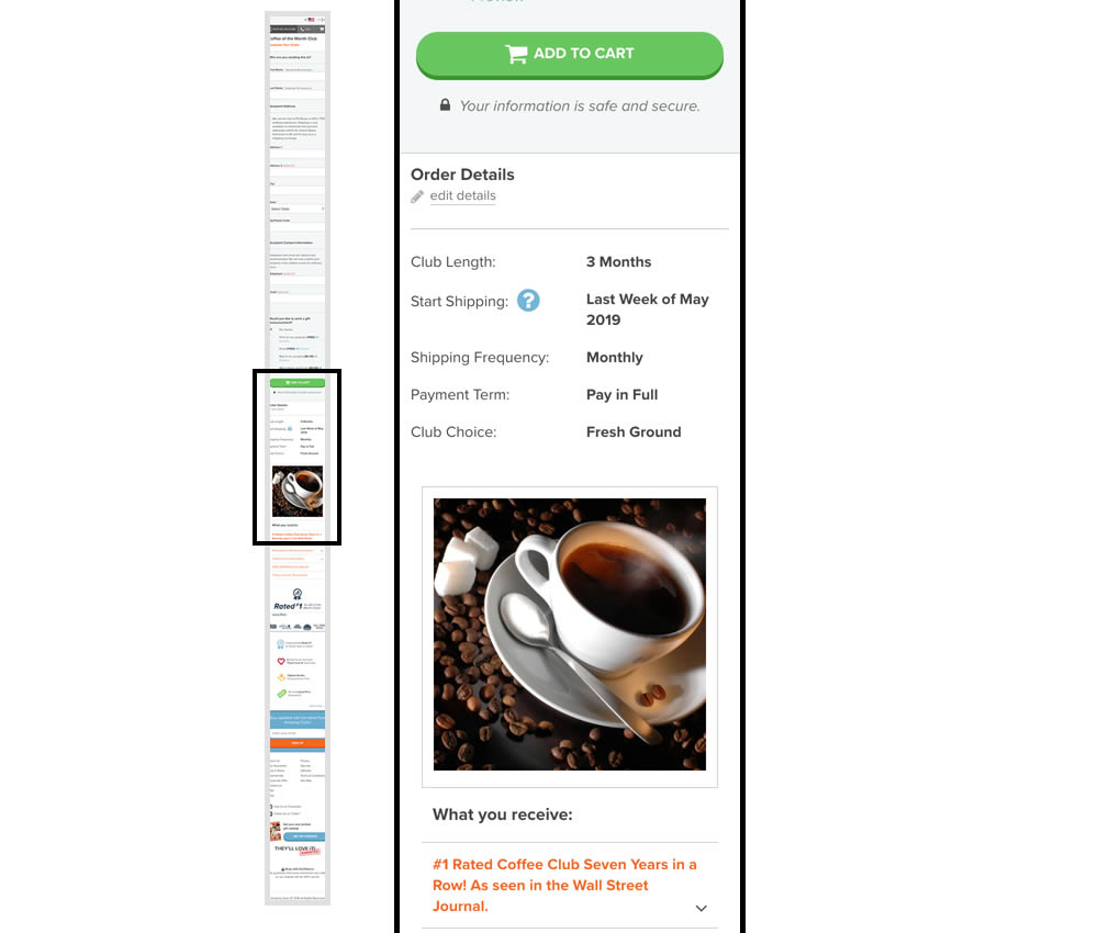
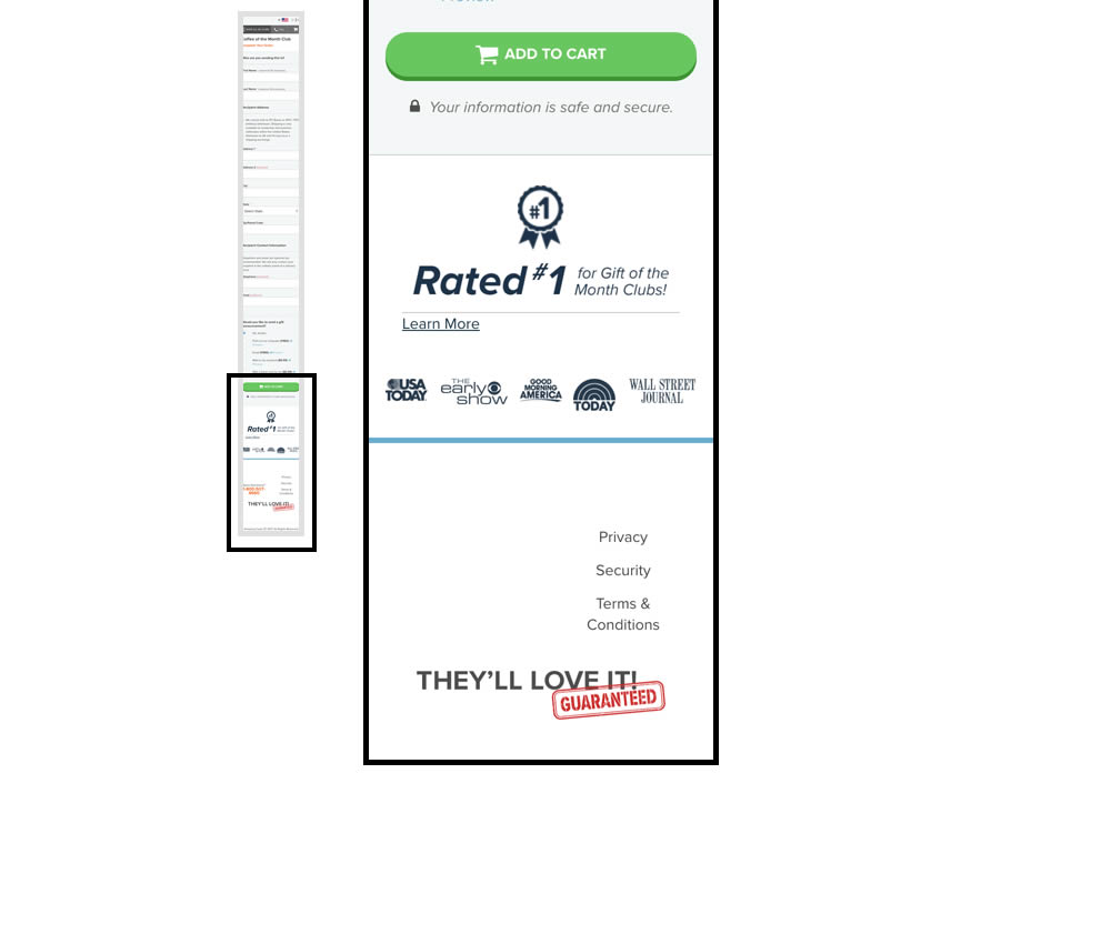
In this experiment, multiple elemenets were removed from the bottom of the cart page. This was done to see if they were potential distractions that hindered the purchase process. The elements included such things as: Order details (visible on other pages), large product photo, a "what you receive" section with selling points, more reassurances, and a newsletter subscribe box.
Test #276 on
Umbraco.com
by  Lars Skjold Iversen
Dec 31, 2019
Desktop
Mobile
Home & Landing
X.X%
Signups
Lars Tested Pattern #111: Field Explanations On Umbraco.com
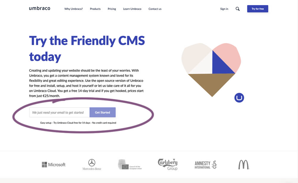
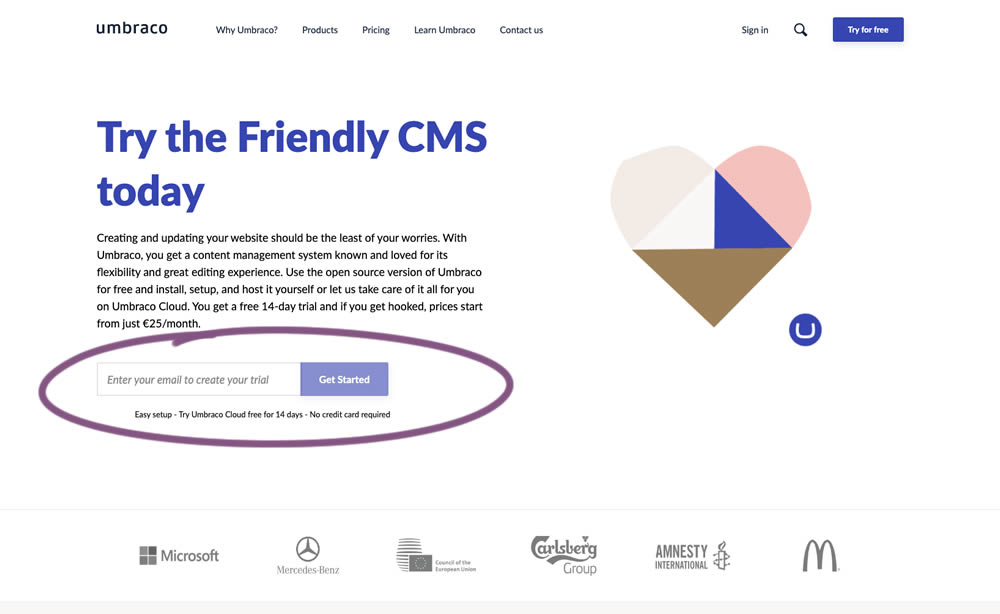
In this experiment, the idea was to move away from copy that was focusing on the needs of the company ("we need your email") towards copy that hinted at a customer benefit ("create your trial").
Test #273 on
Elevate App
by  Jesse Germinario
Dec 19, 2019
Mobile
Signup
X.X%
Signups
Jesse Tested Pattern #9: Multiple Steps
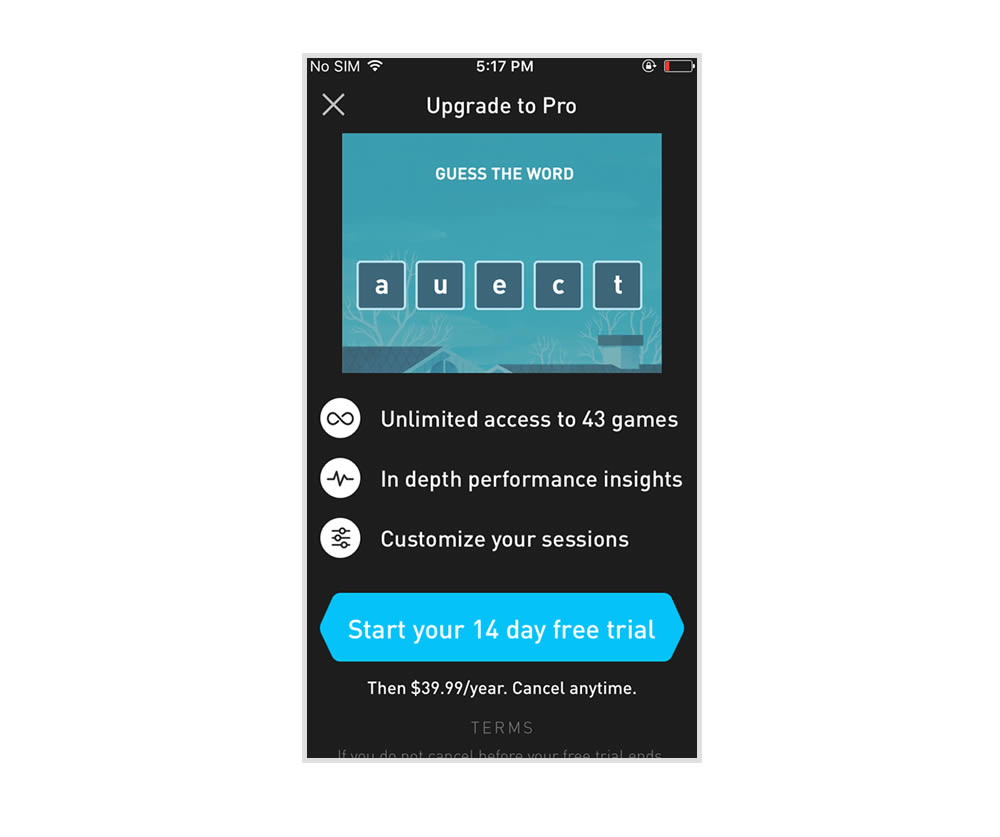
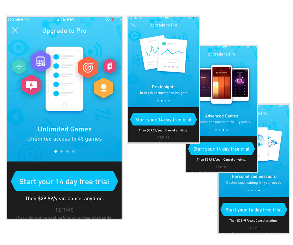
This experiment tests the impact of a different paywall screen on iOS. The current control paywall screen for 100% of iOS users was the animated pro screen. In this screen, users see an animation that gives shows glimpses of several Elevate games in action, as well as a bulleted list of key selling points for Pro. The proposed change (variant B) features a swipeable carousel of pages where each page has an image and some accompanying text explaining a different benefit of subscribing to Pro. The hypothesis is that we can lift conversion by showing users the alternate swiping paywall screen.
Test #274 on
by  Someone
Dec 16, 2019
Desktop
Mobile
Checkout
X.X%
Sales
Someone Tested Pattern #1: Remove Coupon Fields
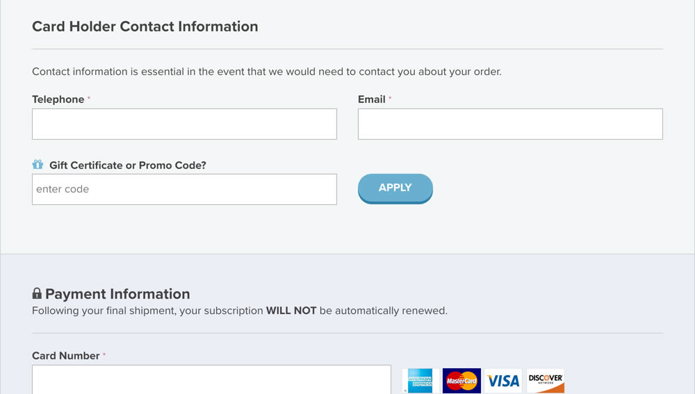
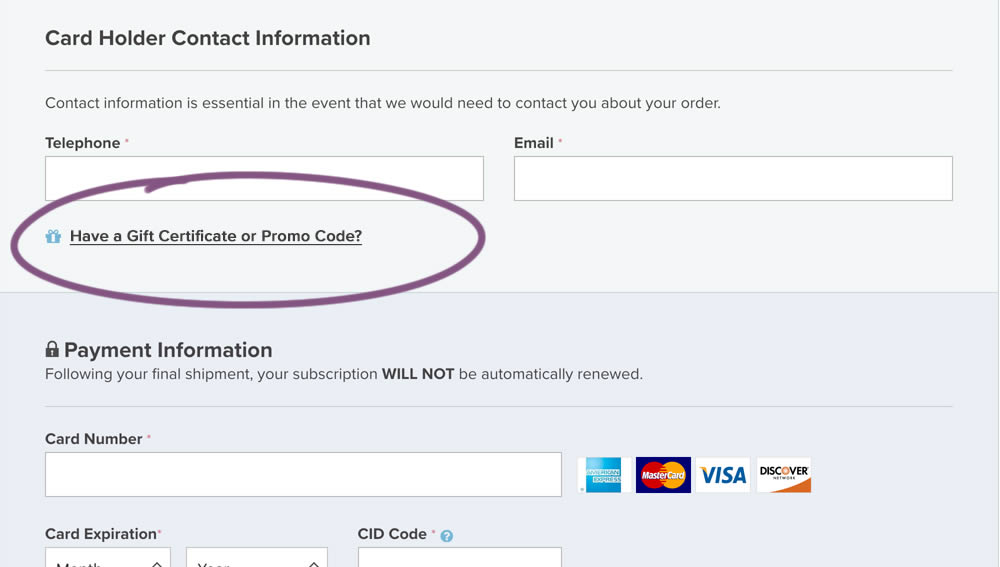
In this experiment, a fully visible coupon field (A) was made less visible by turning it into a default collaped link (B). Clicking on the link caused the coupon field to appear.
Test #271 on
Analytics-toolkit.co...
by  Georgi Z. Georgiev
Nov 24, 2019
Desktop
Mobile
Signup
X.X%
Signups
Georgi Tested Pattern #4: Testimonials On Analytics-toolkit.co...
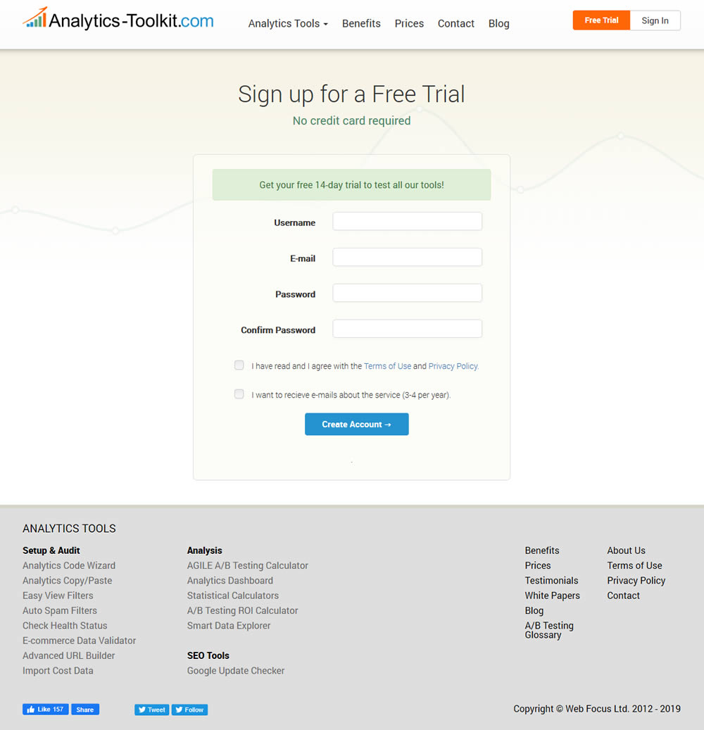
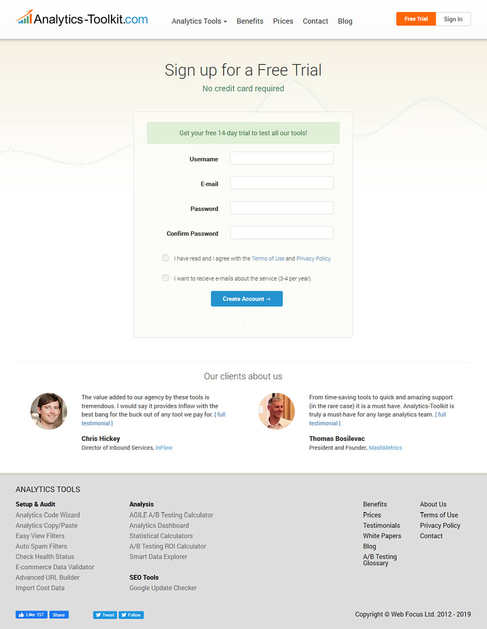
In this experiment, the test variant showed 2 testimonials on the user registration / free trial registration page at Analytics-Toolkit.com
Test #268 on
Backstage.com
by  Stanley Zuo
Nov 08, 2019
Mobile
Listing
X.X%
Sales
Stanley Tested Pattern #14: Exposed Menu Options On Backstage.com
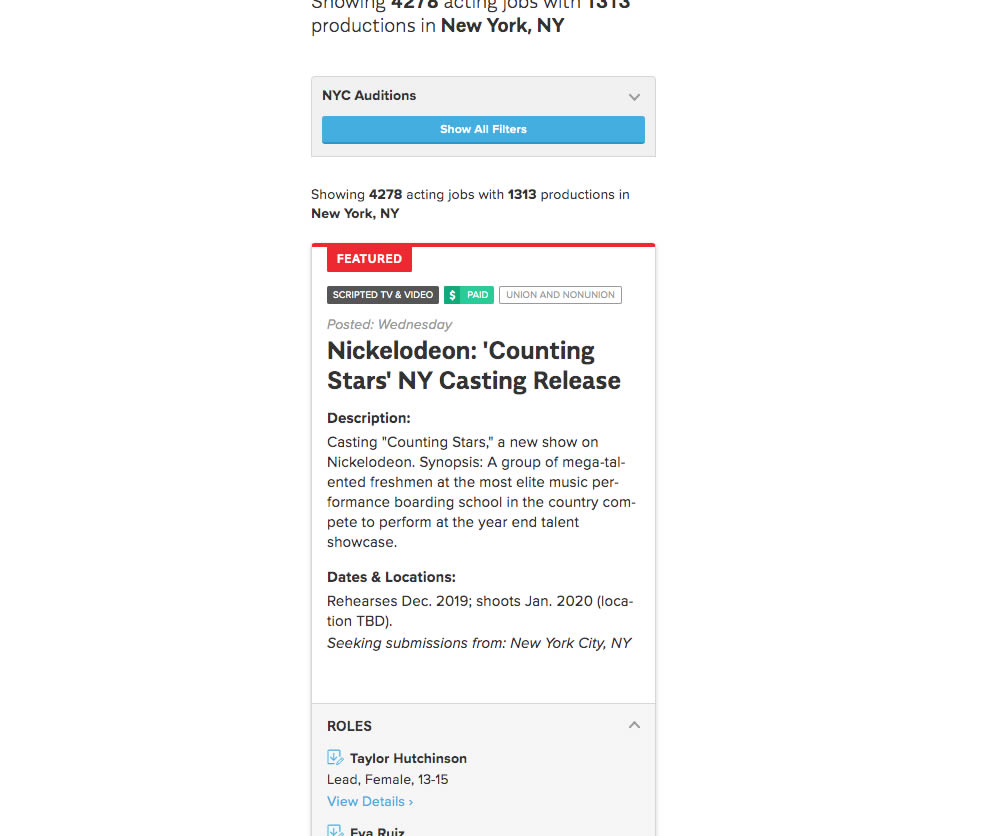
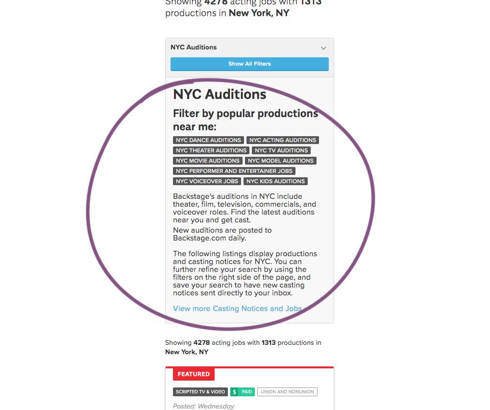
The change in this experiment was an exposed SEO panel (B) with a number of clickable filter options.
Test #267 on
Backstage.com
by  Stanley Zuo
Nov 05, 2019
Mobile
Checkout
X.X%
Sales
Stanley Tested Pattern #99: Progress Bar On Backstage.com
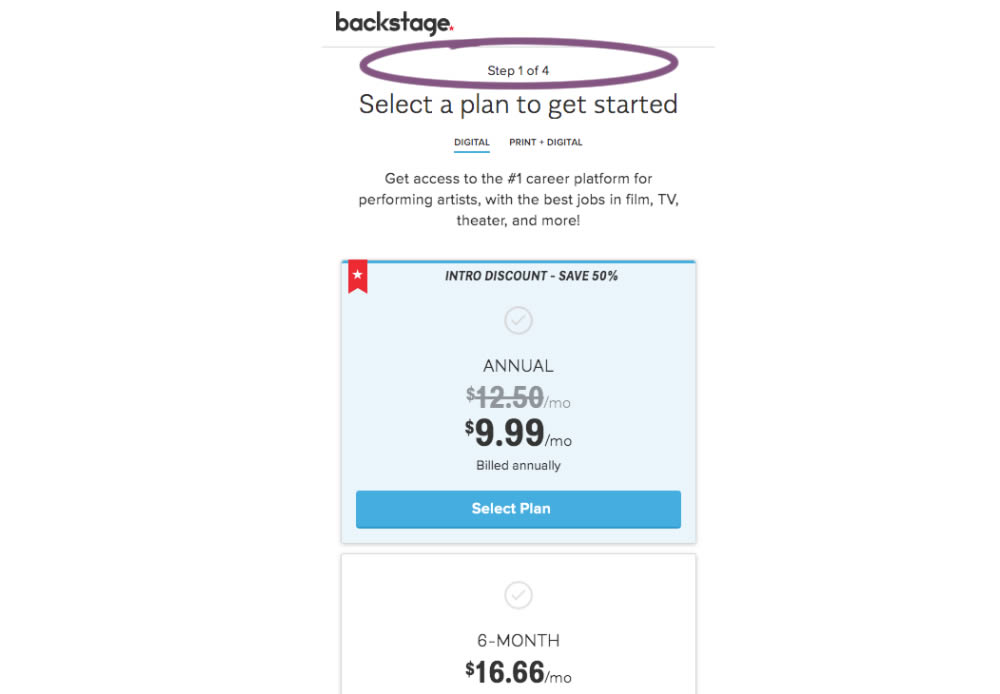
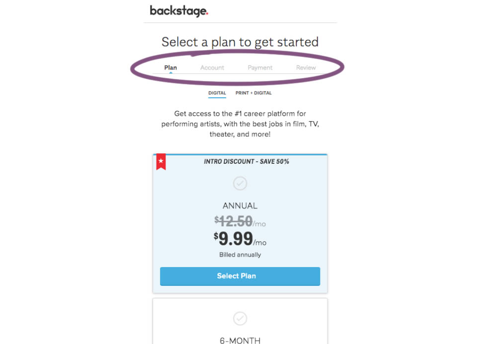
A "Step X of 4" progress bar was tested against a fully visible one that was also clickable.
Test #266 on
by  Someone
Oct 25, 2019
Desktop
Mobile
Product
X.X%
Sales
Someone Tested Pattern #4: Testimonials
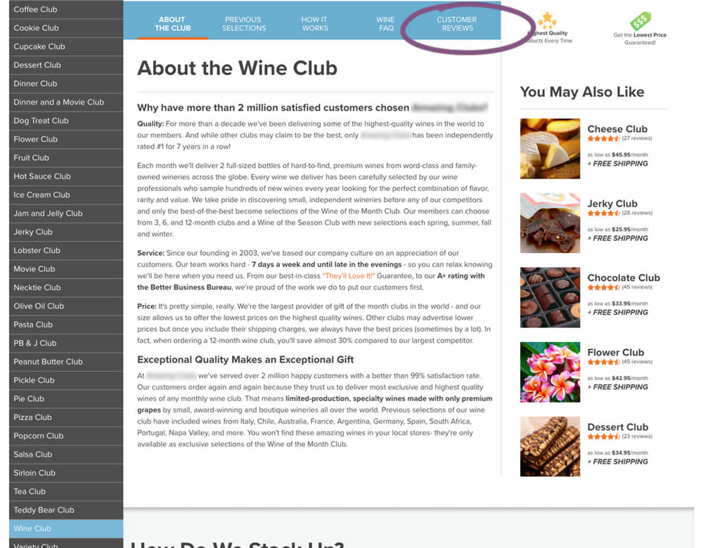
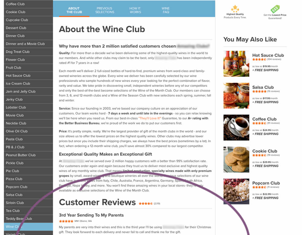
In this experiment, a product page showed customer reviews at the bottom of the page (B) instead of hiding them under a tab (A).
Test #265 on
Poll-app.com
by  Pierre Olivier Martel
Oct 17, 2019
Desktop
Mobile
Pricing
X.X%
Sales
Pierre Olivier Tested Pattern #112: Lower Price Frames On Poll-app.com
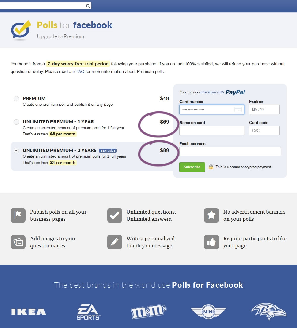
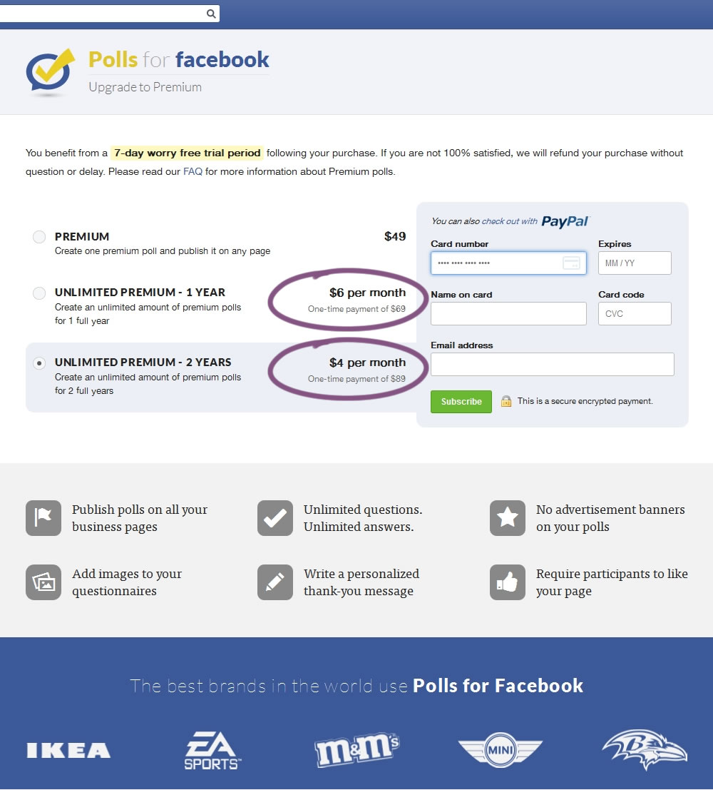
In this experiment, the $69 payment was explained as $6 per month over 1 year, and the $89 was explained as $4 per month over 2 years.
Test #264 on
Kenhub.com
by  Niels Hapke
Oct 05, 2019
Desktop
Mobile
Global
X.X%
Sales
Niels Tested Pattern #41: Sticky Call To Action On Kenhub.com
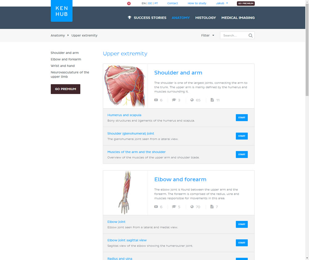
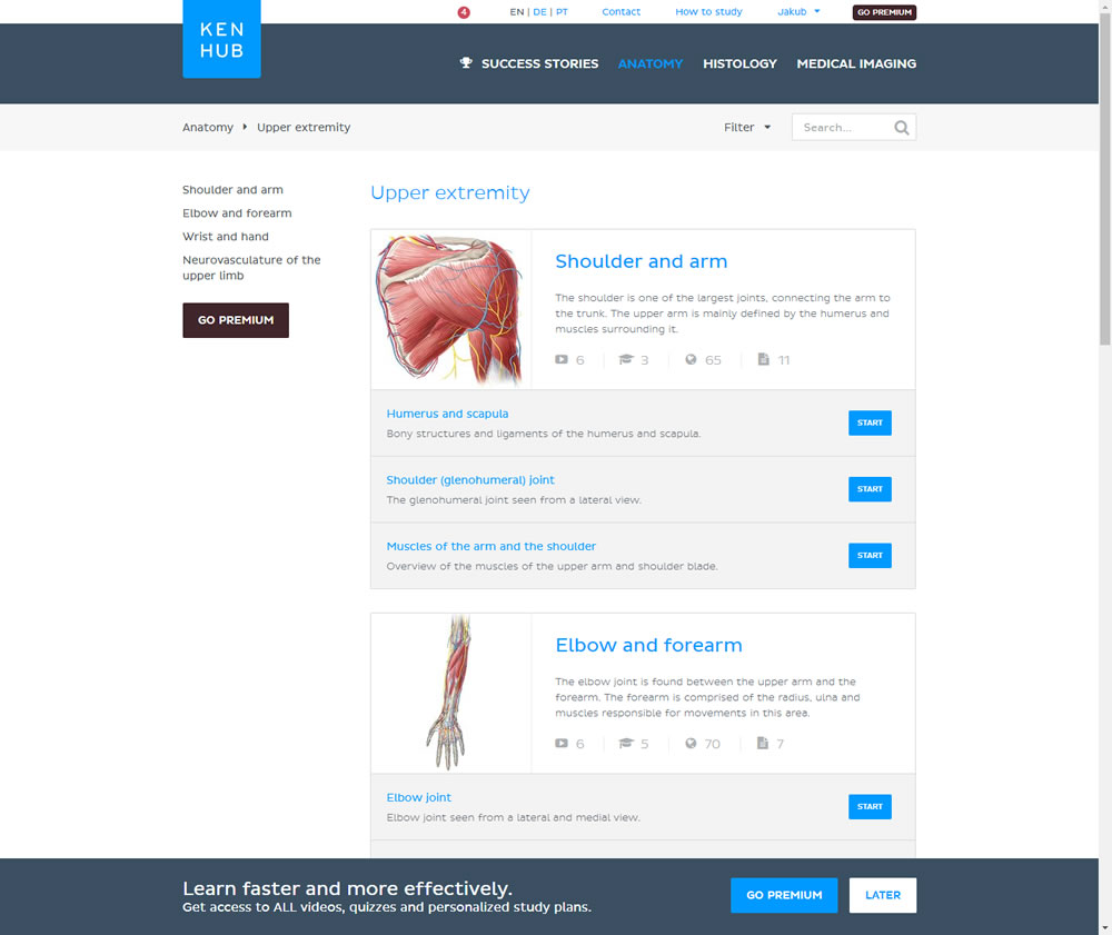
In this experiment users saw a sticky bar advertising the benefits of a Premium account across the bottom of the website, wherever they navigate. The sticky call to action appeared with a 4 second delay and was floating.
Test #263 on
Goodui.org
by  Jakub Linowski
Oct 04, 2019
Desktop
Mobile
Home & Landing
X.X%
Signups
Jakub Tested Pattern #22: Empowering Headline On Goodui.org
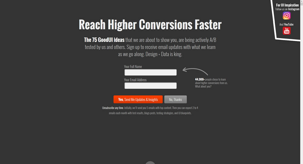
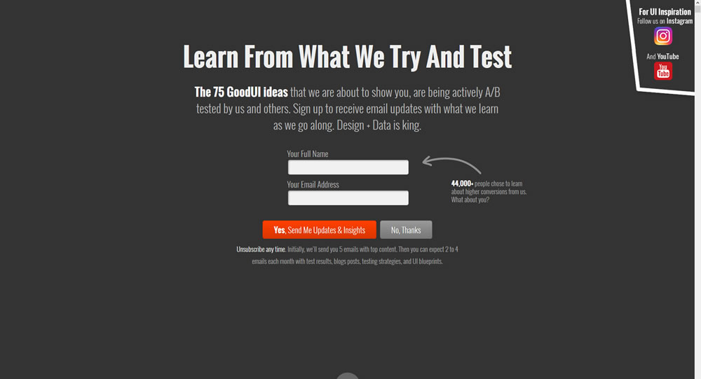
In this experiment a different headline was tested. "Reach Higher Conversions Faster" vs. "Learn From What We Try And Test".
Test #262 on
Thomasnet.com
by  Julian Gaviria
Oct 03, 2019
Desktop
Mobile
Listing
X.X%
Leads
Julian Tested Pattern #32: Condensed List On Thomasnet.com
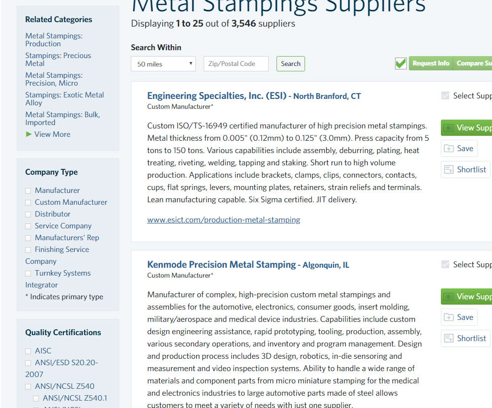
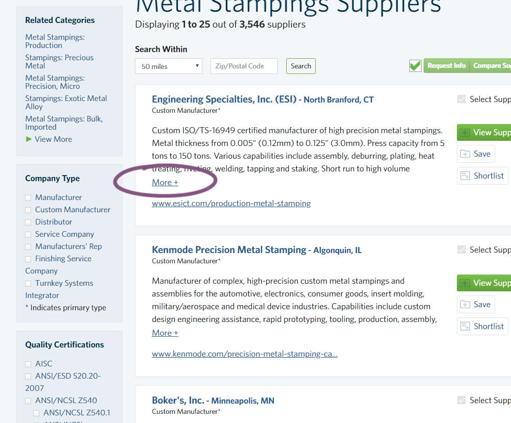
In this experiment, the B version condensed the company listings. This was done by showing less of the description and introducing a "more" and "less" dynamic links that would expand and collapse the description.
Test #105 on
Inktweb.nl
by  Martijn Oud
Sep 23, 2019
Desktop
Mobile
Signup
X.X%
Signups
Martijn Tested Pattern #111: Field Explanations On Inktweb.nl
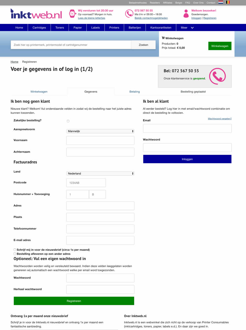
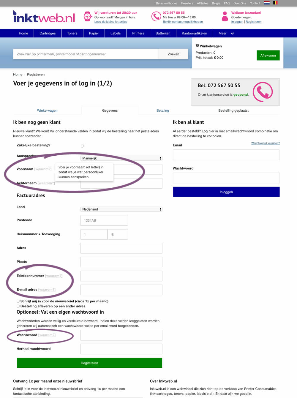
In this experiment, onhover tooltip explanations were added to selected fields (Firstname, Lastname, Phone, Email and Password). One translation example of the Firstname tooltip was the following "Enter your first name (or letter) so that we can address you in a more personal way".
Test #258 on
Thomasnet.com
by  Julian Gaviria
Sep 12, 2019
Desktop
Mobile
Signup
X.X%
Signups
Julian Tested Pattern #110: Optional Field Labels On Thomasnet.com

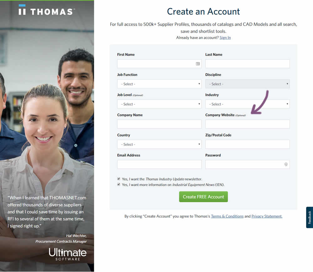
In this variation an optional field label was added.
Test #259 on
Thomasnet.com
by  Julian Gaviria
Sep 12, 2019
Desktop
Mobile
Signup
X.X%
Signups
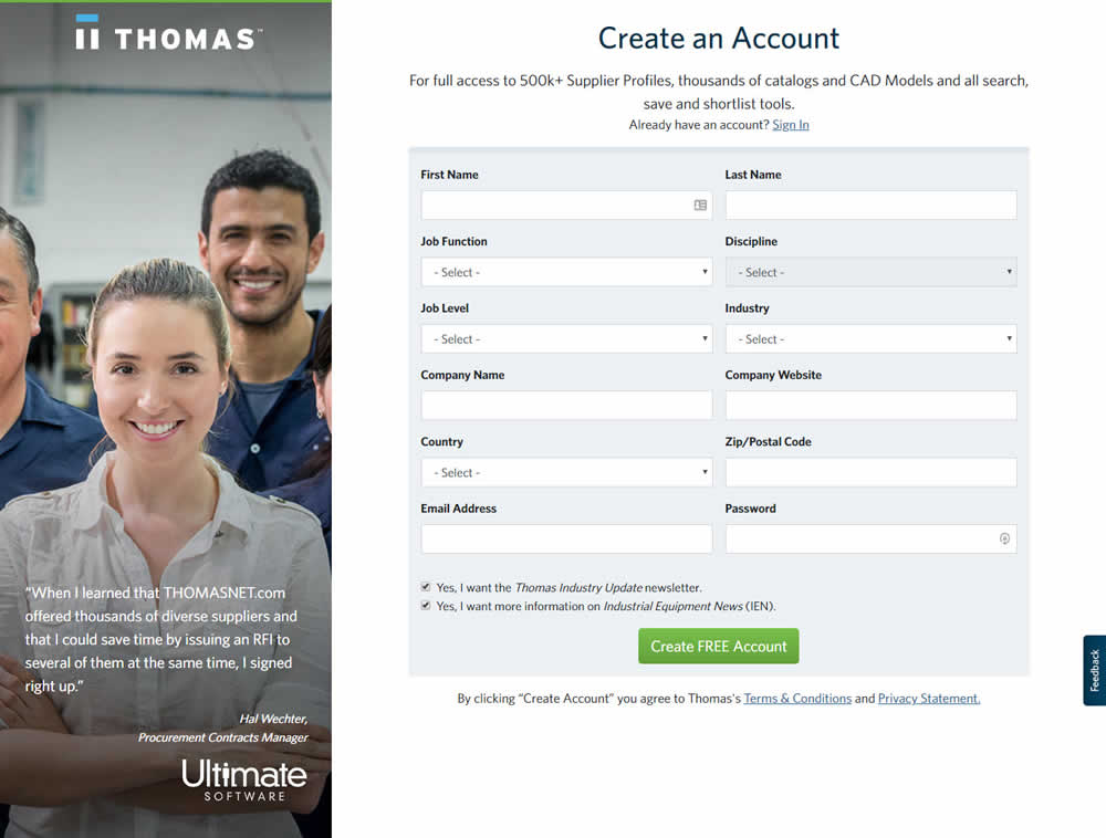
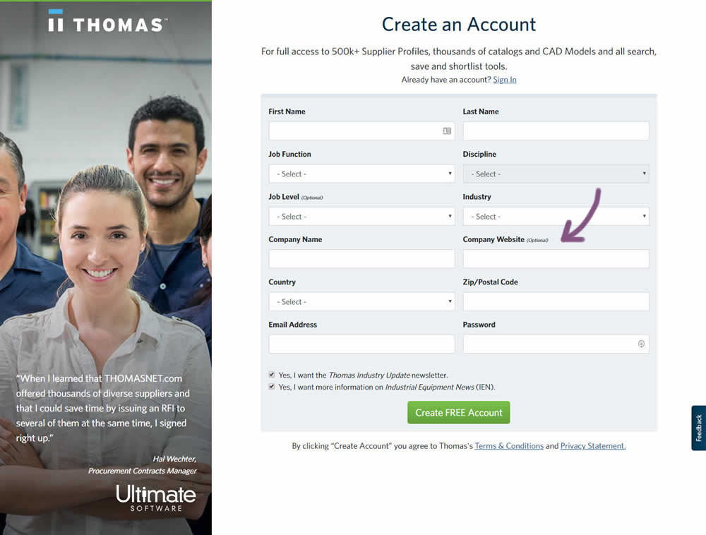
Julian Tested Pattern #110: Optional Field Labels On Thomasnet.com
Test #257 on
Thomasnet.com
by  Julian Gaviria
Sep 09, 2019
Desktop
Mobile
Signup
X.X%
Signups
Julian Tested Pattern #109: Required Field Labels On Thomasnet.com

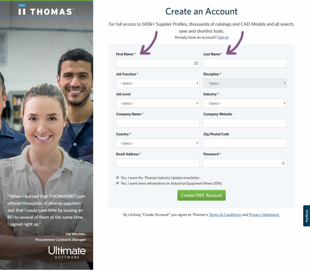
In this followup experiment, field labels without and with a marked asterisk were tested.
Test #256 on
by  Alex James
Aug 23, 2019
Desktop
Mobile
Signup
X.X%
Signups
Alex Tested Pattern #109: Required Field Labels
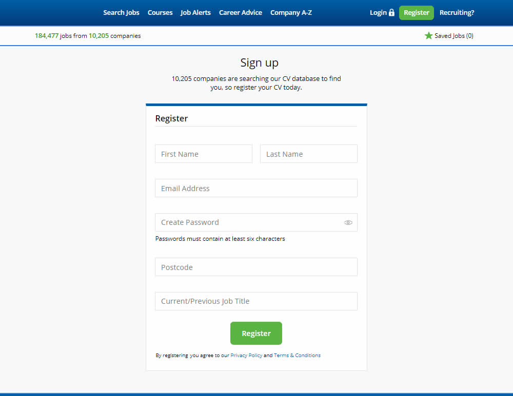
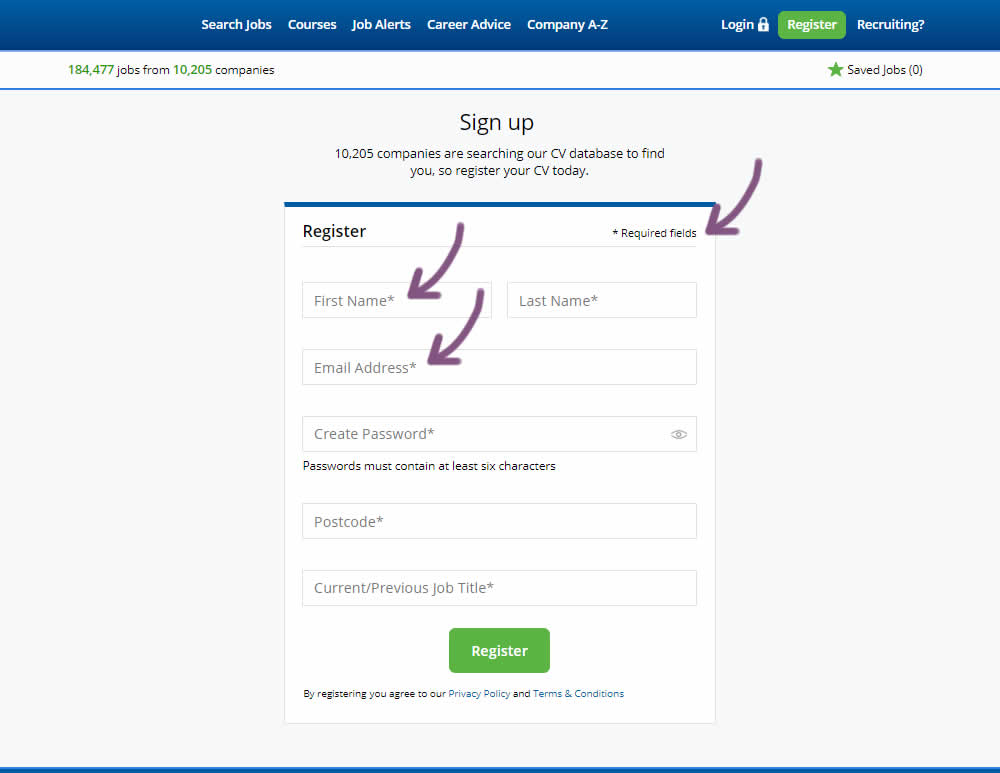
The original had no fields marked as required. The variant had all fields marked as required with an asterisk (and a reference note).