All Latest 620 A/B Tests
MOST RECENT TESTS
Test #310 on
Backstage.com
by  Stanley Zuo
Jul 25, 2020
Mobile
Listing
X.X%
Sales
Stanley Tested Pattern #77: Filled Or Ghost Buttons On Backstage.com
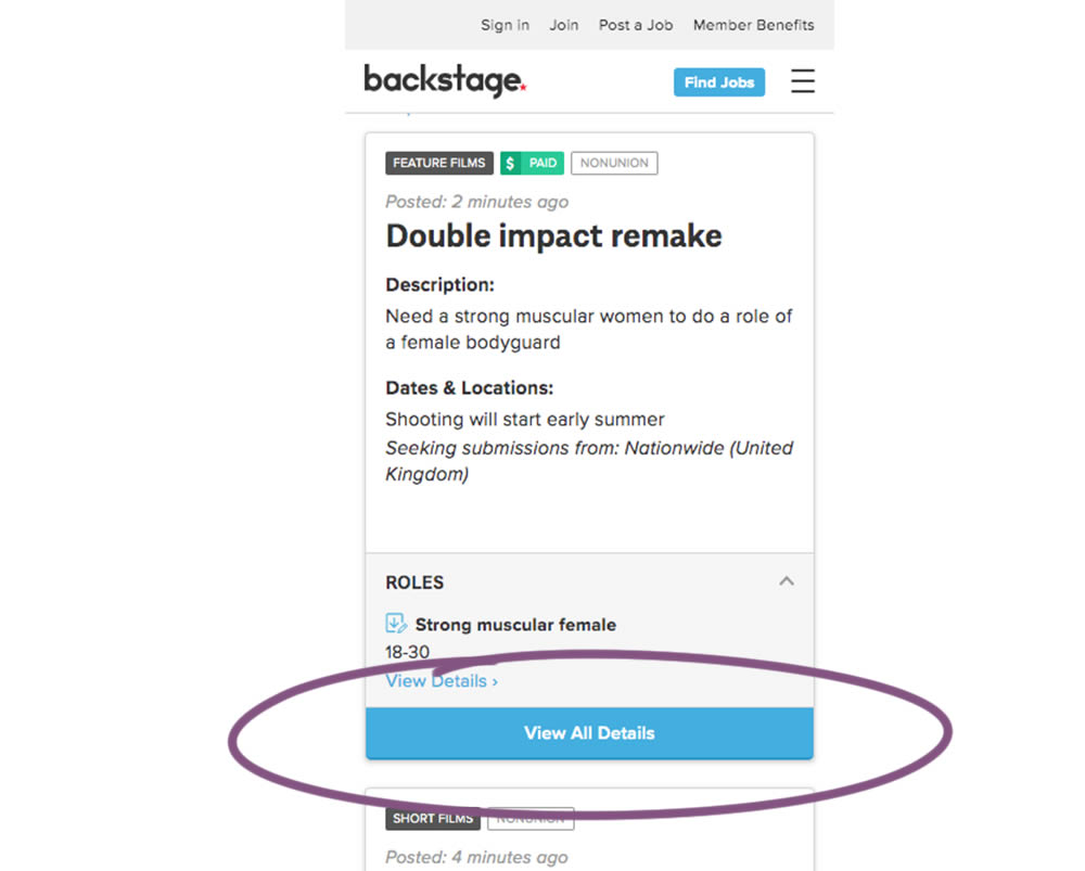
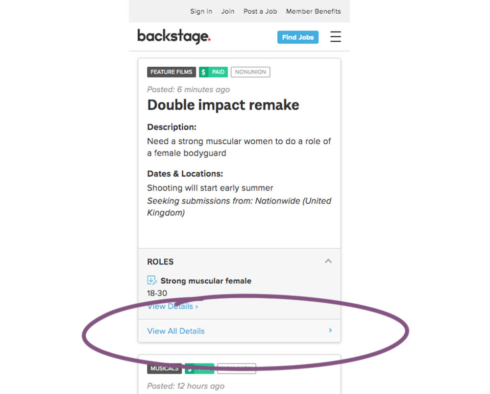
In this experiment, the style of a button leading to view detailed casting calls on a listing page was changed. In the A version the style was a filled high contrast blue background, and the B variation had a feint "ghost button" style.
Which A Or B Actually Wins? Find Out Before You Test.
Members see every test result — the winners, the flat ones, and the losers — along with exact effects and sample sizes. Use it to estimate your tests and prioritize by probability, not gut feel. Start every experiment with the odds on your side.
Test #306 on
Backstage.com
by  Stanley Zuo
Jul 09, 2020
Desktop
Mobile
Pricing
X.X%
Sales
Stanley Tested Pattern #69: Autodiscounting On Backstage.com
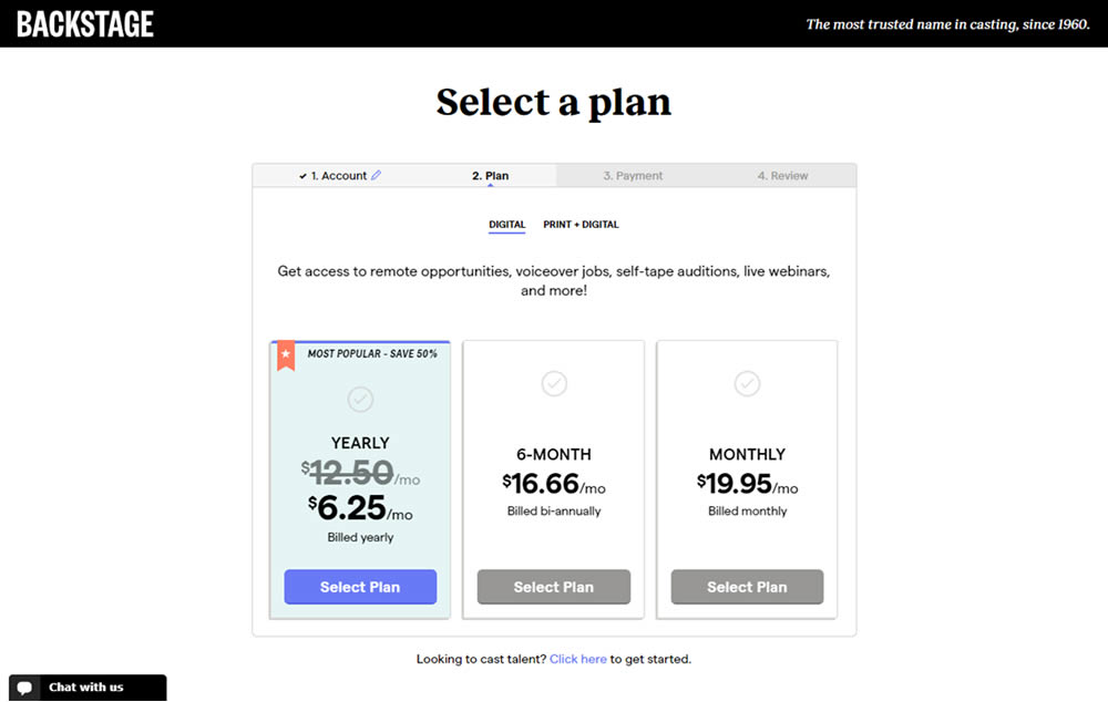
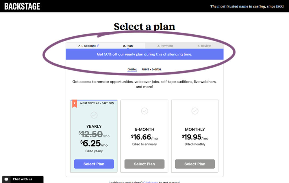
In this experiment, the only change was an added message at the top of the pricing screen, clarifying that there is an active discount on a yearly plan. The discount was already communicated with a strike-through price on the control version as well. The variation simply emphasized this aggressively.
Test #305 on
Volders.de
by Michal Fiech
Jun 30, 2020
Mobile
Desktop
Home & Landing
X.X%
Sales
Michal Tested Pattern #94: Visible Search On Volders.de

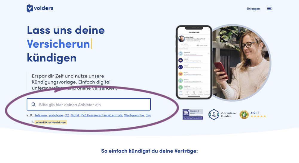
In this experiment, a search input field (to look for companies) along with most popular links (also company names) were displayed on the homepage of a leading contract cancellation service. The control (A) version instead had a button that sent users to a next page where the same selection could be made - only later. The measurable success criteria were the number of paid cancellations - a few steps down the funnel.
Test #304 on
Backstage.com
by  Stanley Zuo
Jun 29, 2020
Mobile
Product
X.X%
Signups
Stanley Tested Pattern #97: Bigger Form Fields On Backstage.com
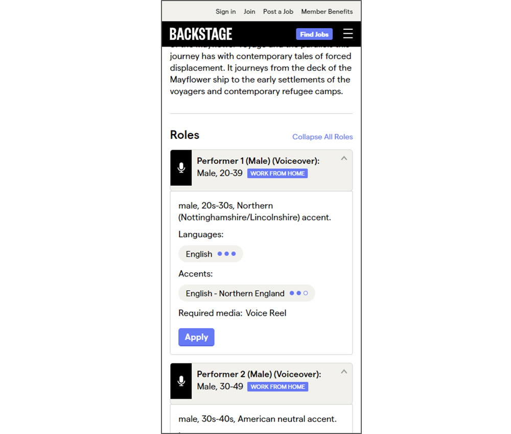
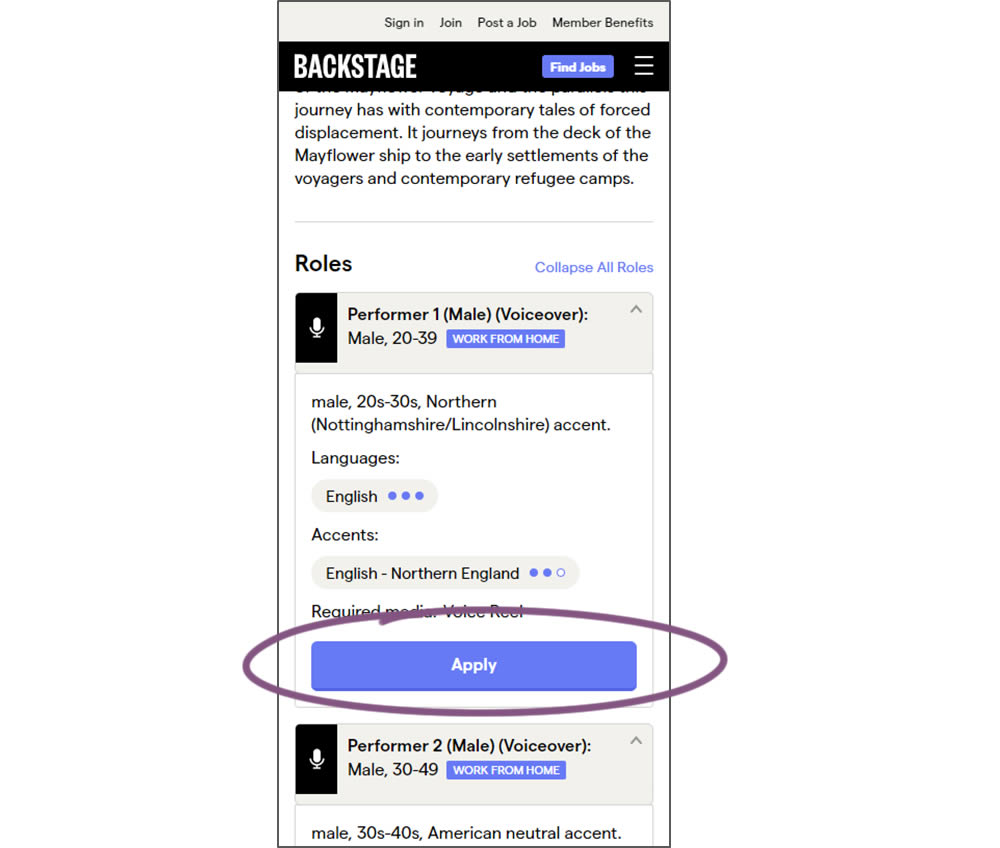
In this experiment, larger "Apply" buttons were shown on a casting detail page. The application funnel would take users through a series of steps leading to a paid membership subscription. The experiment measured initial progression and account signups (email signups).
Test #303 on
Thomasnet.com
by  Julian Gaviria
Jun 26, 2020
Desktop
Mobile
Global
X.X%
Leads
Julian Tested Pattern #14: Exposed Menu Options On Thomasnet.com

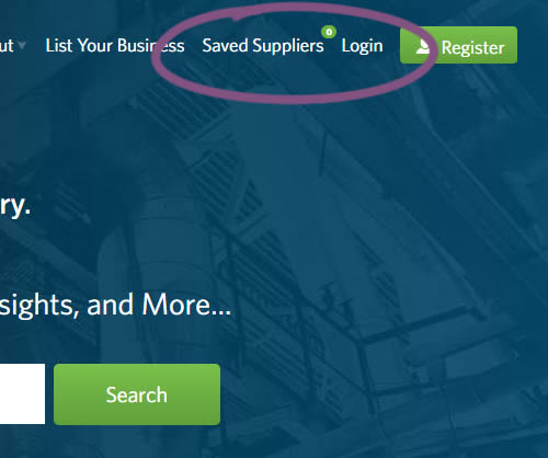
In this experiment variation, the saved suppliers feature was surfaced in the global navigation.It was already possible to save supplier companies from listing and specific company pages. This experiment aimed to increase the saving functions visibility and possibly increase more leads.
Test #302 on
Volders.de
by Michal Fiech
Jun 09, 2020
Desktop
Mobile
Signup
X.X%
Sales
Michal Tested Pattern #83: Progressive Fields On Volders.de
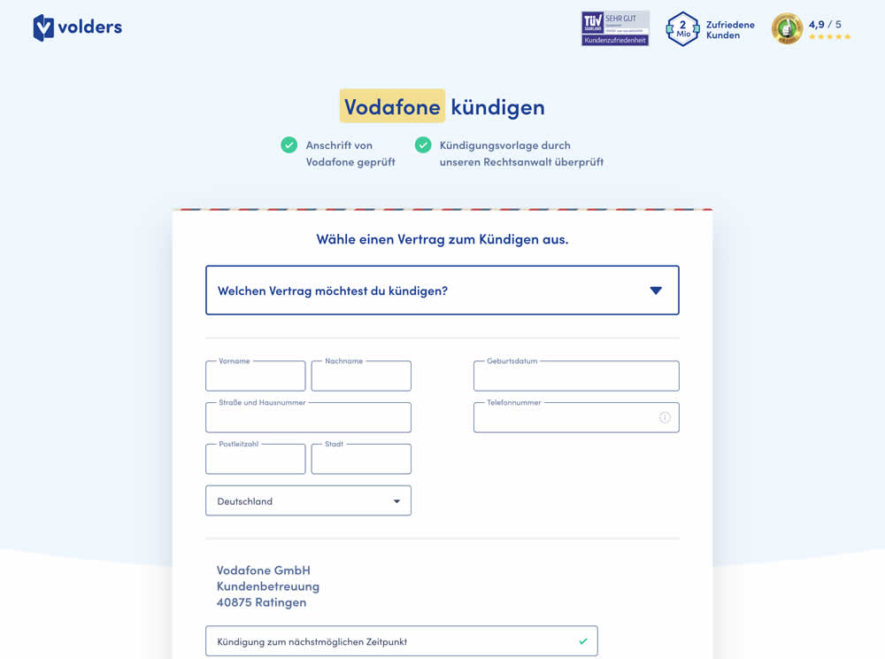
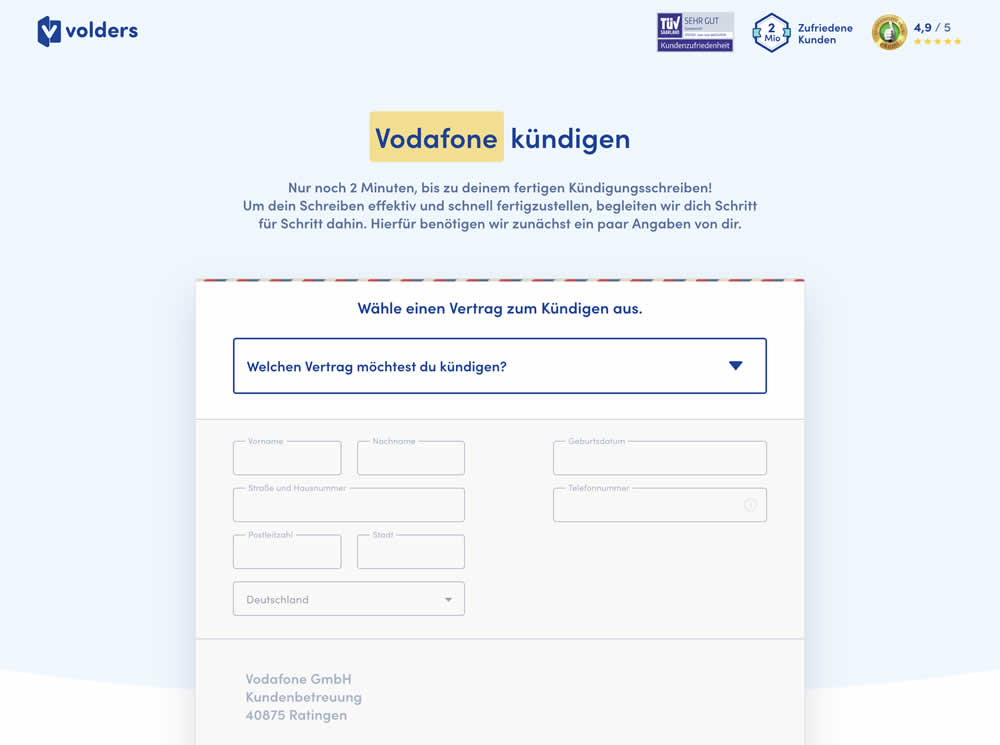
In this experiment a long form (A) was replaced with a progressive form interaction (B). Most of the form fields would appear in a grey-disabled style, until the prerequioste fields were first filled out.
Test #301 on
Zapimoveis.com.br
by  Vinicius Barros Peixoto
May 31, 2020
Desktop
Mobile
Product
X.X%
Leads
Vinicius Tested Pattern #21: What It's Worth On Zapimoveis.com.br


In this experiment, the B variation property prices were framed using higher and crossed out price points from 12 months ago - achieving a relative discount. A tooltip was also shown which explained the higher price point on hover. The example in the screenshot translates to "2% less compared to 12 months ago". This high-power experiment measured the number of leads that were generated on property (product) screens.
Test #300 on
Volders.de
by Michal Fiech
May 25, 2020
Desktop
Mobile
Signup
X.X%
Progression
Michal Tested Pattern #3: Fewer Form Fields On Volders.de
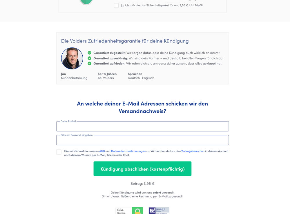
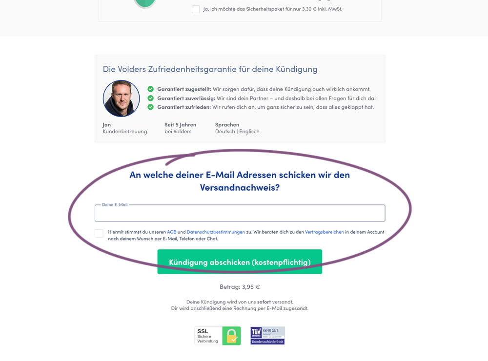
In this experiment, a password field was removed on a contract cancellation form (Volders).
In the control version, users were required to enter their email address and a password. If the email address was associated with an existing account, then the password was used to authenticate the user (and validated). When users entered a new email address, then the password field was used to create a new account.
In the variation, the password field was removed, as the authentication happened after the conversion itself using other backend mechanisms.
Test #299 on
Backstage.com
by  Stanley Zuo
May 22, 2020
Desktop
Mobile
Listing
X.X%
Sales
Stanley Tested Pattern #60: Repeated Bottom Call To Action On Backstage.com
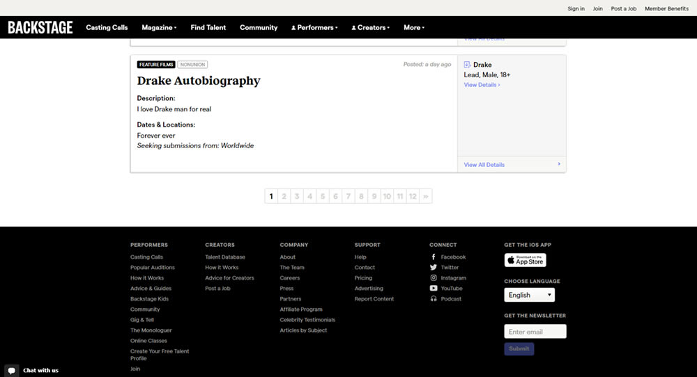
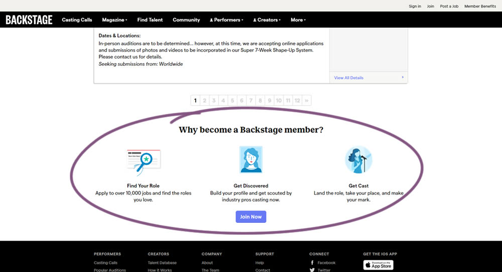
In this experiment, at the bottom of a search results screen, a membership join button was added along with 3 encouraging reasons. The experiment measured membership funnel starts, as well as paid membership transactions (sales).
Test #298 on
Zapimoveis.com.br
by  Vinicius Barros Peixoto
May 14, 2020
Desktop
Mobile
Listing
X.X%
Leads
Vinicius Tested Pattern #36: Fewer Or More Results On Zapimoveis.com.br
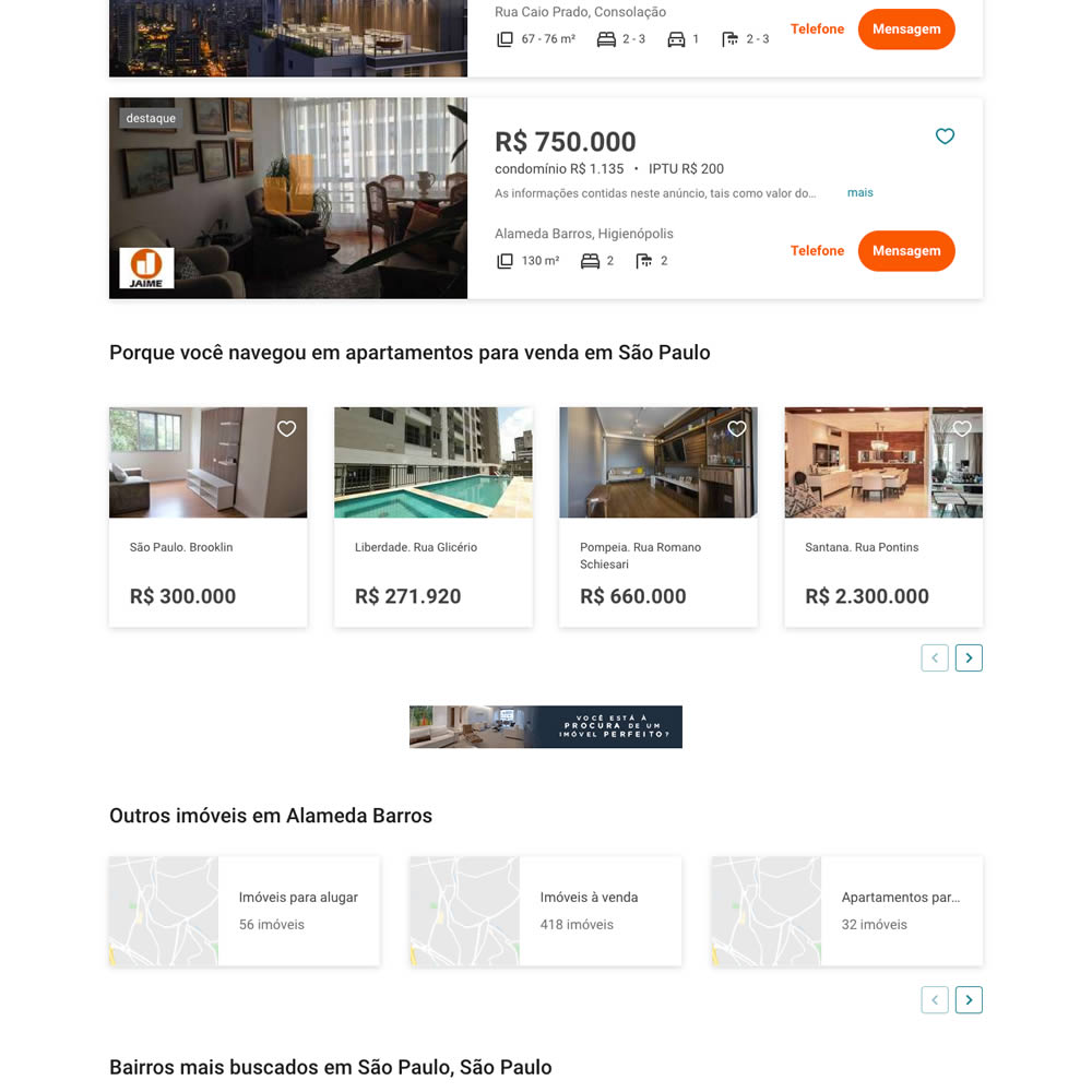
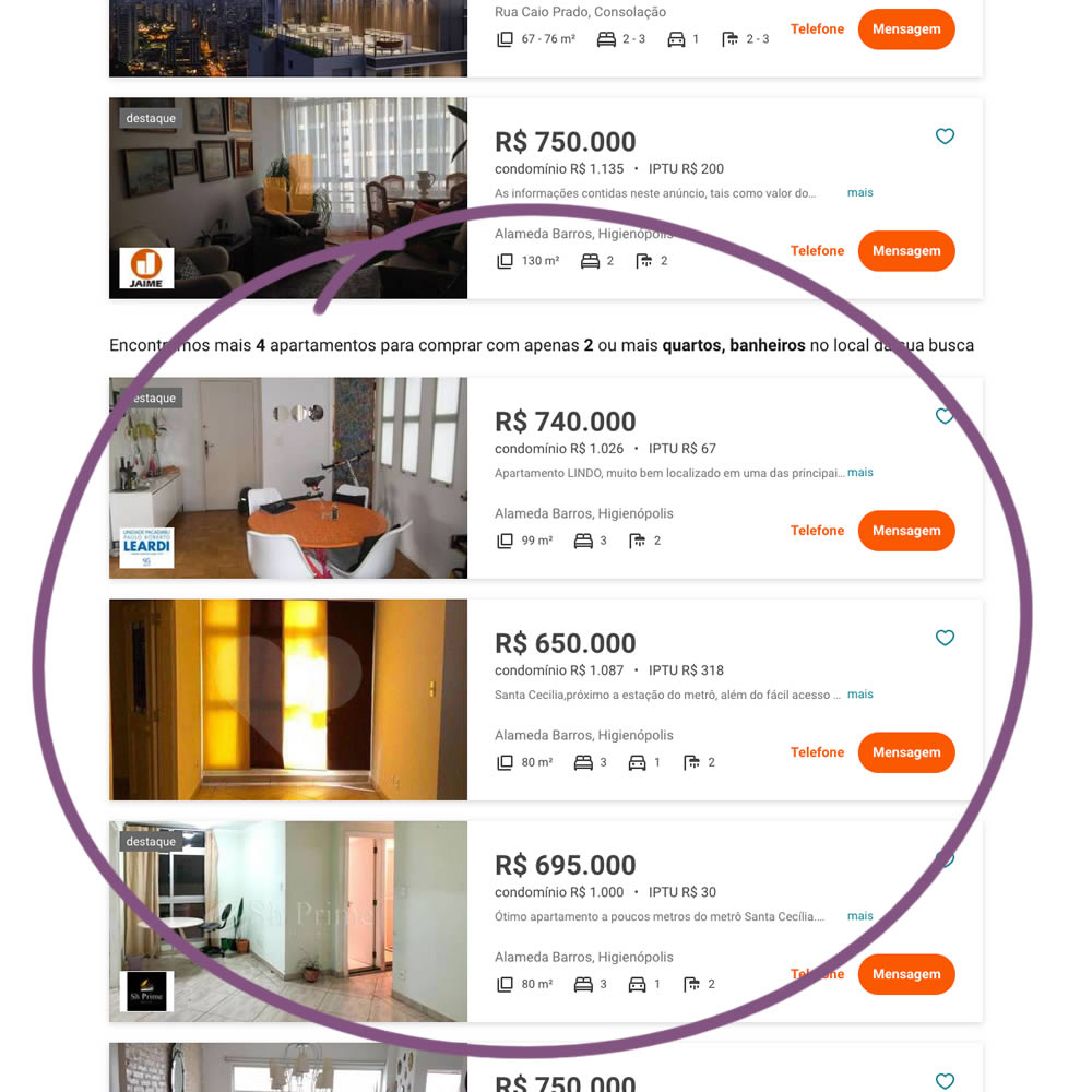
In this experiment on a listing page, the search was expanded to show more listings (variation B). Conditionally, if there were fewer than 36 results, set basic filters such as number bedrooms and bathrooms were expanded and appended to the results. Hence if someone chose 2 bedrooms and 2 bathrooms in variation A, they would only see listing with that filter. In variation B however they would first see the filtered results, and later they would also see results with 3 or more of each.
Test #296 on
Backstage.com
by  Stanley Zuo
Apr 30, 2020
Mobile
Content
X.X%
Sales
Stanley Tested Pattern #23: Inline Link Nudge On Backstage.com
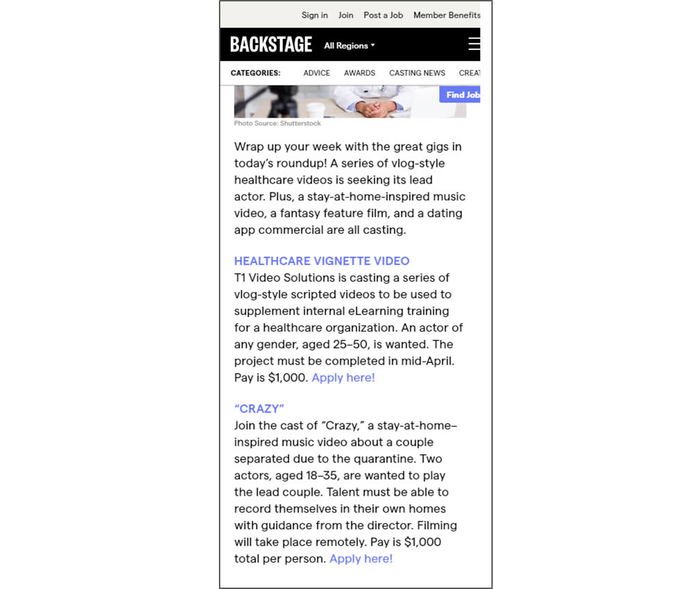
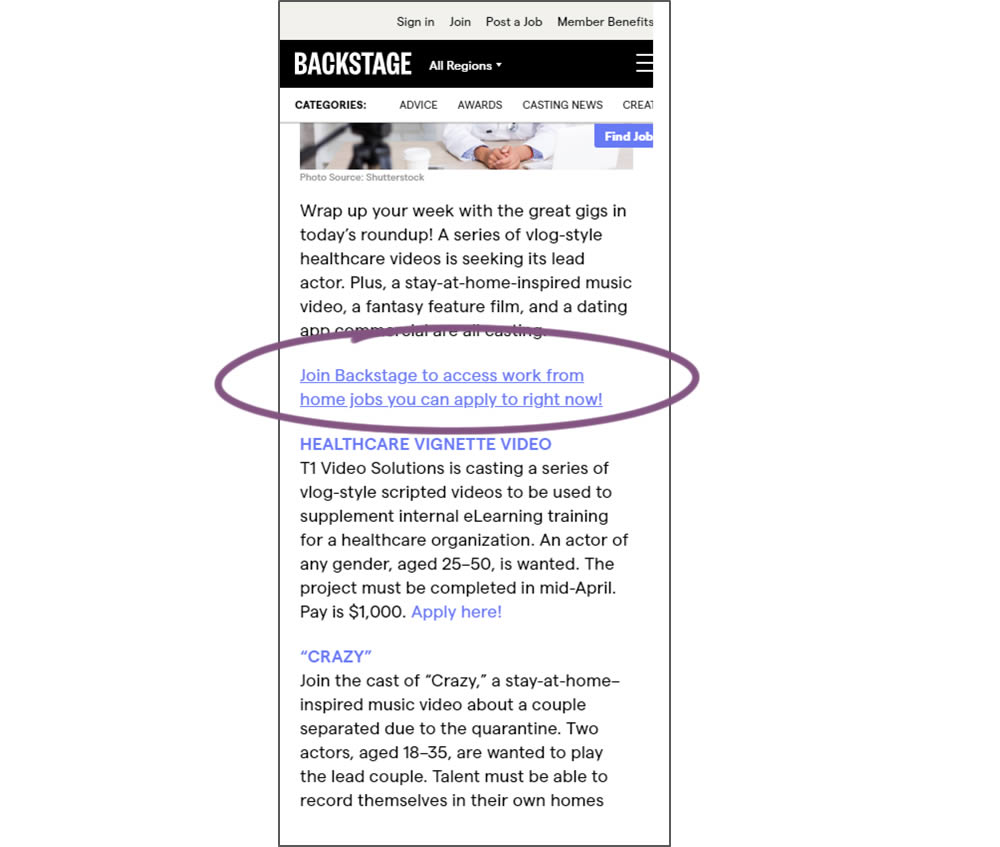
In this simple experiment, a text link to a join page was injected on an article page. The hypothesis was that more users would signup as a result of this subtle trigger.
Test #295 on
Thomasnet.com
by  Julian Gaviria
Apr 29, 2020
Desktop
Mobile
Content
X.X%
Engagement
Julian Tested Pattern #25: Nagging Results On Thomasnet.com
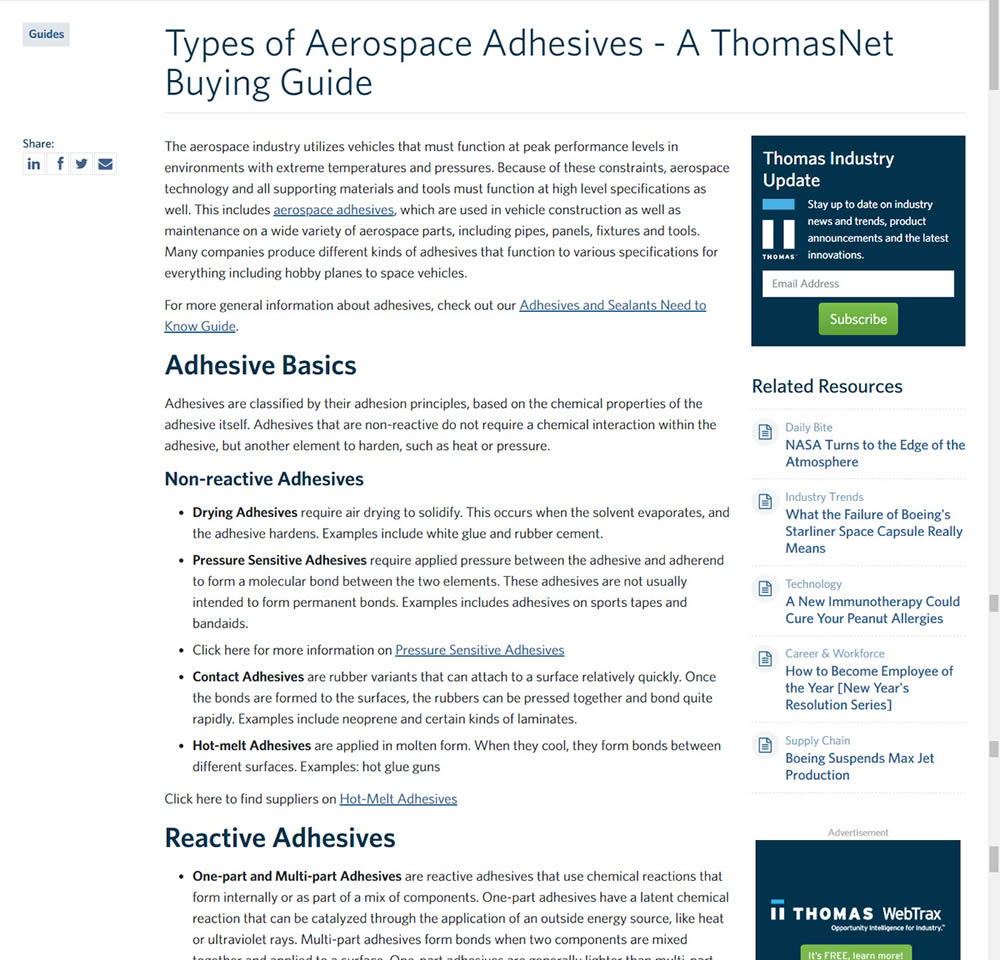
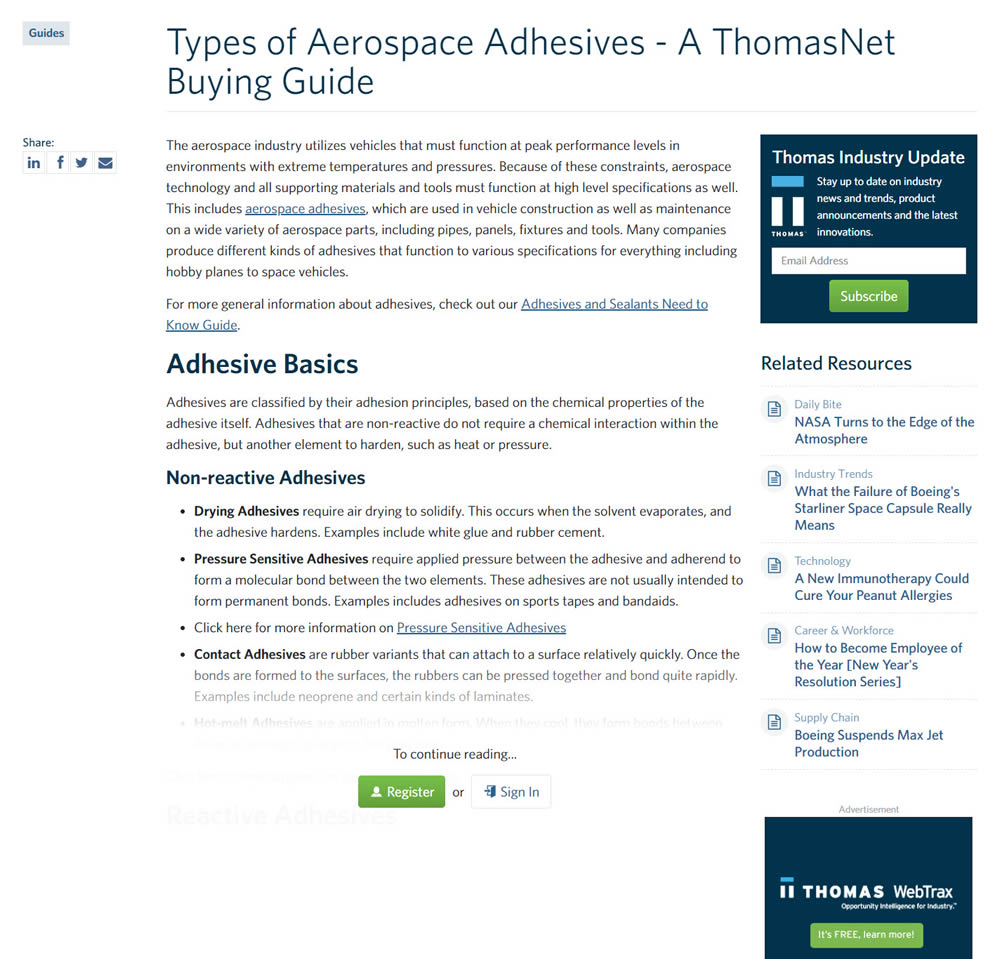
In this experiment, blog article pages were hidden behind a registration wall - requing a signup to access. The registration wall would appear after the first paragraph using gradual opacity to cover the rest of the article. We have published the effects of this change on registrations (signups) and on engagement (users viewing other more important company detail pages).
Test #293 on
Backstage.com
by  Stanley Zuo
Apr 14, 2020
Desktop
Mobile
Product
X.X%
Sales
Stanley Tested Pattern #114: Less Or More Visible Prices On Backstage.com
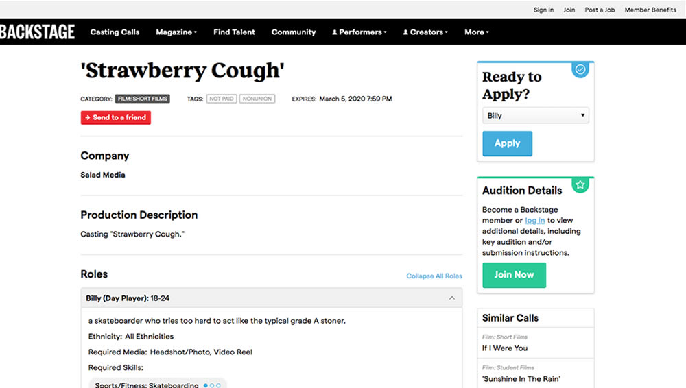
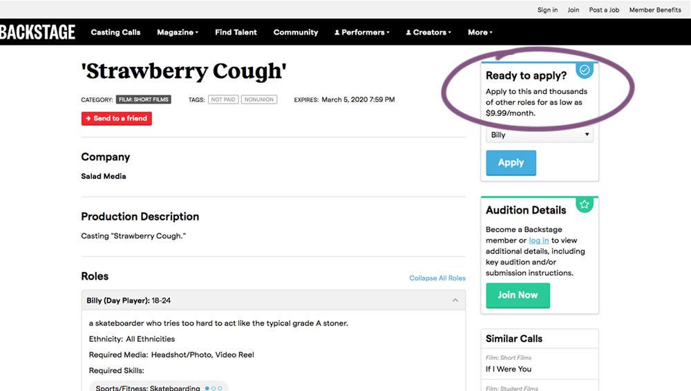
In this experiment on a casting call site, pricing information was shown beside the application button. This change shows the effect of setting a price expectation and being more clear that the application process is not free.
Test #292 on
Backstage.com
by  Stanley Zuo
Apr 13, 2020
Desktop
Mobile
Listing
X.X%
Sales
Stanley Tested Pattern #24: Visible Availability On Backstage.com
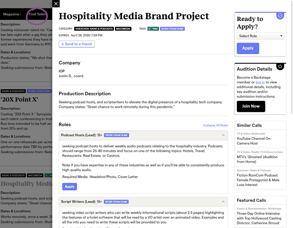
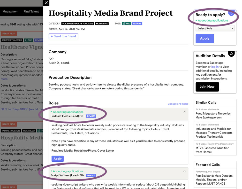
The core hypothesis of this experiment was that by showing clear availability (in green text) beside each casting call, more users would apply and become premium members. The experiment reports on two metrics: application starts (the first progression metric), and premium membership sales (measured a few steps further in the funnel).
Test #291 on
Elevate App
by  Jesse Germinario
Mar 30, 2020
Mobile
Signup
X.X%
Signups
Jesse Tested Pattern #91: Forced Action
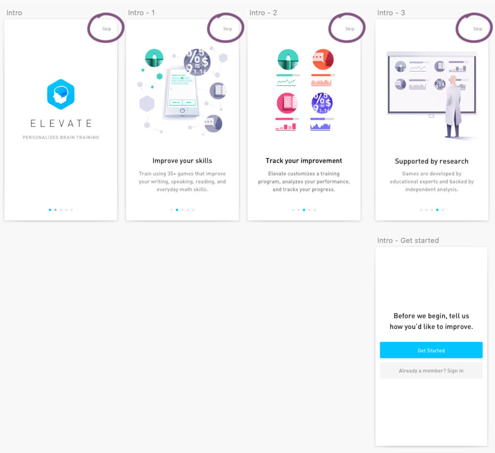
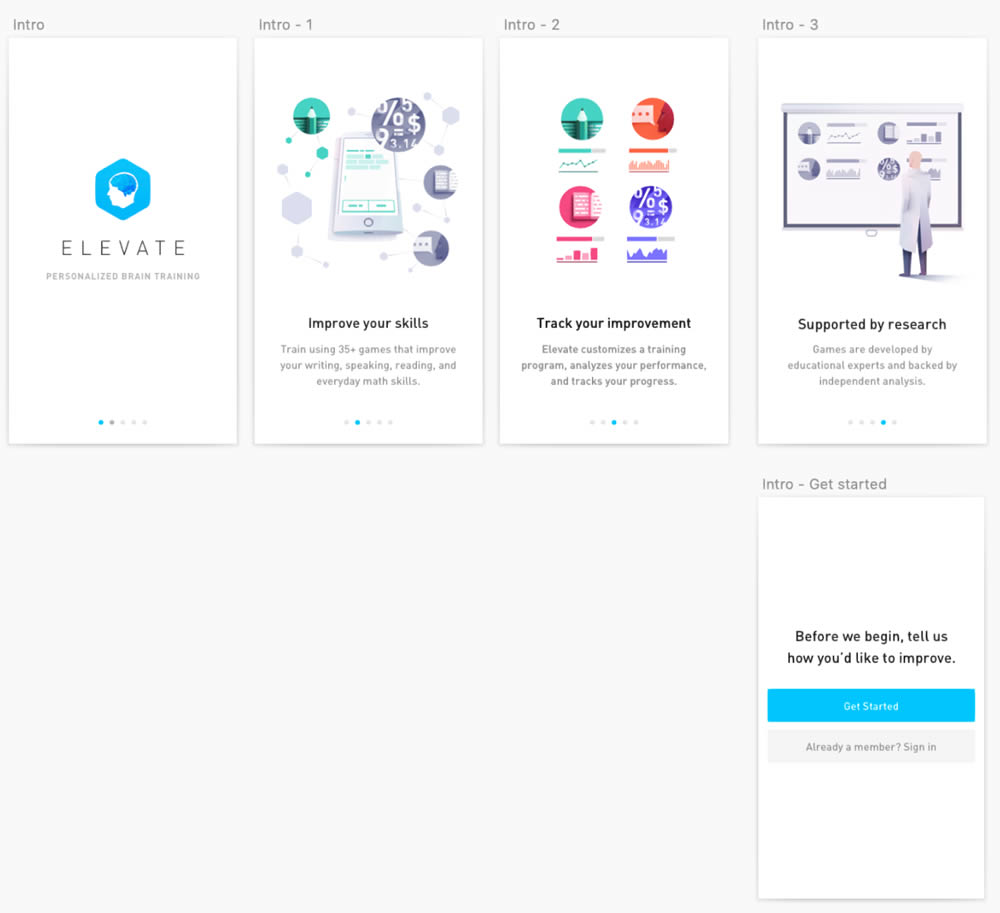
This experiment was ran on the initial onboarding screens of the Elevate App - right after installing and launching the app for the first time. The change was the removal of subtle "skip" links that fast tracked users to the signup/login screen (Get Started). Hence in the variation, all users had to scroll through the 4 introductory messages before being asked to create an account.
Test #288 on
Kenhub.com
by  Niels Hapke
Mar 05, 2020
Desktop
Mobile
Home & Landing
X.X%
Signups
Niels Tested Pattern #117: Company Logos On Kenhub.com


In this experiment, customer logos (of universities attended by students using Kenhub) were placed on a homepage. The experiment tested for the effect on registration visits, and premium subscription starts.
Test #287 on
Goodui.org
by  Jakub Linowski
Mar 04, 2020
Desktop
Mobile
Pricing
X.X%
Sales
Jakub Tested Pattern #117: Company Logos On Goodui.org
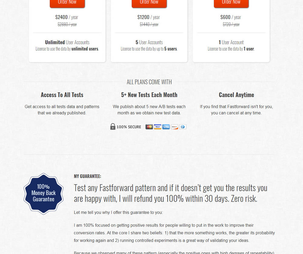
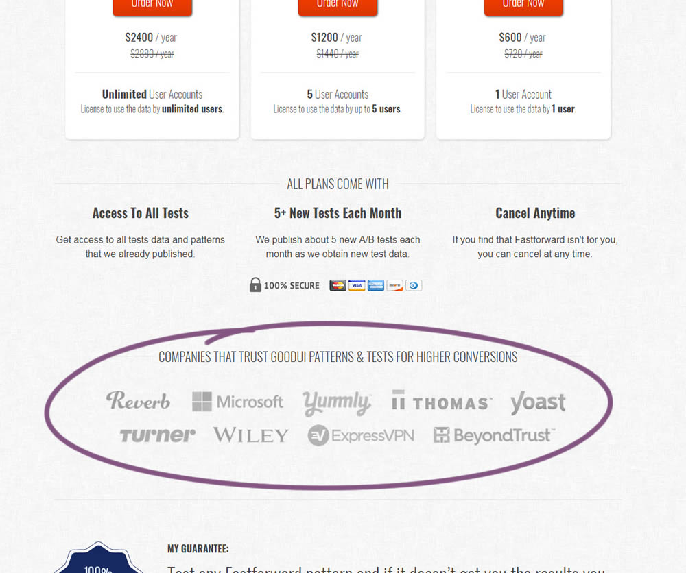
In this experiment, a handful of customers and contributors from GoodUI were added on a pricing page to test the effect on sales.
Test #286 on
Volders.de
by  Alexander Krieger
Feb 28, 2020
Desktop
Mobile
Home & Landing
X.X%
Sales
Alexander Tested Pattern #9: Multiple Steps On Volders.de
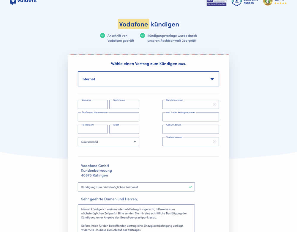
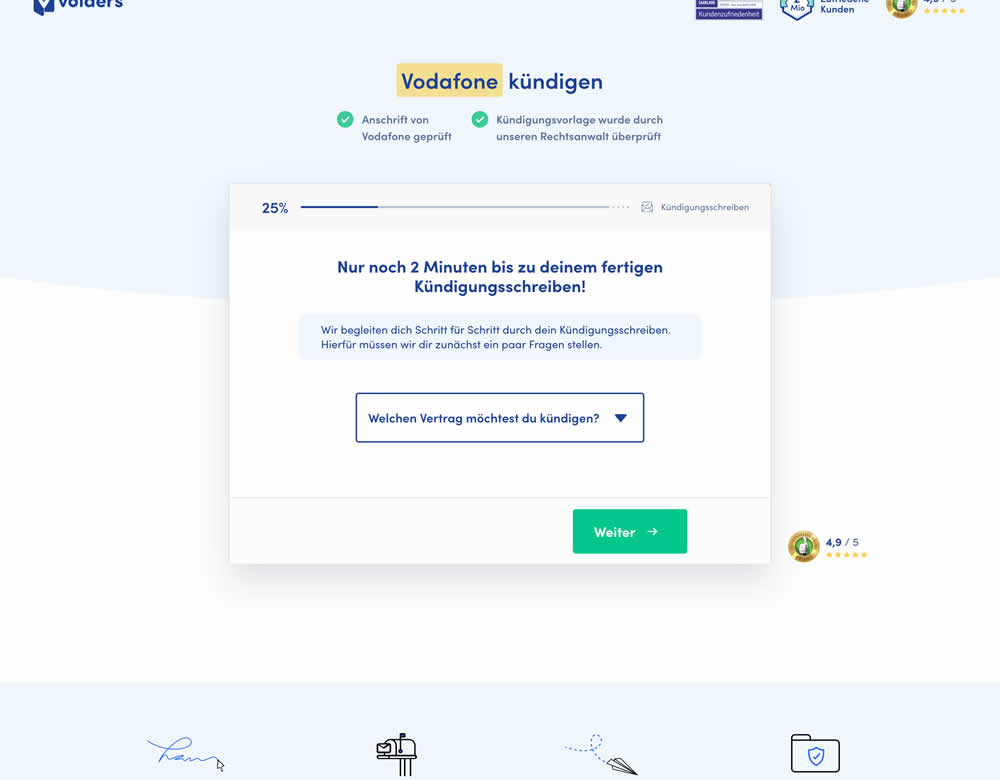
In this experiment, a long contract cancellation landing page (control) was broken down into 4 steps with 1 final summary step (variation).
Test #284 on
Thomasnet.com
by  Julian Gaviria
Feb 19, 2020
Desktop
Mobile
Listing
X.X%
Leads
Julian Tested Pattern #78: Tags, Badges And Structured Information On Thomasnet.com
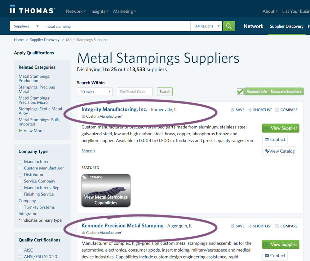
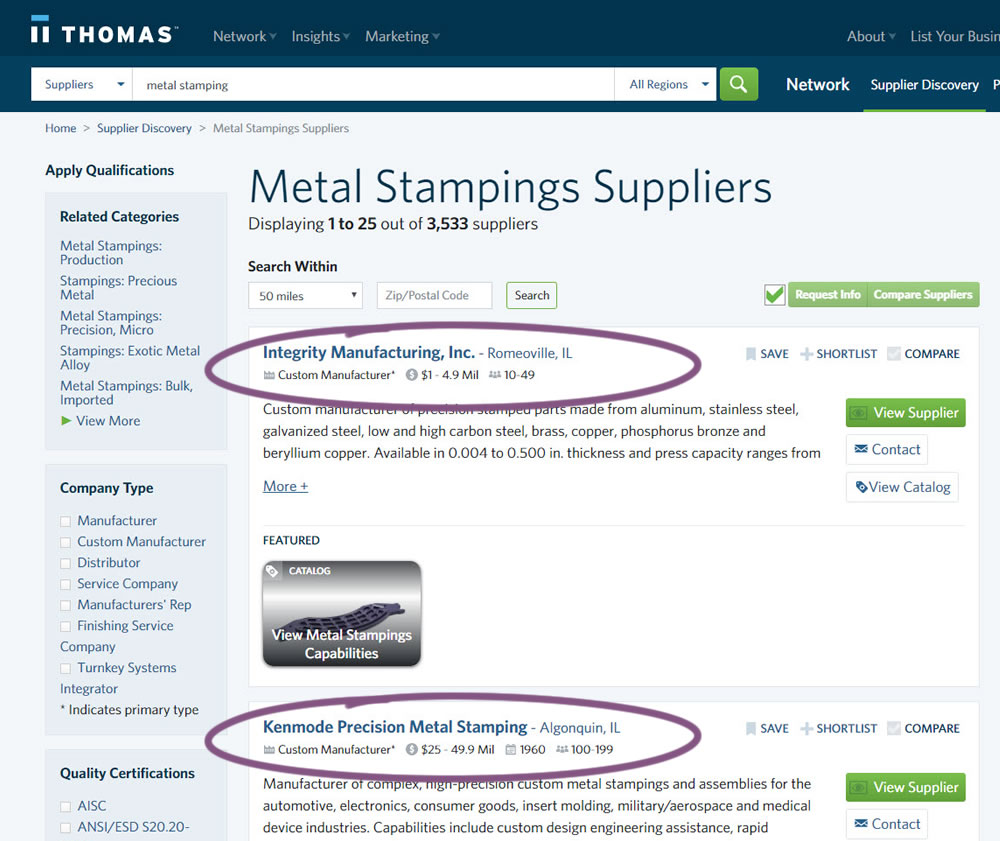
In this experiment, structured data tags were displayed on a listing page to help potential buyers make better decisions. The additional information about the listed companies included: annual revenue, employee count, and year of establishment.
Test #283 on
Kenhub.com
by  Niels Hapke
Feb 08, 2020
Desktop
Mobile
Global
X.X%
Sales
Niels Tested Pattern #42: Countdown Timer On Kenhub.com
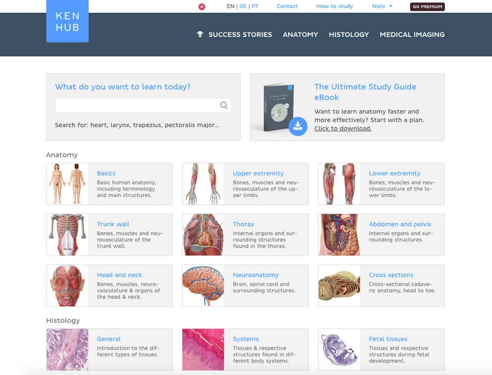
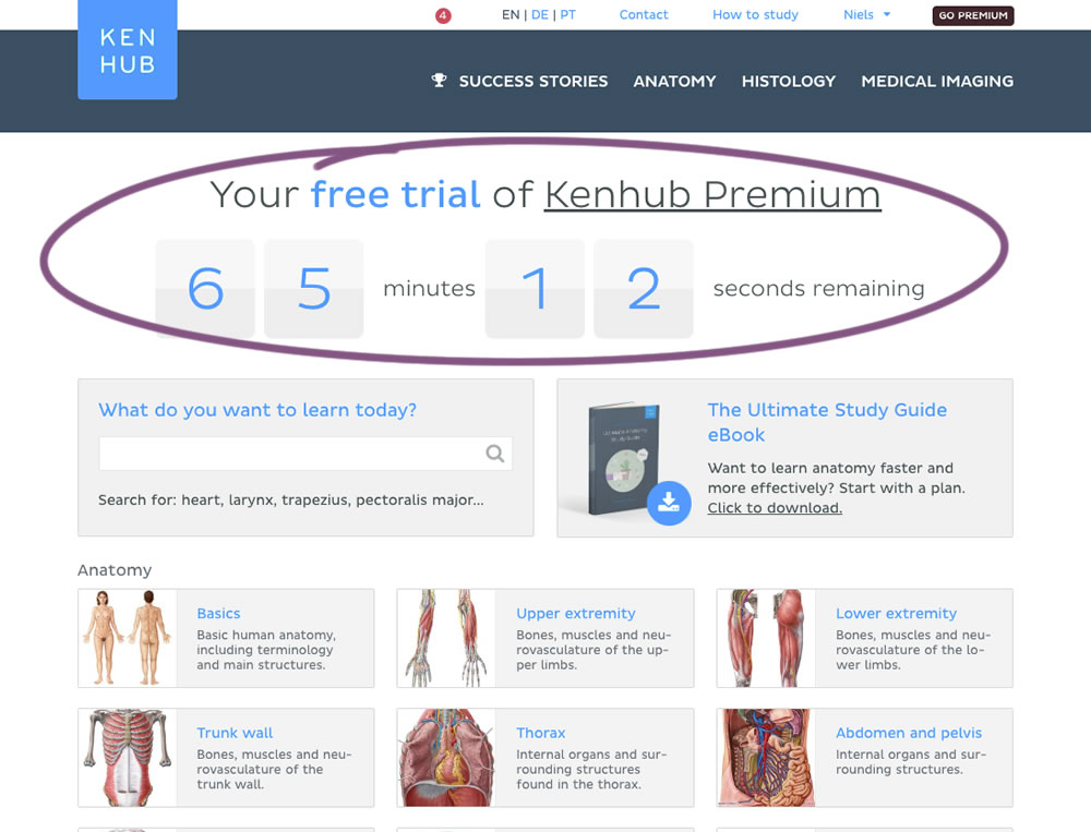
In this experiment, registered trial users were shown a 65 minute counter on multiple pages (dashboard, listing, quiz, articles) encouraging them to get a full subscription and study all content. Both A and B experiences offered the same limited content for trial users. After the 65 minutes came to an end, the B variation showed an additional "Go Premium" button on all pages, but continued to offer the same limited content.