All Latest 620 A/B Tests
MOST RECENT TESTS
Test #333 on
Expertinstitute.com
by  Ardit Veliu
Dec 31, 2020
Desktop
Mobile
Home & Landing
X.X%
Leads
Ardit Tested Pattern #11: Gradual Reassurance On Expertinstitute.com


In this experiment, the variation broke up a lead form into two parts. In the first step users were asked for their state followed by a standard contact form on a second step. All of the states were shown as selectable options. In the control version, the landing page only showed a button which lead to the full form. The experiment measured impact on lead form submissions.
Which A Or B Actually Wins? Find Out Before You Test.
Members see every test result — the winners, the flat ones, and the losers — along with exact effects and sample sizes. Use it to estimate your tests and prioritize by probability, not gut feel. Start every experiment with the odds on your side.
Test #331 on
by  Jakub Linowski
Dec 30, 2020
Desktop
Mobile
Product
X.X%
Sales
Jakub Tested Pattern #121: Free Shipping

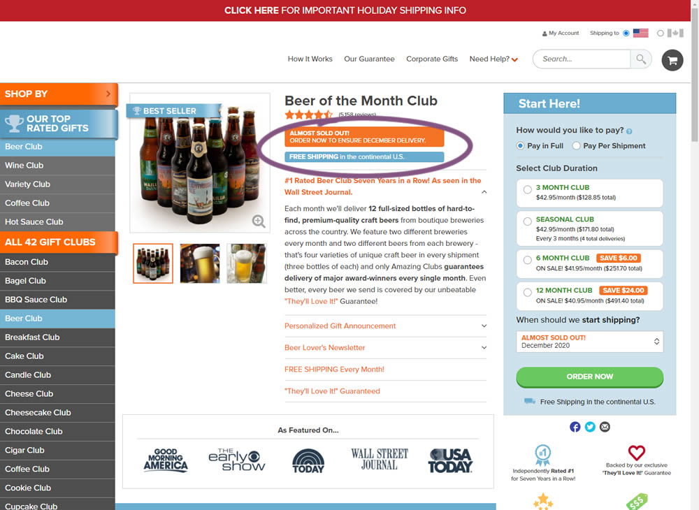
In this little experiment, an extra "Free Shipping" message was added on a product page. It's prominence was increased by using white copy on a darker blue background. Impact on adds-to-cart and total sales was measured.
Test #332 on
by  Jakub Linowski
Dec 30, 2020
Desktop
Mobile
Product
X.X%
Sales
Jakub Tested Pattern #121: Free Shipping
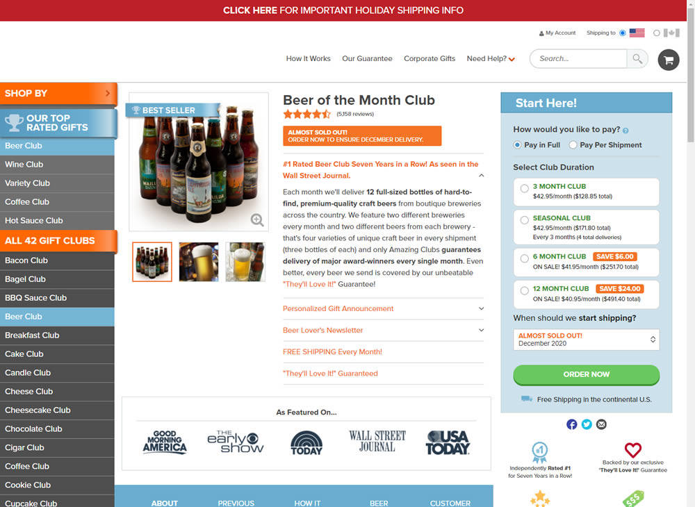
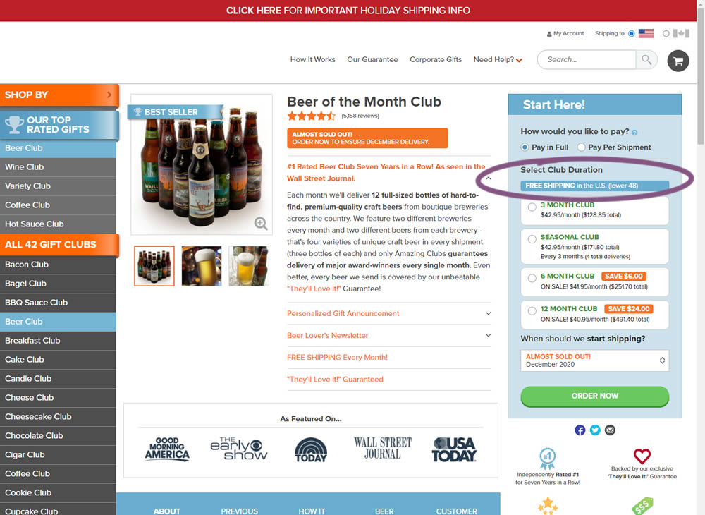
In this experiment, an extra "Free Shipping" message was added on a product page - at the top of the buy box with an add-to-cart call to action. It's prominence was increased by using white copy on a darker blue background. Impact on adds-to-cart and total sales was measured.
Test #329 on
Snocks.com
by  Samuel Hess
Dec 23, 2020
Mobile
Home & Landing
X.X%
Sales
Samuel Tested Pattern #14: Exposed Menu Options On Snocks.com
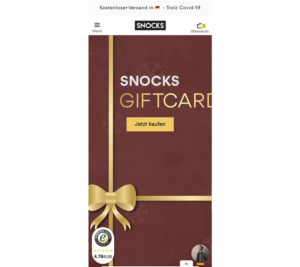
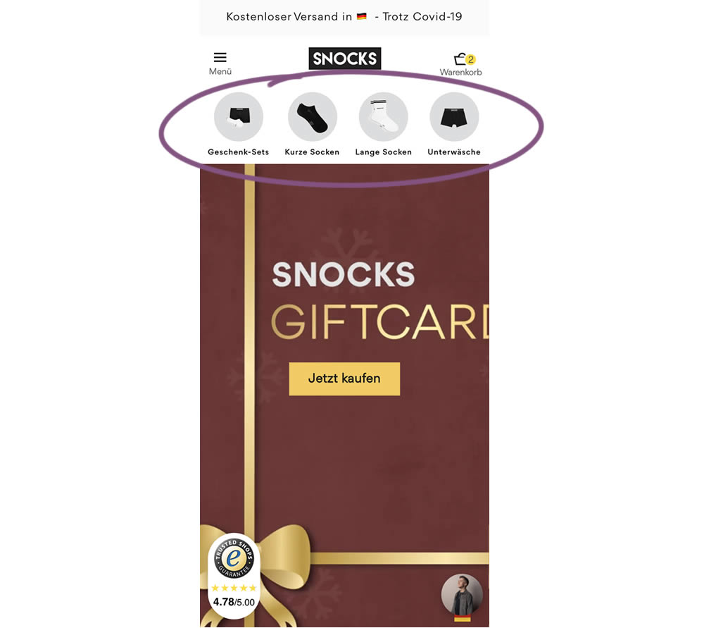
In this homepage experiment, a series of product categories were shown more visible near the top of the screen (instead of only being shown inside the hamburger menu). They linked up to corresponding listing pages with such items as: gifts, short socks, long socks, and underwear. Impact on adds-to-cart and total sales was measured.
Test #328 on
Umbraco.com
by  Lars Skjold Iversen
Dec 21, 2020
Desktop
Mobile
Home & Landing
X.X%
Signups
Lars Tested Pattern #60: Repeated Bottom Call To Action On Umbraco.com

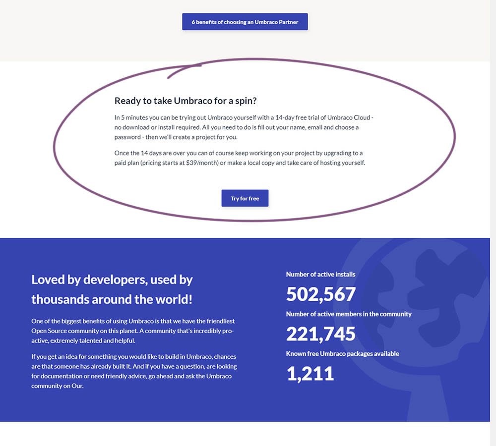
In this experiment, a trial signup section was added at the bottom of Umbraco's long homepage (CMS business). The experiment measured the impact on trial signups.
Test #98 on
3dhubs.com
by  Rob Draaijer
Nov 30, 2020
Desktop
Mobile
Listing
X.X%
Leads
Rob Tested Pattern #24: Visible Availability On 3dhubs.com

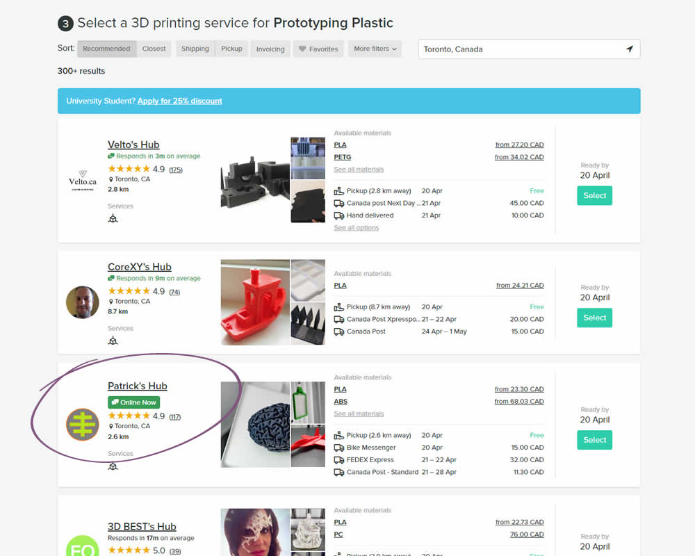
In this experiment, the variation showed a listing's owner online status as a badge, instead of showing their average "response time". More specifically, an "Online Now" badge was shown beside individual listings of a 3D printing marketplace site. The experiment measured completed quote / lead requests (a few steps further).
Test #326 on
Thomasnet.com
by  Kyle Phillips
Nov 25, 2020
Desktop
Mobile
Content
X.X%
Progression
Kyle Tested Pattern #41: Sticky Call To Action On Thomasnet.com


In this simple experiment on an article page, the variation slid out a sticky call to action linking to the next article. The sliding interaction triggered after some scrolling threshold (around 1000px or so). Afterwards, the sticky call to action maintained its floating position. The experiment measured clicks on this "next article" button.
Test #324 on
by  Jakub Linowski
Oct 30, 2020
Desktop
Mobile
Product
X.X%
Revenue
Jakub Tested Pattern #17: Least Or Most Expensive First
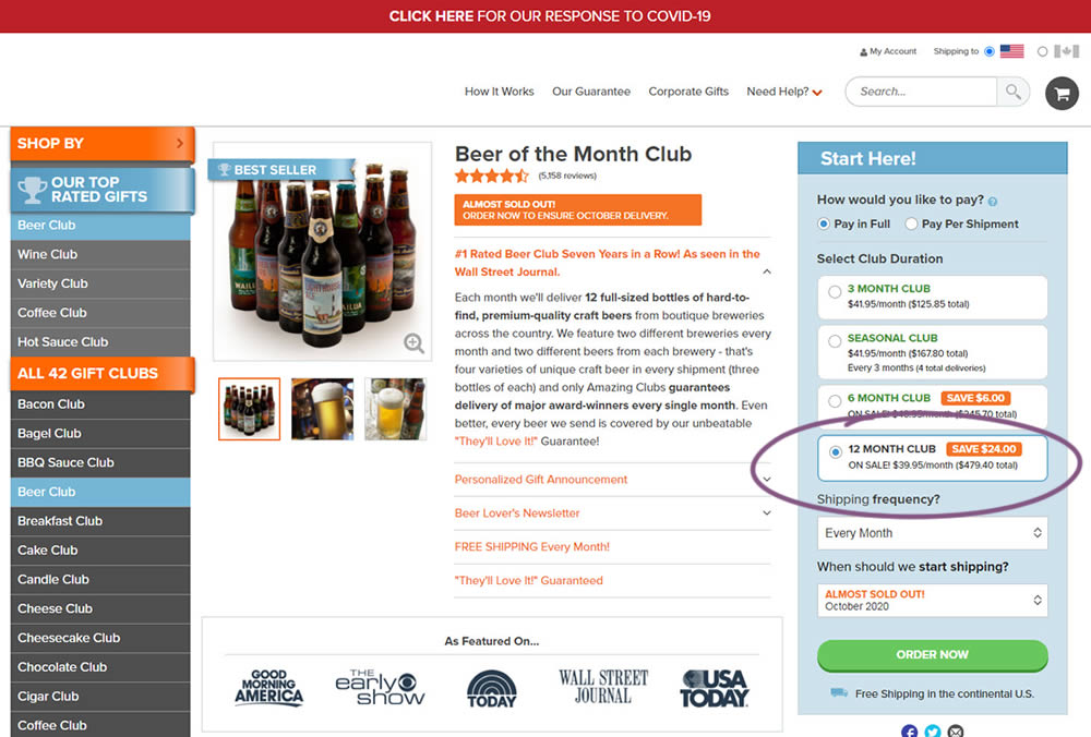
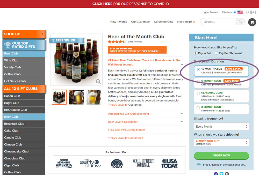
This experiment tested the order of purchase plans. The control version sorted the purchase options by the least expensive while the variation sorted them by the most expensive first. Impact on sales and revenue was measured.
Test #323 on
Backstage.com
by  Stanley Zuo
Oct 29, 2020
Mobile
Signup
X.X%
Sales
Stanley Tested Pattern #117: Company Logos On Backstage.com
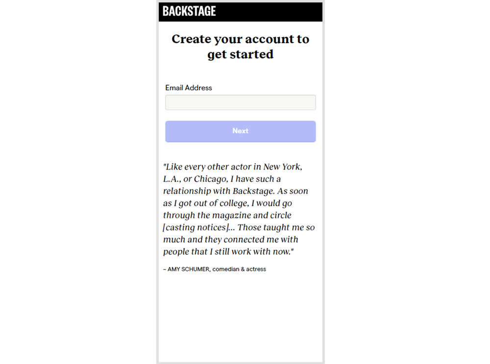
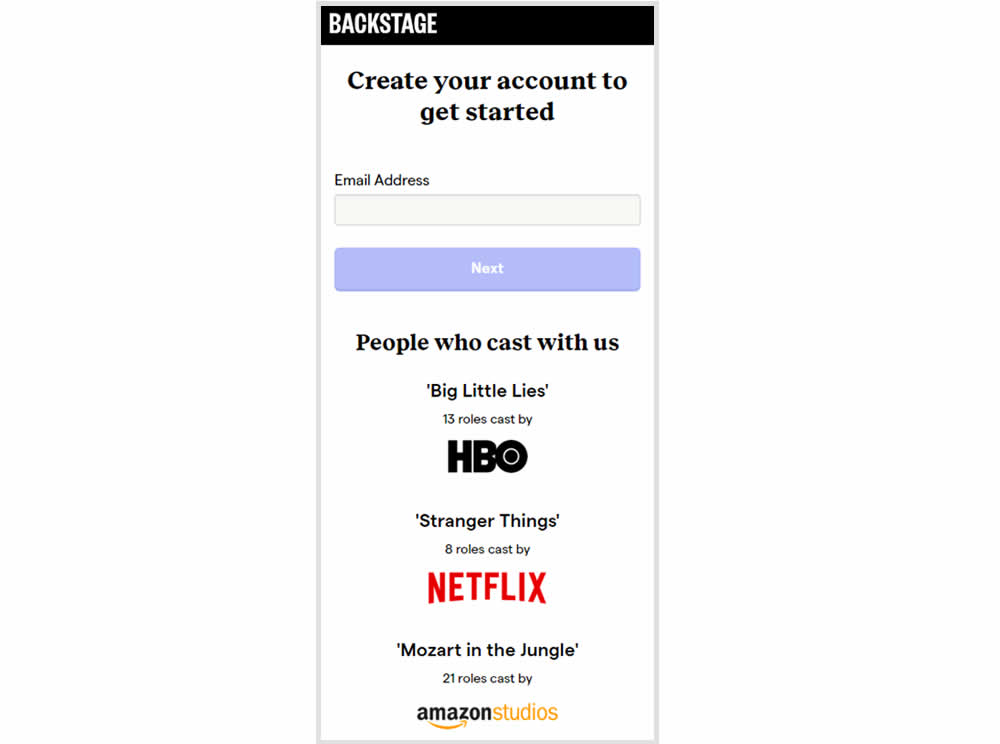
In this experiment, the variation replaced a text testimonial with high-profile production companies that have cast with Backstage. The logos were shown during the signup and checkout flow.
Test #322 on
Thomasnet.com
by  Kyle Phillips
Oct 27, 2020
Desktop
Mobile
Product
X.X%
Signups
Kyle Tested Pattern #82: Onboarding Callouts On Thomasnet.com
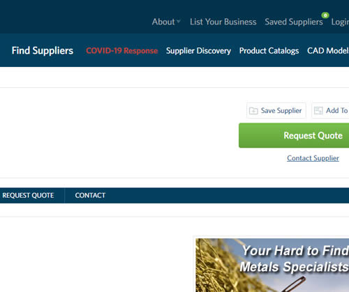
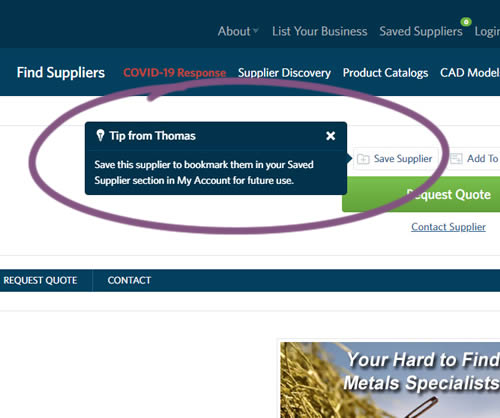
This experiment variation prompted users to save (bookmark) a company profile on a company detail page. Clicking on the save feature while logged out, would prompt a registration modal. Hence the save feature acted as an extra reason to signup. The number of people engaging or interacting with the feature was measured, as well as registrations.
Test #321 on
Elevate App App
by  Jesse Germinario
Oct 23, 2020
Mobile
X.X%
Progression
Jesse Tested Pattern #11: Gradual Reassurance
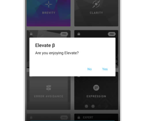
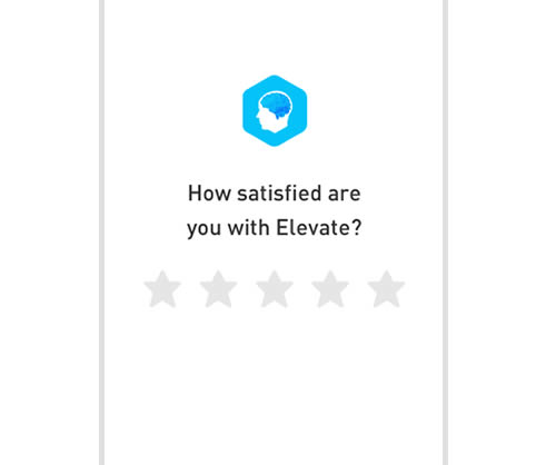
This experiment aimed to increase the number of application ratings from within the Elevate app. Success was measured by the number of users going towards Google Play to create the rating. The control version prompted users if they wanted to rate the app with a simple yes and no answer. The variation however presented the rating choice right away in the form of 5 stars - enabling users to express their choice sooner.
Test #318 on
Thomasnet.com
by  Kyle Phillips
Sep 29, 2020
Desktop
Mobile
Content
X.X%
Signups
Kyle Tested Pattern #60: Repeated Bottom Call To Action On Thomasnet.com
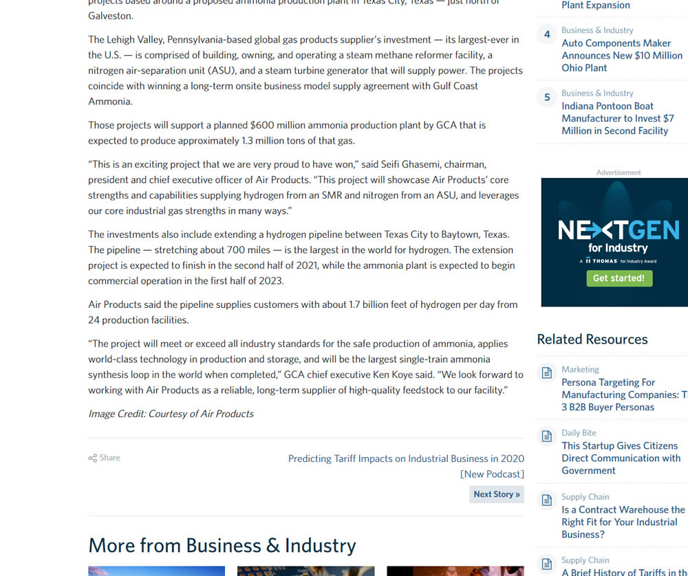
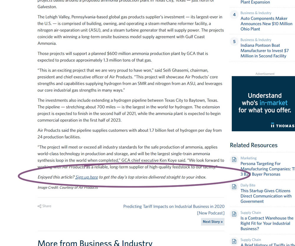
In this experiment, a simple link to a newsletter signup landing page was added at the bottom of an article. The newsletter landing page then encouraged users to provide their email address for future article updates.
Test #317 on
Volders.com
by Michal Fiech
Sep 28, 2020
Mobile
Signup
X.X%
Sales
Michal Tested Pattern #119: Unselected Or Selected Defaults On Volders.com
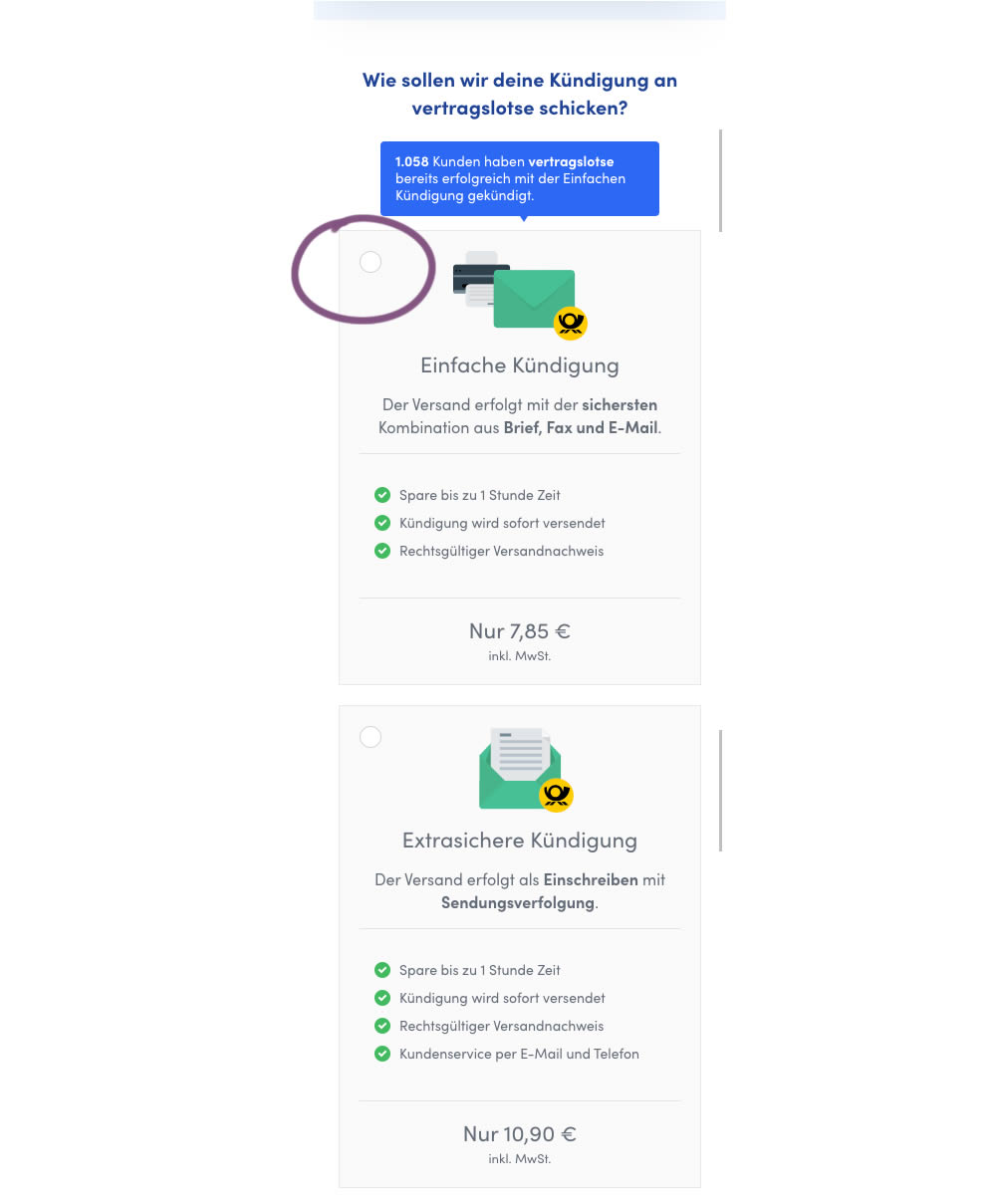
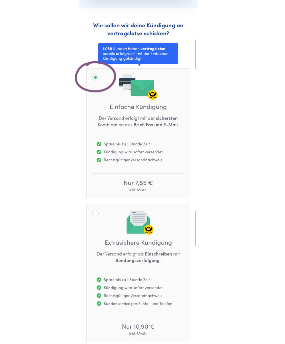
In this mobile experiment, an unselected vs selected payment plan was tested for its impact on sales. The experiment ran on a mid page of a signup funnel where customers were being asked to select one of two payment plans.
Test #316 on
Trydesignlab.com
by  Daniel Shapiro
Sep 24, 2020
Desktop
Mobile
Home & Landing
X.X%
Signups
Daniel Tested Pattern #22: Empowering Headline On Trydesignlab.com


In this experiment, the headline was changed to focus more on the end-goal of the UX Academy program - that of landing your first UI/UX role.
Test #99 on
Vivareal.com.br
by  Rodrigo Maués
Sep 23, 2020
Desktop
Mobile
Product
X.X%
Leads
Rodrigo Tested Pattern #24: Visible Availability On Vivareal.com.br
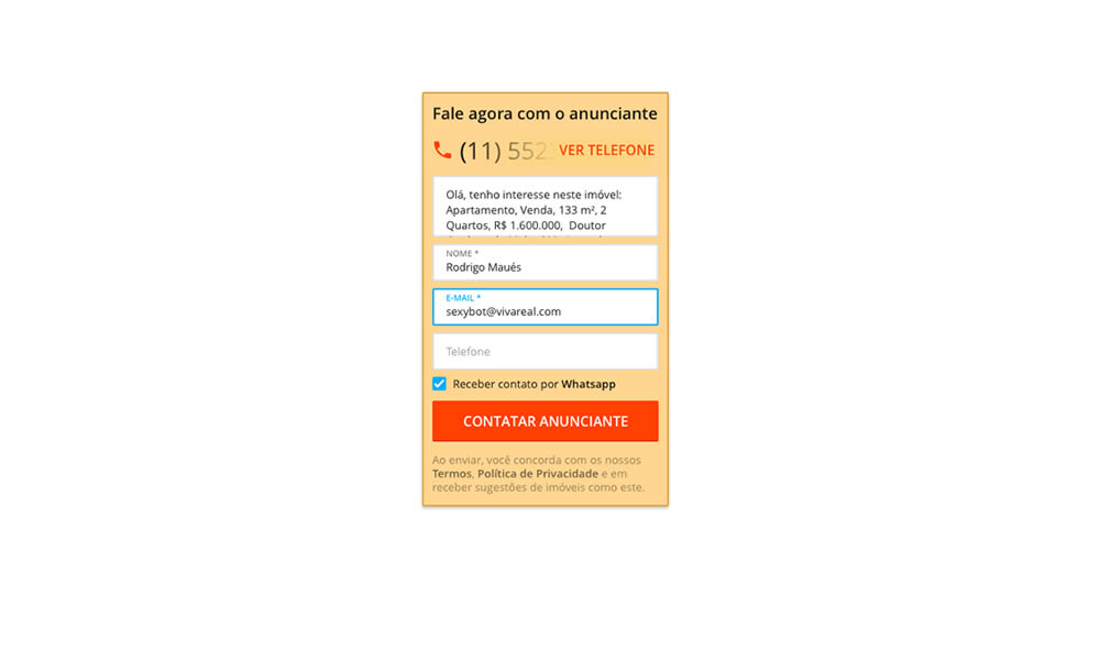
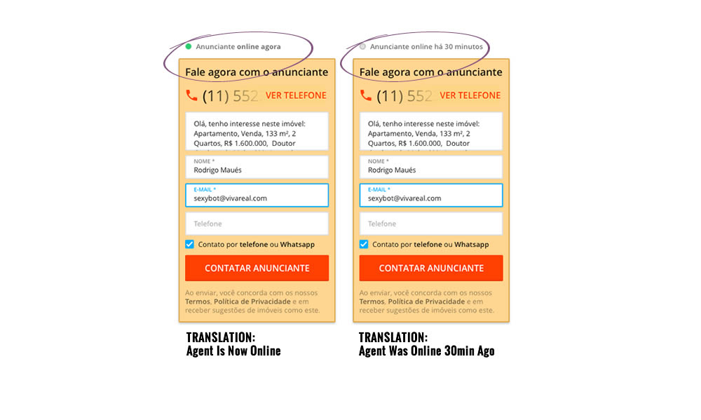
In this experiment, a lead form on a listing page showed whether an agent was recently online or not. The diplayed had two statuses: either indicating that someone is online now, or the most recent time they were online in minutes.
Test #315 on
Backstage.com
by  Stanley Zuo
Aug 22, 2020
Mobile
Signup
X.X%
Sales
Stanley Tested Pattern #7: Social Counts On Backstage.com
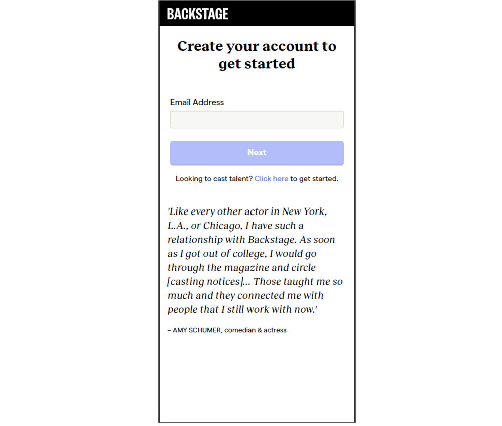
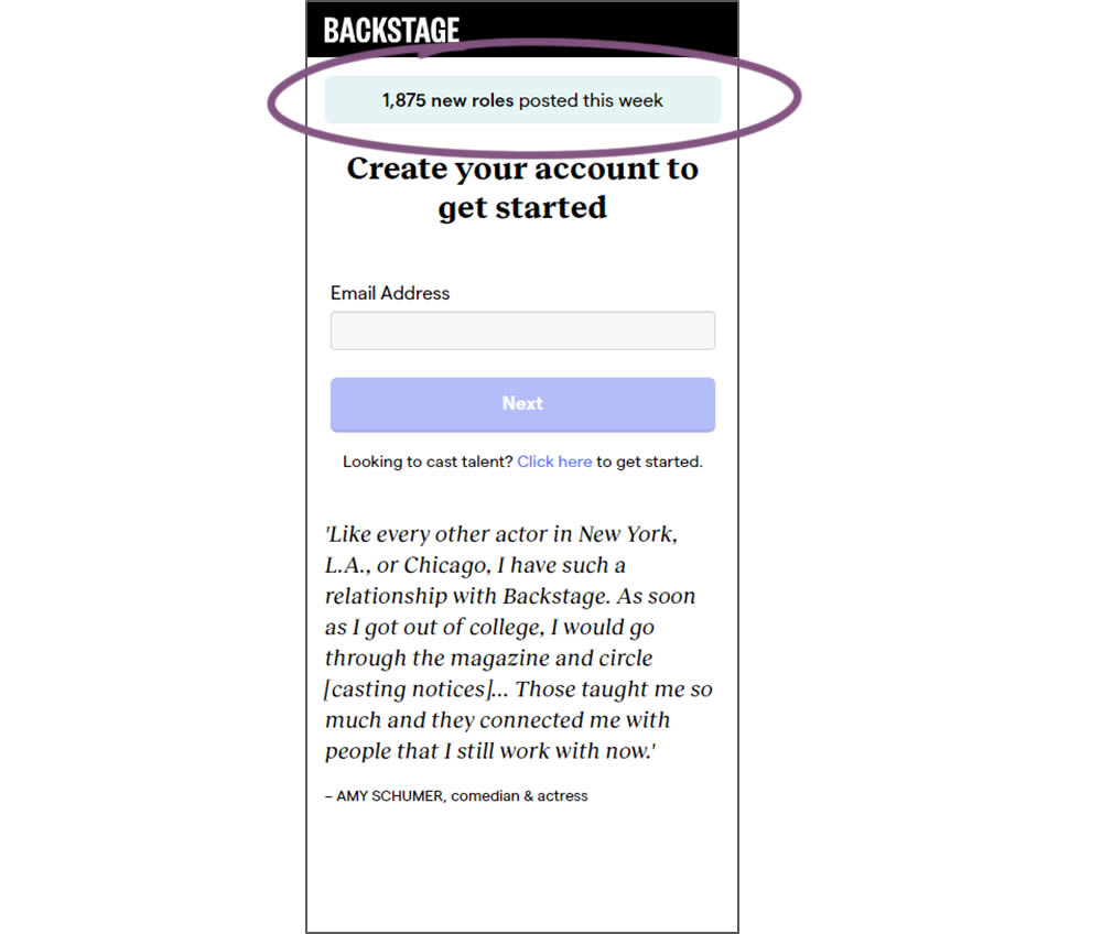
In this experiment, a dynamic number of job postings was displayed during the signup process - reinforcing the value of signing up for membership access.
Test #314 on
Zapimoveis.com.br
by  Vinicius Barros Peixoto
Aug 21, 2020
Desktop
Mobile
Product
X.X%
Leads
Vinicius Tested Pattern #43: Long Titles On Zapimoveis.com.br
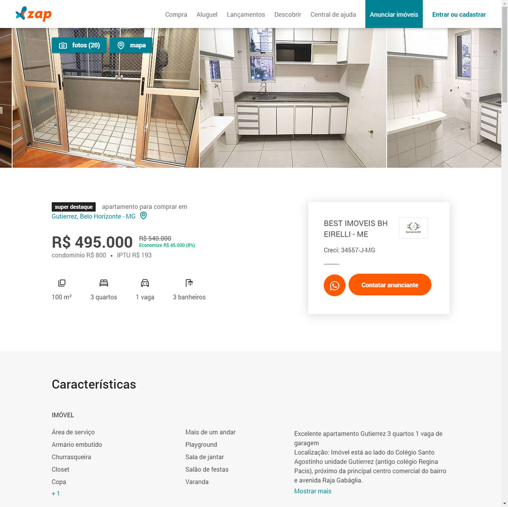
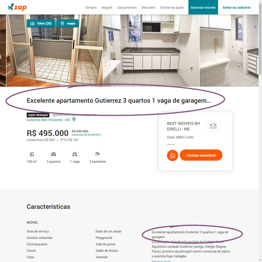
In this experiment, a dynamic page title was generated and added at the top of the screen. The first few words from a property description were used to dynamically generate these titles. The effect on leads was measured.
Test #313 on
Trydesignlab.com
by  Daniel Shapiro
Aug 19, 2020
Desktop
Mobile
Home & Landing
X.X%
Leads
Daniel Tested Pattern #11: Gradual Reassurance On Trydesignlab.com


In this experiment, instead of showing a single-focused lead form (for the UX Academy Program), users were asked to express a wider set of choices first (for the UX Academy or shortter set of skill-based courses). The experiment measured overall leads for both types of programs.
Test #312 on
by  Jakub Linowski
Aug 14, 2020
Desktop
Mobile
Product
X.X%
Sales
Jakub Tested Pattern #83: Progressive Fields
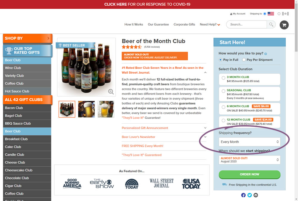
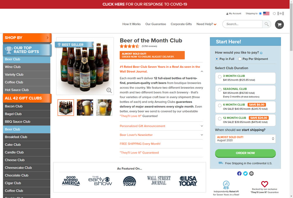
In this experiment, we tested a visible "Shipping Frequency" (A) option against a progressively displayed one (B) that would only appear after someone first chose a duration option. Thus in variation B, the buy box component would initially appear with fewer fields and smaller. The experiment measured initial progression and actual sales.
Note on the data: the experiment was run a little shorter than usual, as one of the variations triggered a stop rule to protect losses (so the effect might be somewhat inflated from a lower power).
Test #311 on
Backstage.com
by  Stanley Zuo
Aug 11, 2020
Desktop
Mobile
Home & Landing
X.X%
Sales
Stanley Tested Pattern #118: Category Images On Backstage.com
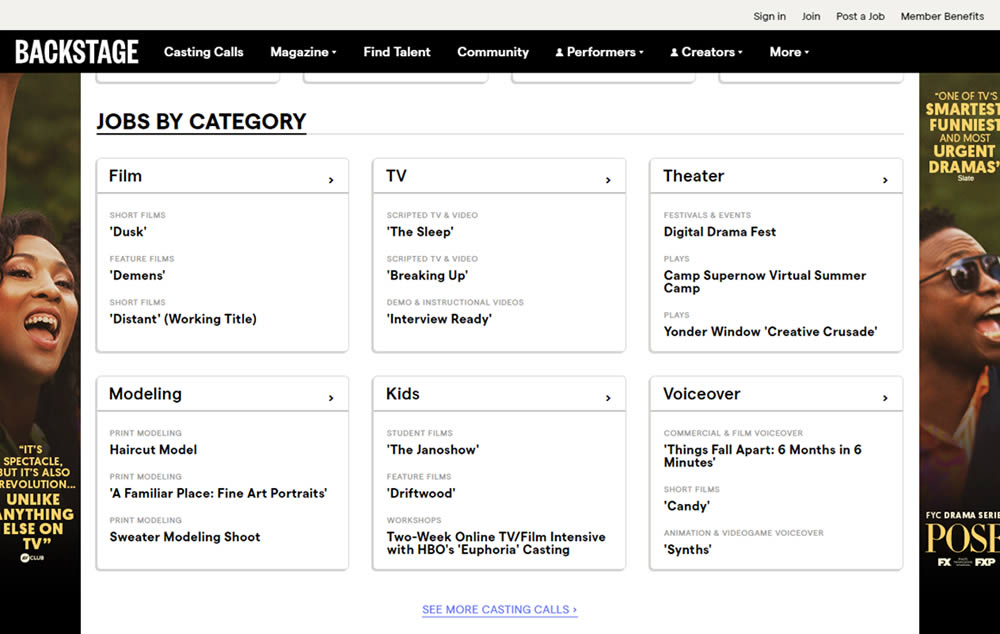
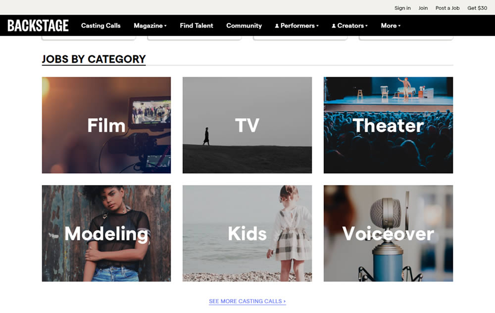
In this experiment, category links (linking to casting call search results) were replaced with tile images. In addition, 2 levels of categories were also replaced with a single text link for each tile. Finally, the font size of the link titles was also increased.