All Latest 620 A/B Tests
Test #222 on
Thomasnet.com
by  Julian Gaviria
Feb 01, 2019
Desktop
Listing
X.X%
Leads
Julian Tested Pattern #7: Social Counts On Thomasnet.com

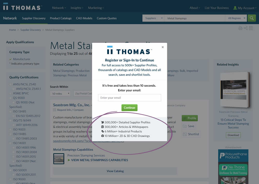
In this variation, a number of social proof references were added to a signup modal.
Which A Or B Actually Wins? Find Out Before You Test.
Members see every test result — the winners, the flat ones, and the losers — along with exact effects and sample sizes. Use it to estimate your tests and prioritize by probability, not gut feel. Start every experiment with the odds on your side.
Test #218 on
Yummly.com
by  Kimberly Cheung
Jan 14, 2019
Desktop
Mobile
Home & Landing
X.X%
Signups
Kimberly Tested Pattern #94: Visible Search On Yummly.com
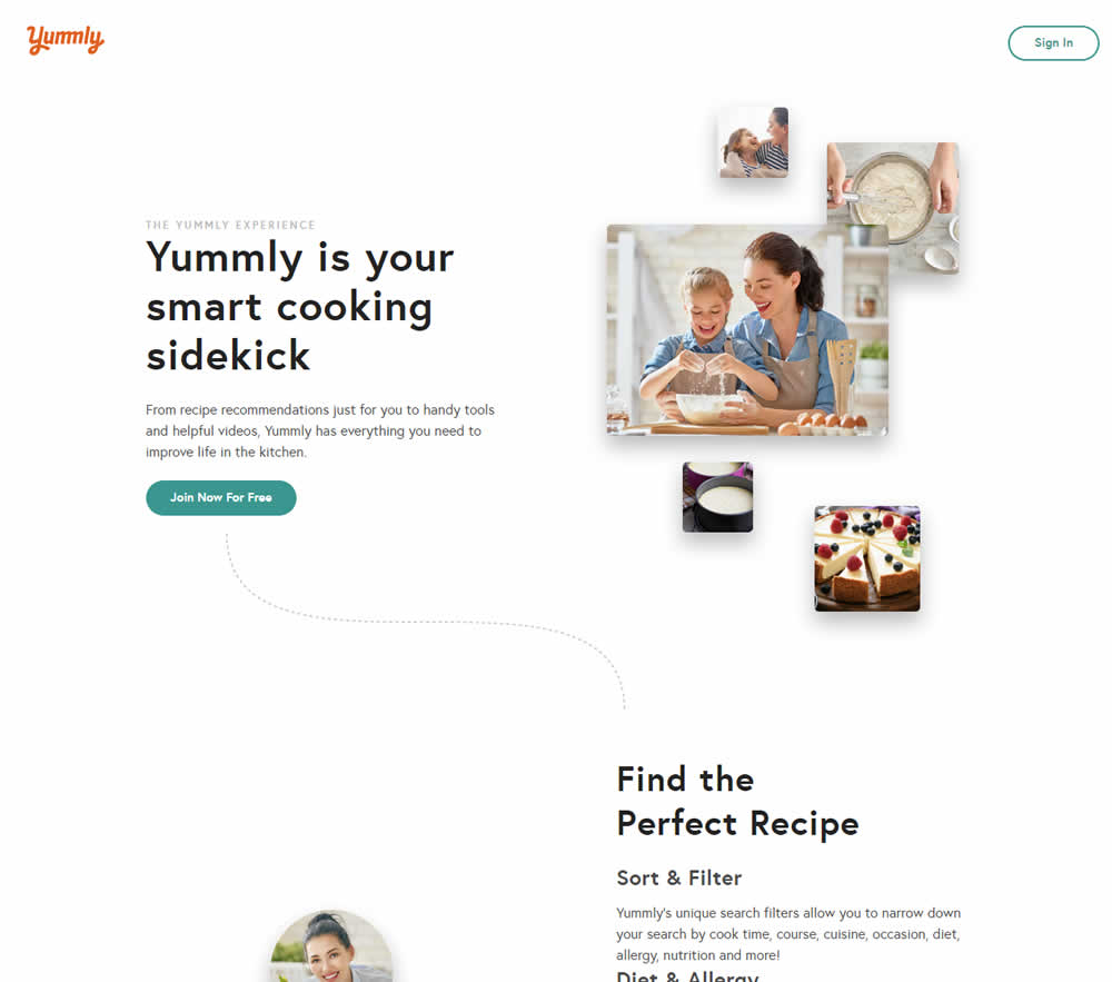
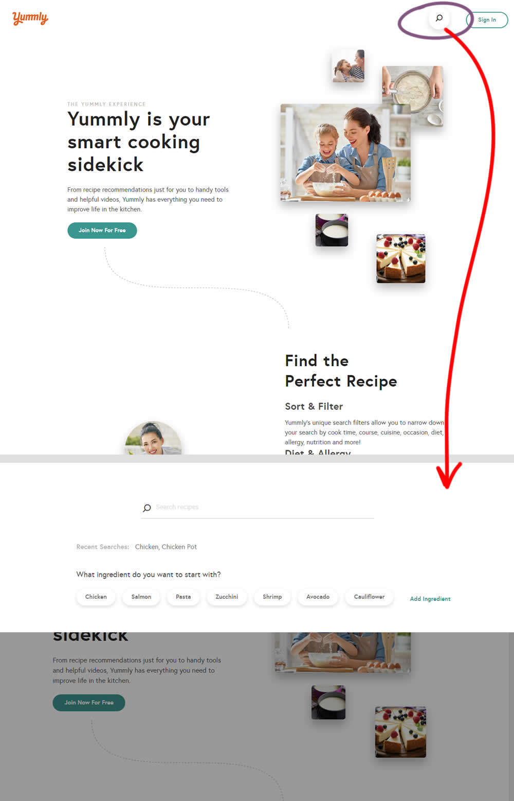
Hypothesis: Anonymous users can't use global search while on the home promo page. We believe that if we show a global search bar to anonymous users, it presents a higher converting funnel (guided search) and will increase our sign-up rates significantly.
Control (A): Logged out users don't see global search bar.
Variant (B): Logged out users see global search bar. After searching for a keyword, the signup funnel starts with a more personalized reason to continue the signup process.
Test #219 on
Mt.com
by  Vito Mediavilla
Jan 14, 2019
Desktop
Mobile
Home & Landing
X.X%
Leads
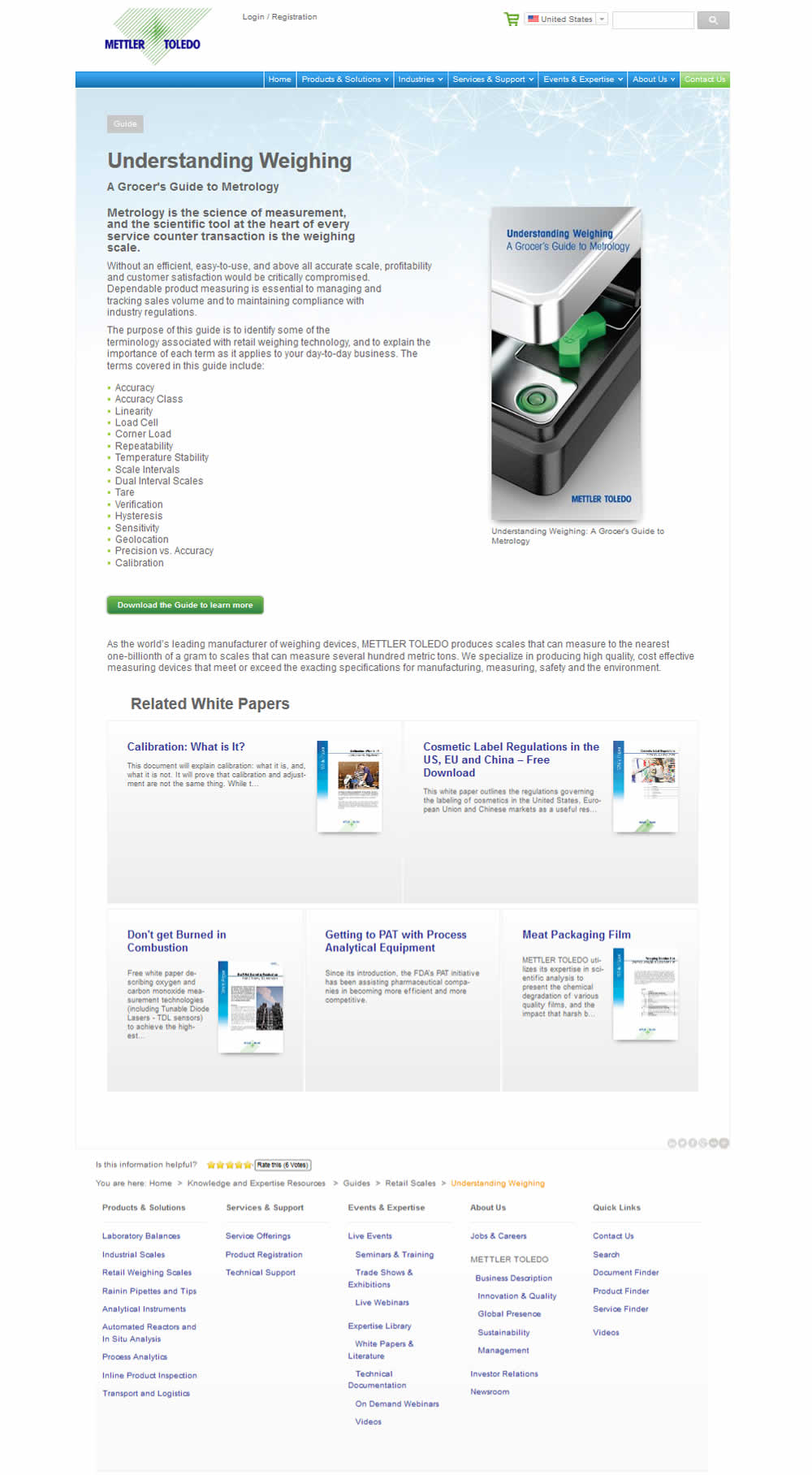
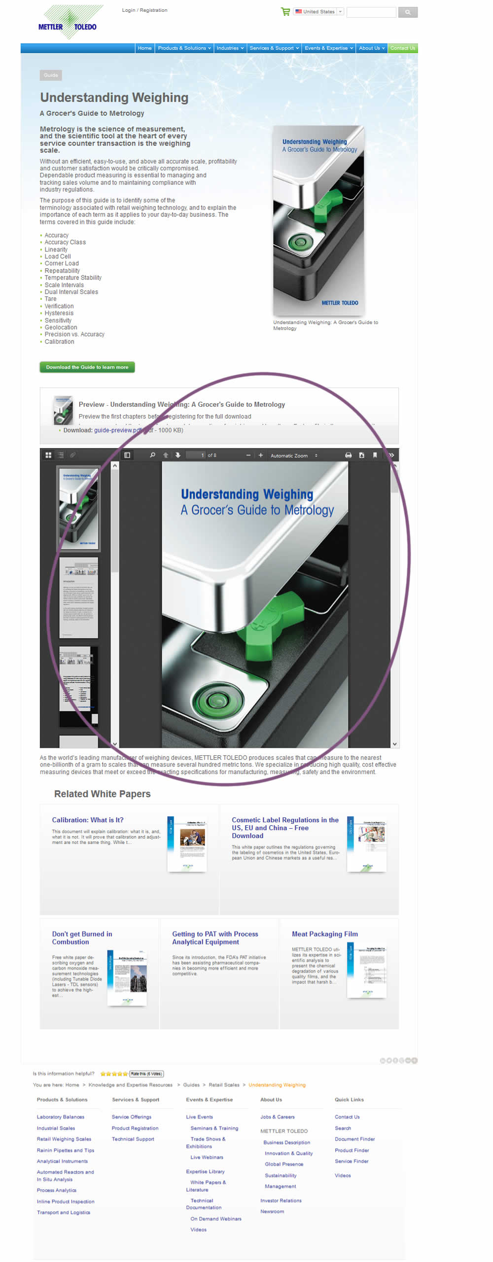
Vito Tested Pattern #95: Clickable Product Previews On Mt.com
Test #217 on
Thomasnet.com
by  Julian Gaviria
Jan 03, 2019
Desktop
Mobile
Home & Landing
X.X%
Engagement
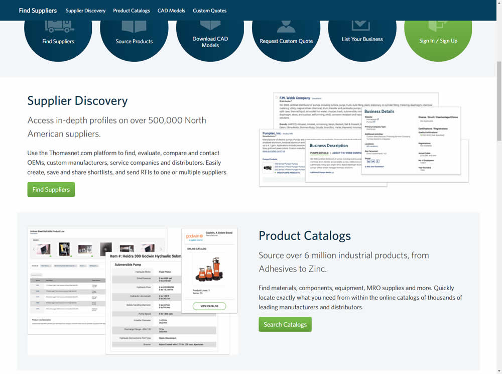
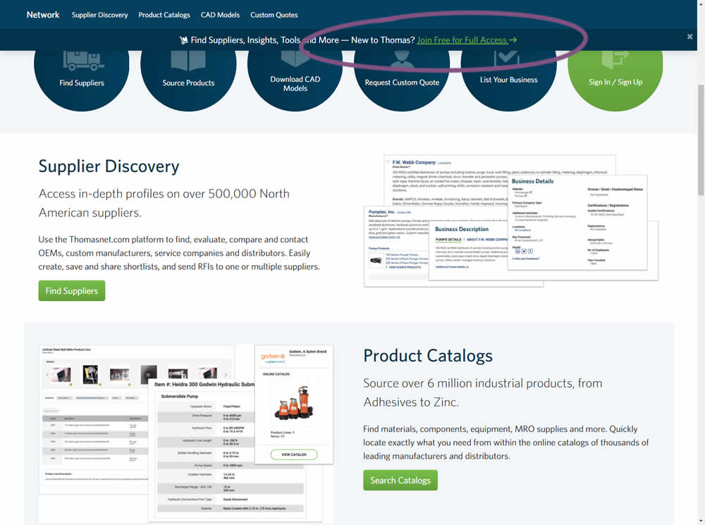
Julian Tested Pattern #41: Sticky Call To Action On Thomasnet.com
Test #216 on
Support.microsoft.co...
by  Ronny Kohavi
Dec 21, 2018
Desktop
Home & Landing
X.X%
Progression
Ronny Tested Pattern #2: Icon Labels On Support.microsoft.co...
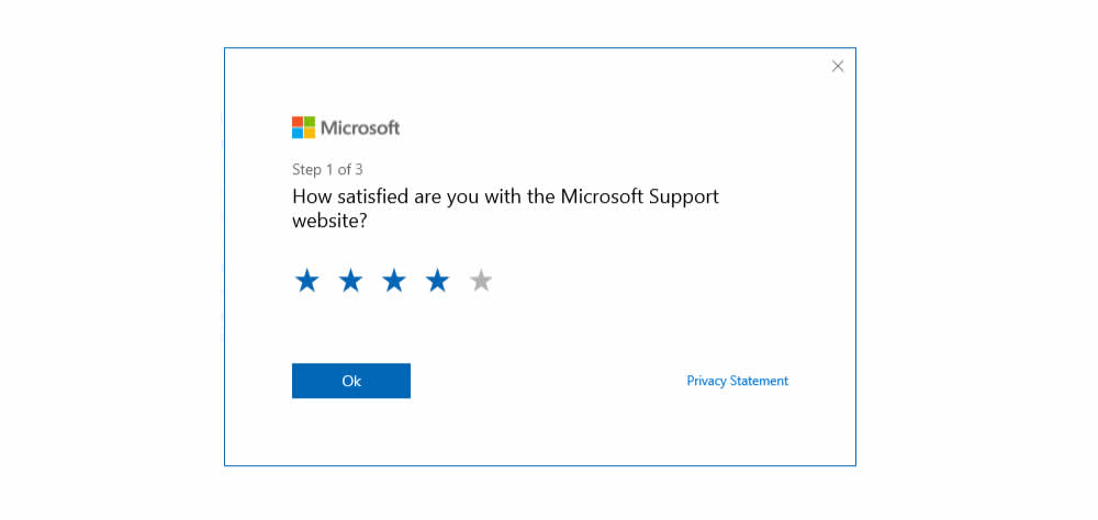
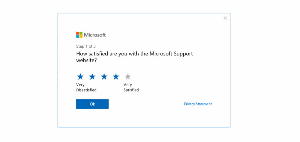
Microsoft ran an experiment on their Customer Satisfaction Survey at both support.microsoft.com and answers.microsoft.com (Desktop). The treatment contained two icon labels at the opposite sides of the star rating range (ex: Very Dissatisfied and Very Satisfied) - providing it with additional meaning.
Test #215 on
Vivareal.com.br
by  Vinicius Barros Peixoto
Dec 21, 2018
Mobile
Listing
X.X%
Leads
Vinicius Tested Pattern #92: Already Viewed Label On Vivareal.com.br


The idea of this test was to add a "Viewed" label on a listing page to indicate listings which have already been viewed by users.
Test #212 on
Mt.com
by  Vito Mediavilla
Dec 04, 2018
Desktop
Mobile
Product
X.X%
Leads
Vito Tested Pattern #60: Repeated Bottom Call To Action On Mt.com
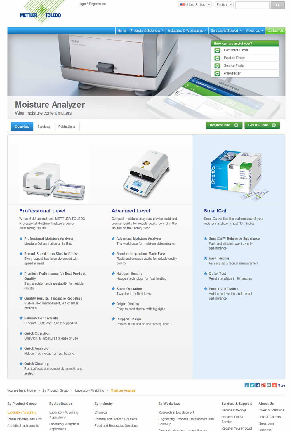
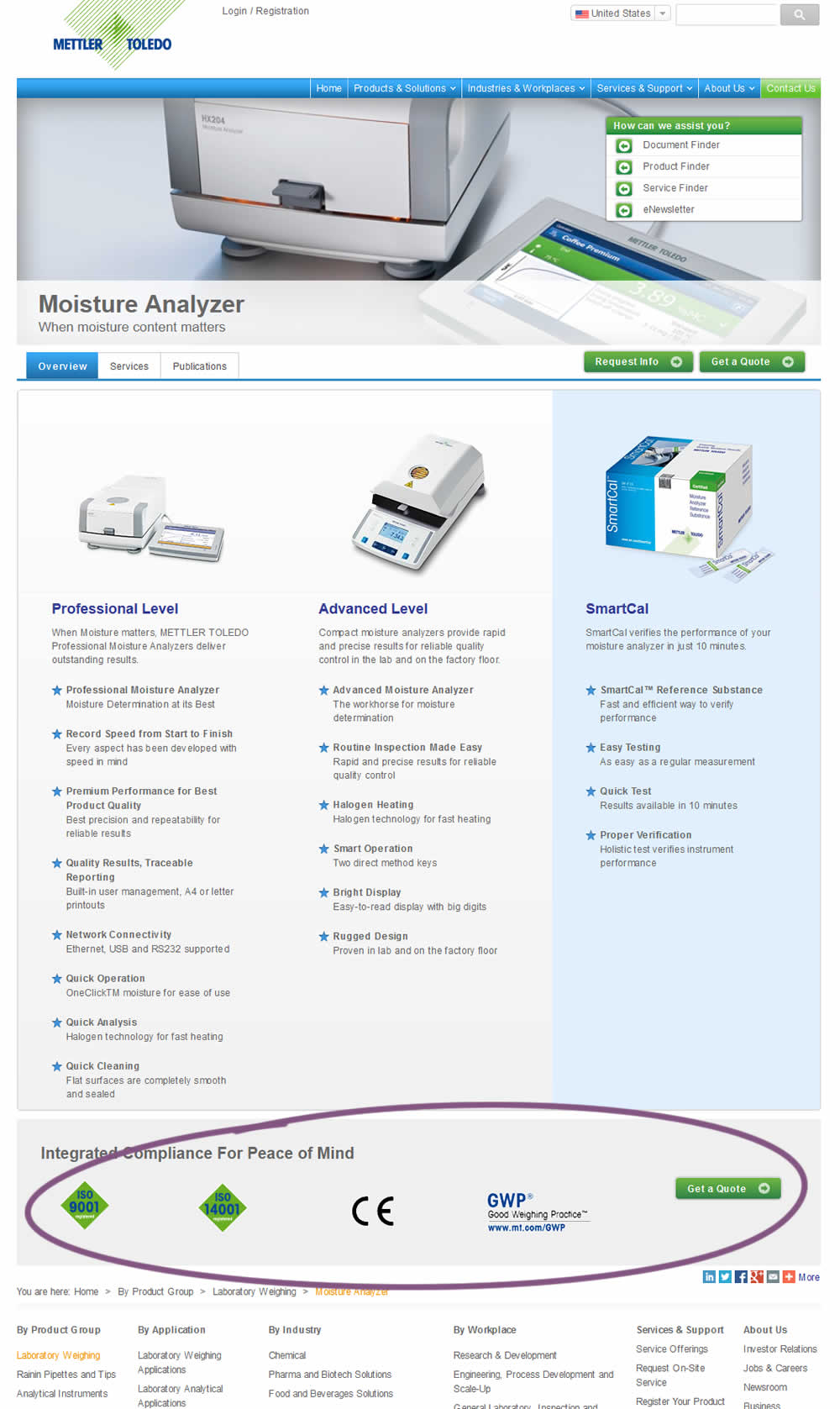
In this experiment, a call to action was repeated at the bottom of the product page. Additional certification icons were also added for additional reassurance.
Test #211 on
Skype App
by  Ronny Kohavi
Nov 20, 2018
Mobile
Global
X.X%
Progression
Ronny Tested Pattern #2: Icon Labels
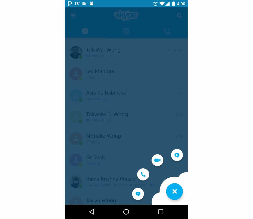
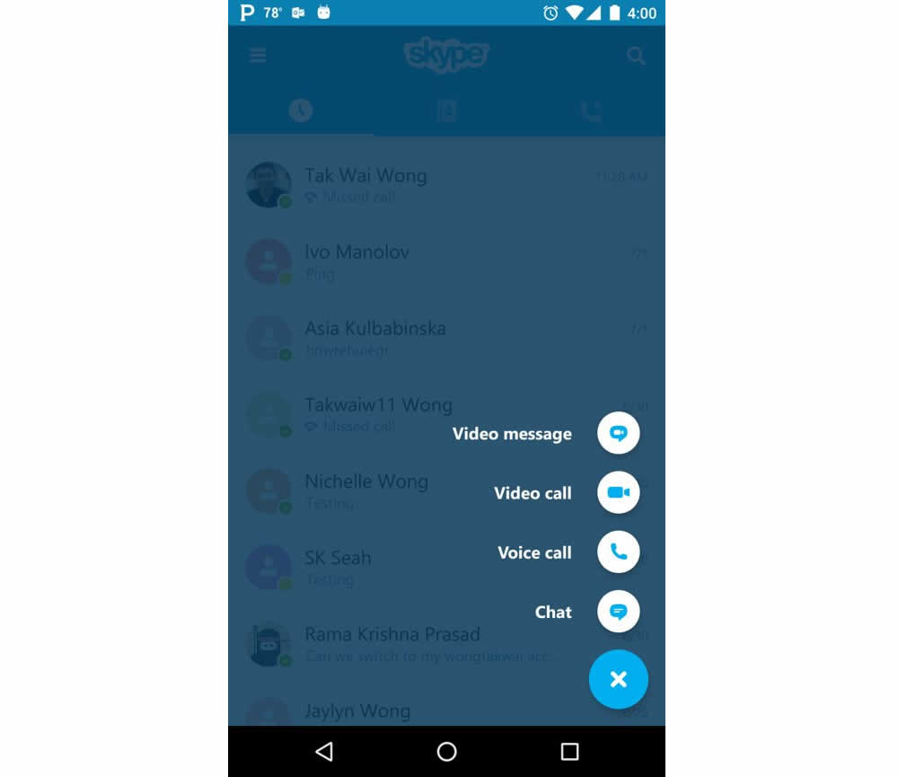
Microsoft Skype ran an experiment for the mobile segment of the Skype application with a treatment having combined icons with corresponding labels. The control only showed icons.
Test #207 on
Suzuki.be
by  Karl Gilis
Nov 01, 2018
Desktop
Product
X.X%
Progression
Karl Tested Pattern #88: Action Button On Suzuki.be
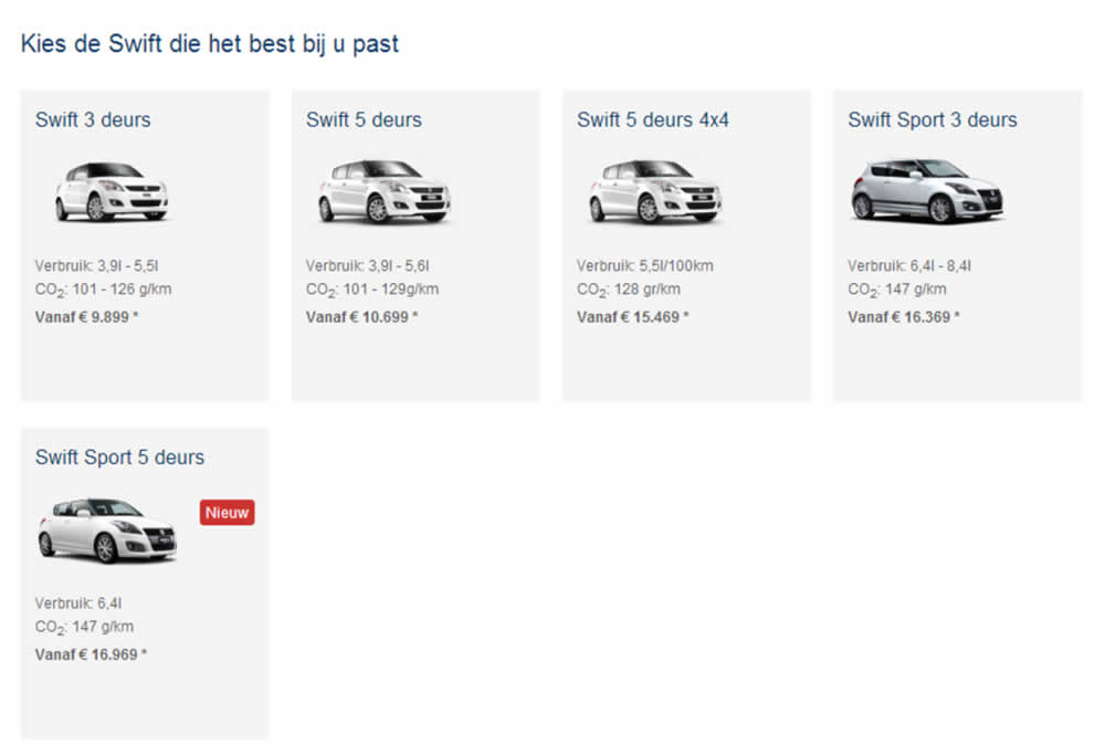
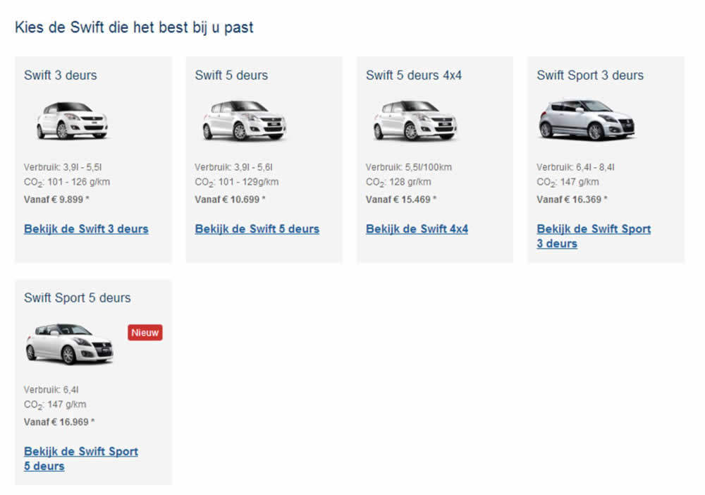
This test ran on the Suzuki Swift landing page. In the B variation, extra links with the following copy ‘Discover the <name of car model>’ were added for each sub product. (in Dutch: ‘Bekijk de…’).
Test #201 on
by  Ben Labay
Sep 19, 2018
Desktop
Mobile
Thank You
X.X%
Sales
Ben Tested Pattern #7: Social Counts
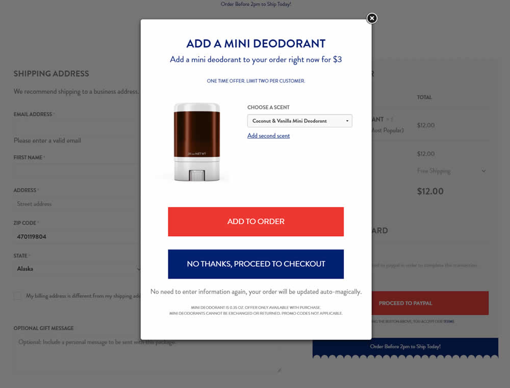
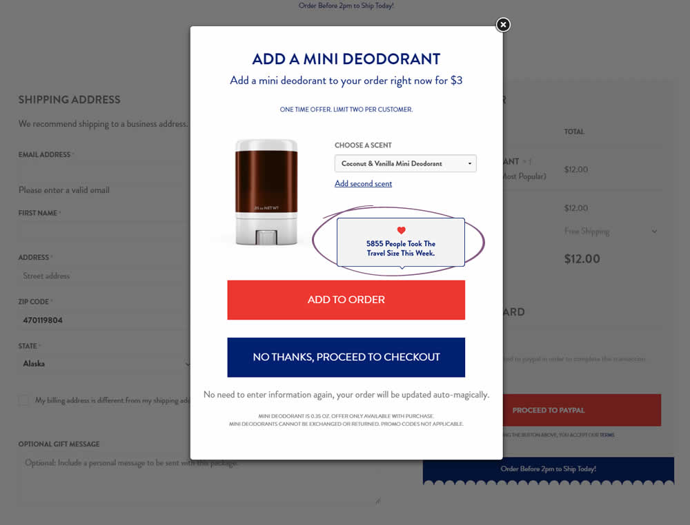
In this test the upsell modal had an added text box with number of people that day who took the offer. The test hypothesis was that social proof will add motivation to take an action and the offer.
Test #197 on
Reverb.com
by  Nicholas Evans
Sep 04, 2018
Desktop
Product
X.X%
Sales
Nicholas Tested Pattern #4: Testimonials On Reverb.com
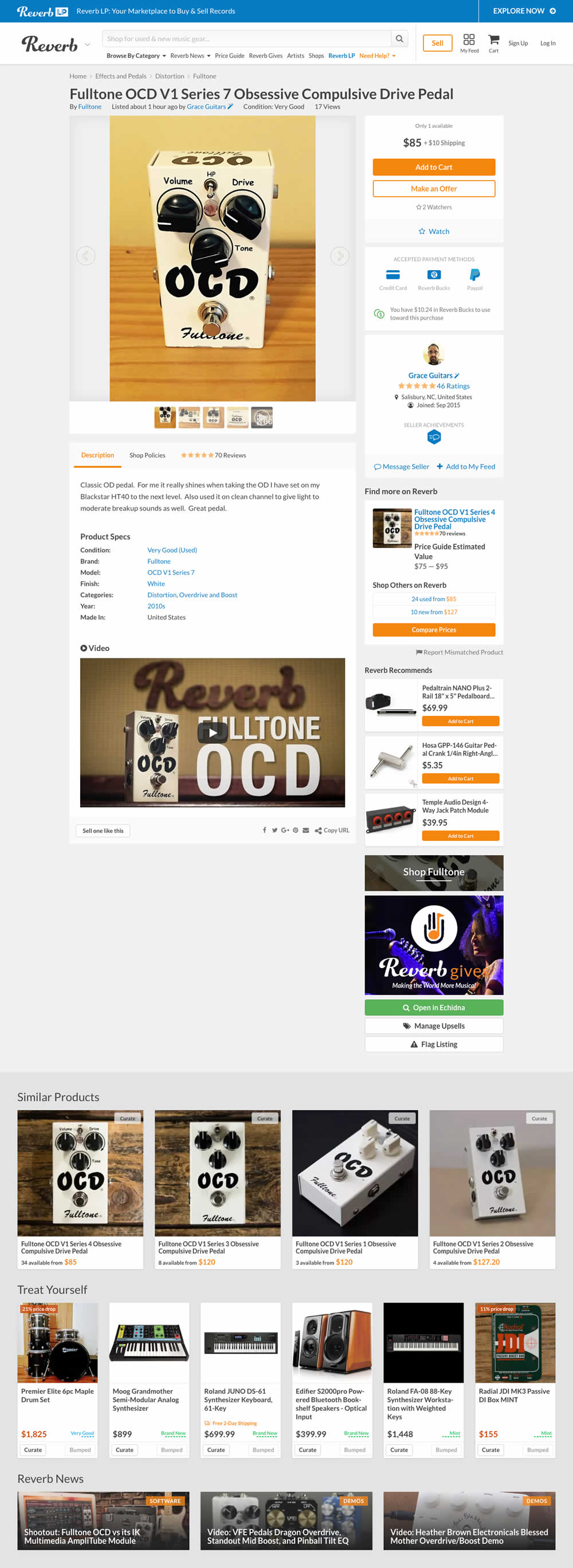

In the variation, customer reviews were exposed from a less visible tab view.
Test #195 on
Yummly.com
by  Kimberly Cheung
Aug 13, 2018
Desktop
Mobile
Listing
X.X%
Signups
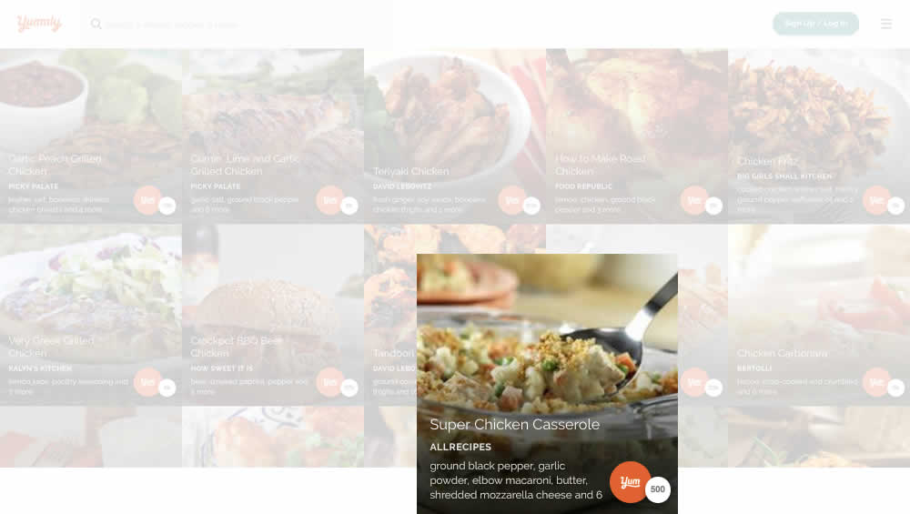
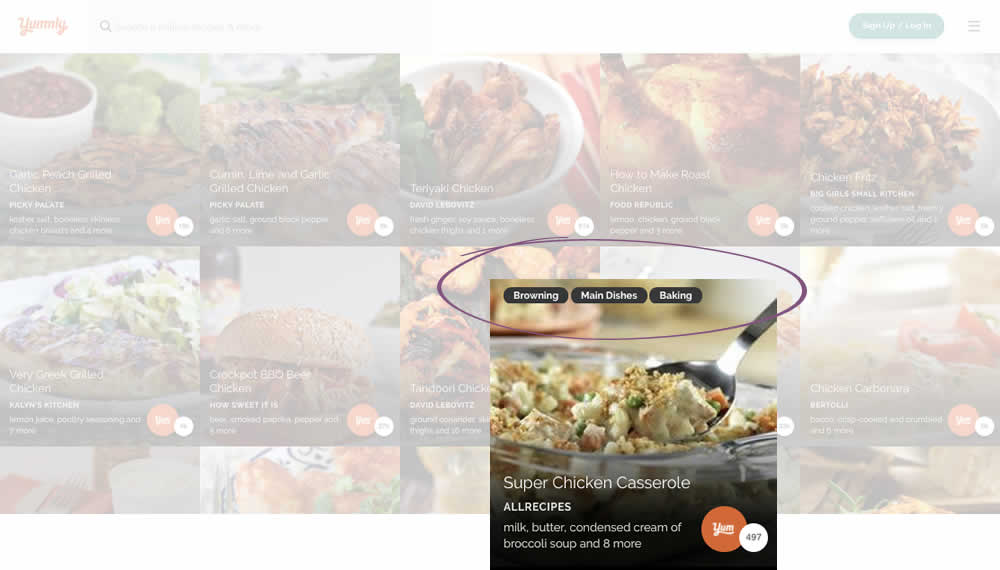
Kimberly Tested Pattern #78: Tags, Badges And Structured Information On Yummly.com
Test #192 on
Refactoring.guru
by  Alexander Shvets
Aug 07, 2018
Desktop
Mobile
Product
X.X%
Sales
Alexander Tested Pattern #4: Testimonials On Refactoring.guru


In this experiment, a number of customer reviews were added at the middle of a product page.
Test #193 on
Yummly.com
by  Marcos Ciarrocchi
Aug 07, 2018
Desktop
Mobile
Signup
X.X%
Signups
Marcos Tested Pattern #91: Forced Action On Yummly.com
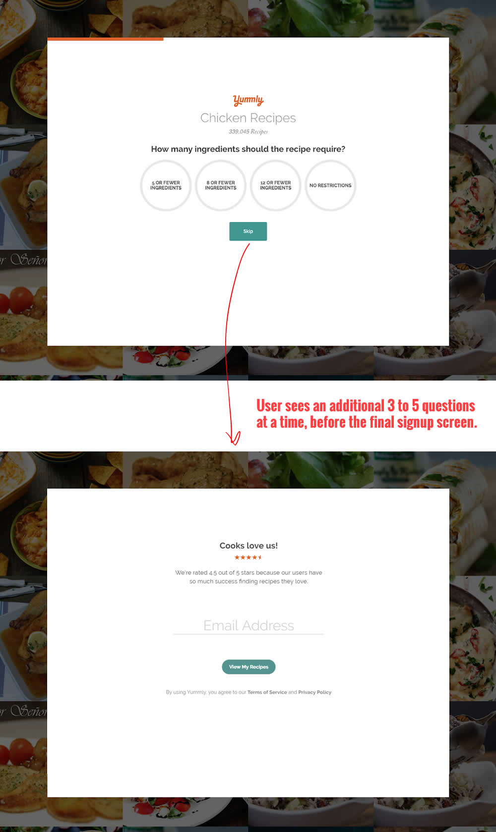
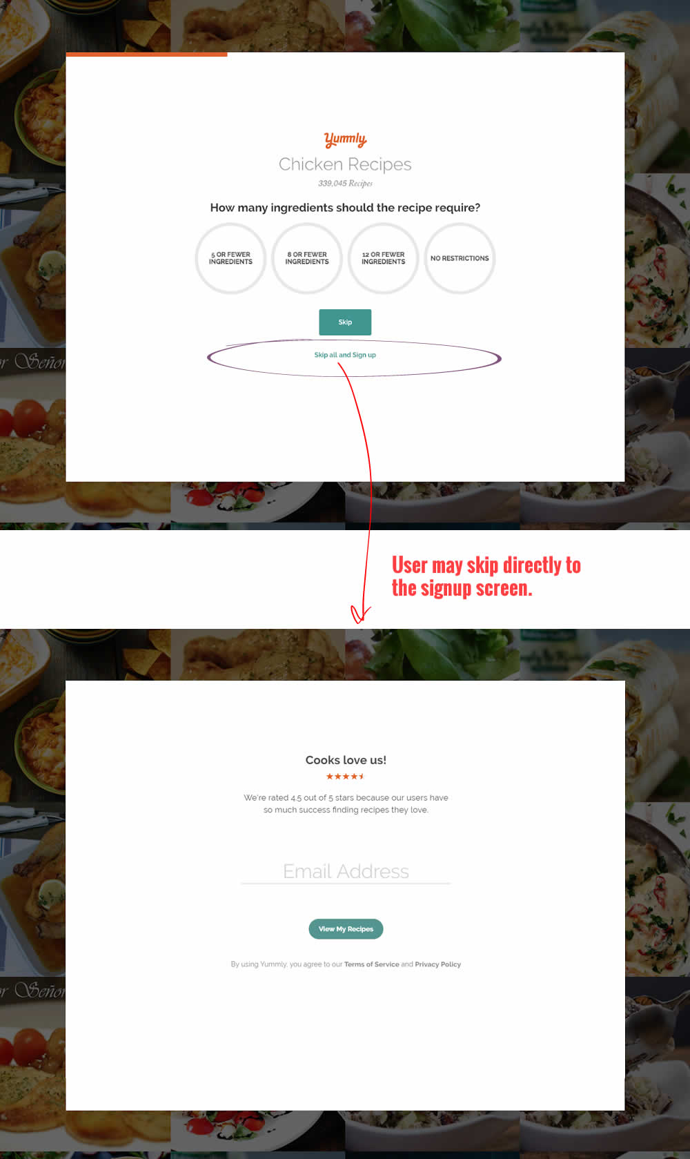
In this experiment, the presence of an additional "skip all" text link was tested on a multiple step signup flow. The skip all link allowed users to bypass personalization questions and go straight to their app dashboard. The control (A) shows its presence, and in variant B we can see it was removed.
Test #188 on
Thomasnet.com
by  Julian Gaviria
Jul 11, 2018
Desktop
Mobile
Home & Landing
X.X%
Progression
Julian Tested Pattern #4: Testimonials On Thomasnet.com
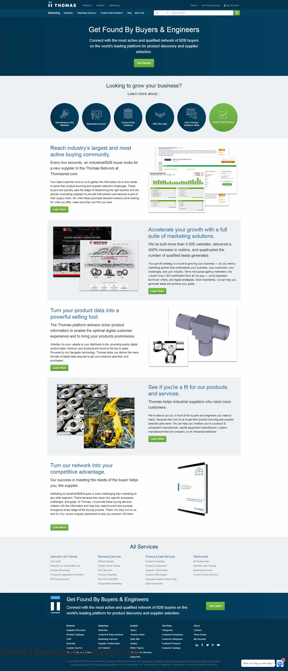
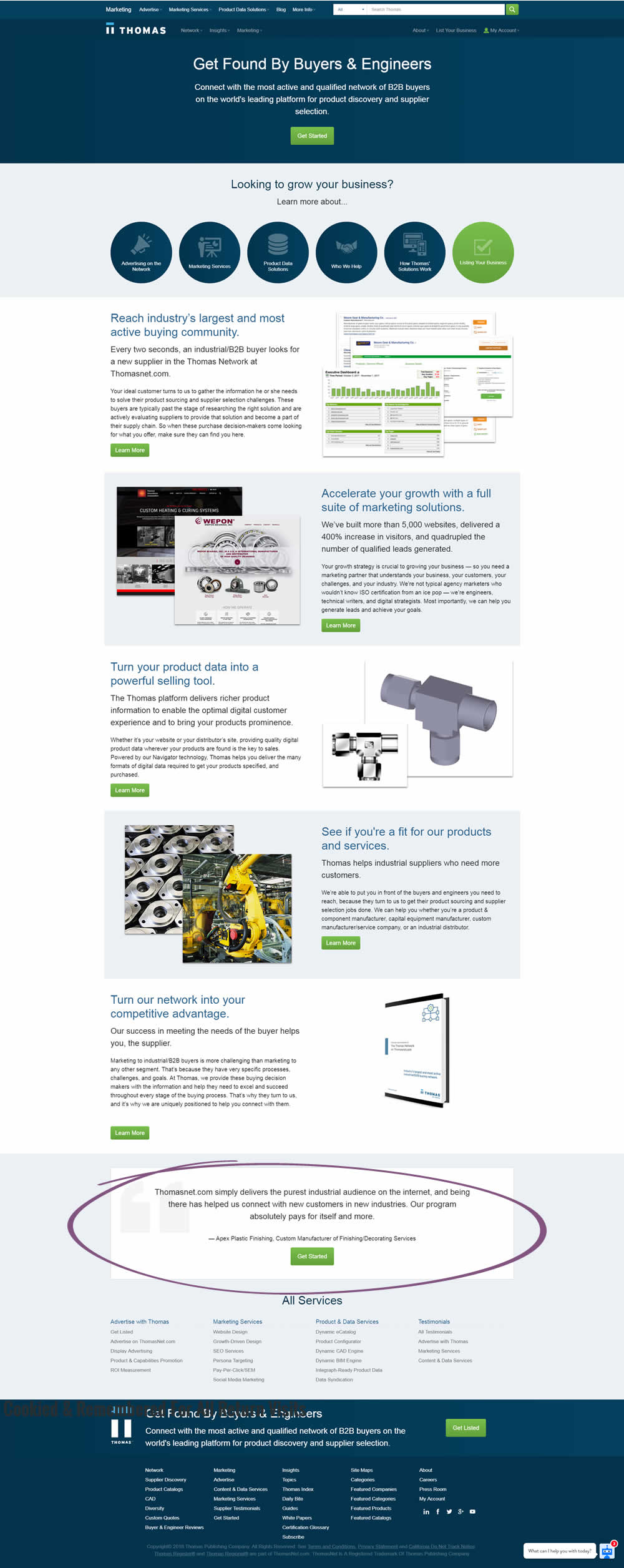
In this experiment, a testimonial with a repeated call to action was placed at the bottom of a landing page.
Test #186 on
by  Devesh Khanal
Jul 02, 2018
Mobile
Home & Landing
X.X%
Sales
Devesh Tested Pattern #14: Exposed Menu Options
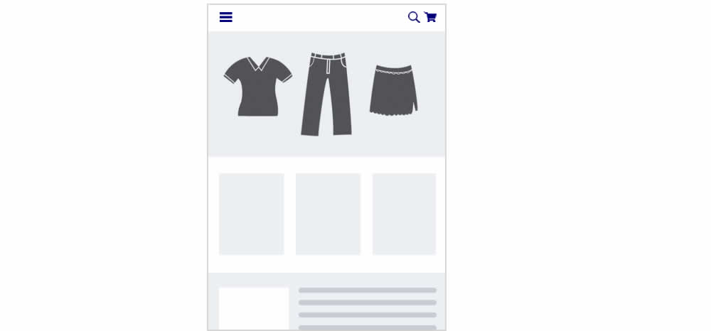
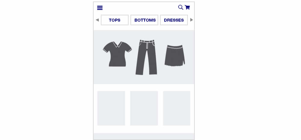
In this experiment, additional product categories were added at the top of the navigation.
Test #183 on
Trydesignlab.com
by  Daniel Shapiro
Jun 19, 2018
Desktop
Mobile
Product
X.X%
Signups
Daniel Tested Pattern #46: Pay Later On Trydesignlab.com


Test #182 on
Yummly.com
by  Marcos Ciarrocchi
Jun 12, 2018
Desktop
Listing
X.X%
Engagement
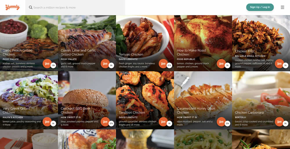
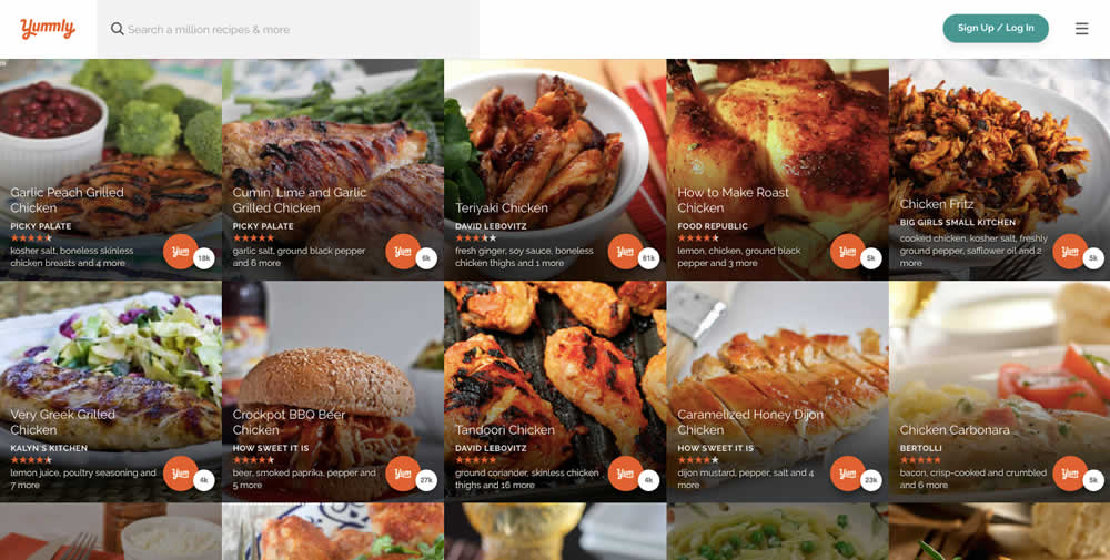
Marcos Tested Pattern #6: Customer Star Ratings On Yummly.com
Test #181 on
Yummly.com
by  Kimberly Cheung
Jun 04, 2018
Desktop
Mobile
Signup
X.X%
Signups
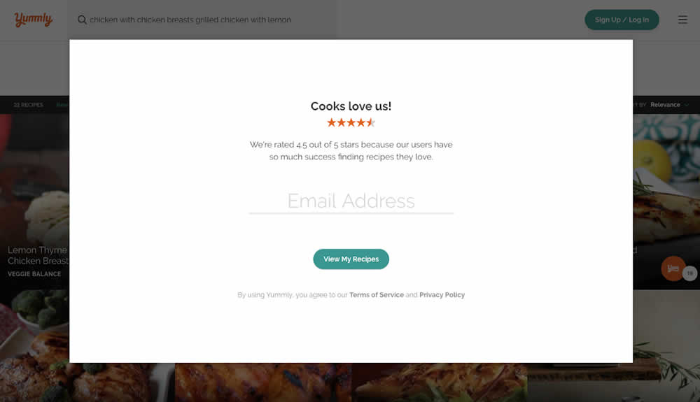
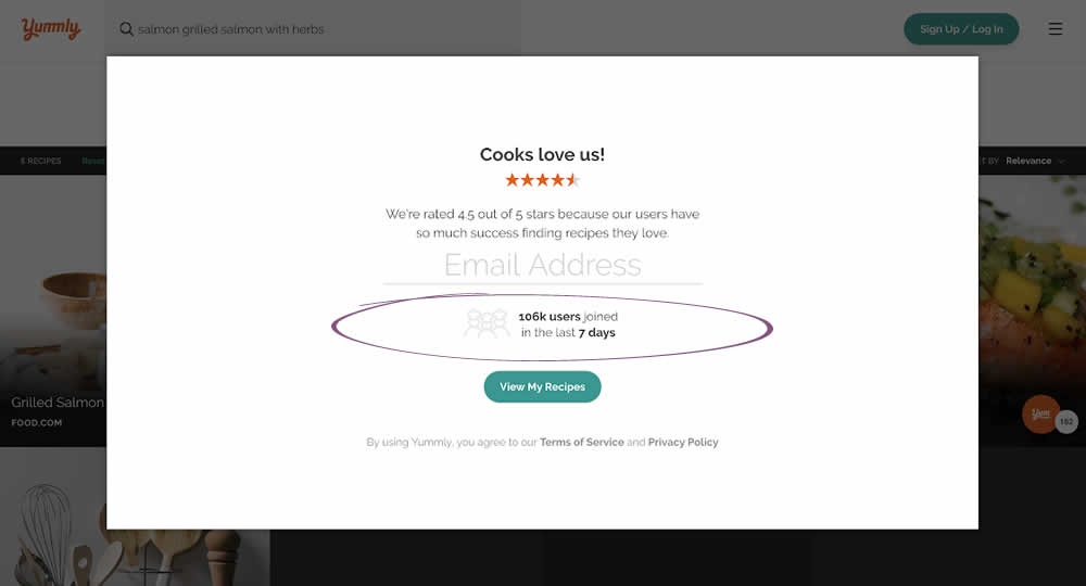
Kimberly Tested Pattern #7: Social Counts On Yummly.com
Test #180 on
Radhabeauty.com
by  Viljo Vabrit
Jun 03, 2018
Mobile
Global
X.X%
Sales
Viljo Tested Pattern #45: Benefit Bar On Radhabeauty.com

