All Latest 620 A/B Tests
Test #282 on
Thomasnet.com
by  Julian Gaviria
Feb 07, 2020
Desktop
Mobile
Listing
X.X%
Leads
Julian Tested Pattern #51: Shortcut Buttons On Thomasnet.com
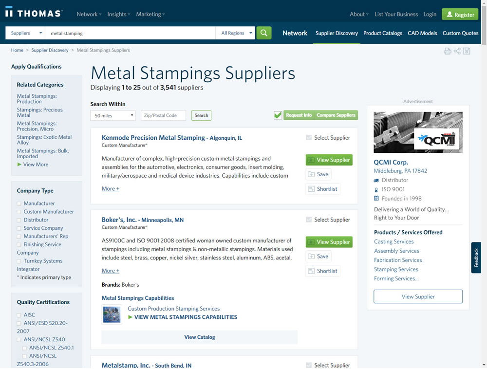
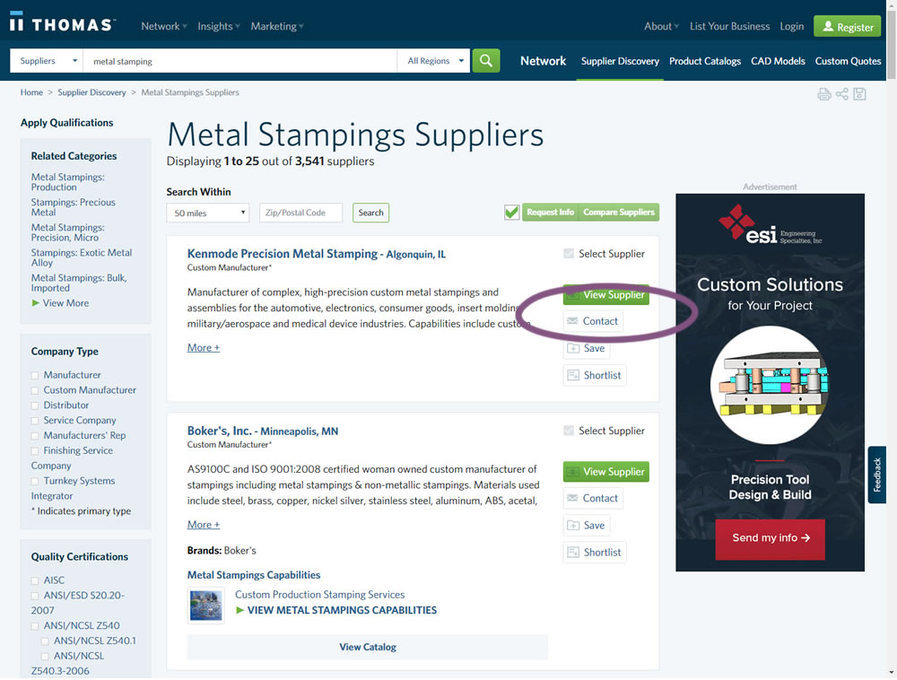
In this experiment, a contact button was added to a listing / search results page to make it faster to contact a company. This same button was also visible on the company detail page.
Which A Or B Actually Wins? Find Out Before You Test.
Members see every test result — the winners, the flat ones, and the losers — along with exact effects and sample sizes. Use it to estimate your tests and prioritize by probability, not gut feel. Start every experiment with the odds on your side.
Test #279 on
Umbraco.com
by  Lars Skjold Iversen
Jan 16, 2020
Desktop
Mobile
Home & Landing
X.X%
Sales
Lars Tested Pattern #79: Product Highlights On Umbraco.com
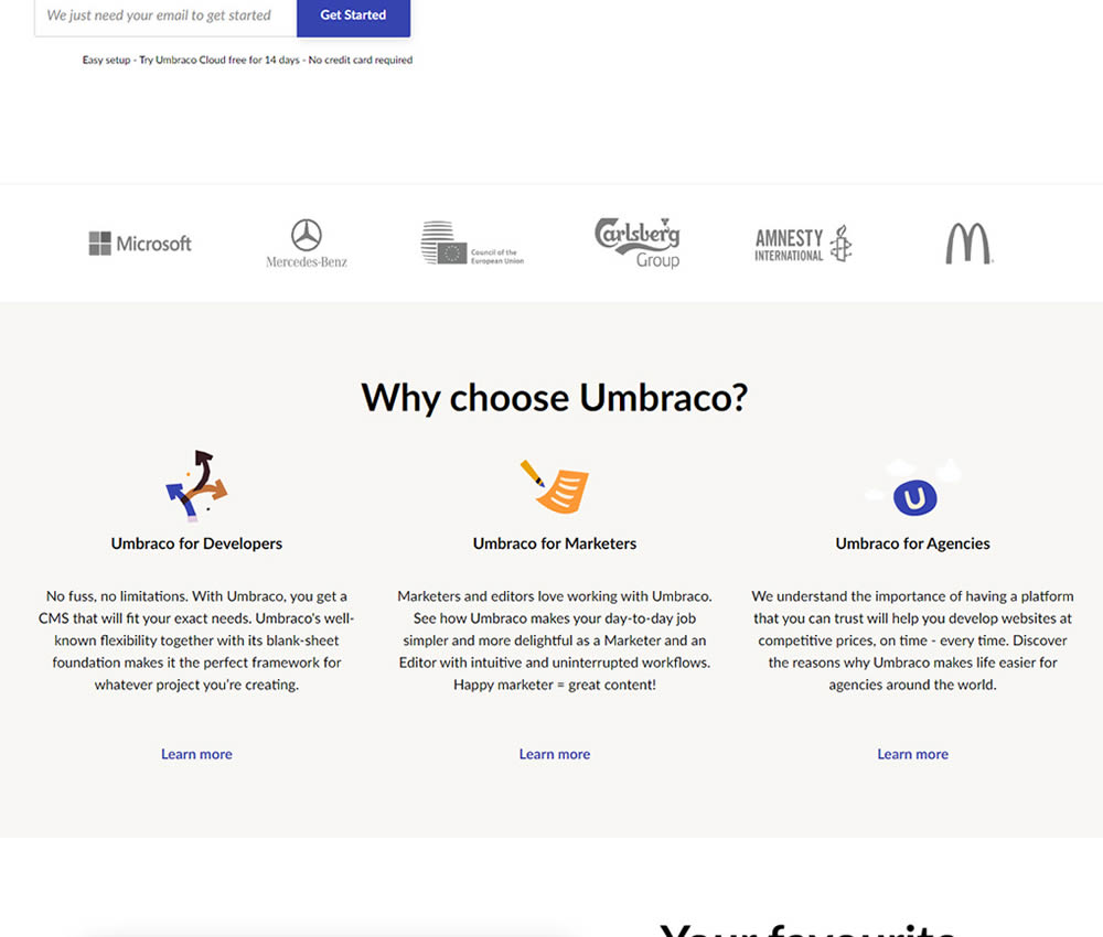
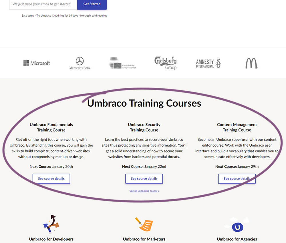
In this experiment, 3 additional course links with descriptions were added to the homepage. The idea was to increase course sales aside of the Saas subscription signups.
Test #271 on
Analytics-toolkit.co...
by  Georgi Z. Georgiev
Nov 24, 2019
Desktop
Mobile
Signup
X.X%
Signups
Georgi Tested Pattern #4: Testimonials On Analytics-toolkit.co...
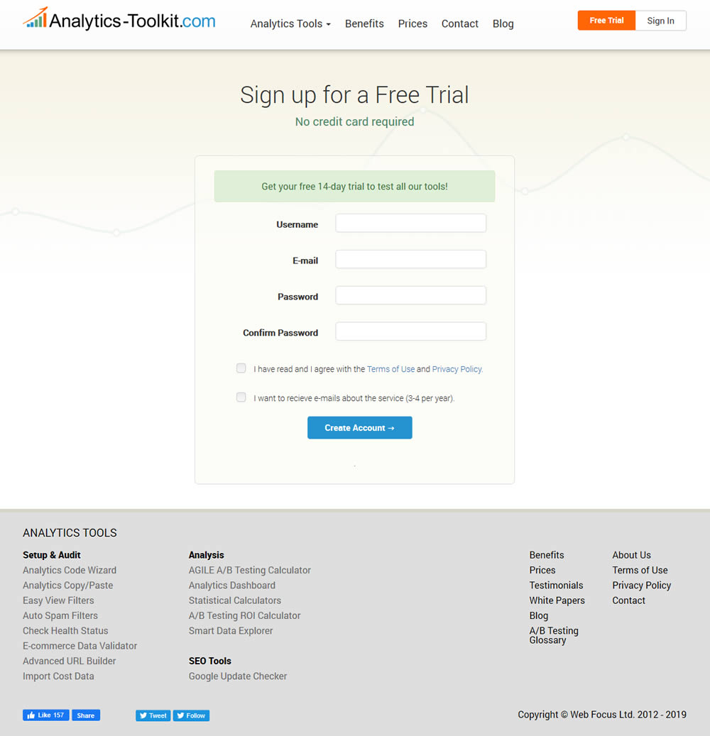
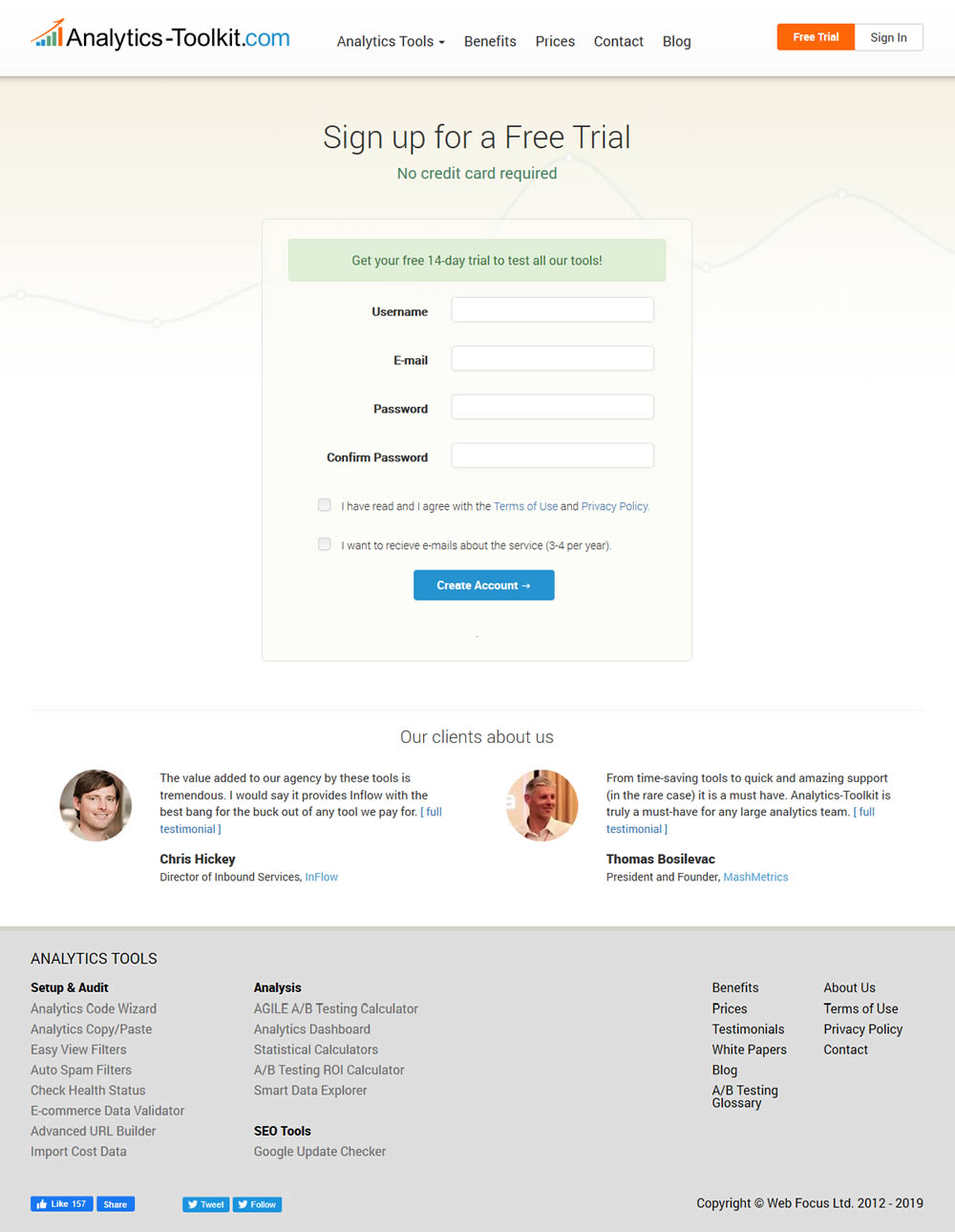
In this experiment, the test variant showed 2 testimonials on the user registration / free trial registration page at Analytics-Toolkit.com
Test #264 on
Kenhub.com
by  Niels Hapke
Oct 05, 2019
Desktop
Mobile
Global
X.X%
Sales
Niels Tested Pattern #41: Sticky Call To Action On Kenhub.com
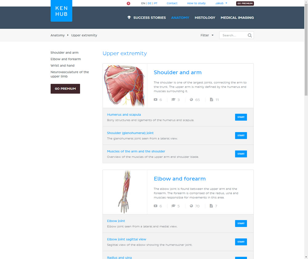
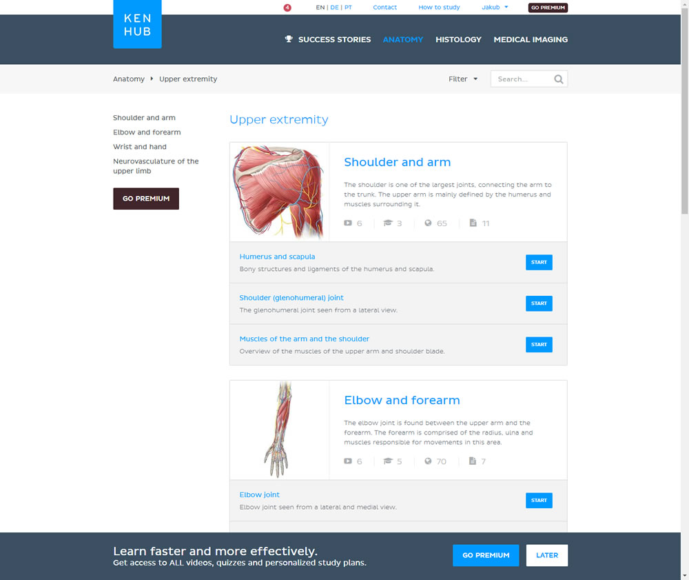
In this experiment users saw a sticky bar advertising the benefits of a Premium account across the bottom of the website, wherever they navigate. The sticky call to action appeared with a 4 second delay and was floating.
Test #105 on
Inktweb.nl
by  Martijn Oud
Sep 23, 2019
Desktop
Mobile
Signup
X.X%
Signups
Martijn Tested Pattern #111: Field Explanations On Inktweb.nl
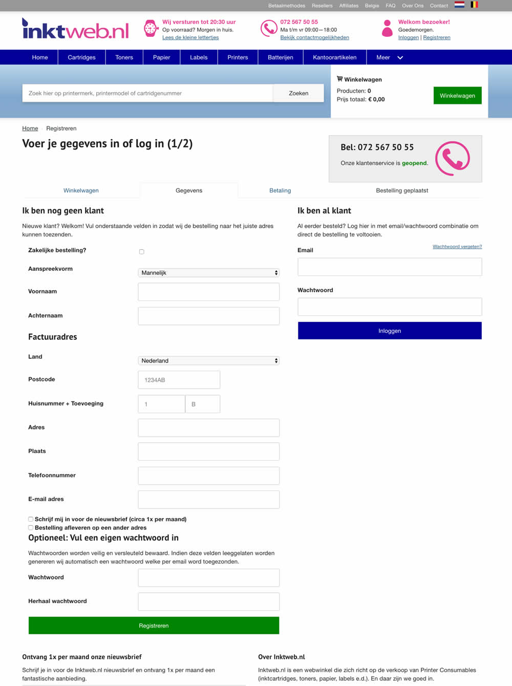
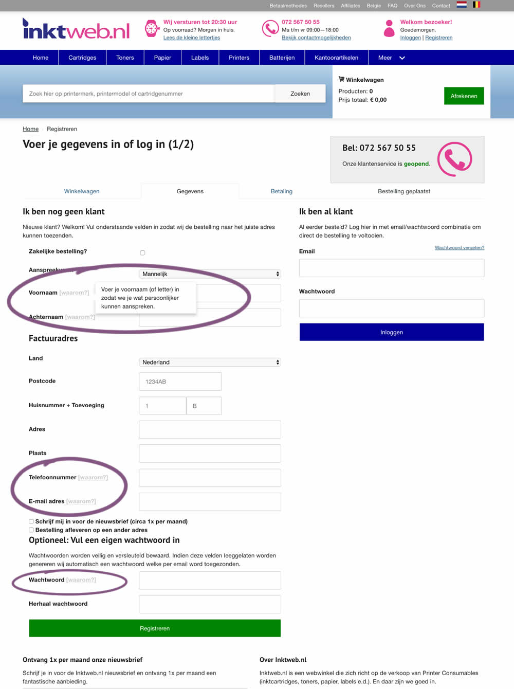
In this experiment, onhover tooltip explanations were added to selected fields (Firstname, Lastname, Phone, Email and Password). One translation example of the Firstname tooltip was the following "Enter your first name (or letter) so that we can address you in a more personal way".
Test #261 on
Valkexclusief.nl
by  Online Dialogue
Sep 20, 2019
Desktop
Checkout
X.X%
Sales
Online Tested Pattern #111: Field Explanations On Valkexclusief.nl
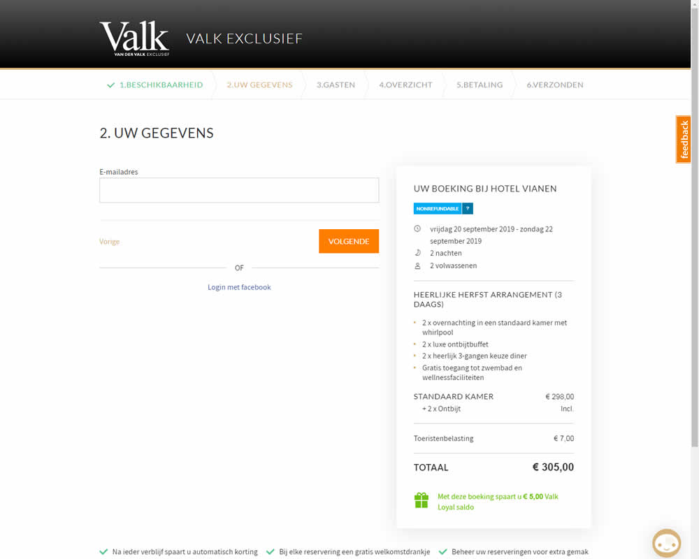
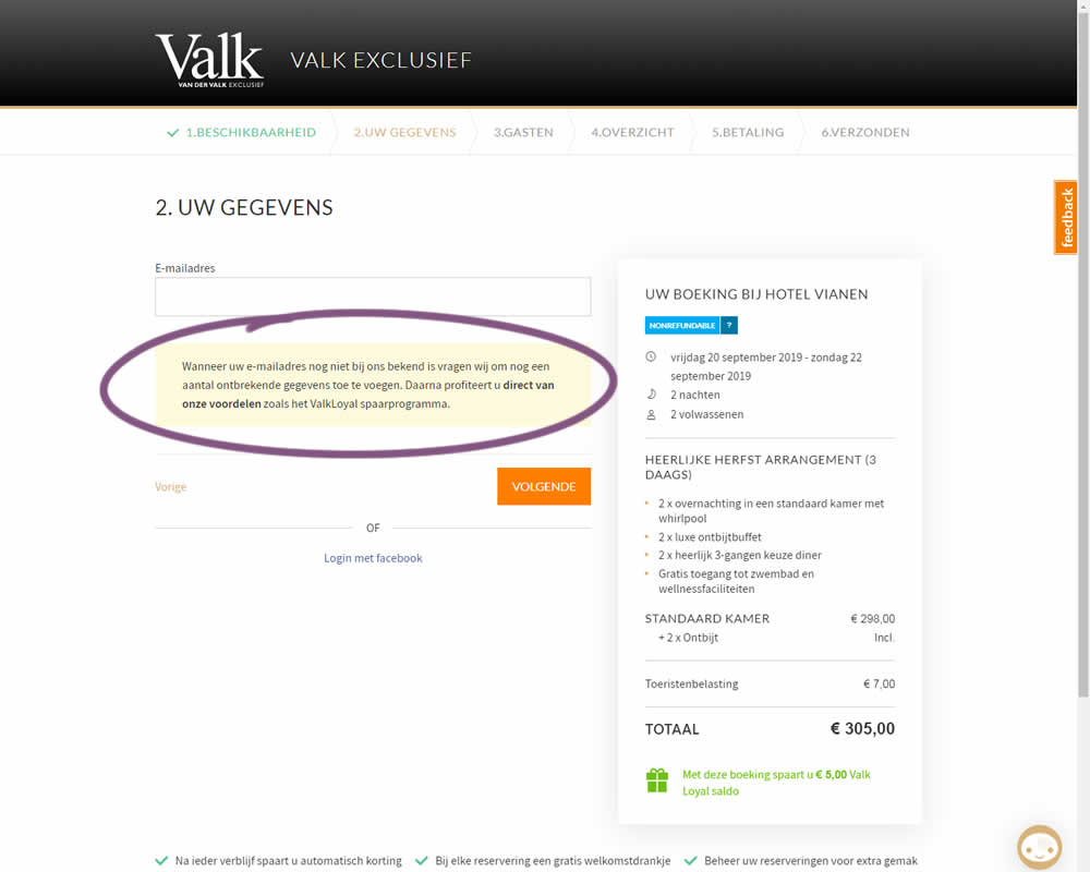
In this experiment on Valk Exclusief's web site, a reason was provided for why the e-mail address is being collected. Google translation of the added text is as follows: "If your e-mail address is not yet known to us, we will ask you to add some missing information. Then you immediately benefit from our benefits such as the ValkLoyal savings program."
Test #260 on
Valkexclusief.nl
by  Online Dialogue
Sep 16, 2019
Desktop
Home & Landing
X.X%
Sales
Online Tested Pattern #45: Benefit Bar On Valkexclusief.nl
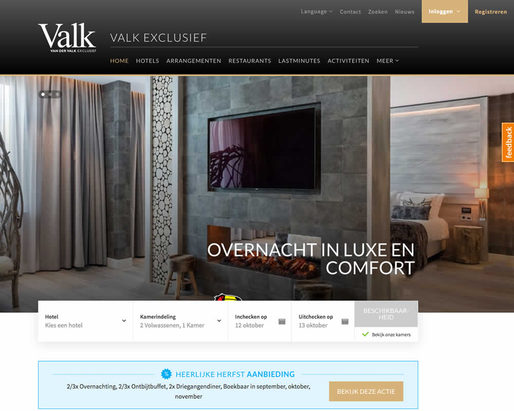
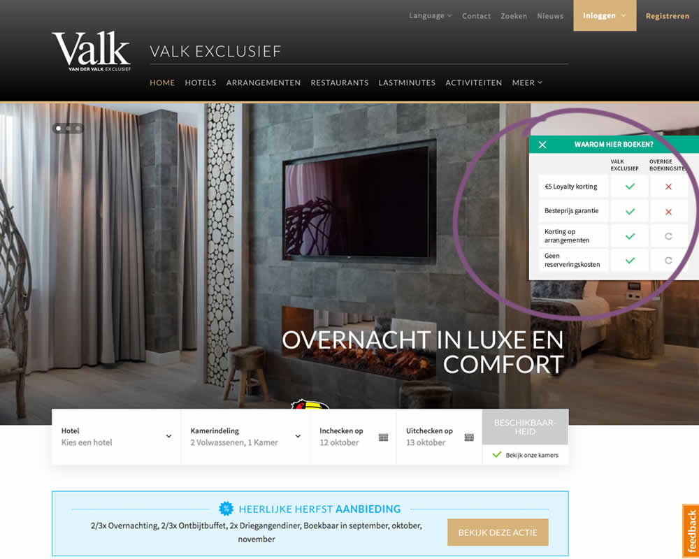
In this experiment on Valk Exclusief's web site, a transparent overview of the benefits for booking hotels was shown. The copy translates to: "Why should you book here? - 5€ Loyalty Discount - Best Price Guarantee - Discount On Packages - No Reservation Costs. Valk is a 150 year hotel chain in the Netherlands.
Test #258 on
Thomasnet.com
by  Julian Gaviria
Sep 12, 2019
Desktop
Mobile
Signup
X.X%
Signups
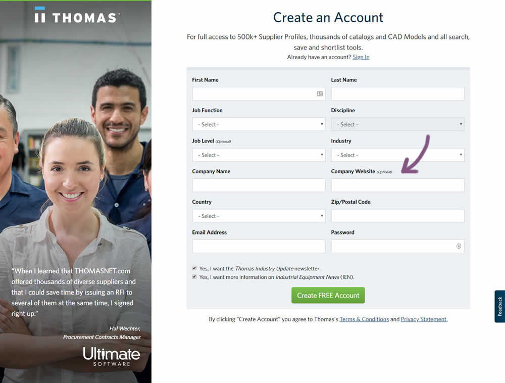
Julian Tested Pattern #110: Optional Field Labels On Thomasnet.com

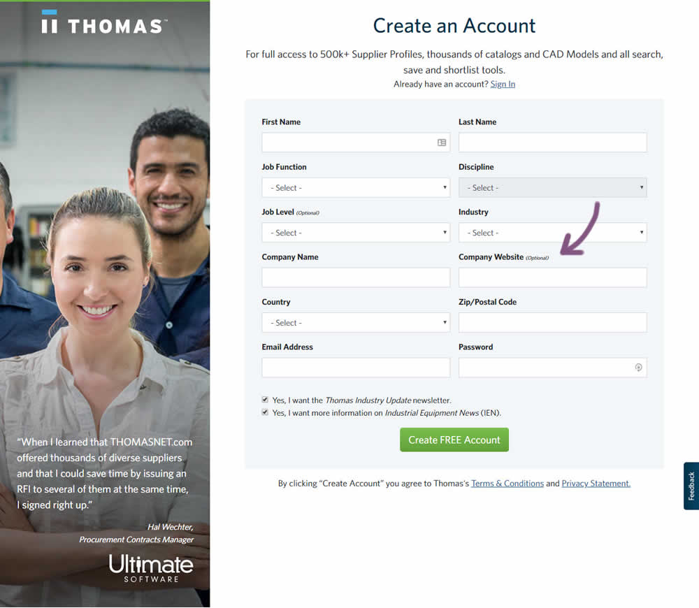
In this variation an optional field label was added.
Test #259 on
Thomasnet.com
by  Julian Gaviria
Sep 12, 2019
Desktop
Mobile
Signup
X.X%
Signups
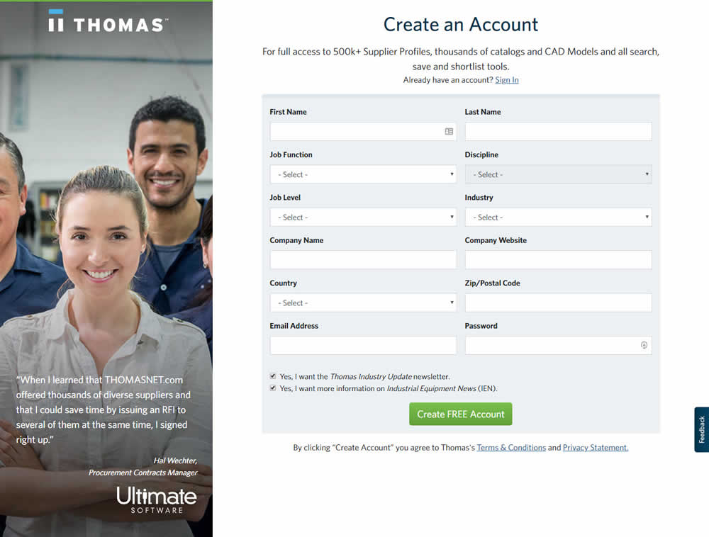
Julian Tested Pattern #110: Optional Field Labels On Thomasnet.com
Test #256 on
by  Alex James
Aug 23, 2019
Desktop
Mobile
Signup
X.X%
Signups
Alex Tested Pattern #109: Required Field Labels
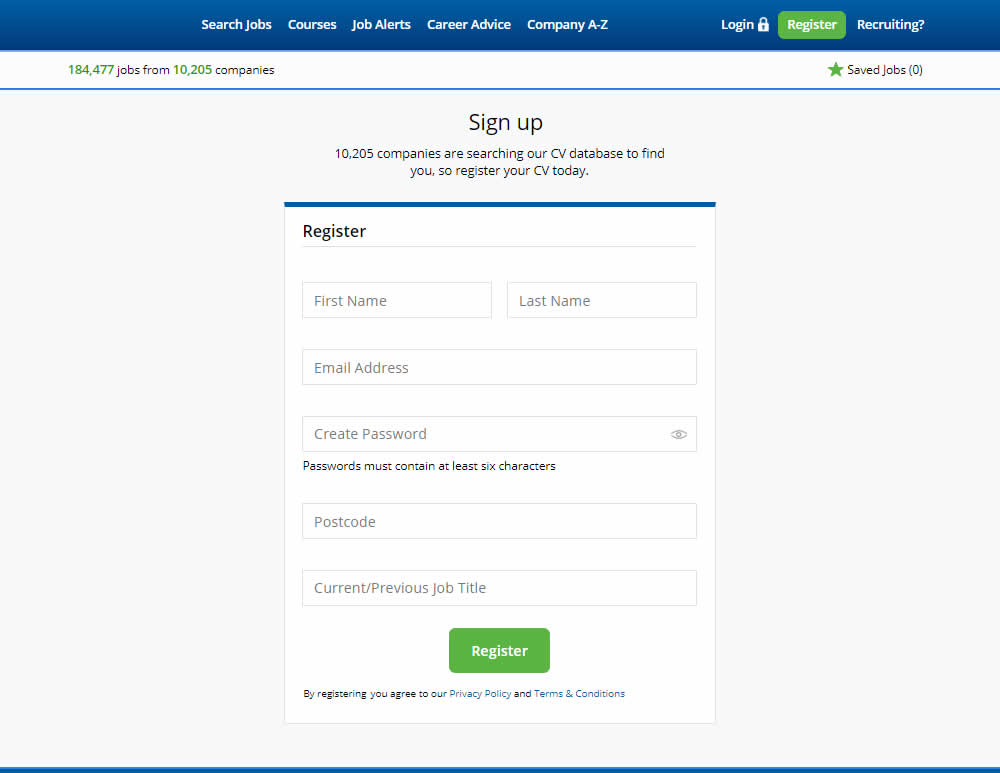
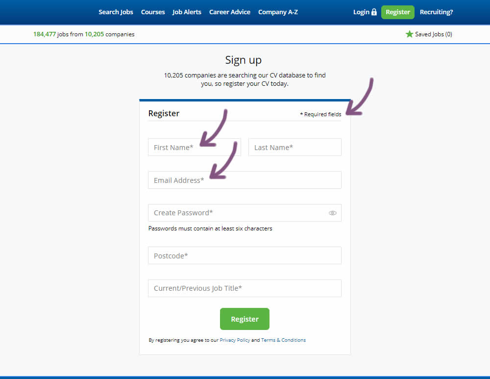
The original had no fields marked as required. The variant had all fields marked as required with an asterisk (and a reference note).
Test #255 on
Thomasnet.com
by  Julian Gaviria
Aug 22, 2019
Desktop
Mobile
Signup
X.X%
Signups
Julian Tested Pattern #109: Required Field Labels On Thomasnet.com
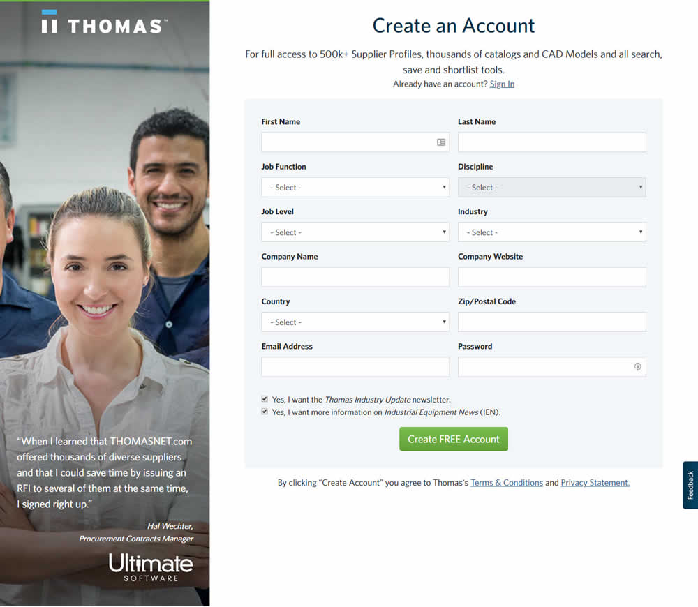

In this experiment, field labels without and with a marked asterisk were tested.
Test #250 on
Volders.de
by  Alexander Krieger
Jul 25, 2019
Desktop
Mobile
Signup
X.X%
Signups
Alexander Tested Pattern #106: Back Buttons On Volders.de
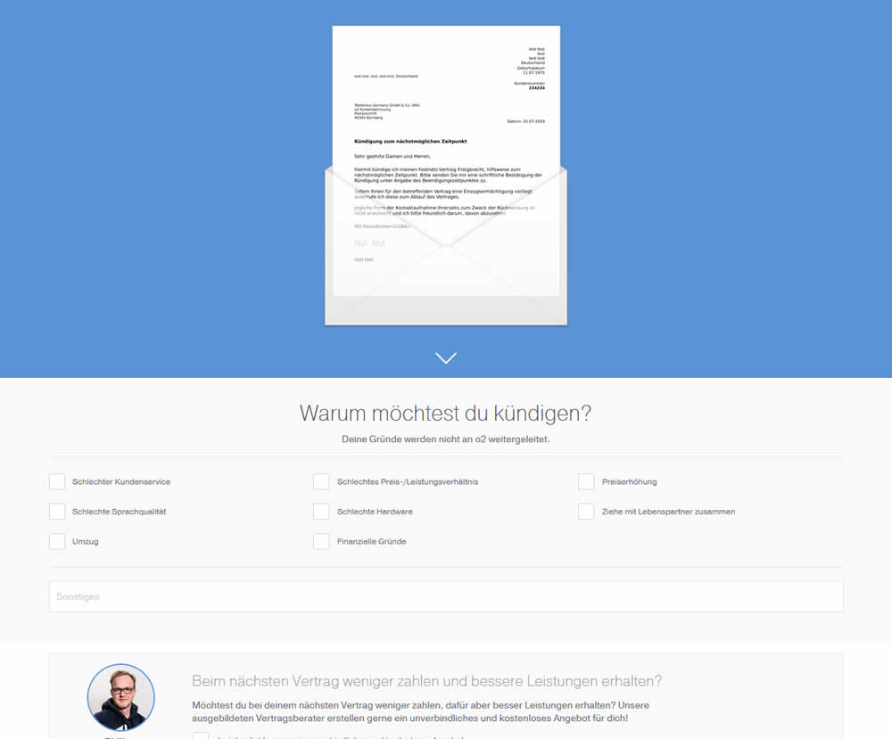
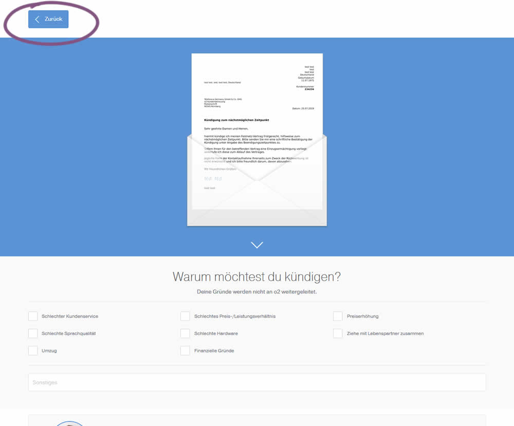
In this experiment, a version without a back button was tested against a one where it was positioned in the upper left corner. This test occured on a second step of a contract cancellation service.
Test #249 on
Autoscout24.com
by  Optimizely
Jul 17, 2019
Desktop
Product
X.X%
Leads
Optimizely Tested Pattern #20: Canned Response On Autoscout24.com
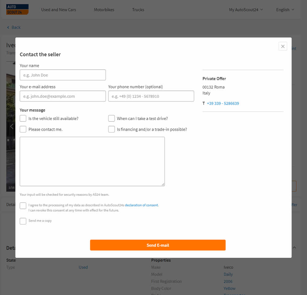
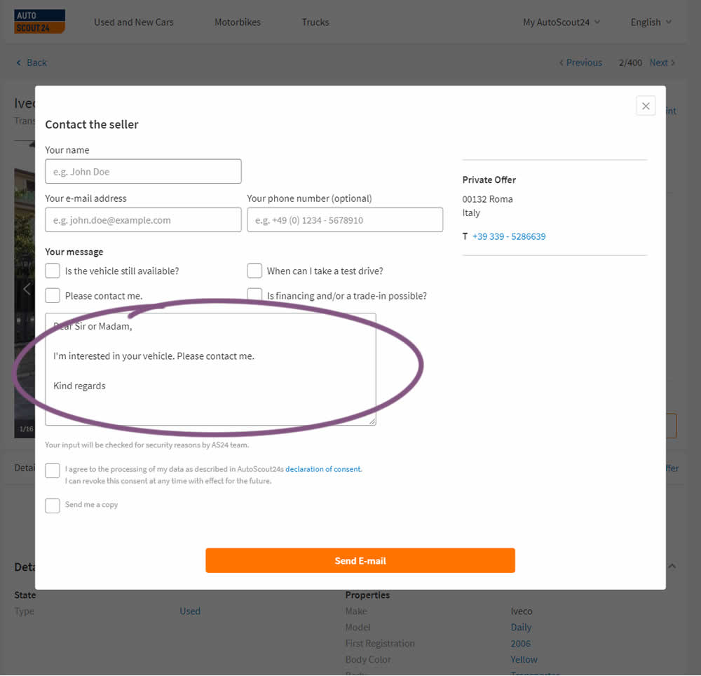
AutoScout24 is Europe’s largest online marketplace for new and used cars. As published by Optimizely, they tested a form pre-filled with text that read: ‘Hello. I am interested in your vehicle. Please contact me. Kind regards.’
Test #242 on
by  Alex James
May 27, 2019
Desktop
Mobile
Signup
X.X%
Signups
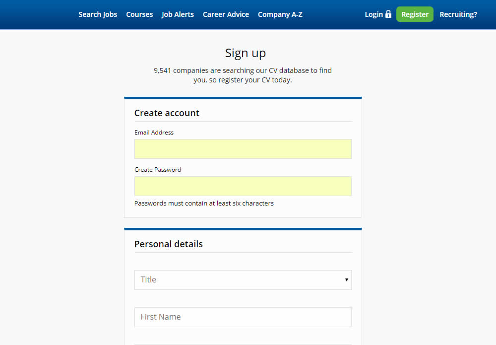
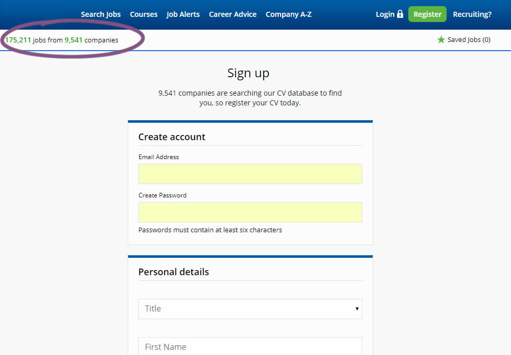
Alex Tested Pattern #7: Social Counts
Test #241 on
Kenhub.com
by  Niels Hapke
May 24, 2019
Desktop
Mobile
Signup
X.X%
Signups
Niels Tested Pattern #105: Lead Magnets On Kenhub.com
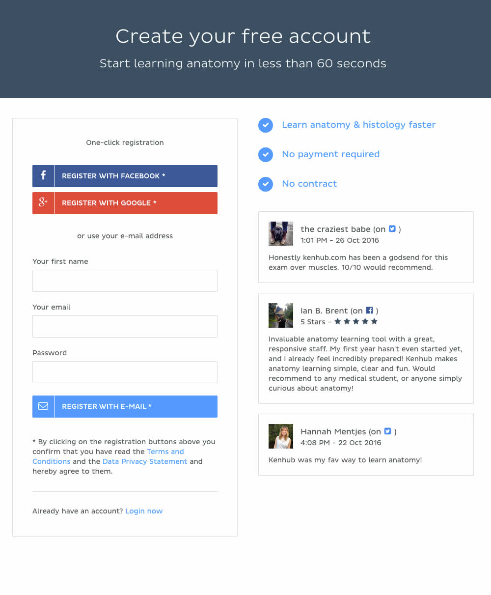
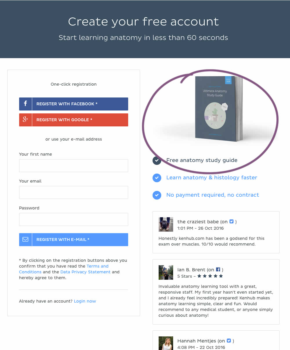
In this experiment, a free study guide ebook was promoted on a registration page.
Test #237 on
Goodui.org
by  Jakub Linowski
Apr 29, 2019
Desktop
Mobile
Listing
X.X%
Sales
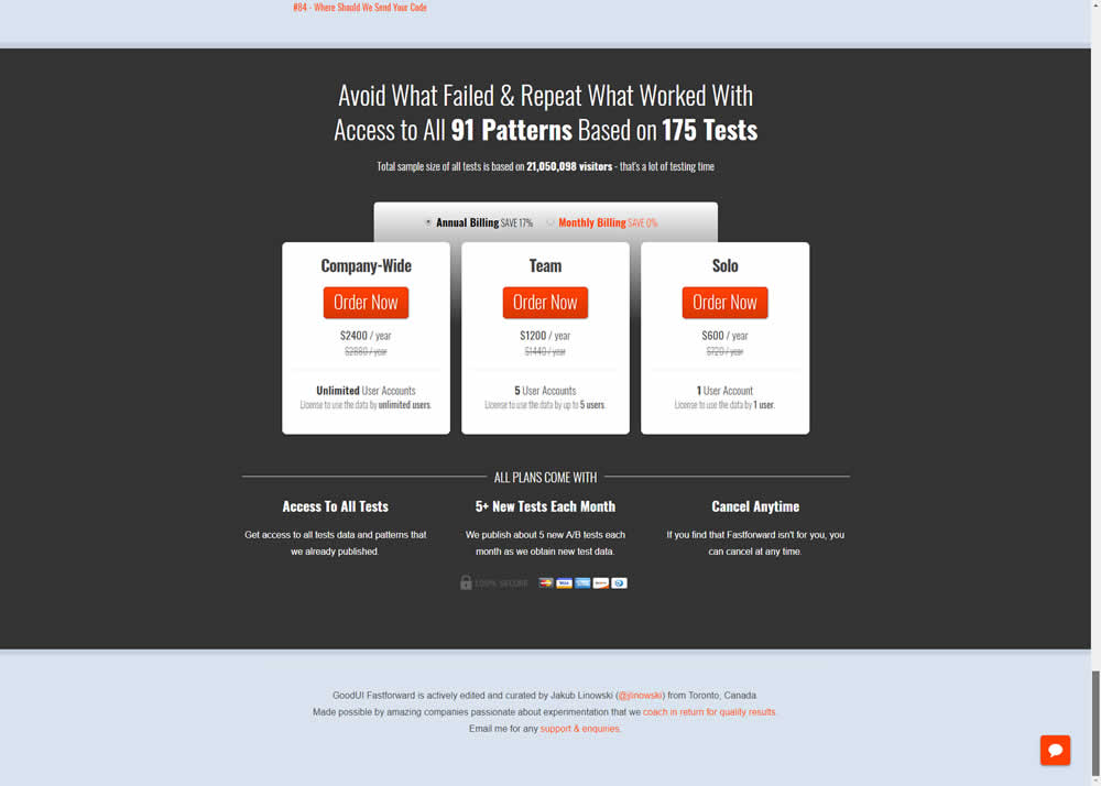
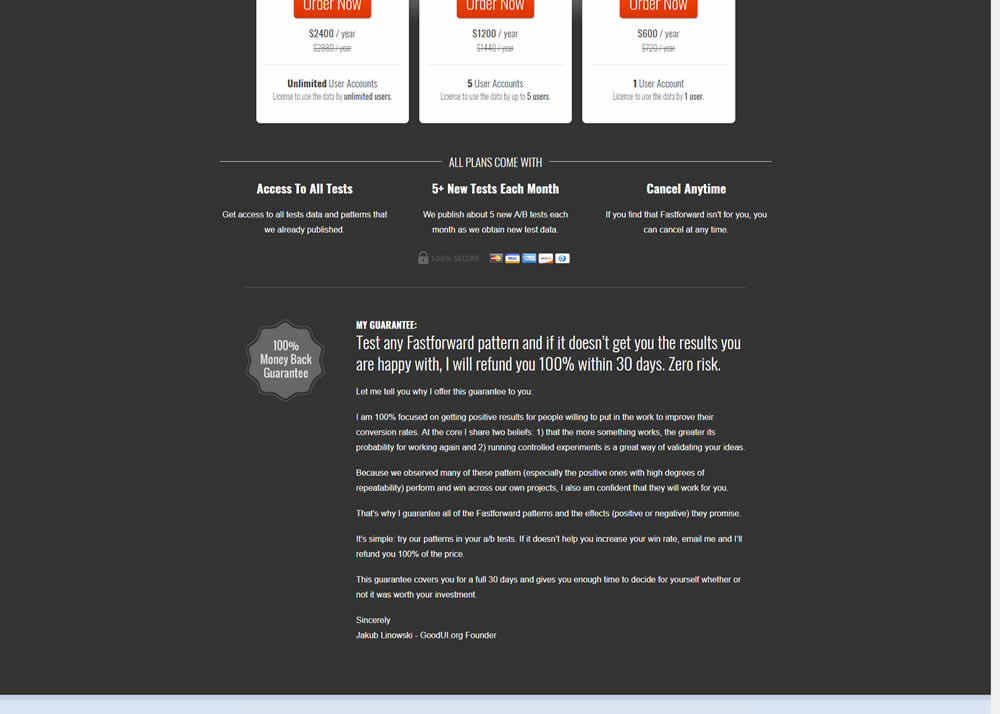
Jakub Tested Pattern #103: Money Back Guarantee On Goodui.org
Test #231 on
Glass.net
by  Mark Freedle
Mar 14, 2019
Desktop
Mobile
Signup
X.X%
Leads
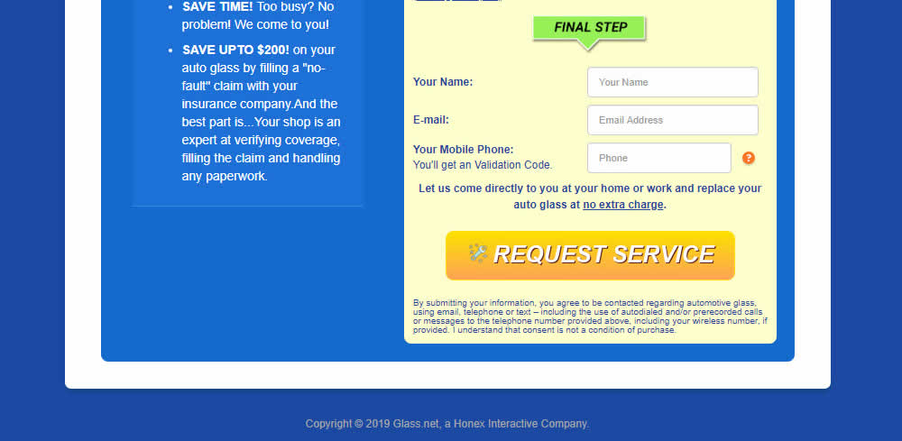
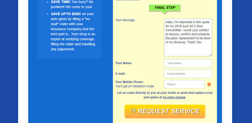
Mark Tested Pattern #20: Canned Response On Glass.net
Test #229 on
by  Jakub Linowski
Mar 08, 2019
Desktop
Mobile
Checkout
X.X%
Sales
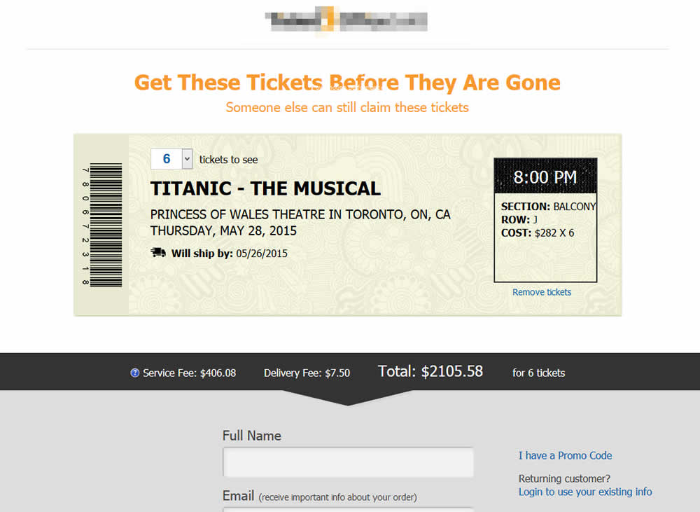
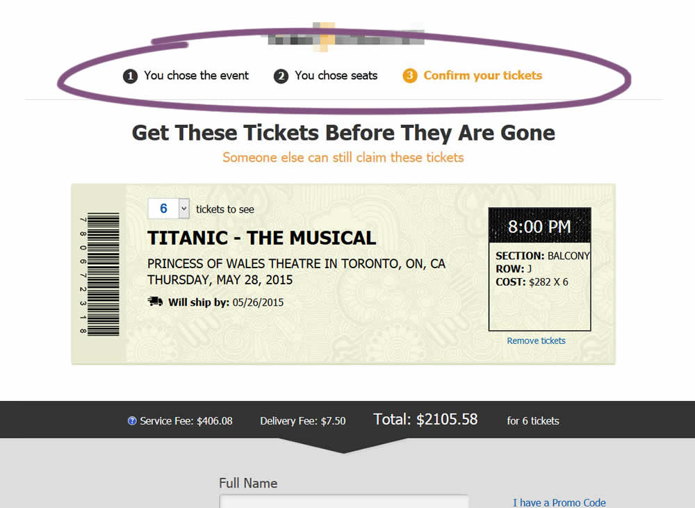
Jakub Tested Pattern #99: Progress Bar
Test #228 on
by  Jakub Linowski
Mar 05, 2019
Desktop
Mobile
Checkout
X.X%
Sales
Jakub Tested Pattern #99: Progress Bar

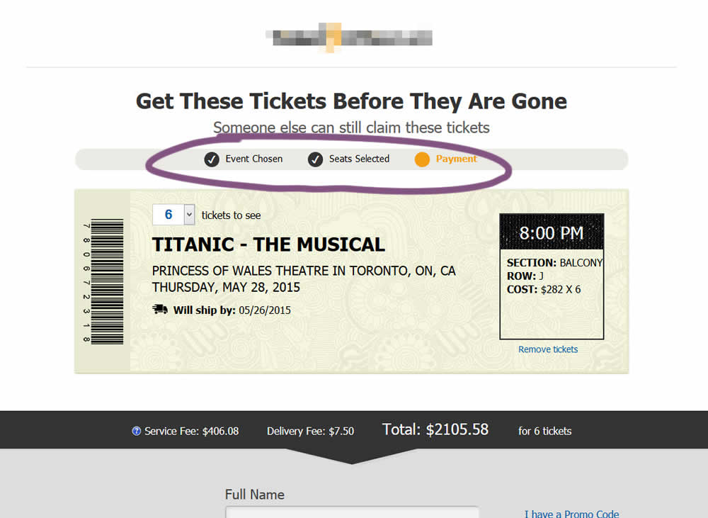
The variation added a progress bar to one of the checkout steps for a ticket ordering site.
Test #227 on
Volders.de
by  Alexander Krieger
Mar 04, 2019
Desktop
Signup
X.X%
Leads
Alexander Tested Pattern #99: Progress Bar On Volders.de

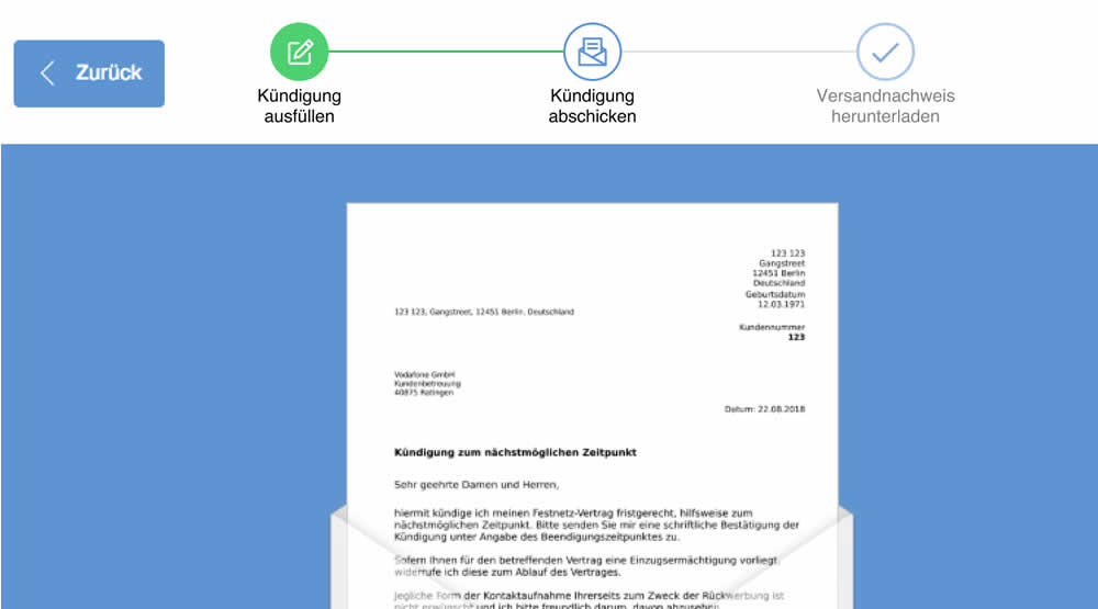
In this experiment, a simple progress bar was added to a 2nd step of contract cancellation funnel. The progress bar used separate styles to show which steps were completed, what the current step was, as well as the future step.
Translation of the 3 steps from German are as follows:
- Fill out the termination
- Send termination
- Proof of termination