All Latest 620 A/B Tests
Test #501 on
Volders.de
by  Daria Kurchinskaia
Nov 02, 2023
Desktop
Mobile
Pricing
X.X%
Sales
Daria Tested Pattern #132: One Time Payment Copy On Volders.de
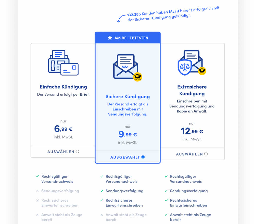
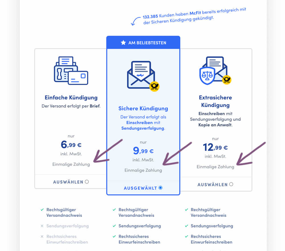
In this experiment, the wording "one-time payment" was appended below all three pricing plans for a contract cancelation service. Impact on orders placed was measured. (Translated from German: "Einmalige Zahlung").
Which A Or B Actually Wins? Find Out Before You Test.
Members see every test result — the winners, the flat ones, and the losers — along with exact effects and sample sizes. Use it to estimate your tests and prioritize by probability, not gut feel. Start every experiment with the odds on your side.
Test #500 on
Kayoutlet.com
by  Craig Kistler
Oct 25, 2023
Mobile
Product
X.X%
Sales
Craig Tested Pattern #7: Social Counts On Kayoutlet.com
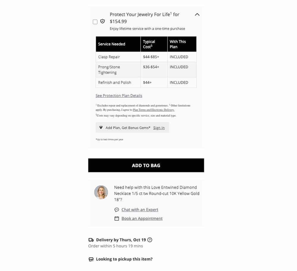
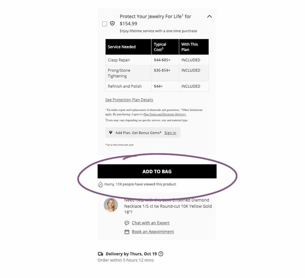
This was a replication attempt similar to experiment 497. A social proof message was added below add to cart buttons on product detail pages. Impact on adds to cart and transactions was measured.
Test #499 on
Shmoodyapp.com
by  Michael McSweeney
Oct 20, 2023
Mobile
Signup
X.X%
Sales
Michael Tested Pattern #99: Progress Bar On Shmoodyapp.com
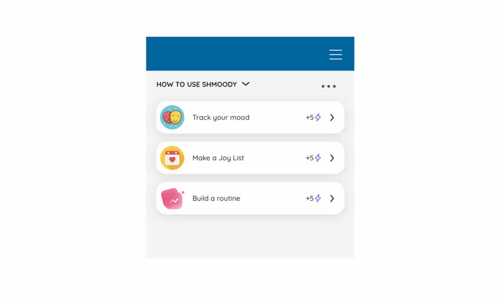
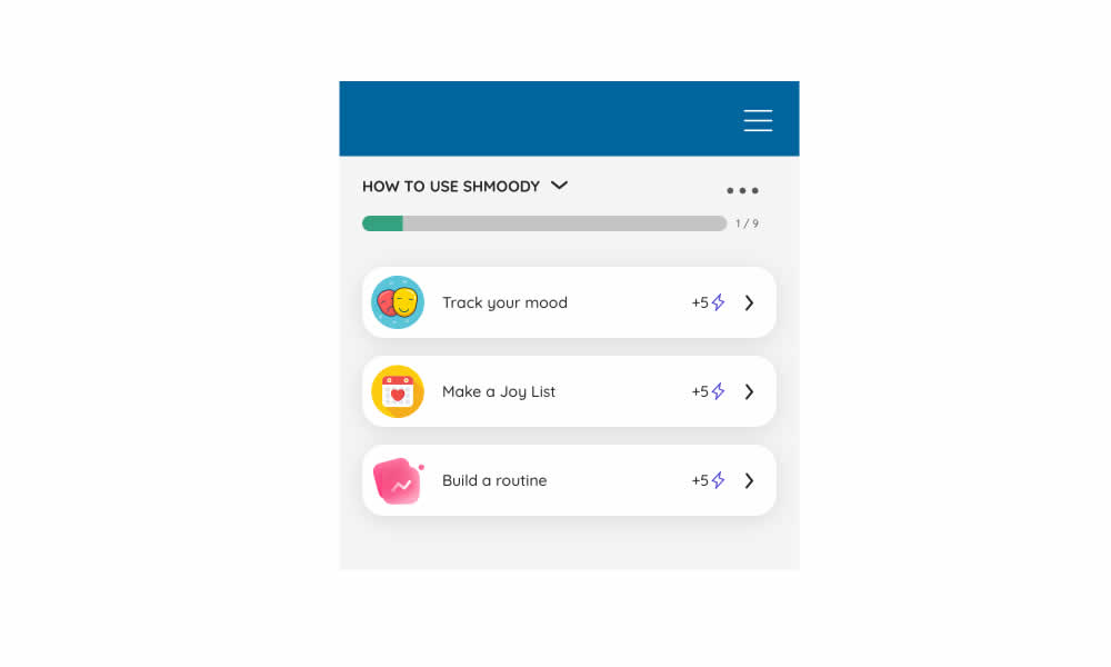
In this experiment, a progress bar was added to a signup flow of a mental health app. It appeared on numerous steps of a onboarding flow. Impact on signup completions and checkouts was measured.
Test #498 on
by  Jakub Linowski
Oct 19, 2023
Desktop
Mobile
Product
X.X%
Sales
Jakub Tested Pattern #7: Social Counts
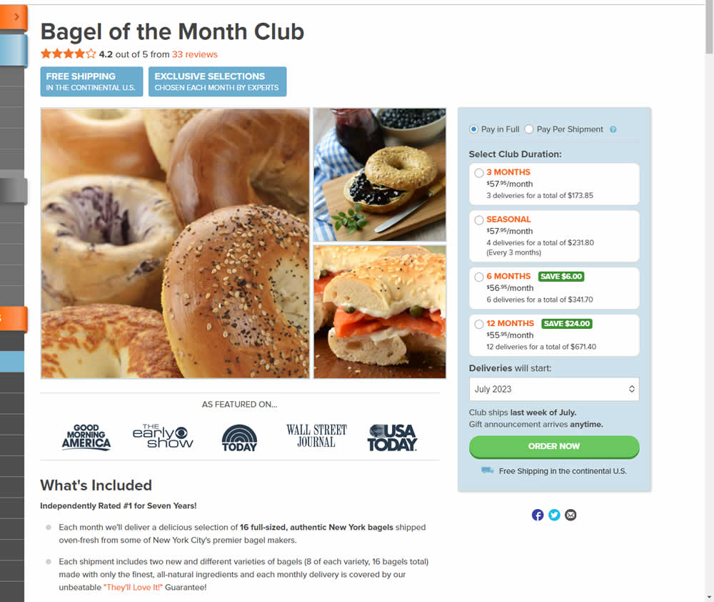
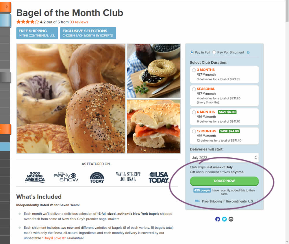
In this experiment, the variation tracked how many people would add something to cart over the last 24 hours and display that just below the add to cart button. Impact on adds to cart and transactions was measured.
Test #497 on
Jared.com
by  Craig Kistler
Oct 16, 2023
Mobile
Product
X.X%
Sales
Craig Tested Pattern #7: Social Counts On Jared.com
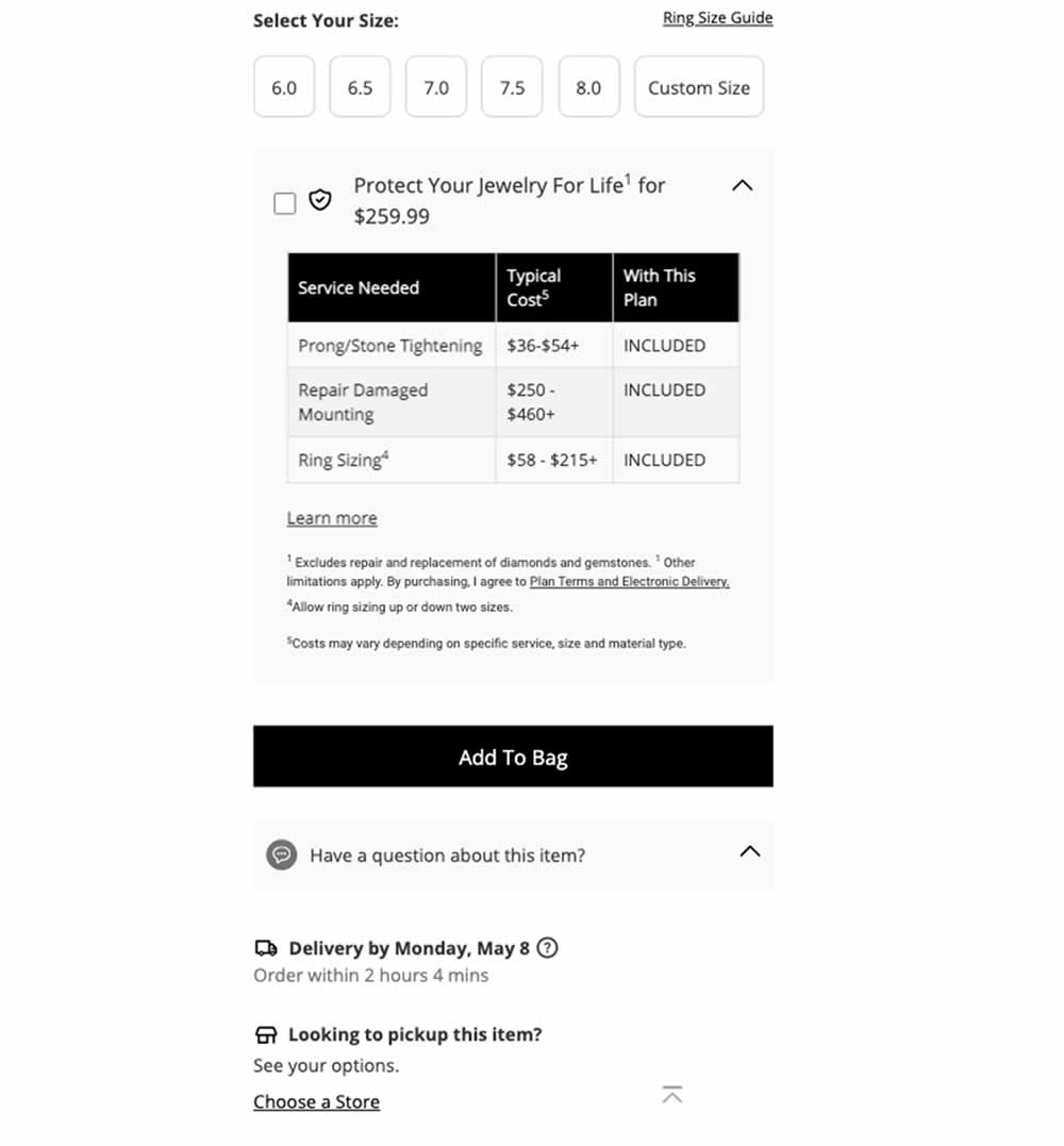
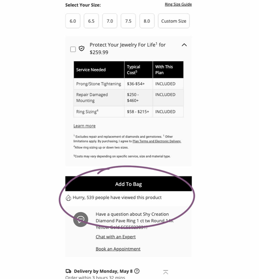
In this experiment, a social proof message was added below add to cart buttons on product detail pages. The copy read "Hurry, X people have viewed this product". Impact on adds to cart and transactions was measured.
Test #496 on
Livefresh.de
by  Pascal Dietz
Oct 03, 2023
Desktop
Mobile
Product
X.X%
Sales
Pascal Tested Pattern #43: Long Titles On Livefresh.de
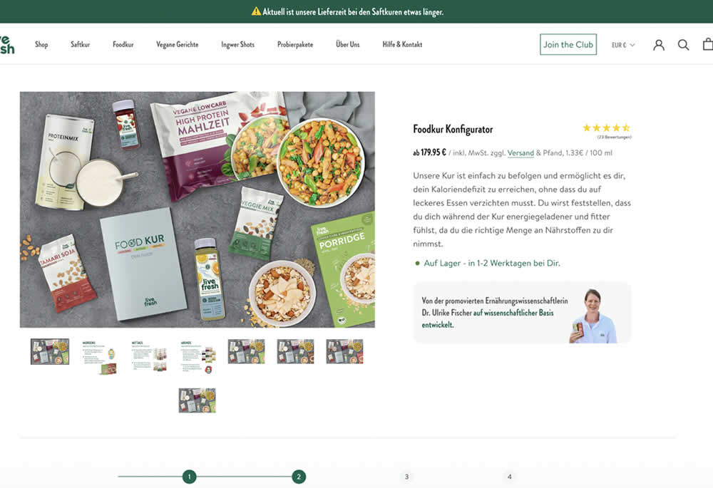
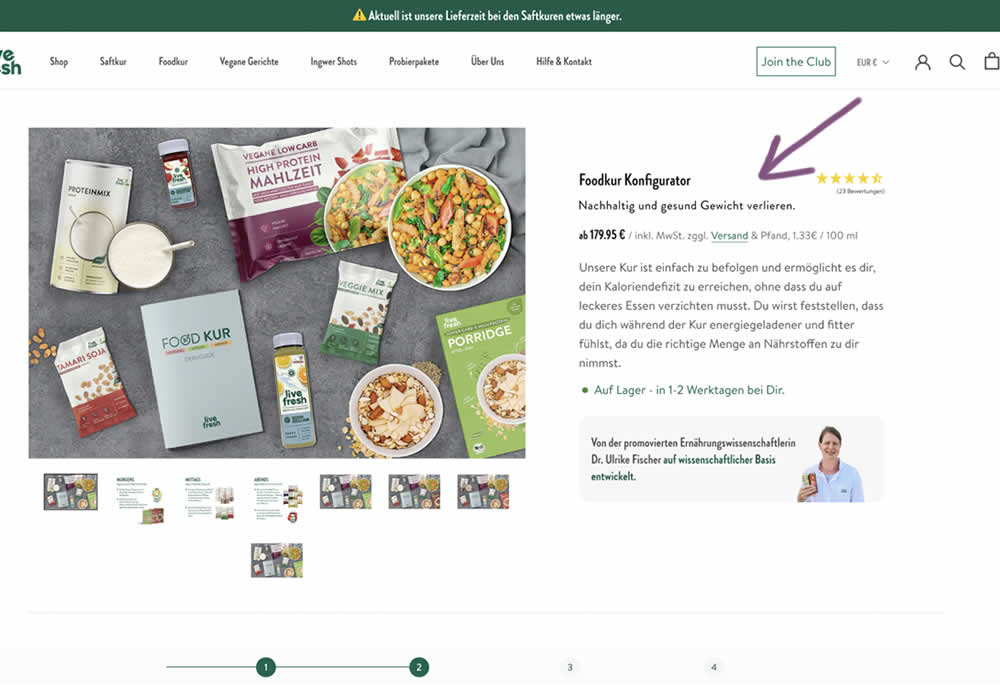
In this product detail page experiment a simple subheadline was appended to a new product. The tagline read "Lose weight sustainably and healthily." (Google translated from German "Nachhaltig und gesund Gewicht verlieren."). Impact on sales and revenue was measured.
Test #494 on
Online.Metro-cc.ru
by  Andrey Andreev
Sep 20, 2023
Desktop
Mobile
Home & Landing
X.X%
Sales
Andrey Tested Pattern #26: Cart Reminder And Recently Viewed On Online.Metro-cc.ru
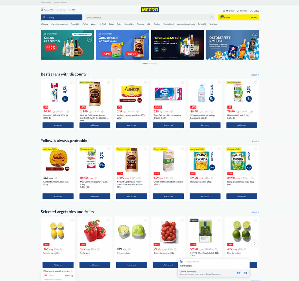
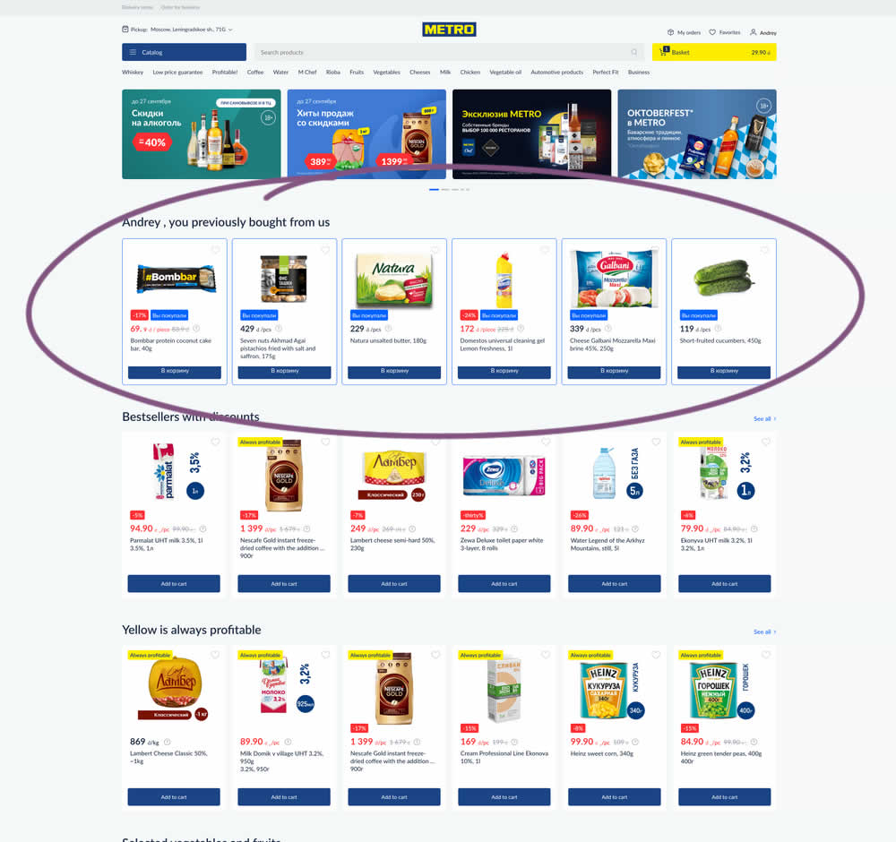
In this experiment, recently purchased products were appended at the top of the homepage. The test ran for loggedin users only. Impact on add-to-cart, sales and revenue was measured.
Test #492 on
Formelskin.de
by  Alexander Krieger
Sep 15, 2023
Mobile
Signup
X.X%
Sales
Alexander Tested Pattern #131: Authority On Formelskin.de
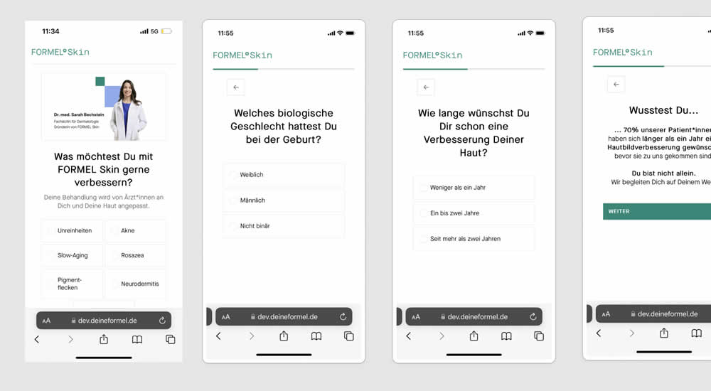
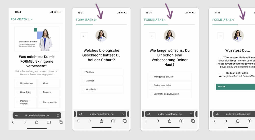
This experiment was a retest of a previously tested test 491. Simiarly, a photo of the real doctor behind a skin care product was shown throughout a signup / questionnaire flow in the variation.
Test #491 on
Formelskin.de
by  Alexander Krieger
Sep 08, 2023
Mobile
Signup
X.X%
Sales
Alexander Tested Pattern #131: Authority On Formelskin.de
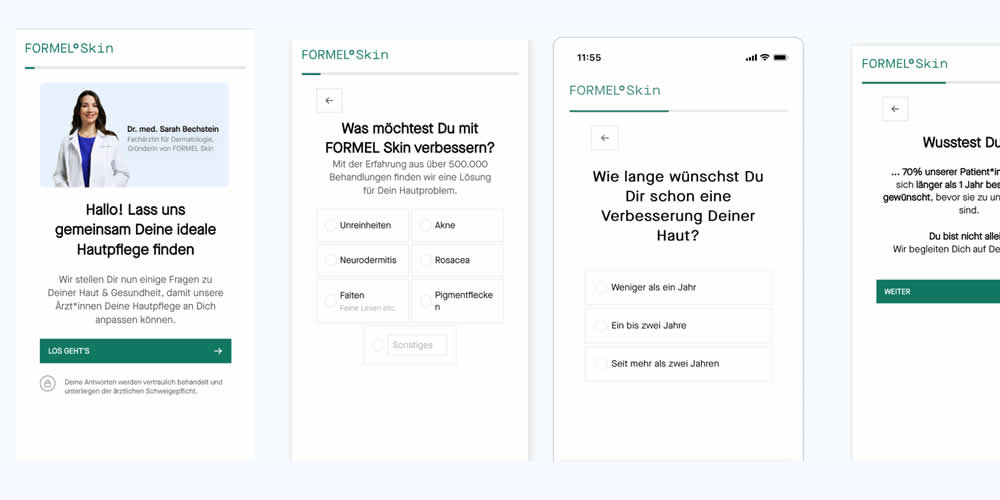
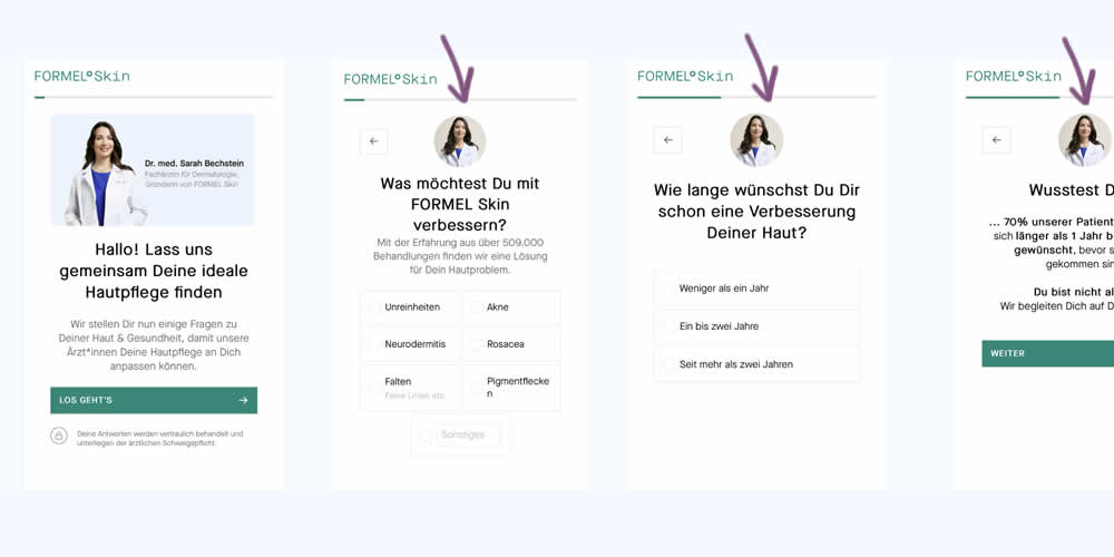
In this experiment, a photo of the real doctor behind a skin care product was shown throughout a signup / questionnaire flow. In the control version, the photo with introduction was only shown on the first screen. In the variation, the photo appeared on the first and all other screens - reinforcing expertise, authority and the idea of a consultation. Impact on signups and purchases was measured.
Test #488 on
Metro-cc.ru
by  Andrey Andreev
Aug 11, 2023
Mobile
Product
X.X%
Sales
Andrey Tested Pattern #4: Testimonials On Metro-cc.ru
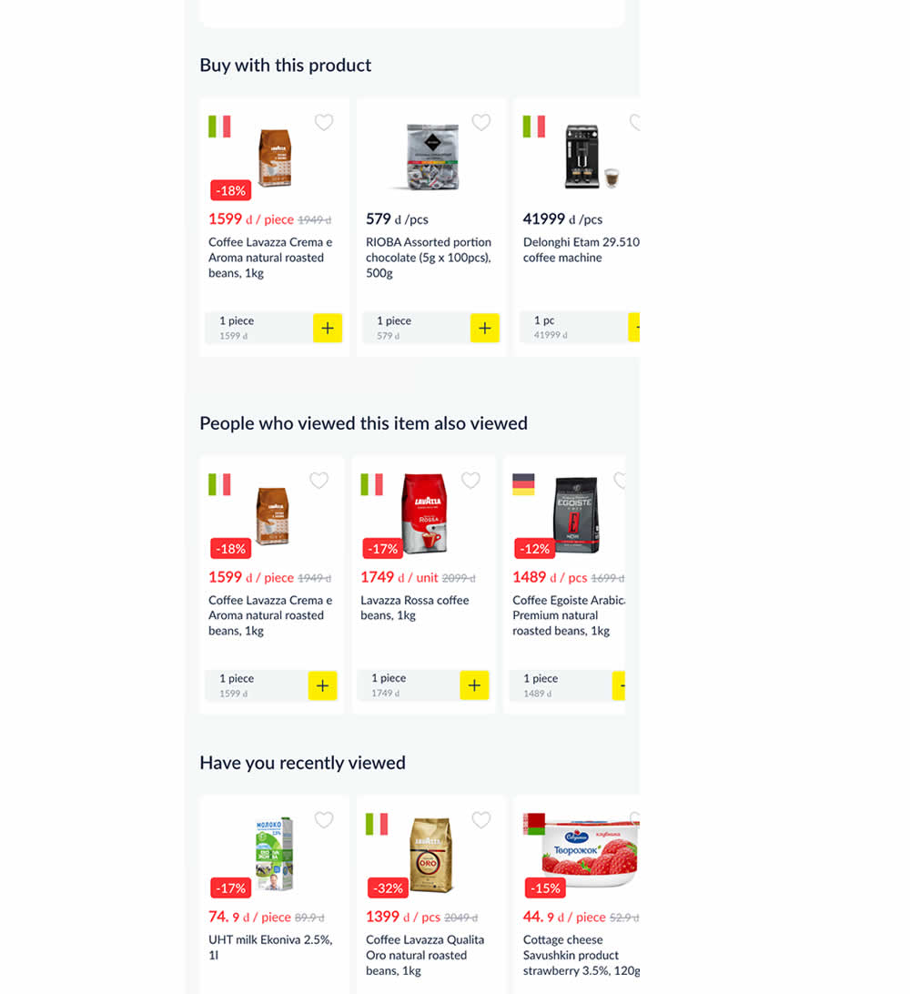
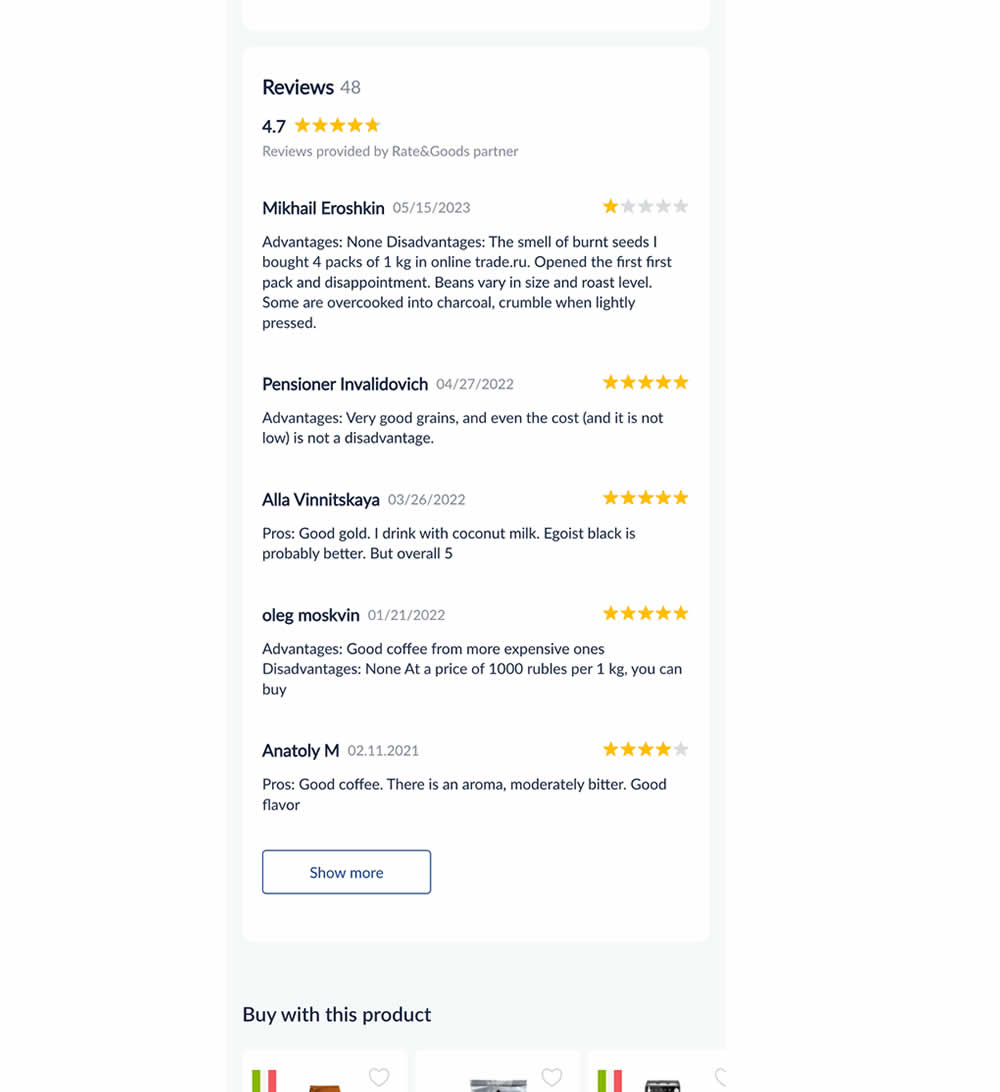
In this experiment, customer reviews were shown on product detail pages. Impact on adds to cart and sales was measured.
Test #486 on
Livefresh.de
by  Pascal Dietz
Aug 03, 2023
Mobile
Product
X.X%
Sales
Pascal Tested Pattern #78: Tags, Badges And Structured Information On Livefresh.de
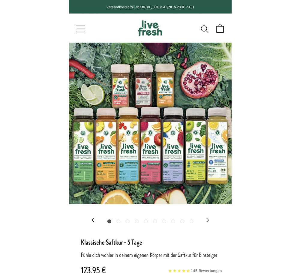
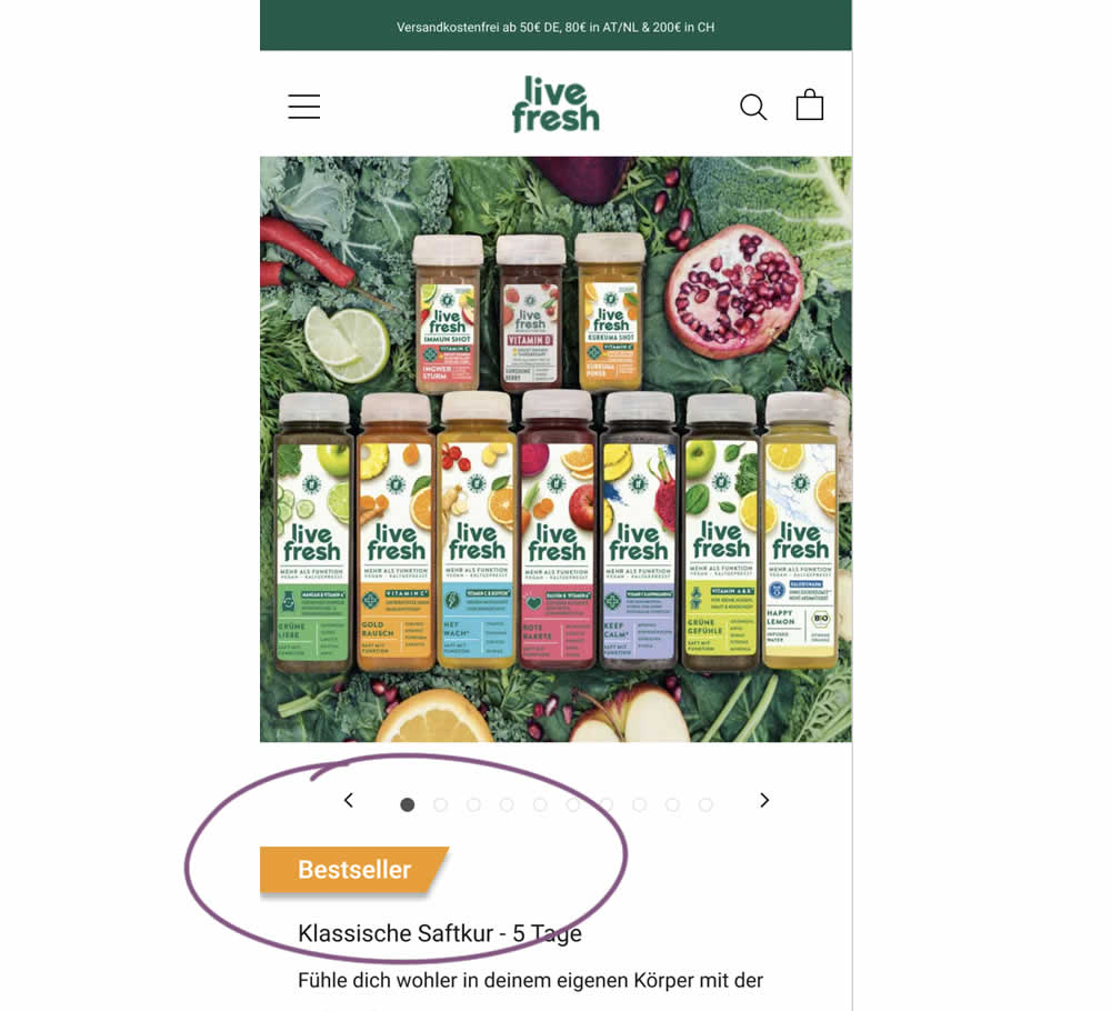
Does a "Bestseller" badge increase sales? This experiment tested exactly this by adding a visible badge on a juice cleansing product detail page.
Test #483 on
Menufy.com
by  Aleksandr Elesev
Jul 17, 2023
Desktop
Checkout
X.X%
Sales
Aleksandr Tested Pattern #124: Confirmed Selection On Menufy.com
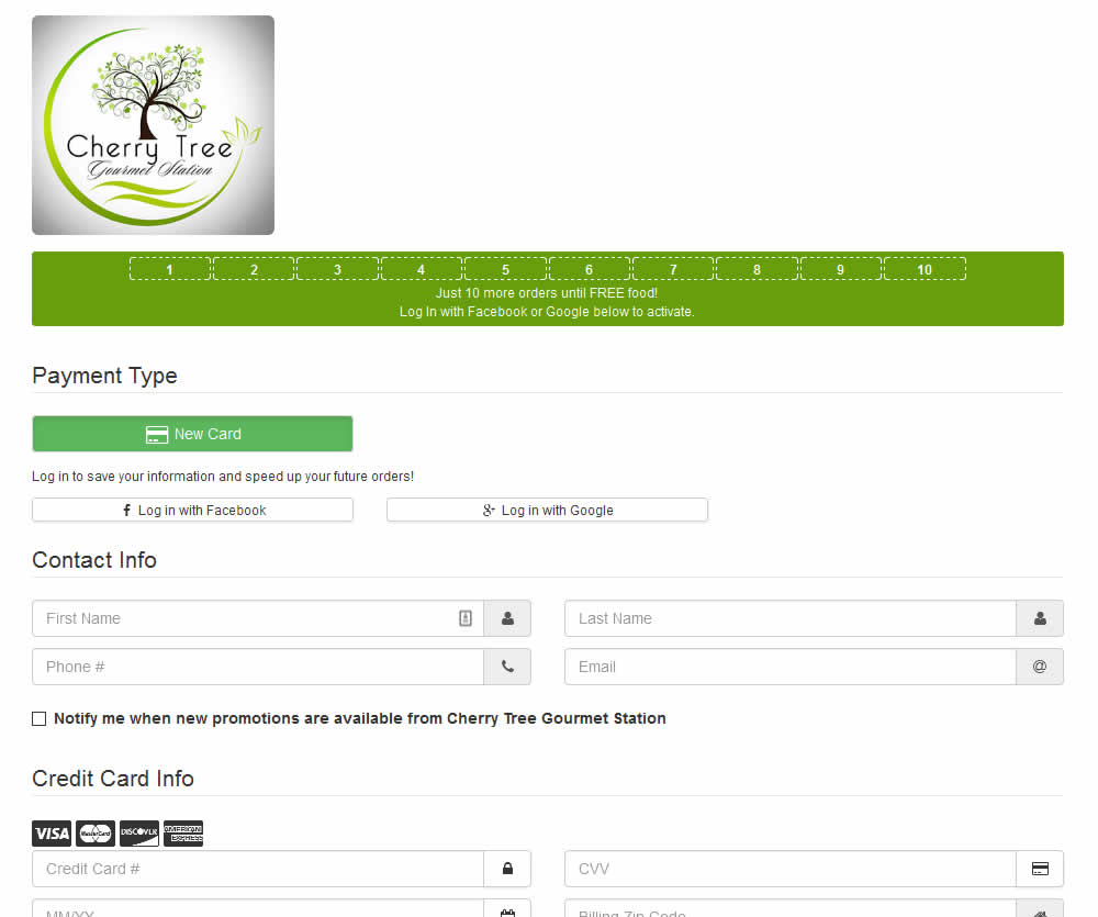
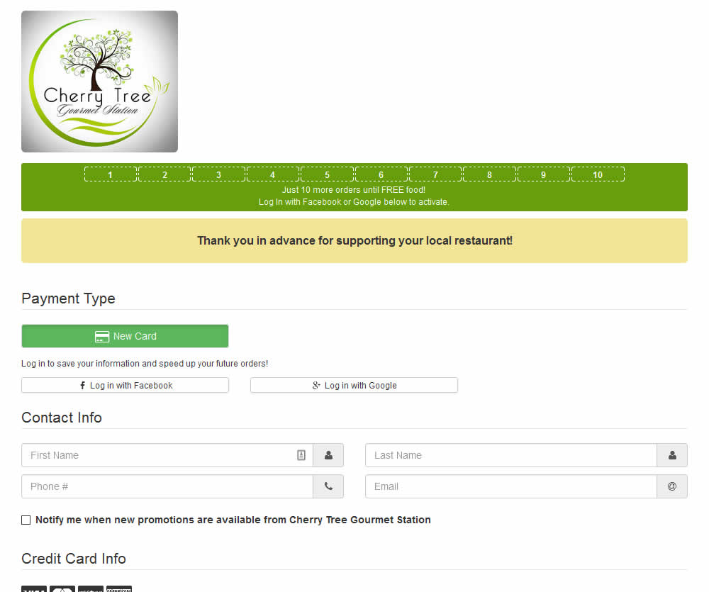
In this experiment, a thanking confirmation message was appended at the top of the checkout screen of a local food delivery service. Impact on completed transactions was measured.
Test #481 on
Backstage.com
by  Stanley Zuo
Jul 14, 2023
Desktop
Mobile
Checkout
X.X%
Sales
Stanley Tested Pattern #15: Bulleted Reassurances On Backstage.com
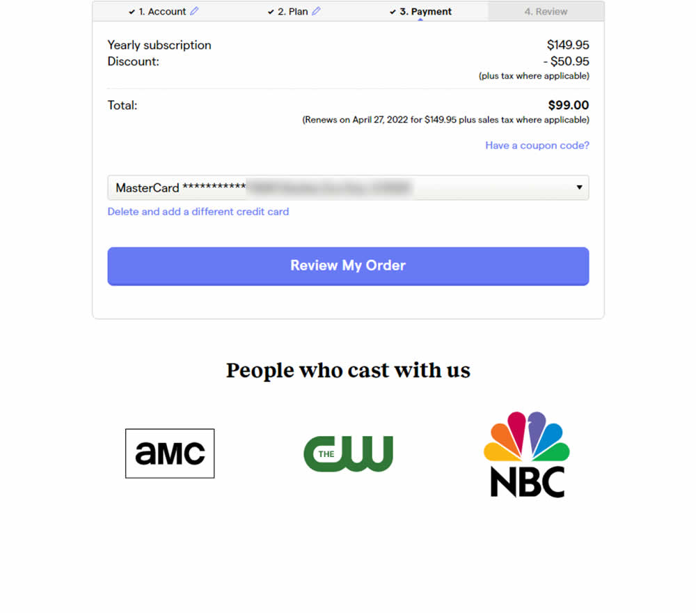
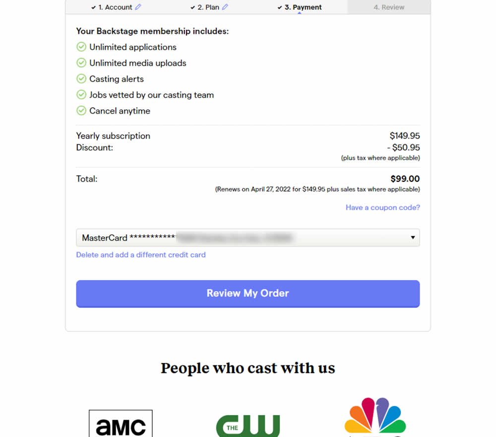
In this experiment, selling points and benefits of a subscription were placed as bullets at the top of a checkout page. The benefits highlighted things such as: unlimited applications, access to vetted jobs and the ability to cancel anytime. Impact on sales was measured.
Test #479 on
Aboalarm.de
by  Daria Kurchinskaia
Jun 15, 2023
Desktop
Mobile
Checkout
X.X%
Sales
Daria Tested Pattern #15: Bulleted Reassurances On Aboalarm.de
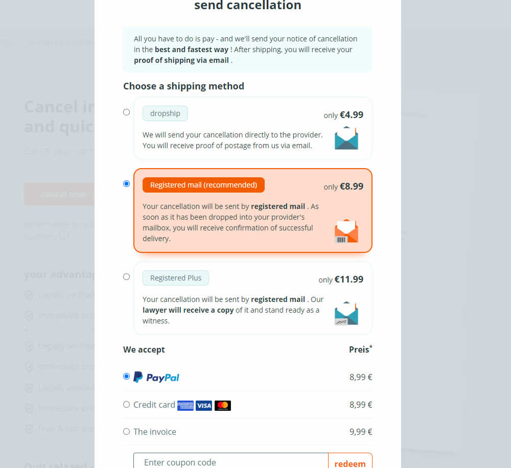
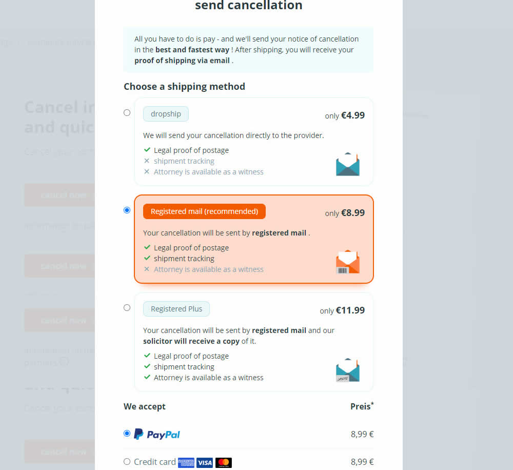
In this experiment, a list of benefits were shown for each of the 3 plans on the last step of a contract cancelation service. Benefit items not included in the lower plans were also shown with grayed out styles (and an "x"). Clearly the higher paid plan had all the benefits listed. Impact on transactions was measured.
Test #480 on
Aboalarm.de
by  Daria Kurchinskaia
Jun 15, 2023
Desktop
Mobile
Checkout
X.X%
Sales
Daria Tested Pattern #15: Bulleted Reassurances On Aboalarm.de

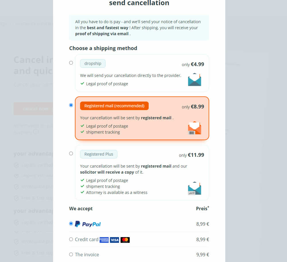
In this experiment, a list of benefits were shown for each of the 3 plans on the last step of a contract cancelation service. The lowest plan only had one benefit, whereas the highest plan had 3. Impact on transactions was measured.
Test #475 on
Online.metro-cc.ru
by  Andrey Andreev
Jun 07, 2023
Desktop
Mobile
Listing
X.X%
Sales
Andrey Tested Pattern #36: Fewer Or More Results On Online.metro-cc.ru
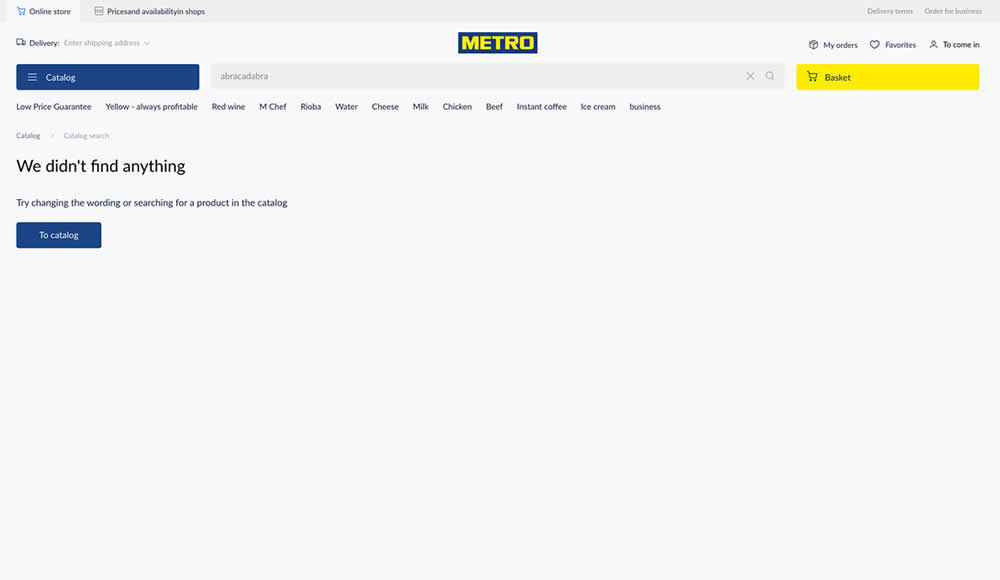
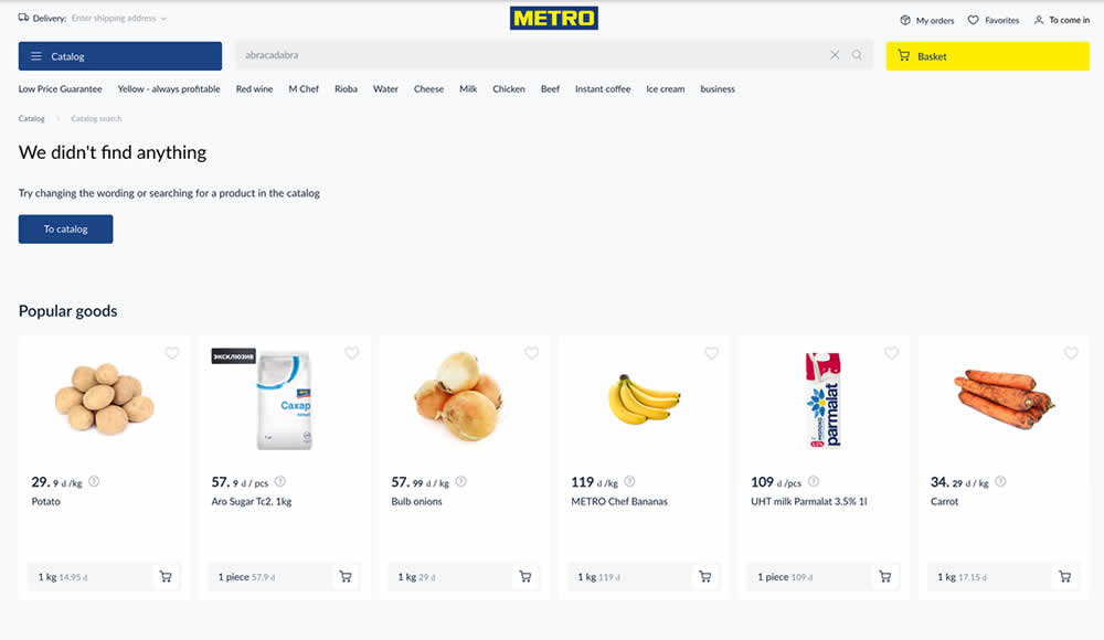
Are more (popular) product results better than none at all? In this experiment, popular products were shown during an empty search result. Impact on sales was measured.
Test #474 on
Rollbar.com
by  Mike Smith
May 27, 2023
Desktop
Mobile
Home & Landing
X.X%
Signups
Mike Tested Pattern #4: Testimonials On Rollbar.com
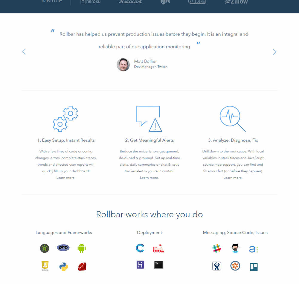
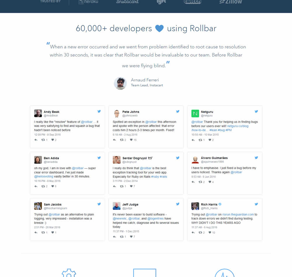
In this experiment, 9 Twitter card style testimonials were appended onto the homepage of Rollbar. These were image / screenshots recreations without links to the actual tweets.
Test #471 on
Expertinstitute.com
by  Ardit Veliu
May 25, 2023
Desktop
Mobile
Home & Landing
X.X%
Leads
Ardit Tested Pattern #48: Video Testimonials On Expertinstitute.com

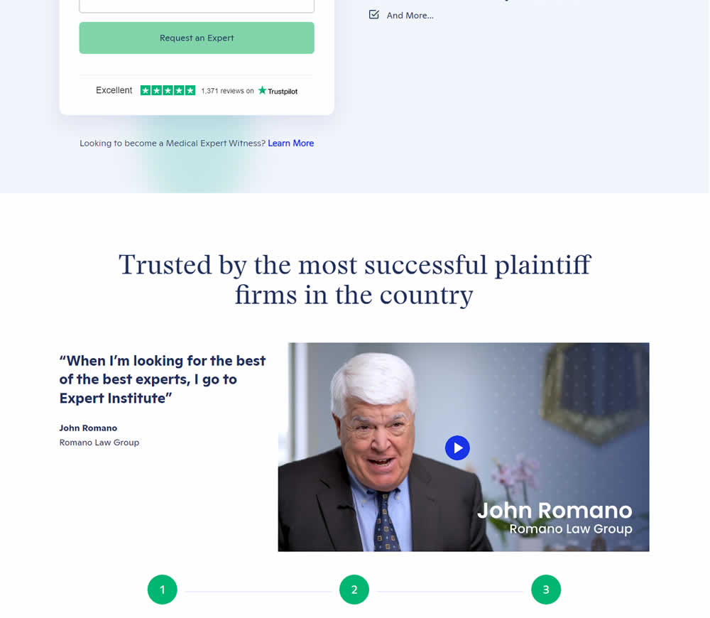
In this experiment, a video testimonial was added mid page onto a signup / lead form page.
Test #472 on
Expertinstitute.com
by  Ardit Veliu
May 25, 2023
Desktop
Mobile
Home & Landing
X.X%
Leads
Ardit Tested Pattern #48: Video Testimonials On Expertinstitute.com
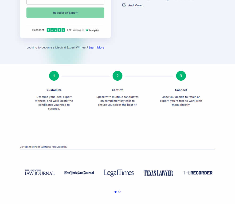
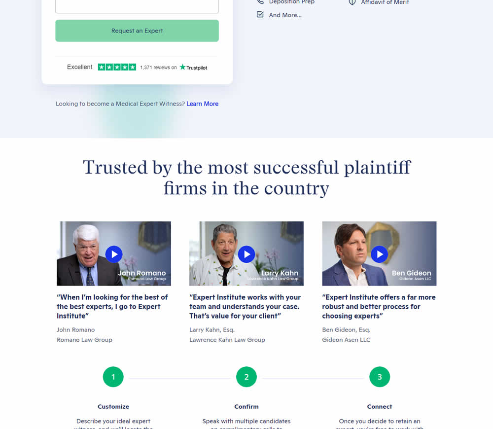
In this experiment, three video testimonials were added mid page onto a signup / lead form page.
Test #467 on
by  Jakub Linowski
Apr 27, 2023
Desktop
Mobile
Product
X.X%
Sales
Jakub Tested Pattern #108: Frequently Asked Questions

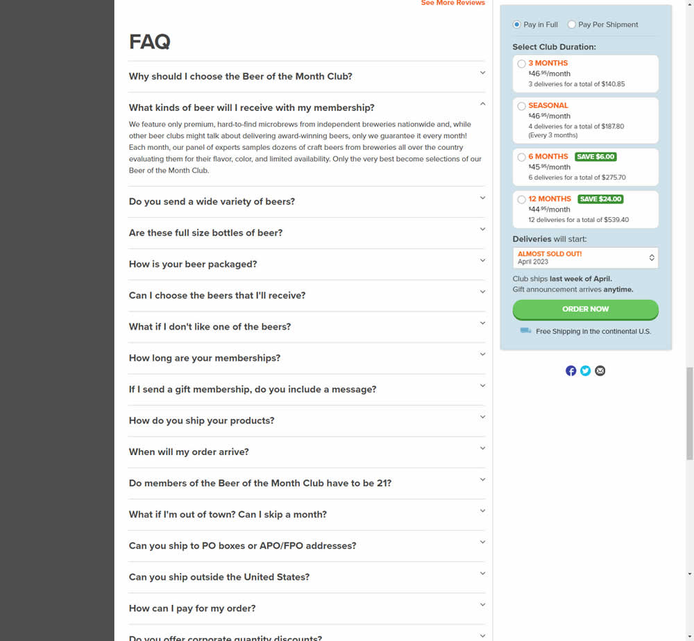
In this experiment, an FAQ section was added near the bottom of a long product page. The reviews were collapsed by default, but expandable upon clicking. Impact on adds-to-cart and sales was measured.