All Latest 617 A/B Tests
Test #433 on
Expertinstitute.com
by  Ardit Veliu
Sep 30, 2022
Desktop
Mobile
Signup
X.X%
Leads
Ardit Tested Pattern #20: Canned Response On Expertinstitute.com
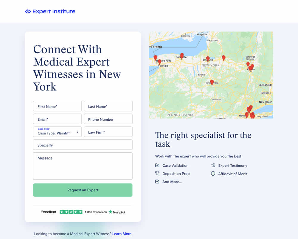
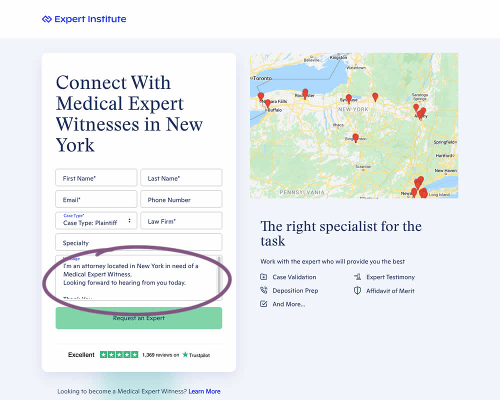
In this experiment a dynamic canned response was added to a lead form. The contents of the copy reflected a handful of user choices from other form field selections. Impact on leads / form submissions was measured.
Which A Or B Actually Wins? Find Out Before You Test.
Members see every test result — the winners, the flat ones, and the losers — along with exact effects and sample sizes. Use it to estimate your tests and prioritize by probability, not gut feel. Start every experiment with the odds on your side.
Test #432 on
Snocks.com
by  Melina Hess
Sep 29, 2022
Mobile
Global
X.X%
Sales
Melina Tested Pattern #94: Visible Search On Snocks.com
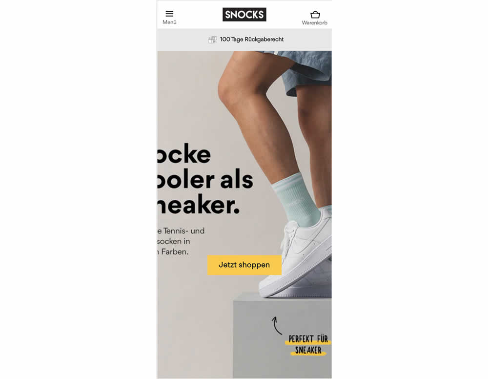
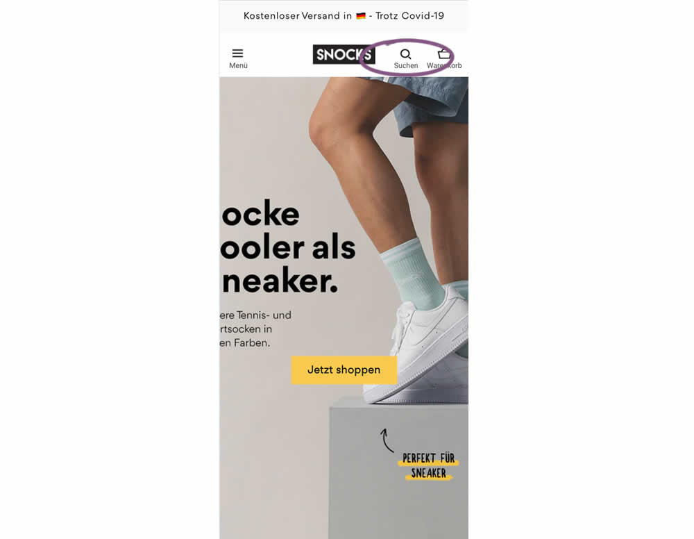
In this experiment, search functionality was added in the variation, globally on mobile. Impact on sales was measured
Test #431 on
Volders.de
by  Daria Kurchinskaia
Sep 23, 2022
Desktop
Mobile
Pricing
X.X%
Sales
Daria Tested Pattern #21: What It's Worth On Volders.de
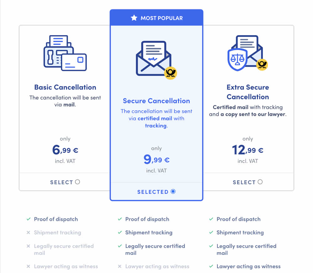
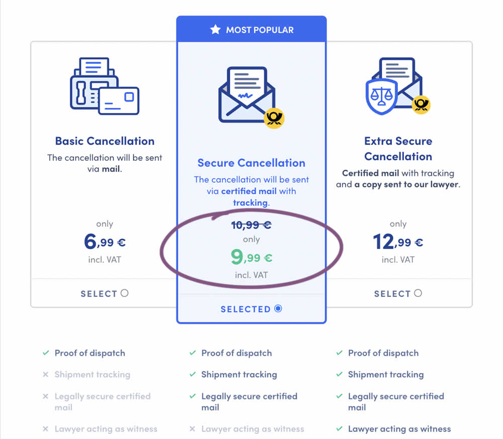
In this experiment, a historically higher price point was added as a crossed out anchor. The control only showed the current price. The variation showed the current price with the higher price crossed out. Impact on sales was measured.
Test #430 on
by  Jakub Linowski
Sep 20, 2022
Desktop
Product
X.X%
Sales
Jakub Tested Pattern #26: Cart Reminder And Recently Viewed
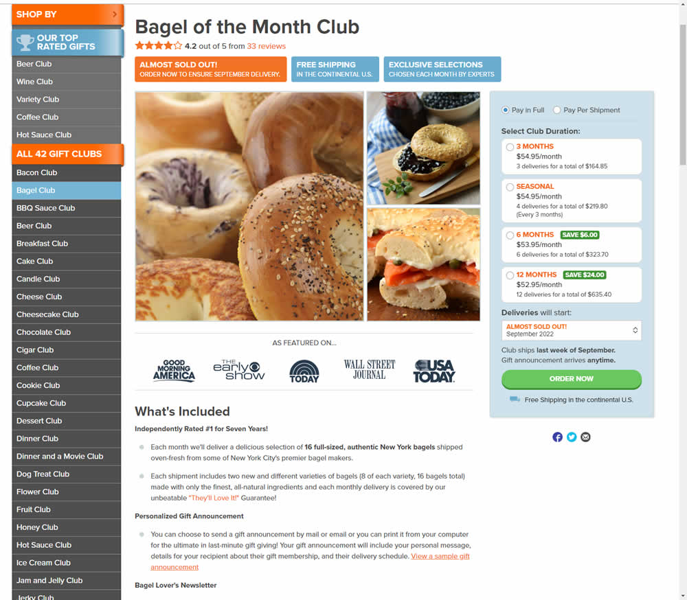
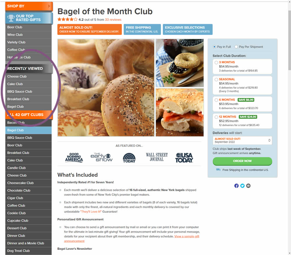
In this experiment, up to 5 recently viewed product pages would appear on the left hand navigation. The idea was to make it easier for users get back to what they were looking at in case they were browsing. These recently viewed products were not visibile in the control. Impact on adds-to-cart and completed transactions was measured.
Test #428 on
Volders.de
by  Daria Kurchinskaia
Aug 16, 2022
Desktop
Mobile
Signup
X.X%
Sales
Daria Tested Pattern #26: Cart Reminder And Recently Viewed On Volders.de
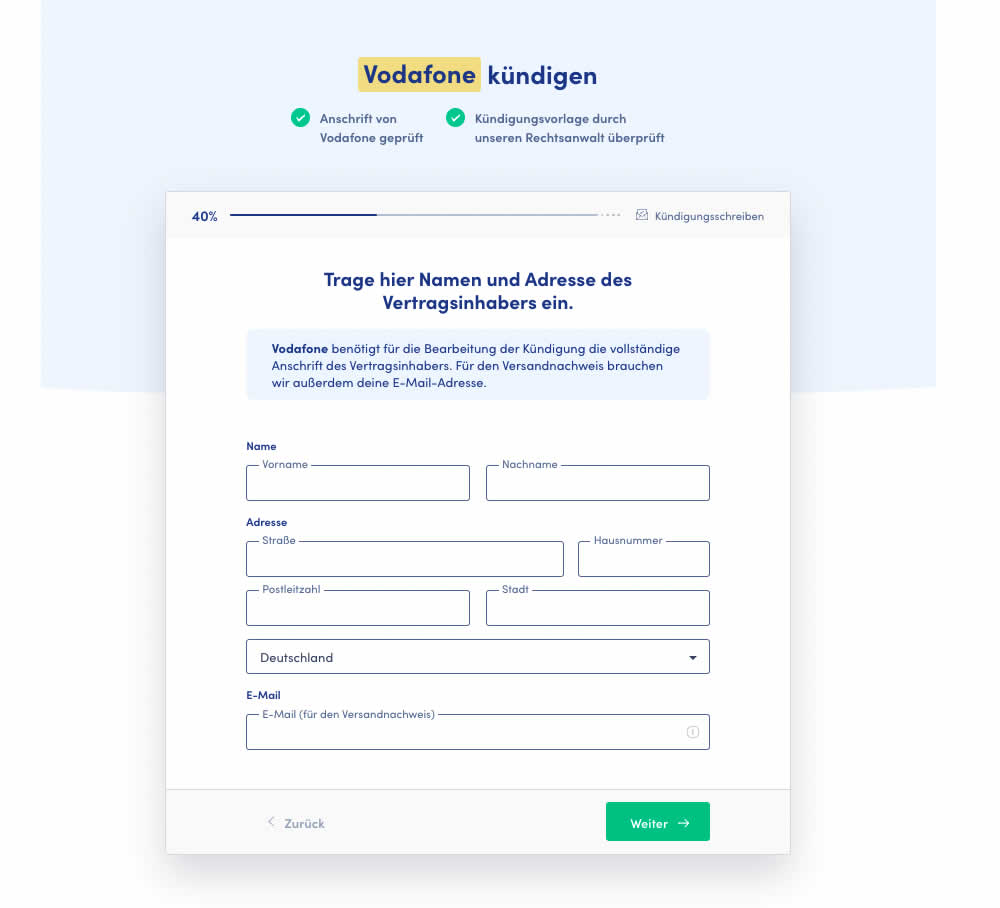
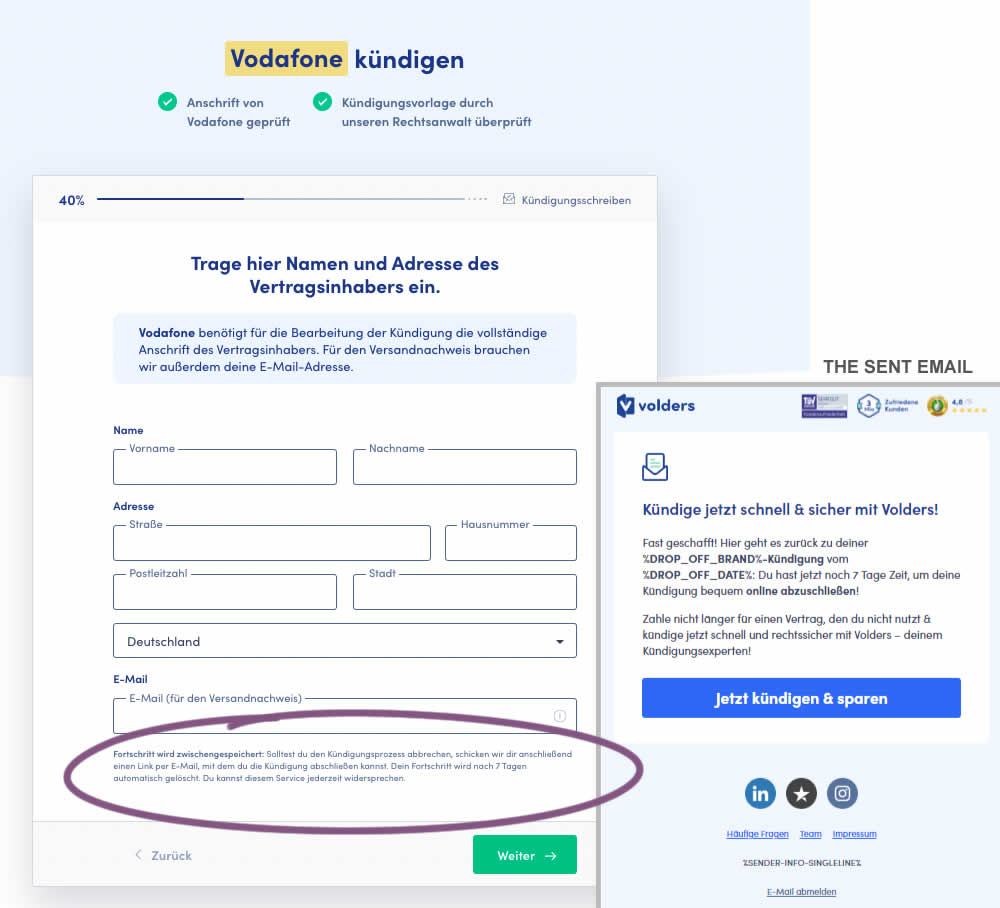
In this test 1) a passive hint communicated to users that their data will be saved for 7 days for them to be able to continue their cancellation later and 2) dropped off users were targeted with an email campaign within the first 4 hours after drop off. The reminder email linked users to a shipping page (checkout page) without them requiring to fill out their personal, contract information one more time.
Test #424 on
by  Sandis Viksna
Jul 28, 2022
Desktop
Shopping Cart
X.X%
Sales
Sandis Tested Pattern #45: Benefit Bar
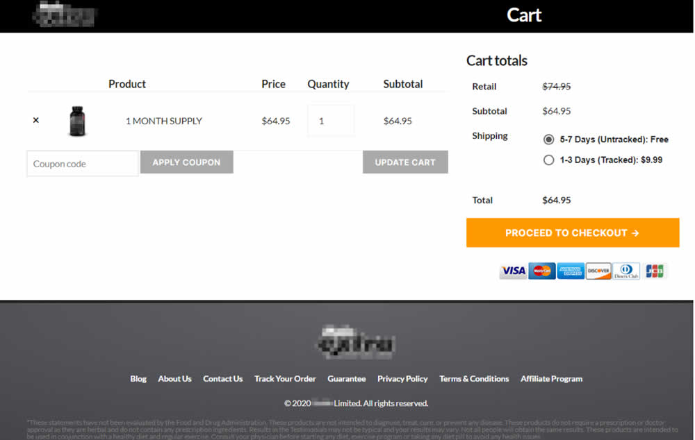
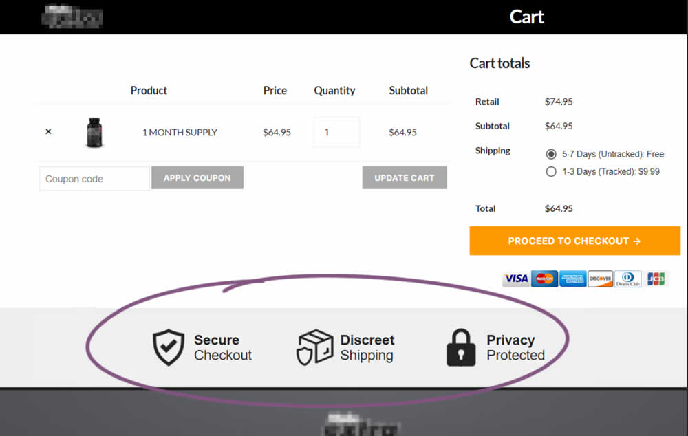
In this experiment, 3 reassurances were shown at the bottom of cart and checkout pages. The web site was selling health and nutrition products for males and one of the reassurances included "discreet shipping". Impact on sales was measured.
Test #423 on
Expertinstitute.com
by  Ardit Veliu
Jul 26, 2022
Desktop
Mobile
Home & Landing
X.X%
Leads
Ardit Tested Pattern #110: Optional Field Labels On Expertinstitute.com
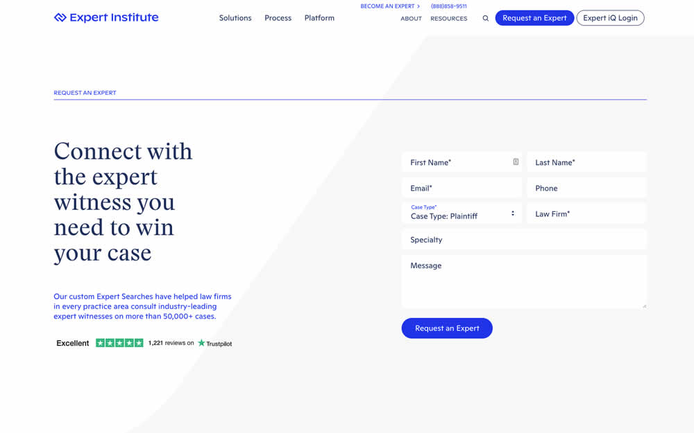
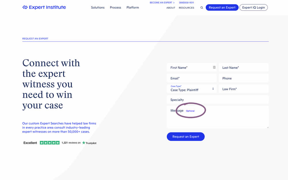
In this experiment, an "optional" label was shown near a message form field. Impact on overall leads was measured (requesting experts).
Test #419 on
by  Jakub Linowski
Jun 29, 2022
Desktop
Home & Landing
X.X%
Sales
Jakub Tested Pattern #68: Welcome Discount
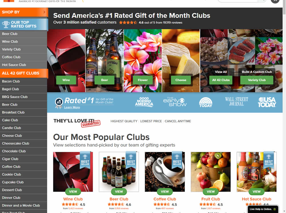
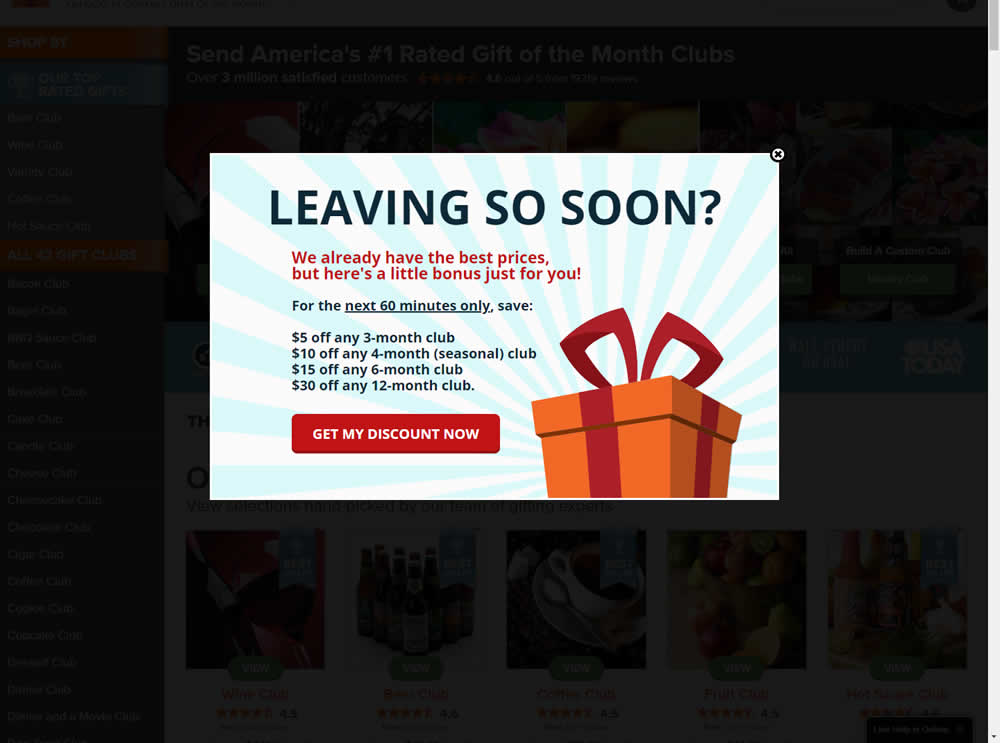
In this experiment, the presence of a discount modal (bigger discount for larger purchases) was tested on home and product pages. The trigger happend after a scroll down, a few second pause, and a mouse scroll up interaction. Impact on sales was measured.
Test #418 on
Online.metro-cc.ru
by  Andrey Andreev
Jun 28, 2022
Desktop
Mobile
Home & Landing
X.X%
Sales
Andrey Tested Pattern #135: Product Categories On Online.metro-cc.ru
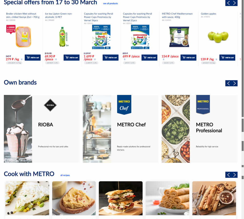
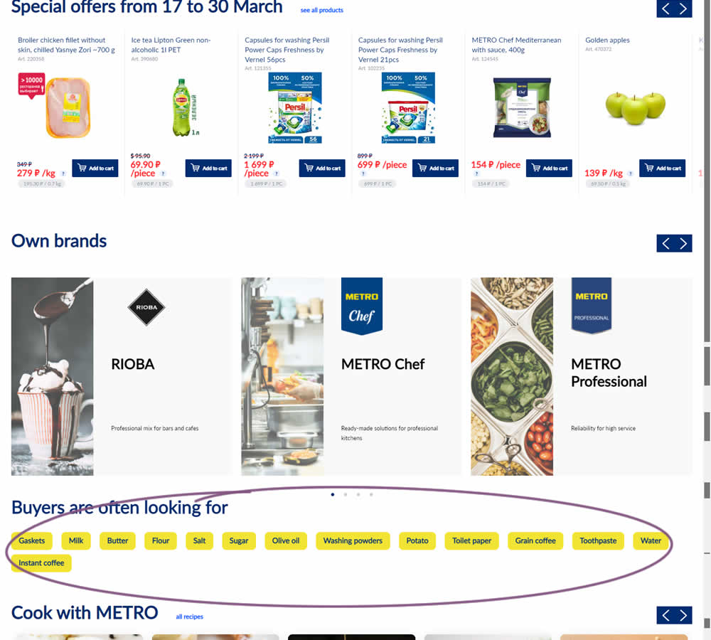
In this experiment, popular product category links were added near the bottom of the homepage of an online grocery store - Metro. Impact on completed sales was measured.
Test #416 on
Designlab.com
by  Daniel Shapiro
Jun 20, 2022
Desktop
Mobile
Product
X.X%
Sales
Daniel Tested Pattern #105: Lead Magnets On Designlab.com

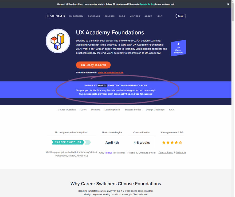
In this experiment, copy was added which communicated that students signing up for a course would receive extra design resources (the lead magnet). This was added in multiple states of the course page. Impact on lead generation and enrollment was measured.
Test #413 on
by  Jakub Linowski
May 26, 2022
Desktop
Mobile
Shopping Cart
X.X%
Sales
Jakub Tested Pattern #114: Less Or More Visible Prices
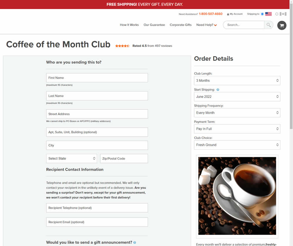
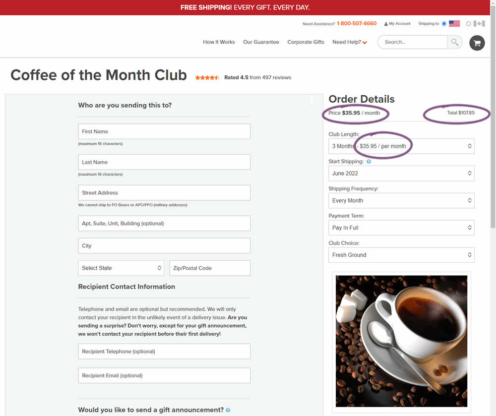
Should prices be displayed during an editing state on an add-to-cart screen (after adding-to-cart from a product detail page)? In this experiment, club pricing was added and shown in three areas after customers clicked on a small "edit details" links. The control did not have this pricing information (which was only shown on a product detail screen before).
Test #412 on
Volders.de
by  Frederik Fröhle
May 16, 2022
Desktop
Mobile
Checkout
X.X%
Sales
Frederik Tested Pattern #15: Bulleted Reassurances On Volders.de
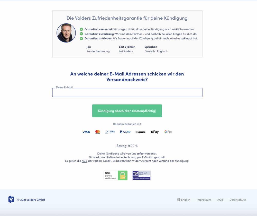
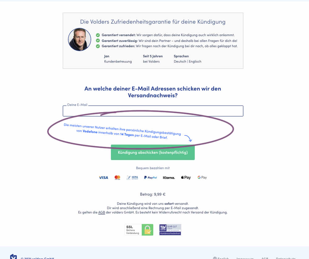
The Volders experimentation team assumed that adding information about how long it might take to get a cancellation confirmation near a CTA Button would result in higher cancellation requests (the paid service being offered).
The variation contained additional copy translated from German to: "Most of our users receive their cancellation confirmation from <vendor> within 14 days by email or letter."
Test #410 on
Designlab.com
by  Daniel Shapiro
May 05, 2022
Desktop
Mobile
Home & Landing
X.X%
Sales
Daniel Tested Pattern #29: Surfaced Content On Designlab.com
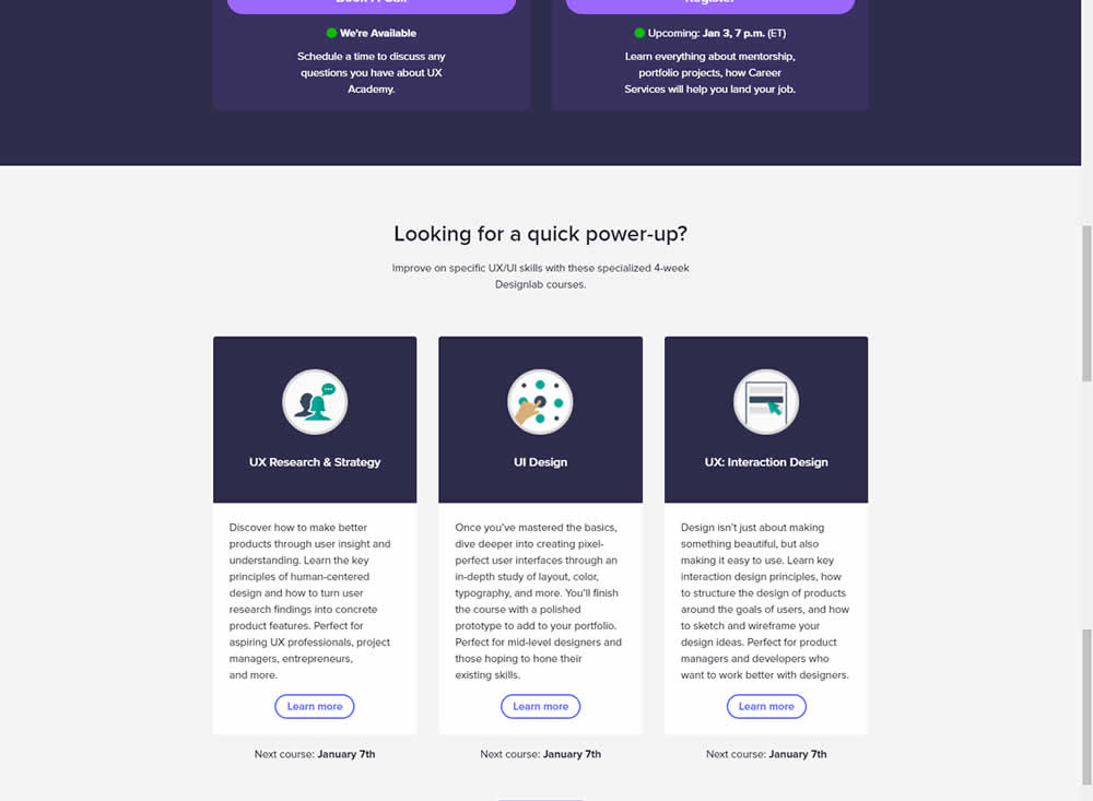
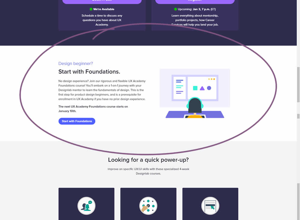
Does linking to a product detail page help? Or should a homepage simply focus on generic lead generation? In this homepage experiment, the presence of a component with a link to a detailed course landing page was tested. Impact on course enrollments was measured.
Test #408 on
by  Jakub Linowski
Apr 29, 2022
Desktop
Mobile
Product
X.X%
Sales
Jakub Tested Pattern #67: Currency & Taxes
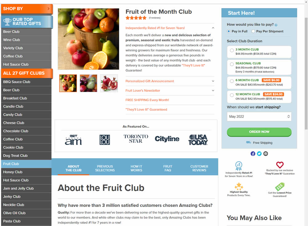
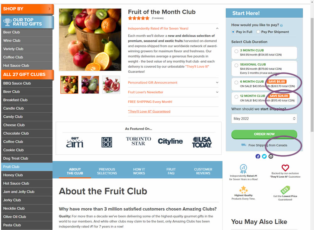
Here is a very simple experiment where CDN currency copy was appended to prices being shown on a Canadian ecommerce site. Additional copy ("from Canada") was appended to an existing shipping message.
Test #407 on
Snocks.com
by  Melina Hess
Apr 22, 2022
Desktop
Mobile
Product
X.X%
Sales
Melina Tested Pattern #125: Unit Prices On Snocks.com
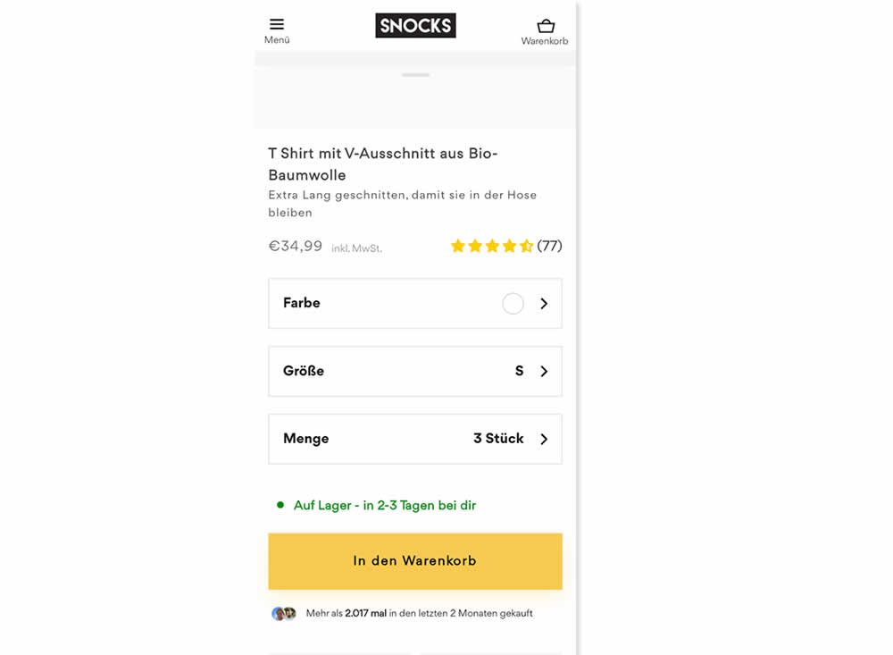
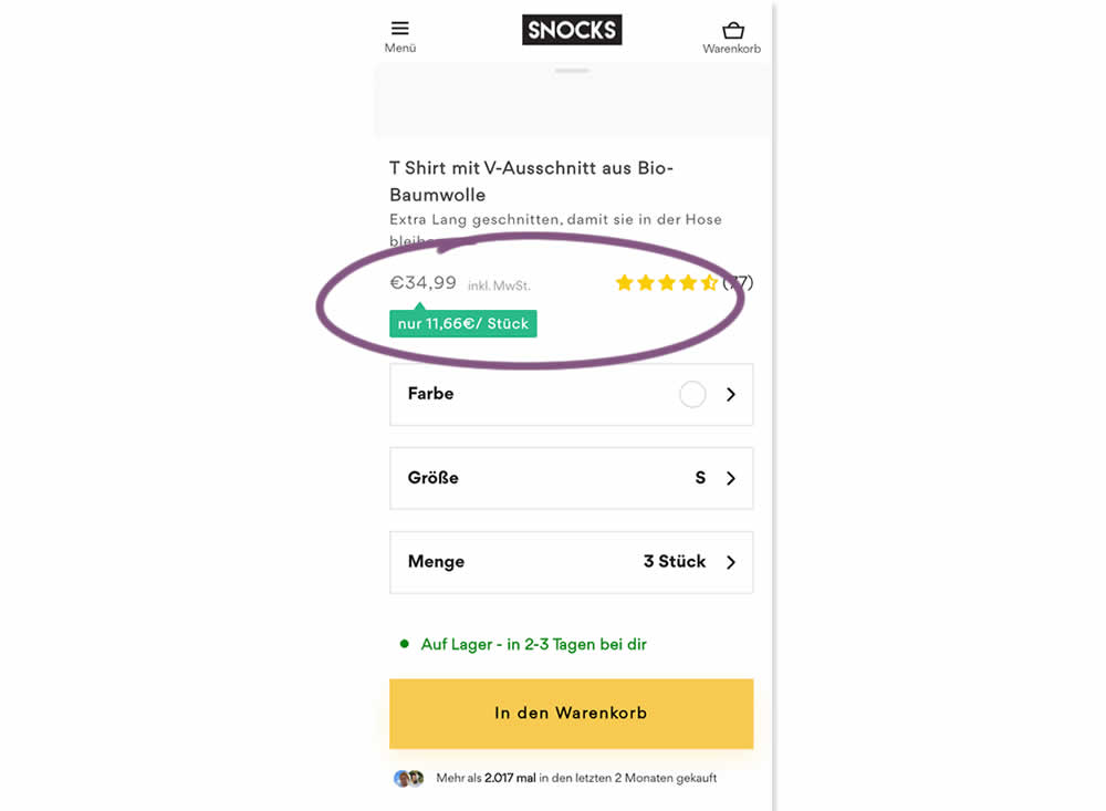
Here is an experiment with an added "price per pair" in the context of products with multiple items (packs).A high contrast badge-like copy was appended underneath the price which translates to "only $X per item". Impact on sales was measured.
Test #403 on
by  Jakub Linowski
Mar 29, 2022
Desktop
Mobile
Checkout
X.X%
Sales
Jakub Tested Pattern #42: Countdown Timer
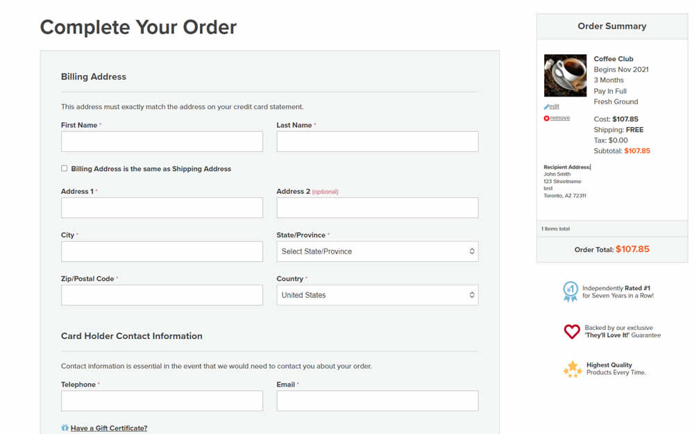
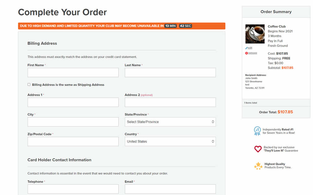
In this experiment, an urgency related message with a dynamic countdown timer was added on the final checkout screen. Impact on sales was measured.
Test #400 on
by  Herman Klein
Mar 06, 2022
Desktop
Shopping Cart
X.X%
Sales
Herman Tested Pattern #65: Add More For Extra Incentive

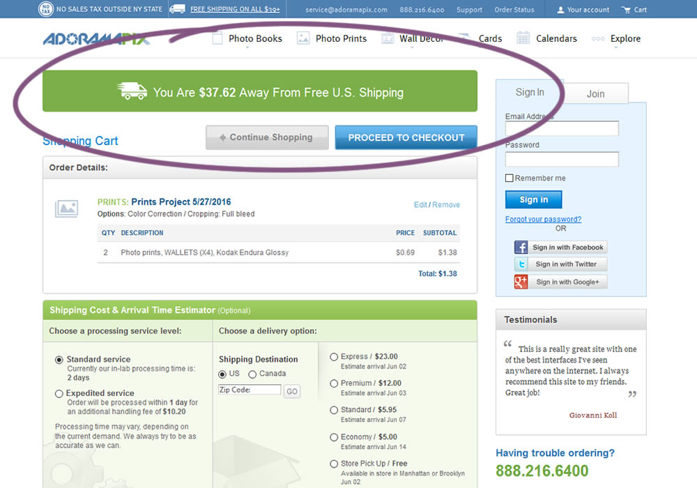
In this experiment, customers who were not yet eligible for free shipping (with cart amounts under $39) were presented with an encouraging message to add more and earn free shipping. Impact on progression to checkout and sales was measured.
Test #398 on
Adoramapix.com
by  Herman Klein
Feb 25, 2022
Desktop
Shopping Cart
X.X%
Sales
Herman Tested Pattern #121: Free Shipping On Adoramapix.com
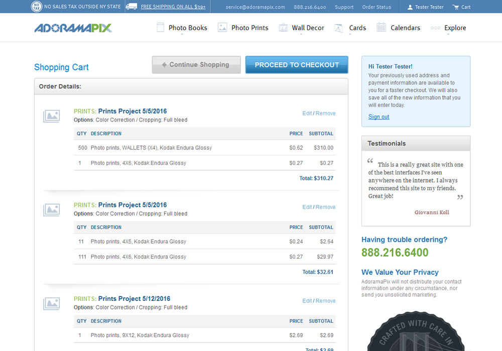
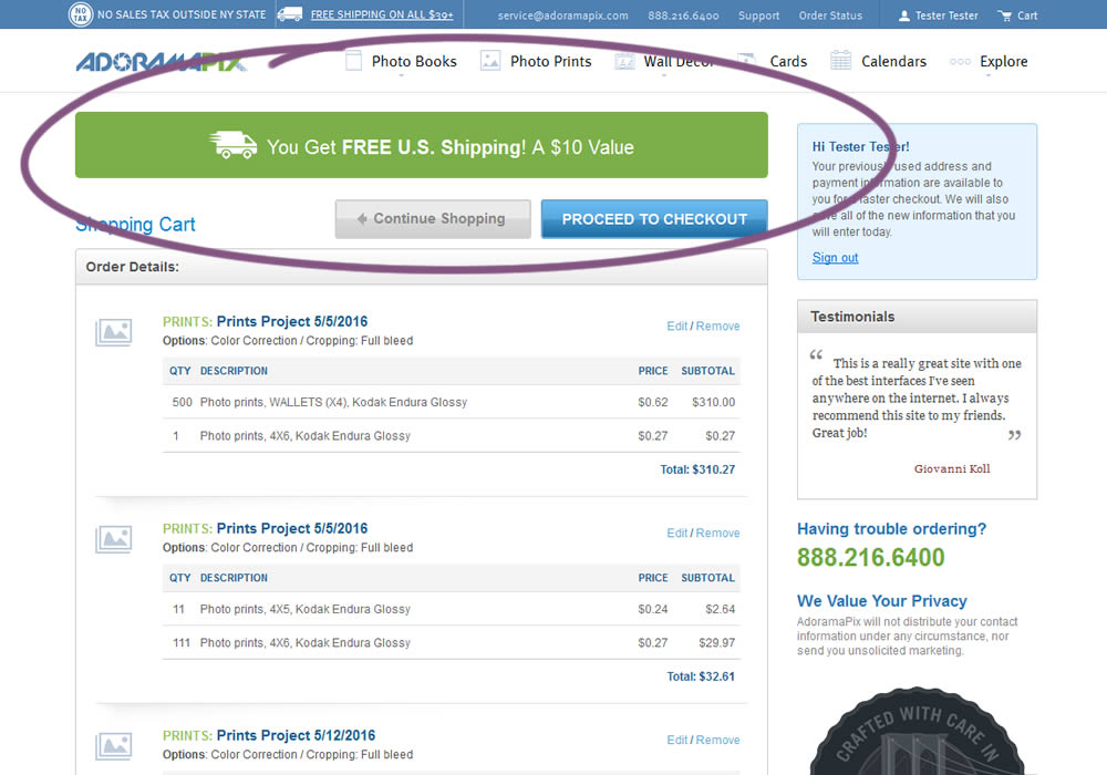
In this experiment, customers were eligible for free shipping (with cart amounts of $39 or more) were presented with an earned free shipping message. The variation also showed the value of the earned free shipping - (for example $10). Impact on progression to checkout and sales was measured.
Test #397 on
Snocks.com
by  Melina Hess
Feb 24, 2022
Mobile
Product
X.X%
Revenue
Melina Tested Pattern #121: Free Shipping On Snocks.com
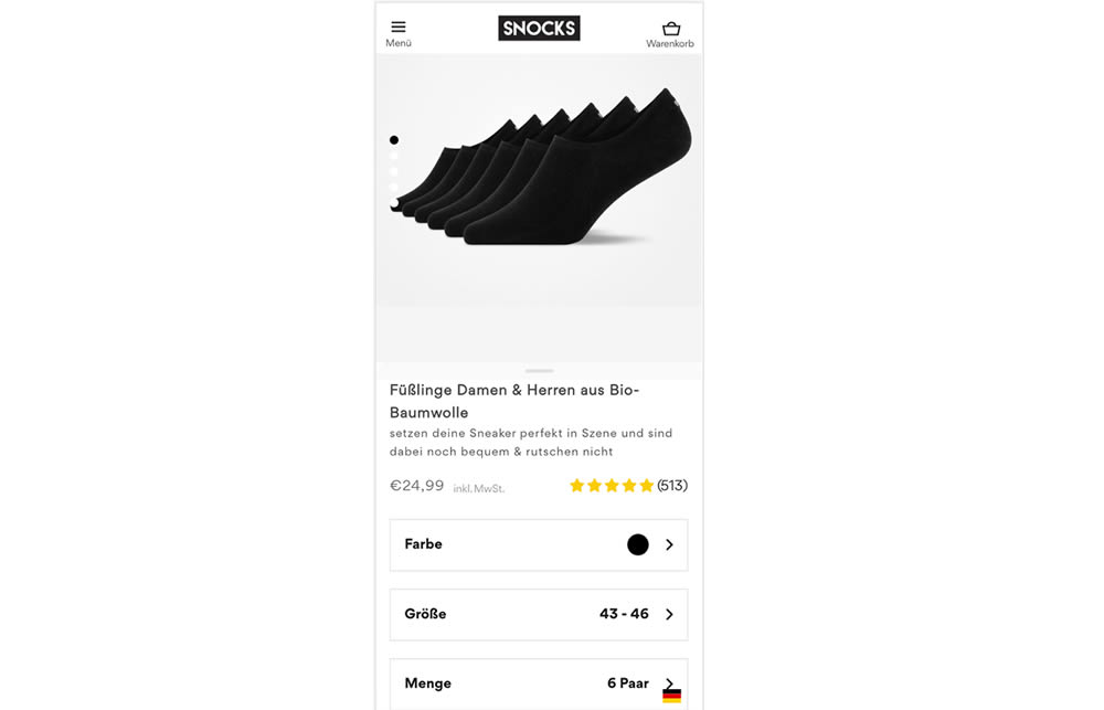
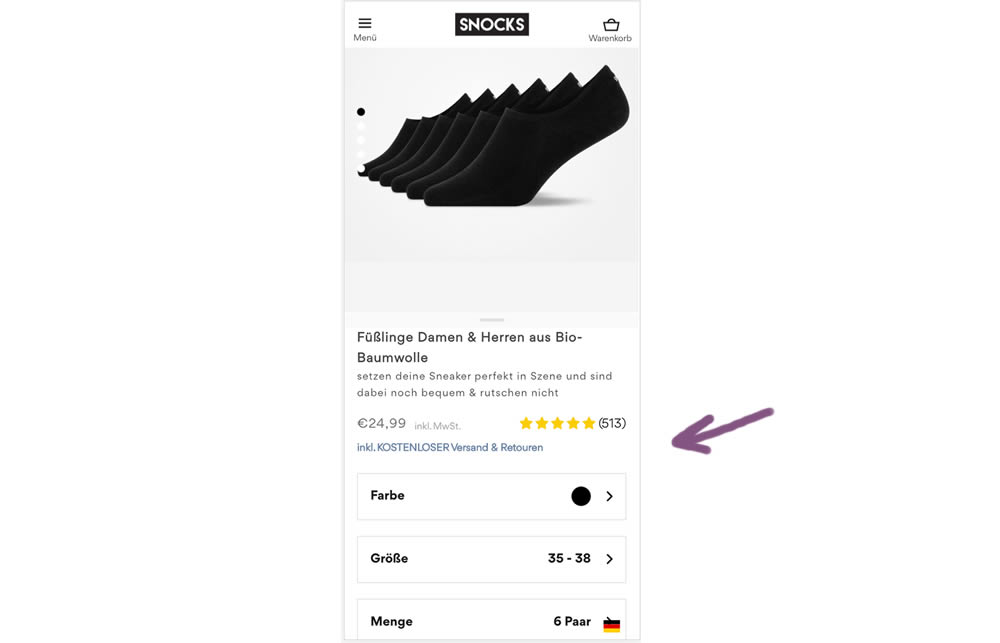
In this experiment a "Free Shipping & Returns" message was added just below the price information.
Test #395 on
by  Jakub Linowski
Jan 31, 2022
Desktop
Mobile
Product
X.X%
Sales
Jakub Tested Pattern #52: How It Works
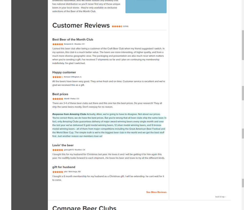
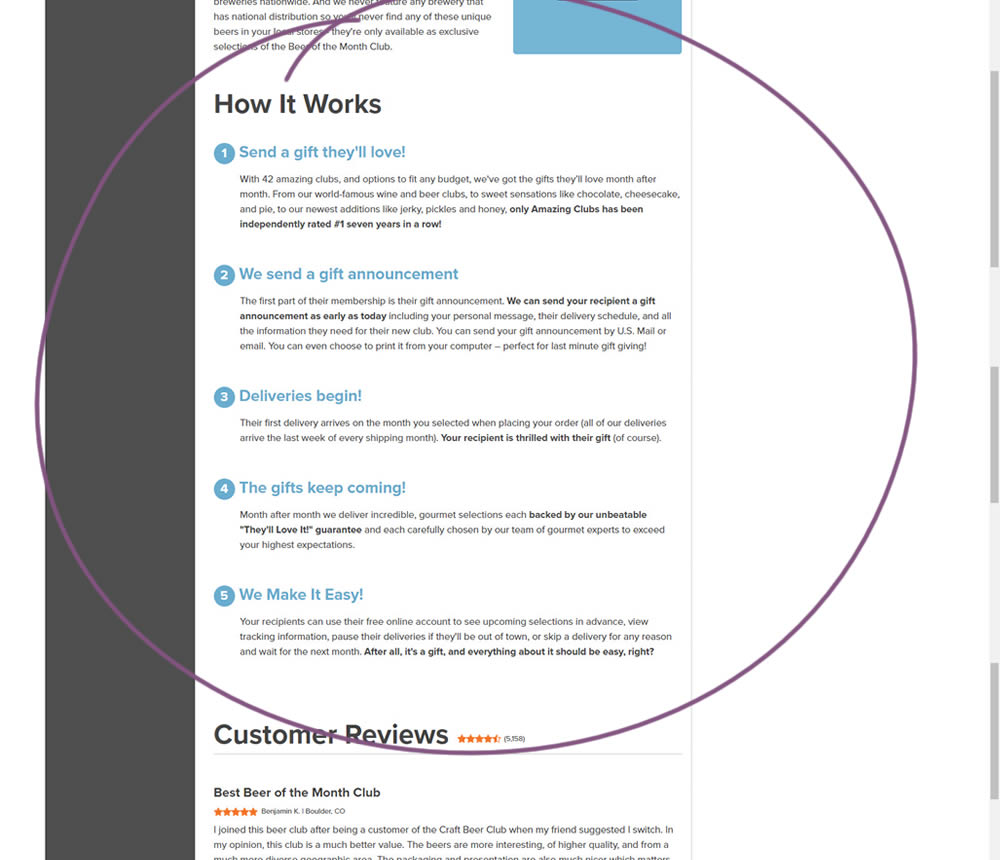
In this experiment, a How It Works section was appended on a product detail page just above product reviews.