All Latest 620 A/B Tests
Test #466 on
Volders.de
by  Daria Kurchinskaia
Apr 26, 2023
Desktop
Signup
X.X%
Sales
Daria Tested Pattern #4: Testimonials On Volders.de

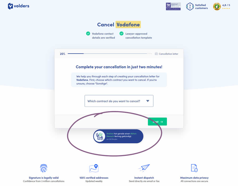
In this experiment, a social proof popups were added to the signup / funnel pages for a contract cancellation service. The added social testimonials appeared as other customers used the service, anywhere except on the final checkout page. Additionaly, the interval at which these messaged appeared was 60 seconds, and they were shown for 10s. The messages translated to "[Name] had recently canncelled a contract with [Company], in the last 38 minutes". Impact on sales was measured.
Which A Or B Actually Wins? Find Out Before You Test.
Members see every test result — the winners, the flat ones, and the losers — along with exact effects and sample sizes. Use it to estimate your tests and prioritize by probability, not gut feel. Start every experiment with the odds on your side.
Test #464 on
Expertinstitute.com
by  Ardit Veliu
Mar 31, 2023
Desktop
Mobile
Home & Landing
X.X%
Leads
Ardit Tested Pattern #7: Social Counts On Expertinstitute.com
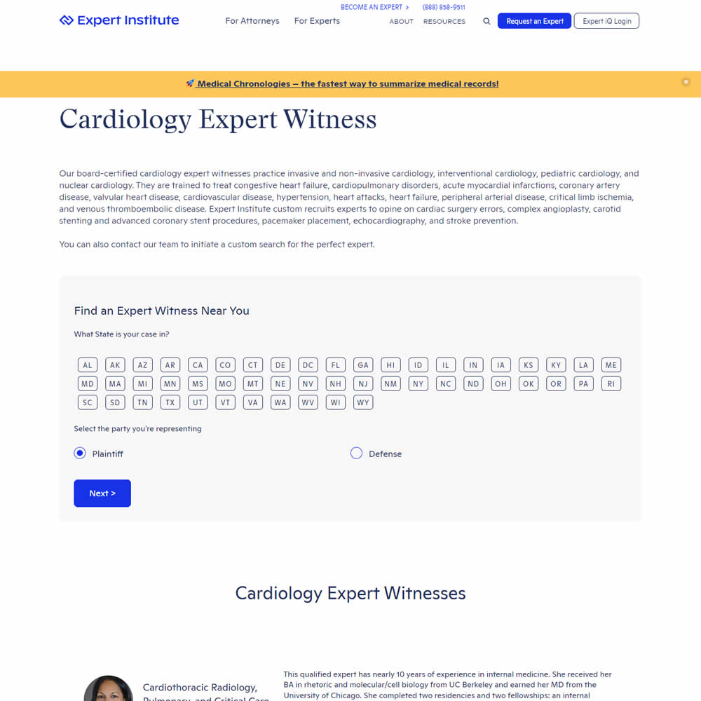
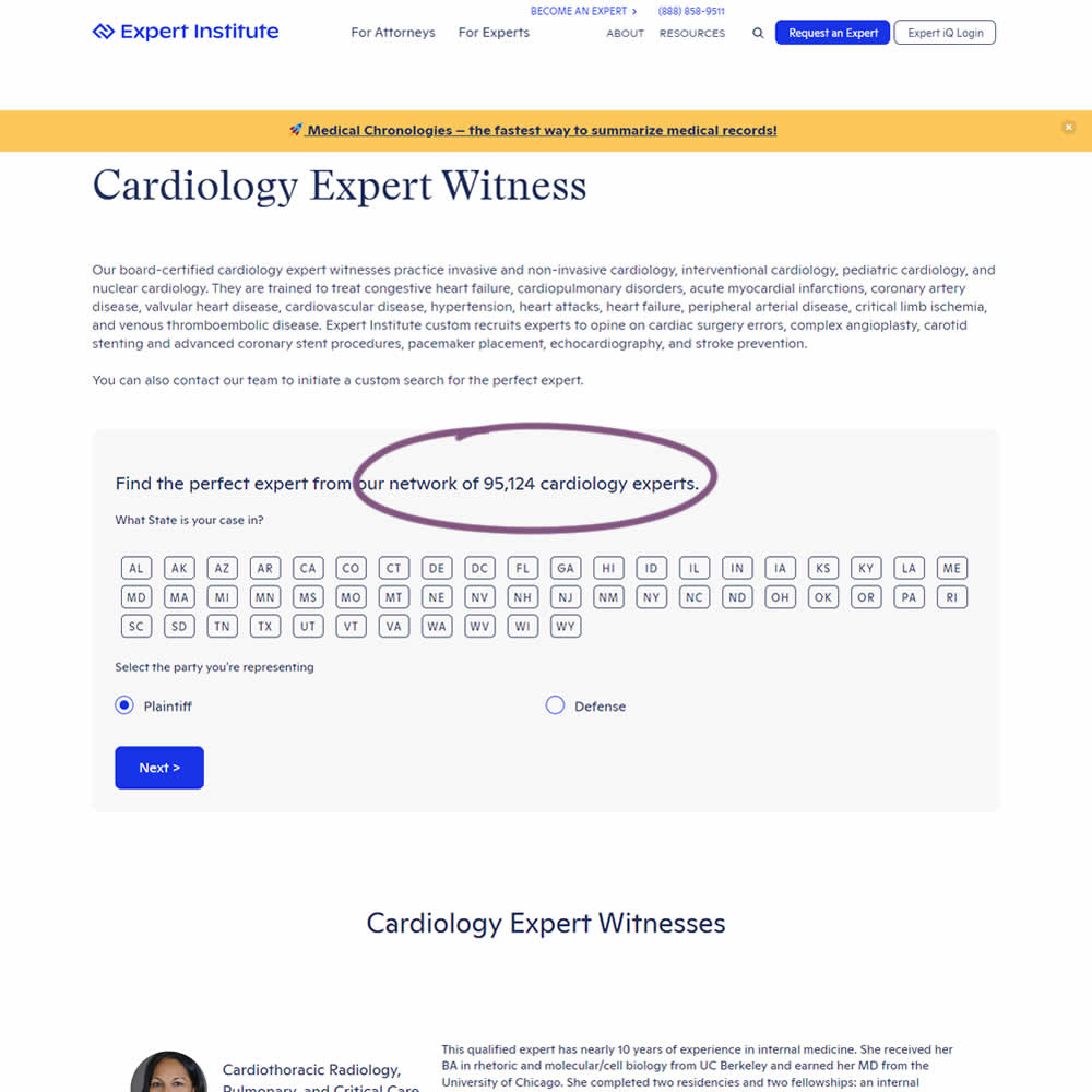
In this experiment, copy was added which showed the number of experts (in a given category) a person may gain access to after filling out a lead form. The context of this is a lead-gen landing page where people are seeking experts for legal purposes. Impact on initial progression (of a multi step form) and completed leads was measured.
Test #460 on
Backstage.com
by  Stanley Zuo
Mar 21, 2023
Mobile
Listing
X.X%
Sales
Stanley Tested Pattern #41: Sticky Call To Action On Backstage.com
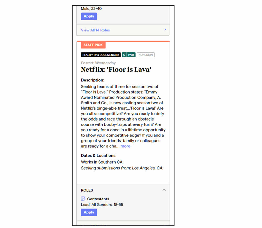
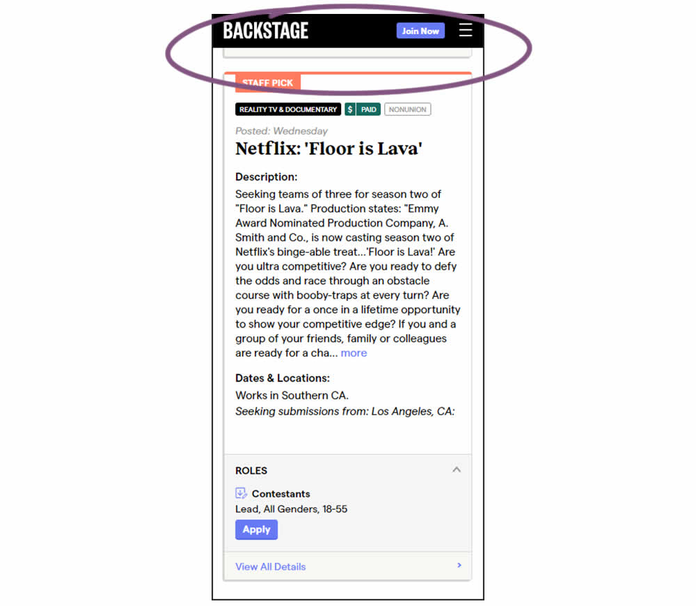
In this experiment, a floating top navigation was shown with a "Join" button. In the control, the navigation was only visible at the top of the page. Also keep in mind that signup starts were also triggered throughout multiple CTAs throughout the page and from particular job detail pages. The a/b test ran on a listing page of Backstage - a casting call job site. Impact on signups and checkouts was measured.
Test #458 on
Volders.de
by  Daria Kurchinskaia
Feb 27, 2023
Desktop
Mobile
Checkout
X.X%
Sales
Daria Tested Pattern #103: Money Back Guarantee On Volders.de
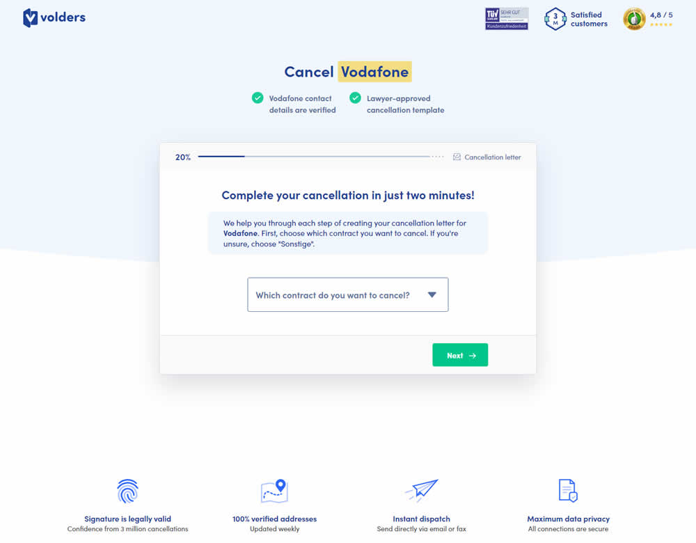
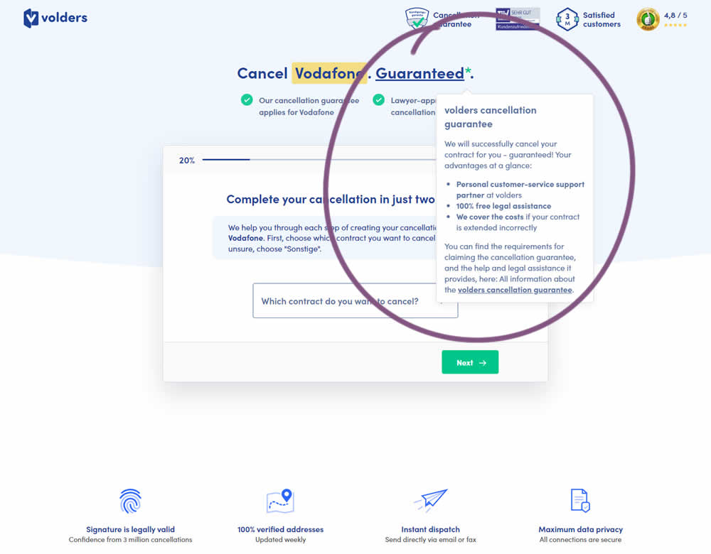
In this experiment, a cancelation guarantee was added believing it would make users feel safer while canceling their contracts with Volders (the paid service being offered). The variation appended a Guarantee in the headline as a hyperlink with an explanatory tooltip shown on hover. This variation change was added to multiple screens throughout the checkout flow (a 5 step process).
Test #455 on
Expertinstitute.com
by  Ardit Veliu
Feb 16, 2023
Desktop
Mobile
Home & Landing
X.X%
Leads
Ardit Tested Pattern #117: Company Logos On Expertinstitute.com
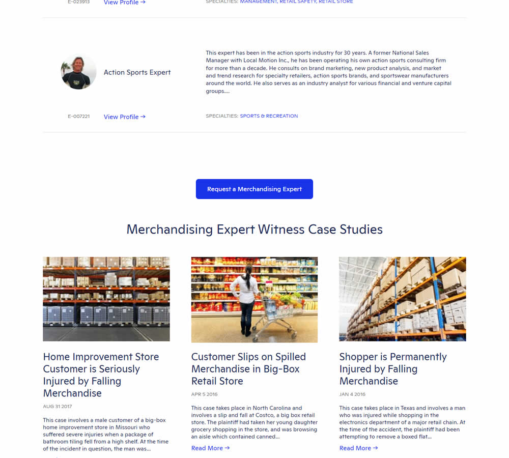
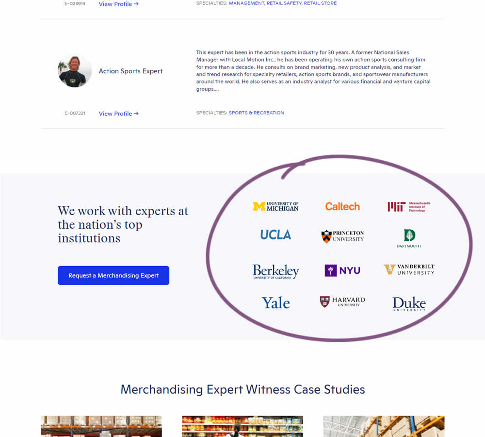
In this experiment, supporting university logos were appended near the primary call to action for additional credibility. These logos were placed around the middle of long landing pages on Expert Institute's web site (where experts for legal advice are searched). Impact on total leads was measured.
Test #452 on
Volders.de
by  Daria Kurchinskaia
Jan 30, 2023
Desktop
Mobile
Checkout
X.X%
Sales
Daria Tested Pattern #62: Urgent Next Day Delivery On Volders.de
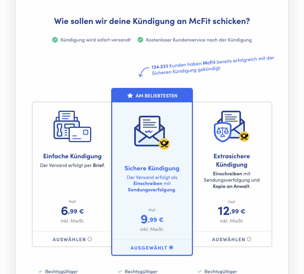
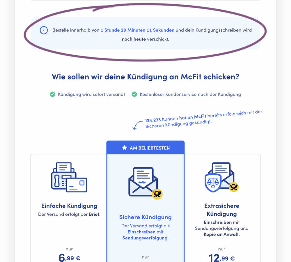
In this experiment, a count down timer was added near the top of a checkout page. The timer was only shown before 1pm and clarified that the serivce (contract cancellation) will be initiated on the same day if users act before a cut off time. Impact on completed payments was measured.
Test #451 on
Fluke.com
by  Marika Francisco
Jan 25, 2023
Desktop
Product
X.X%
Sales
Marika Tested Pattern #115: Pricing Comparison Table On Fluke.com
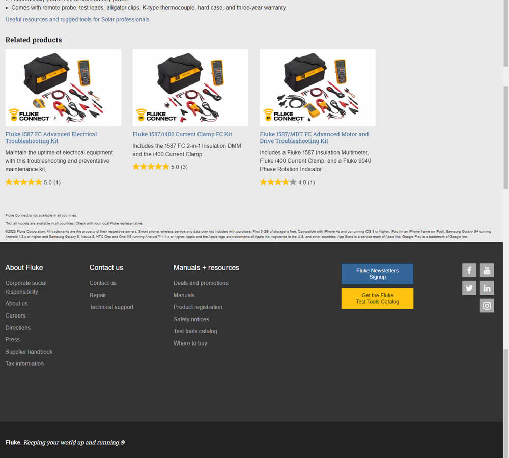
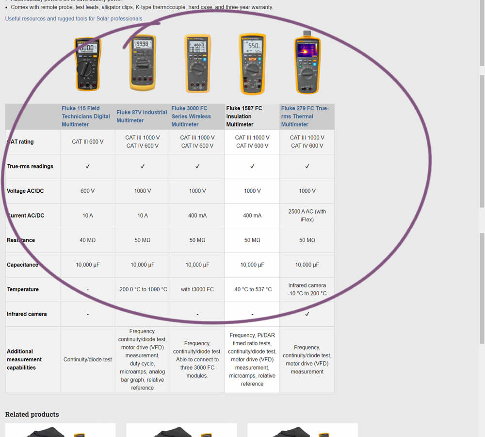
In this experiment, a product comparison table was added in the middle of a product detail page. The comparison table contained products from the same class or family of products. Clicking on the photo thumbnails also allowed customers to visit the specific detail page. Impact on adds to cart and transactions was measured.
Test #449 on
Snocks.com
by  Melina Hess
Dec 31, 2022
Desktop
Mobile
Product
X.X%
Sales
Melina Tested Pattern #78: Tags, Badges And Structured Information On Snocks.com
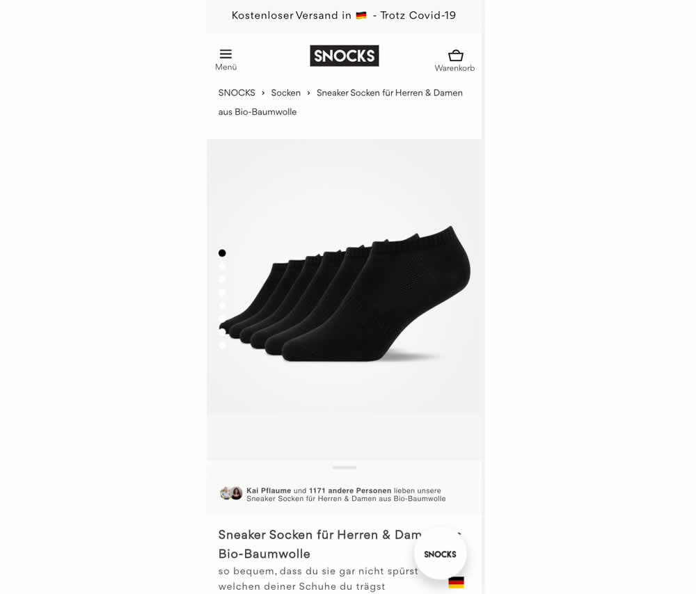
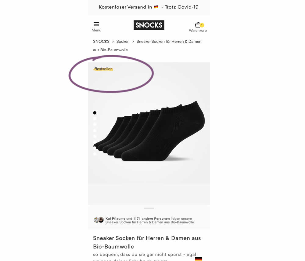
In this experiment, bestselling product colors were highlighted with a bestseller badge on product listing and product detail pages.
Test #448 on
Zapimoveis.com.br
by  Vinicius Barros Peixoto
Dec 30, 2022
Desktop
Mobile
Product
X.X%
Leads
Vinicius Tested Pattern #21: What It's Worth On Zapimoveis.com.br
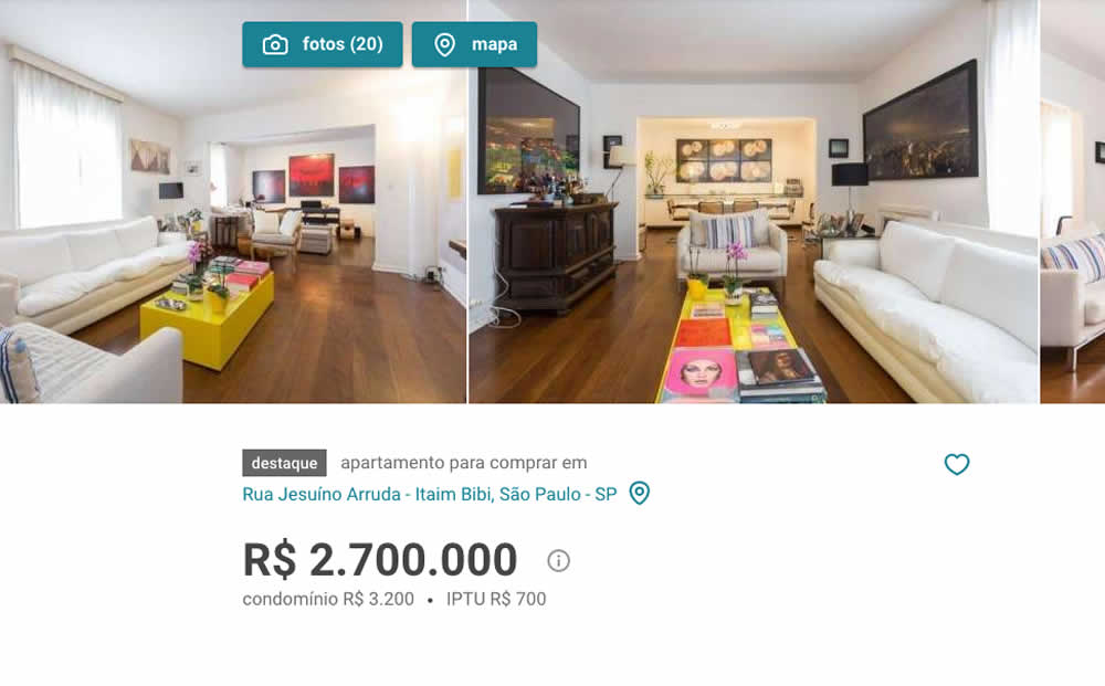
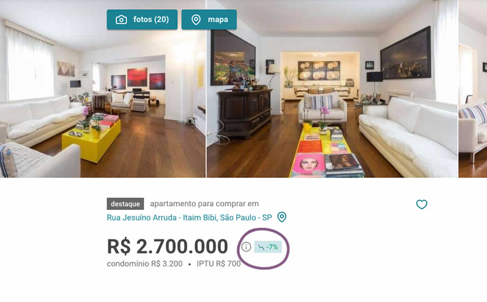
In this experiment, the B variation showed the relative discount in price from within the most recent 12 months as a percentage point. A tooltip was also shown which explained this message on hover.
Test #447 on
Vivareal.com.br
by  Vinicius Barros Peixoto
Dec 23, 2022
Mobile
Listing
X.X%
Leads
Vinicius Tested Pattern #18: Single Or Alternative Buttons On Vivareal.com.br
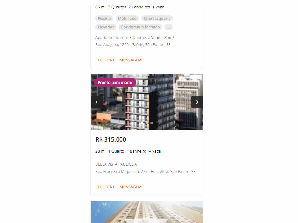
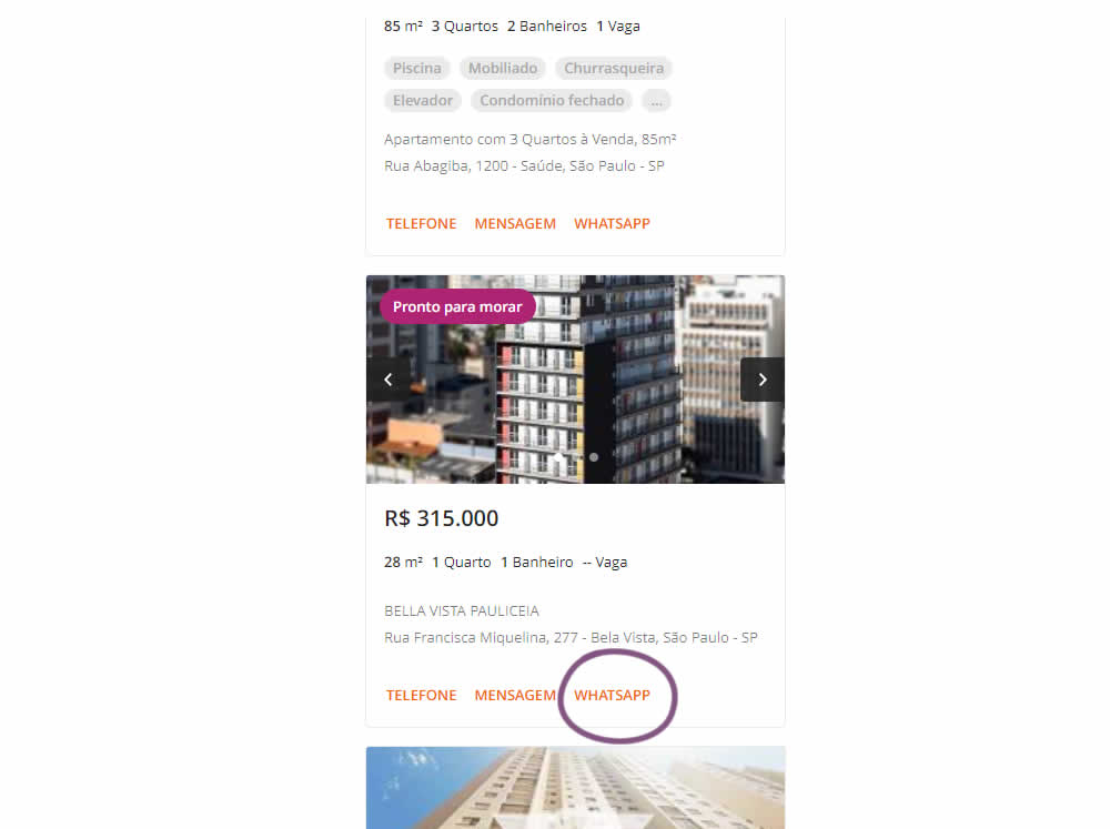
In this experiment, an additional call to action (Whatsapp link) was added on a listing page of one of Brazil's largest real estate sites.In the variation the 3 calls to action include: a link that launched the phone interaction, a general contact lead form, and finally the Whatsapp link (added in the variant). Impact on total lead starts and completions was measured.
Test #446 on
by  Jakub Linowski
Dec 15, 2022
Desktop
Mobile
Product
X.X%
Sales
Jakub Tested Pattern #18: Single Or Alternative Buttons
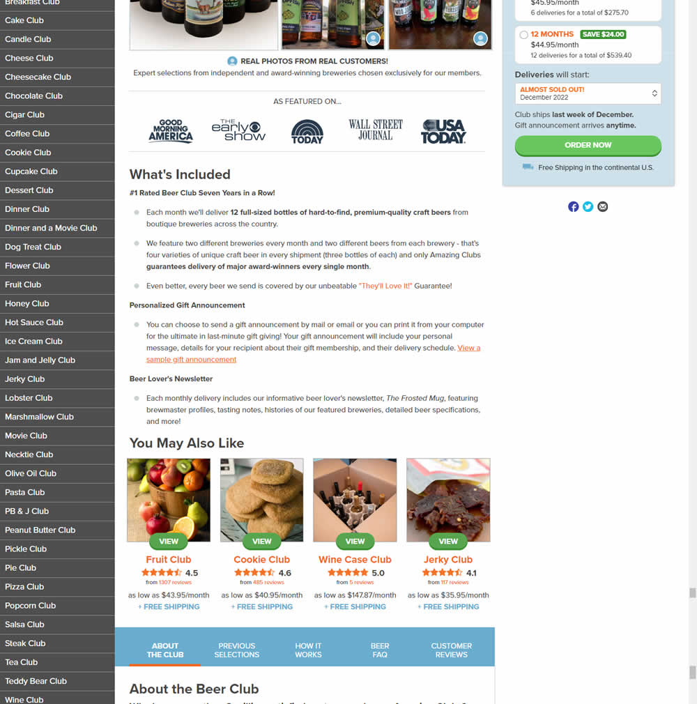
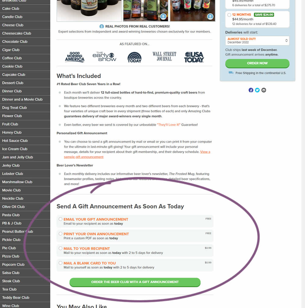
In this experiment, an additional purchase trigger was added - the ability to start by chosing a gift announcement option. In the control, this same question was asked further in the purchase funnel (after adding to cart). In the variation, this question was surfaced earlier as an alternative way of starting the purchase. Impact on total sales was measured.
Test #445 on
Phorest.com
by  Sorcha Mullis
Dec 14, 2022
Desktop
Mobile
Home & Landing
X.X%
Leads
Sorcha Tested Pattern #33: Example Situations On Phorest.com
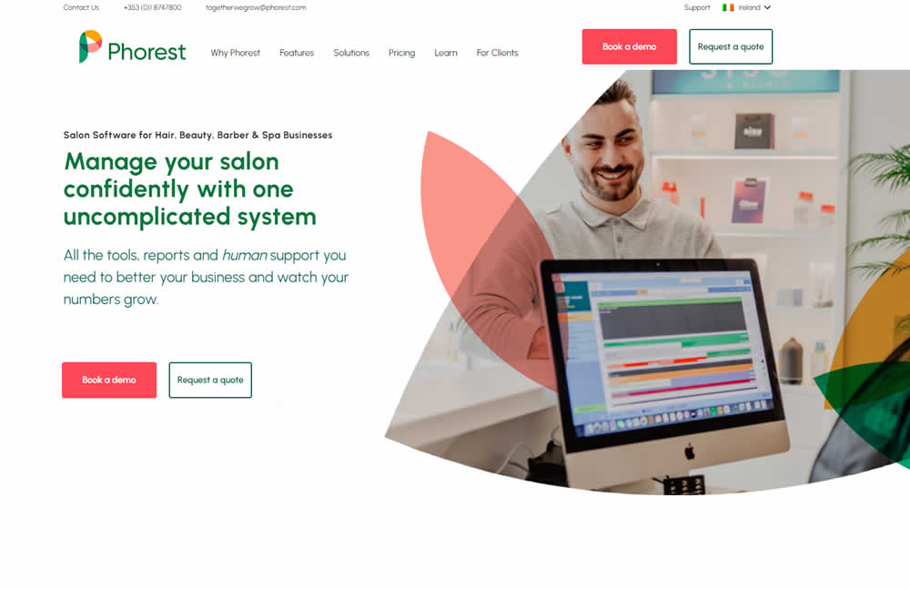
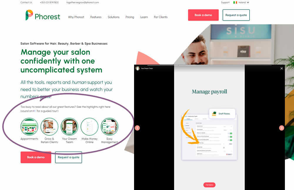
In this experiment, five clickable feature elements were surfaced on the homepage. Clicking on any of these 5 elements launched an Instastory-like short 10 second video in full screen. These videos explained the key features of the software being offered. Impact on lead generation was measured.
Test #444 on
by  Melina Hess
Nov 30, 2022
Mobile
Product
X.X%
Sales
Melina Tested Pattern #41: Sticky Call To Action
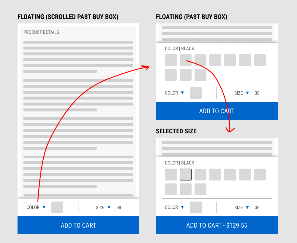
In this experiment, a floating add-to-cart with two product choices (color and size) were added on a product page. This appeared only after scrolling past the existing / embedded product selection buy box.
The floating add-to-cart widget had another layer of complexity in that it allowed customers to make a size and color selection with an expandable fly out. Making a selection would also append the total price to the add-to-cart button label.
Impact on total transactions was measured.
Test #442 on
Volders.de
by  Daria Kurchinskaia
Nov 27, 2022
Desktop
Mobile
Home & Landing
X.X%
Sales
Daria Tested Pattern #4: Testimonials On Volders.de

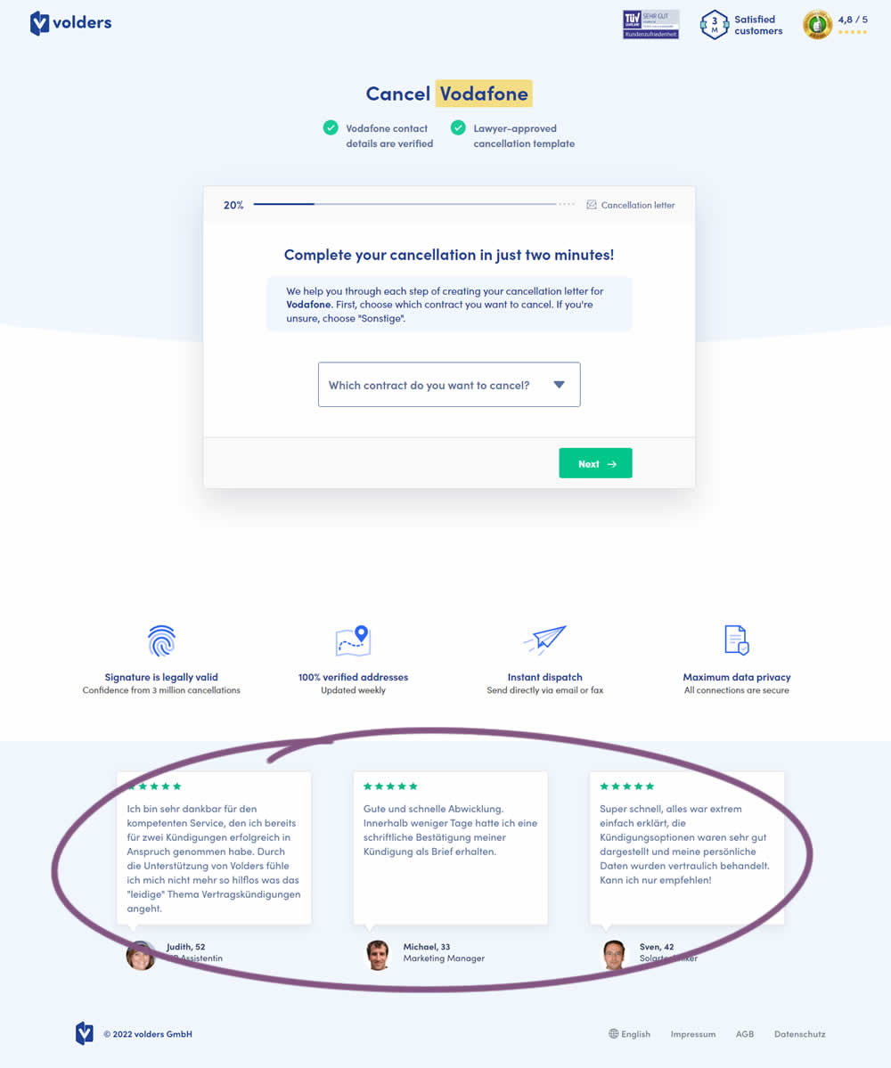
In this experiment, three testimonials were appended at the bottom of landing pages of a contract cancelation service (paid). These testimonials were also shown throughout the complete signup funnel (4 more steps). Impact on progression (step 2) and final completed purchases were measured.
Test #443 on
Volders.de
by  Daria Kurchinskaia
Nov 27, 2022
Desktop
Mobile
Home & Landing
X.X%
Sales
Daria Tested Pattern #4: Testimonials On Volders.de
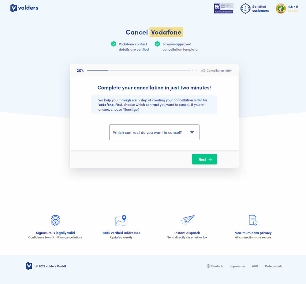
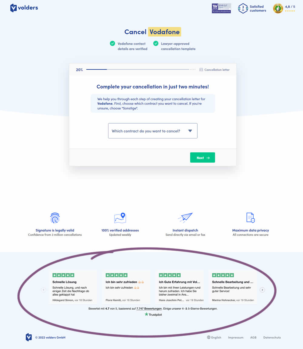
In this experiment, four TrustPilot reviews were appended at the bottom of landing pages of a contract cancelation service (paid). These reviews were also shown throughout the complete signup funnel (4 more steps). Impact on progression (step 2) and final completed purchases were measured.
Test #441 on
by  Melina Hess
Nov 23, 2022
Desktop
Mobile
Product
X.X%
Sales
Melina Tested Pattern #41: Sticky Call To Action
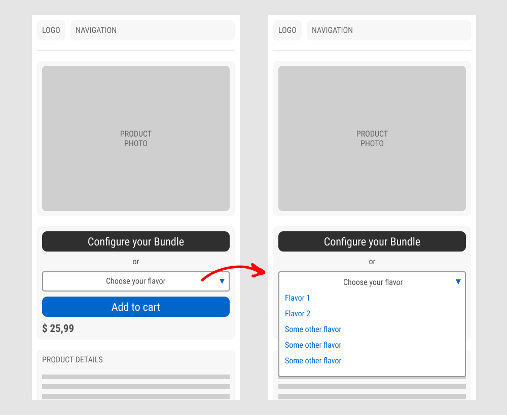
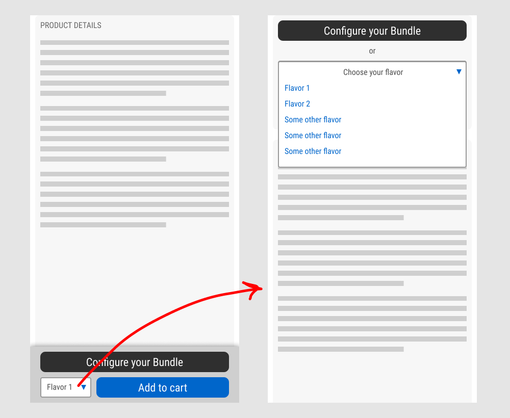
In this experiment, a floating sticky bar was added on product pages. The sticky elements only appeared after users scrolled beyond the fixed buy box area that is relatively high on the page (visible on the control screenshot). The sticky bar contained three elements: a button to configure up to three product choices, a flavor selection pulldown, and the add-to-cart button.
In the variation, when users clicked on the flavor pulldown three things happened. First, they were anchored back to the top of the buy box. Second, the floating sticky disappeared. And third, the flavors pulldown automatically expanded (overlapping the original primary add-to-cart button).
The control did not have any of the sticky behaviors.
Impact to total sales was measured.
Test #437 on
Vivareal.com.br
by  Rodrigo Maués
Oct 28, 2022
Desktop
Mobile
Listing
X.X%
Leads
Rodrigo Tested Pattern #18: Single Or Alternative Buttons On Vivareal.com.br

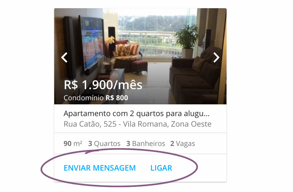
In this experiment, an additional and alternative text based call to action link was added on real estate properity listings. Instead of only having "Ligar" ("Call"), "Enviar mensagem" was also appended ("Send Message"). This additional link lead to a lead-gen form.
Test #438 on
Phorest.com
by  Sorcha Mullis
Oct 28, 2022
Desktop
Mobile
Home & Landing
X.X%
Leads
Sorcha Tested Pattern #18: Single Or Alternative Buttons On Phorest.com
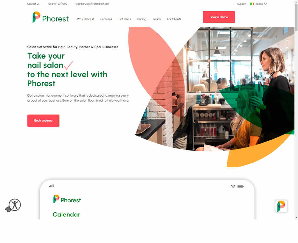
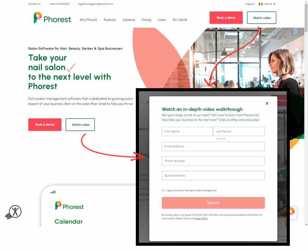
In this experiment, the addition of a secondary CTA for lead generation in the nav and the hero were tested. The additional button invited users to watch a gated demo video (approx 12 minutes). Clicking the CTA triggered a pop-up form collecting some basic contact information before the user could access the video page. Total leads were measured with lead form submittions.
Test #436 on
Designlab.com
by  Daniel Shapiro
Oct 25, 2022
Desktop
Mobile
Home & Landing
X.X%
Sales
Daniel Tested Pattern #7: Social Counts On Designlab.com

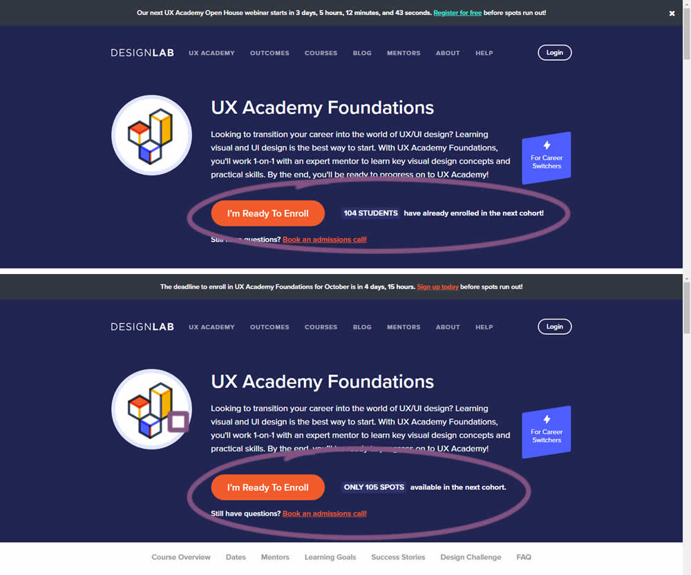
In this experiment, social proof and scarcity messages were shown on a course enrollment landing page. When students were starting to sign up at the beginning of each month (with greater availability), a simpler "X students have already enrolled in the next cohort" message was used.
Later in the month when fewer spots were available, a more scarce message was used with the following copy "ONLY X SPOTS available in the next cohort".
In both cases, the numbers were accurate and dynamically updated.
Test #433 on
Expertinstitute.com
by  Ardit Veliu
Sep 30, 2022
Desktop
Mobile
Signup
X.X%
Leads
Ardit Tested Pattern #20: Canned Response On Expertinstitute.com
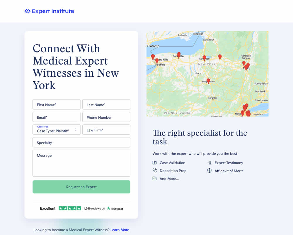
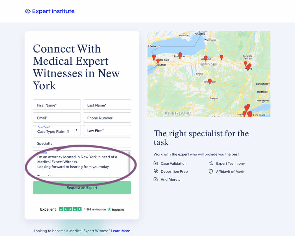
In this experiment a dynamic canned response was added to a lead form. The contents of the copy reflected a handful of user choices from other form field selections. Impact on leads / form submissions was measured.