All Latest 620 A/B Tests
Test #177 on
by  Devesh Khanal
May 17, 2018
Desktop
Shopping Cart
X.X%
Revenue
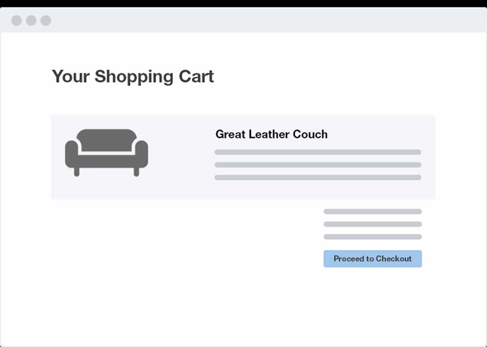
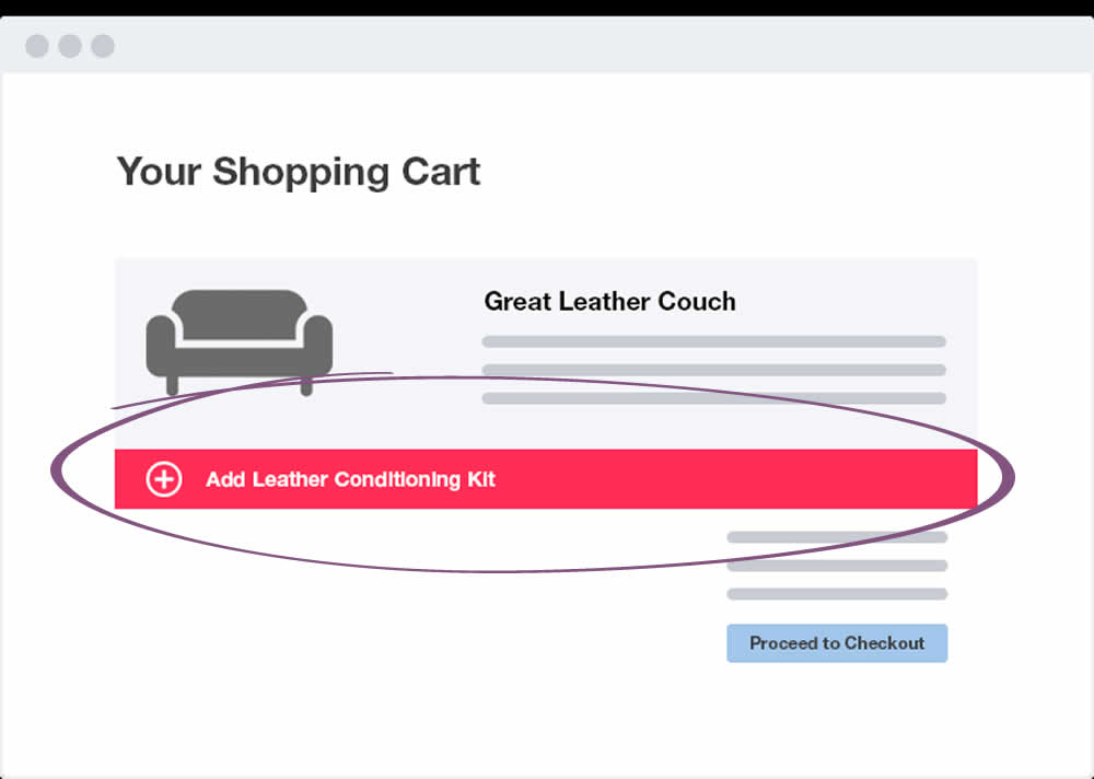
Devesh Tested Pattern #66: Complementary Upsell
Which A Or B Actually Wins? Find Out Before You Test.
Members see every test result — the winners, the flat ones, and the losers — along with exact effects and sample sizes. Use it to estimate your tests and prioritize by probability, not gut feel. Start every experiment with the odds on your side.
Test #178 on
by  Devesh Khanal
May 17, 2018
Desktop
Product
X.X%
Sales
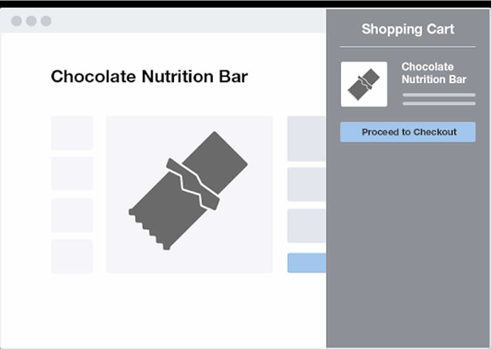
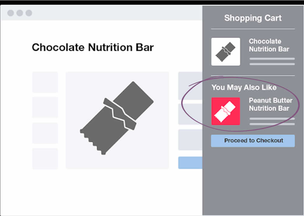
Devesh Tested Pattern #66: Complementary Upsell
Test #176 on
Kenhub.com
by  Niels Hapke
May 16, 2018
Desktop
Mobile
Checkout
X.X%
Sales
Niels Tested Pattern #4: Testimonials On Kenhub.com
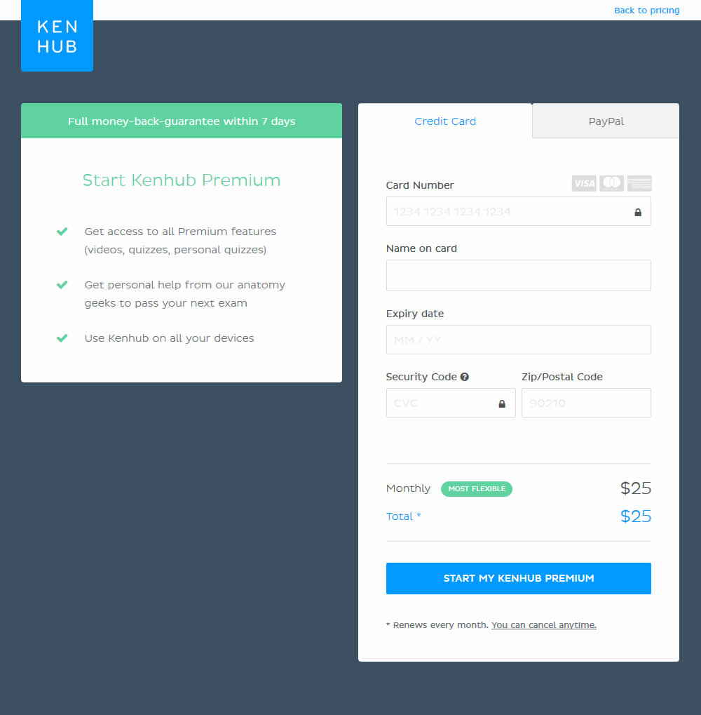
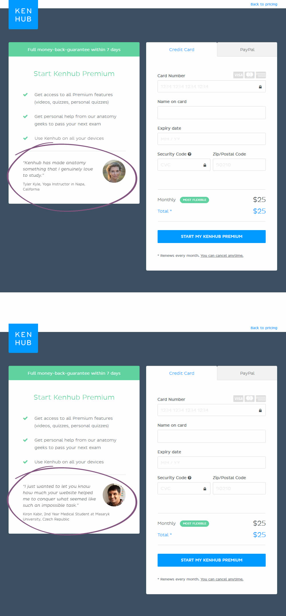
In this experiment, testimonials were added on a checkout screen.
Test #175 on
Thomasnet.com
by  Julian Gaviria
May 14, 2018
Desktop
Mobile
Content
X.X%
Leads
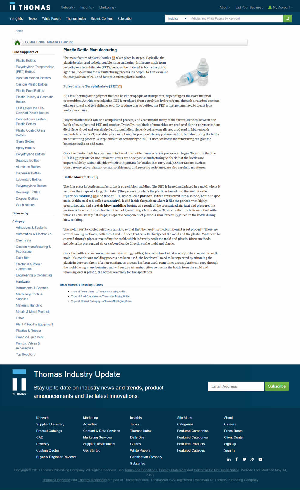
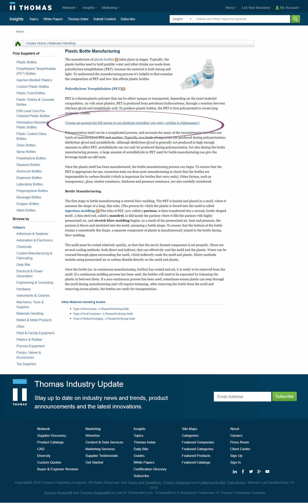
Julian Tested Pattern #23: Inline Link Nudge On Thomasnet.com
Test #171 on
Sjvc.edu
by Phillip Barnes
Apr 27, 2018
Desktop
Mobile
Signup
X.X%
Leads
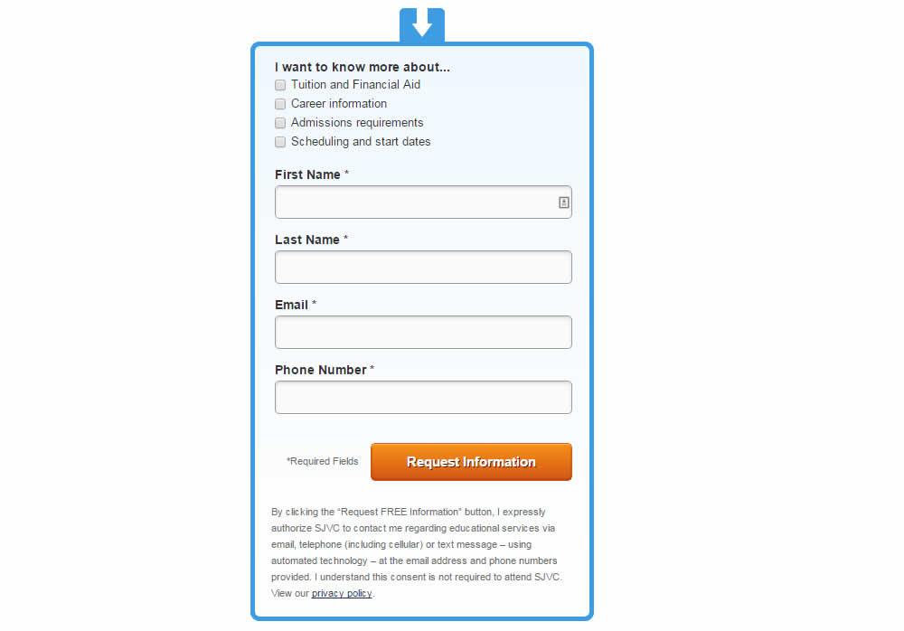
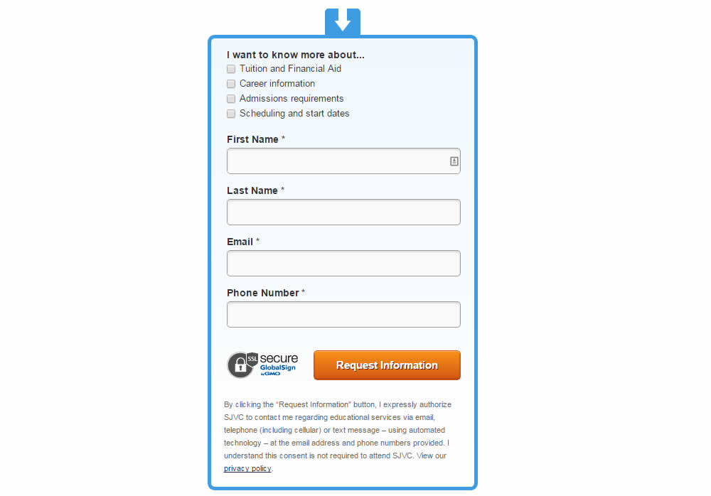
Phillip Tested Pattern #63: Trust Seals On Sjvc.edu
Test #168 on
Akademiafotografii.p...
by Grzegorz Jancewicz
Apr 23, 2018
Desktop
Listing
X.X%
Leads
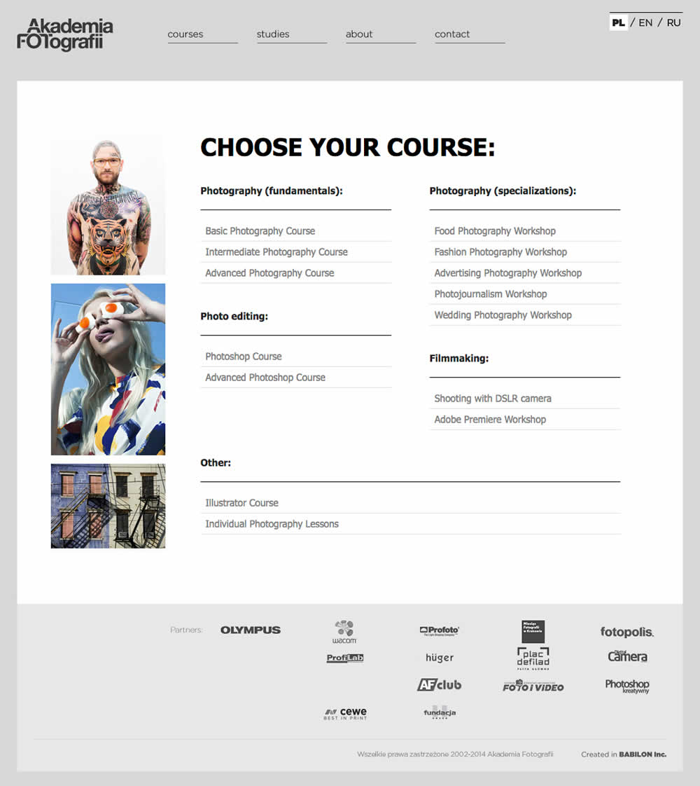
Grzegorz Tested Pattern #45: Benefit Bar On Akademiafotografii.p...

Test #167 on
Lovehoney.co.uk
by  Matthew Curry
Apr 10, 2018
Desktop
Product
X.X%
Sales
Matthew Tested Pattern #69: Autodiscounting On Lovehoney.co.uk
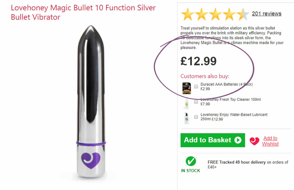
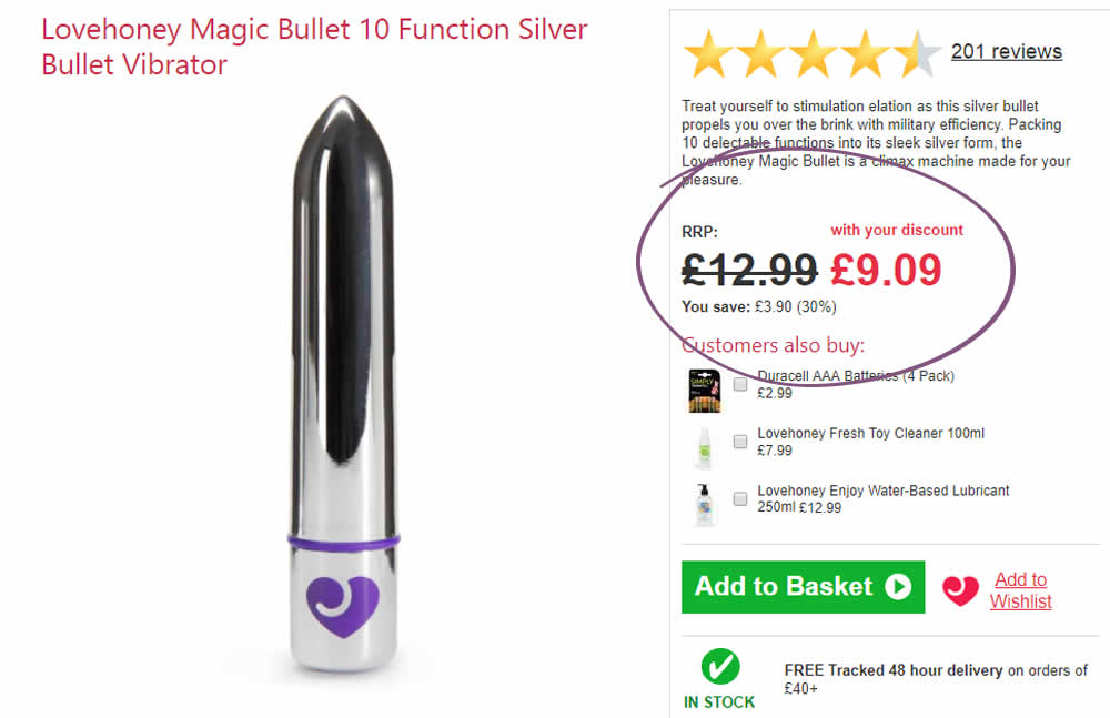
The idea is that, if the customer has an active discount code for that session (either by landing on a particular page, or entering a code somewhere), instead of just showing the discount in the basket, we show it further (earlier) up the funnel and automatically discount on the product page.
The effectiveness of this depends on the discount level, I've tested it at 30% and 50%.
With a 50% Discount:
Add to Cart rate +33%
Sales rate + 24%
With a 30% Discount:
Add to Cart rate +11.6%
Sales rate + 10.2%
Test #162 on
Bullymax.com
by  Viljo Vabrit
Mar 20, 2018
Desktop
Home & Landing
X.X%
Sales
Viljo Tested Pattern #68: Welcome Discount On Bullymax.com

Test #160 on
Examine.com
by  Martin Wong
Mar 15, 2018
Desktop
Mobile
Product
X.X%
Sales
Martin Tested Pattern #49: Above The Fold Call To Action On Examine.com


Test #158 on
Kenhub.com
by  Niels Hapke
Mar 11, 2018
Desktop
Mobile
Checkout
X.X%
Sales
Niels Tested Pattern #63: Trust Seals On Kenhub.com

Test #159 on
Swimsuitsforall.com
by  Devesh Khanal
Mar 11, 2018
Desktop
Checkout
X.X%
Sales
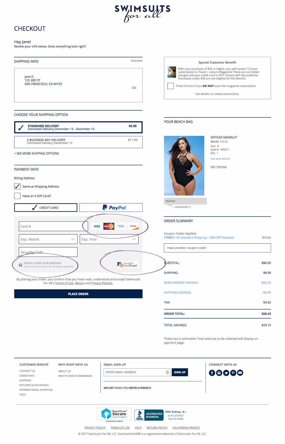
Devesh Tested Pattern #63: Trust Seals On Swimsuitsforall.com
Test #157 on
Bobandlush.com
by  Viljo Vabrit
Mar 06, 2018
Desktop
Product
X.X%
Sales
Viljo Tested Pattern #62: Urgent Next Day Delivery On Bobandlush.com
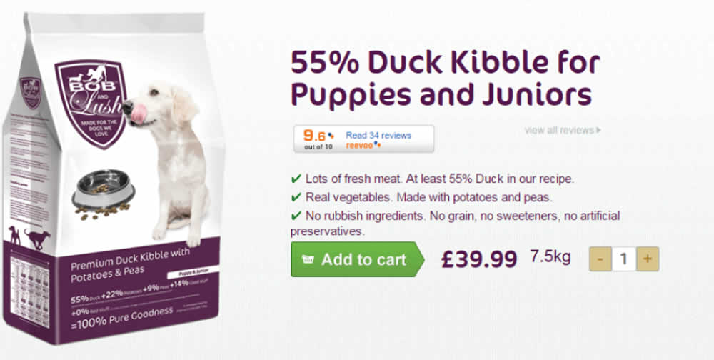
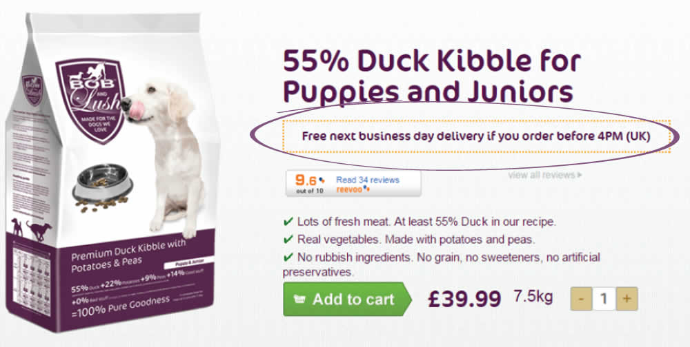
Hypothesis - Urgency leads to higher conversions as people have less time to think and will instead follow their impulse to complete the purchase now rather than later.
The Treatment - From Monday to Friday, before 4 PM, we added the urgency message “Free next business day delivery if you order before 4 PM (UK)”. We placed the urgency message just below the product name ensuring that it fell into the reading pattern of all visitors interested in the products. To ensure the treatment was only shown at the right time and for the right people we added a condition: MON, TUE, WED, THU, FRI before 4 PM; UK IP.
Test #156 on
Mt.com
by  Vito Mediavilla
Feb 25, 2018
Desktop
Listing
X.X%
Leads
Vito Tested Pattern #60: Repeated Bottom Call To Action On Mt.com
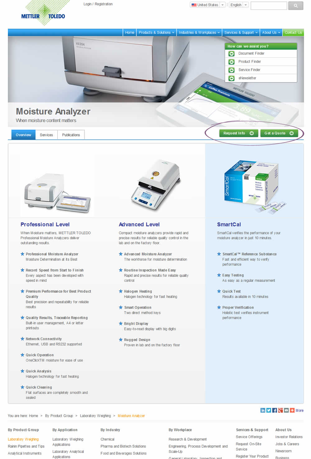
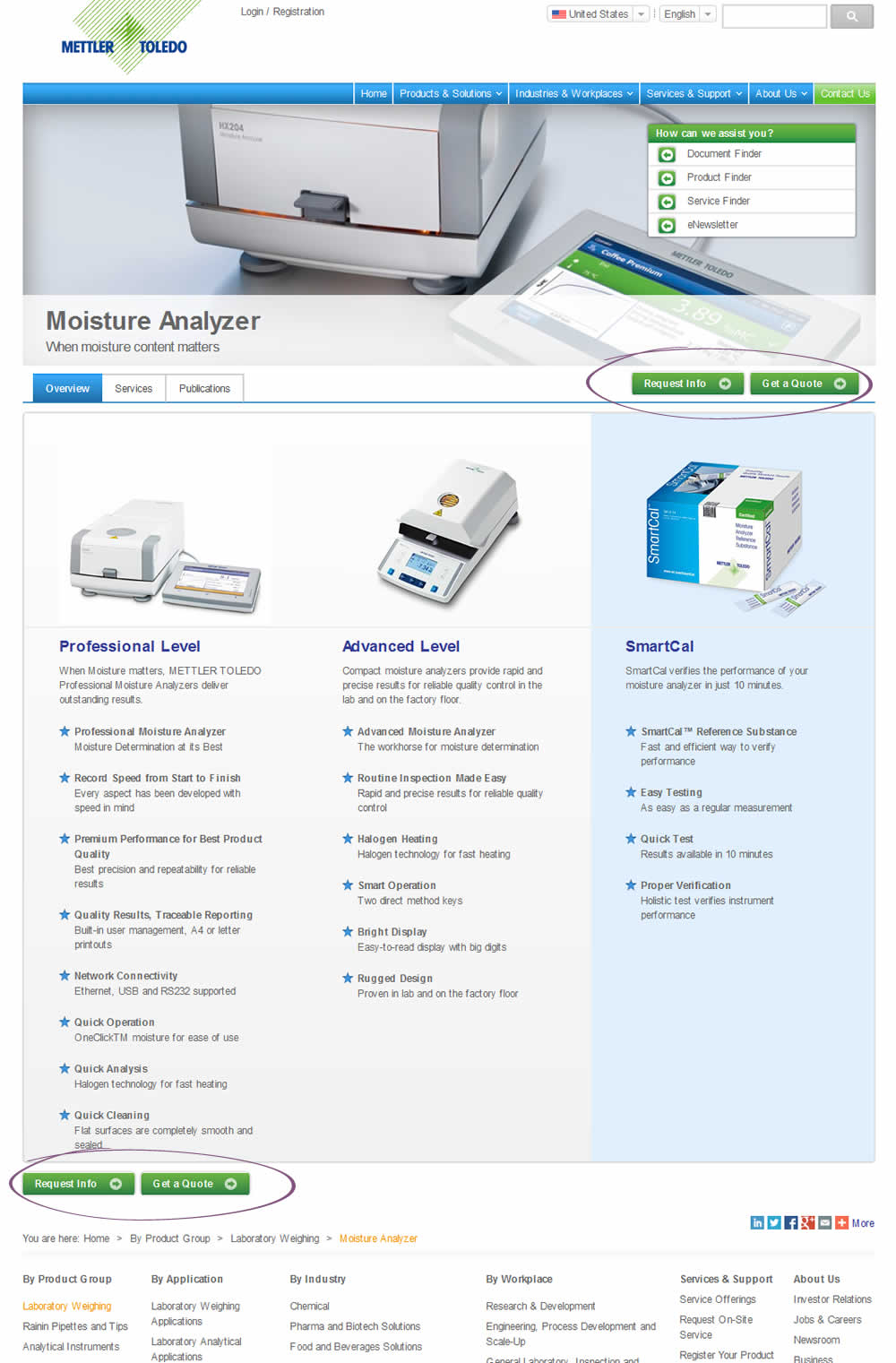
This test duplicated two buttons at the bottom of the page. However, the site already contained floating buttons (from the header).
Test #152 on
Reverb.com
by  Nicholas Evans
Feb 13, 2018
Desktop
Mobile
Product
X.X%
Sales
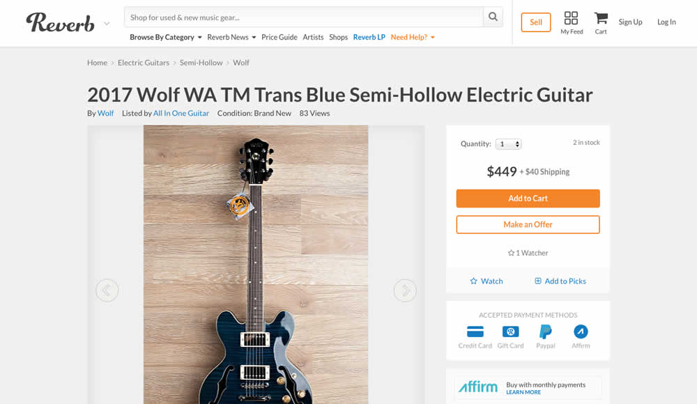
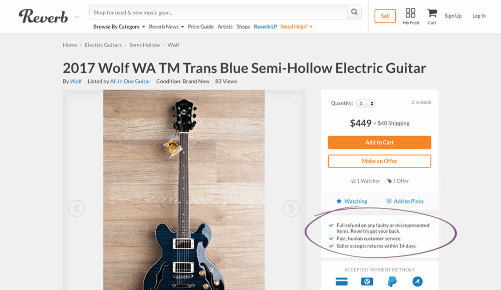
Nicholas Tested Pattern #15: Bulleted Reassurances On Reverb.com
Test #151 on
Mamaearth.ca
by  Michael Bernstein
Feb 08, 2018
Desktop
Checkout
X.X%
Sales
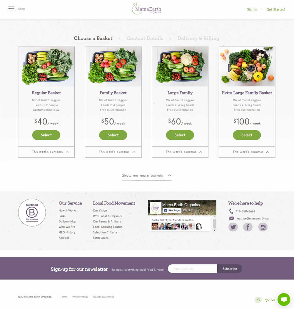
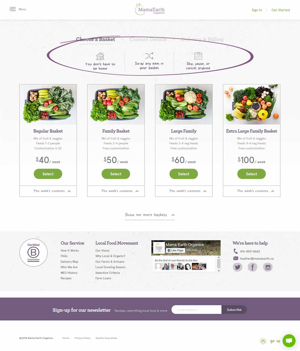
Michael Tested Pattern #45: Benefit Bar On Mamaearth.ca
Test #149 on
Reverb.com
by  Nicholas Evans
Feb 07, 2018
Desktop
Product
X.X%
Signups
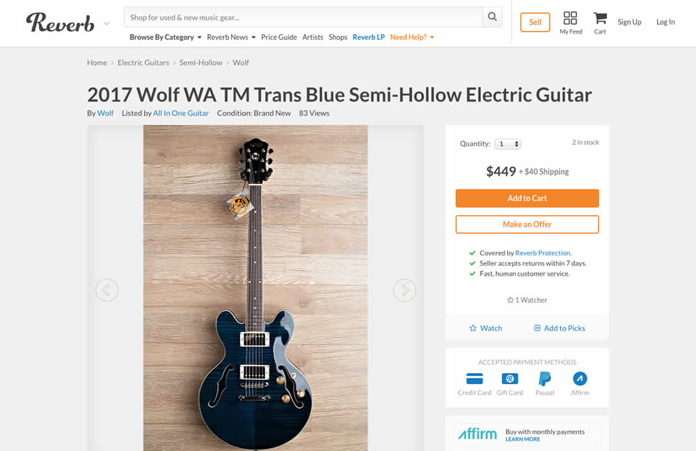
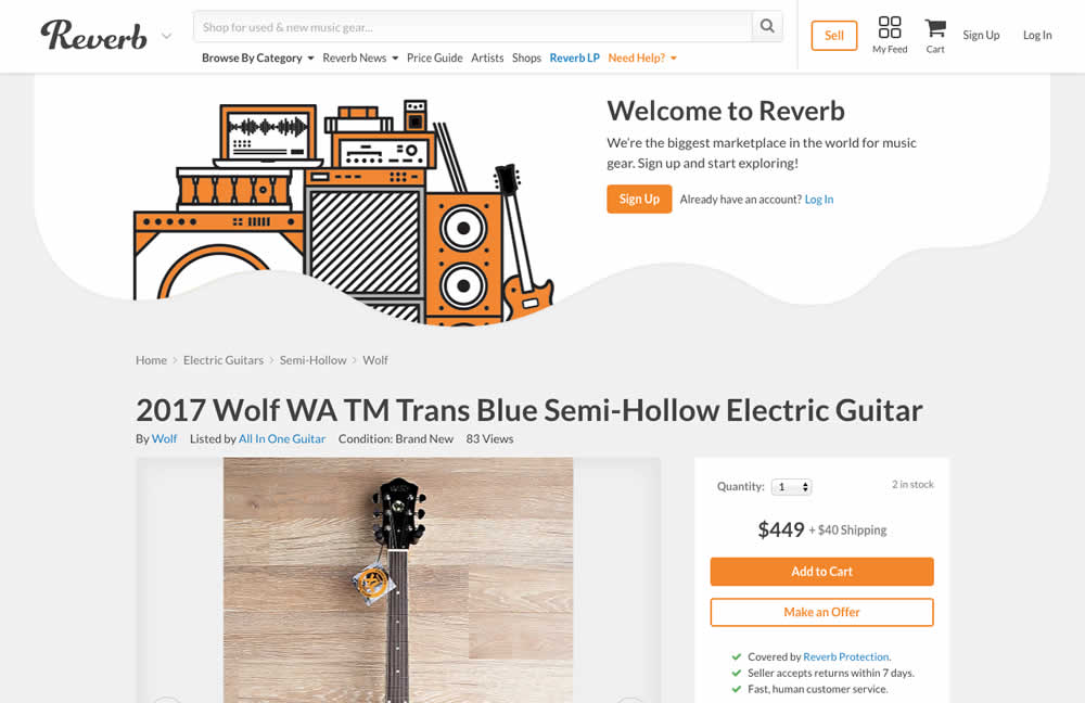
Nicholas Tested Pattern #16: Welcome Mat - Partial On Reverb.com
Test #150 on
Normanrecords.com
by  Nathon Raine
Feb 07, 2018
Desktop
Home & Landing
X.X%
Sales
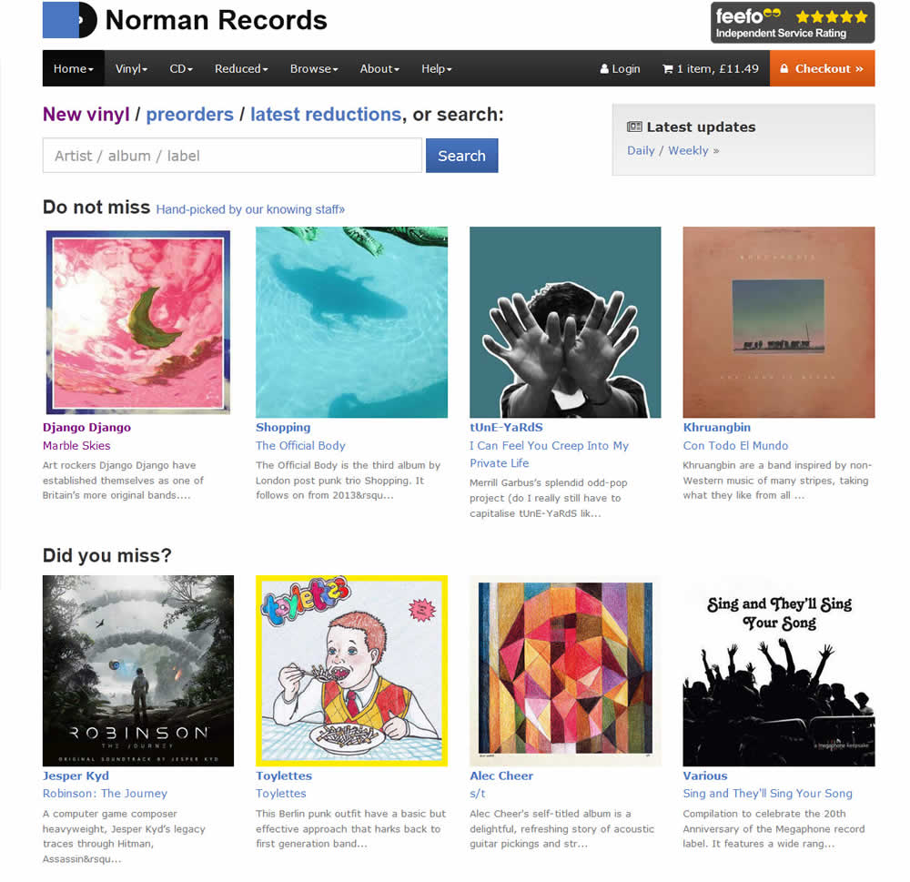
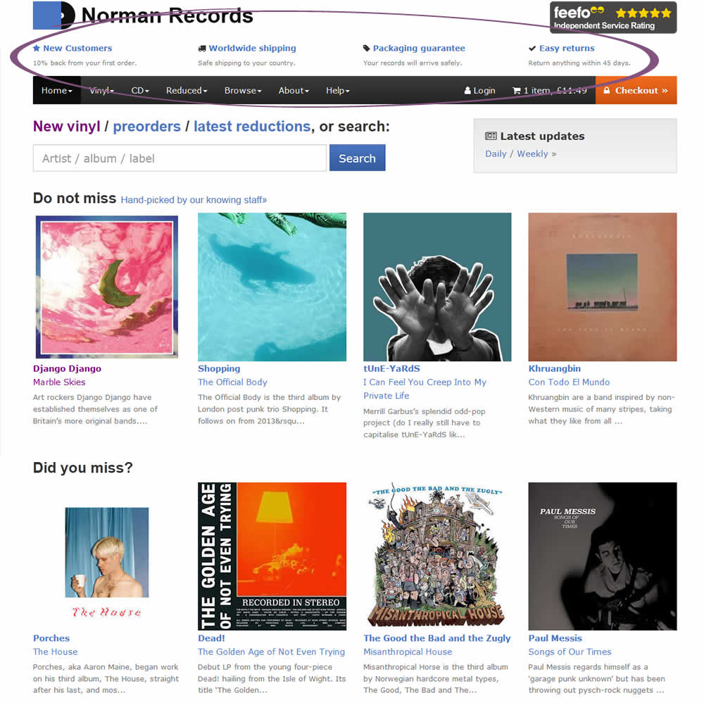
Nathon Tested Pattern #45: Benefit Bar On Normanrecords.com
Test #140 on
Akademiafotografii.p...
by Grzegorz Jancewicz
Jan 05, 2018
Desktop
Mobile
Product
X.X%
Leads
Grzegorz Tested Pattern #46: Pay Later On Akademiafotografii.p...
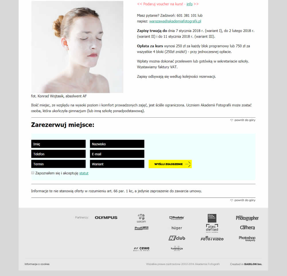
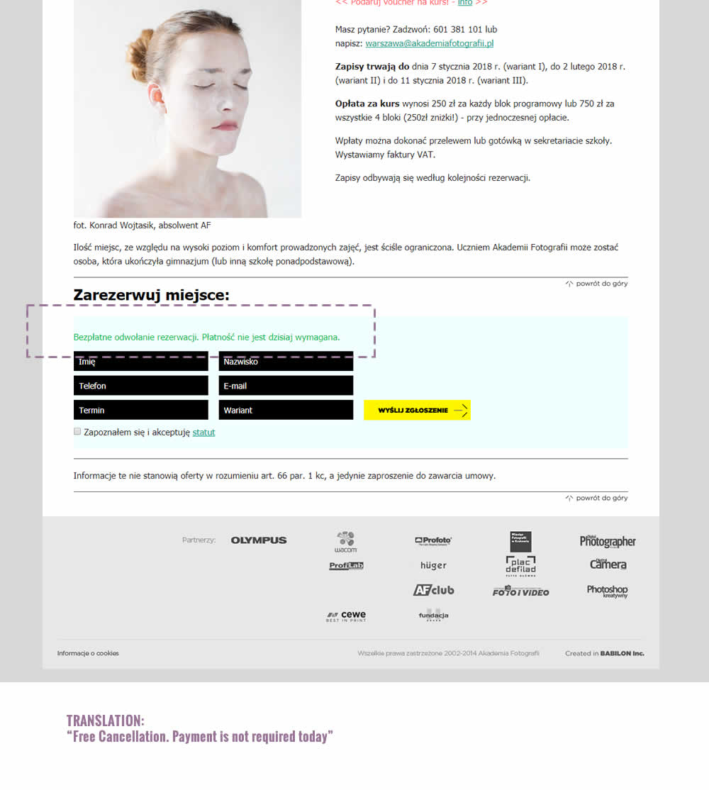
The test was run on multiple course pages. The screenshot contains the cropped bottom part of a long screen with an exposed signup form. The variation introduced additional text above the form which states: "Free Cancellation. Payment is not required today".
Test #139 on
Examine.com
by  Martin Wong
Jan 04, 2018
Desktop
Pricing
X.X%
Sales
Martin Tested Pattern #51: Shortcut Buttons On Examine.com
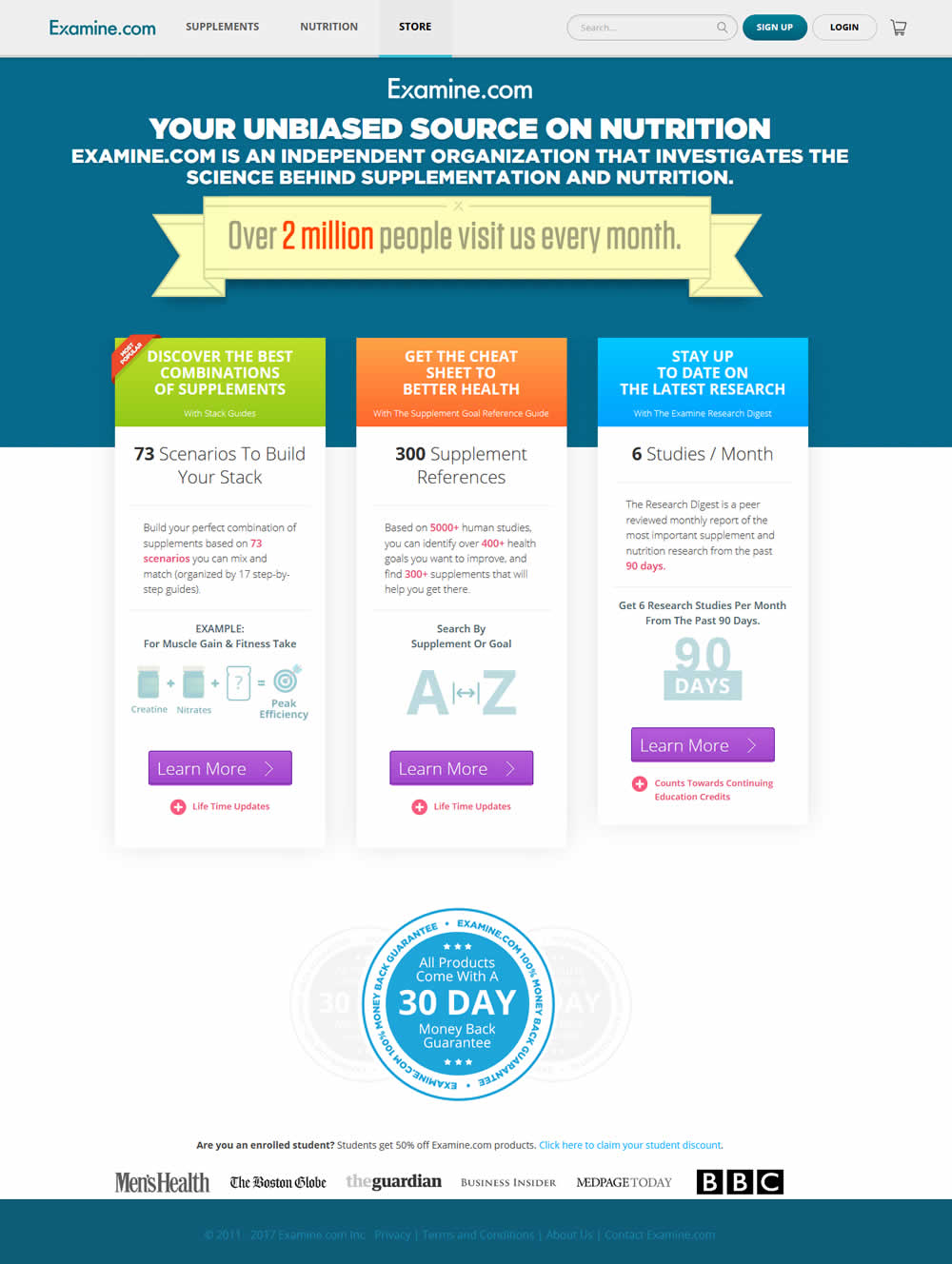
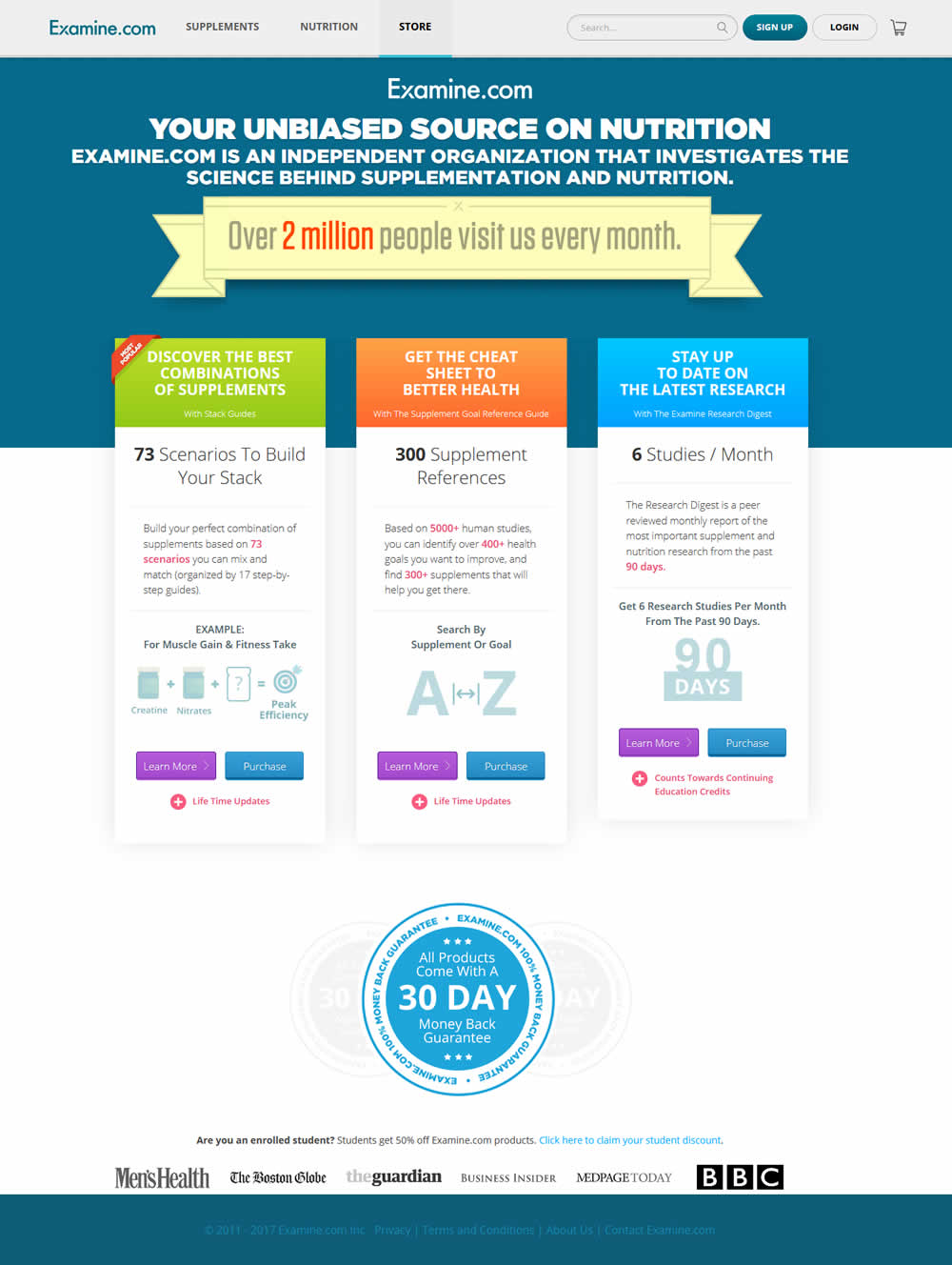
In this test an additional "Purchase" button was shown along side a "Learn More" button. The "Purchase" button went straight to checkout, whereas the "Learn More" button went to a product overview page.
Test #137 on
Trydesignlab.com
by  Daniel Shapiro
Dec 22, 2017
Desktop
Mobile
Checkout
X.X%
Sales
Daniel Tested Pattern #46: Pay Later On Trydesignlab.com
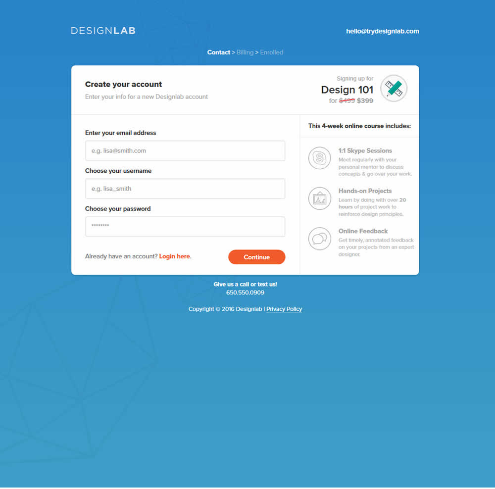
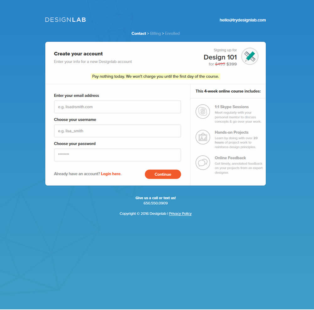
This test was run on a 3 step checkout process. The first screen was asking for contact information, and the second screen asked for credit card details. The change was shown on both first two steps as shown on the image below.