All Latest 620 A/B Tests
Test #589 on
by  Jakub Linowski
Apr 30, 2025
Desktop
Product
X.X%
Progression
Jakub Tested Pattern #68: Welcome Discount
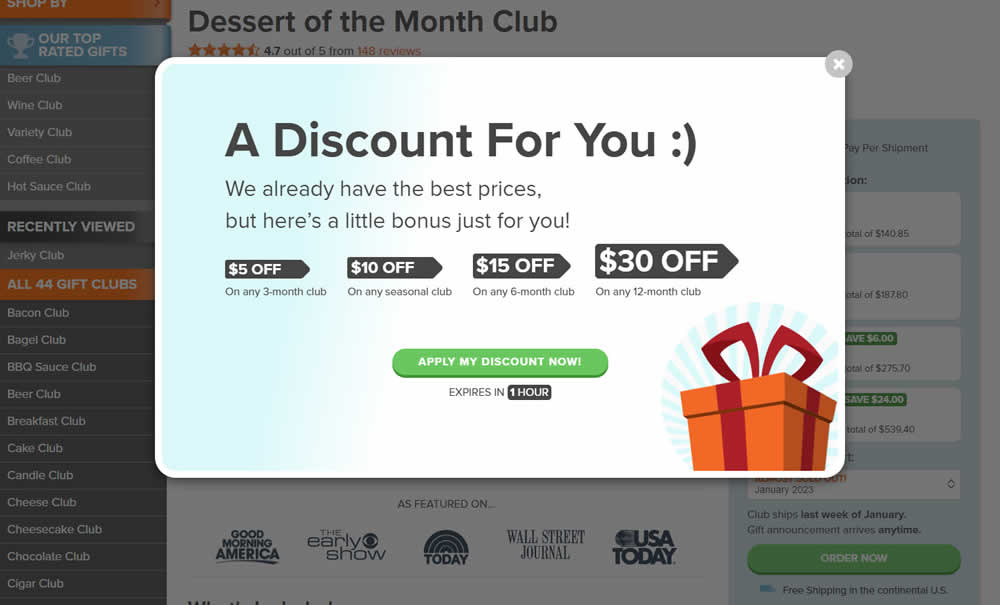
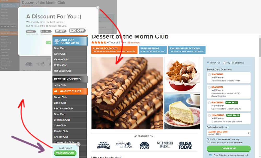
This experiment added one extra layer of persistence to an appearing welcome discount offer. In the variation, a welcome discount appeared on product pages after some inactivity behavior combined with a delay. In the variation, the only thing that was modified was the "collapse" behavior - basically creating a small floating micro modal in the bottom right. The micro modal allowed users to return to the larger modal or collaping it for good (with a second X collapse button). Impact on sales was measured.
Which A Or B Actually Wins? Find Out Before You Test.
Members see every test result — the winners, the flat ones, and the losers — along with exact effects and sample sizes. Use it to estimate your tests and prioritize by probability, not gut feel. Start every experiment with the odds on your side.
Test #587 on
https://asics.com App
by  Andrey Prokhorov
Apr 26, 2025
Desktop
Product
X.X%
Progression
Andrey Tested Pattern #140: Product Descriptions
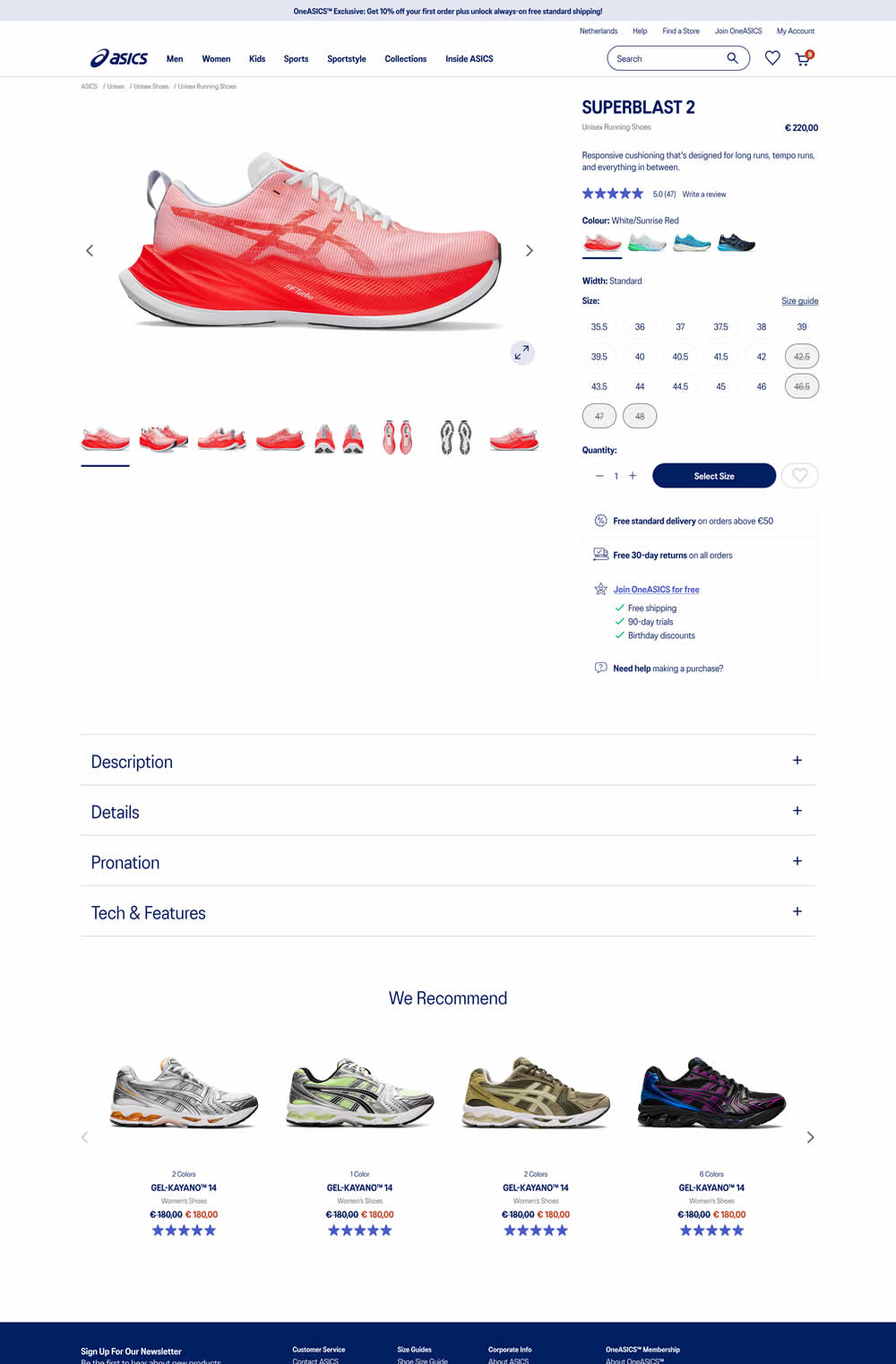
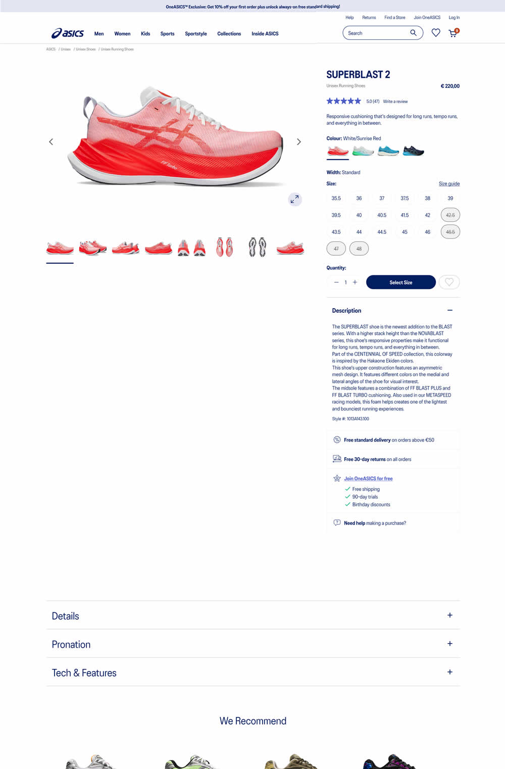
In this experiment, product descriptions were moved up on the page and expanded by default. As a result, related and product recommendation were pushed further down on the page. Impact on ATC and sales was measured.
Test #586 on
by  Jakub Linowski
Apr 25, 2025
Mobile
Product
X.X%
Progression
Jakub Tested Pattern #48: Video Testimonials
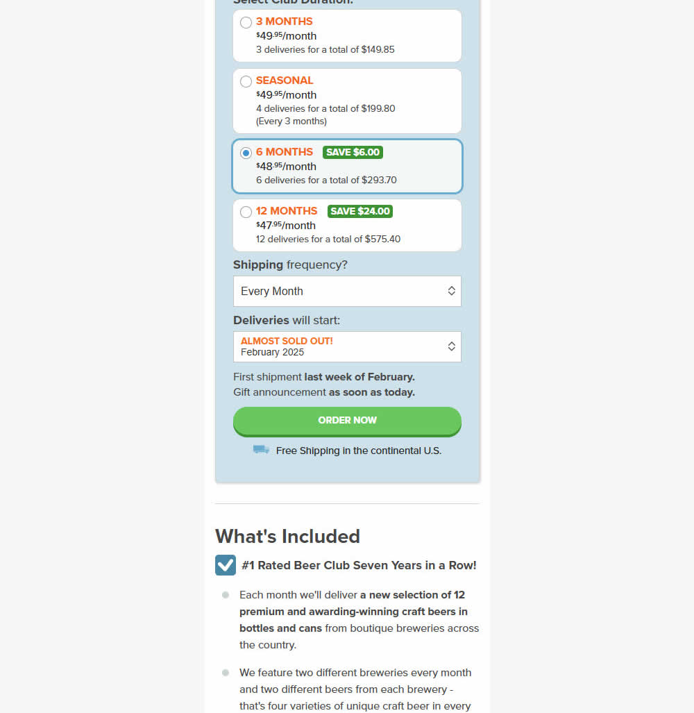
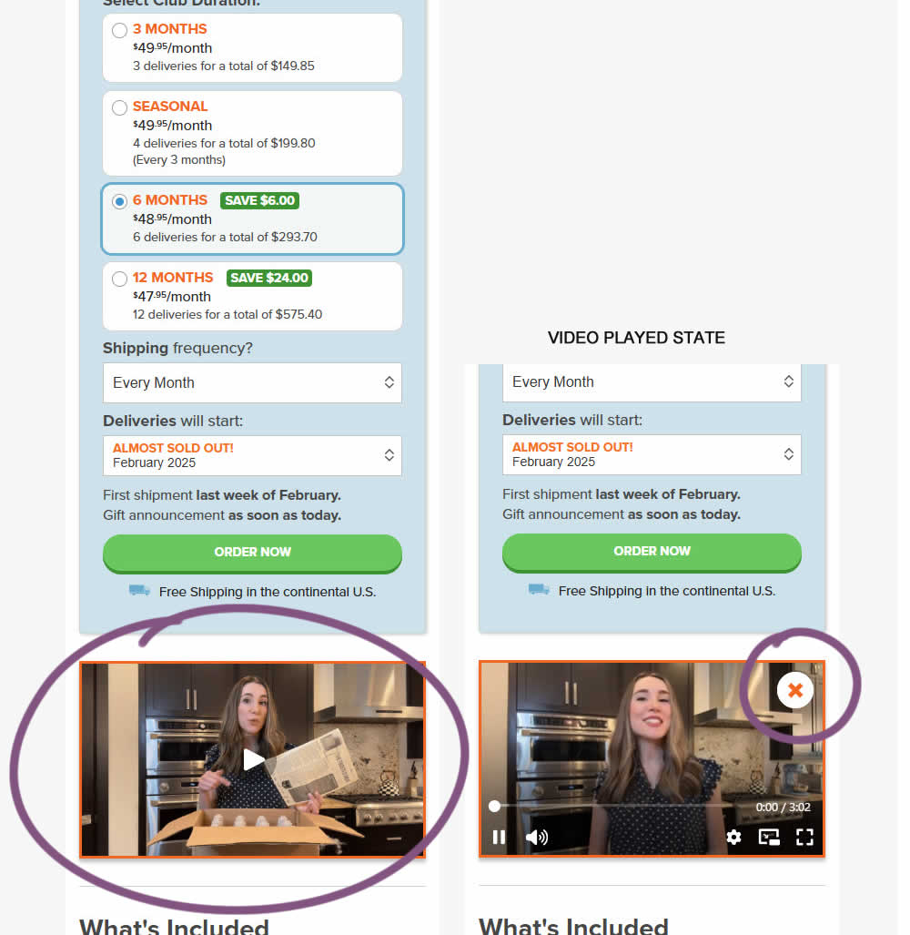
In this experiment, a video unboxing and product overview video was added on product pages (below the buy box). After pressing play, the video started playing with a visible "close" control to allow stopping of the video.
Impact on adds to cart and sales was measured.
Test #585 on
Jared.com
by  Craig Kistler
Apr 10, 2025
Mobile
Desktop
Listing
X.X%
Progression
Craig Tested Pattern #137: Visible Filters On Jared.com
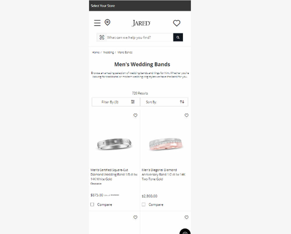
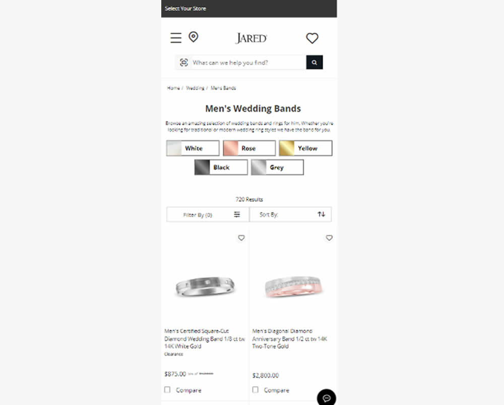
In this experiment, UI filters with metal color options were surfaced at the top of product listing pages (for Jared - an online jewelry retailer). Impact on filter usage, adds to cart and sales were measured.
Test #583 on
Backstage.com
by  Stanley Zuo
Mar 30, 2025
Desktop
Mobile
Listing
X.X%
Progression
Stanley Tested Pattern #24: Visible Availability On Backstage.com
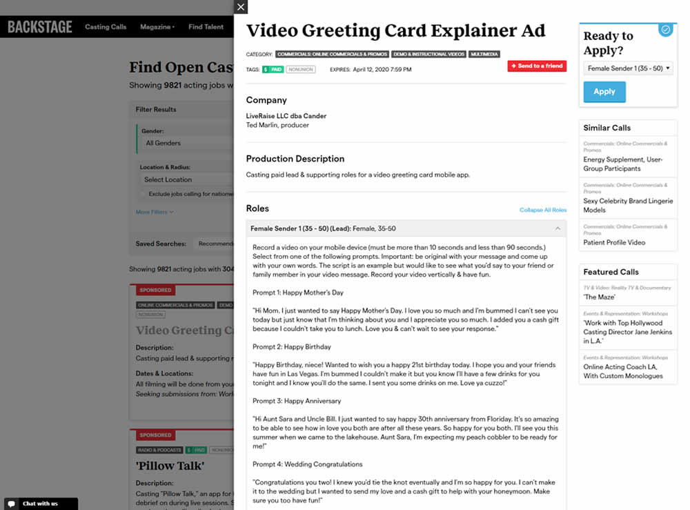
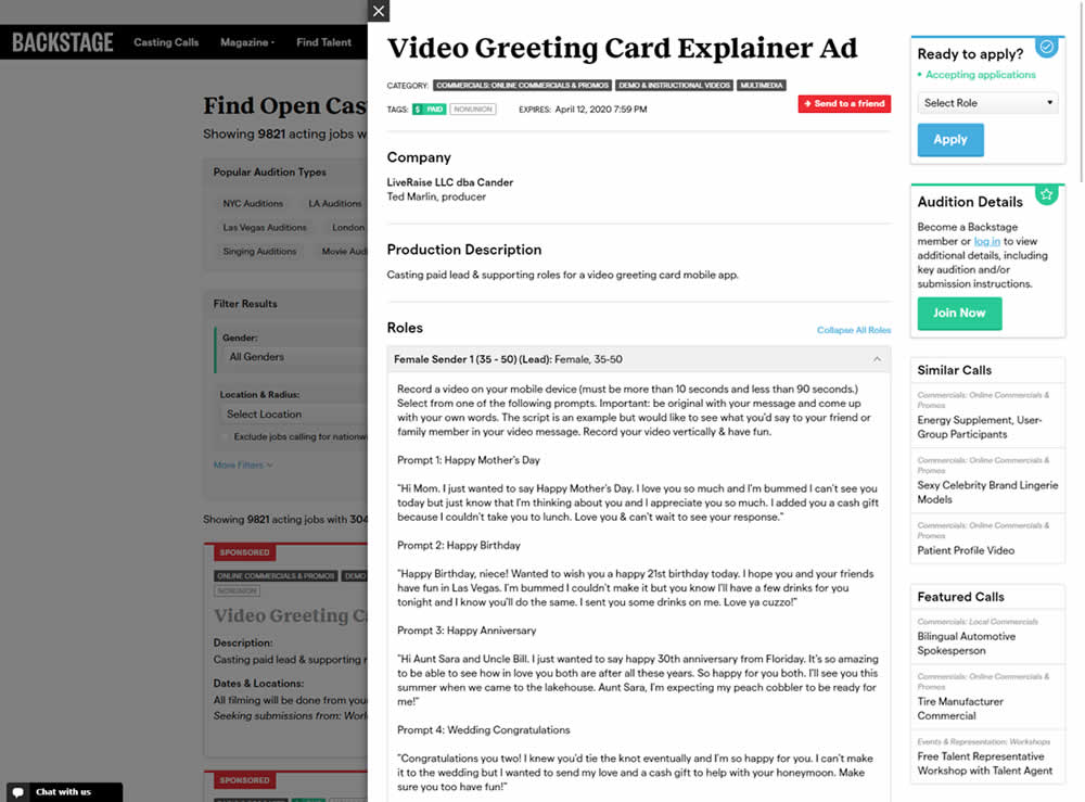
In this experiment, the active availability of a casting call (job offer) was was made more prominent using green text: "Accepting applications". The variation also made the "Join Now" button more prominent as an alternative path to signing up for a membership. The experiment reports on three metrics: clicks on apply, application starts and premium membership sales (measured a few steps further in the funnel).
Test #582 on
Online.metro-cc.ru
by  Andrey Andreev
Mar 22, 2025
Desktop
Mobile
Listing
X.X%
Progression
Andrey Tested Pattern #77: Filled Or Ghost Buttons On Online.metro-cc.ru
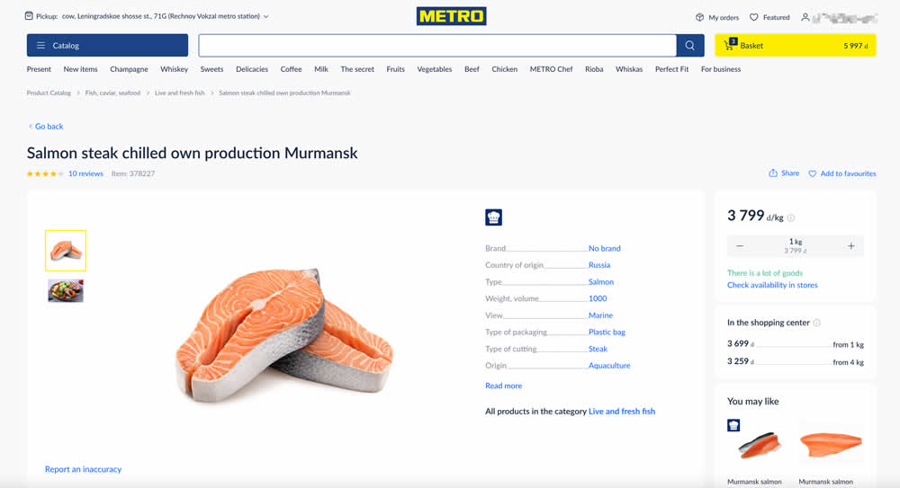
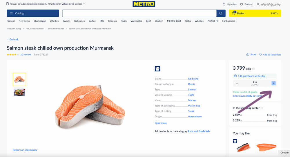
In this experiment, the plus and minus quantity icons near the add to cart button were tested with different contrasts. The control had a higher contrast from a solid background color, and the variant was lower contrast. Impact on add to cart and sales was measured. (A/B test was inverted to B/A in order to fit the pattern).
Test #581 on
Asics.com
by  Andrey Prokhorov
Mar 21, 2025
Desktop
Product
X.X%
Progression
Andrey Tested Pattern #104: Carousel Vs Static Grid Images On Asics.com
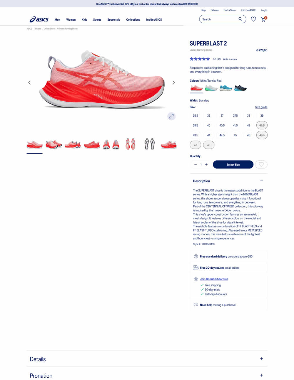
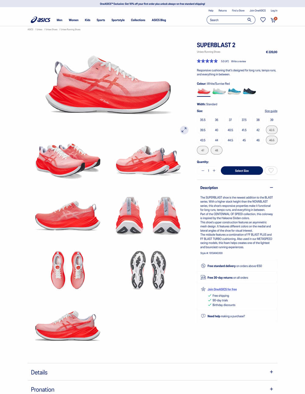
More product photos were exposed in the main column of the variation. Treatment used a collapsed gallery. Impact on ATC and sales was measured.
Test #579 on
Jared.com
by  Craig Kistler
Feb 23, 2025
Mobile
Product
X.X%
Progression
Craig Tested Pattern #21: What It's Worth On Jared.com
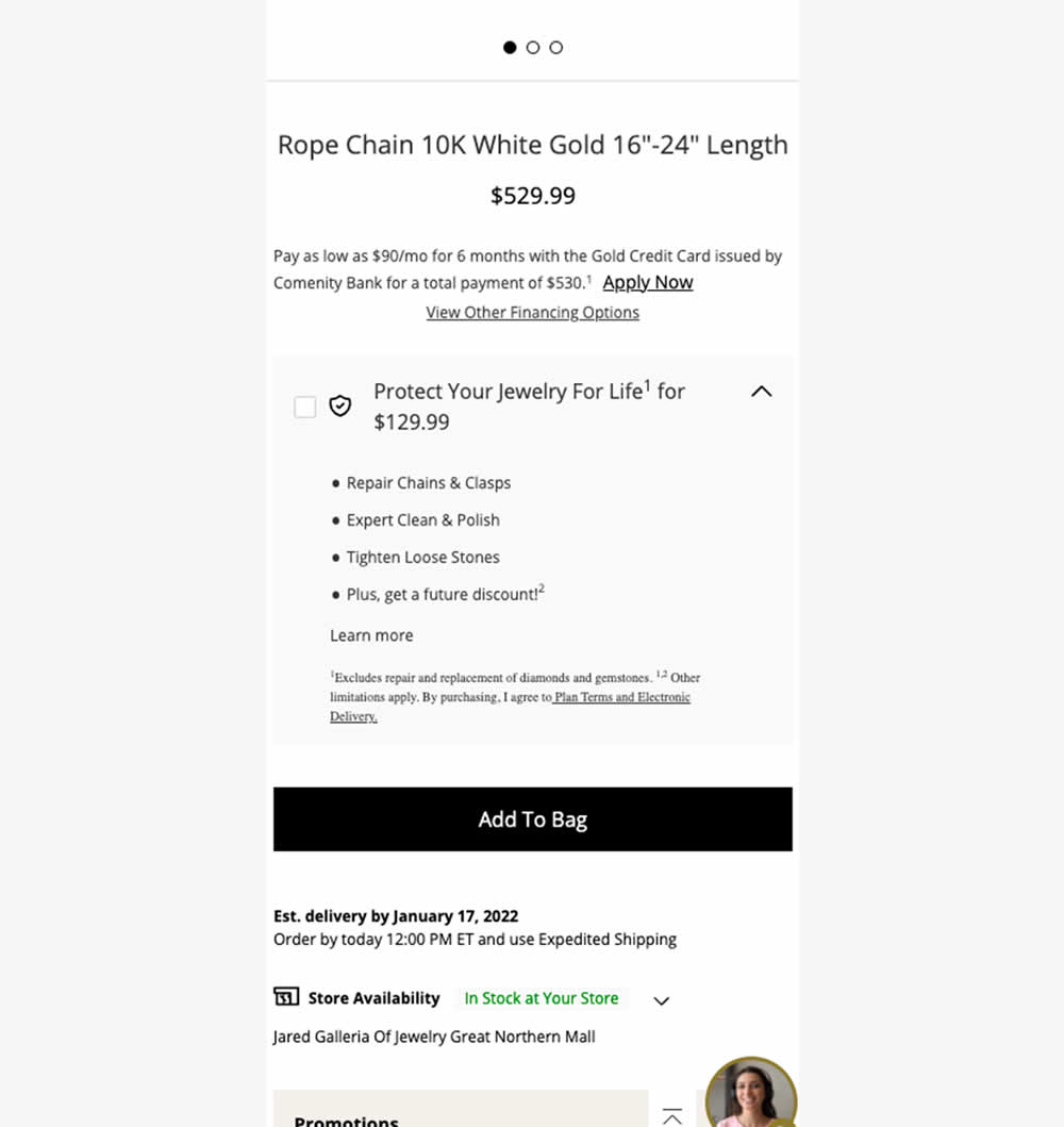
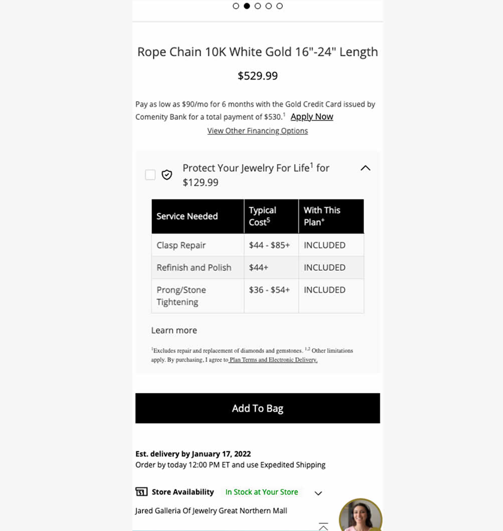
In this experiment, typical dollar values of typical coverages for an extended protection plan were shown. This ran on a product page of a jewelery site. Impact on on adds to cart, sales and uptake of the upsell was measured. Traffic split was 25/75.
Test #578 on
by  Jakub Linowski
Feb 20, 2025
Mobile
Product
X.X%
Progression
Jakub Tested Pattern #48: Video Testimonials
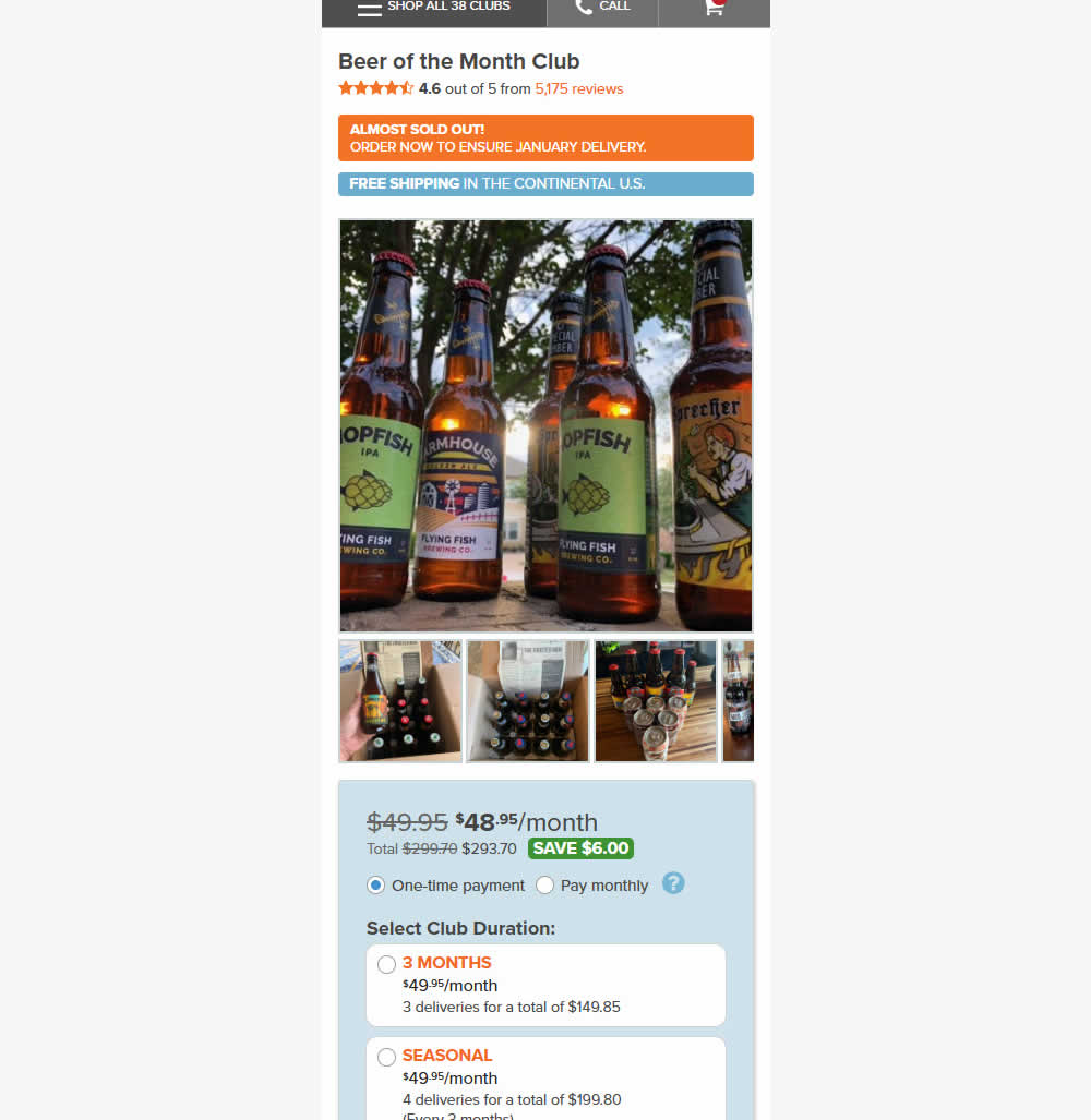
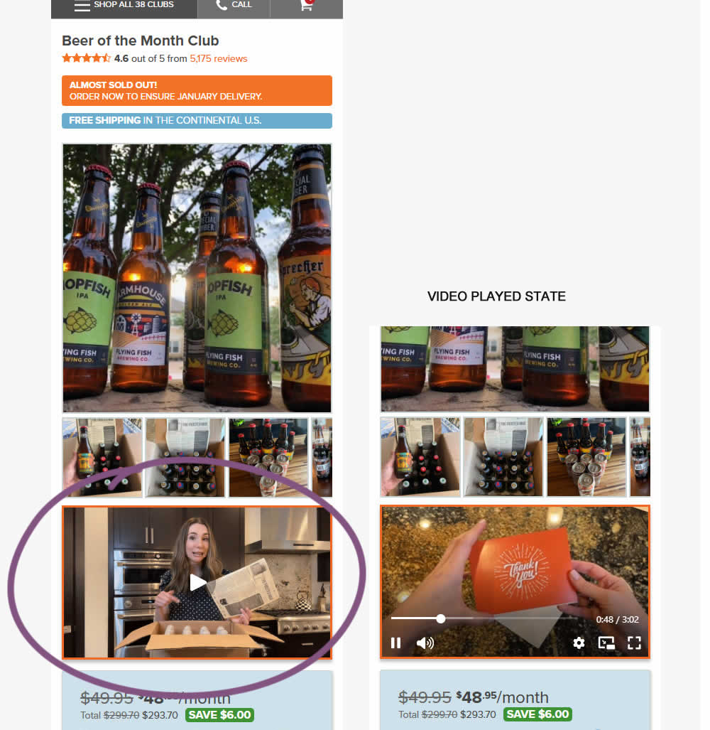
In this experiment, a video unboxing and product overview video was added on product pages. After pressing play, the video started playing with the controls only appearing for a short time before fading away.
Notice the confounding from pushing the buy box further down.
Impact on adds to cart and sales was measured.
Test #577 on
by  Jakub Linowski
Feb 19, 2025
Desktop
Product
X.X%
Progression
Jakub Tested Pattern #48: Video Testimonials
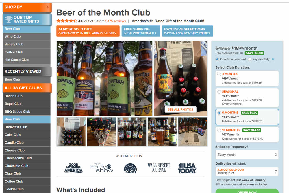
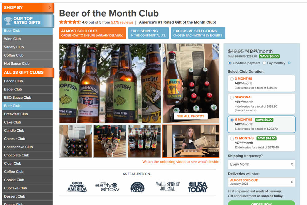
In this experiment, a video unboxing and product overview video was added on product pages. After pressing play, the video expanded to a full column width (taking over the middle column while replacing the 5 small square photo tiles and growing in height.) The video in its play state also contained a prominent (X) icon that allowed users to stop and revert to the original state.
Impact on adds to cart and sales was measured.
Test #575 on
Finn.com
by  Tim Karcher
Feb 12, 2025
Desktop
Listing
X.X%
Progression
Tim Tested Pattern #34: Open In A New Tab On Finn.com
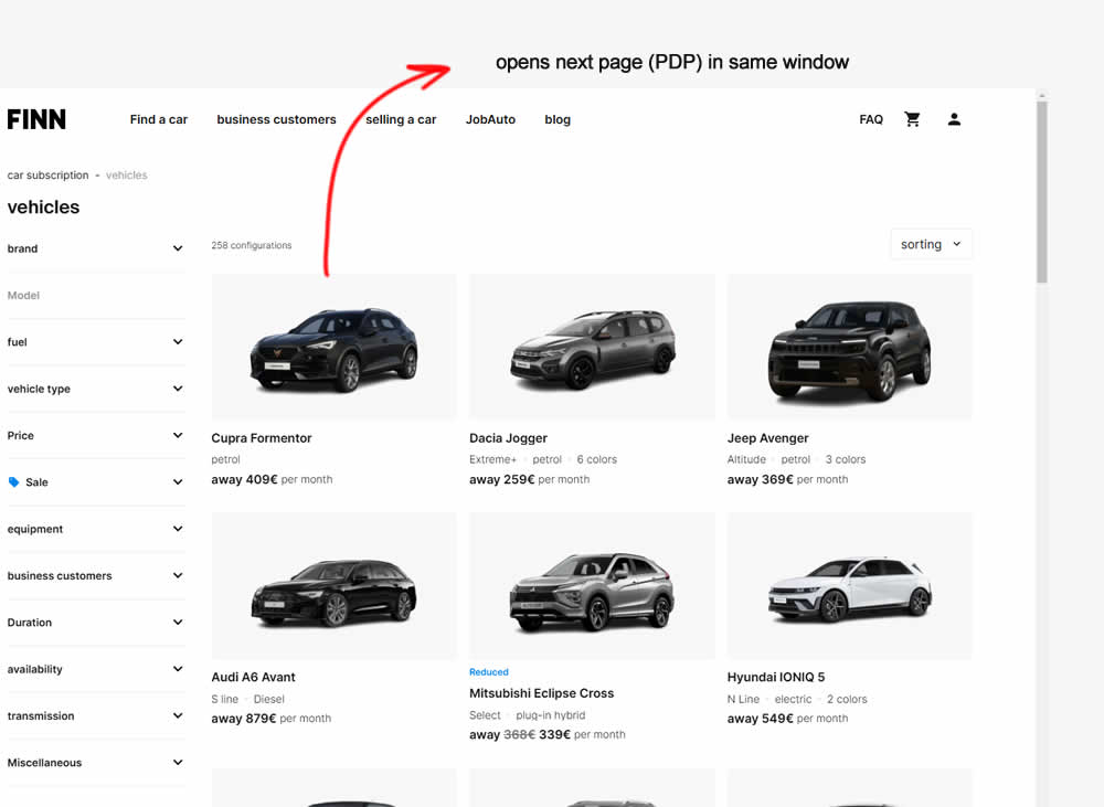
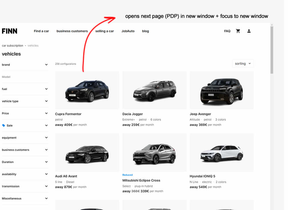
In this experiment, product listing were either opened in the same window (control) or opened in a new tab and focused on (variation). Impact on signups and sales was measured.
Test #576 on
Finn.com
by  Tim Karcher
Feb 12, 2025
Mobile
Listing
X.X%
Progression
Tim Tested Pattern #34: Open In A New Tab On Finn.com
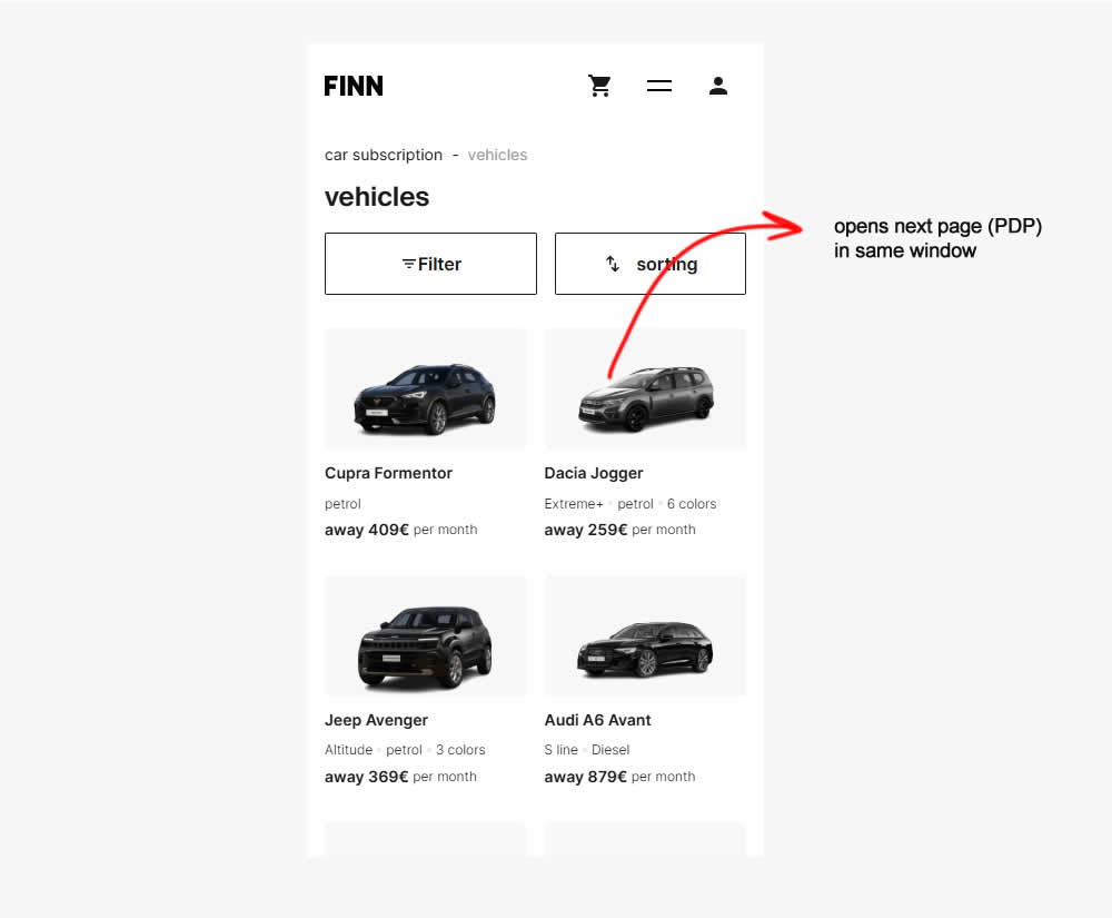
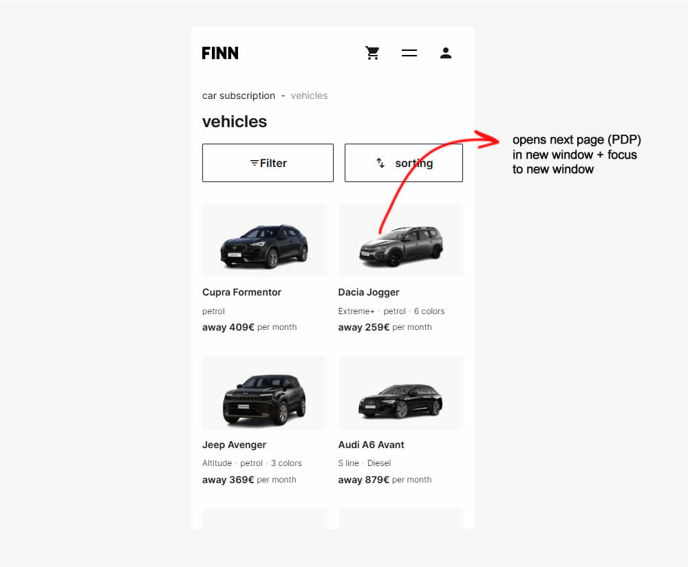
Test #574 on
Myer.com.au
by  Jay Kim
Jan 30, 2025
Mobile
Product
X.X%
Progression
Jay Tested Pattern #41: Sticky Call To Action On Myer.com.au
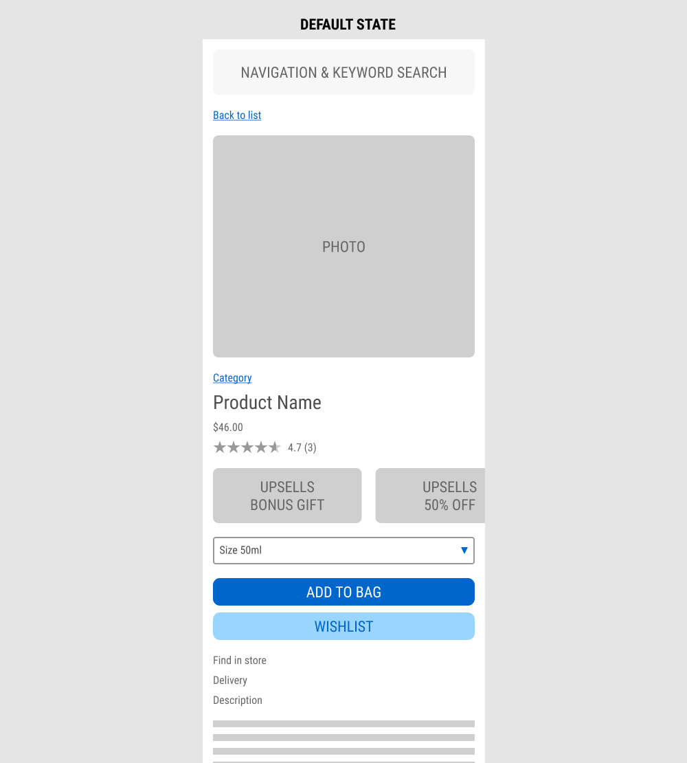
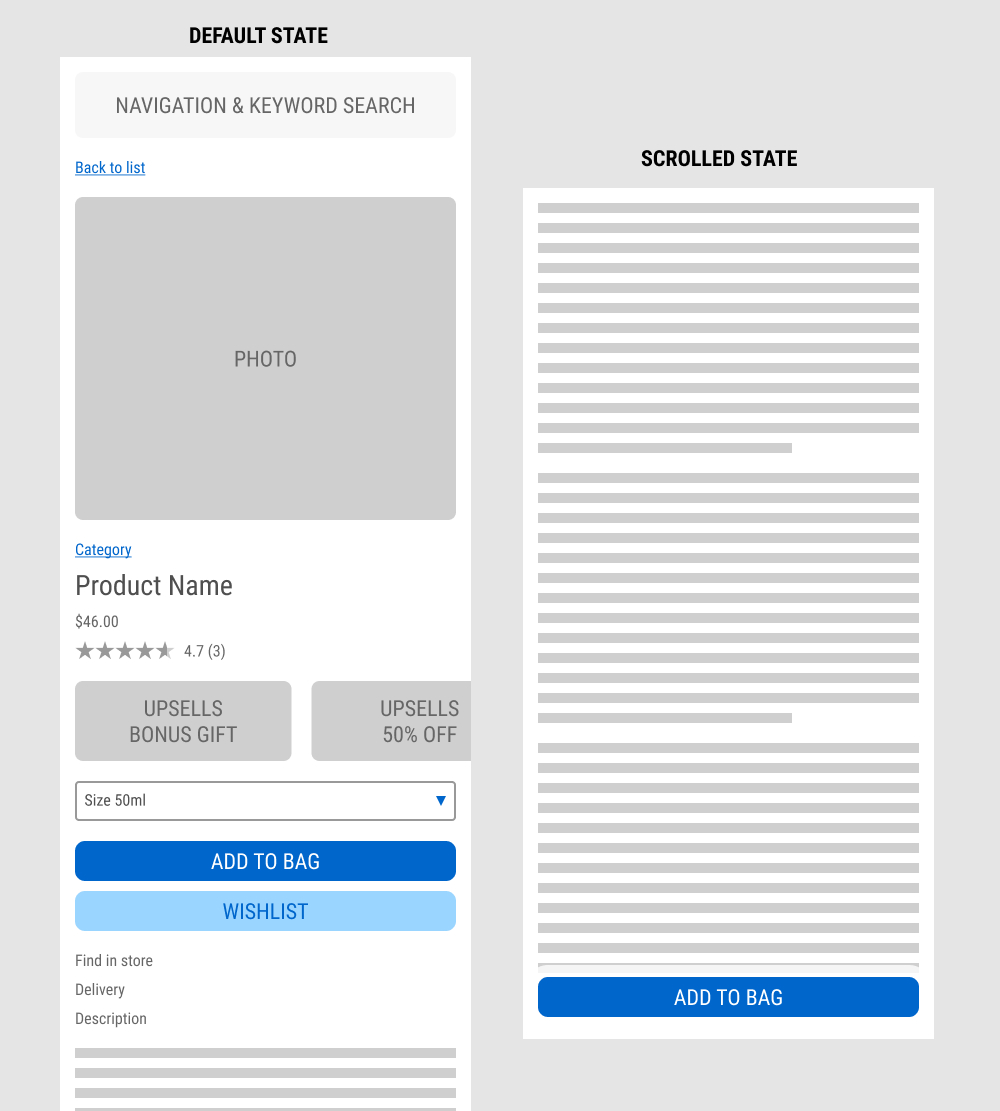
In this experiment published by Jay Kim, a sticky add to cart button was added on mobile product detail pages. It appeared after the scroll depth past the original add to cart button. Impact to adds to cart and completed sales was measured.
Test #573 on
Online.metro-cc.ru
by  Andrey Andreev
Jan 28, 2025
Mobile
Shopping Cart
X.X%
Progression
Andrey Tested Pattern #41: Sticky Call To Action On Online.metro-cc.ru
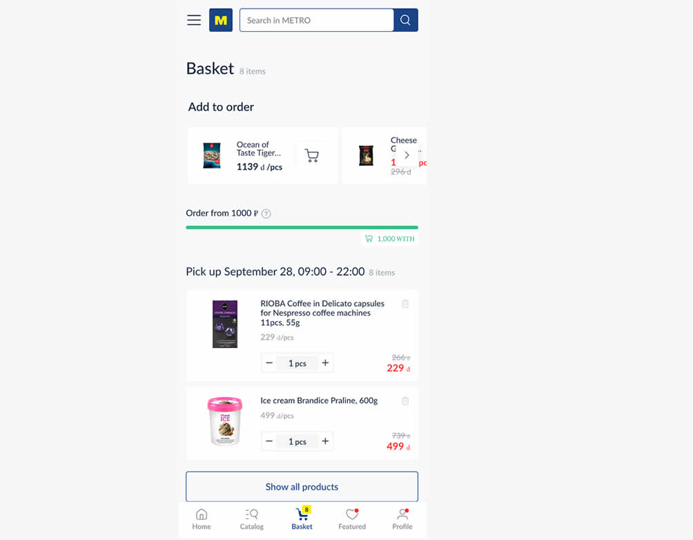
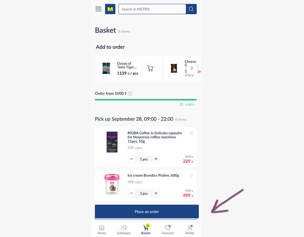
In this experiment, a floating "Place order" button was added to a mobile shopping cart screen. Impact on progression (to checkout) and sales was measured.
Test #572 on
by  Deborah O'Malley
Jan 27, 2025
Mobile
Product
X.X%
Progression
Deborah Tested Pattern #41: Sticky Call To Action


In this experiment from GuessTheTest.com, the control variation only showed the primary add-to-cart button further down on the page. The variation however turned the button into a floating one once users scrolled on the page. Impact on button clicks was measured.
Test #571 on
by  Jakub Linowski
Jan 03, 2025
Desktop
Mobile
Product
X.X%
Progression
Jakub Tested Pattern #30: Authentic Photos
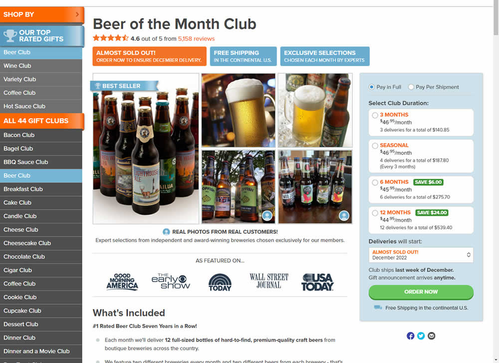
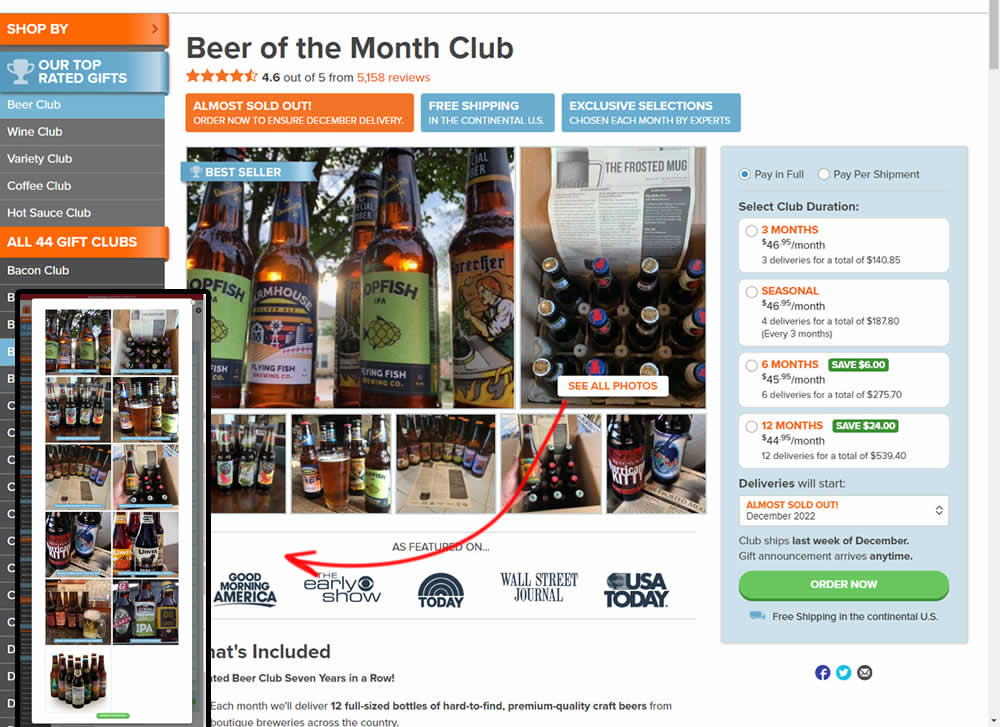
In this experiment, additional customer product photos were shown at the top of the product page. A "Show More Photos" button was also added which launched a modal with additional and larger images. Impact on sales was measured.
Test #568 on
by  Jakub Linowski
Dec 22, 2024
X.X%
Progression
Jakub Tested Pattern #80: Persistent Filters
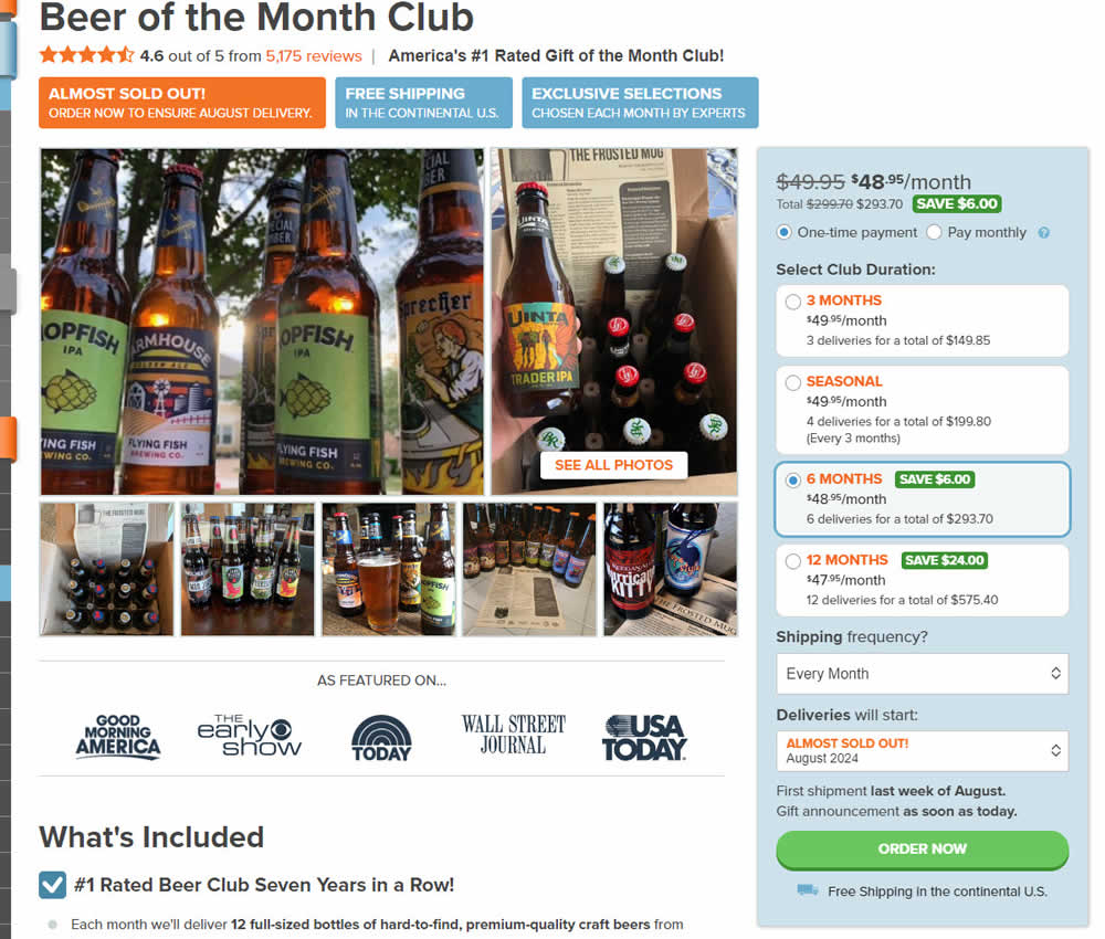
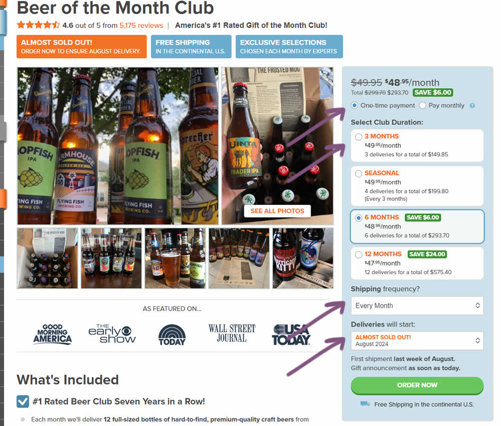
In this experiment, "persistence" of 4 product choices was added in the variation. When users made a product selection such as: duration, payment terms, starting month or shipping frequency, their choices were remembered and defaulted on next visits, reloads or when viewing other products. Impact on adds to cart and sales was measured.
Test #566 on
Banter.com
by  Craig Kistler
Dec 11, 2024
Desktop
Product
X.X%
Progression
Craig Tested Pattern #66: Complementary Upsell On Banter.com
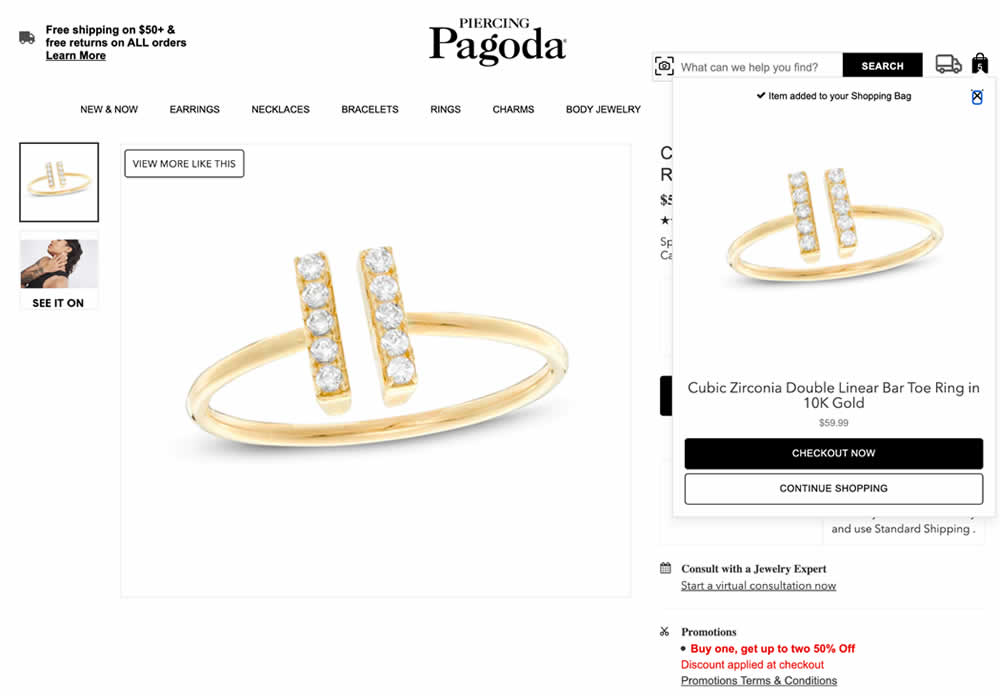
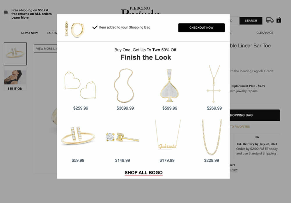
In this experiment, a modal based message was shown to encourage extra products being added as complementary upsells. In the control, the promotion text appeared at the bottom as red text ("Buy one, get up to two 50% Off"). Whereas in the variation, specific products were shown on the modal (post add-to-cart). Impact on adds-to-cart, sales and average revenue was measured.
Test #565 on
Umbraco.com
by  Lars Skjold Iversen
Nov 30, 2024
Desktop
Home & Landing
X.X%
Progression
Lars Tested Pattern #129: Right Or Left Aligned Forms On Umbraco.com
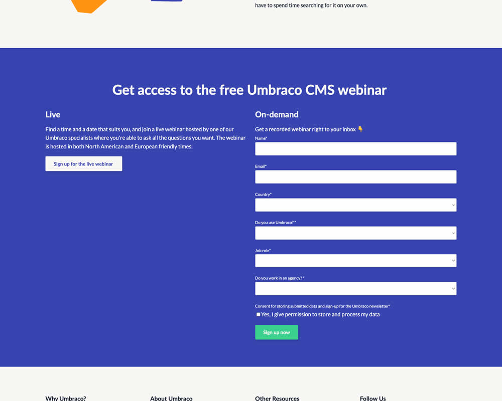
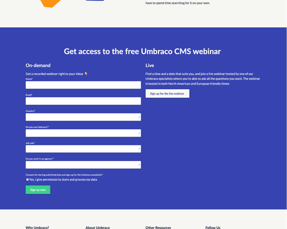
In this experiment, the right vs left position of a form (at the bottom of a landing page) was a/b tested. Impact on progression and form completion was measured.
Test #564 on
Hellostake.com
by  Louis Alston
Nov 26, 2024
Desktop
Mobile
Home & Landing
X.X%
Progression
Louis Tested Pattern #114: Less Or More Visible Prices On Hellostake.com
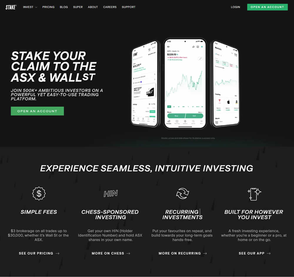
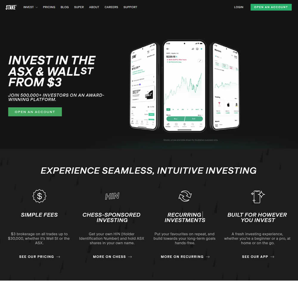
In this a/b test, the headline was changed to reflect pricing information (informing that trades are starting at $3). Impact on progression and signups was measured.