All Latest 620 A/B Tests
Test #443 on
Volders.de
by  Daria Kurchinskaia
Nov 27, 2022
Desktop
Mobile
Home & Landing
X.X%
Progression
Daria Tested Pattern #4: Testimonials On Volders.de
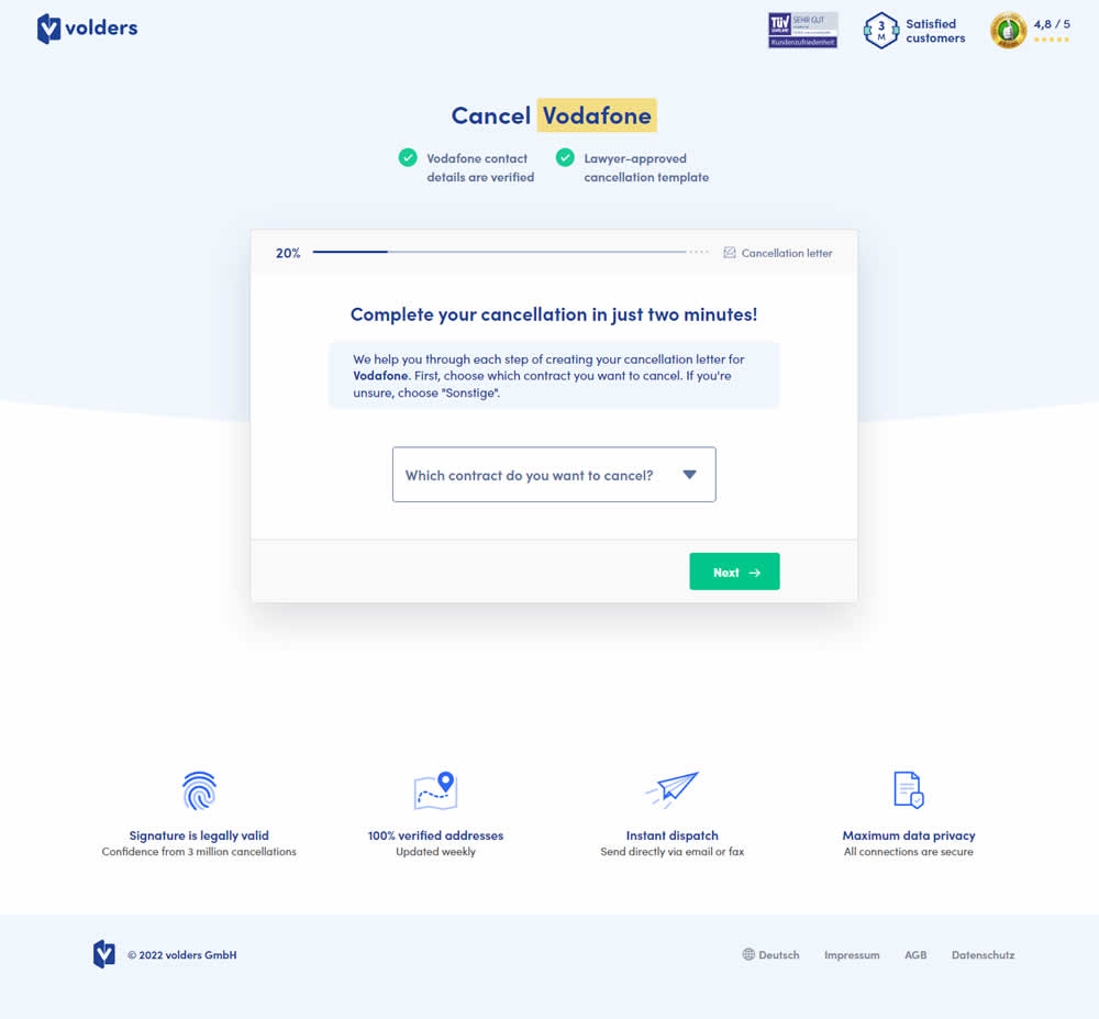
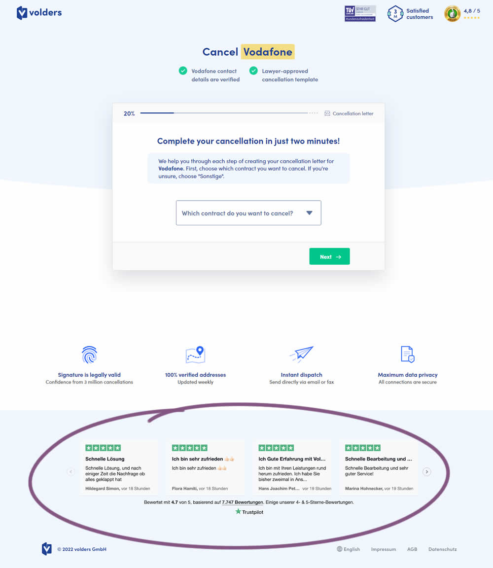
In this experiment, four TrustPilot reviews were appended at the bottom of landing pages of a contract cancelation service (paid). These reviews were also shown throughout the complete signup funnel (4 more steps). Impact on progression (step 2) and final completed purchases were measured.
Which A Or B Actually Wins? Find Out Before You Test.
Members see every test result — the winners, the flat ones, and the losers — along with exact effects and sample sizes. Use it to estimate your tests and prioritize by probability, not gut feel. Start every experiment with the odds on your side.
Test #430 on
by  Jakub Linowski
Sep 20, 2022
Desktop
Product
X.X%
Progression
Jakub Tested Pattern #26: Cart Reminder And Recently Viewed
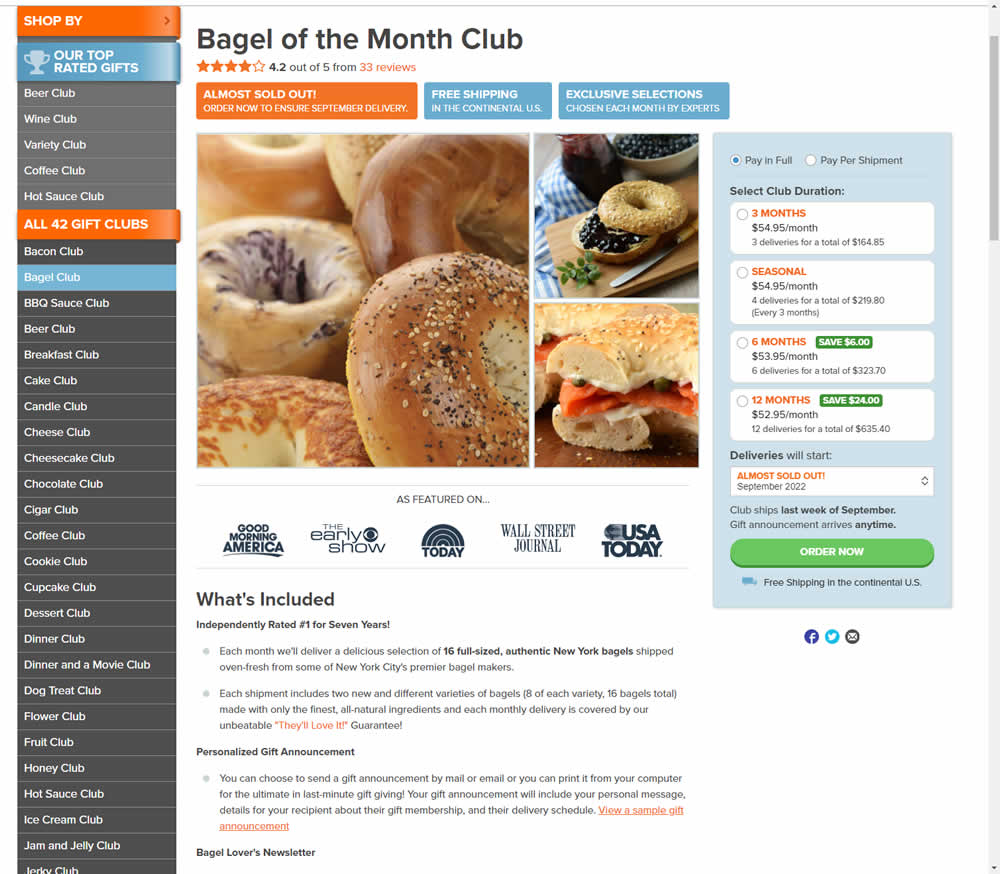
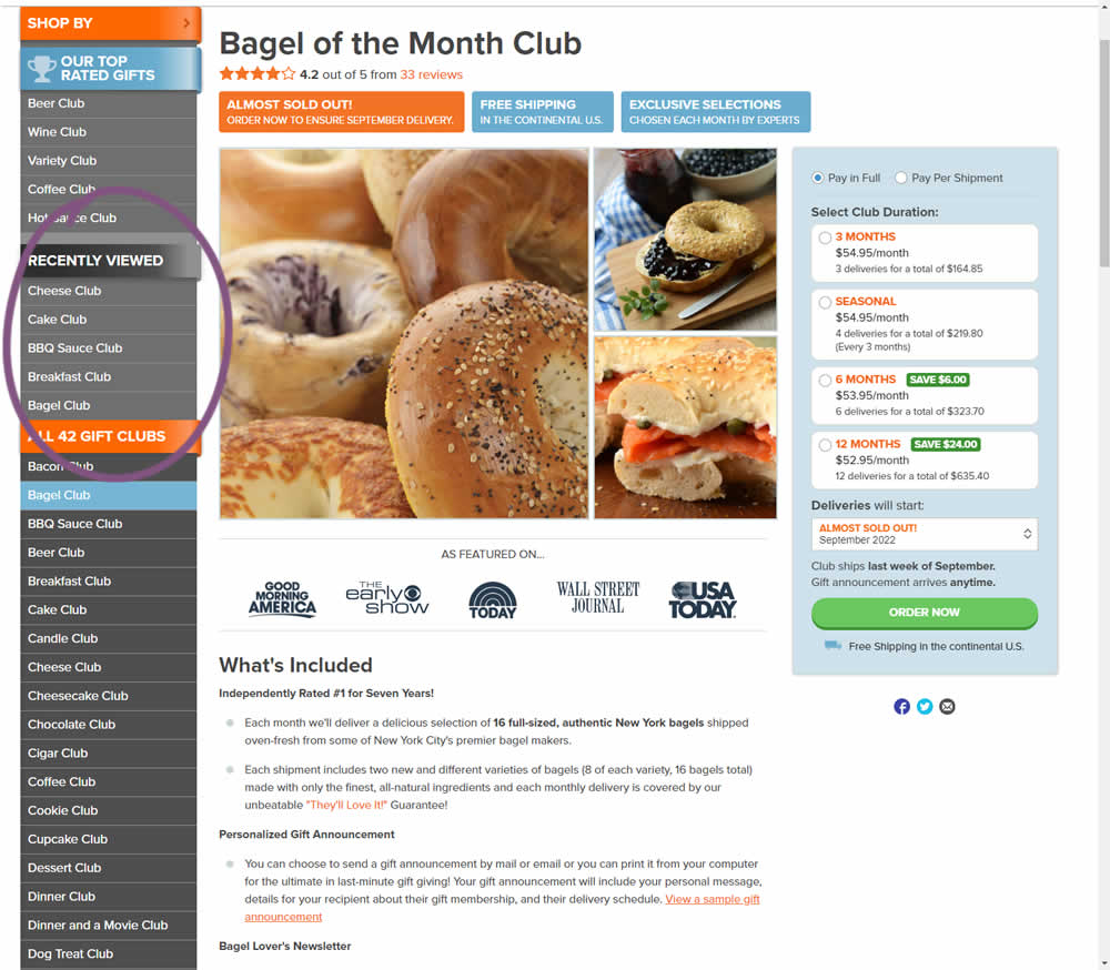
In this experiment, up to 5 recently viewed product pages would appear on the left hand navigation. The idea was to make it easier for users get back to what they were looking at in case they were browsing. These recently viewed products were not visibile in the control. Impact on adds-to-cart and completed transactions was measured.
Test #427 on
Designlab.com
by  Daniel Shapiro
Aug 10, 2022
Desktop
Mobile
Checkout
X.X%
Progression
Daniel Tested Pattern #28: Easiest Fields First On Designlab.com
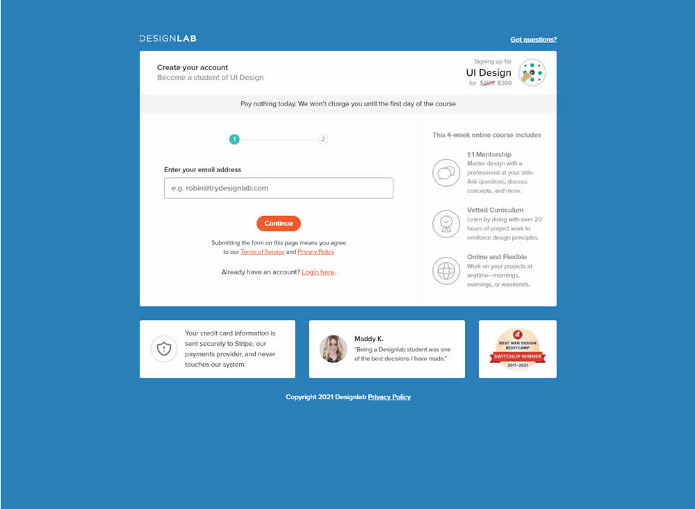
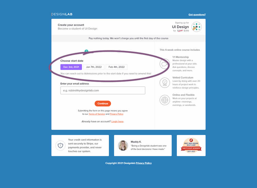
In this experiment, the course enrollment start date was moved from step 2 to step 1 of an enrollment / checkout flow. The test was run by Designlab - that offers design courses and education with a strong element of mentorship. Impact on progression to next step and completed transactions were measured.
Test #425 on
by  Jakub Linowski
Aug 03, 2022
Desktop
Product
X.X%
Progression
Jakub Tested Pattern #41: Sticky Call To Action
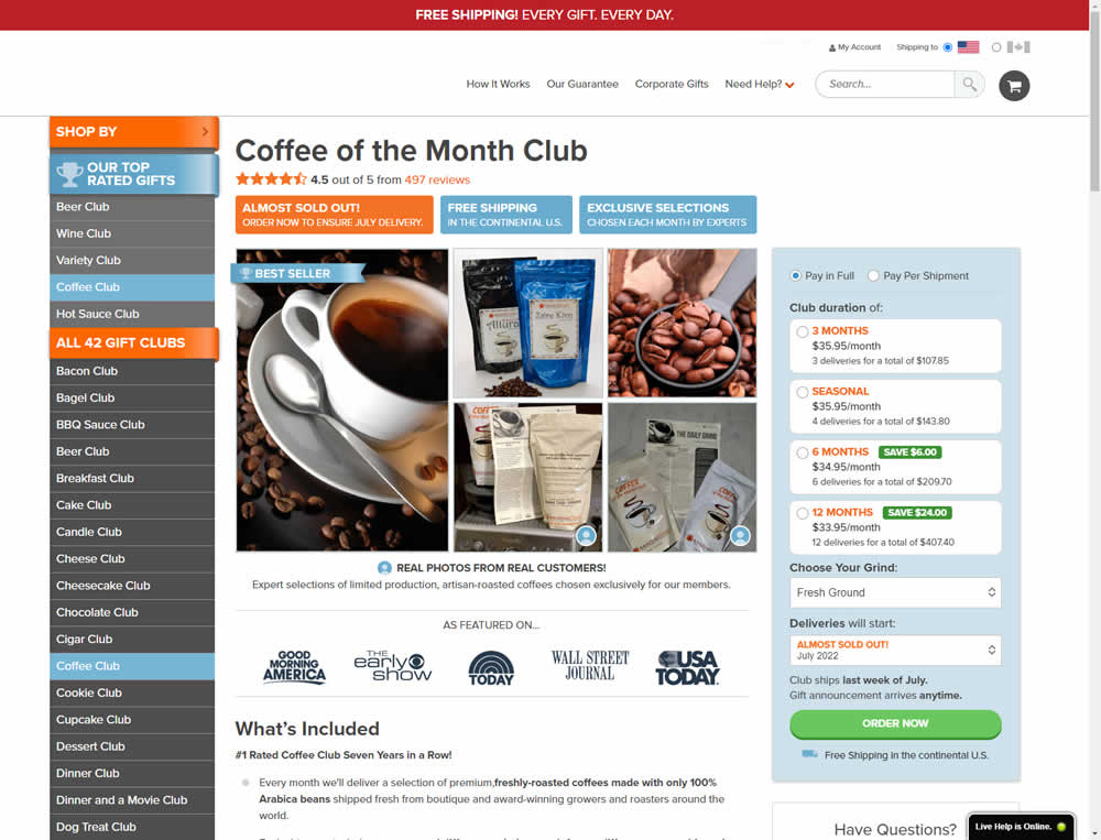
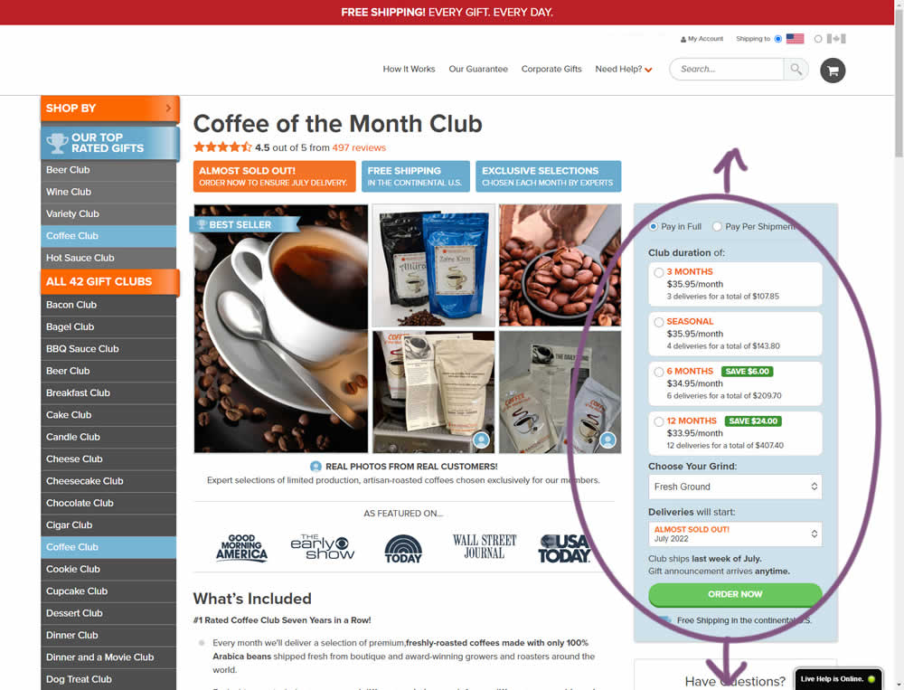
In this experiment, the complete buy box on a product detail page, floated along as users scrolled through the long screen. The variation made sure the product choice and order now button was always visible. Impact on adds-to-cart and sales was measured.
Test #422 on
Volders.de
by  Daria Kurchinskaia
Jul 22, 2022
Desktop
Mobile
Shopping Cart
X.X%
Progression
Daria Tested Pattern #3: Fewer Form Fields On Volders.de
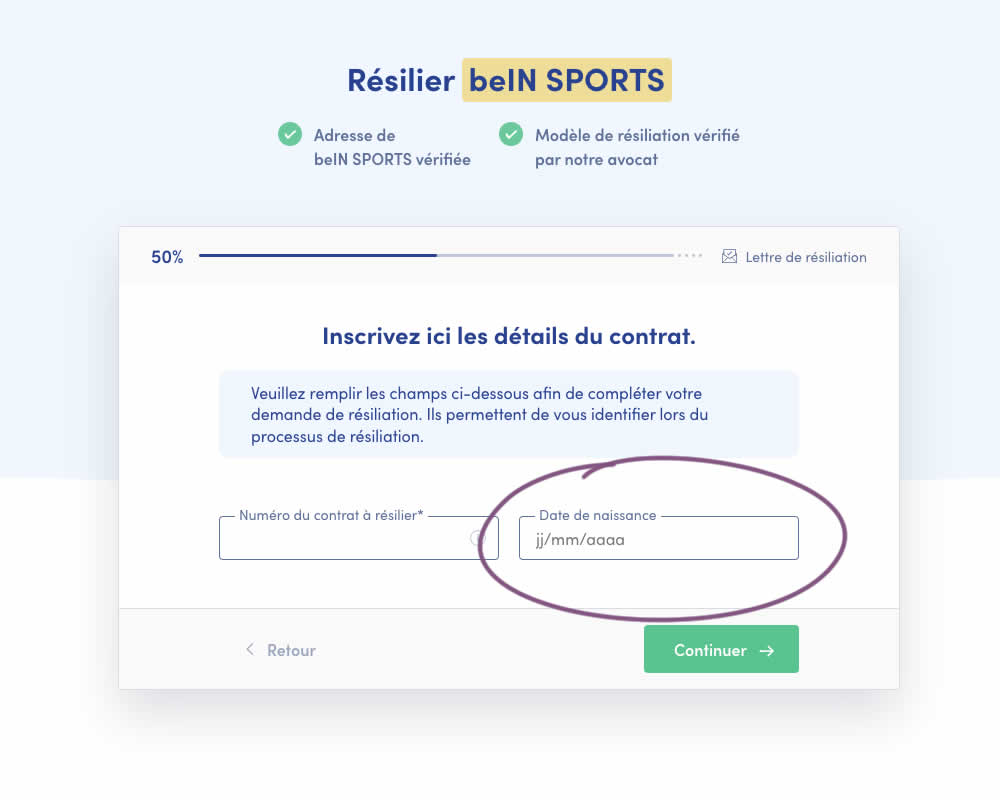
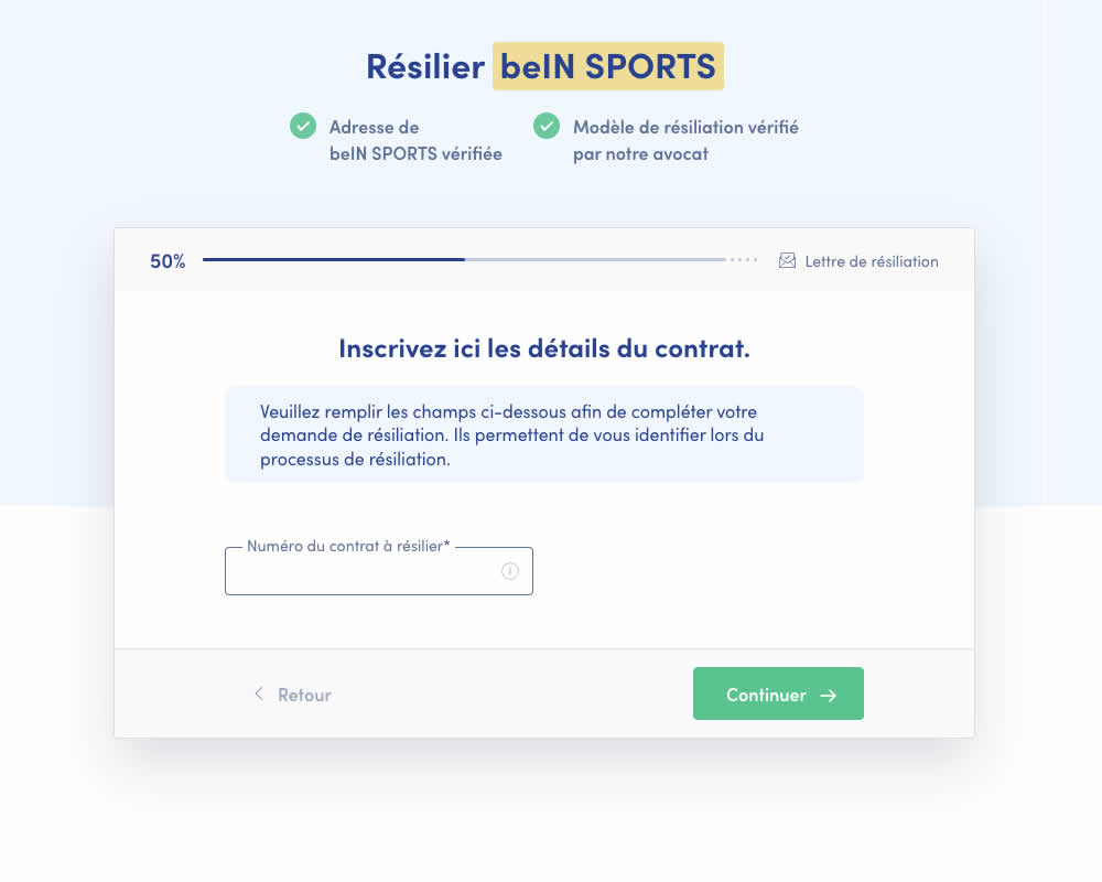
A birthdate field was removed during a signup process for a paid contract cancellation service. Impact on progression (next step) and sales (completed transactions) was measured.
Test #419 on
by  Jakub Linowski
Jun 29, 2022
Desktop
Home & Landing
X.X%
Progression
Jakub Tested Pattern #68: Welcome Discount
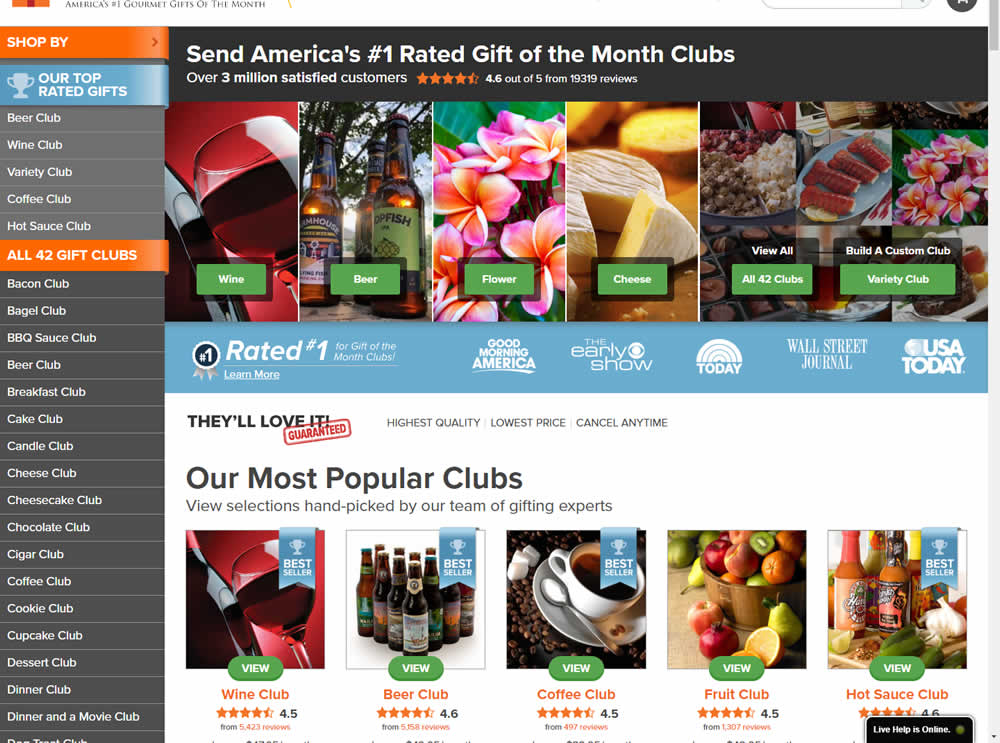
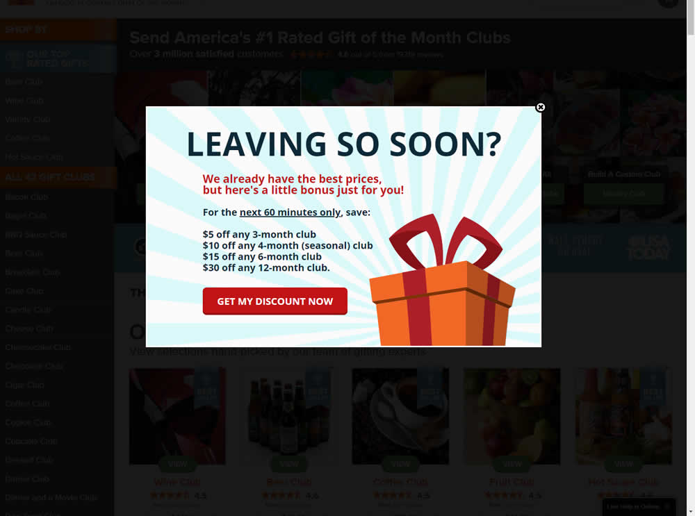
In this experiment, the presence of a discount modal (bigger discount for larger purchases) was tested on home and product pages. The trigger happend after a scroll down, a few second pause, and a mouse scroll up interaction. Impact on sales was measured.
Test #413 on
by  Jakub Linowski
May 26, 2022
Desktop
Mobile
Shopping Cart
X.X%
Progression
Jakub Tested Pattern #114: Less Or More Visible Prices
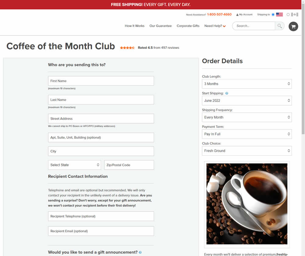
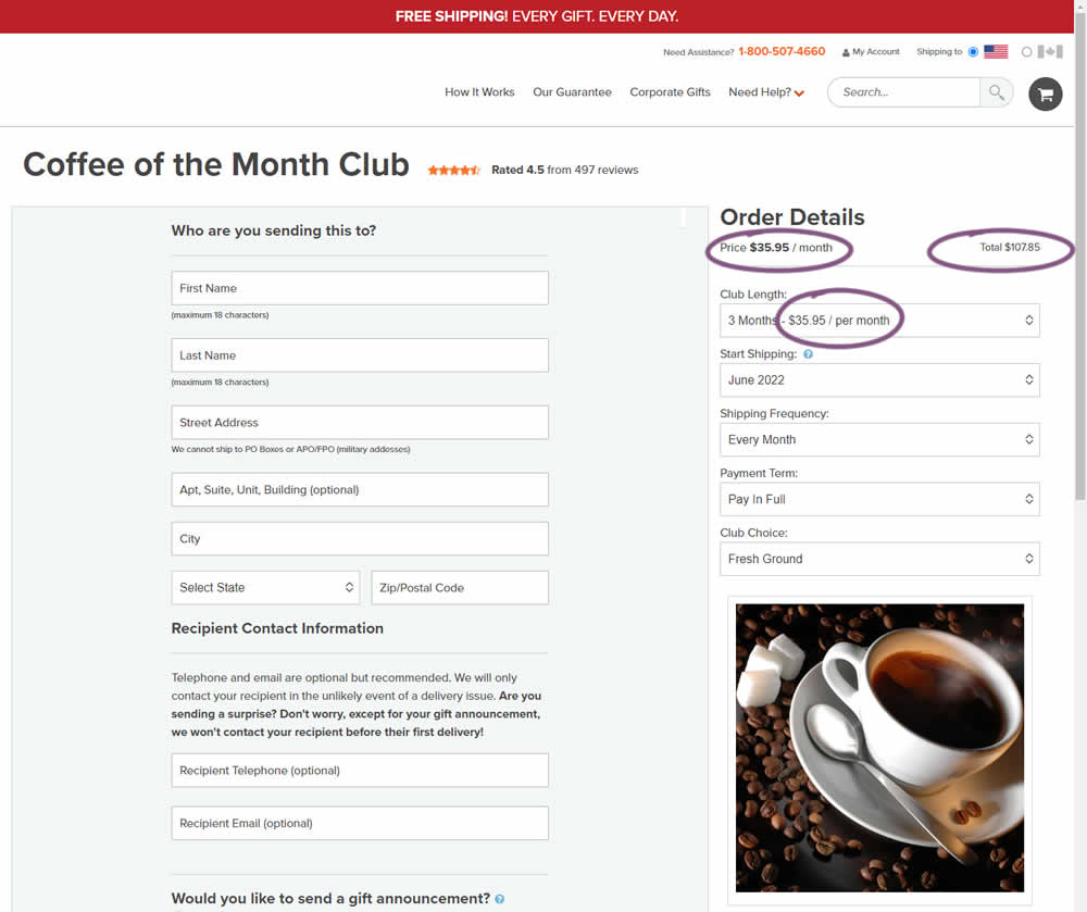
Should prices be displayed during an editing state on an add-to-cart screen (after adding-to-cart from a product detail page)? In this experiment, club pricing was added and shown in three areas after customers clicked on a small "edit details" links. The control did not have this pricing information (which was only shown on a product detail screen before).
Test #411 on
by  Ayat Shukairy
May 09, 2022
Desktop
Mobile
Product
X.X%
Progression
Ayat Tested Pattern #126: Bottom Or Left Thumbnails
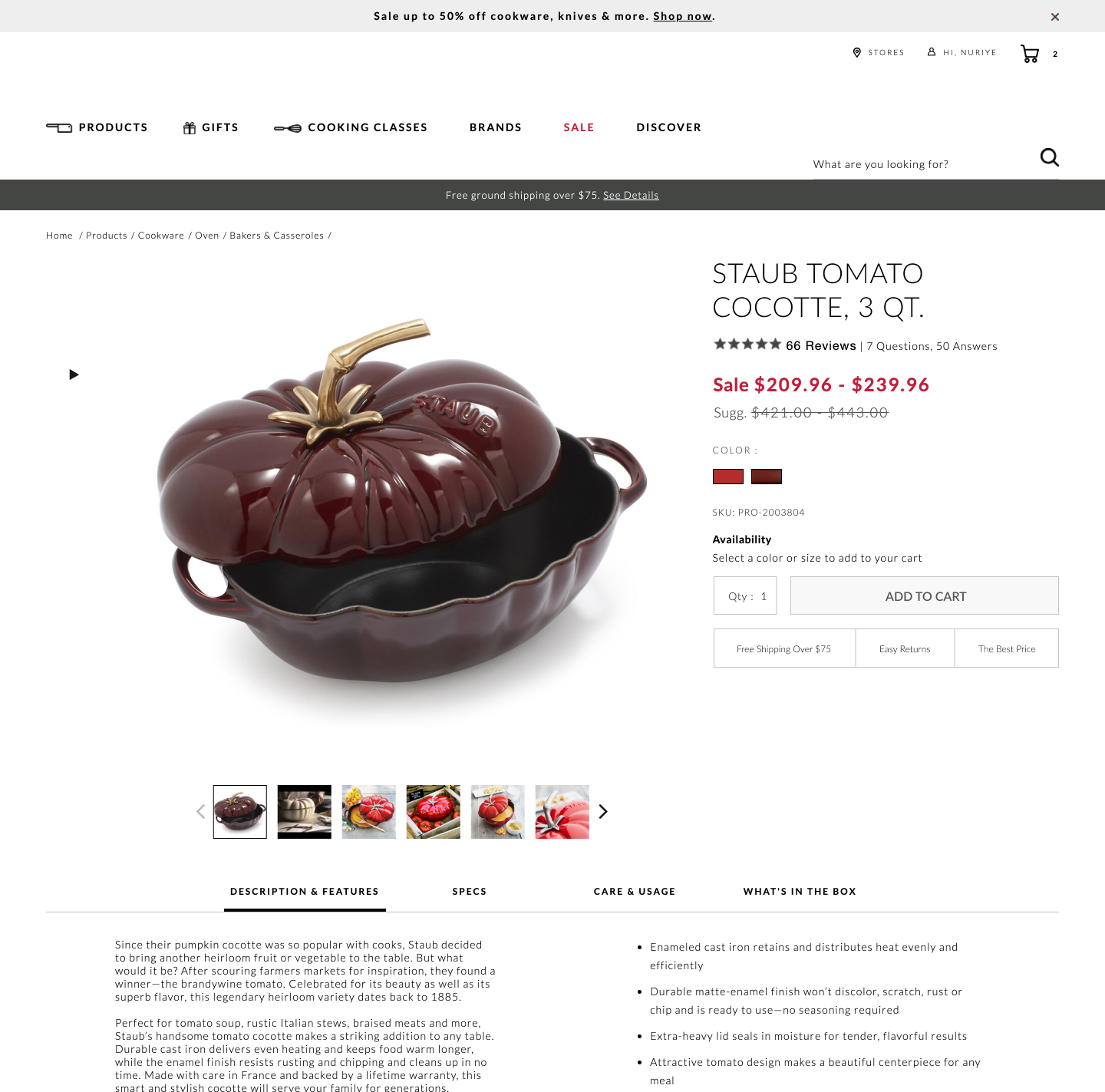
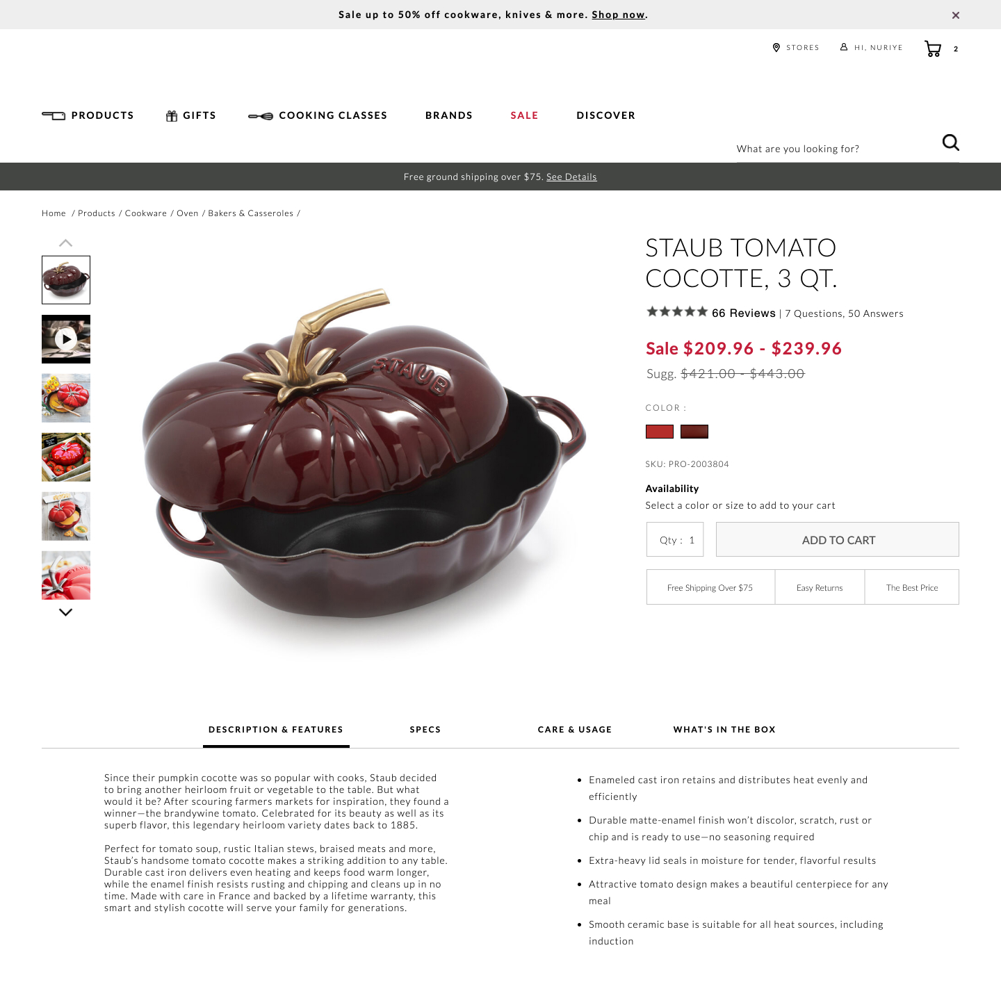
Bottom aligned thumbnails were shifted to the left side on a product image. Doing so, also shifted the product descriptions a little higher. Impact on adds-to-cart and total transactions was measured.
Test #410 on
Designlab.com
by  Daniel Shapiro
May 05, 2022
Desktop
Mobile
Home & Landing
X.X%
Progression
Daniel Tested Pattern #29: Surfaced Content On Designlab.com
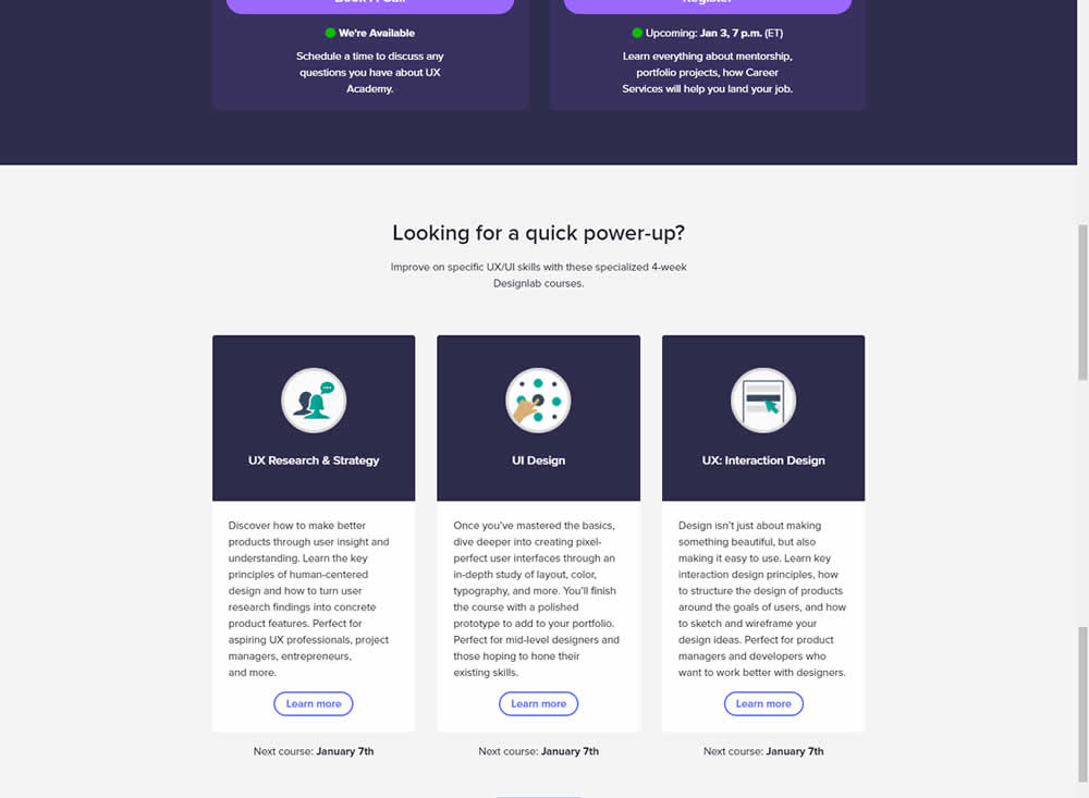
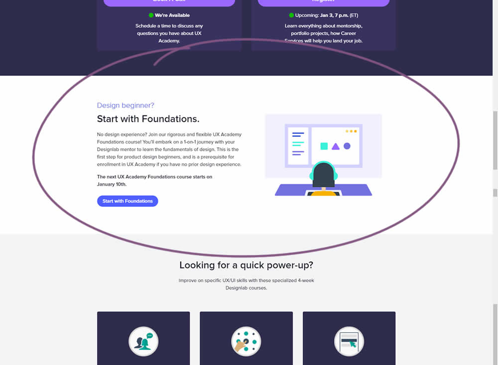
Does linking to a product detail page help? Or should a homepage simply focus on generic lead generation? In this homepage experiment, the presence of a component with a link to a detailed course landing page was tested. Impact on course enrollments was measured.
Test #408 on
by  Jakub Linowski
Apr 29, 2022
Desktop
Mobile
Product
X.X%
Progression
Jakub Tested Pattern #67: Currency & Taxes
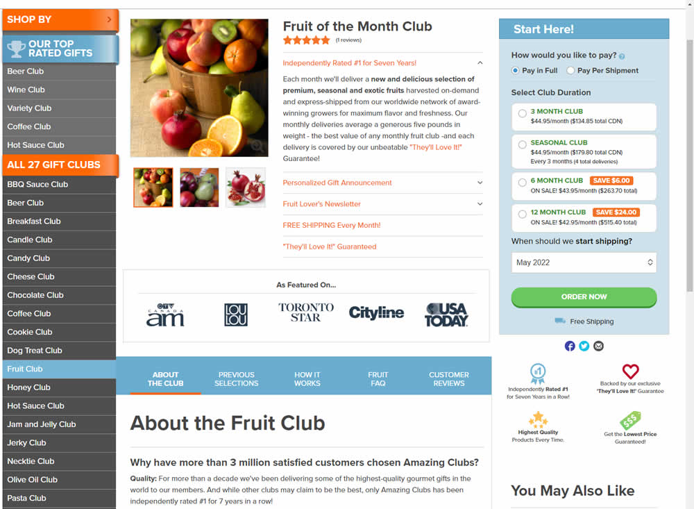
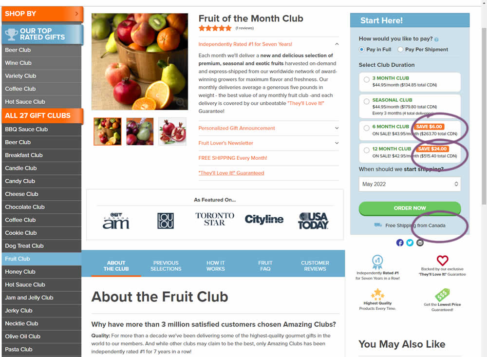
Here is a very simple experiment where CDN currency copy was appended to prices being shown on a Canadian ecommerce site. Additional copy ("from Canada") was appended to an existing shipping message.
Test #400 on
by  Herman Klein
Mar 06, 2022
Desktop
Shopping Cart
X.X%
Progression
Herman Tested Pattern #65: Add More For Extra Incentive

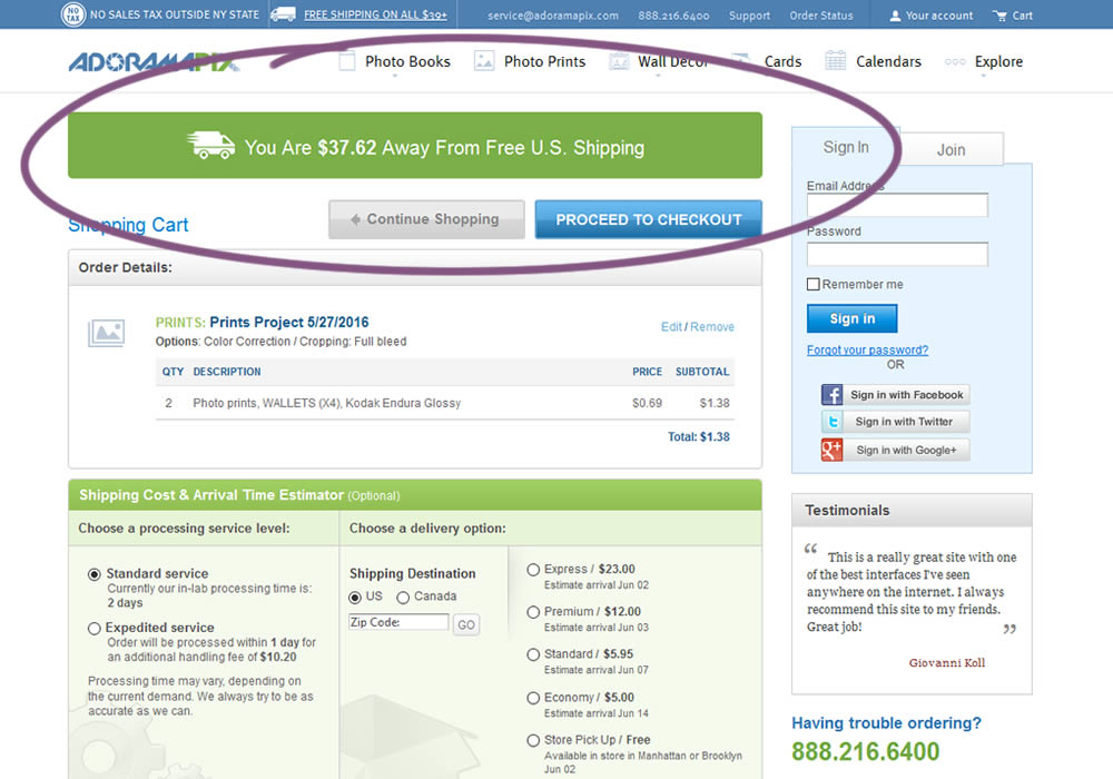
In this experiment, customers who were not yet eligible for free shipping (with cart amounts under $39) were presented with an encouraging message to add more and earn free shipping. Impact on progression to checkout and sales was measured.
Test #399 on
by  Jakub Linowski
Feb 27, 2022
Desktop
Mobile
Checkout
X.X%
Progression
Jakub Tested Pattern #35: Floating Labels
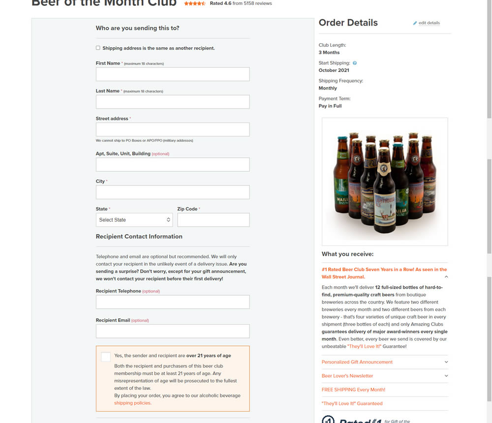
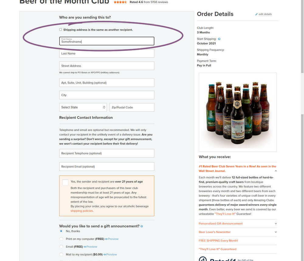
In this experiment, top-aligned field labels were tested against floating labels (with labels floating inside the form field itself).
Test #398 on
Adoramapix.com
by  Herman Klein
Feb 25, 2022
Desktop
Shopping Cart
X.X%
Progression
Herman Tested Pattern #121: Free Shipping On Adoramapix.com
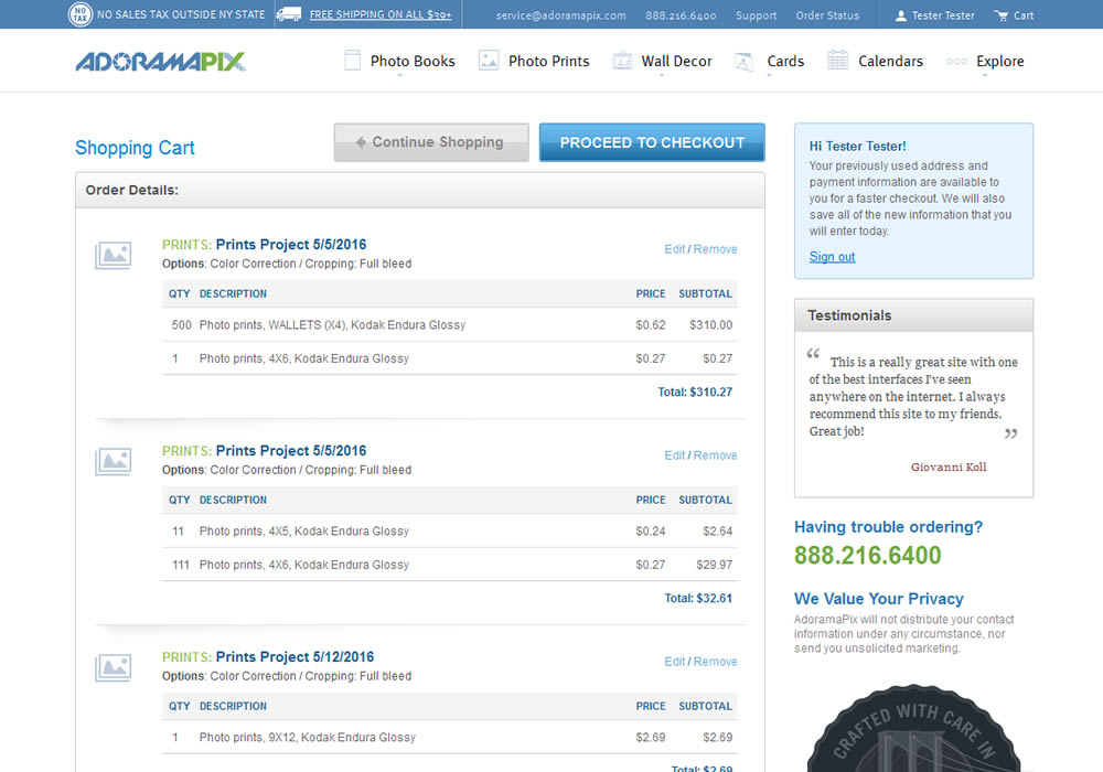
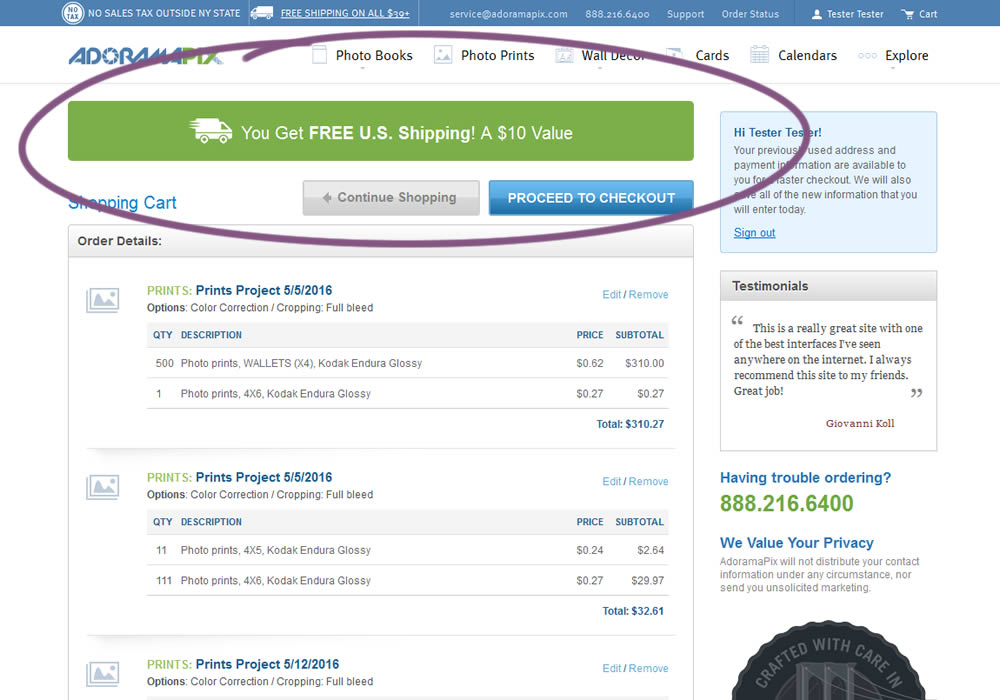
In this experiment, customers were eligible for free shipping (with cart amounts of $39 or more) were presented with an earned free shipping message. The variation also showed the value of the earned free shipping - (for example $10). Impact on progression to checkout and sales was measured.
Test #395 on
by  Jakub Linowski
Jan 31, 2022
Desktop
Mobile
Product
X.X%
Progression
Jakub Tested Pattern #52: How It Works
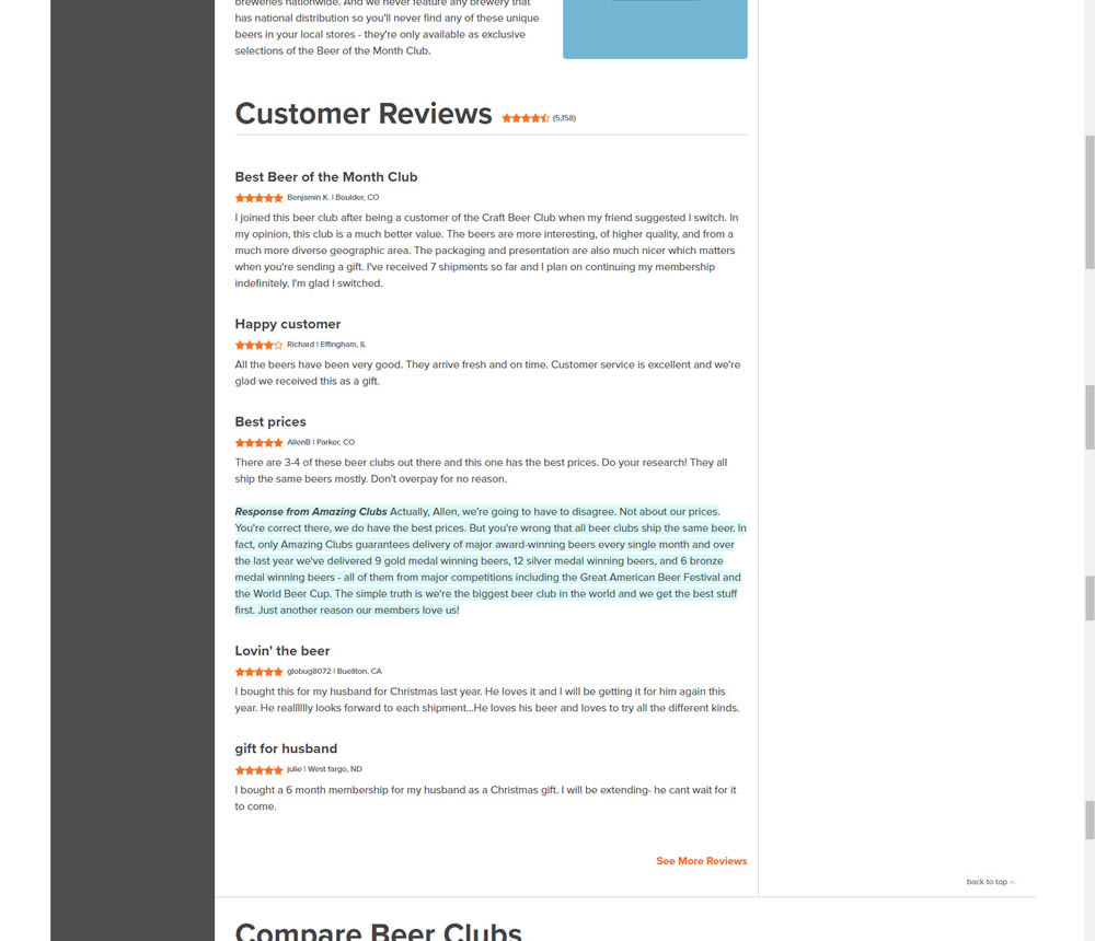
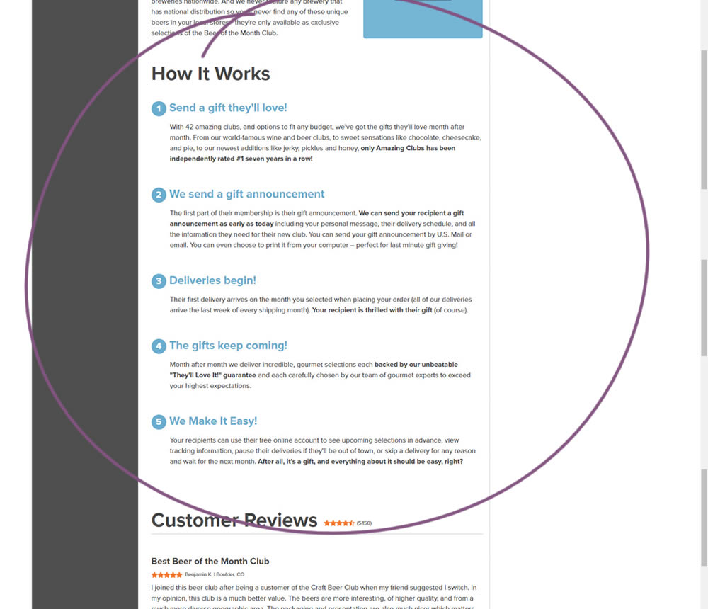
In this experiment, a How It Works section was appended on a product detail page just above product reviews.
Test #394 on
Chaos.com
by  Velin Penev
Jan 29, 2022
Desktop
Product
X.X%
Progression
Velin Tested Pattern #113: More Or Fewer Plans On Chaos.com
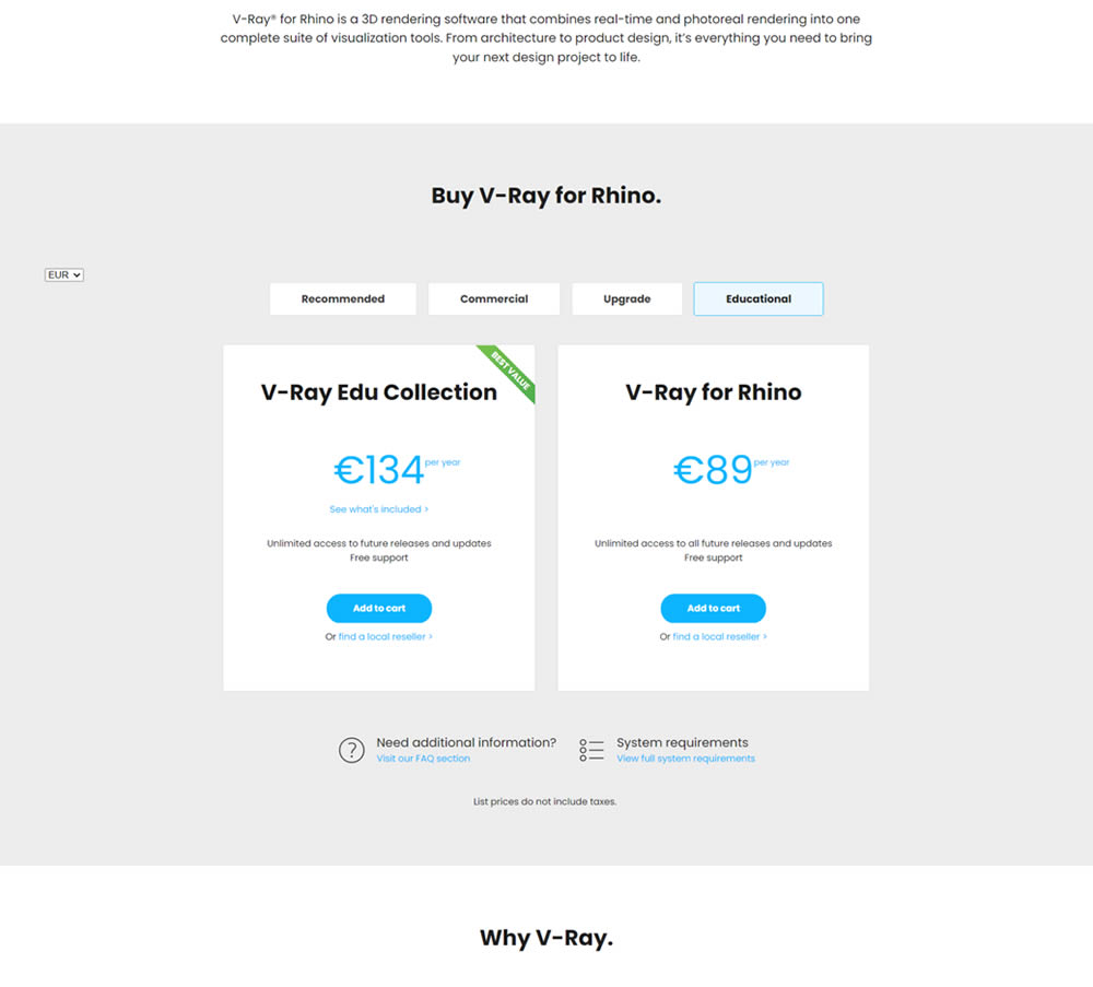
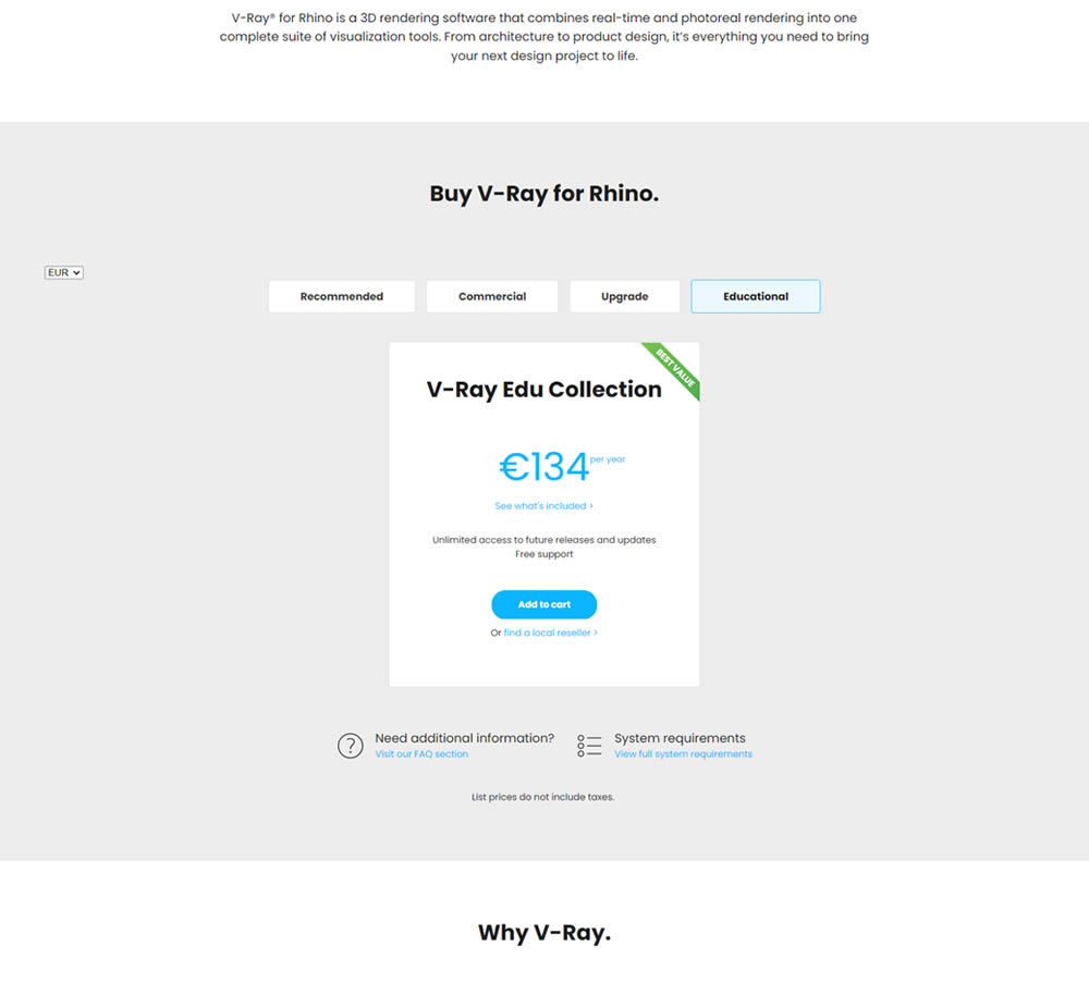
In this experiment, a two plan pricing plan (standalone product with a higher collection set) was tested against a single plan one (only a collection set). Impact on clicks and total sales was measured.
Test #5 on
Busyteacher.org
by  Andrei Zakhareuski
Jan 23, 2022
Desktop
Mobile
Product
X.X%
Progression
Andrei Tested Pattern #21: What It's Worth On Busyteacher.org
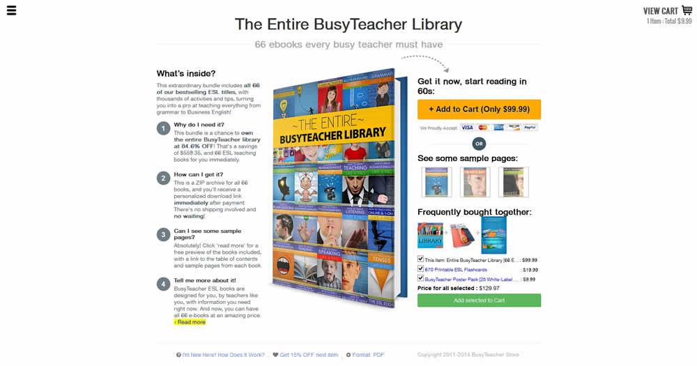
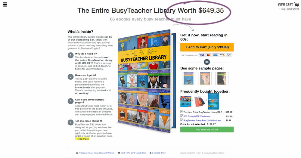
The variation included a simple extention of the headline to include the full dollar worth of a discounted bundle deal.
Test #392 on
by  Jakub Linowski
Dec 31, 2021
Desktop
Mobile
Product
X.X%
Progression
Jakub Tested Pattern #122: Zigzag Layout
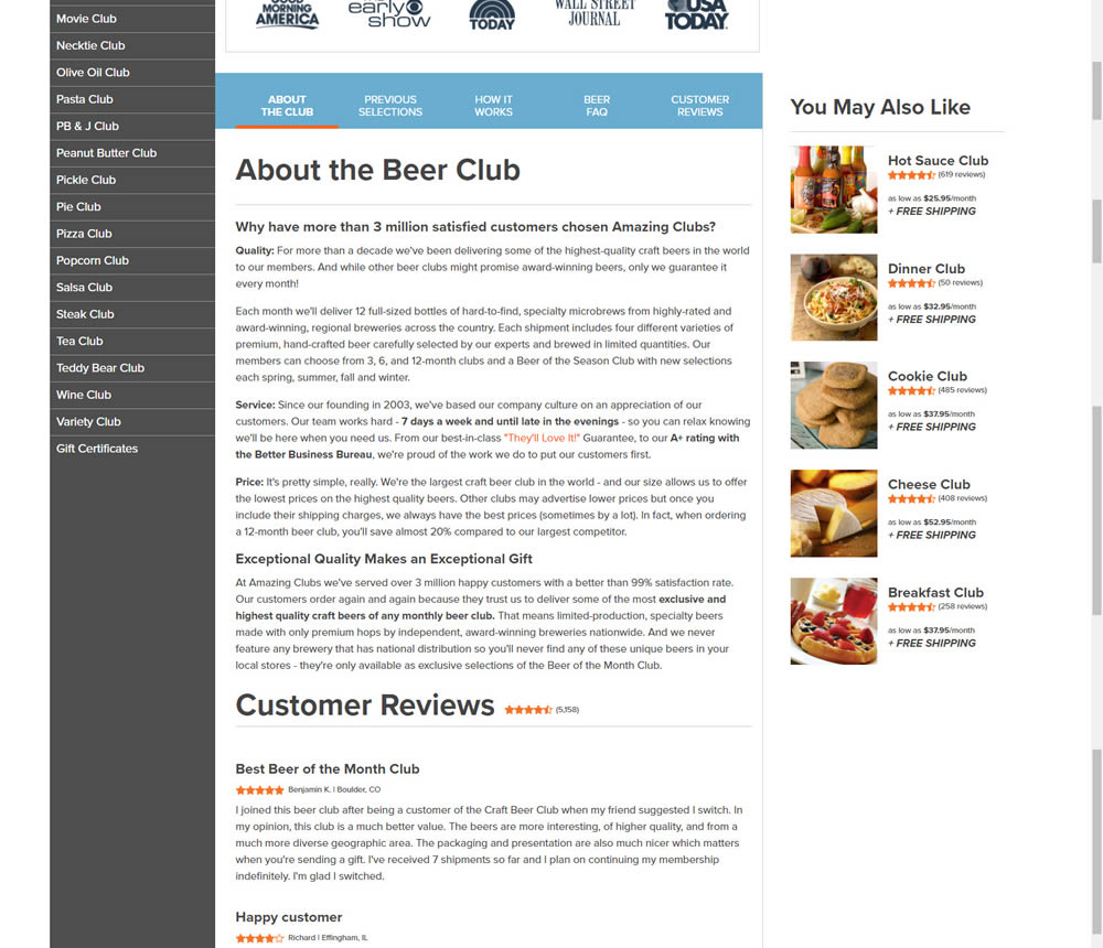
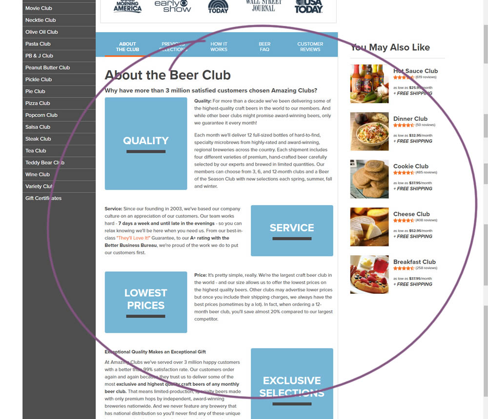
In this experiment, paragraph style copy was reorganized into a zig zag layout with key sections being reinforiced with copy-as-image statements. Impact on adds-to-cart and sales was measured.
Test #391 on
Backstage.com
by  Stanley Zuo
Dec 30, 2021
Desktop
Mobile
Listing
X.X%
Progression
Stanley Tested Pattern #82: Onboarding Callouts On Backstage.com
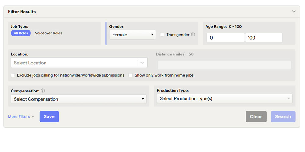
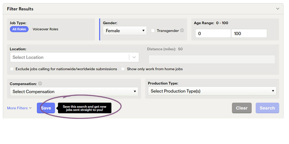
This experiment added a small nudge or callout to encourage more signups. Attention was directed towards the save function, which lead to the signup flow for anyone not signed it. Impact on signups was measured.
Test #388 on
by  Jakub Linowski
Dec 09, 2021
Mobile
Listing
X.X%
Progression
Jakub Tested Pattern #51: Shortcut Buttons
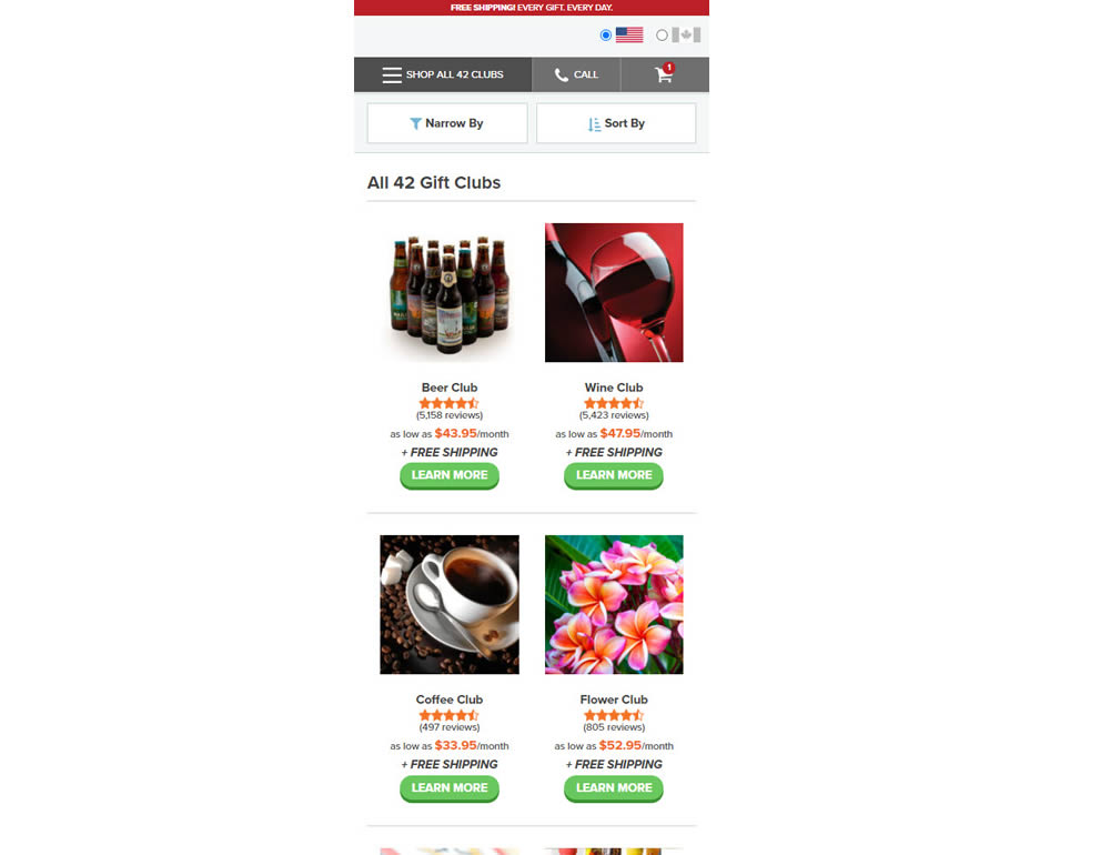
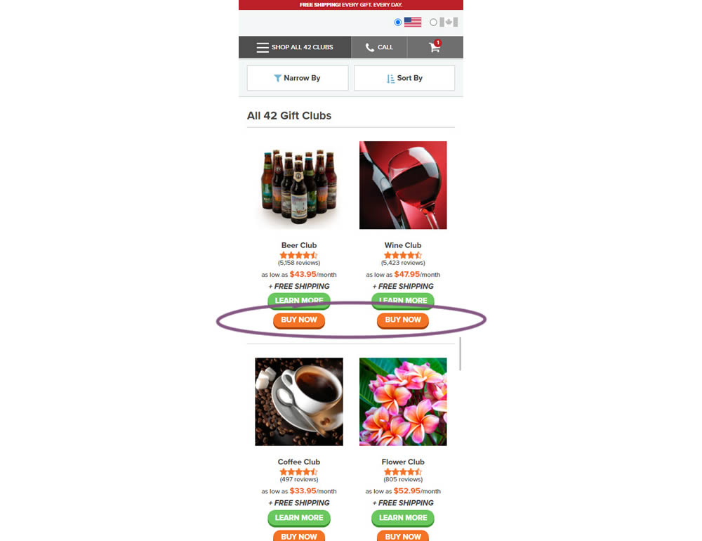
In this experiment, extra "buy now" buttons were added on a listing page. These buttons were shortcuts to an add to cart flow, whereas the "learn more" buttons lead customers to product detail pages (visible in both control and variation). Impact on adds-to-cart and sales was measured.
Test #387 on
by  Jakub Linowski
Nov 30, 2021
Mobile
Listing
X.X%
Progression
Jakub Tested Pattern #88: Action Button
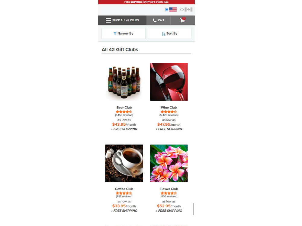
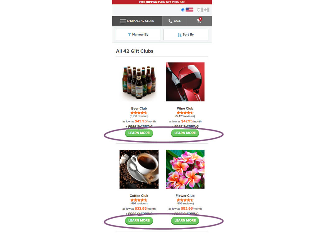
In this experiment, simple "Learn More" buttons were added underneath each product thumbnail. These buttons were additional triggers that linked to product detail pages on top of the existing thumbnails and product names (that also linked to the PDPs). Impact on product visits and sales was measured.