All Latest 620 A/B Tests
Test #563 on
Expertinstitute.com
by  Ardit Veliu
Nov 19, 2024
Desktop
Home & Landing
X.X%
Progression
Ardit Tested Pattern #108: Frequently Asked Questions On Expertinstitute.com


In this RETEST experiment, a Frequently Asked Questions section was added near the bottom of a short lead gen form. This test ran on one of Expert Institute's landing pages for their expert witness seeking services. Impact on leads was measured. It was also triggered by users who scrolled at least 100px downwards towards the FAQ section.
Which A Or B Actually Wins? Find Out Before You Test.
Members see every test result — the winners, the flat ones, and the losers — along with exact effects and sample sizes. Use it to estimate your tests and prioritize by probability, not gut feel. Start every experiment with the odds on your side.
Test #562 on
by  Jakub Linowski
Nov 13, 2024
Desktop
Mobile
Checkout
X.X%
Progression
Jakub Tested Pattern #99: Progress Bar
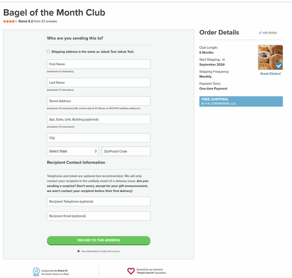
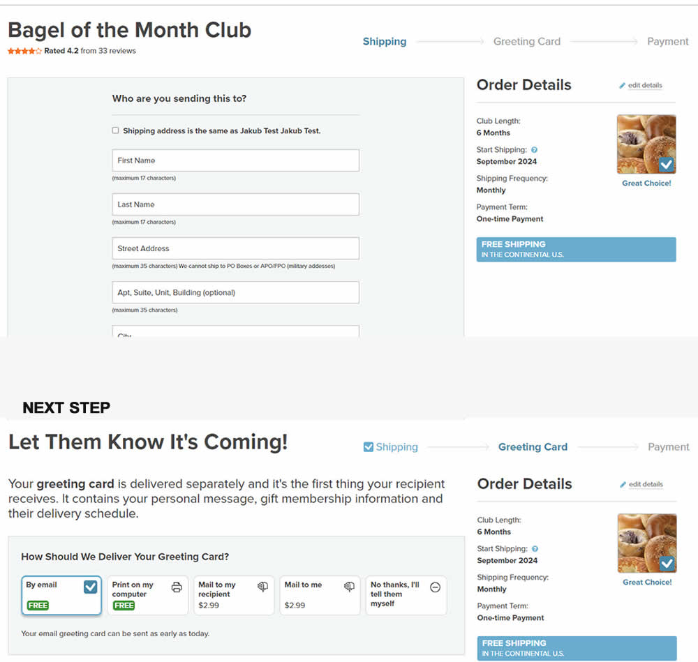
In this experiment, a 3 step progress bar was added starting on a checkout funnel (dedicated add-to-cart page, greeting card step and order summary). The progress bar also showed any completed steps as a "checked off" state. More so, users were able to use the progress bar as a navigation item to any previously completed and currently active steps. Impact on sales was measured.
Test #559 on
Tourradar.com
by  Clemens Grave
Oct 18, 2024
Desktop
Listing
X.X%
Progression
Clemens Tested Pattern #137: Visible Filters On Tourradar.com
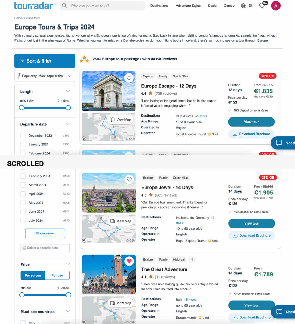
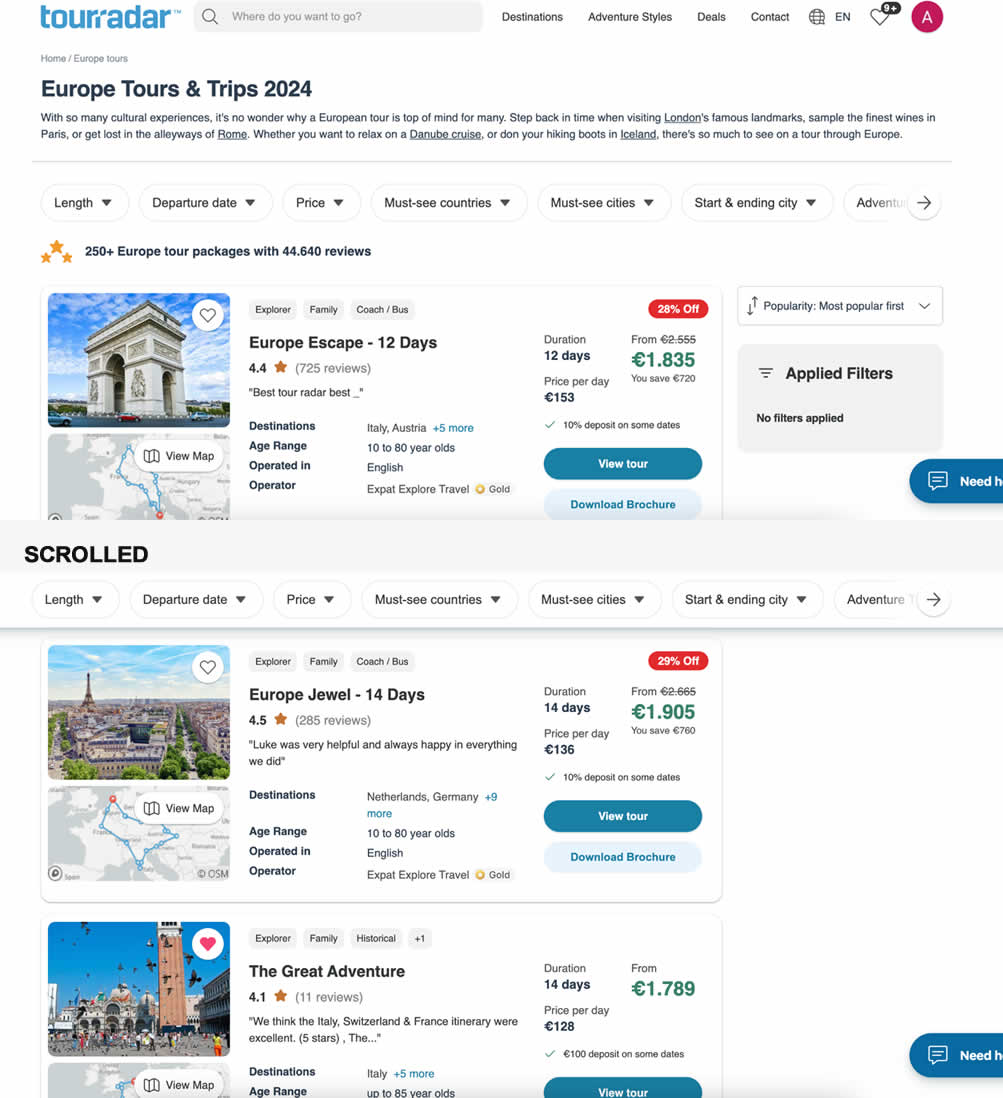
In this experiment, left column filters (control) were tested against top-aligned and sticky filters (variation). The hypothesis was to increase their visibility. Impact on their use and progression to next step (product/tour detail page) were measured.
Test #556 on
Snocks.com
by  Melina Hess
Oct 08, 2024
Mobile
Product
X.X%
Progression
Melina Tested Pattern #65: Add More For Extra Incentive On Snocks.com
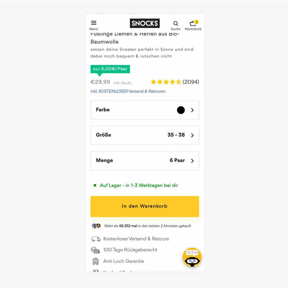
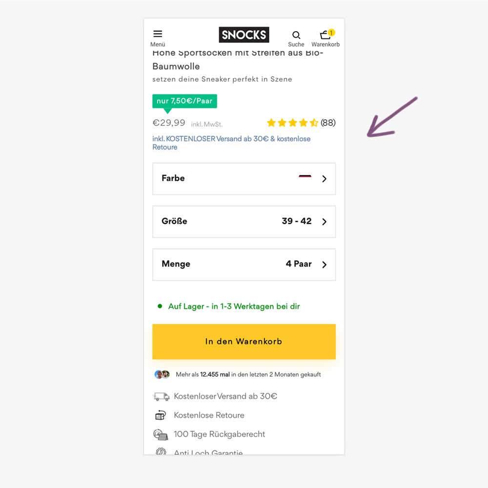
In this experiment, free shipping was a/b tested against free shipping with a 30€ purchase or higher. Hence, in the variation, customers needed to reach a cart amount total in order to be eligible for the free shipping.
Test #552 on
Tourradar.com
by  Clemens Grave
Sep 19, 2024
Product
X.X%
Progression
Clemens Tested Pattern #15: Bulleted Reassurances On Tourradar.com
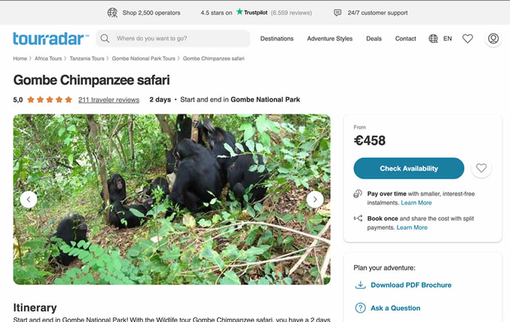

In this experiment, existing reassurance copy was changed. The control contained copy that focused on splitting payments and paying over time. The variation challenged this and showed a best price guarantee and the ability to earn credits.
Test #551 on
Tourradar.com
by  Clemens Grave
Sep 04, 2024
Desktop
Product
X.X%
Progression
Clemens Tested Pattern #139: Page Level Navigation On Tourradar.com
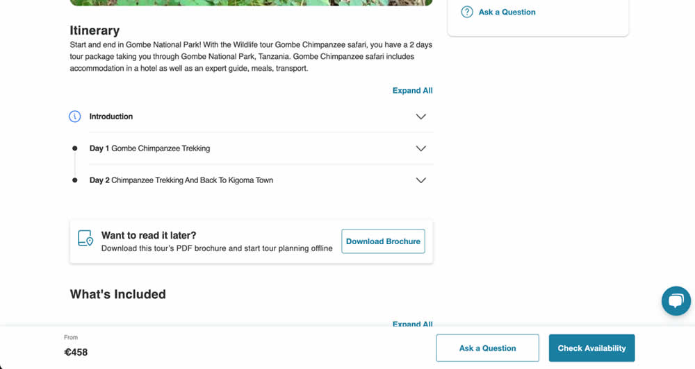
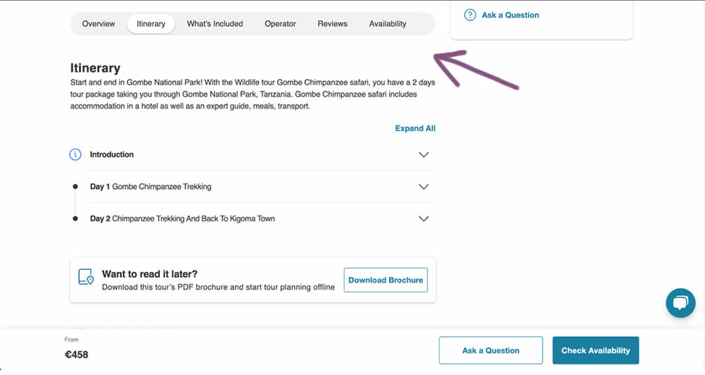
In this experiment, a floating page level navigation was added near the top of the product pages (under the main image). The navigation links included: Overview, Itinerary, What's Included, Operator, Reviews and Availability. Impact on next step progression was measured.
Test #550 on
Online.metro-cc.ru
by  Andrey Andreev
Aug 14, 2024
Mobile
Listing
X.X%
Progression
Andrey Tested Pattern #137: Visible Filters On Online.metro-cc.ru
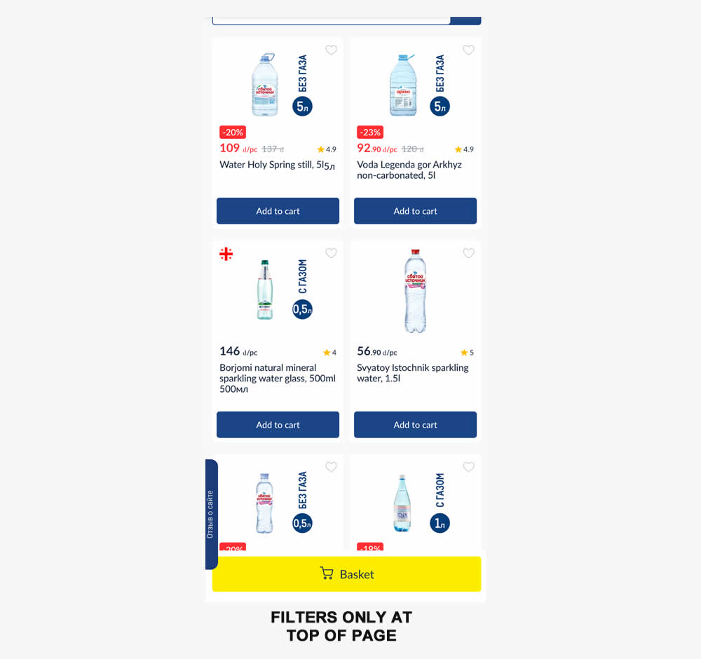
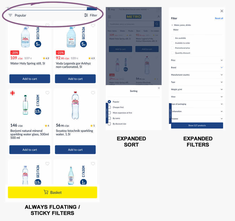
Instead of only displaying sort and filters at the top of a listing page, the variation always had them visible with a sticky/floating interaction. Impact on sales was measured.
Test #549 on
Kay.com
by  Craig Kistler
Aug 13, 2024
Desktop
Listing
X.X%
Progression
Craig Tested Pattern #138: Visible Payment Options On Kay.com
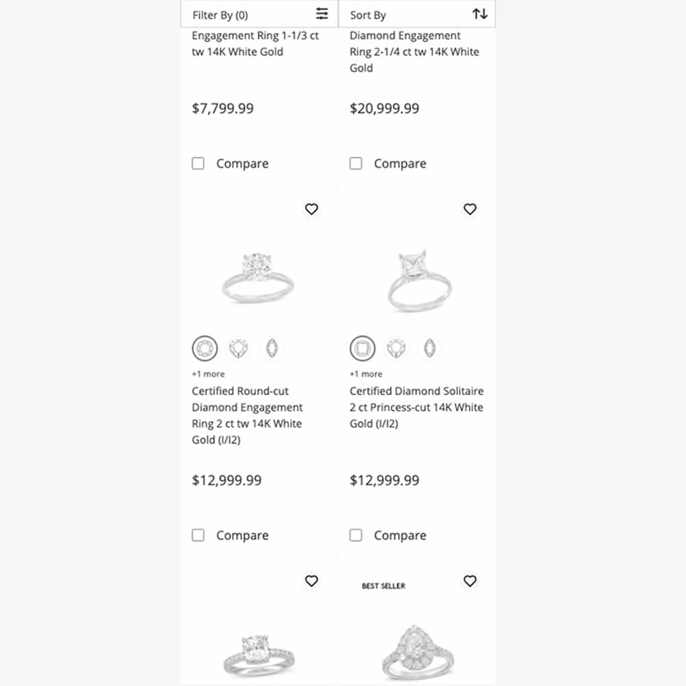
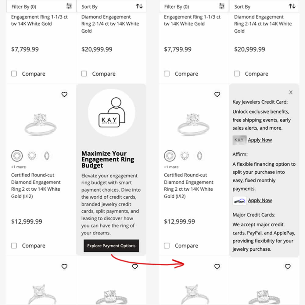
In this experiment, an inline panel was shown as a product tile. The panel informed customers about a variety of payment options (with detailed information being further presented after a button click). Impact on sales was measured.
Test #545 on
Banter.com
by  Craig Kistler
Jul 29, 2024
Desktop
Product
X.X%
Progression
Craig Tested Pattern #66: Complementary Upsell On Banter.com
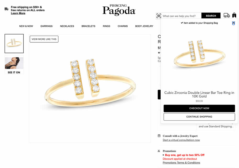
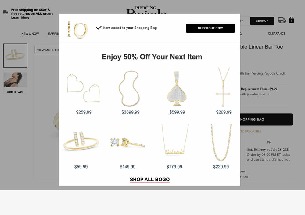
In this experiment, a modal based message was shown to encourage extra products being added as complementary upsells. In the control, the promotion text appeared at the bottom as red text ("Buy one, get up to two 50% Off"). Whereas in the variation, specific products were shown on the modal (post add-to-cart). Impact on adds-to-cart, sales and average revenue was measured.
Test #543 on
by  Jakub Linowski
Jul 22, 2024
Desktop
Mobile
Product
X.X%
Progression
Jakub Tested Pattern #7: Social Counts
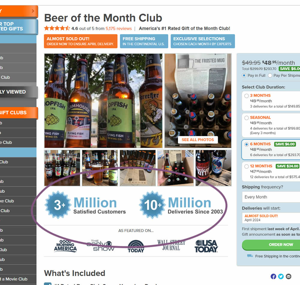
In this experiment, social proof copy was added just below product photos. The copy emphasied that "3 million satisfied customers" and "10 million deliveries since 2003". Impact on sales was measured.
Test #541 on
Online.metro-cc.ru
by  Andrey Andreev
Jul 10, 2024
Desktop
Listing
X.X%
Progression
Andrey Tested Pattern #137: Visible Filters On Online.metro-cc.ru
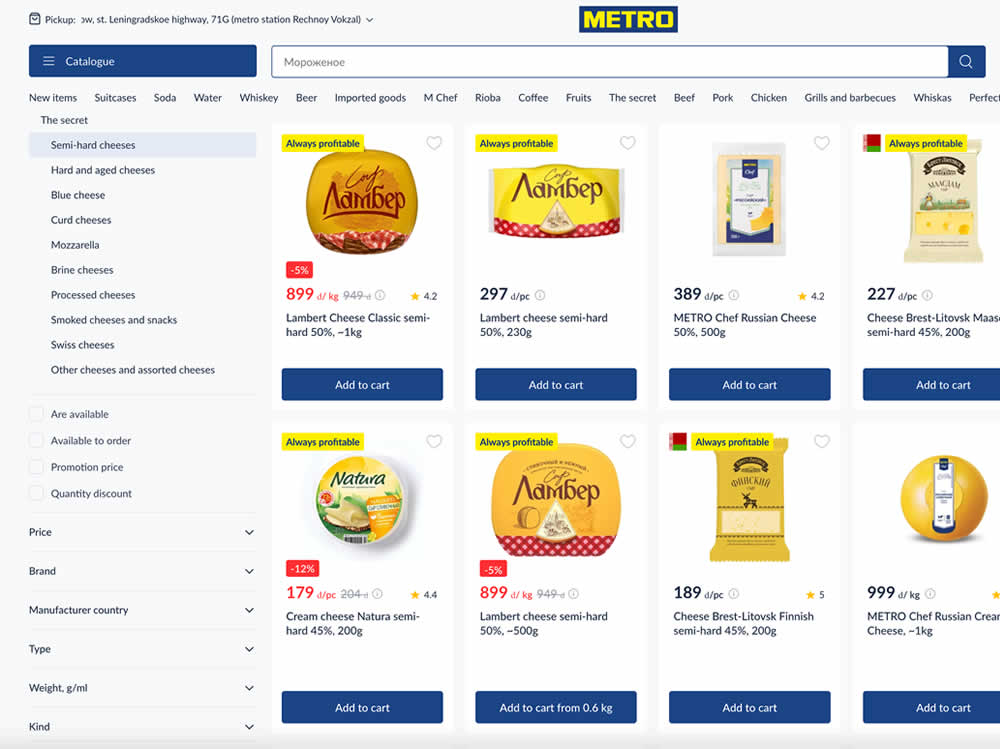
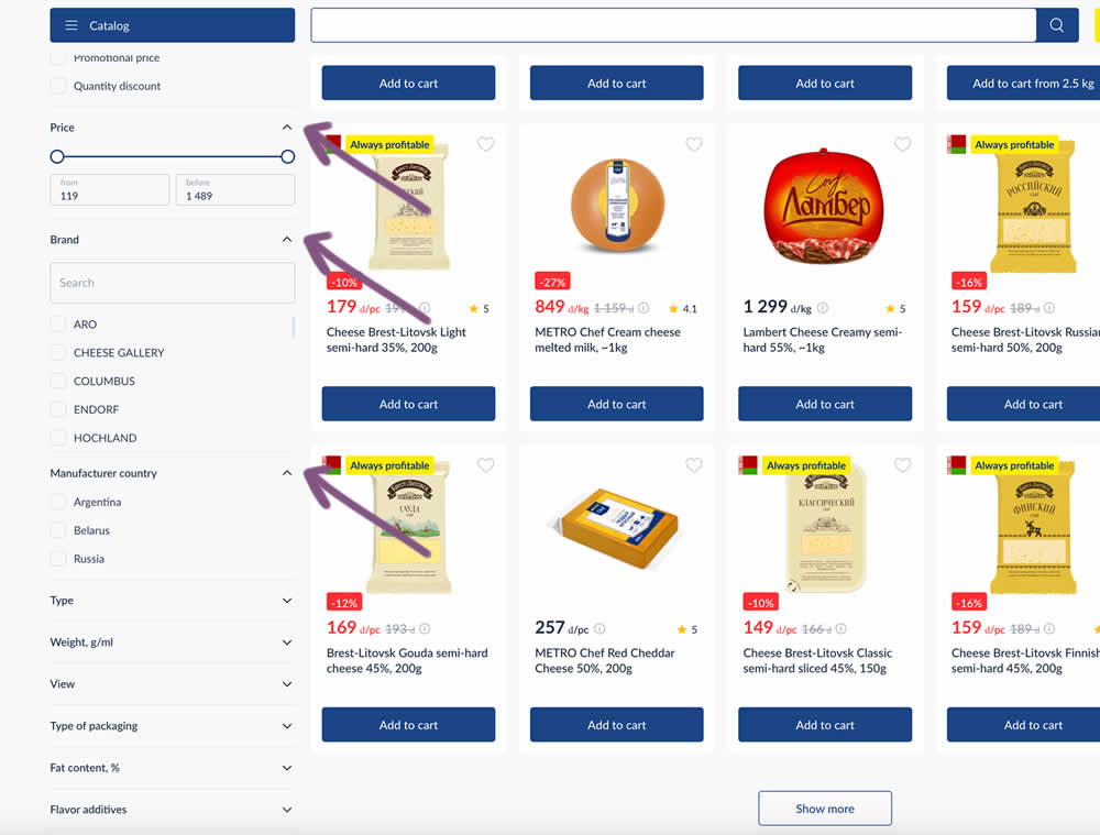
In this experiment, some side column filters were made more visible by being automatically expanded. These included: brand, price and country of manufacturing.
Test #540 on
Finn.com
by  Maksim Meged
Jun 28, 2024
Mobile
Listing
X.X%
Progression
Maksim Tested Pattern #136: Earliest Availability On Finn.com
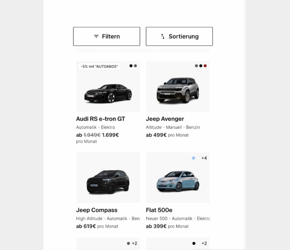
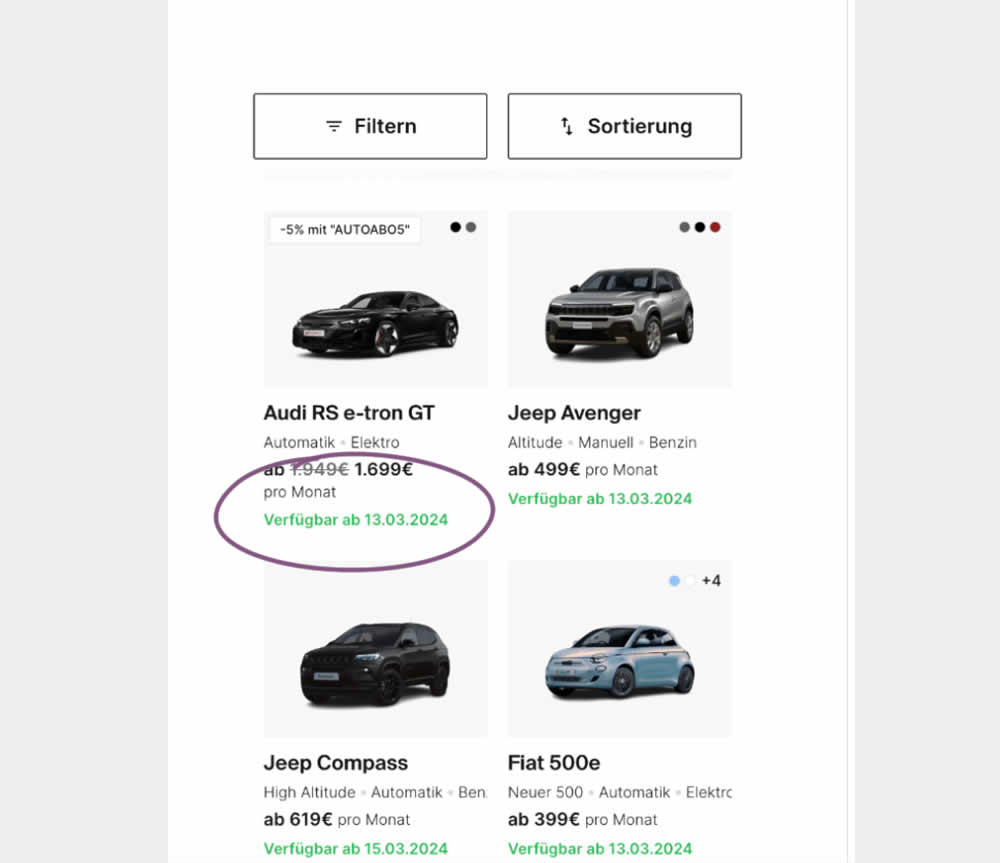
In this experiment, the earliest availability dates were displayed underneath product tiles on listing pages. This was a/b tested on a car rental service website. Impact on product adds-to-cart as well as transactions was measured.
Test #538 on
Volders.de
by  Daria Kurchinskaia
Jun 20, 2024
Desktop
Mobile
Checkout
X.X%
Progression
Daria Tested Pattern #77: Filled Or Ghost Buttons On Volders.de
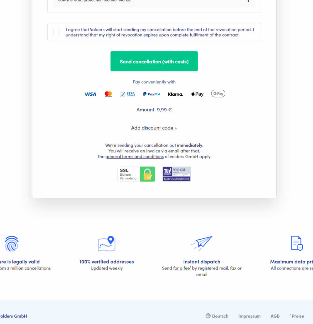
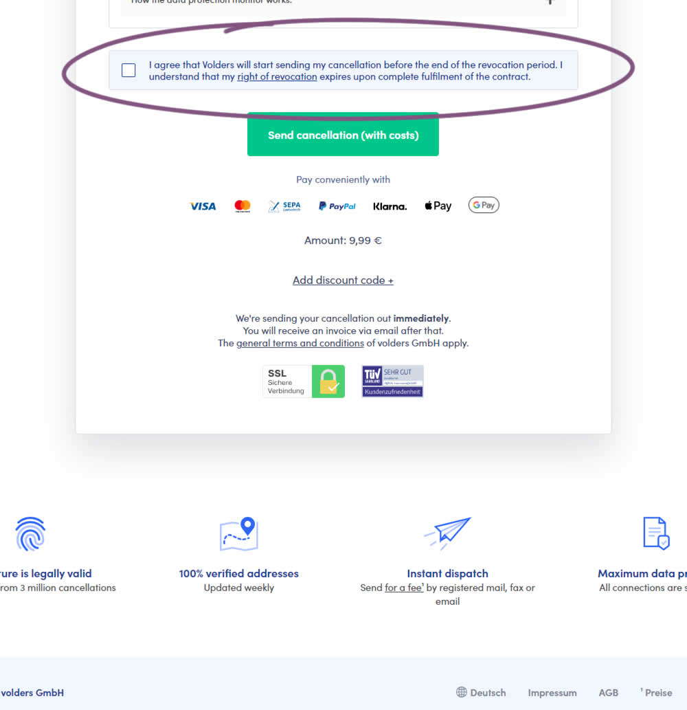
In this experiment, a less visible (ghost button style) legal confirmation box, was tested against a more visible one (filled state with higher contrast). Impact on error rates (from submitting an incomplete form) and sales was measured.
Test #534 on
Online.metro-cc.ru
by  Andrey Andreev
May 28, 2024
Desktop
Global
X.X%
Progression
Andrey Tested Pattern #82: Onboarding Callouts On Online.metro-cc.ru
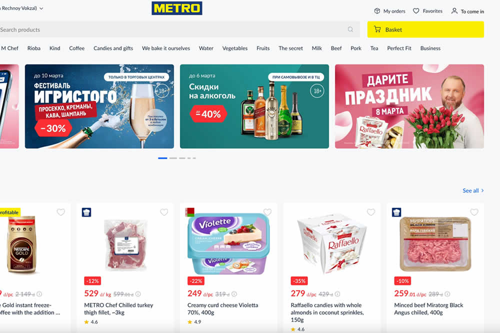
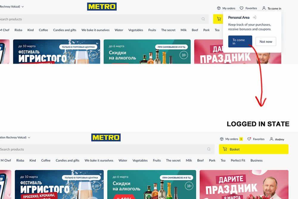
In this site wide experiment, logged out customers were directed to sign in with the help of a top navigation callout. The experiment was triggered for anyone who saw the callout message. After signing in, the user would 1) remain on the same screen they were on and 2) the top header slightly changed to show a logged in state (with their orders, favorites and active username). Impact on successful logins and overall purchases was measured.
Test #533 on
by  Jakub Linowski
May 23, 2024
Desktop
Global
X.X%
Progression
Jakub Tested Pattern #94: Visible Search
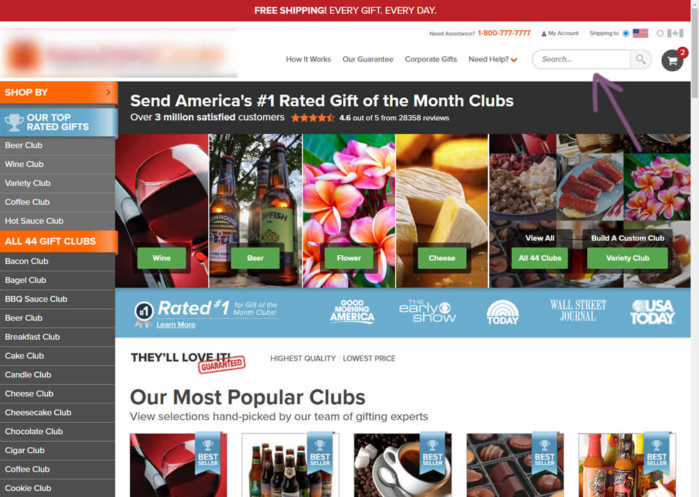

In this experiment, the presence of a search bar was tested against no search bar altogether. The control had search, and in the variation it was removed. The variation also exposed items from within the "Need Help?" menu, making "My account", "Contact Us" and "FAQ" more prominent.
(Here the AB test is inverted / flipped to match the pattern).
Test #532 on
Finn.com
by  Maksim Meged
May 10, 2024
Mobile
Listing
X.X%
Progression
Maksim Tested Pattern #76: Infinite Scrolling Or Pagination On Finn.com


In this experiment, infinite scrolling was a/b tested against a paginated one.
Test #529 on
Jared.com
by  Craig Kistler
Apr 29, 2024
Mobile
Desktop
Listing
X.X%
Progression
Craig Tested Pattern #55: Conversational Filters On Jared.com
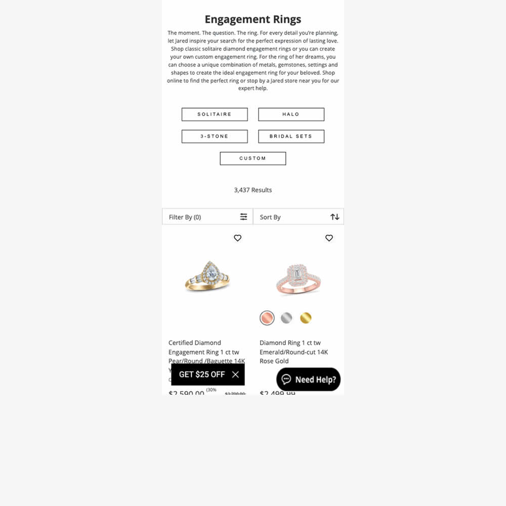
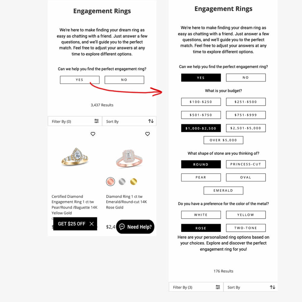
In this experiment, conversational filters were tested at the top of some listing pages. Instead of showing one set of product filters, customers were shown three sets of product questions. After selecting each answer, product results would narrow and update further down on the page. Impact on adds to cart and sales were measured.
Test #527 on
by  Jakub Linowski
Apr 23, 2024
Desktop
Mobile
Product
X.X%
Progression
Jakub Tested Pattern #132: One Time Payment Copy
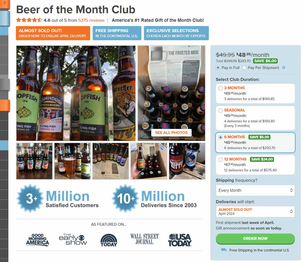
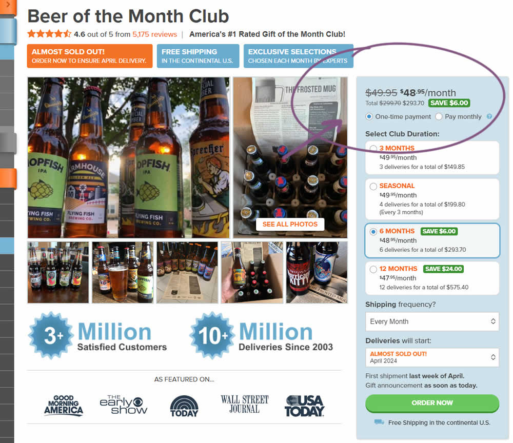
In this experiment, copy related to payment duration types (paid in full or ongoing) was changed. In the the control, one of the option used the "Pay in Full" copy, whereas the variation changed this to "One-time payment". Impact on sales was measured.
Test #526 on
Online.metro-cc.ru
by  Andrey Andreev
Apr 17, 2024
Desktop
Mobile
Global
X.X%
Progression
Andrey Tested Pattern #77: Filled Or Ghost Buttons On Online.metro-cc.ru
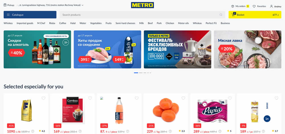
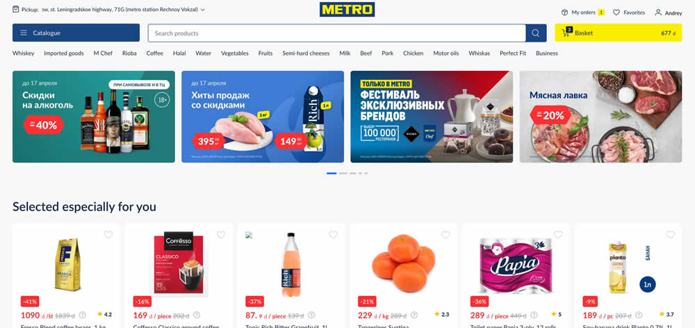
In this experiment, a higher contrast search bar with a blue border and a filled blue button style was tested against a more feint style. Impact on searches and purchases was measured. (A/B test was inverted to B/A in order to fit the filled-vs-ghost button pattern).
Test #525 on
by  Jakub Linowski
Mar 27, 2024
Desktop
Mobile
Product
X.X%
Progression
Jakub Tested Pattern #119: Unselected Or Selected Defaults
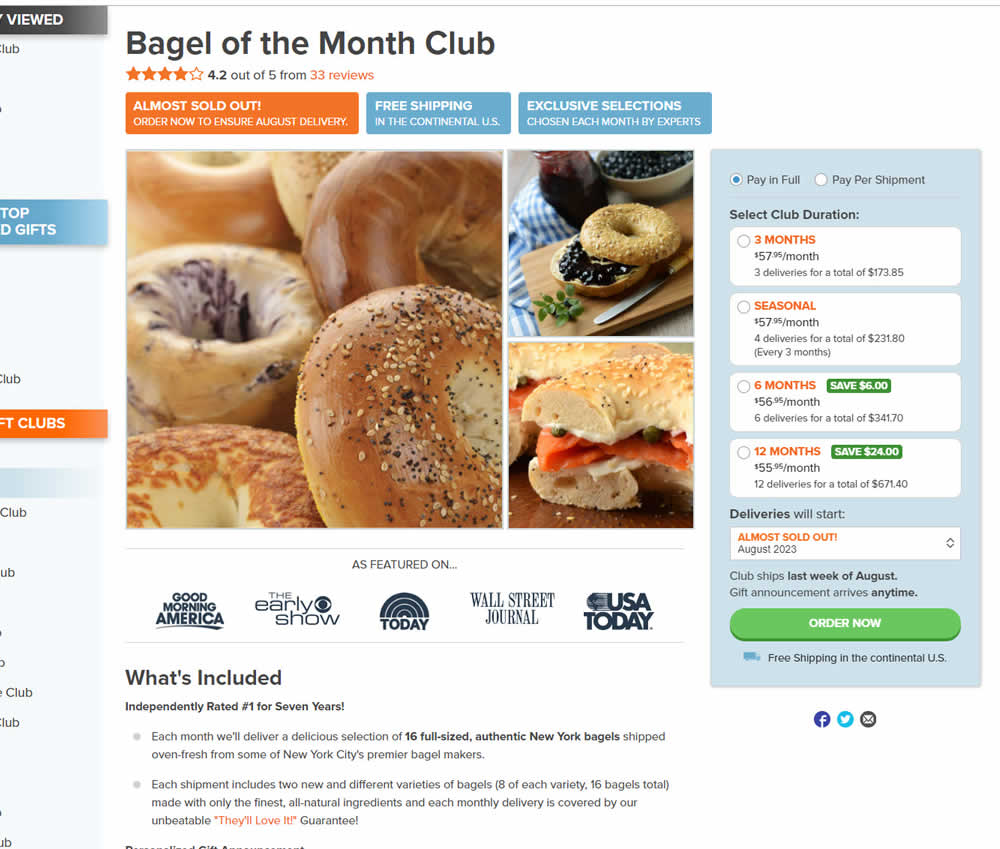
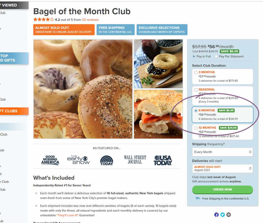
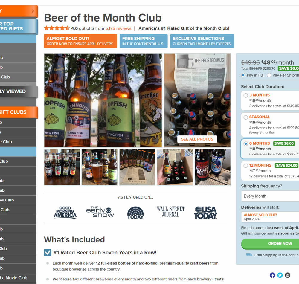
In this experiment, a club subscription duration was preselected to 6 in the variation. The control had no club durations preselected. As a result of preselecting a club duration, a more visible price also appeared at the top (sooner in the variation). Impact on sales was measured.