All Latest 620 A/B Tests
Test #349 on
Backstage.com
by  Stanley Zuo
Apr 27, 2021
Mobile
Global
X.X%
Progression
Stanley Tested Pattern #49: Above The Fold Call To Action On Backstage.com
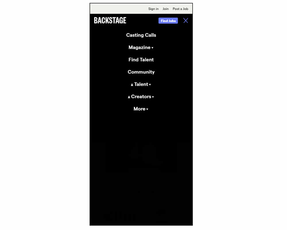
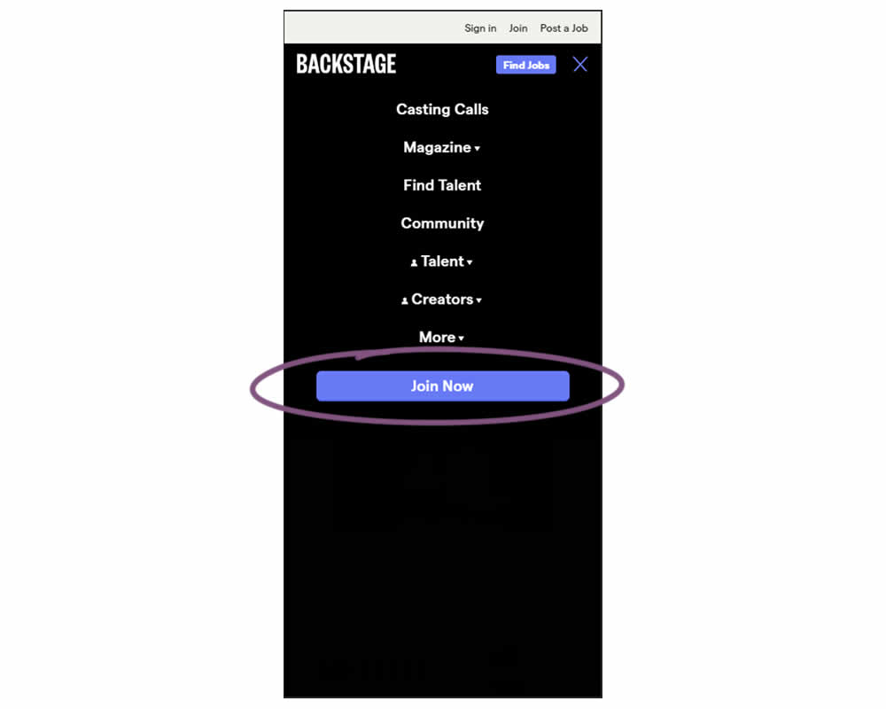
In this experiment, a simple "Join Now" button was added inside an expanded mobile navigation menu. Clicking the button would start a multiple step membership subscription process. Impact on subscription starts and final sales were tracked.
Which A Or B Actually Wins? Find Out Before You Test.
Members see every test result — the winners, the flat ones, and the losers — along with exact effects and sample sizes. Use it to estimate your tests and prioritize by probability, not gut feel. Start every experiment with the odds on your side.
Test #348 on
Flukenetworks.com
by  Marika Francisco
Apr 22, 2021
Desktop
Home & Landing
X.X%
Progression
Marika Tested Pattern #97: Bigger Form Fields On Flukenetworks.com

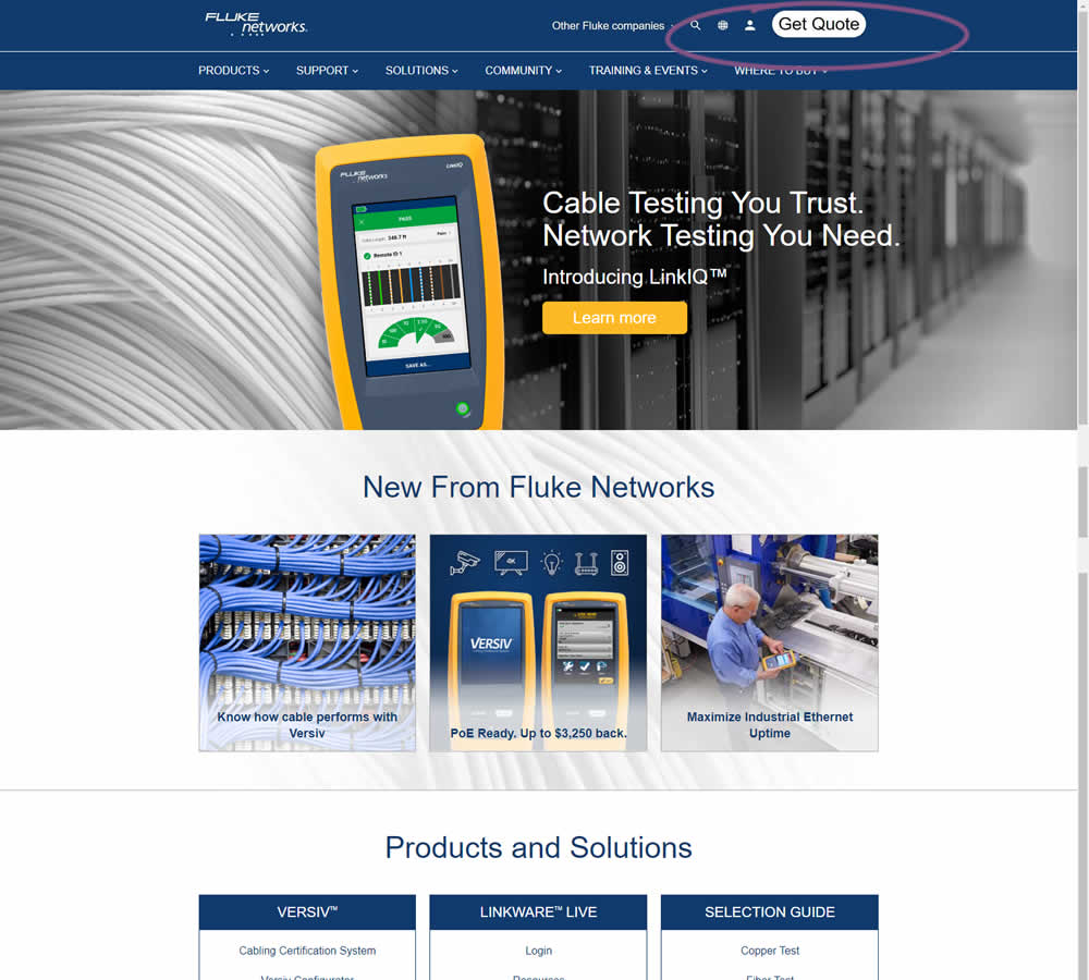
In this simple experiment, the size of the "Get Quote" button in the top navigation was increased.
Test #347 on
by  Jakub Linowski
Apr 07, 2021
Desktop
Mobile
Home & Landing
X.X%
Progression
Jakub Tested Pattern #26: Cart Reminder And Recently Viewed
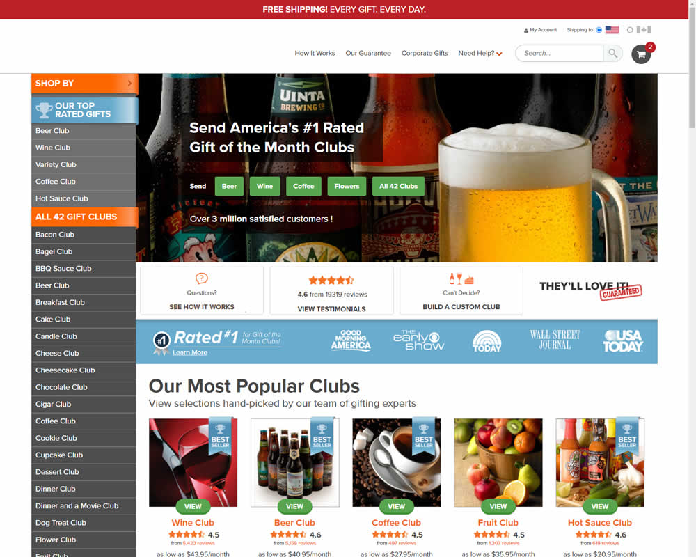
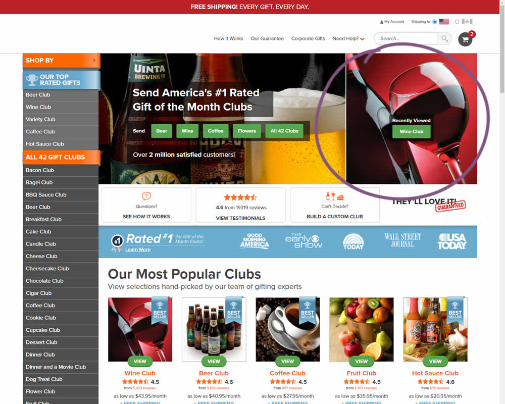
In this experiment, when customers viewed a product and returned to the homepage, they would then see the most recently viewed one - a delicate nudge. The experiment ran with full traffic and impact on sales was measured.
Test #346 on
by  Stanley Zuo
Mar 30, 2021
Desktop
Mobile
Home & Landing
X.X%
Progression
Stanley Tested Pattern #117: Company Logos
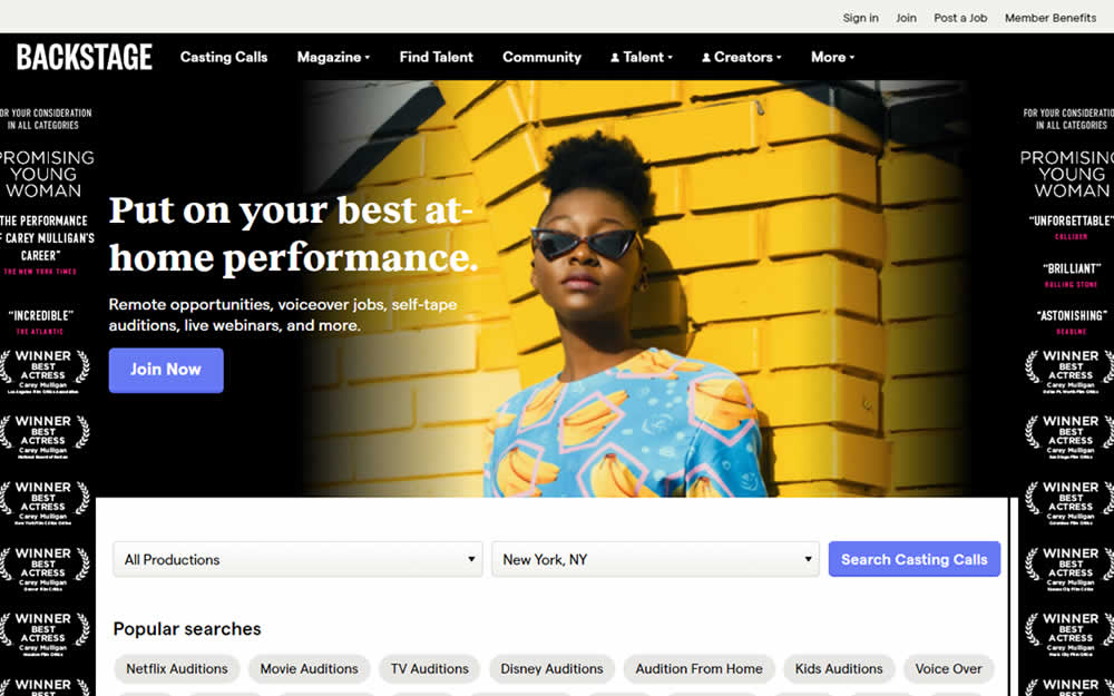

In this homepage experiment, company logos were added to the homepage. These were example clients or companies that Backstage works with and offers casting (job) listing from. Impact on the registration flow and membership checkouts was measured.
Test #345 on
Getninjas.com.br
by  Rodolfo Lugli
Mar 29, 2021
Desktop
Home & Landing
X.X%
Progression
Rodolfo Tested Pattern #9: Multiple Steps On Getninjas.com.br
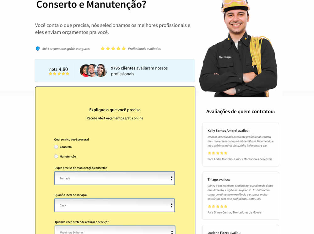
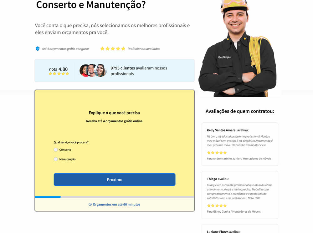
In this experiment, a single long form was broken into at least 3 steps.
Test #343 on
Snocks.com
by  Samuel Hess
Mar 12, 2021
Desktop
Mobile
Product
X.X%
Progression
Samuel Tested Pattern #122: Zigzag Layout On Snocks.com

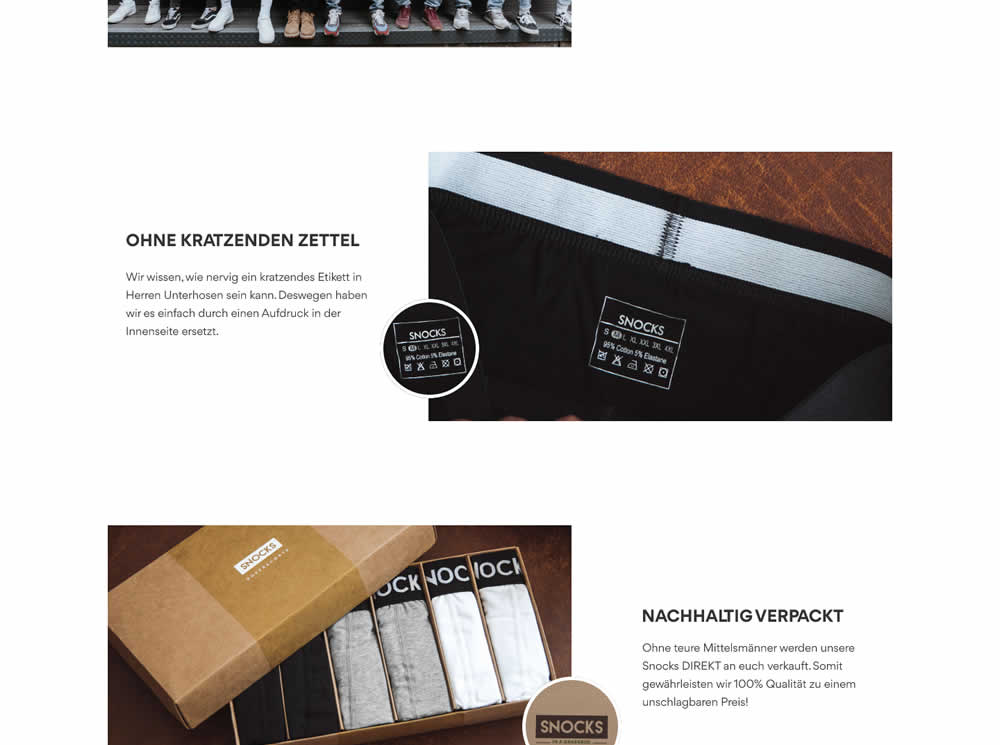
In this experiment, the content on a product page was reorganized into a zigzagging (alternating layout) along with reinforcing photos. Impact on adds-to-cart and total sales was measured.
Test #336 on
Backstage.com
by  Stanley Zuo
Jan 28, 2021
Desktop
Mobile
Listing
X.X%
Progression
Stanley Tested Pattern #51: Shortcut Buttons On Backstage.com
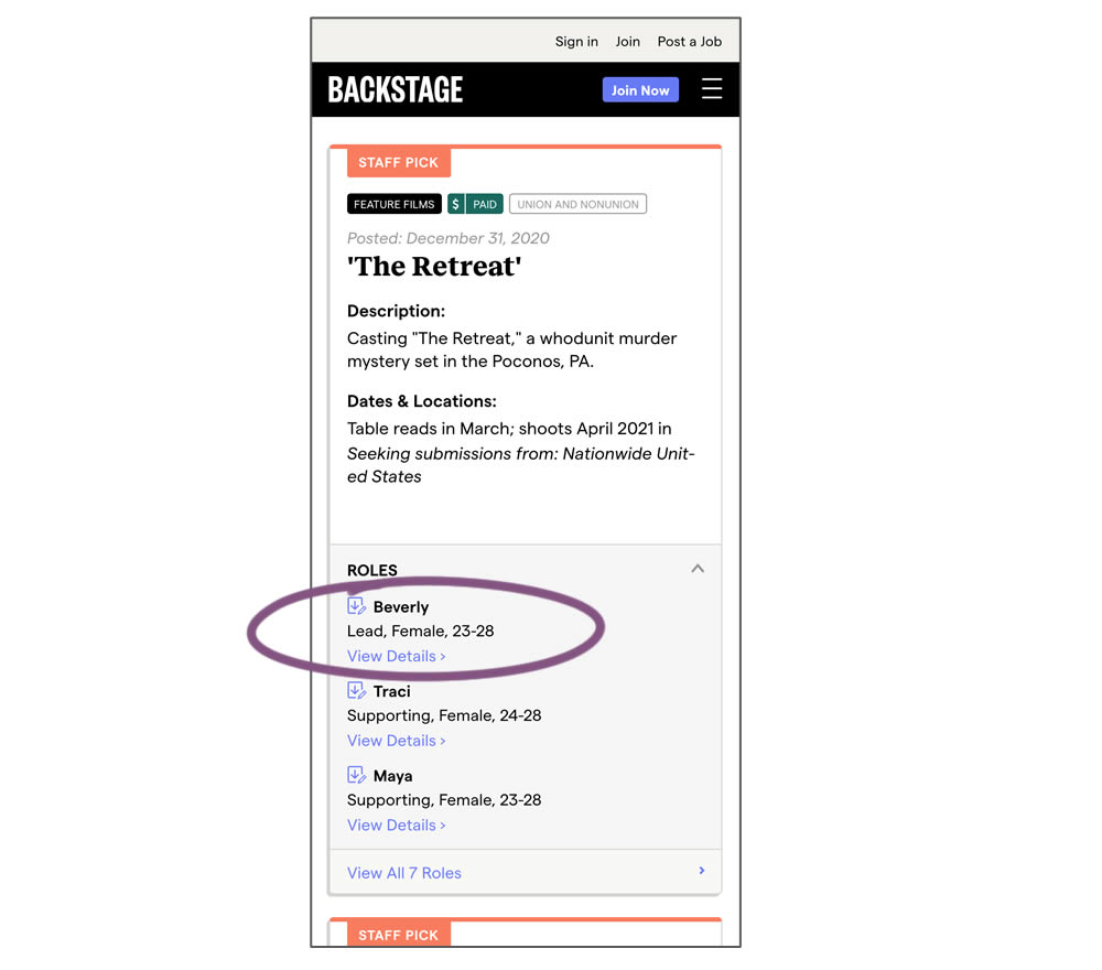
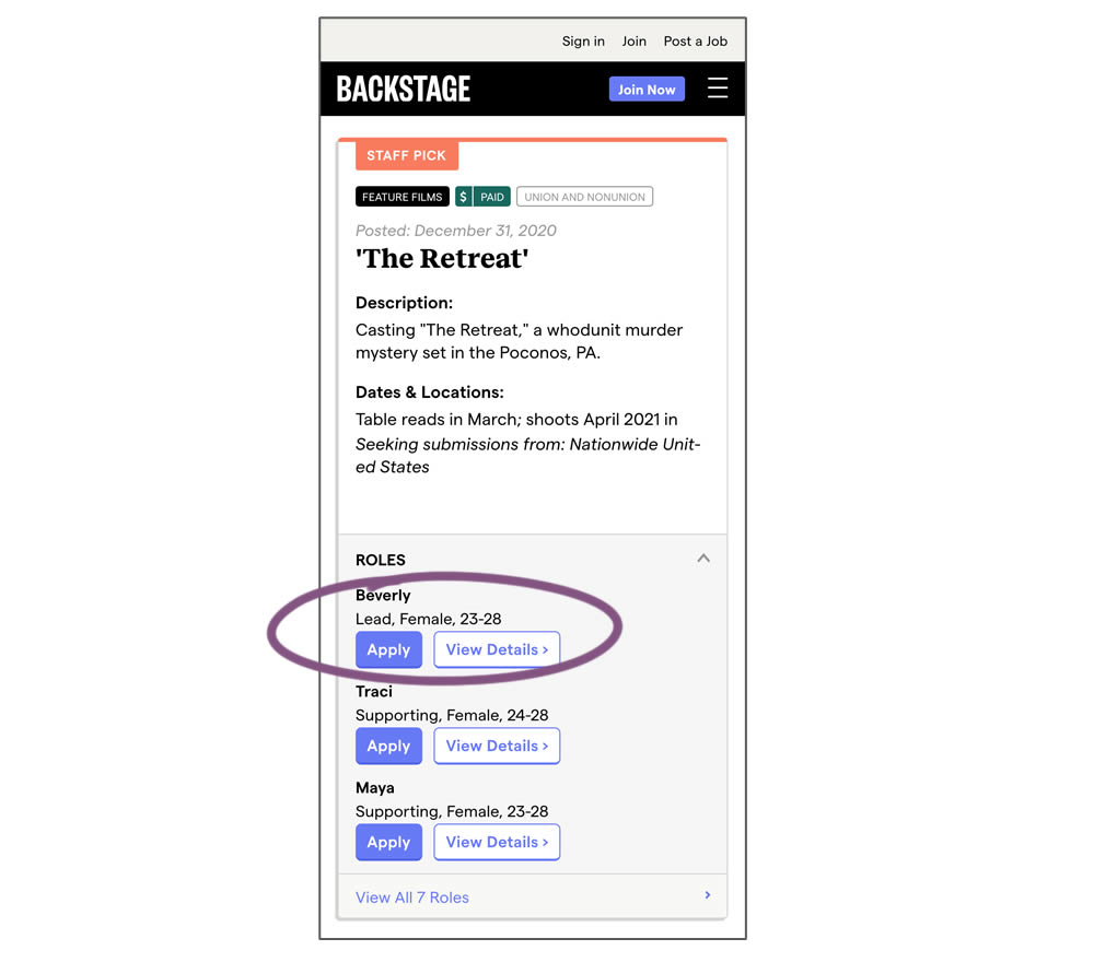
In this experiment, a listing page was expanded to show two actions (apply and view details) instead of a single one (view details only). This variation enabled users with a shortcut action to apply for roles one step earlier (and start membership flows for new users).
Test #337 on
Backstage.com
by  Stanley Zuo
Jan 28, 2021
Desktop
Mobile
Listing
X.X%
Progression
Stanley Tested Pattern #51: Shortcut Buttons On Backstage.com
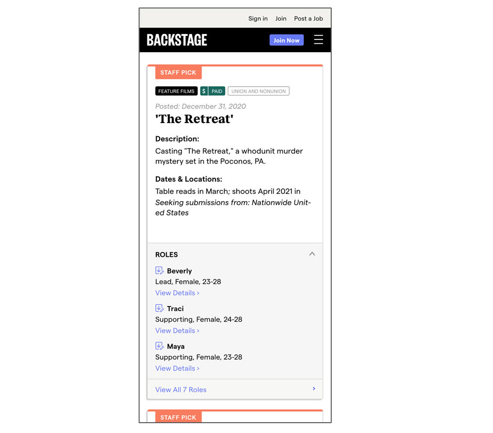
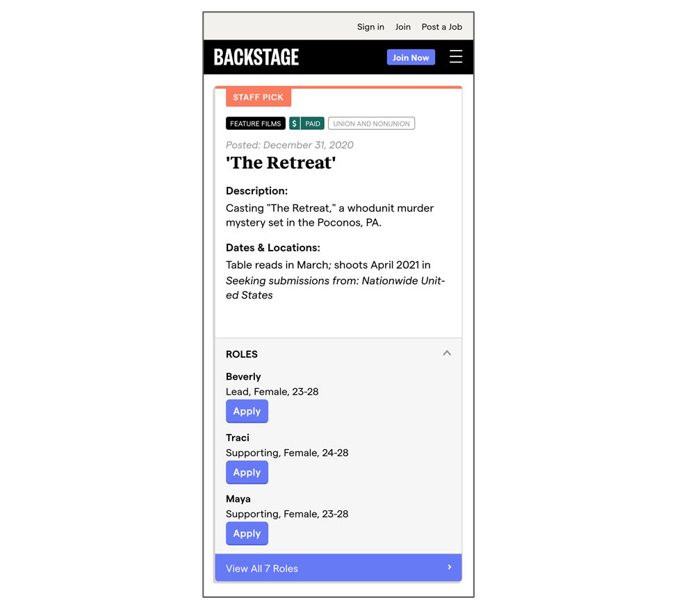
In this experiment, a listing page was expanded to show two actions (apply and view details) instead of a single one (view details only). In the variant, the "view detail" links were replaced with "apply links" starting a job application (and membership flows) sooner.
Test #335 on
by  Jakub Linowski
Jan 27, 2021
Desktop
Mobile
Home & Landing
X.X%
Progression
Jakub Tested Pattern #32: Condensed List
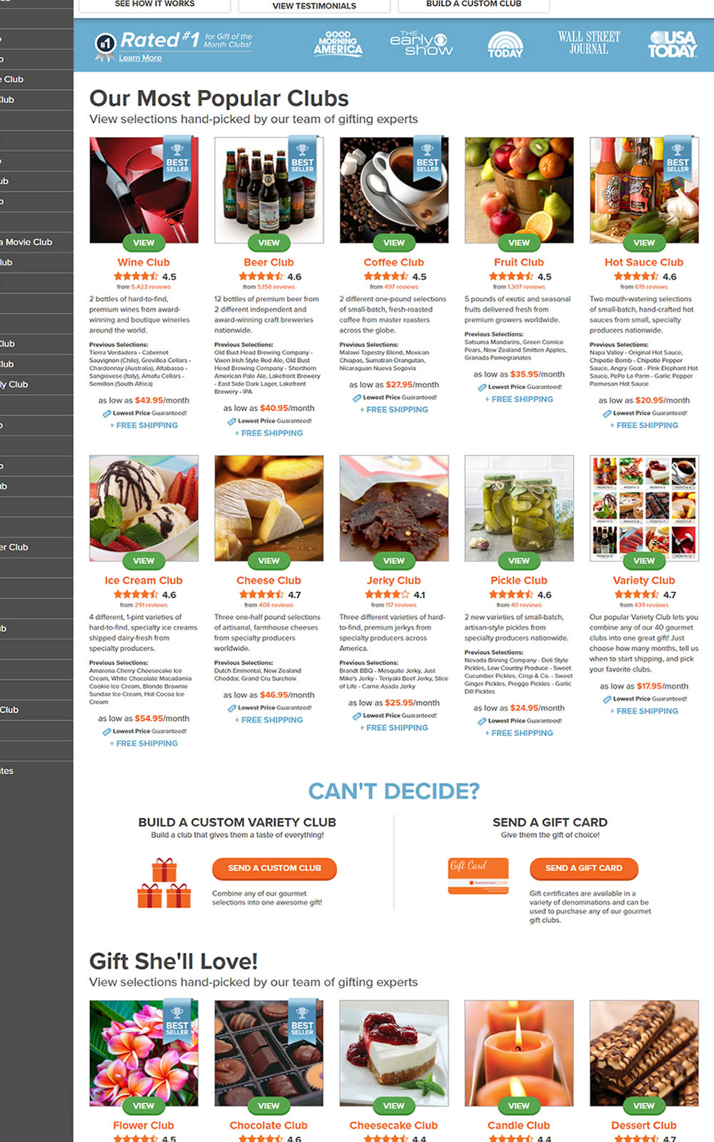
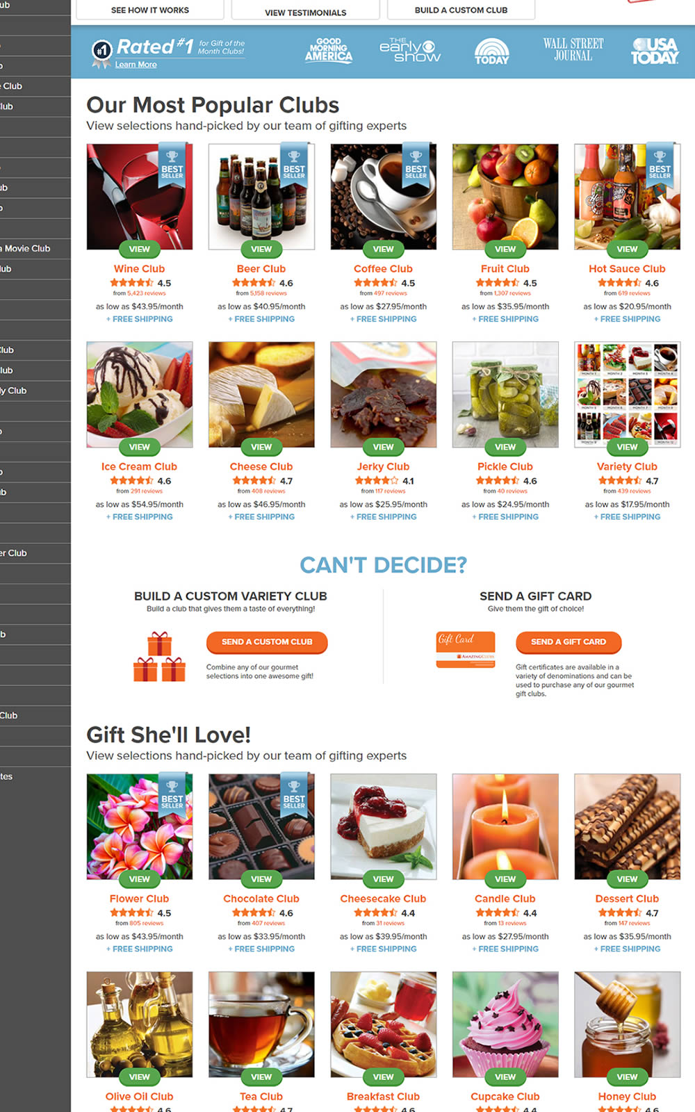
The variation here has more condensed product tiles being shown on a homepage. Two pieces of information were removed: product descriptions and past selections. Impact on product page visits and total sales was measured.
Test #334 on
Thomasnet.com
by  Kyle Phillips
Jan 25, 2021
Desktop
Mobile
Global
X.X%
Progression
Kyle Tested Pattern #2: Icon Labels On Thomasnet.com
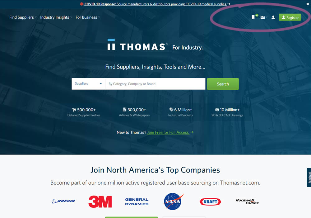
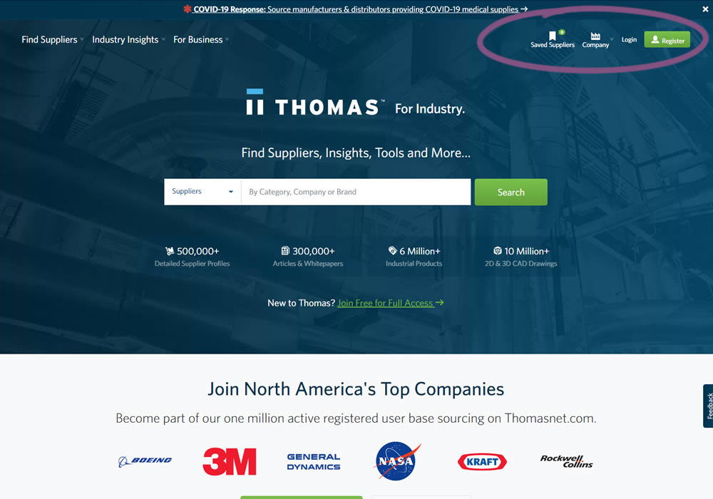
This experiment measured the impact of adding text labels to three icon-only nav items.
Test #331 on
by  Jakub Linowski
Dec 30, 2020
Desktop
Mobile
Product
X.X%
Progression
Jakub Tested Pattern #121: Free Shipping

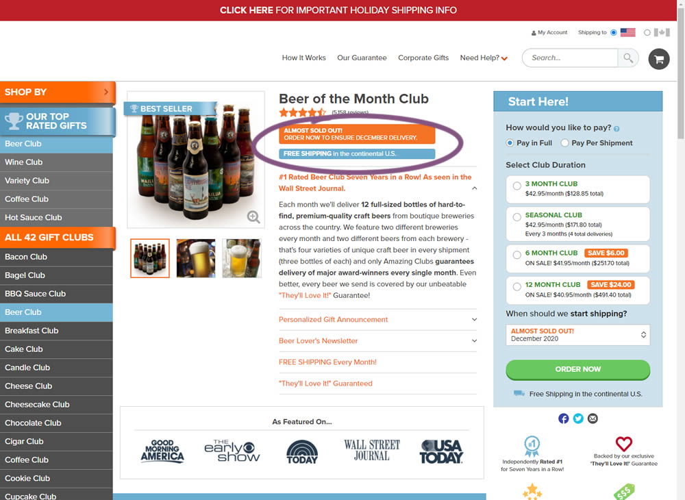
In this little experiment, an extra "Free Shipping" message was added on a product page. It's prominence was increased by using white copy on a darker blue background. Impact on adds-to-cart and total sales was measured.
Test #332 on
by  Jakub Linowski
Dec 30, 2020
Desktop
Mobile
Product
X.X%
Progression
Jakub Tested Pattern #121: Free Shipping
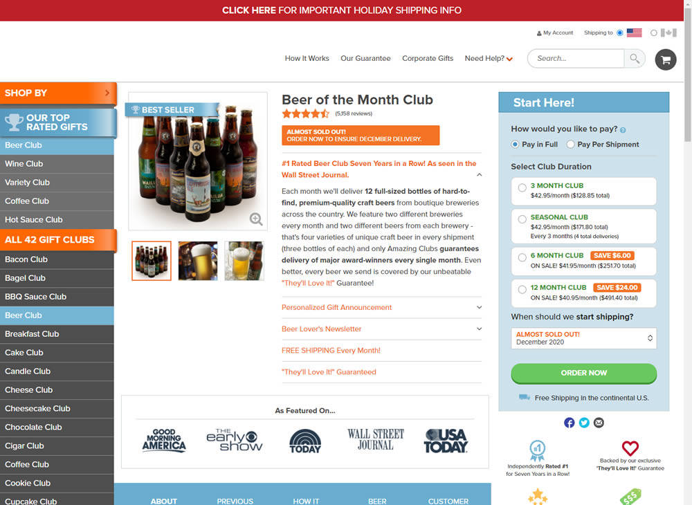
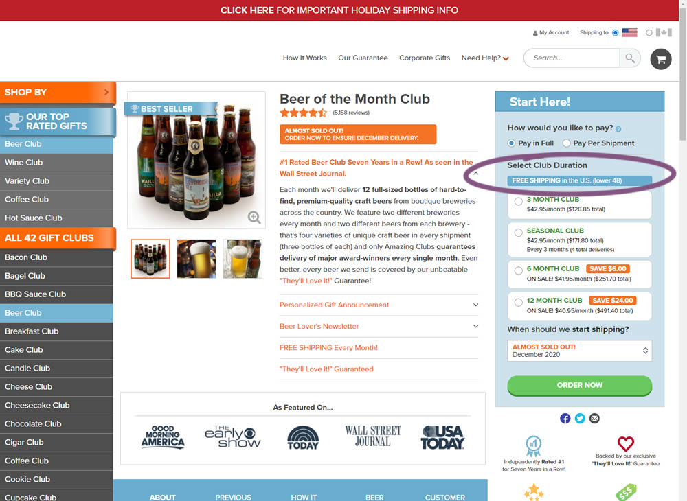
In this experiment, an extra "Free Shipping" message was added on a product page - at the top of the buy box with an add-to-cart call to action. It's prominence was increased by using white copy on a darker blue background. Impact on adds-to-cart and total sales was measured.
Test #330 on
Backstage.com
by  Stanley Zuo
Dec 29, 2020
Desktop
Content
X.X%
Progression
Stanley Tested Pattern #116: Links Or Buttons On Backstage.com
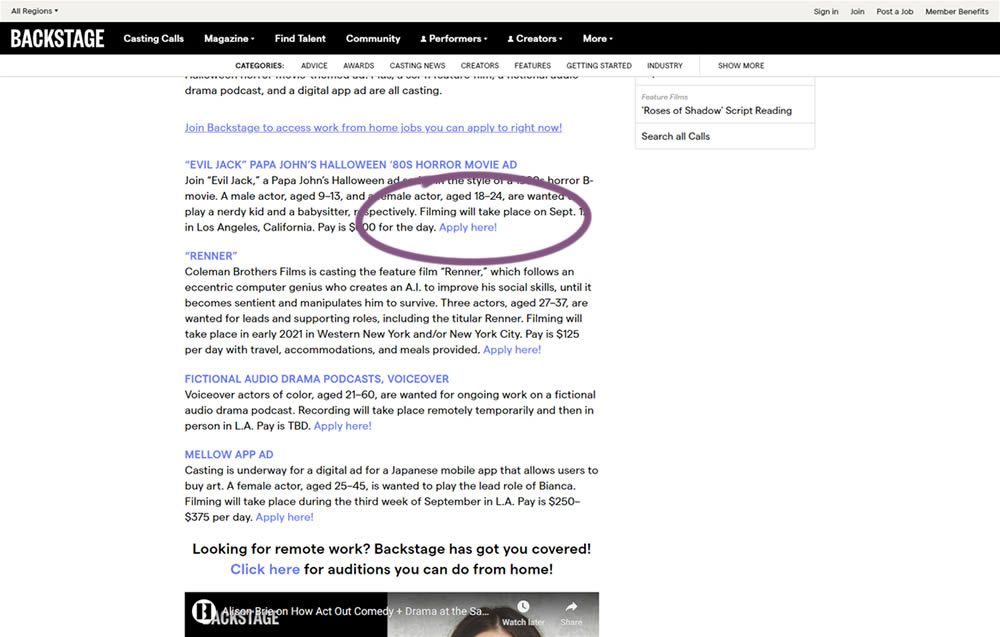
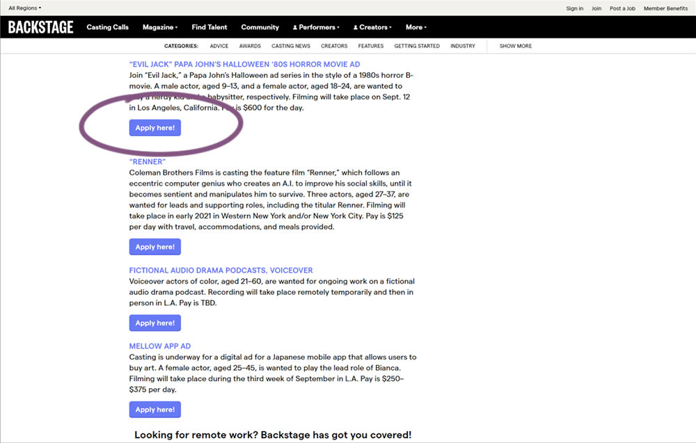
In this simple experiment on a content page, links were turned into more prominent buttons. The experiment measured clicks and signups.
Test #329 on
Snocks.com
by  Samuel Hess
Dec 23, 2020
Mobile
Home & Landing
X.X%
Progression
Samuel Tested Pattern #14: Exposed Menu Options On Snocks.com
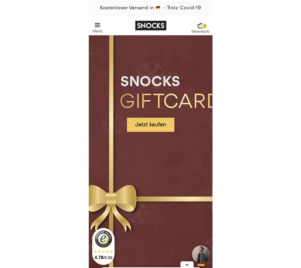
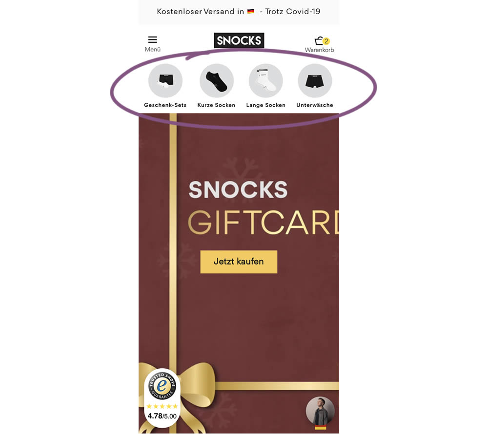
In this homepage experiment, a series of product categories were shown more visible near the top of the screen (instead of only being shown inside the hamburger menu). They linked up to corresponding listing pages with such items as: gifts, short socks, long socks, and underwear. Impact on adds-to-cart and total sales was measured.
Test #328 on
Umbraco.com
by  Lars Skjold Iversen
Dec 21, 2020
Desktop
Mobile
Home & Landing
X.X%
Progression
Lars Tested Pattern #60: Repeated Bottom Call To Action On Umbraco.com
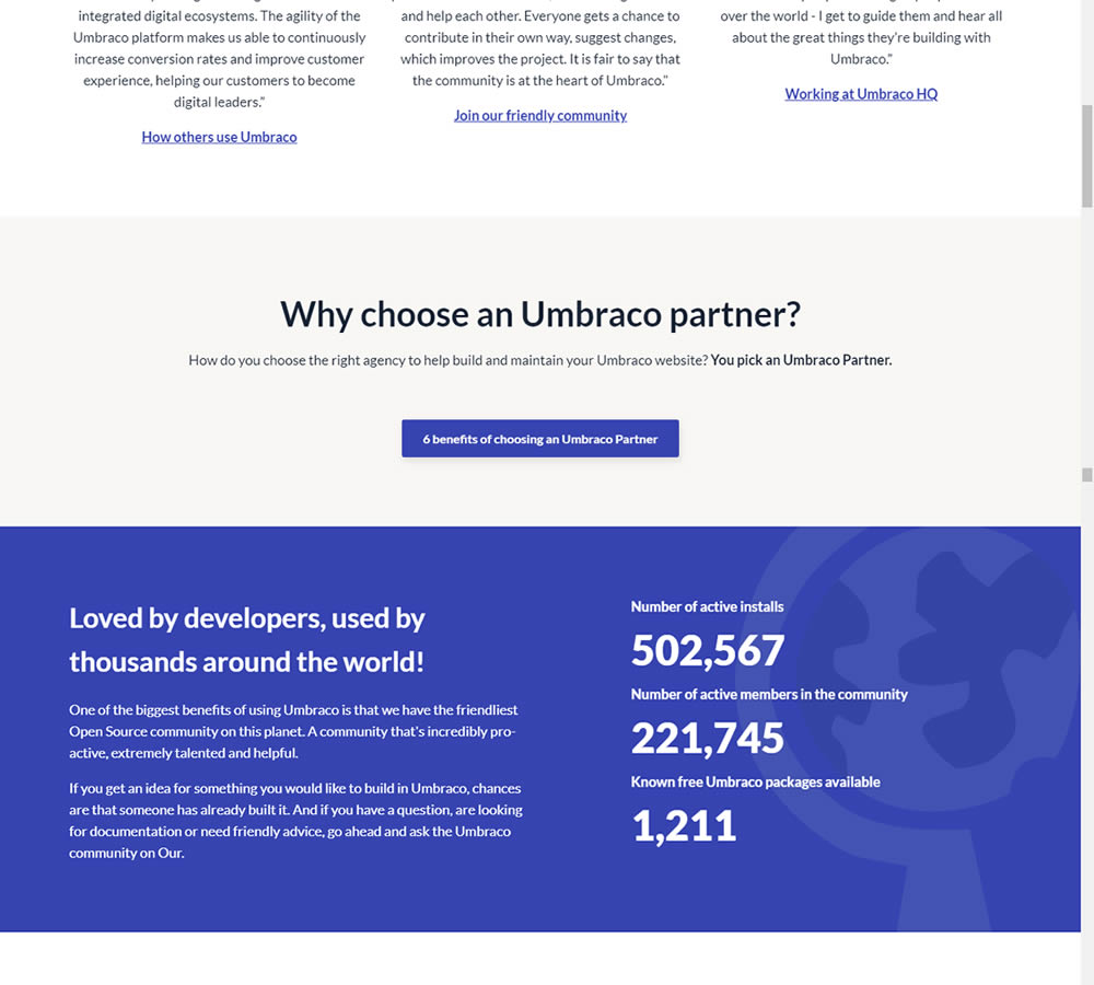
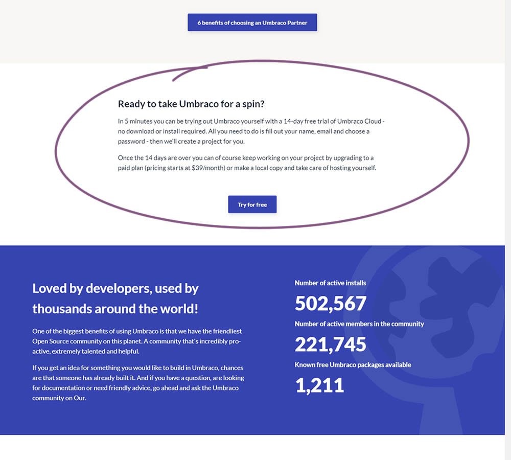
In this experiment, a trial signup section was added at the bottom of Umbraco's long homepage (CMS business). The experiment measured the impact on trial signups.
Test #327 on
Backstage.com
by  Stanley Zuo
Nov 26, 2020
Desktop
Signup
X.X%
Progression
Stanley Tested Pattern #120: Supporting Theme Images On Backstage.com
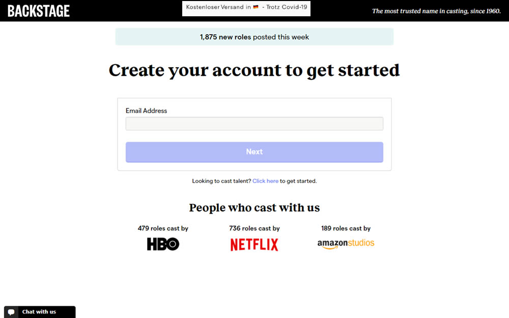
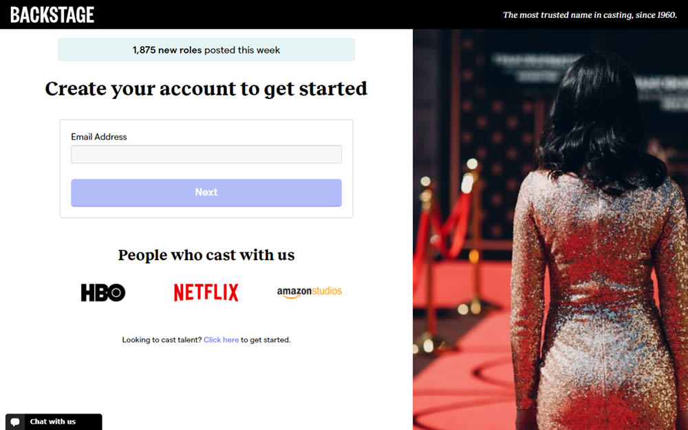
In this experiment, an aspirational photo was shown on the right side panel - reinforcing the theme of casting calls. The experiment measured progression to the next step and completed signups.
Test #326 on
Thomasnet.com
by  Kyle Phillips
Nov 25, 2020
Desktop
Mobile
Content
X.X%
Progression
Kyle Tested Pattern #41: Sticky Call To Action On Thomasnet.com


In this simple experiment on an article page, the variation slid out a sticky call to action linking to the next article. The sliding interaction triggered after some scrolling threshold (around 1000px or so). Afterwards, the sticky call to action maintained its floating position. The experiment measured clicks on this "next article" button.
Test #325 on
Snocks.com
by  Samuel Hess
Nov 24, 2020
Desktop
Global
X.X%
Progression
Samuel Tested Pattern #45: Benefit Bar On Snocks.com
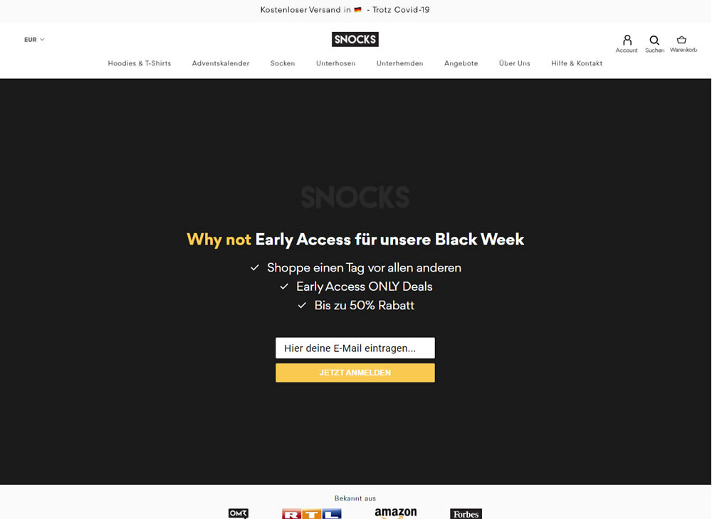
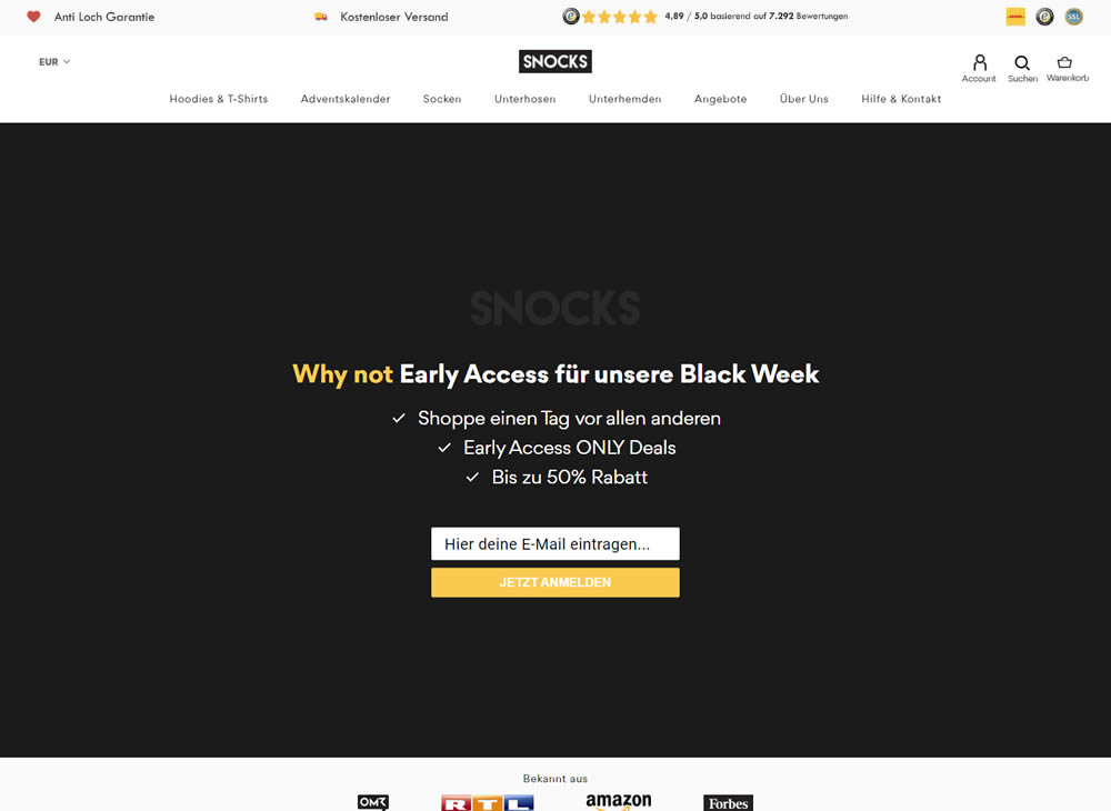
In this experiment, a set of reassurances and reviews were added in the header of this ecommerce website. Translating from German, these read: "Anti Hole Guarantee", "Free Shipping" and "X Ratings out of Y Reviews".
Test #322 on
Thomasnet.com
by  Kyle Phillips
Oct 27, 2020
Desktop
Mobile
Product
X.X%
Progression
Kyle Tested Pattern #82: Onboarding Callouts On Thomasnet.com
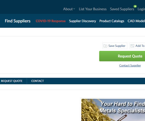
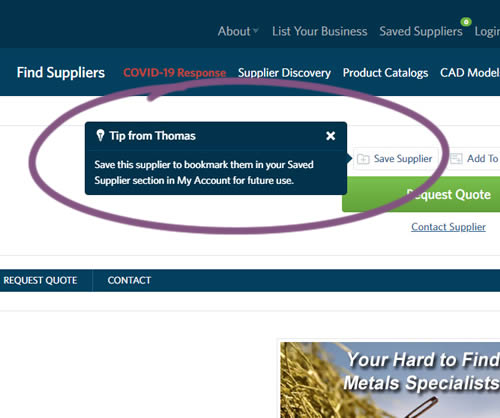
This experiment variation prompted users to save (bookmark) a company profile on a company detail page. Clicking on the save feature while logged out, would prompt a registration modal. Hence the save feature acted as an extra reason to signup. The number of people engaging or interacting with the feature was measured, as well as registrations.
Test #321 on
Elevate App App
by  Jesse Germinario
Oct 23, 2020
Mobile
X.X%
Progression
Jesse Tested Pattern #11: Gradual Reassurance
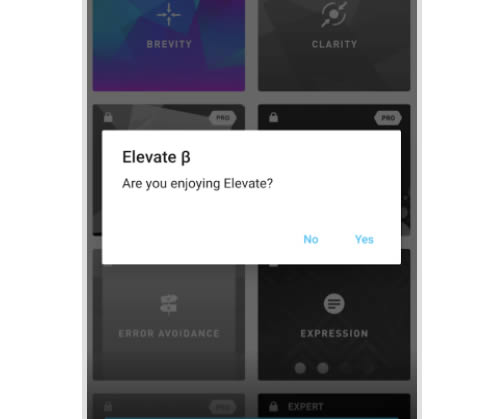
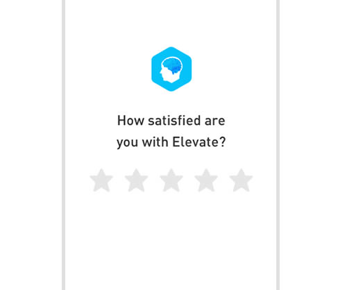
This experiment aimed to increase the number of application ratings from within the Elevate app. Success was measured by the number of users going towards Google Play to create the rating. The control version prompted users if they wanted to rate the app with a simple yes and no answer. The variation however presented the rating choice right away in the form of 5 stars - enabling users to express their choice sooner.